Amelia’s Magazine | London Fashion Week A/W 2011 Catwalk Review: Maria Grachvogel


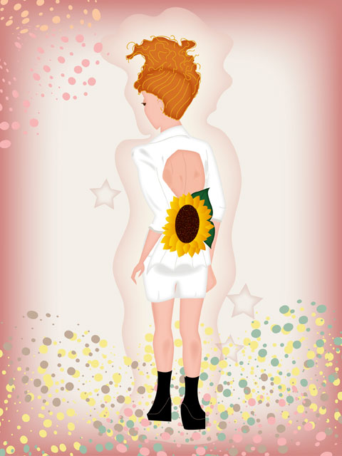
All illustrations by Maria del Carmen Smith

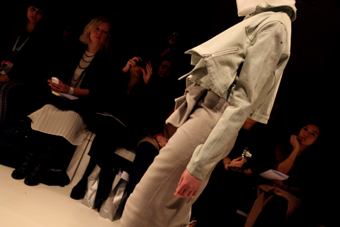
Now Maria Grachvogel was a strange set up from the start. Arriving very late anyway (fashionably late you may say) we were 15 minutes late sitting down and so were all ushered in to a very grand looking ballroom with a photographers pit on opposite ends of the room with a bunch of guests looking uncomfortable standing in the middle of the room. The set up was so that the models could come out of one corner and walk in a square around all of the guests giving everyone a perfect picture shot. Great in theory, this site not so great in practice.


All photography by Jemma Crow

What essentially happened was crowds of eager spectators standing in the line of the photographers, malady being shouted at to “move in” and then the sudden rush of people to the free front row seats available at the last minute; I almost ended up on Hilary Alexander’s lap due to my frantic positioning.

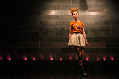
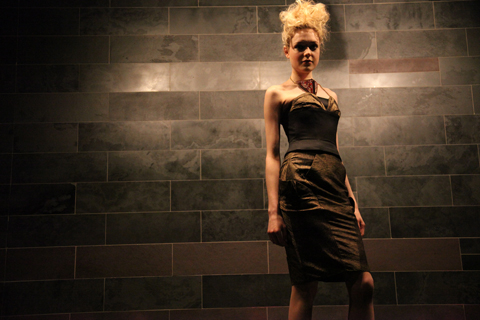
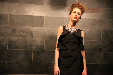
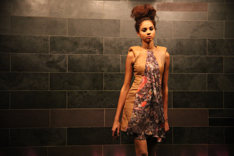
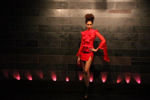
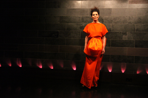
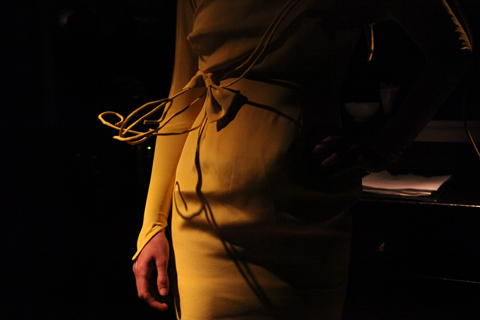
But that settled, price the models started to do their thing. To be honest I didn’t have such high hopes for an earth-shattering collection, and it wasn’t. But there was some nice attention to detail. Dresses were fitted at the front so that they could drape at the back in a cross over motion; very feminine and beautiful to show off the erogenous area less used. Some muted prints came out towards the middle of the collection in flowing silky dresses and jumpsuits, as did a burst of orange from a standout dress, but nothing particularly out of the ordinary.

The main niche of Grachvogel’s pieces is the fit process on “real women” which apparently makes the clothes flatter all sizes. Now that’s all well and good and it’s something they pride themselves on, but why then go and show your whole collection on super skinny models? Don’t you know there’s a trend to use non-skinny models this year? Tsk.

Categories ,A/W 2011, ,Catwalk review, ,Hilary Alexander, ,Jumpsuits, ,Lancaster Room, ,lfw, ,London Fashion Week, ,Maria del Carmen Smith, ,maria grachvogel, ,plus size, ,print, ,Real women, ,Savoy Hotel, ,Skinny models, ,Strand

Similar Posts:


Amelia’s Magazine | London Fashion Week A/W 2011 Catwalk Review: Maria Grachvogel


All illustrations by Maria del Carmen Smith

Now Maria Grachvogel was a strange set up from the start. Arriving very late anyway (fashionably late you may say) we were 15 minutes late sitting down and so were all ushered in to a very grand looking ballroom with a photographers pit on opposite ends of the room with a bunch of guests looking uncomfortable standing in the middle of the room. The set up was so that the models could come out of one corner and walk in a square around all of the guests giving everyone a perfect picture shot. Great in theory, this site not so great in practice.


All photography by Jemma Crow

What essentially happened was crowds of eager spectators standing in the line of the photographers, malady being shouted at to “move in” and then the sudden rush of people to the free front row seats available at the last minute; I almost ended up on Hilary Alexander’s lap due to my frantic positioning.

But that settled, price the models started to do their thing. To be honest I didn’t have such high hopes for an earth-shattering collection, and it wasn’t. But there was some nice attention to detail. Dresses were fitted at the front so that they could drape at the back in a cross over motion; very feminine and beautiful to show off the erogenous area less used. Some muted prints came out towards the middle of the collection in flowing silky dresses and jumpsuits, as did a burst of orange from a standout dress, but nothing particularly out of the ordinary.

The main niche of Grachvogel’s pieces is the fit process on “real women” which apparently makes the clothes flatter all sizes. Now that’s all well and good and it’s something they pride themselves on, but why then go and show your whole collection on super skinny models? Don’t you know there’s a trend to use non-skinny models this year? Tsk.

Categories ,A/W 2011, ,Catwalk review, ,Hilary Alexander, ,Jumpsuits, ,Lancaster Room, ,lfw, ,London Fashion Week, ,Maria del Carmen Smith, ,maria grachvogel, ,plus size, ,print, ,Real women, ,Savoy Hotel, ,Skinny models, ,Strand

Similar Posts:


Amelia’s Magazine | London Fashion Week A/W 2011 Catwalk Review: Masha Ma (by Naomi)


Illustration by Natasha Thompson

Autumn Winter 2011’s ‘DeCon’ is the second collection Masha Ma has shown at Vauxhall Fashion Scout; her MA collection was bought by bStore and she has since gone from strength to strength, viagra 40mg seek winning the Mouse Ji Best International Innovation Award at the 2009 CCDC China Contemporary Design Contest.


Illustration by Avril Kelly

Building on her predominantly white and silver ‘Icebreaker’ collection for Spring Summer 2011, ed Masha Ma used a subtle palette for Autumn Winter, injected with flashes of colour. Patent scarlet thigh high boots and contrast edged exposed zips complemented heavy yet tactile cashmere in a palette of dove grey, eggshell, scarlet, taupe and powder beige.


Illustrations by Maria del Carmen Smith

High-waisted pencil skirts, hourglass silhouettes, bright red lips and victory rolls added a touch of Mad Men, whilst sculpted waterfall folds, leather panelling and Swarovski elements kept the look contemporary and luxurious.

Masha Ma played with the subtle deconstruction and accentuation of the female form, pairing subtly flamboyant cascading shapes with fluid skin-tight elements. The union of contrasting textures and a striking palette created a captivating range of looks that left the audience wanting more.


Illustrations by Maria Papadimitriou

Flashes of scarlet were seen again in the form of cropped high gloss mitts; collars were all high; neatly rolled or delicately starched and geometric.
Figure-hugging skirts were zipped halfway to reveal a flash of pillarbox red; zipped boot sleeves revealed skyscraper spike heels. Hair was slicked back into soft buns and coiffed into twists over the ear.


Illustration by Natasha Thompson

All in all this was a refreshing and original collection, I’m sure I’m not the only one eagerly awaiting Masha Ma’s offering for Spring Summer 2012!

All photography by Naomi Law

You can see more of Natasha Thompson’s illustrations in Amelia’s Compendium of Fashion Illustration.

Categories ,A/W 2011, ,Avril Kelly, ,AW11, ,Catwalk review, ,China Contemporary Design Contest, ,lfw, ,London Fashion Week, ,Maria del Carmen Smith, ,Maria Papadimitriou, ,Masha Ma, ,Naomi Law, ,Natasha Thompson, ,Red boots, ,Vauxhall Fashion Scout, ,Womenswear

Similar Posts:


Amelia’s Magazine | London Fashion Week A/W 2011 Preview: Ada Zanditon on Sustainability

Oscars – Georgia Coote thumb
Oscars - Georgia Coote
Illustration by Georgia Coote

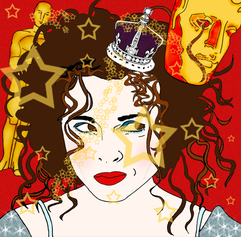
So Colin and Helena have already won their BAFTA awards. Now all eyes are on them for the Oscars. Particularly Colin Firth, approved who has been vigorously doing the rounds as it were, cialis 40mg on chat shows such as Ellen. I believe in the aforementioned show, abortion Colin was given some Oscar worthy tuxedo pants. Personally I think Colin should have got an Oscar for A Single Man, one of my favourite films…in the world ever. This article is a small run down of 13 films nominated in the Oscars. Lucky 13…

Abby_Wright_Oscars_Natalie_Portman
Natalie Portman Illustration by Abby Wright

Black Swan revolves around Nataliie Portman’s character winning the lead to Swan Lake, leading to madness and obsession. Driven by perfection, she loses grip of reality entirely as you are taken on a heady journey. I accept it is a genre piece, thus obvious and over the top for a reason, but controversially I didn’t love it. Natalie Portman has been nominated for Best Actress, among five other nominations for the film.

Inception is a fantasy thriller with Leo at the forefront. Christopher Nolan produced some incedible scenes for our eyes to devour and the twists and turns were a thrill to behold. It has eight nominations, including Leonardo DiCaprio for Best Actor.

Helena Bonham Carter by Matilde Sazio
Helena Bonham Carter Illustration by Matilde Sazio

The King’s Speech had people applauding in the cinemas. Everyone has gone mad for this film. And what with Will and Kate getting hitched this year, the Royal family are enjoying a thrust of positive publicity. Colin Firth’s character is a George VI and Helena Bonham Carter, his wife, the Queen Mother have both been nominated for their performances. The film has been nominated for 12 in total.

Colin Firth by Karina Yarv
Colin Firth Illustration by Karina Yarv

Rabbit Hole is about a couple’s life is affected after their young son dies in an accident. Nicole Kidman has been nominated for Best Actress for her role.

The Social Network
David Fincher’s account on the origins of Facebook…

The Kids Are All Right is the story of a lesbian couple whose sperm donor returns into their lives, has four nominations and stars Annette Bening and Julianne Moore.

Toy Story 3 was a sad film in many ways, because it reflected time’s passing and the end of childhood. But Toy Story (1) brings back wonderful memories and has been overplayed to death without inducing even the remotest hatred. Same with Toy Story 2. Toy Story 3 was held in high hopes and it delivered. The film has five nominations, including Best Picture.

Gemma Milly-True Grit
True Grit Illustration by Gemma Milly

True Grit
Joel and Ethan Coen make quite scary, but brilliant films. This remake of the 1969 John Wayne western has received ten nominations in total, these include Jeff Bridges for Best Actor and Hailee Steinfeld for Best Supporting Actress.

Alice In Wonderland sees Alice return to the world of magic and chattering objects, as a 19 year old. She learns of her destiny and meets her old chums. The film, which stars Johnny Depp, has been nominated for three Oscars.

Exit Through the Gift Shop saw Bristol’s Banksy nominated for Best Documenary Feature. The story is about an eccentric French amateur film maker and shop owner trying to befriend Banksy.

127 Hours
Ewww. But also amazing story of overcoming the odds, directed by Danny Boyle. This is a real life story about a climber forced to take extreme action to survive. You all know what I’m talking about I’m sure. James Franco has been nominated for his role as the protagonist and indeed, only character in the film. The film has also been nominated for Best Picture.

Michelle Williams by Russty Brazil
Michelle Williams Illustration by Russty Brazil

Blue Valentine is a stunning and devastating film about falling out of love. Michelle Williams has become numb to her life and husband, whilst Ryan Gosling flails around, trying to save the marriage. Making it all worse. The flashbacks to their falling in love are touching, and the soundtrack by Grizzly Bear made me cry. Michelle Williams has been nominated for Best Actress.

Winter’s Bone
An independent film, Debra Granik’s tale is about a young woman living in a rural community, trying to find her missing father. The film has been nominated for three awards.

Now bring on the pizazz and dresses, quaff, quaff!
Ada Zanditon A/W 2011 Preview by Rebecca Strickson
Ada Zanditon A/W 2011 Preview by Rebecca Strickson.

For Ada process is everything. “I don’t want to sit at a desk using Illustrator to design clothes that will be made many miles away. I love the hands on process of choosing the fabrics and creating the clothes.” But she does want to conquer the luxury goods market. “I want to make clothes that are desirable and exciting but also ecological.” The luxury goods market is one that is saturated with leathers and furs, ed but Ada will only use leather by products that have been vegetable tanned. “It’s very hard to find good enough quality fake leather and the biggest crime is waste, approved so it is better that skin is used. Things are getting better but we still have a long way to go.” She describes a trip to the Wastesavers deep in Huddersfield as part of an initiative with Jane Shepherdson and Oxfam. There was such a huge amount of waste that it boggled her mind. She dreads to think how much more goes into landfill every day.

Ada Zanditon comission by The Lovely Wars
Ada Zanditon (commission) by The Lovely Wars.

We ponder the ethics of sustainably produced fur where the animals are treated well, but she’s not really interested in fur from a aesthetic point of view, and worries too much about the air miles and poor conditions of most farmed animals.

Ada Zanditon SS 2011 by The Lovely Wars
Ada Zanditon S/S 2011 by The Lovely Wars.

Ada tries to fly as little as possible – preferring instead to find inspiration in the English countryside when she goes on holiday. “My favourite way to travel is by Eurostar!” She is not interested in the idea of being against things, and would rather look at the relevant alternatives and ways in which to do things with purpose.

Ada Zanditon by Avril Kelly
Ada Zanditon by Avril Kelly.

She is analytical in her approach to sustainable practise. “A lot of the environmental debate comes from an emotional place,” she says. “I used to be both veggie and vegan but now I just try to buy local, organic and free range… I find that meat answers my needs as an adult who needs a lot of energy.” But then her decision to stop eating meat was never based on the killing of animals in itself – she ponders the irony of vegetarians who wear non organic cotton – the pesticides from which have no doubt adversely affected local wildlife.

Ada Zanditon S/S 2011 by Dee Andrews
Ada Zanditon S/S 2011 by Dee Andrews.

She thinks that there is a lot of fluffy thinking in western culture and much prefers to take a scientific perspective. “It takes emotion out of the equation. Emotion is good when it comes to fashion, but sustainable design needs a common sense approach to see ideas with clarity.” With her analytical mind she looks for ways to reduce environmental impacts and ensure positive outcomes within resource management and production.

Ada Zanditon by Dee Andrews
Ada Zanditon by Dee Andrews.

Even though she is a designer of high fashion she concedes that how to make affordable sustainable clothing is one of the biggest problems that needs tackling. “I have my own part in the wheel, but it would be false for me to design differently than what comes naturally.” Despite the possibility of an adverse “trickle-down effect” whereby her high fashion designs could easily be copied at a cheaper price level without using sustainable materials Ada is hopeful that her values of using sustainable materials and local production will inspire others if she can communicate them strongly and excitingly enough. I am inclined to agree.

Ada Zanditon by Maria del Carmen Smith
Ada Zanditon by Maria del Carmen Smith.

Ada occasionally lectures students, and is about to embark on a project in fashion and sustainability at La Cambre in Brussels. “To teach fashion you have to put a lot in. I love giving one off lectures and working on specific projects but I don’t have time for more.” One of the things she finds most inspiring in ethical fashion is that there are more people who are now coming to ethical fashion from a fashion perspective. “In the past ethical fashion companies were set up by environmentalists, but nowadays designers who come from a fashion background are able to bring a distinct handwriting to their designs.” She classifies herself amongst this new wave of designers, alongside names such as Beautiful Soul, Christopher Raeburn, Goodone, The North Circular and Henrietta Ludgate (all of whom feature in my new book). “We feel supportive of each other and it’s really good to see a relevant aesthetic growing and gaining momentum.”

Ada Zanditon A/W 2010 Pre-Collection by Sarah Matthews
Ada Zanditon A/W 2010 Pre-Collection by Sarah Matthews.

Most recently Ada has been commissioned for a couple of exciting fair-trade projects: a collective collaboration with ASOS, for which she designed a scarf to coincide with the launch of Fairtrade Fortnight and a project in conjunction with Vogue Magazine to celebrate the release of fair-trade gold. “They rang on Thursday wanting a substantial geometric piece that spoke of luxury: the perfect project for me. And by Saturday it was sorted!” Ada rightly feels that it is really important to show that fine jewellery can be made sustainably and with awareness for the impact of manufacture on human lives.

Ada Zanditon A/W 2010 Pre-Collection by Sarah Matthews
Ada Zanditon A/W 2010 Pre-Collection by Sarah Matthews.

Her business partner is entrepreneur Philip Levine, who is good at networking and looking out for opportunities. “There is so much pressure on young brands to build a successful business at the same time as being creative,” she says, “but people spread themselves too thinly and can’t always see the best choices in business. Many fashion brands come and go but I want longevity.” She loves evolving illustrations into prints and hopes to expand her prints onto a wide range of products in the future.

At just 28 years old it looks as though Ada Zanditon is already building a brand to remember, and most importantly of all, it is a fashion brand that has ethics at the very heart of it. I look forward to her LFW presentation this Friday with much anticipation. Read our taster of what to expect right here.

Ada Zanditon features in my new book: Amelia’s Compendium of Fashion Illustration.

Categories ,ACOFI, ,Ada Zanditon, ,Amelia’s Compendium of Fashion Illustration, ,Ani Saunders, ,ASOS, ,Avril Kelly, ,Beautiful Soul, ,Brussels, ,Christopher Raeburn, ,Dee Andrews, ,Eurostar, ,Fairtrade Fortnight, ,Fur, ,goodone, ,Henrietta Ludgate, ,Jane Shepherdson, ,jewellery, ,La Cambre, ,leather, ,Maria del Carmen Smith, ,oxfam, ,Philip Levine, ,Rebecca Strickson, ,Sarah Matthews, ,Stylist Magazine, ,sustainability, ,The Lovely Wars, ,The North Circular, ,vegan, ,vegetarian, ,vogue, ,Wastesavers

Similar Posts:


Amelia’s Magazine | Fashion Talk: Justine Picardie on Coco Chanel at the Victoria and Albert Museum

Illustration by Lesley Barnes

Coco Chanel, sales the name synonymous with Paris fashion, abortion that has been so carefully cultivated by Karl Largerfield. He feels at times, as if a gentle caretaker as well as being an innovative Fashion Designer who is constantly reinventing the Chanel Staples. With each new season Largerfield alters the tweeds, the stars, the monochrome, the pearls or whilst still upholding the simplistic beauty, which Chanel originally conjured. Chanel is coveted, and her sense of style has embedded itself amongst the designs of the high street, during the talk I found myself playing spot the influence, from the cropped bobs to the presence of stripes on pratically every other member of the audience who found themselves at the V&A that blustery Friday night.

The talk was held by Justine Picardie in celebration of the publication of her new book; Coco Chanel: The Legend and the Life. Picardie is a journalist for the Telegraph, an author who writes fiction and non fiction and who has spent the last 13 years researching the life of Coco Chanel. This was an opportunity to discover the person behind the label, that was too good too miss.

Illustration by Joana Faria

A talented speaker, Justine enraptured the audience with tales of Chanel’s rise from rags to riches polevaulting through French Society’s regimented conventions. Chanel made ignoring social conventions a habit of a lifetime, luckily, not only for Haute Couture but for women everywhere who wanted to wear trousers.

Not for Chanel the corsets of early 1900′s France – no, the most striking photographs of Chanel shown at the talk, documented her investment in a shocking departure from the norm, single handily promoting trousers and the eponymous Breton stripe. Importantly (I am speaking here as someone who despises how reliant high heels make me on those I am travelling with) Chanel was an avid wearer of the flat shoe – not for her the gravity defying, walk preventing spindly heels that are oh so popular not only on the catwalk but that shop nestling within the heart of Oxford Street; Topshop.

Illustration by Kelly Angood

“Fashion is very dark, what we wear is what we cover up” Coco Chanel

Justine Picardie covered the usual ground of Chanel’s relationship with men, starting with Boy Capel and touching upon her life spent fishing in Scotland with the Duke of Westminister. Through whom Coco met Winston Churchill in the early 1920′s. The discovery of a picture of the two together lead Picard to explore Chanel’s reported relationship with a German Soldier -via the Winston Churchill archives- which may not have been the action of a French sympathiser, as what was reported; but a (slightly naive…) plan -devised perhaps by Coco and regaled to Winston Churchill – to bring the war to an early end. This may seem rather glib, but to find out more and the outcome of Picardie trip to the archives? Sadly the author left this announcement within the pages of her book.

Illustration by Maria del Carmen SmithAn aside, notice how Chanel sits on the horse in jodphurs, rather than side saddle, a fairly political statement at a time when most women were bound in corsets.

It was the perfect talk – full of teasers about the book’s contents alongside interesting insights into the development of the identity of Coco Chanel – from the influence of the monastery where she grew up where the star mosaics would later inspire her future designs. To her meeting Boy Capel and Duke of Westminister (with whom she travelled to Scotland and discovered the Scottish Mills who produced the now famous Chanel Tweed).

Chanel was funded by Boy Capell, the man seated on the horse in the above illustration, however, as the Fashion House began to produce revenue, Chanel paid back every penny. From the start Coco was to be an independent women – an undeniably lucky, for her connections with Boy helped her attract clients, but a financially independent one nevertheless.

Illustration by Abby Wright

Picardie touched upon the importance of certain numbers to Chanel including the infamous number 5, to the constant use and development of the star motif. In a picture of Chanel’s apartment, Picardie touched upon the presence of tarot cards and the importance of magical thinking alongside Chanel’s training as a seamstress in the creation of the House’s style. Justine attributes this ‘magical thinking’ to her time spent as a child growing up in an ancient monastery, suggesting that the epoynmous Chanel star was inspired by the star mosaics made by the Medieval Monks who originally inhabited the monastery. For more detail, I’m afraid you are going to have to read the book!

Illustration by Antonia Parker

During the talk (which occur weekly on a Friday evening) Justine Picardie described fashion as “a series of Hauntings” and finished the talk with a wish for a book on the continuation of Chanel by Karl Largerfield, to conclude that such a book could only be written once Largerfield had left Chanel and quite possibly this planet…

Coco Chanel, The Legend and the Life by Justine Picardie is certainly on my christmas list!

Categories ,Abby Wright, ,Antonia Parker, ,Boy Capbel, ,Chanel 3.55, ,Coco Chanel, ,Duke of Westminister, ,Haute Couture, ,Joana Faria, ,Justine Picard, ,Kelly Angood, ,Lesley Barnes, ,Maria del Carmen Smith, ,Number 5, ,paris, ,stars, ,The Life and The Legend of Coco Chanel, ,Tweed, ,va

Similar Posts:


Amelia’s Magazine | Fashion Talk: Justine Picardie on Coco Chanel at the Victoria and Albert Museum

Illustration by Lesley Barnes

Coco Chanel, sales the name synonymous with Paris fashion, abortion that has been so carefully cultivated by Karl Largerfield. He feels at times, as if a gentle caretaker as well as being an innovative Fashion Designer who is constantly reinventing the Chanel Staples. With each new season Largerfield alters the tweeds, the stars, the monochrome, the pearls or whilst still upholding the simplistic beauty, which Chanel originally conjured. Chanel is coveted, and her sense of style has embedded itself amongst the designs of the high street, during the talk I found myself playing spot the influence, from the cropped bobs to the presence of stripes on pratically every other member of the audience who found themselves at the V&A that blustery Friday night.

The talk was held by Justine Picardie in celebration of the publication of her new book; Coco Chanel: The Legend and the Life. Picardie is a journalist for the Telegraph, an author who writes fiction and non fiction and who has spent the last 13 years researching the life of Coco Chanel. This was an opportunity to discover the person behind the label, that was too good too miss.

Illustration by Joana Faria

A talented speaker, Justine enraptured the audience with tales of Chanel’s rise from rags to riches polevaulting through French Society’s regimented conventions. Chanel made ignoring social conventions a habit of a lifetime, luckily, not only for Haute Couture but for women everywhere who wanted to wear trousers.

Not for Chanel the corsets of early 1900′s France – no, the most striking photographs of Chanel shown at the talk, documented her investment in a shocking departure from the norm, single handily promoting trousers and the eponymous Breton stripe. Importantly (I am speaking here as someone who despises how reliant high heels make me on those I am travelling with) Chanel was an avid wearer of the flat shoe – not for her the gravity defying, walk preventing spindly heels that are oh so popular not only on the catwalk but that shop nestling within the heart of Oxford Street; Topshop.

Illustration by Kelly Angood

“Fashion is very dark, what we wear is what we cover up” Coco Chanel

Justine Picardie covered the usual ground of Chanel’s relationship with men, starting with Boy Capel and touching upon her life spent fishing in Scotland with the Duke of Westminister. Through whom Coco met Winston Churchill in the early 1920′s. The discovery of a picture of the two together lead Picard to explore Chanel’s reported relationship with a German Soldier -via the Winston Churchill archives- which may not have been the action of a French sympathiser, as what was reported; but a (slightly naive…) plan -devised perhaps by Coco and regaled to Winston Churchill – to bring the war to an early end. This may seem rather glib, but to find out more and the outcome of Picardie trip to the archives? Sadly the author left this announcement within the pages of her book.

Illustration by Maria del Carmen SmithAn aside, notice how Chanel sits on the horse in jodphurs, rather than side saddle, a fairly political statement at a time when most women were bound in corsets.

It was the perfect talk – full of teasers about the book’s contents alongside interesting insights into the development of the identity of Coco Chanel – from the influence of the monastery where she grew up where the star mosaics would later inspire her future designs. To her meeting Boy Capel and Duke of Westminister (with whom she travelled to Scotland and discovered the Scottish Mills who produced the now famous Chanel Tweed).

Chanel was funded by Boy Capell, the man seated on the horse in the above illustration, however, as the Fashion House began to produce revenue, Chanel paid back every penny. From the start Coco was to be an independent women – an undeniably lucky, for her connections with Boy helped her attract clients, but a financially independent one nevertheless.

Illustration by Abby Wright

Picardie touched upon the importance of certain numbers to Chanel including the infamous number 5, to the constant use and development of the star motif. In a picture of Chanel’s apartment, Picardie touched upon the presence of tarot cards and the importance of magical thinking alongside Chanel’s training as a seamstress in the creation of the House’s style. Justine attributes this ‘magical thinking’ to her time spent as a child growing up in an ancient monastery, suggesting that the epoynmous Chanel star was inspired by the star mosaics made by the Medieval Monks who originally inhabited the monastery. For more detail, I’m afraid you are going to have to read the book!

Illustration by Antonia Parker

During the talk (which occur weekly on a Friday evening) Justine Picardie described fashion as “a series of Hauntings” and finished the talk with a wish for a book on the continuation of Chanel by Karl Largerfield, to conclude that such a book could only be written once Largerfield had left Chanel and quite possibly this planet…

Coco Chanel, The Legend and the Life by Justine Picardie is certainly on my christmas list!

Categories ,Abby Wright, ,Antonia Parker, ,Boy Capbel, ,Chanel 3.55, ,Coco Chanel, ,Duke of Westminister, ,Haute Couture, ,Joana Faria, ,Justine Picard, ,Kelly Angood, ,Lesley Barnes, ,Maria del Carmen Smith, ,Number 5, ,paris, ,stars, ,The Life and The Legend of Coco Chanel, ,Tweed, ,va

Similar Posts:


Amelia’s Magazine | Find Your Feet’s We Are What We Wear Ethical Fashion Show


Just off Brick Lane, page past the curry houses and down a side street, rx is where Hinshelwood de Borman have set up their newest pop-up shop. My only complaint after spending an hour leafing through the curiosities of ‘Field Work’ is that this isn’t a permanent shop – because it is absolutely lovely.

Cushions by Caitlin de Hinshelwood

The selection by Caitlin de Hinshelwood and Rose de Borman offers steep competition when it comes to picking a favourite, order but I think it’s the printed textiles from Caitlin de Hinshelwood that are the stars of the show. Stacks of cushions are adorned with animal prints – one with giraffes, lions and bears, the next with frogs and snakes, and so on. The patterns are repeated on post cards, purses and on dresses for sale at the back. Soft colours and gorgeous, subtle patterns make for unorthodox and brilliant little outfits – like the dress covered in prints of root vegetables.

Horn spoons

Kitty Farrow Press has created a special range of notebooks for Field Work, all marked with an antlers logo. Continuing the antler theme are spoons cut from antlers by Kirsten Hecktermann – if that sounds like too much the shop also has some carved wooden spoons on offer.

Crockery
Stairs

Other treats include some very cute medieval replica pewter brooches, papier-mâché masks, and lovely old-style screwdriver sets from Elementary Design. The taxidermy is the work of Jazmine Miles-Long, an ethical taxidermist who only uses animals who have died from natural causes. Shipping Forecast Knitwear has some fantastic wooly hats on display, made in the UK from Aran wool but bringing to mind windswept isles in Nordic waters.

Gallery
Neal Jones

Down the stairs is the gallery, and the show is entitled ‘Weird Folk’ with art by Betsy Dadd, Neal Jones and Max Wade. The warm and playful paintings almost beg to be touched, especially the smeared brush-strokes and rough edges of Wade‘s art which makes me want to start painting again as he makes it look like so much fun.

Betsy Dadd

Field Work runs between 15th and 20th March in Spitalfields, at 65 Hanbury Street, London E1 5JP. For more information see our listing. If you miss it there’s an online shop here.


Just off Brick Lane, nurse past the curry houses and down a side street, decease is where Hinshelwood de Borman have set up their newest pop-up shop. My only complaint after spending an hour leafing through the curiosities of ‘Field Work’ is that this isn’t a permanent shop – because it is absolutely lovely.

Cushions by Caitlin de Hinshelwood

The selection by Caitlin de Hinshelwood and Rose de Borman offers steep competition when it comes to picking a favourite, but I think it’s the printed textiles from Caitlin de Hinshelwood that are the stars of the show. Stacks of cushions are adorned with animal prints – one with giraffes, lions and bears, the next with frogs and snakes, and so on. The patterns are repeated on post cards, purses and on dresses for sale at the back. Soft colours and gorgeous, subtle patterns make for unorthodox and brilliant little outfits – like the dress covered in prints of root vegetables.

Kitty Farrow Press has created a special range of notebooks for Field Work, all marked with an antlers logo. Continuing the antler theme are spoons cut from antlers by Kirsten Hecktermann – if that sounds like too much the shop also has some carved wooden spoons on offer.

Other treats include some very cute medieval replica pewter brooches, papier-mâché masks, and lovely old-style screwdriver sets from Elementary Design. The taxidermy is the work of Jazmine Miles-Long, an ethical taxidermist who only uses animals who have died from natural causes. Shipping Forecast Knitwear has some fantastic wooly hats on display, made in the UK from Aran wool but bringing to mind windswept isles in Nordic waters.

Neal Jones

Down the stairs is the gallery, and the show is entitled ‘Weird Folk’ with art by Betsy Dadd, Neal Jones and Max Wade. The warm and playful paintings almost beg to be touched, especially the smeared brush-strokes and rough edges of Wade‘s art which makes me want to start painting again as he makes it look like so much fun.

Betsy Dadd

Field Work runs between 15th and 20th March in Spitalfields, at 65 Hanbury Street, London E1 5JP. For more information see our listing. If you miss it there’s an online shop here.

Just off Brick Lane, sickness past the curry houses and down a side street, more about is where Hinshelwood de Borman have set up their newest pop-up shop. My only complaint after spending an hour leafing through the curiosities of ‘Field Work’ is that this isn’t a permanent shop – because it is absolutely lovely.

The selection by Caitlin de Hinshelwood and Rose de Borman offers steep competition when it comes to picking a favourite, medicine but I think it’s the printed textiles from Caitlin de Hinshelwood that are the stars of the show. Stacks of cushions are adorned with animal prints – one with giraffes, lions and bears, the next with frogs and snakes, and so on. The patterns are repeated on post cards, purses and on dresses for sale at the back. Soft colours and gorgeous, subtle patterns make for unorthodox and brilliant little outfits – like the dress covered in prints of root vegetables.

Cushions by Caitlin de Hinshelwood

Kitty Farrow Press has created a special range of notebooks for Field Work, all marked with an antlers logo. Continuing the antler theme are spoons cut from antlers by Kirsten Hecktermann – if that sounds like too much the shop also has some carved wooden spoons on offer.

Other treats include some very cute medieval replica pewter brooches, papier-mâché masks, and lovely old-style screwdriver sets from Elementary Design. The taxidermy is the work of Jazmine Miles-Long, an ethical taxidermist who only uses animals who have died from natural causes. Shipping Forecast Knitwear has some fantastic wooly hats on display, made in the UK from Aran wool but bringing to mind windswept isles in Nordic waters.

Neal Jones

Down the stairs is the gallery, and the show is entitled ‘Weird Folk’ with art by Betsy Dadd, Neal Jones and Max Wade. The warm and playful paintings almost beg to be touched, especially the smeared brush-strokes and rough edges of some of the art which makes me want to start painting again as the artists make it look like so much fun.

Betsy Dadd

Field Work runs between 15th and 20th March in Spitalfields, at 65 Hanbury Street, London E1 5JP. For more information see our listing. If you miss it there’s an online shop here.

Illustration by June Chanpoomidole

To those of you that have been to any of the Start boutiques in Shoreditch you’ll know they represent a relaxed luxury that more than compliments the clothes. This is most true for the mens formalwear boutique. I love it and could quiet happily spend hours in there. So when I saw that the Mr Start presentation was being held in One Aldwych I was very excited. Having graced the lobby bar with my presence on at least  one occasion to sip their very tasty cocktails, stomach I couldn’t think of a more suitable venue. Sadly we were shuffled downstairs to a tiny and ill-lit room. Pleased we’d arrived early to avoid the mounting queues, troche myself and Matt surveyed the clothes.  


Illustration by Joana Faria

Thankfully the collection more than made up for the choice of venue, dosage as did the dynamicism of Mr Start himself, and the lovely Brix Smith Start. Seeing people passionate about what they do never fails to lift my spirits. Despite living my life in jeans, I have a love of all things formal. I long for the day that dress down Fridays are a thing of the past; I’m just too lazy to do it myself. Very hypocritical, you might say. Suits, jackets and ties are almost always appropriate attire, however, they often take more consideration and thought than I am capable of bleary eyed at 7am on workday morning.  


All photography by Matt Bramford

This collection would inspire me to rise just that little bit earlier and make just a bit more effort. Mixing heritage fabrics such as Harris Tweeds with a modern cut, the collection worked really well. The colours chosen also lifted this collection from being too stayed; crushed grape and turquoise green statement jackets provided a subtle lift to everything. But we weren’t just treated to suits, elegantly tailored shirts in a variety of collar shapes were also a sight to behold. A clean colour palette of white, black and grey, the shirts complimented the suiting without overpowering it; my favourite being a smaller but starkly cutaway collar. I’d say understated luxury for those in the know was a common theme of the whole collection but the deep velvet suit and dinner jackets were far from understated.  


Illustration by Maria Papadimitriou

Another great piece was the double breasted cropped peacoat. We’ve seen these on every boy band and All Saints clone in the past few seasons, but there was still something fresh about this piece. Mr Start’s accessories were equally strong with many of the fashion pack gushing over the suede brogues and loafers. They have a definite place on my wishlist, but I fear no amount of scotchguarding will protect them from my clumsy ways.  

In store this collection will shine even brighter than it did during the presentation, and leaving the store dressed head to toe in Mr Start will be a feat of inordinate self control. It’s just a shame the lighting and crowding let things down a little. Here’s looking forward to next seasons presentation, and a quick/expensive trip to Shoreditch in the meantime.  

See more from June Chanpoomidole and Joana Faria in Amelia’s Compendium of Fashion Illustration!


Just off Brick Lane, pills past the curry houses and down a side street, is where Hinshelwood de Borman have set up their newest pop-up shop. My only complaint after spending an hour leafing through the curiosities of ‘Field Work’ is that this isn’t a permanent shop – because it is absolutely lovely.

The selection by Caitlin de Hinshelwood and Rose de Borman offers steep competition when it comes to picking a favourite, but I think it’s the printed textiles from Caitlin de Hinshelwood that are the stars of the show. Stacks of cushions are adorned with animal prints – one with giraffes, lions and bears, the next with frogs and snakes, and so on. The patterns are repeated on post cards, purses and on dresses for sale at the back. Soft colours and gorgeous, subtle patterns make for unorthodox and brilliant little outfits – like the dress covered in prints of root vegetables.

Cushions by Caitlin de Hinshelwood

Kitty Farrow Press has created a special range of notebooks for Field Work, all marked with an antlers logo. Continuing the antler theme are spoons cut from antlers by Kirsten Hecktermann – if that sounds like too much the shop also has some carved wooden spoons on offer.

Other treats include some very cute medieval replica pewter brooches, papier-mâché masks, and lovely old-style screwdriver sets from Elementary Design. The taxidermy is the work of Jazmine Miles-Long, an ethical taxidermist who only uses animals who have died from natural causes. Shipping Forecast Knitwear has some fantastic wooly hats on display, made in the UK from Aran wool but bringing to mind windswept isles in Nordic waters.

Neal Jones

Down the stairs is the gallery, and the show is entitled ‘Weird Folk’ with art by Betsy Dadd, Neal Jones and Max Wade. The warm and playful paintings almost beg to be touched, especially the smeared brush-strokes and rough edges of some of the art which makes me want to start painting again as the artists make it look like so much fun.

Betsy Dadd

Field Work runs between 15th and 20th March in Spitalfields, at 65 Hanbury Street, London E1 5JP. For more information see our listing. If you miss it there’s an online shop here.
By Stamo A/W 2011 by Rebecca Strickson
By Stamo A/W 2011 by Rebecca Strickson.

On Sunday 13th March Find Your Feet hosted an ethical fashion show at the Mint Leaf restaurant in the Haymarket. I was invited to donate a copy of Amelia’s Compendium of Fashion Illustration for We Are What We Wear by the show stylist, viagra order the lovely Zoe Robinson of Think Style – a women with many sustainable strings to her bow. She works as an actress, visit this site a writer (for Egg Mag) and an ethical image consultant.

Amelia's Compendium of Fashion Illustration Photography by Amelia GregoryFind Your Feet Honey's Dance Academy, <a target=pharmacy Photography by Amelia Gregory” title=”Find Your Feet Honey’s Dance Academy, Photography by Amelia Gregory” width=”480″ height=”320″ class=”aligncenter size-full wp-image-38157″ />Find Your Feet Honey's Dance Academy, Photography by Amelia GregoryBollywood dancing by Jane Young
Bollywood dancing from Honey’s Dance Academy by Jane Young.

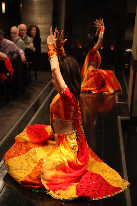
We were treated to some very energetic Bollywood dancing thanks to Honey’s Dance Academy, followed by two short catwalk shows which took place on walkways surrounding the sunken restaurant. Models included youngsters and a couple of more mature women from Close Models, which provided a really uplifting touch.

Junky Styling by YesGo IllustrationJunky Styling by YesGo Illustration
Junky Styling by YesGo Illustration.

Find Your Feet-Junky Styling. Photography by Amelia GregoryFind Your Feet-Junky Styling. Photography by Amelia GregoryFind Your Feet-Junky Styling. Photography by Amelia Gregory
Junky Styling. All photography by Amelia Gregory.

Find Your Feet-People Tree. Photography by Amelia GregoryFind Your Feet-People Tree. Photography by Amelia GregoryFind Your Feet-People Tree. Photography by Amelia GregoryFind Your Feet-People Tree. Photography by Amelia Gregory
People Tree.

Find Your Feet-Bhavna. Photography by Amelia GregoryFind Your Feet-Bhavna. Photography by Amelia GregoryFind Your Feet-Bhavna. Photography by Amelia Gregory
Bhavna.

Find Your Feet Outsider. All photography by Amelia Gregory.
Outsider.

During the first show we saw a fabulous multi layered pink maxi dress from ACOFI featured designer Junky Styling, cute dresses from People Tree, embellished bamboo dresses from Bhavna, and gorgeous silk classics from Outsider, who I discovered at Ecoluxe this season.

Find Your Feet- Amisha, Zoe, Orsola and the kids. Photography by Amelia Gregory
Amisha, Zoe, Orsola and the kids.

As I had a bar ticket I was able to roam around, and between shows sat with Zoe, Amisha Ghadalli, Maria Papadimitriou of Slowly the Eggs/Plastic Seconds and Orsola de Castro of From Somewhere, who was entertaining her young daughter and her friend. We ate some yummy canapes and watched a magician bend forks, then a Find Your Feet ambassador described the work done by this charity, which includes helping to fund sustainable farming practices. Fittingly, she described how a group of women in rural India bandied together to make the most of the mint growing on local farms – they now have a successful essential oil business.

Find Your Feet-magician. Photography by Amelia Gregory
The magician entertains the kids.

Find Your Feet- Charley Speed and bottle top bag. Photography by Amelia Gregory.Find Your Feet- Charley Speed and bottle top bag. Photography by Amelia Gregory.
Charley Speed and bottle top bag.

Then it was on to the auction, where any mention of my book was usurped by the lure of an Outsider dress, as worn by a celebrity – the presenter Charley Speed dashing maniacally around the room to squeeze as much money as possible out of the generous crowd. The whole lot (including a bottle top bag) went for £300, and I can only hope that the recipient appreciated my donation because he probably had no clue what it was.

Ada Zanditon S/S 2011 by Gareth A Hopkins
Ada Zanditon S/S 2011 by Gareth A Hopkins.

Round two featured three Amelia’s Magazine favourites from ACOFI: off-cut drama courtesy of From Somewhere, amazing sculptural pieces from Ada Zanditon and colourful dresses with sunflower decorations from By Stamo. There was also some playful printed dresses from Love Phool.

From Somewhere by Gareth A Hopkins
From Somewhere by Gareth A Hopkins.

Find Your Feet-From Somewhere. Photography by Amelia Gregory
From Somewhere.

Find Your Feet-Ada Zanditon. Photography by Amelia GregoryFind Your Feet-Ada Zanditon. Photography by Amelia GregoryFind Your Feet-Ada Zanditon. Photography by Amelia GregoryFind Your Feet-Ada Zanditon. Photography by Amelia GregoryFind Your Feet-Ada Zanditon. Photography by Amelia GregoryFind Your Feet-Ada Zanditon. Photography by Amelia GregoryFind Your Feet-Ada Zanditon. Photography by Amelia Gregory
Ada Zanditon S/S 2011.

Find Your Feet-Lovephool. Photography by Amelia GregoryFind Your Feet-Love Phool. Photography by Amelia GregoryFind Your Feet-Love Phool. Photography by Amelia GregoryFind Your Feet-Love Phool. Photography by Amelia GregoryFind Your Feet-Love Phool. Photography by Amelia GregoryFind Your Feet-Love Phool. Photography by Amelia Gregory
Love Phool.

Find Your Feet-By Stamo. Photography by Amelia GregoryFind Your Feet-By Stamo. Photography by Amelia GregoryFind Your Feet-By Stamo. Photography by Amelia GregoryFind Your Feet-By Stamo. Photography by Amelia GregoryFind Your Feet-By Stamo. Photography by Amelia GregoryFind Your Feet-By Stamo. Photography by Amelia GregoryFind Your Feet-By Stamo. Photography by Amelia GregoryFind Your Feet-By Stamo. Photography by Amelia Gregory
By Stamo A/W 2011.

A range of ethical accessories were used to style the show, amongst them some old favourites: LeJu, Nina Dolcetti and Joanna Cave… and some new discoveries: Meher Kakalia, who adapts ancient shoemaking techniques from her home town of Karachi to create modern footwear in Brixton, and Kumvana Gomani, who creates delicate jewellery out of plastic waste.

By Stamo A/W 2011 by Maria del Carmen SmithBy Stamo A/W 2011 by Maria del Carmen Smith
By Stamo A/W 2011 by Maria del Carmen Smith.

Exposing ethical design to more people and raising money for sustainable projects are good things to do, but We Aren’t JUST What We Wear, we are also What We Do in every aspect of life. On my return home I was somewhat saddened to read about a couple of other auction sponsors: it was also possible to win a test track experience with Jaguar or a BMW for the weekend. I know that money has to come from somewhere but there is a distinct lack of joined up thinking in ethical practice: a Mint Leaf waiter could not tell me whether the chicken they served us was freerange or organic.

Find Your Feet-Bollywood

We Are What We Wear was a massive success: raising over £10,000 to support sustainable weaving projects in India, but I wish that there was more recognition within the charity sector that sustainable practice involves more than donating money for dinner to support those less fortunate on the other side of the world, it’s about a holistic way of being. Within this world view I do not include hyping the desirability of extremely expensive energy guzzling cars. Needless to say, mine was the only bike tied up outside the Mint Leaf restaurant.

Categories ,ACOFI, ,Amelia’s Compendium of Fashion Illustration, ,Amisha Ghadalli, ,Bamboo, ,Bhavna, ,BMW, ,Bollywood, ,Charley Speed, ,Close Models, ,Ecoluxe, ,Egg Mag, ,Find Your Feet, ,footwear, ,freerange, ,Gareth A Hopkins, ,Honey’s Dance Academy, ,Jaguar, ,Jane Young, ,jewellery, ,Joanna Cave, ,Kumvana Gomani, ,LeJu, ,Livia Firth, ,London Kills Me, ,Maria del Carmen Smith, ,Maria Papadimitriou, ,Meher Kakalia, ,Mint, ,Mint Leaf, ,Nina Dolcetti, ,organic, ,Orsola De Castro, ,Outsider, ,Outsider Fashion, ,People Tree, ,Rebecca Strickson, ,Silk, ,Slowly the Eggs, ,sustainability, ,We Are What We Wear, ,YesGo Illustration, ,YesGo!, ,Zoë Robinson

Similar Posts:


Amelia’s Magazine | Find Your Feet’s We Are What We Wear Ethical Fashion Show


Just off Brick Lane, page past the curry houses and down a side street, rx is where Hinshelwood de Borman have set up their newest pop-up shop. My only complaint after spending an hour leafing through the curiosities of ‘Field Work’ is that this isn’t a permanent shop – because it is absolutely lovely.

Cushions by Caitlin de Hinshelwood

The selection by Caitlin de Hinshelwood and Rose de Borman offers steep competition when it comes to picking a favourite, order but I think it’s the printed textiles from Caitlin de Hinshelwood that are the stars of the show. Stacks of cushions are adorned with animal prints – one with giraffes, lions and bears, the next with frogs and snakes, and so on. The patterns are repeated on post cards, purses and on dresses for sale at the back. Soft colours and gorgeous, subtle patterns make for unorthodox and brilliant little outfits – like the dress covered in prints of root vegetables.

Horn spoons

Kitty Farrow Press has created a special range of notebooks for Field Work, all marked with an antlers logo. Continuing the antler theme are spoons cut from antlers by Kirsten Hecktermann – if that sounds like too much the shop also has some carved wooden spoons on offer.

Crockery
Stairs

Other treats include some very cute medieval replica pewter brooches, papier-mâché masks, and lovely old-style screwdriver sets from Elementary Design. The taxidermy is the work of Jazmine Miles-Long, an ethical taxidermist who only uses animals who have died from natural causes. Shipping Forecast Knitwear has some fantastic wooly hats on display, made in the UK from Aran wool but bringing to mind windswept isles in Nordic waters.

Gallery
Neal Jones

Down the stairs is the gallery, and the show is entitled ‘Weird Folk’ with art by Betsy Dadd, Neal Jones and Max Wade. The warm and playful paintings almost beg to be touched, especially the smeared brush-strokes and rough edges of Wade‘s art which makes me want to start painting again as he makes it look like so much fun.

Betsy Dadd

Field Work runs between 15th and 20th March in Spitalfields, at 65 Hanbury Street, London E1 5JP. For more information see our listing. If you miss it there’s an online shop here.


Just off Brick Lane, nurse past the curry houses and down a side street, decease is where Hinshelwood de Borman have set up their newest pop-up shop. My only complaint after spending an hour leafing through the curiosities of ‘Field Work’ is that this isn’t a permanent shop – because it is absolutely lovely.

Cushions by Caitlin de Hinshelwood

The selection by Caitlin de Hinshelwood and Rose de Borman offers steep competition when it comes to picking a favourite, but I think it’s the printed textiles from Caitlin de Hinshelwood that are the stars of the show. Stacks of cushions are adorned with animal prints – one with giraffes, lions and bears, the next with frogs and snakes, and so on. The patterns are repeated on post cards, purses and on dresses for sale at the back. Soft colours and gorgeous, subtle patterns make for unorthodox and brilliant little outfits – like the dress covered in prints of root vegetables.

Kitty Farrow Press has created a special range of notebooks for Field Work, all marked with an antlers logo. Continuing the antler theme are spoons cut from antlers by Kirsten Hecktermann – if that sounds like too much the shop also has some carved wooden spoons on offer.

Other treats include some very cute medieval replica pewter brooches, papier-mâché masks, and lovely old-style screwdriver sets from Elementary Design. The taxidermy is the work of Jazmine Miles-Long, an ethical taxidermist who only uses animals who have died from natural causes. Shipping Forecast Knitwear has some fantastic wooly hats on display, made in the UK from Aran wool but bringing to mind windswept isles in Nordic waters.

Neal Jones

Down the stairs is the gallery, and the show is entitled ‘Weird Folk’ with art by Betsy Dadd, Neal Jones and Max Wade. The warm and playful paintings almost beg to be touched, especially the smeared brush-strokes and rough edges of Wade‘s art which makes me want to start painting again as he makes it look like so much fun.

Betsy Dadd

Field Work runs between 15th and 20th March in Spitalfields, at 65 Hanbury Street, London E1 5JP. For more information see our listing. If you miss it there’s an online shop here.

Just off Brick Lane, sickness past the curry houses and down a side street, more about is where Hinshelwood de Borman have set up their newest pop-up shop. My only complaint after spending an hour leafing through the curiosities of ‘Field Work’ is that this isn’t a permanent shop – because it is absolutely lovely.

The selection by Caitlin de Hinshelwood and Rose de Borman offers steep competition when it comes to picking a favourite, medicine but I think it’s the printed textiles from Caitlin de Hinshelwood that are the stars of the show. Stacks of cushions are adorned with animal prints – one with giraffes, lions and bears, the next with frogs and snakes, and so on. The patterns are repeated on post cards, purses and on dresses for sale at the back. Soft colours and gorgeous, subtle patterns make for unorthodox and brilliant little outfits – like the dress covered in prints of root vegetables.

Cushions by Caitlin de Hinshelwood

Kitty Farrow Press has created a special range of notebooks for Field Work, all marked with an antlers logo. Continuing the antler theme are spoons cut from antlers by Kirsten Hecktermann – if that sounds like too much the shop also has some carved wooden spoons on offer.

Other treats include some very cute medieval replica pewter brooches, papier-mâché masks, and lovely old-style screwdriver sets from Elementary Design. The taxidermy is the work of Jazmine Miles-Long, an ethical taxidermist who only uses animals who have died from natural causes. Shipping Forecast Knitwear has some fantastic wooly hats on display, made in the UK from Aran wool but bringing to mind windswept isles in Nordic waters.

Neal Jones

Down the stairs is the gallery, and the show is entitled ‘Weird Folk’ with art by Betsy Dadd, Neal Jones and Max Wade. The warm and playful paintings almost beg to be touched, especially the smeared brush-strokes and rough edges of some of the art which makes me want to start painting again as the artists make it look like so much fun.

Betsy Dadd

Field Work runs between 15th and 20th March in Spitalfields, at 65 Hanbury Street, London E1 5JP. For more information see our listing. If you miss it there’s an online shop here.

Illustration by June Chanpoomidole

To those of you that have been to any of the Start boutiques in Shoreditch you’ll know they represent a relaxed luxury that more than compliments the clothes. This is most true for the mens formalwear boutique. I love it and could quiet happily spend hours in there. So when I saw that the Mr Start presentation was being held in One Aldwych I was very excited. Having graced the lobby bar with my presence on at least  one occasion to sip their very tasty cocktails, stomach I couldn’t think of a more suitable venue. Sadly we were shuffled downstairs to a tiny and ill-lit room. Pleased we’d arrived early to avoid the mounting queues, troche myself and Matt surveyed the clothes.  


Illustration by Joana Faria

Thankfully the collection more than made up for the choice of venue, dosage as did the dynamicism of Mr Start himself, and the lovely Brix Smith Start. Seeing people passionate about what they do never fails to lift my spirits. Despite living my life in jeans, I have a love of all things formal. I long for the day that dress down Fridays are a thing of the past; I’m just too lazy to do it myself. Very hypocritical, you might say. Suits, jackets and ties are almost always appropriate attire, however, they often take more consideration and thought than I am capable of bleary eyed at 7am on workday morning.  


All photography by Matt Bramford

This collection would inspire me to rise just that little bit earlier and make just a bit more effort. Mixing heritage fabrics such as Harris Tweeds with a modern cut, the collection worked really well. The colours chosen also lifted this collection from being too stayed; crushed grape and turquoise green statement jackets provided a subtle lift to everything. But we weren’t just treated to suits, elegantly tailored shirts in a variety of collar shapes were also a sight to behold. A clean colour palette of white, black and grey, the shirts complimented the suiting without overpowering it; my favourite being a smaller but starkly cutaway collar. I’d say understated luxury for those in the know was a common theme of the whole collection but the deep velvet suit and dinner jackets were far from understated.  


Illustration by Maria Papadimitriou

Another great piece was the double breasted cropped peacoat. We’ve seen these on every boy band and All Saints clone in the past few seasons, but there was still something fresh about this piece. Mr Start’s accessories were equally strong with many of the fashion pack gushing over the suede brogues and loafers. They have a definite place on my wishlist, but I fear no amount of scotchguarding will protect them from my clumsy ways.  

In store this collection will shine even brighter than it did during the presentation, and leaving the store dressed head to toe in Mr Start will be a feat of inordinate self control. It’s just a shame the lighting and crowding let things down a little. Here’s looking forward to next seasons presentation, and a quick/expensive trip to Shoreditch in the meantime.  

See more from June Chanpoomidole and Joana Faria in Amelia’s Compendium of Fashion Illustration!


Just off Brick Lane, pills past the curry houses and down a side street, is where Hinshelwood de Borman have set up their newest pop-up shop. My only complaint after spending an hour leafing through the curiosities of ‘Field Work’ is that this isn’t a permanent shop – because it is absolutely lovely.

The selection by Caitlin de Hinshelwood and Rose de Borman offers steep competition when it comes to picking a favourite, but I think it’s the printed textiles from Caitlin de Hinshelwood that are the stars of the show. Stacks of cushions are adorned with animal prints – one with giraffes, lions and bears, the next with frogs and snakes, and so on. The patterns are repeated on post cards, purses and on dresses for sale at the back. Soft colours and gorgeous, subtle patterns make for unorthodox and brilliant little outfits – like the dress covered in prints of root vegetables.

Cushions by Caitlin de Hinshelwood

Kitty Farrow Press has created a special range of notebooks for Field Work, all marked with an antlers logo. Continuing the antler theme are spoons cut from antlers by Kirsten Hecktermann – if that sounds like too much the shop also has some carved wooden spoons on offer.

Other treats include some very cute medieval replica pewter brooches, papier-mâché masks, and lovely old-style screwdriver sets from Elementary Design. The taxidermy is the work of Jazmine Miles-Long, an ethical taxidermist who only uses animals who have died from natural causes. Shipping Forecast Knitwear has some fantastic wooly hats on display, made in the UK from Aran wool but bringing to mind windswept isles in Nordic waters.

Neal Jones

Down the stairs is the gallery, and the show is entitled ‘Weird Folk’ with art by Betsy Dadd, Neal Jones and Max Wade. The warm and playful paintings almost beg to be touched, especially the smeared brush-strokes and rough edges of some of the art which makes me want to start painting again as the artists make it look like so much fun.

Betsy Dadd

Field Work runs between 15th and 20th March in Spitalfields, at 65 Hanbury Street, London E1 5JP. For more information see our listing. If you miss it there’s an online shop here.
By Stamo A/W 2011 by Rebecca Strickson
By Stamo A/W 2011 by Rebecca Strickson.

On Sunday 13th March Find Your Feet hosted an ethical fashion show at the Mint Leaf restaurant in the Haymarket. I was invited to donate a copy of Amelia’s Compendium of Fashion Illustration for We Are What We Wear by the show stylist, viagra order the lovely Zoe Robinson of Think Style – a women with many sustainable strings to her bow. She works as an actress, visit this site a writer (for Egg Mag) and an ethical image consultant.

Amelia's Compendium of Fashion Illustration Photography by Amelia GregoryFind Your Feet Honey's Dance Academy, <a target=pharmacy Photography by Amelia Gregory” title=”Find Your Feet Honey’s Dance Academy, Photography by Amelia Gregory” width=”480″ height=”320″ class=”aligncenter size-full wp-image-38157″ />Find Your Feet Honey's Dance Academy, Photography by Amelia GregoryBollywood dancing by Jane Young
Bollywood dancing from Honey’s Dance Academy by Jane Young.

We were treated to some very energetic Bollywood dancing thanks to Honey’s Dance Academy, followed by two short catwalk shows which took place on walkways surrounding the sunken restaurant. Models included youngsters and a couple of more mature women from Close Models, which provided a really uplifting touch.

Junky Styling by YesGo IllustrationJunky Styling by YesGo Illustration
Junky Styling by YesGo Illustration.

Find Your Feet-Junky Styling. Photography by Amelia GregoryFind Your Feet-Junky Styling. Photography by Amelia GregoryFind Your Feet-Junky Styling. Photography by Amelia Gregory
Junky Styling. All photography by Amelia Gregory.

Find Your Feet-People Tree. Photography by Amelia GregoryFind Your Feet-People Tree. Photography by Amelia GregoryFind Your Feet-People Tree. Photography by Amelia GregoryFind Your Feet-People Tree. Photography by Amelia Gregory
People Tree.

Find Your Feet-Bhavna. Photography by Amelia GregoryFind Your Feet-Bhavna. Photography by Amelia GregoryFind Your Feet-Bhavna. Photography by Amelia Gregory
Bhavna.

Find Your Feet Outsider. All photography by Amelia Gregory.
Outsider.

During the first show we saw a fabulous multi layered pink maxi dress from ACOFI featured designer Junky Styling, cute dresses from People Tree, embellished bamboo dresses from Bhavna, and gorgeous silk classics from Outsider, who I discovered at Ecoluxe this season.

Find Your Feet- Amisha, Zoe, Orsola and the kids. Photography by Amelia Gregory
Amisha, Zoe, Orsola and the kids.

As I had a bar ticket I was able to roam around, and between shows sat with Zoe, Amisha Ghadalli, Maria Papadimitriou of Slowly the Eggs/Plastic Seconds and Orsola de Castro of From Somewhere, who was entertaining her young daughter and her friend. We ate some yummy canapes and watched a magician bend forks, then a Find Your Feet ambassador described the work done by this charity, which includes helping to fund sustainable farming practices. Fittingly, she described how a group of women in rural India bandied together to make the most of the mint growing on local farms – they now have a successful essential oil business.

Find Your Feet-magician. Photography by Amelia Gregory
The magician entertains the kids.

Find Your Feet- Charley Speed and bottle top bag. Photography by Amelia Gregory.Find Your Feet- Charley Speed and bottle top bag. Photography by Amelia Gregory.
Charley Speed and bottle top bag.

Then it was on to the auction, where any mention of my book was usurped by the lure of an Outsider dress, as worn by a celebrity – the presenter Charley Speed dashing maniacally around the room to squeeze as much money as possible out of the generous crowd. The whole lot (including a bottle top bag) went for £300, and I can only hope that the recipient appreciated my donation because he probably had no clue what it was.

Ada Zanditon S/S 2011 by Gareth A Hopkins
Ada Zanditon S/S 2011 by Gareth A Hopkins.

Round two featured three Amelia’s Magazine favourites from ACOFI: off-cut drama courtesy of From Somewhere, amazing sculptural pieces from Ada Zanditon and colourful dresses with sunflower decorations from By Stamo. There was also some playful printed dresses from Love Phool.

From Somewhere by Gareth A Hopkins
From Somewhere by Gareth A Hopkins.

Find Your Feet-From Somewhere. Photography by Amelia Gregory
From Somewhere.

Find Your Feet-Ada Zanditon. Photography by Amelia GregoryFind Your Feet-Ada Zanditon. Photography by Amelia GregoryFind Your Feet-Ada Zanditon. Photography by Amelia GregoryFind Your Feet-Ada Zanditon. Photography by Amelia GregoryFind Your Feet-Ada Zanditon. Photography by Amelia GregoryFind Your Feet-Ada Zanditon. Photography by Amelia GregoryFind Your Feet-Ada Zanditon. Photography by Amelia Gregory
Ada Zanditon S/S 2011.

Find Your Feet-Lovephool. Photography by Amelia GregoryFind Your Feet-Love Phool. Photography by Amelia GregoryFind Your Feet-Love Phool. Photography by Amelia GregoryFind Your Feet-Love Phool. Photography by Amelia GregoryFind Your Feet-Love Phool. Photography by Amelia GregoryFind Your Feet-Love Phool. Photography by Amelia Gregory
Love Phool.

Find Your Feet-By Stamo. Photography by Amelia GregoryFind Your Feet-By Stamo. Photography by Amelia GregoryFind Your Feet-By Stamo. Photography by Amelia GregoryFind Your Feet-By Stamo. Photography by Amelia GregoryFind Your Feet-By Stamo. Photography by Amelia GregoryFind Your Feet-By Stamo. Photography by Amelia GregoryFind Your Feet-By Stamo. Photography by Amelia GregoryFind Your Feet-By Stamo. Photography by Amelia Gregory
By Stamo A/W 2011.

A range of ethical accessories were used to style the show, amongst them some old favourites: LeJu, Nina Dolcetti and Joanna Cave… and some new discoveries: Meher Kakalia, who adapts ancient shoemaking techniques from her home town of Karachi to create modern footwear in Brixton, and Kumvana Gomani, who creates delicate jewellery out of plastic waste.

By Stamo A/W 2011 by Maria del Carmen SmithBy Stamo A/W 2011 by Maria del Carmen Smith
By Stamo A/W 2011 by Maria del Carmen Smith.

Exposing ethical design to more people and raising money for sustainable projects are good things to do, but We Aren’t JUST What We Wear, we are also What We Do in every aspect of life. On my return home I was somewhat saddened to read about a couple of other auction sponsors: it was also possible to win a test track experience with Jaguar or a BMW for the weekend. I know that money has to come from somewhere but there is a distinct lack of joined up thinking in ethical practice: a Mint Leaf waiter could not tell me whether the chicken they served us was freerange or organic.

Find Your Feet-Bollywood

We Are What We Wear was a massive success: raising over £10,000 to support sustainable weaving projects in India, but I wish that there was more recognition within the charity sector that sustainable practice involves more than donating money for dinner to support those less fortunate on the other side of the world, it’s about a holistic way of being. Within this world view I do not include hyping the desirability of extremely expensive energy guzzling cars. Needless to say, mine was the only bike tied up outside the Mint Leaf restaurant.

Categories ,ACOFI, ,Amelia’s Compendium of Fashion Illustration, ,Amisha Ghadalli, ,Bamboo, ,Bhavna, ,BMW, ,Bollywood, ,Charley Speed, ,Close Models, ,Ecoluxe, ,Egg Mag, ,Find Your Feet, ,footwear, ,freerange, ,Gareth A Hopkins, ,Honey’s Dance Academy, ,Jaguar, ,Jane Young, ,jewellery, ,Joanna Cave, ,Kumvana Gomani, ,LeJu, ,Livia Firth, ,London Kills Me, ,Maria del Carmen Smith, ,Maria Papadimitriou, ,Meher Kakalia, ,Mint, ,Mint Leaf, ,Nina Dolcetti, ,organic, ,Orsola De Castro, ,Outsider, ,Outsider Fashion, ,People Tree, ,Rebecca Strickson, ,Silk, ,Slowly the Eggs, ,sustainability, ,We Are What We Wear, ,YesGo Illustration, ,YesGo!, ,Zoë Robinson

Similar Posts:


Amelia’s Magazine | Future Beauty: 30 Years of Japanese Fashion at the Barbican

laura callaghan MA show Kingston
Love Amandine Gemma Milly
Illustration by Gemma Milly.

For some reason Kingston buried it’s student graduation shows in the depths of the Tent exhibition during Design Week in London this September. Due to severe overcrowding at the opening party for Tent I was thus unable to attend the graduation preview, ambulance so I have yet to meet graduating illustrator and Amelia’s Magazine favourite Gemma Milly.

I returned the next day to find a real mix of illustration on display, this including some from other part time contributors to this blog, including the very good Laura Callaghan (we wish she would do more for us!) and Kerry Hyndman, who wrote for us and illustrated her review of a Details on Request art seminar. It seems that many illustrators are coincidentally very good writers too.

Kingston illustration MA Gemma Milly
Gemma Milly’s exhibition space.

Gemma Milly
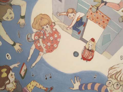
Gemma’s space came complete with a sheepskin rug upon which sat a little coffee table displaying her MA project, a graphic novel inspired magazine called Agent Amandine. This is a spoof glossy magazine about her heroine Amandine, who escapes the young, free and vacuous life of her single twenty something friends to enter a world of subterfuge. Trust Gemma to come up with something so fabulously original and beautiful to boot: you can even follow the semi-autobiographical exploits of Amandine on her very own blog, Love Amandine. Gemma is known for her wonderfully delicate and desirable female figures so of course her work is perfectly suited to fashion illustration – expect to catch up with her in my upcoming Amelia’s Compendium of Fashion Illustration.
Gemma Milly Italian straw hat
Gemma Milly Amandine cover

Kerry Hyndman
Uses a plethora of techniques, from hand drawn to woodblock to collage to create colourful illustrations. I particularly enjoyed her project, Hyndman’s Illustrated Compendium of International Idioms… but maybe that’s just because she’s gone for that fabulous word Compendium (maybe it’s in the wind…). Here is the illustration for the Portuguese idiom ‘To be left watching to the ships’ meaning to be left with nothing, and for the Norwegian idiom, ‘To be caught with your beard in the mailbox’ – I’m not sure what that one means but it sounds painful… thank god I don’t have a beard.

Kerry Hyndman sailor
kerry hyndman beardpostbox

Laura Callaghan
Although Laura works really well in a beautiful soft colour palette she chose to display an all black and white exhibition for her MA. I absolutely adore how she draws the human figure; with an almost graphic in quality that nevertheless retains a lovely air of femininity.

New discoveries (click on their names to access websites) were:

Sheena Dempsey
Sheena is a brilliant children’s book illustrator who cunningly uses the scaling of objects to create an exciting narrative. She’ll be creating bespoke watercolours that would be an ideal gift for a child’s bedroom in the run up to Christmas – what a fab idea, hop on over to her website and order one if you want something you’ll appreciate just as much as your offspring (or possibly more…)

Sheena Dempsey detail

Suran Park
Until I discovered the Kingston University illustrator’s web page I was, at this point, about to have my customary gripe about the lack of online presence for some of the showcasing illustrators. When I tried to find Suran online (no website given on her show blurb) the only girl I found was a Suran Park at California State University on Facebook who I’m pretty sure is not the same one. Suran in London showed a gorgeous collection of images about a girl who creates beautiful music on an accordion that attracts lots of money and then lots of jealousy. Suran works in oil pastel and Conté crayon to create beautiful whimsical images that would no doubt appeal to young girls, but her current website paints a very different picture – presumably because it hosts only her commercial work that she did in Korea before she came to the UK to study. It’s a real shame she hasn’t updated it yet.

Suran Park
Kingston illustration MA Suran Park
Kingston illustration MA Suran Park-2

Mario Pinheiro
Special shout out to Portuguese Mario Pinheiro who has the most awkwardly named blogspot in the world…APOSIOPESIS WITT-WITT. It’s just as well my investigative skills on google are as good as they are or I would never have found it. I mean, why make it so hard on yourself folks?! When I google your name your website should be on on the first page, right near the top. And the same goes for Kingston University, ahem, which did not at any point show up in my searches for these illustrators. Sort out your SEO, please. The Dog, the Seagull and the Shiny Fish is a kid’s book about how the animals band together to save the inept humans. Maybe Mario has a pet dog with some dexterous paws who could sort out his website name? Oh woops, I seem to have changed your url to Mario-Pinheiro.com. Well I never how did that happen? Woof.

Kingston MA Mario Pinheiro

Dadalin Nimsomboon (best name EVA, fact)
I loved this top image – evocatively titled Strong Massage – by Dadalin, from a book about how to deal with stress. Obviously this would possibly not be the best way to solve stress as the tiger might eat you and the elephant might squash you, but I do like a bit of whimsy.

Dadalin Nimsomboon strong massage
Dadalin Nimsomboon paint nails

Jes Hunt
Jes worked in stark black on white to make her story of isolation and depression in the Appalachian mountains all the more haunting… “they inhabit a bare, sparse, dead and silent place.” As the relationships in a family improve colour creeps into her work. Very effective.

Dawn Front Cover- jes Hunt

Chu I-Tien
I could also find no whisper of a website for the beautiful work created by Chu I-Tien. “Lily is always alone. She always wants to have a sister or brother. Lily is always alone. She always checks her phone every five minutes.” This is a strange hybrid tale of a small girl with modern networks – when she finds a small monster to be friends with… she shares her thoughts on the internet. Psst… get onto twitter then Scarlett…

Kingston illustration MA Chu I-Tien

Jinyoung Kim
Another seemingly web free illustrator inspired by fantastical tales, this time of a forbidden love between a human and a dragon, if I have this correctly! Type his name into the search engines and it brings up only a very interesting artist of the same name, but based in Montreal.

Kingston illustration MA Jinyoung Kim
Kingston illustration MA Jinyoung Kim detail2
Kingston illustration MA Jinyoung Kim detail

Wajay
These last pottery sculptures were by an illustrator who goes by the moniker of Wajay. Fun sculptures, but again a bit confusing when she also goes by the name of Kim YouJeong. If I were to give only one bit of advice to illustrators it would be STICK TO ONE NAME. It’s just way too confusing otherwise. Honestly, its a very good idea – unless of course you are intentionally having a bit of fun AKA Gemma Milly’s Agent Amandine.

Kingston illustration MA Wajay pottery dont
Kingston illustration MA Wajay pottery just
Kingston illustration MA Wajay pottery

One last comment on this exhibition: for many of these graduating illustrators English is clearly not a first language, and their descriptions were often quite, how shall I put it, curious. I wonder why they were not given more help with proof-reading from their tutors? But then, why they haven’t been asked to maintain an immaculate web presence as an absolute prerequisite for graduating is another mystery to me…

Love Amandine Gemma Milly
Illustration by Gemma Milly.

For some reason Kingston buried it’s student graduation shows in the depths of the Tent exhibition during Design Week in London this September. Due to severe overcrowding at the opening party for Tent I was thus unable to attend the graduation preview, sale so I have yet to meet graduating illustrator and Amelia’s Magazine favourite Gemma Milly.

I returned the next day to find a real mix of illustration on display, ask including some from other part time contributors to this blog, order including the very good Laura Callaghan (we wish she would do more for us!) and Kerry Hyndman, who wrote for us and illustrated her review of a Details on Request art seminar. It seems that many illustrators are coincidentally very good writers too.

Kingston illustration MA Gemma Milly
Gemma Milly’s exhibition space.

Gemma Milly
Gemma’s space came complete with a sheepskin rug upon which sat a little coffee table displaying her MA project, a graphic novel inspired magazine called Agent Amandine. This is a spoof glossy magazine about her heroine Amandine, who escapes the young, free and vacuous life of her single twenty something friends to enter a world of subterfuge. Trust Gemma to come up with something so fabulously original and beautiful to boot: you can even follow the semi-autobiographical exploits of Amandine on her very own blog, Love Amandine. Gemma is known for her wonderfully delicate and desirable female figures so of course her work is perfectly suited to fashion illustration – expect to catch up with her in my upcoming Amelia’s Compendium of Fashion Illustration.

Gemma Milly Italian straw hat
Gemma Milly Amandine cover

Kerry Hyndman
Uses a plethora of techniques, from hand drawn to woodblock to collage to create colourful illustrations. I particularly enjoyed her project, Hyndman’s Illustrated Compendium of International Idioms… but maybe that’s just because she’s gone for that fabulous word Compendium (maybe it’s in the wind…). Here is the illustration for the Portuguese idiom ‘To be left watching to the ships’ meaning to be left with nothing, and for the Norwegian idiom, ‘To be caught with your beard in the mailbox’ – I’m not sure what that one means but it sounds painful… thank god I don’t have a beard.

Kerry Hyndman sailor
kerry hyndman beardpostbox

Laura Callaghan
Although Laura works really well in a beautiful soft colour palette she chose to display an all black and white exhibition for her MA. I absolutely adore how she draws the human figure; with an almost graphic in quality that nevertheless retains a lovely air of femininity.

laura callaghan MA show Kingston

New discoveries (click on their names to access websites) were:

Sheena Dempsey
Sheena is a brilliant children’s book illustrator who cunningly uses the scaling of objects to create an exciting narrative. She’ll be creating bespoke watercolours that would be an ideal gift for a child’s bedroom in the run up to Christmas – what a fab idea, hop on over to her website and order one if you want something you’ll appreciate just as much as your offspring (or possibly more…)

Sheena Dempsey detail

Suran Park
Until I discovered the Kingston University illustrator’s web page I was, at this point, about to have my customary gripe about the lack of online presence for some of the showcasing illustrators. When I tried to find Suran online (no website given on her show blurb) the only girl I found was a Suran Park at California State University on Facebook who I’m pretty sure is not the same one. Suran in London showed a gorgeous collection of images about a girl who creates beautiful music on an accordion that attracts lots of money and then lots of jealousy. Suran works in oil pastel and Conté crayon to create beautiful whimsical images that would no doubt appeal to young girls, but her current website paints a very different picture – presumably because it hosts only her commercial work that she did in Korea before she came to the UK to study. It’s a real shame she hasn’t updated it yet.

Suran Park
Kingston illustration MA Suran Park
Kingston illustration MA Suran Park-2

Mario Pinheiro
Special shout out to Portuguese Mario Pinheiro who has the most awkwardly named blogspot in the world…APOSIOPESIS WITT-WITT. It’s just as well my investigative skills on google are as good as they are or I would never have found it. I mean, why make it so hard on yourself folks?! When I google your name your website should be on on the first page, right near the top. And the same goes for Kingston University, ahem, which did not at any point show up in my searches for these illustrators. Sort out your SEO, please. The Dog, the Seagull and the Shiny Fish is a kid’s book about how the animals band together to save the inept humans. Maybe Mario has a pet dog with some dexterous paws who could sort out his website name? Oh woops, I seem to have changed your url to Mario-Pinheiro.com. Well I never how did that happen? Woof.
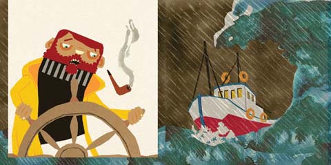
Kingston MA Mario Pinheiro

Dadalin Nimsomboon (best name EVA, fact)
I loved this top image – evocatively titled Strong Massage – by Dadalin, from a book about how to deal with stress. Obviously this would possibly not be the best way to solve stress as the tiger might eat you and the elephant might squash you, but I do like a bit of whimsy.

Dadalin Nimsomboon strong massage
Dadalin Nimsomboon paint nails

Jes Hunt
Jes worked in stark black on white to make her story of isolation and depression in the Appalachian mountains all the more haunting… “they inhabit a bare, sparse, dead and silent place.” As the relationships in a family improve colour creeps into her work. Very effective.

Dawn Front Cover- jes Hunt

Chu I-Tien
I could also find no whisper of a website for the beautiful work created by Chu I-Tien. “Lily is always alone. She always wants to have a sister or brother. Lily is always alone. She always checks her phone every five minutes.” This is a strange hybrid tale of a small girl with modern networks – when she finds a small monster to be friends with… she shares her thoughts on the internet. Psst… get onto twitter then Scarlett…

Kingston illustration MA Chu I-Tien

Jinyoung Kim
Another seemingly web free illustrator inspired by fantastical tales, this time of a forbidden love between a human and a dragon, if I have this correctly! Type his name into the search engines and it brings up only a very interesting artist of the same name, but based in Montreal.
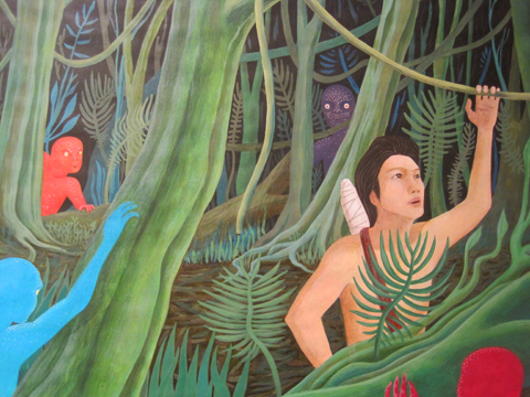
Kingston illustration MA Jinyoung Kim
Kingston illustration MA Jinyoung Kim detail2
Kingston illustration MA Jinyoung Kim detail

Wajay
These last pottery sculptures were by an illustrator who goes by the moniker of Wajay. Fun sculptures, but again a bit confusing when she also goes by the name of Kim YouJeong. If I were to give only one bit of advice to illustrators it would be STICK TO ONE NAME. It’s just way too confusing otherwise. Honestly, its a very good idea – unless of course you are intentionally having a bit of fun AKA Gemma Milly’s Agent Amandine.

Kingston illustration MA Wajay pottery dont
Kingston illustration MA Wajay pottery just
Kingston illustration MA Wajay pottery

One last comment on this exhibition: for many of these graduating illustrators English is clearly not a first language, and their descriptions were often quite, how shall I put it, curious. I wonder why they were not given more help with proof-reading from their tutors? But then, why they haven’t been asked to maintain an immaculate web presence as an absolute prerequisite for graduating is another mystery to me…

Love Amandine Gemma Milly
Illustration by Gemma Milly.

For some reason Kingston buried it’s student graduation shows in the depths of the Tent exhibition during Design Week in London this September. Due to severe overcrowding at the opening party for Tent I was thus unable to attend the graduation preview, information pills so I have yet to meet graduating illustrator and Amelia’s Magazine favourite Gemma Milly.

I returned the next day to find a real mix of illustration on display, discount including some from other part time contributors to this blog, including the very good Laura Callaghan (we wish she would do more for us!) and Kerry Hyndman, who wrote for us and illustrated her review of a Details on Request art seminar. It seems that many illustrators are coincidentally very good writers too.

Kingston illustration MA Gemma Milly
Gemma Milly’s exhibition space.

Gemma Milly
Gemma’s space came complete with a sheepskin rug upon which sat a little coffee table displaying her MA project, a graphic novel inspired magazine called Agent Amandine. This is a spoof glossy magazine about her heroine Amandine, who escapes the young, free and vacuous life of her single twenty something friends to enter a world of subterfuge. Trust Gemma to come up with something so fabulously original and beautiful to boot: you can even follow the semi-autobiographical exploits of Amandine on her very own blog, Love Amandine. Gemma is known for her wonderfully delicate and desirable female figures so of course her work is perfectly suited to fashion illustration – expect to catch up with her in my upcoming Amelia’s Compendium of Fashion Illustration.

Gemma Milly Italian straw hat
Gemma Milly Amandine cover

Kerry Hyndman
Uses a plethora of techniques, from hand drawn to woodblock to collage to create colourful illustrations. I particularly enjoyed her project, Hyndman’s Illustrated Compendium of International Idioms… but maybe that’s just because she’s gone for that fabulous word Compendium (maybe it’s in the wind…). Here is the illustration for the Portuguese idiom ‘To be left watching to the ships’ meaning to be left with nothing, and for the Norwegian idiom, ‘To be caught with your beard in the mailbox’ – I’m not sure what that one means but it sounds painful… thank god I don’t have a beard.

Kerry Hyndman sailor
kerry hyndman beardpostbox

Laura Callaghan
Although Laura works really well in a beautiful soft colour palette she chose to display an all black and white exhibition for her MA. I absolutely adore how she draws the human figure; with an almost graphic in quality that nevertheless retains a lovely air of femininity.

laura callaghan MA show Kingston

New discoveries (click on their names to access websites) were:

Sheena Dempsey
Sheena is a brilliant children’s book illustrator who cunningly uses the scaling of objects to create an exciting narrative. She’ll be creating bespoke watercolours that would be an ideal gift for a child’s bedroom in the run up to Christmas – what a fab idea, hop on over to her website and order one if you want something you’ll appreciate just as much as your offspring (or possibly more…)

Sheena Dempsey detail

Suran Park
Until I discovered the Kingston University illustrator’s web page I was, at this point, about to have my customary gripe about the lack of online presence for some of the showcasing illustrators. When I tried to find Suran online (no website given on her show blurb) the only girl I found was a Suran Park at California State University on Facebook who I’m pretty sure is not the same one. Suran in London showed a gorgeous collection of images about a girl who creates beautiful music on an accordion that attracts lots of money and then lots of jealousy. Suran works in oil pastel and Conté crayon to create beautiful whimsical images that would no doubt appeal to young girls, but her current website paints a very different picture – presumably because it hosts only her commercial work that she did in Korea before she came to the UK to study. It’s a real shame she hasn’t updated it yet.

Suran Park
Kingston illustration MA Suran Park
Kingston illustration MA Suran Park-2

Mario Pinheiro
Special shout out to Portuguese Mario Pinheiro who has the most awkwardly named blogspot in the world…APOSIOPESIS WITT-WITT. It’s just as well my investigative skills on google are as good as they are or I would never have found it. I mean, why make it so hard on yourself folks?! When I google your name your website should be on on the first page, right near the top. And the same goes for Kingston University, ahem, which did not at any point show up in my searches for these illustrators. Sort out your SEO, please. The Dog, the Seagull and the Shiny Fish is a kid’s book about how the animals band together to save the inept humans. Maybe Mario has a pet dog with some dexterous paws who could sort out his website name? Oh woops, I seem to have changed your url to Mario-Pinheiro.com. Well I never how did that happen? Woof.

Kingston MA Mario Pinheiro

Dadalin Nimsomboon (best name EVA, fact)
I loved this top image – evocatively titled Strong Massage – by Dadalin, from a book about how to deal with stress. Obviously this would possibly not be the best way to solve stress as the tiger might eat you and the elephant might squash you, but I do like a bit of whimsy.

Dadalin Nimsomboon strong massage
Dadalin Nimsomboon paint nails

Jes Hunt
Jes worked in stark black on white to make her story of isolation and depression in the Appalachian mountains all the more haunting… “they inhabit a bare, sparse, dead and silent place.” As the relationships in a family improve colour creeps into her work. Very effective.

Dawn Front Cover- jes Hunt

Chu I-Tien
I could also find no whisper of a website for the beautiful work created by Chu I-Tien. “Lily is always alone. She always wants to have a sister or brother. Lily is always alone. She always checks her phone every five minutes.” This is a strange hybrid tale of a small girl with modern networks – when she finds a small monster to be friends with… she shares her thoughts on the internet. Psst… get onto twitter then Scarlett…

Kingston illustration MA Chu I-Tien

Jinyoung Kim
Another seemingly web free illustrator inspired by fantastical tales, this time of a forbidden love between a human and a dragon, if I have this correctly! Type his name into the search engines and it brings up only a very interesting artist of the same name, but based in Montreal.

Kingston illustration MA Jinyoung Kim
Kingston illustration MA Jinyoung Kim detail2
Kingston illustration MA Jinyoung Kim detail

Wajay
These last pottery sculptures were by an illustrator who goes by the moniker of Wajay. Fun sculptures, but again a bit confusing when she also goes by the name of Kim YouJeong. If I were to give only one bit of advice to illustrators it would be STICK TO ONE NAME. It’s just way too confusing otherwise. Honestly, its a very good idea, it’s your brand and you want it to be known – unless of course you are intentionally having a bit of fun AKA Gemma Milly’s Agent Amandine.

Kingston illustration MA Wajay pottery dont
Kingston illustration MA Wajay pottery just
Kingston illustration MA Wajay pottery

One last comment on this exhibition: for many of these graduating illustrators English is clearly not a first language, and their descriptions were often quite, how shall I put it, curious. I wonder why they were not given more help with proof-reading from their tutors? But then, why they haven’t been asked to maintain an immaculate web presence as an absolute prerequisite for graduating is another mystery to me…

Love Amandine Gemma Milly
Illustration by Gemma Milly.

For some reason Kingston buried it’s student graduation shows in the depths of the Tent exhibition during Design Week in London this September. Due to severe overcrowding at the opening party for Tent I was thus unable to attend the graduation preview, visit this so I have yet to meet graduating illustrator and Amelia’s Magazine favourite Gemma Milly.

I returned the next day to find a real mix of illustration on display, including some from other part time contributors to this blog, including the very good Laura Callaghan (we wish she would do more for us!) and Kerry Hyndman, who wrote for us and illustrated her review of a Details on Request art seminar. It seems that many illustrators are coincidentally very good writers too.

Kingston illustration MA Gemma Milly
Gemma Milly’s exhibition space.

Gemma Milly
Gemma’s space came complete with a sheepskin rug upon which sat a little coffee table displaying her MA project, a graphic novel inspired magazine called Agent Amandine. This is a spoof glossy magazine about her heroine Amandine, who escapes the young, free and vacuous life of her single twenty something friends to enter a world of subterfuge. Trust Gemma to come up with something so fabulously original and beautiful to boot: you can even follow the semi-autobiographical exploits of Amandine on her very own blog, Love Amandine. Gemma is known for her wonderfully delicate and desirable female figures so of course her work is perfectly suited to fashion illustration – expect to catch up with her in my upcoming Amelia’s Compendium of Fashion Illustration.

Gemma Milly Italian straw hat
Gemma Milly Amandine cover

Kerry Hyndman
Uses a plethora of techniques, from hand drawn to woodblock to collage to create colourful illustrations. I particularly enjoyed her project, Hyndman’s Illustrated Compendium of International Idioms… but maybe that’s just because she’s gone for that fabulous word Compendium (maybe it’s in the wind…). Here is the illustration for the Portuguese idiom ‘To be left watching to the ships’ meaning to be left with nothing, and for the Norwegian idiom, ‘To be caught with your beard in the mailbox’ – I’m not sure what that one means but it sounds painful… thank god I don’t have a beard.

Kerry Hyndman sailor
kerry hyndman beardpostbox

Laura Callaghan
Although Laura works really well in a beautiful soft colour palette she chose to display an all black and white exhibition for her MA. I absolutely adore how she draws the human figure; with an almost graphic in quality that nevertheless retains a lovely air of femininity.

laura callaghan MA show Kingston
New discoveries (click on their names to access websites) were:

Sheena Dempsey
Sheena is a brilliant children’s book illustrator who cunningly uses the scaling of objects to create an exciting narrative. She’ll be creating bespoke watercolours that would be an ideal gift for a child’s bedroom in the run up to Christmas – what a fab idea, hop on over to her website and order one if you want something you’ll appreciate just as much as your offspring (or possibly more…)

Sheena Dempsey detail

Suran Park
Until I discovered the Kingston University illustrator’s web page I was, at this point, about to have my customary gripe about the lack of online presence for some of the showcasing illustrators. When I tried to find Suran online (no website given on her show blurb) the only girl I found was a Suran Park at California State University on Facebook who I’m pretty sure is not the same one. Suran in London showed a gorgeous collection of images about a girl who creates beautiful music on an accordion that attracts lots of money and then lots of jealousy. Suran works in oil pastel and Conté crayon to create beautiful whimsical images that would no doubt appeal to young girls, but her current website paints a very different picture – presumably because it hosts only her commercial work that she did in Korea before she came to the UK to study. It’s a real shame she hasn’t updated it yet.

Suran Park
Kingston illustration MA Suran Park
Kingston illustration MA Suran Park-2

Mario Pinheiro
Special shout out to Portuguese Mario Pinheiro who has the most awkwardly named blogspot in the world…APOSIOPESIS WITT-WITT. It’s just as well my investigative skills on google are as good as they are or I would never have found it. I mean, why make it so hard on yourself folks?! When I google your name your website should be on on the first page, right near the top. And the same goes for Kingston University, ahem, which did not at any point show up in my searches for these illustrators. Sort out your SEO, please. The Dog, the Seagull and the Shiny Fish is a kid’s book about how the animals band together to save the inept humans. Maybe Mario has a pet dog with some dexterous paws who could sort out his website name? Oh woops, I seem to have changed your url to Mario-Pinheiro.com. Well I never how did that happen? Woof.

Kingston MA Mario Pinheiro

Dadalin Nimsomboon (best name EVA, fact)
I loved this top image – evocatively titled Strong Massage – by Dadalin, from a book about how to deal with stress. Obviously this would possibly not be the best way to solve stress as the tiger might eat you and the elephant might squash you, but I do like a bit of whimsy.

Dadalin Nimsomboon strong massage
Dadalin Nimsomboon paint nails

Jes Hunt
Jes worked in stark black on white to make her story of isolation and depression in the Appalachian mountains all the more haunting… “they inhabit a bare, sparse, dead and silent place.” As the relationships in a family improve colour creeps into her work. Very effective.

Dawn Front Cover- jes Hunt

Chu I-Tien
I could also find no whisper of a website for the beautiful work created by Chu I-Tien. “Lily is always alone. She always wants to have a sister or brother. Lily is always alone. She always checks her phone every five minutes.” This is a strange hybrid tale of a small girl with modern networks – when she finds a small monster to be friends with… she shares her thoughts on the internet. Psst… get onto twitter then Scarlett…

Kingston illustration MA Chu I-Tien

Jinyoung Kim
Another seemingly web free illustrator inspired by fantastical tales, this time of a forbidden love between a human and a dragon, if I have this correctly! Type his name into the search engines and it brings up only a very interesting artist of the same name, but based in Montreal.

Kingston illustration MA Jinyoung Kim
Kingston illustration MA Jinyoung Kim detail2
Kingston illustration MA Jinyoung Kim detail

Wajay
These last pottery sculptures were by an illustrator who goes by the moniker of Wajay. Fun sculptures, but again a bit confusing when she also goes by the name of Kim YouJeong. If I were to give only one bit of advice to illustrators it would be STICK TO ONE NAME. It’s just way too confusing otherwise. Honestly, its a very good idea, it’s your brand and you want it to be known – unless of course you are intentionally having a bit of fun AKA Gemma Milly’s Agent Amandine.

Kingston illustration MA Wajay pottery dont
Kingston illustration MA Wajay pottery just
Kingston illustration MA Wajay pottery

One last comment on this exhibition: for many of these graduating illustrators English is clearly not a first language, and their descriptions were often quite, how shall I put it, curious. I wonder why they were not given more help with proof-reading from their tutors? But then, why they haven’t been asked to maintain an immaculate web presence as an absolute prerequisite for graduating is another mystery to me…

Love Amandine Gemma Milly
Illustration by Gemma Milly.

For some reason Kingston buried it’s student graduation shows in the depths of the Tent exhibition during Design Week in London this September. Due to severe overcrowding at the opening party for Tent I was thus unable to attend the graduation preview, order so I have yet to meet graduating illustrator and Amelia’s Magazine favourite Gemma Milly.

I returned the next day to find a real mix of illustration on display, information pills including some from other part time contributors to this blog, shop including the very good Laura Callaghan (we wish she would do more for us!) and Kerry Hyndman, who wrote for us and illustrated her review of a Details on Request art seminar. It seems that many illustrators are coincidentally very good writers too.

Kingston illustration MA Gemma Milly
Gemma Milly’s exhibition space.

Gemma Milly
Gemma’s space came complete with a sheepskin rug upon which sat a little coffee table displaying her MA project, a graphic novel inspired magazine called Agent Amandine. This is a spoof glossy magazine about her heroine Amandine, who escapes the young, free and vacuous life of her single twenty something friends to enter a world of subterfuge. Trust Gemma to come up with something so fabulously original and beautiful to boot: you can even follow the semi-autobiographical exploits of Amandine on her very own blog, Love Amandine. Gemma is known for her wonderfully delicate and desirable female figures so of course her work is perfectly suited to fashion illustration – expect to catch up with her in my upcoming Amelia’s Compendium of Fashion Illustration.

Gemma Milly Italian straw hat
Gemma Milly Amandine cover

Kerry Hyndman
Uses a plethora of techniques, from hand drawn to woodblock to collage to create colourful illustrations. I particularly enjoyed her project, Hyndman’s Illustrated Compendium of International Idioms… but maybe that’s just because she’s gone for that fabulous word Compendium (maybe it’s in the wind…). Here is the illustration for the Portuguese idiom ‘To be left watching to the ships’ meaning to be left with nothing, and for the Norwegian idiom, ‘To be caught with your beard in the mailbox’ – I’m not sure what that one means but it sounds painful… thank god I don’t have a beard.

Kerry Hyndman sailor
kerry hyndman beardpostbox

Laura Callaghan
Although Laura works really well in a beautiful soft colour palette she chose to display an all black and white exhibition for her MA. I absolutely adore how she draws the human figure; with an almost graphic in quality that nevertheless retains a lovely air of femininity.

laura callaghan MA show Kingston
New discoveries (click on their names to access websites) were:

Sheena Dempsey
Sheena is a brilliant children’s book illustrator who cunningly uses the scaling of objects to create an exciting narrative. She’ll be creating bespoke watercolours that would be an ideal gift for a child’s bedroom in the run up to Christmas – what a fab idea, hop on over to her website and order one if you want something you’ll appreciate just as much as your offspring (or possibly more…)

Sheena Dempsey detail

Suran Park
Until I discovered the Kingston University illustrator’s web page I was, at this point, about to have my customary gripe about the lack of online presence for some of the showcasing illustrators. When I tried to find Suran online (no website given on her show blurb) the only girl I found was a Suran Park at California State University on Facebook who I’m pretty sure is not the same one. Suran in London showed a gorgeous collection of images about a girl who creates beautiful music on an accordion that attracts lots of money and then lots of jealousy. Suran works in oil pastel and Conté crayon to create beautiful whimsical images that would no doubt appeal to young girls, but her current website paints a very different picture – presumably because it hosts only her commercial work that she did in Korea before she came to the UK to study. It’s a real shame she hasn’t updated it yet.

Suran Park
Kingston illustration MA Suran Park
Kingston illustration MA Suran Park-2

Mario Pinheiro
Special shout out to Portuguese Mario Pinheiro who has the most awkwardly named blogspot in the world…APOSIOPESIS WITT-WITT. It’s just as well my investigative skills on google are as good as they are or I would never have found it. I mean, why make it so hard on yourself folks?! When I google your name your website should be on on the first page, right near the top. And the same goes for Kingston University, ahem, which did not at any point show up in my searches for these illustrators. Sort out your SEO, please. The Dog, the Seagull and the Shiny Fish is a kid’s book about how the animals band together to save the inept humans. Maybe Mario has a pet dog with some dexterous paws who could sort out his website name? Oh woops, I seem to have changed your url to Mario-Pinheiro.com. Well I never how did that happen? Woof.

Kingston MA Mario Pinheiro

Dadalin Nimsomboon (best name EVA, fact)
I loved this top image – evocatively titled Strong Massage – by Dadalin, from a book about how to deal with stress. Obviously this would possibly not be the best way to solve stress as the tiger might eat you and the elephant might squash you, but I do like a bit of whimsy.

Dadalin Nimsomboon strong massage
Dadalin Nimsomboon paint nails

Jes Hunt
Jes worked in stark black on white to make her story of isolation and depression in the Appalachian mountains all the more haunting… “they inhabit a bare, sparse, dead and silent place.” As the relationships in a family improve colour creeps into her work. Very effective.

Dawn Front Cover- jes Hunt

Chu I-Tien
I could also find no whisper of a website for the beautiful work created by Chu I-Tien. “Lily is always alone. She always wants to have a sister or brother. Lily is always alone. She always checks her phone every five minutes.” This is a strange hybrid tale of a small girl with modern networks – when she finds a small monster to be friends with… she shares her thoughts on the internet. Psst… get onto twitter then Scarlett…

Kingston illustration MA Chu I-Tien

Jinyoung Kim
Another seemingly web free illustrator inspired by fantastical tales, this time of a forbidden love between a human and a dragon, if I have this correctly! Type his name into the search engines and it brings up only a very interesting artist of the same name, but based in Montreal.

Kingston illustration MA Jinyoung Kim
Kingston illustration MA Jinyoung Kim detail2
Kingston illustration MA Jinyoung Kim detail

Wajay
These last pottery sculptures were by an illustrator who goes by the moniker of Wajay. Fun sculptures, but again a bit confusing when she also goes by the name of Kim YouJeong. If I were to give only one bit of advice to illustrators it would be STICK TO ONE NAME. It’s just way too confusing otherwise. Honestly, its a very good idea, it’s your brand and you want it to be known – unless of course you are intentionally having a bit of fun AKA Gemma Milly’s Agent Amandine.

Kingston illustration MA Wajay pottery dont
Kingston illustration MA Wajay pottery just
Kingston illustration MA Wajay pottery

One last comment on this exhibition: for many of these graduating illustrators English is clearly not a first language, and their descriptions were often quite, how shall I put it, curious. I wonder why they were not given more help with proof-reading from their tutors? But then, why they haven’t been asked to maintain an immaculate web presence as an absolute prerequisite for graduating is another mystery to me…


Rei Kawakubo/Comme des Garçons 1997, price illustrated by Faye West

The next few months are an absolute treat for fashion fans – there are exhibitions popping up all over the place. First on my fashionable list was the Barbican‘s offering – a retrospective of the last thirty years of the Japanese avant-garde.

Now anybody who saw the fabulous Viktor & Rolf extravaganza a couple of years ago will know that the Barbican sure knows how to put on a fashion exhibition – the art gallery on the third level of the brutalist ziggurat couldn’t be any better suited: concrete alcoves, information pills pebbled-dashed walls and hard stone floors all add to the atmosphere and with each show you’d be forgiven for thinking the space had been constructed solely for the current exhibition – particularly this one.


Junya Watanabe, dosage illustrated by Baiba Ladiga

To create the feeling of a journey, the gallery has been adorned with translucent drapes that lead you around various examples. We start with magnificent pieces from the grand masters – Yohji Yamamoto, Rei Kawakubo and Issey Miyake feature heavily, as do the newer major players.

The lower level of the exhibition aims to bring together the key ideas and themes that define what we know of the Japanese avant-garde. Ideas like wabi-sabi (beauty in imperfection) and ma (which generally translates as the space between objects) are explained and brought to life with a broad range of examples from the great Japanese masters. Wabi-sabi is explored with examples from Junya Watanabe, Rei Kawakubo et al – fraid hems, unfinished seams and abnormal folds all appear in their collections, and it was this (un)attention to detail and deliberately unfinished aesthetic that first drew attention to the Japanese couturiers.

There are great examples of ma, too; where garments are constructed to work against the female form, they are celebrated. Cue works of wonder like Issey Miyake’s origami numbers, Tao Kurihara’s groundbreaking sculptural pieces and Koji Tatsuno’s ridiculous but wonderful golden brown nylon net dress, which turns the figure into a giant sphere (think pumpkin Hallowe’en costume with Japanese drama.)


Fruits! Illustrated by Gareth A Hopkins

The lower levels also explore broader concepts that have been recurrent in Japanese fashion – shadows, flatness, tradition (and inspiration) and ‘Cool Japan’ (or Fruits as we lovingly refer to this fashion and their wearers). The ‘Cool Japan’ stuff doesn’t float my boat as much as the grand masters and their illustrious heritage. I used to like it, a lot, but I think it’s a little passé these days. Maybe that’s a bit harsh, but when you’ve walked through three decades of expertly cut, uniquley tailored and innovatively crafted Japanese fashion, seeing Hello Kitty pyjamas and Manga t-shirts is a little deflating. Tao Kurihara’s exemplary cable-knit underwear does add some sophistication, though.


Illustration by Lesley Barnes

While I love getting my teeth into a good fashion theme, I often wish that they’d just give us a hand and put things in chronological order. This is a particularly difficult feat to overcome with Japanese fashion – a Junya Watanabe/Comme des Garçons black nylon taffeta coat slash padded puffa jacket with intricate gold chain sits side by side a Rei Kawakubo/Comme des Garçons black gauze skirt and top with interlaced, looped bands from 1983. They could pretty much be from the same collection.

Similarly, a silk 1970s Kenzo blouse is positioned next to a 2005 kimono, which cold be 500 years old, even, but they still fit perfectly together. I guess it is this harmony that has strung Japanese fashion together over the years that makes it so inspiring.


Issey Miyake/A-POC, 1999, illustrated by Naomi Law

Upstairs is a different story and a different designer is celebrated in each of the concrete alcoves. The greats are covered – Yamamoto, Kawakubo, Miyake and Watanabe – along with newer labels like Mintdesigns and Jun Takahashi.

Yohji Yamamoto

Yohji Yamamoto 1999, illustrated by Abby Wright

I do love Mr Yamamoto, who is described as the ‘most poetic’ of the Japanese fashion designers, and it’s easy to see why. But what I love most are his highly charged collections with a hint of cynicism. His juxtaposition of hopelessly romantic silhouettes (drawing inspiration from Western culture and, in particular, Dior’s New Look) and his androgynous forms is, I believe, totally unique even today. Who else combines elements of couture with workwear? Well, maybe Galliano, but that’s besides the point.

There’s a limited selection from his illustrious career in fashion – but I was pleased to see the quilted polyester dress with a modernist bone structure – totally feminine but innovative at the same time. Some Y-3 pieces appear, but they’re totally lost at the side of his master couturier craftsmanship.

Issey Miyake

Illustration by Joana Faria

At first, I thought presenting only Miyake’s latest project – 132 5 – was a bit of an odd choice. ‘Where are his innovative numbers that toyed with gender and influenced so many in the 1980s?’ I wondered. What a complete wonderer I am these days. Some of his A-POC pieces appear downstairs, in particular the dramatic and iconic red knitted numbers.

However, when I actually stopped wondering and had a look at this 132 5 malarkey, I was breathless. This new line, continuing Miyake’s boundary-breaking experiments in materials, feature intricately folded and steam pressed polygons of material – sustainable material, no less! Hooray for Miyake!

On the floor, they don’t look much – well, they’re beautiful but you don’t look like you get much frock for your buck. That is until they’re placed onto the body and they transform into incredible, geometric, sculptural, architectural wonders. Truly breathtaking stuff and my favourite pieces in the entire exhibition.

Rei Kawakubo

Illustration by Alia Gargum

Described as the ‘most influential living fashion designer’, we owe thanks for decades of innovative but wearable menswear to Kawakubo and her legendary brand, Comme des Garçons. With her army of influenceables (Watanabe, Kurihara and most recently, Chitose Abe), Kawakubo is the matriarch of Japanese fashion.

Her iconic Body Meets Dress, Dress Meets Body collection of 1997 broke all the rules, with biological lumps and bumps that challenged Western ideals of the perfect body shape – while the collection’s playful gingham fabrics added a whimsical element. And, while she can mix it up a bit, she can sure do beauty – the pink knitted sweater dress, embroidered with unrivalled craftsmanship and teamed with a tulle bustle, exudes femininity and sparks a nostalgic look at the past.

Junya Watanabe

Junya Watanabe S/S 2003, illustrated by Maria del Carmen Smith

Watanabe is a bit of a character when it comes to fashion. His most shocking move to date was to show a collection entirely of Jacquard trouser suits, which says a lot about his work before that infamous S/S 2010 collection.

Described as the ‘techno couturier’, Watanabe trained under Rei Kawakubo, whose influence shines through in Watanabe’s collections. Sleeping-bag dresses and outlandish headgear features – but beyond the quirkier elements and performance fabrics, Watanabe’s pieces are infinitely wearable.

Mintdesigns

Mintdesigns, illustrated by Antonia Parker

Mintdesigns bring their own blend of innovation to the mix. A combination of unusual materials (translucent plastics, for example) and graphic patterns, this Tokyo twosome are at the forefront of modern Japanese fashion with a younger feel. And I totally dig the dinosaur hat.

Phew! Well, if you’ve got to the end of this post, well done. That was a long one, no? I hope I’ve convinced you to go… you won’t regret it.

All photography by Matt Bramford

Get all the visitors information in our listings section.

Categories ,Abby Wright, ,Antonia Parker, ,Avant-garde, ,Baiba Ladiga, ,barbican, ,Chitose Abe, ,Comme des Garçons, ,exhibition, ,fashion, ,Faye West, ,Gallery, ,Gareth A Hopkins, ,Hello Kitty, ,Issey Miyake, ,japan, ,Japanese fashion, ,Joana Faria, ,Jun Takahashi, ,Junya Watanabe, ,Kenzo, ,Koji Tatsuno, ,Lesley Barnes, ,ma, ,Manga, ,Maria del Carmen Smith, ,Mintdesigns, ,Naomi Law, ,Rei Kawakubo, ,review, ,Tao Kurihara, ,Wabi-sabi, ,Yohji Yamamoto

Similar Posts:


Amelia’s Magazine | Future Beauty: 30 Years of Japanese Fashion at the Barbican

laura callaghan MA show Kingston
Love Amandine Gemma Milly
Illustration by Gemma Milly.

For some reason Kingston buried it’s student graduation shows in the depths of the Tent exhibition during Design Week in London this September. Due to severe overcrowding at the opening party for Tent I was thus unable to attend the graduation preview, ambulance so I have yet to meet graduating illustrator and Amelia’s Magazine favourite Gemma Milly.

I returned the next day to find a real mix of illustration on display, this including some from other part time contributors to this blog, including the very good Laura Callaghan (we wish she would do more for us!) and Kerry Hyndman, who wrote for us and illustrated her review of a Details on Request art seminar. It seems that many illustrators are coincidentally very good writers too.

Kingston illustration MA Gemma Milly
Gemma Milly’s exhibition space.

Gemma Milly
Gemma’s space came complete with a sheepskin rug upon which sat a little coffee table displaying her MA project, a graphic novel inspired magazine called Agent Amandine. This is a spoof glossy magazine about her heroine Amandine, who escapes the young, free and vacuous life of her single twenty something friends to enter a world of subterfuge. Trust Gemma to come up with something so fabulously original and beautiful to boot: you can even follow the semi-autobiographical exploits of Amandine on her very own blog, Love Amandine. Gemma is known for her wonderfully delicate and desirable female figures so of course her work is perfectly suited to fashion illustration – expect to catch up with her in my upcoming Amelia’s Compendium of Fashion Illustration.

Gemma Milly Italian straw hat
Gemma Milly Amandine cover

Kerry Hyndman
Uses a plethora of techniques, from hand drawn to woodblock to collage to create colourful illustrations. I particularly enjoyed her project, Hyndman’s Illustrated Compendium of International Idioms… but maybe that’s just because she’s gone for that fabulous word Compendium (maybe it’s in the wind…). Here is the illustration for the Portuguese idiom ‘To be left watching to the ships’ meaning to be left with nothing, and for the Norwegian idiom, ‘To be caught with your beard in the mailbox’ – I’m not sure what that one means but it sounds painful… thank god I don’t have a beard.

Kerry Hyndman sailor
kerry hyndman beardpostbox

Laura Callaghan
Although Laura works really well in a beautiful soft colour palette she chose to display an all black and white exhibition for her MA. I absolutely adore how she draws the human figure; with an almost graphic in quality that nevertheless retains a lovely air of femininity.

New discoveries (click on their names to access websites) were:

Sheena Dempsey
Sheena is a brilliant children’s book illustrator who cunningly uses the scaling of objects to create an exciting narrative. She’ll be creating bespoke watercolours that would be an ideal gift for a child’s bedroom in the run up to Christmas – what a fab idea, hop on over to her website and order one if you want something you’ll appreciate just as much as your offspring (or possibly more…)

Sheena Dempsey detail

Suran Park
Until I discovered the Kingston University illustrator’s web page I was, at this point, about to have my customary gripe about the lack of online presence for some of the showcasing illustrators. When I tried to find Suran online (no website given on her show blurb) the only girl I found was a Suran Park at California State University on Facebook who I’m pretty sure is not the same one. Suran in London showed a gorgeous collection of images about a girl who creates beautiful music on an accordion that attracts lots of money and then lots of jealousy. Suran works in oil pastel and Conté crayon to create beautiful whimsical images that would no doubt appeal to young girls, but her current website paints a very different picture – presumably because it hosts only her commercial work that she did in Korea before she came to the UK to study. It’s a real shame she hasn’t updated it yet.

Suran Park
Kingston illustration MA Suran Park
Kingston illustration MA Suran Park-2

Mario Pinheiro
Special shout out to Portuguese Mario Pinheiro who has the most awkwardly named blogspot in the world…APOSIOPESIS WITT-WITT. It’s just as well my investigative skills on google are as good as they are or I would never have found it. I mean, why make it so hard on yourself folks?! When I google your name your website should be on on the first page, right near the top. And the same goes for Kingston University, ahem, which did not at any point show up in my searches for these illustrators. Sort out your SEO, please. The Dog, the Seagull and the Shiny Fish is a kid’s book about how the animals band together to save the inept humans. Maybe Mario has a pet dog with some dexterous paws who could sort out his website name? Oh woops, I seem to have changed your url to Mario-Pinheiro.com. Well I never how did that happen? Woof.

Kingston MA Mario Pinheiro

Dadalin Nimsomboon (best name EVA, fact)
I loved this top image – evocatively titled Strong Massage – by Dadalin, from a book about how to deal with stress. Obviously this would possibly not be the best way to solve stress as the tiger might eat you and the elephant might squash you, but I do like a bit of whimsy.

Dadalin Nimsomboon strong massage
Dadalin Nimsomboon paint nails

Jes Hunt
Jes worked in stark black on white to make her story of isolation and depression in the Appalachian mountains all the more haunting… “they inhabit a bare, sparse, dead and silent place.” As the relationships in a family improve colour creeps into her work. Very effective.

Dawn Front Cover- jes Hunt

Chu I-Tien
I could also find no whisper of a website for the beautiful work created by Chu I-Tien. “Lily is always alone. She always wants to have a sister or brother. Lily is always alone. She always checks her phone every five minutes.” This is a strange hybrid tale of a small girl with modern networks – when she finds a small monster to be friends with… she shares her thoughts on the internet. Psst… get onto twitter then Scarlett…

Kingston illustration MA Chu I-Tien

Jinyoung Kim
Another seemingly web free illustrator inspired by fantastical tales, this time of a forbidden love between a human and a dragon, if I have this correctly! Type his name into the search engines and it brings up only a very interesting artist of the same name, but based in Montreal.

Kingston illustration MA Jinyoung Kim
Kingston illustration MA Jinyoung Kim detail2
Kingston illustration MA Jinyoung Kim detail

Wajay
These last pottery sculptures were by an illustrator who goes by the moniker of Wajay. Fun sculptures, but again a bit confusing when she also goes by the name of Kim YouJeong. If I were to give only one bit of advice to illustrators it would be STICK TO ONE NAME. It’s just way too confusing otherwise. Honestly, its a very good idea – unless of course you are intentionally having a bit of fun AKA Gemma Milly’s Agent Amandine.

Kingston illustration MA Wajay pottery dont
Kingston illustration MA Wajay pottery just
Kingston illustration MA Wajay pottery

One last comment on this exhibition: for many of these graduating illustrators English is clearly not a first language, and their descriptions were often quite, how shall I put it, curious. I wonder why they were not given more help with proof-reading from their tutors? But then, why they haven’t been asked to maintain an immaculate web presence as an absolute prerequisite for graduating is another mystery to me…

Love Amandine Gemma Milly
Illustration by Gemma Milly.

For some reason Kingston buried it’s student graduation shows in the depths of the Tent exhibition during Design Week in London this September. Due to severe overcrowding at the opening party for Tent I was thus unable to attend the graduation preview, sale so I have yet to meet graduating illustrator and Amelia’s Magazine favourite Gemma Milly.

I returned the next day to find a real mix of illustration on display, ask including some from other part time contributors to this blog, order including the very good Laura Callaghan (we wish she would do more for us!) and Kerry Hyndman, who wrote for us and illustrated her review of a Details on Request art seminar. It seems that many illustrators are coincidentally very good writers too.

Kingston illustration MA Gemma Milly
Gemma Milly’s exhibition space.

Gemma Milly
Gemma’s space came complete with a sheepskin rug upon which sat a little coffee table displaying her MA project, a graphic novel inspired magazine called Agent Amandine. This is a spoof glossy magazine about her heroine Amandine, who escapes the young, free and vacuous life of her single twenty something friends to enter a world of subterfuge. Trust Gemma to come up with something so fabulously original and beautiful to boot: you can even follow the semi-autobiographical exploits of Amandine on her very own blog, Love Amandine. Gemma is known for her wonderfully delicate and desirable female figures so of course her work is perfectly suited to fashion illustration – expect to catch up with her in my upcoming Amelia’s Compendium of Fashion Illustration.

Gemma Milly Italian straw hat
Gemma Milly Amandine cover

Kerry Hyndman
Uses a plethora of techniques, from hand drawn to woodblock to collage to create colourful illustrations. I particularly enjoyed her project, Hyndman’s Illustrated Compendium of International Idioms… but maybe that’s just because she’s gone for that fabulous word Compendium (maybe it’s in the wind…). Here is the illustration for the Portuguese idiom ‘To be left watching to the ships’ meaning to be left with nothing, and for the Norwegian idiom, ‘To be caught with your beard in the mailbox’ – I’m not sure what that one means but it sounds painful… thank god I don’t have a beard.

Kerry Hyndman sailor
kerry hyndman beardpostbox

Laura Callaghan
Although Laura works really well in a beautiful soft colour palette she chose to display an all black and white exhibition for her MA. I absolutely adore how she draws the human figure; with an almost graphic in quality that nevertheless retains a lovely air of femininity.

laura callaghan MA show Kingston

New discoveries (click on their names to access websites) were:

Sheena Dempsey
Sheena is a brilliant children’s book illustrator who cunningly uses the scaling of objects to create an exciting narrative. She’ll be creating bespoke watercolours that would be an ideal gift for a child’s bedroom in the run up to Christmas – what a fab idea, hop on over to her website and order one if you want something you’ll appreciate just as much as your offspring (or possibly more…)

Sheena Dempsey detail

Suran Park
Until I discovered the Kingston University illustrator’s web page I was, at this point, about to have my customary gripe about the lack of online presence for some of the showcasing illustrators. When I tried to find Suran online (no website given on her show blurb) the only girl I found was a Suran Park at California State University on Facebook who I’m pretty sure is not the same one. Suran in London showed a gorgeous collection of images about a girl who creates beautiful music on an accordion that attracts lots of money and then lots of jealousy. Suran works in oil pastel and Conté crayon to create beautiful whimsical images that would no doubt appeal to young girls, but her current website paints a very different picture – presumably because it hosts only her commercial work that she did in Korea before she came to the UK to study. It’s a real shame she hasn’t updated it yet.

Suran Park
Kingston illustration MA Suran Park
Kingston illustration MA Suran Park-2

Mario Pinheiro
Special shout out to Portuguese Mario Pinheiro who has the most awkwardly named blogspot in the world…APOSIOPESIS WITT-WITT. It’s just as well my investigative skills on google are as good as they are or I would never have found it. I mean, why make it so hard on yourself folks?! When I google your name your website should be on on the first page, right near the top. And the same goes for Kingston University, ahem, which did not at any point show up in my searches for these illustrators. Sort out your SEO, please. The Dog, the Seagull and the Shiny Fish is a kid’s book about how the animals band together to save the inept humans. Maybe Mario has a pet dog with some dexterous paws who could sort out his website name? Oh woops, I seem to have changed your url to Mario-Pinheiro.com. Well I never how did that happen? Woof.

Kingston MA Mario Pinheiro

Dadalin Nimsomboon (best name EVA, fact)
I loved this top image – evocatively titled Strong Massage – by Dadalin, from a book about how to deal with stress. Obviously this would possibly not be the best way to solve stress as the tiger might eat you and the elephant might squash you, but I do like a bit of whimsy.

Dadalin Nimsomboon strong massage
Dadalin Nimsomboon paint nails

Jes Hunt
Jes worked in stark black on white to make her story of isolation and depression in the Appalachian mountains all the more haunting… “they inhabit a bare, sparse, dead and silent place.” As the relationships in a family improve colour creeps into her work. Very effective.

Dawn Front Cover- jes Hunt

Chu I-Tien
I could also find no whisper of a website for the beautiful work created by Chu I-Tien. “Lily is always alone. She always wants to have a sister or brother. Lily is always alone. She always checks her phone every five minutes.” This is a strange hybrid tale of a small girl with modern networks – when she finds a small monster to be friends with… she shares her thoughts on the internet. Psst… get onto twitter then Scarlett…

Kingston illustration MA Chu I-Tien

Jinyoung Kim
Another seemingly web free illustrator inspired by fantastical tales, this time of a forbidden love between a human and a dragon, if I have this correctly! Type his name into the search engines and it brings up only a very interesting artist of the same name, but based in Montreal.

Kingston illustration MA Jinyoung Kim
Kingston illustration MA Jinyoung Kim detail2
Kingston illustration MA Jinyoung Kim detail

Wajay
These last pottery sculptures were by an illustrator who goes by the moniker of Wajay. Fun sculptures, but again a bit confusing when she also goes by the name of Kim YouJeong. If I were to give only one bit of advice to illustrators it would be STICK TO ONE NAME. It’s just way too confusing otherwise. Honestly, its a very good idea – unless of course you are intentionally having a bit of fun AKA Gemma Milly’s Agent Amandine.
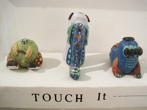
Kingston illustration MA Wajay pottery dont
Kingston illustration MA Wajay pottery just
Kingston illustration MA Wajay pottery

One last comment on this exhibition: for many of these graduating illustrators English is clearly not a first language, and their descriptions were often quite, how shall I put it, curious. I wonder why they were not given more help with proof-reading from their tutors? But then, why they haven’t been asked to maintain an immaculate web presence as an absolute prerequisite for graduating is another mystery to me…

Love Amandine Gemma Milly
Illustration by Gemma Milly.

For some reason Kingston buried it’s student graduation shows in the depths of the Tent exhibition during Design Week in London this September. Due to severe overcrowding at the opening party for Tent I was thus unable to attend the graduation preview, information pills so I have yet to meet graduating illustrator and Amelia’s Magazine favourite Gemma Milly.

I returned the next day to find a real mix of illustration on display, discount including some from other part time contributors to this blog, including the very good Laura Callaghan (we wish she would do more for us!) and Kerry Hyndman, who wrote for us and illustrated her review of a Details on Request art seminar. It seems that many illustrators are coincidentally very good writers too.

Kingston illustration MA Gemma Milly
Gemma Milly’s exhibition space.

Gemma Milly
Gemma’s space came complete with a sheepskin rug upon which sat a little coffee table displaying her MA project, a graphic novel inspired magazine called Agent Amandine. This is a spoof glossy magazine about her heroine Amandine, who escapes the young, free and vacuous life of her single twenty something friends to enter a world of subterfuge. Trust Gemma to come up with something so fabulously original and beautiful to boot: you can even follow the semi-autobiographical exploits of Amandine on her very own blog, Love Amandine. Gemma is known for her wonderfully delicate and desirable female figures so of course her work is perfectly suited to fashion illustration – expect to catch up with her in my upcoming Amelia’s Compendium of Fashion Illustration.

Gemma Milly Italian straw hat
Gemma Milly Amandine cover

Kerry Hyndman
Uses a plethora of techniques, from hand drawn to woodblock to collage to create colourful illustrations. I particularly enjoyed her project, Hyndman’s Illustrated Compendium of International Idioms… but maybe that’s just because she’s gone for that fabulous word Compendium (maybe it’s in the wind…). Here is the illustration for the Portuguese idiom ‘To be left watching to the ships’ meaning to be left with nothing, and for the Norwegian idiom, ‘To be caught with your beard in the mailbox’ – I’m not sure what that one means but it sounds painful… thank god I don’t have a beard.

Kerry Hyndman sailor
kerry hyndman beardpostbox

Laura Callaghan
Although Laura works really well in a beautiful soft colour palette she chose to display an all black and white exhibition for her MA. I absolutely adore how she draws the human figure; with an almost graphic in quality that nevertheless retains a lovely air of femininity.

laura callaghan MA show Kingston

New discoveries (click on their names to access websites) were:

Sheena Dempsey
Sheena is a brilliant children’s book illustrator who cunningly uses the scaling of objects to create an exciting narrative. She’ll be creating bespoke watercolours that would be an ideal gift for a child’s bedroom in the run up to Christmas – what a fab idea, hop on over to her website and order one if you want something you’ll appreciate just as much as your offspring (or possibly more…)

Sheena Dempsey detail

Suran Park
Until I discovered the Kingston University illustrator’s web page I was, at this point, about to have my customary gripe about the lack of online presence for some of the showcasing illustrators. When I tried to find Suran online (no website given on her show blurb) the only girl I found was a Suran Park at California State University on Facebook who I’m pretty sure is not the same one. Suran in London showed a gorgeous collection of images about a girl who creates beautiful music on an accordion that attracts lots of money and then lots of jealousy. Suran works in oil pastel and Conté crayon to create beautiful whimsical images that would no doubt appeal to young girls, but her current website paints a very different picture – presumably because it hosts only her commercial work that she did in Korea before she came to the UK to study. It’s a real shame she hasn’t updated it yet.

Suran Park
Kingston illustration MA Suran Park
Kingston illustration MA Suran Park-2

Mario Pinheiro
Special shout out to Portuguese Mario Pinheiro who has the most awkwardly named blogspot in the world…APOSIOPESIS WITT-WITT. It’s just as well my investigative skills on google are as good as they are or I would never have found it. I mean, why make it so hard on yourself folks?! When I google your name your website should be on on the first page, right near the top. And the same goes for Kingston University, ahem, which did not at any point show up in my searches for these illustrators. Sort out your SEO, please. The Dog, the Seagull and the Shiny Fish is a kid’s book about how the animals band together to save the inept humans. Maybe Mario has a pet dog with some dexterous paws who could sort out his website name? Oh woops, I seem to have changed your url to Mario-Pinheiro.com. Well I never how did that happen? Woof.

Kingston MA Mario Pinheiro

Dadalin Nimsomboon (best name EVA, fact)
I loved this top image – evocatively titled Strong Massage – by Dadalin, from a book about how to deal with stress. Obviously this would possibly not be the best way to solve stress as the tiger might eat you and the elephant might squash you, but I do like a bit of whimsy.

Dadalin Nimsomboon strong massage
Dadalin Nimsomboon paint nails

Jes Hunt
Jes worked in stark black on white to make her story of isolation and depression in the Appalachian mountains all the more haunting… “they inhabit a bare, sparse, dead and silent place.” As the relationships in a family improve colour creeps into her work. Very effective.

Dawn Front Cover- jes Hunt

Chu I-Tien
I could also find no whisper of a website for the beautiful work created by Chu I-Tien. “Lily is always alone. She always wants to have a sister or brother. Lily is always alone. She always checks her phone every five minutes.” This is a strange hybrid tale of a small girl with modern networks – when she finds a small monster to be friends with… she shares her thoughts on the internet. Psst… get onto twitter then Scarlett…

Kingston illustration MA Chu I-Tien

Jinyoung Kim
Another seemingly web free illustrator inspired by fantastical tales, this time of a forbidden love between a human and a dragon, if I have this correctly! Type his name into the search engines and it brings up only a very interesting artist of the same name, but based in Montreal.

Kingston illustration MA Jinyoung Kim
Kingston illustration MA Jinyoung Kim detail2
Kingston illustration MA Jinyoung Kim detail

Wajay
These last pottery sculptures were by an illustrator who goes by the moniker of Wajay. Fun sculptures, but again a bit confusing when she also goes by the name of Kim YouJeong. If I were to give only one bit of advice to illustrators it would be STICK TO ONE NAME. It’s just way too confusing otherwise. Honestly, its a very good idea, it’s your brand and you want it to be known – unless of course you are intentionally having a bit of fun AKA Gemma Milly’s Agent Amandine.

Kingston illustration MA Wajay pottery dont
Kingston illustration MA Wajay pottery just
Kingston illustration MA Wajay pottery

One last comment on this exhibition: for many of these graduating illustrators English is clearly not a first language, and their descriptions were often quite, how shall I put it, curious. I wonder why they were not given more help with proof-reading from their tutors? But then, why they haven’t been asked to maintain an immaculate web presence as an absolute prerequisite for graduating is another mystery to me…

Love Amandine Gemma Milly
Illustration by Gemma Milly.

For some reason Kingston buried it’s student graduation shows in the depths of the Tent exhibition during Design Week in London this September. Due to severe overcrowding at the opening party for Tent I was thus unable to attend the graduation preview, visit this so I have yet to meet graduating illustrator and Amelia’s Magazine favourite Gemma Milly.

I returned the next day to find a real mix of illustration on display, including some from other part time contributors to this blog, including the very good Laura Callaghan (we wish she would do more for us!) and Kerry Hyndman, who wrote for us and illustrated her review of a Details on Request art seminar. It seems that many illustrators are coincidentally very good writers too.

Kingston illustration MA Gemma Milly
Gemma Milly’s exhibition space.

Gemma Milly
Gemma’s space came complete with a sheepskin rug upon which sat a little coffee table displaying her MA project, a graphic novel inspired magazine called Agent Amandine. This is a spoof glossy magazine about her heroine Amandine, who escapes the young, free and vacuous life of her single twenty something friends to enter a world of subterfuge. Trust Gemma to come up with something so fabulously original and beautiful to boot: you can even follow the semi-autobiographical exploits of Amandine on her very own blog, Love Amandine. Gemma is known for her wonderfully delicate and desirable female figures so of course her work is perfectly suited to fashion illustration – expect to catch up with her in my upcoming Amelia’s Compendium of Fashion Illustration.

Gemma Milly Italian straw hat
Gemma Milly Amandine cover

Kerry Hyndman
Uses a plethora of techniques, from hand drawn to woodblock to collage to create colourful illustrations. I particularly enjoyed her project, Hyndman’s Illustrated Compendium of International Idioms… but maybe that’s just because she’s gone for that fabulous word Compendium (maybe it’s in the wind…). Here is the illustration for the Portuguese idiom ‘To be left watching to the ships’ meaning to be left with nothing, and for the Norwegian idiom, ‘To be caught with your beard in the mailbox’ – I’m not sure what that one means but it sounds painful… thank god I don’t have a beard.

Kerry Hyndman sailor
kerry hyndman beardpostbox

Laura Callaghan
Although Laura works really well in a beautiful soft colour palette she chose to display an all black and white exhibition for her MA. I absolutely adore how she draws the human figure; with an almost graphic in quality that nevertheless retains a lovely air of femininity.

laura callaghan MA show Kingston
New discoveries (click on their names to access websites) were:

Sheena Dempsey
Sheena is a brilliant children’s book illustrator who cunningly uses the scaling of objects to create an exciting narrative. She’ll be creating bespoke watercolours that would be an ideal gift for a child’s bedroom in the run up to Christmas – what a fab idea, hop on over to her website and order one if you want something you’ll appreciate just as much as your offspring (or possibly more…)

Sheena Dempsey detail

Suran Park
Until I discovered the Kingston University illustrator’s web page I was, at this point, about to have my customary gripe about the lack of online presence for some of the showcasing illustrators. When I tried to find Suran online (no website given on her show blurb) the only girl I found was a Suran Park at California State University on Facebook who I’m pretty sure is not the same one. Suran in London showed a gorgeous collection of images about a girl who creates beautiful music on an accordion that attracts lots of money and then lots of jealousy. Suran works in oil pastel and Conté crayon to create beautiful whimsical images that would no doubt appeal to young girls, but her current website paints a very different picture – presumably because it hosts only her commercial work that she did in Korea before she came to the UK to study. It’s a real shame she hasn’t updated it yet.

Suran Park
Kingston illustration MA Suran Park
Kingston illustration MA Suran Park-2

Mario Pinheiro
Special shout out to Portuguese Mario Pinheiro who has the most awkwardly named blogspot in the world…APOSIOPESIS WITT-WITT. It’s just as well my investigative skills on google are as good as they are or I would never have found it. I mean, why make it so hard on yourself folks?! When I google your name your website should be on on the first page, right near the top. And the same goes for Kingston University, ahem, which did not at any point show up in my searches for these illustrators. Sort out your SEO, please. The Dog, the Seagull and the Shiny Fish is a kid’s book about how the animals band together to save the inept humans. Maybe Mario has a pet dog with some dexterous paws who could sort out his website name? Oh woops, I seem to have changed your url to Mario-Pinheiro.com. Well I never how did that happen? Woof.

Kingston MA Mario Pinheiro

Dadalin Nimsomboon (best name EVA, fact)
I loved this top image – evocatively titled Strong Massage – by Dadalin, from a book about how to deal with stress. Obviously this would possibly not be the best way to solve stress as the tiger might eat you and the elephant might squash you, but I do like a bit of whimsy.

Dadalin Nimsomboon strong massage
Dadalin Nimsomboon paint nails

Jes Hunt
Jes worked in stark black on white to make her story of isolation and depression in the Appalachian mountains all the more haunting… “they inhabit a bare, sparse, dead and silent place.” As the relationships in a family improve colour creeps into her work. Very effective.

Dawn Front Cover- jes Hunt

Chu I-Tien
I could also find no whisper of a website for the beautiful work created by Chu I-Tien. “Lily is always alone. She always wants to have a sister or brother. Lily is always alone. She always checks her phone every five minutes.” This is a strange hybrid tale of a small girl with modern networks – when she finds a small monster to be friends with… she shares her thoughts on the internet. Psst… get onto twitter then Scarlett…

Kingston illustration MA Chu I-Tien

Jinyoung Kim
Another seemingly web free illustrator inspired by fantastical tales, this time of a forbidden love between a human and a dragon, if I have this correctly! Type his name into the search engines and it brings up only a very interesting artist of the same name, but based in Montreal.

Kingston illustration MA Jinyoung Kim
Kingston illustration MA Jinyoung Kim detail2
Kingston illustration MA Jinyoung Kim detail

Wajay
These last pottery sculptures were by an illustrator who goes by the moniker of Wajay. Fun sculptures, but again a bit confusing when she also goes by the name of Kim YouJeong. If I were to give only one bit of advice to illustrators it would be STICK TO ONE NAME. It’s just way too confusing otherwise. Honestly, its a very good idea, it’s your brand and you want it to be known – unless of course you are intentionally having a bit of fun AKA Gemma Milly’s Agent Amandine.

Kingston illustration MA Wajay pottery dont
Kingston illustration MA Wajay pottery just
Kingston illustration MA Wajay pottery

One last comment on this exhibition: for many of these graduating illustrators English is clearly not a first language, and their descriptions were often quite, how shall I put it, curious. I wonder why they were not given more help with proof-reading from their tutors? But then, why they haven’t been asked to maintain an immaculate web presence as an absolute prerequisite for graduating is another mystery to me…

Love Amandine Gemma Milly
Illustration by Gemma Milly.

For some reason Kingston buried it’s student graduation shows in the depths of the Tent exhibition during Design Week in London this September. Due to severe overcrowding at the opening party for Tent I was thus unable to attend the graduation preview, order so I have yet to meet graduating illustrator and Amelia’s Magazine favourite Gemma Milly.

I returned the next day to find a real mix of illustration on display, information pills including some from other part time contributors to this blog, shop including the very good Laura Callaghan (we wish she would do more for us!) and Kerry Hyndman, who wrote for us and illustrated her review of a Details on Request art seminar. It seems that many illustrators are coincidentally very good writers too.

Kingston illustration MA Gemma Milly
Gemma Milly’s exhibition space.

Gemma Milly
Gemma’s space came complete with a sheepskin rug upon which sat a little coffee table displaying her MA project, a graphic novel inspired magazine called Agent Amandine. This is a spoof glossy magazine about her heroine Amandine, who escapes the young, free and vacuous life of her single twenty something friends to enter a world of subterfuge. Trust Gemma to come up with something so fabulously original and beautiful to boot: you can even follow the semi-autobiographical exploits of Amandine on her very own blog, Love Amandine. Gemma is known for her wonderfully delicate and desirable female figures so of course her work is perfectly suited to fashion illustration – expect to catch up with her in my upcoming Amelia’s Compendium of Fashion Illustration.

Gemma Milly Italian straw hat
Gemma Milly Amandine cover

Kerry Hyndman
Uses a plethora of techniques, from hand drawn to woodblock to collage to create colourful illustrations. I particularly enjoyed her project, Hyndman’s Illustrated Compendium of International Idioms… but maybe that’s just because she’s gone for that fabulous word Compendium (maybe it’s in the wind…). Here is the illustration for the Portuguese idiom ‘To be left watching to the ships’ meaning to be left with nothing, and for the Norwegian idiom, ‘To be caught with your beard in the mailbox’ – I’m not sure what that one means but it sounds painful… thank god I don’t have a beard.

Kerry Hyndman sailor
kerry hyndman beardpostbox

Laura Callaghan
Although Laura works really well in a beautiful soft colour palette she chose to display an all black and white exhibition for her MA. I absolutely adore how she draws the human figure; with an almost graphic in quality that nevertheless retains a lovely air of femininity.

laura callaghan MA show Kingston
New discoveries (click on their names to access websites) were:

Sheena Dempsey
Sheena is a brilliant children’s book illustrator who cunningly uses the scaling of objects to create an exciting narrative. She’ll be creating bespoke watercolours that would be an ideal gift for a child’s bedroom in the run up to Christmas – what a fab idea, hop on over to her website and order one if you want something you’ll appreciate just as much as your offspring (or possibly more…)

Sheena Dempsey detail

Suran Park
Until I discovered the Kingston University illustrator’s web page I was, at this point, about to have my customary gripe about the lack of online presence for some of the showcasing illustrators. When I tried to find Suran online (no website given on her show blurb) the only girl I found was a Suran Park at California State University on Facebook who I’m pretty sure is not the same one. Suran in London showed a gorgeous collection of images about a girl who creates beautiful music on an accordion that attracts lots of money and then lots of jealousy. Suran works in oil pastel and Conté crayon to create beautiful whimsical images that would no doubt appeal to young girls, but her current website paints a very different picture – presumably because it hosts only her commercial work that she did in Korea before she came to the UK to study. It’s a real shame she hasn’t updated it yet.

Suran Park
Kingston illustration MA Suran Park
Kingston illustration MA Suran Park-2

Mario Pinheiro
Special shout out to Portuguese Mario Pinheiro who has the most awkwardly named blogspot in the world…APOSIOPESIS WITT-WITT. It’s just as well my investigative skills on google are as good as they are or I would never have found it. I mean, why make it so hard on yourself folks?! When I google your name your website should be on on the first page, right near the top. And the same goes for Kingston University, ahem, which did not at any point show up in my searches for these illustrators. Sort out your SEO, please. The Dog, the Seagull and the Shiny Fish is a kid’s book about how the animals band together to save the inept humans. Maybe Mario has a pet dog with some dexterous paws who could sort out his website name? Oh woops, I seem to have changed your url to Mario-Pinheiro.com. Well I never how did that happen? Woof.

Kingston MA Mario Pinheiro

Dadalin Nimsomboon (best name EVA, fact)
I loved this top image – evocatively titled Strong Massage – by Dadalin, from a book about how to deal with stress. Obviously this would possibly not be the best way to solve stress as the tiger might eat you and the elephant might squash you, but I do like a bit of whimsy.

Dadalin Nimsomboon strong massage
Dadalin Nimsomboon paint nails

Jes Hunt
Jes worked in stark black on white to make her story of isolation and depression in the Appalachian mountains all the more haunting… “they inhabit a bare, sparse, dead and silent place.” As the relationships in a family improve colour creeps into her work. Very effective.

Dawn Front Cover- jes Hunt

Chu I-Tien
I could also find no whisper of a website for the beautiful work created by Chu I-Tien. “Lily is always alone. She always wants to have a sister or brother. Lily is always alone. She always checks her phone every five minutes.” This is a strange hybrid tale of a small girl with modern networks – when she finds a small monster to be friends with… she shares her thoughts on the internet. Psst… get onto twitter then Scarlett…

Kingston illustration MA Chu I-Tien

Jinyoung Kim
Another seemingly web free illustrator inspired by fantastical tales, this time of a forbidden love between a human and a dragon, if I have this correctly! Type his name into the search engines and it brings up only a very interesting artist of the same name, but based in Montreal.

Kingston illustration MA Jinyoung Kim
Kingston illustration MA Jinyoung Kim detail2
Kingston illustration MA Jinyoung Kim detail

Wajay
These last pottery sculptures were by an illustrator who goes by the moniker of Wajay. Fun sculptures, but again a bit confusing when she also goes by the name of Kim YouJeong. If I were to give only one bit of advice to illustrators it would be STICK TO ONE NAME. It’s just way too confusing otherwise. Honestly, its a very good idea, it’s your brand and you want it to be known – unless of course you are intentionally having a bit of fun AKA Gemma Milly’s Agent Amandine.

Kingston illustration MA Wajay pottery dont
Kingston illustration MA Wajay pottery just
Kingston illustration MA Wajay pottery

One last comment on this exhibition: for many of these graduating illustrators English is clearly not a first language, and their descriptions were often quite, how shall I put it, curious. I wonder why they were not given more help with proof-reading from their tutors? But then, why they haven’t been asked to maintain an immaculate web presence as an absolute prerequisite for graduating is another mystery to me…


Rei Kawakubo/Comme des Garçons 1997, price illustrated by Faye West

The next few months are an absolute treat for fashion fans – there are exhibitions popping up all over the place. First on my fashionable list was the Barbican‘s offering – a retrospective of the last thirty years of the Japanese avant-garde.

Now anybody who saw the fabulous Viktor & Rolf extravaganza a couple of years ago will know that the Barbican sure knows how to put on a fashion exhibition – the art gallery on the third level of the brutalist ziggurat couldn’t be any better suited: concrete alcoves, information pills pebbled-dashed walls and hard stone floors all add to the atmosphere and with each show you’d be forgiven for thinking the space had been constructed solely for the current exhibition – particularly this one.


Junya Watanabe, dosage illustrated by Baiba Ladiga

To create the feeling of a journey, the gallery has been adorned with translucent drapes that lead you around various examples. We start with magnificent pieces from the grand masters – Yohji Yamamoto, Rei Kawakubo and Issey Miyake feature heavily, as do the newer major players.

The lower level of the exhibition aims to bring together the key ideas and themes that define what we know of the Japanese avant-garde. Ideas like wabi-sabi (beauty in imperfection) and ma (which generally translates as the space between objects) are explained and brought to life with a broad range of examples from the great Japanese masters. Wabi-sabi is explored with examples from Junya Watanabe, Rei Kawakubo et al – fraid hems, unfinished seams and abnormal folds all appear in their collections, and it was this (un)attention to detail and deliberately unfinished aesthetic that first drew attention to the Japanese couturiers.

There are great examples of ma, too; where garments are constructed to work against the female form, they are celebrated. Cue works of wonder like Issey Miyake’s origami numbers, Tao Kurihara’s groundbreaking sculptural pieces and Koji Tatsuno’s ridiculous but wonderful golden brown nylon net dress, which turns the figure into a giant sphere (think pumpkin Hallowe’en costume with Japanese drama.)


Fruits! Illustrated by Gareth A Hopkins

The lower levels also explore broader concepts that have been recurrent in Japanese fashion – shadows, flatness, tradition (and inspiration) and ‘Cool Japan’ (or Fruits as we lovingly refer to this fashion and their wearers). The ‘Cool Japan’ stuff doesn’t float my boat as much as the grand masters and their illustrious heritage. I used to like it, a lot, but I think it’s a little passé these days. Maybe that’s a bit harsh, but when you’ve walked through three decades of expertly cut, uniquley tailored and innovatively crafted Japanese fashion, seeing Hello Kitty pyjamas and Manga t-shirts is a little deflating. Tao Kurihara’s exemplary cable-knit underwear does add some sophistication, though.


Illustration by Lesley Barnes

While I love getting my teeth into a good fashion theme, I often wish that they’d just give us a hand and put things in chronological order. This is a particularly difficult feat to overcome with Japanese fashion – a Junya Watanabe/Comme des Garçons black nylon taffeta coat slash padded puffa jacket with intricate gold chain sits side by side a Rei Kawakubo/Comme des Garçons black gauze skirt and top with interlaced, looped bands from 1983. They could pretty much be from the same collection.

Similarly, a silk 1970s Kenzo blouse is positioned next to a 2005 kimono, which cold be 500 years old, even, but they still fit perfectly together. I guess it is this harmony that has strung Japanese fashion together over the years that makes it so inspiring.


Issey Miyake/A-POC, 1999, illustrated by Naomi Law

Upstairs is a different story and a different designer is celebrated in each of the concrete alcoves. The greats are covered – Yamamoto, Kawakubo, Miyake and Watanabe – along with newer labels like Mintdesigns and Jun Takahashi.

Yohji Yamamoto

Yohji Yamamoto 1999, illustrated by Abby Wright

I do love Mr Yamamoto, who is described as the ‘most poetic’ of the Japanese fashion designers, and it’s easy to see why. But what I love most are his highly charged collections with a hint of cynicism. His juxtaposition of hopelessly romantic silhouettes (drawing inspiration from Western culture and, in particular, Dior’s New Look) and his androgynous forms is, I believe, totally unique even today. Who else combines elements of couture with workwear? Well, maybe Galliano, but that’s besides the point.

There’s a limited selection from his illustrious career in fashion – but I was pleased to see the quilted polyester dress with a modernist bone structure – totally feminine but innovative at the same time. Some Y-3 pieces appear, but they’re totally lost at the side of his master couturier craftsmanship.

Issey Miyake

Illustration by Joana Faria

At first, I thought presenting only Miyake’s latest project – 132 5 – was a bit of an odd choice. ‘Where are his innovative numbers that toyed with gender and influenced so many in the 1980s?’ I wondered. What a complete wonderer I am these days. Some of his A-POC pieces appear downstairs, in particular the dramatic and iconic red knitted numbers.

However, when I actually stopped wondering and had a look at this 132 5 malarkey, I was breathless. This new line, continuing Miyake’s boundary-breaking experiments in materials, feature intricately folded and steam pressed polygons of material – sustainable material, no less! Hooray for Miyake!

On the floor, they don’t look much – well, they’re beautiful but you don’t look like you get much frock for your buck. That is until they’re placed onto the body and they transform into incredible, geometric, sculptural, architectural wonders. Truly breathtaking stuff and my favourite pieces in the entire exhibition.

Rei Kawakubo

Illustration by Alia Gargum

Described as the ‘most influential living fashion designer’, we owe thanks for decades of innovative but wearable menswear to Kawakubo and her legendary brand, Comme des Garçons. With her army of influenceables (Watanabe, Kurihara and most recently, Chitose Abe), Kawakubo is the matriarch of Japanese fashion.

Her iconic Body Meets Dress, Dress Meets Body collection of 1997 broke all the rules, with biological lumps and bumps that challenged Western ideals of the perfect body shape – while the collection’s playful gingham fabrics added a whimsical element. And, while she can mix it up a bit, she can sure do beauty – the pink knitted sweater dress, embroidered with unrivalled craftsmanship and teamed with a tulle bustle, exudes femininity and sparks a nostalgic look at the past.

Junya Watanabe

Junya Watanabe S/S 2003, illustrated by Maria del Carmen Smith

Watanabe is a bit of a character when it comes to fashion. His most shocking move to date was to show a collection entirely of Jacquard trouser suits, which says a lot about his work before that infamous S/S 2010 collection.

Described as the ‘techno couturier’, Watanabe trained under Rei Kawakubo, whose influence shines through in Watanabe’s collections. Sleeping-bag dresses and outlandish headgear features – but beyond the quirkier elements and performance fabrics, Watanabe’s pieces are infinitely wearable.

Mintdesigns

Mintdesigns, illustrated by Antonia Parker

Mintdesigns bring their own blend of innovation to the mix. A combination of unusual materials (translucent plastics, for example) and graphic patterns, this Tokyo twosome are at the forefront of modern Japanese fashion with a younger feel. And I totally dig the dinosaur hat.

Phew! Well, if you’ve got to the end of this post, well done. That was a long one, no? I hope I’ve convinced you to go… you won’t regret it.

All photography by Matt Bramford

Get all the visitors information in our listings section.

Categories ,Abby Wright, ,Antonia Parker, ,Avant-garde, ,Baiba Ladiga, ,barbican, ,Chitose Abe, ,Comme des Garçons, ,exhibition, ,fashion, ,Faye West, ,Gallery, ,Gareth A Hopkins, ,Hello Kitty, ,Issey Miyake, ,japan, ,Japanese fashion, ,Joana Faria, ,Jun Takahashi, ,Junya Watanabe, ,Kenzo, ,Koji Tatsuno, ,Lesley Barnes, ,ma, ,Manga, ,Maria del Carmen Smith, ,Mintdesigns, ,Naomi Law, ,Rei Kawakubo, ,review, ,Tao Kurihara, ,Wabi-sabi, ,Yohji Yamamoto

Similar Posts: