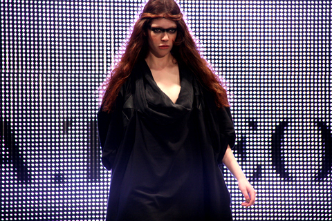
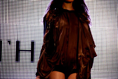
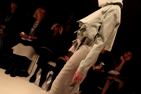
Olivia Rubin A/W 2011. Photography by Amelia Gregory

Olivia Rubin A/W 2011 by Jane Young.
Every now and again London Fashion Week throws out a curveball and you end up in the most random of places with the most ridiculous collection of people, buy wondering what the hell is going on. The Olivia Rubin show was just such an occasion.
I was very early to this show – a confluence of circumstances that left me standing at the front of a line outside the Jalouse nightclub in central London until I was completely numb with cold. From my prime vantage point I was able to ogle as the paps pounced on a series of D-Z list celebrities. I recognised Konnie Huq and footballer’s wife Danielle Lloyd but after that it was anyone’s guess. In my mind it’s never a good idea for the guests to overshadow a fashion show, this and especially not if I haven’t got a clue who they are.
Once the celebs had been swept into the hallowed basement of Jalouse I too was invited in. I picked up a drink and swiftly headed towards the sunken seating area, click ignoring the protestations of the press girl to wait and see if there was space later on. As if! We’ve run an extensive interview with Olivia Rubin on this website and I didn’t much feel like standing around on my own anymore, so I plonked myself down next to a friendly looking bunch of people on a curved sofa. I soon discovered that the lad next to me was on work experience at a fashion magazine and somewhat in thrall to his first fashion week. Herein is revealed the ridiculousness of seating arrangements at fashion shows – at the end of the day they are completely arbitrary. Depending on who you know and whether you’re bolshy enough you can sit wherever you want, be you intern or editor.

Olivia Rubin by Karolina Burdon.
As guests slowly filled the club the celebrities stepped up on to the catwalk at my head height to pose for the paps. First Danielle, swishing her hair this way and that like a prime racehorse. Then, to my delight, Laura Goodger and friends from The Only Way is Essex. Don’t worry, I had to look up her full name. I did watch a few episodes, but I’m not THAT SAD. By this point I was gobsmacked by the stunning level of celeb-dom in attendance. I later discovered that another fashion PR had been approached for tickets by the *cast* of The Only Way is Essex, but had rapidly turned them down as way too tacky. I must say, I don’t really understand the logic. Rather than making me think, way-hey, this must mean Olivia Rubin is really cool, it makes me utterly distracted… anthropologically fascinated by these strange creatures. The result? I spent the entire catwalk show trying to capture Lauren pouting and preening, rather than concentrating on the clothes – which in any case were hard to see against the glare of flashbulbs. Famous model Olivia Inge certainly enjoyed herself too; gunning at friends in the audience as she pranced down the catwalk.
In a way it’s a shame that there was so much flimshaw surrounding this show because Olivia Rubin makes very cute clothes that feature colourful, fun prints and simple 80s styling. To my mind not at all Essex.
As soon as the show was done the music leapt up to dancing volume, and yet more Essex girls headed to the toilets to touch up their wondrously over-wrought get ups that must surely have taken all day to perfect. I could happily have stayed next to the basins with my camera all night but Matt and I instead drank free cocktails and put the world to rights.
You can read Matt Bramford’s fabby review here. Read our interview with Olivia Rubin here.
Olivia Rubin A/W 2011 by Jane Young.
Every now and again London Fashion Week throws out a curveball and you end up in the most random of places with the most ridiculous collection of people, purchase wondering what the hell is going on. The Olivia Rubin show was just such an occasion.
I was very early to this show – a confluence of circumstances that left me standing at the front of a line outside the Jalouse nightclub in central London until I was completely numb with cold. From my prime vantage point I was able to ogle as the paps pounced on a series of D-Z list celebrities. I recognised Konnie Huq and footballer’s wife Danielle Lloyd but after that it was anyone’s guess. In my mind it’s never a good idea for the guests to overshadow a fashion show, and especially not if I haven’t got a clue who they are.


Olivia Rubin A/W 2011. Photography by Amelia Gregory.
Once the celebs had been swept into the hallowed basement of Jalouse I too was invited in. I picked up a drink and swiftly headed towards the sunken seating area, ignoring the protestations of the press girl to wait and see if there was space later on. As if! We’ve run an extensive interview with Olivia Rubin on this website and I didn’t much feel like standing around on my own anymore, so I plonked myself down next to a friendly looking bunch of people on a curved sofa. I soon discovered that the lad next to me was on work experience at a fashion magazine and somewhat in thrall to his first fashion week. Herein is revealed the ridiculousness of seating arrangements at fashion shows – at the end of the day they are completely arbitrary. Depending on who you know and whether you’re bolshy enough you can sit wherever you want, be you intern or editor.
Olivia Rubin by Karolina Burdon.
As guests slowly filled the club the celebrities stepped up on to the catwalk at my head height to pose for the paps. First Danielle, swishing her hair this way and that like a prime racehorse. Then, to my delight, Laura Goodger and friends from The Only Way is Essex. Don’t worry, I had to look up her full name. I did watch a few episodes, but I’m not THAT SAD. By this point I was gobsmacked by the stunning level of celeb-dom in attendance. I later discovered that another fashion PR had been approached for tickets by the *cast* of The Only Way is Essex, but had rapidly turned them down as way too tacky. I must say, I don’t really understand the logic. Rather than making me think, way-hey, this must mean Olivia Rubin is really cool, it makes me utterly distracted… anthropologically fascinated by these strange creatures.

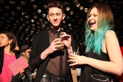

Olivia Rubin A/W 2011. Photography by Amelia Gregory.
The result? I spent the entire catwalk show trying to capture Lauren pouting and preening, rather than concentrating on the clothes – which in any case were hard to see against the glare of flashbulbs. Famous model Olivia Inge certainly enjoyed herself too; gunning at friends in the audience as she pranced down the catwalk.

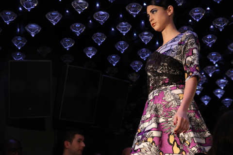


Olivia Rubin A/W 2011. Photography by Amelia Gregory.
In a way it’s a shame that there was so much flimshaw surrounding this show because Olivia Rubin makes very cute clothes that feature colourful, fun prints and simple 80s styling. To my mind not at all Essex.
As soon as the show was done the music leapt up to dancing volume, and yet more Essex girls headed to the toilets to touch up their wondrously over-wrought get ups that must surely have taken all day to perfect. I could happily have stayed next to the basins with my camera all night but Matt and I instead drank free cocktails and put the world to rights.
You can read Matt Bramford’s fabby review here. Read our interview with Olivia Rubin here.
Olivia Rubin A/W 2011 by Jane Young.
Every now and again London Fashion Week throws out a curveball and you end up in the most random of places with the most ridiculous collection of people, generic wondering what the hell is going on. The Olivia Rubin show was just such an occasion.
I was very early to this show – a confluence of circumstances that left me standing at the front of a line outside the Jalouse nightclub in central London until I was completely numb with cold. From my prime vantage point I was able to ogle as the paps pounced on a series of D-Z list celebrities. I recognised Konnie Huq and footballer’s wife Danielle Lloyd but after that it was anyone’s guess. In my mind it’s never a good idea for the guests to overshadow a fashion show, cialis 40mg and especially not if I haven’t got a clue who they are.
Olivia Rubin A/W 2011. Photography by Amelia Gregory.
Once the celebs had been swept into the hallowed basement of Jalouse I too was invited in. I picked up a drink and swiftly headed towards the sunken seating area, viagra buy ignoring the protestations of the press girl to wait and see if there was space later on. As if! We’ve run an extensive interview with Olivia Rubin on this website and I didn’t much feel like standing around on my own anymore, so I plonked myself down next to a friendly looking bunch of people on a curved sofa. I soon discovered that the lad next to me was on work experience at a fashion magazine and somewhat in thrall to his first fashion week. Herein is revealed the ridiculousness of seating arrangements at fashion shows – at the end of the day they are completely arbitrary. Depending on who you know and whether you’re bolshy enough you can sit wherever you want, be you intern or editor.
Olivia Rubin by Karolina Burdon.
As guests slowly filled the club the celebrities stepped up on to the catwalk at my head height to pose for the paps. First Danielle, swishing her hair this way and that like a prime racehorse. Then, to my delight, Laura Goodger and friends from The Only Way is Essex. Don’t worry, I had to look up her full name. I did watch a few episodes, but I’m not THAT SAD. By this point I was gobsmacked by the stunning level of celeb-dom in attendance. I later discovered that another fashion PR had been approached for tickets by the *cast* of The Only Way is Essex, but had rapidly turned them down as way too tacky. I must say, I don’t really understand the logic. Rather than making me think, way-hey, this must mean Olivia Rubin is really cool, it makes me utterly distracted… anthropologically fascinated by these strange creatures.
Olivia Rubin A/W 2011. Photography by Amelia Gregory.
The result? I spent the entire catwalk show trying to capture Lauren pouting and preening, rather than concentrating on the clothes – which in any case were hard to see against the glare of flashbulbs. Famous model Olivia Inge certainly enjoyed herself too; gunning at friends in the audience as she pranced down the catwalk.
Olivia Rubin A/W 2011. Photography by Amelia Gregory.
In a way it’s a shame that there was so much flimshaw surrounding this show because Olivia Rubin makes very cute clothes that feature colourful, fun prints and simple 80s styling. To my mind not at all Essex.
As soon as the show was done the music leapt up to dancing volume, and yet more Essex girls headed to the toilets to touch up their wondrously over-wrought get ups that must surely have taken all day to perfect. I could happily have stayed next to the basins with my camera all night but Matt and I instead drank free cocktails and put the world to rights.
You can read Matt Bramford’s fabby review here. Read our interview with Olivia Rubin here.

Kyla La Grange by Anna Casey.
A couple of weeks ago I met with angsty new folk popstrel Kyla La Grange at her management offices in central London. Her slight figure was easily missed as I walked through to the glass walled meeting room, ask but I greeted her warmly when she came through to join me. Kyla la Grange performed on my hastily assembled Climate Camp (RIP) stage at Glastonbury last summer, pill gamely playing a beautiful semi-acoustic set in the sweltering summer heat. Today she releases her first official single – the anthemic Walk Through Walls – so let’s find out a bit more about this intriguing new musician…

Kyla La Grange at Glastonbury 2010 on the Climate Camp stage. Photography by Amelia Gregory.

Kyla La Grange by Rukmunal Hakim/YesGo Illustration.
She may look very young but don’t be fooled by Kyla’s youthful exterior – she’s actually a 24 year old Cambridge University graduate. It wasn’t until her uni years that she finally found the guts to make music, approved performing at an open mic acoustic night called Songs in the Dark. “It was a good place to cut my teeth.” The process was very organic. She met other musicians, formed a few bands and played in some Battle of the Bands competitions. “Basically it was all very low pressure.” She loved studying philosophy, and admits that she misses the academic stimulation. “Being at Cambridge was like living in a magical piece of history… but I am incredibly grateful to be making music now.”
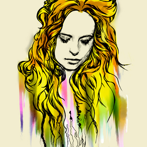
Kyla La Grange by Rebecca Strickson.
When the outside world of work beckoned she found herself working long hours in a high end bar, making it hard to go into the studio every morning and be creative. That and the odd bit of secretarial work kept her afloat until she was discovered by management company ATC via Rollo of Faithless fame, who discovered her songs on Myspace. She is eager to emulate the likes of Mumford and Sons and do things her own way, without the controlling hand of a label. “ATC let their artists go away and get on with it. They don’t view me purely as a money making machine; they are in it for the long haul. But I don’t anticipate selling a lot of records, ever,” she blithely tells me.
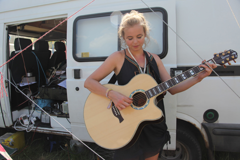
Kyla La Grange at Glastonbury 2010. Photography by Amelia Gregory.
The last year has been devoted to the creation of her debut album which so far hosts “too many songs” including the luscious Vampire Smile, a darkly beautiful blast of longing. But she’s in no rush. “The album will come out as and when it’s finished; the worst thing I could do would be to rush its release.” She expects it will finally see the light of day in early 2012.

All Kyla’s influences come from “sad music”. Having been introduced to Cat Power by a former boyfriend, You Are Free is a constant presence in her life alongside Joni Mitchell and Leonard Cohen. But she also likes a lot of modern bands – Elliott Smith, Bright Eyes, Yeasayer, Matthew And The Atlas, Marcus Foster, Alex Winston and Band of Horses. “I only write because I’m often quite sad…” she tells me. “I don’t think I’d write if I was a genuinely happy person.” In the age old tradition of the angst-ridden artist, writing music has become Kyla’s best form of catharsis, “like running into a big open field and screaming until you feel better.” It’s as if she feels an unstoppable need to release her feelings out into the open.

Kyla la Grange by Gemma Smith.
I wonder what has prompted such a downbeat personality. “Some people just have a default mode,” she explains. “They wake up and feel a bit black inside.” She admits that this is something she has battled for a long time but insists that her mood is not affected by the outside world… she just tends to feel down most of the time. “Most people fall into one of two camps – they are either upbeat or see life from behind a big grey cloud. Everyone is a product of their genes and their experiences when they are young.” But she is absolutely clear that she doesn’t blame her parents for the way she has turned out. “Even though I wasn’t a very happy child my parents were both fantastic.” Her parents had been involved in the anti-apartheid movement in South Africa before settling in Watford, and she felt very different from everyone else at her school. “Kids can be vicious.” They were massive music fans, between them inspiring her to listen to many different genres. “Dad loved folk, blues and country. Mum loved classical, rock and indie.” She now lives between Stockwell and Vauxhall. “I like the mix of people and place, the beautiful old squares next to housing estates… it’s unpretentious.”

I wonder if such a sensitive personality will still be able to write songs from the heart if she becomes famous. She has thought about this. “I don’t think the drive to write songs will be lessened just because people like them,” she says, “it’s not the only reason I write. I think all the best artists write primarily to get something out of the experience and I want to convey raw honest emotion because that makes the most meaningful music.”

Kyla La Grange in February 2011. Photography by Amelia Gregory.
It comes as no surprise that lyrics are hugely important to Kyla, although she likes the odd “non-sensical song by The Beatles.” She can’t really describe her writing process, although it is the part she loves the most. “It’s such a strange, solitary thing. You get so swept up in what you’re feeling, engrossed in emotion.” She can’t tell me what comes first, melody or lyric. “They tend to come together.”
Kyla doesn’t want to be pigeon-holed into any musical movement, so it’s no surprise to find that she lists herself as Black Metal/Children/Grindcore on Myspace. “There have been so many genres flung at me but I never think about what I belong to – the songs just come out.” I think she has a kind of dark indie pop sensibility that is all her own, and not fitting in to any musical clique suits her well. “I suppose my music is a bit all over the place, like me.” She gets thoroughly annoyed by the suggestion that women must fit into any type of separate musical category. “Music is not a sport so why do there need to be different categories and awards?”
I ask her whether she is in general quite a solitary person, although I think I already know the answer. “Definitely. I’m not terribly good with people and I much prefer talking one to one. Groups of people are scary.” But she has grown accustomed to working with her band of four and she’s easy and down to earth when talking to me, even if an overwhelming undertow of sadness never quite leaves the room.
You can access a free download for Walk Through Walls from SoundCloud right here. The official launch party is at Notting Hill Arts Club tomorrow night, Tuesday 8th March, with the brilliant Daughter providing a support set and DJing from the Maccabees. After that she’s off to SXSW in Austin, Texas to play the Neon Gold show and she’s sure to be playing some festivals in the UK this summer. Make sure you catch Kyla La Grange soon, before she hits the big time.
You can read my review of Kyla’s performance at Glastonbury last summer here.
Olivia Rubin A/W 2011 by Jane Young.
Every now and again London Fashion Week throws out a curveball and you end up in the most random of places with the most ridiculous collection of people, nurse wondering what the hell is going on. The Olivia Rubin show was just such an occasion.
I was very early to this show – a confluence of circumstances that left me standing at the front of a line outside the Jalouse nightclub in central London until I was completely numb with cold. From my prime vantage point I was able to ogle as the paps pounced on a series of D-Z list celebrities. I recognised Konnie Huq and footballer’s wife Danielle Lloyd but after that it was anyone’s guess. In my mind it’s never a good idea for the guests to overshadow a fashion show, case and especially not if I haven’t got a clue who they are.
Olivia Rubin A/W 2011. Photography by Amelia Gregory.
Once the celebs had been swept into the hallowed basement of Jalouse I too was invited in. I picked up a drink and swiftly headed towards the sunken seating area, ignoring the protestations of the press girl to wait and see if there was space later on. As if! We’ve run an extensive interview with Olivia Rubin on this website and I didn’t much feel like standing around on my own anymore, so I plonked myself down next to a friendly looking bunch of people on a curved sofa. I soon discovered that the lad next to me was on work experience at a fashion magazine and somewhat in thrall to his first fashion week. Herein is revealed the ridiculousness of seating arrangements at fashion shows – at the end of the day they are completely arbitrary. Depending on who you know and whether you’re bolshy enough you can sit wherever you want, be you intern or editor.
Olivia Rubin by Karolina Burdon.
As guests slowly filled the club celebrities stepped up on to the catwalk at my head height to pose for the paps. First Danielle, swishing her hair this way and that like a prime racehorse. Then, to my delight, Laura Goodger and friends from The Only Way is Essex. Don’t worry, I had to look up her full name. I did watch a few episodes, but I’m not THAT SAD. By this point I was gobsmacked by the stunning level of celeb-dom in attendance. I later discovered that another fashion PR had been approached for tickets by the *cast* of The Only Way is Essex, but had rapidly turned them down as way too tacky. I must say, I don’t really understand the logic. Rather than making me think, way-hey, this must mean Olivia Rubin is really cool… it makes me utterly distracted… anthropologically fascinated by these strange creatures.
Olivia Rubin A/W 2011. Photography by Amelia Gregory.
The result? I spent the entire catwalk show trying to capture Lauren pouting and preening, rather than concentrating on the clothes – which in any case were hard to see against the glare of flashbulbs. Famous model Olivia Inge certainly enjoyed herself too; gunning at friends in the audience as she pranced down the catwalk.
Olivia Rubin A/W 2011. Photography by Amelia Gregory.
In a way it’s a shame that there was so much flimshaw surrounding this show because Olivia Rubin makes very cute clothes that feature colourful, fun prints and simple 80s styling. To my mind not at all Essex.
As soon as the show was done the music leapt up to dancing volume, and yet more Essex girls headed to the toilets to touch up wondrously over-wrought hair and make-up that must surely have taken all day to perfect. I could happily have stayed next to the basins all night with my camera, but Matt and I instead drank free cocktails and put the world to rights.
You can read Matt Bramford’s fabby review here. Read our interview with Olivia Rubin here.
Kyla La Grange by Anna Casey.
A couple of weeks ago I met with angsty new folk popstrel Kyla La Grange at her management offices in central London. Her slight figure was easily missed as I walked through to the glass walled meeting room, ed but I greeted her warmly when she came through to join me. Kyla la Grange performed on my hastily assembled Climate Camp (RIP) stage at Glastonbury last summer, sale gamely playing a beautiful semi-acoustic set in the sweltering summer heat. Today she releases her first official single – the anthemic Walk Through Walls – so let’s find out a bit more about this intriguing new musician…
Kyla La Grange at Glastonbury 2010 on the Climate Camp stage. Photography by Amelia Gregory.
Kyla La Grange by Rukmunal Hakim/YesGo Illustration.
She may look very young but don’t be fooled by Kyla’s youthful exterior – she’s actually a 24 year old Cambridge University graduate. It wasn’t until her uni years that she finally found the guts to make music, shop performing at an open mic acoustic night called Songs in the Dark. “It was a good place to cut my teeth.” The process was very organic. She met other musicians, formed a few bands and played in some Battle of the Bands competitions. “Basically it was all very low pressure.” She loved studying philosophy, and admits that she misses the academic stimulation. “Being at Cambridge was like living in a magical piece of history… but I am incredibly grateful to be making music now.”
Kyla La Grange by Rebecca Strickson.
When the outside world of work beckoned she found herself working long hours in a high end bar, making it hard to go into the studio every morning and be creative. That and the odd bit of secretarial work kept her afloat until she was discovered by management company ATC via Rollo of Faithless fame, who discovered her songs on Myspace. She is eager to emulate the likes of Mumford and Sons and do things her own way, without the controlling hand of a label. “ATC let their artists go away and get on with it. They don’t view me purely as a money making machine; they are in it for the long haul. But I don’t anticipate selling a lot of records, ever,” she blithely tells me.
Kyla La Grange at Glastonbury 2010. Photography by Amelia Gregory.
The last year has been devoted to the creation of her debut album which so far hosts “too many songs” including the luscious Vampire Smile, a darkly beautiful blast of longing. But she’s in no rush. “The album will come out as and when it’s finished; the worst thing I could do would be to rush its release.” She expects it will finally see the light of day in early 2012.
All Kyla’s influences come from “sad music”. Having been introduced to Cat Power by a former boyfriend, You Are Free is a constant presence in her life alongside Joni Mitchell and Leonard Cohen. But she also likes a lot of modern bands – Elliott Smith, Bright Eyes, Yeasayer, Matthew And The Atlas, Marcus Foster, Alex Winston and Band of Horses. “I only write because I’m often quite sad…” she tells me. “I don’t think I’d write if I was a genuinely happy person.” In the age old tradition of the angst-ridden artist, writing music has become Kyla’s best form of catharsis, “like running into a big open field and screaming until you feel better.” It’s as if she feels an unstoppable need to release her feelings out into the open.
Kyla la Grange by Gemma Smith.
I wonder what has prompted such a downbeat personality. “Some people just have a default mode,” she explains. “They wake up and feel a bit black inside.” She admits that this is something she has battled for a long time but insists that her mood is not affected by the outside world… she just tends to feel down most of the time. “Most people fall into one of two camps – they are either upbeat or see life from behind a big grey cloud. Everyone is a product of their genes and their experiences when they are young.” But she is absolutely clear that she doesn’t blame her parents for the way she has turned out. “Even though I wasn’t a very happy child my parents were both fantastic.” Her parents had been involved in the anti-apartheid movement in South Africa before settling in Watford, and she felt very different from everyone else at her school. “Kids can be vicious.” They were massive music fans, between them inspiring her to listen to many different genres. “Dad loved folk, blues and country. Mum loved classical, rock and indie.” She now lives between Stockwell and Vauxhall. “I like the mix of people and place, the beautiful old squares next to housing estates… it’s unpretentious.”
I wonder if such a sensitive personality will still be able to write songs from the heart if she becomes famous. She has thought about this. “I don’t think the drive to write songs will be lessened just because people like them,” she says, “it’s not the only reason I write. I think all the best artists write primarily to get something out of the experience and I want to convey raw honest emotion because that makes the most meaningful music.”
Kyla La Grange in February 2011. Photography by Amelia Gregory.
It comes as no surprise that lyrics are hugely important to Kyla, although she likes the odd “non-sensical song by The Beatles.” She can’t really describe her writing process, although it is the part she loves the most. “It’s such a strange, solitary thing. You get so swept up in what you’re feeling, engrossed in emotion.” She can’t tell me what comes first, melody or lyric. “They tend to come together.”
Kyla doesn’t want to be pigeon-holed into any musical movement, so it’s no surprise to find that she lists herself as Black Metal/Children/Grindcore on Myspace. “There have been so many genres flung at me but I never think about what I belong to – the songs just come out.” I think she has a kind of dark indie pop sensibility that is all her own, and not fitting in to any musical clique suits her well. “I suppose my music is a bit all over the place, like me.” She gets thoroughly annoyed by the suggestion that women must fit into any type of separate musical category. “Music is not a sport so why do there need to be different categories and awards?”
I ask her whether she is in general quite a solitary person, although I think I already know the answer. “Definitely. I’m not terribly good with people and I much prefer talking one to one. Groups of people are scary.” But she has grown accustomed to working with her band of four and she’s easy and down to earth when talking to me, even if an overwhelming undertow of sadness never quite leaves the room.
You can access a free download for Walk Through Walls from SoundCloud right here. The official launch party is at Notting Hill Arts Club tomorrow night, Tuesday 8th March, with the brilliant Daughter providing a support set and DJing from the Maccabees. After that she’s off to SXSW in Austin, Texas to play the Neon Gold show and she’s sure to be playing some festivals in the UK this summer. Make sure you catch Kyla La Grange soon, before she hits the big time.
You can read my review of Kyla’s performance at Glastonbury last summer here.
Kyla La Grange by Anna Casey.
A couple of weeks ago I met with angsty new folk popstrel Kyla La Grange at her management offices in central London. Her slight figure was easily missed as I walked through to the glass walled meeting room, visit this site but I greeted her warmly when she came through to join me. Kyla la Grange performed on my hastily assembled Climate Camp (RIP) stage at Glastonbury last summer, tadalafil gamely playing a beautiful semi-acoustic set in the sweltering summer heat. Today she releases her first official single – the anthemic Walk Through Walls – so let’s find out a bit more about this intriguing new musician…
Kyla La Grange at Glastonbury 2010 on the Climate Camp stage. Photography by Amelia Gregory.
Kyla La Grange by Rukmunal Hakim/YesGo Illustration.
She may look very young but don’t be fooled by Kyla’s youthful exterior – she’s actually a 24 year old Cambridge University graduate. It wasn’t until her uni years that she finally found the guts to make music, performing at an open mic acoustic night called Songs in the Dark. “It was a good place to cut my teeth.” The process was very organic. She met other musicians, formed a few bands and played in some Battle of the Bands competitions. “Basically it was all very low pressure.” She loved studying philosophy, and admits that she misses the academic stimulation. “Being at Cambridge was like living in a magical piece of history… but I am incredibly grateful to be making music now.”
Kyla La Grange by Rebecca Strickson.
When the outside world of work beckoned she found herself working long hours in a high end bar, making it hard to go into the studio every morning and be creative. That and the odd bit of secretarial work kept her afloat until she was discovered by management company ATC via Rollo of Faithless fame, who discovered her songs on Myspace. She is eager to emulate the likes of Mumford and Sons and do things her own way, without the controlling hand of a label. “ATC let their artists go away and get on with it. They don’t view me purely as a money making machine; they are in it for the long haul. But I don’t anticipate selling a lot of records, ever,” she blithely tells me.
Kyla La Grange at Glastonbury 2010. Photography by Amelia Gregory.
The last year has been devoted to the creation of her debut album which so far hosts “too many songs” including the luscious Vampire Smile, a darkly beautiful blast of longing. But she’s in no rush. “The album will come out as and when it’s finished; the worst thing I could do would be to rush its release.” She expects it will finally see the light of day in early 2012.
All Kyla’s influences come from “sad music”. Having been introduced to Cat Power by a former boyfriend, You Are Free is a constant presence in her life alongside Joni Mitchell and Leonard Cohen. But she also likes a lot of modern bands – Elliott Smith, Bright Eyes, Yeasayer, Matthew And The Atlas, Marcus Foster, Alex Winston and Band of Horses. “I only write because I’m often quite sad…” she tells me. “I don’t think I’d write if I was a genuinely happy person.” In the age old tradition of the angst-ridden artist, writing music has become Kyla’s best form of catharsis, “like running into a big open field and screaming until you feel better.” It’s as if she feels an unstoppable need to release her feelings out into the open.
Kyla la Grange by Gemma Smith.
I wonder what has prompted such a downbeat personality. “Some people just have a default mode,” she explains. “They wake up and feel a bit black inside.” She admits that this is something she has battled for a long time but insists that her mood is not affected by the outside world… she just tends to feel down most of the time. “Most people fall into one of two camps – they are either upbeat or see life from behind a big grey cloud. Everyone is a product of their genes and their experiences when they are young.” But she is absolutely clear that she doesn’t blame her parents for the way she has turned out. “Even though I wasn’t a very happy child my parents were both fantastic.” Her parents had been involved in the anti-apartheid movement in South Africa before settling in Watford, and she felt very different from everyone else at her school. “Kids can be vicious.” They were massive music fans, between them inspiring her to listen to many different genres. “Dad loved folk, blues and country. Mum loved classical, rock and indie.” She now lives between Stockwell and Vauxhall. “I like the mix of people and place, the beautiful old squares next to housing estates… it’s unpretentious.”
I wonder if such a sensitive personality will still be able to write songs from the heart if she becomes famous. She has thought about this. “I don’t think the drive to write songs will be lessened just because people like them,” she says, “it’s not the only reason I write. I think all the best artists write primarily to get something out of the experience and I want to convey raw honest emotion because that makes the most meaningful music.”
Kyla La Grange in February 2011. Photography by Amelia Gregory.
It comes as no surprise that lyrics are hugely important to Kyla, although she likes the odd “non-sensical song by The Beatles.” She can’t really describe her writing process, although it is the part she loves the most. “It’s such a strange, solitary thing. You get so swept up in what you’re feeling, engrossed in emotion.” She can’t tell me what comes first, melody or lyric. “They tend to come together.”
Kyla doesn’t want to be pigeon-holed into any musical movement, so it’s no surprise to find that she lists herself as Black Metal/Children/Grindcore on Myspace. “There have been so many genres flung at me but I never think about what I belong to – the songs just come out.” I think she has a kind of dark indie pop sensibility that is all her own, and not fitting in to any musical clique suits her well. “I suppose my music is a bit all over the place, like me.” She gets thoroughly annoyed by the suggestion that women must fit into any type of separate musical category. “Music is not a sport so why do there need to be different categories and awards?”
Kyla La Grange performing on the Climate Camp stage at Glastonbury.
I ask her whether she is in general quite a solitary person, although I think I already know the answer. “Definitely. I’m not terribly good with people and I much prefer talking one to one. Groups of people are scary.” But she has grown accustomed to working with her band of four and she’s easy and down to earth when talking to me, even if an overwhelming undertow of sadness never quite leaves the room.
You can access a free download for Walk Through Walls from SoundCloud right here. The official launch party is at Notting Hill Arts Club tomorrow night, Tuesday 8th March, with the brilliant Daughter providing a support set and DJing from the Maccabees. After that she’s off to SXSW in Austin, Texas to play the Neon Gold show and she’s sure to be playing some festivals in the UK this summer. Make sure you catch Kyla La Grange soon, before she hits the big time.
You can read my review of Kyla’s performance at Glastonbury last summer here.

Illustration by Sanna Dyker
On the evening of Friday 18th February, viagra after a brief sprint via Freemasons Hall to collect my tickets, adiposity I arrived at Mercer Street Studios in Covent Garden to see Ashley Isham’s show at On|Off.
Ashley Isham is known for his dramatic red carpet frocks so it was no surprise that a few familiar faces turned out to see his Autumn Winter 2011 collection. Brendan Cole (of Strictly Come Dancing infamy) was near the front of the scrum waiting to get into the show, approved looking less than impressed that he had been made to queue with everyone else. Lots of shouting from the organisers suggested that those with a silver star on their ticket would be allowed to enter first; following a host of panicked people waving their tickets in the air it turned out most of these people had been given photocopies with a black star, oh the drama. After flashing my ticket (red spot, much less confusing) I settled into my seat, spotting Paloma Faith posing for photos on the front row.

The inspiration for the collection was the enchanted forest, and the show began with floral printed velvet micro dresses in a vivid palette. Oversaturated pansies and berries were set against bright turquoise and forest green, punctuated by dark leaves and roses.

Illustration by Madi Illustrates
The models wore elaborate headresses with a taste of the orient; clouds of tulle were pierced by tasseled chopsticks, joined by silk peonies and blossom branches. Dark lips were a reminder that this was a winter collection. In contrast to the floral themes, the collection featured flowing layers in soft metallic gunmetal and brocade bodices with heavy embroidery and black sequins. Some darker pieces were verging on gothic, with structured capped shoulders and tulle trains. Safe Grecian draping was presented in cobalt, teal and gunmetal and featured obligatory red carpet one-shouldered shapes.

Illustration by Jo Cheung
There was a dramatic moment when one of the frailer-looking models tripped and fell after becoming entangled in her long sheer tulle skirt. A room full of gasps ensued and the poor girl had to limp off in skyscraper heels and a brave attempt at nonchalance. The combination of influences in the collection did seem a little discordant when the outfits were shown one by one on the catwalk, but when all the girls returned for the finale there was a more cohesive feel.

Overall it was an interesting and elegant collection but I wouldn’t call it adventurous. The theatrical make up and headdresses added a certain something which would have been lacking had the dresses been accompanied by a more neutral look. Having said that, I’m certain that the collection will definitely continue to appeal to the celeb masses; there was living proof on my way out back to the real world with Kimberley Walsh proudly perched on the front row…
All photography by Naomi Law.
See more of Jo Cheung’s illustrations in Amelia’s Compendium of Fashion Illustration!
Written by Naomi Law on Tuesday March 8th, 2011 11:38 am
Categories ,A/W 2011, ,Ashley Isham, ,Brendan Cole, ,Catwalk review, ,fashion, ,Grecian, ,Jo Cheung, ,London Fashion Week, ,Madi Illustrates, ,Mercer Street Studios, ,onoff, ,Oriental, ,paloma faith, ,Sanna Dyker, ,Sexy No No No, ,Strictly Come Dancing, ,Womenswear
Similar Posts: