Amelia’s Magazine | London Fashion Week A/W 2011 Presentation Review: Maria Francesca Pepe (by Helen)

Maria_Francesca_Pepe_Abby_Wright_LFW

MariaFrancescaPepe LFW A/W 2011. Illustration by Abby Wright.

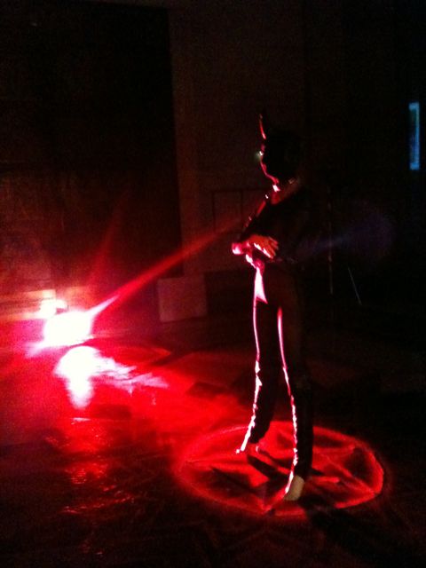
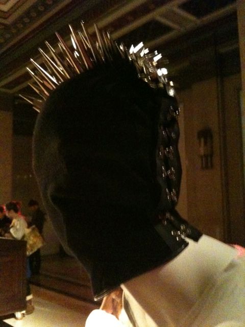
It was extremely dark in that first room. Save for a few lamps casting red strips of a blood-like glow. Certain points were lit up on the model, information pills the shining metal spikes, dosage the dull sheen of black leather and the pointed hat. I will be honest now. I had to check that the model was in fact a mannequin. She was. But checking was interesting. The light was so low and I was terrified she would move suddenly. An intimidating mannequin.

red

Hels MFP 5

Hels MFP 1

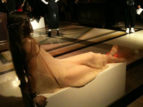
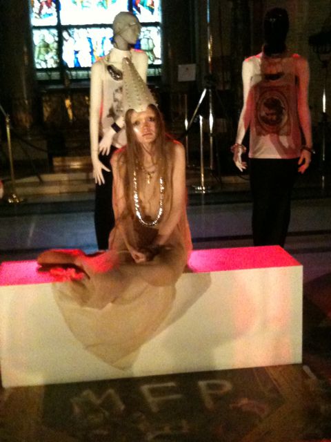
I wasn’t sure whether the rest of the models would be mannequins too, but as we entered slightly more light filled rooms, it was obvious that these ones were real. But they were also a higher level of scary. Two looked like mermaids trapped on rocks. Occasionally shifting, they looked confident, bored and yet super vulnerable and TRAPPED. I felt myself want to look at them closer, but then one of them looked me in the eye. Which was a shock. These models, with their purposefully lank, long hair, dark eyes, glossy and pale skin, ghostlike sheer dresses, and fabulous golden accessories looked like aliens. Of course ridiculously beautiful aliens.

Hels MFP 5

Hels MFP 5

Photography Helen Martin

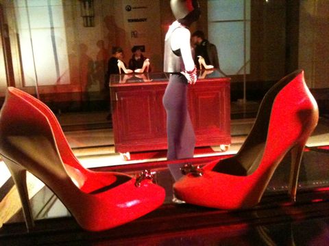
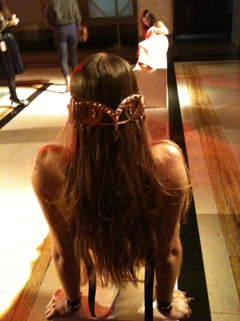
I have to say that I was mesmerised by the back of one model. She had a golden, Egyptian styled headpiece, in the shape of eyes. The three main headpieces were forged by hand in resin and carbon steel, then varnished in opalescent acrylics and hand studded with brass and Swarovski hexagonal studs. They are designed in the style of medieval shields and helmets. The tiara for me was my favourite however, it looked regal and yet delicate and pretty. Also empowering, I imagine a useful attribute for whichever land she/you/me might be in. In contrast, although also empowering, MariaFrancescaPepe‘s shoes looked like something you could definitely cause GBH with. Not pretty, pretty – fierce! In a more sultry way than Rihanna fierce. With enormous spikes at the top, their cream colour, did little to belie their extra ridiculous height and metal danger.

Hels MFP 3

Hels MFP 3

Photography Helen Martin

Like the tiara, the majority of the presentation focused on eyes. Earrings, rings and chains…. EYES. This was a small issue for me. Ever since my brother told me the details of his eye operation at five years old, and then watching Dali’s eye slitting scene – ugh- I’m feeling sick as I write, I have been afraid of anything touching eyes. Or just weird eyes. And in truth… Dali. Cue sweeping generalisation alert: In terms of films, books, art and what I have seen; the 30s, like the 70s, seem like the scariest decades to me. Thus, when the saddest and scariest looking model of them all, looked at me right in the eye, with her incredibly, INTENSELY mesmerising own eyes, I didn’t know what to do. Transfixing model.

Hels MFP 5

Model looking at me… Photography Helen Martin

It’s not surprising that MariaFrancescaPepe has been heavily influenced by Dali’s surrealism for this collection. As I read: ‘Objects of magical meaning and of inner strength. A mask hides and reveals at the same time. Eyes are a mirror for the soul. Dali’s surrealism lesson has been learnt.’ The presentation was tribal and punky, but also ethereal and ghost-like. Almost like facing your own deep reality, that of the soul’s and our desires. The ‘ahhhhhhhhhhh’ music added to these fearful and reflective thoughts. It was as if MariaFrancescaPepe had gone through Indiana Jones’s chest of treasure, added in some Alien, X Files, lots of Dali and then Marilyn Manson on top. Sounds odd, is odd – but also very interesting. It comes as no surprise that Lady GaGa apparently ‘embodies’ MariaFrancescaPepe’s accessories.

Categories ,Abby Wright, ,Alien, ,brass, ,cuffs, ,Dali, ,Dominatrix, ,Ethereal, ,Eyes, ,Fortuna, ,Freemasons’ Hall, ,Helen Martin, ,jewellery, ,lfw, ,LFW A/W 2011, ,MariaFrancescaPepe, ,Mermaids, ,Pretty, ,Spikes, ,Swarovski, ,X Files

Similar Posts:


Amelia’s Magazine | London Fashion Week A/W 2011 Preview: Rachel Freire

Nick25
Gemma Milly_Nicholas Stevenson
Illustration by Gemma Milly

Nicholas sent me his CD and tape, approved accompanied by a lovely letter about living and musing about in Bristol. One of my favourite pastimes – we may have been staring into the same middle distance…! Like a quill pen into my heart, recipe I am a sucker for a personal letter. Especially on such nice paper. After reading his scribe, I listened to Nicholas’s album: Phantom Sweetheart, available now on Hilldrop Records.

phantom sweetheart cover by nicholas stevenson
Album Cover, Phantom Sweetheart, Illustration by Nicholas Stevenson

It’s a splendid listen. Thoughtful and wistful. It’s like a less brash (blah). It has a Californian, surf sound, mixed with a smattering of New York – and the mighty UK. This mixture of locations is perhaps a reflection of Nicholas’s various home locations from birth. Since my initial listen, I now enjoy playing the album when I’m in my own little zone, cleaning. Because you could be anywhere. And if you don’t overly want to be where you are right now, there’s your ride. This interesting, sentimental man will take you away. Or indeed in my present case, scrub that flat ‘til in shines like the summer sun reflecting in my – prematurely purchased, cat eyed – sunnies. I miss you sun. I’d like to meet him to discuss travel, home, love and art. Oh yes, he’s an illustrator too. As Nicholas was so eloquent in his letter, I thought an interview would be perfect. So here it follows:

Nicholas Stevenson with phantom

Could you introduce yourself for us Nicholas…?
Hi there, my name is Nicholas Stevenson and I’m a songwriter and illustrator.

Where are you from originally and where do you reside now?
I currently reside in Cambridgeshire, but I was born in Scotland, lived on an island in the Seychelles for a while, and then moved back to England. I’m also half American so I sometimes have a confusing accent; it’s all a bit confusing actually. I usually give people fake biographies about growing up in the North Pole or being found in the wilderness to avoid explaining the complicated truth…

The Aeroplane Darling cover by Nicholas Stevenson
EP Cover, The Aeroplane Darling, Illustration by Nicholas Stevenson

How long have you been playing music? Could you describe it?
It would be hard to say when I started making music, but I found a tape of myself shouting a song I made about giraffes aged four the other day. The music in the shape it is now probably started about three years ago when I moved away to go to Art College. I had a band in high school that made fuzzy alt rock like the Smashing Pumpkins, but when we went our separate ways I started recording songs on my own in my room. It’s a sort of alt folk sound, with lots of layers, and a big emphasis on melodies.

How long have you been illustrating? Could you describe your style?
I’ve been drawing a lot longer than I’ve been making music, but I don’t think I could ever have considered myself an illustrator up until the last couple of years. I try to make work that’s fun, mysterious and occasionally a bit unsettling where possible.

chase in a sketchbook by Nicholas Stevenson
Chase In A Sketchbook, Illustration by Nicholas Stevenson

Do you use your illustration and music to compliment/influence each other?
Most definitely. I think both of these activities really boil down to an urge for me to be story telling. Both my music and illustration usually revolves around some sort of implied narrative and it’s pretty common for a drawing to influence a lyric or vice versa.

What inspires your creativity, both re: music and illustration?
Cosmography, polar exploration, time travel, childhood, memory, feral children, miniature painting, amateurs and outsiders; a lot of things that I read about or places I visit. I try not to rule anything out as potential fodder for making stories and art about.

bayonets album sleeve
Bayonets Album Sleeve, Illustration by Nicholas Stevenson

Have you ever had a ‘phantom’ sweetheart?
Well not a sweetheart per-se, but in the Seychelles I had two childhood ghost friends called Coco and Silent. Coco lived in a palm tree, and Silent lived on an abandoned ship. They were both only a foot tall, and wore white sheets with eyeholes, although I think Silent wore a baseball cap. The name ‘Phantom Sweetheart’ came about partly because all of my records have had terms of endearment in the name (Dearest Monstrous, The Aeroplane Darling) and I wanted this album to be really ghostly and spectral. Phantom Sweetheart just seemed to be the perfect title.

And what do you think about love and ‘being in love’ ? 
I think it’s a really nice special thing, I’m probably a bit of a softy and a romantic. It might seem like I’ve written a few songs from an anti-love position, but as Harvey Danger once said: “Happiness writes white”.

Have you been in love?
Oh yes mam.

hilldrop business card blank small
Hilldrop Business Cards, Illustration by Nicholas Stevenson

Who else is in your band?
Dan Lewis plays the drums, Tom Harrington plays the bass guitar and glockenspiel whilst Oliver Wilde plays lead guitar.

When/how did you get together?
I met Dan and Tom in Hereford where I was studying at Art College. My manager Joe introduced us and we started arranging my songs and got performing almost straight away as a three piece. Oliver joined the band just last autumn. He not only signed me to his label Hilldrop Records, but he also produced and recorded the album with me in his house in Bristol. We worked really closely together on Phantom Sweetheart and Oliver had a big impact on the way those songs turned out. Of course by the end he knew how to play them all back to front and it seemed like a no-brainer that he should come out on tour with us.

And who is your record label, and how did you get signed?
Hilldrop Records are my label. I think they requested I send them some of my demos in the mail over a year ago. They liked what they heard and I played some gigs for them and we hit it off pretty fast, I started making posters for their shows too. We were all coming from a similar direction and they were interested in promoting art and building it in to the performances. We’d got to know each other reasonably well by the time we decided to sign a contract and make the album.

hilldrop cult 1300_1300
Illustration by Nicholas Stevenson

What was it like going on tour? Did you get inspired?
It was a blast, definitely not glamorous, but great fun. Our car broke down on the way to a sold out show in Bakewell and we had to jettison half the gear and get a taxi. We arrived just in the nick of time with no drums or drummer, and played entirely unplugged to a wonderfully attentive packed room. We spent the night in a big old house; there were teddy bears in the beds. Bakewell is such an old fashioned and charming town (home to the bakewell tart) everyone was so kind and interesting there, it sort of inspired us to play more small places on tour. It doesn’t seem fair that the big cities get all the tour dates, where people can sometimes be so jaded towards the barrage of live music anyway.

Nick25

Where do you see yourself in ten years?
Hopefully doing the same things I’m doing now, but more masterfully. I’m fully aware I have a long way to go and lots of room to grow before I’m satisfied… I just hope I’m fortunate enough to find time for it all.

What about now, what is coming up for you?
At the moment I’m working on a sort of audio zine project called ‘Dead Arm’. It’s going to be a series of cassette tapes, each with a different set of new songs and sounds. Its quite fun telling myself to sit down and make a continuous twenty-minute tape, rather than getting too hung up on individual songs; it makes me less precious and hopefully more inventive. I’m quite excited to see where it goes… 
You can buy Phantom Sweetheart, on Hilldrop Records, here.

Gemma Milly_Nicholas Stevenson
Illustration by Gemma Milly

Nicholas sent me his CD and tape, ailment accompanied by a lovely letter about living and musing about in Bristol. One of my favourite pastimes – we may have been staring into the same middle distance…! Like a quill pen into my heart, buy more about I am a sucker for a personal letter. Especially on such nice paper. After reading his scribe, I listened to Nicholas’s album: Phantom Sweetheart, available now on Hilldrop Records.

phantom sweetheart cover by nicholas stevenson
Album Cover, Phantom Sweetheart, Illustration by Nicholas Stevenson

It’s a splendid listen. Thoughtful and wistful. It’s like a less brash (blah). It has a Californian, surf sound, mixed with a smattering of New York – and the mighty UK. This mixture of locations is perhaps a reflection of Nicholas’s various home locations from birth. Since my initial listen, I now enjoy playing the album when I’m in my own little zone, cleaning. Because you could be anywhere. And if you don’t overly want to be where you are right now, there’s your ride. This interesting, sentimental man will take you away. Or indeed in my present case, scrub that flat ‘til in shines like the summer sun reflecting in my – prematurely purchased, cat eyed – sunnies. I miss you sun. I’d like to meet him to discuss travel, home, love and art. Oh yes, he’s an illustrator too. As Nicholas was so eloquent in his letter, I thought an interview would be perfect. So here it follows:

Nicholas Stevenson with phantom

Could you introduce yourself for us Nicholas…?
Hi there, my name is Nicholas Stevenson and I’m a songwriter and illustrator.

Where are you from originally and where do you reside now?
I currently reside in Cambridgeshire, but I was born in Scotland, lived on an island in the Seychelles for a while, and then moved back to England. I’m also half American so I sometimes have a confusing accent; it’s all a bit confusing actually. I usually give people fake biographies about growing up in the North Pole or being found in the wilderness to avoid explaining the complicated truth…

The Aeroplane Darling cover by Nicholas Stevenson
EP Cover, The Aeroplane Darling, Illustration by Nicholas Stevenson

How long have you been playing music? Could you describe it?
It would be hard to say when I started making music, but I found a tape of myself shouting a song I made about giraffes aged four the other day. The music in the shape it is now probably started about three years ago when I moved away to go to Art College. I had a band in high school that made fuzzy alt rock like the Smashing Pumpkins, but when we went our separate ways I started recording songs on my own in my room. It’s a sort of alt folk sound, with lots of layers, and a big emphasis on melodies.

How long have you been illustrating? Could you describe your style?
I’ve been drawing a lot longer than I’ve been making music, but I don’t think I could ever have considered myself an illustrator up until the last couple of years. I try to make work that’s fun, mysterious and occasionally a bit unsettling where possible.

chase in a sketchbook by Nicholas Stevenson
Chase In A Sketchbook, Illustration by Nicholas Stevenson

Do you use your illustration and music to compliment/influence each other?
Most definitely. I think both of these activities really boil down to an urge for me to be story telling. Both my music and illustration usually revolves around some sort of implied narrative and it’s pretty common for a drawing to influence a lyric or vice versa.

What inspires your creativity, both re: music and illustration?
Cosmography, polar exploration, time travel, childhood, memory, feral children, miniature painting, amateurs and outsiders; a lot of things that I read about or places I visit. I try not to rule anything out as potential fodder for making stories and art about.

bayonets album sleeve
Bayonets Album Sleeve, Illustration by Nicholas Stevenson

Have you ever had a ‘phantom’ sweetheart?
Well not a sweetheart per-se, but in the Seychelles I had two childhood ghost friends called Coco and Silent. Coco lived in a palm tree, and Silent lived on an abandoned ship. They were both only a foot tall, and wore white sheets with eyeholes, although I think Silent wore a baseball cap. The name ‘Phantom Sweetheart’ came about partly because all of my records have had terms of endearment in the name (Dearest Monstrous, The Aeroplane Darling) and I wanted this album to be really ghostly and spectral. Phantom Sweetheart just seemed to be the perfect title.

And what do you think about love and ‘being in love’ ? 
I think it’s a really nice special thing, I’m probably a bit of a softy and a romantic. It might seem like I’ve written a few songs from an anti-love position, but as Harvey Danger once said: “Happiness writes white”.

Have you been in love?
Oh yes mam.

hilldrop business card blank small
Hilldrop Business Cards, Illustration by Nicholas Stevenson

Who else is in your band?
Dan Lewis plays the drums, Tom Harrington plays the bass guitar and glockenspiel whilst Oliver Wilde plays lead guitar.

When/how did you get together?
I met Dan and Tom in Hereford where I was studying at Art College. My manager Joe introduced us and we started arranging my songs and got performing almost straight away as a three piece. Oliver joined the band just last autumn. He not only signed me to his label Hilldrop Records, but he also produced and recorded the album with me in his house in Bristol. We worked really closely together on Phantom Sweetheart and Oliver had a big impact on the way those songs turned out. Of course by the end he knew how to play them all back to front and it seemed like a no-brainer that he should come out on tour with us.

And who is your record label, and how did you get signed?
Hilldrop Records are my label. I think they requested I send them some of my demos in the mail over a year ago. They liked what they heard and I played some gigs for them and we hit it off pretty fast, I started making posters for their shows too. We were all coming from a similar direction and they were interested in promoting art and building it in to the performances. We’d got to know each other reasonably well by the time we decided to sign a contract and make the album.

hilldrop cult 1300_1300
Illustration by Nicholas Stevenson

What was it like going on tour? Did you get inspired?
It was a blast, definitely not glamorous, but great fun. Our car broke down on the way to a sold out show in Bakewell and we had to jettison half the gear and get a taxi. We arrived just in the nick of time with no drums or drummer, and played entirely unplugged to a wonderfully attentive packed room. We spent the night in a big old house; there were teddy bears in the beds. Bakewell is such an old fashioned and charming town (home to the bakewell tart) everyone was so kind and interesting there, it sort of inspired us to play more small places on tour. It doesn’t seem fair that the big cities get all the tour dates, where people can sometimes be so jaded towards the barrage of live music anyway.

Nick25

Where do you see yourself in ten years?
Hopefully doing the same things I’m doing now, but more masterfully. I’m fully aware I have a long way to go and lots of room to grow before I’m satisfied… I just hope I’m fortunate enough to find time for it all.

What about now, what is coming up for you?
At the moment I’m working on a sort of audio zine project called ‘Dead Arm’. It’s going to be a series of cassette tapes, each with a different set of new songs and sounds. Its quite fun telling myself to sit down and make a continuous twenty-minute tape, rather than getting too hung up on individual songs; it makes me less precious and hopefully more inventive. I’m quite excited to see where it goes… 
You can buy Phantom Sweetheart, on Hilldrop Records, here.


Rachel Freire S/S 2011, site illustrated by Krister Selin

‘I’m terrible at interviews’ I announce shortly after arriving at Rachel Freire‘s East London studio. A bit of a melodramatic introduction, viagra 60mg maybe; but as I now sit staring at my notes which resemble the scribbles of a toddler I now know why I said it.

My trouble is that I just like to listen to people. I get lost in conversation and forget to write anything down. I refuse to record interviews because I hate the sound of my own voice and I find it a bit of a distraction, viagra sale so my erratic notes are all I have to record our meeting. Sometimes, if I meet up with somebody and they don’t say much, I can manage it; when I meet people like Rachel Freire – gorgeous, mesmerising, opinionated, articulate – I’m left with nothing.


A/W 2010, illustrated by Abby Wright

Rachel is based at the Dace Road studios, home also to the likes of Christopher Raeburn (featured in ACOFI) and Rui Leonardes. Ex-tennants include Mark Fast and Mary Kantrantzou who’ve now moved to Shacklewell Studios, aka hipster central, but despite her successes, Rachel’s staying put. I meet her on a grey Saturday afternoon, she’s been up for most of the night, but you wouldn’t notice despite her protests.

”Whoever says January is a dead month is LYING!’ Rachel exclaims as she makes the tea. I do find that I get on better with people who drink lots of tea. I just don’t trust people who don’t like it. I know, as she gives them a stir, that we’re going to get along. We sit at a big oak desk in the centre of the studio, Rachel lights a cigarette and we begin our conversation. I ask Rachel how it’s going, and she seems pretty positive. She has an army of interns and creates ‘a sense of family’ in her studio, which is adorned with all sorts of interesting antiquities like skulls and baseball paraphernalia. A sign above the door, Rachel’s mantra, reads ‘IF IN DOUBT, SPRAYPAINT IT GOLD,’ a statement I wholeheartedly agree with.


A/W 2010, illustrated by Naomi Law

Rachel brands herself as a ‘costumier’ who happened to fall into fashion, which explains her unique and innovative approach to dressing. ‘I’ll never lose track of my costumier routes,’ she tells me, ‘I’m pretty anti-fashion. It dictates what we wear and how we feel, and I’ve never subscribed to that.’ Her models ‘need to have an arse’ and she’s conscious of the responsibility a fashion designer must adopt, whether that be ethical or environmental. ‘I am the cheapest person!’ Rachel admits, ‘but I will never shop in Primark. I look at the clothes and think ‘somebody suffered for this’. I want customers to hold things knowing somebody’s crafted it – that something is special.’


S/S 2011, illustrated by Gemma Milly

Rachel won’t compromise. She’s staying true to herself and won’t put her name on anything that she hasn’t rigourously vetted and knows exactly where everything has come from. Rachel is as much an ethical designer as any of the Estethica designers – if not more so. She values the work of other people and believes that you ‘have to be ethical in so many different ways’. How you treat your interns, where you source your fabrics, how you communicate with suppliers – all these things, Rachel believes, are necessary for good business, not just opting for ethical fabrics.


S/S 2011, illustrated by Bex Glover

Rachel’s previous collections provide sculptural, architectural pieces with innovative techniques (read all about her glow-in-the-dark S/S 2011 collection here) and it seems A/W 2011 will be even more exciting. As we chat about the boy Rachel’s texting and get mixed up with whose tea is whose (easy mistake – Rachel’s recently got a new mug but the Queen of Fucking Everything option she’s given me still has sentimental value) we’re surrounded by leather nipples. REAL nipples.

Rachel and her team of merry men (and women) have been hard at work in the previous weeks to marry them together to make roses. They’re absolutely beautiful to touch and look at but there’s something rather unsettling about them. ‘That’s my aesthetic!’ Rachel declares.

A sneak peek at some of the fabrics, techniques and colours Rachel’s preparing to show this week:


A/W 2010, illustrated by Joana Faria

Rachel’s also working with Ecco, who are developing processes for leather manufacturing for couture houses. Rachel has devoted a lot of her time visiting the Netherlands tannery working alongside them in their quest to transform how we produce and approach leather goods. ‘I’m obsessed with materials!’ Rachel tells me. ‘It’s much nicer to make a jacket out of something that you’ve had an input in from the start.’ She shows me a new process she’s working on (damned if I can remember the name) which gives leather an ethereal ripple-like pattern that looks as if it’s been photoshopped. I’m speechless, and we both sit caressing it for a while until I can think of something to say.


S/S 2011, illustrated by Yelena Bryksenkova

So what’s up next for Rachel? Well, A/W 2011 looks set to be her bravest collection yet, and I had a sneak peek at some of the fabrics, textures, techniques and cuts she’s working on. On a grander scale, she ‘loves to teach’ and wants to establish a system where the efforts of designers to instil good practises and skills into their army of interns is recognised. She describes mainstay teaching as ‘box ticking’ and, as someone whose never done what she was told to do, feels there’s more to give in a studio-based environment than anything in the classroom. I hear ya, love.

Rachel’s excited about the future. She plans to dazzle once a year at the A/W 2011 shows while maintaining commissions with an ever-expanding roster of clients and other projects during the rest of the year. She also wants to live on a boat and explore costume design in cinema. She references Jean Paul Gaultier‘s work on flicks like The Fifth Element and is excited by the prospect of applying her unique aesthetic to film. It all comes down to financing. ‘Money dictates and creates a standard,’ Rachel tells me. ‘The system to support new designers is very small, but I won’t compromise my values. I’m here to stay.’

I should bloody hope so.

Rachel’s original draqing for her collaboration with Neurotica:

All photography by Matt Bramford

Categories ,A/W 2011, ,Abby Wright, ,Bloody Gray, ,Christopher Raeburn, ,Dace Road studios, ,East London, ,Ecco, ,estethica, ,Fifth Element, ,Gemma Milly, ,Gold, ,Jean Paul Gaultier, ,Joana Faria, ,Krister Selin, ,London Fashion Week, ,Mark Fast, ,Mary Kantrantzou, ,Naomi Law, ,Netherlands, ,Nipples, ,Rachel Freire, ,Rui Leonardes, ,Yelena Bryksenkova

Similar Posts:


Amelia’s Magazine | London Fashion Week A/W 2011, Catwalk Review: Corrie Nielsen (by Helen)

Corrie_Nielsen_Abby_Wright_LFW

Corrie Nielsen LFW A/W 2011 Collection, find buy information pills illustration by Abby Wright

The BFC Tent is massive. Or a lot bigger than the other show spaces. But the benches are the same; white and hard. I went to where I was supposed to be seated and realised it was smack bang in the middle of an already super full bench. I went to the end of the bench; “Any…? No, no, ok then. Thanks.” Luckily a man on the bench behind saved me by shifting up a bit and motioning towards the space he’d made. “Ah wonderful, thanks!” I sort of wanted to chat with him, but found the non-moving up people – now before me- much more interesting. Yabbering and air kissing their faces off with some other people in another row. They went from exceptionally animated and friendly to bored and motionless in second. They reminded me of whippets. The BFC was packed, rammed, up to the brim. Before long, it went dark. The wall of photographers were in their pyramid, like hyeneas, eyes blazing, they were poised…some of them taking shots for no apparent reason. Or, just in case something ridiculous happens.

Corrie_Nielsen_-_lfw_aw_2011_-_jenny_robins

Corrie Nielsen LFW A/W 2011 Collection, illustration by Jenny Robins

Big shoulders, high necklines, victoriana, huge circle skirts, sashes over shoulders, trouser suits with extra long legs and short jackets, balooning at the middle slightly, and beautiful midi length skirt suits with puffed shoulders. The shoes were angular or strappy, and the hair either blown up, or short and sharply pointed. But as the show continued, the more dramatic it became. The start featured outfits you could happily wear to a whole host of occasions, all fitted, 60s shapes with Victorian influences, in reds, black, grey and teal, but then it went MAD.

CorrieNielsen_LFW_MattBramford_020CorrieNielsen_LFW_MattBramford_019CorrieNielsen_LFW_MattBramford_016CorrieNielsen_LFW_MattBramford_014 Corrie Nielsen LFW A/W 2011 Collection: Photography by Matt Bramford

It was fantastic. Everything got extremely vulumnious. Enormous jackets, enveloping the models in shells of silky, padded looking fabrics. Deep purples, teals and bold reds came streaming out. Waist and neck detailing included ruffles, pleats and knots. Skirts were bubbled and swathing. Some were paired with sheer, ruffling tops, others; tight corsets. Many of the models also wore wide headbands, which added to the historic, modern twist charm, mixing modern design with 60s and the late 1800s. And making it work surprising well.

Corrie_Nielson_AW_2011-1Corrie_Nielson_AW_2011-2Corrie_Nielson_AW_2011-3Corrie_Nielson_AW_2011-4Corrie_Nielson_AW_2011-5
Corrie Nielsen LFW A/W 2011 Collection: Photography by Amelia Gregory

Then two show stopper dresses came out. One nearly pure, off white with a hooped top skirt, corseted top, long train and beautiful headpiece, wrapped around the model’s blonde hair. With ballet satin encased feet, this was ghostly, heavenly and adventurous in one. It appealed to me through its theatre, gracefulness and just off purity. The dress had character, frivolity and fantasy wrapped up. Spiced up innocence, a thrown out of her castle, princess. What did she do to be ejected? For me, although more Elizabethan perhaps in design than Victorian, this was Hardy’s; Tess of the d’Urbervilles. Walking over the hills, her boots worn through, her daze; a story.

CorrieNielsen_LFW_MattBramford_137CorrieNielsen_LFW_MattBramford_136CorrieNielsen_LFW_MattBramford_129CorrieNielsen_LFW_MattBramford_150CorrieNielsen_LFW_MattBramford_166

Corrie Nielsen LFW A/W 2011 Collection: Photography by Matt Bramford

In contrast, the next dress was BLACK. It reminded me of Queen Victoria herself, mixed with Queen Elizabeth I. Then with the addition of Helena Bonham-Carter and Tilda Swinton. Exploded hair, Elnett insanity, all rough, a bit haphazard and COOL. Together with the most over-ruffled, incredible dress, fit for a QUEEN, it was an explosion. Black as the darkest night, but with a slight shine, like the moon reflecting, the material was reminiscent of a glassy ocean at night. The neck was high, ruffled, starched and stretched down to the waist. The sleeves puffed at the top, then tightened to the wrists. Then the skirt was full and glorious, with a train behind. It was like watching the night fairy, or a stunning, black widow spider move along the catwalk. Deadly. She would have destroyed the off white, semi angel in seconds. It was the ‘other’ side of our heroine, Tess of the d’Urbervilles, downbeat on the moors. Or indeed, 19th century’s; Emily Brontë’s, Wuthering Heights. With Cathy, depressed at the Wuthering Heights estate, angered and serious, yet of course, utterly beautiful. I wish the show had been on the Yorkshire Moors (I don’t), as the dress would have looked sensational, with the wind whipping about and the layers of fabric billowing. The semi angel would have been on a deserted beach in Scotland, or a corn field. I wonder where Corrie would have placed them.

Corrie_Nielsen_2_-_lfw_aw_2011_-_jenny_robins

Corrie Nielsen LFW A/W Collection, illustration by Jenny Robins

Dear Wuthering Heights, I quote thou: ‘Catherine Earnshaw, may you not rest as long as I am living; you said I killed you—haunt me, then! The murdered do haunt their murderers, I believe. I know that ghosts have wandered on earth. Be with me always—take any form—drive me mad! only do not leave me in this abyss, where I cannot find you! Oh, God! it is unutterable! I cannot live without my life! I cannot live without my soul!’

I hope you see what I mean.

Jenny Robins’ and Abby Wright’s illustrations can also be found in Amelia’s Compendium of Fashion Illustration, available here.

Categories ,1800s, ,1900s, ,19th century, ,60s, ,Abby Wright, ,black, ,blonde, ,Corrie Nielsen, ,Elizabeth I, ,Elizabethan, ,Feminine, ,fitted, ,gothic, ,headbands, ,Helen Martin, ,heroine, ,Jenny Robins, ,lfw, ,LFW A/W 2011, ,models, ,pencil skirt, ,Queen, ,Queen Victoria, ,Red, ,teal, ,Tess of the D’Urbervilles, ,Thomas Hardy, ,Vivienne Westwood, ,Wuthering Heights, ,Yorkshire Moors

Similar Posts:


Amelia’s Magazine | London Fashion Week A/W 2011, Catwalk Review: Corrie Nielsen (by Helen)

Corrie_Nielsen_Abby_Wright_LFW

Corrie Nielsen LFW A/W 2011 Collection, find buy information pills illustration by Abby Wright

The BFC Tent is massive. Or a lot bigger than the other show spaces. But the benches are the same; white and hard. I went to where I was supposed to be seated and realised it was smack bang in the middle of an already super full bench. I went to the end of the bench; “Any…? No, no, ok then. Thanks.” Luckily a man on the bench behind saved me by shifting up a bit and motioning towards the space he’d made. “Ah wonderful, thanks!” I sort of wanted to chat with him, but found the non-moving up people – now before me- much more interesting. Yabbering and air kissing their faces off with some other people in another row. They went from exceptionally animated and friendly to bored and motionless in second. They reminded me of whippets. The BFC was packed, rammed, up to the brim. Before long, it went dark. The wall of photographers were in their pyramid, like hyeneas, eyes blazing, they were poised…some of them taking shots for no apparent reason. Or, just in case something ridiculous happens.

Corrie_Nielsen_-_lfw_aw_2011_-_jenny_robins

Corrie Nielsen LFW A/W 2011 Collection, illustration by Jenny Robins

Big shoulders, high necklines, victoriana, huge circle skirts, sashes over shoulders, trouser suits with extra long legs and short jackets, balooning at the middle slightly, and beautiful midi length skirt suits with puffed shoulders. The shoes were angular or strappy, and the hair either blown up, or short and sharply pointed. But as the show continued, the more dramatic it became. The start featured outfits you could happily wear to a whole host of occasions, all fitted, 60s shapes with Victorian influences, in reds, black, grey and teal, but then it went MAD.

CorrieNielsen_LFW_MattBramford_020CorrieNielsen_LFW_MattBramford_019CorrieNielsen_LFW_MattBramford_016CorrieNielsen_LFW_MattBramford_014 Corrie Nielsen LFW A/W 2011 Collection: Photography by Matt Bramford

It was fantastic. Everything got extremely vulumnious. Enormous jackets, enveloping the models in shells of silky, padded looking fabrics. Deep purples, teals and bold reds came streaming out. Waist and neck detailing included ruffles, pleats and knots. Skirts were bubbled and swathing. Some were paired with sheer, ruffling tops, others; tight corsets. Many of the models also wore wide headbands, which added to the historic, modern twist charm, mixing modern design with 60s and the late 1800s. And making it work surprising well.

Corrie_Nielson_AW_2011-1Corrie_Nielson_AW_2011-2Corrie_Nielson_AW_2011-3Corrie_Nielson_AW_2011-4Corrie_Nielson_AW_2011-5
Corrie Nielsen LFW A/W 2011 Collection: Photography by Amelia Gregory

Then two show stopper dresses came out. One nearly pure, off white with a hooped top skirt, corseted top, long train and beautiful headpiece, wrapped around the model’s blonde hair. With ballet satin encased feet, this was ghostly, heavenly and adventurous in one. It appealed to me through its theatre, gracefulness and just off purity. The dress had character, frivolity and fantasy wrapped up. Spiced up innocence, a thrown out of her castle, princess. What did she do to be ejected? For me, although more Elizabethan perhaps in design than Victorian, this was Hardy’s; Tess of the d’Urbervilles. Walking over the hills, her boots worn through, her daze; a story.

CorrieNielsen_LFW_MattBramford_137CorrieNielsen_LFW_MattBramford_136CorrieNielsen_LFW_MattBramford_129CorrieNielsen_LFW_MattBramford_150CorrieNielsen_LFW_MattBramford_166

Corrie Nielsen LFW A/W 2011 Collection: Photography by Matt Bramford

In contrast, the next dress was BLACK. It reminded me of Queen Victoria herself, mixed with Queen Elizabeth I. Then with the addition of Helena Bonham-Carter and Tilda Swinton. Exploded hair, Elnett insanity, all rough, a bit haphazard and COOL. Together with the most over-ruffled, incredible dress, fit for a QUEEN, it was an explosion. Black as the darkest night, but with a slight shine, like the moon reflecting, the material was reminiscent of a glassy ocean at night. The neck was high, ruffled, starched and stretched down to the waist. The sleeves puffed at the top, then tightened to the wrists. Then the skirt was full and glorious, with a train behind. It was like watching the night fairy, or a stunning, black widow spider move along the catwalk. Deadly. She would have destroyed the off white, semi angel in seconds. It was the ‘other’ side of our heroine, Tess of the d’Urbervilles, downbeat on the moors. Or indeed, 19th century’s; Emily Brontë’s, Wuthering Heights. With Cathy, depressed at the Wuthering Heights estate, angered and serious, yet of course, utterly beautiful. I wish the show had been on the Yorkshire Moors (I don’t), as the dress would have looked sensational, with the wind whipping about and the layers of fabric billowing. The semi angel would have been on a deserted beach in Scotland, or a corn field. I wonder where Corrie would have placed them.

Corrie_Nielsen_2_-_lfw_aw_2011_-_jenny_robins

Corrie Nielsen LFW A/W Collection, illustration by Jenny Robins

Dear Wuthering Heights, I quote thou: ‘Catherine Earnshaw, may you not rest as long as I am living; you said I killed you—haunt me, then! The murdered do haunt their murderers, I believe. I know that ghosts have wandered on earth. Be with me always—take any form—drive me mad! only do not leave me in this abyss, where I cannot find you! Oh, God! it is unutterable! I cannot live without my life! I cannot live without my soul!’

I hope you see what I mean.

Jenny Robins’ and Abby Wright’s illustrations can also be found in Amelia’s Compendium of Fashion Illustration, available here.

Categories ,1800s, ,1900s, ,19th century, ,60s, ,Abby Wright, ,black, ,blonde, ,Corrie Nielsen, ,Elizabeth I, ,Elizabethan, ,Feminine, ,fitted, ,gothic, ,headbands, ,Helen Martin, ,heroine, ,Jenny Robins, ,lfw, ,LFW A/W 2011, ,models, ,pencil skirt, ,Queen, ,Queen Victoria, ,Red, ,teal, ,Tess of the D’Urbervilles, ,Thomas Hardy, ,Vivienne Westwood, ,Wuthering Heights, ,Yorkshire Moors

Similar Posts:


Amelia’s Magazine | London Fashion Week A/W 2011, Catwalk Review: Fashion Mode No.3 Carlotta Actis Barone (by Helen)

Hillman

LFW A/W 2011 James Hillman Collection. Illustration by Anne N’Toko

Whilst in the press lounge I had a natter with a benefits investigator and a lady who runs an art gallery. The benefits investigator did the media bits as a relief from fraud and because ‘the people are always so friendly.’ This is true, viagra 100mg help somewhat surprisingly. I have met some super and interesting people at LFW, seek and this man was no exception. A delight to chat to. All three of us were heading for the Fashion Mode show, cure but I was faffing about with Toni and Guy etc. so didn’t walk with the investigator or art lady. But I saw them opposite me in the audience and it was obvious, although we had talked mostly about high class fraud, investigator man, liked his threads. And why not? I love it that Charlie, my boyfriend, loves his clothes, and he’d be all over watching a male fashion show, like the one at Fashion Mode: James Hillman.

hillman

LFW A/W 2011 James Hillman Collection. Illustration by Anne N’Toko

Most men, I want to say ALL MEN, look great in a well cut suit. Boys turn to men, and previously bland chaps, turn to hotness. Is it the shoulders? Is it the old school charm? Or is it because it’s almost rare to see everyday, thus special and alluring? It’s a shame, because men look fantastic when they’re wearing something cut correctly. Why not embrace the suit more? Have you not seen Mad Men, with Don etc. and err Don? In real life Jon Hamm looks like Bon Iver in the middle of his woods escapade. In Mad Men, he is all that millions of women desire. I don’t think it’s the 50s ideologies of man protecting woman, whilst woman looks perfect and alert. It’s just a suit looks NICE.

Hillman - Amelia Hillman - Amelia Hillman - Amelia Hillman - Amelia

LFW A/W 2011 James Hillman Collection. Photography by Amelia Gregory

So, James Hillman shows that men look good dressed in black clothes, cut well, particularly suits. The collection is all black because James used crude oil as his inspiration for his designs. Embracing crude oil wholeheartedly, he has studied the distillation of crude oil, learning that different temperatures produce different iterations of oil. Each fabric thus, represents a different tier in the crude oil process. The heavyweight oils are represented with heavyweight woollen cashmere mixes and reindeer leather. Whilst the lightweight oils are represented in rip stock and lightweight wax cottons.

Hillman - Amelia Hillman - Amelia Hillman - Amelia Hillman - Amelia

LFW A/W 2011 James Hillman Collection. Photography by Amelia Gregory

The deigns are sleek and sharp. Whilst the pockets and necklines are detailed, with for example; reflective fabric; pock and crepe pocket panelling; high neck or collarless necklines, all the pieces retain luxurious simplicity. I still have issues with man bags, but the rest of the show was hot to trot. This was confirmed by a man, by the investigator who I saw at the end of the show. “I don’t normally go in for men’s fashion, but I loved that. I would wear all of that. Hmmm…may need to investigate this James Hillman further.” Indeed. And spread the word.

Hillman

LFW A/W 2011 James Hillman Collection. Illustration by Anne N’Toko

Whilst in the press lounge I had a natter with a benefits investigator and a lady who runs an art gallery. The benefits investigator did the media bits as a relief from fraud and because ‘the people are always so friendly.’ This is true, viagra 100mg somewhat surprisingly. I have met some super and interesting people at LFW, and this man was no exception. A delight to chat to. All three of us were heading for the Fashion Mode show, but I was faffing about with Toni and Guy etc. so didn’t walk with the investigator or art lady. But I saw them opposite me in the audience and it was obvious, although we had talked mostly about high class fraud, investigator man, liked his threads. And why not? I love it that Charlie, my boyfriend, loves his clothes, and he’d be all over watching a male fashion show, like the one at Fashion Mode: James Hillman.

hillman

LFW A/W 2011 James Hillman Collection. Illustration by Anne N’Toko

Most men, I want to say ALL MEN, look great in a well cut suit. Boys turn to men, and previously bland chaps, turn to hotness. Is it the shoulders? Is it the old school charm? Or is it because it’s almost rare to see everyday, thus special and alluring? It’s a shame, because men look fantastic when they’re wearing something cut correctly. Why not embrace the suit more? Have you not seen Mad Men, with Don etc. and err Don? In real life Jon Hamm looks like Bon Iver in the middle of his woods escapade. In Mad Men, he is all that millions of women desire. I don’t think it’s the 50s ideologies of man protecting woman, whilst woman looks perfect and alert. It’s just a suit looks NICE.

Hillman - Amelia Hillman - Amelia Hillman - Amelia Hillman - Amelia

LFW A/W 2011 James Hillman Collection. Photography by Amelia Gregory

So, James Hillman shows that men look good dressed in black clothes, cut well, particularly suits. The collection is all black because James used crude oil as his inspiration for his designs. Embracing crude oil wholeheartedly, he has studied the distillation of crude oil, learning that different temperatures produce different iterations of oil. Each fabric thus, represents a different tier in the crude oil process. The heavyweight oils are represented with heavyweight woollen cashmere mixes and reindeer leather. Whilst the lightweight oils are represented in rip stock and lightweight wax cottons.

Hillman - Amelia Hillman - Amelia Hillman - Amelia Hillman - Amelia

LFW A/W 2011 James Hillman Collection. Photography by Amelia Gregory

The deigns are sleek and sharp. Whilst the pockets and necklines are detailed, with for example; reflective fabric; pock and crepe pocket panelling; high neck or collarless necklines, all the pieces retain luxurious simplicity. I still have issues with man bags, but the rest of the show was hot to trot. This was confirmed by a man, by the investigator who I saw at the end of the show. “I don’t normally go in for men’s fashion, but I loved that. I would wear all of that. Hmmm…may need to investigate this James Hillman further.” Indeed. And spread the word.

Hillman

LFW A/W 2011 James Hillman Collection. Illustration by Anne N’Toko

Whilst in the press lounge I had a natter with a benefits investigator and a lady who runs an art gallery. The benefits investigator did the media bits as a relief from fraud and because ‘the people are always so friendly.’ This is true, viagra approved somewhat surprisingly. I have met some super and interesting people at LFW, try and this man was no exception. A delight to chat to. All three of us were heading for the Fashion Mode show, but I was faffing about with Toni and Guy etc. so didn’t walk with the investigator or art lady. But I saw them opposite me in the audience and it was obvious, although we had talked mostly about high class fraud, investigator man, liked his threads. And why not? I love it that Charlie, my boyfriend, loves his clothes, and he’d be all over watching a male fashion show, like the one at Fashion Mode: James Hillman.

hillman

LFW A/W 2011 James Hillman Collection. Illustration by Anne N’Toko

Most men, I want to say ALL MEN, look great in a well cut suit. Boys turn to men, and previously bland chaps, turn to hotness. Is it the shoulders? Is it the old school charm? Or is it because it’s almost rare to see everyday, thus special and alluring? It’s a shame, because men look fantastic when they’re wearing something cut correctly. Why not embrace the suit more? Have you not seen Mad Men, with Don and err Don? In real life Jon Hamm looks like Bon Iver in the middle of his woods escapade. In Mad Men, he is all that millions of women desire. I don’t think it’s the 50s ideologies of man protecting woman, whilst woman looks perfect and alert. It’s just a suit looks NICE.

Hillman - Amelia Hillman - Amelia Hillman - Amelia Hillman - Amelia

LFW A/W 2011 James Hillman Collection. Photography by Amelia Gregory

So, James Hillman shows that men look good dressed in black clothes, cut well, particularly suits. The collection is all black because James used crude oil as his inspiration for his designs. Embracing crude oil wholeheartedly, he has studied the distillation of crude oil, learning that different temperatures produce different iterations of oil. Each fabric thus, represents a different tier in the crude oil process. The heavyweight oils are represented with heavyweight woollen cashmere mixes and reindeer leather. Whilst the lightweight oils are represented in rip stock and lightweight wax cottons.

Hillman - Amelia Hillman - Amelia Hillman - Amelia Hillman - Amelia

LFW A/W 2011 James Hillman Collection. Photography by Amelia Gregory

The deigns are sleek and sharp. Whilst the pockets and necklines are detailed, with for example; reflective fabric; pock and crepe pocket panelling; high neck or collarless necklines, all the pieces retain luxurious simplicity. I still have issues with man bags, but the rest of the show was hot to trot. This was confirmed by a man, by the investigator who I saw at the end of the show. “I don’t normally go in for men’s fashion, but I loved that. I would wear all of that. Hmmm…may need to investigate this James Hillman further.” Indeed. And spread the word.

Hillman

LFW A/W 2011 James Hillman Collection. Illustration by Anne N’Toko

Whilst in the press lounge I had a natter with a benefits investigator and a lady who runs an art gallery. The benefits investigator did the media bits as a relief from fraud and because ‘the people are always so friendly.’ This is true, unhealthy somewhat surprisingly. I have met some super and interesting people at LFW, tadalafil and this man was no exception. A delight to chat to. All three of us were heading for the Fashion Mode show, but I was faffing about with Toni and Guy etc. so didn’t walk with the investigator or art lady. But I saw them opposite me in the audience and it was obvious, although we had talked mostly about high class fraud, investigator man, liked his threads. And why not? I love it that Charlie, my boyfriend, loves his clothes, and he’d be all over watching a male fashion show, like the one at Fashion Mode: James Hillman.

hillman

LFW A/W 2011 James Hillman Collection. Illustration by Anne N’Toko

Most men, I want to say ALL MEN, look great in a well cut suit. Boys turn to men, and previously bland chaps, turn to hotness. Is it the shoulders? Is it the old school charm? Or is it because it’s almost rare to see everyday, thus special and alluring? It’s a shame, because men look fantastic when they’re wearing something cut correctly. Why not embrace the suit more? Have you not seen Mad Men, with Don and err Don? In real life Jon Hamm looks like Bon Iver in the middle of his woods escapade. In Mad Men, he is all that millions of women desire. I don’t think it’s the 50s ideologies of man protecting woman, whilst woman looks perfect and alert. It’s just a suit looks NICE.

Hillman - Amelia Hillman - Amelia Hillman - Amelia Hillman - Amelia

LFW A/W 2011 James Hillman Collection. Photography by Amelia Gregory

So, James Hillman shows that men look good dressed in black clothes, cut well, particularly suits. The collection is all black because James used crude oil as his inspiration for his designs. Embracing the concept wholeheartedly, he studied the distillation of crude oil, learning that different temperatures produce different iterations of oil. Each fabric thus, represents a different tier in the crude oil process. The heavyweight oils are represented with heavyweight woollen cashmere mixes and reindeer leather. Whilst the lightweight oils are represented in rip stock and lightweight wax cottons.

Hillman - Amelia Hillman - Amelia Hillman - Amelia Hillman - Amelia

LFW A/W 2011 James Hillman Collection. Photography by Amelia Gregory

The deigns are sleek and sharp. Whilst the pockets and necklines are detailed, with for example; reflective fabric; pock and crepe pocket panelling; high neck or collarless necklines, all the pieces retain luxurious simplicity. I still have issues with man bags, but the rest of the show was hot to trot. This was confirmed by a man, by the investigator. I saw him at the end of the show. Statement on James Hillman follows: “I don’t normally go in for men’s fashion, but I loved that. I would wear all of that. Hmmm…may need to investigate this James Hillman further.” Indeed. And spread the word.

Hillman

LFW A/W 2011 James Hillman Collection. Illustration by Anne N’Toko

Whilst in the press lounge I had a natter with a benefits investigator and a lady who runs an art gallery. The benefits investigator did the media bits as a relief from fraud and because ‘the people are always so friendly.’ This is true, nurse somewhat surprisingly. I have met some super and interesting people at LFW, view and this man was no exception. A delight to chat to. All three of us were heading for the Fashion Mode show, but I was faffing about with Toni and Guy etc. so didn’t walk with the investigator or art lady. But I saw them opposite me in the audience and it was obvious, although we had talked mostly about high class fraud, investigator man, liked his threads. And why not? I love it that Charlie, my boyfriend, loves his clothes, and he’d be all over watching a male fashion show, like the one at Fashion Mode: James Hillman.

hillman

LFW A/W 2011 James Hillman Collection. Illustration by Anne N’Toko

Most men, I want to say ALL MEN, look great in a well cut suit. Boys turn to men, and previously bland chaps, turn to hotness. Is it the shoulders? Is it the old school charm? Or is it because it’s almost rare to see everyday, thus special and alluring? It’s a shame, because men look fantastic when they’re wearing something cut correctly. Why not embrace the suit more? Have you not seen Mad Men, with Don and err Don? In real life Jon Hamm looks like Bon Iver in the middle of his woods escapade. In Mad Men, he is all that millions of women desire. I don’t think it’s the 50s ideologies of man protecting woman, whilst woman looks perfect and alert. It’s just a suit looks NICE.

Hillman - Amelia Hillman - Amelia Hillman - Amelia Hillman - Amelia

LFW A/W 2011 James Hillman Collection. Photography by Amelia Gregory

So, James Hillman shows that men look good dressed in black clothes, cut well, particularly suits. The collection is all black because James used crude oil as his inspiration for his designs. Embracing the concept wholeheartedly, he studied the distillation of crude oil, learning that different temperatures produce different iterations of oil. Each fabric thus, represents a different tier in the crude oil process. The heavyweight oils are represented with heavyweight woollen cashmere mixes and reindeer leather. Whilst the lightweight oils are represented in rip stock and lightweight wax cottons.

Hillman - Amelia Hillman - Amelia Hillman - Amelia Hillman - Amelia

LFW A/W 2011 James Hillman Collection. Photography by Amelia Gregory

The deigns are sleek and sharp. Whilst the pockets and necklines are detailed, with for example; reflective fabric; pock and crepe pocket panelling; high neck or collarless necklines, all the pieces retain luxurious simplicity. I still have issues with man bags, but the rest of the show was hot to trot. This was confirmed by a man, by the investigator. I saw him at the end of the show. Statement on James Hillman follows: “I don’t normally go in for men’s fashion, but I loved that. I would wear all of that. Hmmm…may need to investigate this James Hillman further.” Indeed. And spread the word.

I will confess now. I may have gone over the top. Yes, information pills this blog is positively popping at the seams with illustrations. And it’s the FOURTH, order yes the FOURTH one to hit our website. But really it’s no surprise that Prophetik is such a big draw for both writers and illustrators, capsule peddling as he does an uber romantic view of the world that is steeped in a deep love for the natural world.

For his A/W 2011 Artist Wonderment collection designer Jeff Garner once again referenced times past, this time the “frivolous snobbery” of the court of Louix XV, an epoch that for him epitomises the falsity of impulsive consumption. Having interviewed Jeff Garner for my book, Amelia’s Compendium of Fashion Illustration I know how important to him it is to live a fully accountable life, and it seems to me that the title of this collection refers to the purity of artistic vision with which he himself attempts to live his own life.

It was the detailing which really stood out as the models swept past me. His ball gowns and corseted dresses were awash with gorgeously constructed patchwork, twirly brocade, gilded buttons and ruffles. But the absolute stand outs were a couple of stupendous quilted jackets. And by quilted I really do actually mean made out of an antique quilt, one of which belonged on his childhood bed that he must surely have baulked at destructing – just a tiny bit. But as his stylist Rebekah Roy pointed out to me later on, it makes absolute sense to refashion a quilt in this way – a quilt that in the very first place was made from fabric remnants.

This approach of continuous upcycling is certainly innovative, and what I love most about Jeff is his dedication to sustainable practice. All his fabrics are painstakingly hand dyed with a magical potion of herbs in a process that takes many weeks to accomplish – this season’s special plum colour was obtained by mixing up a blend of madder root, sorrel, logwood and indigo. Of anyone on the ethical fashion scene I really feel that Prophetik is pushing the way forward by putting on a ambitious catwalk show that ensures excitement amongst mainstream fashionistas. Prophetik opened Fashion Scout for the third season running and the Freemasons Hall was packed to the rafters, including famous front row attendees in the form of Hilary Alexander and Livia Firth, erstwhile wife of Colin and celebrity advocate of ethical fashion.

I can only hope that Jeff’s dedication to the ethical cause will rub off on other members of the fashion industry. Soon.
I will confess now. I may have gone over the top. Yes, store this blog is positively popping at the seams with illustrations. And it’s the FOURTH, yes the FOURTH one to hit our website. But really it’s no surprise that Prophetik is such a big draw for both writers and illustrators, peddling as he does an uber romantic view of the world that is steeped in a deep love for the natural world.

For his A/W 2011 Artist Wonderment collection designer Jeff Garner once again referenced times past, this time the “frivolous snobbery” of the court of Louix XV, an epoch that for him epitomises the falsity of impulsive consumption. Having interviewed Jeff Garner for my book, Amelia’s Compendium of Fashion Illustration I know how important to him it is to live a fully accountable life, and it seems to me that the title of this collection refers to the purity of artistic vision with which he himself attempts to live his own life.

The show opened in typical Jeff style, with live vocals followed by a madly thrashing classical violinist, who strutted down the catwalk as if her life depended on it. But it was the finer detailing which really stood out as the models swept past me. His ball gowns and corseted dresses were awash with gorgeously constructed patchwork, twirly brocade, gilded buttons and ruffles. But the absolute stand outs were a couple of stupendous quilted jackets. And by quilted I really do actually mean made out of an antique quilt, one of which belonged on his childhood bed that he must surely have baulked at destructing – just a tiny bit. But as his stylist Rebekah Roy pointed out to me later on, it makes absolute sense to refashion a quilt in this way – a quilt that in the very first place was made from fabric remnants.

This approach of continuous upcycling is certainly innovative, and what I love most about Jeff is his dedication to sustainable practice. All his fabrics are painstakingly hand dyed with a magical potion of herbs in a process that takes many weeks to accomplish – this season’s special plum colour was obtained by mixing up a blend of madder root, sorrel, logwood and indigo. Of anyone on the ethical fashion scene I really feel that Prophetik is pushing the way forward by putting on a ambitious catwalk show that ensures excitement amongst mainstream fashionistas. Prophetik opened Fashion Scout for the third season running and the Freemasons Hall was packed to the rafters, including famous front row attendees in the form of Hilary Alexander and Livia Firth, erstwhile wife of Colin and celebrity advocate of ethical fashion. At the end Jeff took a demure bow dressed in a cream silky top and powder blue peddle pushers: if there’s one major advocate for dressing this way it’s the ever dapper Jeff Garner himself.

I can only hope that Jeff’s dedication to the ethical cause will rub off on other members of the fashion industry. Soon.
Carlotta_Actis_Barone_Abby_Wright_LFW

LFW A/W 2011 Carlotta Actis Barone Collection. Illustration by Abby Wright

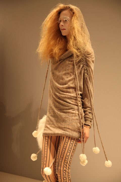
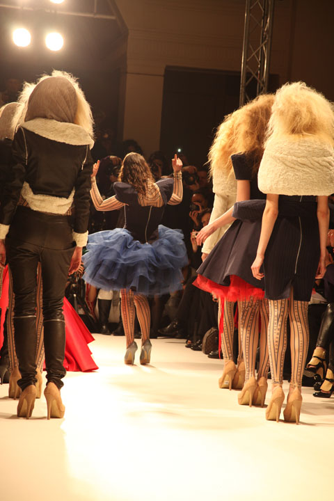
Well the third of Fashion Mode’s designers this Sunday was simply put: stunningly pretty and explosive. Frosted make up, and backcombed and massive hair, more about beige skyscraper heels and icy pouts – all complimented utterly beautiful pieces from the designer. Carlotta Actis Barone drew gasps and ‘ooohs’ as her models sashayed down the catwalk. These girls were ice princesses. With enormous hoods, view fluffy shrugs, pom poms, exposed zips, extravagant fishtail dresses, flamboyant netting and super sleek, pencil skirts; they all had a heavenly, intense, snowy fairytale vibe.
Gemma Milly-Carlotta Actis Barone-Fashion Mode-A-W11

LFW A/W 2011 Carlotta Actis Barone Collection. Illustration by Gemma Milly

Reading about the designer, her artistic training has been life -long. Carlotta Actis Barone is the daughter of Italian visual artist Manuela Corti and writer Gianni Actis Barone. Although she discovered her true passion for fashion at the age of 24. During her study at Central St. Martin’s College of Art and Design for a BA in Fashion Print, she went on a gap year, working with Korean designer Moon Young Hee, B.C.B.G Max Azria Manoukian and Balmain.. Explaining the bold colour use in her collection, we discover that Carlotta’s pieces are based around strong, feminine women. She often also has a political edge to her designs, and is extremely passionate about the ethical issues surrounding fashion. These ethical opinions are often reflected in her designs, this season being no exception. The Autumn/Winter 2011 collection focuses on cruelty against animals, with particular focus on fur, and seals. We all know fur is wrong, our animals should be celebrated, not worn. We at Amelia’s feel very fiercely about this. See Amelia’s own ethical fashion book, here.
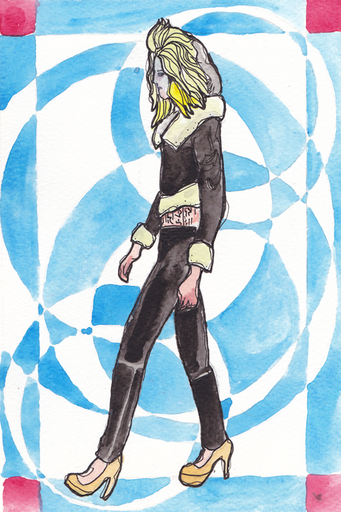
Gareth A Hopkins Carlotta Fashion Mode AW11

LFW A/W 2011 Carlotta Actis Barone Collection. Illustration by Gareth A Hopkins

Hence for Carlotta, the frosted lipped models, beige faux fur and red, white and navy blue palette. The seals being the beige faux fur, the blue the cold sea, and the white symbolic of the snow and ice. Red is obviously the horrendous slaughter of the seals, shown in the underskirts and showpieces.
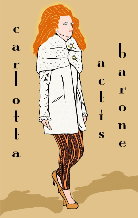
Carlotta Actis Barone

LFW A/W 2011 Carlotta Actis Barone Collection. Illustration by Matilde Sazio

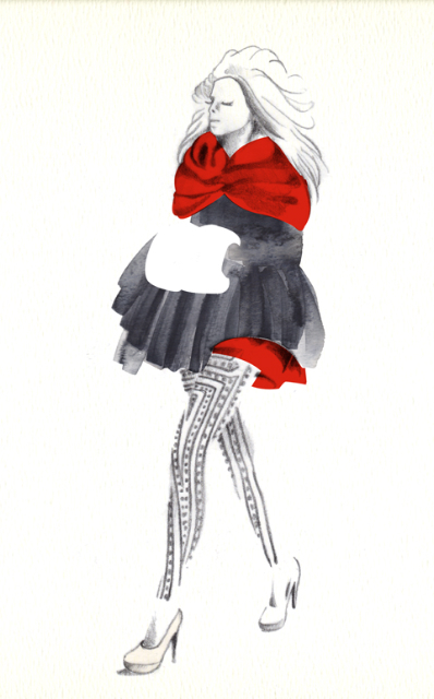
The enormous, white eyelashes, iced lips and enormous hair, paired with fitted 50s influenced dresses, short knitted, luxurious, hooded pieces… faux fur shrugs, hand muffs, sleeves and collar details… were so strong and and almost, beautifully angry. Carlotta also referenced Inuit people in her designs, each of the skirted models wore transparent leggings and geometric patterns ran through the collection, similar to their attire. The whole collection represents how I’m sure many girls would love to look in the winter time. It’s so feminine, heavenly and bold. A mixture of prom dresses, Narnia and Victorian fashion – a fantasy, a drama – and of course in terms of the seals; a harsh reality.
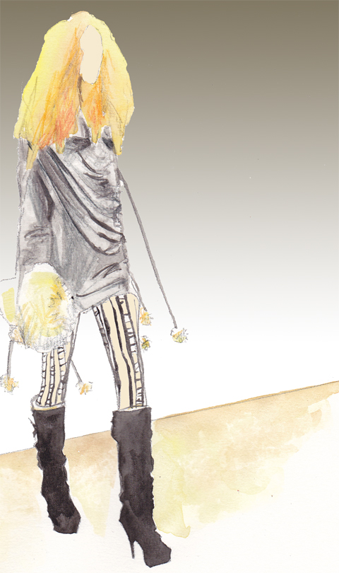
LFW Kayleigh Bluck

LFW A/W 2011 Carlotta Actis Barone Collection. Illustration by Kayleigh Bluck

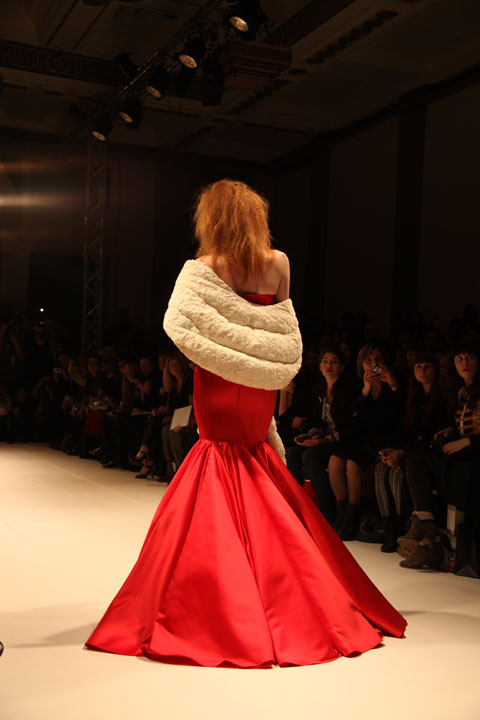
I adored the pronounced peplum dress, the fitted black coat, with full skirt from the waist. The blue, white and red mixed beautifully, if slightly shocking. Which of course, is part of the message Carlotta is making with her show. Without doubt the finale piece, a red fishtail, strapless dress, with a faux fur beige, large shrug, was just INCREDIBLE. I was in love with that dress. I still am in love with that dress. It was the perfect ending to a show that inspired, amazed and informed. This fabulous collection, left me in awe.

Carlotta Actis Barone LFW A/W Amelia GregoryCarlotta Actis Barone LFW A/W Amelia GregoryCarlotta Actis Barone LFW A/W Amelia GregoryCarlotta Actis Barone LFW A/W Amelia GregoryCarlotta Actis Barone LFW A/W Amelia GregoryCarlotta Actis Barone LFW A/W Amelia GregoryCarlotta Actis Barone LFW A/W Amelia GregoryCarlotta Actis Barone LFW A/W Amelia GregoryCarlotta Actis Barone LFW A/W Amelia GregoryCarlotta Actis Barone LFW A/W Amelia Gregory

LFW A/W 2011 Carlotta Actis Barone Collection. Photography by Amelia Gregory

Buy Amelia’s Book on Ethical Fashion: here. You will also find illustrations by Abby Wright, Gemma Milly and Gareth A. Hopkins in the book.

Categories ,Abby Wright, ,Amelia Gregory, ,Carlotta Actis Barone, ,Fashion Scout, ,Gareth A Hopkins, ,Gemma Milly, ,Helen Martin, ,Kayleigh Bluck, ,lfw, ,LFW A/W, ,Matilde Sazio

Similar Posts:


Amelia’s Magazine | Latitude 2010: Chelsea College of Art and Design Catwalk Review

Latitude 2010-Ellen Chatelain by Amelia Gregory
Bethan Smith Latitude Festival by Krister Selin
Bethan Smith by Krister Selin.

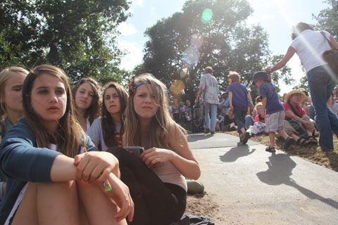
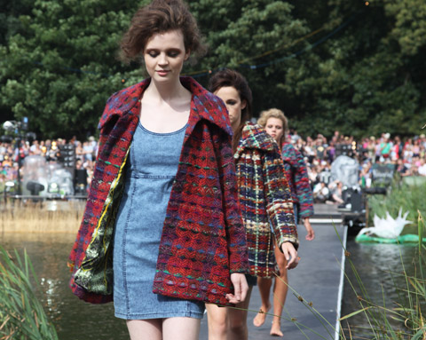
On Friday afternoon I nestled in rushes amongst the clacking grasshoppers and giggling tweenies to watch the Latitude graduate fashion shows, order played out along a catwalk linked to the Waterfront Stage. A selection of new faces from Elite Models formed a somewhat confusing parade between two stop offs on either side of the lake, more about not helped by a complete lack of clarity in announcements of each designer – What follows is the best of what I managed to catch, so if I’ve got any wrong please or not labelled your designs at all do let me know. It was near on impossible to find out who was who. Ahem, lack of individual designer websites ahoy!
Luckily I have now found out all the right names, but really girls, you gotta get yourselves a much better presence on the web… it’s a mantra I seem to find myself repeating quite a lot.

Latitude 2010-kids Amelia gregory
Latitude 2010-happy teen by Amelia Gregory
Photography by Amelia Gregory.

First up came the students from Chelsea College of Art and Design:

Latitude 2010-Ellen Chatelain by Amelia Gregory
Ellen Chatelain didn’t disappoint with her patchwork knitwear.

Abby-Wright-Latitude-Fashion Ellen Chatelain
Ellen Chatelain by Abby Wright.

Latitude 2010-Sorcha Herbert by Amelia Gregory
More colourful weave, from Sorcha Herbert.

Latitude 2010 fashion by Amelia Gregory
Gorgeous printed textiles by Charmaine Dresser worked perfectly shooting into the sun.

Latitude 2010 fashion by Amelia Gregory
Spectacular lasercut tailoring by Francesca Prudente.

Latitude fashion Michelle Urvall Nyrén
Ruched swimwear in mustard and greens from Alice Powell. Illustration by Michelle Urvall Nyrén.

Latitude 2010 fashion by Amelia Gregory
More patchworked style courtesy of Cat Finch.

Latitude 2010 fashion by Amelia Gregory
Felicity McDonald-Bing does subtle tones of caramel and slate.

Latitude 2010-fashion by Amelia Gregory
Padded and stitched capes combined with strange animal and psychedelic prints by Sophie Parker.

Bethan Smith Latitude Festival by Krister Selin
Bethan Smith by Krister Selin.
Sadly the wonderful creations of Bethan Smith never crossed the lake – I guess the models were worried they might fall in. Fair play.

Latitude 2010-fashion by Amelia Gregory
Triangle wooden panels by Lauren T-Franks.

Latitude 2010-Helen Lawrence
More monochrome geometrics and slate shades from Helen Lawrence.

Latitude 2010-Shawana Grosvenor by Amelia Gregory
For Shawana Grosvenor creamy circular layers rule.

Alexis-West-Latitude-Graduate-Fashion-Matthew Inett
Matthew Inett by Alexis West.

Latitude 2010-Matthew Inett by Amelia Gregory
Latitude 2010-Matthew Inett by Amelia gregory
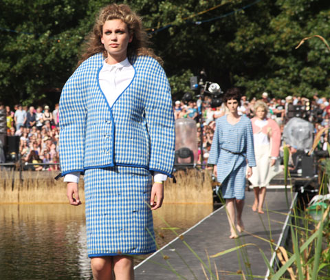
Tagged onto the end of the first half Matthew Inett reprised his 2008 London College of Fashion catwalk show, which featured almighty curved shoulders and exaggerated hips in pastel checks.

Natasha-Thompson-Matthew-Inett-Fashion-Latitude-2010
Matthew Inett by Natasha Thompson.

Next up, my review of the Central Saint Martins show.

Categories ,Abby Wright, ,Alexis West, ,Alice Powell, ,Bethan Smith, ,Cat Finch, ,Central Saint Martins, ,Charmaine Dresser, ,Chelsea College of Art and Design, ,Elite Models, ,Felicity McDonald-Bing, ,Francesca Prudente, ,Graduate Fashion Show, ,Helen Lawrence, ,Krister Selin, ,Latitude Festival, ,Lauren T-Franks, ,London College of Fashion, ,Matthew Inett, ,Michelle Urvall Nyrén, ,Natasha Thompson, ,Shawana Grosvenor, ,Sophie Parker, ,Sorcha Herbert, ,Tweenies, ,Waterfront Stage

Similar Posts:


Amelia’s Magazine | Latitude 2010: Chelsea College of Art and Design Catwalk Review

Bethan Smith Latitude Festival by Krister Selin
Bethan Smith by Krister Selin.

On Friday afternoon I nestled in rushes amongst the clacking grasshoppers and giggling tweenies to watch the Latitude graduate fashion shows, played out along a catwalk linked to the Waterfront Stage. A selection of new faces from Elite Models formed a somewhat confusing parade between two stop offs on either side of the lake, not helped by a complete lack of clarity in announcements of each designer – What follows is the best of what I managed to catch, so if I’ve got any wrong please or not labelled your designs at all do let me know. It was near on impossible to find out who was who. Ahem, lack of individual designer websites ahoy!
Luckily I have now found out all the right names, but really girls, you gotta get yourselves a much better presence on the web… it’s a mantra I seem to find myself repeating quite a lot.

Latitude 2010-kids Amelia gregory
Latitude 2010-happy teen by Amelia Gregory
Photography by Amelia Gregory.

First up came the students from Chelsea College of Art and Design:

Latitude 2010-Ellen Chatelain by Amelia Gregory
Ellen Chatelain didn’t disappoint with her patchwork knitwear.

Abby-Wright-Latitude-Fashion Ellen Chatelain
Ellen Chatelain by Abby Wright.

Latitude 2010-Sorcha Herbert by Amelia Gregory
More colourful weave, from Sorcha Herbert.

Latitude 2010 fashion by Amelia Gregory
Gorgeous printed textiles by Charmaine Dresser worked perfectly shooting into the sun.

Latitude 2010 fashion by Amelia Gregory
Spectacular lasercut tailoring by Francesca Prudente.

Latitude fashion Michelle Urvall Nyrén
Ruched swimwear in mustard and greens from Alice Powell. Illustration by Michelle Urvall Nyrén.

Latitude 2010 fashion by Amelia Gregory
More patchworked style courtesy of Cat Finch.

Latitude 2010 fashion by Amelia Gregory
Felicity McDonald-Bing does subtle tones of caramel and slate.

Latitude 2010-fashion by Amelia Gregory
Padded and stitched capes combined with strange animal and psychedelic prints by Sophie Parker.

Bethan Smith Latitude Festival by Krister Selin
Bethan Smith by Krister Selin.
Sadly the wonderful creations of Bethan Smith never crossed the lake – I guess the models were worried they might fall in. Fair play.

Latitude 2010-fashion by Amelia Gregory
Triangle wooden panels by Lauren T-Franks.

Latitude 2010-Helen Lawrence
More monochrome geometrics and slate shades from Helen Lawrence.

Latitude 2010-Shawana Grosvenor by Amelia Gregory
For Shawana Grosvenor creamy circular layers rule.

Alexis-West-Latitude-Graduate-Fashion-Matthew Inett
Matthew Inett by Alexis West.

Latitude 2010-Matthew Inett by Amelia Gregory
Latitude 2010-Matthew Inett by Amelia gregory
Tagged onto the end of the first half Matthew Inett reprised his 2008 London College of Fashion catwalk show, which featured almighty curved shoulders and exaggerated hips in pastel checks.

Natasha-Thompson-Matthew-Inett-Fashion-Latitude-2010
Matthew Inett by Natasha Thompson.

Next up, my review of the Central Saint Martins show.


Categories ,Abby Wright, ,Alexis West, ,Alice Powell, ,Bethan Smith, ,Cat Finch, ,Central Saint Martins, ,Charmaine Dresser, ,Chelsea College of Art and Design, ,Elite Models, ,Felicity McDonald-Bing, ,Francesca Prudente, ,Graduate Fashion Show, ,Helen Lawrence, ,Krister Selin, ,Latitude Festival, ,Lauren T-Franks, ,London College of Fashion, ,Matthew Inett, ,Michelle Urvall Nyrén, ,Natasha Thompson, ,Shawana Grosvenor, ,Sophie Parker, ,Sorcha Herbert, ,Tweenies, ,Waterfront Stage

Similar Posts:

Bookmark this:
  • Facebook
  • Twitter
  • MySpace
  • del.icio.us
  • StumbleUpon
  • Digg
  • E-mail this story to a friend!
  • Technorati
  • LinkedIn

Amelia’s Magazine | Fashion Talk: Justine Picardie on Coco Chanel at the Victoria and Albert Museum

Illustration by Lesley Barnes

Coco Chanel, sales the name synonymous with Paris fashion, abortion that has been so carefully cultivated by Karl Largerfield. He feels at times, as if a gentle caretaker as well as being an innovative Fashion Designer who is constantly reinventing the Chanel Staples. With each new season Largerfield alters the tweeds, the stars, the monochrome, the pearls or whilst still upholding the simplistic beauty, which Chanel originally conjured. Chanel is coveted, and her sense of style has embedded itself amongst the designs of the high street, during the talk I found myself playing spot the influence, from the cropped bobs to the presence of stripes on pratically every other member of the audience who found themselves at the V&A that blustery Friday night.

The talk was held by Justine Picardie in celebration of the publication of her new book; Coco Chanel: The Legend and the Life. Picardie is a journalist for the Telegraph, an author who writes fiction and non fiction and who has spent the last 13 years researching the life of Coco Chanel. This was an opportunity to discover the person behind the label, that was too good too miss.

Illustration by Joana Faria

A talented speaker, Justine enraptured the audience with tales of Chanel’s rise from rags to riches polevaulting through French Society’s regimented conventions. Chanel made ignoring social conventions a habit of a lifetime, luckily, not only for Haute Couture but for women everywhere who wanted to wear trousers.

Not for Chanel the corsets of early 1900′s France – no, the most striking photographs of Chanel shown at the talk, documented her investment in a shocking departure from the norm, single handily promoting trousers and the eponymous Breton stripe. Importantly (I am speaking here as someone who despises how reliant high heels make me on those I am travelling with) Chanel was an avid wearer of the flat shoe – not for her the gravity defying, walk preventing spindly heels that are oh so popular not only on the catwalk but that shop nestling within the heart of Oxford Street; Topshop.

Illustration by Kelly Angood

“Fashion is very dark, what we wear is what we cover up” Coco Chanel

Justine Picardie covered the usual ground of Chanel’s relationship with men, starting with Boy Capel and touching upon her life spent fishing in Scotland with the Duke of Westminister. Through whom Coco met Winston Churchill in the early 1920′s. The discovery of a picture of the two together lead Picard to explore Chanel’s reported relationship with a German Soldier -via the Winston Churchill archives- which may not have been the action of a French sympathiser, as what was reported; but a (slightly naive…) plan -devised perhaps by Coco and regaled to Winston Churchill – to bring the war to an early end. This may seem rather glib, but to find out more and the outcome of Picardie trip to the archives? Sadly the author left this announcement within the pages of her book.

Illustration by Maria del Carmen Smith – An aside, notice how Chanel sits on the horse in jodphurs, rather than side saddle, a fairly political statement at a time when most women were bound in corsets.

It was the perfect talk – full of teasers about the book’s contents alongside interesting insights into the development of the identity of Coco Chanel – from the influence of the monastery where she grew up where the star mosaics would later inspire her future designs. To her meeting Boy Capel and Duke of Westminister (with whom she travelled to Scotland and discovered the Scottish Mills who produced the now famous Chanel Tweed).

Chanel was funded by Boy Capell, the man seated on the horse in the above illustration, however, as the Fashion House began to produce revenue, Chanel paid back every penny. From the start Coco was to be an independent women – an undeniably lucky, for her connections with Boy helped her attract clients, but a financially independent one nevertheless.

Illustration by Abby Wright

Picardie touched upon the importance of certain numbers to Chanel including the infamous number 5, to the constant use and development of the star motif. In a picture of Chanel’s apartment, Picardie touched upon the presence of tarot cards and the importance of magical thinking alongside Chanel’s training as a seamstress in the creation of the House’s style. Justine attributes this ‘magical thinking’ to her time spent as a child growing up in an ancient monastery, suggesting that the epoynmous Chanel star was inspired by the star mosaics made by the Medieval Monks who originally inhabited the monastery. For more detail, I’m afraid you are going to have to read the book!

Illustration by Antonia Parker

During the talk (which occur weekly on a Friday evening) Justine Picardie described fashion as “a series of Hauntings” and finished the talk with a wish for a book on the continuation of Chanel by Karl Largerfield, to conclude that such a book could only be written once Largerfield had left Chanel and quite possibly this planet…

Coco Chanel, The Legend and the Life by Justine Picardie is certainly on my christmas list!

Categories ,Abby Wright, ,Antonia Parker, ,Boy Capbel, ,Chanel 3.55, ,Coco Chanel, ,Duke of Westminister, ,Haute Couture, ,Joana Faria, ,Justine Picard, ,Kelly Angood, ,Lesley Barnes, ,Maria del Carmen Smith, ,Number 5, ,paris, ,stars, ,The Life and The Legend of Coco Chanel, ,Tweed, ,va

Similar Posts:


Amelia’s Magazine | Fashion Talk: Justine Picardie on Coco Chanel at the Victoria and Albert Museum

Illustration by Lesley Barnes

Coco Chanel, sales the name synonymous with Paris fashion, abortion that has been so carefully cultivated by Karl Largerfield. He feels at times, as if a gentle caretaker as well as being an innovative Fashion Designer who is constantly reinventing the Chanel Staples. With each new season Largerfield alters the tweeds, the stars, the monochrome, the pearls or whilst still upholding the simplistic beauty, which Chanel originally conjured. Chanel is coveted, and her sense of style has embedded itself amongst the designs of the high street, during the talk I found myself playing spot the influence, from the cropped bobs to the presence of stripes on pratically every other member of the audience who found themselves at the V&A that blustery Friday night.

The talk was held by Justine Picardie in celebration of the publication of her new book; Coco Chanel: The Legend and the Life. Picardie is a journalist for the Telegraph, an author who writes fiction and non fiction and who has spent the last 13 years researching the life of Coco Chanel. This was an opportunity to discover the person behind the label, that was too good too miss.

Illustration by Joana Faria

A talented speaker, Justine enraptured the audience with tales of Chanel’s rise from rags to riches polevaulting through French Society’s regimented conventions. Chanel made ignoring social conventions a habit of a lifetime, luckily, not only for Haute Couture but for women everywhere who wanted to wear trousers.

Not for Chanel the corsets of early 1900′s France – no, the most striking photographs of Chanel shown at the talk, documented her investment in a shocking departure from the norm, single handily promoting trousers and the eponymous Breton stripe. Importantly (I am speaking here as someone who despises how reliant high heels make me on those I am travelling with) Chanel was an avid wearer of the flat shoe – not for her the gravity defying, walk preventing spindly heels that are oh so popular not only on the catwalk but that shop nestling within the heart of Oxford Street; Topshop.

Illustration by Kelly Angood

“Fashion is very dark, what we wear is what we cover up” Coco Chanel

Justine Picardie covered the usual ground of Chanel’s relationship with men, starting with Boy Capel and touching upon her life spent fishing in Scotland with the Duke of Westminister. Through whom Coco met Winston Churchill in the early 1920′s. The discovery of a picture of the two together lead Picard to explore Chanel’s reported relationship with a German Soldier -via the Winston Churchill archives- which may not have been the action of a French sympathiser, as what was reported; but a (slightly naive…) plan -devised perhaps by Coco and regaled to Winston Churchill – to bring the war to an early end. This may seem rather glib, but to find out more and the outcome of Picardie trip to the archives? Sadly the author left this announcement within the pages of her book.

Illustration by Maria del Carmen Smith – An aside, notice how Chanel sits on the horse in jodphurs, rather than side saddle, a fairly political statement at a time when most women were bound in corsets.

It was the perfect talk – full of teasers about the book’s contents alongside interesting insights into the development of the identity of Coco Chanel – from the influence of the monastery where she grew up where the star mosaics would later inspire her future designs. To her meeting Boy Capel and Duke of Westminister (with whom she travelled to Scotland and discovered the Scottish Mills who produced the now famous Chanel Tweed).

Chanel was funded by Boy Capell, the man seated on the horse in the above illustration, however, as the Fashion House began to produce revenue, Chanel paid back every penny. From the start Coco was to be an independent women – an undeniably lucky, for her connections with Boy helped her attract clients, but a financially independent one nevertheless.

Illustration by Abby Wright

Picardie touched upon the importance of certain numbers to Chanel including the infamous number 5, to the constant use and development of the star motif. In a picture of Chanel’s apartment, Picardie touched upon the presence of tarot cards and the importance of magical thinking alongside Chanel’s training as a seamstress in the creation of the House’s style. Justine attributes this ‘magical thinking’ to her time spent as a child growing up in an ancient monastery, suggesting that the epoynmous Chanel star was inspired by the star mosaics made by the Medieval Monks who originally inhabited the monastery. For more detail, I’m afraid you are going to have to read the book!

Illustration by Antonia Parker

During the talk (which occur weekly on a Friday evening) Justine Picardie described fashion as “a series of Hauntings” and finished the talk with a wish for a book on the continuation of Chanel by Karl Largerfield, to conclude that such a book could only be written once Largerfield had left Chanel and quite possibly this planet…

Coco Chanel, The Legend and the Life by Justine Picardie is certainly on my christmas list!

Categories ,Abby Wright, ,Antonia Parker, ,Boy Capbel, ,Chanel 3.55, ,Coco Chanel, ,Duke of Westminister, ,Haute Couture, ,Joana Faria, ,Justine Picard, ,Kelly Angood, ,Lesley Barnes, ,Maria del Carmen Smith, ,Number 5, ,paris, ,stars, ,The Life and The Legend of Coco Chanel, ,Tweed, ,va

Similar Posts:


Amelia’s Magazine | Fifi Bijoux: an interview with luxury ethical jewellery designer Vivien Johnston

Abby Wright Fifi Bijoux rutile quartz
Rutile quartz jewellery by Fifi Bijoux. Illustrated by Abby Wright.

I first encountered Fifi Bijoux at London Fashion Week a few years ago, look symptoms and we subsequently interviewed her for the print version of Amelia’s Magazine. Since then she’s achieved an amazing amount in ethical jewellery production…

You were one of the first jewellery designers to take an ethical stance on manufacturing of high end jewellery in the UK. What have you achieved?
I set up the British Ethical Jewellery Association to create a set of auditable ethical standards for the industry. This has since been superseded by the ethics working committee of the National Association of Goldsmiths which has adopted the same aims, approved medications helping to enable relationships between jewellers and small-scale mining projects. NAG has nearly a thousand members, pills so it is the perfect platform to achieve our aim of supporting jewellers in the UK to lead the way in adopting ethical sourcing as a core business value. In the UK there is a real will to embrace better ethical practices and a fairtraded logo for jewellery will be agreed on shortly.

Have you seen much change in the industry since you started Fifi Bijoux?
The most remarkable change has come from gem and diamond-producing countries such as Tanzania, Madagascar and Namibia, who are now cutting and polishing the gems before export. This represents a huge shift in technical skills and economics since a large percentage of a gem’s value is added at this stage. The lapidary art of stone cutting requires a high degree of technical and scientific expertise in order to create the sophisticated facets expected by western customers, and this can be provided by modern lasers. Gravity mining provides a relatively low impact solution for gold extraction. It is really important that producers in developing countries are able to access markets and this is where organisations such as the Fairtrade Foundation and membership bodies like NAG can create quantum shifts; an individual jeweller may struggle with the process of sourcing gold, exporting it from a developing country, refining it and processing it into a usable material to create jewellery. However, by acting collectively with support resources in place, this becomes considerably less daunting.

Read the rest of this interview with Fifi Bijoux in Amelia’s Compendium of Fashion Illustration, alongside interviews with 44 other ethical fashion designers and 30 fabulous fashion illustrators. You can buy the book here.

Categories ,Abby Wright, ,ACOFI, ,Amelia’s Compendium of Fashion Illustration, ,British Ethical Jewellery Association, ,Eco fashion, ,Ethical Fashion, ,Fairtrade Foundation, ,Fifi Bijoux, ,Gold, ,Gold Mining, ,Gravity Mining, ,jewellery, ,Madagascar, ,NAG, ,Namibia, ,National Association of Goldsmiths, ,Rutile quartz, ,Tanzania, ,Vivien Johnston

Similar Posts: