Amelia’s Magazine | Josh & Nicol: London Fashion Week A/W 2013 Catwalk Review

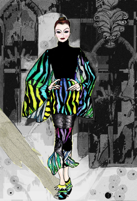
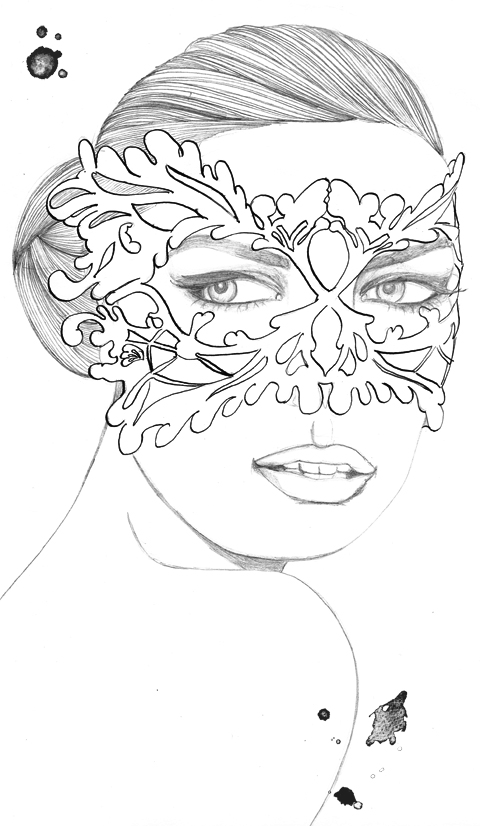
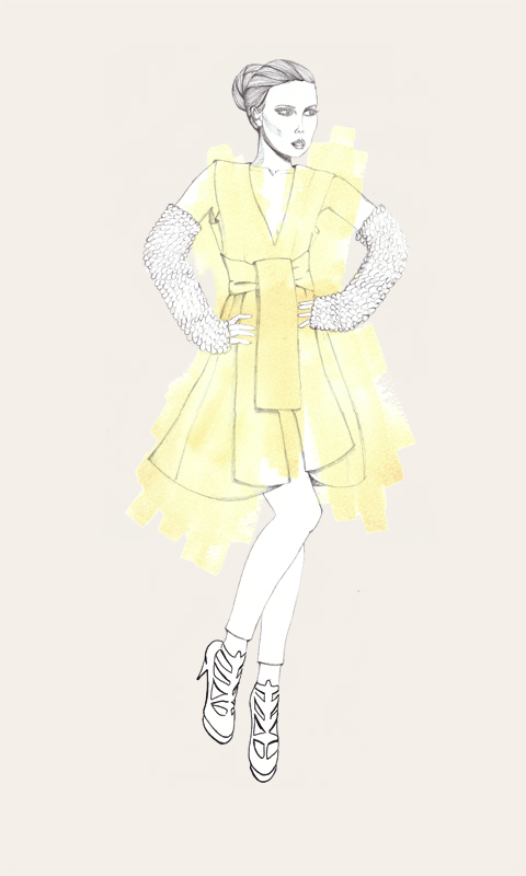
Josh & Nicol LFW A/W 2013 by Sam Parr
Josh & Nicol, LFW A/W 2013 by Sam Parr

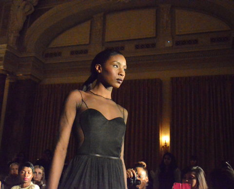
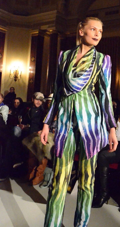
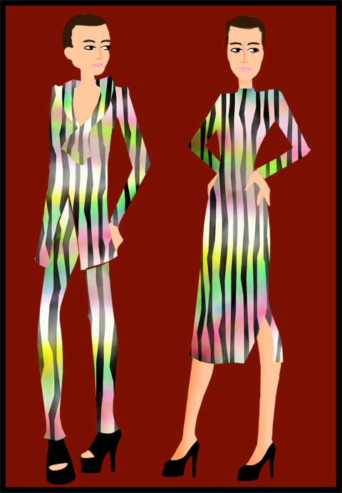
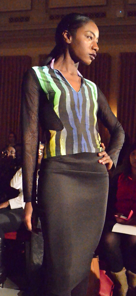
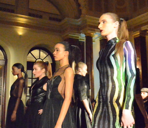
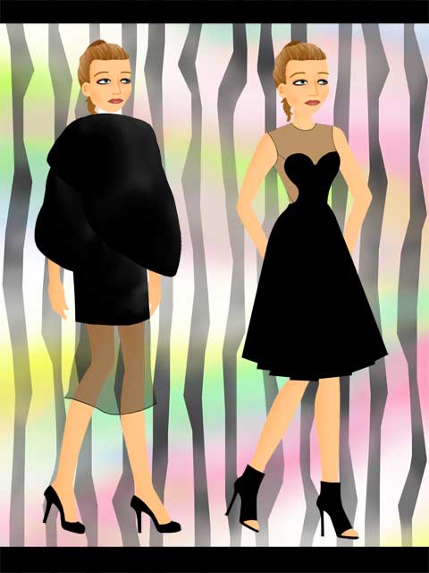
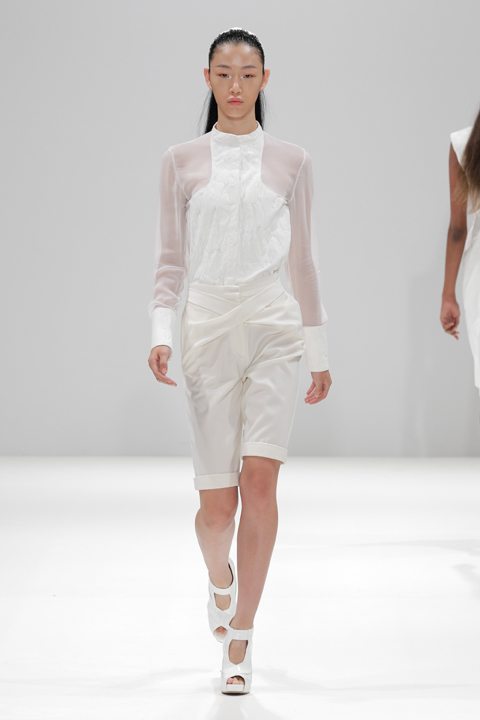
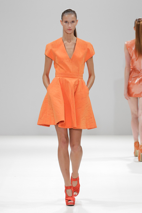
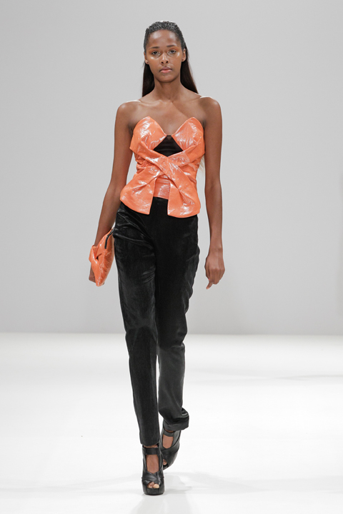
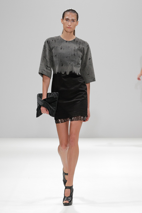
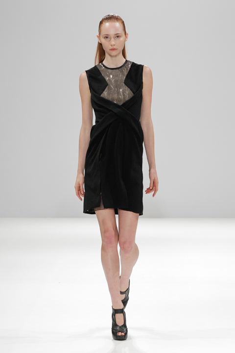
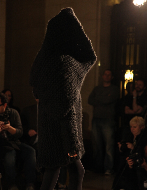
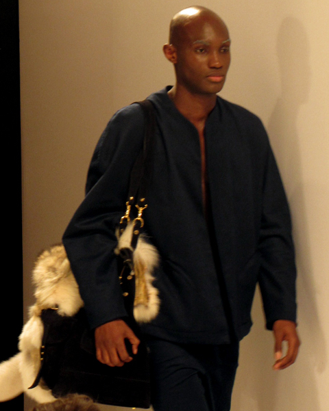
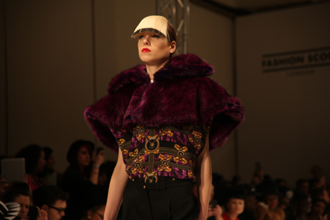
Somewhere over the rainbow, namely at Charing Cross Hotel, Josh & Nicol presented their LFW A/W 2013 collection. The Promise of the Rainbow is a colourful collection with inspirations including birds of paradise and the Wizard of Oz. A distinctive rainbow-style fabric dominated the collection and in my mind, the pieces are split into two camps: black, elegant, gothic garments contrasting against bright, green-palette, rainbow prints with a tribal feel. The black pieces sport conspicuous zips with sections of floaty, translucent fabric. In some of the garments these two different threads meet and the fresh, colourful print is mixed with the sexier black, tying the pieces together.

Josh & Nicol LFW AW 2013

Josh & Nicol LFW AW 2013

Josh & Nicol LFW AW 2013

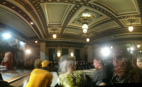
Held in the Betjeman Suite of the Charing Cross Hotel, the venue was, although a day too late, Valentine’s Day appropriate, with candles leading the way through the corridor and up the stairs. Named after a former Poet Laureate the room came complete with chandeliers, marble pillars and a sculpted ceiling, which provided a stark contrast to the goth-rock feel of the black garments and the flamboyant prints of the rainbow inspired togs that made up this collection.

Josh & Nicol LFW AW 2013 by Louise Smith
Josh & Nicol, LFW A/W 2013 by Louise Smith

Josh & Nicol is a luxury fashion brand established in 2010, Ufuoma Ekpecham is the brands’ Creative Director and believes that “there is nothing more beautiful and sophisticated than a woman that dresses to suit her body shape.” The designer went on to start the label after winning the Planet Africa Red Carpet Dress Challenge in Toronto.

Josh & Nicol LFW AW 2013

Josh & Nicol LFW AW 2013

There is free champagne, orange juice and wine, which is handed to me in my front row seat. After a day of queues and bobbing heads blocking my view, this is a welcome change. The show starts late, and the atmosphere is relaxed and friendly. I chat to a friend of the designer who has made her way all the way from Brussels to attend, and will leave the next day. This show feels much more personal to me, close-knit friends and family seems to make up the audience, as well as journalists.

Josh & Nicol LFW AW 2013

Josh & Nicol LFW AW 2013

There are references to Baum‘s The Wonderful Wizard of Oz in the program and although initially I couldn’t see any sign of Dorothy, the yellow brick road, or red glittery pumps, I speculate that the collection has drawn inspiration from other elements of the story. The green print is perhaps a nod to the Emerald City and the green-tinted glasses that the characters must wear to enter. If I remember correctly, in the original novel, the Wizard and Dorothy fashion a balloon from green silk, which perhaps could be something the designer has taken inspiration from for the colourful print design. Or maybe, the film version with Judy Garland‘s rendition of Over the Rainbow was part of the inspiration to inject colour and life into the fabrics Either way, this collection whisked me away from the bustling streets of London, like the cyclone whisked away Dorothy. Sadly though, reciting, “there’s no place like home,” didn’t work for me, and after this show finished, I had an hour and a half train journey to get back to Bath, my first day of London Fashion Week over with a colourful and stylish bang.

Josh & Nicol LFW AW 2013 by Louise Smith
Josh & Nicol, LFW A/W 2013 by Louise Smith

All photography by Jessica Cook

Categories ,A/W 2013, ,Betjeman Suite, ,bright prints, ,Catwalk review, ,Charing Cross, ,gothic, ,Jessica Cook, ,Josh & Nicol, ,lfw, ,London Fashion Week, ,Louise Smith, ,Sam Parr, ,Tribal, ,Ufuoma Ekpecham

Similar Posts:


Amelia’s Magazine | David Longshaw, Father Said: New S/S 2012 Season Preview Interview

David Longshaw S/S 2012 by Abi Hall
David Longshaw S/S 2012 by Abi Hall.

We’ve been following David Longshaw‘s career since we spotted him at Fashion Scout back in 2010. His work continues to evolve in intriguing directions, utilising his illustration and animations skills more than ever before…

We last spoke to you in 2010, what have been the biggest changes since then?
I’m now selling in Harrods as well as more shops in a variety of countries.

David Longshaw SS 2012
What was the inspiration behind Father Said, your S/S 2012 collection, and where does the accompanying story come from? (it’s quite dark!)
I created the story a few years ago for TANK magazine – but never used it for a collection. This season felt like the perfect time to use it and develop the characters. The story is a bit dark – but I think it can be fun to have a dark inspiration from time to time for something as frivolous and light as fashion – I like the contradiction. Here’s the story:

Father said it would have been… by David Longshaw
Father said it would be nice to go to the seaside. I’m not sure mother would have agreed; here I go getting all Alan Bennett. It wasn’t Alan Bennett like at all. That’s why I brought you here, a little nostalgic trip for me, unchartered territory for you. I was driving of course. Well you’d come to see me hadn’t you?
I didn’t expect it to happen. You know I didn’t. I hadn’t planned it. I mean I was all tired out from the drive. It was just these memories coming back that did it. I hadn’t told you about them had I?
“We could go round the castle you said,” but then we spied the purveyor of local delicacies and were ensnared by the intoxicating aroma.
Well, it would have been rude not to.

David Longshaw S/S 2012 by Mitika Chohan
David Longshaw S/S 2012 by Mitika Chohan.

Monies were exchanged and we floated out on the emerald green sea of tiles, shimmering from the hedgehog that had just mopped them. It was you who pointed out she was a hedgehog- all little and bristly and nose twitching as she mopped that chip shop floor; scared by the preying silver fox in the corner (Trevor they called him from over the counter) with his suave, debonair mask- under which lurked a wild, preying animal ready for its next victim. At least that’s how he looked, sitting, pouting but that gentle trickle of saliva and the abstract motif that speckled his jacket- formed from chips and gravy, suggested otherwise.
We did laugh about that, chuckling, as you do, walking towards the sea. You spotted that sign, “Boat Trip to Puffin Island.” £4.50 each, but it was worth it. We saw seals, and jellyfish and went up really close to the island and there were so many little birds. I’m not sure if there were any puffins though, you said you’d seen one but that was you all over.
I’m sorry the rest of the day didn’t pan out quite as well for you. It’s just these memories coming back. Now I think of it, I was reading a book at the time with a puffin mentioned in it, so perhaps that’s what it was.
I’m awfully sorry all the same. Anyway not much I can do now other than tidy things up I suppose. Well there you go. You’re wrapped up now. It was handy I had that spade in the boot wasn’t it. I’ll just cover you up- the soil will keep you warm.”

David Longshaw SS 2012

How did you put together the animation for Father Said and why did you decide to put the story together in animated form?
I’ve always been fascinated by animation – I love creating characters and the idea of bringing them to life for people to watch in a little version of my world. It’s a massively time consuming medium – even for something as crudely done as mine, but that’s part of its beauty. I thought it was a natural next step for me to explore animation as I create a story and illustrate it each season. It’s a fun tool to explain my collection and to build interest in my label, and it’s a point of differentiation. There are so many fashion labels out there and the big fashion houses have huge adverting budgets to promote their collections – so by doing something creative it helps showcase my ideas and the plan is that people will hopefully enjoy what I do and want to keep seeing more.

David Longshaw SS12 by Janneke de Jong
David Longshaw S/S 2012 by Janneke de Jong.

Putting it together was tricky as I’d never done it before and I thought it would be fun to do it all myself from a series of my illustrations (apart from the voice over which I got Jessica Bumpus to do). I did it using a very old mac – which seemed a good idea at the time until it became apparent that it was so old it wasn’t compatible with any others, or with upload programs to put it on Vimeo… which was unfortunate. But after a lot of pfaffing around I finally managed to get it on there and now it’s linked to my website as well. In the short term I’m planning to work on more short animations to develop with my collections. At some point in the future I would like to work on a more ambitious project with a much larger animation – perhaps even a stop motion model animation But I’d need a larger budget and a lot more time.

David Longshaw SS 2012
Why are narratives important?
Narratives help create the theme and tone of the collection – they inform everything from print and silhouette to the colour of the fabrics.

David Longshaw SS 2012
What was the inspiration behind the extravagant silhouettes in the S/S 2012 collection?
The idea was from the point in the story where Sophie accidentally kills her boyfriend, buries him, planting flowers over his burial place. The flowers grow and flow in to the dress she’s wearing. For the rest of her life she wears a flower to remind her of him. I wanted to convey the sense of the flowers growing and taking over what the wearer has on.

David Longshaw SS12 by Janneke de Jong
David Longshaw S/S 2012 by Janneke de Jong.

How did your time at Max Mara equip you for working as an independent designer, and do you have any tips for those just starting out?
My time at both Max Mara and Alberta Ferretti was really useful for starting my own label – aesthetically my style (and indeed the style of the other labels) are very different, but in a way that works out better than if I was just doing a smaller version of either label. Day to day there are things I put in to practice that I learnt there. When you work for big fashion houses you get to see how very successful businesses and design houses work and what’s helped them to get there. But there’s always things you think you would do differently as well.

David Longshaw SS 2012
For people just starting out it’s good to get as much experience in the industry as possible, whether it’s from work experience, or actually designing for a label – if you want to start your own label straight away then try to get as much business advice as you can. Design schools teach how to pull a collection together but you have to know how to be a business person – if you don’t then you won’t have the money or the structure to be able to continue. It’s also really important to think what you want your label to be like – what’s your point of difference and what do you think you can do better than is already out there. It’s good to be aware of all the pitfalls with running your own label: financial, emotional, time constraints, constantly questioning yourself, knowing all the things that can go wrong, all the reasons not to do your own label… Then just go for it anyway!

David Longshaw S/S 2012 by Maria Papadimitriou aka Slowly The Eggs
David Longshaw S/S 2012 by Maria Papadimitriou aka Slowly The Eggs.

You are not just a fashion designer but also an accomplished illustrator, how do the two fit together?
They go well together – I use my illustrations in the prints of my collection. Both my design and illustration work inspire each other. When I illustrate for a mag it’s a fun way for people to see my work and see which other designers I like (as I get to select who I interview or illustrate) and it gives people another window in to my thinking. Then when I’m designing I think back to my illustration work and why I selected certain designers/pieces. I’m not trying to be like another designer but it makes me reflect on why I would choose one designer’s work over another.

David Longshaw SS 2012
How do your partnerships with footwear designer Heather Blake and milliner Katherine Lee work? What is the process of working together on a collection?
With Katherine Lee we work together throughout the season on different projects for the collection – from looking and reviewing the collection’s designs and progress to specific pieces she creates for me. With Heather we look at my designs and work out what would be cool to go with them – what elements we can bring out from the clothes and in to the shoes.

David Longshaw S/S 2012 by Maria Papadimitriou aka Slowly The Eggs
David Longshaw S/S 2012 by Maria Papadimitriou aka Slowly The Eggs.

You also collaborate with girlfriend (and another Amelia’s Mag favourite) Kirsty Ward. How was the Christmas break with the Longshaw Wards? Did you do anything fun?
Christmas was great: there was a Maude fairy on top of the tree – there was still some pfaffing around with fabrics and pens (aka work) but also lots of fun – road trips to visit our families and friends. Then on New Year’s Eve we had a studio party in London and had some friends over.

David Longshaw SS 2012
What can we expect from A/W 2012? any tips?
More Maude: this season Maude’s taken over my collection and mashed it up with her own style… so basically she’s covered most of it with herself – from prints to bags, to scarves, to products…

David Longshaw SS 2012
Make sure you also check out our previous interview with David Longshaw here.

Categories ,Abi Hall, ,Alan Bennett, ,Alberta Ferretti, ,animation, ,David Longshaw, ,Father Said, ,Harrods, ,Heather Blake, ,illustration, ,interview, ,Janneke de Jong, ,Jessica Bumpus, ,Katherine Lee, ,Kirsty Ward, ,Maria Papadimitriou, ,Maude, ,Max Mara, ,Mitika Chohan, ,Puffin Island, ,S/S 2012, ,Slowly the Eggs, ,TANK magazine

Similar Posts:


Amelia’s Magazine | Ekaterina Kukhareva: London Fashion Week S/S 2013 Catwalk Review

Ekaterina Kukhareva by S/S 2013 by Shy Illustrations
Ekaterina Kukhareva by S/S 2013 by Sheilagh Tighe aka Shy Illustrations.

Ukranian born Ekaterina Kukhareva is a Central Saint Martins knitwear graduate, about whom I knew nothing before this show, staged on Sunday at Freemasons’ Hall. Her psychedelic take on St Tropez high style was inspired by Brigitte Bardot, with geometric patterns gleaned from Egyptian hieroglyphs and applied to complex woven jacquards and intarsias in a range of light weight resortwear.

Ekaterina Kukhareva by S/S 2013 photography by Amelia Gregory
The designs took on a retro 60s feel in sugary shades of pink and lilac teamed with a lovely denim indigo blue. Acidic purple and orange made for a particularly eye catching combination when used for a trouser set, worn with swinging beaded earrings and contrasting blue and orange platform sandals. Somehow the briefcase that the model swung at her side seemed out of place: I can’t imagine many people wearing this to the office. Even more stunning was the knitted maxi dress that featured a huge intarsia pattern: a bright fuchsia cross across the bodice and a bold zig zag design down the centre of the skirt. The American stars and stripes appeared to have influenced the pattern on a cutout pink white and blue swimsuit and the matching beach cardigan that it was worn with. It’s not often that you see an entire range of outfits created from scratch using home spun fabrics: there were some stunning designs to be found within this aspirational collection.

Ekaterina Kukhareva by S/S 2013 photography by Amelia Gregory
Ekaterina Kukhareva by S/S 2013. All photography by Amelia Gregory.

Ekaterina Kukhareva by S/S 2013 by Shy Illustrations
Ekaterina Kukhareva by S/S 2013 by Sheilagh Tighe aka Shy Illustrations.

Categories ,Brigitte Bardot, ,Central Saint Martins, ,Ekaterina Kukhareva, ,Freemasons’ Hall, ,Goddess in St. Tropez, ,Intarsia, ,Jacquard, ,knitwear, ,lfw, ,S/S 2013, ,Sheilagh Tighe, ,Shy Illustrations, ,Ukranian

Similar Posts:


Amelia’s Magazine | Eugene Lin: London Fashion Week S/S 2014 Catwalk Review

Eugene_lin_by_Novemto_komo
Eugene Lin S/S14 by Novemto Komo

Eugene Lin’s interest in Mythology has not dwindled and neither has his talent: for his S/S 2014 collection he set out to create his own fable with Valkyrie; named after the Norse myth that female spirits of battle become swans with the aid of feathered cloaks. Returning once again to the Fashion Scout catwalk, for this latest battle he offered a much cleaner and less embellished collection, sending his own kind of modern warrior women down the runway. Pure white pieces came first, before a burst of unexpected orange turned things up a notch. Strong tailoring included high waists, feathers and pleats and provoked much delight, my own included. Lin provided his signature sharp lines and much loved screen prints; this time including some minimal digital printing techniques that worked well with the structured pieces. Themes and references can be tacky if overdone but Eugene Lin managed to modernise the myth and create a collection that showed the execution of an idea done well, plus the power of top class tailoring.

eugene_lin_ss14

eugene_lin_ss14

eugene_lin_ss14

eugene_lin_ss14

eugene_lin_ss14

eugene_lin_ss14

eugene_lin_ss14

eugene_lin_ss14

eugene_lin_ss14

eugene_lin_ss14

eugene_lin_ss14

Photography by Christopher Dadey


Categories ,Eugene Lin, ,Fashion Scout, ,Freemasons’ Hall, ,London Fashion Week, ,prints, ,S/S 2014, ,tailoring, ,Valkyrie

Similar Posts:


Amelia’s Magazine | Fantastic Flaçons: A look at iconic perfume bottles


‘Chanel No.5′ designed by Jean Helleau. Illustration by Sandra Contreras

When Freud pondered the question of ‘what women want, pharmacy ’ someone should have told him that there are few things more desirable than a beautiful bottle of scent. Since the early 20th century, viagra 100mg the perfume flaçon (small bottle) has taken on many weird and wonderful guises – some of which have gone on to become cultural artefacts and artist’s muses. By no means a comprehensive list, here is a small selection of some of the most jaw-dropping flaçons you’ll ever encounter – some of which even manage to upstage the scents they contain.

Chanel Nº 5
“I always launch my collection on the 5th day of the 5th month, so the number 5 seems to bring me luck – therefore, I will name it Nº 5,” proclaimed Mademoiselle Chanel after putting her initial doubts to one side and deciding to branch out into fragrance. The name itself summed up the scent’s abstract nature, and was a two-fingered salute to the other flowery perfume names at the time. Launched in 1921, No. 5 made greater use of synthetic ingredients, resulting in a blend of rose and ylang ylang that is rich, intoxicating but decidedly ‘unfloral.’ The first bottle was designed by the lady herself, modelled on the Charvet toiletry bottle that once belonged to her then-lover Captain Arthur ‘Boy’ Capel. The resulting flaçon we know and love was created in 1924 by Jean Helleau, and went on to become the subject of Andy Warhol’s famous ‘pop art’ prints, as well as being on permenant display in New York’s Musuem of Modern Art (MOMA) since 1959. The rich gold coloured liquid seen vividly through the glass of the minimalist square bottle, with its simple black letters and jewel-like stopper simply screams luxury. 86 years on, it is still capable of stopping women’s hearts – my fair own included.

Shalimar by Guerlain

‘Shalimar’ designed by Raymond Guerlain. Illustration by Stéphanie Thieullent

Named after the Shalimar Gardens in Lahore, and meaning ‘temple of love’ in Sanskrit, you could half expect a genie to emerge from this fan-shaped bottle with sapphire-coloured stopper, but the sweet vanilla fragrance inside is just as mesmerising. Designed by Raymond Guerlain in 1925 and manufactured by Cristal Baccarat (who along with Lalique, first turned the perfume flaçon into an objet d’art) the design of Shalimar was inspired by the fountains one might find in Indian palaces, and was displayed at the Decorative Arts Exhibition in the same year. The bottle has recently been given a modern make-over by jewellery designer/socialite Jade Jagger, who hasn’t strayed that far from the original, and produced a slightly sleeker version that Raymond himself would have been happy with.

Flower by Kenzo

‘Flower by Kenzo’ designed by Serge Mansau. Illustration by Kayleigh Bluck

I love the beautiful simplicity of Flower by Kenzo – how the tall thin glass leans gracefully to one side like a delicate stem in a summer breeze, echoing the sweet floral fragrance within – with a trompe l’oeil image of a flower appearing as if it were inside the bottle itself. Launched in 2000, the flaçon was designed by Serge Mansau, a French glass sculptor and stage decorator, who had already honed his craft designing flaçons for the likes of Dior and Hermés. He was given the concept of a flower by Kenzo’s artistic director Patrick Geudj, who wanted to highlight it as a powerful symbol for peace, and was particularly inspired by photographer Marc Ribaud’s image March in Washington (21st of October 1967) in which a girl holds a flower in front of a gun that is being pointed at her. Who knew a perfume could be political?

Shocking by Schiaparelli

Schiaparelli’s ‘Shocking’ designed by Leonor Fini. Illustration by Joana Faria

Inspired by a bust of Mae West, who was one of Schiaparelli’s major clients, 1937’s “Shocking” was designed by Argentine painter Leonor Fini, and best exemplifies Schiaparelli’s role in the surrealist movement (her designs included her famous lobster dress, and a hat in the shape of high heeled shoe.) The name was inspired by Cartier’s famous ‘shocking pink’ diamond the Tête de Belier (Ram’s Head) and Shocking’s encasing box was dyed in the same pink shade to match. In an era where few fashion houses were releasing perfume, ‘Shocking’ was Schiaparelli’s attempt to compete with her nemesis Chanel (although sadly unlike her rival, the label did not adapt to the changes brought about by WWII and closed in 1954.) The scent itself – a rather dry powdery bouquet of honey rose and jasmine – may not be to everyone’s taste, but the bottle still remains a little piece of perfume history.

Alien by Thierry Mugler

‘Alien’ designed by Thierry Mugler. Illustration by Karolina Burdon

Designed by Mugler himself, Alien is a bright amethyst and gold flaçon, made to appear like a ‘sacred stone’ and bringing to mind 1980’s sci-fi films such as Blade Runner and Tron –  and is a good example of the designer’s flamboyant, theatrical style (check out Beyoncé’s motorcycle corset for a better idea). Alien was Mugler’s second fragrance, which he described as a nod to ‘ultra-feminity’ and contains notes of sambac jasmine and cashmeran wood, creating a soft woody- amber bouquet. The flaçon according to the designer “symbolises thoughtfulness and peace of mind” despite appearing as if it’s going to hatch a new life form on a mission to destroy all humanity as we know it, HG Wells-style.

Categories ,1980s, ,Alien, ,Andy Warhol, ,Balde Runner, ,beyonce, ,Bottle, ,Cartier, ,chanel, ,Cristal Baccarat, ,Decorative Arts, ,Flaçon, ,Flower, ,Guerlain, ,Jade Jagger, ,Jean Helleau, ,Joana Faria, ,Karolina Burdon, ,Kenzo, ,Lahore, ,Lalique, ,Leonor Fini, ,Mae West, ,Marc Ribaud, ,MOMA, ,No.5, ,Patrick Geudj, ,Perfume, ,Pop Art, ,Raymond Guerlain, ,Sandra Contreras, ,Schiaparelli, ,Serge Mansau, ,Shalimar, ,Shocking, ,Stéphanie Thieullent, ,Thierry Mugler, ,Tron, ,Viola Levy, ,WWII

Similar Posts:


Amelia’s Magazine | Charlie May: S/S 2014 Preview Interview

Charlie May S/S 2014 by Rebecca May Higgins
Charlie May S/S 2014 by Rebecca May Higgins.

Last season I was most impressed with the new collection from up and coming designer Charlie May: sadly this time around I missed her show at St Martins Lane Hotel. Here the talented young designer talks about her love of minimalism, working with British mills to create bespoke materials, and teaming up with Hudson shoes.

Charlie May S/S 2014 by Claire Kearns
Charlie May S/S 2014 by Claire Kearns.

Where does your love for sleek minimalist designs come from – can you trace it back to any early influences or inspirations?
That’s a tough one – I think coming from a farm where it’s always busy and messy and you have to dress for the mud, you natural want to create the opposite. I’m always inspired by the feeling I get from being in the countryside, there’s a calmness that I like to translate into my collections.
 
Charlie May S:S 2014
The Charlie May girl wears a lot of white and pale colours – any tips for keeping the look fresh and clean?
Every season I plan to use black and I always manage to phase it out! I think it’s got something to do with a clearer cleaner vision and the same goes with personal style. I always feel like I’m dressed better when I’m wearing lighter colours. At the moment I love the look of black shoes with a white look, I think that looks fresh and not overdone.
 
Charlie May S/S 2014 by Slowly The Eggs
Charlie May S/S 2014 by Slowly The Eggs.

I understand you worked closely with mills to create a range of exclusive fabrics this season, what was that process like?
It was really fun and quite eye opening. I’m used to working with exclusively natural materials, so weaving polyester and silk together created something quite unique to me. I think it was a natural step for me to push for more creative fabrics and something that’s not readily available, I’m looking forward to doing it again for AW14.


Charlie May S:S 2014
You used some stunning pearlescent and metallic print fabrics for S/S 2014 – where did you source these from? 
Thank you, it started with working with the mills on the pink metallic woven fabric, and when I saw the butter soft blush foil leather I knew it would be the perfect accompaniment. The collection was meant to be a bit tongue in cheek with references to my youth and the spice girls – so it goes without saying that pink leather was meant to be there! 


Charlie May Dress by Claire Kearns
Charlie May S/S 2014 by Claire Kearns.

How did you get involved with Hudson shoes and what was the process of producing a limited edition shoe? where can fans buy a pair?
I met Hudson through my blog, Girl a la Mode. We quickly got talking about collaborating on a shoe for my SS14! I love their classic, elegant brogues and boots and knew they’d be the perfect choice. They will be a limited edition, available to buy through my site (www.Charlie-May.co.uk) from January. 
 
Charlie May S:S 2014
What are your aspirations for the coming year?
I hope to keep growing as I am and developing the collections and brand image, I’m excited to develop knitwear for AW14 too. 

Categories ,Charlie May, ,Claire Kearns, ,Girl a la Mode, ,hudson, ,interview, ,London Fashion Week, ,Rebecca May Higgins, ,S/S 2014, ,Slowly the Eggs, ,St Martins Lane Hotel

Similar Posts:


Amelia’s Magazine | Clemency – Je t’aime (moi non plus)

Jacob Kimmie by Gemma Milly.

I knew nothing about South African born Jacob Kimmie before reading Rachael Oku’s excellent interview with him on this very website, information pills posted just prior to London Fashion Week. Jacob Kimmie is self-taught and has made a name for himself through sheer hard work and determination – he believes that this, and not a university training, has brought him to where he is today.

In yet another room in the Tardis-like Freemasons’ Hall I was seated behind lady Baby-leg once more, proudly placed on the front row like the reining mascot of cool.

Baby-leg Girl at Jacob Kimmie.
Baby-leg Girl at Jacob Kimmie. I have got a pen in my mouth.

Jacob Kimmie. Photography by Amelia Gregory.
Close up of the BABY-LEGS.

Unfortunately her pouffed hair (re-pouffed several times to maintain volume through the short catwalk show) obscured much of my view, but I can tell you that Kimmie’s Pilgrim show started with a hooded lady.

jacob kimmie
Jacob Kimmie. Photography by Amelia Gregory.
Jacob Kimmie hooded lady. Photography by Amelia Gregory.

This polo-neck was seriously out of control. “Spiritual & Enlightened & Monastic” was the header to the slip of paper on our seats; a mammoth amount to encompass in one collection surely; and all this inspiration from hearing just one funky tune! (read Rachael’s interview for more on Kimmie’s inspiration). Indeed, veils worn by several of the models did a fair job of creating a beautifully elegant and oddly monastic silhouette alongside knits and marabous in fabulous monochrome black and cream swing shapes, all worn by ladies adorned in the most delightful cutaway butterfly masks, designed in leather by Ginta Siceva.

Jacob Kimmie. Photography by Amelia Gregory.
Jacob Kimmie by Gemma Milly.

Jacob Kimmie. Photography by Amelia Gregory.

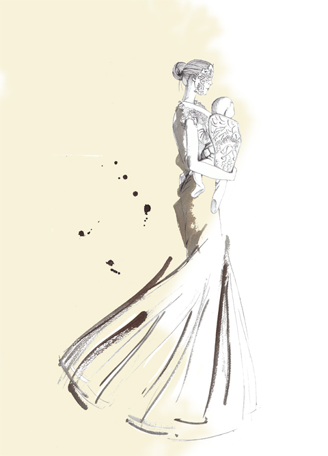
The best was reserved for last though, when a lady in a long white dress calming glided out bearing a surprised but placid baby in a beautiful metallic pearlised papoose. You should have heard the coos. Now where can we buy one of those?

Jacob Kimmie by Gemma Milly.

Jacob Kimmie. Photography by Amelia Gregory.
Oops-a-daisy!

Jacob Kimmie by Gemma Milly.

I knew nothing about South African born Jacob Kimmie before reading Rachael Oku’s excellent interview with him on this very website, malady posted just prior to London Fashion Week. Jacob Kimmie is self-taught and has made a name for himself through sheer hard work and determination – he believes that this, and not a university training, has brought him to where he is today.

In yet another room in the Tardis-like Freemasons’ Hall I was seated behind lady Baby-leg once more, proudly placed on the front row like the reining mascot of cool.

Baby-leg Girl at Jacob Kimmie.
Baby-leg Girl at Jacob Kimmie. Photography by Tim Adey. I have got a pen in my mouth.

Jacob Kimmie. Photography by Amelia Gregory.
Close up of the BABY-LEGS.

Unfortunately her pouffed hair (re-pouffed several times to maintain volume through the short catwalk show) obscured much of my view, but I can tell you that Kimmie’s Pilgrim show started with a hooded lady.

jacob kimmie
Photography by Tim Adey.

Jacob Kimmie. Photography by Amelia Gregory.
Jacob Kimmie hooded lady. Photography by Amelia Gregory.

This polo-neck was seriously out of control. “Spiritual & Enlightened & Monastic” was the header to the slip of paper on our seats; a mammoth amount to encompass in one collection surely; and all this inspiration from hearing just one funky tune! (read Rachael’s interview for more on Kimmie’s inspiration). Indeed, veils worn by several of the models did a fair job of creating a beautifully elegant and oddly monastic silhouette alongside knits and marabous in fabulous monochrome black and cream swing shapes, all worn by ladies adorned in the most delightful cutaway butterfly masks, designed in leather by Ginta Siceva.

Jacob Kimmie. Photography by Amelia Gregory.
Jacob Kimmie by Gemma Milly.

Jacob Kimmie. Photography by Amelia Gregory.

The best was reserved for last though, when a lady in a long white dress calming glided out bearing a surprised but placid baby in a beautiful metallic pearlised papoose. You should have heard the coos. Now where can we buy one of those?

Jacob Kimmie by Gemma Milly.

Jacob Kimmie. Photography by Amelia Gregory.
Oops-a-daisy!

Alison Clemency-Buddenhagen’s first independent label, cheap ‘Clemency’ is now set for its second season.  Launched last year and already rubbing shoulders with avid Knightsbridge shoppers in Harvey Nichols, ‘Clemency’ has been tipped as a label to look out for this year.

To say the designer’s CV is impressive would be an understatement and the woman behind the label could certainly inspire a whole other article. Alison Clemency-Buddenhagen graduated with a BA Honours degree in Design from Central St Martin’s School of Art and Design. Whilst studying she worked for the ethical designer and eco campaigner, Katharine Hamnett. Amid the bustling competition of London’s fashion breeding ground, her degree show earned Alison positive coverage from the press including front-page coverage from the International Herald Tribune.  A delightful fashion/art amalgamation ensued, when one of the pieces from this collection was shown alongside the work of a fledgling Damien Hirst.

In a career that has seen Clemency-Buddenhagen secure design posts for Armani, Trussardi, Calvin Klein and Burberry, to name but a few, it is no surprise that her first independent label reflects a well mastered skill and appreciation of fabric and cut. Alison also worked as a music journalist and has interviewed a diverse mix of artists, such as Radiohead, Nirvana, Massive Attack and Janet Jackson.

‘Clemency’ actualises the designer’s artistic musings and well-honed skills, in a cleverly understated manner. The Spring Summer 2010 collection, recently launched in Montaigne Market, is effortlessly feminine with an edge.  There is a nod to swinging London and her ladylike Parisian sister, with a faint streak of street savvy New Yorker running through the collection.

Dainty feminine frills sit prettily alongside studded leather.  The colour palette is muted dove grey, ivory, fawn… with the detailing and accessories doing the talking. Leather biker caps punctuate silk ruffled dresses.  Spotting the little details in the collection is a joy, from the hand embroidered borders to the tattered edges and fraying hemlines. The embellishments are rusted and antique looking, giving the garments a vintage mood. The Brigitte Bardot influence on the collection is striking; the felt signature hats and tousled ruffles along hems instantly evoke images of that famous nude coloured pout.

The iconic Joy Division album artwork for ‘Unknown Pleasures’ also proved to be an inspiration for the collection.

The artwork depicting white linear topography over a stark black background generated the idea behind the beautifully engineered dresses. The origami folds create a jagged silhouette, feminized by a carefully constructed cut.

The collection has an atmospheric quality.  Inspired by effortlessly chic Jane Birkin, the garments hang with the same spirit of cool nonchalance. From sheer gloves to bare arm to military influenced leather jackets with embellished lapels. Outfits playfully twirl from Boudoir inspired chiffon pleats, to cheeky piquet polos and silk couture shorts. These pieces are at odds with the idea of a one-dimensional woman. The fabrics give the wearer permission to be feminine and sexy, comfortable and edgy, designer clad and decadently vintage.

Alison Clemency-Buddhagen’s humbling experience in the fashion world has obviously helped her to hone her skills and the collection is technically striking. The wide range of influences and moods evoked by the collection reveal a deep seated knowledge of art and culture.

Autumn Winter 2010 proves to be equally interesting. With whispers of next season’s collection including a flash of David Bowie for inspiration, it makes any fashion enthusiast with a penchant for music weak at the knees.

Categories ,Alison Clemency-Buddenhagen, ,Becca Kitson, ,Brigitte Bardot, ,Burberry, ,Calvin Klein, ,Central St Martins, ,Clemency, ,David Bowie, ,fashion, ,Harvey Nichols, ,Jane Birkin, ,Janet Jackson, ,joy division, ,Massive Attack, ,S/S 2010

Similar Posts:


Amelia’s Magazine | An interview with Spanish fashion duo Animal Bandido


Illustration by Donna McKenzie

Regular readers of Amelia’s Magazine will know that we covered the Maison Martin Margiela 20 exhibition last March, story capsule when it showed in fashion capital Antwerp.

But, information pills since it’s moved to our very own fashion capital, we thought we’d have another look, and get some of our wonderful illustrators involved!

Somerset House is quickly becoming a fashion hot spot, with the rehoming of London Fashion Week and the recent SHOWstudio sessions. It’s clear why, too – it’s bloody beautiful.

This is the third outing for the Maison Martin Margiela exhibition, after seasons in Antwerp and Munich, so actually it’s the label’s 22nd anniversary this year, but who cares? I’ll use any excuse to have a poke around a fashion archive.


Illustration by Louise McLennan

The exhibition, set in Somerset House’s lower galleries and you’d be forgiven for believing, if this building wasn’t centuries old, that the space had been purpose-built for this nostalgic trip down Margiela memory lane.

All but a couple of the rooms are white-washed in typical Margiela fashion, and while the exhibition allows us to explore the history of this conceptual and inspirational label, it still give nothing away about the elusive man himself.


Illustration by Amy Martino

Instead of being a chronological or nostalgic display, the aim of this exhbition is to explore the key themes of Maison Martin Margiela, including the inspiration behind each collection and the techniques used.

So it is the quirks that have made this brand truly unique that are given most attention. We begin with a look at the anniversary catwalk show, amongst a lot of polystyrene models, whilst mooching along a row of rather battered Tabi shoes.


Illustration by Donna McKenzie

The bulk of the exhibition explores varying collections and what made them stand out alongside so many other fashion designers of the time. Flat-pack clothing, XXXL oversized pieces, painted garments, narrow tailoring, the trench coat, and the re-visioning of old garments. We also see the evolution of Margiela’s elusivity – first it was a slash of paint across a model’s face, then a blindfold, and then the infamous sunglasses (which I was so tempted to lift I had to walk around with my hands in my pockets. Damn I wish I’d bought them – what a collector’s item).


Illustration by Farzeen Jabbar

One room is devoted to archive footage, film and photographs from across the collections – the room is dark and has white lounge chairs for you to kick back and revel in some of the most iconic fashion images of the last two decades.


Illustration by Zarina Liew

Whether you like fashion or not, I’m entirely convinced that you will love this exhibition – it breaks the boundaries of typical gallery design and it is incredibly inspirational – Go See It!

You can read a full review of the Antwerp exhibition (which was exactly the same exhibition, I promise) here.

For the all important details, visit our listings section.


Illustration by Yelena Bryksenkova

Animal Bandido are a fashion label with a difference. They’re totally anti-establishment and detest the omniprescent multi-national fashion empires that exploit workers and fabrics, medical and are on a mission to create a renaissance for struggling manufacturers who cannot compete with the big boys.

Their collections range from the vibrant to the downright whacky; weird and wonderful creations which illustrate fruits and other objects make up there range, clinic which includes knitwear, side effects fabulous graphic prints and casual basics with a twist. Viewing their collections draws comparisons to Jean Charles de Castelbajac, nutty nu-raver Carri Mundane and knitwear brand Sibling. I caught up with Zosen and Claudia, aka Animal Bandido, to find out what’s behind this fresh new label…

What made you guys team up and create the street-wear label Animal Bandido?
Claudia: We started to talk about this project in September 2007. I finished studying fashion design a year before that. I was designing my own collections, doing super-limited editions that I sewed on my own.
At the beginning I was sceptical because I had collaborated on projects before, and most of the time it’s very difficult to agree with the ideas of other people. I thought I’d give this one a go because our backgrounds are different, each of us bringing different ideas and ways of working.
Zosen: I printed my designs on t-shirts for years and I collaborated with fashion designers, but I wanted to go forward producing other garments and control the process. Animal Bandido was born to make something in collaboration and use different techniques; Claudia brings her experience with the patterns and fashion design and I with the graphics and design in general.
But, day-to-day, we both take part in every process.


Spring/Summer 2009

What does the label represent for you?
The label represents other way to create pieces and to show our stuff to as many people possible.

Zosen, you are a well known urban artist in Barcelona. What made you move into fashion?
After the zero tolerance law against street art in Barcelona, I decided to use another techniques to spread the word. Using my graphics and colours on clothes, it’s another way to have a presence on the street and give the message to the street’s citizens.
Also, it’s interesting for me to experiment with other media and other people – it’s a great way to learn.


Autumn/Winter 2010

Claudia, tell us more about your background, in fashion?
I studied a degree in Fashion Design in Barcelona and then studied millinery at Central Saint Martins in London, followed by jewellery workshops at Casa Espiral, Barcelona.
I interned with Alberto Tous for his fashion show for Barcelona Fashion Week, and then began designing my own collections and selling them in little shops in Barcelona and Berlin.

What makes you different to big fashion corporations?
Well, there’s only two of us! There are no hierarchies; we work together and are both involved in everything, all the time. We produce everything locally, we pay worthy salaries, and we keep our manufacturing quantities reasonable to avoid waste.


Illustration by Natsuki Otani

Do you think your label is art or fashion led?
Our clothes are fashion, but treated as small pieces of art. We don’t follow the trends or encourage throwaway fashion, as the corporate giants do. We create and manufacture to order (for shops and customers) again to reduce waste.

Do you usually agree on everything? How easy is it to compromise when working as a creative partnership?
Claudia: It depends on the project, normally we just discuss everything thoroughly, allowing both of us to express our point of view. Sometimes Zosen is forced agree with me when we are talking about patterns and shapes or different ways of finishing a garment, but he controls more in graphic and web design!
We always try to be equally satisfied with everything related to the brand.


Autumn/Winter 2010

Do you experiment with anything else apart from clothes?
Zosen: Oh yes! We do many things, the most recent thing being a sculpture to present the new collection, that we installed in our studio to photograph the collection against.
It’s huge and gives so much new life to our studio that we are hoping to relocate it to some public space.
Claudia: Zosen always has a million and one projects on the go: a giant mural for the people on walls in London, an exhibition of customised records in Rome…
Now I’m coming up with a few surprises for September for Animal Bandido.


Illustration by Yuann Shen

What does Animal Bandido support?
We support the national textile industry in Spain, as opposed to the over-production and the exploitation of the third world. We pay people fairly. We’re behind a renaissance of the companies that became obsolete as a result of insurmountable production levels in third world countries; we want to give the possibility of growth to small companies so it’s not just the yucky multinationals that dominate the local market.

What makes Animal Bandido unique?
Our fabrics have our own original and unique designs printed on them. We make no more than 100 items per piece, so they are truly limited edition. When you consider that we now sell in Basel, New York, Barcelona, Madrid, Seville, Zaragoza, Sweden and Nottingham and our pieces are divided between those places, there aren’t many per country.


Autumn/Winter 2010

What’s up next for Animal Bandido?
For the summer we’re launching printed bikinis and swimwear; lightweight hoodies using prints from the collection and a new, retro-inspired one. We’re also looking at launching accessories.

Categories ,Alberto Tous, ,Animal Bandido, ,art, ,barcelona, ,Barcelona Fashion Week, ,Basel, ,berlin, ,Carri Mundane, ,Central Saint Martins, ,Claudia, ,Ethics, ,fashion, ,graffiti, ,Graphics, ,Jean-Charles de Castelbajac, ,london, ,Madrid, ,Natsuki Otani, ,new york, ,nottingham, ,print, ,Rome, ,Seville, ,Sibling, ,spain, ,sweden, ,Vinyl, ,Waste, ,Yelena Brykensova, ,Yuann Shen, ,Zaragoza, ,Zosen

Similar Posts:


Amelia’s Magazine | Asger Juel Larsen Vs T.Lipop: London Fashion Week A/W 2012 Menswear Day Catwalk Review


T.Lipop A/W 2012 by Jo Ley

I’ve been keen to see more from Asger Juel Larsen since illustrating his S/S 2012 collection for Amelia’s Magazine. It’s not every day you get to draw a beard made out of leather and nails, and the post-apocalyptic aesthetic is one that I can naturally appreciate. That, and I’d read that at Copenhagen Fashion Week they sent a guy down the catwalk bloodied and with a chainsaw…


Asger Juel Larsen A/W 2012 by Gemma Cotterell

A few incidents immediately prior to the show dampened my enthusiasm somewhat. For a start, while waiting in the Media Lounge at Freemason’s Hall, I found that a pot of Sudocrem that I had no recollection of ever having seen before had split in my bag (random pots of Sudocrem being one of the given perils of being a parent to a young child). There’s nothing cooler than a man whose hands are covered in Sudocrem, I’m sure you’ll agree.


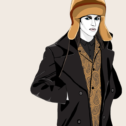
Asger Juel Larsen A/W 2012 by Sam Parr

The queue into the show was a mess, not helped by the show starting half an hour late, although there was free frozen yogurt. I also realised too late that the ‘ST’ on my ticket meant ‘Standing’ and wasn’t code for something more exciting, like… I don’t know what I thought it would stand for, to be honest. I was just happy to get the ticket (it had my name on it and everything).

Once the crowd had been herded into the showroom and I’d baffled nearly everyone around me with my insistent politeness, I found myself smushed against a wall with a direct view into the catwalk’s entrance, which was pretty much as good as I could have got, considering, and it was totally fluked.


All photography by Gareth A Hopkins

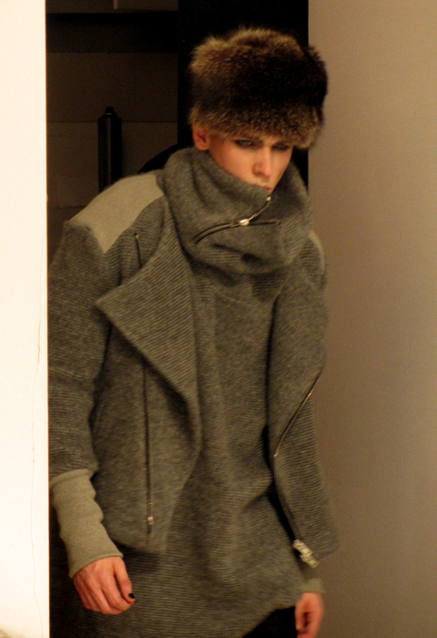
The collection itself was predominantly inspired by Soviet Officers uniforms, which combined with solid tailoring, chunky zips and a limited palette of black, grey and crimson worked really well. The majority of the models were made to look gaunt and frozen by pale makeup, which played up the ‘fragility of war’ concept that Larsen was going for. Breaking away from the palette was a suit in brown and tan paisley; paisley seemed to have infiltrated everywhere this season, so if I was to pick out a ‘trend’ other than the whole arctic/Baltic aesthetic, paisley would be it.

The headgear was a problem for me, though. I’ve distrusted beanie hats since East 17 were first on Top Of The Pops, and there was a raft of them bobbing down the catwalk. More fundamentally problematic were the ginormous fur hats – the size and shape wasn’t a problem (I actually liked the look of them) but I’d hoped we’d all moved on from fur now, and for me its inclusion sullied my opinion of the rest of the collection.

Also: there was no chainsaw anywhere. Whether Health & Safety had been in touch or they’d run out of petrol, I don’t know. But I’d been promised a chainsaw and there wasn’t one.


T.Lipop A/W 2012 by Lo Parkin

Straight out of the gates after Larsen was T.Lipop, whose collection I’d also seen at the Fashion East installations earlier in the day. Similar to Larsen’s Soviet-in-the-trenches look, Lipop’s models were decked out to look like Victorian arctic explorers, with frost in their beards and eyebrows and carrying explorer gear. This hid a more muted but arguably more wearable collection with softer lines and a less harsh colour palette that included burgundies, oranges and tan along with a hit here and there of good ol’ Navy Blue.


T.Lipop A/W 2012 by Jo Ley

Once again, the fur card was played, this time right at the end with a digital-print coat with an enormous pelt hood, drew gasps of wonder from the crowd and a unified surge of camera clicks. The shape and the weight of the coat were satisfying, it’s just a pity that the arctic theme had to be held so rigidly that fur couldn’t have been avoided.

Not to put too much of a downer on either though, as both were very strong showings and I’m positive we’ll be hearing more from both in the future. Although next time, if you say there’ll be a chainsaw, bring a chainsaw.

Categories ,Arctic, ,Asger Juel Larsen, ,AW2012, ,Baltic, ,Big Zips, ,Chainsaw, ,Freemasons’ Hall, ,Frosty Beards, ,Frozen Yogurt, ,Gareth A Hopkins, ,Gemma Cotterell, ,Health & Safety, ,Jo Ley, ,Lo Parkin, ,London Fashion Week, ,military, ,Paisley, ,Sam Parr, ,soviet, ,Standing, ,Sudocrem, ,t.lipop, ,Vauxhall Fashion Scout

Similar Posts:


Amelia’s Magazine | Belle Sauvage: London Fashion Week A/W 2013 Catwalk Review

Belle_Sauvage_AW_2013_by_Isabelle_Mattern
Belle Sauvage A/W 2013 by Isabelle Mattern.

Belle Sauvage hit Fashion Scout with the look for which they are known best: incredibly complex digital placement prints, as described in our exclusive preview interview with designers Virginia Ferreira and Chris Neuman.

Belle Sauvage AW 2013-photo by Amelia Gregory
Belle Sauvage A/W 2013 by Victoria Haynes
Belle Sauvage A/W 2013 by Victoria Haynes.

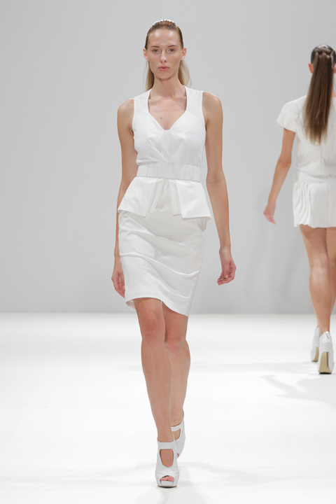
The show opened with a trio of models, resplendent in massive hairpieces: swishing pigtails and gigantic dip dyed fringes that dominated each of the looks that were to follow. Sheepskin and fake fur topped eminently wearable silk shift dresses which were covered in swirls inspired by Chinese dragons and baroque ornaments, and lace trims appeared at the arms and thigh. Zip up black suede boots and laced patent platforms worked well with the simplicity of the looks, though to my mind they were of questionable styling taste. The intention of this collection was to mix up inspirations from East and West and there was certainly a wide range of styles on show. Classic Chanel styling appeared in the form of heavy contrast seams and big buttons on boxy suits and peplums paired with pencil skirts and mini capes provided a contrasting silhouette.

Belle Sauvage AW 2013-photo by Amelia Gregory
Belle_Sauvage_AW_2013_by_Isabelle_Mattern
Belle Sauvage A/W 2013 by Isabelle Mattern.

That this brand does well in the commercial sector abroad was evident in the more casual range that made up the middle section of the show. Amongst my favourite looks was the head of Botticelli‘s famous Birth of Venus reimagined in a repeat pattern on a loose fitting top and matching trouser set, but there was one odd look that didn’t appear to fit in at all: an intarsia knit cat portrait top which was accessorised with beanie and sunglasses.
Belle Sauvage AW 2013-photo by Amelia Gregory
This was a lengthy show featuring many similar pieces and I must confess I became a little weary somewhere around the ten minute mark, but this was clearly intended as a showcase for plentiful looks that will no doubt gain lots of sales for this talented twosome. The show came to a screeching halt as the models massed for a final walk down the catwalk.

Belle Sauvage AW 2013-photo by Amelia Gregory
Belle Sauvage A/W 2013. All photography by Amelia Gregory.

Categories ,A/W 2013, ,Belle Sauvage, ,Birth of Venus, ,Botticelli, ,chanel, ,Chris Neuman, ,Fashion Scout, ,Freemasons’ Hall, ,Isabelle Mattern, ,London Fashion Week, ,review, ,Victoria Haynes, ,Virginia Ferreira

Similar Posts: