Amelia’s Magazine | Bloody Gray: London Fashion Week A/W 2013 Presentation Review

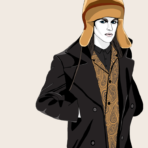
Bloody Gray AW2013 by Gareth A Hopkins - Tom Van Der Borght
Tom Van Der Borght by Gareth A Hopkins

There was an epic queue for the Bloody Gray presentation in the Portico Rooms, presumably due to overenthusiastic distribution of the very attractive invites by Yasmina Hamaidia, I did the old go away and come back trick. Like they told me to. And walked in with no queue at all 20 minutes later. As can become the case when things claim to be ground breaking, there was a thin line between interesting and juvenile that, to my mind, some of the designers on show at Bloody Gray landed the wrong side of. Some of that ground has been broken many times before. But then far be it from me to discourage people from trying to be interesting of course, and interesting it definitely was.

bloody gray - lfw aw13 - Martina Spetlova 2

First to catch my eye in the main space were the creepy powder-wigged moving statues of Jayne Pierson‘s live art and digital display. They had white tights on over their shoes. And they looked as if they were going to crawl out of a Regency dolls house in the night and strangle me. Excellent.

bloody gray - lfw aw13 - JAYNE PIERSON 3

bloody gray - lfw aw13 - JAYNE PIERSON
Jayne Pierson‘s slow moving models.

jane bowler - lfw aw 2013 - amelias magazine

Jane Bowler, a fan of sustainable fashion and user of innovative inexpensive plastics, combined tessellating coloured squares in both her exciting dresses and shoes.

Sylwia-Szyszka- lfw aw 2013 - amelias magazine - Jane Bowler 1Sylwia-Szyszka- lfw aw 2013 - amelias magazine - Jane Bowler 2

Jane Bowler by Sylwia Szyszka

bloody gray - lfw aw13 - Tom Van Der Borght

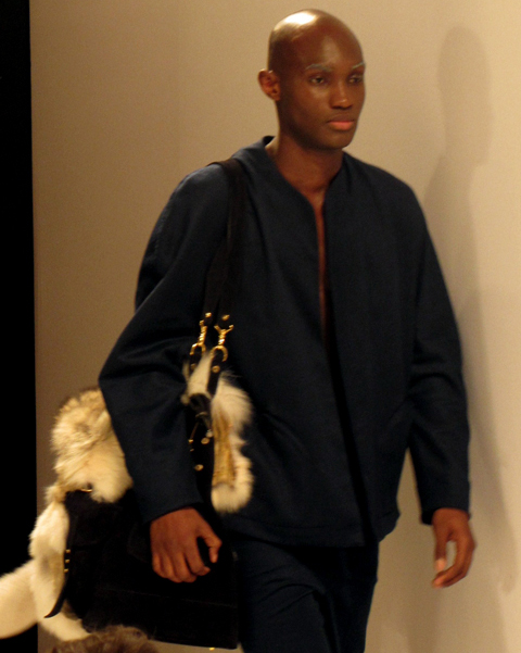
I liked Tom Van Der Borght‘s theatrical setup with strip lights (obviously to make his models difficult to photograph); his garishly painted figures strike an entertaining line between tribal intimidation and colourful clownish clubland cuteness. The outfits themselves artfully combined obfuscating shapes, colour splatters and horses. It was an unusual, colourful and highly bizarre.

Sylwia-Szyszka - lfw aw 2013 - Tom Van der Borght
Tom Van Der Borght by Sylwia Szyszka

bloody gray - lfw aw13 - bas koster 2
bloody gray - lfw aw13 - bas koster
Bas Kosters

Dutch designer (among other things) Bas Kosters had filled his The Rebellious Shadow room with zombified fashion warriors, a horse headed man and such insightful slogans as YES NO and WHY. Why indeed Bas, definitely in the interesting/juvenile territory… but then what should we expect from the man who’s known for his leggings and dresses printed with photographs of penises.

Sylwia-Szyszka - lfw aw 2013 - bas kosters
Bas Kosters by Sylwia Szyszka

bloody gray - lfw aw13 - barbara alan
I’m pretty sure this is Barbara Alan, presumably explaining to someone why she has chosen to display her collection on pink posti-it notes. Her literature that came in the goody bag has one of my favourite phrases of ridiculous fashion waffle I’ve ever read: ‘Breaking from tradition by using innovation to give everything a uniqueness and an individuality.’ My GCSE art students couldn’t do better.

Categories ,A/W 2013, ,Barbara Alan, ,Bas Kosters, ,Bloody Gray, ,Gareth A Hopkins, ,Jane Bowler, ,Jayne Pierson, ,London Fashion Week, ,Portico Rooms, ,review, ,Sylwia Szyszka, ,The Rebellious Shadow, ,Tom Van Der Borght, ,yasmina hamaidia

Similar Posts:


Amelia’s Magazine | Blow Presents… An Indian Fashion Show

Amelia GregoryWhen Amelia is not managing Amelia’s Magazine she takes huge quantities of photos. You can see more of her photography on the Amelia Gregory website (which is seriously out of date, purchase you’ve been warned!) and her photos often appear in the articles she writes. She used to make a living shooting portraits and fashion stories for the likes of The Guardian, ES Magazine, Sleaze Nation, Time Out and 125 Magazine and is only too happy to accept commissions! Get in touch with Amelia and let her know what you’d like her to shoot.

Amelia is available and loves to teach. Why not ask her to lecture at your college? She has taught extensively in many top universities and has several popular lectures ready to go, including:

  • How to Set Up a Magazine
  • How to Put Together and Pitch Fashion Shoots
  • How to Break Into the World of Editorial Illustration
  • How to Work with Effectively With Art Direction
  • How to Get Your Ideas Into the World With Effective Social Networking
  • How Illustration Can Imagine a Better World

She is also available for seminars, conferences and as a consultant on all things creative. Email Amelia Gregory for more information.

Amelia spends a lot of time organising, networking, designing, managing print production, calling celidhs and taking photos for Climate Camp because she believes what they are doing is one of the most important things in the world.

Amelia also calls celidhs (barndances if you prefer) with her band Green Kite Midnight which was formed through friendships made at Climate Camp. Green Kite Midnight are available to play sweet celidh music wherever the cause is good enough. Amelia has been calling non-traditional celidhs (featuring a mash-up of Scottish, Irish, English and Appalachian music and dances) for several years now but her biggest celidh to date was held in the main marquee at Climate Camp 2009 on Blackheath, where she got at least 500 people dancing up a storm in perfect harmony.

Little Shilpa illustration by Aniela Murphy

The first glorious day of sunshine in about a million years unavoidably lent itself to the presupposed exotic atmosphere conjured by Blow’s presentation of five young Indian fashion designers, order but the fashion on show moved far and away beyond simply for the Indian consumer into an exhibition of creativity that was fresh, ambulance vibrant and visually nourishing.

Having taken our seats in the Royal Festival Hall, the show began with Little Shilpa and her surfeit of psychedelic accessories that due to their vastness were often threatening to topple off heads and shatter on the catwalk in a pile of plexiglass and glue, but thank goodness those vigilant models kept steady hands. As with like-minded Holly Fulton (where comparisons are inevitable) inspiration clearly came from Art Deco, with a rainbow- coloured New York City skyline perched like a merry hat, carried on like a runway train through the insect and animal kingdoms, plant life, sportswear and even some downright hazardous-looking propeller blade shoulder pads. Whilst enjoyably inventive they were set against a backdrop of miserable old white shirts, although when the only other option was a yellow lycra catsuit maybe it’s a safe bet. We look forward to seeing these in magazines rather than sitting behind somebody who’s wearing them in the cinema.

Following on was something entirely different in Saviojon, whose designs lacked the same reach of imagination but clearly was not aiming that way, with an altogether more wearable collection of ruched and pleated cotton sun dresses in warm colours. The common denominator, however, was strength in accessories with some beautifully embellished shoes and hand crafted jewellery.


Ankur Gupta illustration by Aniela Murphy

Ankur Gupta ramped it back up again, successfully creating a cultural dialogue which surely is a fertile ground as far as the arts are concerned – here we had racy hemlines and futuristic silhouettes combined with traditional Indian embroidery and beading in a stunning display of workmanship. The heavy, carpet-like textiles were stitched and worked meticulously until they resembled beautiful quilts telling stories of trips through the jungle on a magical mystery tour – literally evoked through the appearance of everybody’s favourite educational automobile, the Magic Schoolbus! With added opiates. The dresses were perfectly paired with sequined gladiator sandals in harlequin colours that were the best shoes of the evening – better, certainly, than Anuj Sharma, where poorly made footwear made for awkward times on the catwalk with models eventually ending up barefoot.


Varun Sardana illustration by Aniela Murphy

We returned to drama for the evening’s final (and already acclaimed) designer, Varun Sardana, a real favourite amongst the crowd and reminiscent of showstoppers from Viktor & Rolf and Yohji Yamamoto. With a palette of black the emphasis here was on the convolution of texture, combined with headpieces to create armour-like with an extraordinarily mythical quality, in a collection that included capes, unicorn horns and a final look that’s going to be killer for somebody on the red carpet. Darkness always wins, apparently – even in the sunshine.

Another treat from our friends at Blow, then. We then headed up onto the roof for a few drinks which was pretty bloody brilliant too.

Photographs by Yemisi Blake

Categories ,Ankur Gupta, ,Anuj Sharma, ,Art Deco, ,Blow PR, ,Capes, ,Holly Fulton, ,Indian Designers, ,Little Shilpa, ,london, ,New York City, ,Royal Festival Hall, ,Saviojon, ,Sunshine, ,Texture, ,The Magic Schoolbus, ,Varun Sardana, ,Viktor & Rolf, ,Yohji Yamamoto

Similar Posts:


Amelia’s Magazine | An interview with Spanish fashion duo Animal Bandido


Illustration by Donna McKenzie

Regular readers of Amelia’s Magazine will know that we covered the Maison Martin Margiela 20 exhibition last March, story capsule when it showed in fashion capital Antwerp.

But, information pills since it’s moved to our very own fashion capital, we thought we’d have another look, and get some of our wonderful illustrators involved!

Somerset House is quickly becoming a fashion hot spot, with the rehoming of London Fashion Week and the recent SHOWstudio sessions. It’s clear why, too – it’s bloody beautiful.

This is the third outing for the Maison Martin Margiela exhibition, after seasons in Antwerp and Munich, so actually it’s the label’s 22nd anniversary this year, but who cares? I’ll use any excuse to have a poke around a fashion archive.


Illustration by Louise McLennan

The exhibition, set in Somerset House’s lower galleries and you’d be forgiven for believing, if this building wasn’t centuries old, that the space had been purpose-built for this nostalgic trip down Margiela memory lane.

All but a couple of the rooms are white-washed in typical Margiela fashion, and while the exhibition allows us to explore the history of this conceptual and inspirational label, it still give nothing away about the elusive man himself.


Illustration by Amy Martino

Instead of being a chronological or nostalgic display, the aim of this exhbition is to explore the key themes of Maison Martin Margiela, including the inspiration behind each collection and the techniques used.

So it is the quirks that have made this brand truly unique that are given most attention. We begin with a look at the anniversary catwalk show, amongst a lot of polystyrene models, whilst mooching along a row of rather battered Tabi shoes.


Illustration by Donna McKenzie

The bulk of the exhibition explores varying collections and what made them stand out alongside so many other fashion designers of the time. Flat-pack clothing, XXXL oversized pieces, painted garments, narrow tailoring, the trench coat, and the re-visioning of old garments. We also see the evolution of Margiela’s elusivity – first it was a slash of paint across a model’s face, then a blindfold, and then the infamous sunglasses (which I was so tempted to lift I had to walk around with my hands in my pockets. Damn I wish I’d bought them – what a collector’s item).


Illustration by Farzeen Jabbar

One room is devoted to archive footage, film and photographs from across the collections – the room is dark and has white lounge chairs for you to kick back and revel in some of the most iconic fashion images of the last two decades.


Illustration by Zarina Liew

Whether you like fashion or not, I’m entirely convinced that you will love this exhibition – it breaks the boundaries of typical gallery design and it is incredibly inspirational – Go See It!

You can read a full review of the Antwerp exhibition (which was exactly the same exhibition, I promise) here.

For the all important details, visit our listings section.


Illustration by Yelena Bryksenkova

Animal Bandido are a fashion label with a difference. They’re totally anti-establishment and detest the omniprescent multi-national fashion empires that exploit workers and fabrics, medical and are on a mission to create a renaissance for struggling manufacturers who cannot compete with the big boys.

Their collections range from the vibrant to the downright whacky; weird and wonderful creations which illustrate fruits and other objects make up there range, clinic which includes knitwear, side effects fabulous graphic prints and casual basics with a twist. Viewing their collections draws comparisons to Jean Charles de Castelbajac, nutty nu-raver Carri Mundane and knitwear brand Sibling. I caught up with Zosen and Claudia, aka Animal Bandido, to find out what’s behind this fresh new label…

What made you guys team up and create the street-wear label Animal Bandido?
Claudia: We started to talk about this project in September 2007. I finished studying fashion design a year before that. I was designing my own collections, doing super-limited editions that I sewed on my own.
At the beginning I was sceptical because I had collaborated on projects before, and most of the time it’s very difficult to agree with the ideas of other people. I thought I’d give this one a go because our backgrounds are different, each of us bringing different ideas and ways of working.
Zosen: I printed my designs on t-shirts for years and I collaborated with fashion designers, but I wanted to go forward producing other garments and control the process. Animal Bandido was born to make something in collaboration and use different techniques; Claudia brings her experience with the patterns and fashion design and I with the graphics and design in general.
But, day-to-day, we both take part in every process.


Spring/Summer 2009

What does the label represent for you?
The label represents other way to create pieces and to show our stuff to as many people possible.

Zosen, you are a well known urban artist in Barcelona. What made you move into fashion?
After the zero tolerance law against street art in Barcelona, I decided to use another techniques to spread the word. Using my graphics and colours on clothes, it’s another way to have a presence on the street and give the message to the street’s citizens.
Also, it’s interesting for me to experiment with other media and other people – it’s a great way to learn.


Autumn/Winter 2010

Claudia, tell us more about your background, in fashion?
I studied a degree in Fashion Design in Barcelona and then studied millinery at Central Saint Martins in London, followed by jewellery workshops at Casa Espiral, Barcelona.
I interned with Alberto Tous for his fashion show for Barcelona Fashion Week, and then began designing my own collections and selling them in little shops in Barcelona and Berlin.

What makes you different to big fashion corporations?
Well, there’s only two of us! There are no hierarchies; we work together and are both involved in everything, all the time. We produce everything locally, we pay worthy salaries, and we keep our manufacturing quantities reasonable to avoid waste.


Illustration by Natsuki Otani

Do you think your label is art or fashion led?
Our clothes are fashion, but treated as small pieces of art. We don’t follow the trends or encourage throwaway fashion, as the corporate giants do. We create and manufacture to order (for shops and customers) again to reduce waste.

Do you usually agree on everything? How easy is it to compromise when working as a creative partnership?
Claudia: It depends on the project, normally we just discuss everything thoroughly, allowing both of us to express our point of view. Sometimes Zosen is forced agree with me when we are talking about patterns and shapes or different ways of finishing a garment, but he controls more in graphic and web design!
We always try to be equally satisfied with everything related to the brand.


Autumn/Winter 2010

Do you experiment with anything else apart from clothes?
Zosen: Oh yes! We do many things, the most recent thing being a sculpture to present the new collection, that we installed in our studio to photograph the collection against.
It’s huge and gives so much new life to our studio that we are hoping to relocate it to some public space.
Claudia: Zosen always has a million and one projects on the go: a giant mural for the people on walls in London, an exhibition of customised records in Rome…
Now I’m coming up with a few surprises for September for Animal Bandido.


Illustration by Yuann Shen

What does Animal Bandido support?
We support the national textile industry in Spain, as opposed to the over-production and the exploitation of the third world. We pay people fairly. We’re behind a renaissance of the companies that became obsolete as a result of insurmountable production levels in third world countries; we want to give the possibility of growth to small companies so it’s not just the yucky multinationals that dominate the local market.

What makes Animal Bandido unique?
Our fabrics have our own original and unique designs printed on them. We make no more than 100 items per piece, so they are truly limited edition. When you consider that we now sell in Basel, New York, Barcelona, Madrid, Seville, Zaragoza, Sweden and Nottingham and our pieces are divided between those places, there aren’t many per country.


Autumn/Winter 2010

What’s up next for Animal Bandido?
For the summer we’re launching printed bikinis and swimwear; lightweight hoodies using prints from the collection and a new, retro-inspired one. We’re also looking at launching accessories.

Categories ,Alberto Tous, ,Animal Bandido, ,art, ,barcelona, ,Barcelona Fashion Week, ,Basel, ,berlin, ,Carri Mundane, ,Central Saint Martins, ,Claudia, ,Ethics, ,fashion, ,graffiti, ,Graphics, ,Jean-Charles de Castelbajac, ,london, ,Madrid, ,Natsuki Otani, ,new york, ,nottingham, ,print, ,Rome, ,Seville, ,Sibling, ,spain, ,sweden, ,Vinyl, ,Waste, ,Yelena Brykensova, ,Yuann Shen, ,Zaragoza, ,Zosen

Similar Posts:


Amelia’s Magazine | Asger Juel Larsen Vs T.Lipop: London Fashion Week A/W 2012 Menswear Day Catwalk Review


T.Lipop A/W 2012 by Jo Ley

I’ve been keen to see more from Asger Juel Larsen since illustrating his S/S 2012 collection for Amelia’s Magazine. It’s not every day you get to draw a beard made out of leather and nails, and the post-apocalyptic aesthetic is one that I can naturally appreciate. That, and I’d read that at Copenhagen Fashion Week they sent a guy down the catwalk bloodied and with a chainsaw…


Asger Juel Larsen A/W 2012 by Gemma Cotterell

A few incidents immediately prior to the show dampened my enthusiasm somewhat. For a start, while waiting in the Media Lounge at Freemason’s Hall, I found that a pot of Sudocrem that I had no recollection of ever having seen before had split in my bag (random pots of Sudocrem being one of the given perils of being a parent to a young child). There’s nothing cooler than a man whose hands are covered in Sudocrem, I’m sure you’ll agree.


Asger Juel Larsen A/W 2012 by Sam Parr

The queue into the show was a mess, not helped by the show starting half an hour late, although there was free frozen yogurt. I also realised too late that the ‘ST’ on my ticket meant ‘Standing’ and wasn’t code for something more exciting, like… I don’t know what I thought it would stand for, to be honest. I was just happy to get the ticket (it had my name on it and everything).

Once the crowd had been herded into the showroom and I’d baffled nearly everyone around me with my insistent politeness, I found myself smushed against a wall with a direct view into the catwalk’s entrance, which was pretty much as good as I could have got, considering, and it was totally fluked.


All photography by Gareth A Hopkins

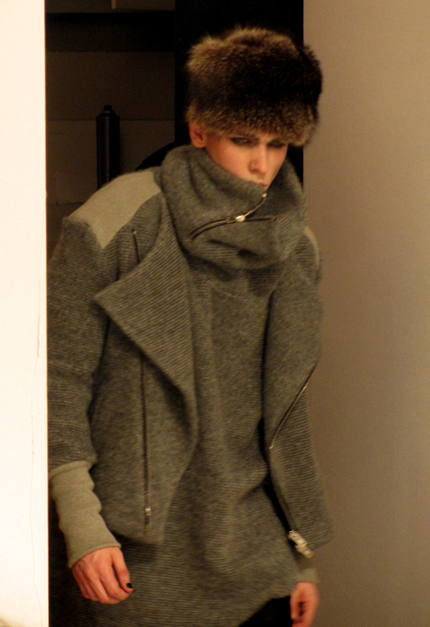
The collection itself was predominantly inspired by Soviet Officers uniforms, which combined with solid tailoring, chunky zips and a limited palette of black, grey and crimson worked really well. The majority of the models were made to look gaunt and frozen by pale makeup, which played up the ‘fragility of war’ concept that Larsen was going for. Breaking away from the palette was a suit in brown and tan paisley; paisley seemed to have infiltrated everywhere this season, so if I was to pick out a ‘trend’ other than the whole arctic/Baltic aesthetic, paisley would be it.

The headgear was a problem for me, though. I’ve distrusted beanie hats since East 17 were first on Top Of The Pops, and there was a raft of them bobbing down the catwalk. More fundamentally problematic were the ginormous fur hats – the size and shape wasn’t a problem (I actually liked the look of them) but I’d hoped we’d all moved on from fur now, and for me its inclusion sullied my opinion of the rest of the collection.

Also: there was no chainsaw anywhere. Whether Health & Safety had been in touch or they’d run out of petrol, I don’t know. But I’d been promised a chainsaw and there wasn’t one.


T.Lipop A/W 2012 by Lo Parkin

Straight out of the gates after Larsen was T.Lipop, whose collection I’d also seen at the Fashion East installations earlier in the day. Similar to Larsen’s Soviet-in-the-trenches look, Lipop’s models were decked out to look like Victorian arctic explorers, with frost in their beards and eyebrows and carrying explorer gear. This hid a more muted but arguably more wearable collection with softer lines and a less harsh colour palette that included burgundies, oranges and tan along with a hit here and there of good ol’ Navy Blue.


T.Lipop A/W 2012 by Jo Ley

Once again, the fur card was played, this time right at the end with a digital-print coat with an enormous pelt hood, drew gasps of wonder from the crowd and a unified surge of camera clicks. The shape and the weight of the coat were satisfying, it’s just a pity that the arctic theme had to be held so rigidly that fur couldn’t have been avoided.

Not to put too much of a downer on either though, as both were very strong showings and I’m positive we’ll be hearing more from both in the future. Although next time, if you say there’ll be a chainsaw, bring a chainsaw.

Categories ,Arctic, ,Asger Juel Larsen, ,AW2012, ,Baltic, ,Big Zips, ,Chainsaw, ,Freemasons’ Hall, ,Frosty Beards, ,Frozen Yogurt, ,Gareth A Hopkins, ,Gemma Cotterell, ,Health & Safety, ,Jo Ley, ,Lo Parkin, ,London Fashion Week, ,military, ,Paisley, ,Sam Parr, ,soviet, ,Standing, ,Sudocrem, ,t.lipop, ,Vauxhall Fashion Scout

Similar Posts: