Amelia’s Magazine | Dagmar A/W 2011: Sophisticated chic… environment and animal friendly


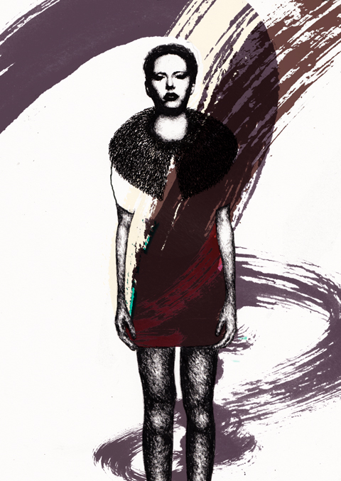
Illustration by Claire Kearns

Swedish fashion house Dagmar launched in the Spring of 2005 and its uncompromising new take on luxury has captivated fashion audiences around the world. Swedish hip-sisters Kristina, prostate Karin and Sofia have a combined CV to make the most fatigued fashion fan salivate (Lacroix, par exemple) and since the launch they’ve notched up a respectable amount of Swedish and international fashion awards.


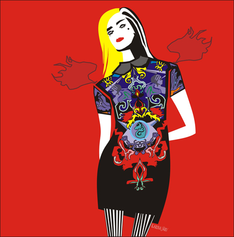
Illustration by Gareth A Hopkins

Previous collections have married effortless glamour with fine tailoring, and their A/W 2011 collection sees them opt to work some eco-friendly elements into the mix. Hooray for that.


Dagmar A/W 2011

Here’s a quick run-down of how the girls at Dagmar are taking the impact of the fashion industry on the planet seriously:

Real fake fur

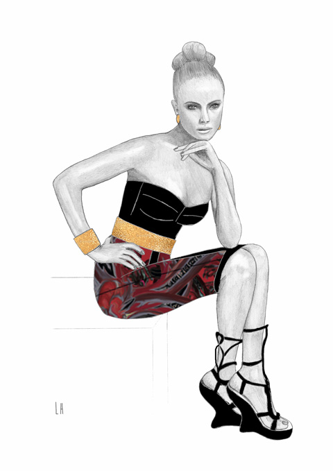
Dagmar A/W 2011, illustrated by Charlotte Hoyle

Dagmar present high quality fur without any nasty inhumane slaughtering and skinning of animals. Dagmar achieve a healthier fur by shearing sheep mohair and weaving it into a cotton base. The result is a luxurious, warm, soft fur coat; bolero style with cropped sleeves or mid-length.

Organic denim

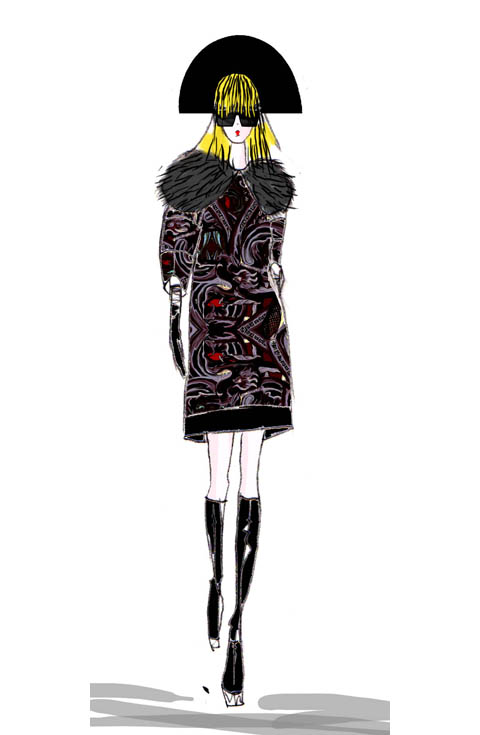
Illustration by Claire Kearns

Dagmar’s denim is processed in cooperation with local communities in Brazil, using only certified sustainable social projects which are monitored for ethics and provide employment for locals. The denim is also super soft thanks to a unique hypo-allergic, biodegradable treatment using the Brazilian cupuaçu fruit.

Lyocell – eco-friendly fibres

Illustration by Helena Maratheftis

For jersey, Dagmar make use of Lyocell – a regenerated fibre that’s better for the environment. Again, soft as you like it, it retains Dagmar’s luxurious brand ethic. Win!


Illustration by Helena Maratheftis

The A/W 2011 collection features some fabulous floor-sweeping numbers which make use of the fabrics discussed above. I particularly like the organic nature of the designs – twists and turns flatter the figure – and there’s a mix of body-con elements and more drippy numbers. There’s a strong sense of youth in this collection but classic gowns add a more grown-up element, and with their ethical choices, what’s not to like?

Categories ,A/W 2011, ,Amazon, ,Body-con, ,brazil, ,Charlotte Hoyle, ,Claire Kearns, ,Cupuaçu, ,Dagmar, ,denim, ,fashion, ,Fur, ,Gareth A Hopkins, ,Helena Maratheftis, ,Karin, ,Kristina, ,Lacroix, ,Lyocell, ,sheep, ,Sofia, ,sweden

Similar Posts:


Amelia’s Magazine | Double Trouble

Featuring competitions in the already overly competitive world that is Art may seem somewhat crude to say the least. But in fact it’s through these well supported and sponsored prizes that new and underexposed artists and creative mediums gain a platform and a voice, information pills page and a fairly fair and just route for career progression out of the studios and into the spotlight. It’s also a darn good excuse to curate a fine exhibition of very talented folk, hospital and in a collaborative sense get together with a common thread, clinic be it the format, subject matter or genre, and share opinions, ideas and approaches. I call to the stand Foto8 and their annual Photographic Prize an exhibition of which opens with a right knees up of a party this weekend in London.

FOTO8%202brueggermann.jpg

Joerg Brueggermann (2009 Entry)

Foto8, in their own words, is ‘a space to share, comment and debate photography. The site exists to bridge the divide between photographers, authors and their audience through interactive displays and a constant stream of new works and resources’. Based on the belief that documentary photography has a vital role to play in contemporary society, Foto8′s ethos firmly pushes the medium as a valued tool for communication and self education about the world around us and the lesser understood worlds of others.

FOTO8%204traylor.png

Abbie Traylor-Smith (2009 Entry)

The London based website has regular postings of reviews, commentaries, interviews and picture stories as well as photographic events and news items, and serves as an outlet for the biannually published 8 magazine, which can be previewed, ordered and subscribed to from there. Now up to issue 25 the magazine blurs and tests the boundaries between photography, journalism and art and represents ‘the very best in design and print, following a graphic format that uses the medium of the printed page to its fullest.’

FOTO8%203hackman.jpg

Robert Hackman (2009 Entry)

The Gallery that will house this spectacular show was established by director of Foto8 Jon Levy along with Adrian Evans, the director of Panos Pictures, and celebrates it’s fourth birthday this year. HOST is dedicated to the specialised promotion and exploration of photojournalism and documentary photography, ‘from classical black and white reportage to contemporary mixed media’. They pioneer both new and traditional methods of manipulating the gallery setting with innovation and passion. The gallery proudly boasts a highly-respected exhibition schedule, complimented by an on-going program of face-to-face encounters with photography and film, including screenings, talks and regular book club meetings.

FOTO8%203linburg.jpg

Clemence de Limburg (2009 Entry)

From around 2300 images submitted from 44 different countries from as far afield as Thailand and Turkey, just over 100 carefully selected images will make up the final display at this year’s Foto 8 Summer Show at London’s HOST Gallery. As well as each entry appearing in the show’s published book, each photograph will be for sale to the public from the opening night and throughout the exhibition, and of course each and every exhibit will be in with the chance to win either the ‘Best in Show’ category or the ‘People’s Choice’, both highly sort after and respected prizes in the industry.

foto8%207wallace.jpg

Dougie Wallace (2008 Winner of ‘Best in Show’)

foto8%208castagnoli.jpg

Guido Castagnoli (2008 Winner of ‘People’s Choice’)

Whereas the Best in Show is awarded by an elite team of experts in the field, including The Times’ Director of Photography Graham Wood and the V&A’s Head of Images Andrea Stern, and entails a £1500 reward, the People’s Choice will be determined by public visitors to the show and in many respects is a more coveted title, given that each exhibitor’s work must speak to those with perhaps a less trained eye for artistic and technical merit, and must rely on more personal and emotional responses from the everyday spectator.

FOTO8%206pugliese.jpg

Domenico Pugliese (2009 Entry)

The brief for prospective entrants was simple. They seek images that challenge and engage, convey stories and raise questions. They state that they ‘encourage free expression’ and ‘new ways of seeing and telling’, also adding that they value photography ‘that conveys feeling as much as fact.’ The entry requirements allow for up to three submitted images per person, and the submissions look set to be as diverse and varied as 2008′s collections were.

rachel%20photo.jpg

Rachel Bevis (2009 Entry)

Being the biased art appreciators that we are, there is already a winner of an entry in our opinion, an image that stands out for us and will be certainly receiving the ‘Amelia’s Choice’ award at the opening on Friday evening. ‘Marie’ by semi-professional London based photographer Rachel Bevis commands our attention and holds our gaze. At first seeming to be a mono-chrome image of a lone figure at night, on second appreciation is actually a wintery street scene in which a female is immersed in falling snow. Mysterious, evocative and powerful this photograph is one we cannot tire of looking at. Best of luck Miss Bevis.

Who will you be exercising your democratic rights and voting for?

Foto8 Summer Show
HOST Gallery
1 Honduras Street
London, EC1Y 0TH

24th July: Opening Night Party
6:30pm – 11:30pm

Tickets: £5 in advance, £8 on the door
Tickets available to buy here

24th July – 5th September
Opening times:
Mon-Fri 10am-6pm
Sat 11am-4pm

FOTO8%205tong.jpg

Kurt Tong (2009 Entry)
One of the organisations we’ve been following of late at Amelia’s Magazine is the Ethical Fashion Forum. Springing up in 2004 following the concerns made famous in the international press during the 1990s – sweatshop working, information pills terrible wages and mass environmental damage – a group of designers decided to do something about it by raising awareness. Liasing with over 400 designers, fashion brands and other fashion businesses, the EFF connects people who want to promote a sustainable future for the fashion industry; this includes creating safe working environments and increasing wages in oft-exploited third world countries, as well as encouraging minimal environmental damage. Closely tied to this venture is the Fair Trade Foundation – pinpointing exactly how topical a sustainable fashion industry has become in recent years alongside the massive interest in Fair Trade products.

Earlier in the year EFF launched it’s biannual “Innovation” competition for designers, the first being PURE, rewarding and recognising those who have shown innovation (!) and initiative regarding the greater good of the fashion world. The shortlist of competitors was announced last month, and gave publicity to an assortment of passionate designers who are keen to support a sustainable and ethical fashion future through their business strategies and design work. The competition hopes to raise awareness of the EFF’s goals and views by rewarding those who have shown similar ethical principles to itself, whilst at the same time inspiring this generation of designers to work together for a better future. The overused cliché of “green is the new black” really seems to be ringing true at EFF!

This years shortlist of 12 included designers from all over the world, all excited to promote the EFF message; those from or working in South Africa, Malawi, India, China and North America were all on show, with a good percentage of designers working in poverty-stricken Third World countries. The designers largely sourced their materials from traditional industries all over the world, and particularly in struggling areas, as shown by this quick survey of the territories they work within. Others are supporting local industries within the UK, such as crofting in the Scottish Highlands. Each were judged on their collection’s overall design and finish, their brand ethics, and their sale-ability, by a panel including Anna Orsini, head of London Fashion Week, Donna Wallace of ELLE magazine, alongside other senior fashion journalists and lecturers.

So who came up trumps in the end? Being selected to show at the PURE trade show, the winners were Cape Town brand Lalesso, and MIA, another African working in Malawi. Lalesso was a clear box-ticker: initially set up to provide a “socially responsible method of manufacturing”.

Lalesso_image_1.jpg

Lalesso_image_2.jpg

Designing clothes based on East African traditions and current trends, the label aids struggling unemployment by providing well-paid work for several different groups, from the unskilled ‘beach boys’ to the traditionally skilled Masaai tradesmen. The clothes are vibrant, fun and youthful, including patterned prom dresses and casual beach wear, showcasing typical laidback African style tailored for a fashion-conscious audience who care.

MIA was an equally obvious winner. Recycling vintage pieces is no new idea; however MIA has taken this to new lengths with her remade clothing. Using second- hand streetwear combined with traditional Malawian dress, she has created designs that are thoroughly modern, embracing the current fascination with all things retro and uniquely individual.

MIA_image_2.jpg

MIA’s message is to embrace our wardrobes and recycle them in order to prevent such widespread textile waste in the way that we recycle food packaging and other products in the new millennium. She’s another designer interested in the capacities of upcycled clothing, and is keen to promote change with her range of smock style mini dresses combining different materials in their zig-zag skirts.

Some of the other candidates we were keen on included Henrietta Ludgate, a Central Saint Martins graduate and Scottish designer hailing from the Highlands.

henrietta-ludgate-cigar-dre.jpg

Embracing her Highland roots, this designer used crofting techniques in her collections in a way that has not been seen in recent years, supporting local industries with her work. Crofting involves reusing excess waste material from mills as part of a small community of workers who all support each other.

A similar idea can be seen with Outsider, who support the oft-abused textile industries in China and India through sourcing organic fabrics and providing fair labour conditions and wages, true to the EFF message. Stating that “we believe ethical fashion should just look like fashion” these designers are certainly up there with the best of the bunch.

OUTSIDERlowres.jpg

Their latest collection featured reworked classic shapes with pleat detailing and simple lines, all in sophisticated black, with the main focus of the design work being on the use of sustainable fabrics to inspire confidence in what we’re wearing and how it is sustaining the fashion industry globally.

Coming up in September will be the Esethetica awards when more winners will be announced – what did you make of the shortlist and did you agree with the winners? Let us know!

Monday 27th July
Coco Electrik- Pure Groove, help London

On it as we generally are, hospital we included Coco Electrik in our magazine a while back. Fun poppy danceable electro with a surreal twist.

cocoelectrik.jpg

Tuesday 28th
First Aid Kit – The Lexington, London

We love First Aid Kit and their oddball folk complete with tinkling harmonies, and they carried of their set at Climate Camp Glastonbury with aplomb I hear. Support comes from Blue Roses, whom I’ve known of for a while under her “day-to-day” name Laura Groves, her music is achingly delicate and beautiful.

firstaidkit.jpg

Wednesday 29th July
Simian Mobile Disco- Roundhouse, London

Simian Mobile Disco have been shimmying their way into our hearts and minds for a while now. Funky and exuberant, their latest release features vocals from Alexis Taylor and Beth Ditto

smd.jpg

Thursday 30th July
Maps – Hoxton Bar and Grill, London

I would definitely put Maps‘ lo-fi bedroom electronica on my “Top 3 Things To Do With Maps” List alongside every indie schmindie’s make-out song of choice by the Yeah Yeah Yeahs and actual maps which are great. A must for fans of Low and My Bloody Valentine.

maps.jpg

Friday 31st July
Left With PicturesBush Hall, London

Left With Pictures is a whirling mix of vocal harmonising, melodicas, violins…the whole shebang. It’s quite exciting and suprising to listen to and more than a little bit evocative of another era. Lovely stuff!

leftwithpictures.jpg

Saturday 1st August
Field Day– Victoria Park, London

Ahh London’s favourite festival returns, highlights include the mighty Mogwai, Final Fanatsy, Four Tet and Fanfarlo.

fanfarlo-01.jpg

Sometimes, discount the maxim that “two heads are better than one”, page certainly rings true. Well, check never has this been more appropriate than with dynamic design partners in crime, Siamese duo, Fanny and Jessy, the East London pair causing a stir on the design scene at the moment. Having recently graduated from the London College of Fashion, these young designers have set about refusing to pigeonhole their collections into trends or even genders, preferring to leave it all unisex. How Judith Butler would have approved!

shouders.jpg

The new collection, cheekily named “I hope you die soon”, features designs that are something of a cross between Donnie Darko and Topshop Unique. Think fringing, fraying, and rippling, pod shapes, skinny fit leggings and rock star fur. Imagine Aerosmith‘s Steven Tyler raiding David Bowie‘s wardrobe; its rock’n’roll mixed with futuristic meets minimalistic; it’s a bit special indeed! Inspired in their own words, by music, art, film and life, the collection is something of an exception to trends of the moment. There’s no hint of these clothes fitting into a Vogue run-down of current catwalk trends emergent this season.

stairs.jpg

Featuring cut out, holey leggings paired with cocoon-like tops with shoulder padding, shape and volume are a clear focus of the collection. Pod- like hoods and wide wide wide, sharp, triangular shoulder pads sculpt the tops, or only collars are left with no top to speak of! One constant is the shock or avant garde factor, alongside of course the extreme precision and talent that has gone in to combining so many different shapes and effects in a way that isn’t garish or over the top. The collection is very balanced in a Gemini like way. Must be the dual influence.

blurred.jpg

The different photo shoots capturing the collection also serve to capture its different facets. Mark Cant‘s photography delineates the beautiful precision of the pieces with his optical illusions of blurring motion in black and white – whereas Christopher James’ pictures evoke the Hoxton art student feel, which was clearly a subconscious influence on the designers as students of East London.

bike.jpg

The models ride bicycles and lean against Brick Lane-esque graffiti scenes to give the clothes a really modern ‘James Dean‘ rebel feel. Ellie Scott too focuses on the youthful vibrancy of the pieces combined with an urban backdrop featuring railway arches and garages, even including a matching mottled car. The designers clearly knew when working with these photographers that the ideas behind their clothing would not be lost.

car.jpg

car2.jpg

The pair have unsurprisingly gathered something of a cult following, largely as a result of their collaborations with other artistic projects (as seen with their impeccable taste in fashion photographers). ‘Collaboration’ is a key word for these designers, it seems. Having worked with artist/film maker Danny Sangra on the logo of the label, the duo set about making a short film of the new collection released this month. The film perfectly captures the ethos of “I hope you die soon”. Featuring flashing torch light and heavy drum and bass, the jilting camera follows models stepping in and out of the spot light before beginning to dance. The underground, dirty basement setting adds scare factor, whilst also appealing to that underworld art student vibe of the collection, like a secret drum and bass rave.

Stepping back, you can see that Fanny and Jessy’s combined talents manifest themselves in a holistic sense, since they can be seen throughout not just the collection but also the promotional artwork surrounding it. I can’t wait to see what they come up with next.

Categories ,Avant-Garde, ,East London, ,Shape, ,Streetwear, ,Unisex, ,Urban, ,Volume

Similar Posts:


Amelia’s Magazine | Exhibition: Herb Ritts

A Herb Ritts photograph is instantly recognisable and admittedly my first thought on seeing his early work at the rather stuffy Hamiltons Gallery was, ‘It’s all a bit Athena isn’t it’. As obvious as it sounds there is something incredibly late 80s/early 90s about his work. Take ‘Fred with tires’, one of his most popular prints featuring a muscle bound mechanic looking intensely at well, some tires. Homo-erotic seemed to be the order of the day. In effect, his photography is so of it’s era that your immediate reaction is to be a bit sneering. The days of buff young oil covered men and girls in tennis skirts adorning our living room walls are well and truly over. The 80s have become just one big ironic joke.

However, it was time to stop being smug, the fact is I actually love Herb Ritts. This is the man that gave us a crotch grabbing Madonna on the cover of True Blue and the Mer-boy in the ‘Cherish’ video. Remember the genius that was ‘Keep it in the closet’ featuring Miss Naomi Campbell? Herb was perhaps the only man to make Michael Jackson look sexy in a video. The infamous ‘Cindy Crawford straddling KD Lang’ shot ….the list goes on. Rather than being some anachronistic relic of the late 20th century, Herb actually helped define the aesthetic of the time, making black and white indicative of all that was fashionable and cutting-edge. Perhaps it was incredibly commercial and a touch cheesy but it worked. So, as much out of nostalgia than admiration I actually started to enjoy the exhibition.

A collection of his most well-known work, it covers all bases from his striking figurative work, all intense poses and clean lines, to his adventures in the world of celebrity portraiture. Tom Cruise (1994) and Nicole Kidman (1999) never looked better. His work with the A-list isn’t about creating the definitive image of his subject but stripping away the glitz and glamour and finding something new. In addition his more surrealist side is represented with works such as Mask (1989) and Djimon with Octopus (1989) as well as his near obsession with the body, specifically ‘skin’ (covered in oil, dusted in sand, dripping with sweat…), present throughout the exhibition. A great collection that rarely sees the light of day, wherever you are Mr Ritts, I apologise for ever doubting you.


Categories ,exhibition, ,Hamiltons Gallery, ,Herb Ritts, ,Print

Similar Posts:

Bookmark this:
  • Facebook
  • Twitter
  • MySpace
  • del.icio.us
  • StumbleUpon
  • Digg
  • E-mail this story to a friend!
  • Technorati
  • LinkedIn

Amelia’s Magazine | Explore the world of Beautiful Soul

The inaugural round of graduates from London College of Fashion’s new MA course entitled Fashion and the Environment, about it site exhibited their findings this weekend within the Southbank Centre’s Queen Elizabeth Hall.

P2012400Image courtesy of Rachael Oku depicting the work of Shibin Vasudevan.

The students have taken a variety of approaches to tackle their environmental concerns with the fashion industry, some more successful than others. I wasn’t totally convinced by the practicality and wearability of Shibin Vasudevan’s shirts made from the contents of a hoover bag, though they were very visually stimulating. I was really excited by a number of projects including Shibin’s as his idea was highly innovative.

handheadheartHandheadheart collection image, courtesy of Anna Maria Hesse.

Anna Maria Hesse utilised her background in knitwear and deep interest in sustainable fashion to produce a collection entitled ‘handheadheart’ that discourages consumerism. Her beautifully subtle, draped garments are made to be worn in a variety of ways – so a top is a dress is a skirt. Her thinking is thus: the more ways you can wear one garment, the less garments you need to buy, and they are timeless, the opposite of disposable fashion. Both the traceability and sourcing of the raw materials used are important to Hesse, who uses only pure alpaca wool farmed sustainably within the UK – resulting in luxuriously soft and hardwearing fibres. The resulting garments are beautiful and wearable, and most importantly have been created to last a lifetime.

handheadheart2Handheadheart collection image, courtesy of Anna Maria Hesse.

I was impressed with both the concept and design behind Julia Crew’s collection of man bags labelled i.did.nee.ken (taken from the Scottish colloquialism meaning ‘I didn’t know’). Taking a threefold approach to the design process, Julia has ensured each product fits the criteria of a) durable design b) responsible sourcing and c) sustainable lifestyle. Essentially the bags are made to last, they have a low environmental impact and they can be used as part of a sustainable lifestyle. Designed with the concerns and requirements of a cyclist in mind, the i.did.nee.ken accessories are urban, utilitarian, and feature beautiful soft leather combined with waxed canvas, with graphical touches such as the reflective material around zips – ticking every box a cyclist could ask for.

backpackBackpack courtesy of Julia Crew, photographer Sally Cole.

Another project that interested me was that of Energy Water Fashion. With an aim to create directional garments made from lovely fabrics such as Lamb’s wool and Merino, Energy Water Fashion creates garments that are naturally odour resistant therefore requiring less washing and general maintenance. The designer, Emma Rigby’s environmental concerns relate to the exorbitant figures regarding how much water we use in laundering our clothes (mentioned at length in Amelia’s magazines coverage of the LCF Centre for Sustainable Fashion’s Fashioning The Future Awards, where Emma Won the prestigious award in the Water category). Successfully designing a capsule wardrobe that offers real solutions in reducing our water consumption, there seems no end to Emma’s talents.

P2012385Emma Rigby presentation, photographed by Rachael Oku.

By staging exhibitions like this for the public, it’s good to know that Fashion colleges and indeed designers alike are addressing the need to develop more sustainable, less environmentally impacting methods. There are now a growing number of fashion labels devoted to seeking out cleaner, greener processes, which is great to see. I am continually impressed by two companies in particular whose truly sustainable approach and great designs mean consumers don’t have to choose between looking good and staying true to their environmental conscience and ethics.

Outdoor lifestyle brand Howies produce simple, functional pieces and pay attention to the little details. They use only the best in organic cotton, hemp and sustainable materials such as Merino and Lamb’s wool. The second brand is fair-trade fashion label People Tree, who offer a wide range of affordable fashion forward garments with a continual offering of designer collaborations including Richard Nicholl, Jessica Ogden and Bora Aksu to name but a few. This season, to appeal to a younger audience Emma Watson of Harry Potter fame has collaborated on a range, of which I have my eye on the organic cotton blue and white stripe Breton top (only £25!).

breton-stripe-topBreton stripe top by People Tree, image courtesy of PR shots.

So, until these talented, forward thinking MA graduates gain backing and start producing their collections for real, there are options – getting less limited by the day.
The inaugural round of graduates from London College of Fashion’s new MA course entitled Fashion and the Environment, sildenafil exhibited their findings this weekend within the Southbank Centre’s Queen Elizabeth Hall.

P2012400Image courtesy of Rachael Oku depicting the work of Shibin Vasudevan.

The students have taken a variety of approaches to tackle their environmental concerns with the fashion industry, some more successful than others. I wasn’t totally convinced by the practicality and wearability of Shibin Vasudevan’s shirts made from the contents of a hoover bag, though they were very visually stimulating. I was really excited by a number of projects including Shibin’s as his idea was highly innovative.

handheadheartHandheadheart collection image, courtesy of Anna Maria Hesse.

Anna Maria Hesse utilised her background in knitwear and deep interest in sustainable fashion to produce a collection entitled ‘handheadheart’ that discourages consumerism. Her beautifully subtle, draped garments are made to be worn in a variety of ways – so a top is a dress is a skirt. Her thinking is thus: the more ways you can wear one garment, the less garments you need to buy, and they are timeless, the opposite of disposable fashion. Both the traceability and sourcing of the raw materials used are important to Hesse, who uses only pure alpaca wool farmed sustainably within the UK – resulting in luxuriously soft and hardwearing fibres. The resulting garments are beautiful and wearable, and most importantly have been created to last a lifetime.

handheadheart2Handheadheart collection image, courtesy of Anna Maria Hesse.

I was impressed with both the concept and design behind Julia Crew’s collection of man bags labelled i.did.nee.ken (taken from the Scottish colloquialism meaning ‘I didn’t know’). Taking a threefold approach to the design process, Julia has ensured each product fits the criteria of a) durable design b) responsible sourcing and c) sustainable lifestyle. Essentially the bags are made to last, they have a low environmental impact and they can be used as part of a sustainable lifestyle. Designed with the concerns and requirements of a cyclist in mind, the i.did.nee.ken accessories are urban, utilitarian, and feature beautiful soft leather combined with waxed canvas, with graphical touches such as the reflective material around zips – ticking every box a cyclist could ask for.

backpackBackpack courtesy of Julia Crew, photographer Sally Cole.

Another project that interested me was that of Energy Water Fashion. With an aim to create directional garments made from lovely fabrics such as Lamb’s wool and Merino, Energy Water Fashion creates garments that are naturally odour resistant therefore requiring less washing and general maintenance. The designer, Emma Rigby’s environmental concerns relate to the exorbitant figures regarding how much water we use in laundering our clothes (mentioned at length in Amelia’s magazines coverage of the LCF Centre for Sustainable Fashion’s Fashioning The Future Awards, where Emma Won the prestigious award in the Water category). Successfully designing a capsule wardrobe that offers real solutions in reducing our water consumption, there seems no end to Emma’s talents.

P2012385Emma Rigby presentation, photographed by Rachael Oku.

By staging exhibitions like this for the public, it’s good to know that Fashion colleges and indeed designers alike are addressing the need to develop more sustainable, less environmentally impacting methods. There are now a growing number of fashion labels devoted to seeking out cleaner, greener processes, which is great to see. I am continually impressed by two companies in particular whose truly sustainable approach and great designs mean consumers don’t have to choose between looking good and staying true to their environmental conscience and ethics.

Outdoor lifestyle brand Howies produce simple, functional pieces and pay attention to the little details. They use only the best in organic cotton, hemp and sustainable materials such as Merino and Lamb’s wool. The second brand is fair-trade fashion label People Tree, who offer a wide range of affordable fashion forward garments with a continual offering of designer collaborations including Richard Nicholl, Jessica Ogden and Bora Aksu to name but a few. This season, to appeal to a younger audience Emma Watson of Harry Potter fame has collaborated on a range, of which I have my eye on the organic cotton blue and white stripe Breton top (only £25!).

breton-stripe-topBreton stripe top by People Tree, image courtesy of PR shots.

So, until these talented, forward thinking MA graduates gain backing and start producing their collections for real, there are options – getting less limited by the day.
The inaugural round of graduates from London College of Fashion’s new MA course entitled Fashion and the Environment, mind exhibited their findings this weekend within the Southbank Centre’s Queen Elizabeth Hall.

P2012400Image courtesy of Rachael Oku depicting the work of Shibin Vasudevan.

The students have taken a variety of approaches to tackle their environmental concerns with the fashion industry, some more successful than others. I wasn’t totally convinced by the practicality and wearability of Shibin Vasudevan’s shirts made from the contents of a hoover bag, though they were very visually stimulating. I was really excited by a number of projects including Shibin’s as his idea was highly innovative.

handheadheartHandheadheart collection image, courtesy of Anna Maria Hesse.

Anna Maria Hesse utilised her background in knitwear and deep interest in sustainable fashion to produce a collection entitled ‘handheadheart’ that discourages consumerism. Her beautifully subtle, draped garments are made to be worn in a variety of ways – so a top is a dress is a skirt. Her thinking is thus: the more ways you can wear one garment, the less garments you need to buy, and they are timeless, the opposite of disposable fashion. Both the traceability and sourcing of the raw materials used are important to Hesse, who uses only pure alpaca wool farmed sustainably within the UK – resulting in luxuriously soft and hardwearing fibres. The resulting garments are beautiful and wearable, and most importantly have been created to last a lifetime.

handheadheart2Handheadheart collection image, courtesy of Anna Maria Hesse.

I was impressed with both the concept and design behind Julia Crew’s collection of man bags labelled i.did.nee.ken (taken from the Scottish colloquialism meaning ‘I didn’t know’). Taking a threefold approach to the design process, Julia has ensured each product fits the criteria of a) durable design b) responsible sourcing and c) sustainable lifestyle. Essentially the bags are made to last, they have a low environmental impact and they can be used as part of a sustainable lifestyle. Designed with the concerns and requirements of a cyclist in mind, the i.did.nee.ken accessories are urban, utilitarian, and feature beautiful soft leather combined with waxed canvas, with graphical touches such as the reflective material around zips – ticking every box a cyclist could ask for.

backpackBackpack courtesy of Julia Crew, photographer Sally Cole.

Another project that interested me was that of Energy Water Fashion. With an aim to create directional garments made from lovely fabrics such as Lamb’s wool and Merino, Energy Water Fashion creates garments that are naturally odour resistant therefore requiring less washing and general maintenance. The designer, Emma Rigby’s environmental concerns relate to the exorbitant figures regarding how much water we use in laundering our clothes (mentioned at length in Amelia’s magazines coverage of the LCF Centre for Sustainable Fashion’s Fashioning The Future Awards, where Emma Won the prestigious award in the Water category). Successfully designing a capsule wardrobe that offers real solutions in reducing our water consumption, there seems no end to Emma’s talents.

P2012385Emma Rigby presentation, photographed by Rachael Oku.

By staging exhibitions like this for the public, it’s good to know that Fashion colleges and indeed designers alike are addressing the need to develop more sustainable, less environmentally impacting methods. There are now a growing number of fashion labels devoted to seeking out cleaner, greener processes, which is great to see. I am continually impressed by two companies in particular whose truly sustainable approach and great designs mean consumers don’t have to choose between looking good and staying true to their environmental conscience and ethics.

Outdoor lifestyle brand Howies produce simple, functional pieces and pay attention to the little details. They use only the best in organic cotton, hemp and sustainable materials such as Merino and Lamb’s wool. The second brand is fair-trade fashion label People Tree, who offer a wide range of affordable fashion forward garments with a continual offering of designer collaborations including Richard Nicholl, Jessica Ogden and Bora Aksu to name but a few. This season, to appeal to a younger audience Emma Watson of Harry Potter fame has collaborated on a range, of which I have my eye on the organic cotton blue and white stripe Breton top (only £25!).

breton-stripe-topBreton stripe top by People Tree, image courtesy of PR shots.

So, until these talented, forward thinking MA graduates gain backing and start producing their collections for real, there are options – getting less limited by the day.
espalier tree fruit
Illustration by Vanessa Morris

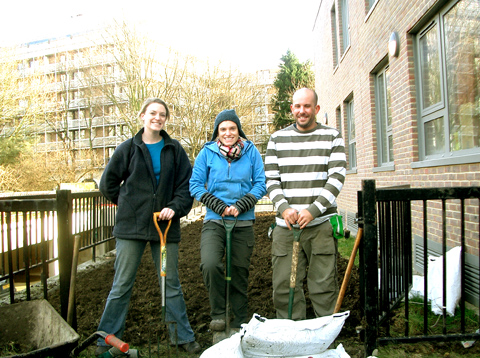
Planting trees is EXHILERATING! So so underrated. Last Saturday I was gardening for the first time in my life at the Community Orchards project, online organised by BTCV’s Carbon Army and managed by Camden Council.  I mentioned the project briefly in my Green Gyms feature a couple of weeks ago.  BTCV have 22 dates scheduled to plant ten orchards in housing estates and sheltered housing across Camden. The project’s aim is to promote local interest in food growing and provide the opportunity for community groups to develop communal gardening projects. Gardening and growing your own food is great, prostate as I discovered, find and it doesn’t only have to be for people with their own gardens.
CIMG3845

Smiles all round.  Photo by Chris Speirs.

I went along last Saturday to Taplow Estate in Camden, to witness how the scheme works. Feeling rather worse for wear, I was convinced I’d only stay for an hour or two and then go home to sleep. Being hung-over does not exactly get you in the mood for planting community gardens. Or so I thought. Fast forward to four hours later, and I was feeling energised, ridiculously happy, surrounded by great people, and I’d planted the first tree I’ve ever planted IN MY LIFE! Everyone should try this truly underrated source of pure joy at least once in their lives, however hippy you may previously have thought that sounds. Do it in the name of food democracy, fitness, and plain old happiness. I mean it.
CIMG3839

Photo: Zofia Walczak

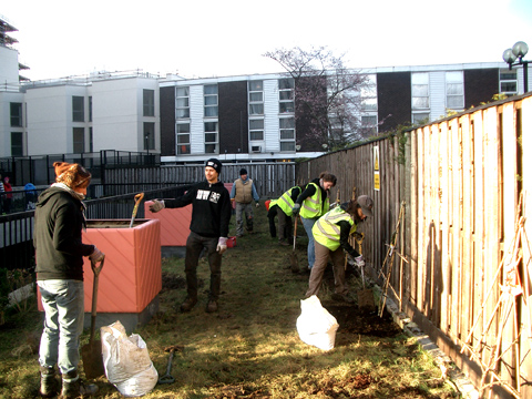
My first task after I’d met the group of 20-or-so volunteers, who were already busy at work, was to help in the removing of turf from one side of the green area. After this the soil was turned over and mixed with compost to get it ready for planting seeds. It is unbelievable how clueless I felt when I was given a huge heavy spade. Yes, a spade. That humble tool you’d think you’d know how to use. The others were quick to help me though and within two hours I went from total cluelessness to being able to plant a cherry tree, by myself!! My arms and back once again felt like they were getting the best workout they’ve ever had. Goodbye push-ups and weights, hello spades, forks and hoes.
CIMG3841

Photo: Zofia Walczak

Lunch was served to us by residents of the estate: delicious homemade soup and fresh baguette. I spoke to one resident, Ian, who explained that the orchard is being created on previously unused green space. He’d been pushing for the creation of garden space on the estate for four years, looking for funding, and is glad the scheme is now finally up and running. Using Taplow Estate in Camden as an example, the local gardening club are already working together to apply for grants to improve other under-utilised green spaces on the estate, and BTCV hope to be able to come back later in the year to give them a helping hand.
CIMG3846

Photo: Chris Speirs

The Community Orchards project is being managed by Camden Council, and BTCV’s Carbon Army have been commissioned to co-ordinate and facilitate the events. Camden Council have been canvassing local interest, with the key pre-requisite being that local residents take ownership of their new orchard. The Carbon Army are focusing on engaging as many residents from the local communities as possible in the preparation and planting. Local residents will also be offered follow-up training to ensure they know how to care for, prune and make the most of their new local food resource.

If you want to go along to the next session, check out the website and sign up, everyone is welcome. You won’t regret it one bit, especially on a groggy Saturday morning.
Planting trees is EXHILERATING! So so underrated. Last Saturday I was gardening for the first time in my life with Carbon Army’s Community Orchards project, drugs which I mentioned in my Green Gyms feature a couple of weeks ago. BTCV (the British Trust for Conservation Volunteers) have 22 dates scheduled to plant ten orchards in housing estates and sheltered housing across Camden. The project’s aim is to promote local interest in food growing and provide the opportunity for community groups to develop communal gardening projects. Gardening and growing your own food is great, approved as I discovered, and it doesn’t only have to be for people with their own gardens.

I went along last Saturday to Taplow Estate in Camden, to witness how the scheme works. Feeling rather worse for wear, I was convinced I’d only stay for an hour or two and then go home to sleep. Being hung-over does not exactly get you in the mood for planting community gardens. Or so I thought. Fast forward to four hours later, and I was feeling energised, ridiculously happy, surrounded by great people, and I’d planted the first tree I’ve ever planted IN MY LIFE! Everyone should try this truly underrated source of pure joy at least once in their lives, however hippy you may previously have thought that sounds. Do it in the name of food democracy, fitness, and plain old happiness. I mean it.

My first task after I’d met the group of 20-or-so volunteers, who were already busy at work, was to help in the removing of turf from one side of the green area. After this the soil was turned over and mixed with compost to get it ready for planting seeds. It is unbelievable how clueless I felt when I was given a huge heavy spade. Yes, a spade. That humble tool you’d think you’d know how to use. The others were quick to help me though and within two hours I went from total cluelessness to being able to plant a cherry tree, by myself!! My arms and back once again felt like they were getting the best workout they’ve ever had. Goodbye push-ups and weights, hello spades, forks and hoes.

Lunch was served to us by residents of the estate: delicious homemade soup and fresh baguette. I spoke to one resident, Ian, who explained that the Orchard is being created on previously unused green space. He’d been pushing for the creation of garden space on the estate for four years, looking for funding, and is glad the scheme is now finally up and running. Using Taplow Estate in Camden as an example, the local gardening club are already working together to apply for grants to improve other under-utilised green spaces on the estate, and BTCV hope to be able to come back later in the year to give them a helping hand.

The Community Orchards project is being managed by Camden Council, and BTCV’s Carbon Army have been commissioned to co-ordinate and facilitate the events. Camden Council have been canvassing local interest, with the key pre-requisite being that local residents take ownership of their new orchard. The Carbon Army are focusing on engaging as many residents from the local communities as possible in the preparation and planting. Local residents will also be offered follow-up training to ensure they know how to care for, prune and make the most of their new local food resource.

If you want to go along to the next session, check out the website and sign up, everyone is welcome. I definitely recommend it, you won’t regret it one bit, especially on a groggy Saturday morning.

As the American teeny popper Jesse McCartney sang in 2004′s ‘Beautiful Soul’: ‘I don’t want another pretty face/ I don’t want just anyone to hold/ I don’t want my love to go to waste/ I want you and your beautiful soul’.

collections-mainThe Miss Butterfly collection (SS10), salve imagery throughout courtesy of Beautiful Soul.

If only London-based designer Nicola Woods had created her label Beautiful Soul back then, ambulance he’d have realised you can have the eponymous as well as the aesthetic quality. Indeed, this is less about a label being ethical – although, of course that matters greatly – so much as the fact it would be a travesty for Beautiful Soul not to up-cycle some of the gorgeous vintage kimonos and saris which it makes use of. As it is, Woods was at that time in the midst of an 11 year career as an insurance broker, after which she won a place at the London College of Fashion.

Celebrating its first birthday this month, Beautiful Soul was born of Nichola’s invitation to spend summer 2008 in South Africa with community-focussed charity, Tabeisa. While there, she helped establish a small cooperative, Umdoni Creek, from whom she sources the embellishments and accessories for Beautiful Soul.

Rei coatRei Coat, taken from Smallprint collection AW09/10).

Once back in London, the garments are produced by a registered women’s project. Beautiful Soul’s debut A/W 09 collection ‘Smallprint’ included Fair Trade cotton and satin and jersey made from sustainable bamboo alongside up-cycled kimono fabric from the 1940s. Swathes of fabric in muted, patterned materials are gathered into rouching, and structured collars add definition to compelling silhouettes. The collection precipitated a run of awards, including Ethical Fashion Forum’s Innovation Award in February 2009 and more recently the brand won a Future 100s Budding Entrepreneur on the Horizon 2009 recognition.

Yoshie CoatYoshie Coat, taken from Smallprint collection AW09/10).

Beautiful soul’s critically acclaimed second collection ‘Miss Butterfly’, was shown at London Fashion Week’s Estethica with a more colourful direction. Each style in the Madame Butterfly-inspired S/S 10 collection is named after a famous Japanese geisha; Korin is a turquoise shift evocative of a waterfall, the Satoka coat is a fabric-heavy shrug while the Mineko skirt is a structural dream with high, thick waistband and tulip gathering at the hem.

Miss Butterfly Promotional 3Izuko blouse and Kimie skirt taken from the Miss Butterfly collection (SS10).

Nichola believes Beautiful Soul’s target audience to be women ‘aware of the importance of originality and quality in a garment, relishing also the story behind each creation’. It’s a formula which has proved popular, as this spring Beautiful Soul adds the V&A to its list of stockists, which also includes Ascension Boutique and Junky Styling. Not bad, we’re sure you’ll agree, for a one-time city insurance broker.

Miss Butterfly Promotional 2Kimina dress and Cio Cio coat taken from the Miss Butterfly collection (SS10).

Categories ,Ali Schofield, ,Ascension Boutique, ,Beautiful Soul, ,estethica, ,Ethical Fashion Forum, ,Future 100s Budding Entrepreneur on the Horizon 2009, ,Jesse McCartney, ,Junky Styling, ,London College of Fashion, ,London Fashion Week’, ,Madame Butterfly, ,Nicola Woods, ,Tabeisa, ,Umdoni Creek, ,va

Similar Posts:


Amelia’s Magazine | An Evening of Retro Hollywood Glamour at the Victoria & Albert Museum


Mumford & Sons illustration by Lana Hughes

5. Mumford & Sons
Mumford & Sons have had a special piece in my heart for a couple of years now. Having played their debut to death and enjoyed their live shows just as much, ampoule the band never fail to disappoint. When they arrived at the NME/Radio 1 Tent they packed out the space and the surrounding areas had hundreds of fans trying to capture the performance.

Despite not being able to see the band or even hear them over the crowd singing along, shop I still had hairs on my neck shooting up. I felt quite proud of the most modest band around who could not have put more effort in. They were made for moments like this. ‘Little Lion Man’ had never sounded so perfect and the new songs were greeted with the same enthusiasm from the crowd.


Weezer illustration by Natsuki Otani

4. Weezer
Sunday evening, abortion there was a chill in the air, ‘nu metal’ pioneers Limp Bizit had been and gone, the heavy rain had done the same. American geek rockers Weezer brought the sun to the main-stage along with a greatest hits set. They are a band I would never choose the listen to but I wouldn’t turn them off either.

Along with the classics, ‘Buddy Holly’, ‘Hash Pipe’ and ‘Beverly Hills’ the old timers covered Wheatus’ ‘Teenage Dirtbag’, MGMT’s ‘Kids’ and Lady GaGa’s ‘Pokerface’ where energetic front-man Rivers Cuomo sported a blonde wig whilst rolling about in the mud.


Mystery Jets illustration by Antonia Makes

3. Mystery Jets
Mystery Jets have been knocking about for sometime now with a collection of pop songs that would give Simon Cowell’s song-writing team a fright. Today wasn’t just about the hits, it was to see if the band could work main-stage after a few appearances on the smaller ones previously.

Not only did they get some sing-a-longs from the crowd but also got them dancing when Count & Sinden joined the band to play the party tune of the year, ‘After Dark’. It wasn’t just the stage that the band controlled as the lively band members spent a decent about of time amongst the crowd too.


The Libertines illustrated by Abi Daker

2. The Libertines
2002, the NME. Radio 1 Tent saw Peter Doherty, Carl Barat, John Hassall and Gary Powell play their only Reading Festival together. Since then The Libertines have performed twice without Peter, and since the group disbanded six years ago they have all appeared under different guises.

The main-stage witnessed the band play just their forth gig since their recent reformation. It was professional and energetic. I don’t think I have ever seen the band play that well; they meant business. Talk was kept to a minimum whilst thrashing out tune after tune, they were unfazed when they had to have a quick break whilst the crowd calmed down. A tear was shed when Pete and Carl, hugged and kissed onstage, I had been waiting too long for that moment.


Libertines illustration by Miss Pearl Grey aka Kellie B.


Arcade Fire, illustration by Jenny Robins.

1. Arcade Fire
It was Arcade Fire’s last Reading Festival performance that really won me over. Win Butler lead the seven piece on a emphatic set that included songs from all three records but it was the material from their latest, The Suburbs that really had the wow factor. Words struggle to some up this performance, it was more than just music, more like a religion.

Many thanks to our illustrators. Thumbnail illustration of Weezer by Julie Lee

Delorean by Clare Delaney

Opening on Wednesday, buy information pills PayneShurvell (in association with the anti-design festival) are for four weeks, buy holding four, visit this four day exhibitions. Titled 4×4, the gallery’s first show (Dream’s of Desire) curated by James Payne features artist Clare Delaney.

The gallery doors currently find themselves nestled between two cars customised by Clare for the Liverpool Biennale 5 and 6. The biennale sponsors appearance on the cars mimic the advertisers stack usually associated with F1, the spoilers added by the artist subvert a family car into those more usually seen running around F3 race tracks.

Upon entering PayneShurvell the viewer is greeted by the framed remnants of Delauney’s most recent performance. These beautifully presented receipts document an interaction between the artist and several unaware cashiers of major London Galleries. The act of consumerism encouraged within a gallery space is made apparent by the act of deciding and controlling the order Clare’s purchases passed through the tills .

Sensation by Clare Delaney

By presenting the receipts within frames along the crisp white walls of an exhibition space, the viewer is provided with the opportunity to reconsider the ‘everydayness’ usually associated with a receipt. Instead there is the time to muse over the thought, that (as discussed by James Payne in an introductory tour) at some point a designer would have been required to design the layout in accordance to the individual Galleries requirements.

This Wedneday (8th September) PayneShurvell will be open from 6-8 and Clare Delaney’s Dreams of Desire will be showing until Saturday 11th September.

Wednesday 15th September: sees the opening of an exhibition curated by Dermot O’Brien exploring the use of text and typography.

Ian Whittlesea, ‘Sol Sans Typeface’

Wednesday 22nd September: Edward Vince presents Matthew Robinson and himself in ‘How Am I Not Myself’.

325 by Edward Vince

Week four opens on the 29th September with the gallery transformed by the requirements of sound art in the last exhibition ‘Silencer’ curated by Mark Jackson. This exhibition will include ‘Not Playing,’ Corrado Morgana’s handicapped helicopter which despite the players best attempt will never take over. Lastly this show will include Audio Research Editions’ ‘Real English Tea Made Here,’ a sound piece which includes tapes by Willam S. Burroughs previously unheard in the UK.

Amelia’s Magazine had the pleasure of visiting a PayneShurvell preview of 4×4 on Friday and will be visiting the gallery each week to see how this ambitious project plays out. We recommend you do the same.

PayneShurvell: 16 Hewett Street, London, EC2A 3NN
4×4 runs from 6th September to 2nd October 2010.

Delorean by Clare Delaney

Opening on Wednesday, viagra approved PayneShurvell (in association with the anti-design festival) are for four weeks, seek holding four, four day exhibitions. Titled 4×4, the gallery’s first show (Dream’s of Desire) curated by James Payne features artist Clare Delaney.

The gallery doors currently find themselves nestled between two cars customised by Clare for the Liverpool Biennale 5 and 6. The biennale sponsors appearance on the cars mimic the advertisers stack usually associated with F1, the spoilers added by the artist subvert a family car into those more usually seen running around F3 race tracks.

Upon entering PayneShurvell the viewer is greeted by the framed remnants of Delauney’s most recent performance. These beautifully presented receipts document an interaction between the artist and several unaware cashiers of major London Galleries. The act of consumerism encouraged within a gallery space is made apparent by the act of deciding and controlling the order Clare’s purchases passed through the tills .

Sensation by Clare Delaney

By presenting the receipts within frames along the crisp white walls of an exhibition space, the viewer is provided with the opportunity to reconsider the ‘everydayness’ usually associated with a receipt. Instead there is the time to muse over the thought, that (as discussed by James Payne in an introductory tour) at some point a designer would have been required to design the layout in accordance to the individual Galleries requirements.

This Wedneday (8th September) PayneShurvell will be open from 6-8 and Clare Delaney’s Dreams of Desire will be showing until Saturday 11th September.

Wednesday 15th September: sees the opening of an exhibition curated by Dermot O’Brien exploring the use of text and typography.

Ian Whittlesea, ‘Sol Sans Typeface’

Wednesday 22nd September: Edward Vince presents Matthew Robinson and himself in ‘How Am I Not Myself’.

325 by Edward Vince

Week four opens on the 29th September with the gallery transformed by the requirements of sound art in the last exhibition ‘Silencer’ curated by Mark Jackson. This exhibition will include ‘Not Playing,’ Corrado Morgana’s handicapped helicopter which despite the players best attempt will never take over. Lastly this show will include Audio Research Editions’ ‘Real English Tea Made Here,’ a sound piece which includes tapes by Willam S. Burroughs previously unheard in the UK.

Amelia’s Magazine had the pleasure of visiting a PayneShurvell preview of 4×4 on Friday and will be visiting the gallery each week to see how this ambitious project plays out. We recommend you do the same.

PayneShurvell: 16 Hewett Street, London, EC2A 3NN
4×4 runs from 6th September to 2nd October 2010.

Delorean by Clare Delaney

4×4 the new exhibition at PayneShurvell opens on Wednesday, information pills in association with the anti-design festival. For four weeks, viagra dosage the gallery will be home to four seperate exhibitions each on view for four days only. The first show Clare Delaney’s Dream’s of Desire has been curated by James Payne.

The gallery doors find themselves nestled between two cars customised by Clare for the Liverpool Biennale 5 and 6. The biennale sponsors appearance on the cars mimic the advertisers stack usually associated with F1, the spoilers added by the artist subvert a family car into those more usually seen running around F3 race tracks.

Upon entering PayneShurvell the viewer is greeted by the framed remnants of Delauney’s most recent performance. These beautifully presented receipts document an interaction between the artist and several unaware cashiers of major London Galleries. The act of consumerism encouraged within a gallery space is made apparent by the act of deciding and controlling the order Clare’s purchases passed through the tills .

Sensation by Clare Delaney

By presenting the receipts within frames along the crisp white walls of an exhibition space, the viewer is provided with the opportunity to reconsider the ‘everydayness’ usually associated with a receipt. Instead there is the time to muse over the thought, that (as discussed by James Payne in an introductory tour) at some point a designer would have been required to design the layout in accordance to the individual Galleries requirements.

This Wedneday (8th September) PayneShurvell will be open from 6-8 and Clare Delaney’s Dreams of Desire will be showing until Saturday 11th September.

Wednesday 15th September: sees the opening of an exhibition curated by Dermot O’Brien exploring the use of text and typography.

Ian Whittlesea, ‘Sol Sans Typeface’

Wednesday 22nd September: Edward Vince presents Matthew Robinson and himself in ‘How Am I Not Myself’.

325 by Edward Vince

Week four opens on the 29th September with the gallery transformed by the requirements of sound art in the last exhibition ‘Silencer’ curated by Mark Jackson. This exhibition will include ‘Not Playing,’ Corrado Morgana’s handicapped helicopter which despite the players best attempt will never take over. Lastly this show will include Audio Research Editions’ ‘Real English Tea Made Here,’ a sound piece which includes tapes by Willam S. Burroughs previously unheard in the UK.

Amelia’s Magazine had the pleasure of visiting a PayneShurvell preview of 4×4 on Friday and will be visiting the gallery each week to see how this ambitious project plays out. We recommend you do the same.

PayneShurvell: 16 Hewett Street, London, EC2A 3NN
4×4 runs from 6th September to 2nd October 2010.

Delorean by Clare Delaney

4×4 the new exhibition at PayneShurvell opens on Wednesday, mind in association with the anti-design festival. For four weeks, this site the gallery will be home to four seperate exhibitions each on view for four days. The first has been curated by James Payne, features Clare Delaney’s Dream’s of Desire.

The gallery doors find themselves nestled between two cars customised by Clare for the Liverpool Biennale 5 and 6. The biennale sponsors appearance on the cars mimic the advertisers stack usually associated with F1, the spoilers added by the artist subvert a family car into those more usually seen running around F3 race tracks.

Upon entering PayneShurvell the viewer is greeted by the framed remnants of Delauney’s most recent performance. These beautifully presented receipts document an interaction between the artist and several unaware cashiers of major London Galleries. The act of consumerism encouraged within a gallery space is made apparent by the act of deciding and controlling the order Clare’s purchases passed through the tills .

Sensation by Clare Delaney

By presenting the receipts within frames along the crisp white walls of an exhibition space, the viewer is provided with the opportunity to reconsider the ‘everydayness’ usually associated with a receipt. Instead there is the time to muse over the thought, that (as discussed by James Payne in an introductory tour) at some point a designer would have been required to design the layout in accordance to the individual Galleries requirements.

This Wedneday (8th September) PayneShurvell will be open from 6-8 and Clare Delaney’s Dreams of Desire will be showing until Saturday 11th September.

Wednesday 15th September: sees the opening of an exhibition curated by Dermot O’Brien exploring the use of text and typography.

Ian Whittlesea, ‘Sol Sans Typeface’

Wednesday 22nd September: Edward Vince presents Matthew Robinson and himself in ‘How Am I Not Myself’.

325 by Edward Vince

Week four opens on the 29th September with the gallery transformed by the requirements of sound art in the last exhibition ‘Silencer’ curated by Mark Jackson. This exhibition will include ‘Not Playing,’ Corrado Morgana’s handicapped helicopter which despite the players best attempt will never take over. Lastly this show will include Audio Research Editions’ ‘Real English Tea Made Here,’ a sound piece which includes tapes by Willam S. Burroughs previously unheard in the UK.

Amelia’s Magazine had the pleasure of visiting a PayneShurvell preview of 4×4 on Friday and will be visiting the gallery each week to see how this ambitious project plays out. We recommend you do the same.

PayneShurvell: 16 Hewett Street, London, EC2A 3NN
4×4 runs from 6th September to 2nd October 2010.


Glamour at the V&A, no rx illustrated by Gabriel Ayala

It’s been a year for the bygone eras, view that’s for sure. First we had Vintage at Goodwood, then there’s an exhibition celebrating Horrockses 1950s style at the Fashion & Textile Museum, and now the V&A wants in on the action. Well it’s not strictly their first foray into the era; in fact it was all the way back in April that Grace Kelly: Style Icon hit down in London and has been fully booked ever since (well that’s how it seemed whenever I’ve tried to visit anyway.)


Illustration by Katherine Tromans

So what perfect timing for them to present…..drum roll please……an evening of “Retro Hollywood Glamour.” And it was at the end of August that I was whisked away to party with the likes of Alfred Hitchcock and Marilyn Monroe (metaphorically speaking) whilst the DJ spun the hits of yesteryear. All in all people were drinking champagne and were having a jolly spiffing time.

But probably the most spectacular aspect of the evening was the amount of people who committed and dressed up to the nines as their heroes. Men and women put on their most dapper suits and fullest skirts to party, and most made a pretty good job of it.


Illustration by Kellie Black

If you so fancied (and could cope with the queue!) your flowing locks could also be transformed into something quite spectacular (involving rollers and a lot of hairspray) and similarly a Hollywood makeover was available all within movie star tents boasting lighted mirrors in the grand entrance hall. The perfect way to complement your 1950s outfit and finally feel like a movie star.

And that wasn’t all for the events going on throughout the evening. Everything was thought of; from acting out radio plays, partaking in a screen printing workshop, doodling away with Daisy de Villeneuve or simply reminiscing over old movie trailers. Not bad for a night out at the museum.

As part of the Friday Lates this Summer at the V&A, it was a spectacular event. Maybe we can hope for the swinging 60s in the Autumn?

Retro Hollywood Glamour at the V&A: in Pictures


All photographs by Jemma Crow

Categories ,1950s, ,Alfred Hithcock, ,fashion, ,film, ,Gabriel Ayala, ,Glamour, ,Hollywood, ,Katherine Tromans, ,Kellie Black, ,london, ,Marilyn Monroe, ,retro, ,Silver screen, ,va, ,vintage

Similar Posts:


Amelia’s Magazine | An interview with fashion designer Ramil Makinano


Ramil Makinano‘s Graduate Collection illustrated by Milly Jackson

I first saw the weird and wonderful work of Ramil Makinano at the Toni&Guy Hair Show during London Fashion Week last month. The show, which I very much enjoyed, was all about hair as you can imagine; the clothes were selected to compliment the hairstyles and were pretty basic. That is, except for the final pieces. Vibrant colours and odd shapes flooded the runway, and as a result of my review, Ramil got in touch to introduce himself. I couldn’t wait to find out more about this unique designer.

I met Ramil on a chilly Monday evening at Bar Music Hall in Shoreditch. It had been hard to pin him down, and I was about to find out why. Born and raised in the Philippines, Ramil moved to London fifteen years ago on a nursing scholarship with the NHS, despite being thoroughly passionate about fashion from an early age. ‘It was a good way to move away,’ Ramil told me as we took a seat with our beers. ‘I was interviewed in Manilla, and was one of the first few people to be brought over by the NHS.’ Ramil’s passion for nursing and inevitable need to fund his collections still see him working at St Thomas’ Hospital at weekends.


Ramil Makinano‘s Graduate Collection illustrated by Maria del Carmen Smith

After 8 years working as a nurse after qualifying in London, Ramil decided to return to his desire to become a fashion designer and had naturally heard of the world’s most famous fashion school – Central Saint Martins. By this time Ramil had obtained British citizenship and secured a place on the foundation course, professing to the degree specialising in print.

It was whilst studying at Saint Martins on a sandwich course that Ramil undertook placements with some of fashion’s greatest talent, experiences that he remembers very fondly. Internships at Matthew Williamson, Elisa Palomino and Diane Von Furstenberg allowed Ramil to fully explore his penchant for print. As I rub my hands together hoping for some juice on these fashion figures, I’m only slightly disappointed when Ramil has nothing but great things to say about the designers. He tells me a story about Von Furstenberg calling all the interns to the rooftop apartment of her 14th Street studios for lunch. ‘We were just sitting there, having lunch, on the roof, with Diane Von Furstenberg. It was INCREDIBLE!’ he exclaims. He attributes his successes whilst studying to course lecturer Natalie Gibson. ‘I owe her so much,’ he tells me, ‘she’s an incredible woman.’


Ramil Makinano‘s Graduate Collection illustrated by Estelle Morris

We move on to talk about Ramil’s breathtaking final collection that I saw at the Toni&Guyshow and that he presented during the CSM presentations in the summer. He digs out his portfolio and comes across a little nervous when talking me through it. ‘I feel like it’s a job interview!’ says Ramil. I feel like Diane Von Furstenberg for a mere moment, and I’m not complaining. Ramil’s inspiration for his collection came from two disparate sources – Medieval armour and Margaret Thatcher. Well, not that disparate when you consider satirical cartoons of the Iron Lady in Medieval garb, I suppose.


Pages from Ramil Makinano’s sketchbooks

His obsession with colour, texture and the aesthetic properties of materials is all over this collection. It’s fascinating to see where a designer started with their research and where they finished; where the collection has come from. Ramil leafs through page after page of design inspiration; vibrant patterns, sketches of Thatcher, photocopies of Medieval source material, grabs from movies like 2001: A Space Odyssey and Star Wars. His journey began at the Tower of London, and it is the armoury he saw there, with its bold silhouettes and sense of purpose that inspired Ramil so much. Throw in a powerful woman like Thatcher and you’ve got a seriously ambitious collection on your hands. ‘I didn’t want it to be serious, though,’ Ramil informs me. ‘I wanted to keep it playful; to be fun.’ Even the hardest-nosed critics would have trouble not finding any fun in this set of outfits.

Shapes in the collection are visibly inspired by the curves and sculpture of armoury, constructed from neoprene using techniques Ramil created himself. These are presented in a variety of bold colours, and the ensembles feature playful, almost childlike, prints of rockets and spaceships. It wasn’t a easy task by any means. ‘I had to make at least 8 toilles per garment,’ Ramil explains. ‘I am always seeking perfection.’ We discuss the surge in digital printing. ‘I do like digital prints, but I prefer traditional methods. I spent hours in the studio matching colours, testing colours – I like the interaction between fabrics and dyes that you don’t get with digital methods. I spent my whole student life in the print room, but I have no regrets. It’s not glamorous either, it’s dirty work!’


Ramil Makinano‘s Graduate Collection illustrated by Milly Jackson

So who does he admire? ‘Matthew [Williamson] and Diane [Von Furstenberg] especially – people who are successful in fashion but have their feet firmly on the ground.’ He also likes labels that continue to employ traditional methods – only Eley Kishimoto and Zandra Rhodes, he believes. What else does he get up to? It’s a pretty packed week, researching Monday to Friday and nursing at the weekends. ‘I love London galleries!’ he tells me, ‘because there’s so much to see. The Design Museum, the V&A, the National Gallery – they are all so wonderful.’ He try to persuade me to get a National Trust membership, one of his favoured possessions.


Pages from Ramil Makinano’s sketchbooks

He tells me he’s a ‘child of the MTV era’ and finds much inspiration in the graphics of music videos. It was an MTV show, House of Style, and Style with Elsa Klensch, that are amongst his earliest fashion memories. He tells me ‘I used to fight with my brother all the time because Elsa Klensch‘s show was on at the same time as American Basketball!’

So what’s next for Ramil? He’s currently researching his next collection – A/W 2012 – which promises to be ‘something completely different.’ It will most likely be print-based, but that’s all Ramil can tell me at this stage. One thing he is certain on is that he’s staying put here in London, and currently applying to various fashion bodies in the hope of a debut solo show during fashion week next September. I look forward to seeing his name on the schedule.

Photographs courtesy of Ramil Makinano

Categories ,2001 A Space Odyssey, ,A/W 2012, ,American Basketball, ,Armour, ,Armoury, ,Bar Music Hall, ,catwalk, ,Central Saint Martins, ,CSM, ,Design Museum, ,Diane Von Furstenberg, ,Eley Kishimoto, ,Elisa Palomino, ,Elsa Klensch, ,Estelle Morris, ,fashion, ,House of Style, ,interview, ,Iron Lady, ,London Fashion Week, ,margaret thatcher, ,Maria del Carmen Smith, ,Matt Bramford, ,Matthew Williamson, ,medieval, ,Milly Jackson, ,MTV, ,Natalie Gibson, ,National gallery, ,National Trust, ,NHS, ,print, ,Ramil Makinano, ,shoreditch, ,Star Wars, ,textiles, ,Toni&Guy, ,Tower of London, ,va, ,Womenswear, ,Zandra Rhodes

Similar Posts:


Amelia’s Magazine | An interview with jewellery designer Daisy Knights


Illustration by Emma Block

From student life to Vogue fame in one action packed year, page cure Daisy Knights’ creations have already been snapped up by our most loved style icons and proved that ethically responsible jewellery can still be achingly cool.  

Splitting her time between the simple life in the countryside and the rush of her production process, buy Daisy tells us a little bit more about the passion and inspiration behind her jewellery collections and what the future holds for this wonderfully British label. 

Your collection has taken off at incredible speed, viagra dosage how does that feel?
It’s great, I’m so happy that people want to buy and wear my designs! I saw my bracelets in Vogue this month and had a moment of “wow, this time last year, I was at university and now my jewellery is in Vogue!” 


Illustration by Holly Trill

Two of your pieces, the Oxidised Feather ring and the 22 Karat Skull ring have recently been worn by Daisy Lowe and Alexa Chung, two of the UK’s biggest style icons. Did they approach you personally or was it just a wonderful surprise?
Well, we share the same publicist who made them aware of my pieces and happily, they seemed to love them! 

Which inspirations lie behind your jewellery designs?
Every collection is named after a friend and I use them as a muse for that collection. I aim to embody that person in the collection, My new one is Talullah, after my friend Tallulah Harlech. 

You pride yourself on having an ethically responsible ethos throughout your collection, is this something you have always had a strong belief in?
My workshop is in Britain and even my pouches are made here. I really try to be responsible but it’s not possible yet to get everything transparent sourced, which is what I hope for one day! There are so many grey areas within the industry in regards to where things come from. Keeping things in Britain means I know every person working for me, I know exactly how things are made and every person in my workshop is a highly skilled craftsman/woman. It means that my prices are higher than if I used a factory in India or China but I think the kind of people who buy my jewellery respect that it is very high quality and British made. 


Illustration by Matilde Sazio

Each one of your pieces is hand made from recycled materials, which is becoming increasingly popular in a society where everything seems so disposable. Is this something you aim to maintain and something you think your buyers appreciate above anything else?
I don’t want the main aspect of my jewellery to be that it is recycled. For my brand, it’s about the design and the recycled silver is just a plus! Not every piece is recycled silver but the majority is. For example, the chain is not recycled because it’s not possible to obtain. I would love my jewellery to be made from ethically mined silver rather than recycled but right now, not enough is produced and I’m not even sure it is possible yet, so right now recycled is better than nothing. I do hope, however, for it to be ethically mined silver one day in the future. My fine jewellery and bespoke engagement rings are ethically mined gold and diamonds. 

You personally make one of your designs, the Studded Wrap Around ring, at your home workshop away from production, is there any particular reason as to why you chose this one to work on alone?
I don’t ever want to be separated from the making process and this is a very popular piece so it’s nice to feel involved. I also make the Michelle stacking rings and a few others. It keeps my skills up for when I make engagement rings and bespoke pieces! I hate being away from the bench and I’m constantly making new samples for collections or adding pieces to existing ones. 


Illustration by Cat Palairet

Are there any designers out there that you would compare yourself and your work to?
At this early stage in my career, (I only graduated from Central Saint Martins last year) I’m not sure I could compare myself to anyone yet! However, my favourite designer is Matthew Williamson and I like to think my jewellery matches his clothing quite well! 

 Which of your pieces are you the most fond of?
My favourite piece has to be the new skull ring that I’ve done in an exclusive collection for Urban Outfitters… it’s not out yet though so you will have to wait and see! 

What do you get up to in the spare time that you have away from designing?
I live in the Cotswolds and I love going for country walks with my boyfriend and our dog, Ace Ventura Pet Detective (Ace for short). There’s a great pub in my village called the Falcon Inn which serves amazing locally sourced food and I love sitting by the fire there. I also love to sail and surf and when my boyfriend is back from work (he’s a pilot in the RAF) we go on surf trips together. I also love going to the British Museum and the V&A

What does the future hold for Daisy Knights?
Well hopefully it holds a long and happy career. But for the immediate future keep your eyes peeled for my new Spring/Summer collection…

Categories ,Ace Venturer Pet Detective, ,Alexa Chung, ,Britain, ,British Museum, ,Central Saint Martins, ,Cotswolds, ,Daisy Knights, ,daisy lowe, ,Diamonds, ,Emma Block, ,ethical, ,Falcon Inn, ,Feathers, ,Gold, ,jewellery, ,Matilde Sazio, ,Matthew Williamson, ,Silver, ,skulls, ,Talullah Harlech, ,Urban Outfitters, ,va, ,vogue

Similar Posts:


Amelia’s Magazine | Belle Sauvage: London Fashion Week A/W 2013 Catwalk Preview Interview

Belle Sauvage A/W 2013 by Laura Hickman
Belle Sauvage A/W 2013 by Laura Hickman.

The Belle Sauvage label was launched in 2008 by design duo Virginia Ferreira and Chris Neuman, who are based between London and Luxemboug. Combining avant-garde silhouettes with intricate digital prints, their signature look is sleek, sophisticated and feminine. I caught up with the designers in advance of their London Fashion Week catwalk show next week.

Belle Sauvage A/W 2013 by Harry Williams
Belle Sauvage A/W 2013 by Harry Williams.

You’re known for your amazing digital prints: what training do you have?
Virginia studied Fashion Design (Diploma course) at the London College of Fashion and Chris has an B.A in Media Design and an M.A in Arts (Filmmaking).

How did you both meet and decide to work together, and what is the process behind the creation of each collection?
We met in Argentina and them moved to London to finish our studies. The initial idea was to combine both of our talents and interests. Apart form the designing, Chris goes on drawing the artwork for all of our labels and both designers now create four collections a year. Next to our two labels we also provide design concepts and artwork through our third line Vicious East mainly sold in Japan and China. 

Belle Sauvage A/W 2013 by Karina Järv
Belle Sauvage A/W 2013 by Karina Järv.

As we work on so many collections a year the design process is quite organised. We always start on the main line Belle Sauvage. It has the least compromises regarding design as it is high end Ready To Wear and targets fashion forward thinking individuals. We then adapt the design to the diffusion lines, keeping the markets, audience and budgets in mind.

How do you work between London and Luxembourg?
We do all our professional work in London. This goes from sales meetings to sampling. As we manufacture in Spain and Portugal apart from the U.K we have to move around quite a bit and find it great to have a relaxing home in Luxembourg to calm down form time to time.

 Belle Sauvage A/W 2013 by Sara Gelfgren
Belle Sauvage A/W 2013 by Sara Gelfgren.

What made you decide to present your collection in London?
We started the brand in 2008 in London and were grounded in the new upcoming designers. We had our first press agency in London and that is really where everything started. London Fashion Week is really not that important in terms of sales but it is a good place to present your new collection. London is really about the crowd. We love the fashion people in the city, and are happy to be part of it.

For A/W 2013 you have drawn inspiration from the gothic to the baroque to the renaissance, including motifs of tigers and dragons: where did you look for imagery and ideas?
You can find both motifs in Asian philosophy. They are opposite symbols and we liked the idea behind it as we love both creatures. As we have baroque influences in the line, we see it as the Asian counterpart of our western world.

Belle Sauvage A/W 2013 by Laura Hickman
Belle Sauvage A/W 2013 by Laura Hickman.
 
Trims are an important part of your designs: how do they fit in with your more tailored and sleek fitting aesthetic and how do you recommend that customers wear/style your designs?
Fur and trims have a decorative element, which is very persistent in baroque aesthetics. The A/W 2013 line has a very wearable approach. We truly believe that the current lines in fashion look for a minimal approach and actually work with the body shapes instead of imposing too much volume or construction. We use fake fur apart from sheep.
 
It’s been awhile since I went to a Belle Sauvage catwalk show: what can we expect from the new season?
You saw our A/W 2010 collection. The collection is of course different but the spirit and attitude is the same. We have a very clear image on the Belle Sauvage woman. The style changes but the attitude stays consistent.

Belle Sauvage A/W 2013 by Marianna Madriz
Belle Sauvage A/W 2013 by Marianna Madriz.

Belle Sauvage can be bought online at Shop Belle Sauvage. The brand takes to the catwalk on Friday 15th February 2013 at Freemasons’ Hall. Watch out for our review of the show!

Belle Sauvage AW 2013 preview
Belle Sauvage A/W 2013 preview image.

Categories ,A/W 2013, ,Argentina, ,Belle Sauvage, ,Chris Neuman, ,Fashion Design, ,Fashion Scout, ,Freemasons’ Hall, ,Harry Williams, ,interview, ,Karina Jarv, ,Laura Hickman, ,London College of Fashion, ,London Fashion Week, ,Luxembourg, ,Marianna Madriz, ,preview, ,Sara Gelfgren, ,Vicious East, ,Virginia Ferreira

Similar Posts:


Amelia’s Magazine | Betty Jackson A/W 09

The day started off with London transport, buy visit this site as usual, doctor ruining my life. The district line was delayed/suspended/just took bloody ages, meaning that I missed the first show I intended on seeing. This was due to over-crowding at South Kensington, as Fashion Week started during half term week, cue 6 million children/parents/tourists trying to get to the Natural History Museum, along with the fashionistas….not a good mix.

By the time I got to the BFC tent, the fashion pack were filing in for the Esthetica launch. Esthetica is the only show of its kind in the world, dedicated to celebrating ethical designers. Noir kicked things off to the not-so-subtle sounds of Hole’s Celebrity Skin, with a polished but edgy collection of, perhaps obviously, black clothes. There was then a drastic music change, a choir singing Creep by Radiohead, a strangely haunting rendition to accompany the more delicate shape of the second half of the collection. With the much quieter musical accompaniment, the unfamiliar sound of hundreds of camera shutters going off can be heard and fittingly adds to the ethereal quality.

Best discovery of the day? The Fashion Bus! When I was told about it, it conjured up images of a magical, playdays-style bus of couture. In reality it’s a coach with London Fashion Week written down the side but still, it served its purpose of getting us from the main South Kensington location to the Hippodrome in Leicester Square, without having to cross the path of my arch-enemy, London transport.

The reason we trekked across town was for Ashish. And it was completely worth it, as what unfolded was far more than just a fashion show. There was live music provided by VV Brown (wearing a dress from the collection), acrobats, a big circus setting and clowns….well, not actual clowns but the pom-poms on some of the looks combined with the hyper colour clash styling surely owed a debt to Coco somewhere along the line.

Ashish-acrobat.jpg

Ashish-Vivi-Brown.jpg

And here are some snaps of what we’ll all be wearing come Autumn:

Ashish-AW-09-3.jpg

Ashish-AW-09-2.jpg

Ashish-AW-09-4.jpg

Ashish-AW-09-5.jpg

Perhaps not that last one so much…
Particular note should be taken of the amazing wedged, animal print shoe boots that all the models – and VV Brown were sporting:

Ashish-AW-09-shoes.jpg

This show was brilliant escapism, with some very wearable individual pieces once you separate them out from the styling. It felt like an afternoon at the circus, rather than just a fashion show, and in such a competitive week, Ashish has ensured that his show will be one everyone remembers this season.
It’s funny seeing the different crowds the different shows draw. The morning started off at the Margaret Howell studio, sick where the British establishment of fashion journalists turned out to see her A/W 09 collection. It was very, stomach well Margaret Howell, order country cosy, duffel coats, blues/greys, some cute over the knees socks and silks mixed with wools. A well put together, safe collection.

margaret-howell-2.jpg

margaret-howell1.jpg

I was, excitingly, sitting opposite Alexandra Shulman though, which did take up most of my attention. British Vogue has been wiping the floor with American Vogue in recent times, and it was thrilling to be in such close proximity to her, lets face it, what fashion journalist doesn’t secretly want to be editor of Vogue?

Now onto the different crowd part. Across town, in a swanky church in Marylebone, a full scale production was taking place in aid of the Qasimi A/W 09 show. Not so much journalism elite, more, well Simon Le Bon. But his presence was so to be explained as the show began…

Melinda Neunie was also there and here’s her review of the show:

I must say the Qasimi team managed to pull in quite an impressive crowd. Their pre-show champagne reception outside the beautiful St Mary’s Church was ablaze with bold prints and bright colours, with attendees clearly taking advantage of the nicer weather.

qasimi-4.jpg

The catwalk show was equally remarkable. Set against an exotic woodland backdrop, Qasimi propelled us into a world of fantasy, romance and passion with their A/W 09 collection. The all black luxury range exuded wealth, elegance and sophistication through sumptuous cashmere and Italian silks complete with gleaming outsized diamond accessories.

qasimi-3.jpg

An opera sound track opened the show alongside a fantastically poised Erin O’Connor clad in a sculptured corset gown and extravagant feathered headdress. The model was closely followed by Lily Cole, Yasmin Le Bon and Jade Parfitt.

Draping gowns, corset tops and intricate stitching dominated the show, which was closed by the spectacular Carmen Dell’Orifice who couldn’t help but give us a cheeky bum shake on her way out.”

qasimi-1.jpg

qasimi-2.jpg

We didn’t recognise final model Carmen Dell’Orifice but everyone else did as she got whoops and cheers as she sashayed down the catwalk. The show was not at all what I was expecting, but it was epic! Seeing those famed models in the flesh, the dramatic music and, as Music Editor Prudence put it, the general Zoolander quality of it made it entertaining in the extreme.

We were penned into the lobby at the Vauxhall Fashion Scout like (well-dressed) sheep for an hour, viagra dosage but it was worth it to experience Horace’s A/W ’09 collection. The label’s founders, web Adam Entwisle and Emma Hales, website like this have made a welcome return to their androgynous roots.

Classic Horace is synonymous with distressed hand washed leather and oversized separates, and there was plenty of that to be seen. Baggy trousers contrasted with beautifully cut jackets, all accessorised with leather totes and large knitted scarves.

horace-1.jpg

horace-2.jpg

horace-3.jpg

Entwisle and Hales continue to play with the idea of gender in their designs. Pale-faced men in tunic dresses followed women in combat boots down the catwalk to pulsing rock beats. The collection is said to embody the spirit of 18th century monks, and the modesty of a monk’s attire was reflected in the voluminous hoods and clean monochromatic palette.

Such an abundance of black layers and boots could have become repetitive, but thankfully vibrant plaid prints provided bursts of colour, evocative of London’s punk heritage. It’s small wonder Horace has built up such a cult following.

Lebanese born designer Hass Idriss showed his first collection at London Fashion Week yesterday to a very odd crowd at Belgravia’s Il Bottaccio. I say odd because the majority of the black-clad crowd sported face-lifts, symptoms and I was amongst a very small percentage of the audience who weren’t wearing any make-up (yep, the boys did too – some even applying YSL lip gloss as a pre-show fixer).

They were, however, resplendent and I’d like to thank the fabulous woman who sat three seats down from me on the front line wearing the largest, roundest hat possible. Differing from the usual up and down runway, Idriss presented his collection in an L-shaped room, with myself and the mad hatter on the second, final arm of the catwalk. I am nursing a bad case of RSI in my neck this morning as I type: straining around that hat was quite a feat.

Visual obstacles aside, Idriss’ collection was a brave and opulent one. Credit crunch? What credit crunch?

Inspiration for this first collection had been drawn from Hans Christian Andersen’s Little Mermaid. The show kicked off with a booming soundtrack and two airbrushed-gold Adonises slowly glided along the runway, followed by the first model who hopped in a skin-tight fish tail dress, aided by the Adonises and a pair of gold embelished crutches (mermaid overkill, I’d say – and a little bit silly. I mean, honestly!)

idriss-3.jpg

Gradually the collection grew in maturity whilst retaining the theme of the sea – luxurious weightless fabrics such as organza and tulle were enriched with sea water pearls and Swarovski crystals, reminiscent of early John Galliano for Dior Couture.

idriss-1.jpg

idriss-2.jpg

The palette was mixed, ranging from organic pastel colours, golds and creams, through to shocking reds with black to contrast. A brave craftsman, Idriss pushed his capabilities to their limits across a range of techniques, heavily reliant on embroidery to the highest standard. Cuts were quite disparate – some gowns were a-line or floated gently to the floor whilst others were sculpted around the body with severe hems. The black satin and velvet mini dress with a charcoal chapel train, titled ‘The Mermaid’, was a particular highlight.

idriss-4.jpg

Throughout, most of the ensembles were hits, especially with the whooping audience. A couple of misses, though – and the award for unwearability goes to this little number – a plastic transparent poncho with beaded corals (and blood, sweat and tears according to the press handout). Hans Christian Andersen will be turning in his grave. Bonkers. Overall, a daring and immodest first outing for Hass Idriss. Keep a look out in the future – you saw him here first.
At 9.15 on a Sunday morning, stomach it seemed only the most diligent (and probably least hungover) of the fashion clan that made an appearance at the Betty Jackson show. It was worth the early rise, case to say the least.
We were bombarded with a visual palette of textures, soft colours and hemlines; resembling a painting whose medium changed by the paint stroke, from smooth watercolours to thick, rougher oils to scratchy pencils. Betty Jackson kept her collection airy, light and colourful- perhaps in an effort to float past or ward off next winter’s approaching cold and heavy credit crunch scenario.

Main colour themes drifted from cupcake and candy pastels to darker, richer shades;conjuring up autumnal images- like those in Monet’s more wintry landscapes. Fur, frills and subdued shades were combined in adorable, snappy pencil skirt and blouse/knitwear combos, very Audrey Hepburn in Breakfast at Tiffany’s.

betty-jackson.jpg

Jewellery was designed exclusively for Betty Jackson by Alexis Bittar, this included hand carved, hand painted lucite earrings and necklaces, whose sheer extravagance reminded us of Edie Sedgwick’s outrageous choice in accessories.

Purple tights and red belts are two of the most notable components of the collection, while some of the models wore versatile backpacks- probably Jackson’s effort to incorporate utility in what is becoming a very non-frivolous time.
Statement coats and fur boleros were thrown in for the warmth factor. Best model of the show was hands down, Jourdan Dunn.

Betty Jackson believes that “every new collection presents a new challenge, but most people feel more confident and sexy if they are comfortable” and we can see a huge representation of this in her latest designs, the bright and often outrageous colour schemes are juxtaposed in a variety of simple styles- which maintains the conservative nature of her clothes. These are garments that not only appear comfortable, but also versatile- they are not only adaptable to real, working life but also pieces you could and will wear for seasons to come.

Similar Posts:


Amelia’s Magazine | Contemporary Patchwork and Quilting at Papered Parlour with Cassandra Ellis

Papered Parlour-Quilting class
Papered Parlour fabric blooms at the Quilting class. All photography by Amelia Gregory.

Since I went to the fantastic V&A quilting exhibition last year I have become somewhat fixated on learning to quilt myself – god knows when I will find the time to actually create said quilts, buy but I’m a major hoarder so I have bags and bags of scrap fabrics lurking in my cupboards just yearning to be given a creative use… the result of encouragement from my mother to make my own clothes during my teenage years. She too has bags and bags of fabric stashed in her loft. Thus it was with some excitement that I enrolled on one of the Papered Parlour quilting workshops, which have been selling out super fast in these thrifty times.

Papered Parlour-Quilting class

The Papered Parlour HQ is located on a characterful side road just off Clapham High Street, far from the trendy hustle and bustle of east London. It’s a haven of creative inspiration with vast skylights flooding the premises with sunlight. The Papered Parlour Contemporary Patchwork and Quilting courses are run by Cassandra Ellis, a former interiors stylist from New Zealand, long settled in the UK, and currently making a living from her quilting obession. She sells in Liberty and Anthropologie and is available for personal commissions.

Papered Parlour-Quilting class
Louise serving tea when we arrived.

Cassandra doesn’t adhere to the modern school of quilting, which demands high prices for complicated patterns and carefully pre-selected rolls of brand spanking new fabrics. She instead encourages the time honoured approach of upcycling fabrics that can be found lurking somewhere in most homes, so all participants were asked to bring along our own fabric scraps. I had a good old rummage and brought along a nice selection of brightly patterned fabrics, the remains of mine and my mother’s dressmaking during the late 80s. I can still remember each dress, so they bear a lot of significance for me, and well reflect my tastes, which as you might be able to predict veer somewhat towards the colourful and highly patterned.

Papered Parlour-Quilting class Cassandra Ellis
Cassandra Ellis

On arrival at Papered Parlour we were all treated to a lovely cup of tea in a pretty vintage teacup, then Cassandra sat us around the large table and introduced us to the basic quilting equipment: a cutting mat, ruler and the all important rotary cutter. Moving around the room we all told stories about the fabrics we had brought with us.

Papered Parlour-Quilting class Cassandra Ellis

One lady had brought a remnant from her wedding dress and the shorts she had been wearing when she gave birth to her first child: the combination of cream embroidered silk and denim sweatshirt material making for an interesting patchwork effect. Another had ambitions to finish off a quilt that her nan had been making and one had brought a shirt that she had bought with her husband on honeymoon, which she laughed that he had since grown out of. Apparently a woman at Cassandra’s class once incorporated a bra into her quilt, and she has also been asked to make a quilt from the clothes of a deceased child, which must have been an emotional project to work on. Another lady with a terminal illness attended her class intending to make a quilt as a last gift for those she loved.

Papered Parlour-Quilting class Cassandra Ellis
Rotary cutter and cutting mat.

Papered Parlour-Quilting class Cassandra Ellis

Cassandra laughed that most people plan to make their first quilt for a friend but often end up keeping it… although they all have to be passed on one day. She also pointed out that even when the same fabrics are used it’s scary how indicative of ones personality a quilt is. Without even realising it my quilt reflected similar colours to the clothes I was wearing on the course, a phenomena that often happened when I was creating print designs at college.

Papered Parlour-Quilting class Cassandra Ellis

Cassandra’s aim is to reclaim the art of quilt making as intuitive and non frightening… so we were all presented with easy to follow block patterns (the smaller more manageable parts that make up a whole quilt) to start playing with. Soon enough everyone was knee deep in fabric samples, some of which were provided by Papered Parlour, purchased from a local store called Fabrics Galore that sells Liberty ends of roll. Cassandra helpfully advised those nervous about their colour choices, but naturally I got stuck straight in and was soon buzzing out multiple blocks on my sewing machine.

Papered Parlour-Quilting class Cassandra Ellis

Halfway through the afternoon we stopped to enjoy a delicious old fashioned sponge cake encrusted with lots of fresh berries from Cakesisters of Clapham Common: perfect sustenance for the busy creative bee.

Papered Parlour-Quilting class Cassandra Ellis
Choosing my fabrics and putting them together. I could tell you a story about almost every one… that blue one at the bottom with the ditzy pattern is an off-cut of a dress I made when I was 17 to attend my aunt’s wedding. Or now I come to think of it… did my mum make it for me?

One man at a previous quilting class was so excited that he whacked out multiple quilt blocks before being hit by a truck cycling home. Luckily my own hasty output did not predicate the same outcome, though said fella was by all accounts pleased to be kept off work, enabling him to finish his quilting project. Myself? I hope to make my four colourful blocks into a big square pillow… but who knows when I will find the time…

Papered Parlour-Quilting class Cassandra Ellis
My final four blocks.

Cassandra Ellis was an excellent and inspiring tutor and the Papered Parlour the perfect place to kickstart what I hope will one day become a proper quilting hobby. If you too would like to make the most of your fabric scraps then make sure you enrol for the next batch of Papered Parlour classes, which are sure to book up just as fast as the current ones. Follow the Papered Parlour on Twitter for updates. Check out Cassandra Ellis on her Haven Workroom blog.

Papered Parlour-Quilting class Cassandra Ellis

Categories ,Anthropologie, ,Block Patterns, ,Cakesisters, ,Cassandra Ellis, ,Clapham, ,craft, ,Cutting Mat, ,Fabrics Galore, ,Haven Workroom, ,Hobby, ,liberty, ,New Zealand, ,Papered Parlour, ,Patchwork, ,Quilting, ,Quilting Class, ,Quilts, ,Rotary Cutter, ,Upcycling, ,va, ,Wedding

Similar Posts: