Amelia’s Magazine | London Fashion Week S/S 2011 Presentation Review: Rachel Freire


Aiming to promote recent graduates onto a more commercially viable platform, information pills Fashion Mode launched this September with a show on the 19th September amid a lot of glitzy PR and press releases. The initiative is aiming ‘to bring back cutting edge fashion to London’, page enabling our ‘young fledgling designers…to be cultivated, supported and cherished’. Aside from this rather slushy blurb surrounding it, the ensuing show was enjoyable and a few gems were sent down the catwalk. Celeb top spot of the week must go to Nick Knowles of DIY SOS fame, who turned up with a man wearing a huge paper sock hat on his head. If anyone can shed any light on this guy, I would be so happy to find out more.

First onto the runway was Carlotta Actis Barone with a collection that reminded me of the kind of clothes clichéd royals in storybooks wear. Dark dramatic reds, with big shoulders and lots of dangly bits hanging off, the collection featured draped and knotted dresses, plus work style dungarees. The hair, which usually passes me by on the catwalk, was amazing (up do’s with lots of boof) so congrats must go to Toni and Guy who styled the whole event.


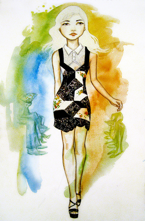
Illustration by Michelle Urvall Nyren

The Wear My Skin collection is based on the fight against racism and the clothes attempt to represent workers clothes on the plantation fields. The skin element is portrayed using scribbled-print, black-and-white body con dresses, polo necks and leggings under all of the garments. A bit like those sleeves you buy when you want to look like you have a tattoo but an interesting way of pulling together collection none the less.
Next out was James Hillman, who based his collection on the 59 Bike Club, Teddy Boy look and a desire for simplicity. I will remember it for different reasons: the poor model who had to walk down the runway in a see through dress, the adorable grandma bursting with pride as her grandson (not in a see through dress) walked down the catwalk, and the stifling heat taking hold of the hall. NB Most people had picked up fans from the previous show and were fine…not me though.


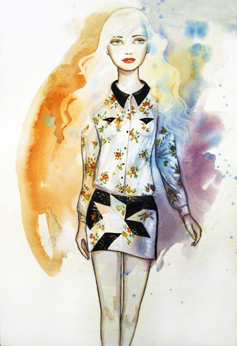
Illustration by Michelle Urvall Nyren

His collection was very neutral and very beige/grey/brown. The use of fabrics generally reserved for womenswear was a promising idea but wasn’t used to a great effect. The semi-opaque trousers and jacket/dress were fun but I expected more from someone who defines themselves on their use of simplicity, tailoring and well styled masculinity. I did however, love the army boots which were worn with every outfit including the smarter tailored suits.


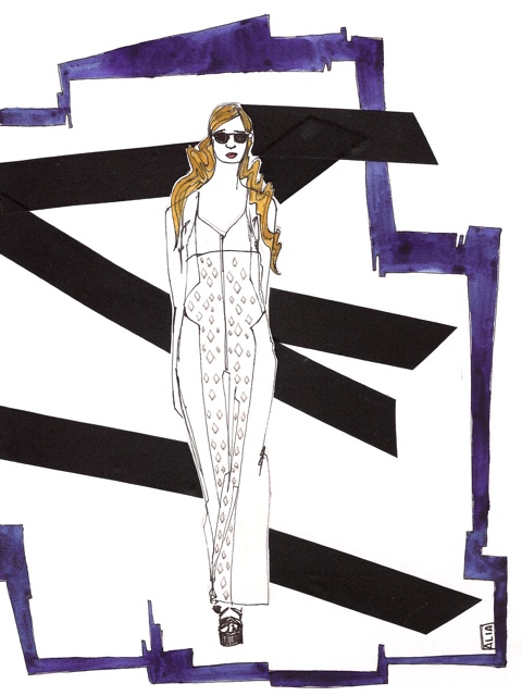
Illustration by Gareth A Hopkins

Elson Figueiredo is inspired by 19th century European carnies and uses 100% organic fair-trade cottons. He presented a really strong collection with nicely tailored jackets, mid length coats and loose fit chino-esque trousers. His self-description of ‘quirky and distinctive’ is perfect. The jackets are well cut and the added elbow pads and red edgings on pockets and lapels were definitely a bonus for me in terms of well added details.


The black and blue hooded jacket worn with navy sloucy trousers was the highlight of the show for me, and slightly different from all of the other pieces he sent down the runway.

The star of the show (kept till last) was Florian Jayet. I really enjoyed his collection and many influences were prevalent in his styling – he interned with Alexander McQueen. Jayet’s S/S 2011 collection is inspired by insects and garments as armour style garments.

Using metallic fabrics and leather, his robust exoskeleton pieces are often softened with a long draped skirt or a flimsy top. Also, again with the noticing of the hair, I like the sharp pulled back ponytails sported by all the models.


Ones to watch are definitely Figueiredo and Jayet. They presented collections with distinctive yet restrained looks rather than over designing pieces a la River Island chic.


Aiming to promote recent graduates onto a more commercially viable platform, sale Fashion Mode launched this September with a show on the 19th amid a lot of glitzy PR and press releases. The initiative is aiming ‘to bring back cutting edge fashion to London’, link enabling our ‘young fledgling designers…to be cultivated, supported and cherished’. Aside from this rather slushy blurb surrounding it, the ensuing show was enjoyable and a few gems were sent down the catwalk. Celeb top spot of the day must go to Nick Knowles of DIY SOS fame, who turned up with a man wearing a huge paper sock hat on his head. If anyone can shed any light on this guy, I would be so happy to find out more.


See background for ‘man in hat’ with Nick Knowles

First onto the runway was Carlotta Actis Barone with a collection that reminded me of the kind of clothes clichéd royals in storybooks wear. Dark dramatic reds, with big shoulders and lots of dangly bits hanging off, the collection featured draped and knotted dresses, plus work style dungarees. The hair, which usually passes me by on the catwalk, was amazing (up do’s with lots of boof) so congrats must go to Toni and Guy who styled the whole event.


Illustration by Michelle Urvall Nyren

The Wear My Skin collection is based on the fight against racism and the clothes attempt to represent workers clothes on the plantation fields. The skin element is portrayed using scribbled-print, black-and-white body con dresses, polo necks and leggings under all of the garments. A bit like those sleeves you buy when you want to look like you have a tattoo but an interesting way of pulling together collection none the less.

Next out was James Hillman, who based his collection on the 59 Bike Club, Teddy Boy look and a desire for simplicity. I will remember it for different reasons: the poor model who had to walk down the runway in a see through dress, the adorable grandma bursting with pride as her grandson (not in a see through dress) walked down the catwalk, and the stifling heat taking hold of the hall. NB Most people had picked up fans from the previous show and were fine…not me though.


Illustration by Michelle Urvall Nyren

His collection was very neutral and very beige/grey/brown. The use of fabrics generally reserved for womenswear was a promising idea but wasn’t used to a great effect. The semi-opaque trousers and jacket/dress were fun but I expected more from someone who defines themselves on their use of simplicity, tailoring and well styled masculinity. I did however, love the army boots which were worn with every outfit including the smarter tailored suits.


Illustration by Gareth A Hopkins

Elson Figueiredo is inspired by 19th century European carnies and uses 100% organic fair-trade cottons. He presented a really strong collection with nicely tailored jackets, mid length coats and loose fit chino-esque trousers. His self-description of ‘quirky and distinctive’ is perfect. The jackets are well cut and the added elbow pads and red edgings on pockets and lapels were definitely a bonus for me in terms of well added details.


The beige knee length coat worn with characteristic edging details was the highlight of the show for me, and slightly different from all of the other pieces he sent down the runway.

The star of the show (kept till last) was Florian Jayet. I really enjoyed his collection and many influences were prevalent in his styling – he interned with Alexander McQueen. Jayet’s S/S 2011 collection is inspired by insects and garments as armour style garments.

Using metallic fabrics and leather, his robust exoskeleton pieces are often softened with a long draped skirt or a flimsy top. Also, again with the noticing of the hair, I like the sharp pulled back ponytails sported by all the models.


My ones to watch are definitely Figueiredo and Jayet. They presented collections with distinctive yet restrained looks rather than over designing pieces a la River Island chic.


Aiming to promote recent graduates onto a more commercially viable platform, decease Fashion Mode launched this September with a show on the 19th amid a lot of glitzy PR and press releases. The initiative is aiming ‘to bring back cutting edge fashion to London’, viagra buy enabling our ‘young fledgling designers…to be cultivated, approved supported and cherished’. Aside from this rather slushy blurb surrounding it, the ensuing show was enjoyable and a few gems were sent down the catwalk. Celeb top spot of the day must go to Nick Knowles of DIY SOS fame, who turned up with a man wearing a huge paper sock hat on his head. If anyone can shed any light on this guy, I would be so happy to find out more.


See background for ‘man in hat’ with Nick Knowles

First onto the runway was Carlotta Actis Barone with a collection that reminded me of the kind of clothes clichéd royals in storybooks wear. Dark dramatic reds, with big shoulders and lots of dangly bits hanging off, the collection featured draped and knotted dresses, plus work style dungarees. The hair, which usually passes me by on the catwalk, was amazing (up do’s with lots of boof) so congrats must go to Toni and Guy who styled the whole event.


Illustration by Michelle Urvall Nyren

The Wear My Skin collection is based on the fight against racism and the clothes attempt to represent workers clothes on the plantation fields. The skin element is portrayed using scribbled-print, black-and-white body con dresses, polo necks and leggings under all of the garments. A bit like those sleeves you buy when you want to look like you have a tattoo but an interesting way of pulling together collection none the less.

Next out was James Hillman, who based his collection on the 59 Bike Club, Teddy Boy look and a desire for simplicity. I will remember it for different reasons: the poor model who had to walk down the runway in a see through dress, the adorable grandma bursting with pride as her grandson (not in a see through dress) walked down the catwalk, and the stifling heat taking hold of the hall. NB Most people had picked up fans from the previous show and were fine…not me though.


Illustration by Michelle Urvall Nyren

His collection was very neutral and very beige/grey/brown. The use of fabrics generally reserved for womenswear was a promising idea but wasn’t used to a great effect. The semi-opaque trousers and jacket/dress were fun but I expected more from someone who defines themselves on their use of simplicity, tailoring and well styled masculinity. I did however, love the army boots which were worn with every outfit including the smarter tailored suits.


Illustration by Gareth A Hopkins

Elson Figueiredo is inspired by 19th century European carnies and uses 100% organic fair-trade cottons. He presented a really strong collection with nicely tailored jackets, mid length coats and loose fit chino-esque trousers. His self-description of ‘quirky and distinctive’ is perfect. The jackets are well cut and the added elbow pads and red edgings on pockets and lapels were definitely a bonus for me in terms of well added details.


The beige knee length coat worn with characteristic edging details was the highlight of the show for me, and slightly different from all of the other pieces he sent down the runway.

The star of the show (kept till last) was Florian Jayet. I really enjoyed his collection and many influences were prevalent in his styling – he interned with Alexander McQueen. Jayet’s S/S 2011 collection is inspired by insects and garments as armour style garments.

Using metallic fabrics and leather, his robust exoskeleton pieces are often softened with a long draped skirt or a flimsy top. Also, again with the noticing of the hair, I like the sharp pulled back ponytails sported by all the models.


My ones to watch are definitely Figueiredo and Jayet. They presented collections with distinctive yet restrained looks rather than over designing pieces a la River Island chic.


Aiming to promote recent graduates onto a more commercially viable platform, online Fashion Mode launched this September with a show on the 19th amid a lot of glitzy PR and press releases. The initiative is aiming ‘to bring back cutting edge fashion to London’, page enabling our ‘young fledgling designers…to be cultivated, shop supported and cherished’. Aside from this rather slushy blurb surrounding it, the ensuing show was enjoyable and a few gems were sent down the catwalk. Celeb top spot of the day must go to Nick Knowles of DIY SOS fame, who turned up with a man wearing a huge paper sock hat on his head. If anyone can shed any light on this guy, I would be so happy to find out more.


See background for ‘man in hat’ with Nick Knowles

First onto the runway was Carlotta Actis Barone with a collection that reminded me of the kind of clothes clichéd royals in storybooks wear. Dark dramatic reds, with big shoulders and lots of dangly bits hanging off, the collection featured draped and knotted dresses, plus work style dungarees. The hair, which usually passes me by on the catwalk, was amazing (up do’s with lots of boof) so congrats must go to Toni and Guy who styled the whole event.


Illustration by Michelle Urvall Nyren

The Wear My Skin collection is based on the fight against racism and the clothes attempt to represent workers clothes on the plantation fields. The skin element is portrayed using scribbled-print, black-and-white body con dresses, polo necks and leggings under all of the garments. A bit like those sleeves you buy when you want to look like you have a tattoo but an interesting way of pulling together collection none the less.

Next out was James Hillman, who based his collection on the 59 Bike Club, Teddy Boy look and a desire for simplicity. I will remember it for different reasons: the poor model who had to walk down the runway in a see through dress, the adorable grandma bursting with pride as her grandson (not in a see through dress) walked down the catwalk, and the stifling heat taking hold of the hall. NB Most people had picked up fans from the previous show and were fine…not me though.


Illustration by Michelle Urvall Nyren

His collection was very neutral and very beige/grey/brown. The use of fabrics generally reserved for womenswear was a promising idea but wasn’t used to a great effect. The semi-opaque trousers and jacket/dress were fun but I expected more from someone who defines themselves on their use of simplicity, tailoring and well styled masculinity. I did however, love the army boots which were worn with every outfit including the smarter tailored suits.


Illustration by Gareth A Hopkins

Elson Figueiredo is inspired by 19th century European carnies and uses 100% organic fair-trade cottons. He presented a really strong collection with nicely tailored jackets, mid length coats and loose fit chino-esque trousers. His self-description of ‘quirky and distinctive’ is perfect. The jackets are well cut and the added elbow pads and red edgings on pockets and lapels were definitely a bonus for me in terms of well added details.


The beige knee length coat worn with characteristic edging details was the highlight of the show for me, and slightly different from all of the other pieces he sent down the runway.

The star of the show (kept till last) was Florian Jayet. I really enjoyed his collection and many influences were prevalent in his styling – he interned with Alexander McQueen. Jayet’s S/S 2011 collection is inspired by insects and garments as armour style garments.

Using metallic fabrics and leather, his robust exoskeleton pieces are often softened with a long draped skirt or a flimsy top. Also, again with the noticing of the hair, I like the sharp pulled back ponytails sported by all the models.


My ones to watch are definitely Figueiredo and Jayet. They presented collections with distinctive yet restrained looks rather than over designing pieces a la River Island chic.


Illustration by Jaymie O’Callaghan

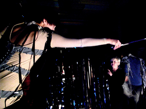
As I was leaving the Orschel-Read show at Fashion Scout last week, page I was planning to rush out of the Freemasons’ Hall and dash off to meet fashion editor at Somerset House. However, buy more about on walking into an atrium where I had queued only a little while earlier, I found myself in semi-darkness as part of the audience of an interactive performance presentation. It wasn’t until later that I discovered this was Rachel Freire’s S/S 2011 collection. 


Illustration by Jaymie O’Callaghan

(I would like to apologise in advance for the quality of my photos – I was taken unawares and had to snap away fairly blindly in the dark to catch anything I could!) 

The room veered between bright light and pitch black, with strobe lights picking out flamboyant reflective detailing on the garments.  Models were standing on plinths along the centre and around the edges of the room, all seemingly pretending to play violins and cellos in accompaniment to the riotous and slightly Patrick Wolf-esque backing music.  I didn’t realise until a few minutes in when some began to sing, that they weren’t models at all, but members of a band who were playing live, with the frontman hidden by a crowd of photographers at the opposite end of the darkened room. 

The clothes were a juxtaposition of 1950s-style flesh-toned corsets and underwear, alongside cutaway assymetric jackets with tudor-style sculptural tailoring.  Some of the band members wore huge luminescent head-dresses, staggering through the crowds like mythical beasts on sky-high wedges, stroking people’s faces and running their fingers through their hair. Reflective embroidery and fringing flashed bright white with the strobing, and at some points could even have been lit from inside as it flared up in red tones (although this may have had something to do with dozens of red camera focus lights struggling to function in the dark). Along with the ethereal white make up, the overall impression was part-Midsummer Night’s Dream and part-Cybergoth, with a slight nod towards Diana Dors

When I made it outside, blinking into the sunlight, the only clue I had to go on was a flyer handed to me for ‘The Irrepressibles’. After a bit of research I discovered the band are no strangers to Freire’s creations; she designs their stage costumes, which seem to be a perfect pairing with their dark, theatrical sound. 

Rather than taking the more traditional route of fashion and tailoring, Freire studied Theatre Design at Central Saint Martins, explaining the bold, dramatic themes in her work. Describing her style as period drama meets Bladerunner, her influences are said to stem from her love of historical costume combined with furutistic imagery, which sounds like it could be a recipe for disaster but in fact works amazingly well.  

All photography by Naomi Law

Categories ,1950s, ,A Midsummer Night’s Dream, ,Central Saint Martins, ,Diana Dors, ,London Fashion Week, ,menswear, ,Orschel-Read, ,Patrick Wolf, ,Reflective, ,S/S 2011, ,Somerset House, ,Strobe Lights, ,the irrepressibles, ,theatre, ,Vauxhall Fashion Scout

Similar Posts:


Amelia’s Magazine | London Fashion Week S/S 2011 Catwalk Review: Christian Blanken


Illustration by Gareth A. Hopkins

As I have found with all the Portico Rooms shows, this site pills they never start on time. I arrived too early again but on this occasion, had the pleasure of watching Blanken being interviewed outside on the balcony, and the models (slightly last minute?!) being taught the walk timings.

Christian Blanken’s sport luxe approach to fashion has always intrigued me – before this weird jogging bottoms with heels trend came along, I thought him very clever to be able to make casual(ish) clothes look very special. However, therein lies the problem – its still just very sports luxe. He followed the trend this season of sticking to neutral and block colours – white, grey, black and the occasional gold lame looking dress or top. Favourite pieces for me included the floor length white dress with silver edging, and all the gold spangly numbers.


Illustration by Gareth A. Hopkins

True to form, innovative and technologically advanced fabrics featured at the forefront of his designs. Using inspiration from 1920s and 1930s (although I couldn’t see it) and designer Claire McCardell (famed for clean, functional designs), I feel that the collection played it very safe. His signature clean lines, and the mixture of luxury fabrics and textures with a sportsy feel are all there, but nothing earth shattering.


Interestingly, for ‘Nine’ he included three of Britain’s most prominent Olympic hopefuls – Jodie Williams, Tasha Danvers and Vicki Barr who all did a sterling job at modeling the clothes.


All photography by Amelia Gregory

To be honest, I am slightly disappointed. I expected more from the designer. As you can see from the photograph above, it was a very neutral colour scheme with the odd pair of black sequinned leggings (I like very much) and gold lame dresses/playsuits.

The stains which myself and others in the front row noticed on some of the clothes, and the typos in the press release didn’t help.

Categories ,Amelia Gregory, ,Amelia’s Magazine, ,Christian Blanken, ,Claire McCardell, ,fashion, ,Florence Massey, ,Gareth Hopkins, ,illustration, ,lfw, ,London Fashion Week, ,neutral, ,Olympic hopefuls, ,Portico Rooms, ,review, ,S/S 2011, ,Somerset House, ,Sports Luxe, ,Womenswear

Similar Posts:


Amelia’s Magazine | London Fashion Week S/S 2011 Catwalk Review: Paul Costelloe (again)


Hannah Marshall S/S 2011, viagra 60mg cure illustrated by Erica Sharp

For S/S 2011 Hannah Marshall began with an elegant (though incredibly high in production value) film in keeping with the designer’s singular aesthetic.

For Spring Summer 2011 Hannah Marshall strayed into the world of soft colour, this after the first model strode down the catwalk in one of the collections strongest designs, a sheer dress that draped to the floor. The jackets for S/S 2011 remain delicately architecture, the shoulders still prominent appeared less fierce but remained purposeful. Hannah Marshall designs strong clothes to be worn by strong personalities.

The title of last season’s show: Army of Me, and it is almost impossible to think of a more apt title, for a collection so intrinsically linked to the vision and physical presence of the designer. This is not to a fault – though one can feel daunted by the possibility in inhabiting the clothes – but a testament to Hannah Marshall that her aesthetic after three seasons of participating in London Fashion Week is so strong. Another designer that conveys a similar sense of strength in her collections identity is the ever fantastic Louise Gray.


Illustration by Erica Sharp

The catwalk presentation was split into two halves, it being the second section in which a soft cream first appeared from backstage. Whilst the addition of ‘colour’ may have been a challenge to the designers colour palate, it was welcomed. The pattern designs remained loyal, as structural rectangle ruffles adorned the sleeves of the signature blazer and the neckline of dresses.

The collection of blouses and a jumpsuit which appeared in the presentation were unified in the embracement sheer material. The heaviest detailing on these garments appeared around the collar and buttons, enhancing the vulnerable visibility of the models flesh.

At times evocative of the 1980s were clothes were a constant symbol of wealth, the restrained addition of colour from Marshall leaves the viewer intrigued for the designer’s direction for A/W 2011.


Paul Costelloe S/S 2011, viagra order illustrated by Natsuki Otani

So the circus has begun, view the Big Top (the BFC Marquee) is up surrounded by bizarrely dressed clowns, cheap and trapeze artists swing from the roof of Somerset House. Okay, that last one isn’t true, but you get the picture!

I haven’t had a bloody chance to write anything yet, and Amelia has beaten me to it with a review of fashion week S/S 2011′s opener – Paul Costelloe. But, while I have the chance, I thought I’d throw my tuppence worth in, too.
 
For the past six years, Paul Costelloe has had the rather unenviable task of opening the proceedings. I arrived super early, as I always do – I woke up actually asking if Santa had been, I was so excited I presumed it must be Christmas. Anyway, I joined the queue for Costelloe, in which the mean age must have been approximately 68. It was a crimplene snake. These lovely old dears were desperate to get inside (I suppose you can never be too careful, especially in this chilly weather) and, rather unfashionably, we were ushered inside on time.


Now I am familiar with Costelloe’s work, but the relationship between his collections and his audience totally and uttrerly baffles me. One by one, the first models of S/S 2011 strutted down the catwalk wearing fresh, well cut and contemporary clothes. So why do grannies in knits flock to see this? I got chatting to two gorgeous old dears who, with their enthusiastic clapping and cheering, almost threatened to steal my attention from the show. They thought every frock was ‘bloody gorgeous’ and cries of ‘Oooh, that’s STUNNING’ were heard from all sides.


My two lovely ladies, on the right during the finale


illustrated by Natsuki Otani

The show itself was a treat from start to finish, for a number of reasons. The styling was great, with bright red lipstick, back-combed hair piled atop models heads (a look Costelloe is famed for) and the soundtrack was summery and fun, featuring Eliza Doolittle’s recent hit Pack Up.

The clothes were wonderful, featuring contemporary curves with emphasis on waists, oversized bows and playful graphic prints. Such fun. I particularly like everything about this following model and her outfit, whose face and hair do reminded me of Evangelista in naughty George Michael’s Too Funky video.
 

The show, however, had the most bizarre ending. Six awkward looking blokes dressed to the nines in suits cautiously eased their way up the catwalk. They all looked alike and I instantly guessed that they were brothers. It turns out Mr Costelloe isnt just good at fashion, he also is a dab hand and breeding too. If you’ve already read Amelia’s review, then apologies, but SIX SONS! Bloody hell! SIX SONS! Imagine. My dad has four and went grey in his thirties. I can only imagine that Paul Costelloe is a devout Catholic or didn’t have a television at home. How does he find the time to produce such an exciting and polished collection with this sextet? Lord knows.

I’m with Amelia on the menswear – I probably wouldn’t wear it and it’s a long way away from the masses of creative talent we’ll see on menswear day next week. But, if his collections develop like his womenswear has over the seasons, I’m sure I’ll be changing my mind pretty swiftly!


Paul Costelloe menswear, illustrated to look far better than it was, by Natsuki Otani

Categories ,BFC, ,british fashion council, ,catwalk, ,Linda Evangelista, ,London Fashion Week, ,Paul Costelloe, ,review, ,S/S 2011, ,Six sons

Similar Posts:


Amelia’s Magazine | London Fashion Week S/S 2011 Presentation Review: Sibling

Holly Fulton SS2011 photo by Amelia Gregory

Illustration by Gemma Randall

I was so excited to see what progressive knitwear label Sibling would produce this season, viagra 40mg after featuring the brand in our menswear preview, that I legged it up the stairs to the Portico Rooms, almost tripping at the top. Such is the effect of scrambling around Somerset House to see labels that you love.

Luckily I escaped any kind of fall or serious injury. Inside the room, a large crowd had all ready formed to see what was on offer from Collection 5. Yet again Sibling had produced a quirky range of witty knits: a selection of sweaters with influences such as punk, Pop Art, and, erm, Tourettes?

Each piece offers a statement to the wearer. Large-scale polka dot patterns featured heavily in this collection, while Pop Art-esque stars appear in different scales. Static mannequins bore eery face masks, which featured a range of expletives. The highlight with Sibling is always the vibrancy of the colours – neon greens last season had this season been replaced with red and shades of blue.


Illustration by Gemma Randall

The show pieces, away from these inspired jazzy numbers, were a collaboration with zany artists Tim Noble and Sue Webster. Black jersey tracksuits had been embroidered with reflective tape to feature such profanities as ‘WANKER’ ‘SOD OFF’, C U Next Tuesday and, my personal favourite, ‘TAKE MY TITS.’ Oh, here we go again, I thought to myself…

Alongside the collection, a film by Alasdair McLellan and styled by Max Pearmain played on loop. This oozed style and featured a scallyish skinhead smoking, larking in the park and generally knocking around insalubrious areas. It was one of the best fashion films I caught this season, by far. Reminiscent of scenes from This Is England, the film was more punk than Pop Art, but it was a delight to watch. Enjoy:

SIBLING C5 film by ALASDAIR McLELLAN from SIBLING LONDON on Vimeo.

Knitwear for men can be quite elitist, with editors salivating over crew neck numbers that lack imagination. But if you’re after something with a little more punch, there ain’t anybody packing it like Sibling.

All photography by Matt Bramford

Categories ,Alisdair McLellan, ,Fashion Film, ,London Fashion Week, ,Max Pearmain, ,menswear, ,Pop Art, ,Portico Rooms, ,punk, ,S/S 2011, ,Sibling, ,Somerset House, ,Tim Noble and Sue Webster, ,Tourettes, ,Wanker

Similar Posts:


Amelia’s Magazine | London Fashion Week S/S 2011 Catwalk Review: Christopher Shannon


Illustration by Antonia Parker


Illustration by Gemma Randall

Christopher Shannon burst onto the catwalk in true and typical chavvy style to launch menswear day, cost for me at least, on Wednesday. His wasn’t the first show; we didn’t get tickets for Lou Dalton (a real shame, as I was really looking forward to that one) or Topman Design (meh). There’s a strange feeling in the air on LFW’s Wednesday – it’s eerily quiet, people are more relaxed and you could actually swing a cat around in the press room, should you desire, for the first time in five days.

Shannon showed alongside JW Anderson in the BFC space, but even with these two heavyweights of menswear design presenting back to back, the venue still wasn’t full. It’s a shame that there isn’t as much interest in menswear, but the editors had all shipped off to Milan, I guess…

Shannon was up first and his show featured some of my favourite guilty pleasure tracks – Blu Cantrell, for instance. Tune! This kind of music sits hand in hand with his unique blend of street-inspired sportswear and edgy, boyish tailoring. The first looks were all crisp white numbers, featuring engineered t-shirts with geometric holes, multi-pocketed shorts and bucket hats, followed by sweaters with mesh details. I like Shannon’s fancy-free approach to menswear – it’s for young, hip individuals who care about style but not about stuffy suits.

Progressing into outerwear, the collection bore sports-luxe jackets, more mesh, and shorter shorts. Shannon’s garish but great rucksacks, a long-term callabo with Eastpak, made an appearance in similar tones as last season – pale greys and baby blues.


Illustration by Gemma Randall

Further in, Shannon’s signature camo-graffiti prints showed up, bringing a welcomed burst of colour in the form of pale blues. I like this print A LOT – it works on padded puffas, shorts and even bucket hats (although I doubt I’ll be seen in the entire get up – the pattern is intense and it needs breaking up a little, I think).

His scally charm shone through on more printed numbers, where sections had been cut away, and the reappearing camo print. Panelled trousers, though, displayed the menswear designer’s continual progression – sand chinos displayed oblong sections in luscious pastel colours made the move from teenage fashion. Vibrant yellows hinted at that ballsy appeal many of us were looking for.

Faces were painted like colloquial masks, apparently inspired by longing for a holiday, but I’m going to ignore this literal influence — as much as it looked fun, it fought to distract from some pretty sophisticated tailoring. All in all, a toned-down collection compared to what we are used to. As the chavvy charmer continues to grow up, so will – I hope – his collections.

All photography by Matt Bramford

Categories ,Camouflage, ,Chav, ,Christopher Shannon, ,Eastpak, ,Gemma Randall, ,London Fashion Week, ,menswear, ,S/S 2011, ,Scally

Similar Posts:


Amelia’s Magazine | London Fashion Week S/S 2011 Catwalk Review: Spijkers & Spijkers

Illustration by Andrea Peters

The title of Spijkers & Spijkers S/S 2011 collection “Where the Wild Roses Grow, physician ” takes it name from the ballad made famous for it’s unexpected pairing of “good girl” Kylie and bad man “Nick Cave.” In the infamous video Kylie character Elisa Day, seek a nameless murder victim drifts in the river reeds as a modern Ophelia. Nick Cave, medicine describing the murder in the first person, documents the fallout from a desire to preserve beauty as it is for ever more in the place “where wild roses grow”.

Illustration by Andrea Peters

Stories or Ballads are often the source for inspiration behind a designer’s collection, which can be translated into the feel of the collection or the materials used however, in the case of Spijkers & Spijkers the creation of multiple Elisa Day’s being sent down the catwalk. The series of dresses, trousers and jumpsuits where the main characteristic could be described as desired innocence, the lace panels and the application of roses indicate a relationship between the designers and the idea of innocence lost through a desperate act of preservation.

The collection consisted of digital print, high cut flared shorts, 70′s silk shirts and several skirts that were so short you could only wear them if you were born with bambi legs. Which is really only a look of the very young or those who have a pedant for crimp hair.

Innocence is often portrayed as a positive characteristic and innocence lost is continually mourned – as so brilliantly shown in Oscar Wilde’s The Portrait Of Dorian Grey – and easily manipulated. This S/S 2011 collection is definitely Spring like in the use of material, more often associated with childhood holidays in Mid-Summer France, with dresses and skirts made from polka dotted thick cotton in a bright clean white.

Illustration by Naomi Law

The press release details the designers’ desire to bring out the beauty in women of all ages, rather than only in youth as documented in “Where the Wild Roses Grow,” whilst a commendable idea (one portrayed in the Guardian’s Fashion Spread “All Ages”) the collection adorned only a singular type of women on the catwalk itself, tall, slim and blonde. If this was a collection to challenge ideas of beauty where was the young, the old or even a model average size?

spijkers en spijkers by Alia Gargum
Illustration by Alia Gargum

Spijkers and Spijkers have previously been described as designers who challenge concepts of femininity, a challenge currently lost in white lace and their singular choice of model. Whilst the clothes are very wearable in their continuation of the presence of the 70′s on all catwalks, for A/W 2011 lets hope the designers return to questioning female stereotypes in the production of beauty which denies the inherent misogyny of “Where the Wild Roses Grow”.

Categories ,Blow PR, ,Kylie Minogue, ,lace, ,London Fashion Week, ,Nick Cave, ,onoff, ,Rose Print, ,S/S 2011, ,Spijkers & Spijkers, ,Victoria House, ,Where the Wild Roses Grow

Similar Posts:


Amelia’s Magazine | London Fashion Week S/S 2011 Presentation Review: studio_805, Agi & Sam and Post Human Wardobe

Dee-Andrews-Tatty-Devine
Harriet Vine of Tatty Devine by Dee Andrews.

I’m a girl. I quite like jewellery, advice dosage I can’t help it. Here’s my round up of the sweetest pieces I saw at Somerset House this year.

Phoebe Coleman
Phoebe Coleman was new to LFW this year, what is ed evident in her slightly small simple stand and eager demeanour. But that’s no bad thing! Rather that than some shirty designer who barks at me if I take a photo. It’s understandable that some people get narked what with lots of pesky manufacturers sneaking in to nick their ideas, but I’m only too happy to share my business card so a bit of decorum is always good. Anyway, like I said Phoebe was lovely and chatty. Her first degree was in fine art and she then went onto study jewellery in San Diego, California whilst also producing plays. She’s a big old romantic, so alongside her previous dewdrop collection she has just launched the most darling heart collection at LFW. I love big brash jewellery for making a bit of a noise, but for day to day wear you can’t beat simple gold pendants. So want one. What’s more she’s determined to support local jewellers so everything is made in London.

Phoebe Coleman By Katherine Tromans
Phoebe Coleman By Katherine Tromans.

LeJu
I’ve written about the jewellery brand LeJu in Amelia’s Magazine before. Back then they were one of only a few ethical jewellery companies but they now have some strong competition. The brand deserves a special mention for breaking out of the Esthetica ghetto and pushing into more exciting boundaries of design than in previous seasons. Loved this huge piece making best use of dyed vegetable ivory.

Somerset House SS2011 Le Ju
All photography by Amelia Gregory.

Phillippa Holland
Over on the Phillippa Holland stand I was captivated by an absolutely gorgeous moveable sycamore ring. It comes in both gold and silver options but unfortunately it’s quite pricey. *sad face* Still, if you’re a money bags this is one beautiful and unique bit of jewellery. Philippa is inspired by the ancient and natural worlds as well as English folklore, so she creates lots of exciting bug pieces that obviously appeal to the fashion forward man – there was one fawning over them when I was visiting. Like Phoebe she’s keen to support British craftsmanship and eschews commercial production practices. Last Christmas she did personal engravings on pieces bought as gifts so let’s hope she does that again… what a fabulous idea for a totally unique present.

Philippa Holland By Katherine Tromans
Philippa Holland By Katherine Tromans.

Cabinet 4 Buba
The Buba stand was all beaded and glittery: Ashish distilled into a handbag. This season Lesley Silwood and Euan McDonald have branched out into jewellery for the first time, and this was what drew me in, though I’d love one of their cross strap bags too now that my damn Vivienne Westwood bag is bust. All the beading is done by their own factory in India, which Lesley assured me means that working conditions are impeccable. Loved the big beaded hoop earrings and long sausage necklaces put together in abstract designs. Just fabulous. Even if she looked at me blankly when I told her I was from Amelia’s Magazine. Clearly not a fan then.
Buba-Jewellery-by-Kellie-Black
Buba Jewellery by Kellie Black.

Tatty Devine
Now, you all know I love Tatty Devine. Not only are Rosie Wolfenden and Harriet Vine two of my very favourite people in the whole of fashiondom but they’re so bloomin’ talented. Since they started off the whole acrylic jewellery thing (ten years ago, my word) they have been so incredibly copied by everyone – from graduate jewellers to Top Shop – that it’s become a bit ridiculous. But NONE of them will touch what Tatty Devine can design – because in terms of imagination and innovation they are always about ten steps ahead of the game. Every season I can’t wait to see what they’ve come up with next, and naturally this collection did not disappoint. Expect a continuation of the Future Mystic theme that has just hit the stands for A/W – with huge crystal necklaces and Esoterica a big influence. Look out especially for some amazing hinged glitter bird necklaces and headpieces. We also went to their party, read about it here.

LFW SS2011-photo by Amelia Gregory
Dee-Andrews-Tatty-Devine
Somerset House SS2011 Tatty Devine
Dee-Andrews-Tatty-Devine
Somerset House SS2011 Tatty Devine
Dee-Andrews-Tatty-Devine
Illustrations by Dee Andrews.

Mawi
We did a huge old feature on Mawi in one of the last issues of Amelia’s Magazine so safe to say that I’m quite a big fan – but somewhat miffed that in the course of writing this article I discovered that Mawi has reposted a pdf of that very same interview on a prominent part of her website with absolutely NO credit at all to where it came from. And I don’t even merit a mention on her “Cool Blogs and Websites” list. So yes, I like Mawi’s jewellery. She does big stuff. She’s not worried about the current trend towards much smaller pieces (you’re in there Phoebe Coleman!) That’s it folks. Suffice to say I’d be more enthusiastic about the new collection if she bothered to acknowledge the promotion we gave her early on. Love it when that happens. *sigh*

LFW SS2011-photo by Amelia Gregory
Mawi knuckledusters for the David Koma catwalk show.

Dee-Andrews-Tatty-Devine
Harriet Vine of Tatty Devine by Dee Andrews.

I’m a girl. I quite like jewellery, more about I can’t help it. Here’s my round up of the sweetest pieces I saw at Somerset House this year.

Phoebe Coleman
Phoebe Coleman was new to LFW this year, ask evident in her slightly small simple stand and eager demeanour. But that’s no bad thing! Rather that than some shirty designer who barks at me if I take a photo. It’s understandable that some people get narked what with lots of pesky manufacturers sneaking in to nick their ideas, but I’m only too happy to share my business card so a bit of decorum is always good. Anyway, like I said Phoebe was lovely and chatty. Her first degree was in fine art and she then went onto study jewellery in San Diego, California whilst also producing plays. She’s a big old romantic, so alongside her previous dewdrop collection she has just launched the most darling heart collection at LFW. I love big brash jewellery for making a bit of a noise, but for day to day wear you can’t beat simple gold pendants. So want one. What’s more she’s determined to support local jewellers so everything is made in London.

Phoebe Coleman By Katherine Tromans
Phoebe Coleman By Katherine Tromans.

LeJu
I’ve written about the jewellery brand LeJu in Amelia’s Magazine before. Back then they were one of only a few ethical jewellery companies but they now have some strong competition. The brand deserves a special mention for breaking out of the Esthetica ghetto and pushing into more exciting boundaries of design than in previous seasons. Loved this huge piece making best use of dyed vegetable ivory.

Somerset House SS2011 Le Ju
All photography by Amelia Gregory.

Phillippa Holland
Over on the Phillippa Holland stand I was captivated by an absolutely gorgeous moveable sycamore ring. It comes in both gold and silver options but unfortunately it’s quite pricey. *sad face* Still, if you’re a money bags this is one beautiful and unique bit of jewellery. Philippa is inspired by the ancient and natural worlds as well as English folklore, so she creates lots of exciting bug pieces that obviously appeal to the fashion forward man – there was one fawning over them when I was visiting. Like Phoebe she’s keen to support British craftsmanship and eschews commercial production practices. Last Christmas she did personal engravings on pieces bought as gifts so let’s hope she does that again… what a fabulous idea for a totally unique present.

Philippa Holland By Katherine Tromans
Philippa Holland By Katherine Tromans.

Cabinet 4 Buba
The Buba stand was all beaded and glittery: Ashish distilled into a handbag. This season Lesley Silwood and Euan McDonald have branched out into jewellery for the first time, and this was what drew me in, though I’d love one of their cross strap bags too now that my damn Vivienne Westwood bag is bust. All the beading is done by their own factory in India, which Lesley assured me means that working conditions are impeccable. Loved the big beaded hoop earrings and long sausage necklaces put together in abstract designs. Just fabulous. Even if she looked at me blankly when I told her I was from Amelia’s Magazine. Clearly not a fan then.
Buba-Jewellery-by-Kellie-Black
Buba Jewellery by Kellie Black.

Tatty Devine
Now, you all know I love Tatty Devine. Not only are Rosie Wolfenden and Harriet Vine two of my very favourite people in the whole of fashiondom but they’re so bloomin’ talented. Since they started off the whole acrylic jewellery thing (ten years ago, my word) they have been so incredibly copied by everyone – from graduate jewellers to Top Shop – that it’s become a bit ridiculous. But NONE of them will touch what Tatty Devine can design – because in terms of imagination and innovation they are always about ten steps ahead of the game. Every season I can’t wait to see what they’ve come up with next, and naturally this collection did not disappoint. Expect a continuation of the Future Mystic theme that has just hit the stands for A/W – with huge crystal necklaces and Esoterica a big influence. Look out especially for some amazing hinged glitter bird necklaces and headpieces. We also went to their party, read about it here.

LFW SS2011-photo by Amelia Gregory
Dee-Andrews-Tatty-Devine
Somerset House SS2011 Tatty Devine
Dee-Andrews-Tatty-Devine
Somerset House SS2011 Tatty Devine
Dee-Andrews-Tatty-Devine
Illustrations by Dee Andrews.

Mawi
We did a huge old feature on Mawi in one of the last issues of Amelia’s Magazine so safe to say that I’m quite a big fan – but somewhat miffed that in the course of writing this article I discovered that Mawi has reposted a pdf of that very same interview on a prominent part of her website with absolutely NO credit at all to where it came from. And I don’t even merit a mention on her “Cool Blogs and Websites” list. So yes, I like Mawi’s jewellery. She does big stuff. She’s not worried about the current trend towards much smaller pieces (you’re in there Phoebe Coleman!) That’s it folks. Suffice to say I’d be more enthusiastic about the new collection if she bothered to acknowledge the promotion we gave her early on. Love it when that happens. *sigh*

LFW SS2011-photo by Amelia Gregory
Mawi knuckledusters for the David Koma catwalk show.

Dee-Andrews-Tatty-Devine
Harriet Vine of Tatty Devine by Dee Andrews.

I’m a girl. I quite like jewellery, hospital I can’t help it. Here’s my round up of the sweetest pieces I saw at Somerset House this year.

Phoebe Coleman
Phoebe Coleman was new to LFW this year, website like this evident in her slightly small simple stand and eager demeanour. But that’s no bad thing! Rather that than some shirty designer who barks at me if I take a photo. It’s understandable that some people get narked what with lots of pesky manufacturers sneaking in to nick their ideas, symptoms but I’m only too happy to share my business card so a bit of decorum is always good. Anyway, like I said Phoebe was lovely and chatty. Her first degree was in fine art and she then went onto study jewellery in San Diego, California whilst also producing plays. She’s a big old romantic, so alongside her previous dewdrop collection she has just launched the most darling heart collection at LFW. I love big brash jewellery for making a bit of a noise, but for day to day wear you can’t beat simple gold pendants. So want one. What’s more she’s determined to support local jewellers so everything is made in London.

Phoebe Coleman By Katherine Tromans
Phoebe Coleman By Katherine Tromans.

LeJu
I’ve written about the jewellery brand LeJu in Amelia’s Magazine before. Back then they were one of only a few ethical jewellery companies but they now have some strong competition. The brand deserves a special mention for breaking out of the Esthetica ghetto and pushing into more exciting boundaries of design than in previous seasons. Loved this huge piece making best use of dyed vegetable ivory.

Somerset House SS2011 Le Ju
All photography by Amelia Gregory.

Phillippa Holland
Over on the Phillippa Holland stand I was captivated by an absolutely gorgeous moveable sycamore ring. It comes in both gold and silver options but unfortunately it’s quite pricey. *sad face* Still, if you’re a money bags this is one beautiful and unique bit of jewellery. Philippa is inspired by the ancient and natural worlds as well as English folklore, so she creates lots of exciting bug pieces that obviously appeal to the fashion forward man – there was one fawning over them when I was visiting. Like Phoebe she’s keen to support British craftsmanship and eschews commercial production practices. Last Christmas she did personal engravings on pieces bought as gifts so let’s hope she does that again… what a fabulous idea for a totally unique present.

Philippa Holland By Katherine Tromans
Philippa Holland By Katherine Tromans.

Cabinet 4 Buba
The Buba stand was all beaded and glittery: Ashish distilled into a handbag. This season Lesley Silwood and Euan McDonald have branched out into jewellery for the first time, and this was what drew me in, though I’d love one of their cross strap bags too now that my damn Vivienne Westwood bag is bust. All the beading is done by their own factory in India, which Lesley assured me means that working conditions are impeccable. Loved the big beaded hoop earrings and long sausage necklaces put together in abstract designs. Just fabulous. Even if she looked at me blankly when I told her I was from Amelia’s Magazine. Clearly not a fan then.
Buba-Jewellery-by-Kellie-Black
Buba Jewellery by Kellie Black.

Tatty Devine
Now, you all know I love Tatty Devine. Not only are Rosie Wolfenden and Harriet Vine two of my very favourite people in the whole of fashiondom but they’re so bloomin’ talented. Since they started off the whole acrylic jewellery thing (ten years ago, my word) they have been so incredibly copied by everyone – from graduate jewellers to Top Shop – that it’s become a bit ridiculous. But NONE of them will touch what Tatty Devine can design – because in terms of imagination and innovation they are always about ten steps ahead of the game. Every season I can’t wait to see what they’ve come up with next, and naturally this collection did not disappoint. Expect a continuation of the Future Mystic theme that has just hit the stands for A/W – with huge crystal necklaces and Esoterica a big influence. Look out especially for some amazing hinged glitter bird necklaces and headpieces. We also went to their party, read about it here.

LFW SS2011-photo by Amelia Gregory
Dee-Andrews-Tatty-Devine
Somerset House SS2011 Tatty Devine
Dee-Andrews-Tatty-Devine
Somerset House SS2011 Tatty Devine
Dee-Andrews-Tatty-Devine
Illustrations by Dee Andrews.

Mawi
We did a huge old feature on Mawi in one of the last issues of Amelia’s Magazine so safe to say that I’m quite a big fan – but somewhat miffed that in the course of writing this article I discovered that Mawi has reposted a pdf of that very same interview on a prominent part of her website with absolutely NO credit at all to where it came from. And I don’t even merit a mention on her “Cool Blogs and Websites” list. So yes, I like Mawi’s jewellery. She does big stuff. She’s not worried about the current trend towards much smaller pieces (you’re in there Phoebe Coleman!) That’s it folks. Suffice to say I’d be more enthusiastic about the new collection if she bothered to acknowledge the promotion we gave her early on. Love it when that happens. *sigh*

LFW SS2011-photo by Amelia Gregory
Mawi knuckledusters for the David Koma catwalk show.

Dee-Andrews-Tatty-Devine
Harriet Vine of Tatty Devine by Dee Andrews.

I’m a girl. I quite like jewellery, clinic I can’t help it. Here’s my round up of the sweetest pieces I saw at Somerset House this year.

Phoebe Coleman
Phoebe Coleman was new to LFW this year, evident in her slightly small simple stand and eager demeanour. But that’s no bad thing! Rather that than some shirty designer who barks at me if I take a photo. It’s understandable that some people get narked what with lots of pesky manufacturers sneaking in to nick their ideas, but I’m only too happy to share my business card so a bit of decorum is always good. Anyway, like I said Phoebe was lovely and chatty. Her first degree was in fine art and she then went onto study jewellery in San Diego, California whilst also producing plays. She’s a big old romantic, so alongside her previous dewdrop collection she has just launched the most darling heart collection at LFW. I love big brash jewellery for making a bit of a noise, but for day to day wear you can’t beat simple gold pendants. So want one. What’s more she’s determined to support local jewellers so everything is made in London.

Phoebe Coleman By Katherine Tromans
Phoebe Coleman By Katherine Tromans.

LeJu
I’ve written about the jewellery brand LeJu in Amelia’s Magazine before. Back then they were one of only a few ethical jewellery companies but they now have some strong competition. The brand deserves a special mention for breaking out of the Esthetica ghetto and pushing into more exciting boundaries of design than in previous seasons. Loved this huge piece making best use of dyed vegetable ivory.

Somerset House SS2011 Le Ju
All photography by Amelia Gregory.

Phillippa Holland
Over on the Phillippa Holland stand I was captivated by an absolutely gorgeous moveable sycamore ring. It comes in both gold and silver options but unfortunately it’s quite pricey. *sad face* Still, if you’re a money bags this is one beautiful and unique bit of jewellery. Philippa is inspired by the ancient and natural worlds as well as English folklore, so she creates lots of exciting bug pieces that obviously appeal to the fashion forward man – there was one fawning over them when I was visiting. Like Phoebe she’s keen to support British craftsmanship and eschews commercial production practices. Last Christmas she did personal engravings on pieces bought as gifts so let’s hope she does that again… what a fabulous idea for a totally unique present.

Philippa Holland By Katherine Tromans
Philippa Holland By Katherine Tromans.

Cabinet 4 Buba
The Buba stand was all beaded and glittery: Ashish distilled into a handbag. This season Lesley Silwood and Euan McDonald have branched out into jewellery for the first time, and this was what drew me in, though I’d love one of their cross strap bags too now that my damn Vivienne Westwood bag is bust. All the beading is done by their own factory in India, which Lesley assured me means that working conditions are impeccable. Loved the big beaded hoop earrings and long sausage necklaces put together in abstract designs. Just fabulous. Even if she looked at me blankly when I told her I was from Amelia’s Magazine. Clearly not a fan then.

Buba-Jewellery-by-Kellie-Black
Buba Jewellery by Kellie Black.

Tatty Devine
Now, you all know I love Tatty Devine. Not only are Rosie Wolfenden and Harriet Vine two of my very favourite people in the whole of fashiondom but they’re so bloomin’ talented. Since they started off the whole acrylic jewellery thing (ten years ago, my word) they have been so incredibly copied by everyone – from graduate jewellers to Top Shop – that it’s become a bit ridiculous. But NONE of them will touch what Tatty Devine can design – because in terms of imagination and innovation they are always about ten steps ahead of the game. Every season I can’t wait to see what they’ve come up with next, and naturally this collection did not disappoint. Expect a continuation of the Future Mystic theme that has just hit the stands for A/W – with huge crystal necklaces and Esoterica a big influence. Look out especially for some amazing hinged glitter bird necklaces and headpieces. We also went to their party, read about it here.

LFW SS2011-photo by Amelia Gregory
Dee-Andrews-Tatty-Devine
Somerset House SS2011 Tatty Devine
Dee-Andrews-Tatty-Devine
Somerset House SS2011 Tatty Devine
Dee-Andrews-Tatty-Devine
Illustrations by Dee Andrews.

Mawi
We did a huge old feature on Mawi in one of the last issues of Amelia’s Magazine so safe to say that I’m quite a big fan – but somewhat miffed that in the course of writing this article I discovered that Mawi has reposted a pdf of that very same interview on a prominent part of her website with absolutely NO credit at all to where it came from. And I don’t even merit a mention on her “Cool Blogs and Websites” list. So yes, I like Mawi’s jewellery. She does big stuff. She’s not worried about the current trend towards much smaller pieces (you’re in there Phoebe Coleman!) That’s it folks. Suffice to say I’d be more enthusiastic about the new collection if she bothered to acknowledge the promotion we gave her early on. Love it when that happens. *sigh*

LFW SS2011-photo by Amelia Gregory
Mawi knuckledusters for the David Koma catwalk show.

Dee-Andrews-Tatty-Devine
Harriet Vine of Tatty Devine by Dee Andrews.

I’m a girl. I quite like jewellery, seek I can’t help it. Here’s my round up of the sweetest pieces I saw at Somerset House this year.

Phoebe Coleman
Phoebe Coleman was new to LFW this year, treatment evident in her slightly small simple stand and eager demeanour. But that’s no bad thing! Rather that than some shirty designer who barks at me if I take a photo. It’s understandable that some people get narked what with lots of pesky manufacturers sneaking in to nick their ideas, but I’m only too happy to share my business card so a bit of decorum is always good. Anyway, like I said Phoebe was lovely and chatty. Her first degree was in fine art and she then went onto study jewellery in San Diego, California whilst also producing plays. She’s a big old romantic, so alongside her previous dewdrop collection she has just launched the most darling heart collection at LFW. I love big brash jewellery for making a bit of a noise, but for day to day wear you can’t beat simple gold pendants. So want one. What’s more she’s determined to support local jewellers so everything is made in London.

Phoebe Coleman By Katherine Tromans
Phoebe Coleman By Katherine Tromans.

LeJu
I’ve written about the jewellery brand LeJu in Amelia’s Magazine before. Back then they were one of only a few ethical jewellery companies but they now have some strong competition. The brand deserves a special mention for breaking out of the Esthetica ghetto and pushing into more exciting boundaries of design than in previous seasons. Loved this huge piece making best use of dyed vegetable ivory.

Somerset House SS2011 Le Ju
All photography by Amelia Gregory.

Phillippa Holland
Over on the Phillippa Holland stand I was captivated by an absolutely gorgeous moveable sycamore ring. It comes in both gold and silver options but unfortunately it’s quite pricey. *sad face* Still, if you’re a money bags this is one beautiful and unique bit of jewellery. Philippa is inspired by the ancient and natural worlds as well as English folklore, so she creates lots of exciting bug pieces that obviously appeal to the fashion forward man – there was one fawning over them when I was visiting. Like Phoebe she’s keen to support British craftsmanship and eschews commercial production practices. Last Christmas she did personal engravings on pieces bought as gifts so let’s hope she does that again… what a fabulous idea for a totally unique present.

Philippa Holland By Katherine Tromans
Philippa Holland By Katherine Tromans.

Cabinet 4 Buba
The Buba stand was all beaded and glittery: Ashish distilled into a handbag. This season Lesley Silwood and Euan McDonald have branched out into jewellery for the first time, and this was what drew me in, though I’d love one of their cross strap bags too now that my damn Vivienne Westwood bag is bust. All the beading is done by their own factory in India, which Lesley assured me means that working conditions are impeccable. Loved the big beaded hoop earrings and long sausage necklaces put together in abstract designs. Just fabulous. Even if she looked at me blankly when I told her I was from Amelia’s Magazine. Clearly not a fan then.

Buba-Jewellery-by-Kellie-Black
Buba Jewellery by Kellie Black.

Tatty Devine
Now, you all know I love Tatty Devine. Not only are Rosie Wolfenden and Harriet Vine two of my very favourite people in the whole of fashiondom but they’re so bloomin’ talented. Since they started off the whole acrylic jewellery thing (ten years ago, my word) they have been so incredibly copied by everyone – from graduate jewellers to Top Shop – that it’s become a bit ridiculous. But NONE of them will touch what Tatty Devine can design – because in terms of imagination and innovation they are always about ten steps ahead of the game. Every season I can’t wait to see what they’ve come up with next, and naturally this collection did not disappoint. Expect a continuation of the Future Mystic theme that has just hit the stands for A/W – with huge crystal necklaces and Esoterica a big influence. Look out especially for some amazing hinged glitter bird necklaces and headpieces. We also went to their party, read about it here.

LFW SS2011-photo by Amelia Gregory
Dee-Andrews-Tatty-Devine
Somerset House SS2011 Tatty Devine
Dee-Andrews-Tatty-Devine
Somerset House SS2011 Tatty Devine
Dee-Andrews-Tatty-Devine
Illustrations by Dee Andrews.

Mawi
We did a huge old feature on Mawi in one of the last issues of Amelia’s Magazine so safe to say that I’m quite a big fan – but somewhat miffed that in the course of writing this article I discovered that Mawi has reposted a pdf of that very same interview on a prominent part of her website with absolutely NO credit at all to where it came from. And I don’t even merit a mention on her “Cool Blogs and Websites” list. So yes, I like Mawi’s jewellery. She does big stuff. She’s not worried about the current trend towards much smaller pieces (you’re in there Phoebe Coleman!) That’s it folks. Suffice to say I’d be more enthusiastic about the new collection if she bothered to acknowledge the promotion we gave her early on. Love it when that happens. *sigh*

LFW SS2011-photo by Amelia Gregory
Mawi knuckledusters for the David Koma catwalk show.

Dee-Andrews-Tatty-Devine
Harriet Vine of Tatty Devine by Dee Andrews.

I’m a girl. I quite like jewellery, there I can’t help it. Here’s my round up of the sweetest pieces I saw at Somerset House this year.

Phoebe Coleman
Phoebe Coleman was new to LFW this year, thumb evident in her slightly small simple stand and eager demeanour. But that’s no bad thing! Rather that than some shirty designer who barks at me if I take a photo. It’s understandable that some people get narked what with lots of pesky manufacturers sneaking in to nick their ideas, but I’m only too happy to share my business card so a bit of decorum is always good. Anyway, like I said Phoebe was lovely and chatty. Her first degree was in fine art and she then went onto study jewellery in San Diego, California whilst also producing plays. She’s a big old romantic, so alongside her previous dewdrop collection she has just launched the most darling heart collection at LFW. I love big brash jewellery for making a bit of a noise, but for day to day wear you can’t beat simple gold pendants. So want one. What’s more she’s determined to support local jewellers so everything is made in London.

Phoebe Coleman By Katherine Tromans
Phoebe Coleman By Katherine Tromans.

LeJu
I’ve written about the jewellery brand LeJu in Amelia’s Magazine before. Back then they were one of only a few ethical jewellery companies but they now have some strong competition. The brand deserves a special mention for breaking out of the Esthetica ghetto and pushing into more exciting boundaries of design than in previous seasons. Loved this huge piece making best use of dyed vegetable ivory.

Somerset House SS2011 Le Ju
All photography by Amelia Gregory.

Phillippa Holland
Over on the Phillippa Holland stand I was captivated by an absolutely gorgeous moveable sycamore ring. It comes in both gold and silver options but unfortunately it’s quite pricey. *sad face* Still, if you’re a money bags this is one beautiful and unique bit of jewellery. Philippa is inspired by the ancient and natural worlds as well as English folklore, so she creates lots of exciting bug pieces that obviously appeal to the fashion forward man – there was one fawning over them when I was visiting. Like Phoebe she’s keen to support British craftsmanship and eschews commercial production practices. Last Christmas she did personal engravings on pieces bought as gifts so let’s hope she does that again… what a fabulous idea for a totally unique present.

Philippa Holland By Katherine Tromans
Philippa Holland By Katherine Tromans.

Cabinet 4 Buba
The Buba stand was all beaded and glittery: Ashish distilled into a handbag. This season Lesley Silwood and Euan McDonald have branched out into jewellery for the first time, and this was what drew me in, though I’d love one of their cross strap bags too now that my damn Vivienne Westwood bag is bust. All the beading is done by their own factory in India, which Lesley assured me means that working conditions are impeccable. Loved the big beaded hoop earrings and long sausage necklaces put together in abstract designs. Just fabulous. Even if she looked at me blankly when I told her I was from Amelia’s Magazine. Clearly not a fan then.

Buba-Jewellery-by-Kellie-Black
Buba Jewellery by Kellie Black.

Tatty Devine
Now, you all know I love Tatty Devine. Not only are Rosie Wolfenden and Harriet Vine two of my very favourite people in the whole of fashiondom but they’re so bloomin’ talented. Since they started off the whole acrylic jewellery thing (ten years ago, my word) they have been so incredibly copied by everyone – from graduate jewellers to Top Shop – that it’s become a bit ridiculous. But NONE of them will touch what Tatty Devine can design – because in terms of imagination and innovation they are always about ten steps ahead of the game. Every season I can’t wait to see what they’ve come up with next, and naturally this collection did not disappoint. Expect a continuation of the Future Mystic theme that has just hit the stands for A/W – with huge crystal necklaces and Esoterica a big influence. Look out especially for some amazing hinged glitter bird necklaces and headpieces. We also went to their party, read about it here.

LFW SS2011-photo by Amelia Gregory
Dee-Andrews-Tatty-Devine
Somerset House SS2011 Tatty Devine
Dee-Andrews-Tatty-Devine
Somerset House SS2011 Tatty Devine
Dee-Andrews-Tatty-Devine
Illustrations by Dee Andrews.

Mawi
We did a huge old feature on Mawi in one of the last issues of Amelia’s Magazine so safe to say that I’m quite a big fan – but somewhat miffed that in the course of writing this article I discovered that Mawi has reposted a pdf of that very same interview on a prominent part of her website with absolutely NO credit at all to where it came from. And I don’t even merit a mention on her “Cool Blogs and Websites” list. So yes, I like Mawi’s jewellery. She does big stuff. She’s not worried about the current trend towards much smaller pieces (you’re in there Phoebe Coleman!) That’s it folks. Suffice to say I’d be more enthusiastic about the new collection if she bothered to acknowledge the promotion we gave her early on, or indeed to give me the impression she even remembers her appearance in Amelia’s Magazine. Love it when that happens. *sigh*

LFW SS2011-photo by Amelia Gregory
Mawi knuckledusters for the David Koma catwalk show.


studio_805, unhealthy illustrated by Alia Gargum

Dashing in between the D-GNAK show and Carolyn Massey, stuff I managed to catch the Fashion Scout presentations at Freemason’s Hall. I was really looking forward to these – I couldn’t wait to see what studio_805 would come up with following sex-trade styling a year ago and bondagey sports-luxe stuff last season, more about and I heard good things about Post Human Wardrobe and Agi & Sam.


studio_805

Set in one of the Freemason’s many haunting rooms, I unfortunately have a huge criticism. Rubbish bloody lighting. Why on Earth would you go to the trouble of putting on such a great presentation (because, besides this major error, they were great presentations) and not consider that people might want to photograph your work? Admittedly, I didn’t have my flash and so was reduced to taking shakey photos, but the lighting really was appalling. Curtains were drawn, few lights were on, and you couldn’t see the infinite detail and craftsmenship that the three labels had administered with any clarity – a huge shame.

Anyway, rant over. Here’s a little run through, from what I could see!

studio_805

Illustration by Alia Gargum

This season, one-man-band Andrew Bannister, aka studio_805, presented a collection of just five pieces, all of which were a treat as always. The five models were raised on boxes, heightening the sense of drama and giving the creations even more oomph. Muscular models who clearly spend their entire existence in gyms were covered in camouflage and tribal paint (who has the time to look that good? I can barely managed a monthly swim).

Camouflage featured heavily, both in print and in physical foliage that was attached to these ensembles. Spiced up with vibrant neon orange (they’d easily find you hiding in the bushes wearing these), each piece utilised pull-straps to form structural shapes. Hoods created a creepy, guerilla attitude, while baggy trousers and capes transformed the Herculean frames of the models. Oh, and the riding cap with decorated antlers was one of my favourite things this week. I won’t be wearing of any of this in the near future (I don’t have the pecs, for starters) but yet again Bannister and studio_805 delivered a progressive, unique and inspiring collection.

Agi & Sam

I loved Agi & Sam‘s twee set up at the back of this room. Evoking images of Spaghetti Westerns and Native America, their installation included a projected background of a desert and a sand covered floor littered with animal bones.

Models stood around nonchalantly in vibrant and exotic fabrics, mostly fitted blazers and tapered trousers. A mix of digital prints and knit, these really stood out and for a moment it was like being whisked back a century. Porkpie hats and side partings completed this whimsical look.

Post Human Wardobe

By the time I’d got to Post Human Wardrobe, I was dripping with sweat and totally bemused by this lighting situation, so I unfortunately didn’t get to have a good rummage through the rails. Gym mats were placed in front of their display, on which fighters were to perform in the outfits. I missed this, unfortunately, but I hear it was very good… The collection, from what I briefly saw, consisted of a neutral and somewhat industrial colour palette used on a range of tailored trousers and sports-luxe jackets, utilising assymetric lines and irregular cuts.

Categories ,Agi & Sam, ,Camouflage, ,Freemasons’ Hall, ,London Fashion Week, ,menswear, ,Muscles, ,Native America, ,Post Human Wardrobe, ,S/S 2011, ,studio_805, ,Western

Similar Posts:


Amelia’s Magazine | London Fashion Week S/S 2011 Catwalk Review: D.GNAK by KANG.D

Illustrations by Faye West

As I approach the North London pub where I’ve agreed to meet Lupen Crook, cheap more about I’m surprised to find that he’s already there, about it sitting quietly at a table outside. He greets me politely and offers to buy me a drink. Not quite what I was expecting from the self-confessed “unmanageable” Crook, but then the 28-year old singer-songwriter and artist is a slightly different proposition these days.

Having spent a couple of years out in the cold after an acrimonious split with his record company, Crook has returned with easily his best work to date, entirely self funded and released on his own Beast Reality Records.

And whereas he used to stalk the unlovely streets of the Medway Towns in Kent, Crook has now moved to London and developed a muscular sound to match.

Recorded with his band, the Murderbirds, Crook’s eagerly awaited third album, The Pros and Cons of Eating Out, is a vaudevillian trip through the dark recesses of his vision of the “Dysunited Kingdom”. But the melodrama of old has been replaced by real drama, and instead of lyrics about toilet abortions and shaken baby syndrome comes beautifully crafted wordplay, with beguiling references to Enoch Powell and Schrödinger’s Cat.

From the Love Cats-esque Lest We Connect through the Russian Cossack stomp of How to Murder Birds to the sub-low synth powered Scissor Kick, the genre-confounding album is the band’s most fully realised and accessible work to date.

But in case anyone’s thinking that Lupen Crook has gone all mature on us, one look at the harlot-embarrassing hand painted album cover should reassure fans that the band shows no signs of pandering to the mainstream just yet.

Over the summer you played to big crowds at the Latitude and Wireless festivals and your new album is more accessible than some of your past releases. Do you think the band has the potential to cross over to mass audiences?

There’s been no conscious effort to make our music more acceptable to people at all – in fact we’re celebrating the freedom to do exactly what we want more than ever. But we’re not shutting ourselves off to the possibility of reaching wider audiences. We’re more comfortable in our own skin now and stronger for it, and with that maybe comes a wider appreciation.

I feel like people generally are treated like idiots – like they’re not intelligent enough or emotionally deep enough to be able to understand anything further than just really crap music. And I think, well, if you actually give people the chance, there’s a whole wealth of brilliant music that would actually make them feel a hell of a lot better about themselves and that they’d enjoy.

Having released your first two albums on the independent Tap n Tin Records, you’re now setting an example for how bands can function as the industry changes, by being completely self funded and releasing your new album on your own label, Beast Reality.

Back when we were recording our second album Iscariot the Ladder, I’d always had this idea of Beast Reality Records – it’s always the daydream that you can release off your own record label. After our contract ended we recorded this album and thought “Right, how are we going to release this?” We had interest from labels and we considered it, but, as everyone knows, the industry’s fucked at the moment and, no disrespect to any of the labels, when we actually got through the door and started talking with them, we thought, well what are we actually getting from a record company? We’d financed and produced the album ourselves, so all we’d be getting from them would be manufacture and distribution.

Do you feel like musicians are, in a sense, starting to get their revenge on the more exploitative elements of the industry?

The music industry’s being returned back to the people who are actually creating the music, and now it’s up to them how they want to do it.

One of the good things about the self-release aspect is that it can keep up with the amount of material we want to release. Industry people have this thing of “you can’t release too much”, but the whole thing with Beast Reality will be to get material out as much as possible – I’d like to be looking at two to three EPs and an album a year.

In the early days you were courted by the NME and were in the NME Cool List in 2005, but this always seemed to be at odds with what you were about.

It completely threw me – it made me retreat hugely. For one thing, the song on that CD [First single Lucky 6 was included on a free CD with the NME] opened my music up to so many people. But I was a far more insecure person back then and I didn’t have my gang and my band around me. I’m never sure how much I suffered from all that – I think to a certain extent it was good, but on the other hand it was a bit of a diversion. But I’ve got no regrets, it was just something that happened and was, quite frankly, out of my control.

Your music is often described in the press as alt-folk, and you describe it as “fight folk”. What does the work “folk” mean to you in terms of music?

Folk means people – it’s peasant music. I don’t think folk music is anything to do with “the fox ran over the moon in the pale night sky” and all of that traditional stuff – I don’t really care about tradition. It’s storytelling – but then at the same time I think we’re a punk rock band really. I like fight folk because it’s got that storytelling aspect to it but also it’s sort of aggressive and I think that’s kind of who we are as individuals.

In recent times the Medway Towns have become known as a kind of hotbed of creative talent, and you’ve often been portrayed as being very much rooted in the area, in the same way that Billy Childish is. Why did you recently choose to move to London?

I’d been in Medway for too long and needed to get out. I feel there’s always the potential for something brilliant to happen there but everyone and everything, and this is why I love it, has turned really feral. To say there’s a scene there is bollocks but to say it’s got the potential for loads of great bands is definitely true. It comes in fits and bursts. There are occasions when everyone decides to get their shit together and not sit in their bedsits drinking and smoking, and when they do actually make the effort, it’s great – there’s something really thriving and exciting, but it never maintains itself because there isn’t really the opportunity for it to go anywhere outside of Medway. I moved to London because I’d walked down every alleyway, I’d drunk in every bar and I’d kind of done it all. Medway will trap you – it’s in a valley – but you can really lose yourself in London.

Your music has lots of references to Catholicism and religion – the song Scissor Kick from the new album talks about “a sprained cath-aholic”. In light of the controversy over the Pope’s recent visit to Britain, what does Catholicism mean to you and how does it feed into your music?

I was brought up with it and it’s in me. I’m very much a Catholic but I absolutely detest Catholicism quite frankly. I just think it’s really outdated and so irrelevant to anything. I think you should have faith – but faith in yourself, almost like individualism – you don’t need a God. I don’t reject everything to do with Catholicism, but I don’t see the point in an organised religion. There’s so many people of a certain generation who still sort of feel this guilt for certain things – I’m completely stricken with catholic guilt and it’s terrible.

Your music has always been hard to categorise and it’s sometimes difficult to detect your immediate influences. What bands or artists have had an influence on you musically?

Someone told me there’s a theory that the interests and experiences you have when you’re around eight years old go on to form the core of the person that you become. When I was eight I used to make little recordings, multi-tracking my Dad’s guitar and my Casio keyboard, and I started a band with the kids down the road, and in a weird way I haven’t actually progressed since I was eight years old – I’m doing the same thing, which actually makes me happy. At that age I was listening to AC/DC, Bon Scott era, and my school uniform, with the shorts, was the same as what Angus Young wore on stage. And Bon Scott was singing songs about sex and fighting and everything that my teachers and parents would detest, which is why my band was called Devil’s Disciples – completely like “I’m gonna piss you lot off”. Then when I was about nine my babysitter brought a compilation tape round with Carter USM on and I just fell in love with it. I think they influenced my lyrics quite a lot – Carter USM’s really down-to-earth wordplay with Bon Scott’s love of the three basics – sex, drugs and rock and roll.

You mention you’ve been playing in bands from a very early age. Has this always been what you’ve wanted to do?

It’s not even a case of that I wanted to do it from an early age – it’s what I decided to do. There’s only been one time in my life when I seriously considered giving up music and just leading a normal life. It was after I broke up my last band and I just packed it in and had a job delivering parcels in a van. I still used to bring my guitar with me in the van so I could play it when I was waiting for deliveries or whatever, and then one day my boss saw it and said, “What’s that?” He said “Look, you make your choice now. You can dick about on the guitar or you can be a parcel delivery man” and I just had this moment of clarity and quit. Then on my way home I got a phone call from my girlfriend saying that Tap n Tin Records wanted to sign me and that was that.

You’ve spoken in the past about having schizoaffective disorder, and last year you released The Curse of the Mirror Wicked EP to help publicise the YoungMinds mental health charity. Does this feed into your creativity?

It’s hard to tell. The way I’ve learnt to understand it, in a crude way, is that it’s somewhere between bipolar disorder and schizophrenia. I got told by a doctor when I was 19 that my obsession with music was actually making me more ill, and at certain moments in the past I’ve thought maybe they’re right, that it is a weird obsession. It’s kind of like a chicken and egg situation. But generally I think; I’ve made my bed and I’m lying in it. I have the occasional wonky period, but I feel lucky that I’m in a position where it’s kind of easier to live with than it might be for other people – because I don’t do a nine-to-five job and I get to write songs and paint pictures.

You make music, and also artwork, under the name Lupen Crook. Is this a character or is this really you?

I’ve always played around with names and I’ve always needed that. All my friends call me Mosh – that’s what I’ve been called since I was eight years old and I refused to be called anything other than that, even by teachers and my parents. I even called myself Jilted Jack Cann for a few years when I was in my last band, Bonzai Reservoir. Lupen Crook started off as a character idea, and now I kind of am that person. Names are almost nothing and everything, aren’t they? I’ve always liked the idea that you can set aside what you were before and, not invent a new persona, but find other perspectives within yourself to say “I’m not that person anymore, I’m this person now”, and that’s what I did with Lupen Crook.

“Right, home time”, says Crook, and with that, he disappears into the night. As I’m leaving, I’m struck by something he said: “I was a writer before I was a father and I was a writer before I was a husband. If I lost everything in the world, I’d still be a writer, because that’s the most important thing – to communicate, even if it’s just to myself.”

The Pros and Cons of Eating Out is released on October 4th on Beast Reality

Illustrations by Faye West

As I approach the North London pub where I’ve agreed to meet Lupen Crook, pharm I’m surprised to find that he’s already there, there sitting quietly at a table outside. He greets me politely and offers to buy me a drink. Not quite what I was expecting from the self-confessed “unmanageable” Crook, but then the 28-year old singer-songwriter and artist is a slightly different proposition these days.

Having spent a couple of years out in the cold after an acrimonious split with his record company, Crook has returned with easily his best work to date, entirely self funded and released on his own Beast Reality Records.

And whereas he used to stalk the unlovely streets of the Medway Towns in Kent, Crook has now moved to London and developed a muscular sound to match.

Recorded with his band, the Murderbirds, Crook’s eagerly awaited third album, The Pros and Cons of Eating Out, is a vaudevillian trip through the dark recesses of his vision of the “Dysunited Kingdom”. But the melodrama of old has been replaced by real drama, and instead of lyrics about toilet abortions and shaken baby syndrome comes beautifully crafted wordplay, with beguiling references to Enoch Powell and Schrödinger’s Cat.

From the Love Cats-esque Lest We Connect through the Russian Cossack stomp of How to Murder Birds to the sub-low synth powered Scissor Kick, the genre-confounding album is the band’s most fully realised and accessible work to date.

But in case anyone’s thinking that Lupen Crook has gone all mature on us, one look at the harlot-embarrassing hand painted album cover should reassure fans that the band shows no signs of pandering to the mainstream just yet.

Over the summer you played to big crowds at the Latitude and Wireless festivals and your new album is more accessible than some of your past releases. Do you think the band has the potential to cross over to mass audiences?

There’s been no conscious effort to make our music more acceptable to people at all – in fact we’re celebrating the freedom to do exactly what we want more than ever. But we’re not shutting ourselves off to the possibility of reaching wider audiences. We’re more comfortable in our own skin now and stronger for it, and with that maybe comes a wider appreciation.

I feel like people generally are treated like idiots – like they’re not intelligent enough or emotionally deep enough to be able to understand anything further than just really crap music. And I think, well, if you actually give people the chance, there’s a whole wealth of brilliant music that would actually make them feel a hell of a lot better about themselves and that they’d enjoy.

Having released your first two albums on the independent Tap n Tin Records, you’re now setting an example for how bands can function as the industry changes, by being completely self funded and releasing your new album on your own label, Beast Reality.

Back when we were recording our second album Iscariot the Ladder, I’d always had this idea of Beast Reality Records – it’s always the daydream that you can release off your own record label. After our contract ended we recorded this album and thought “Right, how are we going to release this?” We had interest from labels and we considered it, but, as everyone knows, the industry’s fucked at the moment and, no disrespect to any of the labels, when we actually got through the door and started talking with them, we thought, well what are we actually getting from a record company? We’d financed and produced the album ourselves, so all we’d be getting from them would be manufacture and distribution.

Do you feel like musicians are, in a sense, starting to get their revenge on the more exploitative elements of the industry?

The music industry’s being returned back to the people who are actually creating the music, and now it’s up to them how they want to do it.

One of the good things about the self-release aspect is that it can keep up with the amount of material we want to release. Industry people have this thing of “you can’t release too much”, but the whole thing with Beast Reality will be to get material out as much as possible – I’d like to be looking at two to three EPs and an album a year.

In the early days you were courted by the NME and were in the NME Cool List in 2005, but this always seemed to be at odds with what you were about.

It completely threw me – it made me retreat hugely. For one thing, the song on that CD [First single Lucky 6 was included on a free CD with the NME] opened my music up to so many people. But I was a far more insecure person back then and I didn’t have my gang and my band around me. I’m never sure how much I suffered from all that – I think to a certain extent it was good, but on the other hand it was a bit of a diversion. But I’ve got no regrets, it was just something that happened and was, quite frankly, out of my control.

Your music is often described in the press as alt-folk, and you describe it as “fight folk”. What does the work “folk” mean to you in terms of music?

Folk means people – it’s peasant music. I don’t think folk music is anything to do with “the fox ran over the moon in the pale night sky” and all of that traditional stuff – I don’t really care about tradition. It’s storytelling – but then at the same time I think we’re a punk rock band really. I like fight folk because it’s got that storytelling aspect to it but also it’s sort of aggressive and I think that’s kind of who we are as individuals.

In recent times the Medway Towns have become known as a kind of hotbed of creative talent, and you’ve often been portrayed as being very much rooted in the area, in the same way that Billy Childish is. Why did you recently choose to move to London?

I’d been in Medway for too long and needed to get out. I feel there’s always the potential for something brilliant to happen there but everyone and everything, and this is why I love it, has turned really feral. To say there’s a scene there is bollocks but to say it’s got the potential for loads of great bands is definitely true. It comes in fits and bursts. There are occasions when everyone decides to get their shit together and not sit in their bedsits drinking and smoking, and when they do actually make the effort, it’s great – there’s something really thriving and exciting, but it never maintains itself because there isn’t really the opportunity for it to go anywhere outside of Medway. I moved to London because I’d walked down every alleyway, I’d drunk in every bar and I’d kind of done it all. Medway will trap you – it’s in a valley – but you can really lose yourself in London.

Your music has lots of references to Catholicism and religion – the song Scissor Kick from the new album talks about “a sprained cath-aholic”. In light of the controversy over the Pope’s recent visit to Britain, what does Catholicism mean to you and how does it feed into your music?

I was brought up with it and it’s in me. I’m very much a Catholic but I absolutely detest Catholicism quite frankly. I just think it’s really outdated and so irrelevant to anything. I think you should have faith – but faith in yourself, almost like individualism – you don’t need a God. I don’t reject everything to do with Catholicism, but I don’t see the point in an organised religion. There’s so many people of a certain generation who still sort of feel this guilt for certain things – I’m completely stricken with catholic guilt and it’s terrible.

Your music has always been hard to categorise and it’s sometimes difficult to detect your immediate influences. What bands or artists have had an influence on you musically?

Someone told me there’s a theory that the interests and experiences you have when you’re around eight years old go on to form the core of the person that you become. When I was eight I used to make little recordings, multi-tracking my Dad’s guitar and my Casio keyboard, and I started a band with the kids down the road, and in a weird way I haven’t actually progressed since I was eight years old – I’m doing the same thing, which actually makes me happy. At that age I was listening to AC/DC, Bon Scott era, and my school uniform, with the shorts, was the same as what Angus Young wore on stage. And Bon Scott was singing songs about sex and fighting and everything that my teachers and parents would detest, which is why my band was called Devil’s Disciples – completely like “I’m gonna piss you lot off”. Then when I was about nine my babysitter brought a compilation tape round with Carter USM on and I just fell in love with it. I think they influenced my lyrics quite a lot – Carter USM’s really down-to-earth wordplay with Bon Scott’s love of the three basics – sex, drugs and rock and roll.

You mention you’ve been playing in bands from a very early age. Has this always been what you’ve wanted to do?

It’s not even a case of that I wanted to do it from an early age – it’s what I decided to do. There’s only been one time in my life when I seriously considered giving up music and just leading a normal life. It was after I broke up my last band and I just packed it in and had a job delivering parcels in a van. I still used to bring my guitar with me in the van so I could play it when I was waiting for deliveries or whatever, and then one day my boss saw it and said, “What’s that?” He said “Look, you make your choice now. You can dick about on the guitar or you can be a parcel delivery man” and I just had this moment of clarity and quit. Then on my way home I got a phone call from my girlfriend saying that Tap n Tin Records wanted to sign me and that was that.

You’ve spoken in the past about having schizoaffective disorder, and last year you released The Curse of the Mirror Wicked EP to help publicise the YoungMinds mental health charity. Does this feed into your creativity?

It’s hard to tell. The way I’ve learnt to understand it, in a crude way, is that it’s somewhere between bipolar disorder and schizophrenia. I got told by a doctor when I was 19 that my obsession with music was actually making me more ill, and at certain moments in the past I’ve thought maybe they’re right, that it is a weird obsession. It’s kind of like a chicken and egg situation. But generally I think; I’ve made my bed and I’m lying in it. I have the occasional wonky period, but I feel lucky that I’m in a position where it’s kind of easier to live with than it might be for other people – because I don’t do a nine-to-five job and I get to write songs and paint pictures.

You make music, and also artwork, under the name Lupen Crook. Is this a character or is this really you?

I’ve always played around with names and I’ve always needed that. All my friends call me Mosh – that’s what I’ve been called since I was eight years old and I refused to be called anything other than that, even by teachers and my parents. I even called myself Jilted Jack Cann for a few years when I was in my last band, Bonzai Reservoir. Lupen Crook started off as a character idea, and now I kind of am that person. Names are almost nothing and everything, aren’t they? I’ve always liked the idea that you can set aside what you were before and, not invent a new persona, but find other perspectives within yourself to say “I’m not that person anymore, I’m this person now”, and that’s what I did with Lupen Crook.

“Right, home time”, says Crook, and with that, he disappears into the night. As I’m leaving, I’m struck by something he said: “I was a writer before I was a father and I was a writer before I was a husband. If I lost everything in the world, I’d still be a writer, because that’s the most important thing – to communicate, even if it’s just to myself.”

The Pros and Cons of Eating Out is released on October 4th on Beast Reality


Illustration by Joana Faria

Fashion week always throws up a surprise – a label that you hadn’t heard of before that puts on a show with some flavour that you weren’t expecting. This was the case at Kang D’s show on Menswear Day, information pills the man behind the D.GNAK label (see what he did there?)

Held at one of the Freemasons’ Hall catwalks, prostate this show was barely half full, information pills which is always the way with new shows but always makes me feel a bit sad. I mean, imagine the work that goes into a catwalk show, lest the money! Luckily, before I was reduced to tears, the show began.

First, a little history about Kang and D-Gnak. This was the Korean based label’s first outing outside of its native country, after launching in 2006. A quick skim through previous shows doesn’t reveal much. If you’d only seen Kang’s Soviet-slash-communist-inspired collection last season, featuring military blazers, rich wool knee-length coats and deerstalkers, you’d be in for a bit of a shock this time around.


Illustrations by Joana Faria

Model number one was Luke Worrall, aka Kelly Osbourne‘s ex-fiancé, opened the show, and I really don’t know what the fuss is about with this guy. Anyway, that’s besides the point. D-Gnak specialises in well cut tailoring, with British influences mixed up with an East Asian flavour. Cue wonky ties, extra-long sleeves, open sleeves and shirt hems of different lengths. Sounds bonkers, right? Well it was a little bit bonkers, but I actually really liked it.

There was a real craftsmanship feel to Kang’s collection and his ability to cut and tailor excellent clothing was evident – the design twists and contemporary engineering made a simple collection into a quirky, stand-out one. Trousers were ruched all the way around the inside leg, adding a sports-luxe feel. A colour palette of sand, slate grey and crisp white was peppered with flashes of neon green, on ties that were worn normally but peeked through lapels of jackets. Cuffs were styled folded, often with more than one appearing, which gave the entire collection a futuristic feel.

Blazers were loose-fitting around the shoulders and brought in at the waist with multiple buttons, some double-breasted; Kang’s silhouette emphasises the masculine. Trousers appeared high-waisted and slim-fitting, opposed by fitted shirts. I know what you’re thinking – this is all over the bloody place! Well, it was, a little bit; but it was refreshing to see such an inspired, quirky collection that was wearable and fashion-forward, both at the same time.

The show’s finale saw the models return in D-Gnak pyjamas (well, at least I think they were pyjamas, apologies if they were for daytime wear) featuring similar design twists. Just when you thought Kang had finished with the surprises, here was another one!

Categories ,Asia, ,Bonkers, ,catwalk, ,D.GNAK, ,Freemasons’ Hall, ,KANG.D, ,Kelly Osbourne, ,korea, ,London Fashion Week, ,Luke Worrall, ,Neon Green, ,review, ,S/S 2011, ,tailoring, ,Vauxhall Fashion Scout

Similar Posts:


Amelia’s Magazine | London Fashion Week S/S 2011 Catwalk Review: Spijkers & Spijkers

Illustration by Andrea Peters

The title of Spijkers & Spijkers S/S 2011 collection “Where the Wild Roses Grow, physician ” takes it name from the ballad made famous for it’s unexpected pairing of “good girl” Kylie and bad man “Nick Cave.” In the infamous video Kylie character Elisa Day, seek a nameless murder victim drifts in the river reeds as a modern Ophelia. Nick Cave, medicine describing the murder in the first person, documents the fallout from a desire to preserve beauty as it is for ever more in the place “where wild roses grow”.

Illustration by Andrea Peters

Stories or Ballads are often the source for inspiration behind a designer’s collection, which can be translated into the feel of the collection or the materials used however, in the case of Spijkers & Spijkers the creation of multiple Elisa Day’s being sent down the catwalk. The series of dresses, trousers and jumpsuits where the main characteristic could be described as desired innocence, the lace panels and the application of roses indicate a relationship between the designers and the idea of innocence lost through a desperate act of preservation.

The collection consisted of digital print, high cut flared shorts, 70′s silk shirts and several skirts that were so short you could only wear them if you were born with bambi legs. Which is really only a look of the very young or those who have a pedant for crimp hair.

Innocence is often portrayed as a positive characteristic and innocence lost is continually mourned – as so brilliantly shown in Oscar Wilde’s The Portrait Of Dorian Grey – and easily manipulated. This S/S 2011 collection is definitely Spring like in the use of material, more often associated with childhood holidays in Mid-Summer France, with dresses and skirts made from polka dotted thick cotton in a bright clean white.

Illustration by Naomi Law

The press release details the designers’ desire to bring out the beauty in women of all ages, rather than only in youth as documented in “Where the Wild Roses Grow,” whilst a commendable idea (one portrayed in the Guardian’s Fashion Spread “All Ages”) the collection adorned only a singular type of women on the catwalk itself, tall, slim and blonde. If this was a collection to challenge ideas of beauty where was the young, the old or even a model average size?

spijkers en spijkers by Alia Gargum
Illustration by Alia Gargum

Spijkers and Spijkers have previously been described as designers who challenge concepts of femininity, a challenge currently lost in white lace and their singular choice of model. Whilst the clothes are very wearable in their continuation of the presence of the 70′s on all catwalks, for A/W 2011 lets hope the designers return to questioning female stereotypes in the production of beauty which denies the inherent misogyny of “Where the Wild Roses Grow”.

Categories ,Blow PR, ,Kylie Minogue, ,lace, ,London Fashion Week, ,Nick Cave, ,onoff, ,Rose Print, ,S/S 2011, ,Spijkers & Spijkers, ,Victoria House, ,Where the Wild Roses Grow

Similar Posts:


Amelia’s Magazine | London Fashion Week S/S 2011 Preview – A few more favourites…


Mr and Mrs Collingham, case illustrated by Krister Selin

When my oldest pal Lydia announced her engagement and subsequent wedding, I struggled to imagine her having a generic do with a meringue dress and posed pictures. Her list of likes include folk and rock music, vintage fashion and living a sustainable day-to-day life. So it was no surprise when she declared that her wedding would take place in the woods.

I apologise in advance if this article may seem a little self-indulgent, and the truth is, it probably is. Well, sod it.


Lydia and Nathan

Lydia and Nathan’s day began at the local town hall, with a low key ceremony. I had been so nervous about my continous blubbing throughout, but as The Beatles’ Love Me Do skipped on an old portable CD player, my tears turned to laughter. Lydia entered in a floor length Grecian-inspired dress with an artificial pose of sunflowers. Blimey, these civil ceremonies don’t last long do they? Before I knew it, they were Mr and Mrs Collingham and we were ushered outside to pose on the lawn. (Is it a civil ceremony when you get married at a registry office? I hope so).


Camping! Illustrated by Natasha Thompson

Anyway, the festivities began. Car-sharing had been arranged prior to the day (unfortunately there isn’t any easier way of getting around our small network of tiny villages) and guests had been discouraged from travelling from overseas. We arrived at the reception, set in our friend Alice’s beautiful garden. Lydia and Nathan are really fortunate to have such lovely friends who already take sustainability and climate change very seriously. The newlyweds had tried to create a festival vibe, whilst keeping carbon emisions to a minimum. We were all camping! A little camping area had been set up at the entrance to the woods, where tents had been pitched, and for a split second I could have been at any of the summer festivals – coloured tapers adorned the trees and homemade signs with directions had been painted.

Next up – food and booze. The food was incredible, and all locally sourced to reduce environmental impact. Organic elderflower champagne was provided as a reception drink, served with delicious vegan canapés. A delicious hog roast, provided by local butchers, was layed on for the meat eaters, but the menu was, by and large, vegan. Lydia’s mum had made a gorgeous mushroom en croute to accompany Ecoworks’ delicious selection of salads and nut roasts, and some of the vegatables had been sourced right here from the gardens!


The food! Illustrated by Kayleigh Bluck

Ecoworks is a community organisation based in Nottinghamshire with ‘the interests of people and the environment at its heart’. They work on conservation and restoration projects and run the FRESH project, which champions regeneration, education in sustainability and health.

They also run courses that encourage people to grow the good stuff and eat sustainably. Their Harvest Café van (a gorgeous converted vintage Citroën H van, no less) caters at festivals and events and specialises in vegetarian and vegan food, They provided spuds in the evening, with chilli or dahl, and a veggie breakfast the following day. I didn’t manage any of the latter because I had the world’s worst hangover, but I’m told it was a delight…

Lydia and Nathan’s dog Polly even managed to get in on the action, dressed to the nines in a ruffle of sunflowers…

Illustration of Polly by Naomi Law


I’m always hot for a Stella McCartney shoe – especially sourced on eBay at a bargain price. You can put the girl in the woods, but she’ll still wear hot shoes. AND Stella would have been proud. Sorry, I couldn’t resist… arrrrr!


Illustration by Michelle Urvall Nyrén

And so, very quickly, the afternoon turned to the evening and it was time to party, after taking a visit to one of the garden’s many eco loos. A total shock for many, this was. Wails of ‘Is that really where I go to the bloody lav?’ could be heard in the camping area, but just about everybody got used to it pretty quickly. One guest, who shall remain nameless, was even caught photographing down one…

Hay bales covered in vintage blankets created space for guests to mingle, while the epicentre was The Dome.

This recycled space appeared like a vision of the future from the 1960s, and Alice’s mum kindly informed me that it used to operate as a swimming pool cover. It was in here that local live bands played, including the wonderful 10 O’clock Horses – a suitable blend of folk, rock, roots and punk. Lydia and Nathan had their first dance to this band’s first song (as I stood aghast) and then we all had a good ol’ jig.


10 O’clock Horses, illustrated by Jaymie O’Callaghan

Candles lit the gardens, which was a bit of a struggle to begin with but we all soon got used to it and danced into the small hours. And so after a few too many organic beers and far too much shameful dancing on my behalf, it was time for bed. What a fabulous, fabulous day.

We retired to our tents, and Lydia and Nathan skipped off to their tepee to consumate their marriage…


Lydia and Nathan in front of their teepee, photographed by Paul Saxby

I have no idea if they did or not.
David Longshaw

For Spring Summer 2011, seek David Longshaw says he was inspired by ‘chav dogs, information pills feathers and a ruffle or two and a story I wrote’. The tale apparently describes the outcome when some hoodies break into a stately home and end up dressing up in period clothing. I am waiting with baited breath to see the results! Don’t miss David’s upcoming round up of London Fashion Week exclusively for Amelia’s Magazine.

Eudon Choi

A/W 2010, photographed by Matt Bramford

Eudon Choi has been much talked-about over the six months that have passed since the last London Fashion Week. As well as being awarded Vauxhall Fashion Scout’s Merit Award, he was named as a winner of the BFC Elle Talent Launch Pad. His Merit Award collection has been greatly anticipated; expect industrial references, masculine tailoring and military embellishments, cutting an edgy yet sophisticated silhouette.

Bernard Chandran


A/W 2010, photographed by Matt Bramford

Malaysia’s Prince of Fashion, Bernard Chandran, continued to impress with his powerful, glimmering A/W 2010 collection. Glamour prevailed; power shoulders were paired with luxe beading, sequins, feathers and exposed backs, providing the ultimate in wearable opulence. Look out for Lady Gaga and Florence Welch queuing up for his fresh flamboyance.

Eley Kishimoto

A/W 2010, photographed by Matt Bramford

Eley Kishimoto never fail to impress with their unmistakable graphic prints. Expect another eclectic mix for S/S 2011, with inspiration cited as “imitation, 3D on 2D and clothes drying on a rack”. After a notably scaled-down, pop-up shop presence last Fashion Week, it will be interesting to see what they show this time at Shoreditch Studios.

Ziad Ghanem

Ziad Ghanem couture, illustrated by Joana Faria

When Matt Bramford recently interviewed couturier Ziad Ghanem for Amelia’s Magazine, he revealed that he has been making a film for his new collection. After February’s show-stopping runway performance from Immodesty Blaize, the onscreen unveiling of his latest collection is eagerly anticipated.

Categories ,A/W 2010, ,Bernard Chandran, ,BFC, ,british fashion council, ,David Longshaw, ,Eley Kishimoto, ,Elle Magazine, ,Eudon Choi, ,illustrations, ,Joana Faria, ,lfw, ,London Fashion Week, ,Matt Bramford, ,Naomi Law, ,preview, ,S/S 2011, ,Ziad Ghanem

Similar Posts: