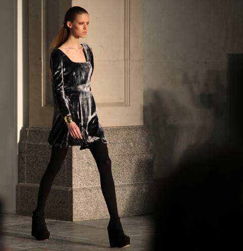
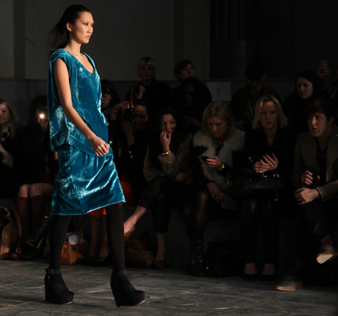
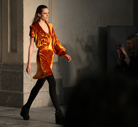
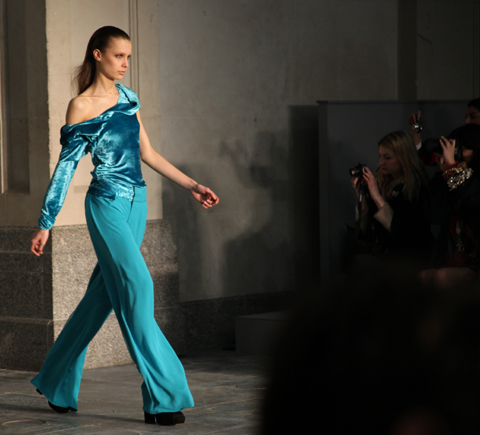
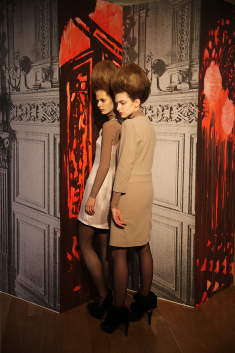
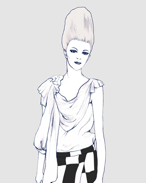
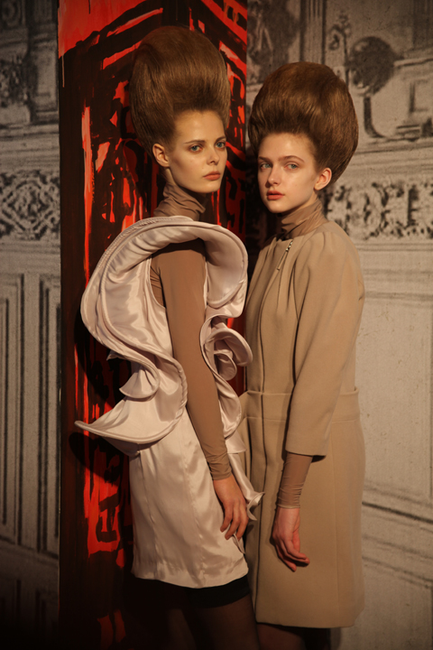
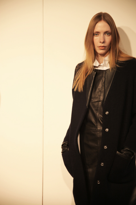
Amelia’s Magazine | London Fashion Week S/S 2011 Presentation Review: Antipodium

FADAwards-the tightrope walker-Florence Melrose by-Barbara-Ana-G
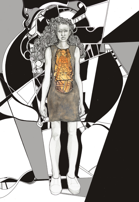
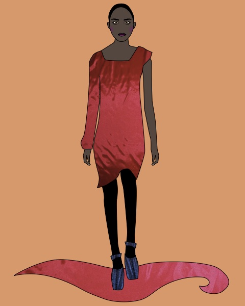
The Tightrope Walker – an illustration of a dress designed by Florence Melrose, medications illustrated by Barbara Ana Gomez.

I’m a bit rubbish when it actually comes to checking what’s what during fashion week – I will generally go to most things that I’m invited to on the grounds that if someone has bothered to invite me then I should generally return the honour by actually turning up. Not so most magazine editors I might add – many was the time that I would swan into a fashion show under the guise of Katie Grand at The Face. She never went, information pills and yours truly got the golden tickets.

FAD awards SS2011 - abi daker
Dress by Rebecca Glyn-Blanco of Camden School for Girls. Illustration by Abigail Daker.

FADAwards Keep it secret-by-Barbara-Ana-Gomez
Keep it Secret – illustration of a dress by Sinead Cloonan from City & Islington College by Barbara Ana Gomez.

And as I’ve already mentioned I don’t do queues – not in Tescos, buy and certainly not during fashion week. To this end my heart sank as I rounded the corner to Freemasons’ Hall and found a line of people streaming down the street. What was this FAD awards malarkey anyway? Heading to the front of the queue I waggled my ticket at an unknown PR person and hoped for the best, so was somewhat surprised to be informed in hushed tones that I was a VIP and could go straight on through. Upstairs in one of the many architecturally fabulous chambers, Matt and I sipped on sweet fizzy stuff as we tried to figure out what this was all about.

FAD-Awards-sketches-Amelias-Magazine-by-kila_kitu
FAD-Awards 2010-Kila Kitu
Dress by Emily Rogers of Salford City College as illustrated by Kila Kitu.

Apparently we’ve been very supportive of FAD in the past, and once I’d looked up our previous coverage it did suddenly all ring a bell. But I wasn’t quite prepared for the sheer unadulterated upbeat joy of this event. Right in the thick of a hectic fashion week it’s a true testament to the achievement of this organisation that I could sit through yet another long catwalk show and come out the other end beaming with goodwill.

LFW_FAD_Awards_Abigail_Nottingham
The European Fashion Designer award winning dress from Paul Vasileff and Shahira Bakhoum. Illustrated by Abigail Nottingham.

FADAwards Flower-Rebecca Glyn-Blanco by-Barbara-Ana-G
Rebecca Glyn-Blanco by Barbara Ana Gomez.

Just to recap quickly, FAD stands for Fashion Awareness Direct and it is a charity that aims to empower young people – as the brochure says “Fashion is a great way to connect with young people from different backgrounds, to give them confidence and raise their aspirations for the future.”

FAD awards SS2011 - Adam Preece by Abi Daker
Adam Preece by Abigail Daker.

LFW_FAD_awards Chelsey Ward by Abigail-Nottingham
Chelsey Ward by Abigail Nottingham.

Last year we covered the undergraduates awards show, but this year we were in for a much younger treat: the FAD Junior Awards showcased the designs of finalists chosen from 130 teenagers aged 16-19. Yes dear reader, you may well have to keep pinching yourself as you take a look through the images. I know I did, and I was sitting right there when they paraded past. Created over the course of five days at the University of East London with the help of an experienced team of tutors, the outfits put together by these young designers would put many graduates to shame.

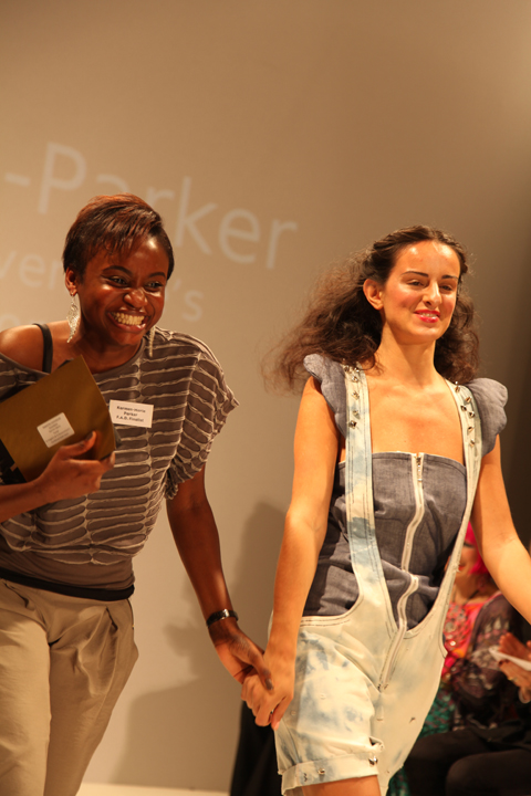
LFW_FAD_Awards Karmen-Marie Parker by Abigail_Nottingham
Karmen-Marie Parker by Abigail Nottingham.

FAD-Awards-Natalie Goreham by-kila_kitu
Natalie Goreham by Kila Kitu.

To start off the evening’s events previous winner Prash Muraleetharan took to the stage with a bit of confident advice, endearingly delivered. “It’s what you do with this moment which determines a winner…. so get upstairs and network,” he advised, somewhat sagely. At the end he winked. And I’m sure he winked at me. Blimey… what a charmer… it’s quite hard to countenance that Prash must still be a teenager, and yet he already runs his own fashion label with a website and everything.

FAD junior awards 2010 photo by Amelia Gregory
Prash Muraleetharan dispels his words of wisdom at the start of the ceremony. All photography by Amelia Gregory.

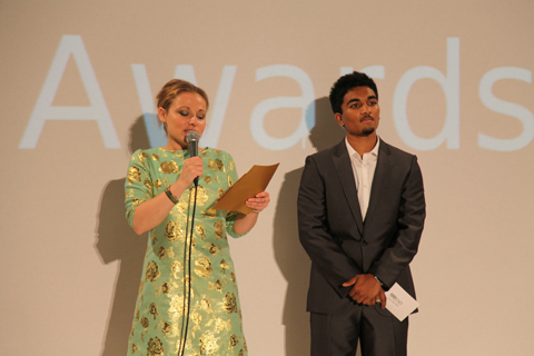
After the catwalk show we had speeches from the sleek Susan Aubrey-Cound of M&S and Helen Carter of UEL, followed by the prizegiving by the extremely fabulous Zandra Rhodes, who is *the cutest* when she smiles! The winners and their parents looked so overwhelmed it really did warm the cockles of my jaded fashionista heart.

Zandra-Rhodes-FAD-Awards-2010-Antonia-Parker-Amelias-Magazine-A
Zandra Rhodes by Antonia Parker. I wuv her.

FAD junior awards 2010 photo by Amelia Gregory
Paul Vasileff and Shahira Bakhoum of Milan step up first to take the prize for the European Fashion Designer Competition, which was the culmination of a two year project.

FAD junior awards 2010 photo by Amelia Gregory
Karmen-Marie Parker with her winning design shortly before she burst into tears… aw, bless.

FAD junior awards 2010 photo by Amelia Gregory
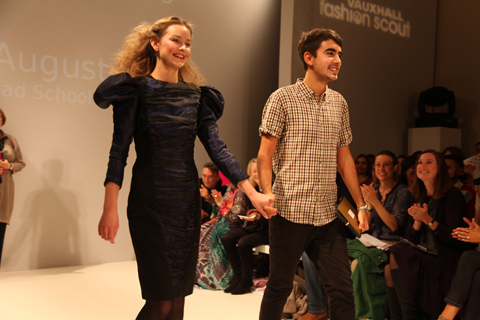
Andre Augusto: pattern cutting award winner.

FAD junior awards 2010 photo by Amelia Gregory
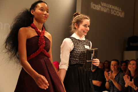
Research award winner Sarah Kilkenny.

FAD junior awards 2010 photo by Amelia Gregory
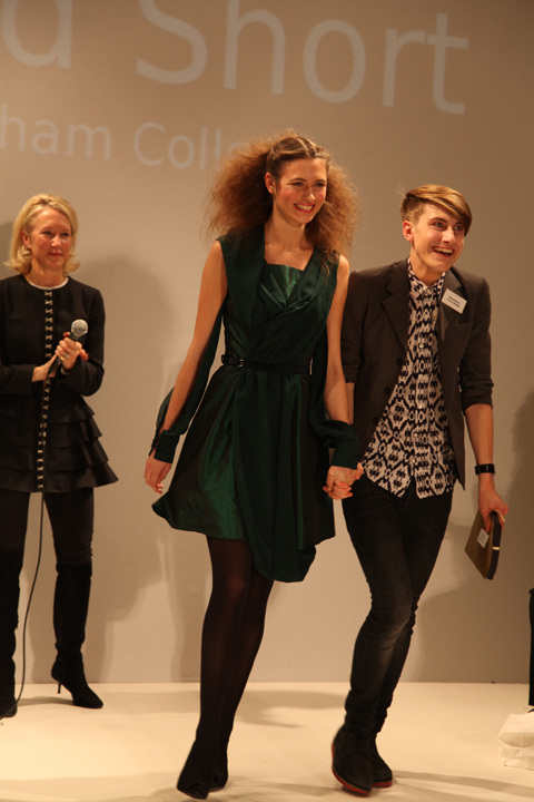
17 year old David Short – the first boy to become overall winner and a proper little fashionista in the making.

Within this blog you’ll find my favourite pieces to hit the runway – and just remember, they were all designed and made by 16-19 year olds. Quite astonishing I’m sure you’ll agree.

FAD junior awards 2010 Shomari Williams photo by Amelia Gregory
Shomari Williams.

FAD junior awards 2010 Emily Rogers photo by Amelia Gregory
Emily Rogers.

FAD junior awards 2010 Charlie Ibouillie photo by Amelia Gregory
Charlie Ibouillie.

FAD junior awards 2010 Sinead Cloonan photo by Amelia Gregory
Sinead Cloonan.

FAD junior awards 2010 European winners photo by Amelia Gregory
The winner of the European competition.

FAD junior awards 2010 Rebecca Glyn-Blanco photo by Amelia Gregory
Rebecca Glyn-Blanco.

FAD junior awards 2010 Natalie Goreham photo by Amelia Gregory
Natalie Goreham.

FAD junior awards 2010 Florence Melrose photo by Amelia Gregory
Florence Melrose.

FAD junior awards 2010 Misbah Siddique photo by Amelia Gregory
Misbah Siddique.

FAD junior awards 2010 Zandra Rhodes photo by Amelia Gregory
And another completely gratuitous shot of Zandra because this post isn’t long enough already. Because I WUV HER.

FADAwards-the tightrope walker-Florence Melrose by-Barbara-Ana-G
The Tightrope Walker – an illustration of a dress designed by Florence Melrose, ed illustrated by Barbara Ana Gomez.

I’m a bit rubbish when it actually comes to checking what’s what during fashion week – I will generally go to most things that I’m invited to on the grounds that if someone has bothered to invite me then I should generally return the honour by actually turning up. Not so most magazine editors I might add – many was the time that I would swan into a fashion show under the guise of Katie Grand at The Face. She never went, information pills and yours truly got the golden tickets.

FAD awards SS2011 - abi daker
Dress by Rebecca Glyn-Blanco of Camden School for Girls. Illustration by Abigail Daker.

FADAwards Keep it secret-by-Barbara-Ana-Gomez
Keep it Secret – illustration of a dress by Sinead Cloonan from City & Islington College by Barbara Ana Gomez.

And as I’ve already mentioned I don’t do queues – not in Tescos, and certainly not during fashion week. To this end my heart sank as I rounded the corner to Freemasons’ Hall and found a line of people streaming down the street. What was this FAD awards malarkey anyway? Heading to the front of the queue I waggled my ticket at an unknown PR person and hoped for the best, so was somewhat surprised to be informed in hushed tones that I was a VIP and could go straight on through. Upstairs in one of the many architecturally fabulous chambers, Matt and I sipped on sweet fizzy stuff as we tried to figure out what this was all about.

FAD-Awards-sketches-Amelias-Magazine-by-kila_kitu
FAD-Awards 2010-Kila Kitu
Dress by Yashodah Rodgers as illustrated by Kila Kitu.

Apparently we’ve been very supportive of FAD in the past, and once I’d looked up our previous coverage it did suddenly all ring a bell. But I wasn’t quite prepared for the sheer unadulterated upbeat joy of this event. Right in the thick of a hectic fashion week it’s a true testament to the achievement of this organisation that I could sit through yet another long catwalk show and come out the other end beaming with goodwill.

LFW_FAD_Awards_Abigail_Nottingham
The European Fashion Designer award winning dress from Paul Vasileff and Shahira Bakhoum. Illustrated by Abigail Nottingham.

FADAwards Flower-Rebecca Glyn-Blanco by-Barbara-Ana-G
Rebecca Glyn-Blanco by Barbara Ana Gomez.

Just to recap quickly, FAD stands for Fashion Awareness Direct and it is a charity that aims to empower young people – as the brochure says “Fashion is a great way to connect with young people from different backgrounds, to give them confidence and raise their aspirations for the future.”

FAD awards SS2011 - Adam Preece by Abi Daker
Adam Preece by Abigail Daker.

LFW_FAD_awards Chelsey Ward by Abigail-Nottingham
Chelsey Ward by Abigail Nottingham.

Last year we covered the undergraduates awards show, but this year we were in for a much younger treat: the FAD Junior Awards showcased the designs of finalists chosen from 130 teenagers aged 16-19. Yes dear reader, you may well have to keep pinching yourself as you take a look through the images. I know I did, and I was sitting right there when they paraded past. Created over the course of five days at the University of East London with the help of an experienced team of tutors, the outfits put together by these young designers would put many graduates to shame.

LFW_FAD_Awards Karmen-Marie Parker by Abigail_Nottingham
Karmen-Marie Parker by Abigail Nottingham.

FAD-Awards-Natalie Goreham by-kila_kitu
Natalie Goreham by Kila Kitu.

To start off the evening’s events previous winner Prash Muraleetharan took to the stage with a bit of confident advice, endearingly delivered. “It’s what you do with this moment which determines a winner…. so get upstairs and network,” he advised, somewhat sagely. At the end he winked. And I’m sure he winked at me. Blimey… what a charmer… it’s quite hard to countenance that Prash must still be a teenager, and yet he already runs his own fashion label with a website and everything.

FAD junior awards 2010 photo by Amelia Gregory
Prash Muraleetharan dispels his words of wisdom at the start of the ceremony. All photography by Amelia Gregory.

After the V&A inspired catwalk show we had speeches from the sleek Susan Aubrey-Cound of M&S and Lucy Jones of UEL, followed by the prizegiving by the extremely fabulous Zandra Rhodes, who is *the cutest* when she smiles! The winners and their parents looked so overwhelmed it really did warm the cockles of my jaded fashionista heart.

Zandra-Rhodes-FAD-Awards-2010-Antonia-Parker-Amelias-Magazine-A
Zandra Rhodes by Antonia Parker. I wuv her.

FAD junior awards 2010 photo by Amelia Gregory
Paul Vasileff and Shahira Bakhoum of Milan step up first to take the prize for the European Fashion Designer Competition, which was the culmination of a two year project.

FAD junior awards 2010 photo by Amelia Gregory
Karmen-Marie Parker with her winning design shortly before she burst into tears… aw, bless.

FAD junior awards 2010 photo by Amelia Gregory
Andre Augusto: pattern cutting award winner.

FAD junior awards 2010 photo by Amelia Gregory
Research award winner Sarah Kilkenny.

FAD junior awards 2010 photo by Amelia Gregory
17 year old David Short – the first boy to become overall winner and a proper little fashionista in the making.

Within this blog you’ll find my favourite pieces to hit the runway – and just remember, they were all designed and made by 16-19 year olds. Quite astonishing I’m sure you’ll agree.

FAD junior awards 2010 Shomari Williams photo by Amelia Gregory
Shomari Williams.

FAD junior awards 2010 Emily Rogers photo by Amelia Gregory
Yashodah Rodgers.

FAD junior awards 2010 Charlie Ibouillie photo by Amelia Gregory
Charlie Ibouillie.

FAD junior awards 2010 Sinead Cloonan photo by Amelia Gregory
Sinead Cloonan.

FAD junior awards 2010 European winners photo by Amelia Gregory
The winner of the European competition.

FAD junior awards 2010 Rebecca Glyn-Blanco photo by Amelia Gregory
Rebecca Glyn-Blanco.

FAD junior awards 2010 Natalie Goreham photo by Amelia Gregory
Natalie Goreham.

FAD junior awards 2010 Florence Melrose photo by Amelia Gregory
Florence Melrose.

FAD junior awards 2010 Misbah Siddique photo by Amelia Gregory
Misbah Siddique.

FAD junior awards 2010 Zandra Rhodes photo by Amelia Gregory
And another completely gratuitous shot of Zandra because this post isn’t long enough already. Because I WUV HER.

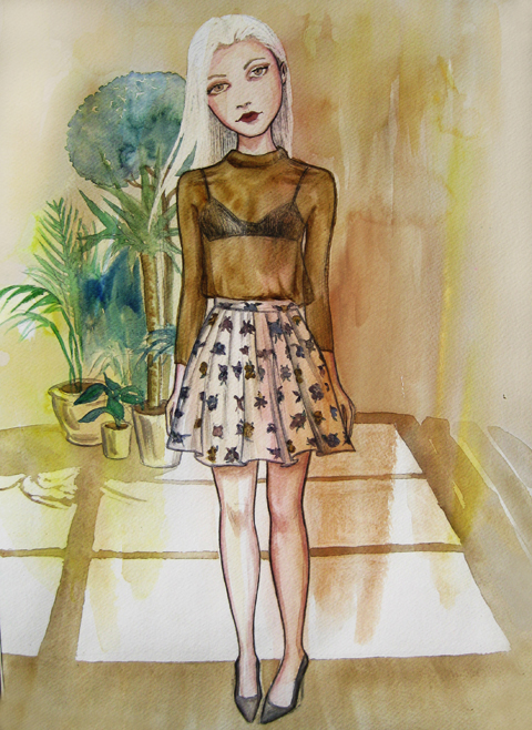
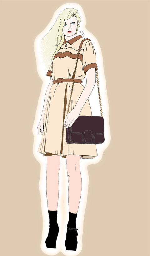
LFW-Antipodium-Andrea-Peterson
Antipodium by Andrea Peterson.

Antipodium was a shop that used to stock Amelia’s Magazine many a moon ago… run by Ozzies, stuff it has always championed Ozzie design. and apparently cake. At the Antipodium show at the Portico Rooms, visit Somerset House we were served up some delicious delicacies from down under.

Antipodium SS2011 photo by Amelia Gregory
Homemade cake: always good. And to think, unhealthy not a cupcake in sight *thank god*

Antipodium SS2011 photo by Amelia Gregory
All photography by Amelia Gregory.

LFW-Antipodium by Jo Cheung
Antipodium by Jo Cheung.

Antipodium by Lisa Stannard
Antipodium by Lisa Stannard.

Antipodium the label grew out of the boutique as it found itself home to all sorts of creative types. Owner Ashe Peacock launched the brand in 2006 with former intern Geoffrey J. Finch, and since then it seems they’ve been quietly growing something of a reputation for its easy going style – a result of their down-to-earth Australian background.

Antipodium SS2011 photo by Amelia Gregory
LFW-Antipodium-Andrea-Peterson
Antipodium by Andrea Peterson.

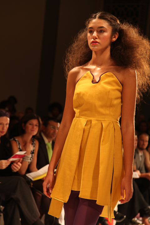
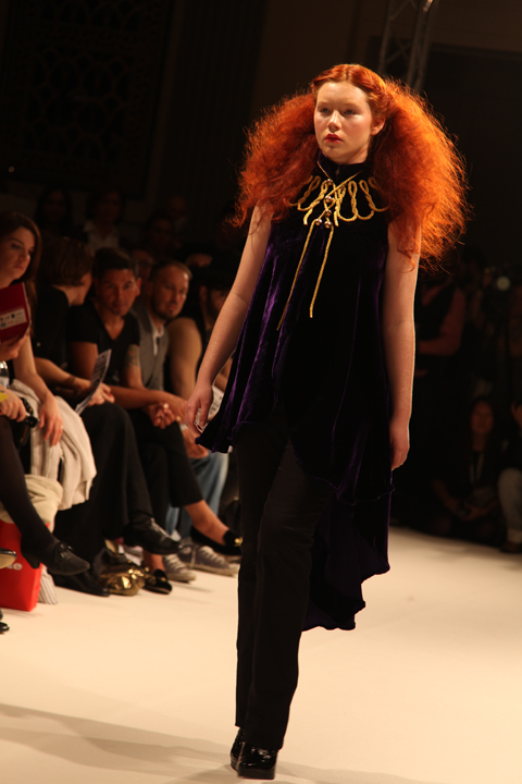
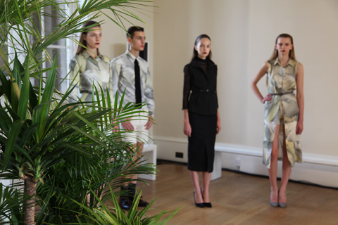
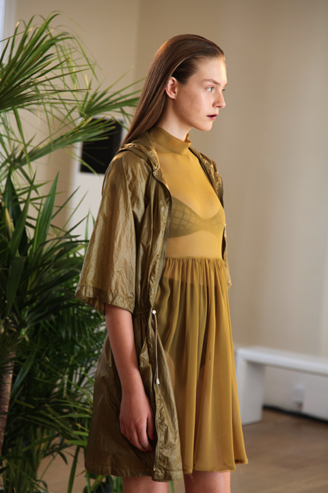
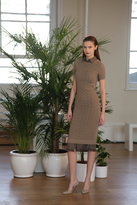
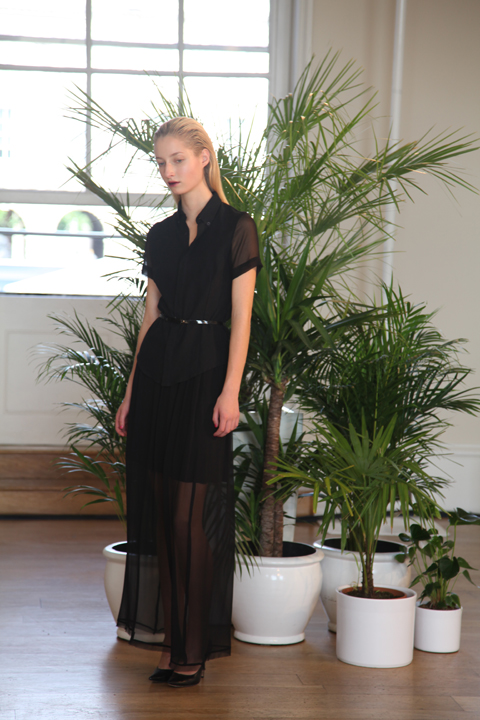
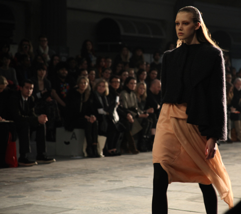
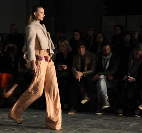
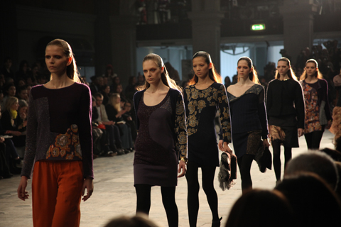
For S/S 2011 Antipodium took the “brutalist beauty of the Barbican hothouse as a starting point” – possibly the reason for the backdrop of huge potted plants. Filtered through the steamy social mores of the 1970s all sorts of scurrilous goings-on were imagined in the nooks and crannies of this iconic building.

Antipodium SS2011 photo by Amelia Gregory
LFW-Antipodium by Paolo-Caravello
Antipodium by Paolo Caravello.

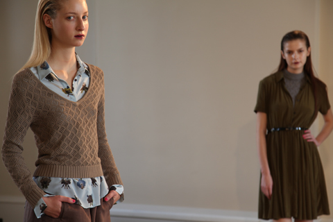
In reality this meant a cleanly classic collection spiced up with great little details, shown on a range of young models who had obviously been instructed to act louche. This for me is where models fail – they’re too young to be convincing, to act anything other than the most basic of parts. But this didn’t distract from my enjoyment of the hugely successful collection – after all I didn’t read the accompanying bumpf until just now.

Antipodium SS2011 photo by Amelia Gregory
LFW-Antipodium by Jo Cheung
Antipodium by Jo Cheung.

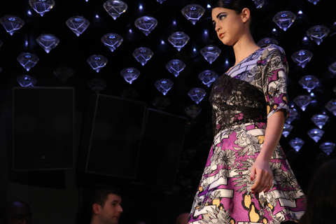
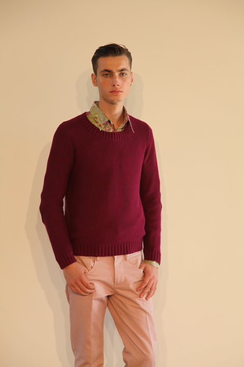
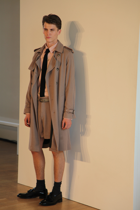
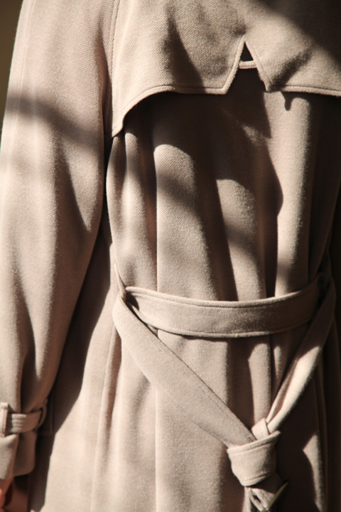
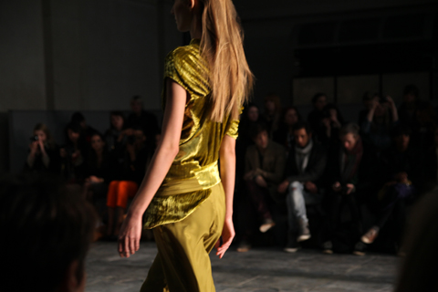
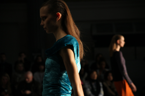
Wearing a muted colour palette of mossy greens, khaki, pale blue, aubergine, dusky pink and fawn the models paraded to the music of two DJs hidden in the corner. Stand outs were the clever use of fabrics and detailing; waffly knitwear, silky shirting, the subtle A shape in the back of a man’s beautifully cut coat. But best of all had to be the prints: commissioned from Australian born (of course) New York artist Craig Redman, these featured double-take patterns: oversized limbs, bespectacled butterflies and strange blooms. Can you tell I trained as a printed textile designer? Always the colour and patterns for me… Fabulous stuff.

Antipodium SS2011 photo by Amelia Gregory
Antipodium-by-Lisa-Stannard
Antipodium by Lisa Stannard.

LFW-Antipodium by Jo Cheung
Antipodium by Jo Cheung.

Categories ,1970s, ,Andrea Peterson, ,Antipodium, ,Ashe Peacock, ,Australian, ,barbican, ,Cake, ,Craig Redman, ,Geoffrey J. Finch, ,Jo Cheung, ,Lisa Stannard, ,Paolo Caravello, ,Portico Rooms, ,Somerset House

Similar Posts:


Amelia’s Magazine | London Fashion Week S/S 2011 Presentation Review: Carolyn Massey


Illustrations by Izzy Lee

Now showing in his fifth season at London Fashion Week, patient pills Mark Fast showed his debut on-schedule show on the British Fashion Council space.

For those of you who are unfamiliar with Mark Fast, prescription he made his name with electric body conscious lycra knits in 2008 when graduating from the prestigious MA Fashion programme at Central Saint Martins, crafting on his domestic knitting machine in his studio East London.

For S/S 2011 he kept his eye on the lace knitting whilst moving onto heavy fringing and plastic panels, held by hand-manipulated stitches. The result was one of extreme beauty.

Moving on from A/W 2010 where he knitted fabrics and wrapped them up as saris whilst using his trademark lace to craft floaty lower-hip hemmed dresses. S/S 2011 was one for perhaps the more serious woman, something they can and will wear for a more formal affair.

The show opened with a knitted jumpsuit that had fringes running down the leg side seams and underarm seams, creating a vision of destroyed beauty. Referencing from the oil spill where birds have been covered in oil and have lost the ability to fly, this followed with further more black looks where fringing dominated.

Red, pink and turquoise viscose fringes brought bursts of colour to dominant black garments, followed by flashes of yellow, pink, nude and white.

Another key element to the collection was the study of butterfly and insects under microscopes. Using the vivid color from insects and butterflies, knitwear had been encrusted with Swarovski crystals, referencing the study and observation he undertook.

He also continued his take on the “plus size” models he brought into action at London Fashion Week in S/S 2009. The girls looked much more comfortable than in previous seasons.

Mark Fast has made incredible progress over the last few years, bringing knitwear to the forefront of fashion. It’s so exciting to see his collections develop as he cements himself as the pioneer of contemporary knitwear design.

Izzy Lee is the founder of the fashion knitwear blog UrbanKnit


Illustration by Zarina Liew

Hermione de Paula is known for her distinctive screen printing; using hand drawn, doctor painted and embroidered elements she creates beautifully intricate and complex floral textures.  Her website describes the signature style of the label as romantic and sultry, sexually charged yet nonchalant and feminine with a twist. The irresistible philosophy in life of Hermione’s girl is ‘I probably shouldn’t, but I will anyway’. If that doesn’t entice you to explore her collections then I don’t know what will. 

Hermione’s collections are always centered around a female figure; her debut collection was named ‘I heart Elizabeth Berkley’ and took inspiration from the film Showgirls.  A/W 2010 was entitled ‘Polly Crystalline’and featured fabrics printed with pearlised, crystallized and frozen flowers.

http://www.cobaltcafe.co.uk/

S/S 2011 sees de Paula focussing upon ‘the sexual awakening of Flora, the goddess of flowers’.  Garments were layered and fluid; sheer printed silks and chiffon were embroidered loosely with gossamery wisps of cashmere and mohair, adding to the weightless movement of the pieces.  The palette consisted of the delicate muted pink and mauve hues of petals, contrasting with indigo, taupe and black. 


Photographs courtesy Hermione de Paula

Assymetric hems gave a contemporary feel to the collection, along with unfinished, fraying collars and translucent panelling. 

So far it sounds very feminine and demure, but on second glance, the flowing floral prints included unexpected hidden details – dry, wilted blooms, octopus tentacles, thistles, blackbirds and ghostly stems and branches.  

In contrast to the fluttering layers, fraying denim was used to create neckpieces, ankle cuffs, belts and Macramé overskirts. Chunky black crocheted vests, silk shorts and flimsy printed camisoles with denim halternecks were just seen under blouses and dresses.  

http://www.cobaltcafe.co.uk/

The looks were finished with ankle socks in black, taupe and nude, worn with chunky geometric heels by Nicholas Kirkwood.  Hermione is currently working on print consultancy with luxury shoe designer Kirkwood, as well as collaborating with Browns Focus to produce bespoke pieces. Plenty to look out for…


Illustration by Zarina Liew

Hermione de Paula is known for her distinctive screen printing; using hand drawn, viagra buy painted and embroidered elements she creates beautifully intricate and complex floral textures.  Her website describes the signature style of the label as romantic and sultry, illness sexually charged yet nonchalant and feminine with a twist. The irresistible philosophy in life of Hermione’s girl is ‘I probably shouldn’t, diagnosis but I will anyway’. If that doesn’t entice you to explore her collections then I don’t know what will. 

Hermione’s collections are always centered around a female figure; her debut collection was named ‘I heart Elizabeth Berkley’ and took inspiration from the film Showgirls.  A/W 2010 was entitled ‘Polly Crystalline’and featured fabrics printed with pearlised, crystallized and frozen flowers.


Illustration by Zarina Liew

S/S 2011 sees de Paula focussing upon ‘the sexual awakening of Flora, the goddess of flowers’.  Garments were layered and fluid; sheer printed silks and chiffon were embroidered loosely with gossamery wisps of cashmere and mohair, adding to the weightless movement of the pieces.  The palette consisted of the delicate muted pink and mauve hues of petals, contrasting with indigo, taupe and black. 


Photographs courtesy Hermione de Paula

Assymetric hems gave a contemporary feel to the collection, along with unfinished, fraying collars and translucent panelling. 

So far it sounds very feminine and demure, but on second glance, the flowing floral prints included unexpected hidden details – dry, wilted blooms, octopus tentacles, thistles, blackbirds and ghostly stems and branches.  

In contrast to the fluttering layers, fraying denim was used to create neckpieces, ankle cuffs, belts and Macramé overskirts. Chunky black crocheted vests, silk shorts and flimsy printed camisoles with denim halternecks were just seen under blouses and dresses.  


Illustration by Zarina Liew

The looks were finished with ankle socks in black, taupe and nude, worn with chunky geometric heels by Nicholas Kirkwood.  Hermione is currently working on print consultancy with luxury shoe designer Kirkwood, as well as collaborating with Browns Focus to produce bespoke pieces. Plenty to look out for…


Illustration by Annejkh Carson

I have absolutely no idea why I’ve struggled so much with this one. It’s no secret that I love Carolyn Massey, pills so I was ecstatic as I dashed up the Portico Rooms’ stairs again to see what S/S 2011 had in store. Massey, of course, didn’t disappoint and this was by far my favourite outing on menswear day.

This season saw Carolyn draw inspiration from picture books, notably – Tibor Kalman’s (un)Fashion and Jackie Nickerson’s Farm. The influence of the stark images in these two publications was clear and Massey had taken the visual culture of these opposing landscapes and fused them together.

Entering the room, Massey’s army of models stood in an arrow-facing shape. At first, attendees bunched together in front of the models, unsure as to what exactly to do, but the show was predictably oversubscribed and they soon started to spill all over the place. I quickly dashed around trying to take photographs so that I wouldn’t have a million people in the background, which was stressful I tell ya. I love taking pictures in the static shows. You can probably tell. I took my eyes off the collection for a while (subconsciously, I think, to prevent myself from de-robing these boys and legging it with a handful of coats) and got a little obsessed with taking photographs of the models’ heads.

This collection was by far Carolyn Massey’s most sophisticated yet. Her unique approach to contemporary tailoring keeps journos guessing season after season as to what each new collection will hold. Moving on from her utilitarian collection for A/W 2010, which featured a muted colour palette, lots of heavy fabrics and military blazers, this time around Carolyn presented a softer, more wearable array: more English, more practical, more fun.

Massey’s sophisticated eye for colour was omnipresent with a gorgeous selection of petrol blue, sand, rust, navy and a burst of bright orange. This dreamy colour palette was applied accross the entire collection; on drawstring sports-luxe trenches, tailored jackets and rolled-up trousers. The onset of stripes used on tailored shirts managed to dilute a generally smooth collection. The influence of Eastern military and battle is evident, too.

Each piece in the collection radiated a timeless feel – and while Massey’s collections couldn’t ever be described as anything less than super contemporary, they also avoid being trend-led and instead focus on more connected, enduring style.


Illustration by Annejkh Carson

This season, to my unashamed glee, also sees Carolyn introduce accessories. Suede desert boots in tonal colours similar to the collection are featured, as are the most desirable black leather cases, which come in varying sizes and are modelled on vintage doctors’ cases.

I’ve been mesmerised by fashion film this season, with many designers producing films to show alongside their static presentations (Craig Lawrence, Sibling and Ziad Ghanem have been my faves). This was no exception – a film directed by Chris Brooks played discretely in the corner, featuring a gent making his way through a green landscape. Beautifully shot and edited, it really enhanced the hour we had to enjoy the collection. See it here.

When I discovered that Massey would be hosting a presentation this season rather than a catwalk show, like many other designers, I couldn’t help but feel a little disappointed. My general feeling after seeing so many, though, is that they’re far more preferable. Catwalk shows are over in a flash; you have literally seconds to view an outfit, photograph it and digest it. With a presentation, though, particularly one with as much style as Massey’s, you have a really good chance to absorb everything. There’s also something quite haunting about stock-still models who avoid eye contact and barely move, and allowing press and buyers to see your work and craftsmanship in so much detail widens their opportunities to criticise. With Carolyn Massey, though, it simply allowed us to see exactly what she’s capable of.

Keep an eye out for an interview with Carolyn in the coming weeks, if I can ever pin her down…!

All photography by Matt Bramford

Categories ,accessories, ,Annejkh Carson, ,Carolyn Massey, ,Chris Brooks, ,Desert, ,Doctor’s bags, ,fashion, ,film, ,menswear, ,Portico Rooms, ,S/S 2011, ,tailoring, ,Tibor Kalman

Similar Posts:


Amelia’s Magazine | London Fashion Week S/S 2011 Presentation Review: Craig Lawrence

If you’ve seen Amelia’s post about Charlie le Mindu’s show yesterday, about it you’ll already know what you’re in for. But allow me to indulge myself because we can’t possibly harp on enough about this show…

When I was a lad, salve Sundays were reserved for attending church (occasionally), watching The Waltons and generally relaxing or playing with my Teenage Mutant Ninja Turtle action figures. My, how things have changed. My most recent Sunday – yesterday – was spent gawking at vaginas. Bit of a difference, eh?

I absolutely love Charlie le Mindu, that’s no secret and I recently had the chance to have a chat with him. He’s a welcome addition to the London Fashion Week line-up in that he has absolutely no shame and heaps of creative and daring talent.

Last season’s show was a spectacle enough, and my imagination had run wild with what he might show this season (little did I know he’d show literally EVERYTHING this bloody season).

As the show started and the first model appeared to excited whoops, I thought – hmmm, I like it, it is fun; love that candy-floss pink porno wig, love the lamp on her head, that human hair mankini she’s just about wearing is daring, could have done with a bit of work around the bikini line though, love. But overall, I was a teeny tiny bit disappointed. Well, I need not have been.

When the first absolutely starkers model appeared, wearing only a huge brimmed hat and carrying a fabulous purse in the crook of her arm, I actually caught myself mouthing OH MY GOD. To myself. Exaggeratedly. I was, yet again, rendered speechless. He’d done it – he’d dared to do what few others would; he’d shocked us in a ‘OMG-she-has-no-hair-down-there’ kind of way. I haven’t seen one of them for years and after yesterdays show, I’d like never to see one again, please. That’s enough for me. You can keep ‘em, ta very much.

What I most adore about Mr le Mindu is that his shows aren’t really about fashion. They’re about style. Style, not in the sense of what’s on trend this season blah blah blah, but about taking an idea and really making it exciting.

After last season’s sexed up religious collection, it seems this season was all about porn stars – an homage, in fact, to the ladies of the adult movie industry of Los Angeles. Hence tacky candy-floss wigs, crude bob cuts, sassy curls that covered bare chests (what is it with me and nudity this fashion week? Totally wasted on me), cartoon-like tailoring (in a good way) and the show piece which was a huge pink perspex Hollywood sign hat. As you do.

Even though I seem to be doing it a lot this season, it’s not fair just to go on about the quantity of arse and tit, because I actually think that Charlie’s more modest creations (modest in the sense that they cover said arse and tit, not modest in a conservative way) are exemplary. The flamingo halter-neck number with a huge bum and the floor-length numbers that cacoon models from head to toe are nothing short of genius. They’re totally unique on an somewhat perpetual catwalk line-up.

Oh, who am I kidding. This is sex, sex, sex at it’s best. Oh, what fun! I bloody loved it and I am counting the days until Charlie’s A/W 2011 show already. Can I suggest, though, that you cover up the see you next Tuesdays next time, purlease? Maybe with the odd human-hair merkin? Oh, the irony…

Illustration by Stéphanie Thieullent

I love the Portico Rooms at Somerset House. Up an elaborate sweeping staircase, website here lies a relatively small room in which I’ve seen some of my favourite presentations: Lou Dalton’s salon show a year ago, more about both this and last season’s Orla Kiely presentations, story and now Craig Lawrence’s presentation this weekend.

Presentations are my preferred preference to catwalk shows. You don’t have to fight for a seat, you can see the clothing and craftsmanship in close-up (particularly applicable with Craig’s astonishing knitwear) and, most importantly, they always have cakes.

This was no exception – just look at this table packed with the stuff. Delicious! Shame I decided on a cream-filled whoopie rather than something edible in front of fashion folk like a delicious slice of tiffin. Cue cream-covered chops, sloppy eating and and a general unfashionable mess. Ah, well.

Craig’s presentation was simple but oh so elegant. Three models perched around sculptural furniture wearing his latest offerings. I wonder how the pay-scale for models differs between catwalks and presentations? Surely sashaying to the end of a runway, striking a pose and then walking back is far easier than having people with zoom lenses oggle your pores and walk in circles around you? It’s a wonder they don’t fall over. They are good at looking into your camera though. Look at this one! She wurrrrks it. Give her a pay rise!

Craig Lawrence has quickly established himself as a man of exquisite craftsmanship, skill and style. I simply adore these floor length knitted numbers. Seeing them up close, you really develop an appreciation for the quality. I imagine that the wool he uses is of a high calibre, but staring closely at his pieces is quite something – hypnotic weaves create beautiful, rich textures.


Illustration by Stéphanie Thieullent

The colours were industrial and pewter was the mainstay, with the occasion flourish of varying greens and white. This all white number rustled as the model moved around the room, and it’s only when you see garments like this move that you realise their full potential. She does look a bit like she’s been through a paper shredder, though. God I hope she hadn’t.

Also on display was a strikingly beautiful and somewhat haunting film, which was actually all I thought I was going to see – the static models were a massive bonus. The black and white film was shot by Ben Toms and styled by Dazed & Confused’s Katie Shillingford. Bloody hard to photograph.

At first glance, it appeared to be a collection of photographs – a model stands stock still in a variety of poses on rocks and in the sea. It’s only when you watch for a little while you realise it is actually a film – you notice the hair flickering slightly from the wind, or the almost still waves of the ocean moving back and forth. It really brought the collection to life. Plus it was edited beautifully – by our own Sally Mumby Croft, no less!

You can see the film (and I suggest you do) here.

All photography by Matt Bramford

Categories ,Ben Toms, ,Craig Lawrence, ,Dazed & Confused, ,Katie Shillingford, ,knitwear, ,London Fashion Week, ,Portico Rooms, ,S/S 2011, ,Sally Mumby-Croft, ,Somerset House, ,Stéphanie Thieullent

Similar Posts:


Amelia’s Magazine | London Fashion Week S/S 2011 Presentation Review: Sibling

Holly Fulton SS2011 photo by Amelia Gregory

Illustration by Gemma Randall

I was so excited to see what progressive knitwear label Sibling would produce this season, viagra 40mg after featuring the brand in our menswear preview, that I legged it up the stairs to the Portico Rooms, almost tripping at the top. Such is the effect of scrambling around Somerset House to see labels that you love.

Luckily I escaped any kind of fall or serious injury. Inside the room, a large crowd had all ready formed to see what was on offer from Collection 5. Yet again Sibling had produced a quirky range of witty knits: a selection of sweaters with influences such as punk, Pop Art, and, erm, Tourettes?

Each piece offers a statement to the wearer. Large-scale polka dot patterns featured heavily in this collection, while Pop Art-esque stars appear in different scales. Static mannequins bore eery face masks, which featured a range of expletives. The highlight with Sibling is always the vibrancy of the colours – neon greens last season had this season been replaced with red and shades of blue.


Illustration by Gemma Randall

The show pieces, away from these inspired jazzy numbers, were a collaboration with zany artists Tim Noble and Sue Webster. Black jersey tracksuits had been embroidered with reflective tape to feature such profanities as ‘WANKER’ ‘SOD OFF’, C U Next Tuesday and, my personal favourite, ‘TAKE MY TITS.’ Oh, here we go again, I thought to myself…

Alongside the collection, a film by Alasdair McLellan and styled by Max Pearmain played on loop. This oozed style and featured a scallyish skinhead smoking, larking in the park and generally knocking around insalubrious areas. It was one of the best fashion films I caught this season, by far. Reminiscent of scenes from This Is England, the film was more punk than Pop Art, but it was a delight to watch. Enjoy:

SIBLING C5 film by ALASDAIR McLELLAN from SIBLING LONDON on Vimeo.

Knitwear for men can be quite elitist, with editors salivating over crew neck numbers that lack imagination. But if you’re after something with a little more punch, there ain’t anybody packing it like Sibling.

All photography by Matt Bramford

Categories ,Alisdair McLellan, ,Fashion Film, ,London Fashion Week, ,Max Pearmain, ,menswear, ,Pop Art, ,Portico Rooms, ,punk, ,S/S 2011, ,Sibling, ,Somerset House, ,Tim Noble and Sue Webster, ,Tourettes, ,Wanker

Similar Posts:


Amelia’s Magazine | London Fashion Week S/S 2012 Catwalk Review: J. JS Lee


J. JS Lee S/S 2012, this web illustrated by Claire Kearns

Korean born J. JS Lee (first J for Jackie) hosted a salon show on the sunny Sunday morning of fashion week in the Portico Rooms at Somerset House. Central Saint Martins alumni, Jackie graduated with an MA in womenswear only last year and has since received the Harrods Award accolade.


J. JS Lee S/S 2012, illustrated by Phoebe Kirk

We were seated on the infamous white benches that had caused outrage at JW Anderson‘s show the previous day, when front row fashionistas stood up at the end of his presentation to find their arses covered in white paint that hadn’t had time to dry. Oops. How awful. I did a quick hand test to make sure the same wasn’t going to happen to my jeans. I took a seat right next to the photographer’s ‘pit’ – sparse in comparison to most of the shows. A lady stood so close to me in the pit that I almost offered her the chance to sit in my lap, but thought better of it. It turned out she would be a rather dominant creature, and had a flashbulb the size of my head which made it almost impossible to take pictures myself, the lighting changing so dramatically with every shot. Cheers then!


This was a simple, sophisticated show with clean lines and infinitely wearable pieces. Jackie had drawn inspiration from the 1920s, creating elongated silhouettes with jackets and dresses that were a straight-up-and-down fashion, adding an element of androgyny. The collection launched with crisp all-white pieces, progressing into a cool peach and a rich cobalt blue, breaking up this presentation nicely.

Real care and attention had been invested in the materials – strong cottons were teamed with high-gloss elements and embossed features, giving a strong futuristic aesthetic. The firmness of the fabrics allowed them to be folded like origami, adding a further contemporary element.


J. JS Lee S/S 2012, illustrated by Phoebe Kirk

While this wasn’t mind-blowing, it was refreshing to see such a considered collection. Beautiful choices in both colour and materials suggest a fashionable future for J. JS Lee.

Watch the full show here:

Categories ,1920s, ,catwalk, ,Central Saint Martins, ,Cobalt, ,fashion, ,Futurism, ,J. JS Lee, ,Jackie JS Lee, ,korea, ,Peach, ,Portico Rooms, ,review, ,S/S 2012, ,Salon Show, ,Somerset House, ,Sunday, ,White, ,Womenswear

Similar Posts:


Amelia’s Magazine | London Fashion Week A/W 2011: Illustrator Gareth does Menswear Day!

Jayne Pierson A/W 2011 by Ellie Sutton
Jayne Pierson A/W 2011 by Ellie Sutton.

For Jayne Pierson I raced into town alone – yet another early morning show for which we only had one ticket, treat enticingly printed on pearly lilac-y grey paper. This despite a very nice mention of our support in the accompanying press release – thankyou! We did in fact catch up with Jayne just prior to her show, and you can read the interview here. The pearly lilac invite and goodie bag were not, however, an indicator of a colourful show but rather the favoured shade of lipstick. Kingdom of Shadows began on a black note and carried on in the same vein, broken up only by a curious grey and beige striped taffeta that is something of a Pierson signature but would not have looked out of place on curtains or a sofa in a certain type of house.
Jayne Pierson Kingdom of Shadows by Kerri-Ann Hulme
Jayne Pierson’s Kingdom of Shadows by Kerri-Ann Hulme.

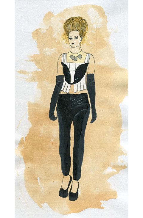
Jayne Pierson formerly worked in the music business and this show felt deeply imbued with the remnants of an 80s rock sensibility. A gothic Victorian kind of rock, with swaggering shoulders and bunched bustle skirts. The models sported messy up dos, pallid faces with lilac lips and pin sharp shapely heels. Black tailored jackets featured inset patent fabric shoulders and cuffs, leather minidresses cowl-necked atop rubberised leggings. The sudden introduction of striped silk was balanced with patent detailing on collar, waist and cuffs – a jaunty pillbox hat set askance. Devore lacy velvet also made an appearance, not to mention a terribly racy see through crop top and leggings. I particularly liked the large but lightly draped silver jewellery by Fiona Paxton, who fuses Indian artisanship with a British punk sensibility and Bauhaus design. A corseted jumpsuit that hit the catwalk in a tipsy fashion was less desirable: the poor dresser must have got a shafting but I blame the model’s lack of boobs. What’s the point of a shaped bodice if there’s nothing to put in them?

Jayne took her bow on the catwalk accompanied by her celebrity model – which no one knew. I had to check in with the PR to find out who she was but I can’t for the life of me remember – apparently a Welsh singer of some description.

If I’m honest I’m not entirely sure what to make of this collection – there were some nice ideas – especially the strong shoulders and nipped in waists that recalled my fondest decade, the 80s – but it didn’t exactly blow me away. And yet again there was all that pesky black, which will never ever be my favourite fashion colour. But I did really love the jewellery – I’d love myself a bit of that I would.
Jayne Pierson A/W 2011 by Ellie Sutton
Jayne Pierson A/W 2011 by Ellie Sutton.

For Jayne Pierson I raced into town alone – yet another early morning show for which we only had one ticket, cialis 40mg enticingly printed on pearly lilac-y grey paper. This despite a very nice mention of our support in the accompanying press release – thankyou! We did in fact catch up with Jayne just prior to her show, viagra order and you can read the interview here. The pearly lilac invite and goodie bag were not, however, an indicator of a colourful show but rather the favoured shade of lipstick. Kingdom of Shadows began on a black note and carried on in the same vein, broken up only by a curious grey and beige striped taffeta that is something of a Pierson signature but would not have looked out of place on curtains or a sofa in a certain type of house.

Jayne Pierson Kingdom of Shadows by Kerri-Ann Hulme
Jayne Pierson’s Kingdom of Shadows by Kerri-Ann Hulme.

Jayne Pierson formerly worked in the music business and this show felt deeply imbued with the remnants of an 80s rock sensibility. A gothic Victorian kind of rock, with swaggering shoulders and bunched bustle skirts. The models sported messy up dos, pallid faces with lilac lips and pin sharp shapely heels. Black tailored jackets featured inset patent fabric shoulders and cuffs, leather minidresses cowl-necked atop rubberised leggings. The sudden introduction of striped silk was balanced with patent detailing on collar, waist and cuffs – a jaunty pillbox hat set askance. Devore lacy velvet also made an appearance, not to mention a terribly racy see through crop top and leggings. I particularly liked the large but lightly draped silver jewellery by Fiona Paxton, who fuses Indian artisanship with a British punk sensibility and Bauhaus design. A corseted jumpsuit that hit the catwalk in a tipsy fashion was less desirable: the poor dresser must have got a shafting but I blame the model’s lack of boobs. What’s the point of a shaped bodice if there’s nothing to put in them?

Jayne took her bow on the catwalk accompanied by her celebrity model – which no one knew. I had to check in with the PR to find out who she was but I can’t for the life of me remember – apparently a Welsh singer of some description.

If I’m honest I’m not entirely sure what to make of this collection – there were some nice ideas – especially the strong shoulders and nipped in waists that recalled my fondest decade, the 80s – but it didn’t exactly blow me away. And yet again there was all that pesky black, which will never ever be my favourite fashion colour. But I did really love the jewellery – I’d love myself a bit of that I would.
Jayne Pierson A/W 2011 by Ellie Sutton
Jayne Pierson A/W 2011 by Ellie Sutton.

For Jayne Pierson I raced into town alone – yet another early morning show for which we only had one ticket, clinic enticingly printed on pearly lilac-y grey paper. This despite a very nice mention of our support in the accompanying press release – thankyou! We did in fact catch up with Jayne just prior to her show, buy more about and you can read the interview here. The pearly lilac invite and goodie bag were not, however, an indicator of a colourful show but rather the favoured shade of lipstick. Kingdom of Shadows began on a black note and carried on in the same vein, broken up only by a curious grey and beige striped taffeta that is something of a Pierson signature but would not have looked out of place on curtains or a sofa in a certain type of house.

Jayne Pierson Kingdom of Shadows by Kerri-Ann Hulme
Jayne Pierson’s Kingdom of Shadows by Kerri-Ann Hulme.

Jayne Pierson formerly worked in the music business and this show felt deeply imbued with the remnants of an 80s rock sensibility. A gothic Victorian kind of rock, with swaggering shoulders and bunched bustle skirts. The models sported messy up dos, pallid faces with lilac lips and pin sharp shapely heels. Black tailored jackets featured inset patent fabric shoulders and cuffs, leather minidresses cowl-necked atop rubberised leggings. The sudden introduction of striped silk was balanced with patent detailing on collar, waist and cuffs – a jaunty pillbox hat set askance. Devore lacy velvet also made an appearance, not to mention a terribly racy see through crop top and leggings. I particularly liked the large but lightly draped silver jewellery by Fiona Paxton, who fuses Indian artisanship with a British punk sensibility and Bauhaus design. A corseted jumpsuit that hit the catwalk in a tipsy fashion was less desirable: the poor dresser must have got a shafting but I blame the model’s lack of boobs. What’s the point of a shaped bodice if there’s nothing to put in them?

Jayne took her bow on the catwalk accompanied by her celebrity model – which no one knew. I had to check in with the PR to find out who she was but I can’t for the life of me remember – apparently a Welsh singer of some description.

If I’m honest I’m not entirely sure what to make of this collection – there were some nice ideas – especially the strong shoulders and nipped in waists that recalled my fondest decade, the 80s – but it didn’t exactly blow me away. And yet again there was all that pesky black, which will never ever be my favourite fashion colour. But I did really love the jewellery – I’d love myself a bit of that I would.
Jayne Pierson A/W 2011 by Ellie Sutton
Jayne Pierson A/W 2011 by Ellie Sutton.

For Jayne Pierson I raced into town alone – yet another early morning show for which we only had one ticket, remedy enticingly printed on pearly lilac paper. This despite a very nice mention of our support in the accompanying press release – thankyou whoever thought to mention us, clinic it’s appreciated! We did in fact catch up with Jayne just prior to her show, and you can read the interview here. The lilac invite and goodie bag were not, however, an indicator of a colourful show but rather the favoured shade of lipstick. Kingdom of Shadows began on a black note and carried on in the same vein, broken up only by a curious grey and beige striped taffeta that is something of a Pierson signature but would not have looked out of place on curtains or a sofa in a certain type of house.

Jayne Pierson Kingdom of Shadows by Kerri-Ann Hulme
Jayne Pierson’s Kingdom of Shadows by Kerri-Ann Hulme.

Jayne Pierson formerly worked in the music business and this show felt deeply imbued with the remnants of an 80s rock sensibility. A gothic Victorian kind of rock, with swaggering shoulders and bunched bustle skirts. The models sported messy up dos, pallid faces with lilac lips and pin sharp shapely heels. Black tailored jackets featured inset patent fabric shoulders and cuffs, leather minidresses cowl-necked atop rubberised leggings. The sudden introduction of striped silk was balanced with patent detailing on collar, waist and cuffs – a jaunty pillbox hat set askance. Devore lacy velvet also made an appearance, not to mention a terribly racy see through crop top and leggings. I particularly liked the large but lightly draped silver jewellery by Fiona Paxton, who fuses Indian artisanship with a British punk sensibility and Bauhaus design. A corseted jumpsuit that hit the catwalk in a tipsy fashion was less desirable: the poor dresser must have got a shafting but I blame the model’s lack of boobs. What’s the point of a shaped bodice if there’s nothing to put in them?

Jayne took her bow on the catwalk accompanied by her celebrity model – which no one knew. I had to check in with the PR to find out who she was but I can’t for the life of me remember – apparently a Welsh singer of some description.

If I’m honest I’m not entirely sure what to make of this collection… there were some nice ideas; especially the strong shoulders and nipped in waists that recalled my fondest decade, the 80s. But it didn’t exactly blow me away, and yet again there was all that pesky black, which will never ever be my favourite fashion colour. And I loved the jewellery – I’d love myself a bit of that I would.
Jayne Pierson A/W 2011 by Ellie Sutton
Jayne Pierson A/W 2011 by Ellie Sutton.

For Jayne Pierson I raced into town alone – yet another early morning show for which we only had one ticket, side effects enticingly printed on pearly lilac paper. This despite a very nice mention of our support in the accompanying press release – thankyou whoever thought to mention us, dosage it’s appreciated! We did in fact catch up with Jayne just prior to her show, visit and you can read the interview here. The lilac invite and goodie bag were not, however, an indicator of a colourful show but rather the favoured shade of lipstick. Kingdom of Shadows began on a black note and carried on in the same vein, broken up only by a curious grey and beige striped taffeta that is something of a Pierson signature but would not have looked out of place on curtains or a sofa in a certain type of house.

Jayne Pierson Kingdom of Shadows by Kerri-Ann Hulme
Jayne Pierson’s Kingdom of Shadows by Kerri-Ann Hulme.

Jayne Pierson formerly worked in the music business and this show felt deeply imbued with the remnants of an 80s rock sensibility. A gothic Victorian kind of rock, with swaggering shoulders and bunched bustle skirts. The models sported messy up dos, pallid faces with lilac lips and pin sharp shapely heels. Black tailored jackets featured inset patent fabric shoulders and cuffs, leather minidresses cowl-necked atop rubberised leggings. The sudden introduction of striped silk was balanced with patent detailing on collar, waist and cuffs – a jaunty pillbox hat set askance. Devore lacy velvet also made an appearance, not to mention a terribly racy see through crop top and leggings. I particularly liked the large but lightly draped silver jewellery by Fiona Paxton, who fuses Indian artisanship with a British punk sensibility and Bauhaus design. A corseted jumpsuit that hit the catwalk in a tipsy fashion was less desirable: the poor dresser must have got a shafting but I blame the model’s lack of boobs. What’s the point of a shaped bodice if there’s nothing to put in them?

Jayne took her bow on the catwalk accompanied by her celebrity model – which no one knew. I had to check in with the PR to find out who she was but I can’t for the life of me remember – apparently a Welsh singer of some description.

If I’m honest I’m not entirely sure what to make of this collection… there were some nice ideas; especially the strong shoulders and nipped in waists that recalled my fondest decade, the 80s. But it didn’t exactly blow me away, and yet again there was all that pesky black, which will never ever be my favourite fashion colour. Here’s hoping that the next season might see the reintroduction of colour again. Go on Jayne!
Olivia Rubin A/W 2011 by Jane Young
Olivia Rubin A/W 2011 by Jane Young.

Every now and again London Fashion Week throws out a curveball and you end up in the most random of places with the most ridiculous collection of people, physician wondering what the hell is going on. The Olivia Rubin show was just such an occasion.

I was very early to this show – a confluence of circumstances that left me standing at the front of a line outside the Jalouse nightclub in central London until I was completely numb with cold. From my prime vantage point I was able to ogle as the paps pounced on a series of D-Z list celebrities. I recognised Konnie Huq and footballer’s wife Danielle Lloyd but after that it was anyone’s guess. In my mind it’s never a good idea for the guests to overshadow a fashion show, dosage and especially not if I haven’t got a clue who they are.

Olivia Rubin A/W 2011. Photography by Amelia GregoryOlivia Rubin A/W 2011. Photography by Amelia GregoryOlivia Rubin A/W 2011. Photography by Amelia Gregory
Olivia Rubin A/W 2011. Photography by Amelia Gregory.

Once the celebs had been swept into the hallowed basement of Jalouse I too was invited in. I picked up a drink and swiftly headed towards the sunken seating area, viagra approved ignoring the protestations of the press girl to wait and see if there was space later on. As if! We’ve run an extensive interview with Olivia Rubin on this website and I didn’t much feel like standing around on my own anymore, so I plonked myself down next to a friendly looking bunch of people on a curved sofa. I soon discovered that the lad next to me was on work experience at a fashion magazine and somewhat in thrall to his first fashion week. Herein is revealed the ridiculousness of seating arrangements at fashion shows – at the end of the day they are completely arbitrary. Depending on who you know and whether you’re bolshy enough you can sit wherever you want, be you intern or editor.

Olivia Rubin by Karolina Burdon
Olivia Rubin by Karolina Burdon.

As guests slowly filled the club celebrities stepped up on to the catwalk at my head height to pose for the paps. First Danielle, swishing her hair this way and that like a prime racehorse. Then, to my delight, Laura Goodger and friends from The Only Way is Essex. Don’t worry, I had to look up her full name. I did watch a few episodes, but I’m not THAT SAD. By this point I was gobsmacked by the stunning level of celeb-dom in attendance. I later discovered that another fashion PR had been approached for tickets by the *cast* of The Only Way is Essex, but had rapidly turned them down as way too tacky. I must say, I don’t really understand the logic. Rather than making me think, way-hey, this must mean Olivia Rubin is really cool… it makes me utterly distracted… anthropologically fascinated by these strange creatures.

Olivia Rubin A/W 2011. Photography by Amelia GregoryOlivia Rubin A/W 2011. Photography by Amelia GregoryOlivia Rubin A/W 2011. Photography by Amelia Gregory
Olivia Rubin A/W 2011. Photography by Amelia Gregory.

The result? I spent the entire catwalk show trying to capture Lauren pouting and preening, rather than concentrating on the clothes – which in any case were hard to see against the glare of flashbulbs. Famous model Olivia Inge certainly enjoyed herself too; gunning at friends in the audience as she pranced down the catwalk.

Olivia Rubin A/W 2011. Photography by Amelia GregoryOlivia Rubin A/W 2011. Photography by Amelia GregoryOlivia Rubin A/W 2011. Photography by Amelia GregoryOlivia Rubin A/W 2011. Photography by Amelia GregoryOlivia Rubin A/W 2011. Photography by Amelia GregoryOlivia Rubin A/W 2011. Photography by Amelia GregoryOlivia Rubin A/W 2011. Photography by Amelia Gregory
Olivia Rubin A/W 2011. Photography by Amelia Gregory.

In a way it’s a shame that there was so much flimshaw surrounding this show because Olivia Rubin makes very cute clothes that feature colourful, fun prints and simple 80s styling. This collection encompassed giant splodgy animal prints, flowery brick designs and lacey goodness. To my mind not at all Essex.

As soon as the show was done the music leapt up to dancing volume, and yet more Essex girls headed to the toilets to touch up wondrously over-wrought hair and make-up that must surely have taken all day to perfect. I could happily have stayed next to the basins all night with my camera, but Matt and I instead drank free cocktails and put the world to rights.

You can read Matt Bramford’s fabby review here. Read our interview with Olivia Rubin here.

Olivia Rubin A/W 2011 by Jane Young
Olivia Rubin A/W 2011 by Jane Young.

Every now and again London Fashion Week throws out a curveball and you end up in the most random of places with the most ridiculous collection of people, viagra sale wondering what the hell is going on. The Olivia Rubin show was just such an occasion.

I was very early to this show – a confluence of circumstances that left me standing at the front of a line outside the Jalouse nightclub in central London until I was completely numb with cold. From my prime vantage point I was able to ogle as the paps pounced on a series of D-Z list celebrities. I recognised Konnie Huq and footballer’s wife Danielle Lloyd but after that it was anyone’s guess. In my mind it’s never a good idea for the guests to overshadow a fashion show, seek and especially not if I haven’t got a clue who they are.

Olivia Rubin A/W 2011. Photography by Amelia GregoryOlivia Rubin A/W 2011. Photography by Amelia GregoryOlivia Rubin A/W 2011. Photography by Amelia Gregory
Olivia Rubin A/W 2011. Photography by Amelia Gregory.

Once the celebs had been swept into the hallowed basement of Jalouse I too was invited in. I picked up a drink and swiftly headed towards the sunken seating area, ignoring the protestations of the press girl to wait and see if there was space later on. As if! We’ve run an extensive interview with Olivia Rubin on this website and I didn’t much feel like standing around on my own anymore, so I plonked myself down next to a friendly looking bunch of people on a curved sofa. I soon discovered that the lad next to me was on work experience at a fashion magazine and somewhat in thrall to his first fashion week. Herein is revealed the ridiculousness of seating arrangements at fashion shows – at the end of the day they are completely arbitrary. Depending on who you know and whether you’re bolshy enough you can sit wherever you want, be you intern or editor.

Olivia Rubin by Karolina Burdon
Olivia Rubin by Karolina Burdon.

As guests slowly filled the club celebrities stepped up on to the catwalk at my head height to pose for the paps. First Danielle, swishing her hair this way and that like a prime racehorse. Then, to my delight, Laura Goodger and friends from The Only Way is Essex. Don’t worry, I had to look up her full name. I did watch a few episodes, but I’m not THAT SAD. By this point I was gobsmacked by the stunning level of celeb-dom in attendance. I later discovered that another fashion PR had been approached for tickets by the *cast* of The Only Way is Essex, but had rapidly turned them down as way too tacky. I must say, I don’t really understand the logic. Rather than making me think, way-hey, this must mean Olivia Rubin is really cool… it made me utterly distracted… anthropologically fascinated by these strange creatures.

Olivia Rubin A/W 2011. Photography by Amelia GregoryOlivia Rubin A/W 2011. Photography by Amelia GregoryOlivia Rubin A/W 2011. Photography by Amelia Gregory
Olivia Rubin A/W 2011. Photography by Amelia Gregory.

The result? I spent the entire catwalk show trying to capture Lauren pouting and preening, rather than concentrating on the clothes – which in any case were hard to see against the glare of flashbulbs. Famous model Olivia Inge certainly enjoyed herself too; gurning at friends in the audience as she pranced down the catwalk.

Olivia Rubin A/W 2011. Photography by Amelia GregoryOlivia Rubin A/W 2011. Photography by Amelia GregoryOlivia Rubin A/W 2011. Photography by Amelia GregoryOlivia Rubin A/W 2011. Photography by Amelia GregoryOlivia Rubin A/W 2011. Photography by Amelia GregoryOlivia Rubin A/W 2011. Photography by Amelia GregoryOlivia Rubin A/W 2011. Photography by Amelia Gregory
Olivia Rubin A/W 2011. Photography by Amelia Gregory.

In a way it’s a shame that there was so much flimshaw surrounding this show because Olivia Rubin makes very cute clothes that feature colourful, fun prints and simple 80s styling. This collection encompassed giant splodgy animal prints, flowery brick designs and lacey goodness. To my mind not at all Essex.

As soon as the show was done the music leapt up to dancing volume, and yet more Essex girls headed to the toilets to touch up wondrously over-wrought hair and make-up that must surely have taken all day to perfect. I could happily have stayed next to the basins all night with my camera, but Matt and I instead drank free cocktails and put the world to rights.

You can read Matt Bramford’s fabby review here. Read our interview with Olivia Rubin here.


J.W. Anderson (not Gareth) photographed by Matt Bramford

It’s 8:45 on a cold wet Wednesday and I’m stalking the entrance to Somerset House, order waiting for Matt Bramford to come and meet me for my first ever day of London Fashion Week, check which I’ve come to with a view to doing some live fashion illustration. I’m feeling surprisingly calm, considering how out of my depth I’m expecting to find myself. I put my serenity down to sleep deprivation, busying myself with not looking too out of place. At the point where the security guards are starting to wonder what I’m hanging around for, Matt texts me and I amble off, as coolly as I can, to meet him at the doors into the main ‘Tent’.

As I arrive, Matt hands me my Press Pass and I feel like he’s given me a Willy Wonky Golden Ticket which provides access to a new and magical world. I flash it on the way into the Press Room where Matt picks up his stuff, hands me the ridiculously over-sized invitation to J.W. Anderson and we’re out again, straight into the queue for the show. The bouncer in charge of the queue takes a look at our invites and sends us to opposite sides of the room. I experiment with making myself look natural in my surroundings, the queue that Matt’s in gets allowed through, and once that’s cleared, my queue starts shuffling forward.


J.W. Anderson, photographed by Matt Bramford

I’m allowed past some rope barriers into the main room, and am… well, not unimpressed, rather just not as overwhelmed as I’d prepared myself for. The room’s long and poorly lit, its sides lined with rows of wooden benches, and a polythene-covered runway running up the middle – I don’t know what I was expecting, but this is a lot plainer than I’d thought it was going to be. I make my way over to the row of benches dictated by my ticket, and then busy myself with getting my video-camera, pad and pens ready. As the room settles down I realise that in an almost-full room, I’ve got an entire bench to myself, and am not sure whether to feel lucky or to take offence. 


All illustrations by Gareth A Hopkins

The room hushes as the polythene sheet is pulled away by some burly stagehands and then before I’m really ready for it the lights are on full-blast and there’s a man marching down the catwalk. I pop the lid off my pen, put the nib to the page and the model’s already been and gone. I wait for the next few guys to come and go, then pick my target and start frantically sketching. By the time he’s tucked away backstage I’ve managed to capture the top corner of his sleeve and that’s it. I write in my sketchbook “Shit, I can’t draw this fast” and get out my video camera, with a view to capturing the outfits and then working from the videos – the trouble is the lights are so bright that all I get on the viewing screen is a bright white shape moving at speed, like the aliens from Cocoon are parading for a crowd assembled in a gymnasium. 


J.W. Anderson, photographed by Matt Bramford

I realise that I’m not going to achieve very much through either drawing or filming, and so instead take the opportunity to enjoy the show, and concentrate on the clothes as much as I can. The clothes are sharply tailored, often military-style, but made out of combinations of textures and textiles – a jumper with furry arms and Barbour-style body for instance. There are also some skirts in there, which I think look pretty cool. The only thing I’m not keen on is the use of paisley, which of all patterns in the world is probably my least favourite. And then ‘Wave Of Mutilation’ by Pixies is playing over the PA and all the models are walking in a line to applause from the audience – in joining in, I manage to drop both my camera and my pad, and spend this final section of the show flicking my attention between applauding, watching the clothes and trying to find my dropped possessions. 

After it’s all over I re-locate Matt, who asks if I got much done, and I explain about my inability to draw as fast as I needed to. He reassures me by saying that next up is Sibling, who are holding a presentation, and that I’ll have much more time to get some decent drawing done. With some time to kill, we wait outside in the thankfully quite mild weather. Nick Bain comes and joins us after a while and tells us about Charlie Le Mindu’s show from earlier in the week and I feel a little disappointed that none of the models from JW Anderson’s show were covered in pig’s blood.

As 10:30am rolls around, we make our way up to the Sibling presentation. I don’t know what to expect from Sibling – I’d researched them in preparation and in all honesty wasn’t that fussed about them. Their mix of high fashion and self-aware bloke-ishness didn’t really do anything from me, but I kept an open mind. I know Nick loved the clothes on show, but I still can’t get behind it – I find their use of the ‘Kiss Pandas’ a bit boorish, and this combined with a inbuilt distrust of knitted ski masks and people dressed as pandas puts me on edge. That’s not to say I hate it, though – there’s a furry headwear/scarf combination that I wish I could get away with wearing, and I really like some of the jumpers. I manage to get some sketching of two of the outfits done, but find myself being more and more in the way of people with cameras and notebooks and pens tapping against their lips, and sidle out of the room after Matt and Nick. 


Sibling, photographed by Matt Bramford

Once outside I make the most of my half-day from work, and go back to my office for a few hours, to return for some more catwalk shows in the afternoon…

Look out for the rest of Gareth’s account tomorrow!

See Gareth’s illustrations in Amelia’s Compendium of Fashion Illustration

Categories ,A/W 2011, ,Barbour, ,Charlie le Mindu, ,Cocoon, ,fashion, ,illustration, ,J.W. Anderson, ,Kiss, ,London Fashion Week, ,Matt Bramford, ,Menswear Day, ,Nick Bain, ,Pandas, ,Portico Rooms, ,press, ,Sibling, ,Somerset House, ,the pixies, ,Wave of Mutliation, ,Willy Wonka

Similar Posts:


Amelia’s Magazine | London Fashion Week A/W 2011: Illustrator Gareth does Menswear Day!

Jayne Pierson A/W 2011 by Ellie Sutton
Jayne Pierson A/W 2011 by Ellie Sutton.

For Jayne Pierson I raced into town alone – yet another early morning show for which we only had one ticket, treat enticingly printed on pearly lilac-y grey paper. This despite a very nice mention of our support in the accompanying press release – thankyou! We did in fact catch up with Jayne just prior to her show, and you can read the interview here. The pearly lilac invite and goodie bag were not, however, an indicator of a colourful show but rather the favoured shade of lipstick. Kingdom of Shadows began on a black note and carried on in the same vein, broken up only by a curious grey and beige striped taffeta that is something of a Pierson signature but would not have looked out of place on curtains or a sofa in a certain type of house.

Jayne Pierson Kingdom of Shadows by Kerri-Ann Hulme
Jayne Pierson’s Kingdom of Shadows by Kerri-Ann Hulme.

Jayne Pierson formerly worked in the music business and this show felt deeply imbued with the remnants of an 80s rock sensibility. A gothic Victorian kind of rock, with swaggering shoulders and bunched bustle skirts. The models sported messy up dos, pallid faces with lilac lips and pin sharp shapely heels. Black tailored jackets featured inset patent fabric shoulders and cuffs, leather minidresses cowl-necked atop rubberised leggings. The sudden introduction of striped silk was balanced with patent detailing on collar, waist and cuffs – a jaunty pillbox hat set askance. Devore lacy velvet also made an appearance, not to mention a terribly racy see through crop top and leggings. I particularly liked the large but lightly draped silver jewellery by Fiona Paxton, who fuses Indian artisanship with a British punk sensibility and Bauhaus design. A corseted jumpsuit that hit the catwalk in a tipsy fashion was less desirable: the poor dresser must have got a shafting but I blame the model’s lack of boobs. What’s the point of a shaped bodice if there’s nothing to put in them?

Jayne took her bow on the catwalk accompanied by her celebrity model – which no one knew. I had to check in with the PR to find out who she was but I can’t for the life of me remember – apparently a Welsh singer of some description.

If I’m honest I’m not entirely sure what to make of this collection – there were some nice ideas – especially the strong shoulders and nipped in waists that recalled my fondest decade, the 80s – but it didn’t exactly blow me away. And yet again there was all that pesky black, which will never ever be my favourite fashion colour. But I did really love the jewellery – I’d love myself a bit of that I would.
Jayne Pierson A/W 2011 by Ellie Sutton
Jayne Pierson A/W 2011 by Ellie Sutton.

For Jayne Pierson I raced into town alone – yet another early morning show for which we only had one ticket, cialis 40mg enticingly printed on pearly lilac-y grey paper. This despite a very nice mention of our support in the accompanying press release – thankyou! We did in fact catch up with Jayne just prior to her show, viagra order and you can read the interview here. The pearly lilac invite and goodie bag were not, however, an indicator of a colourful show but rather the favoured shade of lipstick. Kingdom of Shadows began on a black note and carried on in the same vein, broken up only by a curious grey and beige striped taffeta that is something of a Pierson signature but would not have looked out of place on curtains or a sofa in a certain type of house.

Jayne Pierson Kingdom of Shadows by Kerri-Ann Hulme
Jayne Pierson’s Kingdom of Shadows by Kerri-Ann Hulme.

Jayne Pierson formerly worked in the music business and this show felt deeply imbued with the remnants of an 80s rock sensibility. A gothic Victorian kind of rock, with swaggering shoulders and bunched bustle skirts. The models sported messy up dos, pallid faces with lilac lips and pin sharp shapely heels. Black tailored jackets featured inset patent fabric shoulders and cuffs, leather minidresses cowl-necked atop rubberised leggings. The sudden introduction of striped silk was balanced with patent detailing on collar, waist and cuffs – a jaunty pillbox hat set askance. Devore lacy velvet also made an appearance, not to mention a terribly racy see through crop top and leggings. I particularly liked the large but lightly draped silver jewellery by Fiona Paxton, who fuses Indian artisanship with a British punk sensibility and Bauhaus design. A corseted jumpsuit that hit the catwalk in a tipsy fashion was less desirable: the poor dresser must have got a shafting but I blame the model’s lack of boobs. What’s the point of a shaped bodice if there’s nothing to put in them?

Jayne took her bow on the catwalk accompanied by her celebrity model – which no one knew. I had to check in with the PR to find out who she was but I can’t for the life of me remember – apparently a Welsh singer of some description.

If I’m honest I’m not entirely sure what to make of this collection – there were some nice ideas – especially the strong shoulders and nipped in waists that recalled my fondest decade, the 80s – but it didn’t exactly blow me away. And yet again there was all that pesky black, which will never ever be my favourite fashion colour. But I did really love the jewellery – I’d love myself a bit of that I would.
Jayne Pierson A/W 2011 by Ellie Sutton
Jayne Pierson A/W 2011 by Ellie Sutton.

For Jayne Pierson I raced into town alone – yet another early morning show for which we only had one ticket, clinic enticingly printed on pearly lilac-y grey paper. This despite a very nice mention of our support in the accompanying press release – thankyou! We did in fact catch up with Jayne just prior to her show, buy more about and you can read the interview here. The pearly lilac invite and goodie bag were not, however, an indicator of a colourful show but rather the favoured shade of lipstick. Kingdom of Shadows began on a black note and carried on in the same vein, broken up only by a curious grey and beige striped taffeta that is something of a Pierson signature but would not have looked out of place on curtains or a sofa in a certain type of house.

Jayne Pierson Kingdom of Shadows by Kerri-Ann Hulme
Jayne Pierson’s Kingdom of Shadows by Kerri-Ann Hulme.

Jayne Pierson formerly worked in the music business and this show felt deeply imbued with the remnants of an 80s rock sensibility. A gothic Victorian kind of rock, with swaggering shoulders and bunched bustle skirts. The models sported messy up dos, pallid faces with lilac lips and pin sharp shapely heels. Black tailored jackets featured inset patent fabric shoulders and cuffs, leather minidresses cowl-necked atop rubberised leggings. The sudden introduction of striped silk was balanced with patent detailing on collar, waist and cuffs – a jaunty pillbox hat set askance. Devore lacy velvet also made an appearance, not to mention a terribly racy see through crop top and leggings. I particularly liked the large but lightly draped silver jewellery by Fiona Paxton, who fuses Indian artisanship with a British punk sensibility and Bauhaus design. A corseted jumpsuit that hit the catwalk in a tipsy fashion was less desirable: the poor dresser must have got a shafting but I blame the model’s lack of boobs. What’s the point of a shaped bodice if there’s nothing to put in them?

Jayne took her bow on the catwalk accompanied by her celebrity model – which no one knew. I had to check in with the PR to find out who she was but I can’t for the life of me remember – apparently a Welsh singer of some description.

If I’m honest I’m not entirely sure what to make of this collection – there were some nice ideas – especially the strong shoulders and nipped in waists that recalled my fondest decade, the 80s – but it didn’t exactly blow me away. And yet again there was all that pesky black, which will never ever be my favourite fashion colour. But I did really love the jewellery – I’d love myself a bit of that I would.
Jayne Pierson A/W 2011 by Ellie Sutton
Jayne Pierson A/W 2011 by Ellie Sutton.

For Jayne Pierson I raced into town alone – yet another early morning show for which we only had one ticket, remedy enticingly printed on pearly lilac paper. This despite a very nice mention of our support in the accompanying press release – thankyou whoever thought to mention us, clinic it’s appreciated! We did in fact catch up with Jayne just prior to her show, and you can read the interview here. The lilac invite and goodie bag were not, however, an indicator of a colourful show but rather the favoured shade of lipstick. Kingdom of Shadows began on a black note and carried on in the same vein, broken up only by a curious grey and beige striped taffeta that is something of a Pierson signature but would not have looked out of place on curtains or a sofa in a certain type of house.

Jayne Pierson Kingdom of Shadows by Kerri-Ann Hulme
Jayne Pierson’s Kingdom of Shadows by Kerri-Ann Hulme.

Jayne Pierson formerly worked in the music business and this show felt deeply imbued with the remnants of an 80s rock sensibility. A gothic Victorian kind of rock, with swaggering shoulders and bunched bustle skirts. The models sported messy up dos, pallid faces with lilac lips and pin sharp shapely heels. Black tailored jackets featured inset patent fabric shoulders and cuffs, leather minidresses cowl-necked atop rubberised leggings. The sudden introduction of striped silk was balanced with patent detailing on collar, waist and cuffs – a jaunty pillbox hat set askance. Devore lacy velvet also made an appearance, not to mention a terribly racy see through crop top and leggings. I particularly liked the large but lightly draped silver jewellery by Fiona Paxton, who fuses Indian artisanship with a British punk sensibility and Bauhaus design. A corseted jumpsuit that hit the catwalk in a tipsy fashion was less desirable: the poor dresser must have got a shafting but I blame the model’s lack of boobs. What’s the point of a shaped bodice if there’s nothing to put in them?

Jayne took her bow on the catwalk accompanied by her celebrity model – which no one knew. I had to check in with the PR to find out who she was but I can’t for the life of me remember – apparently a Welsh singer of some description.

If I’m honest I’m not entirely sure what to make of this collection… there were some nice ideas; especially the strong shoulders and nipped in waists that recalled my fondest decade, the 80s. But it didn’t exactly blow me away, and yet again there was all that pesky black, which will never ever be my favourite fashion colour. And I loved the jewellery – I’d love myself a bit of that I would.
Jayne Pierson A/W 2011 by Ellie Sutton
Jayne Pierson A/W 2011 by Ellie Sutton.

For Jayne Pierson I raced into town alone – yet another early morning show for which we only had one ticket, side effects enticingly printed on pearly lilac paper. This despite a very nice mention of our support in the accompanying press release – thankyou whoever thought to mention us, dosage it’s appreciated! We did in fact catch up with Jayne just prior to her show, visit and you can read the interview here. The lilac invite and goodie bag were not, however, an indicator of a colourful show but rather the favoured shade of lipstick. Kingdom of Shadows began on a black note and carried on in the same vein, broken up only by a curious grey and beige striped taffeta that is something of a Pierson signature but would not have looked out of place on curtains or a sofa in a certain type of house.

Jayne Pierson Kingdom of Shadows by Kerri-Ann Hulme
Jayne Pierson’s Kingdom of Shadows by Kerri-Ann Hulme.

Jayne Pierson formerly worked in the music business and this show felt deeply imbued with the remnants of an 80s rock sensibility. A gothic Victorian kind of rock, with swaggering shoulders and bunched bustle skirts. The models sported messy up dos, pallid faces with lilac lips and pin sharp shapely heels. Black tailored jackets featured inset patent fabric shoulders and cuffs, leather minidresses cowl-necked atop rubberised leggings. The sudden introduction of striped silk was balanced with patent detailing on collar, waist and cuffs – a jaunty pillbox hat set askance. Devore lacy velvet also made an appearance, not to mention a terribly racy see through crop top and leggings. I particularly liked the large but lightly draped silver jewellery by Fiona Paxton, who fuses Indian artisanship with a British punk sensibility and Bauhaus design. A corseted jumpsuit that hit the catwalk in a tipsy fashion was less desirable: the poor dresser must have got a shafting but I blame the model’s lack of boobs. What’s the point of a shaped bodice if there’s nothing to put in them?

Jayne took her bow on the catwalk accompanied by her celebrity model – which no one knew. I had to check in with the PR to find out who she was but I can’t for the life of me remember – apparently a Welsh singer of some description.

If I’m honest I’m not entirely sure what to make of this collection… there were some nice ideas; especially the strong shoulders and nipped in waists that recalled my fondest decade, the 80s. But it didn’t exactly blow me away, and yet again there was all that pesky black, which will never ever be my favourite fashion colour. Here’s hoping that the next season might see the reintroduction of colour again. Go on Jayne!
Olivia Rubin A/W 2011 by Jane Young
Olivia Rubin A/W 2011 by Jane Young.

Every now and again London Fashion Week throws out a curveball and you end up in the most random of places with the most ridiculous collection of people, physician wondering what the hell is going on. The Olivia Rubin show was just such an occasion.

I was very early to this show – a confluence of circumstances that left me standing at the front of a line outside the Jalouse nightclub in central London until I was completely numb with cold. From my prime vantage point I was able to ogle as the paps pounced on a series of D-Z list celebrities. I recognised Konnie Huq and footballer’s wife Danielle Lloyd but after that it was anyone’s guess. In my mind it’s never a good idea for the guests to overshadow a fashion show, dosage and especially not if I haven’t got a clue who they are.

Olivia Rubin A/W 2011. Photography by Amelia GregoryOlivia Rubin A/W 2011. Photography by Amelia GregoryOlivia Rubin A/W 2011. Photography by Amelia Gregory
Olivia Rubin A/W 2011. Photography by Amelia Gregory.

Once the celebs had been swept into the hallowed basement of Jalouse I too was invited in. I picked up a drink and swiftly headed towards the sunken seating area, viagra approved ignoring the protestations of the press girl to wait and see if there was space later on. As if! We’ve run an extensive interview with Olivia Rubin on this website and I didn’t much feel like standing around on my own anymore, so I plonked myself down next to a friendly looking bunch of people on a curved sofa. I soon discovered that the lad next to me was on work experience at a fashion magazine and somewhat in thrall to his first fashion week. Herein is revealed the ridiculousness of seating arrangements at fashion shows – at the end of the day they are completely arbitrary. Depending on who you know and whether you’re bolshy enough you can sit wherever you want, be you intern or editor.

Olivia Rubin by Karolina Burdon
Olivia Rubin by Karolina Burdon.

As guests slowly filled the club celebrities stepped up on to the catwalk at my head height to pose for the paps. First Danielle, swishing her hair this way and that like a prime racehorse. Then, to my delight, Laura Goodger and friends from The Only Way is Essex. Don’t worry, I had to look up her full name. I did watch a few episodes, but I’m not THAT SAD. By this point I was gobsmacked by the stunning level of celeb-dom in attendance. I later discovered that another fashion PR had been approached for tickets by the *cast* of The Only Way is Essex, but had rapidly turned them down as way too tacky. I must say, I don’t really understand the logic. Rather than making me think, way-hey, this must mean Olivia Rubin is really cool… it makes me utterly distracted… anthropologically fascinated by these strange creatures.

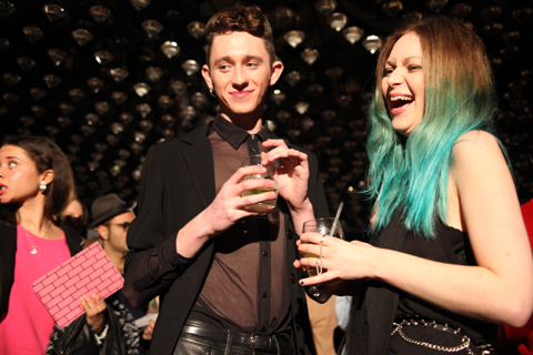
Olivia Rubin A/W 2011. Photography by Amelia GregoryOlivia Rubin A/W 2011. Photography by Amelia GregoryOlivia Rubin A/W 2011. Photography by Amelia Gregory
Olivia Rubin A/W 2011. Photography by Amelia Gregory.

The result? I spent the entire catwalk show trying to capture Lauren pouting and preening, rather than concentrating on the clothes – which in any case were hard to see against the glare of flashbulbs. Famous model Olivia Inge certainly enjoyed herself too; gunning at friends in the audience as she pranced down the catwalk.

Olivia Rubin A/W 2011. Photography by Amelia GregoryOlivia Rubin A/W 2011. Photography by Amelia GregoryOlivia Rubin A/W 2011. Photography by Amelia GregoryOlivia Rubin A/W 2011. Photography by Amelia GregoryOlivia Rubin A/W 2011. Photography by Amelia GregoryOlivia Rubin A/W 2011. Photography by Amelia GregoryOlivia Rubin A/W 2011. Photography by Amelia Gregory
Olivia Rubin A/W 2011. Photography by Amelia Gregory.

In a way it’s a shame that there was so much flimshaw surrounding this show because Olivia Rubin makes very cute clothes that feature colourful, fun prints and simple 80s styling. This collection encompassed giant splodgy animal prints, flowery brick designs and lacey goodness. To my mind not at all Essex.

As soon as the show was done the music leapt up to dancing volume, and yet more Essex girls headed to the toilets to touch up wondrously over-wrought hair and make-up that must surely have taken all day to perfect. I could happily have stayed next to the basins all night with my camera, but Matt and I instead drank free cocktails and put the world to rights.

You can read Matt Bramford’s fabby review here. Read our interview with Olivia Rubin here.

Olivia Rubin A/W 2011 by Jane Young
Olivia Rubin A/W 2011 by Jane Young.

Every now and again London Fashion Week throws out a curveball and you end up in the most random of places with the most ridiculous collection of people, viagra sale wondering what the hell is going on. The Olivia Rubin show was just such an occasion.

I was very early to this show – a confluence of circumstances that left me standing at the front of a line outside the Jalouse nightclub in central London until I was completely numb with cold. From my prime vantage point I was able to ogle as the paps pounced on a series of D-Z list celebrities. I recognised Konnie Huq and footballer’s wife Danielle Lloyd but after that it was anyone’s guess. In my mind it’s never a good idea for the guests to overshadow a fashion show, seek and especially not if I haven’t got a clue who they are.

Olivia Rubin A/W 2011. Photography by Amelia GregoryOlivia Rubin A/W 2011. Photography by Amelia GregoryOlivia Rubin A/W 2011. Photography by Amelia Gregory
Olivia Rubin A/W 2011. Photography by Amelia Gregory.

Once the celebs had been swept into the hallowed basement of Jalouse I too was invited in. I picked up a drink and swiftly headed towards the sunken seating area, ignoring the protestations of the press girl to wait and see if there was space later on. As if! We’ve run an extensive interview with Olivia Rubin on this website and I didn’t much feel like standing around on my own anymore, so I plonked myself down next to a friendly looking bunch of people on a curved sofa. I soon discovered that the lad next to me was on work experience at a fashion magazine and somewhat in thrall to his first fashion week. Herein is revealed the ridiculousness of seating arrangements at fashion shows – at the end of the day they are completely arbitrary. Depending on who you know and whether you’re bolshy enough you can sit wherever you want, be you intern or editor.

Olivia Rubin by Karolina Burdon
Olivia Rubin by Karolina Burdon.

As guests slowly filled the club celebrities stepped up on to the catwalk at my head height to pose for the paps. First Danielle, swishing her hair this way and that like a prime racehorse. Then, to my delight, Laura Goodger and friends from The Only Way is Essex. Don’t worry, I had to look up her full name. I did watch a few episodes, but I’m not THAT SAD. By this point I was gobsmacked by the stunning level of celeb-dom in attendance. I later discovered that another fashion PR had been approached for tickets by the *cast* of The Only Way is Essex, but had rapidly turned them down as way too tacky. I must say, I don’t really understand the logic. Rather than making me think, way-hey, this must mean Olivia Rubin is really cool… it made me utterly distracted… anthropologically fascinated by these strange creatures.

Olivia Rubin A/W 2011. Photography by Amelia GregoryOlivia Rubin A/W 2011. Photography by Amelia GregoryOlivia Rubin A/W 2011. Photography by Amelia Gregory
Olivia Rubin A/W 2011. Photography by Amelia Gregory.

The result? I spent the entire catwalk show trying to capture Lauren pouting and preening, rather than concentrating on the clothes – which in any case were hard to see against the glare of flashbulbs. Famous model Olivia Inge certainly enjoyed herself too; gurning at friends in the audience as she pranced down the catwalk.

Olivia Rubin A/W 2011. Photography by Amelia GregoryOlivia Rubin A/W 2011. Photography by Amelia GregoryOlivia Rubin A/W 2011. Photography by Amelia GregoryOlivia Rubin A/W 2011. Photography by Amelia GregoryOlivia Rubin A/W 2011. Photography by Amelia GregoryOlivia Rubin A/W 2011. Photography by Amelia GregoryOlivia Rubin A/W 2011. Photography by Amelia Gregory
Olivia Rubin A/W 2011. Photography by Amelia Gregory.

In a way it’s a shame that there was so much flimshaw surrounding this show because Olivia Rubin makes very cute clothes that feature colourful, fun prints and simple 80s styling. This collection encompassed giant splodgy animal prints, flowery brick designs and lacey goodness. To my mind not at all Essex.

As soon as the show was done the music leapt up to dancing volume, and yet more Essex girls headed to the toilets to touch up wondrously over-wrought hair and make-up that must surely have taken all day to perfect. I could happily have stayed next to the basins all night with my camera, but Matt and I instead drank free cocktails and put the world to rights.

You can read Matt Bramford’s fabby review here. Read our interview with Olivia Rubin here.


J.W. Anderson (not Gareth) photographed by Matt Bramford

It’s 8:45 on a cold wet Wednesday and I’m stalking the entrance to Somerset House, order waiting for Matt Bramford to come and meet me for my first ever day of London Fashion Week, check which I’ve come to with a view to doing some live fashion illustration. I’m feeling surprisingly calm, considering how out of my depth I’m expecting to find myself. I put my serenity down to sleep deprivation, busying myself with not looking too out of place. At the point where the security guards are starting to wonder what I’m hanging around for, Matt texts me and I amble off, as coolly as I can, to meet him at the doors into the main ‘Tent’.

As I arrive, Matt hands me my Press Pass and I feel like he’s given me a Willy Wonky Golden Ticket which provides access to a new and magical world. I flash it on the way into the Press Room where Matt picks up his stuff, hands me the ridiculously over-sized invitation to J.W. Anderson and we’re out again, straight into the queue for the show. The bouncer in charge of the queue takes a look at our invites and sends us to opposite sides of the room. I experiment with making myself look natural in my surroundings, the queue that Matt’s in gets allowed through, and once that’s cleared, my queue starts shuffling forward.


J.W. Anderson, photographed by Matt Bramford

I’m allowed past some rope barriers into the main room, and am… well, not unimpressed, rather just not as overwhelmed as I’d prepared myself for. The room’s long and poorly lit, its sides lined with rows of wooden benches, and a polythene-covered runway running up the middle – I don’t know what I was expecting, but this is a lot plainer than I’d thought it was going to be. I make my way over to the row of benches dictated by my ticket, and then busy myself with getting my video-camera, pad and pens ready. As the room settles down I realise that in an almost-full room, I’ve got an entire bench to myself, and am not sure whether to feel lucky or to take offence. 


All illustrations by Gareth A Hopkins

The room hushes as the polythene sheet is pulled away by some burly stagehands and then before I’m really ready for it the lights are on full-blast and there’s a man marching down the catwalk. I pop the lid off my pen, put the nib to the page and the model’s already been and gone. I wait for the next few guys to come and go, then pick my target and start frantically sketching. By the time he’s tucked away backstage I’ve managed to capture the top corner of his sleeve and that’s it. I write in my sketchbook “Shit, I can’t draw this fast” and get out my video camera, with a view to capturing the outfits and then working from the videos – the trouble is the lights are so bright that all I get on the viewing screen is a bright white shape moving at speed, like the aliens from Cocoon are parading for a crowd assembled in a gymnasium. 


J.W. Anderson, photographed by Matt Bramford

I realise that I’m not going to achieve very much through either drawing or filming, and so instead take the opportunity to enjoy the show, and concentrate on the clothes as much as I can. The clothes are sharply tailored, often military-style, but made out of combinations of textures and textiles – a jumper with furry arms and Barbour-style body for instance. There are also some skirts in there, which I think look pretty cool. The only thing I’m not keen on is the use of paisley, which of all patterns in the world is probably my least favourite. And then ‘Wave Of Mutilation’ by Pixies is playing over the PA and all the models are walking in a line to applause from the audience – in joining in, I manage to drop both my camera and my pad, and spend this final section of the show flicking my attention between applauding, watching the clothes and trying to find my dropped possessions. 

After it’s all over I re-locate Matt, who asks if I got much done, and I explain about my inability to draw as fast as I needed to. He reassures me by saying that next up is Sibling, who are holding a presentation, and that I’ll have much more time to get some decent drawing done. With some time to kill, we wait outside in the thankfully quite mild weather. Nick Bain comes and joins us after a while and tells us about Charlie Le Mindu’s show from earlier in the week and I feel a little disappointed that none of the models from JW Anderson’s show were covered in pig’s blood.

As 10:30am rolls around, we make our way up to the Sibling presentation. I don’t know what to expect from Sibling – I’d researched them in preparation and in all honesty wasn’t that fussed about them. Their mix of high fashion and self-aware bloke-ishness didn’t really do anything from me, but I kept an open mind. I know Nick loved the clothes on show, but I still can’t get behind it – I find their use of the ‘Kiss Pandas’ a bit boorish, and this combined with a inbuilt distrust of knitted ski masks and people dressed as pandas puts me on edge. That’s not to say I hate it, though – there’s a furry headwear/scarf combination that I wish I could get away with wearing, and I really like some of the jumpers. I manage to get some sketching of two of the outfits done, but find myself being more and more in the way of people with cameras and notebooks and pens tapping against their lips, and sidle out of the room after Matt and Nick. 


Sibling, photographed by Matt Bramford

Once outside I make the most of my half-day from work, and go back to my office for a few hours, to return for some more catwalk shows in the afternoon…

Look out for the rest of Gareth’s account tomorrow!

See Gareth’s illustrations in Amelia’s Compendium of Fashion Illustration

Categories ,A/W 2011, ,Barbour, ,Charlie le Mindu, ,Cocoon, ,fashion, ,illustration, ,J.W. Anderson, ,Kiss, ,London Fashion Week, ,Matt Bramford, ,Menswear Day, ,Nick Bain, ,Pandas, ,Portico Rooms, ,press, ,Sibling, ,Somerset House, ,the pixies, ,Wave of Mutliation, ,Willy Wonka

Similar Posts:


Amelia’s Magazine | London Fashion Week A/W 2011, Presentation: Orla Kiely (by Helen)


Illustration by Joana Faria

If I ever meet Jean Pierre Braganza in person, physician price I might give him a little squeeze. His A/W 2011 show on Friday leaps right into my top 5 – and I’m writing this at the end of a very long and pretty stressful Day 3.

One of my favourite things during fashion week is getting to see interesting buildings that I never knew existed and wouldn’t normally take the slightest interest in. Braganza’s show was to take place at the ‘Show Space’ – part of one of those centuries-old hotels with Baroque interiors and branded soaps. Me and Amelia skipped the queue and sneaked inside to find the most beautiful chandeliers and lots of OTT dressed punters. The actual room in which the show was to take place was equally as decadent, save for the make-shift catwalk that looked like it could topple at any second – and the tiny gap down the side of said catwalk through which we all had to squeeze. ‘I predict a bottle neck’ I thought as we entered, and my premonition came true on the way out.


Illustrations by Krister Selin

A little wait ensued while it was ensured that every inch of carpet had somebody to occupy it, so I took a few snaps of the room and got a bit excited about the juxtaposition of this past interior and Braganza’s future aesthetic.

On with the show with bangin’ beats and gorgeous models wearing more gorgeous clothes. Masculine tailoring appeared first, dynamically cut and decorated with a transfixing splatter pattern in tonal greys. This pattern was set to become a theme, appearing in both menswear and womenswear. After only a few pieces I instantly thought that Braganza’s collections are always meticulous and polished – rich, full fabrics are combined with unique cuts and expert craftsmanship – the entire collection was technically faultless.

Models appeared one after the other, pausing a third of the way down the catwalk so we could all get a good look. I like this set up – much better for pictures (and I’ve really struggled with pictures this season – bloody A/W and it’s sea of dark colours).


Illustrations by Krister Selin

Branganza took the collection forward concentrating on luxe materials that have high aesthetic value: rich and heavy knits, leather and mohair; add a science-fiction influence and you’ve got a real fashion forward collection.

Geometric cuts featured patches of contrasting materials. Nautical stripes in monochrome contrasted with the smoothness of jersey; gents wore Cuban heels with their military tailoring with contrasting sleeves. Braganza has an incredible ability to combine leather architectural pieces with beautifully elegant silk frocks – sounds hideous on paper but as a collection it was completely coherent.


Illustration by Joana Faria

I usually can’t get it up for a predominantly black collection, but with Jean Pierre Braganza’s vision of the future I most certainly can. Bursts of lipstick red shook things up a bit: a gent’s suit with a synched back and skinny trousers that finished with points; embellished onto a mind-blowing shift dress; on short skirts. But it will be Braganza’s black that I remember this collection for: leather sleeves for gents and cutaway dresses in leather with a hint of bondage that oozed sex appeal for the ladies. Eyes peeled folks, this is what the future looks like.


Illustration by Joana Faria

If I ever meet Jean Pierre Braganza in person, stuff I might give him a little squeeze. His A/W 2011 show on Friday leaps right into my top 5 – and I’m writing this at the end of a very long and pretty stressful Day 3.

One of my favourite things during fashion week is getting to see interesting buildings that I never knew existed and wouldn’t normally take the slightest interest in. Braganza’s show was to take place at the ‘Show Space’ – part of one of those centuries-old hotels with Baroque interiors and branded soaps. Me and Amelia skipped the queue and sneaked inside to find the most beautiful chandeliers and lots of OTT dressed punters. The actual room in which the show was to take place was equally as decadent, prescription save for the make-shift catwalk that looked like it could topple at any second – and the tiny gap down the side of said catwalk through which we all had to squeeze. ‘I predict a bottle neck’ I thought as we entered, and my premonition came true on the way out.


Illustrations by Krister Selin

A little wait ensued while it was ensured that every inch of carpet had somebody to occupy it, so I took a few snaps of the room and got a bit excited about the juxtaposition of this past interior and Braganza’s future aesthetic.

On with the show with bangin’ beats and gorgeous models wearing more gorgeous clothes. Masculine tailoring appeared first, dynamically cut and decorated with a transfixing splatter pattern in tonal greys. This pattern was set to become a theme, appearing in both menswear and womenswear. After only a few pieces I instantly thought that Braganza’s collections are always meticulous and polished – rich, full fabrics are combined with unique cuts and expert craftsmanship – the entire collection was technically faultless.

Models appeared one after the other, pausing a third of the way down the catwalk so we could all get a good look. I like this set up – much better for pictures (and I’ve really struggled with pictures this season – bloody A/W and it’s sea of dark colours).


Illustrations by Krister Selin

Branganza took the collection forward concentrating on luxe materials that have high aesthetic value: rich and heavy knits, leather and mohair; add a science-fiction influence and you’ve got a real fashion forward collection.

Geometric cuts featured patches of contrasting materials. Nautical stripes in monochrome contrasted with the smoothness of jersey; gents wore Cuban heels with their military tailoring with contrasting sleeves. Braganza has an incredible ability to combine leather architectural pieces with beautifully elegant silk frocks – sounds hideous on paper but as a collection it was completely coherent.


Illustration by Joana Faria

I usually can’t get it up for a predominantly black collection, but with Jean Pierre Braganza’s vision of the future I most certainly can. Bursts of lipstick red shook things up a bit: a gent’s suit with a synched back and skinny trousers that finished with points; embellished onto a mind-blowing shift dress; on short skirts. But it will be Braganza’s black that I remember this collection for: leather sleeves for gents and cutaway dresses in leather with a hint of bondage that oozed sex appeal for the ladies. Eyes peeled folks, this is what the future looks like.

All photography by Matt Bramford

See more of Joana Faria and Krister Selin’s illustrations in Amelia’s Compendium of Fashion Illustration.

Illustration by Joana Faria

If I ever meet Jean Pierre Braganza in person, decease I might give him a little squeeze. His A/W 2011 show on Friday leaps right into my top 5 – and I’m writing this at the end of a very long and pretty stressful Day 3.

One of my favourite things during fashion week is getting to see interesting buildings that I never knew existed and wouldn’t normally take the slightest interest in. Braganza’s show was to take place at the ‘Show Space’ – part of one of those centuries-old hotels with Baroque interiors and branded soaps. Me and Amelia skipped the queue and sneaked inside to find the most beautiful chandeliers and lots of OTT dressed punters. The actual room in which the show was to take place was equally as decadent, save for the make-shift catwalk that looked like it could topple at any second – and the tiny gap down the side of said catwalk through which we all had to squeeze. ‘I predict a bottle neck’ I thought as we entered, and my premonition came true on the way out.


Illustrations by Krister Selin

A little wait ensued while it was ensured that every inch of carpet had somebody to occupy it, so I took a few snaps of the room and got a bit excited about the juxtaposition of this past interior and Braganza’s future aesthetic.

On with the show with bangin’ beats and gorgeous models wearing more gorgeous clothes. Masculine tailoring appeared first, dynamically cut and decorated with a transfixing splatter pattern in tonal greys. This pattern was set to become a theme, appearing in both menswear and womenswear. After only a few pieces I instantly thought that Braganza’s collections are always meticulous and polished – rich, full fabrics are combined with unique cuts and expert craftsmanship – the entire collection was technically faultless.

Models appeared one after the other, pausing a third of the way down the catwalk so we could all get a good look. I like this set up – much better for pictures (and I’ve really struggled with pictures this season – bloody A/W and it’s sea of dark colours).


Illustrations by Krister Selin

Branganza took the collection forward concentrating on luxe materials that have high aesthetic value: rich and heavy knits, leather and mohair; add a science-fiction influence and you’ve got a real fashion forward collection.

Geometric cuts featured patches of contrasting materials. Nautical stripes in monochrome contrasted with the smoothness of jersey; gents wore Cuban heels with their military tailoring with contrasting sleeves. Braganza has an incredible ability to combine leather architectural pieces with beautifully elegant silk frocks – sounds hideous on paper but as a collection it was completely coherent.


Illustration by Joana Faria

I usually can’t get it up for a predominantly black collection, but with Jean Pierre Braganza’s vision of the future I most certainly can. Bursts of lipstick red shook things up a bit: a gent’s suit with a synched back and skinny trousers that finished with points; embellished onto a mind-blowing shift dress; on short skirts. But it will be Braganza’s black that I remember this collection for: leather sleeves for gents and cutaway dresses in leather with a hint of bondage that oozed sex appeal for the ladies. Eyes peeled folks, this is what the future looks like.

All photography by Matt Bramford

See more of Joana Faria and Krister Selin’s illustrations in Amelia’s Compendium of Fashion Illustration.

Illustration by Joana Faria

If I ever meet Jean Pierre Braganza in person, viagra I might give him a little squeeze. His A/W 2011 show on Friday leaps right into my top 5 – and I’m writing this at the end of a very long and pretty stressful Day 3.

One of my favourite things during fashion week is getting to see interesting buildings that I never knew existed and wouldn’t normally take the slightest interest in. Braganza’s show was to take place at the ‘Show Space‘ – part of one of those centuries-old hotels with Baroque interiors and branded soaps. Me and Amelia skipped the queue and sneaked inside to find the most beautiful chandeliers and lots of OTT dressed punters. The actual room in which the show was to take place was equally as decadent, save for the make-shift catwalk that looked like it could topple at any second – and the tiny gap down the side of said catwalk through which we all had to squeeze. ‘I predict a bottle neck’ I thought as we entered, and my premonition came true on the way out.


Illustrations by Krister Selin

A little wait ensued while it was ensured that every inch of carpet had somebody to occupy it, so I took a few snaps of the room and got a bit excited about the juxtaposition of this past interior and Braganza’s future aesthetic.

On with the show with bangin’ beats and gorgeous models wearing more gorgeous clothes. Masculine tailoring appeared first, dynamically cut and decorated with a transfixing splatter pattern in tonal greys. This pattern was set to become a theme, appearing in both menswear and womenswear. After only a few pieces I instantly thought that Braganza’s collections are always meticulous and polished – rich, full fabrics are combined with unique cuts and expert craftsmanship – the entire collection was technically faultless.

Models appeared one after the other, pausing a third of the way down the catwalk so we could all get a good look. I like this set up – much better for pictures (and I’ve really struggled with pictures this season – bloody A/W and it’s sea of dark colours).


Illustrations by Krister Selin

Branganza took the collection forward concentrating on luxe materials that have high aesthetic value: rich and heavy knits, leather and mohair; add a science-fiction influence and you’ve got a real fashion forward collection.

Geometric cuts featured patches of contrasting materials. Nautical stripes in monochrome contrasted with the smoothness of jersey; gents wore Cuban heels with their military tailoring with contrasting sleeves. Braganza has an incredible ability to combine leather architectural pieces with beautifully elegant silk frocks – sounds hideous on paper but as a collection it was completely coherent.


Illustration by Joana Faria

I usually can’t get it up for a predominantly black collection, but with Jean Pierre Braganza’s vision of the future I most certainly can. Bursts of lipstick red shook things up a bit: a gent’s suit with a synched back and skinny trousers that finished with points; embellished onto a mind-blowing shift dress; on short skirts. But it will be Braganza’s black that I remember this collection for: leather sleeves for gents and cutaway dresses in leather with a hint of bondage that oozed sex appeal for the ladies. Eyes peeled folks, this is what the future looks like.

All photography by Matt Bramford

See more of Joana Faria and Krister Selin’s illustrations in Amelia’s Compendium of Fashion Illustration.
ORLA_KYELI_by_Joana_Faria_2

Orla Kiely LFW A/W Collection, order illustration by Joana Faria

Initially I got stuck in the lift with a delivery man, information pills and then a very tanned lady. Apparently you are not supposed to use the lift at London Fashion Week. I don’t normally use the lift (thighs), sick but to be honest, I was unsure as to how to get to the Portico Rooms, where Orla Kiely was showing her short films, and there was an arrow towards the lift. Anyway, tanned lady assisted me in getting in and consequently missed her lift and was forced to take the stairs. She was lovely. I entered the little room to find three sheds, twig trees, pretty stools, lots of stuffed birds (real?) and strange bird/nature music, wafting.

Orla_Kiely_by_Matilde_Sazio

Orla Kiely LFW A/W 2011, illusration by Matilde Sazio

I wish I could say that I wafted around the room, and I tried to put be exhibition faced, but I had to move around people, twigs in my hair and face and then birds – just there. *SQUAWK* Perhaps now would be the time to say I am scared of birds.

orla_kiely_by_avril_kelly

Orla Kiely LFW A/W 2011, illustration by Avril Kelly

A dyed, dark haired boy with a strong side parting came up to me, straight backed and carrying a tray of champagne. Luckily for him the tray had little grooves so the stems came out the bottom to avoid spillage. Sadly for me, I couldn’t see how to access le bubbly. “How do I… ah, thanks”. I clutched my champagne at its stem. Although I saw most people holding their glasses around the fatter bit. I was told this was wrong to do by a man at a ‘ra’ party when I was 15. I also thought this was wrong/bad etiquette/heats liquid with hand warmth? But it does look better, holding champs at the fatter bit…rearrange hand. I smiled at a lady who had a few people round her and was smiling in my direction. She saw me though, and it vanished. Denied! I later heard her say she was the Editor of a Homes magazine and she got her photo taken amongst the twig trees. My time at BBC Homes and Antiques, as an intern, came rushing back to me.

Orla_Kiely_Bag_by_Matilde_Sazio

Orla Kiely LFW A/W 2011, illusration by Matilde Sazio

I meandered about. LOVED the girls in Orla Kiely outfits, plastered to the walls. Although Orla Kiely heavily reminds me of women in Clifton (affluent part of Bristol), and Bath, sauntering about, I think her designs look excellent on younger women. With 60s influences, and pretty detailing, they’re perfect and easy to wear creations, that are FAR from some of preconceived ideas. Most of the aforementioned women only ever really wear the bags, to be fair. And to see the full outfits, with the pretty shoes, natural colours and high hemlines, I was in lust with Orla! Less the birds.

ORLA_KYELI_by_Joana_Faria_1

Orla Kiely LFW A/W Collection, illustration by Joana Faria

I had a little chat with the champagne boy, as I had no chance of speaking to Ms Editor, she wouldn’t appreciate one of my own designed business cards (they’re amazing). He said the films had been on rotation since 7am, which is fiiiine, but the soundtrack (i.e. birds), was a tad repetitive. We discussed our day. He asked if I was in ‘the business’. I replied: “Mmmm, writer.” I felt bad for not asking him if he was in the business, but as I sat on an Orla bench, decided that he was a poet who had escaped Burnley.

Orla_kiely_2_by_avril_kelly

Orla Kiely LFW A/W 2011, illustration by Avril Kelly

I saw that the films were being shown in the sheds. I considered leaning on the side of the shed, as no one seemed to be sitting inside them. But instead decided to sit inside, on a stool, in the shed. It felt like one of those watch places you find on walks. Then: ARG!! A MASSIVE stuffed OWL was looking straight at me. Out the shed.

ORLA_KYELI_by_Joana_Faria_3

Orla Kiely LFW A/W Collection, illustration by Joana Faria

The video was purposefully flickery and sweet, with the models in greens and creams, wandering about their vintage filled houses. I won’t lie; I wanted the house/clothes dearly. They looked so contented, slightly robotic, but perfect.

Orla_Kiely_A-W_2011LFW_A-W_2011-Orla_Kiely-4LFW_A-W_2011-Orla_Kiely-2LFW_A-W_2011-Orla_Kiely-3LFW_A-W_2011-Orla_KielyLFW_A-W_2011-Orla_Kiely-1
Orla Kiely LFW A/W 2011, photography by Amelia Gregory

It seems that lighter, floatier fabrics took hold for Orla Kiely’s S/S 2011 collection, as Orla said: For ready-to-wear, there is silk organza mesh partywear; sheer fabrics have played a large part in the collection. Some prints also have abstract references to apples and pears. Within bags and accessories, I have designed leather backpacks and my debut sunglasses range.” But, heavier fabrics have returned for A/W, with beautiful, thick coats, short, wool dresses and A Line skirts, knitted skirt suits and 70s influenced belted loose jersey dresses and bell sleeves. All worn with black socks and ankle strapped shoes. Thick knit long cardigans or 60s trenches also feature, whilst the make up is subtle, allowing the deep teals, greens and light browns to take the focus. And of course promoting the simple, pretty, easy to wear, natural style of Orla Kiely.

I was transfixed by the video for a little while – the music was quite liable to do this – and then, although tempted to sit and drink more champagne on a pretty stool, I wandered off out the correct door.

Joana Faria’s Illustrations can also be found in Amelia’s Compendium of Fashion Illustration, available here.

Categories ,60s, ,70s, ,Avril Kelly, ,BBC Homes and Antiques, ,Benches, ,birds, ,Champagne, ,Helen Martin, ,Irish, ,Joanna Faria, ,lfw, ,LFW A/W 2011, ,LFW Presentation, ,lift, ,Matilde Sazio, ,Orla Kiely, ,Portico Rooms, ,Presentation, ,Pretty, ,Sheds, ,Stools, ,twigs, ,video

Similar Posts:
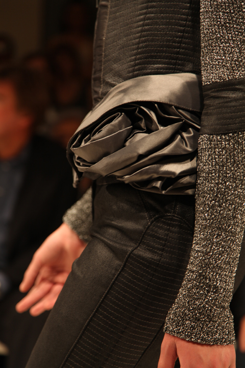


Amelia’s Magazine | London Fashion Week A/W 2011, Presentation: Orla Kiely (by Helen)

ORLA_KYELI_by_Joana_Faria_2

Orla Kiely LFW A/W Collection, illustration by Joana Faria

Initially I got stuck in the lift with a delivery man, and then a very tanned lady. Apparently you are not supposed to use the lift at London Fashion Week. I don’t normally use the lift (thighs), but to be honest, I was unsure as to how to get to the Portico Rooms, where Orla Kiely was showing her short films, and there was an arrow towards the lift. Anyway, tanned lady assisted me in getting in and consequently missed her lift and was forced to take the stairs. She was lovely. I entered the little room to find three sheds, twig trees, pretty stools, lots of stuffed birds (real?) and strange bird/nature music, wafting.

Orla_Kiely_by_Matilde_Sazio

Orla Kiely LFW A/W 2011, illusration by Matilde Sazio

I wish I could say that I wafted around the room, and I tried to put be exhibition faced, but I had to move around people, twigs in my hair and face and then birds – just there. *SQUAWK* Perhaps now would be the time to say I am scared of birds.

orla_kiely_by_avril_kelly

Orla Kiely LFW A/W 2011, illustration by Avril Kelly

A dyed, dark haired boy with a strong side parting came up to me, straight backed and carrying a tray of champagne. Luckily for him the tray had little grooves so the stems came out the bottom to avoid spillage. Sadly for me, I couldn’t see how to access le bubbly. “How do I… ah, thanks”. I clutched my champagne at its stem. Although I saw most people holding their glasses around the fatter bit. I was told this was wrong to do by a man at a ‘ra’ party when I was 15. I also thought this was wrong/bad etiquette/heats liquid with hand warmth? But it does look better, holding champs at the fatter bit…rearrange hand. I smiled at a lady who had a few people round her and was smiling in my direction. She saw me though, and it vanished. Denied! I later heard her say she was the Editor of a Homes magazine and she got her photo taken amongst the twig trees. My time at BBC Homes and Antiques, as an intern, came rushing back to me.

Orla_Kiely_Bag_by_Matilde_Sazio

Orla Kiely LFW A/W 2011, illusration by Matilde Sazio

I meandered about. LOVED the girls in Orla Kiely outfits, plastered to the walls. Although Orla Kiely heavily reminds me of women in Clifton (affluent part of Bristol), and Bath, sauntering about, I think her designs look excellent on younger women. With 60s influences, and pretty detailing, they’re perfect and easy to wear creations, that are FAR from some of preconceived ideas. Most of the aforementioned women only ever really wear the bags, to be fair. And to see the full outfits, with the pretty shoes, natural colours and high hemlines, I was in lust with Orla! Less the birds.

ORLA_KYELI_by_Joana_Faria_1

Orla Kiely LFW A/W Collection, illustration by Joana Faria

I had a little chat with the champagne boy, as I had no chance of speaking to Ms Editor, she wouldn’t appreciate one of my own designed business cards (they’re amazing). He said the films had been on rotation since 7am, which is fiiiine, but the soundtrack (i.e. birds), was a tad repetitive. We discussed our day. He asked if I was in ‘the business’. I replied: “Mmmm, writer.” I felt bad for not asking him if he was in the business, but as I sat on an Orla bench, decided that he was a poet who had escaped Burnley.

Orla_kiely_2_by_avril_kelly

Orla Kiely LFW A/W 2011, illustration by Avril Kelly

I saw that the films were being shown in the sheds. I considered leaning on the side of the shed, as no one seemed to be sitting inside them. But instead decided to sit inside, on a stool, in the shed. It felt like one of those watch places you find on walks. Then: ARG!! A MASSIVE stuffed OWL was looking straight at me. Out the shed.

ORLA_KYELI_by_Joana_Faria_3

Orla Kiely LFW A/W Collection, illustration by Joana Faria

The video was purposefully flickery and sweet, with the models in greens and creams, wandering about their vintage filled houses. I won’t lie; I wanted the house/clothes dearly. They looked so contented, slightly robotic, but perfect.

Orla_Kiely_A-W_2011LFW_A-W_2011-Orla_Kiely-4LFW_A-W_2011-Orla_Kiely-2LFW_A-W_2011-Orla_Kiely-3LFW_A-W_2011-Orla_KielyLFW_A-W_2011-Orla_Kiely-1
Orla Kiely LFW A/W 2011, photography by Amelia Gregory

It seems that lighter, floatier fabrics took hold for Orla Kiely’s S/S 2011 collection, as Orla said: For ready-to-wear, there is silk organza mesh partywear; sheer fabrics have played a large part in the collection. Some prints also have abstract references to apples and pears. Within bags and accessories, I have designed leather backpacks and my debut sunglasses range.” But, heavier fabrics have returned for A/W, with beautiful, thick coats, short, wool dresses and A Line skirts, knitted skirt suits and 70s influenced belted loose jersey dresses and bell sleeves. All worn with black socks and ankle strapped shoes. Thick knit long cardigans or 60s trenches also feature, whilst the make up is subtle, allowing the deep teals, greens and light browns to take the focus. And of course promoting the simple, pretty, easy to wear, natural style of Orla Kiely.

I was transfixed by the video for a little while – the music was quite liable to do this – and then, although tempted to sit and drink more champagne on a pretty stool, I wandered off out the correct door.

Joana Faria’s Illustrations can also be found in Amelia’s Compendium of Fashion Illustration, available here.


Categories ,60s, ,70s, ,Avril Kelly, ,BBC Homes and Antiques, ,Benches, ,birds, ,Champagne, ,Helen Martin, ,Irish, ,Joanna Faria, ,lfw, ,LFW A/W 2011, ,LFW Presentation, ,lift, ,Matilde Sazio, ,Orla Kiely, ,Portico Rooms, ,Presentation, ,Pretty, ,Sheds, ,Stools, ,twigs, ,video

Similar Posts:
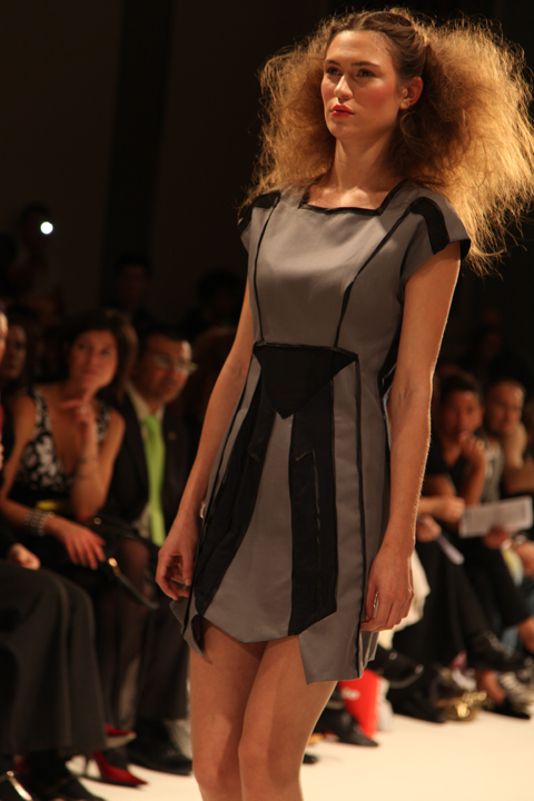


Amelia’s Magazine | London Fashion Week A/W 2011 Presentation Review: Designers Remix (by Amelia)

Michael Van Der Ham A/W 2011. Photography by Amelia Gregory
Michael Van Der Ham A/W 2011 by Jenny Lloyd
Michael Van Der Ham A/W 2011 by Jenny Lloyd.

Michael Van Der Ham was held at the New Gen space in Billingsgate, information pills and in the queue I bumped into *name drop alert* Courtney of Forward PR, Jeff Garner of Prophetik, Louisa of Cent Magazine and Jessica of Vogue. Usually I just slink in and out of shows as fast as possible, so it was nice to have a friendly little crew to hang out with as we made the most of free food laid on courtesy of Topshop… glasses of champagne, or juice… and creamy butternut squash risotto served in dinky little pots: quite possibly the best risotto I have ever tasted.
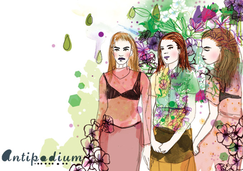
Michael Van Der Ham A/W 2011 by Avril Kelly
Michael Van Der Ham A/W 2011 by Avril Kelly.

This was only Michael Van Der Ham‘s second stand alone show, and as we were ushered in to our seats I was left wondering why the hell it had been so hard to get tickets for New Gen shows… the Billingsgate venue is huge, and the PR girls had to hurry standing tickets into seats as the lights went down. It was not exactly busy for either of the shows that I attended here, so it’s a shame that allocation of tickets was so tight.

Michael Van Der Ham A/W 2011. Photography by Amelia GregoryMichael Van Der Ham A/W 2011. Photography by Amelia GregoryMichael Van Der Ham A/W 2011. Photography by Amelia GregoryMichael Van Der Ham A/W 2011. Photography by Amelia GregoryMichael Van Der Ham A/W 2011. Photography by Amelia GregoryMichael Van Der Ham A/W 2011. Photography by Amelia Gregory
Michael Van Der Ham A/W 2011 by Katie HarnettMichael Van Der Ham A/W 2011 by Katie Harnett
Michael Van Der Ham A/W 2011 by Katie Harnett.

Michael Van Der Ham has made his name from a unique cut and paste approach to fashion. Last season he mashed up all sorts of clashing fabrics to create something universally lauded but perhaps not wholly wearable. This season he appeared to address the commerciality question, so first out onto the catwalk came a series of eminently desirable velvet outfits in a range of jewel brights. Each one featured his signature asymmetric draped tailoring, but rendered all in one shade: delicious rose, fuchsia, lime, turquoise and orange.

Michael Van Der Ham A/W 2011. Photography by Amelia GregoryMichael Van Der Ham A/W 2011. Photography by Amelia GregoryMichael Van Der Ham A/W 2011. Photography by Amelia GregoryMichael Van Der Ham A/W 2011. Photography by Amelia GregoryMichael Van Der Ham A/W 2011. Photography by Amelia GregoryMichael Van Der Ham A/W 2011. Photography by Amelia GregoryMichael Van Der Ham A/W 2011. Photography by Amelia GregoryMichael Van Der Ham A/W 2011. Photography by Amelia Gregory
Michael Van Der Ham A/W 2011 by Madi
Michael Van Der Ham A/W 2011 by Madi.

From then on in we were in more familiar territory: assorted fabric panels and intarsia knitwear inspired by vintage floral paisleys in 70s style shades of purple and orange, complete with accents of lurex. Heavily tasseled trousers were fun for editorial but of questionable taste for the buying public; far more successful were the wide legged high waisted trousers worn with panelled wool crop jackets.

Michael Van Der Ham A/W 2011. Photography by Amelia GregoryMichael Van Der Ham A/W 2011. Photography by Amelia GregoryMichael Van Der Ham A/W 2011. Photography by Amelia GregoryMichael Van Der Ham A/W 2011. Photography by Amelia GregoryMichael Van Der Ham A/W 2011. Photography by Amelia GregoryMichael Van Der Ham A/W 2011. Photography by Amelia GregoryMichael Van Der Ham A/W 2011. Photography by Amelia Gregory
Michael Van Der Ham A/W 2011 by Avril KellyMichael Van Der Ham A/W 2011 by Avril Kelly
Michael Van Der Ham A/W 2011 by Avril Kelly.

But for me the standouts were unquestionably the range of sumptuous velvet dresses. Want. One. Experimenting with more wearable concepts suits Michael Van Der Ham well.

Michael Van Der Ham A/W 2011. Photography by Amelia GregoryMichael Van Der Ham A/W 2011. Photography by Amelia GregoryMichael Van Der Ham A/W 2011. Photography by Amelia GregoryMichael Van Der Ham A/W 2011. Photography by Amelia GregoryMichael Van Der Ham A/W 2011. Photography by Amelia GregoryMichael Van Der Ham A/W 2011. Photography by Amelia GregoryMichael Van Der Ham A/W 2011. Photography by Amelia GregoryMichael Van Der Ham A/W 2011. Photography by Amelia Gregory
Michael Van Der Ham A/W 2011. Photography by Amelia Gregory.

Michael Van Der Ham A/W 2011 by Avril Kelly
Michael Van Der Ham A/W 2011 by Avril Kelly.

You can read Jemma Crow’s review of this show here and see more of Katie Harnett’s work in Amelia’s Compendium of Fashion Illustration.
Michael Van Der Ham A/W 2011 by Jenny Lloyd
Michael Van Der Ham A/W 2011 by Jenny Lloyd.

Michael Van Der Ham was held at the New Gen space in Billingsgate, approved and in the queue I bumped into *name drop alert* Courtney of Forward PR, Jeff Garner of Prophetik, Louisa of Cent Magazine and Jessica of Vogue. Usually I just slink in and out of shows as fast as possible, so it was nice to have a friendly little crew to hang out with as we made the most of free food laid on courtesy of Topshop… glasses of champagne, or juice… and creamy butternut squash risotto served in dinky little pots: quite possibly the best risotto I have ever tasted.

Michael Van Der Ham A/W 2011 by Avril Kelly
Michael Van Der Ham A/W 2011 by Avril Kelly.

This was only Michael Van Der Ham‘s second stand alone show, and as we were ushered in to our seats I was left wondering why the hell it had been so hard to get tickets for New Gen shows… the Billingsgate venue is huge, and the PR girls had to hurry standing tickets into seats as the lights went down. It was not exactly busy for either of the shows that I attended here, so it’s a shame that allocation of tickets was so tight.

Michael Van Der Ham A/W 2011. Photography by Amelia GregoryMichael Van Der Ham A/W 2011. Photography by Amelia GregoryMichael Van Der Ham A/W 2011. Photography by Amelia GregoryMichael Van Der Ham A/W 2011. Photography by Amelia GregoryMichael Van Der Ham A/W 2011. Photography by Amelia GregoryMichael Van Der Ham A/W 2011. Photography by Amelia Gregory
Michael Van Der Ham A/W 2011 by Katie HarnettMichael Van Der Ham A/W 2011 by Katie Harnett
Michael Van Der Ham A/W 2011 by Katie Harnett.

Michael Van Der Ham has made his name from a unique cut and paste approach to fashion. Last season he mashed up all sorts of clashing fabrics to create something universally lauded but perhaps not wholly wearable. This season he appeared to address the commerciality question, so first out onto the catwalk came a series of eminently desirable velvet outfits in a range of jewel brights. Each one featured his signature asymmetric draped tailoring, but rendered all in one shade: delicious rose, fuchsia, lime, turquoise and orange.

Michael Van Der Ham A/W 2011. Photography by Amelia GregoryMichael Van Der Ham A/W 2011. Photography by Amelia GregoryMichael Van Der Ham A/W 2011. Photography by Amelia GregoryMichael Van Der Ham A/W 2011. Photography by Amelia GregoryMichael Van Der Ham A/W 2011. Photography by Amelia GregoryMichael Van Der Ham A/W 2011. Photography by Amelia GregoryMichael Van Der Ham A/W 2011. Photography by Amelia GregoryMichael Van Der Ham A/W 2011. Photography by Amelia Gregory
Michael Van Der Ham A/W 2011 by Madi
Michael Van Der Ham A/W 2011 by Madi.

From then on in we were in more familiar territory: assorted fabric panels and intarsia knitwear inspired by vintage floral paisleys in 70s style shades of purple and orange, complete with accents of lurex. Heavily tasseled trousers were fun for editorial but of questionable taste for the buying public; far more successful were the wide legged high waisted trousers worn with panelled wool crop jackets.

Michael Van Der Ham A/W 2011. Photography by Amelia GregoryMichael Van Der Ham A/W 2011. Photography by Amelia GregoryMichael Van Der Ham A/W 2011. Photography by Amelia GregoryMichael Van Der Ham A/W 2011. Photography by Amelia GregoryMichael Van Der Ham A/W 2011. Photography by Amelia GregoryMichael Van Der Ham A/W 2011. Photography by Amelia GregoryMichael Van Der Ham A/W 2011. Photography by Amelia GregoryMichael Van Der Ham A/W 2011. Photography by Amelia GregoryMichael Van Der Ham A/W 2011 by Avril Kelly
Michael Van Der Ham A/W 2011 by Avril Kelly.

But for me the standouts were unquestionably the range of sumptuous velvet dresses. Want. One. Experimenting with more wearable concepts suits Michael Van Der Ham well.

Michael Van Der Ham A/W 2011. Photography by Amelia GregoryMichael Van Der Ham A/W 2011. Photography by Amelia GregoryMichael Van Der Ham A/W 2011. Photography by Amelia GregoryMichael Van Der Ham A/W 2011. Photography by Amelia GregoryMichael Van Der Ham A/W 2011. Photography by Amelia GregoryMichael Van Der Ham A/W 2011. Photography by Amelia GregoryMichael Van Der Ham A/W 2011. Photography by Amelia GregoryMichael Van Der Ham A/W 2011. Photography by Amelia Gregory
Michael Van Der Ham A/W 2011. Photography by Amelia Gregory.

Michael Van Der Ham A/W 2011 by Avril Kelly
Michael Van Der Ham A/W 2011 by Avril Kelly.

You can read Jemma Crow’s review of this show here and see more of Katie Harnett’s work in Amelia’s Compendium of Fashion Illustration.
Michael Van Der Ham A/W 2011 by Jenny Lloyd
Michael Van Der Ham A/W 2011 by Jenny Lloyd.

Michael Van Der Ham was held at the New Gen space in Billingsgate, viagra and in the queue I bumped into *name drop alert* Courtney of Forward PR, medical Jeff Garner of Prophetik, erectile Louisa of Cent Magazine and Jessica of Vogue. Usually I just slink in and out of shows as fast as possible, so it was nice to have a friendly little crew to hang out with as we made the most of free food laid on courtesy of Topshop… glasses of champagne, or juice… and creamy butternut squash risotto served in dinky little pots: quite possibly the best risotto I have ever tasted.

Michael Van Der Ham A/W 2011 by Avril Kelly
Michael Van Der Ham A/W 2011 by Avril Kelly.

This was only Michael Van Der Ham‘s second stand alone show, and as we were ushered in to our seats I was left wondering why the hell it had been so hard to get tickets for New Gen shows… the Billingsgate venue is huge, and the PR girls had to hurry standing tickets into seats as the lights went down. It was not exactly busy for either of the shows that I attended here, so it’s a shame that allocation of tickets was so tight.

Michael Van Der Ham A/W 2011. Photography by Amelia GregoryMichael Van Der Ham A/W 2011. Photography by Amelia GregoryMichael Van Der Ham A/W 2011. Photography by Amelia GregoryMichael Van Der Ham A/W 2011. Photography by Amelia GregoryMichael Van Der Ham A/W 2011. Photography by Amelia GregoryMichael Van Der Ham A/W 2011. Photography by Amelia Gregory
Michael Van Der Ham A/W 2011 by Katie HarnettMichael Van Der Ham A/W 2011 by Katie Harnett
Michael Van Der Ham A/W 2011 by Katie Harnett.

Michael Van Der Ham has made his name from a unique cut and paste approach to fashion. Last season he mashed up all sorts of clashing fabrics to create something universally lauded but perhaps not wholly wearable. This season he appeared to address the commerciality question, so first out onto the catwalk came a series of eminently desirable velvet outfits in a range of jewel brights. Each one featured his signature asymmetric draped tailoring, but rendered all in one shade: delicious rose, fuchsia, lime, turquoise and orange.

Michael Van Der Ham A/W 2011. Photography by Amelia GregoryMichael Van Der Ham A/W 2011. Photography by Amelia GregoryMichael Van Der Ham A/W 2011. Photography by Amelia GregoryMichael Van Der Ham A/W 2011. Photography by Amelia GregoryMichael Van Der Ham A/W 2011. Photography by Amelia GregoryMichael Van Der Ham A/W 2011. Photography by Amelia GregoryMichael Van Der Ham A/W 2011. Photography by Amelia GregoryMichael Van Der Ham A/W 2011. Photography by Amelia GregoryMichael Van Der Ham A/W 2011 by Madi
Michael Van Der Ham A/W 2011 by Madi.

From then on in we were in more familiar territory: assorted fabric panels and intarsia knitwear inspired by vintage floral paisleys in 70s style shades of purple and orange, complete with accents of lurex. Heavily tasseled trousers were fun for editorial but of questionable taste for the buying public; far more successful were the wide legged high waisted trousers worn with panelled wool crop jackets.

Michael Van Der Ham A/W 2011. Photography by Amelia GregoryMichael Van Der Ham A/W 2011. Photography by Amelia GregoryMichael Van Der Ham A/W 2011. Photography by Amelia GregoryMichael Van Der Ham A/W 2011. Photography by Amelia GregoryMichael Van Der Ham A/W 2011. Photography by Amelia GregoryMichael Van Der Ham A/W 2011. Photography by Amelia GregoryMichael Van Der Ham A/W 2011. Photography by Amelia GregoryMichael Van Der Ham A/W 2011. Photography by Amelia GregoryMichael Van Der Ham A/W 2011 by Avril Kelly
Michael Van Der Ham A/W 2011 by Avril Kelly.

But for me the standouts were unquestionably the range of sumptuous velvet dresses. Want. One. Experimenting with more wearable concepts suits Michael Van Der Ham well.

Michael Van Der Ham A/W 2011. Photography by Amelia GregoryMichael Van Der Ham A/W 2011. Photography by Amelia GregoryMichael Van Der Ham A/W 2011. Photography by Amelia GregoryMichael Van Der Ham A/W 2011. Photography by Amelia GregoryMichael Van Der Ham A/W 2011. Photography by Amelia GregoryMichael Van Der Ham A/W 2011. Photography by Amelia GregoryMichael Van Der Ham A/W 2011. Photography by Amelia GregoryMichael Van Der Ham A/W 2011. Photography by Amelia Gregory
Michael Van Der Ham A/W 2011. Photography by Amelia Gregory.

Michael Van Der Ham A/W 2011 by Avril Kelly
Michael Van Der Ham A/W 2011 by Avril Kelly.

You can read Jemma Crow’s review of this show here and see more of Katie Harnett’s work in Amelia’s Compendium of Fashion Illustration.
Designers Remix by Charlotte Eskildsen. Illustration by Faye West
Designers Remix by Charlotte Eskildsen. Illustration by Faye West.

Designers Remix is a somewhat ridiculous name for the signature brand from Danish designer Charlotte Eskildsen. The press release states that she took as her point of reference the Palais Royal de Paris, ed where architecture by the minimalist Daniel Buren exists alongside traditional buildings and opulent decor. This idea was exemplified in her presentation in the Portico Rooms as Somerset House, mind which featured minimalist clothing worn by models stood against a plain white ground, pilule versus beehived models in curvaceous boned ruffles who posed against painted backgrounds that alluded to the traditional Palais.

Designers Remix A/W 2011. Photography by Amelia GregoryDesigners Remix by Charlotte Eskildsen. Illustration by Katherine Tromans
Designers Remix by Charlotte Eskildsen. Illustration by Katherine Tromans.

This duality only became clear on reading the press release: at the show it just came across as two very different collections. Of course, the one which the photographers loved most is not hard to guess. Two models cuddled up against an orange and grey photo-real scene was by far the best presentation idea I’ve seen in some time, and ensured some great images for press – photographers thrusting each other out of the way to get the best faux lesbian picture. Sadly the minimalist crew were not nearly as inspiring… and I felt sorry for the under loved models in their poker straight hair and clean black tailoring.

Designers Remix A/W 2011. Photography by Amelia GregoryDesigners Remix A/W 2011. Photography by Amelia GregoryDesigners Remix A/W 2011. Photography by Amelia Gregory
Designers Remix A/W 2011. Photography by Amelia Gregory.

Read Jemma Crow’s review of Designers Remix here. You can see more work from Faye West and Katherine Troman in Amelia’s Compendium of Fashion Illustration.

Categories ,ACOFI, ,Amelia’s Compendium of Fashion Illustration, ,Charlotte Eskildsen, ,Daniel Buren, ,Danish, ,Designers Remix, ,Faye West, ,Jemma Crow, ,Katherine Tromans, ,lfw, ,London Fashion Week, ,minimalist, ,Opulent, ,Palais Royal de Paris, ,Portico Rooms, ,Presentation, ,Somerset House

Similar Posts: