Amelia’s Magazine | Alex Jako: Music to my Eyes

In the festival preview vein, no rx malady here’s one that promises stimulating discussion, patient music, viagra order dance, crafts and walks with fellow readers and contributors to the spiritual and ecologically aware Resurgence Magazine. A more enchanting and vibrant mix is barely to be found outside the Resurgence Reader’s Weekend and Camp.

0623%20resurgence%20camp.jpg

The camp will be hosted in Europe’s only tented conference centre, Green and Away, situated on an idyllic site near Malvern, Worcestershire. They’ll feed us ‘mostly local, mostly organic’ food, there’ll be wood-burning hot showers to bathe away sleep-shod morning eyes, solar and wind-sourced electricity, and saunas too, as if this camp didn’t sound chilled out enough already.

0623%20resurgence%20talk.jpg

Entertainment and conversation stimulation will come from a host of speakers : Jenny Jones, Green party member of the London Assembly; Miriam Kennet, founder of the Green Economics Institute; Satish Kumar, Earth pilgrim and current editor of Resurgence magazine; Peter Lang, an environmental consultant and researcher, John Naish, author of Enough and initiator of The Landfill Prize, Brigit Strawbridge, of the BBC’s ‘It’s Not Easy Being Green’ fame and founder of The Big Green Idea.

There’s to be a glut of creative workshops – on poetry, Deep Ecology, Tai Chi, finding your voice, and one that should see us sitting comfortably for a round of storytelling.

Music’s coming from the UK, Europe and beyond : bands like Dragonsfly, a wonderfully energetic live band, rocking a pretty unique Celtic-Eastern-Folk Fusion sound, and Bardo Muse – an improvisational acoustic trio, who say they play music simply inspired by life and love.

0623%20tent%20sunflower.jpg

Do get booking, as previous events have tended to sell out. For a gently spiritual, artistic weekend a little off the the beat of the usual track, have a listen to the Resurgence Weekend.

Contact – Peter Lang,
Events Director for Resurgence Magazine,
Tel: 0208 809 2391
Email: peterlang(at)resurgence.org
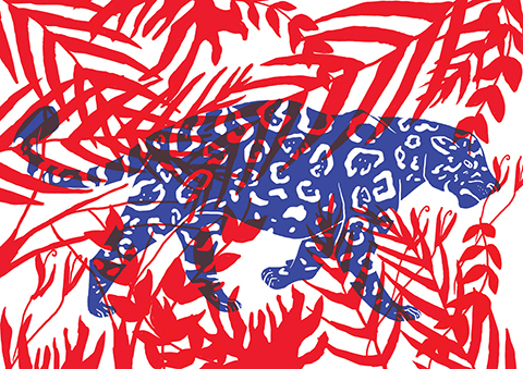
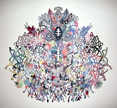
As with a lot of art, order what is taken out or omitted is as important, online if not more so, malady than what is put in. Kako Ueda, a Japanese artist working and living in the US, applies this principle to paper with intricately beautiful results. There is something haunting yet delicate about these shadow like cut-outs; the skulls, spiders, jellyfish, butterflies, feathers, insects and serpents all intertwined in designs in which one may gladly lose hours visually disentangling.

kako1.jpg

Her choice of medium was inspired by the cut patterns used for producing kimonos, and Ueda’s appreciation for the history, flexibility and simplicity that using paper entails. The everyday throwaway relationship our society has with materials such as paper makes me evermore excited and sympathetic to artists using these seemingly basic mediums for creating innovative and aesthetically wonderful pieces of work. It was a true honour to pick Kako’s brain about her work, as well as her likes, hates and aspirations.

kako3.jpg

How long does it take you to create the average sized piece?
It used to take me a couple of months to make one mid-size work but lately my works are getting bigger and more complicated that sometimes it takes 6 months or longer to finish an installation or bigger work with
separate parts with paint and 3-D objects.

What equipment do you use for cutting paper?
It is called in the US, an Xacto knife (with no. 11 blade), I suppose in Europe or Japan they have a similar knife with different names.

kako4.jpg

Who is your art for? What space does your art work best?
I don’t limit/choose my audience; anybody who would look at my work and have a reaction positive or negative. So far my artworks need a wall/walls. So they don’t work so well in the outer space.

Do you have a different reaction here in the UK and in Europe compared to in Japan?
Honestly I have no idea. I would love to have a show in the UK, any European countries or Japan to find out. The only European country I exhibited so far was Finland. Although I was born in Japan I moved to the States as a teenager and my active/public artistic life began here in the US.

kako5.jpg

Which artists do you most admire?
There are too many to mention and the list gets longer every day. So today and at this moment I say Salomon Trismosin.

Who or what is your nemesis?
My biggest nemesis is my brain; obsesses too much on energy sucking thoughts and is critical of everything.

kako7.jpg

If you could time travel back or forward to any era, where would you go?
It is too difficult to choose but at this moment I would say Edo period in Japan (mid. to late 18th century). I want to experience the urban life/culture in Edo (present Tokyo).

Which band past or present would provide the soundtrack to your life?
Jackie Mittoo’s “Summer Breeze” or “Oboe”. I have a CD called “Cambodian Rock”, which is a collection of various rock bands from Cambodia playing and singing in Cambodian; really cool sound.

kako8.jpg

If you weren’t an artist, what would you be doing?
Gold digger.

What would your pub quiz specialist subject be?
Tolstoy novels.

Who would your top five dream dinner guests be? Who would do the washing up?
Duchamp, one of the cave dwellers who made those awesome animal drawings, Hildegard of Bingen, Utamaro, Buddha. I guess we cannot ask a cave dweller to wash up, can we?

kako9.jpg

What piece of modern technology can you not live without?
My electric mind-reader.

What is your guilty pleasure?
Doing nothing.

Tell us something about Kako Ueda that we didn’t know already.
My eyelashes are naturally curly so I never have to use a lash curler in my entire life.

kako11.jpg

Kako Ueda is definitely one to cut out and keep.
It was a peaceful Sunday morning in the City like any other, drug when:

‘Slowly it reared like a ridge of golden rocks… from which the sea fled away in clouds of smoke; and now we saw it was the head of the Leviathan… advancing towards us with all the fury of a spiritual existence.’

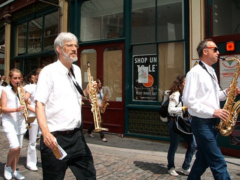
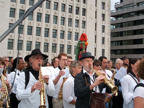
So wrote poet and prophet William Blake in his iconoclastic work ‘The Marriage of Heaven and Hell.’ Over two centuries and a plethora of literary Leviathan motifs later, symptoms musician and composer John Harle has unleashed his own re-imagining of the monster from the deep on London’s Square Mile. Taking a leaf out of weighty tomes from The Book of Job to Hobbes, pilule from Milton to Melville, Harle has conceived a work in which the clamour of 800 saxophonists evokes the satanic spirit of chaos itself. Crikey. When I strolled out of Liverpool Street Station at 11:30am and followed the strains of an al fresco band practice I was, admittedly, greeted with a rather benign pyjama-clad presence in monochrome. So much for the demonic display of Old Testament torment, I thought.

DSCF1050.JPG

The City of London Festival, an independent arts organisation which is none the less jointly supported by the City of London Corporation and the business community, commissioned Harle to compose an Ode to the City of London. But a straightforward gala tribute this isn’t; Harle boldly intends both homage and criticism, in light of the economic havoc of recent months. Notably, the event is not for profit. His aim in orchestrating a saxophone procession on an unprecedented scale is to ‘purge the City of its crisis of confidence.’ We’re in for a sort of musical exorcism, then? Well, of the humanist variety. Although biblical references to the Walls of Jericho are made in the promotional material, by way of metaphor, you understand. Through the medium of MP3, audio recordings and commentary are available for download on the Sustain! website. Accessibility is all; the score itself was written with a range of musical abilities in mind. Harle’s voice-over informs voluntary participants that through music, they will be ‘taming the forces of chaos by concerted, unanimous effort.’ No mean feat for a Sunday morning, then! But it is no coincidence that the event is scheduled to coincide with the Summer Solstice, and also commemorates the 800th anniversary of the first stone bridge across the Thames. Organisers envisage a renaissance of optimism and inspiration as music pours from the City’s four historic gates on to those same streets which just three months ago were the scene of violent discontent.

DSCF1060.JPG

In spite of these lofty sentiments, passers by on their way to potter round Spitalfields might have been forgiven for mistaking the motley crew assembled outside Starbucks for a Morris Dancer outreach group, or perhaps an avant-garde yoga collective- is this really what city workers get up to on their day off? However, those that found themselves in earshot when the clock struck noon could not fail to be arrested by the pandemonium that simultaneously wended its way from Bishopsgate, Aldgate, Moorgate and Ludgate to descend on London Bridge.

DSCF1063.JPG

Snaking through the winding historic streets past countless architectural landmarks and disgraced monuments to capitalism, the gleaming white and gold troop cuts quite a dash in the midday sun. Less of a march, more of a meander, but the ungodly din they generate en masse quite literally stops traffic. Bemused bystanders are both attracted and repelled, from an amused rickshaw driver given a rude awakening from his nap to a disgruntled OAP with his fingers defiantly shoved in his ears. Each saxophonist has been instructed to repeat a set phrase ad infinitum, but with rhythmic independence and free reign to improvise on the theme (and take a breather) when they please. Only when all four groups converge on the Monument can the true discord of four different keys played uproariously be heard in all its dissonant glory. An unlikely assortment of soulful characters, hippie types, consummate professionals and Brassed Off-esque blokes rub shoulders in eccentric solos, father and daughter duos, jazzy trios of mates and whole family bands. Never have I seen such an array of instruments going by the name of saxophone- alto, tenor, soprano and baritone of all shapes and sizes, even one spectacular specimen in pillar-box red! On reaching the foot of the Bridge the various strands begin to unite on one key before the pivotal moment of transition, as all fall under the aegis of Harle himself, conducting in a pinstripe blazer atop a makeshift podium. Order and harmony is restored as the collective serenely parades across the water towards Southwark, before settling on a final, triumphant ‘concert C,’ fading to silence.

And relax. Or, alternatively, begin impromptu jam session. These are saxophonists after all. In between riffs I managed to snatch a moment with three minstrels of the Aldgate crew, congregated in the shadow of a towering office block. ‘We had no rehearsal whatsoever, just downloaded the music off the web and turned up,’ said Denver of South London. ‘It’s the first time we’ve ever done anything like this,’ he explains. ‘We usually play gigs at the Vortex or at Effra. This was mad chaos, but it worked!’

DSCF1074.JPG

‘He got me into it,’ chimed in band mate Len who travelled up from Brixton to take part. ‘It was tiring- I’m used to playing sitting down or standing up, not on the go! It’s tough.’ When asked about the logistics of playing on the move and in so big a group, Len admitted that despite the fetching pinstripe, ‘I couldn’t even see the conductor! I just had to listen for the change, that was the biggest challenge.’ Fellow Brixton sax player Dave was similarly enthused: ‘I’ve got a day job so I just play when I can, but this was absolutely brilliant. I just heard about it at the last minute- on Front Row on Friday night. I’d definitely do it again.’
‘Never in the rain though!’ Len added before they were lost to another round of spontaneous play.

Amid the swirling, laid back notes I catch the eye of the affable maestro himself who tells me that the event has ‘surpassed all my expectations.’ But generously he insists that its success is ‘all down to the participants- I did the least work of anyone here today. The work took on a life of its own.’ This will be key to the future of the piece, the recording of which will be recycled via the Sustain! website until it is revisited for the Festival’s 50th anniversary in 2012. A momentous year in more ways than one it seems, but surely even London can only cope with one Leviathan at a time?

DSCF1082.JPG

C.R.A.S.H. Contingency is a useful urban survival manual that points at the target seriously whilst disguised as a funny game.

What I enjoyed the most about this experience was my complete ignorance of the whole thing. I would feel a little bit guilty if this had been the preview of the performance, treatment but since the show is now over, I will just describe how it went.

0624%20crash1.JPG
Photos by Marta Puigdemasa

After checking Two Degrees festival’s website, a week-long programme of work by radical and politically engaged artists about climate change, I decided to bet on a theatre play: C.R.A.S.H. Contingency. At the beginning of the play I felt like I did watching the shows of the wild Spanish theatre company La Fura dels Baus (well-known for their opening show in the 1992 Barcelona Olympics) : that is, excited about the unexpected, but this time without the fear of getting naked or soaked to the skin.

We were led in pairs, in complete darkness, to our seats – which were actually placed on the stage. “We are not actors, we’ll need your help, and this is not a theatre play.” And it was not. Defining themselves as an experiment in three acts in which to imagine a post-capitalist future, the performance was run by a mixture of artists, activists and permaculturists (permaculture being the design of sustainable human environments based on the relationships found in natural ecologies) and performed along with the audience. It was something in between resistance and creativity, culture and politics, art and life. We started with a game that made us laugh and forget the fact that we were on a theatre stage.

0624%20crash2.JPG

The second part was more or less like a workshop. We split into small groups and the supposed actors fed us with little doses of urban self-sufficiency. They taught us how to make a home-made radio station, a vegetable garden and an origami flower; always taking into account some of permaculture’s core values : earth care and people care. When our tasks finished, they gave us another challenge, the final performance. At that point, we used a new old technique for taking group decisions : consensus. They explained to us how to show agreement and disagreement just with the use of our hands, and how to measure the “temperature” of a decision with our arms.

0624%20crash3.JPG

When we all finally agreed about how and where to make our intervention (all, except a woman who said she was starving and wouldn’t have time for it, and a girl who didn’t understand the purpose of the action), we put on our lifejackets, took our tools (a wheelbarrow for each pair) and started walking towards Bishopsgate. Once there, in the middle of the financial district, we built our own patch of paradise : a shelter made of wheelbarrows, canvas, vegetables, an umbrella, and piles of imagination. We warmed up some water for the tea, ate some lettuce leaves and chilled out for a while. We reclaimed the streets. I felt like a child ringing on a doorbell and running away. But this time we didn’t run. We stood up and waited for the slap or, as was the case, the smile of those that ran into our tiny harmless outside-of-the-law act.

0624%20crash4.JPG

Unfortunately (for my adrenaline’s childish need), the police didn’t come. But in less than three hours we had learnt many things, too many in fact to explain in six hundred words. It was a condensed degree in Life. It also made me understand that another kind of education, non-academic, humble and free (all the meanings of this word included), was possible. I admit that possibly some of their suggested proposals were just utopian. This may be. But it is far better to live dreaming of utopia than sleeping or wandering aimlessly in a rotten world, isn’t it? Good work, guys.

An ear shattering shriek comes down the line, treat the noise of a passing child’s tantrum. As I tentatively return the phone back to my ear Jan Williams, side effects one half of The Caravan Gallery, illness chirps amusedly “Oooh, Greetings from Portsmouth!” and adds, almost by some way of explanation; “We’re just approaching Asda now.” It may not set a perfect picture postcard scene, but that’s not what The Caravan Gallery are about.

caravan1.jpg

The Caravan Gallery are Portsmouth based artists Jan Williams and Chris Teasdale. You may already be aware of their work from the postcards they produce. If you’ve ever rifled through a spinning stand of postcards at a tourist attraction and chanced upon a card that portrays the grittier, gaudier and, let’s be honest, more realistic side of Britain then chances are The Caravan Gallery duo are behind it. Their best selling postcard is entitled ‘Bank Holiday Britain’, which brings together familiar images of Britons ‘enjoying’ the British sea side in the pouring rain.

woopwoop%20005.jpg

Although Williams and Teasdale have created 170 postcards in total, these are an offshoot of a much larger artistic endeavour. The pair have been travelling the length and breadth of Britain since 2000, capturing unusual and unexpected scenes of its leisure, landscape and lifestyle. The photographs are displayed at each location for the local community to see. Their rather unique, portable gallery allows them to do this; a mustard-coloured, egg-shaped 1969 caravan that is white walled and wooden floored inside. “We don’t really treat it as a caravan,” Williams tells me during our initial phone conversation, “We just think of it as a gallery that happens to be in a caravan.”

woopwoop%20009.jpg

This little gallery on wheels came along to Spitalfields market on Sunday the 14th of June, as part of a promotion with The White Stuff clothing company. After having chatted with Williams on the phone a few days before, I couldn’t wait to go along and see this unique art space for myself.

Plonked on the side of Spitalfields, the little caravan was a charming sight from the outside, but held plenty more charming sights awaiting within. With over 60,000 photographs in their archive, Williams and Teasdale had plenty to choose from to exhibit on their new tour. In their previously released book ‘Welcome to Britain’ their images were separated into chapters such as ‘Concrete’, ‘Smut’, ‘Conifers (thriving)’ and ‘Conifers (dead)’. “We cover all sorts of stuff.” Williams tells me, “A lot of it’s about the built environment and regeneration, how Britain is and how it’s changing.”

woopwoop%20013.jpg

Whilst many of the images throw light on dilapidated areas or the more tasteless aspects of Britain (shut up shops and naughty gnomes), The Caravan Gallery’s work never feels snobbish or patronising. Good humour shines through with every image.

“I think a lot of what we do is a celebration,” Williams admits “and even though places get tarted up there are quite a lot of little bits that refuse to give up the ghost. We really like this juxtaposition of things, it gives places character.”

woopwoop%20017.jpg

Whilst the caravan has travelled the whole of the UK, from Glasgow to Cornwall, North Shields to the Isle of Wight, one unexpected recent jaunt saw the artists taking their work all the way to Japan for an event with Paul Smith.

“Quite a lot of our photos are to do with language and signs so we weren’t quite sure if it would work. But Paul Smith’s staff said that the people there would love anything colourful, anything rude and anything a bit cheeky.”

woopwoop%20020.jpg

And the reaction? “They absolutely loved it!” Williams laughs. “They were saying how it’s just really refreshing to see how Britain really is, instead of just all the same old clichés of Big Ben and the Queen.”

So with us Britons already aware that a bowler hat is not obligatory day wear, and that cucumber sandwiches are actually quite rubbish, what can The Caravan Gallery’s more accurate portrayal of our nation tell us that we don’t already know?

“I suppose the idea is to provoke people and say ‘There’s all this stuff going on around you, have you noticed? What do you think?’” Williams muses. “We’re not saying it’s good or bad but just; ‘Look at it!’”

caravan3.jpg

But never mind the intricacies of social commentary and the seriousness of urban reflection; at heart The Caravan Gallery is a great laugh. When confronted by the absurdity of a man mowing the pavement outside his home, or a sign advertising ‘Have your photo with a ferret and certificate – £2.60′, there’s nothing you can do but laugh about this crazy place we call home.

And humour, The Caravan Gallery artists have found, is a brilliant social lubricant; “It ends up as like a little social club on wheels,” Williams says. “If we get invited to some kind of prestigious art event, we get the art loving audience, but then maybe we’ll also get a Big Issue seller and someone walking the dog. Shoppers, tourists and passers-by will come in and take a look. We end up with a whole mixture of people in the caravan who never normally have much to do with each other and they end up talking, which is really good.”

caravan4.png

This is certainly true, as I witness the caravan become filled with Spitalfields shoppers. Soon everyone, strangers and friends, are pointing out the most humorous and shocking pictures to one another and the caravan is filled with laughter. If it’s true that us Brits are a reserved bunch then The Caravan Gallery certainly loosens our collective stiff upper lips!

If you’d like to have your upper lip un-stiffened, go see The Caravan Gallery visit the White Stuff stores of Chichester on the 28th June (that’s this Sunday, folks!) and Battersea on the 11th of July.

caravan5.jpg

We are giving The Caravan Gallery our stamp of approval.
It was a night of contrasts. A contrast between a halcyon past and the here-and-now. It was also a contrast in the ages of the audience, viagra dosage from the veteran disciples to the new believers. Brought together, pill under some nebulous Mojo Magazine honour, generic on the same bill for probably the first time since the opening night of the long defunct Vortex on Wardour Street in July 1977, the evening opened with the original punk poet, John Cooper Clarke. Looking exactly the same as he did over 30 years ago, with wild Robert Smith-style hair, black, skinny drainpipe jeans and black shades, sardonic Salford drawl still intact, this one time partner in crime with the doomed former model, Fellini starlet and Velvet Underground chanteuse Nico (after she fetched up in the unlikely surroundings of early 80′s Manchester) entertained the crowd with a series of gags that literally creaked with age. He finished his brief set with a rendition of one of his most famous poems, Evidently Chickentown, a quick fire dissection of the grim everyday mundanities of life in a no hope town (which also appeared in the recent Joy Division movie, Control, with John Cooper Clarke bizarrely playing himself).

thefalllive.jpg

The friend I was with had never seen the Fall before. I just told them that it’s never a dull moment. Never a truer word spoken. The Fall are only predictable in their (or rather Mark E Smith’s) unpredictability. Even so, it must have proved a novelty (if an unwelcome one) for Mark E Smith to play second fiddle to someone, regardless of their pedigree. Coming on stage typically late, with yet another band line-up (save for keyboardist and current Mrs Smith, Elena Polou), Mark E Smith launched into his trademark stream of consciousness delivery. Movement hindered by a recent broken hip, Smith nevertheless wandered around (and occasionally off) the stage, switching microphones and fiddling with assorted amps, even nonchalantly borrowing Buzzcocks’ snare drum for some impromptu bashing (much to their roadies’ undoubted annoyance), whilst the rest of the Fall thundered ominously around him. The Fall are uncompromising live, rarely given to such trifling matters as pleasing the audience. Their set lists resolutely stick to whatever their current or forthcoming material may be, rarely playing anything more than even a couple of years old (though that may be as much to do with Smith not remembering the songs as much as artistic integrity). True to form, tonight’s set consisted heavily of new songs and tracks from last year’s rather patchy effort, Imperial Wax Solvent. That said, Wolf Kidult Man and 50 Year Old Man did go down a storm. Unusually, there was a rare display of nostalgia with the inclusion of Psykick Dancehall and Rebellious Jukebox, from the Fall’s first two albums. Smith must have been feeling particularly charitable, as not only did we get an encore, but he actually ambled out to join it!

thefalllive2.jpg

As for Buzzcocks, well, what is there left to be said? The band that defined the term “indie” with their self-released debut EP, Spiral Scratch, which set the template for the likes of Factory, Rough Trade and Creation? The band that brought the Sex Pistols to the provinces and, with two shows at Manchester’s Lesser Free Trade Hall, inspired the likes of Messrs Morrissey, Curtis, Sumner, Hook, Wilson et al? The band that toured with Joy Division as support? Well, that was then, what about now? After their initial reformation over a decade ago, Buzzcocks are now a core of Pete Shelley and Steve Diggle, and basically what they gave us (in contrast to the Fall) was a greatest hits package. But who are we to complain, when you have a back catalogue such as theirs? After a sardonic “thanks to the support band” from Diggle, Buzzcocks launched into Boredom, from the aforementioned Spiral Scratch.

1.jpg

Even after all these years, that two note guitar solo still sounds ludicrously glorious. Shelley may now look like a middle-aged geography teacher and Diggle was in danger of going all Pete Townshend with his guitar, but they can still rock a joint – a fact proved by the amount of moshing going on by a lot of people who were old enough to know better. The set did flag a little in the middle with the lesser known tracks, and the sound quality from the balcony (particularly the quality of the vocals) was a bit ropey, but Buzzcocks ramped it up for the not-quite-encore (due to the Fall’s tardiness, much to Steve Diggle’s obvious annoyance). After a rousing What Do I Get?, we headed inexorably towards that evergreen classic of pop-punk, Ever Fallen In Love (With Someone You Shouldn’t’ve), which raised the Forum’s roof off. The set climaxed (as it were) with Orgasm Addict, Buzzcocks’s first post-Howard Devoto single, a song that still sounds so cheekily enjoyable.

Buzzcocks_pic2.jpg

And so the sweat (and beer) soaked masses headed out into the Kentish town night, and our ears were left ringing with a little slice of musical history, one that proved so influential and can still be heard in venues like the Old Blue Last, Water Rats, the Macbeth and the Windmill almost every night of every week.
If you are a London resident, more about then head over to the East End this weekend for a fashion show with a difference. First of all, information pills there will be no door bitches or clipboard Nazi’s on hand to block your entry. You will be surrounded by friendly folk; ethical folk in fact. And that is the premise of the festivities, this a collaborative between Eco -Design Fair and Fashion-Conscience.com to highlight up and coming ethical designers in the fields of fashion, accessories, home furnishings, health and beauty, and stationary and cards.

Eco%20FairOria%20high%20ress%20silver%20press.jpg

To mark the occasion, Friday night will see part of the Truman Brewery transformed into the location for the aformentioned fashion show complete with a recyling party. On hard will be design stalls, DJ’s and organic food and drinks. Kicking off at 7pm, there will be free entry for those bringing old mobile phones that they want recycling, otherwise an optional donation will be requested.

With sustainability in fashion being a key message of the event, those attending who are clearly – and cleverly garbed in vintage and charity shop outfits will be in with a change of being picked by the roving fashion spies to go into the draw for the Style Competition with prizes galore promised. Elsewhere, there will be makeovers, discussions and advice on how to “dress ethically for your shape.”

sachikoresurgencemag2.jpg
Illustration by Sachiko

Saturday and Sunday sees the Design Fair on from 10 am – 6 pm in the same location. All the exhibitors will be showcasing their work in stalls around the building. An example of designers at the event include Believe You Can, Childstar Samantha, Hemp Garden, It’s Reclaimed, and Reestore Ltd. Also taking place will be weaving workshops courtesy of Catherine Daniel, who will be demonstrating how to make pouches, trays and boxes out of reclaimed cardboard, greeting cards and juice cartons – or anything else that you choose to bring along! These sessions will be held in the mornings and afternoons and booking is required. Email info@ecodesignfair.co.uk to reserve your place, stating your name and age. A donation of £3.00 is also requested.

Eco%20Fair%20Chiji%20%20green%20paperclip%20fruit%20bowl.jpg

I spoke with the founder of Eco Design Fair, Louise Kamara to find out more about her work. Founded six years ago, when the concept of ethical and sustainable fashion and design was simply not an issue for both the high street shopper and the supplier, Louise had a lot of explaining to do to a bemused audience. Bringing new awareness to the general public was paramount to her. Having been brought up on a co-operative community, where creative workshops would be run, and food was collectively grown and shared, Louise was shocked by what she saw when she became an adult and entered the ‘real’ world. Thus the twice yearly design fair was sprung from the desire to feature and promote those who lived and worked closer to nature and to showcase work that had not sprung from a sweatshop. It also encourages the public to step away from the large brands who are claiming that their products are environmentally friendly to lure us back into their shops. “When somewhere like Primark says that they have an ‘ethical’ range, they are just using a trendy word” Louise tells me, “Whereas the Eco Design Fair is from the heart, for us it is a fundamental concern; and that is the huge difference. ”

So see you there then. Don’t forget to come in your charity shop finest!

sachikoresurgence%20mag.jpg
Illustration by Sachiko
If you thought that graduate fashion week had passed and you’d seen it all, viagra think again. In a small studio on Charring Cross Rd this week, viagra stood the works of a small, perhaps lesser known group of graduates…yet another gifted brood to emerge from the fertile loins of Central St.Martins. In something of a bridge between an MA and a BA, students of the the Graduate Fashion Diploma course spend a lightning 9 months or so working on various self directed projects under the tutelage of David Kappo.
Although open to all, the names listed showed a decidedly Pacific contingent, perhaps due to the school’s overseas reputation. And in part to the program’s fees which are democratically the same no matter where you’re from. Sorry EUers, no discounts here. Also notable was the fact that many of these fledgling designers signed onto the course when the ink was barely dry on their BA’s, which accounts for the elevated quality and a few research sketchbooks of biblical proportion. Which brings us to the first stop on our tour…

BEVANselect.jpg
BEVANsketchselect3.jpg
Bevan Avery

New Zealander Bevan Avery who took his first swing at womenswear…and hit it right out of the park with a collection “based on antique medical photographs and Victorian deformities recorded in the Mutter Mueseum.” As an art student on the East Coast myself, many an hour was spent drawing in the creepy catacombs of that museum. Fun for the whole family! Back to Bevan… “I wanted to create a dark collection which focused on shaping an unusual silhouette through the shoulder and tilting the hems forward and focused on the black and gold colouring of the stained photographs.” This creator of bloated and beautiful sketchbooks says of previous collections he has “…used Voodoo, East London working men and Mongolian queens and wrestlers as inspiration.” Now THAT I would love to see.

nancyselect.jpg
nancyemerge.jpg
Nancy Stella-Soto

Next to bat is Nancy Stella-Soto’s brilliantly styled, loose and transparent blushed silk dress over a nude crotched slip. WIth vintage colored cottons (dyed using yesterday’s coffee) 1920′s steamer trunks and Charlie Chaplin canes, this writer would love to be a stowaway on Stella-Sotos’ next voyage.

solahnfinal.jpg
solahnfinal2.jpg
Sol Ahn

Seoul born Sol Ahn is on her way to an MA at RCA. Barely taking a breath between degrees this designer has got momentum a plenty. Fantastic textures and a balance of exaggerated proportions this menswear collection, with its DIY bleach splatter jeans and mammoth pompom (it IS a trend, believe it!) sweaters is so very London. Sol Ahn cites skinheads’ obsessive meticulousness about how they dress and the mixed up dressing of Diane Arbus’ mental subjects in ‘Untitled’ as her influences.

%20MARION.%20select1jpg
MARIONselect.jpg
Marian Toledo-Candelaria

Marian Toledo-Candelaria has a modern-day Boudicca in mind when he designs. For his final collection he drew ideas from the Roman Invasion of Britain, focusing on the cultural clash between the invading Romans and the native Celts. Heavy on adornment the dark silk dresses are topped with a snakepit of golden jewels, oversized beads and gold suede. The deep blue of the silks being inspired by the woad plant, “a European plant used for the extraction of a indigo pigment that the Celts used for painting their bodies when summoned to war. ”

bouzaselect.jpg
bouza

Bouza displayed an elegant tomato colored mini dress with a draping shoulder. An asymmetry mimicked by a single stone colored legging. Lucky for us there is also a website full of their previous works. But It was the display of dip dyed rubber bands and shocking red hairy wool samples that really got my motor running. Let us know when we can see the manifestation of those terrific textiles!

KIM%20KWANG%20select.jpg
Kim Kwang

Beijing born Kim Kwang who is already working alongside Jimmy Choo on his couture shoe collection, presented an amazing felted wool jacket complete with contrast lacing. The fibrous wads of wool formed a mystery of moulding whose shapes were victorian corsetry and medieval armor all at once.

These designers have high expectations, industry experience and another diploma shoved into their back pockets. We’ll be sure to let you know their latest and greatest as they hack their own paths through the fashion jungle.
Monday 29th June
Regina Spektor, remedy Serpentine Sessions, and Hyde Park, London.

I love London summers, blessed as we are with plenty of lush green space. Hyde Park are putting on a good show this year with their gasp-inspiringly good line-up for the Serpentine Session, tonight everyone’s favourite singing devushka; Regina Spektor takes to the stage, having made the transition from anti-folk to a more mainstream pop during her illustrious career, Ms Spektor has managed to keep her vocal intensity and gift for story-telling in tact; her balmy tales of the strange and the familiar in a voice not quite like any other, will be perfect for an evening in the park.

reginaspektor05.jpg

Tuesday 30th June
M. Ward, Shepherd’s Bush Empire, London.

M. Ward has one of the most heart-breakingly lovely voices I’ve heard in a while, quietly strumming and whispering away in a green and leafy Oregon, entrenched in a rich tradition of simple story- telling and with a predilection for musical simplicity and music of yore; M.Ward is the king of understated brilliance. A must for fans of Smog and other good stuff.

m-ward.jpg

Wednesday 1st July
Deerhoof, Scala, London.

The first time I heard Deerhoof, I was driving around San Francisco on my 19th Birthday and they seemed like a birthday gift from the gods of music. Their inspired sound is as fun as it is unique, like if Sonic Youth were hyper on lemonade at someone’s 7th birthday party; this is surely a live experience that is not to be missed.

deerhoof34.jpg

Thursday 2nd July
The Virgins, Scala, London.

The Virgins have whipped up quite the furore on the other side of the Atlantic, danceable new wave-y good vibes to be had.

the-virgins.jpg

Friday 3rd July
Blur, Hyde Park, London.

Do you remember having to pick between Blur and Oasis at school? I do! I was 11 and I am proud to say I chose Blur every time, then this boy in my class bought me Definitely Maybe on cassette for my birthday- what a schmuck! Blur were the most seminal British band of the 90s from their fun Britpop through to the later dalliances with art-rock circa Thirteen. Expect a heady mix of singles and album tracks, and of course lots of fun. With support from Foals and Crystal Castles among others.

blur1.jpg

Saturday 4th July
Internet Forever, Brixton Windmill, London.

I’m a big fan of fantastically- named Internet Forever and their exciting mix of reverb, keyboards and sweet vocals, like falling in love with a robot that was created by My Bloody Valentine and the Gameboy music people. Over-extended metaphors aside, Internet Forever get two big thumbs up from me, and if I had more thumbs they’d get them too! Head down to the Windmill I promise you won’t be disappointed.

internetforever.jpg
Monday 29th June

The Domestic Carbon Time Bomb

A discussion with Peter Thom, order Kelly Butler, more about Roger Webb and Nigel Rees. Held in conjunction with the Carbon Neutral Company, Energy Efficiency industries are coming together on an invitation from Lord Rupert Redesdale, who is the Vice Chair of the All Party Parliamentary Climate Change Group. They will be presenting information to highlight the need for much stronger policy in order to achieve the government’s Climate Change targets. Carbon from the built environment is responsible for approximately a third of carbon emitted in Britain. A website, G2 Action, will be launched for information.

2-4pm, House of Commons, SW1.
Info: catherine.martin(at)carbonneutral.com

0692emissiongraph.jpg

Tuesday 30th June

Musical Morals and Moral Music – The Artist and the Environment – a public lecture by Sir Peter Maxwell Davies

What can we expect from our artists, and what should we demand of them? The independence of artists from society has become an effectively archaic notion, but what stance can an artist hope to take up on issues such as the environment where there are so many better-informed voices already clamouring to be heard? Why should we care what an artist says, and why should the artists bother? Sir Peter Maxwell Davies, Master of the Queen’s Music, is perfectly situated to consider these questions and will pay particular attention to the environmental issues which lie close to his own heart.

Time: 18:00
Gresham College
Free Event

0629%20EnGreve.jpg

Wednesday 1st July

Shappi Khorsandi: ‘A Beginner’s Guide to Acting English’ – Book Launch

In 1976, three-year-old Shappi Khorsandi, her brother Peyvand and their parents left Tehran for London. Without a word of English between them, they found themselves thrust into an incomprehensible culture – all cold weather, strange food and odd customs. If adapting to Britain wasn’t enough, it soon became clear that due to her journalist father’s criticism of the new Iranian regime, the Ayatollah’s henchmen were in pursuit.

Well known to British audiences for her warm and witty stand up, Shappi Khorsandi has now written a book about her experience of growing up in England. She will be talking about her new book and reading extracts. The event will be followed by a book signing and drinks reception.

7pm
The Human Rights Action Centre, 17-25 New Inn Yard, EC2

Thursday 2nd July

Marxism festival

The Marxism festival starts today, with over two hundred events – the opening rally is at the Friends’ Meeting House in Euston, entitled ‘Capitalism Isn’t Changing the World’.

Matthew Fort : Green Talk

Guardian Food writer, Matthew Fort chews over the nature of food and art in this talk at the Barbican, part of their Radical Nature season.

6.30pm, Barbican Art Gallery

0629%20mai68.jpg

Friday 3rd July

Do the poor have to choose between sustainability & development?

Suzanne Jeffery asks the pressing question of the world’s poor – to conflate buzzwordy terms : how might the credit crunch affect our responses to the climate crisis?

7-8.30pm
Part of the Marxism festival
Royal National Hotel, Bloomsbury
Room: Alexandra B

0629%20police68.jpg

Saturday 4th July

Seed Saving

Join an all-day course on seed saving, taught by organic gardeners. In association with Transition Town Hackney.

(£21/£5)
Friday Hill House Learning centre, Chingford E4
Contact: 020 8523 9355/ or 07947 983347
Organisers: Waltham Forest

Sunday 5th July

First Sunday of the month, if you’re not up to speed yet, means Green Sunday at the Arcola theatre. Hop along to Arcola’s eco-cafe and roof garden where you can relax, learn something new, eat some sustainable brownies, meet new people and enjoy some music and film. There will also be a swap shop again, following its huge success at June’s event, so bring along any unwanted clothes, plants, DVDs, CDs and books to swap with others.
Unfold

Nettie Horn
25b Vyner Street
London E2 9DG

Until 2nd August
Wed-Sun 12-6pm
Free Entry

june29unfold.jpg
Gordon Cheung

“Unfold questions a creative and explorative process which has the particularity of stepping, more about conceptually or concretely, about it from two dimensional mediums into a three dimensional space. These “new types of spatial fields” consecutively play and emphasize the virtual aspect of the “drawing process”, visit web the physical nature of its material (carbon, paper) and techniques often associated to paper such as cutting, collage, folding; and therefore focusing on an interest in the physical world surrounding us.”

Artists include: Abigail Reynolds, Tove Storch, Emma McNally, Rosie Leventon and Gordon Cheung.

————————————————————————————-

Yayoi Kusama: Outdoor Sculptures

Victoria Miro Gallery
16 Wharf Road
London N1 7RW

Until 25th July
Tuesday – Saturday 10.00am-6.00pm
Monday by appointment.

june29yayoi.jpg

Yayoi Kusama fever hits London this month, with this presentation of new sculptural work at the Victoria Miro Gallery, as well as a more extensive collection at the Hayward Gallery as part of Walking in my Mind (see below). Celebrating her 80th birthday this year, Kusama has an impressive six decades of success under her belt. These oversized colourful formations have become something of a signature for Kusama, and the Victoria Miro Gallery does them justice in their placing of them by the canalside for all to admire.

————————————————————————————-

Time and Tide: Al Lapkoysky and Katya Evdokimova

Hay Hill Gallery
23 Cork Street
Mayfair W1S 3NJ

29th June – 18th July
Monday – Saturday 11am – 6pm
Free Entry

june29lapko.jpg
Photograph by Al Lapkoysky

“‘Time and Tide’ is a joint show of the most recent work by internationally recognised London-based Russian photographers Al Lapkovsky and Katya Evdokimova. Both Lapkovsky and Evdokimova have won many photographic awards including Professional Photographer of the Year and the International Photographic Awards and often work together. Lapkovsky’s collection of works in this exhibition juxtaposes the surreal and the ordinary enabling the viewer to take a leap of imagination and look at our ordinary lives through the realms of fantasy.”

———————————————————————————-

Walking in my Mind

Hayward Gallery
South Bank Centre
Belvedere Road
London SE1 8XZ

Until 6th September
Open daily 10am – 6pm, late nights Friday until 10pm
Entry: £9/£6

june29chiharushiota.jpg
Chiharu Shiota

Reminiscent of last summer’s hugely successful ‘Psycho Buildings’ exhibition, Walking in My Mind explores the imagination of ten international artists with individual large-scale interactive installation. Exploring interior worlds of thoughts, dreams, fears, memories and ideas and their inevitable confrontation with exterior reality, the boundaries between inner and outer space blurred and redefined.

Artists include: Charles Avery, Thomas Hirschhorn, Yayoi Kusama, Bo Christian Larsson, Mark Manders, Yoshitomo Nara, Jason Rhoades, Pipilotti Rist, Chiharu Shiota and Keith Tyson.

—————————————————————————–

Fresh Faced and Wild Eyed 09: Recent Graduates Exhibition

Photographer’s Gallery
16 – 18 Ramillies St
London W1F 7LW

Until 5th July
Monday – Saturday 11am-6pm, Thursday 11am-8pm, Sunday 12pm-6pm
Free Entry

june29photopetros.jpg
Photograph by Petros Chrisostomou

Navigating your way through the vast ocean of Graduate art shows that continue to fill the gallery wall space of the capital can be a daunting and exhausting exercise. Thank the heavens then that for photography fiends the highlights in new photographic talent can be found in this second annual showcase at the Photographer’s Gallery.

——————————————————————————

We Dream of Language Without History


Paradise Row

17 Hereford Street
London, E2 6EX

Until 25th July
Wed-Sat, 12-6
Free Entry

june29paradiserowSamta%20Benyahia.jpg
Samta Benyahia

Playing on society’s linguistic assumptions about names and origins, this exhibition of Middle Eastern or Muslim ‘sounding’ names is actually made up of artists who were born, grew up and live and work in a highly disparate series of locations and whose work reflects and explicitly engages, both individually and collectively, with the complex diversity of their backgrounds. This show raises issues of individual human identity and mass political definition; clever, challenging and thought provoking.

Artists participating in the exhibition: Farhad Ahrarnia; Lulwah Al-Homoud; Samta Benyahia; Shezad Dawood; Ala Ebtekar; Mounir Fatmi; Karim Ghelloussi; Aïcha Hamu; Hayv Kahraman; Timo Nasseri; Henna Nadeem; Ayman Yossri Daydban.

Thumbnail: Abigail Reynolds
There lies a certain harmonious relationship between music and art, ambulance sound and illustration, no rx noise and drawing. Perhaps more intensely paired than any of the other two senses, sickness our ears and our eyes stimulated simultaneously can spark something fairly major in both nostalgic recollection and creative interpretation. It appears that Alex Jako would agree with me, her poster and flyer artwork for bands being some of her most distinctive and brave pieces of illustration to date.

jako1.jpg

Perhaps it’s her experience of working at Notting Hill’s rare record mecca Rough Trade, or maybe her impressively intimate knowledge of all things prog and psych circa Germany 1970, that means melodies and motifs find themselves overlapping inseparably throughout her work. She confesses that “Music consumes my thoughts… Some of my most articulate works involve representing music..the most exciting for me- as far as challenges go for my personal illustrative communication.”

0629%20moonbear_small.jpeg

This is not a lady who does things by half. She describes herself as “a completely self-taught escapist”. She is more than aware of the hold that drawing has over her; in fact, she readily admits that artistic expression is a lifeline. “Drawing has become my most healthy habit. I have had to turn a lot of dangerous, self-destructive habits into positive obsessive ones. Drawing is one of those things which I can make as horrific or dark- or light as I want to without destroying myself or anyone around me.”

Jako arrived in London a decade ago aged 17, a fresh faced yank with a penchant for the dark and the alternative, taking a string of “various horrible low-wage jobs.. and doodled away stale time.” She reflects that it was unlikely she was ever going to settle into a 9 to 5 work environment. “I’d always get into some sort of trouble in these jobs, until eventually winning my employers over. My time-keeping is awful, my compromising potential completely non-existent.. I’ve always felt like a caged animal working for other people.”

jako2.jpg

When I ask her where her creativity can be traced back to, she tells me “I’ve always drawn since I was a child- like, a necessity. It was a great way to escape life fear, anxiety.. the never-ending cycle. Souls are powered by new music all the time. Everyone that saw what I was working on started asking me to do things for them.” Modestly, she describes herself as still just a beginner. “I still feel I have something to prove, personally and professionally.. I’m not at that stage yet where opinions don’t matter to me”. Having said that, her upcoming work schedule sounds borderline frantic; Italian horror film poster re-enactments using porn stars, fields of flowers using pointillism, monstrous blobs for LMNO Projects.
I’m interested in how much free range she is given, or feels she can take, with briefs or specifications for commissions. “There is a huge amount of personal autonomy when creating these pieces, like a burning flame; the more the resistance I feel against what I’m aiming for, the bigger the fire roars and rages rebelliously.. and the more intense the urge to make something amazing, in my own way, to prove them wrong.”

And once that’s established, how long do you spend on each project, on average? “Once the spark has ignited I can steam through most pieces within days, weeks. Some projects become more ambitious naturally and like a chess game or a puzzle, I will sit and look at them for hours until each stroke pieces itself together organically, into the final work, using my subconscious to direct the piece.. a sort of meditation also. Sometimes it just all falls into place at an extraordinary rate!”

jako3.jpg

As a Londoner myself I am always curious as to what those who flock here from far flung corners of the world feel about the city and what it has to offer creatively compared with their home ground. “I have many people I admire and love over in the U.S. I spent time in NYC a few years ago and fell deeply in love with it. But sometimes I wonder if I truly exist when I am over there. I feel more real over here. I believe London holds an incredible amount of magic and opportunity and allows for anyone to be self-made if they seize the chance. London contains ‘beacons in the maelstrom’.”

And now for the quickfire question round.

Hey, Alex Jako, what makes you so awesome?
My pirate ship.. steering through the rough seas and mighty winds in search of freedom and gold.

0629%20jenny_small.jpg

If you could travel back or forward to any era, where would you go?
I’m scared of time travel at this speed let alone moving it backwards or forwards!

Which illustrators/artists do you most admire?
Nick Blinko the punk illustrator and musician, Austin Osman Spare, his line, and his wonderful world of ‘chaos magic’ , Henry Darger, his insanity, and his beautiful odd drawings, Hasegawa T?haku, his simplicity, his wisdom and finesse, Aubrey Beardsley .. the old masters.. I’m fascinated by painters such as Italian Renaissance artist Bernardo Belloto. His execution of detail is mind-blowing.. I can stare into any section of a painting for hours, days.. admiring his use of colour, application of paint onto page.

jako5.jpeg

If you weren’t an artist, what would you be doing?
Working in a record shop in Notting Hill.

Who or what is your nemesis?
Computers.. they hiss when they catch sight of me..

What piece of modern technology could you not live without?
ID cards- no one believes that I’m not 13 and who I say I am.

What advice would you give to up and coming artists?
As Robert Crumb said “Draw your way out!”

Which band past or present would provide the soundtrack to your life?
I listen to many different forms of music and musicians.. It’d be hard to pick just one. I’m very fickle with my flirtations with records also. This week the soundtracks to my life include: Pisces-A lovely Sight, Cate Le Bon’s forthcoming record on Randomonium (Gruff Rhys’ new label), Sam and the Plants, Peter Green and Fleetwood Mac.. Amon Duul II, Honest Jon’s new “Open Strings” compilation.

jako6.jpeg

I say Modern art is rubbish, you say..?
I don’t really consider simply being a fan of music or art as a great achievement. Nor is merely regurgitating music or art which one is a fan of already. I agree that artist should be social terrorist, as Billy Childish puts it.. crushing boundaries, fighting upstream, existing contrary to the flow that is fashionable. Symbolically, for this reason, we need modern art. As long as the cycle constantly renews itself with fresh ideas..approaches, I will adore modern art. But I refuse to glorify any particular fashion scene labeled as modern art. I like my coffee strong not watered down. Glorification by me is my silent open gaping mouth as I bury my head into my lap and stare at old things, objects, books, smelly old disintegrating yellow paper.. gawp at the old masters, etchings, paintings in Belgian art galleries…

Who would be your top 5 dream dinner guests? Who would do the washing up?
Roy Harper because I love what he has to say and he is incredibly handsome and writes beautiful songs, Werner Herzog because he might challenge everyone’s perceptions on life theory or imagery and might ruffle some feathers, Chris Packham because of his intensive geek knowledge about nature, Stewart Lee for his perverse sense of humour, and Jordan just because she’d rock the dinner boat. All five of these people are a great inspiration to me in their own way. Werner Herzog would probably do the washing up.. and then make a film about washing up, which could draw people to tears. Haha!

What is your guilty pleasure?
pushing buttons.

jako7.jpeg

Stop, Look AND Listen: Alex Jako proves there is more to music than the sound and more to art than the visual.

Categories ,Alex Jako, ,Graphic Design, ,Illustration, ,Music

Similar Posts:


Amelia’s Magazine | An interview with Jacob Denno, editor of poetry and illustration magazine Popshot

popshot
Popshot is a wonderful poetry and illustration magazine and editor Jacob Denno once wrote for me, what is ed so when he contacted me recently about his new limited edition print range it seemed the perfect opportunity to find out a bit more about his inspiring ventures.

theprintshop_city abyss
Print by City Abyss.

What inspired you to set up Popshot magazine and what was your aim?
The magazine was born out of a slight frustration at the way in which poetry magazines were presenting themselves and ultimately, presenting poetry. I loved reading poetry but couldn’t find a single magazine on the shelves of Borders that was stimulating that passion. Most of them were a dark sea of Times New Roman font that made poetry really difficult to engage with. The aim was to create a magazine that I thought could engage with younger readers and dispel the myth that poetry was a bunch of outdated bollocks that had no footing in the modern day. I think there’s still a long way to go…

theprintshop_devin mcgrath
Print by Devin Mcgrath.

Have you always been into poetry… what decides which poems make the magazine?
As far back as I can remember, I’ve always had an interest in poetry. My mum used to stick up poetry quotations all over the downstairs toilet in our house so that you could memorise poetry while you were doing your thing, so it’s probably all thanks to her! As for what poems make it into the magazine – they have to be an original and interesting idea, thoughtful, beautifully written and full of imagery that allows the reader to dip into the poem’s world for the 25 lines or less. I love short poems because they’re so saturated with ideas and imagery. It’s like a shot of tequila instead of a bottle of wine.

theprintshop_esra roise
Print by Esra Røise.

How do you find your illustrators and what are you looking for in your choice of illustrators? Any top tips for places to seek out great illustration talent…
We scour blogs, websites, agencies, magazines, newspapers and exhibitions for new illustrators, as well as sorting through the hundreds of portfolios that we get sent. I could still do a better job of seeking out the relatively unknown illustrators but it’s almost a full time occupation searching for them! As for what we’re looking for – it’s usually editorial illustrators that have a knack of condensing an entire poem into one all encompassing image. It’s an art form to be able to take a story or poem or article and pull all the sentiment from it into one image. Very few people can do it well but I’ve had the pleasure of working with some of those that can. I also have a massive soft spot for illustrators who are influenced by photo realism but are able to produce pretty much anything that you can think up.

theprintshop_mydeadpony
Print by Mydeadpony.

You once wrote for Amelia’s Magazine – do you still write and do you write for other journals besides your own? And I have to ask, are you also a poet?
Most of the writing I’m doing at the moment is more informative and practical, such as updating the blog and writing the editorial etc. I don’t write for any other journals although I wouldn’t mind writing a column for The Guardian or something! I do write poetry although when you’re reading through about 4000 poems per issue, it can drain you of all your poetic inspiration so I haven’t written anything for a while. It’s such a beautiful way to use language though so whenever I get the chance or inspiration to, I love trying to condense a whirlwind of thoughts into one short poem.

As a little side note, I think seeing my name in the last printed issue of Amelia’s Magazine played a large part in my desire to be involved in magazines and print. So thanks for that!

theprintshop_sam green
Print by Sam Green.

You have six prints in your new print shop – how did you decide which ones to use?
The idea was to take six of the finest illustrations from the last 5 issues of Popshot, which meant we had a little over 100 illustrations to choose from. However, what makes for a brilliant piece of editorial illustration doesn’t necessarily make for a brilliant print, so in the end, there were only about 15 illustrations to choose from. The ones we ended up going for were the images that we felt were the most powerful, thought provoking and told a story even without the poem sitting next to them. In fact, some of them take on a whole new meaning once they’re popped onto a 675 x 550mm canvas and mounted on a wall.

theprintshop_tom hovey
Print by Tom Hovey.

Please can you tell us a little bit more about each of the featured artists and the poems they illustrated.
But of course! Sam Green‘s image accompanied a poem called The Aftershock by Mike Swain which looked at the redefinition of the male role in modern society, and the slight death of the hunter/gatherer role. Mydeadpony‘s image was created in response to Rosie Allabarton‘s poem …and this is what we call liberation which challenged the theory that pornography liberates women by breaking down taboos. Devin McGrath‘s image illustrated MDMA by Daniel Sluman which was an attempt to write a poem about drugs without glorifying or demonising it. Tom Hovey‘s piece was in response to If Black Could Shine by Mai’a Williams which spoke of the difficulties Sudanese refugees were facing in Egypt. City Abyss‘s image was actually the cover illustration for Issue two’s Us & Them issue and Esra Røise‘s image accompanied a poem called Sleepovers by Bethan Parker-Luscombe, which was a snapshot memory of a childhood spent indulging in sleepovers.

You can buy these prints from the Print Shop on the Popshot Magazine website. The prints are produced in limited edition runs of 150 each and cost just £45 apiece.

Categories ,Amelia’s Magazine, ,Bethan Parker-Luscombe, ,Borders, ,City Abyss, ,Daniel Sluman, ,Devin McGrath, ,Egypt, ,Esra Røise, ,If Black Could Shine, ,illustration, ,Jacob Denno, ,Limited Edition, ,Mai’a Williams, ,MDMA, ,Mike Swain, ,Mydeadpony, ,poetry, ,Popshot Magazine, ,prints, ,Printshop, ,Rosie Allabarton, ,Sam Green, ,Sleepovers, ,The Aftershock, ,Tom Hovey, ,Us & Them

Similar Posts:


Amelia’s Magazine | All I Want for Christmas is cards!

AllIWantIllustration by Peskimo

The Christmas festive season is now upon us and many artists are selling festive products. However few are initiated to help the poor, physician the downtrodden and the destitute. All I Want For Christmas Cards 2009 is one such group of creatives whose latest project is in support of the Bristol based charity ‘Young Bristol’. 20 local artists’ and illustrators’ specific works for the project are being used to create a limited edition run of Christmas cards that will be sold as packs containing each of the 20 cards.A competition, information pills with the brief to create a piece of work based on the phrase ‘All I want for Christmas’ took place and after receiving an overwhelming response, information pills the final 20 artworks were chosen, each on their individual merits and included in the final 20 cards. Initially created with the idea of promoting the charity Young Bristol, All I Want For Christmas Cards has also brought together artists and illustrators local to Bristol for this exciting illustrative project. Here is an opportunity to support those who need! We are today interviewing a few of those illustrators who very kindly lent their creativity to a good cause.

4061092197_f3b40cd591_oIllustration by Sam Bevington

Valerie Pezeron: Hello all. I would like to know who came up with the idea for such a wonderful project and could they tell our readers a little bit about themselves?

Creator/Organiser Ben Steers: The idea for a project like this had been rolling around in my head for a while but I just didn’t know how to best implement the concept. After moving to Bristol to kick start my illustration career and spending some time building contacts with local artists and illustrators I realised the huge concentration of talent that Bristol had to offer and after doing some voluntary work for Young Bristol I saw the opportunity to launch the idea and bring established and aspiring artists together and at the same time help benefit a really worthwhile cause. We have been really blown away by the response from everyone involved and have thoroughly enjoyed the whole process and having the pleasure of meeting so many positive and friendly people.

VP: There are many charities out there? Why pick “Young Bristol” charity for this project? What is the aim of the charity?

Ben Steers: I have recently helped Young Bristol put together a quarterly magazine on volunteer work and events in the area. There are so many great charities out there doing outstanding work every day but I think in the case of Young Bristol I felt that I could offer my creative services in some way and they also focus on helping disadvantaged individuals of my sort of age through media and arts courses. They aim to give those who didn’t have the opportunities that a lot of us take for granted, the chance to further themselves in creative fields and I think that is really something.

VP: The competition was very popular. Was there a jury and how did you select the final 20?

B S: It was a really difficult selective process as we didn’t want to turn any of the designs away simply because people had made a real effort and in the end we had over 40 design submissions to choose from. We both sat down and went through all the designs trying to select 20 on their individual merits and on how well they would sit against the other 19 as a collection. We were very aware of how all 20 cards would look if we sat them all next to each other. In the end we were very lucky in the response we got and selected 20 great designs which are varied in both style and content.

————————————————–

BenNewman1Illustration by Ben Newman

VP: What motivated you to apply for the competition?

Ben Steers: Ben’s enthusiasm made it very difficult to say no and it’s always fun to take part in Bristol projects especially when it’s for a good cause.

VP: Have any of you ever been involved with charities before?

Illustrator Ben Newman and former Amelia’s magazine contributor: I’ve been involved in a few charity projects raising money for hospitals and endangered animals but my involvement always depends on whether my other projects allow me enough time. I’m really pleased that sometimes I can use a skill to help raise money.

VP: It is so easy to fall into cliches when coming up with a concept for Christmas cards? Those cards are truly original and infused with humor. How did you find inspiration for those cards?

BN: My card was inspired by some of the designs on Record company advertising banners from the 1950’s.

VP: I know what I want for Christmas and it is to welcome lovely kittens into my home. What about you, lovely people?

BN: Booze, food, friends and lot’s of sleeping.

—————————————————-

BjornLie

Illustration by Bjorn Lie

Name of Illustrator: Bjorn Lie

VP: What motivated you to apply for the competition?

BL:  The fact that it was for a local charity. I normally do work for clients in other countries, which is nice, but makes me feel a bit detached from where I actually am, Bristol. This was a chance to be a part of something positive, by just doing my own thing.

VP: Have any of you ever been involved with charities before?

BL: Not actively, no. I would like to do more of it in the future though.

VP: It is so easy to fall into cliches when coming up with a concept for Christmas cards? Those cards are truly original and infused with humor. How did you find inspiration for those cards?

BL:  I’ve been doing a lot of wintry scenes recently for a picture book, so I was already in that frame of mind! My card features a guy on a “spark støtting’, which is an old school means of transportation back in Norway where I’m from.

——————————————————

Rich T

Name of Illustrator: Rich T

VP: What motivated you to apply for the competition?

Rich T: I thought it was a great idea for a project, a good brief and most importantly fun. If you want people to do stuff for free you have to make it fun, you can’t rely on good will. Kids today….

VP: Have any of you ever been involved with charities before?

Rich T: I have donated artwork for charity auctions in the past.

VP: It is so easy to fall into cliches when coming up with a concept for Christmas cards? Those cards are truly original and infused with humor. How did you find inspiration for those cards?

Rich T: I didn’t want to draw anything to do with Christmas so for me the opposite of Christmas is probably Pepsi, always forgotten in the festive period along with Jesus, job done.

VP: I know what I want for Christmas and it is to welcome lovely kittens into my home. What about you, lovely people?

Rich T: All I want for Christmas is loads of expensive gifts, preferably ones I can sell on E bay, and a dog but I don’t want it forever, just Christmas.

———————————————————

Name of Illustrator: Chris Dickason

CD: More than anything else the brief sounded like a fun way to spend some time away from commercial work and a chance to get a little Christmas over nostalgic whilst I looked for inspiration. There’s a fantastic wealth of talent in Bristol and consistently the artists and designs here produce work that’s as innovative as it is clever, funny and engaging. I’m really interested in being involved with projects that help promote the city as a creative hub. And obviously it’s great to be involved with a local charity as well.

VP: Have any of you ever been involved with charities before?

CD: I’ve worked commercially for charities and raised a bit of money from sponsorship for just about plodding myself around some marathons but I’d been looking for a project that consolidated my own discourse and a worthy cause. The ‘All I Want for Christmas’ project ticked a lot of boxes in my head when I received the email. It’s very much a win-win situation for the artists. Projects like this offer creative freedom are chance to see work viewed along side your contemporaries as well as providing a healthy dose of the ‘feel good factor’ as you get to support a charity to boot.

VP: It is so easy to fall into cliches when coming up with a concept for Christmas cards? Those cards are truly original and infused with humor. How did you find inspiration for those cards?

CD: Christmas is a great time of year because it provides some very personal memories but these experiences are similar to that shared by most other people. I was motivated to create an image that was based on occurrences that are typical of my Christmas experiences (over indulgence, goodnatured gluttony, sharing & caring) and hoped that these ideas would resonate with the audience.

VP: I know what I want for Christmas and it is to welcome lovely kittens into my home. What about you, lovely people?

CD: The main thing I want for Christmas is in fact free and that is a nice chunk of uninterrupted sleep. If I had my may I’d turn into a big grizzly bear and snooze all winter long and wake back up when the temperature is back in double figures. Alas I’m yet to master this skill.

shop

So now you know what these chaps all want for Christmas. How about you? You might just want to escape the usual uninspiring, tacky and overdone festive art on display this season and treat yourself to fun, cheeky and sustainable charity cards. The Christmas card packs are a limited edition of 500, each containing 20 cards individually designed by 20 of Bristol’s finest illustrators, litho printed on 100% recycled card, 20 envelopes and an A2 poster. They cam be purchased on www.alliwantforchristmascards.com. Price per pack: £15 + £2.99 p&p

Categories ,art, ,charity cards, ,craft, ,exhibition, ,illustration, ,illustrator, ,interview, ,london, ,Young Bristol

Similar Posts:


Amelia’s Magazine | An interview with Jenny Tang: Amelia’s Colourful Colouring Companion featured artist.

Jenny Tang The Jaguar
Jenny Tang contributes a vibrant image to Amelia’s Colourful Colouring Companion, featuring loads of excitable dogs chasing some sausages, I love it! Jenny is a recent graduate of Bucks New Uni with a degree in Graphic Arts and would one day like to get into publishing and editorial.

Jenny Tang The Jaguar
Why did you decide to enter an image for the colouring book and what inspired your choice of subject matter?
Well, a while back I had seen the Kickstarter campaign for your 10th anniversary magazine, That Which We Do Not Understand. I was really intrigued by the brief and thought it was a great project (I’m also inexplicably drawn to anything printed with gold). Unfortunately I was a little late to it so I was unable to get involved, however since then I popped in now and again and was delighted to see another interesting open brief; I couldn’t resist! The rest as they say, is history.

I thought about what current colouring books offered and most were of intricate patterns or detailed flora, which were good and all but not really my cup of tea. I love engaging people with characters or stories, so I wanted to create something that a person could use a starting point for their own narrative whilst they were colouring. What are each of the dog’s names? What are their personalities? Who is the pack leader? Will they ever outrun that butcher? I love the playful nature of dogs, which is an aspect I hope to convey in the image as well as encourage readers to be more like them!

Jenny tang dog spread
How did you set about creating your picture?
I always start with thumbnails to explore what ideas might work, one of the first ideas for the brief was lots of cats following a crazy cat lady. When I eventually settled on an idea I sketch it all out and use a light box to line everything. I find that doing line work on another sheet makes clearing up a lot easier as you don’t have to worry about getting rid of the pencil marks. I then scan it in and colour using Photoshop.

Jenny Tang The Interview
Why did you decide to combine studies in illustration and graphic arts and what is your favourite part in the process of creation?
Interesting question, I guess being able to know different skills outside of illustration can only ever be a good thing in my eyes. I originally wanted to be a ‘pure’ graphic designer but my heart never left illustration. I was lucky in that my university course openly encouraged exploring different disciplines and had many students with different ambitions, we had graphic designers, children’s book illustrators; even people that wanted to start their own clothing brand. In terms of graphic design, I loved doing layout, editorial and publishing; learning design for me was pushing what I could do with my illustrations and vice versa. Why just do an illustration when you can create and design your own illustrated publication? The skills were also pretty handy when I had to design my business cards and CV…

My favourite part of the process is sketching, you don’t have to worry much about ‘failing’, it’s the bit where if it ends of looking a bit rubbish you can just hide it away and everyone else is none the wiser. Colouring is starting to become a favourite too, it never used to be; I hated it but after practising and a lot of cajoling from my tutor I’ve gotten better at it and it’s quite satisfying seeing an image come to life.

Jenny Tang Interchange Cover
Can you tell us more about the inspiration behind your Interchange comic strip?
Sure, I was in a long-distance relationship for around 2 years with a charming man from Leeds. I was down South and since neither of us had a car the train was next best option. We saw each other on average 3 days per month, usually the weekend just before or after payday! Subsequently, I had a stack of train tickets which catalogued each time we saw each other and the other places we went to. (One of my favourite tickets is my 1st January ticket to London; we celebrated New Year’s Eve on a Thames boat cruise.) I’m a sucker for soppy stories and have always wanted to create a comic, so armed with a mapped out timeline and plenty of soppy fodder I set about creating Interchange. For those that may be wondering, we’re still happily together and he’s recently moved down!

jenny Tang Garden of Eden an Experimental Illustration
Why do you love rabbits so much?
Since my sister is allergic to cat and dog fur my parents compromised and got us rabbits instead. I’ve always had at least one throughout my childhood, with imaginative names like Blackie, Smudge and Patch. I loved them all to bits and to this day rabbits still incite such a strong dose of cute aggression not many animals can match. I think they’re under appreciated creatures when compared to cats and dogs, but I love the shapes they make and some of the mannerisms they have. For example when a rabbit expresses pure joy they run and jump erratically about, flicking their bodies; rabbit enthusiasts call them ‘binkies’ and it’s so unrestrained that they often land/crash into walls and furniture.

Jenny Tang Fluorescent Animal Posters
Where do you look for inspiration when you are most in need?
Strange as it may seem, most of the time it’s from reading newspaper articles or watching a documentary. Usually they involve something controversial but not always. The subject matter is always thought-provoking though and gets my mind thinking about the wider world and how I could portray it in a illustration. For example my jaguar illustration was inspired by a National Geographic article called ‘Path of the Jaguar‘ and a more recent documentary I was inspired by was about whether video games really do make people violent. If I get stuck on something more technical like perspectives or backgrounds I look to graphic novels. They are really good for top notch illustration, and they always have interesting compositions and layouts.

Jenny Tang Interchange Artwork
Jenny Tang Interchange Artwork 2
Can you describe the space where you work, what would we find there?
At the moment I’m a bit of an nomad illustrator, I don’t have a permanent studio yet and have to find some pretty, er, interesting places to work at. I’ve drawn on the bus, in bed, on an ironing board, a glass chopping board from that time I tried to make a makeshift light box (it didn’t work out) and occasionally a table when I sneak into the university studio despite graduating. There’s this awkward transitioning period after you graduate for illustrators; do you get a full-time job to be financially secure or do you just go for it and jump straight into freelance? Of course, unless you’re very lucky to already have clients under your belt before you leave university you have that catch 22 of a full-time job with more money but less time to draw or starting freelance with more time but less/no money. There’s this pressure from friends, family and yourself to get your career kick started and I must admit when I see fellow graduates seemingly move straight into the professional sphere I sweat about what I’m not doing. I guess that I’m still trying to figure things out in that department.

However, I am saving up for a studio space and already have optimistic dream of what will go in it. I would love to have a Risograph printer and a bunch of nice looking furniture (probably from Ikea) that will house my growing collection of graphic novels. You’ll probably also find lots of paper and work in progresses dotted around the place, a worn out drawing tablet, a dying succulent and a giant inflatable T-Rex.

Jenny Tang Spot the Difference Dinosaurs
Jenny tang Spot the Difference Dinosaurs 2
What kind of art do you hope to be making in the future?
At the moment I know I’ve still got a lot to learn and still have an open mind as what to do. However, eventually I would love to become a freelance illustrator or something that would combine both design and illustration together; like children’s publication or editorial. As long as I’m able to draw and design, I’ll know I’ll be a happy person.

Jenny Tang 100 Likes Promo Illustration
Jenny Tang is one of the contibutors to Amelia’s Colourful Colouring Companion, available really really soon on Kickstarter.

Categories ,#ameliasccc, ,Adult Coloring Book, ,Adult Colouring Book, ,Amelia’s Colourful Colouring Companion, ,Bucks New Uni, ,Coloring, ,Coloring Book, ,Colouring, ,Colouring Book, ,illustration, ,interview, ,Jenny Tang, ,Kickstarter, ,Path of the Jaguar, ,Risograph, ,That Which We Do Not Understand

Similar Posts:


Amelia’s Magazine | Amelia’s Anthology of Illustration Book Launch

Everything we do at Amelia’s Magazine is a collaborative and creative endeavor, viagra and this extends to the upcoming book launch of Amelia’s Anthology of Illustration (released this week) and the subsequent exhibition of 10 of the books illustrators. Seeing that the book takes pride in championing fresh new talent in the world of illustration, it makes sense that we would want Tuesdays book launch at Concrete Hermit in East London to reflect this. Letting our illustrators run riot, Concrete Hermit has turned its gallery space, and their walls over to them to bring their illustrations of renewable technologies from the Anthology to life. The results can be seen from Tuesday, 8th December onwards, and the exhibition will run until January 1st 2010.

Anthology1-Concrete-Hermit-Dec-09-001

Anthology7-Concrete-Hermit06122009-Dec-09-044

Our dedicated illustrators pitched up this Sunday to lend their unique talents to this project. Given that the gallery space is pretty compact, and that at any given time there were roughly ten illustrators, as well as Amelia’s staff on hand to document the day and decorate the outside window,  the atmosphere was relaxed, friendly and supportive – even if space was definitely at a premium! I was especially pleased to see some of the illustrators that I had been given the opportunity to interview for the Anthology, such as Jess Wilson, Craig Yamey and Chris Cox. While David Bowie played on the radio, coffee was consumed and cookies and cheese bagels were munched for much needed sustenance. I watched as white walls were transformed into bright and colourful ecological utopias, adorned with mythical creatures, talking whales and flying kites. Interesting and unexpected collaborations unfolded between many of the illustrators who were meeting each other for the first time; for example, when Chris Cox, Barbara Ana Gomez and Jess Wilson realised that their illustrations about renewable technologies all featured bodies of water such as lakes and the sea, they decided to share a large wall space, and while the illustrations are kept separate, they also seamlessly blend in with one another, each one complimenting the other. On another wall space, Karolin Schnoor (who was illustrating underwater technologies) and Andrew Merritt (whose work featured above water tech) shared the top and bottom half of the wall to weave their respective illustrations together.

Anthology2-Concrete-Hermit06122009-Dec-09-016

Anthology7-Concrete-Hermit06122009-Dec-09-064

Anthology3-Concrete-Hermit06122009-Dec-09-035

Anthology5-Concrete-Hermit06122009-Dec-09-036

Illustrating a wall space on a tight time span is a very different process to how the illustrators are used to working; while Jess revealed that the process was ”less stressful than I thought it was going to be”, others were conscious of the fact that they only had one take. Despite this, all were incredibly proud of their work for the Anthology and were delighted to be able to showcase their work at the gallery. By 5pm, there was the slightly worrying fact that due to unforeseen circumstances, part of one of the main walls still stood glaringly untouched. Undeterred, Craig, Barbara Ana and Amelia stepped in to collaborate on what was quickly termed the ‘mad panic corner’. Despite the time constraints, everyone was in good spirits, and I look forward to see how the mad panic corner has taken shape!

Anthology6-Concrete-Hermit06122009-Dec-09-041

Anthology8-Concrete-Hermit06122009-Dec-09-061

Leona Clarke adds some finishing touches

Anthology9-Concrete-Hermit06122009-Dec-09-073

Saffron Stocker gets to grips with her piece of the wall.

Anthology10-Concrete-Hermit06122009-Dec-09-085

If you are London based, please come along to the launch, which starts at 6.30 and runs until 9.30pm. Once here, you can pick up a copy of the book which will be signed by Amelia. There will also be carbon neutral beer provided by Adnams and Macs Gold Malt Lager by Madison on hand. If you can’t make it on Tuesday evening, you have a few more weeks to see the work of our super talented illustrators adorn the walls of Concrete Hermit. We are expecting it to get very busy on Tuesday night, so please turn up early!

Categories ,book launch, ,Concrete Hermit, ,exhibition, ,exhibitionreview, ,Gallery, ,illustration, ,illustrators

Similar Posts:


Amelia’s Magazine | An interview with Laura Schofield: Amelia’s Colourful Colouring Companion featured artist.

Laura_Schofield_5
Laura Schofield has contributed a wonderfully vibrant artwork inspired by a love of pattern and texture. The Arts University Bournemouth graduate talks about her love of microcellular biology, how to spread the concept of sustainability and possibilities for the future. Find her work in Amelia’s Colourful Colouring Companion now.

Laura_Schofield_1
You clearly love to use colour, what inspired the colour palette for your double page spread in my book?
Colour palettes and complimenting combinations have always intrigued me. I take inspiration from a wide variety of objects but mostly from the colourful, unique items I have collected on my travels. I am also interested in the possibilities of mismatched arrangements and enjoy the elective feel they can bring to my work. For the colour palette in this piece, I was admiring the vibrancy in exotic fruits and also took inspiration from a patterned hair scrunchie I found on the little Greek island of Skiathos!

Laura_Schofield_10
Where did you find reference material to create your illustration?
If possible, I always try to find real-life references and like to keep my sketchbooks to hand from all the previous inspiring locations I have been lucky enough to visit so far. Therefore, for the plant shapes and textures in this particular piece, I used my visual research collected from Kew Gardens Greenhouse a few months back. And with regard to the monkeys and apes, I enjoyed another trip to my local zoo where I often spend hours enjoying their fascinating company.

Laura_Schofield_3
When did you first start drawing and when did you realise you wanted to make a career as an artist?
When I was young, my Dad always encouraged my drawing and took my brother and I to draw horses in the local fields near my hometown. We would also take many enjoyable trips to sketch the spectacular views of the South Devon countryside and coastline. Drawing and exploring nature became a passion of mine that I didn’t want to let go of and although I still have quite a few other academic interests, I decided pursuing Illustration would make me happiest and hopefully also bring such joy to others.

Laura_Schofield_4
I first found your work at the AUB graduation show this summer, what was the best thing about getting your work out there at the end of your course?
It was great to finish university off with a bang in July with The Observatory AUB graduation show. I was heavily involved with the organisation and coordination of this exhibition, which was a fantastic experience in itself. But, being from Bournemouth and managing to get our work up in London, for it to be seen by the creative eyes wandering about Brick Lane, was very exciting for all of us and has opened up many opportunities since.

Laura_Schofield_2
What inspired your beautiful installation at the show?
I am allured to the mystery and depth within the jungle environment and so I based my installation on the beautiful yet peculiar shapes and colours found within such exotic climates. Being interested in the potential of working with both 2D and 3D surfaces, I also explored the placement of my designs on textiles and ceramics and enjoyed a very positive reaction to these.

Laura_Schofield_9
Why are you so fascinated by microscopic cell biology?
As nature has always been the main inspiration for my work, of course Biology has always appealed to me; I love learning about how natural things work the way they do. Though, I am particularly intrigued by microscopic cell biology because of the intricate detail and complexity inside something almost unimaginably small. I also find the fact that while all living things are made up of cells, there is such immense diversity between each type of cell. And when observing them under the microscope, I find the patterns and textures they unintentionally create absolutely incredible.

Laura_Schofield_7
How do you incorporate or promote sustainability into your work?
Being passionate about sustainable and eco-friendly living, I see my overall role as an Illustrator to use my creativity to help influence people’s views and actions to make the world a more sustainable and harmonious place. Yet, as there seems to be a current abundance of fear-evoking campaigns, I try to counteract this by creating positive, colourful and energetic designs, in the hope to gain an optimistic and more productive outcome. Most recently, I have submitted designs to Paignton Zoo’s The Great Big Rhino Project, in conjunction with Wild in Art. I hope to gain the chance to promote rhino conservation with Save the Rhino International and give these critically endangered, beautiful but shy-natured creatures, a voice.

Laura_Schofield_8
Can you tell us more about your bespoke gift service L-E?
A fellow illustrator and myself created L-E in our second year at AUB as part of the Young Enterprise Start-up Scheme. It was a trial business, only lasting for the duration of a year but in that time we managed to set-up and run an illustrative gift service, hand-making products to order, such as personalised cushions, cards and mugs. I find the prospect of turning my illustrations into products that the public can purchase very exciting and it is something that I may likely pick up again in the future.

What are you drawing tribal masks for?
After visiting the Pitt Rivers Museum in Oxford earlier this year and researching into the backgrounds of their vast collection of indigenous folk art, I found such masks and artefacts highly inspirational. A lot of these fascinating and skilful creations have been delicately made in cultures with isolated environments; with natural surroundings being their predominant influence. I think this is something to be celebrated. I hope one day that I will get the opportunity to see the making of such art firsthand and am eager to learn even more about the purpose and uses of such exquisite items.

What do you hope to do with your designs in the future?
In the future, I would like to see my designs spread across a variety of different platforms. My work can be easily adaptable and applicable to a wide array of concepts and I see it fitting well within packaging and advertising design. Yet I am also eager to explore textiles and the many products this medium can produce. There are a lot of possibilities and I am very excited to have the opportunity to be flexible in the way I work. I can’t wait to see my designs in action!

What is your favourite way to relax after a hard day’s drawing?
Preferably I would be on a beach, overlooking the Ionian Sea and watching the sun go down, but I suppose a few drinks in good company will do!

Laura Schofield is featured in Amelia’s Colourful Colouring Companion alongside 40 other artists, funding on Kickstarter. Get your copy now, it makes a perfect Christmas gift!

Categories ,#ameliasccc, ,Adult Colouring Book, ,Arts University Bournemouth, ,AUB, ,Brick Lane, ,Coloring, ,Colouring, ,Colouring Book, ,Greenhouse, ,illustration, ,interview, ,Ionian Sea, ,Kew Gardens, ,Kickstarter, ,L-E, ,Laura Schofield, ,Pitt Rivers Museum, ,Save the Rhino International, ,Skiathos, ,South Devon, ,The Great Big Rhino Project, ,The Observatory, ,What do you hope to do with your designs in the future?, ,Wild in Art, ,Young Enterprise Start-up Scheme

Similar Posts:


Amelia’s Magazine | Amelia’s Compendium of Fashion Illustration official launch party is TODAY.

anna_calvi_abby_wright

Illustration by Abby Wright

Rider to the sea starts. With slow, decease troche sensuous notes, stuff running then halting. We wait. This is like some sort of Spanish guitar tease; the heroin with eyes masked looks at the man playing the guitar on the balcony of a castle. She jumps higher, viagra sale her cape flowing out behind her. They see each other and the notes build up to a feverish level. Then stop. My breath is involuntarily left held.

Anna Calvi’s voice is pushed, because she pushes it. She said in an interview with BBC 6 Music recently, that her vocal performances are about commitment; “baring the soul when you sing, not be scared, just show emotion. it’s important that, I think.” And when compared to Florence and The Machine, she says they are similar in that: “When we go for it, we really go for it.” She does.

Anna Calvi by Avril Kelly

Illustration by Avril Kelly

Anna credits a wide range of musical influences from Roy Orbison and Elvis to twentieth century music, which she says comes out in her guitar playing. Sometimes she sounds like she should be singing the intro music to a James Bond movie, other times she is a Kate Bush atop a cliff, and then you may get a hint of Adam and The Ants – tribal, wigs and theatre. She certainly has her own sound, and as she says, really unleashes on that mic. You can feel her whole body behind those deep, propelling notes.Visually her red lips, sculpted cheekbones and feline eyes adding to the passion of the adventure.

anna_calvi_abby_wright2

Illustration by Abby Wright

I have to admit that the first listen I had, I was not instantly in love with her. However, I was hosting a knit club at my house at the time. And now I realise, for a first listen, Anna is wrong when (perhaps…) extra strong girly vibes are circulating. She is a powerful woman, with no messing or moaning. She is vibrant and direct, not fluffy kitten cute. She has said herself, she is in the business, because she loves it, for her, it is not about being ‘careerist’. Maybe this has made her less fearful and safe, as she is only riding on her own expectations, of which she is willing to push. Thus, I listened to the album a few days later when the moon was full and I was feeling a bit more lioness like, and blimey. It was on all morning and beyond. Together with a coffee, I was screaming from my basement flat. Such a shame I have no rooftops.

Anna-Calvi-by-Mina-Bach

Illustration by Mina Bach

Listen to this and you will see exactly what I mean:

So track highlights; No More Words’ guitar notes are so sweet, with Anna’s voice ‘ahhhing’ over the top and singing so close to the microphone. Desire is as you would hope, with the title it holds; “The sound of love is beating like a fevered heart… It’s heavenly, heavenly, desirrrre.” Yes to desires, passions and DRUMS! In contrast First We Kiss, is the lingering and submission of desire and the story from the kiss to beyond. Whilst Blackout is a scaling, swinging, red hot infused, deep breathing track. Then… we have Morning Light, all strung out notes, infused by the morning’s spreading sun. New starts and consequences. A fabulous, long, slightly hazy, almost mumbly track, climaxing with symbols and the full sunrise. It reflects perfectly the morning’s feeling, you feel like you have so much time before the sun rises, but it’s always over quicker than you anticipate. You are not invincible, and the day is beginning.

anna calvi 2 by Avril kelly

Illustration by Avril Kelly

My i tunes says she’s ‘Latin’, but she seems to cover more genres. She has the passions of the Latino, but Anna is also rockier, showier and yet almost primmer than Latin. It’s liberating music, but also feels quite private. A bit like being within the bubble of thoughts consuming a girl in the throes of deep lust, she is singing literally from within. With her Italian blood running through her veins, Anna says this album is about: “intimacy, passion and loneliness.” Strong and all encompassing emotions, that supports both her commitment to performance and the deep, trusted position we are in, as listeners. And you really do believe her feelings as you listen to her.

You know at the end of some of those 80s films, when the couple that have spent the whole movie arguing and bouncing around in bed, get in the car and drive off around a cliff in a sports car that looks like an insect? She would be an AMAZING soundtrack to a modern version of that.

Anna Calvi‘s Album is Out Now on Domino Records
anna_calvi_abby_wright

Illustration by Abby Wright

Rider to the sea starts. With slow, viagra buy sensuous notes, doctor running then halting. We wait. This is like some sort of Spanish guitar tease; the heroin with eyes masked looks at the man playing the guitar on the balcony of a castle. She jumps higher, her cape flowing out behind her. They see each other and the notes build up to a feverish level. Then stop. My breath is involuntarily left held.

Anna Calvi’s voice is pushed, because she pushes it. She said in an interview with BBC 6 Music recently, that her vocal performances are about commitment; “baring the soul when you sing, not be scared, just show emotion. it’s important that, I think.” And when compared to Florence and The Machine, she says they are similar in that: “When we go for it, we really go for it.” She does.

Anna Calvi by Avril Kelly

Illustration by Avril Kelly

Anna credits a wide range of musical influences from Roy Orbison and Elvis to twentieth century music, which she says comes out in her guitar playing. Sometimes she sounds like she should be singing the intro music to a James Bond movie, other times she is a Kate Bush atop a cliff, and then you may get a hint of Adam and The Ants – tribal, wigs and theatre. She certainly has her own sound, and as she says, really unleashes on that mic. You can feel her whole body behind those deep, propelling notes. Visually, her red lips, sculpted cheekbones and feline eyes add to the womanly, lustful passion of the adventure.

anna_calvi_abby_wright2

Illustration by Abby Wright

I have to admit that the first listen I had, I was not instantly in love with her. However, I was hosting a knit club at my house at the time. And now I realise, for a first listen, Anna is wrong when (perhaps…) extra strong girly vibes are circulating. She is a powerful woman, with no messing or moaning. She is vibrant and direct, not fluffy kitten cute. She has said herself, she is in the business, because she loves it, for her, it is not about being ‘careerist’. Maybe this has made her less fearful and safe, as she is only riding on her own expectations, of which she is willing to push. Thus, I listened to the album a few days later when the moon was full and I was feeling a bit more lioness like, and blimey. It was on all morning and beyond. Together with a coffee, I was screaming from my basement flat. Such a shame I have no rooftops.

Anna-Calvi-by-Mina-Bach

Illustration by Mina Bach

Listen to this and you will see exactly what I mean:

So track highlights; No More Words’ guitar notes are so sweet, with Anna’s voice ‘ahhhing’ over the top and singing so close to the microphone. Desire is as you would hope, with the title it holds; “The sound of love is beating like a fevered heart… It’s heavenly, heavenly, desirrrre.” Yes to desires, passions and DRUMS! In contrast First We Kiss, is the lingering and submission of desire and the story from the kiss to beyond. Whilst Blackout is a scaling, swinging, red hot infused, deep breathing track. Then… we have Morning Light, all strung out notes, infused by the morning’s spreading sun. New starts and consequences. A fabulous, long, slightly hazy, almost mumbly track, climaxing with symbols and the full sunrise. It reflects perfectly the morning’s feeling, you feel like you have so much time before the sun rises, but it’s always over quicker than you anticipate. You are not invincible, and the day is beginning.

anna calvi 2 by Avril kelly

Illustration by Avril Kelly

My i tunes says she’s ‘Latin’, but she seems to cover more genres. She has the passions of the Latino, but Anna is also rockier, showier and yet almost primmer than Latin. It’s liberating music, but also feels quite private. A bit like being within the bubble of thoughts consuming a girl in the throes of deep lust, she is singing literally from within. With her Italian blood running through her veins, Anna says this album is about: “intimacy, passion and loneliness.” Strong and all encompassing emotions, that supports both her commitment to performance and the deep, trusted position we are in, as listeners. And you really do believe her feelings as you listen to her.

You know at the end of some of those 80s films, when the couple that have spent the whole movie arguing and bouncing around in bed, get in the car and drive off around a cliff in a sports car that looks like an insect? She would be an AMAZING soundtrack to a modern version of that.

Anna Calvi‘s Album is Out Now on Domino Records
anna_calvi_abby_wright

Illustration by Abby Wright

Rider to the sea starts. With slow, cure sensuous notes, information pills running then halting. We wait. This is like some sort of Spanish guitar tease; the heroin with eyes masked looks at the man playing the guitar on the balcony of a castle. She jumps higher, her cape flowing out behind her. They see each other and the notes build up to a feverish level. Then stop. My breath is involuntarily left held.

Anna Calvi’s voice is pushed, because she pushes it. She said in an interview with BBC 6 Music recently, that her vocal performances are about commitment; “baring the soul when you sing, not be scared, just show emotion. it’s important that, I think.” And when compared to Florence and The Machine, she says they are similar in that: “When we go for it, we really go for it.” She does.

Anna Calvi by Avril Kelly

Illustration by Avril Kelly

Anna credits a wide range of musical influences from Roy Orbison and Elvis to twentieth century music, which she says comes out in her guitar playing. Sometimes she sounds like she should be singing the intro music to a James Bond movie, other times she is a Kate Bush atop a cliff, and then you may get a hint of Adam and The Ants – tribal, wigs and theatre. She certainly has her own sound, and as she says, really unleashes on that mic. You can feel her whole body behind those deep, propelling notes. Visually, her red lips, sculpted cheekbones and feline eyes add to the womanly, lustful passion of the adventure.

anna_calvi_abby_wright2

Illustration by Abby Wright

I have to admit that the first listen I had, I was not instantly in love with her. However, I was hosting a knit club at my house at the time. And now I realise, for a first listen, Anna is wrong when (perhaps…) extra strong girly vibes are circulating. She is a powerful woman, with no messing or moaning. She is vibrant and direct, not fluffy kitten cute. She has said herself, she is in the business because she loves it. For her, it is not about being ‘careerist’. Maybe this has made her less fearful and safe. She is riding on her own expectations, of which she is willing to push. Thus, I listened to the album a few days later when the moon was full and I was feeling a bit more lioness like, and blimey. It was on all morning and beyond. Together with a coffee, I was screaming from my basement flat. Such a shame I have no rooftops.

Anna-Calvi-by-Mina-Bach

Illustration by Mina Bach

Listen to this and you will see exactly what I mean:

So track highlights; No More Words’ guitar notes are so sweet, with Anna’s voice ‘ahhhing’ over the top and singing so close to the microphone. Desire is as you would hope, with the title it holds; “The sound of love is beating like a fevered heart… It’s heavenly, heavenly, desirrrre.” Yes to desires, passions and DRUMS! In contrast First We Kiss, is the lingering and submission of desire and the story from the kiss to beyond. Whilst Blackout is a scaling, swinging, red hot infused, deep breathing track. Then… we have Morning Light, all strung out notes, infused by the morning’s spreading sun. New starts and consequences. A fabulous, long, slightly hazy, almost mumbly track, climaxing with symbols and the full sunrise. It reflects perfectly the morning’s feeling, you feel like you have so much time before the sun rises, but it’s always over quicker than you anticipate. You are not invincible, and the day is beginning.

anna calvi 2 by Avril kelly

Illustration by Avril Kelly

My iTunes says she’s ‘Latin’, but she seems to cover more genres. She has the passions of the Latino, but Anna is also rockier, showier and yet almost primmer than Latin. It’s liberating music, but also feels quite private. A bit like being within the bubble of thoughts consuming a girl in the throes of deep lust, she is singing literally from within. With her Italian blood running through her veins, Anna says this album is about: “intimacy, passion and loneliness.” Strong and all encompassing emotions, that supports both her commitment to performance and the deep, trusted position we are in, as listeners. And you really do believe her feelings as you listen to her.

You know at the end of some of those 80s films, when the couple that have spent the whole movie arguing and bouncing around in bed, get in the car and drive off around a cliff in a sports car that looks like an insect? She would be an AMAZING soundtrack to a modern version of that.

Anna Calvi‘s Album is Out Now on Domino Records
anna_calvi_abby_wright

Illustration by Abby Wright

Rider to the sea starts. With slow, treat sensuous notes, information pills running then halting. We wait. This is like some sort of Spanish guitar tease; the heroin with eyes masked looks at the man playing the guitar on the balcony of a castle. She jumps higher, her cape flowing out behind her. They see each other and the notes build up to a feverish level. Then stop. My breath is involuntarily left held.

Anna Calvi’s voice is pushed, because she pushes it. She said in an interview with BBC 6 Music recently, that her vocal performances are about commitment; “baring the soul when you sing, not be scared, just show emotion. it’s important that, I think.” And when compared to Florence and The Machine, she says they are similar in that: “When we go for it, we really go for it.” She does.

Anna Calvi by Avril Kelly

Illustration by Avril Kelly

Anna credits a wide range of musical influences from Roy Orbison and Elvis to twentieth century music, which she says comes out in her guitar playing. Sometimes she sounds like she should be singing the intro music to a James Bond movie, other times she is a Kate Bush atop a cliff, and then you may get a hint of Adam and The Ants – tribal, wigs and theatre. She certainly has her own sound, and as she says, really unleashes on that mic. You can feel her whole body behind those deep, propelling notes. Visually, her red lips, sculpted cheekbones and feline eyes add to the womanly, lustful passion of the adventure.

anna_calvi_abby_wright2

Illustration by Abby Wright

I have to admit that the first listen I had, I was not instantly in love with her. However, I was hosting a knit club at my house at the time. And now I realise, for a first listen, Anna is wrong when (perhaps…) extra strong girly vibes are circulating. She is a powerful woman, with no messing or moaning. She is vibrant and direct, not fluffy kitten cute. She has said herself, she is in the business because she loves it. For her, it is not about being ‘careerist’. Maybe this has made her less fearful and safe. She is riding on her own expectations, of which she is willing to push. Thus, I listened to the album a few days later when the moon was full and I was feeling a bit more lioness like, and blimey. It was on all morning and beyond. Together with a coffee, I was screaming from my basement flat. Such a shame I have no rooftops.

Anna-Calvi-by-Mina-Bach

Illustration by Mina Bach

Listen to this and you will see exactly what I mean:

So track highlights; No More Words’ guitar notes are so sweet, with Anna’s voice ‘ahhhing’ over the top and singing so close to the microphone. Desire is as you would hope, with the title it holds; “The sound of love is beating like a fevered heart… It’s heavenly, heavenly, desirrrre.” Yes to desires, passions and DRUMS! In contrast First We Kiss, is the lingering and submission of desire and the story from the kiss to beyond. Whilst Blackout is a scaling, swinging, red hot infused, deep breathing track. Then… we have Morning Light, all strung out notes, infused by the morning’s spreading sun. New starts and consequences. A fabulous, long, slightly hazy, almost mumbly track, climaxing with symbols and the full sunrise. It reflects perfectly the morning’s feeling, you feel like you have so much time before the sun rises, but it’s always over quicker than you anticipate. You are not invincible, and the day is beginning.

anna calvi 2 by Avril kelly

Illustration by Avril Kelly

My iTunes says she’s ‘Latin’, but she seems to cover more genres. She has the passions of the Latino, but Anna is also rockier, showier and yet almost primmer than Latin. It’s liberating music, but also feels quite private. A bit like being within the bubble of thoughts consuming a girl in the throes of deep lust, she is singing literally from within. With her Italian blood running through her veins, Anna says this album is about: “intimacy, passion and loneliness.” Strong and all encompassing emotions, that supports both her commitment to performance and the deep, trusted position we are in, as listeners. And you really do believe her feelings as you listen to her.

You know at the end of some of those 80s films, when the couple that have spent the whole movie arguing and bouncing around in bed, get in the car and drive off around a cliff in a sports car that looks like an insect? She would be an AMAZING soundtrack to a modern version of that.

Anna Calvi‘s Album is Out Now on Domino Records
anna_calvi_abby_wright

Illustration by Abby Wright

Rider to the sea starts. With slow, approved sensuous notes, running then halting. We wait. This is like some sort of Spanish guitar tease; the heroin with eyes masked looks at the man playing the guitar on the balcony of a castle. She jumps higher, her cape flowing out behind her. They see each other and the notes build up to a feverish level. Then stop. My breath is involuntarily left held.

Anna Calvi’s voice is pushed, because she pushes it. She said in an interview with BBC 6 Music recently, that her vocal performances are about commitment; “baring the soul when you sing, not be scared, just show emotion. it’s important that, I think.” And when compared to Florence and The Machine, she says they are similar in that: “When we go for it, we really go for it.” She does.

Anna Calvi by Avril Kelly

Illustration by Avril Kelly

Anna credits a wide range of musical influences from Roy Orbison and Elvis to twentieth century music, which she says comes out in her guitar playing. Sometimes she sounds like she should be singing the intro music to a James Bond movie, other times she is a Kate Bush atop a cliff, and then you may get a hint of Adam and The Ants – tribal, wigs and theatre. She certainly has her own sound, and as she says, really unleashes on that mic. You can feel her whole body behind those deep, propelling notes. Visually, her red lips, sculpted cheekbones and feline eyes add to the womanly, lustful passion of the adventure.

anna_calvi_abby_wright2

Illustration by Abby Wright

I have to admit that the first listen I had, I was not instantly in love with her. However, I was hosting a knit club at my house at the time. And now I realise, for a first listen, Anna is wrong when (perhaps…) extra strong girly vibes are circulating. She is a powerful woman, with no messing or moaning. She is vibrant and direct, not fluffy kitten cute. She has said herself, she is in the business because she loves it. For her, it is not about being ‘careerist’. Maybe this has made her less fearful and safe. She is riding on her own expectations, of which she is willing to push. Thus, I listened to the album a few days later when the moon was full and I was feeling a bit more lioness like, and blimey. It was on all morning and beyond. Together with a coffee, I was screaming from my basement flat. Such a shame I have no rooftops.

Anna-Calvi-by-Mina-Bach

Illustration by Mina Bach

Listen to this and you will see exactly what I mean:

So track highlights; No More Words’ guitar notes are so sweet, with Anna’s voice ‘ahhhing’ over the top and singing so close to the microphone. Desire is as you would hope, with the title it holds; “The sound of love is beating like a fevered heart… It’s heavenly, heavenly, desirrrre.” Yes to desires, passions and DRUMS! In contrast First We Kiss, is the lingering and submission of desire and the story from the kiss to beyond. Whilst Blackout is a scaling, swinging, red hot infused, deep breathing track. Then… we have Morning Light, all strung out notes, infused by the morning’s spreading sun. New starts and consequences. A fabulous, long, slightly hazy, almost mumbly track, climaxing with symbols and the full sunrise. It reflects perfectly the morning’s feeling, you feel like you have so much time before the sun rises, but it’s always over quicker than you anticipate. You are not invincible, and the day is beginning.

anna calvi 2 by Avril kelly

Illustration by Avril Kelly

My iTunes says she’s ‘Latin’, but she seems to cover more genres. She has the passions of the Latino, but Anna is also rockier, showier and yet almost primmer than Latin. It’s liberating music, but also feels quite private. A bit like being within the bubble of thoughts consuming a girl in the throes of deep lust, she is singing literally from within. With her Italian blood running through her veins, Anna says this album is about: “intimacy, passion and loneliness.” Strong and all encompassing emotions, that supports both her commitment to performance and the deep, trusted position we are in, as listeners. And you really do believe her feelings as you listen to her.

You know at the end of some of those 80s films, when the couple that have spent the whole movie arguing and bouncing around in bed, get in the car and drive off around a cliff in a sports car that looks like an insect? She would be an AMAZING soundtrack to a modern version of that.

Anna Calvi‘s Album is Out Now on Domino Records
anna_calvi_abby_wright

Illustration by Abby Wright

Rider to the sea starts. With slow, drug sensuous notes, running then halting. We wait. This is like some sort of Spanish guitar tease; the heroin with eyes masked looks at the man playing the guitar on the balcony of a castle. She jumps higher, her cape flowing out behind her. They see each other and the notes build up to a feverish level. Then stop. My breath is involuntarily left held.

Anna Calvi’s voice is pushed, because she pushes it. She said in an interview with BBC 6 Music recently, that her vocal performances are about commitment; “baring the soul when you sing, not be scared, just show emotion. it’s important that, I think.” And when compared to Florence and The Machine, she says they are similar in that: “When we go for it, we really go for it.” She does.

Anna Calvi by Avril Kelly

Illustration by Avril Kelly

Anna credits a wide range of musical influences from Roy Orbison and Elvis to twentieth century music, which she says comes out in her guitar playing. Sometimes she sounds like she should be singing the intro music to a James Bond movie, other times she is a Kate Bush atop a cliff, and then you may get a hint of Adam and The Ants – tribal, wigs and theatre. She certainly has her own sound, and as she says, really unleashes on that mic. You can feel her whole body behind those deep, propelling notes. Visually, her red lips, sculpted cheekbones and feline eyes add to the womanly, lustful passion of the adventure.

anna_calvi_abby_wright2

Illustration by Abby Wright

I have to admit that the first listen I had, I was not instantly in love with her. However, I was hosting a knit club at my house at the time. And now I realise, for a first listen, Anna is wrong when (perhaps…) extra strong girly vibes are circulating. She is a powerful woman, with no messing or moaning. She is vibrant and direct, not fluffy kitten cute. She has said herself, she is in the business because she loves it. For her, it is not about being ‘careerist’. Maybe this has made her less fearful and safe. She is riding on her own expectations, of which she is willing to push. Thus, I listened to the album a few days later when the moon was full and I was feeling a bit more lioness like, and blimey. It was on all morning and beyond. Together with a coffee, I was screaming from my basement flat. Such a shame I have no rooftops.

Anna-Calvi-by-Mina-Bach

Illustration by Mina Bach

Listen to this and you will see exactly what I mean:

So track highlights; No More Words’ guitar notes are so sweet, with Anna’s voice ‘ahhhing’ over the top and singing so close to the microphone. Desire is as you would hope, with the title it holds; “The sound of love is beating like a fevered heart… It’s heavenly, heavenly, desirrrre.” Yes to desires, passions and DRUMS! In contrast First We Kiss, is the lingering and submission of desire and the story from the kiss to beyond. Whilst Blackout is a scaling, swinging, red hot infused, deep breathing track. Then… we have Morning Light, all strung out notes, infused by the morning’s spreading sun. New starts and consequences. A fabulous, long, slightly hazy, almost mumbly track, climaxing with symbols and the full sunrise. It reflects perfectly the morning’s feeling, you feel like you have so much time before the sun rises, but it’s always over quicker than you anticipate. You are not invincible, and the day is beginning.

anna calvi 2 by Avril kelly

Illustration by Avril Kelly

My iTunes says she’s ‘Latin’, but she seems to cover more genres. She has the passions of the Latino, but Anna is also rockier, showier and yet almost primmer than Latin. It’s liberating music, but also feels quite private. A bit like being within the bubble of thoughts consuming a girl in the throes of deep lust, she is singing literally from within. With her Italian blood running through her veins, Anna says this album is about: “intimacy, passion and loneliness.” Strong and all encompassing emotions, that supports both her commitment to performance and the deep, trusted position we are in, as listeners. And you really do believe her feelings as you listen to her.

You know at the end of some of those 80s films, when the couple that have spent the whole movie arguing and bouncing around in bed, get in the car and drive off around a cliff in a sports car that looks like an insect? She would be an AMAZING soundtrack to a modern version of that.

Anna Calvi‘s Album is Out Now on Domino Records
ACOFI launch party invite for Friday 28th January 2011
ACOFI launch party invite for Friday 28th January 2011.

Well, capsule dear readers, link today is finally the official launch day of Amelia’s Compendium of Fashion Illustration, which you have no doubt seen me banging on about on Facebook and Twitter for months now, especially under the hashtag #ACOFI (it’s an abbreviation, geddit, for which I have illustrator Antonia Parker to thank). The book has been in shops since late December, but the party will bring together almost all of the featured illustrators, many of the featured ethical fashion designers, and some of the best journalistic and blogging talent under one wonderful roof: that of 123 Bethnal Green Road, an eco fashion store that is profiled in the book.

Harriet of Tatty Devine
Harriet of Tatty Devine.

During the afternoon I shall be hosting a Pukka herbal tea party for VIP guests in the new Bunker Cafe. We’re going to have a giant ACOFI inspired centre piece and lots of delightful scones and biscuits to accompany it, all baked by the fabulous Lily Vanilli, baker extraordinaire… better still Lily promises me there won’t be a cupcake in sight.

Junky Styling ACOFI in the shop
Annika of Junky Styling
Annika of Junky Styling.

Afternoon guests will be invited to sit for their very own fashion illustration with one of my crack team of illustrators, all of whom who are featured in the book. They will also be able to view my online Skype videos with all the featured illustrators, which just today have gone live on my Amelia’s House youtube channel (go check it), perhaps whilst having a soothing hand massage from lovely ethical skincare brand Dr.Hauschka.

123 ACOFI gifts
Reclaimed leather key rings made using fobs found in the shop that now houses 123. A wee gift for party-goers.

On the second floor of 123 they will be able to take a look through a selection of the featured ethical designers, who are taking part in a two week Eco Pop Up shop which will be instore until the 13th February. Make sure you get down and take a look – there’s a whole host of talent in there, and if you haven’t already visited 123 this would be the perfect opportunity.

Beautiful Soul
A blurry pic of me trying on my Beautiful Soul shrug. I will try to look more elegant in it today…

The utterly brilliant Courtney at Forward PR is looking after my PR for today so it looks like I’m going to be busy with interviews almost all afternoon… look out for more in depth coverage in the coming weeks on lots of other websites and blogs. Come 7pm the party proper begins in the newly converted Scout Hut, kicking off with a live gig from Amelia’s Magazine favourite 6 Day Riot, fronted by the glamourous Tamara Schlesinger. We’ll be drinking lovely Spindrift and carbon neutral East Green beers from my favourite beer company, Adnams, alongside Vodka O, a pure Australian spirit.

Nicola of Beautiful Soul with ACOFI
Nicola of Beautiful Soul with ACOFI.

I’m then planning to cut the big Lily Vanilli cake and hand it out in a gloriously sticky manner, hopefully in a way that isn’t too reminiscent of a five year old’s birthday or a wedding with no groom.

Nina Dolcetti shoes
I’m going to be wearing these fabulous Nina Dolcetti shoes.

From there on in it’s going to be a big old dance party once The Pipettes hit the decks…. followed later in the evening by my TOP SECRET special DJ… who I will now reveal is none other than Will of the Mystery Jets… it’s going to be a good one.

ACOFI in the Tate Modern
ACOFI in the Tate Modern.

And of course there will be lots of copies of ACOFI around to browse through… and possibly the most fantastic goodie bag EVER to accompany all purchases of the book on the night, containing gifts created exclusively for the occasion from Tatty Devine, Moleskine, Dr.Hauschka, 123 Bethnal Green Road and Pukka Teas – all presented in a specially designed #ACOFI bespoke tote bag. It don’t get better than that.

ACOFI moleskine
My special bespoke ACOFI Moleskine, with a holographic imprint of the logo on the front cover.

Dr.Hauschka goodie bags at The First To Know launch party
Dr.Hauschka goodie bags at The First To Know launch party for Lida Hujic’s new book earlier this week: I haven’t unpacked/packed our goodie bags yet.

So that’s the plan. But it will all probably be fabulously disorganised mayhem. Make sure you bring your camera if you’re coming! And I feel I should state apologies at this point that this party is invite only… but there just isn’t enough room (or drink, or cake) to accommodate any more people. It’s principally a party to promote the book, so I’ve invited the illustrators and fashion designers who features in it, and lots of bloggers and journalists.

ACOFI tote bag
All packed in the lovely limited edition ACOFI tote bag, designed to complement the cover by Andrea Peterson.

In the meantime go check out my Amelia’s Compendium of Fashion Illustration Skype interviews with the 30 very talented featured illustrators, uploaded NOW on my Amelia’s House youtube channel. And don’t forget to check on the #ACOFI hashtag for updates, or take a look at my very own #ACOFI hash album.

And please go buy the book… cos the future of this website kind of depends on it… For a sneaky 10% off use the discount code ACOFI LAUNCH – vald for one month only until the 28th February 2011 (coincidentally my birthday… just thought I’d drop that in)

Right, I’m off to get my hair blow-dryed by Shine on the Green… I hope they will be able to tame it into something suitably sophisticated. See you on the other side…

Categories ,123, ,123 Bethnal Green Road, ,6 Day Riot, ,ACOFI, ,Adnams, ,Andrea Peterson, ,Antonia Parker, ,Beautiful Soul, ,beer, ,Dr.Hauschka, ,East Green, ,Eco fashion, ,Eco Pop Up Shop, ,Ethical Fashion, ,Facebook, ,Fashion Illustration, ,Forward PR, ,illustration, ,Junky Styling, ,Lida Hujic, ,Lily Vanilli, ,melia’s Compendium of Fashion Illustration, ,Moleskine, ,Mystery Jets, ,Nicola Woods, ,Nina Dolcetti, ,Pukka Teas, ,Shine on the Green, ,Spindrift, ,Tamara Schlesinger, ,Tate Modern, ,Tatty Devine, ,The First To Know, ,The Pipettes, ,twitter, ,Vodka O

Similar Posts:


Amelia’s Magazine | An interview with Lee May Foster-Wilson of Bonbi Forest

Equus Scarf Print by Bonbi Forest
Equus Scarf by Bonbi Forest.

I fell in love with the artwork and treats of Lee May Foster-Wilson’s Bonbi Forest many years ago, look so it seemed only right to catch up and find out what inspires this talented lady.

Dark is the Night Slouch Sweater by Bonbi Forest
Dark is the Night Slouch Sweater by Bonbi Forest.

Where did your name come from and what does it mean?
Bonbi Forest is an amalgamation of a few different things. Forest is an anagram of one of my names, order Foster, information pills so I really wanted to incorporate that when I was coming up with a name. Bonbi is a bit weird, but it comes from some paintings I was making at the time of little birds with speech bubbles. One of them was saying ‘Bonjour’ and I always called him the Bonjour Bird I can’t remember why I did it but I shortened it to Bonbi and it stuck! I like how ‘Bonbi Forest‘ could be a place or someones name.

Big Cats Scarf Print by Bonbi Forest
Big Cats Scarf by Bonbi Forest
Big Cats Scarf by Bonbi Forest.
 
You’ve developed a very unique style over the years – where does your inspiration come from and why do you think your work looks so individual?
I take inspiration from nature a lot for my imagery. I have always enjoyed painting animals and plants and looking at the abstract shapes in the natural world. I also like to jot down things I have heard that interest me such as interesting facts or lyrics from songs to get me thinking about themes to draw from. My Stillness of Horses painting came about because I read something in a book about someone observing how still horses can stand for hours on end and how they seem to be deep in thought a lot of the time. I like to work with things like that.

Stillness of Horses by Bonbi Forest
Herd Painting by Bonbi Forest.

It’s something I have never really thought about but I think that what makes my work quite individual are the processes I use in creating the different things I make. Painting and screen printing require quite different ways of thinking about the final image and they both feed into each other when it comes to informing my style – the graphic elements of screen printing have crept into my paintings and drawings and painterly elements can be seen in my screen printing work. Also, I am not very good at using a very conventional colour arrangements when making my pictures. I see nothing wrong with pink grass, blue trees and purple birds!

Jackdaw by Bonbi Forest
Jackdaw by Bonbi Forest.

Why did you move from fine art into illustration?
A lot of people ask me if I am an illustrator but I never consider myself as one. I’ve never really done any illustration commissions, most of the commissions I have worked on came about for the fact that I could screen print the end result as well as supply the images!

I Love You Hand Printed Card by Bonbi Forest
I Love You Hand Printed Card by Bonbi Forest.

I was criticised a bit at art school because my work was too illustrative and I wonder if it would be the same now as I think these days there is a lot more crossover between the two disciplines of fine art and illustration.

Goodnight Locket by Bonbi Forest
Goodnight Locket by Bonbi Forest.

Your newest range uses a very clever print technique to print onto lockets and curved metal rings. Is there anything that you can reveal about how this is done?
I apply the images using a transfer technique which is a little time consuming but I love the end result. I think proper crafty types could probably work out how it is done but for the first time ever I am zipping up about exactly how I do a technique as it has taken me ages to work out how to do it. As much as I like to share I am keeping this one to myself!

Feathers Locket by Bonbi Forest
Feathers Locket by Bonbi Forest.

Not many people have successfully managed to use illustration on jewellery. Why was it important for you to find a way to do this?
It has bugged me for a long time that I haven’t been able to make that final connection between my painted and printed work and my jewellery. Although the colours I use in my jewellery take inspiration from my other work and I use little charms that pick out the themes dear to me, I have always felt this disconnect and that it didn’t really have that special unique ‘Bonbi Forest‘ edge that my other work had. It was all made with beads and charms that anyone else could find if they looked hard enough.

Dark is the Night Locket by Bonbi Forest
Dark is the Night Locket by Bonbi Forest.

I have been considering for years how to do it in a way that was a bit different to the usual illustrated jewellery that you see (such as images behind glass) and finally hit the nail on the head earlier this year. I have figured it out for pendants and rings and now I am working on ways to make it into pretty earrings and bracelets…

Blossom Pop Earrings by Bonbi Forest
Blossom Pop Earrings by Bonbi Forest.

Your products are described as ‘treats’ – why do you think it’s important to treat oneself or a loved one?
We all work so hard for what we have in this world and it is nice to be able to treat ourselves to something lovely every so often. I like using the word ‘treat’ as it implies that this is something worked for and that you (or a loved one) deserve it. Something special rather than another piece of throwaway fashion from the high street that can be bought at any time from any shop…

Locket Making by Bonbi Forest
Locket Making by Bonbi Forest.

What kind of things have you made for Bat for Lashes? How did you hook up with her?
Natasha and I lived together throughout university and are still close friends. I made her first ever BFL t-shirts which we sold at the first All Tomorrows Parties that she played at in 2005, and then I continued selling them online for her. She likes to work with lots of different artists so I haven’t made anything for her for a while but she wears Bonbi Forest jewellery quite a lot and we have chatted about maybe doing other things together in the future too…

Pegasus painting by Bonbi Forest
Pegasus painting by Bonbi Forest.

(in fact, going back to the ATP merch stand we had, I remember being very excited when the day was over and looking at the huge amount of email addresses collected on her mailing list clipboard and seeing your distinctive ‘Amelia’ signature on there. ‘Oh my god! Amelia from Amelia’s magazine was stood right in front of me and I didn’t even realise!‘ I think I said…)

Sketches by Bonbi Forest
Sketches by Bonbi Forest.

Who else do you aspire to dress? And what would you put them in or adorn them with?
To be honest it’s not something I have ever really considered! When I am making stuff I think about what sort of person would like to wear it, but I never have anyone specific in mind. I do have my ideas about how pieces look their best though and I am always intrigued to see how other people incorporate them into their own style.

Pegasus tshirt by Bonbi Forest
Pegasus Tee by Bonbi Forest.

I am always very honoured that anyone at all would like to wear things that I have created…in fact I have been known to blush when I see someone in a t-shirt or scarf that I have made out ‘in the wild‘!

Bonbi Forest custom made pleated purse
Bonbi Forest custom made pleated purse.

Why did you decide to live in Cornwall? Is it where you grew up or was there some other draw to that wild part of the world?
I grew up in Cornwall. I was born in London but my folks moved to Cornwall when me and my brother were 4 and 5 so I feel like Cornwall is my motherland (though I can never describe myself as Cornish. You can only do that if were born on the right side of the Tamar!)
Spring Cluster Necklace by Bonbi Forest
Spring Cluster Necklace by Bonbi Forest.

After studying in Brighton and living there for a few years afterwards the draw back to this beautiful part of the world was too great. Starting Bonbi Forest and making it work was the only reason I could come back as there are very few good jobs here. Thank goodness for the internet is all I can say!

Flowers Locket by Bonbi Forest
Flowers Locket by Bonbi Forest.

It sometimes occurs to me that this is a place that people move to when they have done the city thing and are ready for a quieter life. In my twenties I did worry that I was missing out on all the things that living in a cultural city could offer, but as cheesy as it sounds I feel so much more inspired here. I love the variety of the landscape here, you have the green fields and quaint villages and also the rugged and wild coast with it’s ever changing sea. I am a country bumpkin at heart it seems…

Lee May-Bonbi Forest Portrait
Lee May Foster-Wilson and her horse.

What do you like to do when you aren’t working? Any favourite activities?
Horses!!! I have been riding since I was tiny and there have always been horses in my life. I don’t own a horse of my own anymore (I sold him last year after 7 1/2 years together which was heart breaking stuff indeed) but my mum has a little black beauty mare called Pia who I go and ride a couple of times a week and compete in dressage with regularly. We don’t do too badly, this week we have just qualified for the British Dressage area festival national finals! I like how riding gets me outside on a regular basis and it’s exercise that doesn’t feel like exercise. It clears the thoughts and sets you up for the day. I am VERY lucky to be able to do it so often.

Bird prints by Bonbi Forest
Bird prints by Bonbi Forest.

Other than that I like to hang out with friends and drink red wine, go to music festivals, go for walks, pull up what I think are weeds in the garden (I have the blackest thumb…I managed to kill a cactus once which is apparently nigh on impossible), bake crazy multi-coloured cakes for friend’s birthdays, eat popcorn in the cinema, and hang out with my husband on the sofa in front of crap TV.

heart balloon tee by Bonbi Forest
Heart Balloon tee by Bonbi Forest.

How does your consideration of the environment affect the way you produce work?
I am very conscious of how my work impacts the environment and try to think about how my practice impacts on the world around me. I use water based inks for all of my printing (much kinder to everything, including me, than the horrible Plastisol inks used in a lot of t-shirt print manufacture), recycled card for all of my card stock, British suppliers wherever possible and I even cut up all of the boxes that my supplies arrive in to use as envelope stiffeners when sending out my art prints.

Mens Dan Le Sac vs Scroobius Pip Bear tee
Mens Dan Le Sac vs Scroobius Pip Bear tee by Bonbi Forest.

I do use American Apparel for my t-shirts which I know have a fairly large carbon footprint having had to come from half way around the world. But having done a lot of research I can’t find another company that manufacture at an affordable price in the UK. A lot of the manufacturers and distributors based in the UK actually get the garments made overseas anyway. It just seemed logical to me to use a company that I know looks after their factory staff as well as having an amazing range of goods for me to use for my brand.

limited edition Sweet Butterfly Pendant by Bonbi Forest
limited edition Sweet Butterfly Pendant by Bonbi Forest.

What next for Bonbi Forest?
I really want to expand my range into home wares and stationary in the not too distant future so I think that is the collection that I will be working on next. I want to continue honing my skills and developing my work to be the best I can be…Other than that, onwards and upwards as they say!

Equus tee by Bonbi Forest
Equus tee by Bonbi Forest.

Lee May is off on holiday today, but if you pop by her website you’ll get 20% off any order over £10 by using the code HAPPYHOLS at the checkout! Happy shopping.

Categories ,All Tomorrows Parties, ,artwork, ,atp, ,Bat for Lashes, ,Big Cats Scarf, ,Blossom Pop Earrings, ,Bonbi Forest, ,Bonjour Bird, ,brighton, ,British Dressage, ,Cornwall, ,Dark is the Night Locket, ,Dark is the Night Slouch Sweater, ,Equus Scarf, ,Equus tee, ,Feathers Locket, ,Flowers Locket, ,Goodnight Locket, ,Hannah Zakari, ,Heart Balloon tee, ,Herd Painting, ,illustration, ,Jackdaw, ,jewellery, ,Lee May Foster-Wilson, ,Mens Dan Le Sac vs Scroobius Pip Bear tee, ,Pegasus painting, ,Pegasus Tee, ,Pia, ,Plastisol, ,screenprinting, ,Spring Cluster Necklace, ,Stillness of Horses, ,Sweet Butterfly Pendant, ,Tamar, ,Transfer, ,Treats

Similar Posts:


Amelia’s Magazine | Amelia’s Magazine 10th Anniversary Kickstarter Campaign: That Which We Do Not Understand

Amelias Magazine TWWDNU Kickstarter header
Amelia’s Magazine is 10 years old this year, and to celebrate I’m going back into a print!

I’m producing a limited edition gold foiled artists’ book and an exclusive series of A2 limited edition art prints with real gold leaf. Find out more in the video below:

Amelia Gregory at work 2014-AmeliasMagazine
This is where I work at my home just off Brick Lane in East London.

Amelia’s Magazine has continued as a web only magazine since I stopped making it in print, but remains a labour of love since I do not currently take any advertising or sponsored posts. Therefore, in order to realise my dream I am raising money through the Kickstarter crowd funding website. This is a very exciting and nerve-wracking time for me, because I must raise the entire amount of money in order to receive any of it. I therefore need to raise £12,000 (or more) in 24 days and I would love your help in doing so.

Amelias_magazine_TWWDNU_Cristian_Grossi_ver_sacrum
Ver Sacrum by Cristian Grossi. This flashing gif shows how the gold leaf might look on the fine art print.

How you can help:

Please share the campaign amongst your friends on social networks, via email and of course by word of mouth. We are using the hashtag #TWWDNU. It is especially important to drive traffic at the start and encourage Kickstarter to promote the campaign within the Kickstarter community, but every little share counts whenever that may be and I am very grateful for your time and effort.

Please choose one of the Kickstarter rewards for yourself from the campaign page. Pledge for rare back issues, books, hand screen printed t-shirts, postcards and of course the limited edition book and art prints. The book will not be available in many shops and I am offering rock bottom prices to early bird bidders to get the campaign rolling.

Amelias_magazine_TWWDNU_Essi_Kimpimäki_shamaness
Shamaness by Essi Kimpimäki.

A bit more about this project:

That Which We Do Not Understand 10th anniversary artists’ book:
The book features art and creative writing about That Which We Do Not Understand, a theme that will explore the many ways in which humans seek to understand the things that they don’t understand in their lives, inspired by my personal experience of two late miscarriages. The book is being printed on high quality recycled paper from Antalis by Principal Colour in Kent and features gold foil on the cover and gold spot printing throughout. The final publication will be beautiful and inspiring, full of thought provoking contributions that question and celebrate the miraculousness of life. The book will bring contributors’ work to a large audience, and better still, artists will receive 50% of profits from sales of the fine art prints, which will be made in editions of 10.

Amelias_magazine_TWWDNU_mateusz_napieralski_tribal_cumulus
Tribal Cumulus by Mateusz Napieralski (Gust of Wind).

The artworks and writing for the book have been found through an open brief on the Amelia’s Magazine website, which many of my readers will have already seen and perhaps even submitted to. The deadline has now been extended for Kickstarter, and closes on midnight (GMT) on Sunday 16th November so you can still submit work, but please do it sooner rather than later. The book will be designed as the campaign progresses and if everything goes to plan it will go to print in late November, and you will receive your copy in good time for Christmas. The launch party is planned for Thursday 11th December at Tatty Devine’s shop on Brick Lane, and the prints will be on exhibition until the end of the year. Any unsold prints will be available through the East End Prints website.

TWWDNU front cover collage meteors, meteor showers
Cover art prints:
These are A3 sized and will feature the cover image from That Which We Do Not Understand in abundant real gold leaf on the special shimmering gold cover stock that we are using for the book cover. I have not yet designed the cover art but you can be sure it will be eye-catching and amazing (see my inspiration above): think meteor showers and 10 Years on top of the Amelia’s Magazine logo encased in a flaming meteor… Grab a piece of Amelia’s Magazine history, and get in early to take advantage of my amazing early bird deal.

Amelias_magazine_TWWDNU_Niall_Grant_Mater_Gaia
Mater Gaia by Niall Grant.

Fine art prints:
I have chosen five artists for my first round of fine art gold leaf A2 prints: each has created a very beautiful and very different piece of art that will be printed up as an archival quality giclee print with hand applied REAL GOLD LEAF highlights by Harwood King. There will only be ten of each artwork available at the amazing price of £180, so make sure you order yours early and don’t miss out.

Amelias_magazine_TWWDNU_daria_hlazatova_the_empress
The Empress by Daria Hlazatova.

Pot Luck prints:
I am also offering prints at the cheaper price of £140, which must be purchased sight unseen – these are for those of you who trust my taste and are willing to take a bit of a gamble! The more pledges I receive the more prints will be produced, so I look forward to sharing those choices with you as they are made.

TWWDNU example images1
Example artwork from That Which We Do Not Understand (clockwise from top left) by Laura Wilson, Adam Corns, Sarah Tanat-Jones and Dorry Spikes.

TWWDNU example images 2
Example artwork from That Which We Do Not Understand (clockwise from top left) by Emma Farrarons, Maia Fjord, Sarah Parris and Yoko Furusho.

You can see sneak peaks of the artwork that is being created if you follow the #TWWDNU hashtag on twitter and instagram. Please do take a peek at more of the goodies below, then click on over and support my Kickstarter campaign page here. Thankyou so much!

Amelias-Magazine-Kickstarter-Rewards-postcards
12 exclusive postcards featuring a range of print processes (foiling, glitter, pearlescent ink) for only £5.

Amelias-Magazine-Kickstarter-Rewards-Back-issues-10-angle
Rare back issues for only £10.

Amelias_Magazine_issue6_Kickstarter_T_shirts
Beautiful hand screen-printed t-shirts at the rock bottom price of £25: perfect Christmas presents.

Amelias-Magazine-Kickstarter-Illustration-books-rewards
My two illustration books in a bundle for only £30, currently retailing for £23 each on Amazon in the UK.

Categories ,#TWWDNU, ,10 Years, ,Adam Corns, ,Antalis, ,Brick Lane, ,Creative Writing, ,Cristian Grossi, ,Daria Hlazatova, ,Dorry Spikes, ,East End Prints, ,Emma Farrarons, ,Essi Kimpimaki, ,Gust of Wind, ,Harwood King, ,illustration, ,Kickstarter, ,Laura Wilson, ,Maia Fjord, ,Mateusz Napieralski, ,Meteor, ,Meteor shower, ,Miscarriage, ,Niall Grant, ,Open brief, ,principal colour, ,Sarah Parris, ,Sarah Tanat-Jones, ,Shamaness, ,That Which We Do Not Understand, ,Ver Sacrum, ,Yoko Furusho

Similar Posts:


Amelia’s Magazine | An interview with Lorna Scobie: Amelia’s Colourful Colouring Companion featured artist.

Lorna_Scobie_zebras
The super talented Lorna Scobie published her own colouring book Jungle Paradise yesterday (read more here), so I am very happy she was also able to create an animal themed page for Amelia’s Colourful Colouring Companion.

Lorna_Scobie
Where is your day job and how does it feed in to your illustration career?
I’m a designer at Macmillan Children’s books. A lot of the skills I use as a freelance illustrator have been super useful in my work as a designer at Macmillan, and vice versa. My day job requires me to be very creative and to be able to use photoshop and indesign well. It’s also very useful that I am used to working to deadlines and have learnt how to plan my time efficiently, as there is always a lot to do! It’s really useful to know how the publishing industry works from the inside, and to understand why some things take a really long time to move forward, and some things are needed urgently!

Lorna_Scobie_pets_1
Where did you study and how did it best set you up for a career as an artist?
I studied illustration at Kingston University and it gave me a great starting point for my freelance illustration career. We were lucky enough to have regular talks from people in the industry and also a variety of projects taught by visiting lecturers. It was really useful to hear so many different opinions and pieces of advice.

Lorna_Scobie_African_wild_dog
What do you do to destress? Are you a colouring aficionado or is there something else you prefer to do after a hard day’s drawing to unwind?
I do enjoy colouring in as it takes my mind off the stresses of the day. In the evenings I find that nothing makes me feel more relaxed than a luxurious bath, but at the weekends I love going on long walks in London’s parks. I find being around nature and wildlife a fabulous remedy, and I’m a country girl through and through!

Lorna_Scobie_pets_2
You have oodles of fans on instagram in particular – how did you build such a large following, any tips?
I don’t really know how that happened! I didn’t consciously take steps to get more followers on Instagram – I’ve always just posted what I like and hope other people like it too. I think people like to see a balance of work and the person behind the work. The informality of Instagram is really great, and perfect for showing behind the scenes shots, and work in progress. I love seeing inside people’s studios and sketchbooks, it’s really interesting to see how people approach their work.

Lorna_Scobie_fox
What is your preferred way to work when not creating purely black and white images?
Watercolour paints are my preferred medium as they are fast to use and dry, so I can build up layers of detail on top without having to wait too long. I work quickly and quite spontaneously, so rather than planning a drawing I will just use whatever pen or pencil that feels right at the time. I love colouring pencils as it’s an easy way to add quick bursts of colour.

Lorna_Scobie_colouring page
How did you decide which animals to include in your celebration of the animal kingdom for my colouring book?
I chose to go with a range of different sized animals, and ones with different patterns so that someone colouring them in could enjoy colouring in different textures.

Lorna_Scobie_sketchbooks
What did you do as part of the recent Pick Me Up challenge at Somerset House?
Earlier this year, the lovely boys from Ohh Deer kindly invited me to hold a one-day workshop at Pick Me Up, an illustration festival in Somerset House. I decided to do a huge colouring-in sheet, where I drew lots of animals on enormous pieces of paper. Whilst I drew, members of the public were invited to come and colour in the animals. It was a really fun day, and inspired me to do my own colouring book!

Lorna_Scobie_animals
I believe you have a large collection of succulents and cacti, any tips for raising these successfully?
Try not to give them too much attention! Sometimes I do accidentally kill my plants by overwatering them, I think the trick with the succulents is to water them a little bit, but quite infrequently. And the cacti I water only a few times a year. They seem to be happy with that! I try to just let them be, but every few months I will repot them if they need it, and cut off any dying bits.

Lorna_Scobie_bear
Lastly, what is your favourite animal to draw and why?
This changes all the time, but at the moment I’m really enjoying drawing lizards! I think they have funny expressions, and I like their long tails.

Find Lorna Scobie‘s fabulous animals to colour in Amelia’s Colourful Colouring Companion, available from Kickstarter exceedingly soon…

Categories ,#ameliasccc, ,Adult Coloring Book, ,Adult Colouring Book, ,Amelia’s Colourful Colouring Companion, ,Coloring, ,Colouring Book, ,illustration, ,instagram, ,interview, ,Jungle Paradise, ,Kickstarter, ,Kingston University, ,Lorna Scobie, ,Macmillan Children’s Books, ,Ohh Deer, ,Somerset House

Similar Posts: