Amelia’s Magazine | Pointillism on the Isle of Wight: An interview with illustrator Sara Netherway

V Westwood by Sara Netherway
Vivienne Westwood.

Contributing illustrator Sara Netherway is based in the beautiful Isle of Wight. Here she reveals her methods and inspiration.

WIP by Sara Netherway
You initially trained in fine art, how did you then make the move across into product and surface design?
After college I came back to the Isle of Wight and looked for a creative job. I worked in design studios on the Island as a graphic designer including one with a local printing company. Designing logos, brochures, magazines, signage and other print mainly for customers around the South of England I learnt on the job and worked on a wide variety of briefs. There was a company on the Island looking for a product/surface pattern designer to create for Woolworths, BHS and Laura Ashley. I applied with a mixed Fine Art/Graphic Design portfolio and after a test brief, they took me on. The company designed and manufactured products from Childrens to Homeware and Lighting. Their studio was based on the Island and I joined a small team as a product/surface pattern designer. It was a great experience working on a wide range of products but unfortunately when the recession happened the company had to close the studio I worked in. I found I was able to tailor myself to different briefs and styles, which was useful, but my portfolio was a mixture of work and I felt all over the place. It’s a work in progress, but I feel a lot more comfortable about my portfolio now.

WIP2 by Sara Netherway
Monkey by Sara Netherway
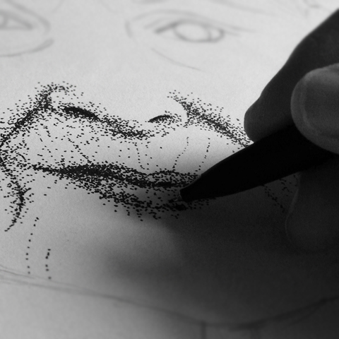
Your technique is almost pointillist – how did you come across this method and why do you like it so much?
My work’s influenced by art through history and printing methods (along with other things in my environment). I grew up in a house stuffed with many different kinds of books, including a beautiful collection of Folio Society. My grandfather was a compositor for the Eastern Daily Press and I think that’s where my dad’s love of print came from. Among other books I cherished, were ones about Aubrey Beardsley for his use of contrasts in his illustrations and decorative detailing. I use pen dotting for creating portraits because I find it the easiest was to create form, I feel confident when I create a face that way. I get drawn into the hypnotic repetition of the mark making though and it feels like therapy sometimes!

Popshot Magazine Editorial by Sara Netherway
Popshot Magazine Editorial by Sara Netherway.

Where are you based and what does your work environment look like/sound like?
I grew up on the Island in one of the Victorian seaside towns, it’s a beautiful place to live and bring up the kids. Currently I’ve taken over the dining room of our Victorian house, except for Christmas when I have to temporarily move into the kitchen, it works pretty well.

Kusama by Sara Netherway
Kusama by Sara Netherway.

You have an illustrious client list: how have you found your employers or have they found you, and if so how?
I’ve tried to get on as many portfolio hosting sites as I can find! I’ve been incredibly lucky so far that I’ve mostly been found through these and my website.

Island by Sara Netherway
What is your favourite kind of image to work on and why?
I’m just very thankful that I get to make images! My favourite kind are when a brief goes well and the client is happy.

Vivienne Westwood Red Label by Sara Netherway
Vivienne Westwood Red Label LFW by Sara Netherway
Vivienne Westwood Red Label LFW by Sara Netherway.

As a member of the AOI what have you found most helpful about this organisation?
I have found the AOI invaluable for advice, particularly about contracts and portfolio surgeries. They’re friendly and professional, and working freelance it’s great to have them there when you need help.

Fable by Sara Netherway 2
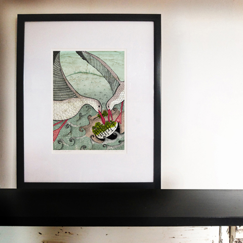
Fable by Sara Netherway.

Where can we find more of your work for sale, and do you have any particularly interesting projects in the pipeline?
Currently I’m working towards a solo show of prints and drawings in May at Shed in Bembridge on the Isle of Wight which I’m excited about. I’m also selling prints on my site www.saranetherway.co.uk that I keep updated with new work.

Categories ,AOI, ,Bembridge, ,Eastern Daily Press, ,Folio Society, ,interview, ,isle of wight, ,Pointillism, ,Popshot Magazine, ,Sara Netherway, ,Shed

Similar Posts:


Amelia’s Magazine | An interview with Jacob Denno, editor of poetry and illustration magazine Popshot

popshot
Popshot is a wonderful poetry and illustration magazine and editor Jacob Denno once wrote for me, what is ed so when he contacted me recently about his new limited edition print range it seemed the perfect opportunity to find out a bit more about his inspiring ventures.

theprintshop_city abyss
Print by City Abyss.

What inspired you to set up Popshot magazine and what was your aim?
The magazine was born out of a slight frustration at the way in which poetry magazines were presenting themselves and ultimately, presenting poetry. I loved reading poetry but couldn’t find a single magazine on the shelves of Borders that was stimulating that passion. Most of them were a dark sea of Times New Roman font that made poetry really difficult to engage with. The aim was to create a magazine that I thought could engage with younger readers and dispel the myth that poetry was a bunch of outdated bollocks that had no footing in the modern day. I think there’s still a long way to go…

theprintshop_devin mcgrath
Print by Devin Mcgrath.

Have you always been into poetry… what decides which poems make the magazine?
As far back as I can remember, I’ve always had an interest in poetry. My mum used to stick up poetry quotations all over the downstairs toilet in our house so that you could memorise poetry while you were doing your thing, so it’s probably all thanks to her! As for what poems make it into the magazine – they have to be an original and interesting idea, thoughtful, beautifully written and full of imagery that allows the reader to dip into the poem’s world for the 25 lines or less. I love short poems because they’re so saturated with ideas and imagery. It’s like a shot of tequila instead of a bottle of wine.

theprintshop_esra roise
Print by Esra Røise.

How do you find your illustrators and what are you looking for in your choice of illustrators? Any top tips for places to seek out great illustration talent…
We scour blogs, websites, agencies, magazines, newspapers and exhibitions for new illustrators, as well as sorting through the hundreds of portfolios that we get sent. I could still do a better job of seeking out the relatively unknown illustrators but it’s almost a full time occupation searching for them! As for what we’re looking for – it’s usually editorial illustrators that have a knack of condensing an entire poem into one all encompassing image. It’s an art form to be able to take a story or poem or article and pull all the sentiment from it into one image. Very few people can do it well but I’ve had the pleasure of working with some of those that can. I also have a massive soft spot for illustrators who are influenced by photo realism but are able to produce pretty much anything that you can think up.

theprintshop_mydeadpony
Print by Mydeadpony.

You once wrote for Amelia’s Magazine – do you still write and do you write for other journals besides your own? And I have to ask, are you also a poet?
Most of the writing I’m doing at the moment is more informative and practical, such as updating the blog and writing the editorial etc. I don’t write for any other journals although I wouldn’t mind writing a column for The Guardian or something! I do write poetry although when you’re reading through about 4000 poems per issue, it can drain you of all your poetic inspiration so I haven’t written anything for a while. It’s such a beautiful way to use language though so whenever I get the chance or inspiration to, I love trying to condense a whirlwind of thoughts into one short poem.

As a little side note, I think seeing my name in the last printed issue of Amelia’s Magazine played a large part in my desire to be involved in magazines and print. So thanks for that!

theprintshop_sam green
Print by Sam Green.

You have six prints in your new print shop – how did you decide which ones to use?
The idea was to take six of the finest illustrations from the last 5 issues of Popshot, which meant we had a little over 100 illustrations to choose from. However, what makes for a brilliant piece of editorial illustration doesn’t necessarily make for a brilliant print, so in the end, there were only about 15 illustrations to choose from. The ones we ended up going for were the images that we felt were the most powerful, thought provoking and told a story even without the poem sitting next to them. In fact, some of them take on a whole new meaning once they’re popped onto a 675 x 550mm canvas and mounted on a wall.

theprintshop_tom hovey
Print by Tom Hovey.

Please can you tell us a little bit more about each of the featured artists and the poems they illustrated.
But of course! Sam Green‘s image accompanied a poem called The Aftershock by Mike Swain which looked at the redefinition of the male role in modern society, and the slight death of the hunter/gatherer role. Mydeadpony‘s image was created in response to Rosie Allabarton‘s poem …and this is what we call liberation which challenged the theory that pornography liberates women by breaking down taboos. Devin McGrath‘s image illustrated MDMA by Daniel Sluman which was an attempt to write a poem about drugs without glorifying or demonising it. Tom Hovey‘s piece was in response to If Black Could Shine by Mai’a Williams which spoke of the difficulties Sudanese refugees were facing in Egypt. City Abyss‘s image was actually the cover illustration for Issue two’s Us & Them issue and Esra Røise‘s image accompanied a poem called Sleepovers by Bethan Parker-Luscombe, which was a snapshot memory of a childhood spent indulging in sleepovers.

You can buy these prints from the Print Shop on the Popshot Magazine website. The prints are produced in limited edition runs of 150 each and cost just £45 apiece.

Categories ,Amelia’s Magazine, ,Bethan Parker-Luscombe, ,Borders, ,City Abyss, ,Daniel Sluman, ,Devin McGrath, ,Egypt, ,Esra Røise, ,If Black Could Shine, ,illustration, ,Jacob Denno, ,Limited Edition, ,Mai’a Williams, ,MDMA, ,Mike Swain, ,Mydeadpony, ,poetry, ,Popshot Magazine, ,prints, ,Printshop, ,Rosie Allabarton, ,Sam Green, ,Sleepovers, ,The Aftershock, ,Tom Hovey, ,Us & Them

Similar Posts: