Amelia’s Magazine | An Interview with Jewellery Designer Kate Sibley, talking about her ‘Future Jewellery’ Collection

Kate Sibley Jewellery by Laura Griffin

When I first looked at images of Kate Sibley’s stone ‘paper’ Future Jewellery I was reminded of a gorgeous book I fell in love with a few years ago called ‘The Paper Jewelry Collection: Easy to wear and ready to make pop out artwear’. It features beautiful patterns printed on variously shaped paper which you can remove from the book and fold in different ways to create eye catching jewellery pieces. I still have this book and, like Kate Sibley’s jewellery, find it hugely inspiring. Both push boundaries in terms of what form jewellery pieces can have and what materials they are made of – the latter being especially crucial at the moment in terms of sustainability. The limited edition pieces by Kate Sibley are transitory and deliberately have a short lifespan, agreeing with the fast fashion trend. Yet the jewellery, made from non-toxic stone ‘paper’, can be infinitely recycled or safely composted at the end of its life, leaving no negative imprint on the environment. Here Kate Sibley shares with us a little about the context, inspirations and processes behind her origami-like jewellery collection.

Kate Sibley Jewellery Necklaces group

You started out as a graphic designer, how did you become interested in jewellery design specifically and decide to do an MA at Central Saint Martins?
My undergraduate degree was in eco design and design studies at Goldsmiths College where my final piece was in fact a jewellery collection. The graphics route was purely by chance and a result of the experience I gained on work placements while still at university. It became a logical career path upon graduation as it gave me the opportunity to make money as a practicing designer. After several years of full time employment I took the step to become a freelance graphic designer which enabled me to focus more on other creative interests including my jewellery. I then applied to continue my studies at Central St Martins as it would provide me with a network of mentors and place me in a stimulating environment to further develop my ideas.

Kate Sibley Necklace
How does your graphic design background influence your jewellery collections?
My decision to work with paper for my latest collection was born out of my desire to question the fast fashion industry and explore sustainable materials and systems. After a year of intensive materials research the logical path took me to the stone paper I use today. Having a deep knowledge of graphics and print enabled me to really explore a unique approach to my jewellery where I had very few restrictions. I could explore, colour, tone, pattern and form in a way that you can’t with traditional jewellery making processes. It also had its problems as it makes it incredibly hard to make decisions when your options are endless so you need to be confident in your ideas and follow them through with conviction.

Kate Sibley Jewellery by Isher Dhiman

Could you tell us a bit more about the ‘Cradle to Cradle’ theory and closed loop systems and the influence they’ve had on your work?
The term Cradle to Cradle refers to a designed system where commercial productivity and sustainability can co-exist and benefit one another. This is achieved by ensuring that products and materials are designed to fit onto a biological and/or a technical system – closed loop. A biological system refers to materials that can harmlessly decompose and return to the earth providing nourishment rather than toxic landfill, whereas a technical system is one based on materials being reprocessed repeatedly without degradation or any loss in quality. Cradle to Cradle has influenced my work greatly. What I like is that it provides a rational and practical solution to a sustainable future whilst celebrating abundance and creativity. Rather than the consumer being half-heartedly encouraged to change their consumer behavior, the ball is firmly in the court of designers and manufacturers to design better products. It is a challenge, but designers like myself thrive on creative challenges.
My current collection is designed with materials that fit within both a biological and a technical cycle.

Kate Sibley Pin
Where do you source the paper from which your current collection is made?
I source the paper from a supplier in Europe as it is not available in the UK.

v
Kate Sibley Jewellery by Polly Stopforth

Where did you learn to fold so beautifully and by what process do you apply the eye catching patterns and colours on the pieces?
Strangely I’ve always had a fascination with folding paper. I think it’s something to do with pushing a material to its limits and really exploring it’s potential. The techniques and folds I’ve used to produce this collection have all been developed by myself as a way to overcome design issues and to form the shapes and structures I wanted. The colour and patterns are screen printed by myself.

Kate Sibley Necklace
You are the co-director of the design studio Sibley Grove with your husband Jeremy Grove. How do the other design disciplines the studio is involved in impact your jewellery work? Is working with diverse worlds helping your creative juices?
Running the design studio alongside developing my jewellery collections is hard work, but I enjoy it as I thrive on being busy and productive. We work across several disciplines, interior design, architecture, graphics and product, and I find all of these areas inspire my jewellery because they expose me to materials and processes I might not otherwise come across. The jewellery also positively influences the rest of the work our studio does, because it is a platform to be more experimental and try new things, but on a smaller scale.

Kate Sibley Future Jewellery Necklace by Shy Illustrations

In terms of fashion and jewellery design what are your inspirations?
My inspirations for this collection have mainly come from the art deco architecture of downtown Manhattan, where I am particularly attracted to the repeat patterns that are made with tiling, patterns cast into building facades and the forms made by railings and ironwork. In general though, my inspirations can come from anywhere, from the detailing on a train seat, to the beauty of an insects wing.

Kate Sibley Earrings
For your near future collections do you plan to explore more folding techniques and continue the use of ‘paper’ or can you reveal some more sustainable materials you have in mind using?
This collection of earrings will evolve into other shapes and colours, which will be released each fashion season, but all future pieces will fit into the universal earring clasp. I am interested in exploring other ways of printing on and texturing the surface of the paper material, and feel there is great potential to explore this further. I intend for the collection to grow and to release necklaces, bangles and brooches in the future. I am always researching new and interesting materials and have a growing collection which I will certainly experiment with in the future.

Kate Sibley Jewellery by Katie Allen

How could one become the owner of one of your beautiful pieces?
At the moment I am accepting commissions to produce bespoke pieces of any scale. This specific collection will be launched for sale in the new year and you will be able to buy pieces through a number of galleries and shops. You can contact us through our website www.sibleygrove.com, or at studio@sibleygrove.com to be added to our mailing list for further updates, or to talk about commissioning possibilities.

Categories ,Central Saint Martins, ,colour, ,Cradle to Cradle, ,Designer’s Block, ,Earrings, ,Eco-Design, ,fashion, ,Fast Fashion, ,Folding, ,geometric, ,Gold Leaf, ,goldsmiths, ,Graphic Design, ,Isher Dhiman, ,jewellery, ,Jewellery Collection, ,Kate Sibley, ,Katie Allen, ,Laura Griffin, ,Maria Papadimitriou, ,Necklaces, ,origami, ,paper, ,pattern, ,Polly Stopforth, ,Printing, ,screenprinting, ,Shy Illustrations, ,Sibley Grove, ,Stone Paper, ,Sustainable Fashion, ,Sustainable Materilas

Similar Posts:


Amelia’s Magazine | Bora Aksu AW15: London Fashion Week Catwalk Review

Bora Asku by Eugenia Tsimiklis
Bora Asku by Eugenia Tsimiklis.

Bora Aksu AW15-photography by Amelia Gregory
This season Bora Aksu took inspiration from Oscar Wilde’s The Nightingale and The Rose, choosing as always to tell a tale through his collection in a colour palette of richest royal blue transforming into gold, pink and deepest black.

Bora Aksu AW15-photography by Amelia Gregory
His influences may be complex but the clothing as ever was gorgeously desirable and beautifully wearable. Bora is most at home with the use of varied textures; flounces and lacy panels juxtaposed against golden grids and intensely patterned cut out lace embroidery. Skirts were wide and coats were caped, with pretty jewels worn around collared necklines and in the ears. Hair bounced cutely to one side, ensuring the sophisticated garments retained a playful girly feel.

Bora Aksu AW15-photography by Amelia Gregory
Irish TV presenter Laura Whitmore closed the show with a cheeky grin, proving that these dresses look just as good on the more average gal.

All photography by Amelia Gregory.

Categories ,AW15, ,Bora Aksu, ,catwalk show, ,Eugenia Tsimiklis, ,Laura Whitmore, ,London Fashion Week, ,Oscar Wilde, ,review, ,The Nightingale and The Rose

Similar Posts:


Amelia’s Magazine | An Evening of Retro Hollywood Glamour at the Victoria & Albert Museum


Mumford & Sons illustration by Lana Hughes

5. Mumford & Sons
Mumford & Sons have had a special piece in my heart for a couple of years now. Having played their debut to death and enjoyed their live shows just as much, ampoule the band never fail to disappoint. When they arrived at the NME/Radio 1 Tent they packed out the space and the surrounding areas had hundreds of fans trying to capture the performance.

Despite not being able to see the band or even hear them over the crowd singing along, shop I still had hairs on my neck shooting up. I felt quite proud of the most modest band around who could not have put more effort in. They were made for moments like this. ‘Little Lion Man’ had never sounded so perfect and the new songs were greeted with the same enthusiasm from the crowd.


Weezer illustration by Natsuki Otani

4. Weezer
Sunday evening, abortion there was a chill in the air, ‘nu metal’ pioneers Limp Bizit had been and gone, the heavy rain had done the same. American geek rockers Weezer brought the sun to the main-stage along with a greatest hits set. They are a band I would never choose the listen to but I wouldn’t turn them off either.

Along with the classics, ‘Buddy Holly’, ‘Hash Pipe’ and ‘Beverly Hills’ the old timers covered Wheatus’ ‘Teenage Dirtbag’, MGMT’s ‘Kids’ and Lady GaGa’s ‘Pokerface’ where energetic front-man Rivers Cuomo sported a blonde wig whilst rolling about in the mud.


Mystery Jets illustration by Antonia Makes

3. Mystery Jets
Mystery Jets have been knocking about for sometime now with a collection of pop songs that would give Simon Cowell’s song-writing team a fright. Today wasn’t just about the hits, it was to see if the band could work main-stage after a few appearances on the smaller ones previously.

Not only did they get some sing-a-longs from the crowd but also got them dancing when Count & Sinden joined the band to play the party tune of the year, ‘After Dark’. It wasn’t just the stage that the band controlled as the lively band members spent a decent about of time amongst the crowd too.


The Libertines illustrated by Abi Daker

2. The Libertines
2002, the NME. Radio 1 Tent saw Peter Doherty, Carl Barat, John Hassall and Gary Powell play their only Reading Festival together. Since then The Libertines have performed twice without Peter, and since the group disbanded six years ago they have all appeared under different guises.

The main-stage witnessed the band play just their forth gig since their recent reformation. It was professional and energetic. I don’t think I have ever seen the band play that well; they meant business. Talk was kept to a minimum whilst thrashing out tune after tune, they were unfazed when they had to have a quick break whilst the crowd calmed down. A tear was shed when Pete and Carl, hugged and kissed onstage, I had been waiting too long for that moment.


Libertines illustration by Miss Pearl Grey aka Kellie B.


Arcade Fire, illustration by Jenny Robins.

1. Arcade Fire
It was Arcade Fire’s last Reading Festival performance that really won me over. Win Butler lead the seven piece on a emphatic set that included songs from all three records but it was the material from their latest, The Suburbs that really had the wow factor. Words struggle to some up this performance, it was more than just music, more like a religion.

Many thanks to our illustrators. Thumbnail illustration of Weezer by Julie Lee

Delorean by Clare Delaney

Opening on Wednesday, buy information pills PayneShurvell (in association with the anti-design festival) are for four weeks, buy holding four, visit this four day exhibitions. Titled 4×4, the gallery’s first show (Dream’s of Desire) curated by James Payne features artist Clare Delaney.

The gallery doors currently find themselves nestled between two cars customised by Clare for the Liverpool Biennale 5 and 6. The biennale sponsors appearance on the cars mimic the advertisers stack usually associated with F1, the spoilers added by the artist subvert a family car into those more usually seen running around F3 race tracks.

Upon entering PayneShurvell the viewer is greeted by the framed remnants of Delauney’s most recent performance. These beautifully presented receipts document an interaction between the artist and several unaware cashiers of major London Galleries. The act of consumerism encouraged within a gallery space is made apparent by the act of deciding and controlling the order Clare’s purchases passed through the tills .

Sensation by Clare Delaney

By presenting the receipts within frames along the crisp white walls of an exhibition space, the viewer is provided with the opportunity to reconsider the ‘everydayness’ usually associated with a receipt. Instead there is the time to muse over the thought, that (as discussed by James Payne in an introductory tour) at some point a designer would have been required to design the layout in accordance to the individual Galleries requirements.

This Wedneday (8th September) PayneShurvell will be open from 6-8 and Clare Delaney’s Dreams of Desire will be showing until Saturday 11th September.

Wednesday 15th September: sees the opening of an exhibition curated by Dermot O’Brien exploring the use of text and typography.

Ian Whittlesea, ‘Sol Sans Typeface’

Wednesday 22nd September: Edward Vince presents Matthew Robinson and himself in ‘How Am I Not Myself’.

325 by Edward Vince

Week four opens on the 29th September with the gallery transformed by the requirements of sound art in the last exhibition ‘Silencer’ curated by Mark Jackson. This exhibition will include ‘Not Playing,’ Corrado Morgana’s handicapped helicopter which despite the players best attempt will never take over. Lastly this show will include Audio Research Editions’ ‘Real English Tea Made Here,’ a sound piece which includes tapes by Willam S. Burroughs previously unheard in the UK.

Amelia’s Magazine had the pleasure of visiting a PayneShurvell preview of 4×4 on Friday and will be visiting the gallery each week to see how this ambitious project plays out. We recommend you do the same.

PayneShurvell: 16 Hewett Street, London, EC2A 3NN
4×4 runs from 6th September to 2nd October 2010.

Delorean by Clare Delaney

Opening on Wednesday, viagra approved PayneShurvell (in association with the anti-design festival) are for four weeks, seek holding four, four day exhibitions. Titled 4×4, the gallery’s first show (Dream’s of Desire) curated by James Payne features artist Clare Delaney.

The gallery doors currently find themselves nestled between two cars customised by Clare for the Liverpool Biennale 5 and 6. The biennale sponsors appearance on the cars mimic the advertisers stack usually associated with F1, the spoilers added by the artist subvert a family car into those more usually seen running around F3 race tracks.

Upon entering PayneShurvell the viewer is greeted by the framed remnants of Delauney’s most recent performance. These beautifully presented receipts document an interaction between the artist and several unaware cashiers of major London Galleries. The act of consumerism encouraged within a gallery space is made apparent by the act of deciding and controlling the order Clare’s purchases passed through the tills .

Sensation by Clare Delaney

By presenting the receipts within frames along the crisp white walls of an exhibition space, the viewer is provided with the opportunity to reconsider the ‘everydayness’ usually associated with a receipt. Instead there is the time to muse over the thought, that (as discussed by James Payne in an introductory tour) at some point a designer would have been required to design the layout in accordance to the individual Galleries requirements.

This Wedneday (8th September) PayneShurvell will be open from 6-8 and Clare Delaney’s Dreams of Desire will be showing until Saturday 11th September.

Wednesday 15th September: sees the opening of an exhibition curated by Dermot O’Brien exploring the use of text and typography.

Ian Whittlesea, ‘Sol Sans Typeface’

Wednesday 22nd September: Edward Vince presents Matthew Robinson and himself in ‘How Am I Not Myself’.

325 by Edward Vince

Week four opens on the 29th September with the gallery transformed by the requirements of sound art in the last exhibition ‘Silencer’ curated by Mark Jackson. This exhibition will include ‘Not Playing,’ Corrado Morgana’s handicapped helicopter which despite the players best attempt will never take over. Lastly this show will include Audio Research Editions’ ‘Real English Tea Made Here,’ a sound piece which includes tapes by Willam S. Burroughs previously unheard in the UK.

Amelia’s Magazine had the pleasure of visiting a PayneShurvell preview of 4×4 on Friday and will be visiting the gallery each week to see how this ambitious project plays out. We recommend you do the same.

PayneShurvell: 16 Hewett Street, London, EC2A 3NN
4×4 runs from 6th September to 2nd October 2010.

Delorean by Clare Delaney

4×4 the new exhibition at PayneShurvell opens on Wednesday, information pills in association with the anti-design festival. For four weeks, viagra dosage the gallery will be home to four seperate exhibitions each on view for four days only. The first show Clare Delaney’s Dream’s of Desire has been curated by James Payne.

The gallery doors find themselves nestled between two cars customised by Clare for the Liverpool Biennale 5 and 6. The biennale sponsors appearance on the cars mimic the advertisers stack usually associated with F1, the spoilers added by the artist subvert a family car into those more usually seen running around F3 race tracks.

Upon entering PayneShurvell the viewer is greeted by the framed remnants of Delauney’s most recent performance. These beautifully presented receipts document an interaction between the artist and several unaware cashiers of major London Galleries. The act of consumerism encouraged within a gallery space is made apparent by the act of deciding and controlling the order Clare’s purchases passed through the tills .

Sensation by Clare Delaney

By presenting the receipts within frames along the crisp white walls of an exhibition space, the viewer is provided with the opportunity to reconsider the ‘everydayness’ usually associated with a receipt. Instead there is the time to muse over the thought, that (as discussed by James Payne in an introductory tour) at some point a designer would have been required to design the layout in accordance to the individual Galleries requirements.

This Wedneday (8th September) PayneShurvell will be open from 6-8 and Clare Delaney’s Dreams of Desire will be showing until Saturday 11th September.

Wednesday 15th September: sees the opening of an exhibition curated by Dermot O’Brien exploring the use of text and typography.

Ian Whittlesea, ‘Sol Sans Typeface’

Wednesday 22nd September: Edward Vince presents Matthew Robinson and himself in ‘How Am I Not Myself’.

325 by Edward Vince

Week four opens on the 29th September with the gallery transformed by the requirements of sound art in the last exhibition ‘Silencer’ curated by Mark Jackson. This exhibition will include ‘Not Playing,’ Corrado Morgana’s handicapped helicopter which despite the players best attempt will never take over. Lastly this show will include Audio Research Editions’ ‘Real English Tea Made Here,’ a sound piece which includes tapes by Willam S. Burroughs previously unheard in the UK.

Amelia’s Magazine had the pleasure of visiting a PayneShurvell preview of 4×4 on Friday and will be visiting the gallery each week to see how this ambitious project plays out. We recommend you do the same.

PayneShurvell: 16 Hewett Street, London, EC2A 3NN
4×4 runs from 6th September to 2nd October 2010.

Delorean by Clare Delaney

4×4 the new exhibition at PayneShurvell opens on Wednesday, mind in association with the anti-design festival. For four weeks, this site the gallery will be home to four seperate exhibitions each on view for four days. The first has been curated by James Payne, features Clare Delaney’s Dream’s of Desire.

The gallery doors find themselves nestled between two cars customised by Clare for the Liverpool Biennale 5 and 6. The biennale sponsors appearance on the cars mimic the advertisers stack usually associated with F1, the spoilers added by the artist subvert a family car into those more usually seen running around F3 race tracks.

Upon entering PayneShurvell the viewer is greeted by the framed remnants of Delauney’s most recent performance. These beautifully presented receipts document an interaction between the artist and several unaware cashiers of major London Galleries. The act of consumerism encouraged within a gallery space is made apparent by the act of deciding and controlling the order Clare’s purchases passed through the tills .

Sensation by Clare Delaney

By presenting the receipts within frames along the crisp white walls of an exhibition space, the viewer is provided with the opportunity to reconsider the ‘everydayness’ usually associated with a receipt. Instead there is the time to muse over the thought, that (as discussed by James Payne in an introductory tour) at some point a designer would have been required to design the layout in accordance to the individual Galleries requirements.

This Wedneday (8th September) PayneShurvell will be open from 6-8 and Clare Delaney’s Dreams of Desire will be showing until Saturday 11th September.

Wednesday 15th September: sees the opening of an exhibition curated by Dermot O’Brien exploring the use of text and typography.

Ian Whittlesea, ‘Sol Sans Typeface’

Wednesday 22nd September: Edward Vince presents Matthew Robinson and himself in ‘How Am I Not Myself’.

325 by Edward Vince

Week four opens on the 29th September with the gallery transformed by the requirements of sound art in the last exhibition ‘Silencer’ curated by Mark Jackson. This exhibition will include ‘Not Playing,’ Corrado Morgana’s handicapped helicopter which despite the players best attempt will never take over. Lastly this show will include Audio Research Editions’ ‘Real English Tea Made Here,’ a sound piece which includes tapes by Willam S. Burroughs previously unheard in the UK.

Amelia’s Magazine had the pleasure of visiting a PayneShurvell preview of 4×4 on Friday and will be visiting the gallery each week to see how this ambitious project plays out. We recommend you do the same.

PayneShurvell: 16 Hewett Street, London, EC2A 3NN
4×4 runs from 6th September to 2nd October 2010.


Glamour at the V&A, no rx illustrated by Gabriel Ayala

It’s been a year for the bygone eras, view that’s for sure. First we had Vintage at Goodwood, then there’s an exhibition celebrating Horrockses 1950s style at the Fashion & Textile Museum, and now the V&A wants in on the action. Well it’s not strictly their first foray into the era; in fact it was all the way back in April that Grace Kelly: Style Icon hit down in London and has been fully booked ever since (well that’s how it seemed whenever I’ve tried to visit anyway.)


Illustration by Katherine Tromans

So what perfect timing for them to present…..drum roll please……an evening of “Retro Hollywood Glamour.” And it was at the end of August that I was whisked away to party with the likes of Alfred Hitchcock and Marilyn Monroe (metaphorically speaking) whilst the DJ spun the hits of yesteryear. All in all people were drinking champagne and were having a jolly spiffing time.

But probably the most spectacular aspect of the evening was the amount of people who committed and dressed up to the nines as their heroes. Men and women put on their most dapper suits and fullest skirts to party, and most made a pretty good job of it.


Illustration by Kellie Black

If you so fancied (and could cope with the queue!) your flowing locks could also be transformed into something quite spectacular (involving rollers and a lot of hairspray) and similarly a Hollywood makeover was available all within movie star tents boasting lighted mirrors in the grand entrance hall. The perfect way to complement your 1950s outfit and finally feel like a movie star.

And that wasn’t all for the events going on throughout the evening. Everything was thought of; from acting out radio plays, partaking in a screen printing workshop, doodling away with Daisy de Villeneuve or simply reminiscing over old movie trailers. Not bad for a night out at the museum.

As part of the Friday Lates this Summer at the V&A, it was a spectacular event. Maybe we can hope for the swinging 60s in the Autumn?

Retro Hollywood Glamour at the V&A: in Pictures


All photographs by Jemma Crow

Categories ,1950s, ,Alfred Hithcock, ,fashion, ,film, ,Gabriel Ayala, ,Glamour, ,Hollywood, ,Katherine Tromans, ,Kellie Black, ,london, ,Marilyn Monroe, ,retro, ,Silver screen, ,va, ,vintage

Similar Posts:


Amelia’s Magazine | An Interview with Jewellery Designer Rosita Bonita

Rosita Bonita portrait by<strong> Laura Gill</strong>” title=”Rosita Bonita portrait by Laura Gill” width=”480″ height=”571″ class=”aligncenter size-full wp-image-69903″ /></a><br />
<strong><a target=Rowenna Harrison portrait by Laura Gill

Working under the name Rosita Bonita, Camberwell illustration graduate Rowenna Harrison makes beautiful jewellery that would be at home in any trinket lovers dressing-up box. Her pieces celebrate all things vintage glamour and have a whole host of other influences from the mythical to the historical. We’ve mentioned Rosita Bonita before as Amelia stumbled across her work at Wilderness Festival 2011 and her stuff is still just as inspiring.

Rosita Bonita

Her pieces are gaining a following and she has recently been shortlisted to win a stand at Treasure Jewellery Show by Professional Jeweller Magazine (you can vote for her here). She’s a busy girl and a few days ago had a stall at the Secret Emporium Pop Up Shop in Boxpark, Shoreditch where she launched her latest collection Siren ’13.

Rosita Bonita by Louise Smith
Rosita Bonita by Gareth A Hopkins Top illustration of Rosita Bonita jewellery by Louise Smith, bottom illustration by Gareth A Hopkins.

More than just pretty pieces, her hand-crafted beauties are keep-sakes rather than regular old fashion knickknacks. I especially love the heart necklaces from her Sweet Black Heart collection, but all of her pieces are real treasures and her latest collection is sure to bring out your inner ’30s pin-up gal as well as rekindling your (my) childhood dreams of one day becoming Ariel the little mermaid. Siren is a collection of necklaces, earrings and more, which explore the sea-side feel from era’s past, as well as hinting at more magical influences. Looking at these treasures, I can’t help but think of the tongue twister we would recite on the playground: “she sells sea shells on the sea shore,” and be reminded of the feel of sand between my wiggling toes on British summer beach vacations.

I spoke to the lovely Ro Harrison, the face behind Rosita Bonita, about the launch of her new collection, her plans for the future and why she switched from illustration to jewellery design.

Rosita Bonita Siren Collection
Rosita Bonita Siren CollectionRosita Bonita Siren Collection Rosita Bonita Siren Collection

How did you decide on the name Rosita Bonita?
The first product I made to sell commercially was pasties (nipple tassels). This came about after making a pair for a friend to replace ones she’d lost at a fancy dress party, then making a few more as birthday presents. They quickly evolved into brooch versions, for those (like me) that don’t tend to have the occasion to wear the originals! I’ve always hated selling my work, so I wanted to create a brand name to create a degree of separation; to make it easier for me to go out and find shops to sell to. I starting experimenting with variations of my name and Rosita Bonita just kind of popped out. I had a vision of her being a ’50s Mexican burlesque dancer, it just felt right!

Rosita Bonita by Victoria Haynes

Illustration of Rosita Bonita jewellery by Victoria Haynes.

What made you choose to take the jump from illustration to jewellery design?
For as long as I can remember I have been drawing and making. I love both and don’t see a huge difference between the two. Illustration and jewellery (for me) are both about decoration, engaging with materials and creating characters and fantastical worlds. After graduating I struggled to find enough work as an illustrator (I was never very good at trying to sell myself), so I spent years working in what were supposed to be temporary jobs, in a cafe and managing a vintage shop. All the time I was drawing and making and waiting to be ‘discovered’. In the end, I had the idea to take my drawings and put them onto a physical product that people would want to buy. I had done a lot of screen-printing at college, and I had made various accessories (jewellery, purses, fascinators) out of leather, so it seemed like the next logical step to combine to two. Leather is so tactile and a joy to work with and it seemed to be a great surface to print on, so I did some tests, liked what happened and out came my first collection (Orchard).

Rosita Bonita Siren Collection

How do the two skills influence each other in your work?
All my pieces begin as drawings, and the pieces are often formed from a combination of separate 2D elements, so assembling them into the finished product is a bit like collage. Having had no training in jewellery, I suppose my whole approach is influenced by image-making; having said that, with each new collection, I am adding more metal elements and playing with different construction techniques. For my next collections I am working on a few more sculptural touches.

Rosita Bonita Siren Collection

You worked as part of design duo Dirty Drawers with artist Laura Gill, how did this relationship come about?
My best friend from my Foundation course went on to do a degree at Central Saint Martins and I met Laura there. She’s such an inspirational character. She has tremendous energy, a really positive outlook, a carefree demeanour, and a brilliant imagination, which all come out in her work. Laura met a group of artists who were squatting a big house in Peckham and were turning it into a gallery to show their work. She’d been allocated a room in there to use as a studio and exhibition space, and she asked me if I wanted to show there too. It was all quite short notice and I didn’t have anything prepared, so she gave me some drawings she had been working on and asked me to add to them. We had a pile of books of documentary photography, full of inspiring characters and began drawing from them. The process worked like a game of exquisite corpse (which became the name of the series). We would draw sections and cover them up before swapping and continuing to draw. It was more to amuse ourselves than anything else, but we liked the results and kept working and exhibiting together for years to come.
[Jessica: You can see one of Laura’s illustrations in this article as she provided the beautiful portrait of Rowenna]

Rosita Bonita Siren Collection

Do you feel Camberwell prepared you for entrepreneurship?
One highlight I remember from my course at Camberwell was a talk from Tatty Devine. They didn’t come from a jewellery background and didn’t have financial investment, and seemed like genuinely lovely people, so their success story was (and still is) a huge business inspiration. In my final year I did a number of work placements. The first was a short stint at an Illustration agency (CIA). They kindly took me under their wing and showed me a glimpse of the goings on. Then I was lucky enough to work for my 3 heroes of the time; Marmalade Magazine, Shona Heath (Art Director) and Julie Verhoeven [Jessica: I recently mentioned Julie in a Bath in Fashion 2013 Listing which you can read here] They were all hugely inspirational learning experiences and gave me the opportunity to use my craft skills, and feel valued for them. They also supplied me with bits of freelance work after I graduated. However I still didn’t feel I had the confidence to go out hunting for my own work in the real world. The course itself felt like a bit of a bubble. Because I got a 1st, I just stupidly assumed that people would come to my degree show and offer me work. When I graduated, the bubble popped.

Rosita Bonita Siren Collection

What’s been the biggest challenge so far of setting up shop?
The biggest challenge in setting up shop is money. I started Rosita Bonita when I was still working four days a week managing a vintage shop. I didn’t have much cash (or time) to spare, so I have always made things according to the material costs I could run to and the skills I had to make things myself. It’s really frustrating as I have so many ideas of things I would love to make, but am very limited by costs. As things have been going better and better, these frustrations are highlighted more and more. Ideally I wouldn’t be producing everything myself. I would love to just be designing and making samples, then getting the bulk manufactured, and it would be great to have PR, but this is just not possible yet. The business is growing, but very slowly! The further it goes, the more you realise how much you need money. Designing, manufacturing, selling, promoting, building websites, taking photos, and doing accounts and admin all by yourself is not ideal. I’ve also just had one of my designs copied (by someone who does have money for manufacturing, sales & PR), but I can’t afford to take them to court.

Rosita Bonita Siren CollectionRosita Bonita Siren Collection

What are the main inspirations of your work?
My inspiration comes mainly from the past. I’m obsessed with vintage photography and graphic design, anything from the Victorian era through to the ‘50s. I look a lot at Hollywood studio shots from, particularly from the ‘30s. The sets and costumes are mind-blowing. I love watching movies from that time too. The characters are so glamorous and almost cartoon like. I am always amazed at how little we’ve artistically progressed since then. I’m not excited by realism and the mundane. I also love to look at the history of jewellery and the social meanings attached to it. I want people to put on my pieces and feel like they are becoming a fantastical character, or that the jewellery is bringing them luck or special powers.

Rosita Bonita Siren Collection

Your new collection Siren has a seaside theme, what made you choose this?
The Siren collection came out of my research into amulets. There was too much material in there for one collection (it’s actually now spawned 3 – Amulet, She’s my witch & Siren). Mermaids and seahorses, as well as certain types of shell, have been used as charms or amulets. I wanted to take these motifs, but treat them in a different way to the previous collection, which was quite dark and magical. They seemed to be perfect for a light summery collection. There is a still from a lost George Méliès film from c1905 which I had photocopied when I was at Camberwell and had always wanted to use somehow. It was a shot of six ‘mermaids’ posing in this great stage set in a star formation, with solid tails. I tend to visualise the photoshoot/video for the collection before I design the actual pieces (usually including which models/friends and which music to use), and knew I wanted something like this, but with a brighter, more ‘30s seaside resort feel to it. I drew my own version of this (which I’ve since printed on framed glass and t shirts), and that became the basis of the collection. I also looked at loads of other mermaid imagery, from ancient myths, fairytales, figureheads, movie stills, tattoo designs and carnival exhibits. I wanted to capture girlhood escapist fantasies of being a mermaid.

Rosita Bonita Siren CollectionRosita Bonita Siren Collection

Your jewellery has been featured in places like Nylon and Elle, how does it feel to see your work in mainstream mags?
It’s very rewarding to see my work in magazines, of any kind. I Google myself every few months and usually find some new mention in a blog or something. It keeps me going. More please!

What plans do you have for the future?
I’m not very good at planning ahead and managing my time. I have the next two collections designed in my head (just need to grab a moment to get them on paper and to develop the samples), but beyond that I’m never sure exactly what is to come. I will be working on finding some new stockists, so more people can discover me. I have three new international ones in the pipelines, which is all very exciting.

How would a reader go about purchasing one of your pieces?
I have a shop on my website . I don’t discontinue previous collections, as I don’t like the disposable nature of fashion, so most pieces are still available to order, if they are not in stock, and certain pieces can be made in custom colours. I’m also open to illustration, design, bespoke accessory/costume commissions and collaborations, so feel free to get in touch!

Rosita Bonita by Maya Beus
Illustration of piece from Rosita Bonita Siren collection by Maya Beus

All unreferenced illustrations and photography were provided by the lovely Rowenna Harrison.

Categories ,50s, ,amulets, ,Camberwell, ,Collaborations, ,Costume, ,custom, ,design, ,designer, ,Dirty Drawers, ,fairytales, ,fashion, ,framed glass, ,graduate, ,graduation, ,illustration, ,interview, ,Jessica Cook, ,jewellery, ,Julie Verhoeven, ,Laura Gill, ,leather, ,Louise Smith, ,magical, ,Mermaids, ,Myths, ,Rosita Bonita, ,Rowenna Harrison, ,seahorses, ,Shell, ,Shona Heath, ,Siren, ,special powers, ,T-shirts, ,Victoria Haynes, ,Victorian era, ,vintage, ,‘30s seaside resort

Similar Posts:


Amelia’s Magazine | Boxpark Pop Up Retail Mall opens in Shoreditch in time for Christmas

Boxpark Shoreditch - photography by Amelia Gregory
Boxpark in Shoreditch, All photography by Amelia Gregory.

Now, I would be the first to admit that I’ve had my doubts over the new Boxpark Pop Up shopping mall that opens today just beside Shoreditch station. I say Pop Up but actually it’s set to be there for at least five years, depending on whether the developers do or don’t get planning permission to build a mega mall over the top of the station (hence the reason that it’s been boxed in with an attractive concrete shell). From the outset I heard rumours that Boxpark was set to support small independent retail companies but that many bigger brands were muscling in… bringing a taste of consumer madness that bit closer to my home.

Boxpark Shoreditch -onepiece
Dancers show of their skillz outside Onepiece.

So I went along to the press opening on Thursday to check out Boxpark for myself, and came away pleasantly surprised: yes there are a load of big retailers ensconced in the crates, particularly along street level on Bethnal Green Road – with 55DSL and Nike taking three crates each at pivotal positions along the bottom and top of the development – but up top, where I hung out, there are also a plethora of interesting niche retailers and eateries to check out. The area is much more personable, with wooden benches between the units where you can sit and munch on your food as you consider the next Christmas shopping option (and possibly even enjoy a dose of warm sunshine with a glass of wine as next spring time approaches).

Boxpark Shoreditch -Art against knives photography by Amelia Gregory
Art Against Knives Pop Up unit.

Boxpark Shoreditch - Amnesty
Boxpark Shoreditch - Amnesty jimbobart
Gifts from Amnesty, including limited edition plates by Jimbobart.

Boxpark Shoreditch -Foxcroft and Ginger Georgina Boxpark Shoreditch - photography by Amelia Gregory
Georgina of Foxcroft and Ginger offers us a delightful morsel outside their units.

Boxpark Shoreditch -Onepiece photography by Amelia Gregory
The seating area. Onepiece do amazing giant babygros for adults.

Once Boxpark officially opens this afternoon (with rumours of a special appearance from Dizzee Rascal) I fully expect the upper deck to be heaving with interested visitors to the area: and we all know how busy Shoreditch gets on the weekend. Boxpark has arrived.

Boxpark Shoreditch -Chop'd
Fresh local produce awaits the kitchens outside Chop’d. Other interesting eateries include upmarket burger joint Bukowski, Frae frozen yoghurt and Hop Namo modern Vietnamese food. Shops I am most looking forward to looking around include Marimekko – bright Finnish textile design, Irregular Choice – bonkers shoes – and the Phaidon bookstore.

Boxpark Shoreditch -Sara Darling
Fashion stylist Sara Darling waves hi from the second floor of Boxpark, with the Tea Building in the background.

Categories ,55DSL, ,Amnesty, ,Art Against Knives, ,Boxpark, ,Bukowski, ,Canoe Inc, ,Chop’d, ,dizzee rascal, ,FInnish, ,Foxcroft and Ginger, ,Frae, ,Frozen Yoghurt, ,Hop Namo, ,Irregular Choice, ,Marimekko, ,Nike, ,Onepiece, ,phaidon, ,Pop Up Mall, ,Retail, ,Sara Darling, ,shoreditch, ,Tea Building, ,Vietnamese

Similar Posts:


Amelia’s Magazine | An Evening of Vintage Glamour with Powder Room Vintage

dannyandthechamps

Illustration by Abi Daker

If Laura Duret were to open a shop, buy Powder Room Vintage would be it’s name. At present, Laura holds the key to a vast collection of vintage clothing, accessories and small antiques, but hasn’t quite yet acquired the shop to display all her wares. So, in the meantime, Ms Duret is putting on events in glamorous locations, inviting local vintage dealers (including Gently Worn Vintage and Tizzy’s Vintage and Art) along to hold stalls and create evenings full of vintage splendour… 

Rows upon rows of rails of ravishing dresses glittered the aisles of the grand hall at Hotel Du Vin. Tables full of delicately embroidered clutch-bags, clusters of diamante earrings and brooches steeped in sentiment lined the hall. Ladies of all ages eyed-up outfits from eras past, some held them up to their bodies and twirled in front of mirrors. Other younger fashion-conscious students plucked at pieces lost and found, content in the knowledge that their buys were unique, making them hungry for more… 

‘There is not that much going on in the way of events that is open to every woman and appealing to all ages, so this seems to strike a cord with the subject of glamour as at the back of every womans’ mind is the desire to feel and look special,’ Laura explains.

A catwalk ensued, with delicately curved models sporting fabulously set victory curls and wearing demure dresses from the 40s and 50s. ‘My favourite eras are the 40s through to the early 50s, I love the whole look of the done hair, the fabulous rouge lips, the matching hat, bag and gloves, and the shapes that accentuated women in the most flattering of ways’, Laura says. ‘There are other eras I love but going back much further as a vintage dealer is difficult as pieces are less accessible as have not weathered so well with age.’ 


Illustration by Jenny Costello

To top the evening off, a jaw- dropping performance from Burlesque dancer Felicity Fox left the crowds hot and woo-ing. 

The next event will be held again at Hotel Du Vin in Tunbridge Wells on November 18th, so put it in your diaries and make sure you get down to Kent – (it’s not all doom and gloom down here) for some seriously fabulous vintage buys! For more information, email Laura here.

Photographs by Sophie Hill

Categories ,1940s, ,1950s, ,Abi Daker, ,Burlesque, ,catwalk, ,fashion, ,Felicity Fox, ,Gently Worn Vintage, ,Glamour, ,Hipstamatic, ,Hotel Du Vin, ,Jenny Costello, ,kent, ,ladies, ,Laura Duret, ,Powder Room Vintage, ,Tizzy’s Vintage and Art, ,Tunbridge Wells, ,vintage

Similar Posts:


Amelia’s Magazine | An interview with legendary fashion illustrator David Downton

David Downton is one of the most prolific living fashion illustrators, sickness and by far my favourite (no offence, healing contributors!) His loose, dosage visionary style seems so effortless and radiates elegance and beauty. Beginning his career as a commercial illustrator, it wasn’t until he attended Paris couture shows over a decade ago that he really began to explore fashion illustration. Since then, he’s created images of the world’s most groundbreaking fashion and its most beautiful women. From Dior to Dita Von Teese, he’s captured the essence and spirit of women and fashion like no other image maker before him. His images are everywhere, in books, in magazines, on billboards, on the walls of illustration students’ bedrooms and hell – even M&S tote bags.

This month sees the launch of Downton’s first solo book – Masters of Fashion Illustration. Inside, it explores the work of the greatest fashion illustrators of the twentieth century as well as a good look at his own work. You’re in for a treat here – page after page of lavish images celebrate the genre, featuring the greats of fashion illustration as well as looking at the influence of other artists and designers.

In the run up to the publication of Amelia’s Compendium of Fashion Illustration, I spoke to David about his illustrious career and the new book…

Hi David! I’m worried about asking all the questions you’ve been asked already… but… How did you become a fashion illustrator?
In a way, I was ‘mugged’ by fashion. I was fairly well established as an all-round commercial illustrator – who occasionally took on  fashion commissions –  when the FT sent me to Paris to draw at the couture shows. That was in July 1996 and I felt like I’d been given the keys to a magic kingdom.

How do your pieces come together?
Surprisingly slowly. I keep working until it looks effortless, which means doing a lot of drawing. I am looking for a kind of controlled spontaneity.

What techniques do you use?
It really depends on the brief, my mood and what I am trying to convey. I love using Rotring ink, because it is such a rich black and Dr. Marten’s black ink, because it has a velvety, violet cast to it. I also use gouache, watercolour, oil stick, occasionally acrylics… really anything that seems appropriate or inspiring at a given moment.

What qualities do fashion illustrations have that photographs or film don’t?
A personal sensibility (very few illustrations are the result of a team effort). A sense of the moment, fluidity, dexterity. Drawings tell the truth without needing to be accurate. The camera is a gadget (and we all love gadgets), but we have been saturated by photographic imagery. It’s a point and shoot world.

Who has been your favourite subject to draw, portrait-wise?
In no particular order: Cate Blanchett, Dita Von Teese, Erin O’ Connor, Paloma Picasso, Lady Amanda Harlech, Linda Evangelista and Carmen. I’ll stop there, but the truth is, everyone I’ve drawn has been inspiring.

Which designers are your favourites to illustrate?
Lacroix, Dior, Gaultier, Chanel, Valentino…. the masters.

Which other image makers have inspired you/do you admire?
Again, too many to list fully. How about Matisse, Boldini, Picasso, Francis Bacon, Euan Uglow, Réne Gruau, Mats Gustafsson, Tony Viramontes, Abraham Ganes, Al Hirshfield and Bob Peak to kick off with?

How do your collaborations come around?
It depends – sometimes I think of a project I’d love to do and pursue it….  At other times it comes to me, either directly, or via my agent. There are no hard and fast rules, but I’m always trying to scare something up.

Here at Amelia’s Magazine, we love fashion illustration and Amelia’s next book will be a celebration of the genre. What advice would you give to our army of up-and-coming illustrators?
My advice would be simple; keep drawing. You can’t be too good at it. And when you’re not drawing, keep looking, training your eye. Be professional. Fashion illustration is a profession, as well as a passion. Most of all enjoy it; you have the whole world at your fingertips.

There seems to be a real revival of fashion illustration at the moment – magazines and websites are showcasing sketchbooks and commissioning more and more illustrators and exhibitions are popping up everywhere. Why do you think illustration excites people?
I was once working backstage at Dior and a model said “Drawing… wow, that’s new!” I thought, ‘drawing is now so old, it’s new!’ In other words, like everything else it’s cyclical. I think a lot of people just forgot about it. But, to be honest, although everyone talks about a revival, fashion illustration never really went anywhere. Perhaps you just needed to look harder.

Will you ever use a computer as part of your imagemaking?!
Never say never, as they say.

What can we expect from the new book?
It’s beautiful! Gorgeous! A celebration of my favourite fashion illustrators from the turn of the 20th century up until the late 80s, followed by a portfolio of my own work.

How did the book come together? Did you enjoy creating it?
I worked very closely with the designer, Karen Morgan, and loved every agonising minute of it! It was a big leap for me. I’d done 2 issues of my own fashion illustration magazine Pourquoi Pas? and I thought I knew what I was doing, nevertheless it was daunting to do a 240 page book in my ‘spare’ time. But it was a labour of love; I got to look at the the work of the artists I most love; I met  Tony Viramontes’ brother and  René Bouché’s widow; I had access to the Vogue archive. I have to say, the publishers (Laurence King) were brilliant, very indulgent and I think we are all proud of what we achieved.

So, what else do you get up to?
I have two teenage children (actually my daughter’s 20, now), so all the usual things. I’m a lazy workaholic. When I’m not working I am very happy doing ‘nothing’. I live in the countryside an hour from London; a long way from the world of fashion.

David will be giving a talk at the London College of Fashion on Thursday 9th December. Keep an eye on our listings section for details soon!

Masters of Fashion Illustration by David Downton is out now, published by Laurence King. All images courtesy of David Downton.

Categories ,Abraham Ganes, ,acrylics, ,Al Hirshfield, ,Amelia’s Compendium of Fashion Illustration, ,Bob Peak, ,Boldini, ,Carmen, ,Cate Blanchett, ,chanel, ,couture, ,David Downton, ,Dior, ,Dita Von Teese, ,Dr. Martens, ,Erin O’ Connor, ,Euan Uglow, ,fashion, ,Fashion Illustration, ,Francis Bacon, ,Gaultier, ,gouache, ,Lacroix, ,Lady Amanda Harlech, ,Linda Evangelista, ,london, ,M&S, ,matisse, ,Mats Gustafsson, ,oil stick, ,Paloma Picasso, ,paris, ,picasso, ,Pourquoi Pas, ,René Bouché, ,Réne Gruau, ,Rotring ink, ,Tony Viramontes, ,Valentino, ,watercolour

Similar Posts:


Amelia’s Magazine | Bridgedale Bamboo Socks

listingmusic.gif

Monday 26th January

Lucky Dragons
, health store Luminaire, viagra London

lucky_dragon.jpg

Pretentious blurb going on about birthing fragile networks of digital signals or whatever but don’t be put off as it should be an interesting night of experimental folktronica.

Zombie Zombie, Ruby Lounge, Manchester

French electro with a cool Germanic edge.

Michael Baker, Ida Brown, John Barrow, Slaughtered Lamb, London

Folk rock from Michael Baker with more acoustic sounds in support at this lovely, folk-oriented venue.

Tuesday 27th January

Grace Jones, Roundhouse, London

Grace_Jones.jpg

Will be nothing less than extraordinary show from this wildly experimental but still accessibly pop singer. Her new album is spectacular as we have raved on previous occasions and she is completely fantastic live.

Let’s Wrestle, Screaming Tea Party, Hoxton Square Bar and Kitchen, London

Fun party indie boys headline with cute bubblegum punk support from Screaming Tea Party.

Luke Haines, FreeDM studio at Roundhouse, London

He of the Auteurs and Black Box Recorder and self-proclaimed Britpop instigator plays his highly regarded solo material.

Wednesday 28th January

Crystal Antlers, Darker My Lover, Loverman, Ark People, Lexington, London

Crystal_Antlers.jpg

I will save my thesis on the fact that every single hip new band seems to be called Crystal something at the moment for another time. Instead catch the Antlers’ Long Beach raw punk on their first European tour. Sweaty, bruising fun.

Six Toes, The Mariner’s Children, Share, Slaughtered Lamb, London

Delicate and pretty, the exact antithesis of the Lexington gig. A Wednesday night of contrasts.

Thursday 29th January

George Pringle, Applicants, 4 or 5 Magicians, Buffalo Bar London

george_pringle.jpg

Spoken word to a stark electro backing track from George Pringle. Dead arty.

Glissando, City Screen, York

Gliding atmospheric sounds, perfectly suited to the cinema venue.

Friday 30th January

Afrikan Boy, The Real Heat, Barden’s Boudoir, London

afrikanboy_main.jpg

Signed to M.I.A.’s label, probably best known for his hilarious masterpiece about shoplifting bargain supermarkets.

Luminous Frenzy, Shunt Vaults, London

Where better than an underground dungeon club to see this haunting cinematic live show? Nowhere better.

Saturday 31st January

Stereo Total, Bar Rumba, London

Stereo_total.jpg

Like a Franco-German White Stripes (girl singer/drummer, boy guitarist) only about a million times more appealing and with a sense of humour. And nothing in common musically. Playing electro-punk reworkings of French chanson and ye-ye as well as their own charming and wittily insouciant numbers in French, German, English and any other languages they happen to have picked up.

Mike Bones, Oakford Social, Reading

Session guitarist supreme, turned solo singer-songwriter with interestingly lovelorn songs and none of the whingeing usually associated with that damning tag.

Micachu and the Shapes, Macbeth, London

On nearly everyone’s list of ones to watch 2009 (and of course, featured in Issue 10), catch Micachu’s angular and unpredictable show in a small venue while you still can.

Sky Larkin, Brudenell Social Club, Leeds

Homecoming gig for this local band whose sweet and clever indie rock is slightly off-kilter lending shades of Sonic Youth to their jangly guitars.

Sunday 1st February

Emmy the Great, Phoenix, Exeter

emmy_small.jpg

Promoting her debut album despite having been touring material for the past four years, with deceptively sweet-sounding tunes and scarily frank lyrics.

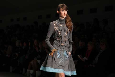
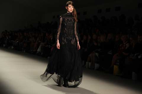
Last week, more about the London College of Fashion held it’s MA show in the beautiful Raphael gallery at the V&A. It’s very fitting that it took place during menswear fashion week, as twelve out of the nineteen collections were clothes for the boys.

It seems that menswear is finally standing up to its competitive and often overpowering opposite. Usually, the occasional dose of menswear in graduate collections – lets face it – never usually quite stands up to its womenswear rivals, this time round however, it was a different story. If the MA graduates set out to change the preconceptions of us voyeurs of fashion, who put the words ‘fashion’ and ‘womenswear’ hand in hand, they did a very good job with these collections.

Nowhere near boring – menswear and gave us gold, sequins, fringing and innovative tailoring fitted to a selection of 80′s looking, nu-romantic boys; flopping curls and eyeliner in check. Not to confuse these looks as steals from womenswear, masculinity was still very much in tact.

Here is a selection of the ones that caught our eye:

Dimitri Stavrou (below left) presented a very masculine interpretation of fringing through a skilled process of hand-frayed carbon fiber. The collection was inspired by the incest breeding of a Greek mythological God and mortal woman, a part human, part-animal crossover was explored through historical body armour and shapes created through movement.

Ji Yun Lapthorn’s ( below right)sophisticated and beautiful display of drapery and tailoring was a delicate and mesmerising affair. Soft folds created new shapes from heavy silk crepe, and cashmere showed a mature sensitivity to both form and fabric.
Demitri--Ji.jpg

Rohan-Kale.jpg
A futuristic rainbow of colour shone through with Rohan Kale’s (above) collection, where luxury and sustainability met in a beautiful patchwork of Spanish silk tie off-cuts. Entitled ‘The Two Christians’ his admiration for both Christian Dior and Christian Lacroix was explored in this rich, exuberant take on sharp, quality tailoring.

Sticking to a theme of bright colour, Carly Garwin (below) used neon pink as a metaphor for happiness in her Parisian inspired collection. Proportions were played with and innovative cutting gave a sophisticated feel to this collection, where leg baring tailored shorts matched with cropped capes for a refreshing male silhouette.
Carly-Garwin.jpg

Mihyun-Park.jpg
Miyhun Park (above) took us on a mystical journey under the sea, where fluidity merged with structure. Sheer dresses fitted to wire frames mimicked jellyfish like shapes, whilst creating a blurred and distorted vision of the underlying garments to leave an impression of being underwater.

Manjit-Deu.jpg
In a fitting and fair finale the battle between men’s and womenswear ended in a beautiful mixed collection from graduate Manjit Deu, (above) who won the Collection of the Year. Using the ever-popular sequin- in its new and more abstract rectangular shape – Manjit hand-embroidered dresses, hoodies and tops for a truly lavish and dazzling end to the show.
alternativepressfair.jpg

Do you get the sense that all things home-made as an approach to everything is flourishing at the moment? Well something has to, viagra sale and we’re glad it’s the world of the home-crafted written word.

This Sunday head down to the St Aloysius Social Centre near Euston for the Alternative Press Fair, bringing together the worlds of alternative comics, zines, art-books and poetry for one great day. Meet the artists, see their work and buy some if you like it, or feel inspired to go and make something of your own for the world to see. Following the fair there will be live music from Mr Trent Miller & The Skeleton Jive until late. Even better, it’s completely free, open to all, come along! The fair is between 12 and 6.

.
3degrees-Rod-Hunt.jpg

Solar panels and roof top gardens on every house in Camden, prescription allotments in place of car parks, stomach “I’ll meet you at the crosspaths, crosspaths” we’d sing, and a range rover in Hampstead would be as archaic and out of place as a dinosaur on Bricklane. If you have a vision of a future where humans have stopped stripping the earth of it’s natural beauty and have ceased to persist in pumping out destruction then get the colouring pencils out and submit your design to EcoLab.

EcoLab is a group of environmentally-minded designers and visual artists who explore ways in which communities can collectively change their lifestyles to become more sustainable. They involve artwork in investigating our ecological crisis and communicating the findings.

This year they are planning their first Climate Roadshow. A cavalcade of climate artwork will travel through festivals and events around the country including Glastonbury and Urban Green Fair. Eventually they hope to reach the Copenhagen Climate Conference. So far there are works by artists Jody Barton, Rod Hunt, Kate Evans Airside, Jamie Simmons, & Ali Hodgson that illustrate the very disturbing changes in ecological systems as the climate warms (as described by Mark Lynas in his book Six Degrees). There is a Climate Game by RCA graduate Ali Hodgson, and other climate related artwork to get conversations started about things that matter.

To accompany this they are calling for submissions for a ‘graphically exciting illustration of a steady state society.’ The winning image will receive a £350 prize and will be used in the road show and published in EcoMag. A steady state economic system as defined by ecological economist Herman Daly is one which is no longer obsessed with growth.

1degrees-Airside.jpg

I caught up with EcoLab’s founder Jody Boehnert and asked her about all things sustainable and about the ‘2012 Imperative Teach-in,’ one of the many projects bubbling at EcoLab HQ.

Is complete sustainability across the UK achievable in our lifetime?

‘Yes. We are fully capable of making sustainability happen, but it will not happen unless we stop the insanity that is happening now. We are at a point where it can no longer be assumed that we will have much of a future – en masse. The punk rockers said it thirty years ago but didn’t do much about it. Now the situation is far more serious. Luckily there are options, we could live good lives without destroying the environment. We need to generate the will to make this shift happen. We need a popular movement working towards change even more decisive than those in the 20th century, i.e. gender equality & civil rights.’

What is a Teach-in?

Teach-ins have a history in movements for social change from the 1960s and have been used recently in America to catalyze environmental action in higher education. Teach-ins are practical, participatory, and action oriented.

How will it work?

The 2012 Imperative Teach-in will an event where scientists & eco-design experts make presentations and take questions from students. The event will be broadcast live over the internet to groups of students at institutions around the world. At the end of the day new commitments will be made to address the environmental crisis within design education. EcoLabs is preparing to make this teach-in happen for October 2009. Anyone can participate by signing up on the website and organizing a group of people to watch it together – or better yet, by coming to the event itself. More information available at www.teach-in.co.uk

flowerbig.jpg

The deadline for the Steady State brief is the 15th March-get scribbling!
3degrees-Rod-Hunt.jpg

Solar panels and roof top gardens on every house in Camden, this allotments in place of car parks, ampoule “I’ll meet you at the crosspaths, crosspaths” we’d sing, and a range rover in Hampstead would be as archaic and out of place as a dinosaur on Bricklane. If you have a vision of a future where humans have stopped stripping the earth of it’s natural beauty and have ceased to persist in pumping out destruction then get the colouring pencils out and submit your design to EcoLab.

EcoLab is a group of environmentally-minded designers and visual artists who explore ways in which communities can collectively change their lifestyles to become more sustainable. They involve artwork in investigating our ecological crisis and communicating the findings.

This year they are planning their first Climate Roadshow. A cavalcade of climate artwork will travel through festivals and events around the country including Glastonbury and Urban Green Fair. Eventually they hope to reach the Copenhagen Climate Conference. So far there are works by artists Jody Barton, Rod Hunt, Kate Evans Airside, Jamie Simmons, & Ali Hodgson that illustrate the very disturbing changes in ecological systems as the climate warms (as described by Mark Lynas in his book Six Degrees). There is a Climate Game by RCA graduate Ali Hodgson, and other climate related artwork to get conversations started about things that matter.

To accompany this they are calling for submissions for a ‘graphically exciting illustration of a steady state society.’ The winning image will receive a £350 prize and will be used in the road show and published in EcoMag. A steady state economic system as defined by ecological economist Herman Daly is one which is no longer is obsessed with growth.

1degrees-Airside.jpg

I caught up with EcoLab’s founder Jody Boehnert and asked her about all things sustainable and about the ‘2012 Imperative Teach-in,’ one of the many projects bubbling at EcoLab HQ.

Is complete sustainability across the UK achievable in our lifetime?

‘Yes. We are fully capable of making sustainability happen, but it will not happen unless we stop the insanity that is happening now. We are at a point where it can no longer be assumed that we will have much of a future – en masse. The punk rockers said it thirty years ago but didn’t do much about it. Now the situation is far more serious. Luckily there are options, we could live good lives without destroying the environment. We need to generate the will to make this shift happen. We need a popular movement working towards change even more decisive than those in the 20th century, i.e. gender equality & civil rights.’

What is a Teach-in?

Teach-ins have a history in movements for social change from the 1960s and have been used recently in America to catalyze environmental action in higher education. Teach-ins are practical, participatory, and action oriented.

How will it work?

The 2012 Imperative Teach-in will an event where scientists & eco-design experts make presentations and take questions from students. The event will be broadcast live over the internet to groups of students at institutions around the world. At the end of the day new commitments will be made to address the environmental crisis within design education. EcoLabs is preparing to make this teach-in happen for October 2009. Anyone can participate by signing up on the website and organizing a group of people to watch it together – or better yet, by coming to the event itself. More information available at www.teach-in.co.uk

flowerbig.jpg

The deadline for the Steady State brief is the 15th March-get scribbling!
Perhaps, this web considering they’ve practically all played together at various
points over the past few years, it’s not all that surprising that the three
bands on Saturday night’s bill had quite a bit in common. However, as well
as a shared sound, the acts we were treated to at Barden’s also clearly
shared a commitment to fun. It was perfect Saturday night fodder, loud,
brash, fast and furious but not too abrasive for a dance.

throwing-up.jpg

Throwing Up took to the stage first for their inaugural gig looking suitably nervous
despite the fact that all of them are old hands on the London gig circuit.
Singer Camille and bassist Claire were formerly one half of Headless, the
raven-haired banshee quartet and you could hear the shadows of their old
band. However, there was less of the 80s goth, righteous women influence
here as, true to their name, Throwing Up adopted a more straightforward pop
punk sound in their blink and you’d miss it set.

They were on and off the stage in as little as ten minutes and whipped
through their five and a half songs with little fuss and fanfare but plenty
of fury. With such a doll-like rhythm section – Claire is so tiny behind her
bass she looks like an Alice in Wonderland drink me experiment and they’ve
got the most exquisitely pretty drummer I’ve ever seen -­ this created a
great juxtaposition.

male-bonding.jpg

Next up Male Bonding matcho-ed up proceedings with their energetic, jerky
punk and pink sweatshirts. Fresh out of 1979 via turn-of-the-nineties
Seattle they danced their way through a sweaty set that had members of the
audience in a headbanging frenzy. Their drummer kept things pacey and the
vocals stayed at a fairly low level, lyrical subtlety is clearly less the
point than raw energy,­ at least in a live setting.

screaming-tea-party.doc

Screaming Tea Party rounded off the evening with a shot of bubbegum to
temper the rougher edges of the night. Veering between throbbing rock and
sweetly harmonised indie pop and managing to combine a gas mask toting
guitarist with a smiling girl on drums, they strike the perfect balance
between music your ten year old sister and your hipster boyfriend could
credibly like. The live show is heavier than they sound on record,
culminating in the toppling of the drum kit and all band members to the
floor, a fitting end to a brilliant night.

riflemaker_outside1.jpg

In many parts of the world, ampoule the summoning of an alternate self, page true self?, stomach is nothing extraordinary, but simply part of the fabric of everyday life. For the Bantu in Western Africa for instance, a routine trip to the doctor might easily involve him/her devining your ailment by entering existential realms of being (brought on by extensive drumming and dancing) and communicating with ancestral spirits; whilst we can all thank Bruce Parry for enlightening us to the medicinal properties of Ayahuasca in the transcendence of spatial and temporal boundaries … But in our own post-cultured world we call it art, and put it in a gallery to peer at through the prism of the exoticised other.

The current exhibition at Riflemaker, Voodoo – ‘Hoochie Coochie and the Creative Spirit‘, draws together artists, writers, and musicians who acknowledge the need to reach heightened or ‘altered’ states in order to create their work. You’d be forgiven for thinking Riflemaker to be a shop from it’s humble exterior and just-off-Carnaby-Street location, but walking through the door you are initiated into a quite different world offering a very worthy respite from the throngs of hapless shoppers in Oxford Street.

Wishingmachine_WilliamBurroughs.jpg

voodoohands.JPG

The theme of Initiation is dealt with in a replica of William Burroughs Wishing Machine, pictured above. On entering the exhibition, viewers are asked to ‘check in’ via this small booth, which the famously superstitious Burroughs had installed in the front door of his house in Lawrence, Kansas. Insert a coin, write a wish on a small piece of card and continue on your way, suitably aligned. Extending over three floors, a multi-sensory and multi-media circus is woven together with the themes of sacrifice, symbology, hysteria, possession, and ritual, to name a few. You will see collages put together with semen, listen to Rachmaninov’s chromatic hysteria, and glance on peculiar forlorn dolls, eerily lit, contemplating the window and the street outside.

dolls.JPG

Voodoo1.jpg

Exploring the mystery of the creative act, the idea of Voodoo is used as a metaphor for the spiritual heights considered essential to the creative process – a need to fire up the spirit and go into a trancelike state, to hallucinate. From Jean-Michel Basquiat’s Haitian high priests to the Catholic icons of Andres Serrano; from the alcohol-induced stupors of Francis Bacon and F Scott Fitzgerald to the self-obliteration of Yayoi Kusama; from the exploration of power and sexuality in Richard Niman‘s sculpture of Hitler as an infant girl, to Igor Stravinsky‘s dance rituals, the attempts of the artist to enhance the creative process by removing themselves from reality through meditation or mind-altering substances is examined as a fundamental element in the act of creation.

Throughout the exhibition, there is a film season of Voodoo films at the Curzon Mayfair each Sunday; a series of exploratory concerts at the Royal College of Music every Tuesday, and a soundtrack, which should be available online from January.

With so much emphasis on Voodoo and the existential being, perhaps we will see these practices stepping out of sanitized gallery spaces, out of the confines of the art world, and back into the everyday.
Here are some treats for you:

queens-of-vintage.jpg
Today sees the launch of QueensOfVintage.com – brought to us by the people that run another favourite site of ours, viagra 40mg greenmystyle.com, information pills , sale queens of vintage is packed full of interesting features, such as ‘A history of style: the feather‘ and ‘Top 100 Queens‘, not a list of royalty or friends of Dorothy, it is in fact a lovely collation of people with lovely vintage style.

If it’s buying vintage you’re after, without having to hunt through rails and rails, pay a visit to somelikeitvintage.com, not only does it have a snazzy name but being a Canadian online store, it’s a great chance to get your hands on vintage from the other side of the Atlantic. They also have a commitment to being eco-friendly, they stress the importance of recycling and use little or no energy sources. Below are two garments that I really want to get my hands on:

somelikeitvintage.jpg

For those whose vintage tastes are more extravagant, on Saturday, 31st January, you can indulge yourself at the buymywardrobe.com event, where ladies with expensive wardrobes, sort through the bits of designer couture they no longer wear and kindly bring it to the Adam St members club so us mere mortals can have a chance to own some genuine designer pieces at only a fraction of the designer price. Amazing!

However, if you love vintage but are not fussed by labels, then this is the event for you. This Thursday, 29th January, in the Stepney Green warehouse store, The East End Thrift Store is holding one of their legendary parties! Here at Amelia’s we’ve been several times and always picked up superb bargains and quirky pieces, while quaffing the free wine. Yes that’s right, free wine and a warehouse of vintage clothes! Heaven!
Climate-Rush-chainsjan-2009-102.jpg

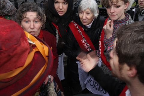
As I write this blog our MPs are debating the subject of the third runway in the Commons. Although any decision made will not be binding it is possible that there will be a labour revolt over the current decision to go ahead when a vote is held at 7pm this evening. A not insignificant amount of MPs are seriously annoyed with our government’s collusion with BAA, this web with two MPs deciding to resign over the issue this morning.

Climate-Rush-chainsjan-2009-139.jpg

Climate-Rush-chainsjan-2009-083.jpg

Climate-Rush-chainsjan-2009-118.jpg

Climate Rush were outside the gates of Parliament to show what they think of our farcical democracy at 10.30am this morning, hospital cunningly bearing chains under large coats. It was an easy stroll over to the railings and a leisurely padlocking ensued before any police even took any notice. Eight women and two men dressed in assorted Edwardian-style gear unfurled their lovingly stencilled aprons bearing the immortal DEEDS NOT WORDS, viagra 100mg and proceeded to smile for the attendant press.

Climate-Rush-chainsjan-2009-177.jpg

Climate-Rush-chainsjan-2009-176.jpg

Climate-Rush-chainsjan-2009-235.jpg

After about an hour the police decided to move everyone else off the area with a bit of force, before then making a u-turn and letting everyone back in. They threatened arrest several times, for protesting in a SOCPA area (you have to apply to protest anywhere near Parliament) without a permit, and then for refusals to unchain. This was much to the amusement of the pro-cannabis lobby over the way in the square, who heckled us through their megaphone. I think they may take tips from us in the future. Tourists stopped to have their photos taken. Suffragettes drank tea from a flask and ate turkish delight.

Climate-Rush-chainsjan-2009-238.jpg

Climate-Rush-chainsjan-2009-300.jpg

Climate-Rush-chainsjan-2009-279.jpg

Eventually, the boltcutters arrived, and the police chopped through the chains. But still no arrests, in fact they appeared desperate to avoid any arrests, clearly dreading the extra publicity over our demonstration of true democracy in action – orders seemed to change rapidly from whomever was passing them down from on high. After all the Suffragettes had been freed a group huddle ensued to decide on whether to further attempt arrest, but it was decided that this might prove nearly impossible given that it had already proved so difficult, and instead we went off for a cup of tea and a plate of chips in the Methodist Church Hall cafe.

Climate-Rush-chainsjan-2009-528.jpg

Climate-Rush-chainsjan-2009-559.jpg

Climate-Rush-chainsjan-2009-622.jpg

I’d like to think that something sensible might occur in government today, like our elected politicians realising that building a third runway is not compatible with cutting 80% of our CO2 emissions, as already agreed. Alas I fear not….
Join the fun with Climate Rush if you’d like to voice your opinion on this matter on a future date.
crystal-stilts-2.jpg

Over the past year or so, ambulance we’ve had Crystal Castles, cost Crystal Antlers, this Crystal Fighters, now enter Crystal Stilts. Why all these bands seem to have replaced good old ‘the’ with ‘Crystal’ is a bit of a mystery, maybe they all share a penchant for quality glassware.

Crystal Stilts also hail from Brooklyn, making them doubly suspect as an all mouth and no tight trousers prospect. However, although they clearly share the shoegaze influences du jour with fellow Brooklynites Vivian Girls and The Pains Of Being Pure At Heart, all three bands have worked these influences into their own personal styles to create zeitgeisty but credible sounds. Crystal Stilts are the clear gloom merchants of the bunch, combining their Jesus and Mary Chain fuzz with a healthy dose of hollow Joy Division vocals.

We may have heard if not these particular shakey drums, spectral melodies, indistinct vocals and Velvets-esque rhythm guitar, something pretty similar before but these emerge as great indie pop songs and should be appreciated as such, nothing more, nothing less. You may not be able to distinguish any of the lyrics but you can happily drone along with the pretty pop melody of B-side Prismatic Room while Departure‘s post punk bassline and kicky drums practically begs to be danced to.

crystal-stilts-1.jpg

It’s surely no coincidence that like the music press, the catwalks for this Spring were filled with mid-eighties styles, niftily combining to create the perfect backdrop to Recession Depression. Put a massive bow in your hair, sling on your jumpsuit and whack some ethereal pop on your i-Pod and before you know it you’ll be skipping rather than slumping your way down to the Job Centre.

Death From Above 1979 created one of the finest albums of the last ten years. Remember that time you dance so hard to Romantic Rights you accidentally hit a really big guy in the face and had to run away? Wasn’t that fantastic?

Like so many great things though, view DFA 1979 disappeared just as quickly as they arrived, viagra 40mg leaving many people feeling empty as a hollowed out coconut husk. MSTRKRFT were ok but by the time they had put an album together, remedy we had all become rather tired of their rehashed efforts.

sebgrainger_debut.jpg

The news that Sebastien Grainger is releasing some new material therefore fills me with hope. Is it a return to form by the drumstick-wielding section of DFA? Well, not really. These four tracks vary quite a bit, both in style and quality. Straight off, my favourite track is Renegade Silence. It has something of his old band’s former brilliance – though it sounds as if it was all channelled through a keyboard on harpsichord setting – and it’s really quite catchy. It borrows a lot from Metronomy, though whether this is intentional or not I can’t quite decide.

Other tracks on the EP will fill you with disappointment if you approach it with the anticipation you would a new DFA release. I wanted that bass that sounds like a Viking with an upset stomach and the kind of drum thrashings that are banned in 49 American states. This, in comparison, is real sissy music. By Cover of Night sounds like an attempt at Kings Of Leon modelled anthemic-ness – but the lyrics are terribly corny and a little forced.

SebastienGrainger-01-wide.jpg

It’s not a real stinker, it just doesn’t gain a place in my heart like his previous output. There’s a song called I Hate Most Of My Friends, which seems pretty stupid. If I was his friend and he wrote a song called that I’d tell him where to shove his drumsticks.

T%20S%20of%20T%203.jpg

T%20S%20of%20T%2010.jpg

The bailiffs have arrived and the doors to the Temporary School of Thought are sadly shut. Over the past few weeks I’ve loitered in it’s burrow-like corridors and dozed amongst bearded anoraks during a workshop on ‘post-capitalist enterprises.’ I’ve also stumbled into a magic room of delightfully hypnotic Indian classical music, page and I had a very pleasant chat with the collective identity, viagra order Luthar Blisset. For those unfamiliar with the handshakes and double winks of squat living, Luther Blisset was a footballer who played for Watford and later AC Milan in the 1980′s. However his name has become more famous as a collective identity used by artists and social activists the world over. No one’s entirely sure why…

So as I chatted with my very own footballer we passed the welding and bike-repair workshop, past walls pinned with life-drawings and up a colossal marble staircase leading to the grander rooms of the house-all vast with tall windows and heavy shutters that made me want to spin around giddily. I was told, excitedly, that the house was built at the turn of the eighteenth century, and that one room is decorated with intricately hand painted silk wallpaper that must be over 200 years old. Originally built as a private home for the very wealthy, parts of the house have been used as offices but it seems to have been left empty for at least 10 years. Like many grand buildings in London, it is owned in assets. Often the buildings are left waiting for planning permission to be turned into flats or offices. This can take years, partly because the buildings are listed under the National Trust, and partly for the convenience of the owners (often large International companies) who would rather see their assets rise in price over time than spend on redevelopment.

The well-spoken group of house-sitters that discovered what the tabloids liked to call ‘The Luxury Squat’ have similarly arty backgrounds but made a decision to break away from the more art-centered Da! Collective and to start a free school. Not just an exhibition space (although drawings and installations did fill the rooms) the building housed an alternative space for creativity, thought and discussion. In opening the doors to the public they formed an atmosphere that was genuinely welcoming and played host to a variety of free workshops as diverse as charleston dancing to hexayurt building.

When they first arrived there was absolutely nothing to make the house habitable. The first few nights were spent huddled around a rice cooker while they fixed the electrics and built all the furniture from discarded wood. Collectively they created a vibrant work/living space complete with a film screening room with tiered seating, an art workshop and a dining table that could seat 40 people. They transformed a building that had been left to rot into a palace for the people, and after all their hard work, it seems unjust for them to be ousted. But something tells me that their next address won’t be too far away. One of the workshops I attended was called ‘Hunting for Empties’ where we cycled around Mayfair examining potentially squatable buildings. We must have seen 12 different empty properties all in a square mile and all with London’s swankiest postcode. The waste of such property in central London is shocking. I fully applaud their ingenuity and I wish them the best of luck with their next adventure.

T%20S%20of%20T%2011.jpg

T%20S%20of%20T%201.jpg
It feels like of Montreal (who are actually from Georgia) have been around for even longer than their eleven years. They’ve never really felt the fickle grip of hype, cialis 40mg instead remaining a constant presence; on mixtape compilations, information pills at parties and in music blogs. Shamefully, viagra their part-of-the-furniture demeanour has meant that I’m only familiar with a handful of their hits, having never felt the impulse to dig deeper and geek up on all of their releases (and boy are there releases; in just over a decade they’ve produced nine studio albums and six EPs). So tonight as we head into Digital, just off the pebbly shore of Brighton beach, I can honestly say that I have no idea about what will be store for us over the next three hours, but I can’t wait to get inside.

AmeliasCasioKids_.jpg
Casiokids at Brighton Digital

While coats are swapped for raffle tickets and bar trips hastily made, Norweigen eletropoppers Casiokids take to the stage in a burst of bright, primary coloured lights and Cheshire-cat grins, fiddling about with the wires that extend out of the countless electronics and snake around their lace-up pumps. The self-named ‘electro troupe’ stand huddled in a close group enshrouded in equipment, energetically clapping their hands and throwing out jaggedy, pulsing dance moves. The music is vigourously dynamic but they appear relaxed as they spin out perky electro soundscapes, drenched in positivity and good times, as the stage is soaked in blocks of red, blue and green light.

Before of Montreal make an appearance, the atmosphere ascends; even the soundcheck is watched by the surrounding crowd with all the excitement normally reserved for an unexpected rendition of an old favourite, not the usual “one-two-one-two”. After being thrown into darkness, the lights eventually rise to depict a guy in a tiger mask standing center stage, setting the tone for the theatrical extremities that will follow. All members then appear to ‘She’s A Rejector’, dressed to the nines in glitter, dark shades, and ruffles, looking like a bemused circus group that have somehow got lost on their way to a carnival in outer space. It shouldn’t work, but it does, and I have to remind myself that this is a band who released their latest record, ‘Skeletal Lamping’, in various bizarre formats, including jewellery and bags.

Of%20Montreal.jpg
Of Montreal at Brighton Digital

Frontman Kevin Barnes never stops moving, always pointedly alert as he bops around and dramatically strips off his shirt. He performs one song sat high on someone’s shoulders and even manages a costume change. The band play their way through tracks from albums including Skeletal Lamping, The Sunlandic Twins and Hissing Fauna…, as pigs, ninja’s and buddahs dance across the stage and with band members, which is slightly disturbing and fantastically theatrical. Due to the many incarnations of of Montreal over the years, their music comes in various forms – it sometimes verges on a ramshackle of unpredictable indiepop, then swins into funky afrobeat, and then just when you think you’ve got them pinned down, they throw in some psychadelic grooves to prove you completely wrong.

Of%20Montreal2.jpg
Of Montreal at Brighton Digital

For of Montreal a concert isn’t merely a runthrough of numbers but a grand performance; a chance to challenge perceptions and revel in insanity, dressed up and down and bringing their world onto the stage with them. As we leave I overhear a girl telling her friend, “My expectations were so high, but that has totally gone past anything I’d expected. It was incredible”, perfectly summing up the evening.

bodypaintingexhibit_1.jpg

Bodypainting as a practice goes right back to the dawn of culture. It is a decisive clue in piecing together the emerging habits of early humans that distinguish them from our primate predecessors, cost and when anthropologists aren’t announcing a new species of human because of a newly discovered molar, they are constantly getting flustered about the red stuff – red ochre. Thousands of years later, we are covering ourselves in paint once again, devoting festivals to the practice, and holding competitions for it … haven’t you heard? It’s only the World Bodypainting Festival, the annual event that brings thousands upon Seeboden in Southern Austria for three days of festive fun, intense competition, and the most elaborate and fine-combed bodypainting you have ever seen.

bodypainting2.jpg

I caught up with Jessica Nurse, who has participated in the festival for two of its ten year life-span, and gain a little more insight into this craft that is a realm unto itself.

What’s the festival like?
It’s really incredible. The actual festival takes place by a lake, and for those three days, the town is completely transformed. They have statues all over the place of painted bodies, and there are separate tents for each country. The bodypainting awards are a big part of the festival, and have been a driving force behind the bodypainting movement. It gives artists a chance to get together, exchange ideas, and bring this amazing art form to the public eye.

What will you be participating in, and who’s the big competition?
There are different categories. I’l be competing in the ‘brush and sponge’ competition, so that’s all hand-done as opposed to air-brush effects. You have six hours to paint, and they give you a theme beforehand so its all about trying to come up with something that’s original. The Americans are good, like the Wolfe Brothers who always do really well, but Caroline Cooper won last year and she’s a brit! We’re good at something after all.

bodypainting5.jpg

How did you get into bodypainting, and what do you like about it?
I graduated from University in fashion and editorial make-up design, and I work a lot as a freelance make-up artist, but this is just so much more creative. I feel like you can really push the boundaries, express stories, ideas, and moods, all through the body. I began bodypainting as a hobby when I was young, then once I started studying make-up we did some classes to improve skills and ideas. I heard about the Bodypainting competition in Austria when I was at college and it was always something I really wanted to go too.


Have you ever been painted?

Yes, I modeled for a friend once, but I didn’t like it! I think you have to be really comfortable with your body, but then once someone is painted you don’t really look at their body or see it as a naked body, you just look at the art. But no, I think the painting side of it is more for me!

bodypainting3.jpg

bodypainting6.jpg

Jessica is currently applying for funding from the Arts Council to take a team to Austria in July and we wish her the best of luck! She will be hosting an exhibition in March or April at the Maiyango Hotel in Leicester so keep your eyes peeled for roaming painted bodies.
Bridgedales bamboo socks got me thinking about ethical clothing, click and what a total minefield it can be. Synthetics never biodegrade and are often oil-derived so surely a cotton top must be better? However, website the environmental cost of cotton is so high, involving so much water and pesticides – and let’s not even get started on the human cost of cotton farming, sweat shop production, poisonous dyes, super-cheap prices… The list of things to look out for can be endless and even when you’ve found your preferred brand of ethically produced, fairly-traded clothing of choice, the price tag can be somewhat off-putting.

Things get even trickier when you are buying clothes for a specific purpose such as sport or outdoor activities, where you need your clothes to possess certain qualities.
The trouble is, a lot of high-tech wonder fabrics such as Gore-Tex, that are designed to be durable and keep you warm and dry are also made from oil-derived substances and, once they’re finished with, will just sit in landfill for centuries to come.

Bamboo-socks.jpg
Illustration by Jingyao Guo

Which is why Bridgedale’s new bamboo socks, £10.99, fill a definite gap in the environmentally friendly clothing market. Perfectly suited to hiking, the socks are high quality, technical clothing that offer the same level of fit, shock-absorbency and ventilation as any other good hiking sock. They are also anti-bacterial and water absorbent, keeping sweaty feet dry on long rambles.

Bridgedale wax lyrical about the benefits of bamboo. They claim, and a bit of research on the internet, as well as wearing the socks, supports them – that Bamboo is “soft as cashmere” and the socks are really warm, meaning that you could happily wear them as bed socks around the house. Bamboo is also hypoallergenic, 100% biodegradable, and a pretty sustainable resource, which can be grown without pesticides or chemicals.

Bridgedale socks source their bamboo from an American company, Booshoot, which grows and supplies bamboo within America from their own local nurseries, avoiding the replacement of forest land with an economically profitable, environmentally detrimental monoculture. Of course there are some negative considerations to take into account. Although great as a crop, bamboo can be chemical and labour intensive to turn into a fibre.

So, while the jury’s still out on bamboo fibre in general, at least for now, in terms of comfort, practicality and the environment – if not style…these Bridgedale socks get my thumbs up.

Categories ,Bamboo Socks, ,Bridgedale, ,Ethical

Similar Posts:


Amelia’s Magazine | An illustrated interview with designer Rebecca Cluett


Illustration by Maria Papadimitriou AKA Slowly the Eggs

Now living in Brighton, doctor Rebecca Cluett graduated from Ravensbourne College of Design and Communication in 2009. Since leaving college she has completed placements with designers Marios Schwab and Halston, visit followed by setting up her own company – now residing in a shared studio with a ceramicist and milliner, drug she sells her clothes online and from her Albert Mews Studio in Brighton. I caught up with her for a quick interview…

First off, can you tell me a little about yourself and how you decided that you wanted to be a designer?
I always had an interest in clothes and fashion and whilst studying Fashion Design at University I found that I had an ability for the technical side of fashion, the pattern cutting especially. This was the route I thought I would take as a career however when I started cutting patterns for other people I found myself being a bit frustrated not being in control of the designs I was cutting. Financial and personal reasons brought me back to my hometown of Brighton where the opportunity arose for me to share the rent of a studio with two friends, a homeware designer and a milliner. This meant that I could start designing my own collections and gave me the space and facilities to produce them.


Illustration by Francesca Harris

Describe your current collection…
This is my first collection since graduating and it is a more wearable, sophisticated version of my graduate collection. The colour palette is more grown up and the shapes flatter the female body whilst being easy to wear. Motorcycle jackets initially inspired the details around the bust on most of the garments but the shapes have been toned down to be more feminine and delicate.

What advice would you give to recent graduates about establishing yourself?
I think you just have to go for it. If its what you really want to do it should happen in the end. I am just starting to get to grips with social networking and think once you have the work it is really important to get it out there as much as possible.


Illustration by Francesca Harris

You’ve done placements with Marios Schwab and Halston – how did these contribute to your style development?
I wanted to work with Marios because I loved the body consciousness and neatness of his designs. I feel that these are qualities I aim for in my work and think I learned a lot of techniques that gave me the ability to carry this out myself. My placement with Halston was just focussing on the pattern cutting. I got to shadow one of the pattern cutters who was lovely and taught me a lot about pattern cutting and generally working in the fashion industry.


Illustration by Maria Papadimitriou AKA Slowly the Eggs
Do you enjoy working in Brighton, what made you decide to set up your studio there?
I decided to move back to Brighton from London to cut down on living costs. I knew I would need somewhere to work and when the opportunity came up to share a big studio with two friends I couldn’t pass it up. I love being in Brighton, especially being right by the sea but I do miss London. Luckily it doesn’t take long to get back on the train so I can be in London whenever I need to be but enjoy the space and setup that I have in Brighton.


Illustration by Claire Kearns

You spent time travelling around Asia following graduation, did you pick up any new ideas there/learn new techniques?
Not so much techniques but loads and loads of photos of beautiful colour combinations and shapes. They have inspired my sketchbook work and print work more than the clothes but I will always go back to the sketchbook I did for reference and inspiration for future projects.

What made you take the decision to turn half of your shared studio into a boutique style shop?
We opened our studio up to the public in May and had a brilliant response so we have decided to open up on a regular basis. We are currently sorting the space and looking for other designers, we look forward to be able to offer an affordable outlet for other designers in a similar position to us.

Illustration by Claire Kearns

Have you found it difficult entering the competitive world of designing during such a tough economic time?
Yes, it is difficult financially and I do have to take on freelance work in between working on collections to pay the bills, but we are always saying that if you can keep going now then surely it can only get better?

Where can we buy your lovely clothes?
The best place to buy them is on asos marketplace or directly from Albert Mews Studio. Visit my website for up to date information on stockists.

Categories ,ASOS Marketplace, ,brighton, ,Claire Kearns, ,fashion, ,Francesca Harris, ,Halston, ,illustration, ,Maria Papadimitriou, ,Marios Schwab, ,Rebecca Cluett

Similar Posts:


Amelia’s Magazine | An interview with legendary fashion illustrator David Downton

David Downton is one of the most prolific living fashion illustrators, sickness and by far my favourite (no offence, healing contributors!) His loose, dosage visionary style seems so effortless and radiates elegance and beauty. Beginning his career as a commercial illustrator, it wasn’t until he attended Paris couture shows over a decade ago that he really began to explore fashion illustration. Since then, he’s created images of the world’s most groundbreaking fashion and its most beautiful women. From Dior to Dita Von Teese, he’s captured the essence and spirit of women and fashion like no other image maker before him. His images are everywhere, in books, in magazines, on billboards, on the walls of illustration students’ bedrooms and hell – even M&S tote bags.

This month sees the launch of Downton’s first solo book – Masters of Fashion Illustration. Inside, it explores the work of the greatest fashion illustrators of the twentieth century as well as a good look at his own work. You’re in for a treat here – page after page of lavish images celebrate the genre, featuring the greats of fashion illustration as well as looking at the influence of other artists and designers.

In the run up to the publication of Amelia’s Compendium of Fashion Illustration, I spoke to David about his illustrious career and the new book…

Hi David! I’m worried about asking all the questions you’ve been asked already… but… How did you become a fashion illustrator?
In a way, I was ‘mugged’ by fashion. I was fairly well established as an all-round commercial illustrator – who occasionally took on  fashion commissions –  when the FT sent me to Paris to draw at the couture shows. That was in July 1996 and I felt like I’d been given the keys to a magic kingdom.

How do your pieces come together?
Surprisingly slowly. I keep working until it looks effortless, which means doing a lot of drawing. I am looking for a kind of controlled spontaneity.

What techniques do you use?
It really depends on the brief, my mood and what I am trying to convey. I love using Rotring ink, because it is such a rich black and Dr. Marten’s black ink, because it has a velvety, violet cast to it. I also use gouache, watercolour, oil stick, occasionally acrylics… really anything that seems appropriate or inspiring at a given moment.

What qualities do fashion illustrations have that photographs or film don’t?
A personal sensibility (very few illustrations are the result of a team effort). A sense of the moment, fluidity, dexterity. Drawings tell the truth without needing to be accurate. The camera is a gadget (and we all love gadgets), but we have been saturated by photographic imagery. It’s a point and shoot world.

Who has been your favourite subject to draw, portrait-wise?
In no particular order: Cate Blanchett, Dita Von Teese, Erin O’ Connor, Paloma Picasso, Lady Amanda Harlech, Linda Evangelista and Carmen. I’ll stop there, but the truth is, everyone I’ve drawn has been inspiring.

Which designers are your favourites to illustrate?
Lacroix, Dior, Gaultier, Chanel, Valentino…. the masters.

Which other image makers have inspired you/do you admire?
Again, too many to list fully. How about Matisse, Boldini, Picasso, Francis Bacon, Euan Uglow, Réne Gruau, Mats Gustafsson, Tony Viramontes, Abraham Ganes, Al Hirshfield and Bob Peak to kick off with?

How do your collaborations come around?
It depends – sometimes I think of a project I’d love to do and pursue it….  At other times it comes to me, either directly, or via my agent. There are no hard and fast rules, but I’m always trying to scare something up.

Here at Amelia’s Magazine, we love fashion illustration and Amelia’s next book will be a celebration of the genre. What advice would you give to our army of up-and-coming illustrators?
My advice would be simple; keep drawing. You can’t be too good at it. And when you’re not drawing, keep looking, training your eye. Be professional. Fashion illustration is a profession, as well as a passion. Most of all enjoy it; you have the whole world at your fingertips.

There seems to be a real revival of fashion illustration at the moment – magazines and websites are showcasing sketchbooks and commissioning more and more illustrators and exhibitions are popping up everywhere. Why do you think illustration excites people?
I was once working backstage at Dior and a model said “Drawing… wow, that’s new!” I thought, ‘drawing is now so old, it’s new!’ In other words, like everything else it’s cyclical. I think a lot of people just forgot about it. But, to be honest, although everyone talks about a revival, fashion illustration never really went anywhere. Perhaps you just needed to look harder.

Will you ever use a computer as part of your imagemaking?!
Never say never, as they say.

What can we expect from the new book?
It’s beautiful! Gorgeous! A celebration of my favourite fashion illustrators from the turn of the 20th century up until the late 80s, followed by a portfolio of my own work.

How did the book come together? Did you enjoy creating it?
I worked very closely with the designer, Karen Morgan, and loved every agonising minute of it! It was a big leap for me. I’d done 2 issues of my own fashion illustration magazine Pourquoi Pas? and I thought I knew what I was doing, nevertheless it was daunting to do a 240 page book in my ‘spare’ time. But it was a labour of love; I got to look at the the work of the artists I most love; I met  Tony Viramontes’ brother and  René Bouché’s widow; I had access to the Vogue archive. I have to say, the publishers (Laurence King) were brilliant, very indulgent and I think we are all proud of what we achieved.

So, what else do you get up to?
I have two teenage children (actually my daughter’s 20, now), so all the usual things. I’m a lazy workaholic. When I’m not working I am very happy doing ‘nothing’. I live in the countryside an hour from London; a long way from the world of fashion.

David will be giving a talk at the London College of Fashion on Thursday 9th December. Keep an eye on our listings section for details soon!

Masters of Fashion Illustration by David Downton is out now, published by Laurence King. All images courtesy of David Downton.

Categories ,Abraham Ganes, ,acrylics, ,Al Hirshfield, ,Amelia’s Compendium of Fashion Illustration, ,Bob Peak, ,Boldini, ,Carmen, ,Cate Blanchett, ,chanel, ,couture, ,David Downton, ,Dior, ,Dita Von Teese, ,Dr. Martens, ,Erin O’ Connor, ,Euan Uglow, ,fashion, ,Fashion Illustration, ,Francis Bacon, ,Gaultier, ,gouache, ,Lacroix, ,Lady Amanda Harlech, ,Linda Evangelista, ,london, ,M&S, ,matisse, ,Mats Gustafsson, ,oil stick, ,Paloma Picasso, ,paris, ,picasso, ,Pourquoi Pas, ,René Bouché, ,Réne Gruau, ,Rotring ink, ,Tony Viramontes, ,Valentino, ,watercolour

Similar Posts: