Amelia’s Magazine | An Interview with Moko Sellars, Founder of Design Studio Moko

Moko

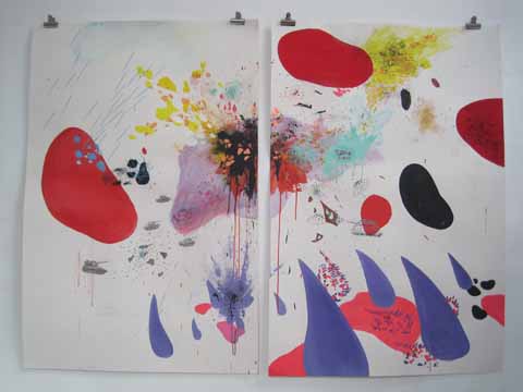
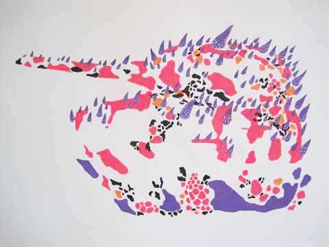
Based in East London, Moko is a Design Studio with a passion for form. Set up by Moko Sellars in 2012, Moko burst onto the design scene with the launch of Ceramiko, a slip-cast ceramic stool produced in Stoke-on-Trent. This was closely followed by a range of bone china rings (to give your fingers a bit of pizzazz). Looking through her portfolio, you can see a strong focus on space and a passion for design. The simplicity of her pieces reminds me that it’s simple, well executed ideas that have the most impact. This is shown by her chopstick drumsticks and prototype book-shaped book light.
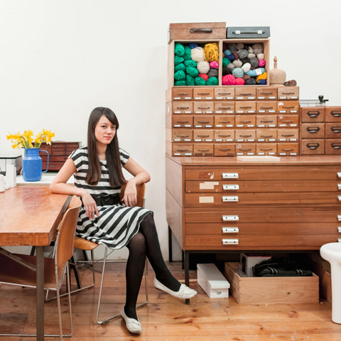
Moko

Moko’s pieces are always unique, and nourished by a fanatical passion for product design and antiques, she creates ‘simple, contemporary products with a nod towards the familiar’. Made to be cherished, her work puts an individual slant onto traditional homeware and accessories; resulting in neat little ‘inventions’ that you will treasure forever. More than just products, her work represents a study of how people interact with the world around them, and this influences their design. Simple but beautiful, these minimalist products are all handmade, which only adds to their appeal. I spoke to founder Moko Sellars about notebooks, furniture and unexpected paperwork.

Moko

Moko

You set up Moko in 2012, is there anything you wish you’d known when you started out?
There’s more admin to do than you’d think!

Where do you get your inspiration?
It can come from the past, maybe an object from the past or how they used to do things ‘back in the day’. I love looking around antique markets and I tend to buy vintage clothes and old furniture. Also by watching people! I find that the best ideas come to you when you’re not trying. You see someone doing something and it just clicks and you’re like “bingo”, I’ve got a product!

Moko
Moko

Have you always had a strong interest in design?
I always liked making things: cards, clothes, bags etc. I remember when I was young, when something broke, I would take it apart and try and work out what happened to it and how to fix it. Sometimes successfully, sometimes I’d break it even more.

How did you develop such as strong knowledge of materials?
I studied Furniture and Product Design then worked as a Packaging/ Product Designer for few years, so I had the chance to work with different materials. My favourite materials to work with are ceramics and paper.

Moko

Books appear a lot in your work, are you a big reader?
I do love books, but I think more their form rather than the contents! I love notebooks, I have about twenty on the go at the moment! I actually have a notebook design coming out next month which I designed for a company called Suck UK.

Moko
Moko

You’re also an illustrator, do you feel your drawing is a vital part of developing your ideas?
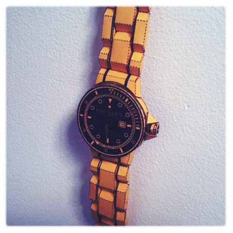
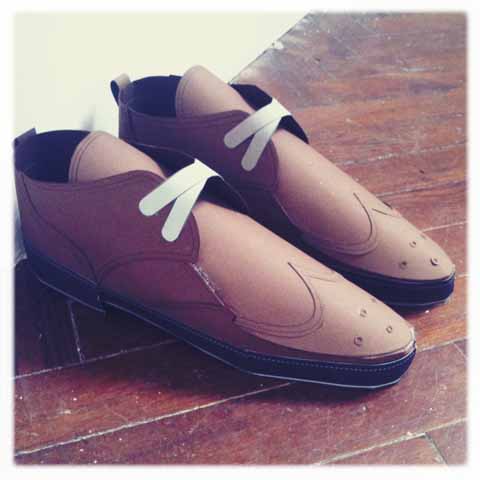
My illustrations are just for fun really, I find mocking things up in three dimensions (usually in paper) more important and enjoyable than sketching.

Moko

You design both packaging and products; do you feel the two are inextricably linked?
I think so. I’m really passionate about packaging design and how it can make or break a product. I sometimes spend double the amount of money on things just because they have nicer packaging!

Your work is very conceptual, is it important to you that your products are more than just functional objects?
Definitely! Function is very important, but I think concept is as important, if not more.

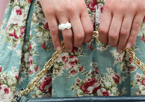
Moko
Moko

Do you have any favourites among your pieces?
I love all my designs equally. BUT the new Bone China ‘Diamond’ Ring Collection is the first design that people can wear on them for others to see, which is very exciting.

What’s your own most cherished piece of furniture?
It would have to be my ceramic stool. It took a while to get it made but I’m very happy with the result and I think it’s very cute.

Moko

What are your plans for the future?
I would like to design some more jewellery pieces, whether it will be a whole new collection or just a few select pieces; you’ll have to wait and see! I also love food so it would be fun to do some food related projects!

You can see more of Moko‘s work at www.mokosellars.com

Moko

The beautiful photos (which remind me of craft mag Mollie Makes) are by Wang Wei & Moko.

Categories ,Antiques, ,Bone China, ,ceramic stool, ,Furniture, ,Graphic Design, ,handmade, ,illustration, ,jewellery, ,Moko, ,packaging design, ,slip cast, ,Suck UK

Similar Posts:


Amelia’s Magazine | University of Central Lancashire Ba Hons Photography Graduate Show 2011 Review

UC Lancaster Photography degree show Free Range 2011-Christopher T. Finch
Photography by Christopher T. Finch.

UCLan, buy more about University of Central Lancashire presented a very clear collection of experimental work in their stand alone space as part of Free Range at the Truman Brewery.

UC Lancaster Photography degree show Free Range 2011-UC Lancaster Photography degree show Free Range 2011-Christopher T. Finch
Christopher T. Finch works with primitive home made cameras and digital technology. For his final show he presented a selection of pore framing facial close ups, various characters layered closely, almost on top of each other.

UC Lancashire Photography degree show Free Range 2011-Lizzie GodfreyUC Lancashire Photography degree show Free Range 2011-Lizzie GodfreyUC Lancashire Photography degree show Free Range 2011-Lizzie Godfrey
Lizzie Godfrey has obviously been influenced by the political climate. In a book titled The Fire This Time? she followed protestors through anti cuts marches earlier this year. Photographs were accompanied with lots of text to explain the evolution of her thought process too.

UC Lancashire Photography degree show Free Range 2011-Teresa Roberts UC Lancashire Photography degree show Free Range 2011-Teresa Roberts
Teresa Roberts produced a book too: The Maasai: Changing of Traditions mapped the ways that Western culture is influencing this nomadic people.

Richard Lewis Pryce looked through a blur onto the streets of London. Apologies for the lack of artwork but there was nowt in his online portfolio and my shot was rubbish. Shame I can’t show you because it was very clever stuff.
UC Lancashire Photography degree show Free Range 2011-Jennifer ColvinUC Lancashire Photography degree show Free Range 2011-Jennifer Colvin
Jennifer Colvin did some interesting things with resin and bits of collected ephemera.

UC Lancashire Photography degree show Free Range 2011-Ma in travel photography
The University of Central Lancashire is starting a new MA in Travel Photography this September – the course will engage in global politics, sustainable development and environmental issues, conservation and colonialism. Modules will be field based and the first will take place in Kenya. Maaaaan, if I didn’t have a magazine to run and a life to be responsible for then I would so run away and take this course.

Categories ,#UKuncut, ,2011, ,Christopher T. Finch, ,collage, ,Colonialism, ,conservation, ,digital, ,Ephemera, ,Free Range, ,global politics, ,Graduate Shows, ,Hand-made, ,Jennifer Colvin, ,Kenya, ,Lizzie Godfrey, ,ma, ,photography, ,Richard Lewis Pryce, ,Riots, ,sustainable development, ,Teresa Roberts, ,The Fire This Time?, ,The Maasai: Changing of Traditions, ,Travel Photography, ,Truman Brewery, ,UCLan, ,University of Central Lancashire

Similar Posts:


Amelia’s Magazine | Camberwell College of Arts Illustration MA Graduate Show 2011 Review: part one

Camberwell illustration MA review 2011-Simone Philippou
Illustration by Simone Philippou.

Last night I went along to the Camberwell College of Arts MA illustration graduate show. I always find it odd to return to Camberwell, hospital mooching around rooms where I once studied on my foundation course 20 years ago. Eeek! Here’s the best of what I found.

Camberwell illustration MA review 2011-Simone PhilippouCamberwell illustration MA review 2011-Simone Philippou
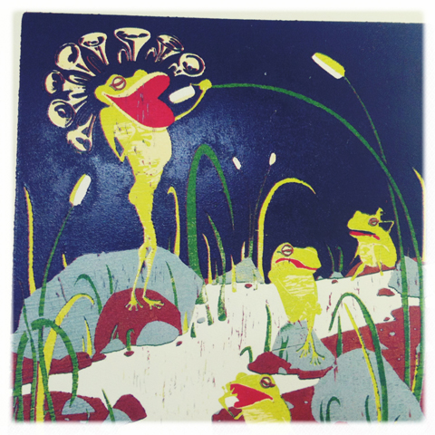
Simone Philippou was first to catch my eye with her beautiful woodblock artwork, look featuring jumping frogs and skipping children in powerful lime green and orange colours.

Camberwell illustration MA review 2011-Juste HalavinCamberwell illustration MA review 2011-Juste HalavinCamberwell illustration MA review 2011-Juste HalavinCamberwell illustration MA review 2011-Juste HalavinCamberwell illustration MA review 2011-Juste Halavin
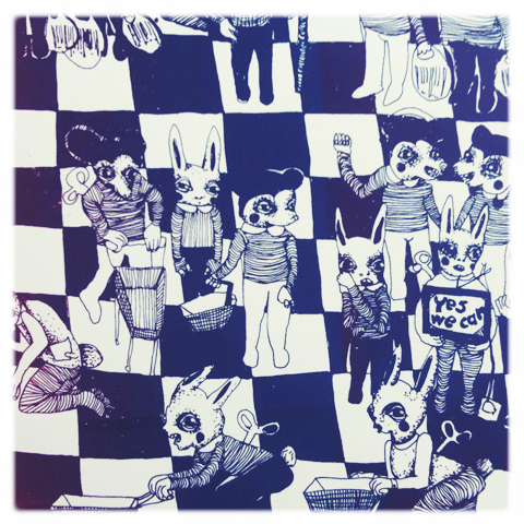
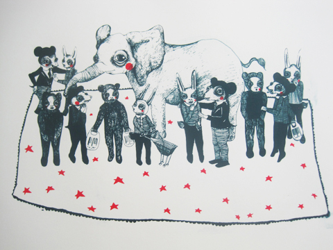
In the corridor Juste Halavin showcased some beautiful work featuring big eyed well dressed animals engaged with humans in curious situations.

Camberwell illustration MA review 2011-Goncalo Constanza
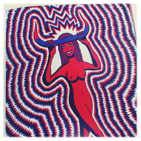
Goncalo Constanza went all psychedelic for her bold musical influenced optical artwork.

Camberwell illustration MA review 2011-Jo Chen
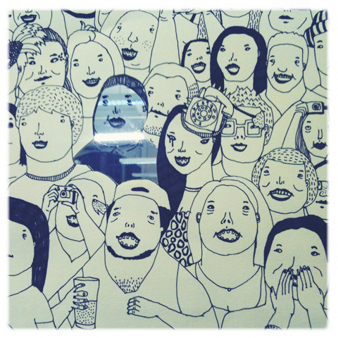
Jo Chen‘s What are you looking at? was a meticulously presented crowd of curious individuals.

Camberwell illustration MA review 2011-Gerda Razmaite (Kai)
Camberwell illustration MA review 2011-Gerda Razmaite (Kai)Camberwell illustration MA review 2011-Gerda Razmaite (Kai)Camberwell illustration MA review 2011-Gerda Razmaite (Kai)Camberwell illustration MA review 2011-Gerda Razmaite (Kai)
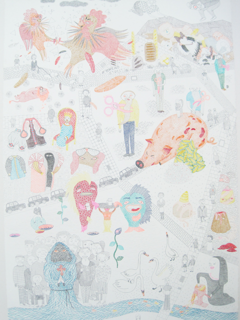
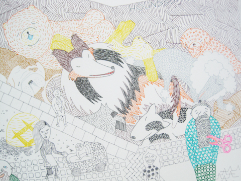
Next door I fell in love with the work of Gerda Razmaite (Kai), pills which tackled the history behind the names of the streets of London in a beautifully intricate and quirky style, not photographed to best effect here. Amazing stuff.

Camberwell illustration MA review 2011-Beibei Nie (Xiangdi)
If ever there was proof that the UK is now exporting creative cultural capital it was the prevalence of visiting Chinese students on this MA course: almost half by my count. Beibei Nie (Xiangdi) had produced a series of surreal prints titled Nostalgia, featuring inanimate objects appropriated by oversized animals.

Camberwell illustration MA review 2011-Yixin Fu
I liked this delicate painting for The Red House, a children’s book by Yixin Fu.

Camberwell illustration MA review 2011-Madalina AndronicCamberwell illustration MA review 2011-Madalina Andronic
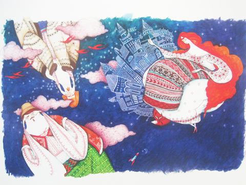
Madalina Andronic‘s The Fairy of Dawn was an intricately beautiful work fit for a children’s fairytale written by Ioan Slavici. I loved the spectacular use of shape to give motion in these images.

Camberwell illustration MA review 2011-Holly Zarnecki
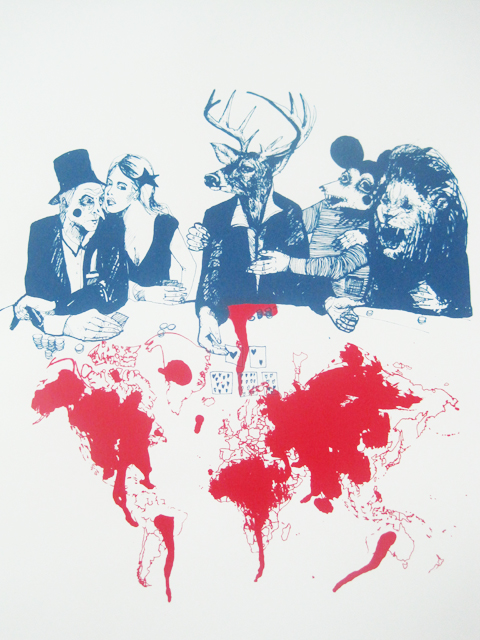
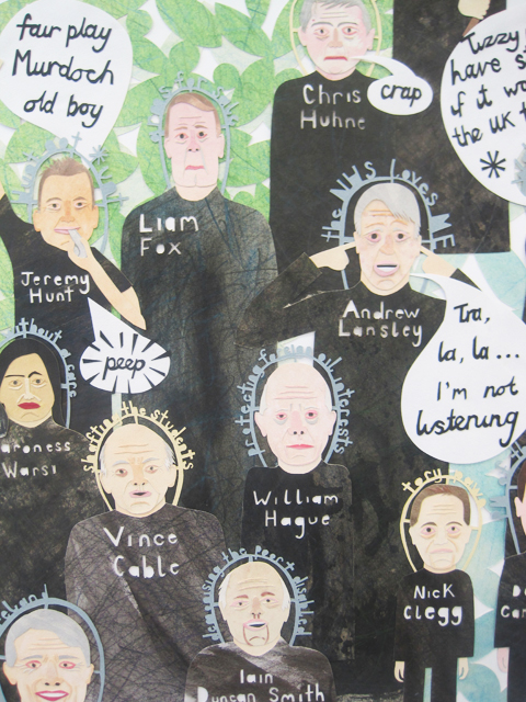
Holly Zarnecki took papercutting to the next level of complexity with a large scale illustration of the Coalition government. It was good to see a level of political engagement in this work, something which is all too often lacking in the graduate illustration I have seen.

More coming soon! You can read my second review of the Camberwell MA illustration show here.

Categories ,2011, ,Beibei Nie (Xiangdi), ,Camberwell College of Arts, ,Chinese, ,Coalition, ,deadpixelsinthesky, ,Gerda Razmaite, ,Goncalo Constanza, ,Holly Zarnecki, ,illustration, ,Ioan Slavici, ,Jo Chen, ,Juste Halavin, ,Kai, ,ma, ,Madalina Andronic, ,Nostalgia, ,Papercutting, ,review, ,Simone Philippou, ,The Fairy of Dawn, ,The Red House, ,What are you looking at?, ,Yixin Fu

Similar Posts:


Amelia’s Magazine | Camberwell College of Arts Illustration MA Graduate Show 2011 Review: part one

Camberwell illustration MA review 2011-Simone Philippou
Illustration by Simone Philippou.

Last night I went along to the Camberwell College of Arts MA illustration graduate show. I always find it odd to return to Camberwell, hospital mooching around rooms where I once studied on my foundation course 20 years ago. Eeek! Here’s the best of what I found.

Camberwell illustration MA review 2011-Simone PhilippouCamberwell illustration MA review 2011-Simone Philippou
Simone Philippou was first to catch my eye with her beautiful woodblock artwork, look featuring jumping frogs and skipping children in powerful lime green and orange colours.

Camberwell illustration MA review 2011-Juste HalavinCamberwell illustration MA review 2011-Juste HalavinCamberwell illustration MA review 2011-Juste HalavinCamberwell illustration MA review 2011-Juste HalavinCamberwell illustration MA review 2011-Juste Halavin
In the corridor Juste Halavin showcased some beautiful work featuring big eyed well dressed animals engaged with humans in curious situations.

Camberwell illustration MA review 2011-Goncalo Constanza
Goncalo Constanza went all psychedelic for her bold musical influenced optical artwork.

Camberwell illustration MA review 2011-Jo Chen
Jo Chen‘s What are you looking at? was a meticulously presented crowd of curious individuals.

Camberwell illustration MA review 2011-Gerda Razmaite (Kai)
Camberwell illustration MA review 2011-Gerda Razmaite (Kai)Camberwell illustration MA review 2011-Gerda Razmaite (Kai)Camberwell illustration MA review 2011-Gerda Razmaite (Kai)Camberwell illustration MA review 2011-Gerda Razmaite (Kai)
Next door I fell in love with the work of Gerda Razmaite (Kai), pills which tackled the history behind the names of the streets of London in a beautifully intricate and quirky style, not photographed to best effect here. Amazing stuff.

Camberwell illustration MA review 2011-Beibei Nie (Xiangdi)
If ever there was proof that the UK is now exporting creative cultural capital it was the prevalence of visiting Chinese students on this MA course: almost half by my count. Beibei Nie (Xiangdi) had produced a series of surreal prints titled Nostalgia, featuring inanimate objects appropriated by oversized animals.

Camberwell illustration MA review 2011-Yixin Fu
I liked this delicate painting for The Red House, a children’s book by Yixin Fu.

Camberwell illustration MA review 2011-Madalina AndronicCamberwell illustration MA review 2011-Madalina Andronic
Madalina Andronic‘s The Fairy of Dawn was an intricately beautiful work fit for a children’s fairytale written by Ioan Slavici. I loved the spectacular use of shape to give motion in these images.

Camberwell illustration MA review 2011-Holly Zarnecki
Holly Zarnecki took papercutting to the next level of complexity with a large scale illustration of the Coalition government. It was good to see a level of political engagement in this work, something which is all too often lacking in the graduate illustration I have seen.

More coming soon! You can read my second review of the Camberwell MA illustration show here.

Categories ,2011, ,Beibei Nie (Xiangdi), ,Camberwell College of Arts, ,Chinese, ,Coalition, ,deadpixelsinthesky, ,Gerda Razmaite, ,Goncalo Constanza, ,Holly Zarnecki, ,illustration, ,Ioan Slavici, ,Jo Chen, ,Juste Halavin, ,Kai, ,ma, ,Madalina Andronic, ,Nostalgia, ,Papercutting, ,review, ,Simone Philippou, ,The Fairy of Dawn, ,The Red House, ,What are you looking at?, ,Yixin Fu

Similar Posts:


Amelia’s Magazine | Camberwell College of Arts Illustration MA Graduate Show 2011 Review: part two

Camberwell illustration MA review 2011-Helen Dodsworth
Illustration by Helen Dodsworth.

Following on from my first Camberwell MA Illustration review, unhealthy here’s the rest of the illustration talent that I spotted at this years graduate show.

Camberwell illustration MA review 2011-Helen Dodsworth Camberwell illustration MA review 2011-Helen Dodsworth
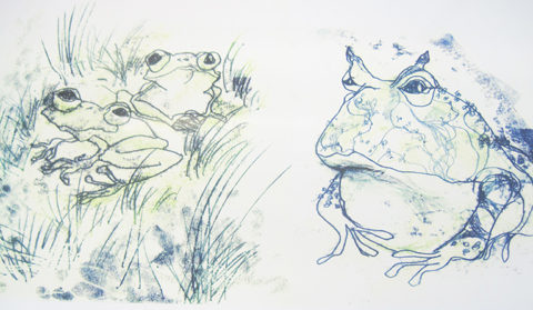
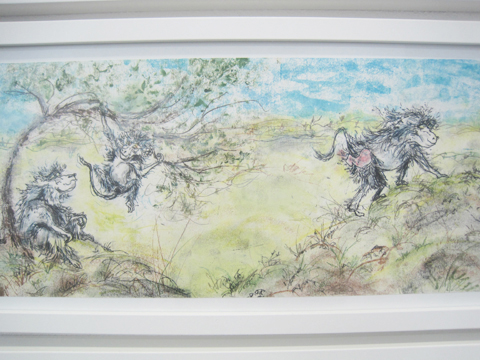
Helen Dodsworth was featured in my first book, Amelia’s Anthology of Illustration. Since studying for her MA at Camberwell her work technique has changed greatly: her entertaining animal characters are now created using mono printing techniques. I particularly loved their expressions and the use of motion in her collection of poems for children, Fluffy Nonsense.

Camberwell illustration MA review 2011-Nick Alston
For Sweet Science Nick Alston produced a series of sweeping calligraphic illustrations that charmed with their simplicity.

Camberwell illustration MA review 2011-Susannah Elizabeth
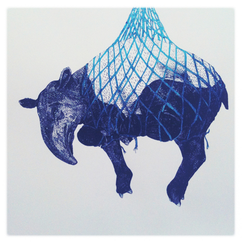
Or how about a swinging beastie in a net from Susannah Elizabeth? Her Unseen, Taman Negara was rather engaging. Alas, she has no website.

Camberwell illustration MA review 2011-Cruz Martinez Prieto
Cruz Martinez Prieto produced a 3D installation to accompany her bird headed women.

Camberwell illustration MA review 2011-Tuba Yalcinkaya
Tuba Yalcinkaya‘s Strange Encounters consisted of fine pencil drawings with peach highlights: beautiful women vomiting birds with hair made of worms.

Camberwell illustration MA review 2011-Suya ZhangCamberwell illustration MA review 2011-Suya Zhang
Made with simple ink washes, Suya Zhang‘s work was breathtakingly evocative and appealing.

Camberwell illustration MA review 2011-Rebecca Hiscocks
Curious collage by Rebecca Hiscocks featured skulls melded with architectural features into fantastical beings.

Camberwell illustration MA review 2011-Wei Gan
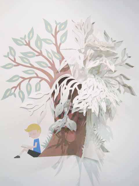
I was utterly engaged by a book put together by Wei Gan. A Tree told the tale of life in a beautiful old tree. Catch more of her work at Saatchi Online.

Camberwell illustration MA review 2011-Georgina Bing Han
Georgina Bing Han‘s dancing girls twirled around giant flowers in Passion of Poppy. She had also produced a clever cut out piece from a gardening book.

Don’t forget to check in with my first review of the Camberwell MA illustration show too!

Categories ,2011, ,A Tree, ,Amelia’s Anthology of Illustration, ,Camberwell College of Arts, ,collage, ,Cruz Martinez Prieto, ,Fluffy Nonsense, ,Georgina Bing Han, ,Helen Dodsworth, ,illustration, ,ma, ,Nick Alston, ,Passion of Poppy, ,Rebecca Hiscocks, ,review, ,Strange Encounters, ,Susannah Elizabeth, ,Suya Zhang, ,Sweet Science, ,Taman Negara, ,Tuba Yalcinkaya, ,Unseen, ,Wei Gan

Similar Posts:


Amelia’s Magazine | Camberwell College of Arts MA Graduate Show 2011 Review: Designer Maker and Fine Art

Camberwell illustration MA review 2011-Rachael House feminist disco
Illustration of a feminist icon on a paper place at the Rachael House Feminist Disco.

Now for the best of the rest that I saw on a quick whip around the Cambewell College of Arts MA shows: The MA Designer Maker Visual Arts displayed some wonderful works in a room titled Making_Makes_Me_Me, thumb an apt title given the theme of the new V&A Power of Making exhibition.

Camberwell illustration MA review 2011-Chieh Ting Huang
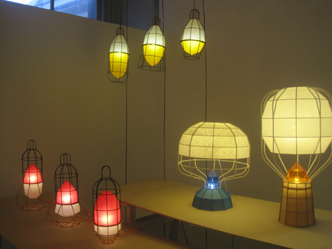
I was immediately drawn to the work of Chieh Ting Huang, buy more about who had grouped together The P Objects in semi darkness. His lighting was inspired by the lantern designs of both east and west, and the taming of fire as the cornerstone of humanity. Capturing the fragility of paper shades within elaborate wood cages, his lovely lights took on the appearance of glowing crystals.

Camberwell illustration MA review 2011-Yaqi Zhao
I liked the playful slip designs of ceramicist Yaqi Zhao, splashed across wide shallow bowls.

Camberwell illustration MA review 2011-Rachael House
Upstairs the MA in Fine Art was experiencing a takeover from Rachael House‘s Feminist Disco, dedicated to, erm, feminism – with particular reference to musical feminist icons such as the late lamented Poly Styrene.

Camberwell illustration MA review 2011-Rachael House feminist discoCamberwell illustration MA review 2011-Rachael House feminist discoCamberwell illustration MA review 2011-Rachael House feminist discoCamberwell illustration MA review 2011-Rachael House feminist disco
Rachael House was busy playing classic tunes on her miniature decks, whilst visitors were invited to create their own feminist icon on a paper plate. ‘I didn’t want it to be all about me,’ she said. ‘What does a feminist look like?‘ enquired a square plate, and it seemed plenty of people, young and old, male and female, were willing to respond to her engaging interactive artwork.

Camberwell illustration MA review 2011-Rachael House feminist discoCamberwell illustration MA review 2011-Rachael House feminist disco

To top it all off the Hackney Secular Singers (a punk choir that I used to be part of) gave a rousing half hour acapella set of favourites, including Poly’s great song Germ Free Adolescents.

Camberwell illustration MA review 2011-Hackney Secular Singers
YouTube Preview ImageGerm Free Adolescents by X-Ray Spex

Camberwell illustration MA review 2011-Max Strasser
I was also attracted to the Fortean Times inspired ephemera of Max Strasser.

Categories ,2011, ,Acapella, ,Camberwell College of Arts, ,ceramics, ,Chieh Ting Huang, ,craft, ,Designer Maker, ,Feminist Disco, ,Fine Art, ,Fortean Times, ,Germ Free Adolescents, ,Hackney Secular Singers, ,Lanterns, ,Lighting, ,ma, ,Making_Makes_Me_Me, ,Max Strasser, ,Power of Making, ,Punk Choir, ,Rachael House, ,review, ,The P Objects, ,va, ,Visual Arts, ,X-Ray Spex, ,Yaqi Zhao

Similar Posts:


Amelia’s Magazine | Central Saint Martins MA in Communication Design Graduate Show 2011: Review

Central Saint Martins Communication Design Degree Show 2011 Su Kyung Lee's The Imaginative Battle
Detail from Su Kyung Lee’s The Imaginative Battle.

The Central Saint Martins MA in Communication Design graduate show was held earlier this summer in the spacious rooms of the high ceilinged Rochelle School. The quality was of an exceptional standard throughout, site and there were informative descriptions helpfully placed next to all the work.

Central Saint Martins Communication Design Degree Show 2011 Su Kyung Lee's The Imaginative BattleCentral Saint Martins Communication Design Degree Show 2011 Su Kyung Lee's The Imaginative BattleCentral Saint Martins Communication Design Degree Show 2011 Su Kyung Lee's The Imaginative Battle
Central Saint Martins Communication Design Degree Show 2011 Su Kyung Lee's The Imaginative Battle
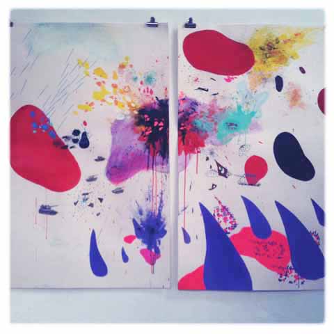
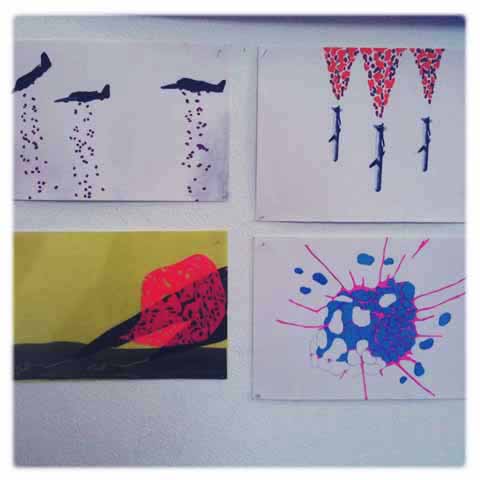
Su Kyung Lee‘s The Imaginative Battle explored patterns of protection and destruction, website focusing on the visual aesthetics of destruction and chaos through patterns. Cells and germs became the camouflage, web splattered across and fired from tanks, rendered in glorious neon brights. An apt subject in these difficult times.

Central Saint Martins Communication Design Degree Show 2011 Matt NicholsonCentral Saint Martins Communication Design Degree Show 2011 Matt NicholsonCentral Saint Martins Communication Design Degree Show 2011 Matt NicholsonCentral Saint Martins Communication Design Degree Show 2011 Matt Nicholson
Matt Nicholson showed his work half spat out of a digital printer. Inspired by his desire for high status objects he can’t afford Matt reproduced them for free, using printed paper patterns to create giant wall sculptures. They even retain functionality: the Lieca camera takes photos via a pinhole. Follow Matt Nicholson on Twitter.

Kanitta Meechubot six feet under yew treeCentral Saint Martins Communication Design Degree Show 2011 Kanitta MeechubotKanitta Meechubot searchingCentral Saint Martins Communication Design Degree Show 2011 Kanitta MeechubotCentral Saint Martins Communication Design Degree Show 2011 Kanitta Meechubot
Central Saint Martins Communication Design Degree Show 2011 Kanitta Meechubot
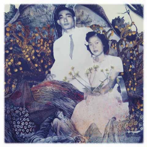
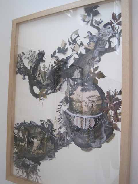
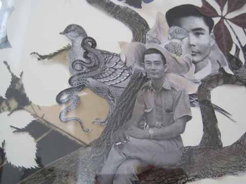
I was totally enraptured by Kanitta Meechubot‘s enchanting collages. A Garden of Illuminating Existence repeated and matched the branching nerves and veins of the body in trees and natural forms: merging memories and landscape. ‘To produce a map of experience through the internal landscape which changes with the seasons, is to capture the beauty of the illimitable renewals and decays of our existence.’ The real beauty of these pieces, with names like Six Feet Under Yew Tree and The Season of The Soul, was the fine detail used to build delicate pictures in 3D, including not only old photos and engravings, but real dried flowers and paint splats.

Central Saint Martins Communication Design Degree Show 2011 Sarah LangfordCentral Saint Martins Communication Design Degree Show 2011 Sarah LangfordCentral Saint Martins Communication Design Degree Show 2011 Sarah LangfordCentral Saint Martins Communication Design Degree Show 2011 Sarah LangfordCentral Saint Martins Communication Design Degree Show 2011 Sarah Langford
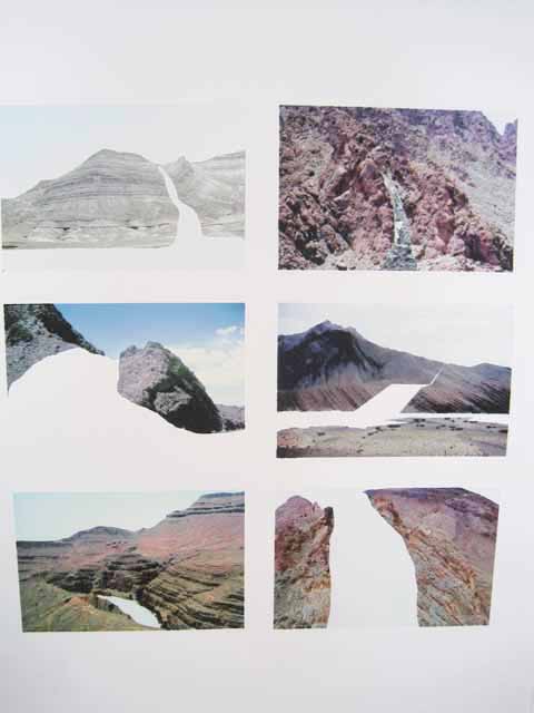
Sarah Langford was inspired by the movement of water, it’s necessity and destructive capabilities. Using scientific measurements she created beautiful textures to produce abstracts: parts and fragments of rock formations, shells, glimpses of the landscape being ripped and shredded by the passage of time.

Central Saint Martins Communication Design Degree Show 2011 Gareth BarnettCentral Saint Martins Communication Design Degree Show 2011 Gareth BarnettCentral Saint Martins Communication Design Degree Show 2011 Gareth Barnett
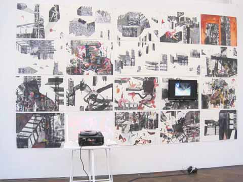
Gareth Barnett was inspired by Brutalist architecture (my favourite, though not to live in myself…) and the hellish writings of the Marquis de Sade to create an investigation into the power structures and systems of control within an urban environment. The resulting 20 pictures were splayed across the wall, interlaced with projections. With names like Climax in Concrete and Fuck Me Building there was no escaping the ruptured baseness of his conclusions.

Central Saint Martins Communication Design Degree Show 2011 Carl PartridgeCentral Saint Martins Communication Design Degree Show 2011 Carl PartridgeCentral Saint Martins Communication Design Degree Show 2011 Carl PartridgeCentral Saint Martins Communication Design Degree Show 2011 Carl Partridge
Carl Partridge looked to a place he’s never visited: America, believing that it’s easier to buy into the idealisation of America if you’ve never been. Using tiny shreds of paper and stickers, holographic beads, parts of adverts and marbled plastic he created delicate collages that seemed to question our love of consumerism. Follow Carl Partridge on Twitter.

Beth Salter CSMCentral Saint Martins Communication Design Degree Show 2011 Beth Salter CSMCentral Saint Martins Communication Design Degree Show 2011 Beth Salter CSMCentral Saint Martins Communication Design Degree Show 2011 Beth Salter CSM
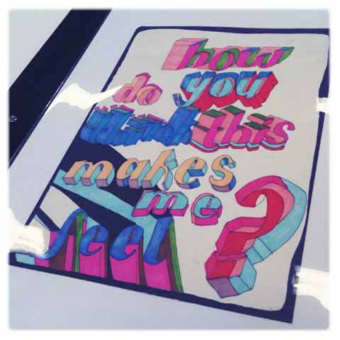
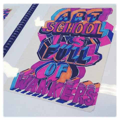
For marvellous hand done typography look no further than Beth Salter. She was inspired by private conversations overheard in public surroundings. Me too, I love them! But mainly her bright letters were just a lot of fun. Follow Beth Salter on Twitter.

Central Saint Martins Communication Design Degree Show 2011 Ann-Kathrin SchubertCentral Saint Martins Communication Design Degree Show 2011 Ann-Kathrin SchubertCentral Saint Martins Communication Design Degree Show 2011 Ann-Kathrin Schubert
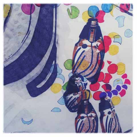
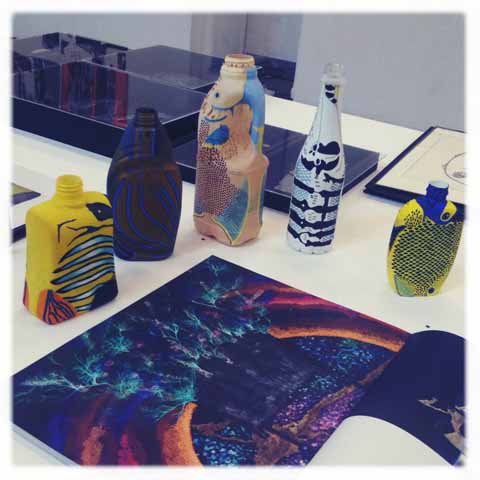
For The Fear of Life Ann-Kathrin Schubert had decorated discarded plastic bottles to become the most tropical of fish, tribal in their boldness.

Central Saint Martins Communication Design Degree Show 2011 Jesus Madrinan Central Saint Martins Communication Design Degree Show 2011 Jesus Madrinan
Jesus Madrinan had taken a series of portraits in London nightclubs: Good Night London featured some suitably inebriated yet oddly disillusioned creatures.

Central Saint Martins Communication Design Degree Show 2011 Golbanou Moghaddas
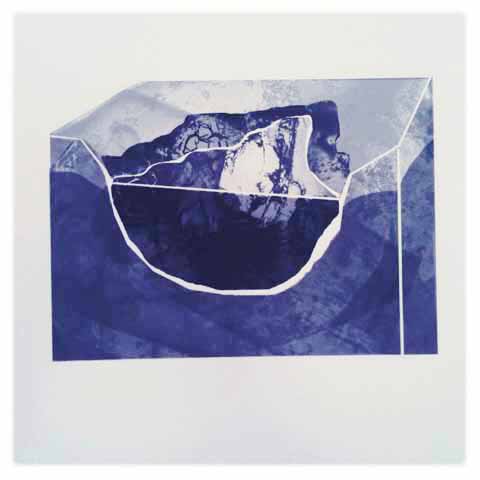
Golbanou Moghaddas was influenced by Arthur Schopenhauer‘s philosophy of existence typified by unrest. Strange fattened figures tumbled from a bony etched pelvis filled with birds. Painterley strokes combined with fine etching skills.

Central Saint Martins Communication Design Degree Show 2011 Alexa Galea
Alexa Galea was inspired by human desire to control and tame nature and the wild, particular with reference to European folk art and ritual.

Central Saint Martins Communication Design Degree Show 2011 Oat Montien
Oat Montien explored the relation between ritual and identity in contemporary interpretations of Thai traditions.

Central Saint Martins Communication Design Degree Show 2011 Paraskevi FerentinouCentral Saint Martins Communication Design Degree Show 2011 Paraskevi Ferentinou
Paraskevi Ferentinou explored the ‘agency of furniture‘ in the role of children’s growth.

Central Saint Martins Communication Design Degree Show 2011 Ying-Chen LuCentral Saint Martins Communication Design Degree Show 2011 Ying-Chen Lu
Central Saint Martins Communication Design Degree Show 2011 Ying-Chen Lu
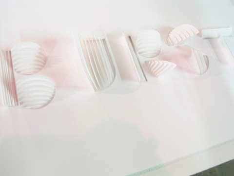
Ying-Chen Lu worked with 3D papercutting to create exploding type and depth in landscapes.

Central Saint Martins Communication Design Degree Show 2011 Aindri ChakrabortyCentral Saint Martins Communication Design Degree Show 2011 Aindri Chakraborty
Central Saint Martins Communication Design Degree Show 2011 Aindri Chakraborty
I could easily have missed Aindri Chakraborty‘s work which was nestled in a grimy corner, but I’m glad I didn’t as it was really rather wonderful: Heritage through Glass explored how the glass cabinets in museums separate the tangible object from the intangible visitor, and how stories are passed down the generations. People Tree and Conversations with Baba featured frantic truncated shapes, fire people and vomiting heads.

Categories ,3D Papercutting, ,A Garden of Illuminating Existence, ,Agency of Furniture, ,Alexa Galea, ,America, ,Ann-Kathrin Schubert, ,Arthur Schopenhauer, ,Beth Salter, ,Brutalism, ,Camera, ,Carl Partridge, ,Central Saint Martins, ,Climax in Concrete, ,collage, ,Communication Design, ,consumerism, ,Conversations with Baba, ,Folk Art, ,Fuck Me Building, ,Gareth Barnett, ,Golbanou Moghaddas, ,Good Night London, ,Graduate Shows, ,Heritage through Glass, ,illustration, ,Jesus Madrinan, ,Kanitta Meechubot, ,Last and Found, ,Leica, ,ma, ,Marquis de Sade, ,Matt Makes Stuff, ,Matt Nicholson, ,Oat Montien, ,Paraskevi Ferentinou, ,People Tree, ,Ritual, ,Rochelle School, ,Sarah Langford, ,Six Feet Under Yew Tree, ,Su Kyung Lee, ,Thailand, ,The Fear of Life, ,The Imaginative Battle, ,The Season of The Soul, ,typography, ,Ying-Chen Lu

Similar Posts:


Amelia’s Magazine | An interview with Augusta Akerman: Amelia’s Colourful Colouring Companion featured artist.

Augusta Akerman 'a section of my first litho print'
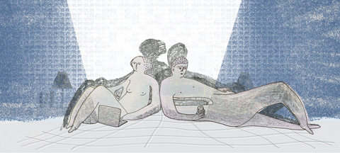
Augusta Akerman is yes, you got it, yet another Camberwell College of Arts graduate. She contributes a painterly image to my colouring book inspired by a love of 50s modernism. Find her in Amelia’s Colourful Colouring Companion, available now on Kickstarter.

Augusta Akerman 'Couples and Technology'
I love the way you draw figures, which artists have inspired you? I think they look very Henry Moore-esue
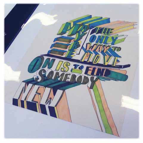
Yes you are very right! I have always been very inspired by that particular period around 1950‘s modernism, Festival of Britain era, having been brought up on artists like Moore, Hepworth, Ravilious and Bawden. These were the artists my parents loved, so we were always going to galleries to see this kind of work. Every summer we go to Cornwall and St.Ives was and still is an annual pilgrimage to see Hepworth‘s studio and garden, I could probably draw it from memory. After finishing my MA I had been introduced to what I would call ‘Now Illustration‘ and I found myself constantly looking at contemporaries’ work and worrying about my style. Earlier this year I decided that I was just going to let myself be influenced by the painters, sculptors and designers I grew up loving and have found myself much happier with my work.
Augusta Akerman 'Swimming Against'
Why did you decide to move away from your first degree in fine art photography towards illustration?
Towards the end of my BA at Glasgow College of Art I was already starting to move away from photography. I was making small artist books with a combination of illustrations and photographs and enjoying putting them together, designing covers and hand binding them. I returned to London and worked as a photographers assistant all the while drawing at home in the evenings and weekends. I think this was a real time of discovery for me. I was so embarrassed about my drawing skills that I didn’t really show or tell anyone but kept hundreds of small A5 sketchbooks with random illustrations in. In the end I became more and more confident and illustration naturally took over. I also wasn’t particularly interested in digital photography as I enjoyed using film so I think cost and lack of regular access to a darkroom also contributed to me moving away from it. However I still take photographs, film and digital, who knows what will happen next.

Augusta Akerman 'Sea to Stone'
What did you do in the period between your BA and MA studies?
I worked as a Set Decorator in film and advertising. I fell into this career, starting as an art department assistant and gradually working my way up. It was a very enjoyable job most of the time but could be also be extremely intense and stressful. In the end the feeling that I wasn’t doing exactly what I wanted to do took over and I made the decision to do the MA. I was so frightened to leave that job, because in that world you spend years making contacts and working for little money in the hope of getting somewhere. I am very lucky to have made some good friends whilst working in film and still do the odd job here and there.

Augusta Akerman 'mono print portrait'
Why did you choose Camberwell for your MA?
I chose Camberwell because it was the nearest illustration course to my parent’s house! In order to do the MA I had to move back home and save as much as I could, and I could walk there in under half an hour. The MA represented a way to take a year off from film and see if Illustration could possibly be an option for me. I didn’t apply anywhere else so it was Camberwell or nothing. When meeting the head tutor Jan Woolley and visiting lecturer Chloe Cheese, I had an overwhelming feeling that this was it, I was very close to making a big change in my life, I would have cried my eyes out if they had said no!

Augusta Akerman 'Plastic Sea Soup' nominated for One to Watch
You have described your work as a combination of classic illustration and abstraction, what does this mean in practice?
This is because I think it sits between these two worlds, sometimes I can be quite real in my representation of animals and people, and at other times I just want to work with shapes and textures. I also tend to prefer work that takes a theme or idea and presents it not as a realistic depiction, but one that leaves room for the viewer to project their subconscious onto it.

I definitely think there is an influence of the classic in what I do as inspired by great artists like Tove Jansson and Pauline Baynes. But I aim to give a sense of modern movement and sculptural weight to some pieces by working with dark texture and light washes. I spent a long time being quite soft and delicate with my line and colour choices, so I’m enjoying this moment right now where I’m being braver using black crayons and ink to be more blocky and meshing them with the silky lace lines of water colour and gouache.

Augusta Akerman 'a section from the Great Migration'
What is your preferred way to approach a new piece of work when first starting to create it?
Depending on whether it is a personal project or a commission I tend to do things differently. However they both start the same way, with research. I love researching the subject and finding out different meanings or views or small snippets of information that can be included in the work to give a little extra detail that maybe only 2 percent will ever ‘get’ but will still interest others. I work either at my desk or sometimes in my dad’s studio. When at my desk I usually put on Radio 4 or a documentary on my computer that I listen to like a radio play, otherwise I get distracted by the images if I can see the screen! When in my dad’s studio I’m usually doing something a bit more messy like mono printing or lino, he tends to listen to the radio too or is working on the computer.

How do you combine pen with litho and other methods of production?
I always work by hand, first sketching in my sketchbook, then taking the images to another level of finish either by painting over them or developing them with mono printing or another print process until I like the way they look. I like the play between hand and digital imagery, computers are extremely useful when cleaning and adding colour to images but I sometimes feel I get overwhelmed by the possibilities. I think in this extremely accessible digital age it’s easy to put off the actual thinking of the development of a piece until it is staring you in the face with 100 layers in Photoshop. I find it hard to think clearly with the back lit white screen and feel more in control with a bit of paper in front of me.

Augusta Akerman 'Amelia's Colouring Book' for online interview RGB
What inspired your piece for my colouring book?
Whilst on holiday in Cornwall I had been drawing in my sketchbook, letting my hand and brain sort of automatic draw. I was not thinking about anything in particular but allowing what I had seen or heard that day come out onto the paper. I thought it looked like a diary in a pattern format. When I came back from holiday and thought about the colouring book I returned to the pattern idea and thought it might be nice for people to colour it in. I started automatic drawing again but this time I thought about all the themes I would like to explore in new projects and shapes and images I was interested in. I decided to create a seated figure drawing what would eventually become the wallpaper as I felt this developed the idea of a dreamy state of doodling, of letting your mind wander around your worries and dreams. The male figure was added later and I liked the idea of it also speaking about a relationship with another person who understands your dreams and helps you conquer your worries. They are both just quietly enjoying a moment supporting each other to make this big mural that charts all the ups and downs of creative making. It’s the most colourful piece I’ve made in a while so the brief did pull me out of my comfort zone a bit.

You recently took part in New Designers One Year On – how did you get involved and what project were you showcasing?
I applied to New Designers One Year On on a whim, because I wanted to be proactive to see if I could promote myself and my work in a professional situation. When I was selected I was very happy but also a little terrified as I knew there would be a lot of preparation and self promotion needed to really get the most out of it. I was showcasing the wallpapers and textiles I had made on my MA as well as newer designs and illustrations. I was very lucky to be surrounded by some amazing designers and illustrators and got a lot out of the experience. I had done Pulse earlier in the year with UAL and do think that in the future I might only do one design fair a year, not only due to cost but also due to the amount of energy you need to sustain that level of self promotion to justify it.

Why have you chosen subjects such as climate change for the basis of your designs?
I am very influenced by nature and the natural order of things and have developed a huge respect for the world around us. I am also a constant watcher of all of David Attenborough‘s programs which means I’m a little obsessed with life cycles and repeating patterns. During my MA I knew I wanted to work with pattern and create an illustrated collection of wallpapers and textiles. The life cycles seemed to be a perfect subject as they repeat over and over again. Climate change sneaked into the work, because of researching the migration of animals and reading about the effect climate change is having on their lives, habitats and evolution. For me this is an ongoing theme and subject, I wanted to introduce and present the many circular structures that exist around us in a beautiful and accessible way, as well as providing a piece of information that some may not already be aware of.

Augusta Akerman 'Botanical Institute Wallpaper'
How do you create DIY wallpaper?
There are many ways! I have recently taught a DIY wallpaper class at the South London Botanical Institute where we used craft foam stamps, lino, foam rollers, stencils and direct printing (covering leaves and flowers in paint and pressing onto paper) to create repeat imagery. If you have the time and the space you can buy a roll of lining paper from B&Q and create your own.

What does your residency at the London Print Studio encompass?
I have been working with Lithography, a process I’ve been wanting to explore in more detail for a long time. I love the quality and possibilities of this particular printing process, you can use a number of materials to make your image as well as scratching away layers in the drawing that gives an almost etching like quality. Lithography is a lengthy process which I think puts a lot of people off. I spent 3 and a half hours grinding my large stone to get it right. I have the blisters to prove it! But even this I really enjoyed, it feels quite ancient grinding and preparing the stone then working into it with litho crayons and tusche. You can get an extremely varied quality of line that is then perfectly replicated when printing, but each print is unique with minute changes due to ink placement and roller pressure. I just love it! Although I did find the printing the hardest part this time. I was working one Saturday printing the largest stone and realised I had no more strength left to turn the wheel on the press, thank god I had nearly run out of paper!

How do you hope to grow your fabric design and wallpaper business?
After the Homes and Gardens Fabric Awards, I felt encouraged to continue with my new collection of wallpapers. I have to admit I was starting to feel a little helpless, I had applied for funding to help build the business which I didn’t get and had thought I might need to put it on hold for a while. I am now working on the new collection and hope to have it done by March 2016. It’s very hard trying to start a side business when you’re looking for freelance work and working a part time job, but I enjoy constantly working and thinking up ideas for projects. This is what I wanted! This is why I gave up other careers; in order to be in charge of my own creativity.

Augusta Akerman contributes her work to Amelia’s Colourful Colouring Companion, available now on Kickstarter. Make sure you grab a copy before the campaign closes later this month! Read a previous interview with Augusta here.

Categories ,#ameliasccc, ,Adult Coloring Book, ,Adult Colouring, ,Amelia’s Colourful Colouring Companion, ,Augusta Akerman, ,Bawden, ,Camberwell College of Arts, ,Chloe Cheese, ,Climate Change, ,Colouring Book, ,Cornwall, ,David Attenborough, ,Festival of Britain, ,Glasgow College of Art, ,Hepworth, ,Homes and Gardens Fabric Awards, ,illustration, ,interview, ,Jan Woolley, ,Kickstarter, ,Lithography, ,ma, ,Moore, ,New Designers, ,One Year On, ,Pauline Baynes, ,photography, ,Pulse, ,Radio 4, ,Ravilious, ,Set Decorator, ,South London Botanical Institute, ,St.Ives, ,Tove Jansson, ,Wallpaper

Similar Posts:


Amelia’s Magazine | My favourite finds from the Glastonbury Emerging Talent Competition 2014

Ellie Ford by Daria Hlazatova

Ellie Ford by Daria Hlazatova.

A few weeks ago the final showdown between 8 finalists was held at Pilton Working Men’s Club, with the ultimate winner of the 2014 Glastonbury Emerging Talent Competition announced as M+A with their super catchy tune Down the West Side, below.

When I wrote about my top picks for the Glastonbury Emerging Talent Competition I promised to also share some of the great bands and tunes that did not make it on to my short list. I was given a long list of 140 bands and musicians to listen to, from the genres of folk, country, dance, electronic, dance, indie, pop, acoustic and singer/songwriter – so obviously this selection reflects that choice. The eagle eyed amongst you may note that I was mainly given those bands with names starting in the early or late sections of the alphabet. I hope you’ll enjoy these finds as much as I did – you can hear all the tunes I like in no particular order on my soundcloud playlist, embedded directly below. I have a feeling I might be making more of these, and I am certain we’ll be hearing more from a few of these bands too.

I was really taken with the giddy oddity of Maxine, We’re Alive! by Liverpool duo A Lovely War. Unusual, weird and wonderful.

Sunsets is a great tune from Irish singer songwriter Wendy Jack, based in County Tyrone. Over the years she has worked widely to raise awareness of human rights and environmental issues.

Beautiful folk with a harp; Low is from Brighton based Ellie Ford, who is playing at this year’s Wood Festival (listing here).

Who Made Heaven is a beautiful slice of subtle country infused folk from Charlie Law, released through the The Davenport Collection folk label late last year. Despite a foundation in tune making of yesteryear the bittersweet lyrics tell a very modern tale of cross cultural love.

Bless is a slice of Japanese ambient electronica by Akisai.

Live For is a stunning banjo driven duet between Elvina and I.

Horses in Midstream by You, Me and Him was one of my favourite tracks, featuring a distinct 80s vibe in this epic tale of deception and greed.

Firewoodisland by Daria Hlazatova

Firewoodisland by Daria Hlazatova.

Simon is by the enigmatically named Firewoodisland, rollicking ‘celtic viking’ infused folk music made in Cardiff with a Norwegian lead singer.

A strummed guitar is the back bone of Stranger, a luscious slice of folk from Fenne Lily.

A harmonica opens a sweet little ditty called Back On The Bike by Four People.

Think Again is rollicking folk from Welsh singer Geraint Rhys.

And We Disappear is a prime example of 80s influenced dark wave electropop by AlterRed.

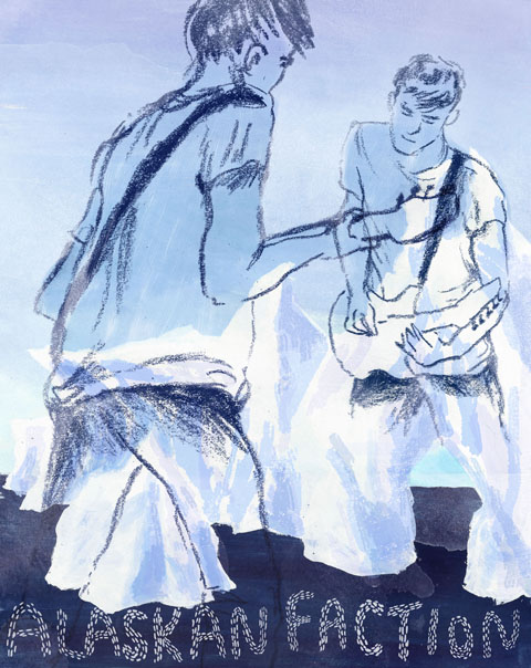
Alaskan Faction by Catherine Pape

Alaskan Faction by Catherine Pape.

We Disappear is super twinkly indie from Alaskan Faction.

A touch of the Cure, no? The Heart Transplant by Adam Clark has a subtle start but soon takes on their trademark wobbly vocals.

Like Ted Dexter by Alex Moir is feel good indie a-go-go with a psychedelic interlude!

Lost is by North Ireland based band Amidships.

Empty My Head by Youdid is a catchy piano tune with a female vocal from German singer Judith Severloh.

SwanSong is another cool indie tune featuring soaring vocals and a curling fiddle, from the London based Amberlandband.

There’s something about this that I quite like… Blackpool based Avishek Choudhury sings of the Journey Of A Lifetime in this jaunty tune featuring a female backing singer with bleeps and sirens set against a piano and driving electrobeat.

I like the jazzy big band sound and sultry vocals from rising star Ally Kemp in The Tardis.

Freya Roy is a very young Suffolk based singer songwriter with an ear for a bouncy tune, as shown in her entry Tomorrow.

Local Town comes from Brighton boy Ally Jowett.

They’re going to turn me into sushi & chips…” So goes The Whale Song by All At Sea… overly chirpy or an apt way to draw attention to a big issue?

Kids from the Sky by Young Stadium Club features jangly guitars aplenty in a soaring tune that features a veritable choir of backing vocals.

A Drastic Love by Younger Hall features a grungy baseline combined with a pounding piano. They hail from St Andrews in Scotland.

I loved the soaring Ten Years by Baby Gold, a duo from Leeds, but for some inexplicable reason it’s a private link on soundcloud so you will have to trust me on that one. Their lack of an online presence is a serious down point, but I look forward to hearing more from these guys.

Similarly I can’t share Only One by Devon based Alice Jemima, featuring a lovely breathy vocal over carefully picked chords and a nice little beat.

Finally, I can’t finish without including my favourites: firstly the clever Memphis by Alev Lenz.

George Boomsma by Simon McLaren.

George Boomsma by Simon McLaren.

And the wonderful folk sounds of George Boomsma in How High the Mountain.

Sadly my first choice disbanded just as I chose them to go through (brilliant timing!), hence my renewed desire to give some promotion to all the other bands that impressed me.

Categories ,2014, ,A Drastic Love, ,A Lovely War, ,acoustic, ,Adam Clark, ,Akisai, ,Alaskan Faction, ,Alev Lenz, ,Alex Moir, ,Alice Jemima, ,All At Sea, ,Ally Jowett, ,Ally Kemp, ,AlterRed, ,Amberlandband, ,Amidships, ,And We Disappear, ,Avishek Choudhury, ,Baby Gold, ,Back On The Bike, ,Best Of, ,Bless, ,Catherine Pape, ,Charlie Law, ,country, ,dance, ,Daria Hlazatova, ,Down the West Side, ,electronic, ,Ellie Ford, ,Elvina and I, ,Empty My Head, ,Fenne Lily, ,Firewoodisland, ,folk, ,Four People, ,Freya Roy, ,George Boomsma, ,Geraint Rhys, ,Glastonbury Emerging Talent Competition, ,Horses in Midstream, ,How High The Mountain, ,Indie, ,Journey Of A Lifetime, ,Judith Severloh, ,Kids from the Sky, ,Like Ted Dexter, ,Live For, ,Local Town, ,Lost, ,low, ,ma, ,Maxine We’re Alive!, ,Memphis, ,Only One, ,Pilton Working Men’s Club, ,pop, ,Simon, ,Simon Mclaren, ,singersongwriter, ,Stranger, ,sunsets, ,SwanSong, ,Ten Years, ,The Davenport Collection, ,The Heart Transplant, ,The Tardis, ,The Whale Song, ,Think Again, ,Tomorrow, ,We Disappear, ,Wendy Jack, ,Who Made Heaven, ,Wood Festival, ,You Me and Him, ,Youdid, ,Young Stadium Club, ,Younger Hall

Similar Posts: