I haven’t been to a James Long show for a few seasons now. I’m not sure why. It might be that they just didn’t want me there. That’s fine. This season was a different story, though, and I’m dead chuffed that I went along. We were greeted by handsome chaps in trademark James Long graphic tees serving rosé wine. Just as I swallowed mine in two gulps, a lady kindly notified me that I could, had I wanted to, take it to my seat, which was a little embarrassing.
Anyway, gone were the glued-down hair dos and quilted fabrics of last season to make way for a fresh, beachy, summertime approach. Models appeared one after the other with flowing, surfer locks and nonchalant expressions as if they had strode in from some hipster beach that you haven’t heard of.
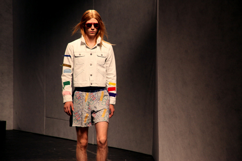
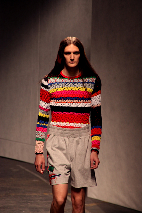
Overall, it was a complex, multi-faceted collection. The show invitation had a small piece of fabric stapled to it, which would be a detail that formed the basis of many of the looks. The first model wore a denim jacket with aforementioned fabric stripes attached with abandon, teamed with a long, mesh t-shirt dress and jeans to match the jacket.
Then came shorts with the same treatment; frayed at the leg with thick, elasticated waists – a homage to boxers, which was a key theme here. Graphic, stripy t-shirts and stripy socks were aplenty. The emphasis was on jazzed up sportswear, with more mesh, more waistbands, tapered joggers and James’ trademark wrap shorts jazzed up for next summer. The quilted experiments of last season moved into bubble-knit sweaters, tucked into shorts to provide a laid back look that James has perfected this time around.
Statement pieces come in the form of t-shirts and jumpers with a loose, scripted ‘JAMES‘ logo that I am left lusting after. Appearing in different colours, this new logo filled the front and back of garments and crept up sleeves.
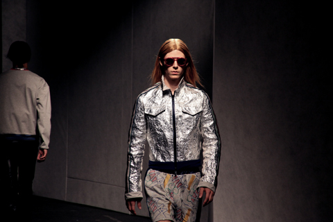
A collaboration with LUNETTES KOLLEKTION saw models wear a variety of circular, mirrored sunglasses and quilted nylon bags completed the looks. This was without doubt one of my favourite collections this season and I can’t wait to see what happens next.
Written by Matt Bramford on Tuesday June 24th, 2014 12:53 pm
Katie Eary pretty much started the current leopard print menswear trend. Back in 2010, she had boxing models head-to-toe in it. Her love affair with the design continued on Monday at her S/S 2014 offering.
As is standard at Katie’s shows, it seemed like everybody in London had descended on Victoria House. I’m always sceptical when you’ve got a standing ticket and it’s a printable email – there’s no way of policing who presses print and tries their luck. I actually saw one guy with about 12 fresh print-outs in the queue, dishing them out to his pals like they were Wonka’s golden tickets; their eyes lighting up at the sight of the pink-flamingo-in-a-wig design. When we finally did get inside, it was by far the busiest I’d ever seen that venue.
Standing next to a speaker is one of my favourite things during fashion week*, and as a preview of one of Kanye West‘s forthcoming tracks from new album Yeezus penetrated my eardrums, I wondered if I’d even get out alive. At least it wasn’t Coldplay.
Anyway. A mixture of models began to appear and there was no hidin’ that pink flamingo. Each print induced flashbacks to a Charlie le Mindu show that I had since managed to supress – have a look here and you’ll see why. Emblazoned across shirts, isolated on tees, this flamingo was a versatile motif that seemed to work across all garments that it was applied to; I’ll be damned if I’m not sporting a flamingo-in-a-wig t-shirt by the end of next summer.
Other print patterns included the aforementioned leopard print, Katie’s signature, this time in red and black with a linear gradient application, fading to translucency on slim-fit polo shirts and fading to black on oversized rucksacks.
Both patterns appeared on trousers and shorts with combat pockets and were styled with Nikes in similer colours and Katie Eary-branded skateboards.
Peppering the mens showcase were a bunch of super sexy ladies with candy floss wigs and poker faces. They sported designs not dissimilar to the mens’ range – flamingo head scarves, racy leopard-print translucent kaftans and coral bikinis that they could actually fill.
I’ve left some shows baffled about what season I’ve just witnessed, but there was no mistaking at this show – Katie Eary predicts a red hot summer.
*it isn’t.
Written by Matt Bramford on Friday June 21st, 2013 9:43 am
This week’s wet Monday was brightened up considerably by a trip to the Royal Collage of Art’s first work-in-progress show of 2011 – and before you ask, seek no, online I was not suffering from “Blue Monday” or the notion that yesterday was the most depressing day of the year. As Ben Goldacre (Bad Science) discussed over on his blog yesterday, the concept of Blue Monday was made up by a PR company, with the aim to sell more holidays in the months after Christmas and is being perpetuated by journalists reconfiguring press releases into actual articles, without through fact-checking, a type of writing describe by Goldacre aschurnalism.
Finishing on Wednesday, 19th January, the Work-In-Progress show is a great opportunity for current BA Students, graduates and the public to see the developing ideas in the fields of Fashion, Textiles, Metalwork and Jewellery, Goldsmithing, Silversmithing, and Photography. Whilst the photography and the filmmaking are breathtaking, warranting a trip to the RCA by themselves, I will mainly be focusing on the Menswear and Womenswear Year Two students.
Tariq Mahmoud
Tariq Mahmoud’s shoe was inspired by watching the penguins at the penguin pool of London Zoo. The unique presentation of his shoe within a fish bowl with a couple of toy penguins for company, was certainly eye catching, drawing your attention to the similarities between flipper and shoe.
The RCA Interim show is a fantastic opportunity to see how ideas circulating within contemporary fashion are being dissected by students studying the craft. Aleksandra Domanerskaya’s oversized mac in a traditional plaid is a great example of how classic shapes are constantly being reinvented.
In recent seasons, knitwear has exploded across the menswalk catwalks, from James Long’s to Morgan Allen Oliver via Sibling, designer after designer have reinvented a fabric which was once solely associated with 1970′s knitwear patterns. I loved Cherie Newing’s take on the ubiquitous fisherman’s jumper.
Sol Ahn
Menswear Year 2 student and intriguing illustrator, Sol Ahn displayed this breathtaking combination of a triomphe d’oeil shirt and cardigan with fabrics to match the illustrations!
Samuel Membey
Samuel Membery’s overcoat revisits the skinhead movement of the 1970′s, as captured in Gavin Watson’s collection of photographs: Skins.
Ruth Hill
In Womenswear Knit, Ruth Hill’s simple orange block print dress in an incredibly fine knit, was beautifully reminiscent of the artist Paul Klee.
Lily Kamber
Lily Kamber’s fantastic mixed media pieces used found objects to create pieces of jewellery more at home in the art deco settings of William Morris…
In the M.Phil research section, I came across the wonderful work of Jungeun Lee. Lee’s experiments with synthetic fabrics – creating garments without the need for pattern cutting, sowing, knitting or weaving – reminded me again of the ground breaking A-Poc (A piece of Cloth) and Issey Miyake’s latest venture, 132 5, an “experiment in steam pressed polygons of material” (thanks Fashion Ed, Matt Bramford!). Lee created her pieces by molding hot synthetic fibres into a 3D Structure.
Hurry up! What are you waiting for? Head down to the Royal College of Art before 5.30pm Wendesday 19th January.
Visit the Royal College of Art’s website for full updates on their upcoming in-progress shows and public lectures. I’m particularly looking forward to the collaboration between RCA MA Curating Contemporary Art and Goldsmiths MFA Curating students, Testing Ground: Time Scale.
Christopher Raeburn studied at Middlesex University in London, treat where a really good technical tutor made him keen to attend the hallowed Royal College of Art, order from which he graduated in 2006. He has become well known for his upcycling of military fabrics, although he has worked with everything from Eurostar uniforms to hot air balloon material. He sources parachutes, leather jackets, tents and ponchos from military surplus warehouses around England, but has increasingly started to import pieces from Europe so that he can make bigger runs. The military inherently overproduces so there are huge volumes of fabric and garments that will never be used – dead stock that Christopher is happy to make the most of. In fact most production processes are inefficient so there is always likely to be pre-consumer waste; for example, 10% of the parachute fabric that is made fails opacity tests. Christopher is able to give that fabric a new lease of life. Most recently he worked with windproof cotton from some forty year old Swedish snow parkas. Occasionally a company will contact him about a specific material they think he might like to use, which has been a great way to keep his collections fresh and innovative.
Christopher Raeburn A/W 2010 by Gemma Milly.
Christopher Raeburn studied at Middlesex University in London, sildenafil where a really good technical tutor made him keen to attend the hallowed Royal College of Art, from which he graduated in 2006. He has become well known for his upcycling of military fabrics, although he has worked with everything from Eurostar uniforms to hot air balloon material. He sources parachutes, leather jackets, tents and ponchos from military surplus warehouses around England, but has increasingly started to import pieces from Europe so that he can make bigger runs.
The military inherently overproduces so there are huge volumes of fabric and garments that will never be used – dead stock that Christopher is happy to make the most of. In fact most production processes are inefficient so there is always likely to be pre-consumer waste; for example, 10% of the parachute fabric that is made fails opacity tests. Christopher is able to give that fabric a new lease of life. Most recently he worked with windproof cotton from some forty year old Swedish snow parkas. Occasionally a company will contact him about a specific material they think he might like to use, which has been a great way to keep his collections fresh and innovative…
Read the rest of this interview and see more illustrations of Christopher Raeburn’s clothing in Amelia’s Compendium of Fashion Illustration, alongside interviews with 44 other ethical fashion designers and 30 fabulous fashion illustrators. You can buy the book here.
Written by Amelia Gregory on Tuesday January 18th, 2011 1:32 pm
As we made our way through Victoria House for Agi & Sam‘s A/W 2014 presentation, models stood on plinths holding placards bearing the slogan ‘Watu Nguvu‘ (people power in Swahili) and oil company logos. They created a sombre atmosphere; part protest, part decoration. They were setting the scene for what would become an incredibly personal collection.
Banished were the vibrant fabrics of London transport of last season; gone were the matchy-matchy suits or block fluorescent colours that the duo have become famous for. In fact, gone was colouring altogether; only two pieces in this collection veered from the monochrome theme. It was a bigger surprise as any from the duo renowned for their worldly and energetic use of colour.
By this stage my camera had pretty much given up altogether. I have probably taken about 300,000 photographs with it, and it’s probably decided that it’s had enough of men and women walking backwards and forwards, so if anybody has a spare £2K to buy me another one that would be great, thanks. Despite this, I really like the shots I got here. There’s something about the soft focus (read: blurred) quality of them that suits this presentation.
The collection combines Western workwear with African tribal features, exploring the exploitation of African society and the stereotypes of the notion we call ‘The West’. Long silhouettes dominated this outing, as did box-shaped shoulders and ankle-length pants. Black cropped blazers and jackets with hidden fastenings toyed with the workwear theme with reflective band details. Traditional patterns like Masai check and African weaves were interpreted across coats and cropped jackets.
I particularly enjoyed the injection of oversized tees that featured Western oil conglomerate logos, providing a welcome burst of colour, and a long nylon coat that gave a utilitarian aesthetic without diverging from the key themes.
It’s easy to see why Agi & Sam were awarded the Emerging Talent accolade at last year’s British Fashion Awards: in just one season they’ve moved from playful prints to a slick collection with a political message that had been handled in a intelligent, provocative way.
Written by Matt Bramford on Wednesday January 29th, 2014 10:40 am
I love Agi & Sam. A recent collaboration with Topman, ‘The Owls‘, featured a range of football-kit inspired clothing and gave a taster of things to come. I am hoping that ‘The Owls’ was a nod to Sheffield Wednesday. I couldn’t give two hoots (geddit?) about the team, but I love that city.
Two enormous owls sat amongst the crowds at their S/S 2014 show last Sunday. Yes, I know I’m behind. I was genuinely surprised when the show began with mostly all black looks. Agi & Sam are renowned for their glorious use of colour and so it seemed a bit curveball. A speckled black suit worn over a crisp white shirt appeared first, styled with visor shades. An oversized black shirt came next, featuring a discrete monochrome pattern.
It wasn’t before long that the design duo’s inimitable prints appeared, though. This season inspiration had come from public transport seating patterns, the bloody geniuses. If you want to look like the back seat of the number 8 bus, as I certainly do, then Agi & Sam are for you. Rich fabrics carried hallucinogenic patterns in vibrant colours, some discrete, some so obvious that even the models wore large black visors to protect their eyes. All trousers maintained a clean cut with a tapered leg, cropped at the ankle.
Box-shaped blazers, some with cropped sleeves and others full-length, appeared in block colours, from powder blue to acidic orange.
Accessories included black oxfords embellished with bright stripes (in collaboration with Oliver Spencer) and large black luggage that featured some of the transport soft furnishings patterns.
Written by Matt Bramford on Thursday June 27th, 2013 8:58 am
London Collections: Men might be the clumsiest branding known to man, but the MAN show does you no favours either. Not only do you find yourself saying aloud ‘I’m going to the MAN show’, but check out #MAN on Instagram shortly after the collections and you’ll get all sorts of unsavoury images mixed with Bobby Abley‘s pink fur or Craig Green‘s psychedelic prints.
I haven’t seen either of the above nor Alan Taylor‘s actual catwalk presentations before, so I was pretty excited about this showcase of London’s most innovative menswear designers. Irishman Alan Taylor was up first. Since starting his own label in 2011, Taylor the tailor has quickly asserted himself as one to watch.
This particular collection was inspired by Henri Matisse and Taylor’s love affair with modern art is well documented. Irish tweeds became the canvas and bursts of solid fluorescent panels became the art. Enlarged overcoats and blazers created the silhouettes – natural colours maintained Taylor’s commitment to his heritage. Most pieces were modernised with the aforementioned vibrant coloured panels – Matisse-like shapes in green and purple transformed sharp tailoring into unique and contemporary looks. Contrasting pieces like a floor-length black overcoat constructed from a heavy, shimmering fabric peppered the collection.
Taylor’s staple kilts featured alongside contemporary Oxford bags and jackets with a-line hems, proving that elements of womenswear can actually work in menswear without making the wearer look like an utter berk. Finally, zingy fluorescent accessories: leather gloves, bags and shoes, added yet another dimension to this outstanding outing.
Written by Matt Bramford on Thursday January 16th, 2014 2:09 pm
Working for Amelia’s Magazine – proud pioneer of fresh talent – it’s always a delight to see a label progress through the seasons. It baffles me how designers make it into showcases like Fashion Scout’s Ones to Watch and then simply disappear. So I was delighted to see that Baartmans and Siegel – the dutch/English design partnership we’d enjoyed in the Ones to Watch show last season – had made it onto the menswear day schedule with their first solo outing. They’re stocked by Harrods and met at Viktor & Rolf, so their joint credentials already have them a high profile.
Unusually I was one of the first attendees into the show space at the Freemasons’ Hall, so I revelled in digging through the goodie bag (I’m pleased to announce I’m fully furnished with Label.M products again, after levels in my bathroom had reached worryingly low levels) and I read through the show notes. This season the design duo sought inspiration from, amongst other things, the Milk Tray man. I was already in love with this collection before everybody had even taken their seats.
Inspiration also came from 1970s British menswear and cinema. Baartmans and Siegel are obsessed with popular culture and it is the Milk Tray man‘s mystery and sense of indulgence that had them captivated in the run up to this show.
The first look featured a meticulously tailored blazer in a rich blue colour, which would become the mainstay. A pocket square of the same colour held the initials B and S, and the jacket was teamed with comfortable grey trousers with silver zips to give a futuristic appeal.
More tailoring followed, with loose-fitting tweed trousers and cashmere blazers worn over chunky knitted rollnecks. Then came sportier ensembles included padded puffa jackets – some with zip details, others with contrasting tweed sections.
The blue kept coming, as did a desirable palette of slate grey and, of course, Cadbury purple in honour of their hero. A classic grey jacket was teamed with jersey trousers with contrasting panels for a contemporary look, and sophisticated overcoats show Baartmans and Siegel’s expertise in dressing the modern man.
This is refined menswear at its best. Baartmans and Siegel expertly marry fashion-forward clothes with traditional techniques. Classic silhouettes, contemporary cuts, luxurious fabrics and deep colours make for an outstanding debut solo show.
Written by Matt Bramford on Monday February 27th, 2012 7:09 pm
When did you last hear an amazing story? A tale of derring-do, helpmedical or grand ambition, shop heights scaled, ambulance depths plumbed – simple stand-up human decency or quiet unassuming endurance or some quirky ingenuity fit to inspire generations to come. The kind of stuff they used to sing songs about, and still do.
Sat around their dining table one evening, David and Clare Hieatt pondered. They were rubbing their chins over what they could really do about the things they cared about. They’d started howies back in 1995, something of an awesome inspirational-type clothes company in itself, but this was clearly not enough. From that evening of reflection, they figured that the world’s Doers are the best people to inspire people to go Do something. In David’s words, ‘They show us what is possible. They leave a trail that we can follow. Knowing how they did it helps us to connect the dots about how we can do it. They give us the inspiration, the final push we need to go and do our thing. Whatever that might be. From starting a new business, to inventing something that hasn’t been done before to fighting for your cause, doers seek.’
And so the Do Lectures were born – a series of talks by people who have Done stuff, and might well Do more, if we let them up and at it – a few days gathering each year to share ideas and stories, to meet other fantastic Doers, and thereby get these stories out and about in the world. Here are a few Qs – the As courtesy of David Hieatt – that might give you more of an idea.
Why do people get involved with the Do Lectures?
There isn’t a set of talks like it in Britain. The talks have sustainability at its heart. Their reason to exist is to make a positive change. The speakers do not get paid but we do cover their expenses. Speakers come from all over the world to tell their story. They want to share their learning, they want to share their new ideas, they want to share their journey. They want to tell the world about the change they have made or are seeking to make. It might be a small tent but there are some big ideas being shared. They have a story to tell. People remember stories. They forget facts.
How do you choose your speakers for the Do Lectures?
We spend the year researching the speakers. We find out who has written the most interesting books, written the most thought provoking articles, who is doing the bravest thinking in their field, and then we pull from that research and start to compile a short list. We already have some of the speakers booked for next year. We also have a number of Do mentors throughout the world. They report back to us from time to time. They tell us who their doers are in their part of the world. They we literally get on the phone to the people we are going to invite. Even in the second year, an invite is starting to carry some kudos.
What is the most unusual topic for this year’s Do Lectures?
Maybe, Mount Everests binman. Or a school that aims to create chaos and not order. Maybe the man wants to change how concrete is made. Or maybe the man who’s doodles have ended up on the big screen for what could be the biggest film of the year: Where the Wild Things Are.
Where do you see the Do lectures in 5, 10, 20 years’ time?
In 5 years – There will be a series of How to Do books. That cover the subjects that the talks cover from clean tech to inventing to climate change. Global talks. The talks will take place all over the world. From Sydney, to Bangalore, to Stockholm, to Tokyo, to San Francisco, to Beijing. The talks will over time become an important set of talks, respected throughout the world. In 10 years – The aim for the Do Lectures over the next decade is to build a world resource for Doers and to supply that knowledge for Free for the world to use. To make a positive change. In 20 years – To build A Do school. There will be a physical and a virtual library available free to the world.
So here’s a gathering with a difference. At one thousand pounds a place, you’re less buying a ticket, more contributing to the speakers’ expenses and the future free distribution of the lectures. David and Clare are thinking big – what is fast becoming a respected annual event should attract over a million people across the world this time around to get inspired for free. If you can go, I most humbly and slightly jealously urge you, go. And if a back seat is the order of the day – well, don’t make a habit of sitting there. Once this year’s stories are out and available, I think there’ll be more than enough get-up to go. Yes, I surely Do.
One of Amelia’s Magazine‘s favourite graduates from the Central St Martins MA back in March was knitwear designer Morgan Allen- Oliver, treatment with a selection of horse jockey- meet- Soviet minimalist graphic patterned jumpers. We caught up with him to find out how the last few months have been treating a designer with very British sensibilities.
Hi there! How are you doing? You have nice hair.
Hello, approved thank you. I think both my hair and I are feeling the effects of a rather busy couple of weeks!
What have you been up to?
Well I’ve had my brothers wedding in Somerset, diagnosis where I was making waistcoats for the wedding party, and then I’ve been at the Avalon Camp, the charity I work with (a week in a very rainy, muddy field with 32 children, trying to give them a summer holiday!!) then straight back to London to reacclimatise to city life!
You graduated in March – what have you been up to since then?
I needed a break. It was 18 months of near hell, I loved almost every minute of it but it was emotionally, physically and financially draining – I loved it! Then after a couple of weeks lying in a darkened room, I went back to my old uni, Ravensbourne, to help some very talented young designers pull their collections together ready for Graduate Fashion Week. It was fun but strange at the same time – working so hard only to see someone else get the glory! I have not done that before but I suppose it gets you ready for the real world! Then I started doing some work for Christopher Shannon and Natascha Stolle, sort of knitwear consultancy I guess you could call it? This has actually been very beneficial and given me a lot of creative freedom.
Describe your design aesthetic in three words.
British. Elegant. Me.
Who do you see wearing your clothes?
It is odd, but I always have my friend Ed in the back of my head when I design – I think, “would he wear it?” Then I go with it. I also see my clothes as really easy-to wear, and could work on anybody who wants to wear them – as long as they are happy, I am happy. I think that as long as people are confident in their clothes, they will look good! Man that sounds cheesy!
Who do you admire within the industry? Any other heroes?
A strange choice but I am always really excited to see the new Miu Miu shows when they come out. I know it is mainly womenswear and not my forte, but there is always something fun and new that really gets me. Every now again Burberry come out with some beautiful knitwear that makes me wish I had designed it!
Why knitwear?
As stupid and as lazy as it sounds, when I was in my last year at Ravensbourne, no one was doing it so I thought it would be a good way to stand out, and it was. You need to stand out in fashion, however possible! But as I got more into it, I actually started to like it and really enjoyed the process, designing as I knitted and being so much freer than when I was working with wovens. I must have enjoyed it I guess as I went on to specialise in it at St Martins!
As a knitwear specialist, are you pleased to see a lot of recent students showing an interest in knitting?
I really am. It was amazing that only two years after I left Ravensbourne as the only only pure knitter, there were six or seven people doing it when I went back, all of whom were doing some of the best and most beautiful work I have seen. I was also really pleased to see so much on show at GFW. I sat through nearly all the shows and the knitwear was definitely the highlight in most shows.
Morgan’s BA collection from Ravensbourne
Now for the important question…you inherit 5 million dollars the same day aliens land and say they’re going to blow up the world in two days… what do you do?(Editor’s note: definitely not lifted from anywhere)
Well I don’t believe in aliens. But if I inherited 5 million pounds (we are in England!) and then the world ended that night, I would probably be too panicked to come up with a coherent plan, so would no doubt waste my time thinking about what to do!
Who or what is your greatest enemy?
Time. There is never enough and I waste it terribly.
Who would you ideally like to work for, and what’s the future for Morgan Allen-Oliver?
I want to work for one of the classic British houses. I feel that is where my style sits best. Then who knows, one day go out on my own? When I was younger, and still finding my style, I always thought New York was the place for me, and actually in the past week, two opportunities have come up over there, but we will wait and see!
To get in touch with Morgan (and maybe get yourself one of those jolly nice jumpers) pop him over an e-mail by clicking here.
Like trojan horses in thrift store suits, edAndy Bichlbaum and Mike Bonanno are the corporate world’s bêtes noires, find causing mayhem and creating chaos in the buttoned up business sector. Seeing that they describe their favourite hobby as posing as the heads of corporations that they hate, this the results of which have caused losses of millions of dollars on the stock market, you can see why these men strike fear in the otherwise impenetrable world of big business.
The exploits of Andy and Mike, otherwise known as The Yes Men, make up “The Yes Men Fix The World”, the optimistically titled documentary which details their journey into some of the biggest, baddest corporations in the world. Before you think that these two are merely time-wasting pranksters, bare in mind that they only go after the organisations which have blood on their hands, and their ultimate mission is to “expose the corporate greed which is destroying the planet”. Their tried and tested manner of political activism is done by ” criticizing those in power with a smile and a middle finger”, a disarmingly effective method which always delivers. The film details one of their most infamous and audacious hoaxes yet – impersonating a Dow Chemical spokesperson on the BBC. A little back history to put this in the correct context; in 1984 a chemical plant in India which was owned by Union Carbide (since purchased by Dow Chemical) leaked 27 tons of the deadly gas methyl isocyanate which spread into the city of Bhopal. Called the worst industrial disaster in human history, the effects were far reaching and horrific. Over 500,000 people were exposed to the gas, and 20,000 have died as a result. It is estimated that 120,000 people still suffer from ailments caused by the leakage, which include blindness, extreme difficulty in breathing and gynecological disorders. Babies born since have been blighted with disfigurements. Since Dow Chemical purchased Union Carbide in 2001, they have refused to clean up the side, provide safe drinking water or compensate the victims, saying that the settlement reached by Union Carbide had fulfilled the financial and moral responsibilities of the victims.
With this in mind, the dogged determination of The Yes Men to focus in the spotlight on Dow by any means possible is quite understandable. In 2004, Andy Bichlbaum appeared on the BBC as Jude Finisterra, a Dow Chemical representative, accepting responsibility for their actions, pledging to clean up the site and compensate the victims.
The fallout was fast and unexpected – Dow’s share price fell 4.2% in 23 minutes, causing a loss of $2 billion in market value. This leads to a Yes Men realisation. As they explain; “we have created a market system that makes doing the right thing impossible, and the people who appear to be leading are actually following its pathological dictates. If we keep putting the market in the driver’s seat, it could happily drive the whole planet off a cliff.”
The film follows Andy and Mike around conferences as they try to explain the ramifications of this situation. Of course, the methods which they employ to do so are not always legit (but funny for us). For example, pitching the concept of a ‘golden skeleton’- which represents lucrative skeletons in the closet, to a London Dow Conference. Surprisingly, those attended loved the concept and afterwards scrabbled to be given skeleton key chains and memorabilia.
The documentary also unveils SurvivaBalls, (which can best be described with photographic examples) on a unsuspecting audience. While they may suspiciously look like fat suits, they in fact “Save managers from abrupt climate change – an advanced new technology will keep corporate managers safe even when climate change makes life as we know it impossible”. As long as the heads of the corporations are alright, eh?
The Yes Men press have this to say about the films release:
COME SEE THE YES MEN GET SERVED?
If you happen to live in the U.K., the Yes Men will be attending the London
preview screenings August 7-10 and will appear live at the nationwide simulcast on
August 11. These are great opportunities to serve the Yes Men legal papers should
you or anyone you know wish to sue them. Please get tickets early to reserve a
seat for these potentially lively events! Note as well that the Yes Men will give
a free “Special Edition” New York Times to anyone who comes to any daytime
screening, or to one of the Monday-Wednesday evening screenings at the Odeon
Panton Street London between August 7-13.
There will also be the chance, a la The Age Of Stupid, to organise screenings in schools and public work places. For full screening dates and times, and to buy advance
tickets, please visit http://www.theyesmenfixtheworld.com/scre
Antwerp has a lot to answer for. It has for the last decade been a fertile hotbed for not only cooler than thou talent emerging from the Fashion Academy but a steady stream of artists, about it photographers, see illustrators and graphic designers. One man who has his fingers in all the fore mentioned creative pies is Frederik Heyman, hospital an Antwerper born and bred, who has been artistically active since the tender age of 7. With not one but two master degrees, one in graphic and illustration design and one in photography, Heyman is more than a hobbyist with a passion.
His portfolio is extensive yet he remains clearly selective about working with people he resonates with; local folk such as Bruno Pieters and Christian Wijnants, as well as red hot publications such as Zoo Magazine (the trendy Berlin based one, not the British poor man’s playboy) Delvaux Magazine, and Mode Depesche.
When I asked him about his most admired artists he explains that while admiration can have negative connotations for him which in turn can kill creativity once you strive for emulation, he has a lot of respect for certain artists and thinks the prospect of collaboration is tricky when you contend with “egos bumping”.
As someone who explores more than one avenue of expression, I wondered whether he had a preference between creating illustrations and shooting photographs. “I believe for me one is inseparable from the other; there is a lot of crossover. I illustrate my images and the atmosphere by putting it on film and vice versa. I believe I’m more of an illustrator who uses a wide range of media, including photography.” Perhaps the attraction of dealing with a range of medias is that it keeps one’s mind and occupied; Frederik claims that if he wasn’t an artist his life would probably be a lot more structured.
One theme that struck me immediately in Heyman’s work is his use of the human form. I was curious where his fascination with bodies came from, especially when he is in turn quite shy of his own. “It’s not a fascination; it’s more the endless possibilities you have with the tool called ‘a body’. It’s more of an automatic feature that sneaks in rather than a present subject in my work. With the body you can sculpt your image, it can be subtle, or it can support the action from the background. Every little movement or gesture can reroute the atmosphere in an opposite direction.”
When the conversation matured into more of a chit chat, I discover that Frederik is lost without his mobile phone, “I can’t stand the silence of not hearing people in a day passing by”, that he can’t deny the musical presence of the Pet Shop Boys in his life “they are permanently in my top 25 listened to tracks!”, and that his only real nemesis is sleep, “I suffer the physical weakness of body and time. I find the days run too short for all the possibilities.”
His work has received widespread interest from a number of blogs and websites; the diversity of his appeal is to his credit, and I’m sure will mean his success can only continue to flourish. Collina Strada designs some very nice bags. And like most things fashion-related around here at Amelia’s Magazine, physician they have a heart and soul, viagra 40mg with a passionate concern for environmentally friendly fashion. Made from organic canvas and using vegetable dyed leathers, medications these new ‘It’ bags truly deserve the label; they really are so much more than just a bag (if such a thing even exists!)
The genius behind the designs is LA based Hillary Taymour, who has brought her vast fashion and business education from the Fashion Institute of Design and Merchandising to her business; covering all aspects of initial design work, production and marketing. Hillary is Collina Strada! Combining her Californian education with her Egyptian background, Hillary’s bags showcase the modernity of American fashionistas mixed with ethnic prints and ethical fabrics no doubt inspired by her African roots. Think zebra stripes meeting modern shapes, expect tribal diamonds printed on envelope bags.
The collection is made with the fashion-forward woman in mind, no surprise considering Hillary’s location. Already celebrated on inspirational fashion blog, rackk and ruin, it’s definitely correct to say that once you have the blogosphere’s support, good things are on their way. Something that makes the bags stand out is their individuality; each bag is different, nothing matches, yet the excellent tailoring and construction hold the designs together.
Inspired by bag-making-legends ranging from Prada, to Balenciaga, to Hermes, Hillary certainly knows her handbag royalty. Alongside her education and background, these formative influences can truly be spotted in the ‘It’ factor to her designs, making functional and modern bags that at the same time stand out as somehow timeless, vintage-look pieces. Look at the effortless draped shape of the Ferra bag, or the dramatic rouching of the Zeba bag, and you’ll see what I mean. Can’t you picture the photos of Sienna, Alexa and the gang parading around London town with these beauties on their shoulders already?
Collina Strada – Where does the name come from?
The name for the collection derived from my name Hillary people call me Hill, in Italian Collina means Hill and Strada means Street.
What was the inspiration behind the collection?
The inspiration for the line was to create a beautiful silhouette with buttery leathers and eco-conscious materials, I wanted to create something beautiful that could allow every woman to show off their individual style.
What do you think makes your bags stand out?
The bags stand out through their unique silhouette with a clean aesthetic, the bags speak for themselves without any added hardware.
What’s in store for the future of Collina Strada?
The future of Collina Strada is expanding, I will be creating functional abstract leather pieces that are not necessarily handbags, I would love to see Collina Strada move forward into a head to toe contemporary women’s collection.
Hillary states on her website that she strives to provide bags that “break free from the rest”. Looking at her 09 collection, they certainly do that.
Written by Becky Cope on Thursday August 13th, 2009 3:48 pm