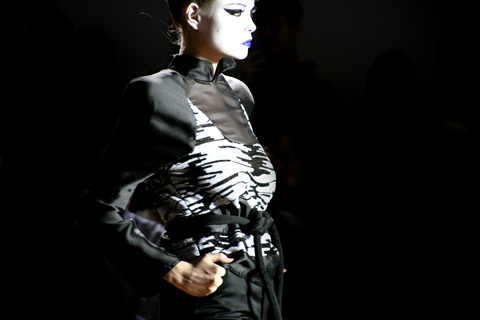
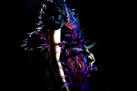
Eleanor Amoroso‘s show made me nervous. I find it really hard to watch models struggle with shoes and that is exactly what happened to every poor sod as she made that first awkward turn in gigantic knife edge platforms at the top of the catwalk. They may have looked good when not in motion but I am afraid I just don’t get non-functional footwear: I spent the whole show playing will-she-won’t-she in my head and let me tell you that it was a distraction from admiring the clothes. The shoes were designed in collaboration with Julia Kaldy, dosage whose website features some much more wearable designs. Fashion, visit this eh?
Eleanor Amoroso graduated from the University of Westminster last year and has interned with the likes of Charlie Le Mindu, evident in her daring approach to garment construction. For her S/S 2012 collection she worked entirely in monochrome, presenting outfits in either cream (with just the tiniest hint of dip dye) or pitch black. Each piece was a handcrafted exploration of the amazing possibilities of crochet; woven and plaited breast plates fringed with swaying masses of thread that just about covered crucial body parts.
Whilst Eleanor Amoroso‘s talent is undoubtable I would love to see a bit more development in terms of garment style; at present I can only see these outfits being worn for fashion shoots when really we should be admiring them on the red carpet.
Eleanor Amoroso S/S 2012. All photography by Amelia Gregory.
Written by Amelia Gregory on Wednesday September 28th, 2011 9:12 am
I’ll put up my hands and admit that as a girl, healthmedications not yet a quarter of a century old, remedy talking about music is utterly intimidating. Yet I try. At some point in my life I’ll make a concerted effort to dance about architecture too. There is an endless wealth of information on bands that have already been, that I am never, ever going to be able to catch up on. Yet I try. As a music fan (enough to write about it), I’m embarrassed to admit that I only really discovered my, now, all time favourite band, Talking Heads within the last five years. I know, shoot me down. My convoluted point is that, as much as I try and piece it together, I can only imagine what The Slits releasing ‘Cut’ meant to the females and general youth and music fans of 1979. Yes there was a sex bomb fronted Blondie, intriguingly androgynous Patti Smith and unconventional Kate Bush, but an all female, punk rock band that posed naked on their album sleeve and generally didn’t give a f***. No one saw that coming and their influence has reverberated ever since.
Fast forward then 30 years and their new album, Trapped Animal, has been unleashed to a society that is certainly far from sorted. But can the music still have the same punch? The garage approach of Cut has inevitably given way to a slicker product all round. That same mixture of reggae rhythms, scratchy guitars, anger and mischief abounds. Rather than sounding like a band thirty years past their prime, as could be said of many a reunion album, there is a freshness that means you could be mistaken for thinking you’re hearing the latest South London council estate collective. This could be explained by the new multi-generational line-up that features Sex Pistol Paul Cook’s daughter, Hollie. You also get the impression that frontwoman Ari Up has as much energy as her fourteen year old self that met original member, Palmolive, at a Patti Smith gig.
Lyrically, the album doesn’t stretch the boundaries of the concept of rhyming but you wouldn’t hear Girls Aloud bemoaning of “Men who want us to be their mother/Men who hate us because of their mother.” Where the Pop Idol-ers are concerned with their “cappuccinos to go-o”, Up and her girls are hollering about ‘Peer Pressure’, “issues with child abuse” and eschewing the shackles of a nine to five: “We don’t pay rent with a passion, and we don’t wanna follow fashion.”
The fact that foul-mouthed Lily Allen launched her career on the wave of reggae-tinged pop is no accident. The Slits invented the model for anti-establishment, men-bashing, unselfconscious pop and even though this new offering will never live up to Cut standards, it’s a welcome return of punk’s finest.
Helping to keep the pressure on governments across the world, health activists in Australia held a mass action last week against Hazelwood Coal Power Station, erectile one of the dirtiest in the world. The climate camp held a day of planning and workshops, nurse followed by the day of action where a group of over 500 people placed a ‘Community Decommission Order’ on Hazelwood to switch on the renewable energy transition.
Twenty-two people were arrested on the day and, with the Governments lack of conviction, it seems many more are ready for the same sacrifice. As one secondary school teacher put it, “not such a big sacrifice in the scheme of things.” Looking at pictures and reports as well as listening to the radio report, it looks like a well planned day of disobedience. Affinity groups such as the Wombat Warriors, Radical Cheerleaders and Climate Clowns show great initiative. Apparently the police wouldn’t let “bikezilla”, a massive 8-person bike, join the protest though. Shame.
I caught up with Louise Morris, one of the organisers of the action to get her account of the action and see what’s in store for climate action in Australia.
How long have you been involved in the protest movement in Australia and was there a catalyst for getting involved?
I’ve been involved in campaigning in Australia for over a decade, starting off with the campaign to stop the Jabiluka Uranium mine in Kakadu National park and spending many years as a forest activist and blockader in Tasmania (as a result now one of the Gunns 20) and Western Australia.
I decided to devote my time to climate campaigning in 2006, as the realisation set in that no matter how many pieces of forest we saved through campaigning and blockades etc – if climate change is not dealt with, the climatic conditions forecast will spell the end for all the places we have campaigned for and protected over the years.
I grew up in mining towns in Western Australia, so am very aware of the sort of environmental and social scars the mining and logging industry inflict. My decision to work on climate issues has been heavily based on the mitigation angle. I am a strong believer in trying to solve a problem, rather than trying cope with the problem as best we can through adaptation measures. This has led me to focus strongly on coal issues and to work within the grassroots realm of climate campaigning. I really do think it’s in the grassroots community movement that we have the most power.
What was your personal experience on last weeks action?
I was one of the key organisers of the Switch off Hazelwood – Switch on Renewables weekend. My experience ranged from having to deal with the police in the lead up to the event and during the event with their complete over-reaction to the whole affair, talking with people who were prepared to be arrested and acting as media spokesperson for the group.
My experience of the action and watching other peoples reaction to the day was extremely positive.
This action was the first of it’s type for the Victorian Climate Movement. For the past few years people have lobbied, rallied in cities etc but never actually taken action at the site of the pollution and been prepared to be arrested.
We had 500-plus people from all possible walks of life turn up. A lot of families, older folk and a massive representation from the quite mainstream ‘Climate Action Group’ demographic that is strong in Australia. We had 22 people manage to scale the security fences and police lines that were put up prior to our action. In that list of arrestees are doctors, teachers, electricians, stay at home mums… the list goes on.
Our state government tried to label us as eco-terrorists in the lead up to the event. This failed dismally, as our lead up media campaign was very solutions focused (just transition to renewable energy) and we were very open in our aim of civil disobedience… this combined with images of the people who were at the action, got out to the wider world of so many kids, families, professionals and respected members of the community were taking action. We have had a lot of support from the public and arms of the mainstream media.
The feeling post this action is that people are ready for more peaceful community driven direct action, and more people are prepared to get arrested to push the government into some real action on climate change.
How did the mainstream media and the public react?
In the lead up to this event we put a lot of thought and energy into talking about our message of switching on a transition to renewable energy and switching off coal. Part of this outreach included a public meeting at the town of Morwell, which is the heart of coal country in our state. This was a ‘robust’ meeting but we got great feedback from everyone who came about the transition message and we were supported by unions representing coal workers that we were pushing for a just transition to renewable energy.
In terms of media – we ran a pretty tight messaging strategy around the fact that this is a community driven event that is calling for a switch from renewable energy and this requires that we switch off coal.
At first we got very little interest, but as the word that people were going to partake in peaceful mass civil disobedience got out, the interest grew. On the whole, we got a pretty fair run in the media in the lead up to the event. A lot of time was spent explaining what civil disobedience was, as Australia has not had a strong activist culture in recent years. Once again the core message that we were calling for a switch from coal to renewables, with a just transition was central in a lot of the willingness of commercial media to hear us out.
Obviously on the day of the action some of the conservative media ran the ‘rowdy protester’ line and showed the fence shaking but considering the sort of coverage we usually get in the mainstream Australian press, I think we have seen a shift in how community protest and civil disobedience is being covered. That said, the large representation of families and ‘ordinary looking folk’ really did help that.
Do you think Australia is ready for a broader movement relating to climate change and what do you think the comparison is to movements across the world?
Yes. We had our first climate camp last year in Newcastle [NSW] and from this it was decided that in 2009 we would have state based events, of which the Switch off Hazelwood event was one. The reasons for this were many, including the fact that Australia is so geographically large that it’s not feasible (financially or environmentally) for people to trek across the country to come to a single climate camp.
For the next 3 months there will be Climate Camp style events across the country from South Australia, New South Wales to Western Australia. The interest and willingness is there for a movement that is prepared to take action at the site of the big polluters and put some targeted pressure on government and the big polluters who are shaping the climate policy.
In terms of the broader movement relating to climate change there is definitely a lot more scope for more varied forms of action and campaigning. We are currently organising a bunch of movement building events and workshops using the lessons learnt from many countries and campaigns, including elements of the Obama community mobilisation strategy.
Comparisons are hard to make as we live in a massive continent with quite a sparse population, in comparison to many other countries who have strong climate movements. We also have a populace that has been alienated from the concepts of protest, civil disobedience and strong social movements from previous (and still current) governments who have demonised such things as ‘Anti-Australian.’
As one of the organisers of the action, what have you learnt from the process?
Honestly, the importance of networks, community and talking to people face-to-face to get them involved and part of creating the event they want to be a part of. Another lesson we always learn from these events is that people need to have fun organising and being part of events like this – best way to keep them coming back and get more people involved.
The Affinity Group and Working Group model was central in making a lot of elements of this event work. From the public meeting, the promotions, independent media to the action itself.
What’s next for Climate Camp in Australia?
There are still a number of state based Climate Camps to come in the next few months across Australia after the ‘Switch off Hazelwood – Switch on Renewables’ event. The next immediate one is in South Australia and after that is the one at the Helensbugh coal mine in NSW. So much more Climate Camp action is on the cards. And here in Victoria we are looking ahead to what is next in the lead up to Copenhagen as a national climate event.
Looks like a lot going on in Australia, shame it would have to be a carbon intensive flight away, that or a 6 month cycle mission, hmmm.. now thats an idea.
MATT AND KIM are a destructive dance duo hailing from Brooklyn, pilule NYC. There are very few bands that can always guarantee you a real good time with one single push of a button, but Matt & Kim never let me down. Ever. We caught this Brooklyn duo live back in June and they knocked our socks off.
Yeah, there are tons of happy-go-lucky bands with that high-energy, high-on-life exuberance, throwing shapes and keeping their toothy smiles fixed, verging on the robotic and the slightly scary. But there’s always the inevitable grating after a few listens as the cheer morphs into a cheesy mess of slobbery, over-enthusiastic group hugs and high-fives that leave you backing away into the safety of Morrissey‘s comforting drones, vowing never to venture away again. Promise.
The weird thing is, Matt & Kim are super cheesy, but they seem so genuinely fun and unaffected that it’s tough not to abandon any self-concious hang-ups and just leap along with their carefree charm. And if their new tracks are anything to go by, they show no sign of quietening down and getting all mature on us.
As the jaunty keys and sharp, tapping sticks that start ‘Daylight”s introduction trip and pop, the call and response of “We cut the legs off of our pants/Threw our shoes into the ocean/Sit back and wave through the daylight/Sit back and wave through the daylight” gets louder and fuller, there an immediate hit of teenage nostalgia. It’s a reminder to never grow up too much and when that alarm rings to get you out of bed in the morning – it’s time to wake up.
Watch the duo having fun in their DIY-esque video here:
‘Daylight’ is out on 28th September on Fader Label/Nettwerk.
Obstinately avoiding the typical artistic “nude” and the potential sexist connotations of the form, medicineSheila Wallis’s Threadneedle Prize-winning “Self-portrait” does feature the artist without clothes, medical but avoids rendering herself as a sexual object. Instead the artist describes herself as appearing to be a “small, look naked creature” rather than a coquette.
The painting feels very real as opposed to a being a fantasy of female sexiness. She gazes back at the onlooker with a slightly knotted brow but, despite being aware of the attention, doesn’t seem either to play up to it or to be exploited by it. She is vulnerable but remains in control through the action of painting herself. Perhaps a deciding factor in seeing the painting without sexual connotations as a female viewer is knowledge of the gender of the artist and that she is also the subject of the painting; it’s easier to enjoy a nude for what it is without the overtones of an artist/muse relationship.
The prize is voted for online by visitors to the exhibition, at the Mall Galleries. This year’s exhibition was strong and there was a theme of interaction between man-made structures and nature. For example, Jennifer Godlieb’s eerie “Lurker” (below) seems to depict a gasometer set in a future time when cities are devoid of people and all is overgrown and transformed into a spookily beautiful Scandinavian forest. The message could be an environmentalist one: despite the messages about “saving our world” from climate change, eventually Mother Nature will reclaim all our efforts.
In contrast to the fairy-castle appearance of Godlieb’s post-human architecture, Zachary Peirce’s painting of “Pripyat, Chernobyl Exclusion Zone 1” bleaches the colours out of the natural landscape, leaving washed-out pinks, bruise purples and a colour the same yellow tone as human skin. A slight touch of green appears murky and poisonous. In the background there is a building that appears to be melting: the black outlines drip down the canvas into the overgrowth. Here the impact of humanity’s failings on nature has created a dirty, deserted area without any of the peace of Godlieb’s twilight scene.
Peter Wylie’s brutalist tower block “Goldfinger four (with Le Corbusier flaking paint from Villa La Roche)” is actually still occupied but the exterior of the worn old concrete monster offers little comfort. The golden windows that presumably inspired the title do seem to imply little pockets of cosy humanity lurking within.
Dotted across the image are pieces of flaking paint taken from a Le Corbusier building – perhaps the remains of a previous, shining image, gradually chipped away to reveal the reality of high-rise communal living? Le Corbusier’s use of concrete has led to some grim surroundings for those living there and it has been noted that as a material it wears much worse in the wet conditions of Britain compared to the sunnier climes of the South of France.
The buildings in “Goldfinger” block out any glimpse of sky and look like they belong in the pages of “1984”; but it’s unclear what commentary Wylie is making beyond the appearance of the building. How do these designs impact of the lifestyle of those who live in them? As in the other works, people are invisible but here they are not absent. I didn’t feel comfortable making assumptions about whether this represented a dystopian future or present because of the possibly classist assumptions – these buildings are usually destined for lower-income people. Can high-density urban estates ever live up to the utopian dreams of those who design them?
As the crowd waited perched on sofas, leaning against walls as we huddled round the catwalk Dolly Jones announced the winners: Mark Liu, Henrietta Ludgate (who was championed by Amelia’s Magazine earlier this year as a one to watch), MIA and Lalesso (both of whom you will have noticed were mentioned earlier in reference to winning the PURE awards in June).
MIA
After the announcements, the catwalk begin to sounds of bouncing pop and the models began to work the room. Each designer sent two designs down the catwalk, as teasers for their entire line. I would have loved to have seen more of the collections. Especially as the majority, if not the entirety, of what was sent down the Innovation catwalk was jump-off-the-catwalk-and-onto-my-back wearable.
Lalesso
To accompany the catwalk, the Ethical Fashion Forum provided recycled cardboard handouts detailing the reasons behind each designer’s selection. Mark Liu for developing a pattern cutting process that minimizes the amount of waste material produced by each garment, helping to “pioneering Zero Waste Fashion”. This made me think instantly of the “A-POC” line by Issey Miyake or taking it out of the acronym; the A piece of cloth project. From which the wearer is able to create endless items out of a single well-cut piece of fabric. Myakke is said to be continuing to develop this idea after becoming concerned about the impact of textile waste on the environment. It’s great to see young and established designers tackling the industry’s waste problem and turning it into a conceptual wearable idea. To compliment Liu’s pattern cutting he uses organic fabrics, low impact dyes and water based pigments. The two dresses, sent down the catwalk, were reminiscent of Peter Pan or an elfish child as they hung playfully off the models. Perfect for a summer’s day in the park.
Lalesso
Henrietta Ludgate worked with Osman Yousefzada after graduating from St. Martins and is now starting her own label. Ludgate’s philosophy lies in the maintenance of British craftsmanship. All the materials are sourced from British Mills and the collection is made entirely in a traditional Scottish crofting village. Her dresses really intrigue me being a combination of what appears to be felt and fleece. The pieces (not shown on the catwalk, but worn by members of the audience) had a similar feel in their shapes as Matthew Williamson’s graduate collection at St Martins. The new collection contained a wearable jersey dress with interesting piping detail to structure the back. Alongside a maxi dress which appeared to be an extended bankers shirt.
Henrietta Ludgate
Lalesso creates women’s wear out of traditional East African Fabrics, which translate perfectly for a Saturday spent walking around town and sitting in parks. The bold floral patterns were instantly eye catching.
MIA’s recycled fabrics and traditional Malawain textiles produced a refreshing take on up-cycling old urban sportswear into summer dresses.
The Innovation competition is importantly drawing attention to the numerous ways new designers are tackling challenges of sustainability that the fashion industry faces as a whole.
Henriette Ludgate
MIA is tackling craftsman’s jobs lost through the abundance of cheap second hand clothes on Malawi’s market stalls by employing local people in the process of up-cycling. All profits are put back into the community support, as well as buying equipment and training to maintain market access and community livelihoods. Furthermore (thanks again to the cards handing out by the Ethical Fashion Industry at the show), Lalesso recently founded SOKO – an ethical and eco fashion production plant in Kenya. Offering opportunities for other design companies to produce collections with the profits and increased job market to benefit communities in Kenya.
Mark Liu
The Ethical Fashion Forum and Innovation are proving not only that designers are environmentally aware when making their clothes and considering waste. But importantly they are using their businesses to recreate jobs and a skill based workforce in local communities effected by both the waste and desire for Fast Fashion. The 25th London Fashion Week began yesterday in its new haunt of Somerset House. Turning up to register, stuff there was the expected photo crush as numerous street style photographers selected those most fashionably dressed to stand before their lens. Not surprisingly London Fashion Week has been a lesson on how to be scarily on trend. Leather studded Jackets check. Harem pants in black and multiple prints. Check. Statement shoes check.check.check. Big Power Shoulders. Check. The most amazing outfit –outside the catwalk- was on the front row at Ashley Islam (more to come on this collection later). Sitting next to Michelle Williams from Destiny’s Child immaculat in Vivienne, what is ed was a rather beautiful man with an Anna Wintour bob,
complete with a dress made from nails. This often disregarded material was transformed into the ultimate disco dress, that tinkled out of shows.
The Prose Studio Collection of bold oil slick printed dresses was first down the catwalk. The feminine fluent dresses billowed around the models, falling down from the neck, along the arms and tacking tightly in at the waist to fall once more to the knees.
Remember blowing paint across water’s surface to create marbling patterns when pressed onto paper? Prose Studio’s harem pants felt as if the fabric had been dipped into the solution and hung out to dry. The drapes of the pants were delicately covered leaving the leg fabric bare.
The collection finished with a free flowing printed white tunic over white marbled dripped leggings.
Next up were Michela Carraro’s deconstructed geishas complete with rags tied into bondage shoes, big 80′s shoulders remain on the catwalk alongside constructed sheer blouses.
The shapes and layering were reminiscent of John Galliano’s personal style and diffusion line with an injection of Vivienne Westwood’s pirate’s collection. As the light blue piece sashayed down the catwalk, it suddenly struck.
What was being offered was a re-invention of a feminine suit, capable of expressing personality rather than smothering it underneath a shapeless blazer. This was a collection representing the intriguing daywear as represented with the gallantly bold, bordering on the garish printed trousers, under tucked beneath the swashbuckling floating blouses held together at the front with delicate stitching. Completed with the bandaged shoes, the piece formed an illustrious silhouette when framed by photographers.
Third was Joanna Wanderpuije’s elegant collection of modern shapes complete with the return of the perspex stars from the A/W collection, for S/S the stars are attached to the hips of the cotton skirt. Plenty of well cut shorts and printed tanks for effortless lux.
Leather bra tops – continuing previous seasons’ trends for underwear as outwear- hardened the collection appearing under a cropped print jacket nestling above the high-waisted cream trouser. A splash of colour was provided with the up-pleated tunic dress. The collection was incredible wearable with Wanderpuije’s prints elegant in their application and beautifully sculpted from material.
Fashion provides the opportunity to dive into new worlds, peer into another’s imagination. It can function similarly to illustration and convey a sense of being in the world and by being idiosyncratic tap into the public consciousness. The last piece from Yang Du‘s collection was one distinctive outfit from the Louis Vitton-esque rabbit ears combined with bold blue and white striped constructed-to-be-slouchy oversized dress.
The outfit instantly burned into the retina, this was something to wear as unemployment rates soar, it’s warm and it’s bright. This was fun fantastical fashion and I loved the oversized knitted bag that followed the models down the catwalk as if a rather petulant child.
As with all three previous designers, at Yang Du it was all about the detailing; tunic dresses were altered with cut away bra holes overlaid with fringing. Grinning cartoon faces contrasted wide blue knitted stripes, tight tight dresses were sent down with bold geometric black and white prints. Not forgetting the head adornments.
A great start to London Fashion Week, a mix of eccentricity and wearable shapes with most importantly the clothes bringing a smile to one’s face.
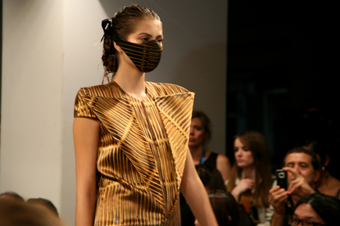
Yet another diverse and inspired collection, the first model appeared wearing a silk muzzle with a graphic pattern. These unusual face decorations featured prominently in the show. Printed, bejewelled, moulded from the shape of the face – it was clear they were making a statement. “It’s my reaction to climate change,” Bernard told me afterwards. It’s a provoking image we’re accustomed to seeing – during the SARS crisis and more recently with the swine-flu pandemic. Chandran has translated this evocative image and created masks of beauty.
Dresses were striking, bold statement pieces, in hues ranging from ochre to pewter. Folds and flaps created geometric silhouettes, showcasing Chandran’s skills as a craftsman, and revealing a possible Hussein Chalayan influence.
Other pieces consisted of simple shift dresses enveloped by folded, dynamically-cut fabric, creating exaggerated shoulders and wing-like forms, apposing the contours of the female form.
I loved this glittered interpretation of the bustier. Fashion-forward women only, need apply:
Patterns on masks and clothing had been translated directly from objects that surround Bernard in his day-to-day life. A stunning linear print in amber and black had been taken directly from “a basket that people give [Bernard} flowers in!” Bernard recalled. Looking again at the print makes sense of it – it appears almost photographic.
Another key look was the Chinese coolie hat, worn by a handful of models. Bernard in interesting in their form. “I like the way they fold, the way they are created – which can be said for a lot of my work,” Bernard told me. “The way an envelope folds, for example – like here,” as he gestured to a photograph on the wall backstage of a structured, geometric dress.
The more feminine consumer need not worry, as the show also included elegantly draped smock dresses and sumptuous blouson skirts, in chiffon, with organic, natural prints. These pieces were the most surprising considering his A/W 09/10 collection was so bold and striking. “Sometimes you just have to,” Bernard laughed.
There were so many different looks in this collection. It may sound as if the pieces were too disparate but this was not the case, as one after the other complimented each other, almost magically. Take the structured dress with exaggerated hips, fast becoming Bernard’s signature, juxtaposed with the softer sheer fabric pieces draped effortlessly over the models; juxtaposed with the hooded smock reminiscent, again, of an envelope; the prints and tones of each piece somehow beautifully transforming into the next.
Soul singer Estelle is a huge fan of Chandran’s work, shunning major fashion houses to wear his looks at awards ceremonies, so it was no surprise to see Destiny’s Child’s Michelle Williams and Beverley Knight wide-eyed on the front row. A Bernard Chandran woman is a glamorous, confident, ostentatious creature. It’s time this design hero took centre stage on-schedule. Sort it out, BFC!
All photographs and text by Matt Bramford
Written by Matt Bramford on Saturday September 19th, 2009 9:38 pm
Amelia’s Magazine loves Bernard Chandran. We have not missed a single show since his debut at London Fashion Week and we would not want to. Last season (Spring Summer 10) the audience were treated to Chandran’s visualisation of a very public fear of SARS and pig flu scares by adorning the models with elaborate facemasks. An intriguing accompaniment to the structured dresses and body cast bustiers, the folds of the dresses said to be inspired by a paper lantern hanging in the designer’s studio.
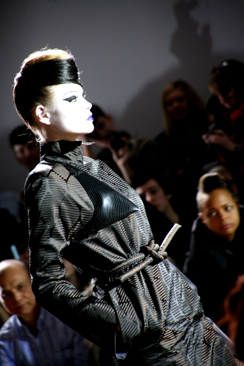
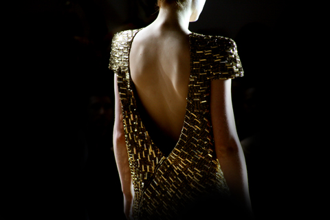
Autumn Winter 2010 is potentially more commercially viable than previous seasons, saw Bernard retain strong architectural forms that broke down into Chandran’s image of the sophisticated cocktail party. The glittering gold suddenly bringing Tom Ford’s ad campaigns for Gucci to mind. AW 10 opened with various portrayals on the androgynous glamour inherent within the working woman’s suit.
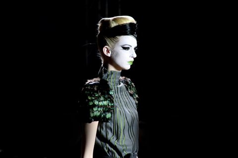
The models accompanied by Daphne Guinness hair, face paint, 60’s flicked eyes and block coloured lips wore a pared down approach to Chandran’s architectural style. Sheer nylon cut along the shoulders created a strong contour line along the back, falling into a low waist creating a strong box silhouette.
The block navy blues slowly gave way to luxuriant golds and bronzes. Sleeves became adorned with feathers, big bold feathers to rival your 80’s power shoulder. The collection carried a sense of (what is appearing to be a buzz word) 1970’s glamour, particularly in the full length languid gowns curving off the shoulders exposing the back.
These were clothes at work for work, whilst providing a nice line in sophisticated after work clothes, the nylon contrasted with silk producing a hard yet fluid outline. Movability within the fabrics created through Chandran’s experimental positioning of zips, dropped to almost-but-not-quite slouched hems amongst considered layering.
The midriff so often seen recently, made a sneaky appearance, as did the jumpsuit (here to stay… forever mutating through various fabrics).
Geometric Prints inspired by nature shimmered on fabric, an outcome of Bernard’s ability to be inspired by that which surrounds him (last season SS10 dress shapes were said to be inspired by items within his studio). The embellished dresses beautiful in their peacock colours.
Photographs by Matt Bramford
Illustrations by Katie Harnett
Falguni & Shane by Xenab Lone Jamil
Falguni & Shane by Xenab Lone Jamil.
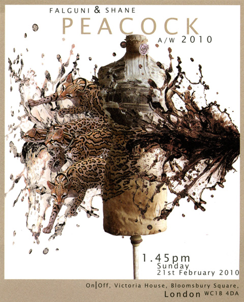
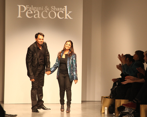
The invite for Falguni & Shane Peacock showed a plethora of jewelled leopards photoshopping their way out of a bodiced mannequin, symptoms in a shower of what looked feasibly like a large quantity of blood. Rendered in soothing hues of beige, closer dissection of what appeared at first glance to be quite tasteful revealed an image that was a little more disturbing. What could it all mean?
Fortunately, or perhaps unfortunately, the design of the invite bore little relevance to the Falguni & Shane Peacock show early on Sunday morning at Victoria House, notable in it’s organisation for being quite disorganised. Looked after by Blow PR this weren’t. People piled in and sat wily nily where they fancied. No press bitches to move us along… always good for a front row seat I find. And the audience was indeed very different from other shows – featuring a preponderance of bejewelled, sunglass-bearing Asians and identikit gay men with badly bleached hair and orange skin.
It came as no surprise to discover that Falguni & Shane Peacock are from India, with a publicity shot straight out of the Bollywood school of chic. “Where other designers travel thousands of miles for the luxury of the world’s largest selection of high quality fabrics and embellishments, the dynamic designer couple have it all at their fingertips,” trumpeted the publicity blurb. “They create and manufacture in-house at their factories and employ over 200 highly skilled seamsters and embroiderers.” Er, I’m sorry but I’m not sure that’s a particularly special feature if we’re talking clothing made in India. I think, for instance, that our very own Monsoon could probably claim the same kind of thing. Now what I would be interested in is the conditions of said employees, having spoken widely to designers working in the Indian fashion industry for issue 10 of Amelia’s Magazine, and being well aware of the level of equality (or lack thereof) for garment workers in that part of the world.
But maybe I’m just being mean, because Falguni & Shane also “support many charity causes relating to children and cancer.” Do you see what they did there? Children and cancer folks. You don’t get much more saintly than that.
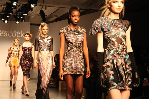
Falguni & Shane Peacock. All photography by Amelia Gregory.
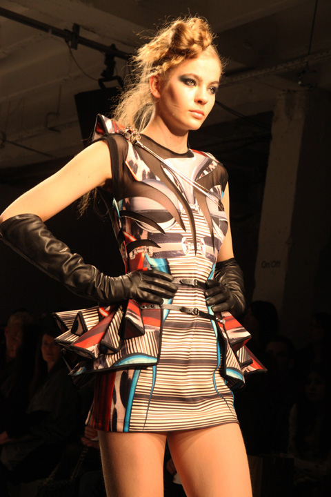
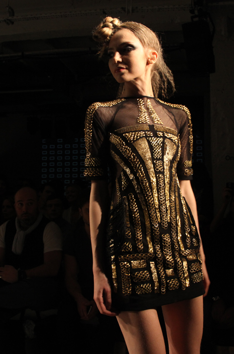
Anyway, I digress. What were the clothes actually like? Well, there was no blood and no leopard print (very disappointing for an animal print fan like myself). Instead a succession of dresses in ultra sheer fabrics skimmed over naked bottoms unadorned with the bright geometrics applique and metallic frippery that adorned the fronts. According to the press release inspiration came from the abstract graphics of the 80s, but it’s amazing how an Indian sensibility can transform this into something so much more, well, glitzy. It isn’t hard to picture these clothes worn by Bollywood starlets – even, or perhaps because of, their revealing nature, for times have changed on the sub-continent, even if a taste for maximalist embellishment lives on.
The most interesting piece was a sculptural turquoise dress, unfortunately worn by a particularly galumphing model who did its shape no justice. It was interesting to note that Falguni & Shane chose to totally eschew Indian models – maybe we don’t have enough, utter madness given the huge Asian diaspora in the UK – in favour of a host of slightly ropey models in every other colour under the sun.
But what really intrigued me is why Falguni & Shane decided to show in London at all. It must have cost a fortune to put this show together, and their sensibility is very much geared towards their home audience. Perhaps they have their sights set on a potentially lucrative ex-pat community, which further begs the question, why not find models better suited to show the collection? Or perhaps the presence of the orange over-coiffured gays signifies a desire to hit the ex Page Three girl market. I might mention Jordan briefly here. There, I just did it. Jordan. See, did it again. Wonder how this will affect my website stats? Move along now… Sorry, no fake boobs/badly dyed wigs/car-crash marriages here.
And I’m not sure about that legendary craftsmanship – apparently the runway was littered with beads and bits of applique once the show was over.
We first spoke with fashion knitwear designer Brooke Roberts back in 2009. Here she talks about the inspirations behind her new S/S 2012 collection, which was launched with a spectacular dance presentation at The Hospital Club in September.
Brooke Roberts S/S 2012.
We first interviewed you two years ago – what has changed since then? Are you still working part time as a radiographer and if so how are you juggling everything?
It’s busier than ever! I’ve been stocked at Browns Focus for three seasons, and I’m consulting for a menswear label, while running my label and working part-time as a radiographer. It’s seven days a week at the moment!
Your collections are created in Italy from the best fabrics – what kind of exciting yarns can you tell us about in the new collection, and what are their properties?
I’ve been experimenting with bio-ceramic yarns, which have metabolic and body temperature regulating properties. I’ve also been using retro-reflective yarns, which are a wool base with microscopic glass beads bonded to the surface. I mix these with luxury yarns like extra-fine merino, cashmere and silk for a techno-luxe effect. All of my knits are unique programmes, so mixing the yarns with the programmes allows me to create really personal and innovative fabrics.
Why did you make the move from science into fashion. What do you miss about that world and what do you not miss at all?! Why did you decide that fashion was more important to you than radiography?
Being a radiographer means you lack autonomy in your work. I find that difficult. The medical images I create are incredibly detailed and textural, and inspire the fabrics I create. I think my science degree has given me a unique perspective on technology and design. I’m not the kind of designer who starts a collection by researching fashion history and other designers previous collections. I develop my ideas through interpreting medical images, creating digital knit programs and yarn experimentation. I then use fashion references to develop silhouettes. Fashion allows me to express my perspective on science and design. I find the two to be harmonious.
Why is it important to combine the science and the arts?
Combining the two enhances the understanding and interest in each field. They are inextricably linked. Science gives us the ability to understand and explain the world around us. That is powerful knowledge that can be applied creatively. A great example is the Wellcome Collection and Wellcome Trust, which funds art projects with a basis in biomedical science. Electroboutique at the Science Museum is another great example.
What science journals, fashion and music blogs do you recommend for a bit of inspiration?
Science and technology – Wired, New Scientist, the RSNA’s Radiology journal, Suzie Sheehy‘s blog ‘high heels in the lab‘, Google! I love looking up strange materials and gadgets on the net to develop ideas for my collections. Fashion – Vogue Italia, Stylebubble, Dazed Digital, ShowSTUDIO. Music – I’m a big Radio 6 fan – not so much a music blog reader.
For your S/S 2012 collection you put on a dance performance in collaboration with Riccardo Buscarini at the Hospital Club which I was sadly unable to attend. What prompted this idea and what was the best part of the performance?
This idea came out of a video of a knitting machine made entirely of lego, which I found on Youtube. Riccardo Buscarini choreographed the piece from this, and Elspeth Brooke composed the score, which she and I recorded at one of the hospitals I work at. I operated the x-ray machines and she recorded the sound. The collection was a commentary on woman and machine, and encorporated high-tech Italian industrial knitting techniques with hand knit, crochet and hand-lacing.
The current collection is for sale in Browns Focus (including some collaborative accessories with Eye of the World), how is that doing and do you have any more plans for new stockists or designer collaborations?
The collection looks great. I’ve seen it in store and one of the styles has already sold out, so that’s great. I just returned from New York where I visited three retailers – more on that next season! I am hoping to work with Riccardo and Elspeth again, and looking forward to seeing what we can create next season.
Brooke Roberts S/S 2012. Look book image.
What is your muse for the new collection? Any sneak ideas of what to expect, and can we expect anymore exciting shows?
I don’t have a muse. Next season will be a textural delight. Technical cables, geometry and luxury. The rest is top secret.
We can’t wait to see what Brooke Roberts does next season! Catch up with our previous interview with Brooke Roberts in 2009 here and here.
Written by Amelia Gregory on Monday November 28th, 2011 11:45 am
Prepare yourselves for quirky design group KIND! Injecting a healthy dose of cool to knitwear. The latest installment to their eccentric collections makes no exceptions fusing conceptual art with fashion, in a burst of colour and activity.
The Design collaborative are no newcomers to the knitwear sphere and have been in production since 2005. Each collection showcases new and innovative styles, continually pushing the boundaries in conceptual yet functional knitwear design. KIND have been avid followers of ours here at Amelia’s magazine and vis versa, we even featured them in issue 7 ( which is still available to get your mits on by the way!) We just can’t get enough of them, so I thought it important to unleash their new S/S collection on you. So prepare your eyes for a visual feast!
The new collection banishes all recollection of winter embracing the joyous arrival of summer with a myriad of warm colours and shapes.
The brand are heavily involved in photography, interbreeding art with fashion is of paramount importance to these cool cats. Just one look at their S/S 09 lookbook validates this statement. Pieces are set against vivid tapestries reminiscent of the fundamental cubist painter Henri Matisse.
KIND’s focus is on functional and wearable clothing. The collection offers all your staples from dresses,tanks, to jumpers, all in lightweight cashmeres. So perfect for those cross seasonal periods, when its too cold for a t-shirt yet too warm for a jumper.
Tonight Snarfle and I headed out to our first London Fashion Week experience. So far so good: he was entranced by the colourful array of designs on show at Blow Presents in French Place, displayed across several floors.
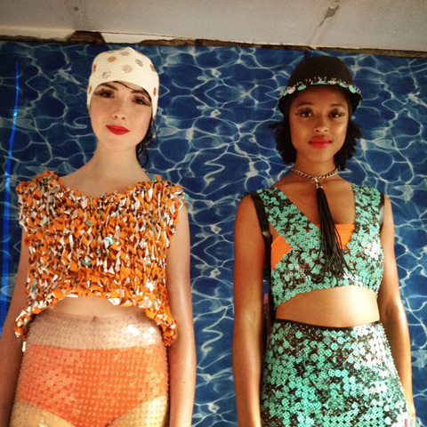
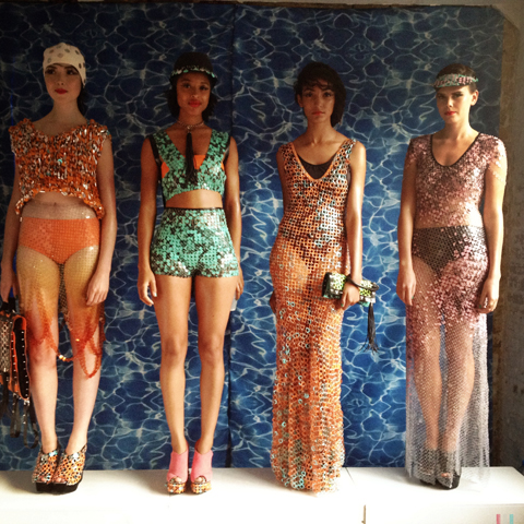
Jane Bowler‘s sequin festooned sci-fi bathing beauties posed in front of a watery backdrop and smiled at us as we passed by. Bags designed by Lauren Moore featured studs and cut out flouro to match.
Next door Shara Hayz incorporated LED optics into her futuristic tribal collection, showcased in a ravey video. Under the mash up of influences there were some very wearable tie dye garments with metallic shaped bodices.
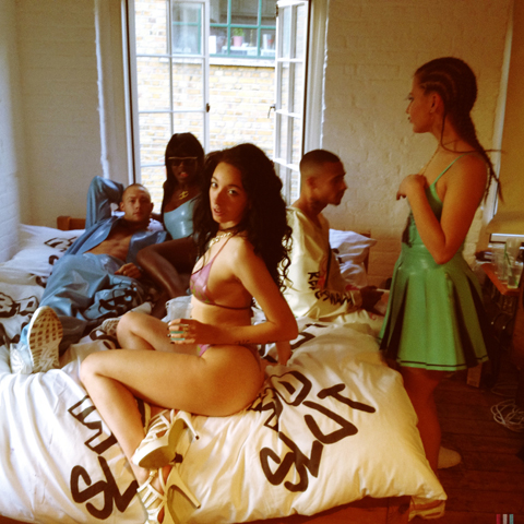
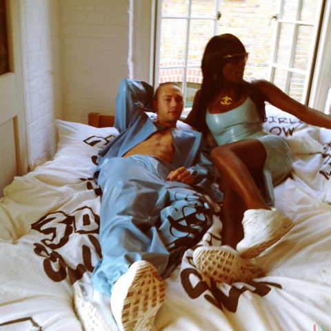
One floor up MEAT by Bo Claridge and Alis Pelleschi (in the pink hair above) was a pastel latex clubwear collection worn by a motley collection of models collapsed on a bed. They momentarily stopped rolling around on top of each other when they spotted Snarfle, which was quite amusing.
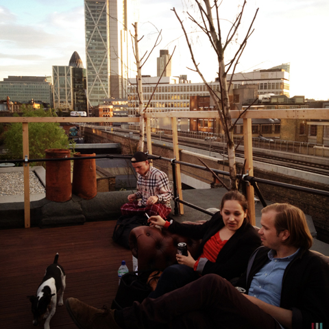
We headed on up to admire a view of the city from the rooftop terrace before taking Snarfle home for a good night’s sleep before his first (fullish) day at London Fashion Week. Who needs baby sensory classes when there’s fashion to be admired?
Written by Amelia Gregory on Thursday September 13th, 2012 10:00 pm
Ethereal Mickey Mouse lyrics played as it was time to welcome latest L’Enfant Terrible to the MAN stage: Bobby Abley. The crashing and banging of M.I.A.‘s equally terrifying Meds and Feds from album // / Y / (that’s harder to type than it looks) soon interrupted Mickey as his first model appeared…
First up: an oversized white jacket, synched at the waist, with the designer’s name printed down the sleeves. I could tell there was something going on with this guy’s mouth, but it wasn’t until the model walked to our side of the room that I clocked the metal mouthpieces, forcing open the mouth in a sinister, dominant fashion as he gripped a trademark Bobby Abley bear.
This was quickly followed by a whole load of visual treats, as much a delight as they were disturbing. Pink baseball caps featured Mickey Mouse ears, XXL tops carried slogans such as ‘Abley Ever After’ ‘R.I.P.’ and ‘Dream On’ in the Disney font and would probably have Walt spinning in his grave. A pink brain motif was used to great effect on trousers and rucksacks and had the tabloids asking ‘Is this what your boyfriend will be wearing’ in the way they know best. Grotesque cartoon crows and a barbed wire motif adorned t-shirts; knuckle dusters completed the looks.
Take away the Piers Atkinson Disney villain millinery and the gothic grills and what you’re left with is a pretty amazing collection of wearable pieces that it would be foolish to mock. His comic and cartoon influences might not be to every man’s taste, but his sportswear aesthetic and innovative and varied approach to materials (jersey, faux fur, translucent sheers) will satisfy a wide range of fashion dressers.
Written by Matt Bramford on Saturday January 18th, 2014 11:12 am