Amelia’s Magazine | Meet Katie Ponder: Featured Artist from That Which We Do Not Understand

Amelias_Magazine_TWWDNU_Katie_Ponder_Weather_Witches
Katie Ponder graduated from Falmouth University and was one of my favourite new illustrators discovered at New Designers this year. She was the winner of the 2014 AOI book category award and took part in the recent exhibition at Somerset House. The Weather Witches was inspired by the change of seasons, and the design of tarot cards. In this image the tempestarii (who control the weather) exchange summer for winter, as the leaves fall and the starry nights draw in.

Katie_Ponder-Rite-of-Spring---growth
Rite of Spring, Growth.

Your illustration was inspired by ideas you first discovered in childhood… can you remember how you came across them and what effect they had on you then?
Whilst considering the theme of That Which We Do Not Understand, the seasons changed from summer to a very sudden winter. Dramatic changes in the weather always bring to mind a song I learnt at primary school about a weather witch, when she was happy she would make the sun shine, but when she was angry there would be thunder and lightening. There is a lot of folklore about witches some times referred to as tempestarii, who control the weather. Inspired by this, I imagined the seasons personified by two witches, who are sisters. The changing of the seasons happens when one sister passes her reign onto the other sister, so that she may rule for her share of time. My image is about autumn, when the sisters exchange places and the weather changes from summer to winter, the leaves fall off the trees and dark starry nights draw in. I am interested in how changes in seasons and the lunar cycle impact the world and also our physical and mental wellbeing.

Katie_Ponder-Titantia-and-Bottom
Titania & Bottom

What in particular appeals to you about Tarot?
I read my own tarot cards on a regular basis, and collect different packs. I find it intriguing me how a picture can reflect some kind of personal truth, and can inspire different ways of thinking about a situation. I also love the symbolism within tarot cards; in particular I love the Rider Waite deck, which has very bold graphic colors, and mysterious symbolic landscapes and scenarios.

Katie_Ponder-Reflection
Reflection.

How did you put together The Weather Witches?
To create my image The Weather Witches, I started of collaging using old papers, self made textures and found images. I then scanned the collage into Photoshop and played around with the composition until I felt there was an aesthetic balance. I added new textures and tweaked the colors and contrasts to create the final image.

Katie_Ponder-Rite-of-Spring---Arrival
Rite of Spring, Arrival.

What was the most challenging part of the process and what was the most satisfying?
I found it a very enjoyable project to work in response to ‘that which we do not understand’ as mysticism and the occult fascinate me and have inspired a lot of my work. Composition is really important to me, and I really like an image to feel balanced. The idea of portraying two sister witches allowed for me to make a fairly symmetrical image, which I find very satisfying to work with.

Katie_Ponder-Pisces
Pisces.

Falmouth University consistently turns out top illustrators, why do you think that is?
The illustration course at Falmouth is well known, the tutors are available to talk to all the time and they are absolutely amazing, and very inspiring, I miss them so much! All the people I studied alongside were very ambitious and had lots of drive, which created a very motivating atmosphere in the studio. I also think what makes Falmouth a really good course is how they prepare you for industry. As part of the course we had to arrange meetings with leading professionals in the industry to have our portfolios reviewed. Knowing that the best art directors and agencies are going to look through your portfolio pushes you to work at the highest standard you can. Also attending these meetings teaches you how to handle and be confident in intimidating professional scenarios.

Katie_Ponder-Words-have-wings
Words have wings.

You only recently graduated this summer, what has happened since then?
I was very lucky to be awarded the new talent award for books by the Association of Illustrators as I finished university. Over October my work was exhibited at Somerset House in London, which was a wonderful experience, and now my work is on a touring exhibition at different venues around the UK. Since graduating, I have moved back to central London where I am originally from and I have been really enjoying being back in the city, seeing lots of art and ballet. I have set up a small studio to work from, and I have been working on commissions as well as meeting people to talk about projects to work on in the future.

Katie Ponder Women Who Run With The Wolves
Women Who Run With The Wolves.

What are you currently working on?
I am working on a couple of ideas in between commissions. The project closest to my heart is some work that has been inspired by ballet and classical music, and is the catalyst behind a book I am developing at the moment.

Kaite_Ponder_Heart of Darkness by Joseph Conrad
Heart of Darkness by Joseph Conrad.

What are you most looking forward to in the coming year?
In December I am taking part in a stop motion animation course, which I am very excited about. I did a project in 3D whilst I was at university and I am eager to see how that might translate into stop motion animation. I am also pursuing my other long-standing passion next year and training to be a yoga teacher, which I plan to have as a companion job alongside being an illustrator. There is also some travelling I really want to do that I am currently working towards and dreaming about.

Visit Katie Ponder‘s website here and pledge for a limited edition gold leaf fine art print of the The Weather Witches on my Kickstarter campaign page here.

Categories ,#TWWDNU, ,Association of Illustrators, ,Falmouth College of Art, ,Falmouth University, ,illustration, ,illustrator, ,interview, ,Katie Ponder, ,New Designers, ,Rider Waite, ,Somerset House, ,Tarot, ,tempestarii, ,That Which We Do Not Understand, ,The Weather Witches, ,Weather Witch

Similar Posts:


Amelia’s Magazine | New Designers 2011 Part One: Ceramics and Glass Graduate Show Review

New Designers review 2011-Tim Rawlinson
Glassware by Tim Rawlinson.

Ceramics and Glass took up most of the upper balcony at New Designers part one, pill curling against the railings in small exhibition spaces that brought home to me just how important it is to put together a really great eye catching main graduate exhibition: the Royal College of Art‘s small space did not show off work to anything like the standard that was seen at their own show and I would have easily passed by some of their most compelling student’s work if this was all I had seen. Luckily I did see Ceramics and Glass in situ at the RCA – read a full review of their show here.

New Designers review 2011-Emily Woodcock
From University of Westminster I was drawn to Emily Woodcock‘s ceramic photo frames piled crazily on top of each other.

New Designers review 2011-Sally SzczechNew Designers review 2011-Sally Szczech
Next to her Sally Szczech had interspersed ceramic bobbins embedded with old photos amongst sewing threads.

New Designers review 2011-Tim Rawlinson
At Bucks New University I liked Tim Rawlinson‘s curvaceous coloured glassware.

New Designers review 2011-Nan Kong from the University of Sunderland
Nan Kong from the University of Sunderland MA course showed a beautiful glass decomposing pear. Nom nom.

New Designers review 2011-Michelle Taylor
At the University of Wolverhampton Michelle Taylor had deconstructed baroque with knitted teacups and half gilded ceramics.

New Designers review 2011-New Designers review 2011-Nicala Hellinger
At University of Wales Institute Cardiff Nicala Hellinger displayed a wall of red and green flocked ornamentation.

Categories ,baroque, ,Bobbins, ,Bucks New University, ,cardiff, ,ceramics, ,Emily Woodcock, ,Frames, ,Gilded, ,Glass, ,knit, ,Michelle Taylor, ,Nan Kong, ,New Designers, ,Nicala Hellinger, ,rca, ,Royal College of Art, ,Sally Szczech, ,Teacups, ,Tim Rawlinson, ,University of Sunderland, ,University of Wales Institute, ,University of Westminster, ,University of Wolverhampton

Similar Posts:


Amelia’s Magazine | New Designers 2011 Part One: Contemporary Craft Graduate Show Review

New Designers review 2011-Hollie Anderson
Creatures, troche by Hollie Anderson, purchase at Hereford College of Arts.

During part one a large part of exhibition space was given out to what is known as Contemporary Craft – which in essence meant anything that was not particularly innovative in comparison with the rest of New Designers. But there were exceptions… Hereford College of Arts turned out some of the strongest contemporary crafters, page with individual and imaginative artwork that looked fresh against much of what I saw, both in the Contemporary Craft space and elsewhere. Hereford very deservingly won Best Stand.

New Designers review 2011-Ashleigh Williams
Ashleigh Williams was on hand to explain that her crocheted jellyfish filled with LED lights were intended for display as groupings that mimic their tendencies in the natural world. The tentacles and translucency were very convincing – amazing what crochet can do.

New Designers review 2011-Sarah Bevan Toft LaskiNew Designers review 2011-Sarah Bevan Toft Laski
Sarah Bevan also goes by the name Toft Laski. On her display cabinet there was a host of curious beasties: dolls with donkey heads, dried fish on wheels and rolling birds with wigs on. A grand old assortment.

New Designers review 2011-Victoria Midgley
Victoria Midgley created extravagant mirrors from unconventional art materials, inspired by the colours and shapes of tropical sealife.

New Designers review 2011-Hollie Anderson hereford
New Designers review 2011-Hollie Anderson herefordNew Designers review 2011-Hollie Anderson herefordNew Designers review 2011-Hollie Anderson hereford
New Designers review 2011-Hollie Anderson hereford
I was totally stunned by Hollie Anderson‘s work – fuelled by an interest in animistic religions, she’d put together some totemic pieces that were vaguely unsettling and yet utterly compulsive: strange faceless creatures with embroidered snowflake tummies, gaping mouths and protruding spikes… bleeding figures with no discernible features at all… five legged creates with bones for mouths… a tethered fox like creature, again with hair and bones in all the wrong positions. She aims to tug at the viewer’s subconscious, ‘creating an innate emotional reaction to the figures, giving them life.’ Totally dazzled with the brilliance of Hollie’s incredible creations, caught somewhere between craft, totems and fine art. More images can be viewed on her very well designed tumblr website.

New Designers review 2011-Nadine SpencerNew Designers review 2011-Nadine Spencer
Nadine Spencer from Nottingham Trent University showed a huge laser cut city chandelier, with buildings piled on top of each other. Her individual artworks also showed cities, this time populated with alien spacecraft too. What fun!

New Designers review 2011-Laura Matthews Nottingham Trent University New Designers review 2011-Laura Matthews Nottingham Trent University New Designers review 2011-Laura Matthews Nottingham Trent University
By the table Laura Mathews was obviously in charge of the rats. I do so love it when you can spot the maker! She told me how her rats with articulated limbs are made out of recycled acrylic that she found in a skip. At last! Someone thinking ecologically! There really wasn’t enough of this at New Designers. Laura would like to make an animation featuring rats amongst those other urban pests: foxes and pigeons.

Don’t forget to check in with my other New Designers Part One blog posts: Textile Design, Surface Design, Ceramics and Glass and Jewellery. Just click on the links!

Categories ,2011, ,Acrylic, ,Animistic Religion, ,Ashleigh Williams, ,Best Stand, ,Business Design Centre, ,ceramics, ,Chandelier, ,Contemporary Craft, ,craft, ,crochet, ,Curious Beasties, ,Fine Art, ,Hereford College of Arts, ,Hollie Anderson, ,Jellyfish, ,Laura Mathews, ,Laura Matthews, ,LED lights, ,Mirrors, ,Nadine Spencer, ,New Designers, ,Nottingham Trent University, ,Rats, ,recycled, ,Sarah Bevan, ,Toft Laski, ,Totems, ,Upcycled, ,Victoria Midgley

Similar Posts:


Amelia’s Magazine | New Designers 2011 Part One: Textile Design Graduate Show Review

New Designers review 2011-Louise Collis Loughborough
Textile design by Louise Collis of Loughborough.

New Designers is held every summer at the Business Design Centre in Islington and it’s a great one stop shop for anyone interested in the best up and coming new creative design talent, information pills boasting two weeks of exhibition to visit. I went along to week one to check out the best in textiles, viagra approved surface design, ceramics, glass, jewellery and craft, and I hope to also visit the second week which is currently taking place and features product design, photography, illustration and graphic design. It really is a crucial place to showcase work and snag the best graduate jobs: it was where I caught the eye of the gift card company I wanted to work for and was subsequently snapped up by a major textile print design agency when I graduated from the University of Brighton… Quadriga later folded and took all the money I earnt, thanks, but that’s another story.

New Designers review 2011-Louise Collis LoughboroughNew Designers review 2011-Louise Collis LoughboroughNew Designers review 2011-Louise Collis Loughborough
New Designers review 2011-Louise Collis Loughborough
My first stop was at Loughborough University, where my eye was caught by the laser etched wall panels of Louise Collis, who pounced on me the minute I revealed my camera. She’s created a stunning range of interiors textiles that she displayed on padded stools and as cushions.

New Designers review 2011-Olivia Streatfield-James New Designers review 2011-Olivia Streatfield-James
Next door Olivia Streatfield-James had produced some wonderful monochrome animal prints.

New Designers review 2011-Gillian Armstrong
Gillian Armstrong had gone for a flowery theme, but her bold use of colour and shape made sure it stood out. Check out Gillian Armstrong’s blogspot here.

New Designers review 2011-Stacey Laura Houghton
Stacey Laura Houghton was inspired by mathematical equations and radical design to create these stunning neon light shades.

Louise Collis
Design by Louise Collis.

Turns out that Loughborough University turns out a very high standard of print graduate. I would have stayed longer to admire the rest but I got frightened out of the area by my constant need to justify why I’d like to take pictures – I understand student’s reticence in case ideas are nicked by big commercial companies but it’s also surely a good thing to get some much needed press… and they should have websites showcasing their work anyway!

New Designers review 2011-New Designers review 2011-Carrie OsborneNew Designers review 2011-Carrie Osborne
At Leeds College of Art Carrie Osborne had won the Tigerprint award for her very detailed and possibly quite commercial wallpaper and fabric designs. My favourite were the unabashedly out there floral designs. Follow Carrie Osborne on twitter here.

New Designers review 2011-Damien Barlow
Round the back I met Damien Barlow, who stood out with his illustrative papercut designs. We had a bit of a chat and he expressed excitement at his sudden discovery of the powers of twitter – interest from magazines within seconds. I’m not surprised because his work is ace.

New Designers review 2011-Damien Barlow
New Designers review 2011-Damien BarlowNew Designers review 2011-Damien BarlowNew Designers review 2011-Damien Barlow
He starts with text and then layers images around the words. Dinosaurs roaming amongst billowing clouds would be ideal for kiddie’s books, which he told me he has considered. He also has a zine and some exhibitions in the pipeline. I look forward to hearing more ideas soon. Follow Damien Barlow on Twitter.

Leeds College of Art also produced the New Designer of the Year 2011, Louise Tiler, so they must be doing something right!

Next up: Surface Design. Part Two of New Designers continues until Saturday 9th July 2011. Follow New Designers on Twitter for updates.

Categories ,2011, ,Business Design Centre, ,Carrie Osborne, ,dinosaurs, ,fashion, ,Furnishings, ,Gillian Armstrong, ,Graduate Shows, ,Islington, ,Leeds College of Art, ,Lighting, ,Loughborough University, ,Louise Collis, ,Louise Tiler, ,New Designer of the Year 2011, ,New Designers, ,Olivia Streatfield-James, ,Quadriga, ,Stacey Laura Houghton, ,surface design, ,Textile Design, ,textiles, ,Tigerprint, ,University of Brighton

Similar Posts:


Amelia’s Magazine | D&AD New Blood 2013 Review: Best Graduate Illustration and Graphic Design

Bird man by Charlotte Cox at southampton solent screenprinting
This year the D&AD New Blood graduate show was held once again in a cordoned off section of Spitalfields Market. It’s a small space with hoards of exhibiting students crammed into the tight corridors, which can make it hard to manoeuvre around when it’s busy. Most colleges had as usual opted for a simple display on plain white stands, but one in particular had pushed the boat out: Southampton Solent had hand stamped the brown boards of their Wooly Bully Illustration show stand, providing an excellent foil to large scale screen printed work, handmade badges and a high quality promotional package. Amongst a sea of stands featuring A2 printed copies of students work this was a delightfully visceral experience. One of my favourite pieces was the bird man above by Charlotte Cox. They were also handing out invites to their stand alone London show, Solstice, at the Coningsby Gallery, but I was sadly away when it took place: I hope I’ll get an earlier invite next year!

Southampton solent book
These images are from a book that was hanging on the wall, illustrator unknown.

Southampton solent - Rake
This screenprint titled Rotam Vitea features alchemical symbolism and is by the enigmatically named Rake.

Elliot Kruszynski at Bath Spa Uni - Save the forests and the animals and the wizards
And from the rest of the show, here’s the illustrations and design work that caught my eye: Elliot Kruszynski at Bath Spa University wants us to Save the Forests and the Animals and the Wizards with this wonderful atmospheric print.

Austrian folk tale by Carina Dewhurst
I didn’t get an invite to the Westminster University standalone degree show this year, which is a shame as on the strength of their small New Blood display it looks like this was a particularly talented group. This beautiful illustration is based on an Austrian folk tale, by Carina Dewhurst.

Louise Byrnes
Printed textiles by Louise Brynes
This gorgeous abstract artwork is by Louise Byrnes, who also created textile designs that reminded me of the trend for splashy abstracts that was very prevalent at New Designers. Just lush, so lush in fact that someone tried to make off with the very print shown above whilst I was there!

Carmen Lynch environmental disaster westminster uni
Carmen Lynch was inspired by environmental disasters to create this threatening yet engaging image.

UCLAN
These cute animals are by someone at UCLAN – unfortunately I didn’t note who as there were no labels. Then the artist responsible tweeted me, but I failed to to take a note of her name then. If it’s you, let me know!

Lunchtime atop a Tree by Rhiannon Izard at plymouth uni
Lunchtime Atop a Tree features a trio of monkeys, by Rhiannon Izard, a paper artist and illustrator from Plymouth University.

Sophia Viney's ghost
Sophia Viney goes under the name Littleinkstain – I like her ghost, which is part of a story about a dark forest inhabited by pixies, created for the BimbaGirls Comic Anthology.

New Blood design show 2013-Saif Chowdhury
Saif Chowdhury‘s fantastical characters are inspired by Japanese video games and bizarre worlds – this image was created for a story about a child on a quest to find their dead father, whilst overcoming monsters and obstacles.

Children's book by Lucy Wooler at norwich uni
This colourful children’s book by Lucy Wooler at Norwich University was inspired by a Victorian morality tale.

Bumble bee by Tori Gray at Dundee
Behold, a humble bumble bee made of type by Tori Gray at the University of Dundee.

Marco Galloway abstract dundee
Marco Galloway researched colour theory to make this great abstract illustration.

Danielle Smith ceramics
These ceramics by Danielle Smith were inspired by mysterious tales of the traveller community.

New Blood design show 2013-Dictionopolis by jame wilson
Dictionopolis by Jamie Wilson at northumbria uni
Dictionopolis tells the tale of a city of words: this beautiful hand printed concertina book by Jamie Wilson of Northumbria University simply took my breath away. I wasn’t sure where to find him online, since Jamie Wilson is apparently quite a common name for an illustrator. This seems most likely to be his home though.

Flower print by Sarah Baskeyfield at Staffordshire Uni
Shells, pineapples & flowers by Sarah Baskeyfield
These hyper colour flower, fruit and shell printed patterns are by Sarah Baskeyfield at Staffordshire University, and were standout pretty amongst all the angular graphic designs on show.

Pottery ampersand by Helen Player at staffordshire uni
This giant pottery ampersand by Helen Player was created as part of a design brief for the V&A.

Dominic Kesterton at ECA
Dominic Kesterton at Edinburgh College of Art based these designs on the linguistics of a fictional seaweed picking culture.

Alex Tait at bucks new uni
Lastly these brilliant black characters are by Alex Tait at Bucks New University.

There were lots of other interesting things on show, but I’ve been writing (or am still writing) stand alone reviews about a number of illustration degrees, so you’ll find their best work elsewhere on my site.

*Many of these images first appeared on my instagram feed, where you can view my pick of design graduates and other inspiring finds as I see them.*

Categories ,2013, ,Alex Tait, ,Bath Spa University, ,BimbaGirls Comic Anthology, ,Bucks New University, ,Carina Dewhurst, ,Carmen Lynch, ,Charlotte Cox, ,Coningsby Gallery, ,D&AD, ,Danielle Smith, ,Dictionopolis, ,Dominic Kesterton, ,Edinburgh College of Art, ,Elliot Kruszynski, ,Helen Player, ,Jamie Wilson, ,Littleinkstain, ,Louise Byrnes, ,Lucy Wooler, ,Lunchtime Atop a Tree, ,Marco Galloway, ,New Blood, ,New Designers, ,Northumbria University, ,Norwich University, ,Plymouth University, ,Rake, ,review, ,Rhiannon Izard, ,Rotam Vitea, ,Saif Chowdhury, ,Sarah Baskeyfield, ,Save the Forests and the Animals and the Wizards, ,Solstice, ,Sophia Viney, ,Southampton Solent, ,Spitalfields Market, ,Staffordshire University, ,Tori Gray, ,University of Dundee, ,va, ,Westminster University, ,Wooly Bully Illustration

Similar Posts:


Amelia’s Magazine | An interview with Alex McGinn: Amelia’s Colourful Colouring Companion featured artist.

Alex McGinn Artwork example 2
Illustrator Alex McGinn was one of a slew of graduates discovered at this summer’s New Designers show. Her distinctive artwork features a strong palette of autumnal colours, which lend themselves perfectly to a host of subjects.

Alex McGinn Artwork example 2
What was the best bit about studying at Falmouth Uni?
At Falmouth University I think the most helpful part of our course was the amount of tutor time and group critiques we had to discuss the development of our work. The university felt like a community, probably because the campus is situated in such a small town. As a student, I really felt the tutors really knew me and were always aware of what particular problem I was trying to overcome.

Alex McGinn Artwork example 4
How do you start a piece of artwork and what is your favourite part of the art making process?
Generally my favourite part of creating an illustration is the ‘thumbnail’ stage. Which is where I am literally laying out every idea that pops into my head until I have this massive page filled with plenty of different visuals to compare and choose from. At this part of the creative process I feel very liberated as I don’t have a fixed idea about what my final outcome will be.

Alex McGinn Artwork example 7
You favour a very particular colour palette, where do you find inspiration for the colours you use?
I think when I was starting to create more editorial illustrations I looked into the kind of colour palettes other successful editorial illustrators use, such as Neil Webb and David Doran. My main aim was however to make the illustrations really jump out at the viewer which is why my colour palette is vivid and bright.

Alex McGinn Double Page colouring book
How did you create the artwork for the colouring book?
I started off by making a few sketches and thumbnails and decided what subject matter would work best for a wide audience. Once I had decided I wanted to create a nature themed image the rest of the process was fairly simple. All my drawings are rather large so I can place all the necessary detail, and then digitally edit using the Adobe Suite.

Alex McGinn Artwork example 6
What are your favourite Dorset landscapes and why?
I personally enjoy the view from the Purbeck peninsula looking towards Corfe Castle which is an area I visited regularly as a child.

Alex McGinn Artwork example 3
How did you get involved with Write to Freedom and what have you done for them?
One of my Falmouth tutors was in contact with a member of Write to Freedom who were collaborating with the Workers’ Educational Association (WEA), and it was through this connection I got one of my first commissions. For this particular commission I was asked to produce a leaflet depicting the History of the Workers’ Educational Association within Dartington, and an illustrated map. The illustrated map was designed to lead the viewer along a trail around Dartington Estate and the surrounding countryside. It was called the ‘Dartington Then and Now‘ Trail. Throughout the trail there were a series of ‘then’ and ‘now’ statements displayed, explaining the past and current projects the WEA undertook in Dartington.

Alex McGinn Artwork example 1
What kind of illustration are you producing for Workers’ Educational Association?
At the moment I am working on another commission now specifically for the Workers’ Educational Association. I am creating large illustrations summarising the development of the WEA over the last 100 years. These illustrations will eventually be displayed in an exhibition towards the end of the year.

Alex McGinn Artwork example 5
Why have you decided to train as a teacher and where do you hope to pass on your skills in the future?
I decided to train to be a teacher whilst keeping up with my freelance work as I really do have a passion for passing on the knowledge I have learnt throughout my education. I enjoy the opportunity to inspire creative thinking at any given opportunity which is why teaching was a logical path for me to undertake. At the moment I am training to teach Secondary Level Art and Design but potentially, in the future, I may qualify to teach at University level as well.

Stay tuned for many more interviews with featured artists from Amelia’s Colourful Colouring Companion.

Categories ,Adult Coloring Book, ,Adult Colouring Book, ,Alex McGinn, ,Amelia’s Colourful Colouring Companion, ,Coloring, ,Coloring Book, ,Colouring, ,Colouring Book, ,Corfe Castle, ,Dartington Estate, ,Dartington Then and Now, ,David Doran, ,Dorset, ,Falmouth University, ,illustration, ,interview, ,Neil Webb, ,New Designers, ,Purbeck peninsula, ,Workers’ Educational Association, ,Write to Freedom

Similar Posts:


Amelia’s Magazine | An interview with Ana Jaks: Amelia’s Colourful Colouring Companion featured artist.

ANAJAKS-FigurePracticeInspiredbyHoliday_Season
I found Ana Jaks at New Designers, where she was also discovered by the likes of Creative Review. She contributes a bold design for Amelia’s Colourful Colouring Companion inspired by recent holidays.

ANAJAKSDRAWING
What did you learn and how did you develop as an artist at university?
I’m a recent graduate who studied illustration at Falmouth University which was probably one of the best environments anyone could ever ask to develop in. Before going to university I already had a very set drawing style which was mainly black and white and was all done in fine liner with barely any colour – it had more of a fine art feel to it than illustration, and being at Falmouth meant I had to break that down, strip everything back and start again. This did prove to be a massive struggle for me and at one point I didn’t think I was good enough to continue the course but the tutors there are honestly some of the most supportive I have ever been around and they really taught me how to use colour and not be afraid to take risks and so I really embraced my time there and I honestly don’t think I could have developed the style I did if it wasn’t for being there.

ANAJAKS-NY
What was the best part about studying at Falmouth Uni?
The best part about being there meant going to New York and showing massive clients like Vice and 3×3 your work, where you would get really focused feedback and as soon as I got back to the UK I took it all on board and tried to really bring my work together a lot more and realised how inspiring architecture is, which is why I created my New York piece. This piece of work really felt like a landmark for me, it was finally something that I thought “yes this is how I want my work to look to an audience.”

ANAJAKS-theselfiephenomenon
ANAJAKS-CreativeReviewBillboard2
I found your work at New Designers, what was the most exciting bit to come out of your show there?
The Selfie Phenomenon, which was a project I showed at both New Designers and New Blood, and was fortunately lucky enough to be chosen by the Creative Review and JCDecaux’s Talent Spotting Showcase 2015 where 20 graduates got chosen to have their work shown nationwide. I thought I would include this in the images I have sent to you because it was one of the most exciting things to have happened straight after finishing my degree and seemed somewhat unbelievable. 

ANAJAKS-EcoCallobforToteBag
What recent projects have you been working on?
Recently I have been working on an image for a collaborative project to do with helping the environment and focuses around the idea of stopping people from using plastic bags and so instead are selling tote bags for a pound in order to get people to help the environment. I was invited to design an image for the tote bags which involved me drawing animals which is really something I never do and so it was quite interesting for me I suppose? I usually stick to buildings, figures and environments as it’s something I much prefer but this was actually really fun!

`ANAJAKS-Inspiredbyrecentholiday
What areas of illustration do you hope to work on in the future?
My main interests lie in editorial because I always think you manage to get the most interesting images out of them. I also really love fashion and so the idea of being able to work on advertising campaigns with some sort of fashion house would be my absolute dream. Anything that I can apply bright colour, pattern, shape and an element of design to is perfect for me and I’ve even found that children’s books (although not what I had originally expected to like) are something I could really see myself enjoying.

ANAJAKS-CommissionbyFTMagazine2
ANAJAKS-CommissionbyFTMagazine
How did you become a member of YCN and what have you been commissioned for as a result of being on the website?
I am currently a member of YCN and am lucky enough to have my portfolio showcased on their website which has meant I am able to say my first ever commission was for the Financial Times Magazine which was amazing. It was an article about Gastropubs and so I had to draw pubs and food which was bloody great as they are both things I love! This was really important for me as it really gave me a taste of how the professional world worked in terms of being a freelance illustrator.

`ANAJAKS-dblepg
What inspired your double page for my book?
My colouring book pages for you were inspired by my summer holiday I had in summer. I wanted each page to contain an element I enjoyed most about the holiday, which is obviously why there is just one page full of people lying down doing nothing because I felt like I’d been on my feet for a full 3 years doing my degree and being able to do nothing for 2 weeks was bliss haha. When I was drawing this image it was the first time in quite a while that I had actually gone back to hardcore drawing and it was really good for me because it meant I pushed myself a lot on what I was doing. The other half of the image that is in black and white of the buildings is supposed to be the part I enjoy most which is walking around and discovering things – I actually much prefer this page and can’t wait to see how people colour it in!

ANAJAKS-FigurePracticeInsipredbySeasons
How does your interest in social media materialise in your work?
Being on holiday also inspired me to draw other images like tourists flouncing around trying to maniacally take pictures of everything but not really looking at anything. Social media is a big thing for me and my work and a lot of focus tends to lie around it. It’s interesting because we are obviously in a day and age where it can be detrimental to a creative’s career, but then you see how much it takes over some peoples lives and I love trying to wrap my head around it and create solutions to it through illustration.

ANAJAKS-FigurePractice
How do you try and evolve your style?
I am constantly trying to recreate and evolve my style because I think it’s incredibly important not to get stuck or comfortable in what you’re doing and so I always try and develop the way I draw the figure. Fashion has a huge influence on how I create my pictures and so I always try and do portraits just as little fun experiments! It’s also good to do just to let everyone know you are still working, because I want the world to know I am still drawing and I am still enjoying it and that I am really serious about it all and not just getting lazy, but it does get hard difficult running out of inspiration.

ANAJAKS-CreativeReviewBillboard3
What are you working on next?
I have plans for an upcoming project which I don’t want to reveal just yet but I feel like it’s something a lot of people my age can relate to. I tried for ages to think about something that would be “cool” or “appealing” or about something I love. It’s hard to stay inspired straight after your degree and I think it’s a really important time to keep pushing – especially when you are just working a job you don’t want to be to pay the bills. Ideally I would love to work freelance and be working within a company too.

You can colour Ana Jaks‘ art in Amelia’s Colourful Colouring Companion alongside that of 40 other international artists. Funding on Kickstarter now! Make sure you grab a copy or two, it makes a fantastic Christmas gift!

Categories ,#ameliasccc, ,Adult Colouring, ,Amelia’s Colourful Colouring Companion, ,Ana Jaks, ,Coloring, ,Colouring Book, ,Creative Review, ,Falmouth University, ,Financial Times Magazine, ,Holiday, ,illustration, ,interview, ,JCDecaux’s Talent Spotting Showcase 2015, ,New Blood, ,New Designers, ,The Selfie Phenomenon, ,YCN

Similar Posts:


Amelia’s Magazine | An interview with Augusta Akerman: Amelia’s Colourful Colouring Companion featured artist.

Augusta Akerman 'a section of my first litho print'
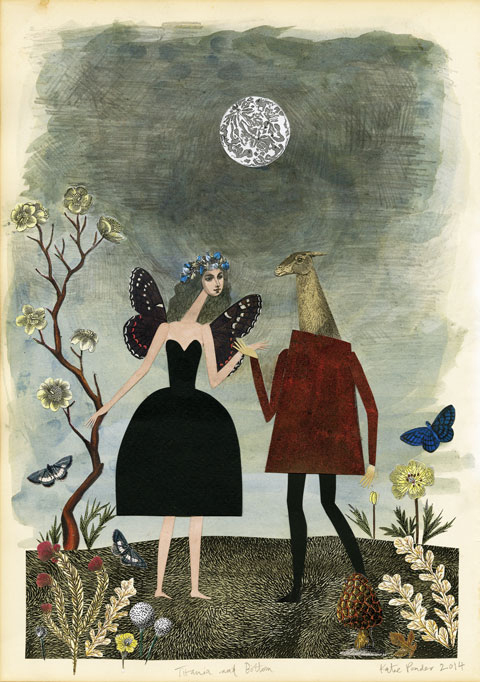
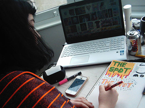
Augusta Akerman is yes, you got it, yet another Camberwell College of Arts graduate. She contributes a painterly image to my colouring book inspired by a love of 50s modernism. Find her in Amelia’s Colourful Colouring Companion, available now on Kickstarter.

Augusta Akerman 'Couples and Technology'
I love the way you draw figures, which artists have inspired you? I think they look very Henry Moore-esue
Yes you are very right! I have always been very inspired by that particular period around 1950‘s modernism, Festival of Britain era, having been brought up on artists like Moore, Hepworth, Ravilious and Bawden. These were the artists my parents loved, so we were always going to galleries to see this kind of work. Every summer we go to Cornwall and St.Ives was and still is an annual pilgrimage to see Hepworth‘s studio and garden, I could probably draw it from memory. After finishing my MA I had been introduced to what I would call ‘Now Illustration‘ and I found myself constantly looking at contemporaries’ work and worrying about my style. Earlier this year I decided that I was just going to let myself be influenced by the painters, sculptors and designers I grew up loving and have found myself much happier with my work.

Augusta Akerman 'Swimming Against'
Why did you decide to move away from your first degree in fine art photography towards illustration?
Towards the end of my BA at Glasgow College of Art I was already starting to move away from photography. I was making small artist books with a combination of illustrations and photographs and enjoying putting them together, designing covers and hand binding them. I returned to London and worked as a photographers assistant all the while drawing at home in the evenings and weekends. I think this was a real time of discovery for me. I was so embarrassed about my drawing skills that I didn’t really show or tell anyone but kept hundreds of small A5 sketchbooks with random illustrations in. In the end I became more and more confident and illustration naturally took over. I also wasn’t particularly interested in digital photography as I enjoyed using film so I think cost and lack of regular access to a darkroom also contributed to me moving away from it. However I still take photographs, film and digital, who knows what will happen next.

Augusta Akerman 'Sea to Stone'
What did you do in the period between your BA and MA studies?
I worked as a Set Decorator in film and advertising. I fell into this career, starting as an art department assistant and gradually working my way up. It was a very enjoyable job most of the time but could be also be extremely intense and stressful. In the end the feeling that I wasn’t doing exactly what I wanted to do took over and I made the decision to do the MA. I was so frightened to leave that job, because in that world you spend years making contacts and working for little money in the hope of getting somewhere. I am very lucky to have made some good friends whilst working in film and still do the odd job here and there.

Augusta Akerman 'mono print portrait'
Why did you choose Camberwell for your MA?
I chose Camberwell because it was the nearest illustration course to my parent’s house! In order to do the MA I had to move back home and save as much as I could, and I could walk there in under half an hour. The MA represented a way to take a year off from film and see if Illustration could possibly be an option for me. I didn’t apply anywhere else so it was Camberwell or nothing. When meeting the head tutor Jan Woolley and visiting lecturer Chloe Cheese, I had an overwhelming feeling that this was it, I was very close to making a big change in my life, I would have cried my eyes out if they had said no!

Augusta Akerman 'Plastic Sea Soup' nominated for One to Watch
You have described your work as a combination of classic illustration and abstraction, what does this mean in practice?
This is because I think it sits between these two worlds, sometimes I can be quite real in my representation of animals and people, and at other times I just want to work with shapes and textures. I also tend to prefer work that takes a theme or idea and presents it not as a realistic depiction, but one that leaves room for the viewer to project their subconscious onto it.

I definitely think there is an influence of the classic in what I do as inspired by great artists like Tove Jansson and Pauline Baynes. But I aim to give a sense of modern movement and sculptural weight to some pieces by working with dark texture and light washes. I spent a long time being quite soft and delicate with my line and colour choices, so I’m enjoying this moment right now where I’m being braver using black crayons and ink to be more blocky and meshing them with the silky lace lines of water colour and gouache.

Augusta Akerman 'a section from the Great Migration'
What is your preferred way to approach a new piece of work when first starting to create it?
Depending on whether it is a personal project or a commission I tend to do things differently. However they both start the same way, with research. I love researching the subject and finding out different meanings or views or small snippets of information that can be included in the work to give a little extra detail that maybe only 2 percent will ever ‘get’ but will still interest others. I work either at my desk or sometimes in my dad’s studio. When at my desk I usually put on Radio 4 or a documentary on my computer that I listen to like a radio play, otherwise I get distracted by the images if I can see the screen! When in my dad’s studio I’m usually doing something a bit more messy like mono printing or lino, he tends to listen to the radio too or is working on the computer.

How do you combine pen with litho and other methods of production?
I always work by hand, first sketching in my sketchbook, then taking the images to another level of finish either by painting over them or developing them with mono printing or another print process until I like the way they look. I like the play between hand and digital imagery, computers are extremely useful when cleaning and adding colour to images but I sometimes feel I get overwhelmed by the possibilities. I think in this extremely accessible digital age it’s easy to put off the actual thinking of the development of a piece until it is staring you in the face with 100 layers in Photoshop. I find it hard to think clearly with the back lit white screen and feel more in control with a bit of paper in front of me.

Augusta Akerman 'Amelia's Colouring Book' for online interview RGB
What inspired your piece for my colouring book?
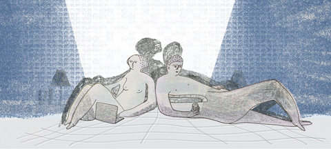
Whilst on holiday in Cornwall I had been drawing in my sketchbook, letting my hand and brain sort of automatic draw. I was not thinking about anything in particular but allowing what I had seen or heard that day come out onto the paper. I thought it looked like a diary in a pattern format. When I came back from holiday and thought about the colouring book I returned to the pattern idea and thought it might be nice for people to colour it in. I started automatic drawing again but this time I thought about all the themes I would like to explore in new projects and shapes and images I was interested in. I decided to create a seated figure drawing what would eventually become the wallpaper as I felt this developed the idea of a dreamy state of doodling, of letting your mind wander around your worries and dreams. The male figure was added later and I liked the idea of it also speaking about a relationship with another person who understands your dreams and helps you conquer your worries. They are both just quietly enjoying a moment supporting each other to make this big mural that charts all the ups and downs of creative making. It’s the most colourful piece I’ve made in a while so the brief did pull me out of my comfort zone a bit.

You recently took part in New Designers One Year On – how did you get involved and what project were you showcasing?
I applied to New Designers One Year On on a whim, because I wanted to be proactive to see if I could promote myself and my work in a professional situation. When I was selected I was very happy but also a little terrified as I knew there would be a lot of preparation and self promotion needed to really get the most out of it. I was showcasing the wallpapers and textiles I had made on my MA as well as newer designs and illustrations. I was very lucky to be surrounded by some amazing designers and illustrators and got a lot out of the experience. I had done Pulse earlier in the year with UAL and do think that in the future I might only do one design fair a year, not only due to cost but also due to the amount of energy you need to sustain that level of self promotion to justify it.

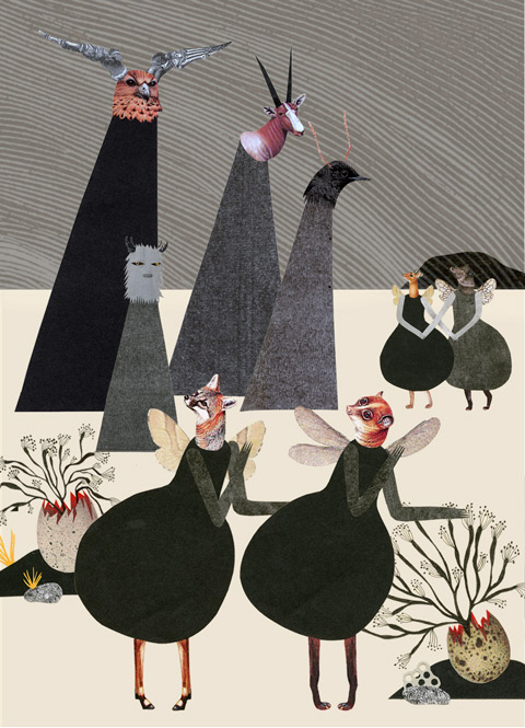
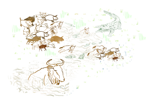
Why have you chosen subjects such as climate change for the basis of your designs?
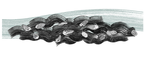
I am very influenced by nature and the natural order of things and have developed a huge respect for the world around us. I am also a constant watcher of all of David Attenborough‘s programs which means I’m a little obsessed with life cycles and repeating patterns. During my MA I knew I wanted to work with pattern and create an illustrated collection of wallpapers and textiles. The life cycles seemed to be a perfect subject as they repeat over and over again. Climate change sneaked into the work, because of researching the migration of animals and reading about the effect climate change is having on their lives, habitats and evolution. For me this is an ongoing theme and subject, I wanted to introduce and present the many circular structures that exist around us in a beautiful and accessible way, as well as providing a piece of information that some may not already be aware of.

Augusta Akerman 'Botanical Institute Wallpaper'
How do you create DIY wallpaper?
There are many ways! I have recently taught a DIY wallpaper class at the South London Botanical Institute where we used craft foam stamps, lino, foam rollers, stencils and direct printing (covering leaves and flowers in paint and pressing onto paper) to create repeat imagery. If you have the time and the space you can buy a roll of lining paper from B&Q and create your own.

What does your residency at the London Print Studio encompass?
I have been working with Lithography, a process I’ve been wanting to explore in more detail for a long time. I love the quality and possibilities of this particular printing process, you can use a number of materials to make your image as well as scratching away layers in the drawing that gives an almost etching like quality. Lithography is a lengthy process which I think puts a lot of people off. I spent 3 and a half hours grinding my large stone to get it right. I have the blisters to prove it! But even this I really enjoyed, it feels quite ancient grinding and preparing the stone then working into it with litho crayons and tusche. You can get an extremely varied quality of line that is then perfectly replicated when printing, but each print is unique with minute changes due to ink placement and roller pressure. I just love it! Although I did find the printing the hardest part this time. I was working one Saturday printing the largest stone and realised I had no more strength left to turn the wheel on the press, thank god I had nearly run out of paper!

How do you hope to grow your fabric design and wallpaper business?
After the Homes and Gardens Fabric Awards, I felt encouraged to continue with my new collection of wallpapers. I have to admit I was starting to feel a little helpless, I had applied for funding to help build the business which I didn’t get and had thought I might need to put it on hold for a while. I am now working on the new collection and hope to have it done by March 2016. It’s very hard trying to start a side business when you’re looking for freelance work and working a part time job, but I enjoy constantly working and thinking up ideas for projects. This is what I wanted! This is why I gave up other careers; in order to be in charge of my own creativity.

Augusta Akerman contributes her work to Amelia’s Colourful Colouring Companion, available now on Kickstarter. Make sure you grab a copy before the campaign closes later this month! Read a previous interview with Augusta here.

Categories ,#ameliasccc, ,Adult Coloring Book, ,Adult Colouring, ,Amelia’s Colourful Colouring Companion, ,Augusta Akerman, ,Bawden, ,Camberwell College of Arts, ,Chloe Cheese, ,Climate Change, ,Colouring Book, ,Cornwall, ,David Attenborough, ,Festival of Britain, ,Glasgow College of Art, ,Hepworth, ,Homes and Gardens Fabric Awards, ,illustration, ,interview, ,Jan Woolley, ,Kickstarter, ,Lithography, ,ma, ,Moore, ,New Designers, ,One Year On, ,Pauline Baynes, ,photography, ,Pulse, ,Radio 4, ,Ravilious, ,Set Decorator, ,South London Botanical Institute, ,St.Ives, ,Tove Jansson, ,Wallpaper

Similar Posts:


Amelia’s Magazine | An interview with Caitlin Gardiner: Amelia’s Colourful Colouring Companion featured artist.

Caitlin Gardiner Rabbit
Caitlin Gardiner has made a fabulous image for Amelia’s Colourful Colouring Companion that works the whole way across a double page. She tells us more about life as a graduate and her upcoming exhibition…

Caitlin Gardiner Studio
You recently graduated from the University of Lincoln, how has Cygnet INK helped you get your work seen professionally?
Cygnet Ink has been great! When trying to raise funds in order to take us to New Designers they organised stalls at craft fairs and printed postcards with all of our work on which raise a tonne of money. At these fairs we also had raffles or auctions for framed pieces of our work and they were instrumental in organising the printing of our graduate book ‘Twenty Fifteen’. Each person on our course was assigned an era of history to illustrate which then came together for the book. This was my first experience really of the professional illustration world, and I loved it. I designed our cover and and all the ‘Twenty Fifteen’ graphics as well as my page so it was great to have the experience of going back and forth with Cygnet INK for feedback. They then sold our book and sent it to prospective clients and agents to advertise our students. Since then they have run a number of exhibitions and fairs to promote the students of Lincoln. I contributed to both parts 1 & 2 of the ‘Twisted Tales’ exhibitions held in Lincoln and Nottingham and now to ‘The Wild Wood’ exhibition.

Caitlin Gardiner Moonflower
Since your return home how have you found jobs, and what have been the most fun things you have worked on?
So I’m back in sleepy Bedfordshire and it turns out that illustration isn’t the easiest profession to get into… who knew?! Throughout the summer I was mainly working up a decent portfolio an developing a good working practice without being a student. That being said I’ve had some real fun jobs come my way. An exciting one I have at the moment is for the theatre review blog, ‘Scatter of Opinion’, involving some fun characters and patterns. The blog is written by one of my oldest friends and she’s given me real freedom to have fun and go mad with it so that’s been great. Unfortunately, I live in the sticks where there isn’t a huge art scene so I am going to have to start relying more now on travelling and an increased internet presence to get my work out there – but at least the environment provides great inspiration for my work.

Caitlin Gardiner Fish
What kind of graphic design work supplements your illustration?
Recently I’ve been doing small bits of graphic design work alongside my illustration practice. I’ve done a few invites, table plans etc for parties. My favourite was a Sports Personality of the Year themed party where everything looked like it was painted on grass. It’s been great to learn a completely new skill but tedious when you realise, for example, that you can simply make your own hand drawn fonts in seconds online just after you’ve individually lettered 200 or so names on Photoshop to get the ‘handwritten look’!

Caitlin Gardiner Fish
What inspired your colouring book image of fishes trapped, and escaping, from a net?
I knew for this colouring brief that I wanted to create a complex image and had been sorting out and backing up some old work at the time. I discovered a gouache painting I had done at university and just started doodling some similar fish and realised I could make something new and more narrative from the drawings. I wanted to explore the idea of freedom but keep it fun and fresh by using the comical looking fish. It was as simple as that: I loved designing and creating the image and thought that it would be great fun to colour!

Caitlin Gardiner Night time
How did you create your image?
I used Photoshop as I am trying to keep improving and developing my digital skills as I have always worked in traditional medias. I’ve really enjoyed mixing traditional and digital mediums together to create new pieces. In every piece of digital work I create I will include scanned papers, textures drawings and all sorts. I’ve always been a bit of a perfectionist so I’ve been trying to quicken my design process to loosen up my style somewhat and I think this been quite successful. I drew hundreds of fish individually and complied them together in Photoshop using a design I had already roughly worked up. For the left hand side I used Photoshop to colour each fish individually and the boat and background and then layered this on top of a sugar paper texture background.

Caitlin Gardiner Fern
What kind of studio environment suits you best when you are working?
Once I get into a piece I will be completely focused and have been known to work until 6 in the morning as I don’t realise the time! However, often I find I am very easily distracted at the start of a project. Our studio at university had a designated working space for the third years so when there weren’t taught sessions this was ideal, there was a quiet place to just stick your head down and draw all those ideas that popped into my brain. On the other hand I love to be able to watch television or listen to an audiobook as I work; I’ve found that if I listen to music I can just wander off and I haven’t really missed anything, but if there is a story going on then I can’t miss any of it as then the whole plot will get confused. I generally only watch TV shows or films I’ve seen before as then I’m just listening to it really rather than having my eyes glued to screen, I probably know ‘Friends’ off by heart now! I think this is why my current home studio (a desk in my bedroom) is working pretty well, I can go and get a cuppa when I want but also have ‘The Office’ (US) playing out loud keeping me in my chair!

Caitlin Gardiner Bowie
How do you inject an element of fun into your drawings?
I really enjoy including hidden jokes or items in many pieces of my work – there are a few of these in my colouring page, I thought this would be extra fun for the reader to find them when colouring in. If the illustration I am working on allows for it I usually like to add a little something to make you giggle if you look closer, whether it be an ironic t-shirt slogan, a little bird pooping or even just an expression on a character’s face.

Caitlin Gardiner Dragonfly
What have you produced for the upcoming Wild Wood exhibition?
My work has recently become increasingly inspired by nature and more specifically the British countryside. I have just finished a piece for ‘The Wild Wood’ at Gallery at St. Martins in Lincoln run by Cygnet INK. For this piece I was inspired by the seasons and decided to explore what one branch or tree could look like throughout an entire year. I aimed to make it look like one image at first glance then upon looking closer, you can see the four seasons represented evenly.

Caitlin Gardiner Heart
Can you tell us more about your plans to sell products?
At the moment I’m working on a range of products to sell online and at craft markets. I’m printing some stuff professionally but I’m most excited about the handprinted bags, materials and wrapping paper that I have planned. I’ve made some hand carved stamps stamps that I’ve handprinted and collaged a handful of cat cards to start my shop (CaitlinGardiner on Etsy) off whilst I get other products printed and designed. I’m very excited about this and have loads of ideas buzzing around just waiting to be made and sold to some lovely customers!

Find Caitlin Gardiner‘s art in Amelia’s Colourful Colouring Companion funding on Kickstarter NOW – grab an Early Bird copy for Christmas at a discount price before they all go..

Categories ,#ameliasccc, ,Amelia’s Colourful Colouring Companion, ,Bedfordshire, ,Caitlin Gardiner, ,Cygnet Ink, ,Early Bird, ,etsy, ,Kickstarter, ,Lincoln, ,New Designers, ,Scatter of Opinion, ,St Martins, ,The Wild Wood, ,Twenty Fifteen, ,Twisted Tales

Similar Posts: