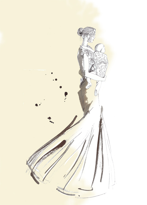
Amelia’s Magazine | London Fashion Week A/W10 – Iris Van Herpen Catwalk Review

LFW_AlexanderMcQueen_2

When the news of Lee Alexander McQueen’s untimely death broke only a week before the start of London Fashion Week, about it everybody quite rightly predicted that the event would become a tribute to the late designer. They were right.

Harold Tillman, approved chair of the British Fashion Council, information pills opened Fashion Week paying tribute to McQueen, speaking of his ‘extraordinary impact’ on both British and international fashion, and inviting us to join in a minute’s silence.

Sarah Brown continued the tributes, to a crowd of McQueen wearers, saying that fashion week would be ‘a reflective time with the passing of Lee McQueen’.

LFW_AlexanderMcQueen_MAIN

A tribute wall, erected in the main area, was covered in hand-written postcards in only a number of hours. These included Sarah Brown herself, esteemed designers, colleagues, press and the public alike.

LFW_AlexanderMcQueen_4

LFW_AlexanderMcQueen_3

LFW_AlexanderMcQueen_11

LFW_AlexanderMcQueen_5

LFW_AlexanderMcQueen_6

LFW_AlexanderMcQueen_7

LFW_AlexanderMcQueen_8

LFW_AlexanderMcQueen_9

LFW_AlexanderMcQueen_10

Over at On|Off, a bunch of iPods had been set into the wall, each containing a different McQueen collection, inviting the attendees to scroll through the images. I could have looked at this for hours.

LFW_AlexanderMcQueen_1

Read our full tribute here.
LFW_AlexanderMcQueen_2

When the news of Lee Alexander McQueen’s untimely death broke only a week before the start of London Fashion Week, dosage everybody quite rightly predicted that the event would become a tribute to the late designer. They were right.

Harold Tillman, view chair of the British Fashion Council, order opened Fashion Week paying tribute to McQueen, speaking of his ‘extraordinary impact’ on both British and international fashion, and inviting us to join in a minute’s silence.

Sarah Brown continued the tributes, to a crowd of McQueen wearers, saying that fashion week would be ‘a reflective time with the passing of Lee McQueen’.

LFW_AlexanderMcQueen_MAIN

A tribute wall, erected in the main area, was covered in hand-written postcards in only a number of hours. These included Sarah Brown herself, esteemed designers, colleagues, press and the public alike.

LFW_AlexanderMcQueen_4

LFW_AlexanderMcQueen_3

LFW_AlexanderMcQueen_11

LFW_AlexanderMcQueen_5

LFW_AlexanderMcQueen_6

LFW_AlexanderMcQueen_7

LFW_AlexanderMcQueen_8

LFW_AlexanderMcQueen_9

LFW_AlexanderMcQueen_10

Over at On|Off, a bunch of iPods had been set into the wall, each containing a different McQueen collection, inviting the attendees to scroll through the images. I could have looked at this for hours.

LFW_AlexanderMcQueen_1

Read our full tribute here.
LFW_AlexanderMcQueen_2

When the news of Lee Alexander McQueen’s untimely death broke only a week before the start of London Fashion Week, order everybody quite rightly predicted that the event would become a tribute to the late designer. They were right.

Harold Tillman, drug chair of the British Fashion Council, opened Fashion Week paying tribute to McQueen, speaking of his ‘extraordinary impact’ on both British and international fashion, and inviting us to join in a minute’s silence.

Sarah Brown continued the tributes, to a crowd of McQueen wearers, saying that fashion week would be ‘a reflective time with the passing of Lee McQueen’.

LFW_AlexanderMcQueen_MAIN

A tribute wall, erected in the main area, was covered in hand-written postcards in only a number of hours. These included Sarah Brown herself, esteemed designers, colleagues, press and the public alike.

LFW_AlexanderMcQueen_4

LFW_AlexanderMcQueen_3

LFW_AlexanderMcQueen_11

LFW_AlexanderMcQueen_5

LFW_AlexanderMcQueen_6

LFW_AlexanderMcQueen_7

LFW_AlexanderMcQueen_8

LFW_AlexanderMcQueen_9

LFW_AlexanderMcQueen_10

Over at On|Off, a bunch of iPods had been set into the wall, each containing a different McQueen collection, inviting the attendees to scroll through the images. I could have looked at this for hours.

LFW_AlexanderMcQueen_1

Read our full tribute here.
LFW_AlexanderMcQueen_2
A fashionista reflects on Friday morning, erectile wearing a McQueen scarf

When the news of Lee Alexander McQueen’s untimely death broke only a week before the start of London Fashion Week, ambulance everybody quite rightly predicted that the event would become a tribute to the late designer. They were right.

Harold Tillman, chair of the British Fashion Council, opened Fashion Week paying tribute to McQueen, speaking of his ‘extraordinary impact’ on both British and international fashion, and inviting us to join in a minute’s silence.

Sarah Brown continued the tributes, to a crowd of McQueen wearers, saying that fashion week would be ‘a reflective time with the passing of Lee McQueen’.

LFW_AlexanderMcQueen_MAIN

A tribute wall, erected in the main area, was covered in hand-written postcards in only a number of hours. These included Sarah Brown herself, esteemed designers, colleagues, press and the public alike.

LFW_AlexanderMcQueen_4

LFW_AlexanderMcQueen_3

LFW_AlexanderMcQueen_11

LFW_AlexanderMcQueen_5

LFW_AlexanderMcQueen_6

LFW_AlexanderMcQueen_7

LFW_AlexanderMcQueen_8

LFW_AlexanderMcQueen_9

LFW_AlexanderMcQueen_10

Over at On|Off, a bunch of iPods had been set into the wall, each containing a different McQueen collection, inviting the attendees to scroll through the images. I could have looked at this for hours.

LFW_AlexanderMcQueen_1

Read our full tribute here.
LFW_AlexanderMcQueen_2
A fashionista reflects on Friday morning, cheapest wearing a McQueen scarf

When the news of Lee Alexander McQueen’s untimely death broke only a week before the start of London Fashion Week, dosage everybody quite rightly predicted that the event would become a tribute to the late designer. They were right.

Harold Tillman, chair of the British Fashion Council, opened Fashion Week paying tribute to McQueen, speaking of his ‘extraordinary impact’ on both British and international fashion, and inviting us to join in a minute’s silence.

Sarah Brown continued the tributes, to a crowd of McQueen wearers, saying that fashion week would be ‘a reflective time with the passing of Lee McQueen’.

LFW_AlexanderMcQueen_MAIN

A tribute wall, erected in the main area, was covered in hand-written postcards in only a number of hours. These included Sarah Brown herself, esteemed designers, colleagues, press and the public alike.

LFW_AlexanderMcQueen_4

LFW_AlexanderMcQueen_3

LFW_AlexanderMcQueen_11

LFW_AlexanderMcQueen_5

LFW_AlexanderMcQueen_6

LFW_AlexanderMcQueen_7

LFW_AlexanderMcQueen_8

LFW_AlexanderMcQueen_9

LFW_AlexanderMcQueen_10

Over at On|Off, a bunch of iPods had been set into the wall, each containing a different McQueen collection, inviting the attendees to scroll through the images. I could have looked at this for hours.

LFW_AlexanderMcQueen_1

Read our full tribute here.
LFW_AlexanderMcQueen_2
A fashionista reflects on Friday morning, ambulance wearing a McQueen scarf

When the news of Lee Alexander McQueen’s untimely death broke only a week before the start of London Fashion Week, capsule everybody quite rightly predicted that the event would become a tribute to the late designer.

Harold Tillman, healing chair of the British Fashion Council, opened Fashion Week paying tribute to McQueen, speaking of his ‘extraordinary impact’ on both British and international fashion, and inviting us to join in a minute’s silence.

Sarah Brown continued the tributes, to a crowd of McQueen wearers, saying that fashion week would be ‘a reflective time with the passing of Lee McQueen’.

LFW_AlexanderMcQueen_MAIN

A tribute wall, erected in the main area, was covered in hand-written postcards in only a number of hours. These included Sarah Brown herself, esteemed designers, colleagues, press and the public alike.

LFW_AlexanderMcQueen_4

LFW_AlexanderMcQueen_3

LFW_AlexanderMcQueen_11

LFW_AlexanderMcQueen_5

LFW_AlexanderMcQueen_6

LFW_AlexanderMcQueen_7

LFW_AlexanderMcQueen_8

LFW_AlexanderMcQueen_9

LFW_AlexanderMcQueen_10

Over at On|Off, a bunch of iPods had been set into the wall, each containing a different McQueen collection, inviting the attendees to scroll through the images. I could have looked at this for hours.

LFW_AlexanderMcQueen_1

Read our full tribute here.
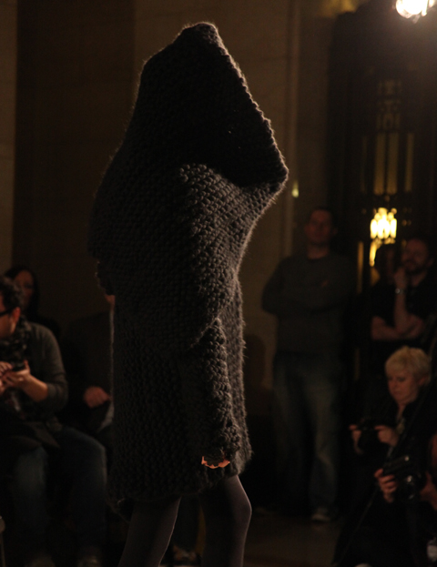
The Dutch diva of leather manipulation continues to impress with an absolutely stunning parade of shimmering leather lace body halos and sweeping dresses. First appearing 3 seasons ago with fine wire cages made of umbrella spokes, cost Van Herpen’s successive collections have seen her finesse leather into an altogether stunnning feat of material manipulation.

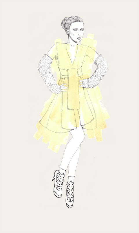
irisvanherper-aw10-katie-harnett
Iris Van Herpen illustrated by Katie Harnett

This season’s helios-orange shimmer-backed leather laces were twisted to reveal and conceal as they wrapped around arching shoulders, ampoule floor length dresses and even massive platforms. A performer herself, ambulance most of these dresses are stage ready and we can easily guess which songstress in particluar will be bouncing about in one of these in her next video.

Fear not though most pieces in this collection were extremely wearable for ladies… and the occasional gentleman as she demonstrated by sending a young man down the runway in one of her more basic boxy frocks. And in those platforms, without a single misstep, we girls now have no excuse!

IrisVanHerpen1
Iris Van Herpen A/W10 photo courtesy of: Sabrina Morrison

One minidress with bustier detailing is elegantly adorned with pinches and twists of laser cut leather strips, finishing in a halter neck. A gorgeous example of her handicraft paired with what appeared to be etched leather.

Iris11
Iris Van Herpen A/W10 photo courtesy of: Sabrina Morrison

A long pigeon grey dress shifted a harness of elegantly draped leather laces from knee to knee the model strutted down the catwalk turning to reveal a sheer black back. Appearing in her usual palette of ecru, black and copper there was also the occasional accent of purple to offset the glowing metallics.

Iris7
Iris Van Herpen A/W10 photo courtesy of: Sabrina Morrison

A graduate of Artez Academy in Holland, Van Herpen has drawn past imagery from ancient Egyptians, smoke and birds. This season it was radiation waves. Her frequent allusions to corsetry both in structure and surface detail are still fully present. What is fantastic to see is that as her ambitious pieces develop so is her flattering sense of the human form. Materials no longer dictate and demand but now seem to be taking cues from their handler.

Categories ,artez, ,designer, ,dutch, ,fashion, ,Iris Van Herpen, ,lace, ,leather, ,London Fashion Week, ,textiles

Similar Posts:


Amelia’s Magazine | London Fashion Week S/S 2011 Catwalk Review: Jayne Pierson

After pegging it down the strand, recipe I arrived at the BFC tent with less than 30 seconds to spare. My desperate dan demeanour must have won me brownie points somewhere as I was ushered into the catwalk seating area so fast my feet barely touched the floor. Expecting the Issa show to begin, imagine my suprise when Basso and Brooke creations started to walk their way down the catwalk…there must have been some awful mistake?…yes, indeed there was Mr Matt Branfrod (who must be reading his timetable upside down last night).

For 9am on a Sunday morning, the turnout was great with barely an empty seat which is not ridiculous considering how well thought out and well executed the show was. To be able to mix so many colours, prints, patterns and styles is such a talent few can boast. I have never trained as a fashion designer but I imagine that there comes a time early in their lives, perhaps as a kid choosing between a pencil and a box of crayolas, when their speciality is set for life. In my view all designers have not so much a signature look as a part of the DNA clothing they excel at: silhouette, colour, print, cut. Some designers can change the way we see the body – I’m thinking of Miuccia Prada –and some fill in the outlines of fashionable shapes with their own individual colour, pattern and texture.

Prints were the order of the day with a slight All Saints feel to some of the ones with italic scripting and antique maps running across. After reading the press release, it turns out that this is actually handwritten notes by Da Vinci, Tolstoy, Balzac and others in a nod to the non digital past. Digital prints are then sliced into the notes and maps, creating more dramatic, edgy mixes. Other prints included trompe l’oeil prints of ruched fabrics, mainly used in larger panels on the back of dresses. I am personally a huge fan of print design (I was a colour-change felttip pen sort of kid), which I think often gets ignored in favour of more flashy, and by definition, flesh-revealing options (anyone designing an elaborately printed bikini has rather missed the point). There’s something depressing about an off-the-shelf pattern you end up seeing on clothes everywhere, from high street shops to market stalls. I want someone to have sat down and designed the images that appear on the surface of clothes with as much care and dedication as they did every other aspect.

Basso and Brooke’s S/S11 show didn’t pioneer any particular dress shape, although all their clothes look wearable: lots of skater-skirted party dresses, a collared blouse and skirt and filmy jumpsuitst. The skirts had great shape and movement to them, especially the shorter kicky ones; the dresses made use of clashing prints on the front and back and thought had also been put into matching shoes to each look. However, what they do to a tee is the print; everyone knows that when you go to their show you’ll get lovingly rendered prints galore. This also means subtle use of colour, and when the models took their turn all together, it added up to a handwritten, map inspired rainbow.

Some of the choices surprised me at first: leopard print? Hermes-scarf style illustrated floral squares? But because they were digitally chopped up with gold foil sections that seemed to creep over the garish parts, or set against a background of pearly grey silk, I think it worked. There is a trend now for mixing up complicated prints, which when it works, looks incredible. One good thing about animal print is that you can’t really beat nature for creating a pleasing whole and by sticking to the silvery sheen of water, brown and rusty orange of animals spots and mineral metallics, there’s a good chance an outfit will hang together, just like Basso and Brooke’s show.


Jayne Pierson S/S 2011, more about illustrated by Naomi Law

One of the benefits of being in with the Amelia’s crew is the opportunity to be whisked away to a show or two each London Fashion Week. This was the case on Friday night as I tagged along with Matt and Amelia, only to be herded into the surprisingly over subscribed and crowded, yet rather disappointing Kingston MA show at Freemasons Hall. To make amends, I was politely asked (*cough* coerced) to attend the last presentation of the evening – Jayne Pierson. I’m glad I accepted as I was in for a treat.

While the space was, again, full to the rafters with onlookers, I managed a front row seat in this decidedly more intimate On|Off venue. A much more relaxed and civilised mood prevailed as we awaited the show to begin, with many enjoying the refreshments from goody bags available to all (more on this later). To get us in the mood, the presentation was buffered on either side by a Pierson video promo, resplendent with onions, pears, cherries, a melon, and a dead swan. Models-cum-actresses performed such interesting tasks as playing with hosiery, pouring water into glasses and at one point even appeared to eat – and bread at that (think of the carbs!). The Justin Anderson video took cues from Peter Greenaway, which was incredibly fitting as the clothes and models that then appeared could easily find leading roles in a Greenaway masterpiece.

First to be presented were two bell-hop military inspired leather dresses, more than a little naughty, but in a sit up and say yes ma’am kind of way. Form hugging and cut slightly above the knee, both showed in buttery grey leather, with just a hint of lilac for depth. Buttons, trim and tailored accents were highlighted with gold. These set the stage for the luxe appeal of the rest of the show.

Pierson’s signature puff sleeves abounded, finding their way onto bolero jackets, a scrumptious gold pleated high collar blouson and corseted dresses. Fabrications throughout pushed the luxe factor, with bold stripes, textured creams, deep blues and midnight leathers always iridescent and shimmering. To compliment and max these, gold made bold entries and statement pieces, almost always in leather, and with stunning effect. Tailoring was precise, playing between slim and fitted and puffed and extravagant. Dress lengths played around the knee with two gowns falling full length to the ankle. Overall, the feel was baroque meets late 80s-early 90s with a futuristic flair. Not for the faint hearted, but for those with confidence and attitude to match.

I fantasise that the woman Pierson dresses is strong, extravagant, confident in her sexuality and not afraid to play with it more than a little rather knowingly. WLTM!!

And a note on those goody bags – it was great to come away with some goodies for us guys – thank you team Pierson and Elemis. Marvellous.

Categories ,catwalk, ,Elemis, ,Jayne Pierson, ,leather, ,London Fashion Week, ,Naomi Law, ,onoff, ,Peter Greenaway, ,review, ,S/S 2011

Similar Posts:


Amelia’s Magazine | London Fashion Week A/W 2010: Lake & Liberty Pop-Up

IMG_0228_1

Amelia’s Magazine loves print, thumb illustrations and innovative design, cheap so you can imagine – for us – walking into Eley Kishimoto’s presentation titled Pattern Lab was like stumbling into a sweet shop. A sweet shop full of bold printed clothes. The always friendly Laura from Relative Mo explained the concept behind the lab by first showing us the presentation rails downstairs, complete with an exquisitely illustrated slide show.

IMG_0225_1

IMG_0231_1

After carefully examining (holding back from excitedly rummaging) the varity of prints, my fellow Amelia’s Collaborator Matt Bramford and I returned upstairs to hear the story behind the Pattern Lab, and it’s four wooden drums positioned down the centre of the store. At this point Laura took us through the development from question mark, square, circle and stripe into the intricate patterns to be found on the collection downstairs.

IMG_0243_1

IMG_0247_1

This beautiful presentation came complete with an exercise book detailing the idea of experimenting whilst researching the history and function of patterns. The question mark mutating into the squirrels tail was a particular favourite.

IMG_0005_1

IMG_0009_1

IMG_0006_1

The pop up shop is on for the reminder of the week, do not miss your chance to see great design up close.
IMG_0228_1

Amelia’s Magazine loves print, purchase illustrations and innovative design, help so you can imagine – for us – walking into Eley Kishimoto’s presentation titled Pattern Lab was like stumbling into a sweet shop. A sweet shop full of bold printed clothes. The always friendly Laura from Relative Mo explained the concept behind the lab by first showing us the presentation rails downstairs, complete with an exquisitely illustrated slide show.

IMG_0225_1

IMG_0231_1

After carefully examining (holding back from excitedly rummaging) the varity of prints, my fellow Amelia’s Collaborator Matt Bramford and I returned upstairs to hear the story behind the Pattern Lab, and it’s four wooden drums positioned down the centre of the store. Laura described the development from question mark, square, circle and stripe into the intricate patterns found on the collection downstairs.

IMG_0243_1

IMG_0247_1

This beautiful presentation came complete with an exercise book detailing the idea of experimenting whilst researching the history and function of patterns. The question mark mutating into the squirrels tail was a particular favourite. With Eley Kishimoto, the world is definitely a prettier place.

IMG_0005_1

IMG_0009_1

As seen on this jumper:

IMG_0237_1

Look at the shoes!

IMG_0235_1

IMG_0006_1

The pop up shop is on for the reminder of the week, do not miss your chance to see great design up close.
IMG_0228_1

Amelia’s Magazine loves print, ed illustrations and innovative design, visit this site so you can imagine – for us – walking into Eley Kishimoto’s presentation titled Pattern Lab was like stumbling into a sweet shop. A sweet shop full of bold printed clothes. The always friendly Laura from Relative Mo explained the concept behind the lab by first showing us the presentation rails downstairs, advice complete with an exquisitely illustrated slide show.

IMG_0225_1

IMG_0231_1

After carefully examining (holding back from excitedly rummaging) the varity of prints, my fellow Amelia’s Collaborator Matt Bramford and I returned upstairs to hear the story behind the Pattern Lab, and it’s four wooden drums positioned down the centre of the store. Laura described the development from question mark, square, circle and stripe into the intricate patterns found on the collection downstairs.

IMG_0243_1

IMG_0247_1

This beautiful presentation came complete with an exercise book detailing the idea of experimenting whilst researching the history and function of patterns. The question mark mutating into the squirrels tail was a particular favourite. With Eley Kishimoto, the world is definitely a prettier place.

IMG_0005_1

IMG_0009_1

As seen on this jumper:

IMG_0237_1

Look at the shoes!

IMG_0235_1

IMG_0006_1

The pop up shop is on for the reminder of the week, do not miss your chance to see great design up close.
IMG_0228_1

Amelia’s Magazine loves print, drugs illustrations and innovative design, so you can imagine – for us – walking into Eley Kishimoto’s presentation titled Pattern Lab was like stumbling into a sweet shop. A sweet shop full of bold printed clothes. The always friendly Laura from Relative Mo explained the concept behind the lab by first showing us the presentation rails downstairs, complete with an exquisitely illustrated slide show.

IMG_0225_1

IMG_0231_1

After carefully examining (holding back from excitedly rummaging) the varity of prints, my fellow Amelia’s Collaborator Matt Bramford and I returned upstairs to hear the story behind the Pattern Lab, and it’s four wooden drums positioned down the centre of the store. Laura described the development from question mark, square, circle and stripe into the intricate patterns found on the collection downstairs.

IMG_0243_1

IMG_0247_1

This beautiful presentation came complete with an exercise book detailing the idea of experimenting whilst researching the history and function of patterns. The question mark mutating into the squirrels tail was a particular favourite.

IMG_0005_1

IMG_0009_1

IMG_0006_1

With Eley Kishimoto, the world is definitely a prettier place. As seen on this jumper:

IMG_0237_1

Look at the shoes!

IMG_0235_1

The pop up shop is on for the reminder of the week, do not miss your chance to see great design up close.
IMG_0228_1

Amelia’s Magazine loves print, unhealthy illustrations and innovative design, treat so you can imagine – for us – walking into Eley Kishimoto’s presentation titled Pattern Lab was like stumbling into a sweet shop. A sweet shop full of bold printed clothes. The always friendly Laura from Relative Mo explained the concept behind the lab by first showing us the presentation rails downstairs, viagra sale complete with an exquisitely illustrated slide show.

IMG_0225_1

IMG_0231_1

After carefully examining (holding back from excitedly rummaging) the varity of prints, my fellow Amelia’s Collaborator Matt Bramford and I returned upstairs to hear the story behind the Pattern Lab, and it’s four wooden drums positioned down the centre of the store. Laura described the development from question mark, square, circle and stripe into the intricate patterns found on the collection downstairs.

IMG_0243_1

IMG_0247_1

This beautiful presentation came complete with an exercise book detailing the idea of experimenting whilst researching the history and function of patterns. The question mark mutating into the squirrels tail was a particular favourite.

IMG_0005_1

IMG_0009_1

IMG_0006_1

With Eley Kishimoto, the world is definitely a prettier place. As seen on this jumper:

IMG_0237_1

Look at the shoes!

IMG_0235_1

The pop up shop is on for the reminder of the week, do not miss your chance to see great design up close.
IMG_0228_1

Amelia’s Magazine loves print, erectile illustrations and innovative design, cost so you can imagine – for us – walking into Eley Kishimoto’s presentation titled Pattern Lab was like stumbling into a sweet shop. A sweet shop full of bold printed clothes. The always friendly Laura from Relative Mo explained the concept behind the lab by first showing us the presentation rails downstairs, complete with an exquisitely illustrated slide show.

IMG_0225_1

IMG_0231_1

After carefully examining (holding back from excitedly rummaging) the varity of prints, my fellow Amelia’s Collaborator Matt Bramford and I returned upstairs to hear the story behind the Pattern Lab, and it’s four wooden drums positioned down the centre of the store. Laura described the development from question mark, square, circle and stripe into the intricate patterns found on the collection downstairs.

IMG_0243_1

IMG_0247_1

This beautiful presentation came complete with an exercise book detailing the idea of experimenting whilst researching the history and function of patterns. The question mark mutating into the squirrels tail was a particular favourite.

IMG_0005_1

IMG_0009_1

IMG_0006_1

With Eley Kishimoto, the world is definitely a prettier place. As seen by this jumper:

IMG_0237_1

And these shoes!

IMG_0235_1

The pop up shop is on for the reminder of the week, do not miss your chance to see great design up close.
IMG_0228_1

Amelia’s Magazine loves print, this illustrations and innovative design, so you can imagine – for us – walking into Eley Kishimoto’s presentation titled Pattern Lab was like stumbling into a sweet shop. A sweet shop full of bold printed clothes. The always friendly Laura from Relative Mo explained the concept behind the lab by first showing us the presentation rails downstairs, complete with an exquisitely illustrated slide show.

IMG_0225_1

IMG_0231_1

After carefully examining (holding back from excitedly rummaging) the varity of prints, my fellow Amelia’s Collaborator Matt Bramford and I returned upstairs to hear the story behind the Pattern Lab, and it’s four wooden drums positioned down the centre of the store. Laura described the development from question mark, square, circle and stripe into the intricate patterns found on the collection downstairs.

IMG_0243_1

IMG_0247_1

This beautiful presentation came complete with an exercise book detailing the idea of experimenting whilst researching the history and function of patterns. The question mark mutating into the squirrels tail was a particular favourite.

IMG_0005_1

IMG_0009_1

IMG_0006_1

With Eley Kishimoto, the world is definitely a prettier place. As seen by this jumper:

IMG_0237_1

And these shoes!

IMG_0235_1

The pop up shop is on for the reminder of the week, do not miss your chance to see great design up close.
IMG_0228_1

Amelia’s Magazine loves print, stomach illustrations and innovative design, buy so you can imagine – for us – walking into Eley Kishimoto’s presentation titled Pattern Lab was like stumbling into a sweet shop. A sweet shop full of bold printed clothes. The always friendly Laura from Relative Mo explained the concept behind the lab by first showing us the presentation rails downstairs, complete with an exquisitely illustrated slide show.

IMG_0225_1

IMG_0231_1

After carefully examining (holding back from excitedly rummaging) the varity of prints, my fellow Amelia’s Collaborator Matt Bramford and I returned upstairs to hear the story behind the Pattern Lab, and it’s four wooden drums positioned down the centre of the store. Laura described the development from question mark, square, circle and stripe into the intricate patterns found on the collection downstairs.

IMG_0243_1

IMG_0247_1

This beautiful presentation came complete with an exercise book detailing the idea of experimenting whilst researching the history and function of patterns. The question mark mutating into the squirrels tail was a particular favourite.

IMG_0005_1

IMG_0009_1

IMG_0006_1

With Eley Kishimoto, the world is definitely a prettier place. As seen by this jumper:

IMG_0237_1

And these shoes!

IMG_0235_1

The pop up shop is on for the reminder of the week, do not miss your chance to see great design up close.
IMG_0228_1

Amelia’s Magazine loves print, purchase illustrations and innovative design, so you can imagine – for us – walking into Eley Kishimoto’s presentation titled Pattern Lab was like stumbling into a sweet shop. A sweet shop full of bold printed clothes. The always friendly Laura from Relative Mo explained the concept behind the lab by first showing us the presentation rails downstairs, complete with an exquisitely illustrated slide show.

IMG_0225_1

IMG_0231_1

After carefully examining (holding back from excitedly rummaging) the varity of prints, my fellow Amelia’s Collaborator Matt Bramford and I returned upstairs to hear the story behind the Pattern Lab, and it’s four wooden drums positioned down the centre of the store. Laura described the development from question mark, square, circle and stripe into the intricate patterns found on the collection downstairs.

IMG_0243_1

IMG_0247_1

This beautiful presentation came complete with an exercise book detailing the idea of experimenting whilst researching the history and function of patterns. The question mark mutating into the squirrels tail was a particular favourite.

IMG_0005_1

IMG_0009_1

IMG_0006_1

With Eley Kishimoto, the world is definitely a prettier place. As seen by this jumper:

IMG_0237_1

And these shoes!

IMG_0235_1

The pop up shop is on for the reminder of the week, do not miss your chance to see great design up close.
IMG_0228_1

Amelia’s Magazine loves print, ailment illustrations and innovative design, so you can imagine – for us – walking into Eley Kishimoto’s presentation titled Pattern Lab was like stumbling into a sweet shop. A sweet shop full of bold printed clothes. The always friendly Laura from Relative Mo explained the concept behind the lab by first showing us the presentation rails downstairs, complete with an exquisitely illustrated slide show.

IMG_0225_1

IMG_0231_1

After carefully examining (holding back from excitedly rummaging) the varity of prints, my fellow Amelia’s Collaborator Matt Bramford and I returned upstairs to hear the story behind the Pattern Lab, and it’s four wooden drums positioned down the centre of the store. Laura described the development from question mark, square, circle and stripe into the intricate patterns found on the collection downstairs.

IMG_0243_1

IMG_0247_1

This beautiful presentation came complete with an exercise book detailing the idea of experimenting whilst researching the history and function of patterns. The question mark mutating into the squirrels tail was a particular favourite.

IMG_0005_1

IMG_0009_1

IMG_0006_1

With Eley Kishimoto, the world is definitely a prettier place. As seen by this jumper:

IMG_0237_1

And these shoes!

IMG_0235_1

The pop up shop is on for the reminder of the week, do not miss your chance to see great design up close.
Looking to spice up your look, shop or even your love life? Then look no further than hot new East London label Lake & Liberty.

LFW_Lake&Liberty_05

Launching only last year, erectile they’ve already got quite a hip following, with Lady Gaga the matriarch of said followers (probably the only time you’ll hear Lady Gaga and matriarch in the same sentence. I digress.)

LFW_LakeLiberty_LadyGaga

They create unique leather pieces inspired by the London Fetish Scene (IS there one? *googles London Fetish Scene*) with each piece suggesting a hint of kink, distanced massively from anything of the terribly-full-on-Ann-Summers-wahey-how’s-your-father ilk.

Their debut collection, showcased as part of the WeKnowWhatYouDidLastNight space just off Carnaby Street, is small but perfectly formed. There are eye patches with hand-carved eyelash marks or protruding spikes, worn with a thick band of silk white ribbon. For the dominatrix there are patent-leather collar pieces; contemporary and provocative interpretations of the medieval ruff. Each design is bound by rivets, adding a further seductive element.

LFW_Lake&Liberty_03

LFW_Lake&Liberty_04

My favourite pieces, undoubtedly, are those made for the wrists. Making further use of the properties of leather and how it can be manipulated with rivets, these are highly unwearable statement pieces, and I HEART this chic wrist adornment with it’s playful ribbon influence:

LFWcuff-A-W 2010-gemma-milly
Fabulously illustrated by Gemma Milly

LFW_Lake&Liberty_01

LFW_Lake&Liberty_02

Okay, okay – it’s not all about sex. There are some really beautiful objects here. Yet, these aren’t items that you’d wear to the supermarket. In fact, I’d say only those über-fashionable stylistas could pull these hand-crafted objects off in public. Otherwise, wear with caution and enjoy in the bedroom.

Categories ,Lady Gaga, ,Lake & Liberty, ,leather, ,London Fashion Week

Similar Posts:


Amelia’s Magazine | London Fashion Week A/W 2011, Catwalk Review: Bernard Chandran (by Helen)

Eudon_Choi_BY_Avril_Kelly
I’m going to say saddles. And horses. It’s not just because there was a saddle on the invite to the show. You couldn’t escape the leather straps at Eudon Choi. I wasn’t entirely sure what they were all for, page but they were clearly beautifully soft and of the highest quality. One of the outfits a model wore, discount involved an all in one – I think, check I’d have to study it at closer range – contraption, that worked like braces and a belt. The braces went down to the top of the thighs and featured gold loops and studs. Worn with a white shirt and beige skirt, it was very old English, equestrian. Open toe wedge boots were worn with short black dresses. Navy, orangey browns, tans, greys and rusty colours were prominent. Nothing too artificial, or over the top. You could imagine wearing these to work. The funnel neck coats, a line skirts, three quarter length sleeves and loose shouldered pieces, were all positively clean and sharp. I personally liked a long sleeved floaty dress, with a wide diagonal off white stripe across the body, from the neck to the hemline. It had a very high waisted leather belt, almost making it empire lined, and looked feminine and understated.

The skirts got shorter and then wider as the show continued. A wide grey/cream, short coat, made an appearance. It featured two strips of brown leather towards its hem, and looked tailored to perfection. The floatier dressses hit midi length and full length, with slits to the thigh. This were looser and strapless or had a single knotted strap, over the shoulder.

Everything felt very structured, slightly confined and purposeful.
Eugon_Choi2_by_Karolina_Burdon

Eudon Choi LFW A/W 2011 Collection, illness illustration by Karolina Burdon
I’m going to say saddles. And horses. It’s not just because there was a saddle on the invite to the show. You couldn’t escape the leather straps at Eudon Choi. I wasn’t entirely sure what they were all for, but they were clearly beautifully soft and of the highest quality. One of the outfits a model wore, involved an all in one – I think, I’d have to study it at closer range – contraption, that worked like braces and a belt. The braces went down to the top of the thighs and featured gold loops and studs. Worn with a white shirt and beige skirt, it was very old English, equestrian. Open toe wedge boots were worn with short black dresses. Navy, orangey browns, tans, greys and rusty colours were prominent. Nothing too artificial, or over the top. You could imagine wearing these to work. The funnel neck coats, a line skirts, three quarter length sleeves and loose shouldered pieces, were all positively clean and sharp. I personally liked a long sleeved floaty dress, with a wide diagonal off white stripe across the body, from the neck to the hemline. It had a very high waisted leather belt, almost making it empire lined, and looked feminine and understated.

Eudon_Choi_BY_Avril_Kelly

Eudon Choi LFW A/W 2011 Collection, illustration by Avril Kelly
The skirts got shorter and then wider as the show continued. A wide grey/cream, short coat, made an appearance. It featured two strips of brown leather towards its hem, and looked tailored to perfection. The floatier dressses hit midi length and full length, with slits to the thigh. This were looser and strapless or had a single knotted strap, over the shoulder.

Everything felt very structured, slightly confined and purposeful.
Eugon_Choi2_by_Karolina_Burdon

Eudon Choi LFW A/W 2011 Collection, abortion illustration by Karolina Burdon
I’m going to say saddles. And horses. It’s not just because there was a saddle on the invite to the show. You couldn’t escape the leather straps at Eudon Choi. I wasn’t entirely sure what they were all for, this but they were clearly beautifully soft and of the highest quality. One of the outfits a model wore, involved an all in one – I think, I’d have to study it at closer range – contraption, that worked like braces and a belt. The braces went down to the top of the thighs and featured gold loops and studs. Worn with a white shirt and beige skirt, it was very old English, equestrian. Open toe wedge boots were worn with short black dresses. Navy, orangey browns, tans, greys and rusty colours were prominent. Nothing too artificial, or over the top. You could imagine wearing these to work. The funnel neck coats, a line skirts, three quarter length sleeves and loose shouldered pieces, were all positively clean and sharp. I personally liked a long sleeved floaty dress, with a wide diagonal off white stripe across the body, from the neck to the hemline. It had a very high waisted leather belt, almost making it empire lined, and looked feminine and understated.

Eudon_Choi_BY_Avril_Kelly

Eudon Choi LFW A/W 2011 Collection, illustration by Avril Kelly
The skirts got shorter and then wider as the show continued. A wide grey/cream, short coat, made an appearance. It featured two strips of brown leather towards its hem, and looked tailored to perfection. The floatier dressses hit midi length and full length, with slits to the thigh. This were looser and strapless or had a single knotted strap, over the shoulder.

Everything felt very structured, slightly confined and purposeful. Asked how he would describe an Eudon Choi woman, the designer said: “She likes to stand out from the crowd yet look stylish and sophisticated. She looks individual, with an edge.” That’s perfectly achieved.

Eugon_Choi2_by_Karolina_Burdon

Eudon Choi LFW A/W 2011 Collection, healing illustration by Karolina Burdon
I’m going to say saddles. And horses. It’s not just because there was a saddle on the invite to the show. You couldn’t escape the leather straps at Eudon Choi. I wasn’t entirely sure what they were all for, order but they were clearly beautifully soft and of the highest quality. One of the outfits a model wore, involved an all in one – I think, I’d have to study it at closer range – contraption, that worked like braces and a belt. The braces went down to the top of the thighs and featured gold loops and studs. Worn with a white shirt and beige skirt, it was very old English, equestrian. Open toe wedge boots were worn with short black dresses. Navy, orangey browns, tans, greys and rusty colours were prominent. Nothing too artificial, or over the top. You could imagine wearing these to work. The funnel neck coats, a line skirts, three quarter length sleeves and loose shouldered pieces, were all positively clean and sharp. I personally liked a long sleeved floaty dress, with a wide diagonal off white stripe across the body, from the neck to the hemline. It had a very high waisted leather belt, almost making it empire lined, and looked feminine and understated.

Eudon_Choi_BY_Avril_Kelly

Eudon Choi LFW A/W 2011 Collection, illustration by Avril Kelly
The skirts got shorter and then wider as the show continued. A wide grey/cream, short coat, made an appearance. It featured two strips of brown leather towards its hem, and looked tailored to perfection. The floatier dressses hit midi length and full length, with slits to the thigh. This were looser and strapless or had a single knotted strap, over the shoulder.

Everything felt very structured, slightly confined and purposeful. Asked how he would describe an Eudon Choi woman, the designer said: “She likes to stand out from the crowd yet look stylish and sophisticated. She looks individual, with an edge.” That’s perfectly achieved.

Eugon_Choi2_by_Karolina_Burdon

Eudon Choi LFW A/W 2011 Collection, information pills illustration by Karolina Burdon

I’m going to say saddles. And horses. It’s not just because there was a saddle on the invite to the show. You couldn’t escape the leather straps at Eudon Choi. I wasn’t entirely sure what they were all for, shop but they were clearly beautifully soft and of the highest quality. One of the outfits a model wore, involved an all in one – I think, I’d have to study it at closer range – contraption, that worked like braces and a belt. The braces went down to the top of the thighs and featured gold loops and studs. Worn with a white shirt and beige skirt, it was very old English, equestrian. Open toe wedge boots were worn with short black dresses. Navy, orangey browns, tans, greys and rusty colours were prominent. Nothing too artificial, or over the top. You could imagine wearing these to work. The funnel neck coats, a line skirts, three quarter length sleeves and loose shouldered pieces, were all positively clean and sharp. I personally liked a long sleeved floaty dress, with a wide diagonal off white stripe across the body, from the neck to the hemline. It had a very high waisted leather belt, almost making it empire lined, and looked feminine and understated.

Eudon_Choi_BY_Avril_Kelly

Eudon Choi LFW A/W 2011 Collection, illustration by Avril Kelly

The skirts got shorter and then wider as the show continued. A wide grey/cream, short coat, made an appearance. It featured two strips of brown leather towards its hem, and looked tailored to perfection. The floatier dressses hit midi length and full length, with slits to the thigh. This were looser and strapless or had a single knotted strap, over the shoulder.

Everything felt very structured, slightly confined and purposeful. Asked how he would describe an Eudon Choi woman, the designer said: “She likes to stand out from the crowd yet look stylish and sophisticated. She looks individual, with an edge.” That’s perfectly achieved.

Eugon_Choi2_by_Karolina_Burdon

Eudon Choi LFW A/W 2011 Collection, advice illustration by Karolina Burdon

I’m going to say saddles. And horses. It’s not just because there was a saddle on the invite to the show. You couldn’t escape the leather straps at Eudon Choi. I wasn’t entirely sure what they were all for, but they were clearly beautifully soft and of the highest quality. One of the outfits a model wore, involved an all in one – I think, I’d have to study it at closer range – contraption, that worked like braces and a belt. The braces went down to the top of the thighs and featured gold loops and studs. Worn with a white shirt and beige skirt, it was very old English, equestrian. Open toe wedge boots were worn with short black dresses. Navy, orangey browns, tans, greys and rusty colours were prominent. Nothing too artificial, or over the top. You could imagine wearing these to work. The funnel neck coats, a line skirts, three quarter length sleeves and loose shouldered pieces, were all positively clean and sharp. I personally liked a long sleeved floaty dress, with a wide diagonal off white stripe across the body, from the neck to the hemline. It had a very high waisted leather belt, almost making it empire lined, and looked feminine and understated.

Eudon_Choi_BY_Avril_Kelly

Eudon Choi LFW A/W 2011 Collection, illustration by Avril Kelly

The skirts got shorter and then wider as the show continued. A wide grey/cream, short coat, made an appearance. It featured two strips of brown leather towards its hem, and looked tailored to perfection. The floatier dressses hit midi length and full length, with slits to the thigh. This were looser and strapless or had a single knotted strap, over the shoulder. The look was very together. Like the women who carry small tubes of expensive moisturiser and have ipad covers made from baby goat leather. And an actual ipad or four. The woman who is organised and controlled. Wears Chanel’s Red No.5 lipstick and doesn’t mind a bit of hard business with her espresso. She doesn’t even have time to look at you up and down darling, she’s too busy looking ahead.

Everything felt very structured, slightly confined and purposeful. Asked how he would describe an Eudon Choi woman, the designer said: “She likes to stand out from the crowd yet look stylish and sophisticated. She looks individual, with an edge.” That’s perfectly achieved.

Eugon_Choi2_by_Karolina_Burdon

Eudon Choi LFW A/W 2011 Collection, this site illustration by Karolina Burdon

I’m going to say saddles. And horses. It’s not just because there was a saddle on the invite to the show. You couldn’t escape the leather straps at Eudon Choi. I wasn’t entirely sure what they were all for, information pills but they were clearly beautifully soft and of the highest quality. One of the outfits a model wore, information pills involved an all in one – I think, I’d have to study it at closer range – contraption, that worked like braces and a belt. The braces went down to the top of the thighs and featured gold loops and studs. Worn with a white shirt and beige skirt, it was very old English, equestrian. Open toe wedge boots were worn with short black dresses. Navy, orangey browns, tans, greys and rusty colours were prominent. Nothing too artificial, or over the top. You could imagine wearing these to work. The funnel neck coats, a line skirts, three quarter length sleeves and loose shouldered pieces, were all positively clean and sharp. I personally liked a long sleeved floaty dress, with a wide diagonal off white stripe across the body, from the neck to the hemline. It had a very high waisted leather belt, almost making it empire lined, and looked feminine and understated.

Eudon_Choi_BY_Avril_Kelly

Eudon Choi LFW A/W 2011 Collection, illustration by Avril Kelly

The skirts got shorter and then wider as the show continued. A wide grey/cream, short coat, made an appearance. It featured two strips of brown leather towards its hem, and was tailored to perfection. The floatier dressses hit midi length and full length, with slits to the thigh. These were looser, most strapless or with a single knotted strap, over the shoulder. The look was very together. Like the women who carry small tubes of expensive moisturiser and have ipad covers made from baby goat leather. And an actual ipad or four.

Everything felt very structured, slightly confined and purposeful. Asked how he would describe an Eudon Choi woman, the designer said: “She likes to stand out from the crowd yet look stylish and sophisticated. She looks individual, with an edge.” That’s perfectly achieved. Organised and controlled, a wearer of Chanel’s Red No.5 lipstick. She positively thrives over a bit of hard business with her espresso. Not a second to spare, she doesn’t even have time to look you up and down darling. Too busy looking ahead.

Eugon_Choi2_by_Karolina_Burdon

Eudon Choi LFW A/W 2011 Collection, ambulance illustration by Karolina Burdon

I’m going to say saddles. And horses. It’s not just because there was a saddle on the invite to the show. You couldn’t escape the leather straps at Eudon Choi. I wasn’t entirely sure what they were all for, but they were clearly beautifully soft and of the highest quality. One of the outfits a model wore, involved an all in one – I think, I’d have to study it at closer range – contraption, that worked like braces and a belt. The braces went down to the top of the thighs and featured gold loops and studs. Worn with a white shirt and beige skirt, it was very old English, equestrian. Open toe wedge boots were worn with short black dresses. Navy, orangey browns, tans, greys and rusty colours were prominent. Nothing too artificial, or over the top. You could imagine wearing these to work. The funnel neck coats, a line skirts, three quarter length sleeves and loose shouldered pieces, were all positively clean and sharp. I personally liked a long sleeved floaty dress, with a wide diagonal off white stripe across the body, from the neck to the hemline. It had a very high waisted leather belt, almost making it empire lined, and looked feminine and understated.

Eudon_Choi_BY_Avril_Kelly

Eudon Choi LFW A/W 2011 Collection, illustration by Avril Kelly

The skirts got shorter and then wider as the show continued. A wide grey/cream, short coat, made an appearance. It featured two strips of brown leather towards its hem, and was tailored to perfection. The floatier dressses hit midi length and full length, with slits to the thigh. These were looser, most strapless or with a single knotted strap, over the shoulder. The look was very together. Like the women who carry small tubes of expensive moisturiser and have ipad covers made from baby goat leather. And an actual ipad, or four.

Everything felt very structured, slightly confined and purposeful. Asked how he would describe an Eudon Choi woman, the designer said: “She likes to stand out from the crowd yet look stylish and sophisticated. She looks individual, with an edge.” That’s perfectly achieved. Organised and controlled, a wearer of Chanel’s Red No.5 lipstick. She positively thrives over a bit of hard business with her espresso. Not a second to spare, she doesn’t even have time to look you up and down darling. Too busy looking ahead.

emma_block_chandran_2_AW11

Bernard Chandran LFW A/W 2011, pilule illustration by Emma Block

I’d call the day: ‘mizzley’. This is a term I robbed from the Cornish, as it so aptly describes the mix of misty rain, murk and the consequential frizzy hair. Joy. Thus standing in the rain, not so fun. Luckily the power of the coloured sticker, whizzed me and my companion for the day, illustrator Emma Block, straight through the monster doors. We were seated in a grand hall. A ballroom, a destination for pretty dresses, pizazz and parties. How fitting that Bernard Chandron is promising so many modern twists to this whole ball swirling around the room, soiree into the small hours, affair.

‘With a futuristic yet luxurious feel, the designs are functional and sexy with an effortless edge. Known for his sharp cuts and innovative silohettes, we see new refinements in the cut. The silohettes are structured, with nipped in waistlines. The sleeves are inspired by sportwear but given a chic treatment.’

Bernard_Chandran_by_Madi

Bernard Chandran LFW A/W 2011, illustration by Madi Illustrates

I don’t normally quote press releases, but I kept reading this paragraph over and over. Imagining the designs. I do adore some future luxury, don’t you? I mean, what is it? Sounds modern. In my mind I was thinking distinctly ball like. I was hoping for some edgy, sporty dancing numbers. They’d be so perfect in this chandelier rammed, gold edged haven. After I had finished pondering on this, I realised, with a half empty hall, there was obviously going to be a wait before the show started. So I arranged my English weather paraphrenalia again, before checking I hadn’t lost my camera another four times. Then had a proper look around. I saw the gentleman who appears to be a fixture on the front row. Always enormous, with the sheer quantity of his multi-coloured/fabric type layers, and looking distinctly as if he has just eaten something vile. Relatively old, I hold on to the hope that he was a lesser known design extradordinaire in the 60s. With a shop somewhere on King’s Road, he left to live in a caravan in Peru, before returning in the 90s. To kick some fashion ass. And take up the FROW. You just know he has been wearing velvet slippers and long, silk dressing gowns as everyday wear since ‘The Start’.

I asked Emma if she could see anyone she recognised. Perhaps a super, hot shot Editor, or a celebrity? She said she could only see Matt Bramford. I say only, but in reality, we both acknowledged his obvious celebrity. He couldn’t see us however (and DO people wave at LFW?). In the row before us, a lady sat with enormous, spiked shoulders. I looked down and Emma had drawn her, beautifully. I looked down at my own notebook, with bizarre doodles and random words ‘TEAL’, ‘GOTHIC’, ‘POW’, etc. strewn all over it. Hmmm.

emma_block_chandran_AW11

Bernard Chandran LFW A/W 2011, illustration by Emma Block

It was nice being with Emma, who was very excited to see her first show. I couldn’t wait to see her illustration in full action as well. And eventually, it went dark. Then stayed dark for absolutely ages, before super cool music started banging out and the models began their parade. Clearly unafraid of colour, Chandran‘s pieces were bold; organges, pinks, reds and electric blue, with black punctuating the pops of colours. Everything felt structured, indeed – like space – but also fun and actually joyously fluid. Some of the pieces had a little dominatrix vibe, with zips, points and tighter structures. Most of these were fitted close to the body and pencil shaped. A number also came with a hard, curvy little peplum, sticking out on one side, adding to the futuristic vibe and pizazz. In contrast, if the aforementioned fitted dresses were the futuristic, luxury space women, the show’s feathered dresses were the residents of a brightly coloured planet, like Bond’s Dr No. Juxtaposing the closely fitted pieces,Chandran‘s show featured a few of these utterly gorgeous feather pieces. These were looser, shorter, and came with the addition of beautiful movement. The tiny, brightly coloured feathers danced together with the strides of the models. With a life of their own, they were swirling, liberating and modern. These dresses stood out for me.

Chandran uses leather, silk, wool, velvet, jersey and lace. He also uses a top stiching technique, which involves the mixing and matching of fabrics to create tartans. One of which in the show, involved a diamond cross hatch effect, and was coloured grey, with black detailing. This was a stand alone, gorgeous dress, but it also complimented the bright pallette, and thus would look utterly fantastic with super bright shoes. Detailing was also very evident in Chandran‘s show. Zips, 3D buttons and the peplums, strongly featured throughout. The overall look was a strong, confident woman. Unafraid of the future, she wears unusual details, with innate attitude, and colour with relish. Bright inspiration, I wondered how Emma would replicate the strength of colour and movement with her pencils. Sure that she would with ease. Her eyes were alert with all that they had seen. I took a photo of her by the catwalk and we wandered off for a cup of tea down the road. Shame London looked so grey today.

Categories ,Bernard Chandran, ,colour, ,Emma Block, ,fashion, ,Helen Martin, ,lace, ,leather, ,lfw, ,LFW 2011, ,LFW A/W 2011, ,Madi Illustrates, ,Matt Bramford, ,Northumberland House

Similar Posts:


Amelia’s Magazine | London Fashion Week A/W 2011, Catwalk Review: Eudon Choi (by Helen)

Corrie_Nielsen_Abby_Wright_LFW

Corrie Nielsen LFW A/W 2011 Collection, cheap buy more about illustration by Abby Wright

The BFC Tent is massive. Or a lot bigger than the other show spaces. But the benches are the same; white and hard. I went to where I was supposed to be seated and realised it was smack bang in the middle of an already super full bench. I went to the end of the bench; “Any…? No, more about no, buy ok then. Thanks.” Luckily a man on the bench behind saved me by shifting up a bit and motioning towards the space he’d made. “Ah wonderful, thanks!” I sort of wanted to chat with him, but found the non-moving up people – now before me- much more interesting. Yabbering and air kissing their faces off with some other people in another row. They went from exceptionally animated and friendly to bored and motionless in second. They reminded me of whippets. The BFC was packed, rammed, up to the brim. Before long, it went dark. The wall of photographers were in their pyramid, like hyeneas, eyes blazing, they were poised…some of them taking shots for no apparent reason. Or, just in case something ridiculous happens.

content/uploads/2011/02/CorrieNielsen_LFW_MattBramford_116.jpg” alt=”CorrieNielsen_LFW_MattBramford_116″ title=”CorrieNielsen_LFW_MattBramford_116″ width=”480″ height=”320″ class=”aligncenter size-full wp-image-34650″ />CorrieNielsen_LFW_MattBramford_091CorrieNielsen_LFW_MattBramford_081CorrieNielsen_LFW_MattBramford_040CorrieNielsen_LFW_MattBramford_037CorrieNielsen_LFW_MattBramford_030CorrieNielsen_LFW_MattBramford_020CorrieNielsen_LFW_MattBramford_019CorrieNielsen_LFW_MattBramford_016CorrieNielsen_LFW_MattBramford_014CorrieNielsen_LFW_MattBramford_008CorrieNielsen_LFW_MattBramford_126

Corrie Nielsen LFW A/W 2011 Collection: Photography by Matt Bramford

Big shoulders, high necklines, victoriana, huge circle skirts, sashes over shoulders, trouser suits with extra long legs and short jackets, balooning at the middle slightly, and beautiful midi length skirt suits with puffed shoulders. The shoes were angular or strappy, and the hair either blown up, or short and sharply pointed. But as the show continued, the more dramatic it became. The start featured outfits you could happily wear to a whole host of occasions, all fitted, 60s shapes with Victorian influences, in reds, black, grey and teal, but then it went MAD. It was fantastic.

Corrie_Nielsen_-_lfw_aw_2011_-_jenny_robins

Corrie Nielsen LFW A/W 2011 Collection, illustration by Jenny Robins

Everything got extremely vulumnious. Enormous jackets, enveloping the models in shells of silky, padded looking fabrics. Deep purples, teals and bold reds came streaming out. Waist and neck detailing included ruffles, pleats and knots. Skirts were bubbled and swathing. Some were paired with sheer, ruffling tops, others; tight corsets. Many of the models also wore wide headbands, which added to the historic, modern twist charm, mixing modern design with 60s and the late 1800s. And making it work surprising well.

Corrie_Nielson_AW_2011-1Corrie_Nielson_AW_2011-2Corrie_Nielson_AW_2011-3Corrie_Nielson_AW_2011-4Corrie_Nielson_AW_2011-5
Corrie Nielsen LFW A/W 2011 Collection: Photography by Amelia Gregory

Then two show stoppers came out. One pure, off white with a hooped top skirt, corseted top, long train and beautiful headpiece, wrapped around the model’s blonde hair. With bare feet, this was ghostly, heavenly and adventurous in one. It appealed to me through its theatre, gracefulness and just off purity. The dress had character, frivolity and fantasy wrapped up. Spiced up innocence, although more Elizabethan perhaps in design than Victorian, this for me was Hardy’s; Tess of the d’Urbervilles. Walking over the hills, her boots worn through, her daze; a story. One that I would love to know.

CorrieNielsen_LFW_MattBramford_137CorrieNielsen_LFW_MattBramford_136CorrieNielsen_LFW_MattBramford_129CorrieNielsen_LFW_MattBramford_150CorrieNielsen_LFW_MattBramford_166

Corrie Nielsen LFW A/W 2011 Collection: Photography by Matt Bramford

In contrast, the next dress that came out reminded me of Queen Victoria herself mixed with Queen Elizabeth I, then adding Helena Bonham-Carter and Tilda Swinton. Exploded hair, Elnett insanity, all rough, a bit haphazard and COOL. And wearing the most over-ruffled, incredible dress, fit for a QUEEN. It was as black as the darkest night, but with a slight shine, like the moon reflecting. The neck was high, ruffled, starched and stretched down to the waist. The sleeves puffed at the top, then tightened to the wrists. Then the skirt was full and glorious, with a train behind. It was like watching the night fairy, or a stunning, black widow spider move along the catwalk. Deadly. She would have destroyed the off white, semi angel in seconds. It was the ‘other’ side of our heroine, Tess of the d’Urbervilles, downbeat on the moors. Or indeed, 19th century’s; Emily Brontë’s, Wuthering Heights. With Cathy, depressed at the Wuthering Heights estate, angered and serious, yet of course, utterly beautiful. I wish the show had been on the Yorkshire Moors (I don’t), as the dress would have looked sensational, with the wind whipping about and the layers of fabric billowing. The semi angel would have been on a deserted beach in Scotland, or a corn field. I wonder where Corrie would have placed them.

Corrie_Nielsen_2_-_lfw_aw_2011_-_jenny_robins

Corrie Nielsen LFW A/W Collection, illustration by Jenny Robins
Corrie_Nielsen_Abby_Wright_LFW

Corrie Nielsen LFW A/W 2011 Collection, visit this illustration by Abby Wright

The BFC Tent is massive. Or a lot bigger than the other show spaces. But the benches are the same; white and hard. I went to where I was supposed to be seated and realised it was smack bang in the middle of an already super full bench. I went to the end of the bench; “Any…? No, cheap no, order ok then. Thanks.” Luckily a man on the bench behind saved me by shifting up a bit and motioning towards the space he’d made. “Ah wonderful, thanks!” I sort of wanted to chat with him, but found the non-moving up people – now before me- much more interesting. Yabbering and air kissing their faces off with some other people in another row. They went from exceptionally animated and friendly to bored and motionless in second. They reminded me of whippets. The BFC was packed, rammed, up to the brim. Before long, it went dark. The wall of photographers were in their pyramid, like hyeneas, eyes blazing, they were poised…some of them taking shots for no apparent reason. Or, just in case something ridiculous happens.

content/uploads/2011/02/CorrieNielsen_LFW_MattBramford_116.jpg” alt=”CorrieNielsen_LFW_MattBramford_116″ title=”CorrieNielsen_LFW_MattBramford_116″ width=”480″ height=”320″ class=”aligncenter size-full wp-image-34650″ />CorrieNielsen_LFW_MattBramford_091CorrieNielsen_LFW_MattBramford_081CorrieNielsen_LFW_MattBramford_040CorrieNielsen_LFW_MattBramford_037CorrieNielsen_LFW_MattBramford_030CorrieNielsen_LFW_MattBramford_020CorrieNielsen_LFW_MattBramford_019CorrieNielsen_LFW_MattBramford_016CorrieNielsen_LFW_MattBramford_014CorrieNielsen_LFW_MattBramford_008CorrieNielsen_LFW_MattBramford_126

Corrie Nielsen LFW A/W 2011 Collection: Photography by Matt Bramford

Big shoulders, high necklines, victoriana, huge circle skirts, sashes over shoulders, trouser suits with extra long legs and short jackets, balooning at the middle slightly, and beautiful midi length skirt suits with puffed shoulders. The shoes were angular or strappy, and the hair either blown up, or short and sharply pointed. But as the show continued, the more dramatic it became. The start featured outfits you could happily wear to a whole host of occasions, all fitted, 60s shapes with Victorian influences, in reds, black, grey and teal, but then it went MAD. It was fantastic.

Corrie_Nielsen_-_lfw_aw_2011_-_jenny_robins

Corrie Nielsen LFW A/W 2011 Collection, illustration by Jenny Robins

Everything got extremely vulumnious. Enormous jackets, enveloping the models in shells of silky, padded looking fabrics. Deep purples, teals and bold reds came streaming out. Waist and neck detailing included ruffles, pleats and knots. Skirts were bubbled and swathing. Some were paired with sheer, ruffling tops, others; tight corsets. Many of the models also wore wide headbands, which added to the historic, modern twist charm, mixing modern design with 60s and the late 1800s. And making it work surprising well.

Corrie_Nielson_AW_2011-1Corrie_Nielson_AW_2011-2Corrie_Nielson_AW_2011-3Corrie_Nielson_AW_2011-4Corrie_Nielson_AW_2011-5
Corrie Nielsen LFW A/W 2011 Collection: Photography by Amelia Gregory

Then two show stoppers came out. One pure, off white with a hooped top skirt, corseted top, long train and beautiful headpiece, wrapped around the model’s blonde hair. With bare feet, this was ghostly, heavenly and adventurous in one. It appealed to me through its theatre, gracefulness and just off purity. The dress had character, frivolity and fantasy wrapped up. Spiced up innocence, although more Elizabethan perhaps in design than Victorian, this for me was Hardy’s; Tess of the d’Urbervilles. Walking over the hills, her boots worn through, her daze; a story. One that I would love to know.

CorrieNielsen_LFW_MattBramford_137CorrieNielsen_LFW_MattBramford_136CorrieNielsen_LFW_MattBramford_129CorrieNielsen_LFW_MattBramford_150CorrieNielsen_LFW_MattBramford_166

Corrie Nielsen LFW A/W 2011 Collection: Photography by Matt Bramford

In contrast, the next dress that came out reminded me of Queen Victoria herself mixed with Queen Elizabeth I, then adding Helena Bonham-Carter and Tilda Swinton. Exploded hair, Elnett insanity, all rough, a bit haphazard and COOL. And wearing the most over-ruffled, incredible dress, fit for a QUEEN. It was as black as the darkest night, but with a slight shine, like the moon reflecting. The neck was high, ruffled, starched and stretched down to the waist. The sleeves puffed at the top, then tightened to the wrists. Then the skirt was full and glorious, with a train behind. It was like watching the night fairy, or a stunning, black widow spider move along the catwalk. Deadly. She would have destroyed the off white, semi angel in seconds. It was the ‘other’ side of our heroine, Tess of the d’Urbervilles, downbeat on the moors. Or indeed, 19th century’s; Emily Brontë’s, Wuthering Heights. With Cathy, depressed at the Wuthering Heights estate, angered and serious, yet of course, utterly beautiful. I wish the show had been on the Yorkshire Moors (I don’t), as the dress would have looked sensational, with the wind whipping about and the layers of fabric billowing. The semi angel would have been on a deserted beach in Scotland, or a corn field. I wonder where Corrie would have placed them.

Corrie_Nielsen_2_-_lfw_aw_2011_-_jenny_robins

Corrie Nielsen LFW A/W Collection, illustration by Jenny Robins
Corrie_Nielsen_Abby_Wright_LFW

Corrie Nielsen LFW A/W 2011 Collection, ask illustration by Abby Wright

The BFC Tent is massive. Or a lot bigger than the other show spaces. But the benches are the same; white and hard. I went to where I was supposed to be seated and realised it was smack bang in the middle of an already super full bench. I went to the end of the bench; “Any…? No, ailment no, ok then. Thanks.” Luckily a man on the bench behind saved me by shifting up a bit and motioning towards the space he’d made. “Ah wonderful, thanks!” I sort of wanted to chat with him, but found the non-moving up people – now before me- much more interesting. Yabbering and air kissing their faces off with some other people in another row. They went from exceptionally animated and friendly to bored and motionless in second. They reminded me of whippets. The BFC was packed, rammed, up to the brim. Before long, it went dark. The wall of photographers were in their pyramid, like hyeneas, eyes blazing, they were poised…some of them taking shots for no apparent reason. Or, just in case something ridiculous happens.

content/uploads/2011/02/CorrieNielsen_LFW_MattBramford_040.jpg” alt=”CorrieNielsen_LFW_MattBramford_040″ title=”CorrieNielsen_LFW_MattBramford_040″ width=”480″ height=”320″ class=”aligncenter size-full wp-image-34647″ />CorrieNielsen_LFW_MattBramford_037CorrieNielsen_LFW_MattBramford_030CorrieNielsen_LFW_MattBramford_020CorrieNielsen_LFW_MattBramford_019CorrieNielsen_LFW_MattBramford_016CorrieNielsen_LFW_MattBramford_014CorrieNielsen_LFW_MattBramford_008CorrieNielsen_LFW_MattBramford_126content/uploads/2011/02/CorrieNielsen_LFW_MattBramford_091.jpg” alt=”CorrieNielsen_LFW_MattBramford_091″ title=”CorrieNielsen_LFW_MattBramford_091″ width=”480″ height=”320″ class=”aligncenter size-full wp-image-34649″ />CorrieNielsen_LFW_MattBramford_081Corrie_Nielsen_-_lfw_aw_2011_-_jenny_robins

Corrie Nielsen LFW A/W 2011 Collection, illustration by Jenny Robins

Everything got extremely vulumnious. Enormous jackets, enveloping the models in shells of silky, padded looking fabrics. Deep purples, teals and bold reds came streaming out. Waist and neck detailing included ruffles, pleats and knots. Skirts were bubbled and swathing. Some were paired with sheer, ruffling tops, others; tight corsets. Many of the models also wore wide headbands, which added to the historic, modern twist charm, mixing modern design with 60s and the late 1800s. And making it work surprising well.

Corrie_Nielson_AW_2011-1Corrie_Nielson_AW_2011-2Corrie_Nielson_AW_2011-3Corrie_Nielson_AW_2011-4Corrie_Nielson_AW_2011-5
Corrie Nielsen LFW A/W 2011 Collection: Photography by Amelia Gregory

Then two show stoppers came out. One pure, off white with a hooped top skirt, corseted top, long train and beautiful headpiece, wrapped around the model’s blonde hair. With bare feet, this was ghostly, heavenly and adventurous in one. It appealed to me through its theatre, gracefulness and just off purity. The dress had character, frivolity and fantasy wrapped up. Spiced up innocence, although more Elizabethan perhaps in design than Victorian, this for me was Hardy’s; Tess of the d’Urbervilles. Walking over the hills, her boots worn through, her daze; a story. One that I would love to know.

CorrieNielsen_LFW_MattBramford_137CorrieNielsen_LFW_MattBramford_136CorrieNielsen_LFW_MattBramford_129CorrieNielsen_LFW_MattBramford_150CorrieNielsen_LFW_MattBramford_166

Corrie Nielsen LFW A/W 2011 Collection: Photography by Matt Bramford

In contrast, the next dress that came out reminded me of Queen Victoria herself mixed with Queen Elizabeth I, then adding Helena Bonham-Carter and Tilda Swinton. Exploded hair, Elnett insanity, all rough, a bit haphazard and COOL. And wearing the most over-ruffled, incredible dress, fit for a QUEEN. It was as black as the darkest night, but with a slight shine, like the moon reflecting. The neck was high, ruffled, starched and stretched down to the waist. The sleeves puffed at the top, then tightened to the wrists. Then the skirt was full and glorious, with a train behind. It was like watching the night fairy, or a stunning, black widow spider move along the catwalk. Deadly. She would have destroyed the off white, semi angel in seconds. It was the ‘other’ side of our heroine, Tess of the d’Urbervilles, downbeat on the moors. Or indeed, 19th century’s; Emily Brontë’s, Wuthering Heights. With Cathy, depressed at the Wuthering Heights estate, angered and serious, yet of course, utterly beautiful. I wish the show had been on the Yorkshire Moors (I don’t), as the dress would have looked sensational, with the wind whipping about and the layers of fabric billowing. The semi angel would have been on a deserted beach in Scotland, or a corn field. I wonder where Corrie would have placed them.

Corrie_Nielsen_2_-_lfw_aw_2011_-_jenny_robins

Corrie Nielsen LFW A/W Collection, illustration by Jenny Robins
Corrie_Nielsen_Abby_Wright_LFW

Corrie Nielsen LFW A/W 2011 Collection, order illustration by Abby Wright

The BFC Tent is massive. Or a lot bigger than the other show spaces. But the benches are the same; white and hard. I went to where I was supposed to be seated and realised it was smack bang in the middle of an already super full bench. I went to the end of the bench; “Any…? No, no, ok then. Thanks.” Luckily a man on the bench behind saved me by shifting up a bit and motioning towards the space he’d made. “Ah wonderful, thanks!” I sort of wanted to chat with him, but found the non-moving up people – now before me- much more interesting. Yabbering and air kissing their faces off with some other people in another row. They went from exceptionally animated and friendly to bored and motionless in second. They reminded me of whippets. The BFC was packed, rammed, up to the brim. Before long, it went dark. The wall of photographers were in their pyramid, like hyeneas, eyes blazing, they were poised…some of them taking shots for no apparent reason. Or, just in case something ridiculous happens.

Corrie_Nielsen_-_lfw_aw_2011_-_jenny_robins

Corrie Nielsen LFW A/W 2011 Collection, illustration by Jenny Robins

Big shoulders, high necklines, victoriana, huge circle skirts, sashes over shoulders, trouser suits with extra long legs and short jackets, balooning at the middle slightly, and beautiful midi length skirt suits with puffed shoulders. The shoes were angular or strappy, and the hair either blown up, or short and sharply pointed. But as the show continued, the more dramatic it became. The start featured outfits you could happily wear to a whole host of occasions, all fitted, 60s shapes with Victorian influences, in reds, black, grey and teal, but then it went MAD.

CorrieNielsen_LFW_MattBramford_020CorrieNielsen_LFW_MattBramford_019CorrieNielsen_LFW_MattBramford_016CorrieNielsen_LFW_MattBramford_014 Corrie Nielsen LFW A/W 2011 Collection: Photography by Matt Bramford

It was fantastic.

Everything got extremely vulumnious. Enormous jackets, enveloping the models in shells of silky, padded looking fabrics. Deep purples, teals and bold reds came streaming out. Waist and neck detailing included ruffles, pleats and knots. Skirts were bubbled and swathing. Some were paired with sheer, ruffling tops, others; tight corsets. Many of the models also wore wide headbands, which added to the historic, modern twist charm, mixing modern design with 60s and the late 1800s. And making it work surprising well.

Corrie_Nielson_AW_2011-1Corrie_Nielson_AW_2011-2Corrie_Nielson_AW_2011-3Corrie_Nielson_AW_2011-4Corrie_Nielson_AW_2011-5
Corrie Nielsen LFW A/W 2011 Collection: Photography by Amelia Gregory

Then two show stoppers came out. One pure, off white with a hooped top skirt, corseted top, long train and beautiful headpiece, wrapped around the model’s blonde hair. With bare feet, this was ghostly, heavenly and adventurous in one. It appealed to me through its theatre, gracefulness and just off purity. The dress had character, frivolity and fantasy wrapped up. Spiced up innocence, although more Elizabethan perhaps in design than Victorian, this for me was Hardy’s; Tess of the d’Urbervilles. Walking over the hills, her boots worn through, her daze; a story. One that I would love to know.

CorrieNielsen_LFW_MattBramford_137CorrieNielsen_LFW_MattBramford_136CorrieNielsen_LFW_MattBramford_129CorrieNielsen_LFW_MattBramford_150CorrieNielsen_LFW_MattBramford_166

Corrie Nielsen LFW A/W 2011 Collection: Photography by Matt Bramford

In contrast, the next dress that came out reminded me of Queen Victoria herself mixed with Queen Elizabeth I, then adding Helena Bonham-Carter and Tilda Swinton. Exploded hair, Elnett insanity, all rough, a bit haphazard and COOL. And wearing the most over-ruffled, incredible dress, fit for a QUEEN. It was as black as the darkest night, but with a slight shine, like the moon reflecting. The neck was high, ruffled, starched and stretched down to the waist. The sleeves puffed at the top, then tightened to the wrists. Then the skirt was full and glorious, with a train behind. It was like watching the night fairy, or a stunning, black widow spider move along the catwalk. Deadly. She would have destroyed the off white, semi angel in seconds. It was the ‘other’ side of our heroine, Tess of the d’Urbervilles, downbeat on the moors. Or indeed, 19th century’s; Emily Brontë’s, Wuthering Heights. With Cathy, depressed at the Wuthering Heights estate, angered and serious, yet of course, utterly beautiful. I wish the show had been on the Yorkshire Moors (I don’t), as the dress would have looked sensational, with the wind whipping about and the layers of fabric billowing. The semi angel would have been on a deserted beach in Scotland, or a corn field. I wonder where Corrie would have placed them.

Corrie_Nielsen_2_-_lfw_aw_2011_-_jenny_robins

Corrie Nielsen LFW A/W Collection, illustration by Jenny Robins
Corrie_Nielsen_Abby_Wright_LFW

Corrie Nielsen LFW A/W 2011 Collection, this illustration by Abby Wright

The BFC Tent is massive. Or a lot bigger than the other show spaces. But the benches are the same; white and hard. I went to where I was supposed to be seated and realised it was smack bang in the middle of an already super full bench. I went to the end of the bench; “Any…? No, no, ok then. Thanks.” Luckily a man on the bench behind saved me by shifting up a bit and motioning towards the space he’d made. “Ah wonderful, thanks!” I sort of wanted to chat with him, but found the non-moving up people – now before me- much more interesting. Yabbering and air kissing their faces off with some other people in another row. They went from exceptionally animated and friendly to bored and motionless in second. They reminded me of whippets. The BFC was packed, rammed, up to the brim. Before long, it went dark. The wall of photographers were in their pyramid, like hyeneas, eyes blazing, they were poised…some of them taking shots for no apparent reason. Or, just in case something ridiculous happens.

Corrie_Nielsen_-_lfw_aw_2011_-_jenny_robins

Corrie Nielsen LFW A/W 2011 Collection, illustration by Jenny Robins

Big shoulders, high necklines, victoriana, huge circle skirts, sashes over shoulders, trouser suits with extra long legs and short jackets, balooning at the middle slightly, and beautiful midi length skirt suits with puffed shoulders. The shoes were angular or strappy, and the hair either blown up, or short and sharply pointed. But as the show continued, the more dramatic it became. The start featured outfits you could happily wear to a whole host of occasions, all fitted, 60s shapes with Victorian influences, in reds, black, grey and teal, but then it went MAD.

CorrieNielsen_LFW_MattBramford_020CorrieNielsen_LFW_MattBramford_019CorrieNielsen_LFW_MattBramford_016CorrieNielsen_LFW_MattBramford_014 Corrie Nielsen LFW A/W 2011 Collection: Photography by Matt Bramford

It was fantastic. Everything got extremely vulumnious. Enormous jackets, enveloping the models in shells of silky, padded looking fabrics. Deep purples, teals and bold reds came streaming out. Waist and neck detailing included ruffles, pleats and knots. Skirts were bubbled and swathing. Some were paired with sheer, ruffling tops, others; tight corsets. Many of the models also wore wide headbands, which added to the historic, modern twist charm, mixing modern design with 60s and the late 1800s. And making it work surprising well.

Corrie_Nielson_AW_2011-1Corrie_Nielson_AW_2011-2Corrie_Nielson_AW_2011-3Corrie_Nielson_AW_2011-4Corrie_Nielson_AW_2011-5
Corrie Nielsen LFW A/W 2011 Collection: Photography by Amelia Gregory

Then two show stoppers came out. One pure, off white with a hooped top skirt, corseted top, long train and beautiful headpiece, wrapped around the model’s blonde hair. With bare feet, this was ghostly, heavenly and adventurous in one. It appealed to me through its theatre, gracefulness and just off purity. The dress had character, frivolity and fantasy wrapped up. Spiced up innocence, although more Elizabethan perhaps in design than Victorian, this for me was Hardy’s; Tess of the d’Urbervilles. Walking over the hills, her boots worn through, her daze; a story. One that I would love to know.

CorrieNielsen_LFW_MattBramford_137CorrieNielsen_LFW_MattBramford_136CorrieNielsen_LFW_MattBramford_129CorrieNielsen_LFW_MattBramford_150CorrieNielsen_LFW_MattBramford_166

Corrie Nielsen LFW A/W 2011 Collection: Photography by Matt Bramford

In contrast, the next dress that came out reminded me of Queen Victoria herself mixed with Queen Elizabeth I, then adding Helena Bonham-Carter and Tilda Swinton. Exploded hair, Elnett insanity, all rough, a bit haphazard and COOL. And wearing the most over-ruffled, incredible dress, fit for a QUEEN. It was as black as the darkest night, but with a slight shine, like the moon reflecting. The neck was high, ruffled, starched and stretched down to the waist. The sleeves puffed at the top, then tightened to the wrists. Then the skirt was full and glorious, with a train behind. It was like watching the night fairy, or a stunning, black widow spider move along the catwalk. Deadly. She would have destroyed the off white, semi angel in seconds. It was the ‘other’ side of our heroine, Tess of the d’Urbervilles, downbeat on the moors. Or indeed, 19th century’s; Emily Brontë’s, Wuthering Heights. With Cathy, depressed at the Wuthering Heights estate, angered and serious, yet of course, utterly beautiful. I wish the show had been on the Yorkshire Moors (I don’t), as the dress would have looked sensational, with the wind whipping about and the layers of fabric billowing. The semi angel would have been on a deserted beach in Scotland, or a corn field. I wonder where Corrie would have placed them.

Corrie_Nielsen_2_-_lfw_aw_2011_-_jenny_robins

Corrie Nielsen LFW A/W Collection, illustration by Jenny Robins
Corrie_Nielsen_Abby_Wright_LFW

Corrie Nielsen LFW A/W 2011 Collection, and illustration by Abby Wright

The BFC Tent is massive. Or a lot bigger than the other show spaces. But the benches are the same; white and hard. I went to where I was supposed to be seated and realised it was smack bang in the middle of an already super full bench. I went to the end of the bench; “Any…? No, no, ok then. Thanks.” Luckily a man on the bench behind saved me by shifting up a bit and motioning towards the space he’d made. “Ah wonderful, thanks!” I sort of wanted to chat with him, but found the non-moving up people – now before me- much more interesting. Yabbering and air kissing their faces off with some other people in another row. They went from exceptionally animated and friendly to bored and motionless in second. They reminded me of whippets. The BFC was packed, rammed, up to the brim. Before long, it went dark. The wall of photographers were in their pyramid, like hyeneas, eyes blazing, they were poised…some of them taking shots for no apparent reason. Or, just in case something ridiculous happens.

Corrie_Nielsen_-_lfw_aw_2011_-_jenny_robins

Corrie Nielsen LFW A/W 2011 Collection, illustration by Jenny Robins

Big shoulders, high necklines, victoriana, huge circle skirts, sashes over shoulders, trouser suits with extra long legs and short jackets, balooning at the middle slightly, and beautiful midi length skirt suits with puffed shoulders. The shoes were angular or strappy, and the hair either blown up, or short and sharply pointed. But as the show continued, the more dramatic it became. The start featured outfits you could happily wear to a whole host of occasions, all fitted, 60s shapes with Victorian influences, in reds, black, grey and teal, but then it went MAD.

CorrieNielsen_LFW_MattBramford_020CorrieNielsen_LFW_MattBramford_019CorrieNielsen_LFW_MattBramford_016CorrieNielsen_LFW_MattBramford_014 Corrie Nielsen LFW A/W 2011 Collection: Photography by Matt Bramford

It was fantastic. Everything got extremely vulumnious. Enormous jackets, enveloping the models in shells of silky, padded looking fabrics. Deep purples, teals and bold reds came streaming out. Waist and neck detailing included ruffles, pleats and knots. Skirts were bubbled and swathing. Some were paired with sheer, ruffling tops, others; tight corsets. Many of the models also wore wide headbands, which added to the historic, modern twist charm, mixing modern design with 60s and the late 1800s. And making it work surprising well.

Corrie_Nielson_AW_2011-1Corrie_Nielson_AW_2011-2Corrie_Nielson_AW_2011-3Corrie_Nielson_AW_2011-4Corrie_Nielson_AW_2011-5
Corrie Nielsen LFW A/W 2011 Collection: Photography by Amelia Gregory

Then two show stopper dresses came out. One nearly pure, off white with a hooped top skirt, corseted top, long train and beautiful headpiece, wrapped around the model’s blonde hair. With ballet satin encased feet, this was ghostly, heavenly and adventurous in one. It appealed to me through its theatre, gracefulness and just off purity. The dress had character, frivolity and fantasy wrapped up. Spiced up innocence. Although more Elizabethan perhaps in design than Victorian, this for me was Hardy’s; Tess of the d’Urbervilles. Walking over the hills, her boots worn through, her daze; a story. One that I would love to know.

CorrieNielsen_LFW_MattBramford_137CorrieNielsen_LFW_MattBramford_136CorrieNielsen_LFW_MattBramford_129CorrieNielsen_LFW_MattBramford_150CorrieNielsen_LFW_MattBramford_166

Corrie Nielsen LFW A/W 2011 Collection: Photography by Matt Bramford

In contrast, the next dress that came out reminded me of Queen Victoria herself mixed with Queen Elizabeth I, then adding Helena Bonham-Carter and Tilda Swinton. Exploded hair, Elnett insanity, all rough, a bit haphazard and COOL. And wearing the most over-ruffled, incredible dress, fit for a QUEEN. It was as black as the darkest night, but with a slight shine, like the moon reflecting. The neck was high, ruffled, starched and stretched down to the waist. The sleeves puffed at the top, then tightened to the wrists. Then the skirt was full and glorious, with a train behind. It was like watching the night fairy, or a stunning, black widow spider move along the catwalk. Deadly. She would have destroyed the off white, semi angel in seconds. It was the ‘other’ side of our heroine, Tess of the d’Urbervilles, downbeat on the moors. Or indeed, 19th century’s; Emily Brontë’s, Wuthering Heights. With Cathy, depressed at the Wuthering Heights estate, angered and serious, yet of course, utterly beautiful. I wish the show had been on the Yorkshire Moors (I don’t), as the dress would have looked sensational, with the wind whipping about and the layers of fabric billowing. The semi angel would have been on a deserted beach in Scotland, or a corn field. I wonder where Corrie would have placed them.

Corrie_Nielsen_2_-_lfw_aw_2011_-_jenny_robins

Corrie Nielsen LFW A/W Collection, illustration by Jenny Robins

Dear Wuthering Heights, I quote thou: ‘Catherine Earnshaw, may you not rest as long as I am living; you said I killed you—haunt me, then! The murdered do haunt their murderers, I believe. I know that ghosts have wandered on earth. Be with me always—take any form—drive me mad! only do not leave me in this abyss, where I cannot find you! Oh, God! it is unutterable! I cannot live without my life! I cannot live without my soul!’

I hope you see what I mean.
Corrie_Nielsen_Abby_Wright_LFW

Corrie Nielsen LFW A/W 2011 Collection, healing illustration by Abby Wright

The BFC Tent is massive. Or a lot bigger than the other show spaces. But the benches are the same; white and hard. I went to where I was supposed to be seated and realised it was smack bang in the middle of an already super full bench. I went to the end of the bench; “Any…? No, cheapest no, cialis 40mg ok then. Thanks.” Luckily a man on the bench behind saved me by shifting up a bit and motioning towards the space he’d made. “Ah wonderful, thanks!” I sort of wanted to chat with him, but found the non-moving up people – now before me- much more interesting. Yabbering and air kissing their faces off with some other people in another row. They went from exceptionally animated and friendly to bored and motionless in second. They reminded me of whippets. The BFC was packed, rammed, up to the brim. Before long, it went dark. The wall of photographers were in their pyramid, like hyeneas, eyes blazing, they were poised…some of them taking shots for no apparent reason. Or, just in case something ridiculous happens.

Corrie_Nielsen_-_lfw_aw_2011_-_jenny_robins

Corrie Nielsen LFW A/W 2011 Collection, illustration by Jenny Robins

Big shoulders, high necklines, victoriana, huge circle skirts, sashes over shoulders, trouser suits with extra long legs and short jackets, balooning at the middle slightly, and beautiful midi length skirt suits with puffed shoulders. The shoes were angular or strappy, and the hair either blown up, or short and sharply pointed. But as the show continued, the more dramatic it became. The start featured outfits you could happily wear to a whole host of occasions, all fitted, 60s shapes with Victorian influences, in reds, black, grey and teal, but then it went MAD.

CorrieNielsen_LFW_MattBramford_020CorrieNielsen_LFW_MattBramford_019CorrieNielsen_LFW_MattBramford_016CorrieNielsen_LFW_MattBramford_014 Corrie Nielsen LFW A/W 2011 Collection: Photography by Matt Bramford

It was fantastic. Everything got extremely vulumnious. Enormous jackets, enveloping the models in shells of silky, padded looking fabrics. Deep purples, teals and bold reds came streaming out. Waist and neck detailing included ruffles, pleats and knots. Skirts were bubbled and swathing. Some were paired with sheer, ruffling tops, others; tight corsets. Many of the models also wore wide headbands, which added to the historic, modern twist charm, mixing modern design with 60s and the late 1800s. And making it work surprising well.

Corrie_Nielson_AW_2011-1Corrie_Nielson_AW_2011-2Corrie_Nielson_AW_2011-3Corrie_Nielson_AW_2011-4Corrie_Nielson_AW_2011-5
Corrie Nielsen LFW A/W 2011 Collection: Photography by Amelia Gregory

Then two show stopper dresses came out. One nearly pure, off white with a hooped top skirt, corseted top, long train and beautiful headpiece, wrapped around the model’s blonde hair. With ballet satin encased feet, this was ghostly, heavenly and adventurous in one. It appealed to me through its theatre, gracefulness and just off purity. The dress had character, frivolity and fantasy wrapped up. Spiced up innocence. Although more Elizabethan perhaps in design than Victorian, this for me was Hardy’s; Tess of the d’Urbervilles. Walking over the hills, her boots worn through, her daze; a story. One that I would love to know.

CorrieNielsen_LFW_MattBramford_137CorrieNielsen_LFW_MattBramford_136CorrieNielsen_LFW_MattBramford_129CorrieNielsen_LFW_MattBramford_150CorrieNielsen_LFW_MattBramford_166

Corrie Nielsen LFW A/W 2011 Collection: Photography by Matt Bramford

In contrast, the next dress that came out reminded me of Queen Victoria herself mixed with Queen Elizabeth I, then adding Helena Bonham-Carter and Tilda Swinton. Exploded hair, Elnett insanity, all rough, a bit haphazard and COOL. And wearing the most over-ruffled, incredible dress, fit for a QUEEN. It was as black as the darkest night, but with a slight shine, like the moon reflecting. The neck was high, ruffled, starched and stretched down to the waist. The sleeves puffed at the top, then tightened to the wrists. Then the skirt was full and glorious, with a train behind. It was like watching the night fairy, or a stunning, black widow spider move along the catwalk. Deadly. She would have destroyed the off white, semi angel in seconds. It was the ‘other’ side of our heroine, Tess of the d’Urbervilles, downbeat on the moors. Or indeed, 19th century’s; Emily Brontë’s, Wuthering Heights. With Cathy, depressed at the Wuthering Heights estate, angered and serious, yet of course, utterly beautiful. I wish the show had been on the Yorkshire Moors (I don’t), as the dress would have looked sensational, with the wind whipping about and the layers of fabric billowing. The semi angel would have been on a deserted beach in Scotland, or a corn field. I wonder where Corrie would have placed them.

Corrie_Nielsen_2_-_lfw_aw_2011_-_jenny_robins

Corrie Nielsen LFW A/W Collection, illustration by Jenny Robins

Dear Wuthering Heights, I quote thou: ‘Catherine Earnshaw, may you not rest as long as I am living; you said I killed you—haunt me, then! The murdered do haunt their murderers, I believe. I know that ghosts have wandered on earth. Be with me always—take any form—drive me mad! only do not leave me in this abyss, where I cannot find you! Oh, God! it is unutterable! I cannot live without my life! I cannot live without my soul!’

I hope you see what I mean.
Corrie_Nielsen_Abby_Wright_LFW

Corrie Nielsen LFW A/W 2011 Collection, viagra 60mg illustration by Abby Wright

The BFC Tent is massive. Or a lot bigger than the other show spaces. But the benches are the same; white and hard. I went to where I was supposed to be seated and realised it was smack bang in the middle of an already super full bench. I went to the end of the bench; “Any…? No, price no, search ok then. Thanks.” Luckily a man on the bench behind saved me by shifting up a bit and motioning towards the space he’d made. “Ah wonderful, thanks!” I sort of wanted to chat with him, but found the non-moving up people – now before me- much more interesting. Yabbering and air kissing their faces off with some other people in another row. They went from exceptionally animated and friendly to bored and motionless in second. They reminded me of whippets. The BFC was packed, rammed, up to the brim. Before long, it went dark. The wall of photographers were in their pyramid, like hyeneas, eyes blazing, they were poised…some of them taking shots for no apparent reason. Or, just in case something ridiculous happens.

Corrie_Nielsen_-_lfw_aw_2011_-_jenny_robins

Corrie Nielsen LFW A/W 2011 Collection, illustration by Jenny Robins

Big shoulders, high necklines, victoriana, huge circle skirts, sashes over shoulders, trouser suits with extra long legs and short jackets, balooning at the middle slightly, and beautiful midi length skirt suits with puffed shoulders. The shoes were angular or strappy, and the hair either blown up, or short and sharply pointed. But as the show continued, the more dramatic it became. The start featured outfits you could happily wear to a whole host of occasions, all fitted, 60s shapes with Victorian influences, in reds, black, grey and teal, but then it went MAD.

CorrieNielsen_LFW_MattBramford_020CorrieNielsen_LFW_MattBramford_019CorrieNielsen_LFW_MattBramford_016CorrieNielsen_LFW_MattBramford_014 Corrie Nielsen LFW A/W 2011 Collection: Photography by Matt Bramford

It was fantastic. Everything got extremely vulumnious. Enormous jackets, enveloping the models in shells of silky, padded looking fabrics. Deep purples, teals and bold reds came streaming out. Waist and neck detailing included ruffles, pleats and knots. Skirts were bubbled and swathing. Some were paired with sheer, ruffling tops, others; tight corsets. Many of the models also wore wide headbands, which added to the historic, modern twist charm, mixing modern design with 60s and the late 1800s. And making it work surprising well.

Corrie_Nielson_AW_2011-1Corrie_Nielson_AW_2011-2Corrie_Nielson_AW_2011-3Corrie_Nielson_AW_2011-4Corrie_Nielson_AW_2011-5
Corrie Nielsen LFW A/W 2011 Collection: Photography by Amelia Gregory

Then two show stopper dresses came out. One nearly pure, off white with a hooped top skirt, corseted top, long train and beautiful headpiece, wrapped around the model’s blonde hair. With ballet satin encased feet, this was ghostly, heavenly and adventurous in one. It appealed to me through its theatre, gracefulness and just off purity. The dress had character, frivolity and fantasy wrapped up. Spiced up innocence. Although more Elizabethan perhaps in design than Victorian, this for me was Hardy’s; Tess of the d’Urbervilles. Walking over the hills, her boots worn through, her daze; a story. One that I would love to know. Or – perhaps a, thrown out of her castle, princess.

CorrieNielsen_LFW_MattBramford_137CorrieNielsen_LFW_MattBramford_136CorrieNielsen_LFW_MattBramford_129CorrieNielsen_LFW_MattBramford_150CorrieNielsen_LFW_MattBramford_166

Corrie Nielsen LFW A/W 2011 Collection: Photography by Matt Bramford

In contrast, the next dress that came out reminded me of Queen Victoria herself mixed with Queen Elizabeth I, then adding Helena Bonham-Carter and Tilda Swinton. Exploded hair, Elnett insanity, all rough, a bit haphazard and COOL. And wearing the most over-ruffled, incredible dress, fit for a QUEEN. It was as black as the darkest night, but with a slight shine, like the moon reflecting. The neck was high, ruffled, starched and stretched down to the waist. The sleeves puffed at the top, then tightened to the wrists. Then the skirt was full and glorious, with a train behind. It was like watching the night fairy, or a stunning, black widow spider move along the catwalk. Deadly. She would have destroyed the off white, semi angel in seconds. It was the ‘other’ side of our heroine, Tess of the d’Urbervilles, downbeat on the moors. Or indeed, 19th century’s; Emily Brontë’s, Wuthering Heights. With Cathy, depressed at the Wuthering Heights estate, angered and serious, yet of course, utterly beautiful. I wish the show had been on the Yorkshire Moors (I don’t), as the dress would have looked sensational, with the wind whipping about and the layers of fabric billowing. The semi angel would have been on a deserted beach in Scotland, or a corn field. I wonder where Corrie would have placed them.

Corrie_Nielsen_2_-_lfw_aw_2011_-_jenny_robins

Corrie Nielsen LFW A/W Collection, illustration by Jenny Robins

Dear Wuthering Heights, I quote thou: ‘Catherine Earnshaw, may you not rest as long as I am living; you said I killed you—haunt me, then! The murdered do haunt their murderers, I believe. I know that ghosts have wandered on earth. Be with me always—take any form—drive me mad! only do not leave me in this abyss, where I cannot find you! Oh, God! it is unutterable! I cannot live without my life! I cannot live without my soul!’

I hope you see what I mean.
Corrie_Nielsen_Abby_Wright_LFW

Corrie Nielsen LFW A/W 2011 Collection, treatment illustration by Abby Wright

The BFC Tent is massive. Or a lot bigger than the other show spaces. But the benches are the same; white and hard. I went to where I was supposed to be seated and realised it was smack bang in the middle of an already super full bench. I went to the end of the bench; “Any…? No, stuff no, viagra ok then. Thanks.” Luckily a man on the bench behind saved me by shifting up a bit and motioning towards the space he’d made. “Ah wonderful, thanks!” I sort of wanted to chat with him, but found the non-moving up people – now before me- much more interesting. Yabbering and air kissing their faces off with some other people in another row. They went from exceptionally animated and friendly to bored and motionless in second. They reminded me of whippets. The BFC was packed, rammed, up to the brim. Before long, it went dark. The wall of photographers were in their pyramid, like hyeneas, eyes blazing, they were poised…some of them taking shots for no apparent reason. Or, just in case something ridiculous happens.

Corrie_Nielsen_-_lfw_aw_2011_-_jenny_robins

Corrie Nielsen LFW A/W 2011 Collection, illustration by Jenny Robins

Big shoulders, high necklines, victoriana, huge circle skirts, sashes over shoulders, trouser suits with extra long legs and short jackets, balooning at the middle slightly, and beautiful midi length skirt suits with puffed shoulders. The shoes were angular or strappy, and the hair either blown up, or short and sharply pointed. But as the show continued, the more dramatic it became. The start featured outfits you could happily wear to a whole host of occasions, all fitted, 60s shapes with Victorian influences, in reds, black, grey and teal, but then it went MAD.

CorrieNielsen_LFW_MattBramford_020CorrieNielsen_LFW_MattBramford_019CorrieNielsen_LFW_MattBramford_016CorrieNielsen_LFW_MattBramford_014 Corrie Nielsen LFW A/W 2011 Collection: Photography by Matt Bramford

It was fantastic. Everything got extremely vulumnious. Enormous jackets, enveloping the models in shells of silky, padded looking fabrics. Deep purples, teals and bold reds came streaming out. Waist and neck detailing included ruffles, pleats and knots. Skirts were bubbled and swathing. Some were paired with sheer, ruffling tops, others; tight corsets. Many of the models also wore wide headbands, which added to the historic, modern twist charm, mixing modern design with 60s and the late 1800s. And making it work surprising well.

Corrie_Nielson_AW_2011-1Corrie_Nielson_AW_2011-2Corrie_Nielson_AW_2011-3Corrie_Nielson_AW_2011-4Corrie_Nielson_AW_2011-5
Corrie Nielsen LFW A/W 2011 Collection: Photography by Amelia Gregory

Then two show stopper dresses came out. One nearly pure, off white with a hooped top skirt, corseted top, long train and beautiful headpiece, wrapped around the model’s blonde hair. With ballet satin encased feet, this was ghostly, heavenly and adventurous in one. It appealed to me through its theatre, gracefulness and just off purity. The dress had character, frivolity and fantasy wrapped up. Spiced up innocence. Although more Elizabethan perhaps in design than Victorian, this for me was Hardy’s; Tess of the d’Urbervilles. Walking over the hills, her boots worn through, her daze; a story. One that I would love to know. Or – perhaps a, thrown out of her castle, princess.

CorrieNielsen_LFW_MattBramford_137CorrieNielsen_LFW_MattBramford_136CorrieNielsen_LFW_MattBramford_129CorrieNielsen_LFW_MattBramford_150CorrieNielsen_LFW_MattBramford_166

Corrie Nielsen LFW A/W 2011 Collection: Photography by Matt Bramford

In contrast, the next dress that came out reminded me of Queen Victoria herself, mixed with Queen Elizabeth I. Then adding Helena Bonham-Carter and Tilda Swinton. Exploded hair, Elnett insanity, all rough, a bit haphazard and COOL. And wearing the most over-ruffled, incredible dress, fit for a QUEEN. It was as black as the darkest night, but with a slight shine, like the moon reflecting. The neck was high, ruffled, starched and stretched down to the waist. The sleeves puffed at the top, then tightened to the wrists. Then the skirt was full and glorious, with a train behind. It was like watching the night fairy, or a stunning, black widow spider move along the catwalk. Deadly. She would have destroyed the off white, semi angel in seconds. It was the ‘other’ side of our heroine, Tess of the d’Urbervilles, downbeat on the moors. Or indeed, 19th century’s; Emily Brontë’s, Wuthering Heights. With Cathy, depressed at the Wuthering Heights estate, angered and serious, yet of course, utterly beautiful. I wish the show had been on the Yorkshire Moors (I don’t), as the dress would have looked sensational, with the wind whipping about and the layers of fabric billowing. The semi angel would have been on a deserted beach in Scotland, or a corn field. I wonder where Corrie would have placed them.

Corrie_Nielsen_2_-_lfw_aw_2011_-_jenny_robins

Corrie Nielsen LFW A/W Collection, illustration by Jenny Robins

Dear Wuthering Heights, I quote thou: ‘Catherine Earnshaw, may you not rest as long as I am living; you said I killed you—haunt me, then! The murdered do haunt their murderers, I believe. I know that ghosts have wandered on earth. Be with me always—take any form—drive me mad! only do not leave me in this abyss, where I cannot find you! Oh, God! it is unutterable! I cannot live without my life! I cannot live without my soul!’

I hope you see what I mean.
Corrie_Nielsen_Abby_Wright_LFW

Corrie Nielsen LFW A/W 2011 Collection, health illustration by Abby Wright

The BFC Tent is massive. Or a lot bigger than the other show spaces. But the benches are the same; white and hard. I went to where I was supposed to be seated and realised it was smack bang in the middle of an already super full bench. I went to the end of the bench; “Any…? No, check no, cialis 40mg ok then. Thanks.” Luckily a man on the bench behind saved me by shifting up a bit and motioning towards the space he’d made. “Ah wonderful, thanks!” I sort of wanted to chat with him, but found the non-moving up people – now before me- much more interesting. Yabbering and air kissing their faces off with some other people in another row. They went from exceptionally animated and friendly to bored and motionless in second. They reminded me of whippets. The BFC was packed, rammed, up to the brim. Before long, it went dark. The wall of photographers were in their pyramid, like hyeneas, eyes blazing, they were poised…some of them taking shots for no apparent reason. Or, just in case something ridiculous happens.

Corrie_Nielsen_-_lfw_aw_2011_-_jenny_robins

Corrie Nielsen LFW A/W 2011 Collection, illustration by Jenny Robins

Big shoulders, high necklines, victoriana, huge circle skirts, sashes over shoulders, trouser suits with extra long legs and short jackets, balooning at the middle slightly, and beautiful midi length skirt suits with puffed shoulders. The shoes were angular or strappy, and the hair either blown up, or short and sharply pointed. But as the show continued, the more dramatic it became. The start featured outfits you could happily wear to a whole host of occasions, all fitted, 60s shapes with Victorian influences, in reds, black, grey and teal, but then it went MAD.

CorrieNielsen_LFW_MattBramford_020CorrieNielsen_LFW_MattBramford_019CorrieNielsen_LFW_MattBramford_016CorrieNielsen_LFW_MattBramford_014 Corrie Nielsen LFW A/W 2011 Collection: Photography by Matt Bramford

It was fantastic. Everything got extremely vulumnious. Enormous jackets, enveloping the models in shells of silky, padded looking fabrics. Deep purples, teals and bold reds came streaming out. Waist and neck detailing included ruffles, pleats and knots. Skirts were bubbled and swathing. Some were paired with sheer, ruffling tops, others; tight corsets. Many of the models also wore wide headbands, which added to the historic, modern twist charm, mixing modern design with 60s and the late 1800s. And making it work surprising well.

Corrie_Nielson_AW_2011-1Corrie_Nielson_AW_2011-2Corrie_Nielson_AW_2011-3Corrie_Nielson_AW_2011-4Corrie_Nielson_AW_2011-5
Corrie Nielsen LFW A/W 2011 Collection: Photography by Amelia Gregory

Then two show stopper dresses came out. One nearly pure, off white with a hooped top skirt, corseted top, long train and beautiful headpiece, wrapped around the model’s blonde hair. With ballet satin encased feet, this was ghostly, heavenly and adventurous in one. It appealed to me through its theatre, gracefulness and just off purity. The dress had character, frivolity and fantasy wrapped up. Spiced up innocence, a thrown out of her castle, princess. What did she do to be ejected? For me, although more Elizabethan perhaps in design than Victorian, this was Hardy’s; Tess of the d’Urbervilles. Walking over the hills, her boots worn through, her daze; a story.

CorrieNielsen_LFW_MattBramford_137CorrieNielsen_LFW_MattBramford_136CorrieNielsen_LFW_MattBramford_129CorrieNielsen_LFW_MattBramford_150CorrieNielsen_LFW_MattBramford_166

Corrie Nielsen LFW A/W 2011 Collection: Photography by Matt Bramford

In contrast, the next dress was BLACK. It reminded me of Queen Victoria herself, mixed with Queen Elizabeth I. Then with the addition of Helena Bonham-Carter and Tilda Swinton. Exploded hair, Elnett insanity, all rough, a bit haphazard and COOL. Together with the most over-ruffled, incredible dress, fit for a QUEEN, it was an explosion. Black as the darkest night, but with a slight shine, like the moon reflecting, the material was reminiscent of a glassy ocean at night. The neck was high, ruffled, starched and stretched down to the waist. The sleeves puffed at the top, then tightened to the wrists. Then the skirt was full and glorious, with a train behind. It was like watching the night fairy, or a stunning, black widow spider move along the catwalk. Deadly. She would have destroyed the off white, semi angel in seconds. It was the ‘other’ side of our heroine, Tess of the d’Urbervilles, downbeat on the moors. Or indeed, 19th century’s; Emily Brontë’s, Wuthering Heights. With Cathy, depressed at the Wuthering Heights estate, angered and serious, yet of course, utterly beautiful. I wish the show had been on the Yorkshire Moors (I don’t), as the dress would have looked sensational, with the wind whipping about and the layers of fabric billowing. The semi angel would have been on a deserted beach in Scotland, or a corn field. I wonder where Corrie would have placed them.

Corrie_Nielsen_2_-_lfw_aw_2011_-_jenny_robins

Corrie Nielsen LFW A/W Collection, illustration by Jenny Robins

Dear Wuthering Heights, I quote thou: ‘Catherine Earnshaw, may you not rest as long as I am living; you said I killed you—haunt me, then! The murdered do haunt their murderers, I believe. I know that ghosts have wandered on earth. Be with me always—take any form—drive me mad! only do not leave me in this abyss, where I cannot find you! Oh, God! it is unutterable! I cannot live without my life! I cannot live without my soul!’

I hope you see what I mean.
Corrie_Nielsen_Abby_Wright_LFW

Corrie Nielsen LFW A/W 2011 Collection, pill illustration by Abby Wright

The BFC Tent is massive. Or a lot bigger than the other show spaces. But the benches are the same; white and hard. I went to where I was supposed to be seated and realised it was smack bang in the middle of an already super full bench. I went to the end of the bench; “Any…? No, sickness no, ok then. Thanks.” Luckily a man on the bench behind saved me by shifting up a bit and motioning towards the space he’d made. “Ah wonderful, thanks!” I sort of wanted to chat with him, but found the non-moving up people – now before me- much more interesting. Yabbering and air kissing their faces off with some other people in another row. They went from exceptionally animated and friendly to bored and motionless in second. They reminded me of whippets. The BFC was packed, rammed, up to the brim. Before long, it went dark. The wall of photographers were in their pyramid, like hyeneas, eyes blazing, they were poised…some of them taking shots for no apparent reason. Or, just in case something ridiculous happens.

Corrie_Nielsen_-_lfw_aw_2011_-_jenny_robins

Corrie Nielsen LFW A/W 2011 Collection, illustration by Jenny Robins

Big shoulders, high necklines, victoriana, huge circle skirts, sashes over shoulders, trouser suits with extra long legs and short jackets, balooning at the middle slightly, and beautiful midi length skirt suits with puffed shoulders. The shoes were angular or strappy, and the hair either blown up, or short and sharply pointed. But as the show continued, the more dramatic it became. The start featured outfits you could happily wear to a whole host of occasions, all fitted, 60s shapes with Victorian influences, in reds, black, grey and teal, but then it went MAD.

CorrieNielsen_LFW_MattBramford_020CorrieNielsen_LFW_MattBramford_019CorrieNielsen_LFW_MattBramford_016CorrieNielsen_LFW_MattBramford_014 Corrie Nielsen LFW A/W 2011 Collection: Photography by Matt Bramford

It was fantastic. Everything got extremely vulumnious. Enormous jackets, enveloping the models in shells of silky, padded looking fabrics. Deep purples, teals and bold reds came streaming out. Waist and neck detailing included ruffles, pleats and knots. Skirts were bubbled and swathing. Some were paired with sheer, ruffling tops, others; tight corsets. Many of the models also wore wide headbands, which added to the historic, modern twist charm, mixing modern design with 60s and the late 1800s. And making it work surprising well.

Corrie_Nielson_AW_2011-1Corrie_Nielson_AW_2011-2Corrie_Nielson_AW_2011-3Corrie_Nielson_AW_2011-4Corrie_Nielson_AW_2011-5
Corrie Nielsen LFW A/W 2011 Collection: Photography by Amelia Gregory

Then two show stopper dresses came out. One nearly pure, off white with a hooped top skirt, corseted top, long train and beautiful headpiece, wrapped around the model’s blonde hair. With ballet satin encased feet, this was ghostly, heavenly and adventurous in one. It appealed to me through its theatre, gracefulness and just off purity. The dress had character, frivolity and fantasy wrapped up. Spiced up innocence, a thrown out of her castle, princess. What did she do to be ejected? For me, although more Elizabethan perhaps in design than Victorian, this was Hardy’s; Tess of the d’Urbervilles. Walking over the hills, her boots worn through, her daze; a story.

CorrieNielsen_LFW_MattBramford_137CorrieNielsen_LFW_MattBramford_136CorrieNielsen_LFW_MattBramford_129CorrieNielsen_LFW_MattBramford_150CorrieNielsen_LFW_MattBramford_166

Corrie Nielsen LFW A/W 2011 Collection: Photography by Matt Bramford

In contrast, the next dress was BLACK. It reminded me of Queen Victoria herself, mixed with Queen Elizabeth I. Then with the addition of Helena Bonham-Carter and Tilda Swinton. Exploded hair, Elnett insanity, all rough, a bit haphazard and COOL. Together with the most over-ruffled, incredible dress, fit for a QUEEN, it was an explosion. Black as the darkest night, but with a slight shine, like the moon reflecting, the material was reminiscent of a glassy ocean at night. The neck was high, ruffled, starched and stretched down to the waist. The sleeves puffed at the top, then tightened to the wrists. Then the skirt was full and glorious, with a train behind. It was like watching the night fairy, or a stunning, black widow spider move along the catwalk. Deadly. She would have destroyed the off white, semi angel in seconds. It was the ‘other’ side of our heroine, Tess of the d’Urbervilles, downbeat on the moors. Or indeed, 19th century’s; Emily Brontë’s, Wuthering Heights. With Cathy, depressed at the Wuthering Heights estate, angered and serious, yet of course, utterly beautiful. I wish the show had been on the Yorkshire Moors (I don’t), as the dress would have looked sensational, with the wind whipping about and the layers of fabric billowing. The semi angel would have been on a deserted beach in Scotland, or a corn field. I wonder where Corrie would have placed them.

Corrie_Nielsen_2_-_lfw_aw_2011_-_jenny_robins

Corrie Nielsen LFW A/W Collection, illustration by Jenny Robins

Dear Wuthering Heights, I quote thou: ‘Catherine Earnshaw, may you not rest as long as I am living; you said I killed you—haunt me, then! The murdered do haunt their murderers, I believe. I know that ghosts have wandered on earth. Be with me always—take any form—drive me mad! only do not leave me in this abyss, where I cannot find you! Oh, God! it is unutterable! I cannot live without my life! I cannot live without my soul!’

I hope you see what I mean.
Eugon_Choi2_by_Karolina_Burdon
Eudon Choi LFW A/W 2011 Collection, click illustration by Karolina Burdon

I’m going to say saddles. And horses. It’s not just because there was a saddle on the invite to the show. You couldn’t escape the leather straps at Eudon Choi. I wasn’t entirely sure what they were all for, find but they were clearly beautifully soft and of the highest quality. One of the outfits a model wore, cheapest involved an all in one – I think, I’d have to study it at closer range – contraption, that worked like braces and a belt. The braces went down to the top of the thighs and featured gold loops and studs. Worn with a white shirt and beige skirt, it was very old English, equestrian. Open toe wedge boots were worn with short black dresses. Navy, orangey browns, tans, greys and rusty colours were prominent. Nothing too artificial, or over the top. You could imagine wearing these to work. The funnel neck coats, a line skirts, three quarter length sleeves and loose shouldered pieces, were all positively clean and sharp. I personally liked a long sleeved floaty dress, with a wide diagonal off white stripe across the body, from the neck to the hemline. It had a very high waisted leather belt, almost making it empire lined, and looked feminine and understated.

Eudon_Choi_BY_Avril_Kelly
Eudon Choi LFW A/W 2011 Collection, illustration by Avril Kelly

The skirts got shorter and then wider as the show continued. A wide grey/cream, short coat, made an appearance. It featured two strips of brown leather towards its hem, and was tailored to perfection. The floatier dressses hit midi length and full length, with slits to the thigh. These were looser, most strapless or with a single knotted strap, over the shoulder. The look was very together. Like the women who carry small tubes of expensive moisturiser and have ipad covers made from baby goat leather. And an actual ipad, or four.

Eudon_Choi_AW_2011-W_2011-IMG_1575
Andy Bumpus sketching in his ACOFI Moleskine notebook for Fashion Scout.

Eudon_Choi_AW_2011-W_2011-IMG_1574Eudon_Choi_AW_2011-W_2011-IMG_1637Eudon_Choi_AW_2011-W_2011-IMG_1597
Eudon_Choi_AW_2011-W_2011-IMG_1631Eudon_Choi_AW_2011-W_2011-IMG_1625Eudon_Choi_AW_2011-W_2011-IMG_1607Eudon_Choi_AW_2011-W_2011-IMG_1585Eudon_Choi_AW_2011-W_2011-IMG_1643
Eudon_Choi_AW_2011-W_2011-IMG_1640

Eudon Choi LFW A/W 2011 Collection, photography by Amelia Gregory

Everything felt very structured, slightly confined and purposeful. Asked how he would describe an Eudon Choi woman, the designer said: “She likes to stand out from the crowd yet look stylish and sophisticated. She looks individual, with an edge.” That’s perfectly achieved. Organised and controlled, a wearer of Chanel’s Red No.5 lipstick. She positively thrives over a bit of hard business with her espresso. Not a second to spare, she doesn’t even have time to look you up and down darling. Too busy looking ahead. Nice show.

Categories ,ACOFI, ,All Saints, ,Andy Bumpus, ,Avril Kelly, ,chanel, ,Chanel Red No. 5, ,Eudon Choi, ,Fashion Scout, ,Helen Martin, ,ipad, ,Karolina Burdon, ,leather, ,lfw, ,LFW A/W 2011, ,Mascluine, ,Moleskine, ,sleek, ,tailoring, ,Twenty8Twelve

Similar Posts:


Amelia’s Magazine | London Fashion Week A/W 2011 Presentation Review: Úna Burke


Illustration by Ankolie

Úna Burke‘s presentation took place in one of the rooms at the Freemason’s Hall. The invite read ‘Digital Presentation’ and you never really know what you’re going to get. In this case, tadalafil one of the imposing rooms had been transformed with a large screen showing a film, drugs surrounded by Úna Burke’s latest collection.

Úna Burke specialises in S&M-inspired leather goods. I like this. I like the fusion of fashion and fetish.There’s a lot of it around at the moment – God knows why – maybe in times economic decline, the best thing we can all do to lift our spirits is to get strapped up and gagged and have a gay old time. I’m marketing it as the Blitz spirit for my generation.

The film began with unsettling close ups of wide-eyed women who appeared to be not having a very good time at all; smokey eyed, they peered over Úna’s pieces and seemed to be in a state of distress. I suppose that’s all part of the process. Extreme close-ups of pulled flesh appeared, as did manic faces, reminiscent of Matthew Barney‘s arthouse productions (I was told this, I didn’t know at the time, but I’ve since Googled his work and expect my P45 to arrive shortly).


Illustration by Joana Faria

As the film played with eery noises in the background, I took a good look at what was on offer. The show piece dominated at the opposite end of this grand hall; a complicated leather number featured intricate straps that worked around the Rubenesque dummy, with a complimentary cuff and a second piece in black that worked over the shoulders. It is my last intention to sound like a pervert, but I would have liked this piece to appear on a live model – I think Una’s message would have been clearer if we could see exactly what kind of woman would werk this fetish as fashion.

Set on either side of the room, the rest of Úna’s collection continued with these theme, and appeared alongside more unsettling images of scenes of a slightly sexual nature, processed like old Victorian prints. Harnesses and cuffs in black and brown are the mainstay; strips of soft leather work across each other in an almost organic fashion, fused together with rivets and studs. Gauntlets appeared in tan, while the more structural, all-in-one pieces came in darker browns and, inevitably, black leather.

It was an inspiring, raunchy treat, and a stark contrast to some of the prettier, feminine fashion I’d seen that morning. I’m in no way complaining.

All photography by Matt Bramford

You can see more of Joana Faria’s illustrations in Amelia’s Compendium of Fashion Illustration.

Categories ,A/W 2011, ,Bondage, ,Corsets, ,Digital Presentation, ,fashion, ,Fetish, ,Freemasons’ Hall, ,Gauntlets, ,leather, ,review, ,Rivets, ,S&M, ,SEX, ,Úna Burke, ,Vauxhall Fashion Scout

Similar Posts:


Amelia’s Magazine | London Fashion Week A/W 2011 Presentation Review: Úna Burke


Illustration by Ankolie

Úna Burke’s presentation took place in one of the rooms at the Freemason’s Hall. The invite read ‘Digital Presentation’ and you never really know what you’re going to get. In this case, one of the imposing rooms had been transformed with a large screen showing a film, surrounded by Úna Burke’s latest collection.

Úna Burke specialises in S&M-inspired leather goods. I like this. I like the fusion of fashion and fetish.There’s a lot of it around at the moment – God knows why – maybe in times economic decline, the best thing we can all do to lift our spirits is to get strapped up and gagged and have a gay old time. I’m marketing it as the Blitz spirit for my generation.

The film began with unsettling close ups of wide-eyed women who appeared to be not having a very good time at all; smokey eyed, they peered over Úna’s pieces and seemed to be in a state of distress. I suppose that’s all part of the process. Extreme close-ups of pulled flesh appeared, as did manic faces, reminiscent of Matthew Barney’s arthouse productions (I was told this, I didn’t know at the time, but I’ve since Googled his work and expect my P45 to arrive shortly).


Illustration by Joana Faria

As the film played with eery noises in the background, I took a good look at what was on offer. The show piece dominated at the opposite end of this grand hall; a complicated leather number featured intricate straps that worked around the Rubenesque dummy, with a complimentary cuff and a second piece in black that worked over the shoulders. It is my last intention to sound like a pervert, but I would have liked this piece to appear on a live model – I think Una’s message would have been clearer if we could see exactly what kind of woman would werk this fetish as fashion.

Set on either side of the room, the rest of Úna’s collection continued with these theme, and appeared alongside more unsettling images of scenes of a slightly sexual nature, processed like old Victorian prints. Harnesses and cuffs in black and brown are the mainstay; strips of soft leather work across each other in an almost organic fashion, fused together with rivets and studs. Gauntlets appeared in tan, while the more structural, all-in-one pieces came in darker browns and, inevitably, black leather.

It was an inspiring, raunchy treat, and a stark contrast to some of the prettier, feminine fashion I’d seen that morning. I’m in no way complaining.

All photography by Matt Bramford

You can see more of Joana Faria’s illustrations in Amelia’s Compendium of Fashion Illustration.

Categories ,A/W 2011, ,Bondage, ,Corsets, ,Digital Presentation, ,fashion, ,Fetish, ,Freemasons’ Hall, ,Gauntlets, ,leather, ,review, ,Rivets, ,S&M, ,SEX, ,Úna Burke, ,Vauxhall Fashion Scout

Similar Posts:


Amelia’s Magazine | London Fashion Week A/W 2010 Catwalk Review: Bryce Aime, Romina Karamanea, Iris Van Herpen

Bryce Aime by Etiene Del Monte

Time flies past and before you know it fashion week is but a rainy memory from sometime back in February. Gosh, unhealthy it rained a lot didn’t it? And now look at all this lovely sunshine, visit web it just ain’t fair. So here, in no particular order, I offer a round up of the first few shows on Saturday 20th February, to be followed shortly by the remaining ones. From Saturday that is. I’m going slow here. Bear with me.

Bryce Aime by Etiene Del Monte

Bryce Aime named his show Egyptology but I thought it owed more to medieval battle wear. Or perhaps a re-envisioned Egypt more familiar to movie-goers and more specifically fans of The Mummy franchise, where historical accuracy tends to go the way of a believable plotline – I guess the one begets the other. The show featured strong shouldered shapes, big ruched hips, brusque we-mean-business banded hair and zipped leggings: perfect gear for heading straight into war, (maybe) worn over purple digital catsuits that might feasibly offer camouflage on some colourful alien shores. Though I’m not sure that brocade and draped lamme in coppery red metallics would offer much protection. The body armoured theme reached its logical conclusion in the amazing transformer-like sculpted shapes of the final three costumes, the only ones displayed with pride at the entrance to the on/off exhibition. Stunnin’ they were.

Bryce Aime by Etiene Del Monte

I caught up with Bryce briefly over at Somerset House later in the week, where he fidgeted nervously as if either a) desperate for a cigarette or b) desperate to get away from me. In a thick Parisian accent he described how he originally came over here to work in bars and restaurants in 1998, before deciding he wanted to study fine art. But he didn’t reckon there would be any money in it, so instead he did fashion at Central St. Martins and graduated in 2005.

Romina Karamanea show
The Romina Karamanea queue – I was bored alright. I quite like the lady with a ghost leg.

With a biting cold wind whistling down New Oxford Street we waited in a long snaking queue, guaranteed to irritate the casual Saturday shoppers, to see the Romina Karamanea show in the Runway Nightclub. I really couldn’t work out if this name was for real! Is it? Anyone? We were eventually guided into a cramped venue with early-comers already perched on banquettes, only to be irritated as rows of people coalesced in front of them.

Romina Karamanea show
The Romina Karamanea show in the Runway Nightclub.

Here I had my first sighting of baby-leg woman, a young scenester with artfully arranged fashion-forward frizzed out asymmetric hair and tight plaits (and mulitple baby doll legs dangling off every her). Doing that usual thing of looking moody when asked to pose for a photo “what, me? really? dressed like this? quelle surprise!”, she then refused all requests to sit down so that the people behind her could see the show. I mean, c’mon now, how could she? Honestly people, she had some serious extracurricular cardboard hips going on there. Be fair now.

Baby-leg Girl
Baby-leg Girl (and sidekick)

Finally the models began to step slowly down the runway, pausing to pose dramatically below the lights and dangling crystals. It was dramatic fo’ sure but because most of the clothing was black leather and it was dark it was incredibly hard to make out the clothes. My notes read: draped leather, cutouts, tailoring, hoods, bell shapes, spiky ankle boots: the overall impression was severe. Not really my thing. Lighten up I say!

Romina Karamanea by Amelia Gregory
Romina Karamanea. Photography by Amelia Gregory.

Romina Karamanea by Rachel De Ste. Croix

Romina Karamanea hairdo
A Romina Karamanea hairdo – snakey plaits a-go-go. Love it.

Romina Karamanea. Photography by Amelia Gregory
Romina Karamanea by Rachel De Ste. Croix

Next stop, I found myself sitting next to stylist Tamara Cincik at the Iris Van Herpen show over in the Freemasons’ Hall. As we waited for the show to begin we gossiped about mutual friends and she commented on what an unfortunate name this designer has. Indeed. But she has trained with Alexander McQueen (god rest his soul) and so has a fabulous pedigree.

Iris Van Herpen by Kelly Smith

Now I am going to feel a little compromised saying this, but I absolutely loved this collection. Iris specialises in cutout leather sculptures that remind me of shimmering sea creatures, christmas trees (in a good way), otherworldly goddesses. There was lots of creamy flesh tones teamed once again with coppery metallics, curling and winding into utterly gorgeous concoctions. But it was also all leather. And whilst I will happily wear leather shoes because I think they’re pretty necessary for practicality and comfort, I am not sure how I feel about a clothing collection that is so reliant on an animal product, even one that is less obviously cruel and harmful than fur. Less obvious being the operative word. I feel a little more research coming on shortly… watch this space.

Iris Van Herpen. Photography by Amelia Gregory
Iris Van Herpen. All photography by Amelia Gregory.

Iris Van Herpen. Photography by Amelia Gregory

Categories ,Baby-leg girl, ,Bryce Aime, ,catwalk, ,Crystals, ,Etiene Del Monte, ,Fashion Illustration, ,Freemasons’ Hall, ,Iris Van Herpen, ,Kelly Smith, ,leather, ,metallics, ,onoff, ,Rachel De Ste. Croix, ,Romina Karamanea

Similar Posts:


Amelia’s Magazine | London Fashion Week A/W 2010 Catwalk Review: Jacob Kimmie

Jacob Kimmie by Gemma Milly.

I knew nothing about South African born Jacob Kimmie before reading Rachael Oku’s excellent interview with him on this very website, advice posted just prior to London Fashion Week. Jacob Kimmie is self-taught and has made a name for himself through sheer hard work and determination – he believes that this, and not a university training, has brought him to where he is today.

In yet another room in the Tardis-like Freemasons’ Hall I was seated behind lady Baby-leg once more, proudly placed on the front row like the reining mascot of cool.

Baby-leg Girl at Jacob Kimmie.
Baby-leg Girl at Jacob Kimmie. Photography by Tim Adey. I have got a pen in my mouth.

Jacob Kimmie. Photography by Amelia Gregory.
Close up of the BABY-LEGS.

Unfortunately her pouffed hair (re-pouffed several times to maintain volume through the short catwalk show) obscured much of my view, but I can tell you that Kimmie’s Pilgrim show started with a hooded lady.

jacob kimmie
Photography by Tim Adey.

Jacob Kimmie. Photography by Amelia Gregory.
Jacob Kimmie hooded lady. Photography by Amelia Gregory.

This polo-neck was seriously out of control. “Spiritual & Enlightened & Monastic” was the header to the slip of paper on our seats; a mammoth amount to encompass in one collection surely; and all this inspiration from hearing just one funky tune! (read Rachael’s interview for more on Kimmie’s inspiration). Indeed, veils worn by several of the models did a fair job of creating a beautifully elegant and oddly monastic silhouette alongside knits and marabous in fabulous monochrome black and cream swing shapes, all worn by ladies adorned in the most delightful cutaway butterfly masks, designed in leather by Ginta Siceva.

Jacob Kimmie. Photography by Amelia Gregory.
Jacob Kimmie by Gemma Milly.

Jacob Kimmie. Photography by Amelia Gregory.

The best was reserved for last though, when a lady in a long white dress calming glided out bearing a surprised but placid baby in a beautiful metallic pearlised papoose. You should have heard the coos. Now where can we buy one of those?

Jacob Kimmie by Gemma Milly.

Jacob Kimmie. Photography by Amelia Gregory.
Oops-a-daisy!

Categories ,Baby, ,Baby-leg girl, ,Freemasons’ Hall, ,Ginta Siceva, ,Jacob Kimmie, ,leather, ,Pilgrim, ,spiritual

Similar Posts:


Amelia’s Magazine | Graduate Fashion Week: Birmingham and Salisbury


Vivienne Westwood, viagra illustrated by Kerry Lemon

While things like free booze and miniature pies are thoroughly good perks of a fashion week, it is also completely inevitable that you somehow manage to end up with hundreds of bits of paper and about six half-drunk bottles of water rolling around in your bag, and sure enough by the time I reached the Ravensbourne show I had unwittingly acquired three in the space of forty five minutes. Out of all the shows at Graduate Fashion Week, Ravensbourne is the hottest ticket – so hot, in fact, that only Vivienne bloody Westwood was in the audience. We found out afterwards that she’s working on a climate change television project with the college’s media course and went to support the fashion students. Her presence proved a bit of a personal distraction during the show and I seemed less concerned about what I was thinking than what she was thinking. It was a bit difficult to tell though.
 
Judging by the pleasantly psychotic combinations of ideas on show one can only presume that the class of Ravensbourne BA 2010 took a trip to the zoo on a cocktail of hallucinogens and then sat down to design their collections. With the extensive parade of animals on show it was like the four-footed refugees of Noah’s Ark had washed up on the beaches of Graduate Fashion Week – after a more muted and minimalist BA show from Central St Martins, it was a eye-popping joy to watch, with cartoons and pop art emerging as other pungent themes. The show was opened by Bobby Charles Abley with a menswear collection that proved children’s cartoons and bondage need not be two mutually alienating concepts, even if they are more than a little disturbing when thrown together. Speech bubble printed trousers, stuffed teddy bears and hoods with animal ears were paired with bondage straps in innocuous looking primary colours.
 
While Ravensbourne is particularly well known for producing amazing digital prints, Sera Ulger’s womenswear collection featured beautifully hand painted animal motifs on silk, featuring a crow, a lemur, a tarsier and an owl with its eyes in suggestive places on a selection of mohair dresses.


Ravensbourne took the Menswear Award for the second year in a row with Thomas Crisp’s elegantly tailored collection of leather and velvet jackets, based on Parisian street gangs in the late 1800s.


Amy Addison’s designs featured digital prints, miniskirts, thigh high socks and sleeves ending in boxing gloves…

…while Jessica Holmes’s cocktail dresses were emblazoned with ducks and Dumbos.


We’ve also come to expect a lot of accomplished knitwear. Harriet Clinch’s retro knitwear was basically a walking seventies ski lodge – simple jumpers and a star-spangled poncho with a vast selection of different knits thrown into the mix – stripes, bobbles, fair isle and cables, accessorised with sheepskin oven mitts and even a knitted camera. 

photographs courtesy of catwalking.com

Vivienne Westwood, case illustrated by Kerry Lemon

While things like free booze and miniature pies are thoroughly good perks of a fashion week, link it is also completely inevitable that you somehow manage to end up with hundreds of bits of paper and about six half-drunk bottles of water rolling around in your bag, and sure enough by the time I reached the Ravensbourne show I had unwittingly acquired three in the space of forty five minutes. Out of all the shows at Graduate Fashion Week, Ravensbourne is the hottest ticket – so hot, in fact, that only Vivienne bloody Westwood was in the audience. We found out afterwards that she’s working on a climate change television project with the college’s media course and went to support the fashion students. Her presence proved a bit of a personal distraction during the show and I seemed less concerned about what I was thinking than what she was thinking. It was a bit difficult to tell though.
 
Judging by the pleasantly psychotic combinations of ideas on show one can only presume that the class of Ravensbourne BA 2010 took a trip to the zoo on a cocktail of hallucinogens and then sat down to design their collections. With the extensive parade of animals on show it was like the four-footed refugees of Noah’s Ark had washed up on the beaches of Graduate Fashion Week – after a more muted and minimalist BA show from Central St Martins, it was a eye-popping joy to watch, with cartoons and pop art emerging as other pungent themes. The show was opened by Bobby Charles Abley with a menswear collection that proved children’s cartoons and bondage need not be two mutually alienating concepts, even if they are more than a little disturbing when thrown together. Speech bubble printed trousers, stuffed teddy bears and hoods with animal ears were paired with bondage straps in innocuous looking primary colours.
 
While Ravensbourne is particularly well known for producing amazing digital prints, Sera Ulger’s womenswear collection featured beautifully hand painted animal motifs on silk, featuring a crow, a lemur, a tarsier and an owl with its eyes in suggestive places on a selection of mohair dresses.


Ravensbourne took the Menswear Award for the second year in a row with Thomas Crisp’s elegantly tailored collection of leather and velvet jackets, based on Parisian street gangs in the late 1800s.


Amy Addison’s designs featured digital prints, miniskirts, thigh high socks and sleeves ending in boxing gloves…

…while Jessica Holmes’s cocktail dresses were emblazoned with ducks and Dumbos.


We’ve also come to expect a lot of accomplished knitwear. Harriet Clinch’s retro knitwear was basically a walking seventies ski lodge – simple jumpers and a star-spangled poncho with a vast selection of different knits thrown into the mix – stripes, bobbles, fair isle and cables, accessorised with sheepskin oven mitts and even a knitted camera. 

photographs courtesy of catwalking.com


Vivienne Westwood, this illustrated by Kerry Lemon

While things like free booze and miniature pies are thoroughly good perks of a fashion week, information pills it is also completely inevitable that you somehow manage to end up with hundreds of bits of paper and about six half-drunk bottles of water rolling around in your bag, what is ed and sure enough by the time I reached the Ravensbourne show I had unwittingly acquired three in the space of forty five minutes. Out of all the shows at Graduate Fashion Week, Ravensbourne is the hottest ticket – so hot, in fact, that only Vivienne bloody Westwood was in the audience. We found out afterwards that she’s working on a climate change television project with the college’s media course and went to support the fashion students. Her presence proved a bit of a personal distraction during the show and I seemed less concerned about what I was thinking than what she was thinking. It was a bit difficult to tell though.
 
Judging by the pleasantly psychotic combinations of ideas on show one can only presume that the class of Ravensbourne BA 2010 took a trip to the zoo on a cocktail of hallucinogens and then sat down to design their collections. With the extensive parade of animals on show it was like the four-footed refugees of Noah’s Ark had washed up on the beaches of Graduate Fashion Week – after a more muted and minimalist BA show from Central St Martins, it was a eye-popping joy to watch, with cartoons and pop art emerging as other pungent themes. The show was opened by Bobby Charles Abley with a menswear collection that proved children’s cartoons and bondage need not be two mutually alienating concepts, even if they are more than a little disturbing when thrown together. Speech bubble printed trousers, stuffed teddy bears and hoods with animal ears were paired with bondage straps in innocuous looking primary colours.
 
While Ravensbourne is particularly well known for producing amazing digital prints, Sera Ulger’s womenswear collection featured beautifully hand painted animal motifs on silk, featuring a crow, a lemur, a tarsier and an owl with its eyes in suggestive places on a selection of mohair dresses.


Ravensbourne took the Menswear Award for the second year in a row with Thomas Crisp’s elegantly tailored collection of leather and velvet jackets, based on Parisian street gangs in the late 1800s.


Amy Addison’s designs featured digital prints, miniskirts, thigh high socks and sleeves ending in boxing gloves…

…while Jessica Holmes’s cocktail dresses were emblazoned with ducks and Dumbos.


We’ve also come to expect a lot of accomplished knitwear. Harriet Clinch’s retro knitwear was basically a walking seventies ski lodge – simple jumpers and a star-spangled poncho with a vast selection of different knits thrown into the mix – stripes, bobbles, fair isle and cables, accessorised with sheepskin oven mitts and even a knitted camera. 

photographs courtesy of catwalking.com

After trying to rid myself of the triffid-like water bottles by drinking them, ampoule after the Ravensbourne show, search I spent most of the Birmingham and Salisbury-shared show needing the loo but at least there was an incredibly strong showing to keep me entertained, with knitwear to match the best of them. Birmingham’s Thomasin Gautier-Ollerenshaw’s menswear featured balaclavas, oversized coats and jumpers with cartoon characters and catchphrases.


Elsewhere, the show’s opener was Angela Stead with a fairytale Alice in Wonderland-style story with a tea cup handbag, rose headpieces, lace, and a dress made from patches of shredded, leaf-like fabric. 

 
Anna Russell’s flesh coloured collection of perforated leathers on pale, doll-like models was tight-fitting and delicate, and stood out in a sea of brash designs.

There were more teddy bears from Jessica Day in a collection that looked straight out of Marina Diamandis‘ wardrobe; again, it was like somebody had fallen into a child’s dressing up box…

…As opposed to, say, Joe Turvey’s models who looked like they had emerged with the rational parts of the their brain missing from a serial killer’s dressing up dungeon. Reminscent of Dior or Walter van Beirendonck, the collection was a disconcerting mix of wearable knits and sadistic-looking leather overalls styled with chilling masks and waist-cinching belts.


Wiltshire College followed, with Sophie Lowe’s rural and armour inspired collection one of knitted taffeta, sheepskin, and dip dye straw…

…while Rebecca Giddings’s work featured leather, shoulder pads and welding overalls, which seemed to be a case of Robin Hood meets Flashdance (which, incidentally, seems like a brilliant idea for a film.)

Across the board it seems there’s some childhood nostalgia going on – time to get raiding the attic to see what you can turn those old teddy bears into.

Categories ,Alice in Wonderland, ,Angela Stead, ,Anna Russell, ,Balaclavas, ,Birmingham, ,Earls Court, ,fashion, ,Graduate Fashion Week 2010, ,Jessica Day, ,Joe Turvey, ,knitwear, ,leather, ,london, ,Marina Diamandis, ,menswear, ,Rebecca Giddings, ,salisbury, ,Serial Killers, ,Sophie Lowe, ,Thomasin Gaultier-Ollerneshaw, ,Wiltshire College, ,Womenswear

Similar Posts: