Amelia’s Magazine | Rob Ryan presents his newspaper SPQR: Senatus Populusque Ryantown

rob ryan newspaper spqr
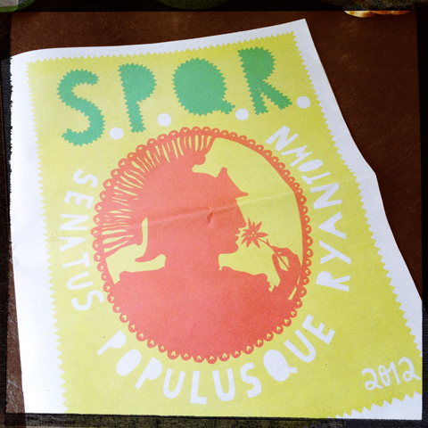
Rob Ryan is masterful at working across disciplines: for example he’s as happy covering the surface of a plate as he is creating a huge hand cut paper artwork for the wall. And he’s no stranger to working with very basic and cheap materials – back in the day he used to screen print newspaper to make wrapping paper, and for his new project he returns to this medium.

rob ryan newspaper spqr
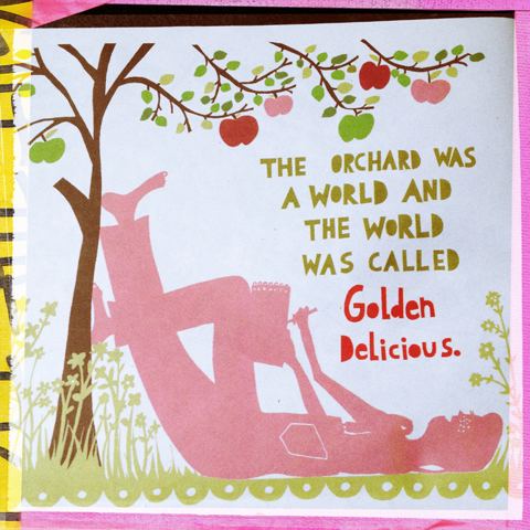
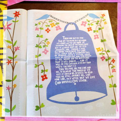
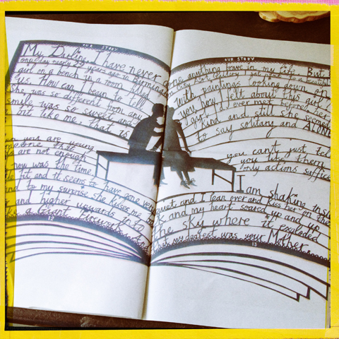
SPQR, which stands for Senatus Populusque Ryantown, The Senate and People of Ryantown, is the first of a planned quarterly journal where Rob will test out some of the many ideas that he has, some of which will never see the light of day. Highlights include a trial for a children’s story that features an abundant apple tree, a touching portrait of the artist talking with his daughter, and glimpses into Rob’s studio and thought processes.

rob ryan newspaper spqr
SPQR is for sale for just £2.13 alongside t-shirts, tiles, decorative tape and mugs on Etsy. It’s a rare chance to delve inside an artist’s mind, and it’s practically free. A must have for any Rob Ryan fan!

Categories ,etsy, ,newspaper, ,rob ryan, ,Senatus Populusque Ryantown, ,SPQR, ,The Senate and People of Ryantown

Similar Posts:


Amelia’s Magazine | Ryantoon – A Tribute To The North

rob-ryan

Acclaimed illustrator Rob Ryan – who designed the exquisite limited edition cover to our second printed issue – has lost the colour in his cheeks. Or his shop has. The quaint Victorian terraced Ryantown on London’s famous, web Columbia Road has closed its doors. Whilst closed, he has covered its façade with monochrome sticky tape to announce it’s new pallid identity.

ryantoon-shopfront

This basically means that little has changed other than the beautiful items that were available in an assortment of hues are now still there to be plucked as pressies to your self or loved ones exclusively in black and white for only six weeks.

Known for his intricate paper cut pieces, Ryan has made a huge dent in the illustration market with books, tiles and plates also being big sellers.

plate-ryantoon

With pop-ups happening all over the capital, it’s nice to see Ryan make his on twist on the trend – by simply removing colour.

Apparently, the removal of colour was a tribute to two of the shop’s Geordie staff members. He says: “[the shop] is usually as bright and as colourful as the famous flower market which surrounds it every Sunday.”

ryantoon

It is unknown as to what décor theme (if any) the shop will adopt next. Amelia’s Magazine suggest a motif of bunting, butterflies, candy floss and ice creams though.

Categories ,illustration, ,rob ryan, ,ryantown

Similar Posts:


Amelia’s Magazine | Scruffy does it: Suzie Winsor presents ‘Beard and Wonderful’

London by Avril kelly2
Bright city lights of London and 123 Bethnal Green Road by Avril Kelly

Vrooosh and we’re in. After a National Express journey from Bristol at 4.10pm we arrived immersed in the mighty traffic of London. From twit updates, information pills I was aware that the Amelia’s Magazine London team had spent the morning working hard whilst I’d been sat at my rectangular Apple.

 Gareth A Hopkins Mattt Bramford

The lovely Matt Bramford, viagra approved Amelia’s Fashion Editor working hard with a smile. Illustration by Gareth A Hopkins

Getting off the beloved bus, we tubed to Bethnal Green Road, missing our bikes with all our hearts after we discovered we had got off at the wrong tube stop and had to walk the length of the road. When we got to 110 -ish I put on my heels and immediately inflicted a new set speed of slow on us. Then after apparently vacantly walking past the venue, we about turned and eventually arrived at 123 Bethnal Green Road at 8pm. And there we are- in.

6dayriot-ACOFI-by-Mina-Bach
Illustration of 6 Day Riot by Mina Bach

It’s buzzing and I can see the feathered headdress and hear the sound of glorious music coming from the stage. 6 Day Riot are on stage and everyone is loving it. “Drink!” Vodka O flowing, blue bottled Adnams beers in hand – mutter to Charlie, he can’t hear me, the walls are bright and the buzz is loud. But we are smirking at each other, as the swirl of this internal world is clearly alleviating our hours of bus lethargy. There are beautiful outfits from where I want to find out, and make up perfection. I’m loving the wedges, flowing skirts, vintage fabrics and beautiful piled up and flowing hair. Breathing art of their own kind, everyone I want to know and only until midnight to do it. Um, let’s CHAT. Ze atmosphere is perfect for le chat… Bonjoir…

helboyf3

Charlie and I by Abby Wright – This illustration was a present for our families (I know) – but now you can see us both. In art form!

I meet Jess Furseth because we are looking at each other like we know each other, but don’t. It’s like online friend dating. How could this all go minus the screen? It’s fine of course. We natter about the world then pop downstairs with my curly haired man. There we meet Hannah Bullivant and her husband. Chat, chat, banter, banter – her husband is from Jersey too. Cue lots of Jersey yabbering then Jess, Hannah and I discuss the power of the word etc. There are tea cups about the place from earlier’s tea, cake and illustration session, and a comfy Chesterfield sofa for a second of sitting. This is when I briefly meet Amelia’s Dad. It’s all in the eyes! Lovely man.

Akeela pic of me

Picture of moi by Akeela

Boosh and we’re chatting outside. Banter, banter. Then downstairs and the Lily Vanilli cake is being cut. I have a bite of Charlie’s and the white chocolate and sweet cake melts like pink heaven in my mouth. He swipes it away from my chops. Chat, chat. “Hello Amelia!” She’s wearing an amazing cape and gorgeous shoes. So nice to see her. “Fabulous PARTYY!”

ACOFI cake illustration by Danielle Shepherd

CAKE! by Danielle Shepherd. Made by Lily Vanilli.

Abby_Wright_Amelia_Gregory_ACOFI
Illustration of Amelia, lady of the night, by Abby Wright

Chat to a couple of bloggers and see some of the splendid illustrators I speak to everyday. Everywhere I turn is enthusiasm and love for ART! Whilst Charlie is talking about his hair (apparently) to a table of chaps, I had a peek inside a goodie bag. With the purchase of ACOFI, one could have a fabulous tote bag with a Tatty Devine necklace, Dr Hauschka products, Pukka tea, a Moleskine notebook and other goodies inside. I bestowed on the goodies the necessary “ooohs” and “ahhhs” as I pulled out product after postcard after teabag. It was literally a combination of all my favourite things. Splendid!

Gareth A Hopkins Sallly Mumby Croft copy

Contributor Sally Mumby- Croft snapping away. Illustration by Gareth A Hopkins

Squeal at Matt Bramford before spending the rest of the evening throwing shapes with Chazaroo, Hannah, her husband and the lovely Jess. C.L.A.S.S.I.C. tunes are spun out from The Pipettes and the Mystery Jets DJ. We take breaks outside and before long it all becomes a spinny blur of joy.

MattBramford_ACOFI_280111_430
Stylish people dancing, picture by Matt Bramford

The Pipettes by Avril Kelly

The Pipettes by Avril Kelly

dancing

Hannah Bullivant in the thrust of a move.

It would have been super to have chatted to EVERYONE, but to be honest I adored spending the evening with three fantastic new (now real-life – that’s right writers and Jersey 2) friends. That’s what it was about for me, relaxed fun and an appreciation for the creative and beautiful. I’m proud to be a part of Amelia’s Magazine and all who sail in her.

tube
Photo by Annie Mole, flickr

Excitable, energised, excellently enjoyable. Ends.


Charles Darwin

Charles Darwin, case Alec Guinness, case Byker Grove’s Geoff Keegan and Rolf Harris are among the great and bearded in Suzie Winsor’s collection. Even Edmund Blackadder has a spot in the lineup now hanging in Shoreditch’s KK Outlet gallery. This all seems right, I’m thinking as I admire the quirky ink drawings; I will be the first to admit to having something of a soft spot for a good beard. But what’s the attraction for Suzie?

‘Oh it’s hard to say, but beards seem to add a lot of character to a face,’ Suzie says, as I manage to steal five minutes of her time during the packed opening night last Thursday. ‘It can make a guy seem friendlier, or sometimes more intellectual.’ It started when Suzie was listing people she wanted to draw, and realised lots of them had beards. ‘So I thought, why not make that a theme for an exhibition.’ Proper beards though, none of those sculptured ones, she adds: ‘Bushy and manly, you know!’


Geoff Keegan

While a great beard became a requisite to be part in her show, Suzie points out that all the candidates are also inspirational. ‘I’m a huge Pulp fan’, she says, pointing to the picture of Jarvis Cocker, then to Charles Dickens: ‘I love Oliver Twist.’ As we’re talking, one of Suzie’s other beardy heroes, Rob Ryan, shows up to congratulate his former colleague. Suzie has also worked alongside Tatty Devine and Paul Smith, but has now embarked on the freelance route.


Bearded Suzie

So now, which inspirational characters do you think should seriously consider having a beard, I ask Suzie? She thinks about it for a moment. ‘Well, maybe Larry David, Stuart Murdoch and David Suchet…’ I suggest Robert Downey Jr, to which Suzie nods, and Cate Blanchett, to which she laughs, but I do think it’s a good idea, you know. Then the next day, she emails me: ‘I’ve just realised I haven’t drawn Mick Fleetwood! I’m genuinely gutted! Aaah. I’m going to have to continue the series!’


Beards

Running alongside Suzie Winsor’s art at KK Outlet is a second show, entitled ‘In almost every picture #9’ by Erik Kessels. It’s a series of old, faded Polaroid photos of one family’s very black dog – the animal is clearly loved as it’s present in so many of their pictures, but because of the inadequate camera the dog is practically invisible.

The result is fascinating. Part of Erik Kessels’ found photography series, the dog-shape appears in photo after photo after photo. It’s sort of like the pet isn’t really there, giving it a ghost-like feel. But still, the family has persevered in the hope that one day, their furry friend will be accurately captured on film.


In almost every picture #9

‘Beard and Wonderful’ runs until 28th February at KK Outlet, 24 Hoxton Square, London N1 6PB. For more information see our listing.

Categories ,Alec Guinness, ,Beard and Wonderful, ,Byker Grove, ,Cate Blanchett, ,Charles Darwin, ,Charles Dickens, ,David Suchet, ,Edmund Blackadder, ,Erik Kessels, ,Geoff Keegan, ,illustration, ,In almost every picture #9, ,Jarvis Cocker, ,KK Outlet, ,Larry David, ,london, ,Mick Fleetwood, ,Paul Smith, ,photography, ,rob ryan, ,Robert Downey Jr, ,Rolf Harris, ,shoreditch, ,Stuart Murdoch, ,Suzie Winsor, ,Tatty Devine

Similar Posts:


Amelia’s Magazine | Kingston University: Illustration and Animation Ba Hons Graduate Show 2011 Review. Animation.

Kingston Illustration graduate exhibition 2011 Zach Ellams
Detail of artwork for The Deptford Mice by Zach Ellams.

As for the animation from Kingston, decease I didn’t manage to take much of it in at the exhibition so I’ve had a scout around on the internet in the intervening days. I absolutely adore Sophie Powell‘s The End, featuring talking planets and a Japanese voiceover.

I also love her Order/Chaos project with jiggling balls:

…and her collaborative project based on the Salmon Rushdie novel Luka and the Fire of LIfe, especially the ominous moving mountains.

Sophie Powell is inspired by murder mysteries, contagious smiles, pop up books and animals in clothes. Sounds good to me.

When Zach Ellams is not collaborating with Sophie he is making wonderful animations of his own. I was drawn to his 3D illustrated artwork (see above) for The Deptford Mice, which was made for a theatre performance in Wimbledon with Tim O’Leary. It’s a dark fantasy adventure of brave mice battling the sewer rats lurking beneath London.

Dawn Smit hung a load of images from the wall in an energetic way that caught my eye.
Kingston Illustration graduate exhibition 2011 Dawn Smit

Moira Lam made a hypnotic showreel of quietly turning music boxes for End in a Box.

The Morse Mystery is a funny and effective little animation with a story to tell, by Welsh born James Lancett.

Sean Weston goes up close and personal to tell the story of Bobby and Billy.

For Reincarnation by Angus Dick a man turns around and around the world, becoming a dragon, emerging a man.

And finally, two further versions of Luka and the Fire of Life, with some wonderful perspectives, firstly from a flying carpet in Katherine Robson‘s video.

And from behind eyelids and confronting monsters in this one by Ben Tobitt.

If you liked this animation why not read more about the illustration upstairs and downstairs too? I’ll leave you with an image of Rob Ryan in his cycling gear. It was a great exhibition, need I say more?
Kingston Illustration graduate exhibition 2011 Rob Ryan

Categories ,Angus Dick, ,animation, ,Ben Tobitt, ,Bobby and Billy, ,Dawn Smit, ,Dragon, ,End in a Box, ,illustration, ,James Lancett, ,Katherine Robson, ,Kingston University, ,Luka and the Fire of LIfe, ,Moira Lam, ,Monsters, ,Morse Mystery, ,Novel, ,Order/Chaos, ,Reincarnation, ,rob ryan, ,Salmon Rushdie, ,Sean Weston, ,Sophie Powell, ,The Deptford Mice, ,The End, ,Tim O’Leary, ,wimbledon, ,Zach Ellams

Similar Posts:


Amelia’s Magazine | London Art Fair 2010

3

Thomas Allen, view Unreachable, viagra 100mg 2009, adiposity Chromogenic Print, 20 x 24 inches, Courtesy of Foley Gallery

I always get rather excited about large art fairs or exhibitions as you have hours of perusing and inspiration ahead of you and the hum of conversation in the air adds to the buzz.  The annual London Art Fair features over 100 galleries promoting 20th Century British art and focuses predominantly on painting while also featuring photography, drawing, installations, video art and print editions.

4280746017_cecc76f4ef_o

Photograph courtesy of Lil Wizz

Formally the Royal Agricultural Hall, The Business Design Centre was saved from demolition in 1981 and re-invented as an exhibition, trade and conference centre and is certainly a spectacular cavernous venue for a large gathering of galleries and art dealers.

att2304972.jpeg

Isabel Rock, Lord Foster, 2009, Pen ink and collage on print, Courtesy of Bearspace

One theme did catch my eye as being on-trend – paper-cut illustration.  It has taken the art world by storm.  You are probably familiar with Rob Ryans illustrations, currently being featured in every commercial format from magazines to packaging.  Well, it appears that the fine art world have a penchant for paper-cut art as well.

IMG_3330Photograph courtesy of Zanny Mellor

4

Wild Waters 2009, courtesy of Georgia Russell, Cut 19th-century engraving in acrylic case, 28 x 30.75 x 2.5 inches

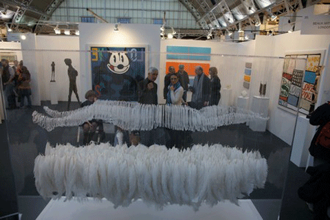
England & Co were showcasing the artists’ books of Georgia Russell, who has taken her scalpel for a walk in the library!  She transforms books, music scores, maps, newspapers and photographs, giving each a new lease of life.  Her three-dimensional book works are created by hand-shredding every page in a book and distilling them in bell jars or perspex boxes, allowing the viewer to take a different meaning from the original title. Evolution and Natural Selection reacts well to this method of presentation, dithering somewhere between museum artefact and artwork. Choosing such an eminent title obviously ensures collect-ability but Russell’s deconstruction of Charles Darwin’s famous publication is quite a find, seeming to have animal fur spilling it out of it.

IMG_3289Photograph courtesy of Zanny Mellor

The Sims Reed Gallery was exhibiting some exquisite screenprints by Eduardo Paolozzi, which had me dissecting and digesting their infinite layers, geometric patterns and cacophony of colours for some time.  His surrealist mish-mash of subject matter creates very interesting compositions that sometimes resemble plan views of cities or a diagram of the inner workings of machines.  So layered and complex are his prints that you could not get bored of having one of those on your wall.

1

John Piper, Sea Buildings, 1938, Oil, pencil & ripolin on canvas laid on panel, 12 x 16 inches, Courtesy of Richard Green

Diagrams and maps are perhaps the perfect marriage of fact and interpretation, science and art.  As artists, we visually document the world around us and map-making appears to be one of those visual forms which encompasses our desire to find the truth but also to create with our hands.  Jason Wallis-Johnson, also represented by England & Co tirelessly produces mesmerisingly detailed maps based on a number of cities around the world.

5

Jason Wallis-Johnson, Imaginary Cities 2002, Pencil and ink on paper

His drawings are not direct but transferred from carbon paper, giving them a soft elegance untouched by hand.  The 3-dimensional pieces are even more captivating.  They are created by pin-pricking black carbon paper and setting them on lightboxes, giving the drawings a glow that more than realistically depicts night-time aerial photographs of the cities which he obsesses over.  Such detailed work has led to him being collected by The British Musueum and the V&A to name a few.  It seems that his work, like Georgia Russell’s can’t make it’s mind up as to whether it is art or artefact, 2 or 3 dimensional.

4281491060_917f9b7bd0_o

Photograph courtesy of Lil Wizz

Categories ,Art dealers, ,contemporary art, ,drawing, ,Eduardo Paolozzi, ,Exhibition Review, ,galleries, ,Georgia Russell, ,Highbury Islington, ,illustration, ,installations, ,Isabel Rock, ,Jason Wallis-Johnson, ,John Piper, ,london, ,London Art Fair, ,photography, ,rob ryan, ,The british Museum, ,The Business Design Centre, ,The Sims Reed Gallery, ,Thomas Allen, ,video art and print editions.

Similar Posts:


Amelia’s Magazine | If You Could Collaborate exhibition at A Foundation Gallery, Rochelle School

If-You-Could-Collaborate-2010134

approved Helvetica, sans-serif; font-size: 12px;”>If You Could Collaborate is the latest event in a series of high profile shindigs put on by designers Alex Bec and Will Hudson, wunderkids of the current graphic arts scene. I first met these ambitious young men when we were both invited to do something or other at LCP, I forget what. It was but a few years ago but they were already something of a phenomenon, having started their first venture whilst still at college. Perhaps now best known currently for their popular blog It’s Nice That, they are now creating a commotion as art directors. Which is probably why they were incredibly busy showing some Very Important People around their latest exhibition when I popped down on Thursday. I would have gone to the opening night, but unfortunately I am learning to sing Mozart at evening classes. As you do. (Quite fun actually, I’m learning pop singing in my other class. Yes I really am taking two singing classes a week.) The exhibition features a variety of artists and designers who have been encouraged to collaborate outside of their disciplines without the aid of a brief – in the hope that some unexpected outcomes might be reached. As might be expected this has led to a variety in quality…

Held in the wonderful space at Rochelle School near Arnold Circus, the first thing you encounter when you arrive at the exhibition is a tall skinny booth which you are encouraged to enter via a string curtain. Inside a laptop sits behind a large red button. Oooh push me push me it seems to say. So I did. What what? A number seemed to be encouraging me to do something but I knew there was a man sat outside and I felt shy, so I missed the first number and whispered the second one. I’m not normally a mouse. Outside I could see my face massed with others, all shouting and yelling their numbers, a montage of shouts. Why hadn’t I noticed this before I went in? Fun, there was no obvious point to this piece, but then I discovered that it was delivered by a “digital agency”. Does this encapsulate the kind of vapid interactivity that clever advertisers are so fond of, but which is essentially meaningless? I don’t know…

If-You-Could-Collaborate-2010137Artwork by With Associates & Anthony Dickens. I’m on the left in the montage.

Turning the corner I was met by Alex and Will’s guided tour of important people, nodding sagely over a computer screen. Me? I was instantly attracted to the huge neon perspex sculpture. The pictures that is. The actual artpiece was a miniature model, a tiny bright town. Ooooohh, if I were a child I’d love to play with this piece. But it’s art, so must be ogled inside a protective case in a look but don’t touch kind of way. Above a neon sign flashes all the colours of the rainbow. Now do you really wonder why I wouldn’t be attracted to this piece? Underneath some more perspex cut outs showcased a new font, called Avec, (downloadable here for free type fans) which looks a bit like a letterset font. Made by Praline and the Model Shop, these pieces are designed to work together – the buildings a 3D reflection of the shapes made by the letters.

If-You-Could-Collaborate-2010076

If-You-Could-Collaborate-2010077

If-You-Could-Collaborate-2010081

And then I turned a corner and artfully fell over one of the artworks.

If-You-Could-Collaborate-2010084A bench by Max Lamb and Gemma Holt.

Yup, I just stepped back and it went tumbling like a stack of dominoes. Like a shot Will was next to me (didn’t recognise me? not sure but he wasn’t giving any signs of recognition away) hastily rectifying the situation.

“What did you do?”

“Oh I dunno, it just fell over. That must have happened on opening night right? Surely? I mean, it’s not exactly stable!”

“No.”

Hmmm.

I have no idea what this piece was meant to be, but a quick hunt online tells me that it is a bench by furniture designer Max Lamb and girlfriend Gemma Holt (can’t tell you what she does I’m afraid, her website don’t say much.) Nice work if you can get it, but I wouldn’t recommend sitting on it.

If-You-Could-Collaborate-2010082Embroidered tabloid headlines re-imagined by Sandy Suffield and Fiona Woodcock.

In front of this was a far more interesting prospect to a type and colour junky like myself. Designers Sandy Suffield and Fiona Woodcock have crafted a series of beautifully stitched tabloid headlines, taking lead from the content. We like a lot. In fact I used to do a similar thing with the fonts we created for Amelia’s Magazine.

If-You-Could-Collaborate-2010124

If-You-Could-Collaborate-2010119

If-You-Could-Collaborate-2010123

Fonts by Sandy Suffield and Fiona Woodcock.

Also in this room was a mirrored ironing table with lots of plasticky junk glued onto it and a weird golden helmet next to it that appeared to be constructed of the kind of junky tat you find in a Christmas cracker. I got really into taking pictures of these but I’m going to have to refer to the If You Could website to see if they represent some kind of meaningful commentary on junk. Nope! All I can decipher is that it’s by commercial designer Ian Wright (inspired by playfulness) and Riitta Ikonen (who is described as an “ex-student” – come on, everyone’s an ex-student of some description. Help, copy editor needed!) I still have no idea what it means, if indeed it means anything. My analysing tentacles are beginning to decipher a bit of a theme here – treading the fine line between design and art can be a tricky job. But then I like pretty things so s’pose I mustn’t grumble.

If-You-Could-Collaborate-2010104

If-You-Could-Collaborate-2010113

If-You-Could-Collaborate-2010110

By Ian Wright and Riitta Ikonen.

In a cabinet a series of objects were presented as alternative currency by design consultancy BCMH and designers Smith&WIghtman – now this commentary on the meaning and intrinsic worth of money interests me. Inscribed on the counter surface are the words “The objects have accrued their value through the amount of time invested in them. Time embedded in the material (through harvesting/extracting and processing) and then time spent in fabrication.” It goes on to ask “Why do certain forms or materials look more expensive than others? What is the value of an object with no apparent function?” Above it a ticker tape flashed red.

If-You-Could-Collaborate-2010116Mint, by design consultancy BCMH and designers Smith&WIghtman.

Mint instantly stands out for making a statement, so it’s such a shame that this is not described or transcribed on the website, which I am now going to have to flag up for it’s utter blandness in describing the works of art in this exhibition. “Relevant in tone and execution, with a crisp sensibility that is very easy on the eye.” This is as good as it gets for this artwork. Utter guff.

If-You-Could-Collaborate-2010085

Opposite there was a large painting by artist Sam Messenger and carpenter Bart Long which reminded me of many other artists – taking it’s cue from the abstract works of Bridget Riley et al. Very pretty.

If-You-Could-Collaborate-2010086

If-You-Could-Collaborate-2010087

If-You-Could-Collaborate-2010088

Lazer wall cuts by typographer Craig Ward with Sean Freeman and Alison Carmichael.

What I did really like was the lazer cut panels further along the wall. I just love the way that the edge of the wood retains the burn marks from the machine used to cut it out. Scho sexy that. Termed “Calligraffiti” these beautiful wall pieces were dreamt up by hardcore typographer Craig Ward with cohorts Sean Freeman and Alison Carmichael. I have no idea what the phrases mean but who cares? See, always the typography. Always.

If-You-Could-Collaborate-2010095

On the floor lay an obscenely long flag, described as “new world” by creators Karl Grandin and And Beyond. What does this new world mean? Maybe we’re all joined together now. That would be nice. In a big snuggle under the flag. Or maybe not.

If-You-Could-Collaborate-2010093

Oliver Jeffers and Aaron Ruff have re-purposed a suitcase as part of a mad story about four dimensional control. I love illustrators – they always make things so playful. And it doesn’t have to mean anything, it can just be for fun. Beautiful.

If-You-Could-Collaborate-2010090Wall hanging by Hvass&Hannibal with Anne Werner.

Next to this was the Hvass&Hannibal wall hanging that I spoke of in my interview with them here. I have to say that I don’t think this is their strongest work – as we know  over the past few weeks they were really super busy with putting together their solo exhibition and I suspect that they didn’t devote a huge amount of time to this. When I spoke to them they expressed an urge to branch out of their comfort zone when it comes to colour, but actually I don’t think that they should – their use of colour is a big part of what makes their work so special. And the meagreness of colour in this piece lets it down. Just a thought girls, if you’re reading.

If-You-Could-Collaborate-2010131

If-You-Could-Collaborate-2010130By Sara Fanelli, George Hardie and Leonardo Sonnoli.

Now, don’t get me started on Sara Fanelli, or I might be forced into a confession…. When I was fresh out of college, trying to be an illustrator (yeah, it didn’t work out, alright) I wanted to be just like her…. you can see her influence heavily in my work of this period – lots of mashed up type, weird animals created out of collage, etc. Anyway, she has teamed up with George Hardie and Leonardo Sonnoli to produce some delicate numerals (which they describe as the bargain version of the alphabet as there are only 10).

If-You-Could-Collaborate-2010091

If-You-Could-Collaborate-2010092Jim Stoten with Andy Rementer.

Oh, and there’s Jim Stoten, collaborating with Andy Rementer (I’m not sure which is which – they seem to have merged successfully). And he STILL hasn’t learned how to produce artwork for digital output (unless he has decided to embrace this particular ‘look’ intentionally). Yes, as the blurb on the website states, Jim can really draw – I absolutely love his work (he’s appeared in my magazine several times and did the cover for issue 6) but boy is he hard to work with – and I remember one of the biggest problems was that he could never produce work at a high enough resolution for decent print reproduction. He scans his drawings at one resolution and then blows them up to fill them in at another. It’s such a shame that once again, his lines look so fuzzy and just a bit, well, crappy. This image has also been printed on low quality gloss paper. It just could have all been so much more beautifully executed.

If-You-Could-Collaborate-2010097

If-You-Could-Collaborate-2010098Artwork by Jesse Auersalo and Jesse Pietila.

The low quality of this production was highlighted by the wonderful execution of the huge hanging by Jesse Auersalo and Jesse Pietila in the next room. Here a surreal juxtaposition of outsize everyday objects; top hat and band aid, were printed in fine monochrome detail on what looked like carpet tile. Just wonderful, and a perfect example of how an exhibition like this should be approached when attempting to merge the disciplines of art and illustration.

If-You-Could-Collaborate-2010099

Next to this (not sure they were best suited to such proximity) was a brightly coloured piece by the lovely Fred Butler (championed in issue 10), jewellery designer extraordinaire. And now I am being visited by the green eyed monster because I’ve seen on the website that THERE WERE BADGES. But not when I got there. Hurumph. Together with No Days Off she has created a wall piece jokingly based around a campaign to get more days in the week. Offbeat and fun. Love it.

Then onto the darkened room, where an animation, Black Lake, by fabulous American illustrator Jon Klassen and video director David OReilly was showing in a loop. Ducks swim away from the viewer towards high rounded mountains and a lone house, then appear to swim back at you upside down and back to front. Coupled with a hypnotic soundtrack this was a really beautiful piece and you can view it here.

Another lovely video came courtesy of Michael Maloney and photographer John Hopper – taken by standing on a peak in the Lake District for 24 hours and rotating a camera 360 degrees to watch the sun rise then set over the hikers who come to stand and have their picture taken in front of the wonderful view. Mesmerising.

If-You-Could-Collaborate-2010126

If-You-Could-Collaborate-2010127Rob Ryan’s decorated chair.

Rob Ryan gets everywhere these days – and for this exhibition he has created a decorated flat pack rocking chair with Michael Marriott which I paused to look at on my way out. Very cute but unfortunately the recipient of another dreadful bit of description on the website: “There are a thousand words we could use to describe Rob Ryan’s work, and all of them are superlatives.” Folks, next time hire a decent writer!

I left the Rochelle School with a lot to mull over in my mind, which can only be a good thing when viewing art. Alex and Will have pulled together a really interesting exhibition, even if at times it felt as if there was something missing – decent explanations of the artworks for example. But I am not really sure how successful an idea it is to shoehorn the work of such obviously commercial designers into an artistic space like this – it felt a little vapid in places. Some of the work obviously considered deeper content but much of it was just pretty for it’s own sake, with an obvious eye to a lucrative advertising contract not far down the line. Of course I really enjoy pattern and type and I absolutely believe there is a place to produce art for beauty’s sake, but I don’t think it works so well to try and be all things to all people. I suppose I also think that if you have the chance to create something more meaningful you should grab it with everything you’ve got (this exhibition had prominent Arts Council funding) instead of adding to the vast canon of superficiality that many contributors to the exhibition must surely work with on a daily basis. To be honest I would like to unremittingly champion Alex and Will but with their eye so clearly set on their own commercial future I felt their choice of collaborators too often produced work that felt a bit empty and soulless. I also think you’ve got to decide what audience you’re aiming for, and this wasn’t obvious.

Having said that there was much to enjoy in this exhibition and I do really admire the zeal with which Alex and Will are are able to pull together such a large project. I was just about to tell you the good news that If You Could Collaborate is on for another week, but I’ve checked the website and instead have discovered that it closed at the weekend, which is a real shame because if you have any kind of interest in the murky ground where art meets design this is a must see exhibition. What a shame it wasn’t given a longer run.

Categories ,A Foundation Gallery, ,Alex Bec, ,art blog, ,Bridget Riley, ,Fred Butler, ,Hvass&Hannibal, ,If You Could, ,If You Could Collaborate, ,It’s Nice That, ,rob ryan, ,Rochelle School, ,shoreditch, ,Will Hudson

Similar Posts:


Amelia’s Magazine | Book Review: SuperMarket Sarah Wonder Walls by Sarah Bagner

Supermarket Sarah Wonder walls book review
Sarah Bagner has come up with a killer idea: walls as showcase, as vertical space where things are not just stacked inconsiderately but placed with love to admire. Since 2009 this former advertising creative has been fetishising the humble wall on her Supermarket Sarah website. On the website she puts together colourful displays as a way to sell stuff in a visually appealing way: it’s a model that has led to many fun collaborations with a host of top brands, including Selfridges, Rob Ryan and Tatty Devine (read our review of the latter launch party here).

Supermarket Sarah Wonder walls book review
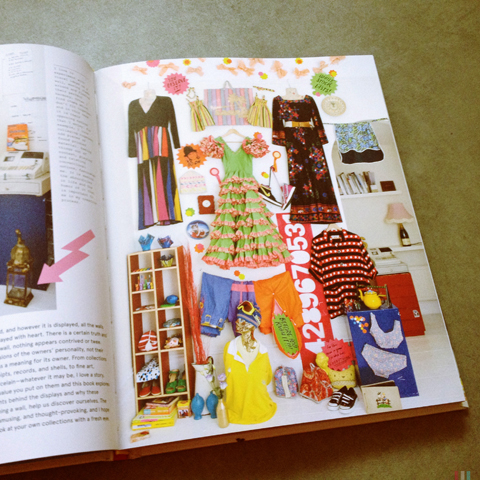
Now Sarah Bagner has written a book, aptly titled Wonder Walls. But the book, it turns out, is about so much more than walls. In it she meets eclectic home owners who’ve got an eye for arresting displays: and without a product to sell it’s the personal clutter of a full creative life that has become king… on shelves, in cabinets, hanging from the ceiling, laid out in ornamental table displays. I love an amazing arrangement of lampshades and chandeliers that dangle over a simple wooden kitchen table in Christopher Kelly‘s abode.

Supermarket Sarah Wonder walls book review
What binds the book together is Sarah’s unique voice: her choice of subjects are unashamed maximalists, as witnessed in the extremely packed shelves of librarian Ilse Runow Raihle (which probably best reflects my own magpie like approach to interior *ahem* design.) The book actually visits just a few creative types who live with their stuff out in the open.. and there is so much of it that you’re still touring the same house a dozen pages later. As a design aesthetic this book is inspiration to all of us who fail to live up to our inner minimalist ideals. Yes, it says, embrace the accumulated clutter and the strange collections… let it all hang out and damn the dust.

Supermarket Sarah Wonder walls book review
SuperMarket Sarah Wonder Walls by Sarah Bagner is available from Amazon and all good bookshops.

Visit Sarah Bagner‘s Supermarket Sarah website to find lots of unique items to buy, especially in the run up to Christmas. I particularly like bright tea towels and printed cushions by Jonna Saarinen (who I spotted at last year’s RCA graduate show). The site is a good place to find exotic one offs, for example props by Lord Whitney, and of course our very own Maria Papadimitriou hosts a wall where you can buy her unique Plastic Seconds upcycled jewellery.

Categories ,Book Review, ,Christopher Kelly, ,Cico Books, ,Ilse Runow Raihle, ,Jonna Saarinen, ,Lord Whitney, ,Maria Papadimitriou, ,Plastic Seconds, ,rob ryan, ,Sarah Bagner, ,Selfridges, ,Supermarket Sarah, ,Tatty Devine, ,Wonder Walls, ,Wonderwalls

Similar Posts:


Amelia’s Magazine | Christmas Gift Ideas 2012: 12 Top Kitchenware Designs

productofyourenvironment jammie dodger plate
I’ve brought you the best cushions, the best mugs and the best tea towels, and now here is the best of the rest of the homewares I found whilst scouring craft fairs and the web for interesting and unique gifts.

If you love slightly kitsch tableware you’ll love these Jammie Dodger biscuit serving plates, created by product designer Rebecca Chitty of productofyourenvironment.

lucentia plastic bowls
I am a little bit in love with these unusual marble effect bowls made out of recycled material originally used for sunglasses frames: created by Lucentia using an innovative in-house process. These awesome bowls are sent out within a week so get ordering.

Jim Bob art Mr Fox coffee cups
Jim Bob Art is still hard at work creating his amazing animal plates, but he is also now hand painting these brilliant sets of coffee cups: which work to perfection when stacked. He is currently holding court in his own shop on Columbia Road, so why not visit in the run up to Christmas?

Lush designs vegetable oven gloves
I’ve already mentioned Lush Designs once but I’m going to mention them again because their quirky print designs are right up my street. I love these vegetable oven gloves – sprouts, carrots and beetroot make such a great seasonal colour combo.

mini modem plates
You can always count on Mini Moderns for a slice of great design: check out these marvellous backgammon tea plates.

Silicone-Trivets-Royal VKB Haus London
Recently discovered: I love Smak, Grum, Blub and Slisss silicone animal shaped trivets by Ontwerperk at Haus London – based on pre-historic rock art. One to please the men too I think.

Grande Dame Madam & Eve Limited Edition Porcelain Dinner Plate
For beautiful decorative porcelain plates I always come back to the inimitable designs of Burnt Offerings by Grande Dame: Tiff McGinnis is an American expat and in honour of New York recognising same sex marriage she has created this wonderful range of plates. Choose from Madam and Eve or Adam and Steve. Get 30% off using the code SANTASALE before Dec 20th!

london plane chopping boards by Hampson Woods
Also in stock at Haus London are these beautiful wooden chopping boards created in a Hackney workshop by Hampson Woods from fallen London Plane trees. Gloriously smooth and sexy to the touch (I’m not making it up, I’ve touched one). Each board comes with a tag explaining the provenance of the tree it came from.

rob-ryan-set-of-4-this-was-our-place-china-plates
Rob Ryan of course deserves a mention, now that he designs such a wide range of ceramic wares. I particularly like this set of four plates titled ‘This Was Our Place‘, available at Soma Gallery.

marcus walters tray howkapow
And to round off my tips for fabulous kitchenware purchases: three beautiful laminated wooden trays, all made from sustainably sourced Scandinavian birch wood. The biggest tray is a retro design by Marcus Walters for Howkapow.

mouse tray by darling clementine soma gallery
Or try this sweet mouse tray by Darling Clementine at Soma Gallery.

Jonna Saarinen Wooden Breakfast and Picnic Trays
And to round off my selection: pick one of these fabulous abstract neon splatter designs by Swedish RCA graduate Jonna Saarinen.

Stay tuned: more to come soon!

Categories ,Adam and Steve, ,Blub, ,Burnt Offerings, ,ceramics, ,Chopping board, ,Christmas, ,Columbia Road, ,Craft Fair, ,Darling Clementine, ,gifts, ,Grande Dame, ,Grum, ,hackney, ,Hampson Woods, ,Haus London, ,Homeware, ,Howkapow, ,Jammie Dodger, ,Jim Bob Art, ,Jonna Saarinen, ,Kitchen, ,Kitchenware, ,London Plane, ,Lucentia, ,Lush Designs, ,Madam and Eve, ,Marcus Walters, ,Mini Moderns, ,Ontwerperk, ,Plates, ,productofyourenvironment, ,rca, ,Rebecca Chitty, ,recycled, ,rob ryan, ,Silicone trivet, ,Slisss, ,Smak, ,Soma Gallery, ,Sunglasses, ,sustainable, ,This Was Our Place, ,Tiff McGinnis, ,Wooden tray

Similar Posts:


Amelia’s Magazine | Christmas Gift Ideas 2012: Top Ten Best Tea Towel Designs

Like cushions, tea towels provide the perfect surface to showcase artwork: is it any wonder there are so many great designs to choose from?

Mr PS old fashioned sweetie type tea towel
For some reason I seem to have fixated on type when it comes to these – first up is this fun sweetie design by Mr PS.

Howkapow great british roast tea towel
Howkapow always stocks great design so I like to check in now and again and see what they have. I particularly like this Great British Roast Tea Towel designed by Stuart Gardiner.

thornback and peel rabbit cabbages tea towel
There is a simplicity to most of Thornback and Peel‘s designs which is very appealing but I like this one with bunnies running through the cabbage patch.

colorful winterland calendar tea towel
On etsy designer Gabriela Larios is selling this brilliant 2013 Tea Towel Calendar: why not kill two birds with one stone! 

almedahls-pomona-tea-towel
Hus and Hem stock this fabulous retro tea towel by Almedahls: the Pomona design was first created in 1956 and looks every bit as good today.

christmas-tea-towel-victoria eggs
Designer Victoria Eggs has produced a Christmas dinner tea towel, featuring all your festive food favourites in fancy type.

Classic Cocktails tea towel by Stuart Gardiner
To Dry For is THE shop for tea towels, so I had to check in and see what they have this season: my favourite is the Classic Cocktails tea towel, also by Stuart Gardiner.

Ella James Bank Note tea towel
How much fun is this bank note tea towel by Ella James? It comes in two designs based on either the £20 or £50 bank note.

pintuck make do and mend
The Pintuck website from Mary Land has got a few fab designs: I like this one’s sentiments. Make Do and Mend.

dear santa rob ryan tea towel
And if your budget doesn’t stretch to a one off bit of Rob Ryan artwork you could always frame his very special 2012 Christmas tea towel. What a winner! Best of all it can be cut up and sewn into a personalised stocking if you fancy.

Looking for other Christmas gifts? Check in with my best cushions and best mugs blog posts too!

Categories ,2012, ,2013 Tea Towel Calendar, ,Almedahls, ,Christmas, ,Classic Cocktails, ,Ella James, ,Gabriela Larios, ,gifts, ,Great British Roast Tea Towel, ,Howkapow, ,Hus and Hem, ,Lettering, ,Make Do and Mend, ,Mary Land, ,Mr PS, ,Pintuck, ,Pomona, ,rob ryan, ,Stuart Gardiner, ,Tea Towel, ,Tea Towels, ,Thornback and Peel, ,To Dry For, ,Type, ,Victoria Eggs

Similar Posts:


Amelia’s Magazine | An interview with Illustrator Andy Rementer

Andy Rementer PENCIL
I discovered the colourful and imaginative work of US based Andy Rementer at the Pick Me Up show last year. Since then he’s stayed in touch with me about new projects, and I’ve been delighted to receive the occasional surprise package in the post: sometimes good old snail mail really is the best possible way to keep in touch. After all, printed matter is my first love and there’s nothing like a gorgeous postcard, poster or zine. From window displays and animations for Kiehls to comic strips for Nobrow and duck t-shirts for Lazy Oaf, this innovative illustrator is engaged in loads of interesting projects that are bringing him to a wider audience in the UK.

Andy Rementer BANANA
What kind of feedback did you get from exhibiting at Pick Me Up last year?
The feedback and response from Pick Me Up was huge. I got a lot of positive words of support from other creatives and fans. After the show, Gavin Lucas from Creative Review wrote a nice piece about my work. Also, I have started a relationship with Nobrow, who invited me to be in their 6th issue, and am working on more projects with them as we speak. As another positive note, my work on display sold out, which hopefully means people liked it.

Andy Rementer SKITSCH_01
Andy Rementer SKITSCH_02
Andy Rementer SKITSCH_03
Andy Rementer SKITSCH_04
Tell us more about your illustrated Skitsch catalogue, how did that come about and where did your Mr. Bello character come from?
The Skitsch catalog was a project made in collaboration with Apartamento magazine. I worked with them previously on a coloring book for their 4th issue, so they were familiar with my work. Skitsch approached them to create a character and narrative around their products and designers. I think they liked my style and color palette, so they chose me to illustrate a small booklet. The Apartamento team along with Skitsch developed the idea and character traits of Mr. Bello, and I worked on the look, feel and development of him and his world. There was a lot of back and forth concerning the way everything looked, but it was worth it and I’m very happy with this project that had a lot of exposure in Milan and London.

Andy Rementer KIEHLS_01
Andy Rementer KIEHLS_02
I love Kiehl’s – but I wouldn’t necessarily put your drawing style together with the cosmetics brand. And are you a Keihls man? tell the truth now… what’s your favourite guy beauty tip?

Yes I am a Kiehl’s man! Love the shaving cream and hand cream—important to keep the drawing hand moisturized. Kiehl’s incorporates a lot of illustration actually, so while my work may be surprising at first, I feel it fits in well. The campaign had a very big response worldwide, and I received a lot of fan photos from Malaysia to Berlin. It was really exciting to collaborate with a brand that I admire so much like Kiehl’s, and I was amazed at how respectful and supportive they were with my work.
 
Andy Rementer NY TIMES_02
Andy Rementer NY TIMES_01
Work for the New York Times.

What were your favourite projects of 2011 and what are you looking forward to in 2012?
Participating in Pick Me Up was a major highlight of 2011 and for my career in general. Being part of something so big, and along with so many talented people was insanely awesome. I met some heroes there like Tom Gauld, NoBrow and the It’s Nice That crew to mention a few. Rob Ryan even picked up a piece of mine!

Andy Rementer MADAMA_01
Andy Rementer MADAMA_02
Another great project I enjoyed doing was a comic interpretation of Madama Butterfly. It was made for the Bavarian State Opera House‘s magazine Max Joseph, which is the coolest opera publication imaginable. They gave me four spreads and free reign to interpret Puccini‘s classic play in my own style and visual world. The project entailed quite a bit of research and translating as the final story was in German, and even if I can’t read it, I’m very happy with the final result.

Andy Rementer BLOOMBERG
Andy Rementer BALLIN
This year, I am really looking forward to participating in Pictoplasma Berlin. I will be giving a talk and showing some work as well. I was a part of the NYC version last year and it was a blast.

Andy Rementer GET_REAL
How would you describe your drawing style?
Fun on the outside, slightly dark on the inside.

Andy Rementer EAT
What are the bonuses of working pastel colours? 
I am naturally prone to using brighter colors in my work. I am technically color blind and have a difficult time distinguishing between muted tones. However in certain cases, I really like the contrast of my clear line style paired with pastel colors, and it’s a nice way to break out of my color comfort zone.

Andy Rementer CITY
What are the good and bad things about living in Philadelphia?
Good thing is the location, with an International Airport. There are plenty of good art stores too, so that is a major plus. Bad thing is it’s a bit of an anachronistic city.

Andy Rementer NIEVES_01
Andy Rementer NIEVES_02
Why are books so good?
Books are the best. They smell good and the tactile quality is irreplaceable.

Andy Rementer NIEVES_03
Andy Rementer NIEVES_04
Where can folks in the UK find your work, other than online?
Good Press in Glasgow sells my latest zine with Nieves (above). Nobrow features my work in issue #6. I have a full page in the first issue of Cagoule published by Present Joys.

Andy Rementer LAZY_01
Andy Rementer LAZY_02
And Lazy Oaf sells some T-shirts I made.

In the future I hope to have an even bigger presence in the UK! *so do we!* Check in with the latest work by Andy Rementer on his website.

Categories ,Andy Rementer, ,Apartamento, ,Bavarian State Opera House, ,Cagoule, ,Creative Review, ,Good Press, ,It’s Nice That, ,Kiehls, ,Lazy Oaf, ,Madama Butterfly, ,Max Joseph, ,Mr. Bello, ,New York Times, ,Nieves, ,Nobrow, ,Pick Me Up, ,Pictoplasma Berlin, ,Present Joys, ,Puccini, ,rob ryan, ,Skitsch

Similar Posts: