Amelia’s Magazine | Review: Moniker Art Fair and The Other Art Fair at Truman Brewery 2013

Frederik Næblerød shark

Frederik Næblerød.

This year was my first visit to Moniker Art Fair, held at the Truman Brewery in conjunction with The Other Art Fair last weekend. Both fairs showcase contemporary artists operating just outside the mainstream art establishment, and many Moniker artists also have their roots in urban culture, particularly street art. Here’s what I liked:

New #artistrash monster on Hanbury Street

This Art is Trash monster was lurking against a tree just outside the gallery entrance on Hanbury Street: a deliberate situation, since he was showing as part of Moniker. I love these quirky monsters, which have been showing up with some regularity around the Brick Lane area: it’s great to see someone approaching street art from such a different perspective.

David shillinglaw - installation

Inside my favourite Moniker Art installation by far was by David Shillinglaw. This artist mixes tribal markings with modern iconography to construct complex narratives that take on a wonderful decorative form.

Crayola Folk by Dickon Drury at theotherartfair

Dickon Drury; a mad Eden featuring houses on stilts & crazy colour slides.

Over in The Other Art Fair I was captivated by colourful surreal works by Brixton based artist Dickon Drury. His Crayola folk are suitably odd, and his version of Eden features houses on stilts, out of which sprout crazy coloured slides.

Saucy and strange by Frederick Noeblerod

Frederik Næblerød really caught my attention with a wall of grotesque graphic pictures in neon colours. Saucily strange and full of a cheeky and irresistible energy.

Categories ,Art is Trash, ,Brick Lane, ,Brixton, ,Crayola, ,David Shillinglaw, ,Dickon Drury, ,Frederik Næblerød, ,Hanbury Street, ,Moniker Art Fair, ,The Other Art Fair, ,Truman Brewery

Similar Posts:


Amelia’s Magazine | Review: Moniker Art Fair and The Other Art Fair at Truman Brewery 2013

Frederik Næblerød shark

Frederik Næblerød.

This year was my first visit to Moniker Art Fair, held at the Truman Brewery in conjunction with The Other Art Fair last weekend. Both fairs showcase contemporary artists operating just outside the mainstream art establishment, and many Moniker artists also have their roots in urban culture, particularly street art. Here’s what I liked:

New #artistrash monster on Hanbury Street

This Art is Trash monster was lurking against a tree just outside the gallery entrance on Hanbury Street: a deliberate situation, since he was showing as part of Moniker. I love these quirky monsters, which have been showing up with some regularity around the Brick Lane area: it’s great to see someone approaching street art from such a different perspective.

David shillinglaw - installation

Inside my favourite Moniker Art installation by far was by David Shillinglaw. This artist mixes tribal markings with modern iconography to construct complex narratives that take on a wonderful decorative form.

Crayola Folk by Dickon Drury at theotherartfair

Dickon Drury; a mad Eden featuring houses on stilts & crazy colour slides.

Over in The Other Art Fair I was captivated by colourful surreal works by Brixton based artist Dickon Drury. His Crayola folk are suitably odd, and his version of Eden features houses on stilts, out of which sprout crazy coloured slides.

Saucy and strange by Frederick Noeblerod

Frederik Næblerød really caught my attention with a wall of grotesque graphic pictures in neon colours. Saucily strange and full of a cheeky and irresistible energy.

Categories ,Art is Trash, ,Brick Lane, ,Brixton, ,Crayola, ,David Shillinglaw, ,Dickon Drury, ,Frederik Næblerød, ,Hanbury Street, ,Moniker Art Fair, ,The Other Art Fair, ,Truman Brewery

Similar Posts:


Amelia’s Magazine | Review: Renegade Craft Fair in London, 2013

Adorable frog king silver ring by La parra jewels

This weekend I hot footed it down Brick Lane to the Truman Brewery for the 2013 London edition of the Renegade Craft Fair. It was a great chance to catch up with familiar faces as well an opportunity to discover new talent. Here’s my pick of the show: first up, this adorable frog king silver ring by La Parra Jewels, who works from her studio in Bedford.

Ceramics by laura lane design

These decorated ceramics are by Laura Lane, featuring geometric shapes and photos taken by her great grandfather.

Ceramic jewels by Made by Me Me Me

It’s not the first time that I’ve been attracted to pastel ceramic jewels by Made by Me Me Me, a lovely alternative to real gems.

Hand screen printed geometric design cushions by Rhian Mclaren at renegade craft fair

Rhian Mclaren has just started her business, producing hand screen printed geometric design cushions that are bang on trend.

Squirrel melamine coaster by Ketchup on Everything

This squirrel melamine coaster by Ketchup on Everything is part of a range that was inspired by illustrations in old children’s books: a lady after my own heart.

Boat in a bottle risograph print by scout editions

I was really bowled over by lovely designs from Scout Editions, a brother and sister design team. They have some really cool risograph prints including a range of bottle themed Christmas cards. Might have bought a tea towel…

Stunning beaded swan flower statement necklace by Clara Francis

I have been meaning to catch up with beaded jewellery designer Clara Francis for a few years now, and was so excited to see her stall brimming over with intricate work, all created from a workshop in her garden. Imagine the compliments you would get wearing this stunning beaded swan flower statement necklace: so unusual and special.

ceramic pot by Amy Worrall

There seems to be a bit of a trend towards illustrators working with ceramic at the moment – I think I can see the appeal of daubing curious characters on top of tactile clay. This bulbous succulent plant pot is by Amy Worrall.

Badger DJ plate by Jim Bob Art

It’s always nice to run into James Ward, working under the name Jim Bob Art. He is constantly adding to his hand painted plate designs and I was especially taken by this new Badger DJ edition.

Helen Lang - plump fox cushions

Helen Lang (Wetpaint) specialises in beautiful hand drawn ink designs and gorgeous bespoke typography. I think her designs look magnificent on big plump cushions.

Lost wax cast silver eyeball necklace Datter Industries

Once upon a time illustrator Kaye Blegvad contributed to Amelia’s Magazine. Now she creates a delicate narrative jewellery range under the name Datter Industries, working between London and New York. I like her lost wax cast silver eyeball necklace: an unusual technique to see in the UK, and one which makes the most of her illustration skills (she’s another one who is producing illustrated ceramics as a bit of a sideline).

paper sculptures by Pappet of Hungary

Such fun: these paper sculptures to make with the kids are by Pappet of Hungary.

textured suede bags in jewel colours by ShopJill

These lovely textured suede bags in jewel colours are screen printed by hand on Brick Lane by ShopJill.

Telegramme christmas cards

Telegramme Studio have just produced a beautiful new Christmas stationery range which I think will do very well. I must also confess that I bought their last Bat For Lashes gig poster, a print which I have adored for a long time

Wooden wall birds by anna wiscombe

Lastly: pretty pretty wooden wall birds by Anna Wiscombe.

With any luck you’ll be able to buy products from some of these wonderful designer makers on the new look Amelia’s Magazine Marketplace very soon. Can’t wait!

Categories ,2013, ,Amy Worrall, ,Anna Wiscombe, ,Bat for Lashes, ,Bedford, ,Brick Lane, ,Clara Francis, ,Datter Industries, ,Helen Lang, ,Hungary, ,James Ward, ,Jim Bob Art, ,Kaye Blegvad, ,Ketchup on Everything, ,La Parra Jewels, ,Laura Lane, ,london, ,Made by Me Me Me, ,Marketplace, ,Pappet, ,Renegade Craft Fair, ,review, ,Rhian Mclaren, ,Scout Editions, ,ShopJill, ,Telegramme, ,Telegramme Studio, ,wetpaint

Similar Posts:


Amelia’s Magazine | Sister Like You by Bellykids at Lik + Neon

Sister Like You by Ellie Andrews

Sister Like You front cover by Ellie Andrews.

Sister Like You is the new book from cult indie publishers Belly Kids, featuring illustrations and stories about some of the fiercest women rulers in Ancient History, from Cleopatra to Elizabeth I. Most of the illustrations have been created by awesome female illustrators and are accompanied with text by Jade Coles. The book comes in an A5 format of over 50 Pages, Perfect Bound. To celebrate the launch last week at LIK + NEON just off Brick Lane, Belly Kids have printed up a selection of illustrations from the book as beautiful A3 and A2 prints, which you can now view on the walls and in the window of the shop, until 8th June 2014.

Sister Like You, Queen Elizabeth 2 by Ana Galvan

Queen Elizabeth II by Ana Galvan.

Jade Coles writes – “For the past 5 years I have been a performer in riot grrl all female punk choir GAGGLE. We have been lucky enough to tour all around the UK and Europe. I joined whilst studying fine art at Wimbledon School of Art, where my ideals of Feminism were being formed. Gaggle were asked to re write 5 sections of a mostly forgotten opera called ‘The Brilliant and the Dark‘ in which 1000 female volunteers performed the history of women in the Royal Albert Hall and it got me thinking on how such important facts could drift from history, losing significance. I started to research at the Womens Library at the London Met… and I couldn’t believe how much female history was crammed into the one tiny space!

Sister Like You, Queen Njinga Mbande by Charlotte Trounce

Queen Njinga Mbande by Charlotte Trounce.

Mike Coley of Belly Kids says “Belly Kids make a habit of revitalising Ancient stories, having released a book about the Egyptian God Osiris last year. Together we looked at the story of 9 female rulers, some you’ll have heard of and some you won’t know of at all. We reveal all the scandal and the gossip, taking the stories from the dull pages of history textbooks and, hopefully, bringing them to life in a humorous and fun way!

Enjoy our selection of work by some of the featured artists:

Ellie Andrews (at top) is a freelance artist and illustrator, who has also exhibited her vibrant work with Beach London.

Ana Galvan (above) is a freelance illustrator living and working in Madrid. She has a great range of editorial credits to her name including Wired magazine, Gestalten, Archive, Nobrow, to name a few.

Charlotte Trounce (also above) is a freelance illustrator living in London. She has worked for notable clients including The New York Times, M&C Saatchi, Anorak Magazine, Wrap Magazine to name a few.

Sister Like You, Catherine the Great by Alice Tye

Catherine the Great by Alice Tye.

Alice Tye is a recent graduate of the brilliant BA Illustration degree course at Camberwell College of Art and her work is influenced by modernist architecture and films. Alice is a member of Olio Studio.

Sister Like You, Queen Zenobia by Kaye Blegvad

Queen Zenobia by Kaye Blegvad.

Kaye Blegvad is an illustrator, designer, and general maker-of-things. She was born & raised in London, studied illustration at the University of Brighton, and since then has lived between London and Brooklyn.

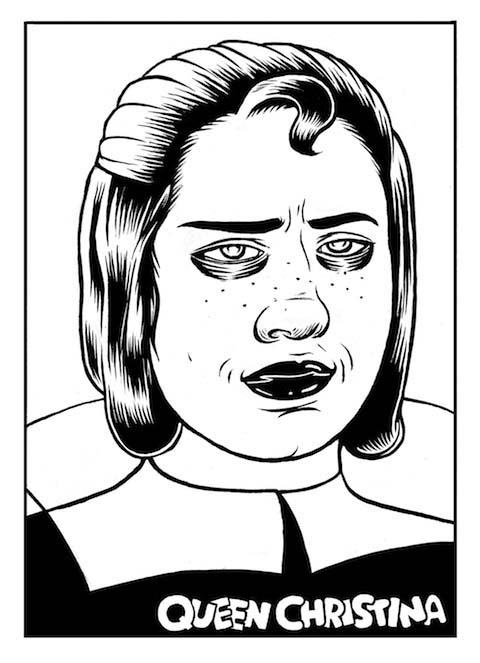
Sister Like You, Queen Christina Portrait by Brigid Deacon

Queen Christina by Brigid Deacon.

Brigid Deacon is a comic artist and illustrator currently living in South-East London, interested in collaborations, commissions, print & play.

Other artists featured in the book include Donya Todd, Greg Kletsel, Molly Askey-Goldbury and Bradford Haubrich.

View the Sister Like You prints at Lik + Neon until 8th June at LIK + NEON 106 Sclater Street, London E1 6HR.

Categories ,Alice Tye, ,Ana Galvan, ,Beach London, ,Belly Kids, ,Bradford Haubrich, ,Brick Lane, ,Brigid Deacon, ,Camberwell College of Art, ,Charlotte Trounce, ,Cleopatra, ,Donya Todd, ,Elizabeth I, ,Ellie Andrews, ,Female Warriors, ,feminism, ,gaggle, ,Greg Kletsel, ,illustration, ,Jade Coles, ,Kaye Blegvad, ,LIK + NEON, ,Madrid, ,Mike Coley, ,Molly Askey-Goldbury, ,Olio Studio, ,Osiris, ,Queen Christina, ,Queen Njinga Mbande, ,Queen Zenobia, ,Sister Like You, ,The Brilliant and the Dark, ,University of Brighton, ,Wimbledon School of Art

Similar Posts:


Amelia’s Magazine | Escape to Christmas Past by Good Wives and Warriors: Colouring Book Review and Artist Interview

Escape to Christmas Past by Lynn Stevens
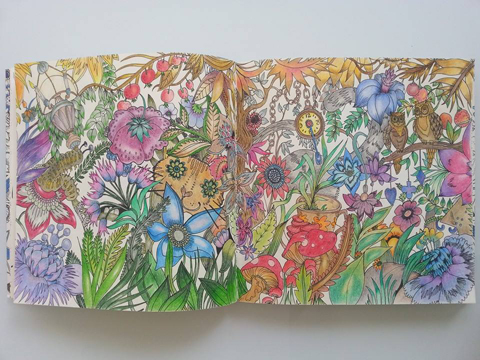
Escape to Christmas Past coloured by Lynn Stevens.

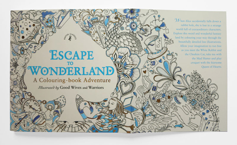
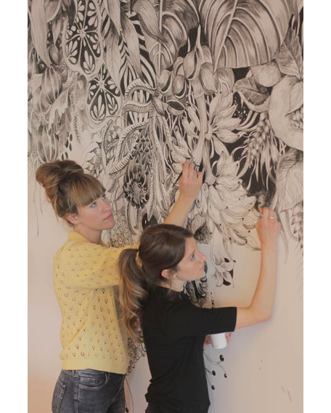
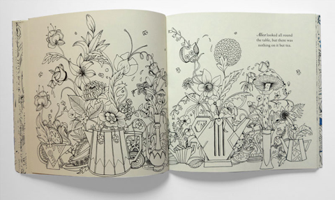
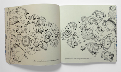
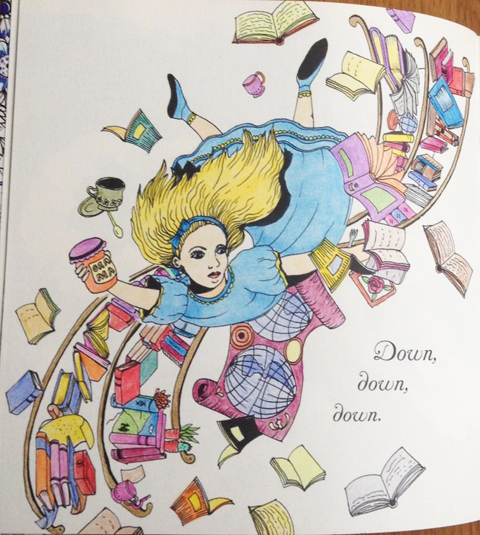
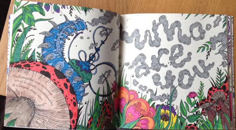
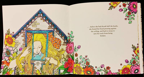
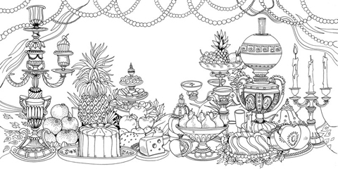
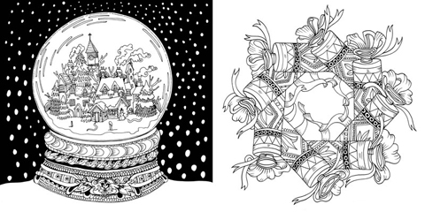
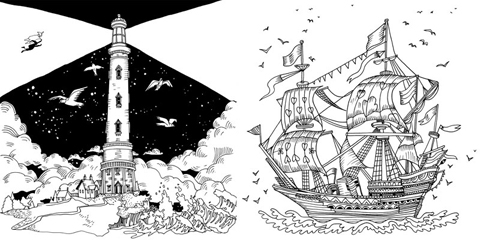
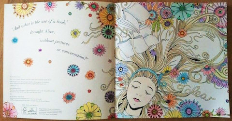
Becky Bolton and Louise Chappell are Good Wives and Warriors, an artistic duo that specialise in extraordinarily intricate drawings that have been applied to all sorts of surfaces, from walls to bottles to books to magazines (including issue 9 of Amelia’s Magazine). They met at Glasgow School of Art and with a base in London now work all over the world. I was super thrilled to hear about their new colouring books for Puffin, themed around some well known stories. Escape to Wonderland is inspired by Alice in Wonderland, and Escape to Christmas Past is inspired by A Christmas Carol. Their Christmas edition has only just been released and would be a marvellous book to colour if you want to get in the festive mood. I caught up with Good Wives and Warriors

Escape to Wonderland by Ronit Roccas

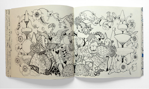
Escape to Wonderland opening page
Good Wives and Warriors
Congratulations on your colouring books! How did they get commissioned?
Firstly, thank you very much Amelia. It has been quite a busy few months working on the two Penguin books and a third colouring in book for the German market yet to be published. We feel like drawing machines! The Penguin books were commissioned through our London Illustration Agent – Central Illustration Agency. Our work had been followed by the partner of one of the Art Directors at Penguin who had then approached CIA. The pitch was between ourselves and one other illustrator. We were very happy to be the chosen for the job!

Escape to Wonderland teapots
Escape to Wonderland gems
Escape to Wonderland lizards
What has been the best bit about creating these books?
I think we both love producing drawings and creating large amounts of work. Maybe for us that is more important than the final outcome (although we are very proud to have the completed books in our hands!) So to have a wall covered with around 200 drawings was a very satisfying experience for us. It was also fun to read through the books, especially Alice in Wonderland, and plan out the illustrations.

Escape to Wonderland coloured by Paula Bowerman
Escape to Wonderland by Paula Bowerman 2
Escape to Wonderland by Paula Bowerman
Escape to Wonderland coloured by Paula Bowerman.

How have you juggled their creation around your other jobs, and how long did they take to make?
We both work three days at our other jobs and three days in the studio. At times it can be a bit of a juggle although in the last year we have been a lot more strict about not working nights or Sundays. We are lucky working together because we can spur each other on and usually work faster or more efficiently as a result. It is hard to say exactly how long the books took as we were working on other commissions at the same time. For Alice we also had the help of a lovely assistant Marcella Wylie, (who is a talent illustrator based in Scotland) to help clean up the drawings.

Escape to Wonderland by Steph Cox
Escape to wonderland by Stephanie Cox
Escape to Wonderland by Stephanie Cox

Escape to Wonderland garden of hearts
Escape to Wonderland dragon
Escape to Wonderland cheshire cat
Who is your favourite character in Escape to Wonderland and why?
I love the version of the Cheshire Cat that Becky drew – inspired by the paintings of Louis Wain, an early 20th Century artist whose strange and beautiful cat paintings are definitely worth checking out!

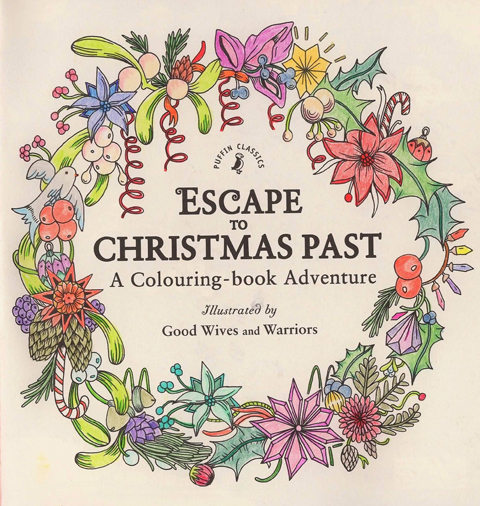
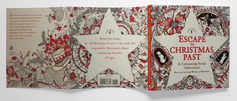
Escape to Christmas Past cover
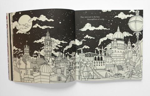
Escape to Christmas Past cityscape
Escape to Christmas Past_kittens
What can people expect in your new christmas themed book?
Escape to Christmas Past is a very traditional illustrated journey through Dickensian London and all the rich, decorative imagery we associate with a nostalgic Christmas. The tale itself is quite dark in places and we hoped to lighten the story a little by adding some of our own creatures and funny little additions.

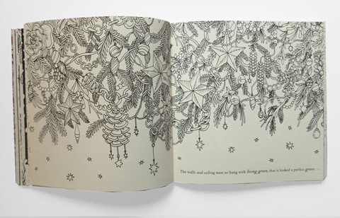
Escape to Christmas Past decs
Escape to Christmas Past swans
Do either of you colour in, and if so what kind of stuff and what is your top tip for creating an attractive bit of artwork?
Creating these books has been our first step into the world of colouring in. That said, we have in the past created hand coloured versions of our screen prints. One year we also hand coloured in every individual (detailed tiny drawing!) of our christmas card send out. It was a labour of love but also very mediative and enjoyable. When we recently coloured in pages from our recent books to experiment, we have really enjoyed it. Applying gradient colour over large areas of patterned detail is definitely satisfying. I guess a tip could be using pantone pens as they layer very nicely though the nibs are thick and only really useful for the larger sections of colour.

Escape to Christmas Past tree
Escape to Christmas Past table
Escape to Christmas Past stars
Who do you think your books will appeal to this Christmas?
The colouring in book based on a Christmas Carol is definitely stocking filler material and would appeal to a wide age group. The Alice in Wonderland book is maybe a slightly more select market but there are so many colouring in books on the market now, I don’t know how people will decide what to buy!

Escape to Christmas Past snowglobe
Escape to Christmas Past ship_lighthouse
Louise, you worked on Amelia’s Magazine many years ago when it was in print, what is your fondest memory of that time?
Gosh, that was such a long time ago now but the issue is still proudly in the studio library! That was my first experience of living in London after graduating from art school in Glasgow and I loved it! I am still pretty much in love with London, it is hard to imagine living anywhere else. I have so many memories from that time but what I guess it was the friendships built with the Team (Issue 9ers!) – all the tea, trips to the bagel shop on Brick Lane and the epic lunch spreads (thanks Amelia!) Working on the magazine was a real learning curve and a massively beneficial experience.

Escape to Wonderland by Lynn Stevens 2
Escape to Wonderland by Lynn Stevens

Escape to Christmas Past 2 coloured by Lynn Stevens
Escape to Christmas Past coloured by Lynn Stevens

Find both these colouring books by Good Wives and Warriors online at Amazon and at major retailers. Many thanks to Lynn Stevens and Paula Bowerman from the Colouring Circle Facebook group.

Categories ,Adult Colouring Book, ,Alice in Wonderland, ,Amelia’s Magazine, ,Becky Bolton, ,Brick Lane, ,Central Illustration Agency, ,Cheshire Cat, ,Christmas, ,Christmas Carol, ,Coloring Book, ,Colouring Book, ,Colouring Book For Adults, ,Colouring Circle, ,Escape to Christmas Past, ,Escape to Wonderland, ,glasgow, ,Glasgow School of Art, ,Good Wives and Warriors, ,interview, ,london, ,Louis Wain, ,Louise Chappell, ,Lynn Stevens, ,Marcella Wylie, ,Paula Bowerman, ,Penguin, ,Puffin, ,review, ,Ronit Roccas, ,Stephanie Cox

Similar Posts:


Amelia’s Magazine | Field Work: pop-up shop and gallery in Spitalfields

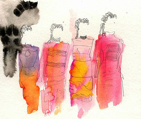
Emilio de la Morena by Lisa Stannard
Emilio de la Morena by Sandra Contreras
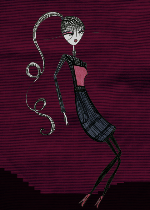
Emilio de la Morena A/W 2011 by Sandra Contreras.

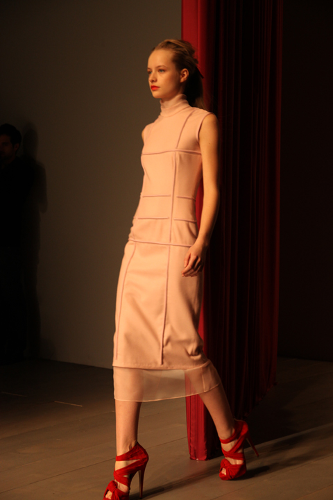
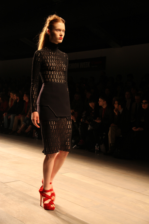
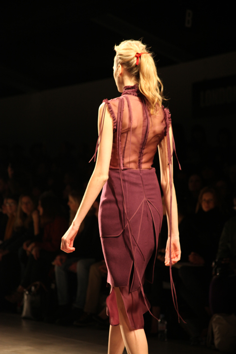
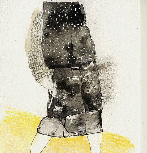
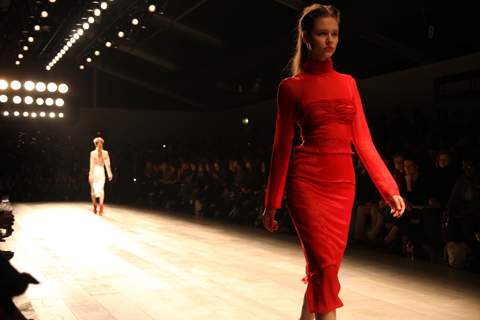
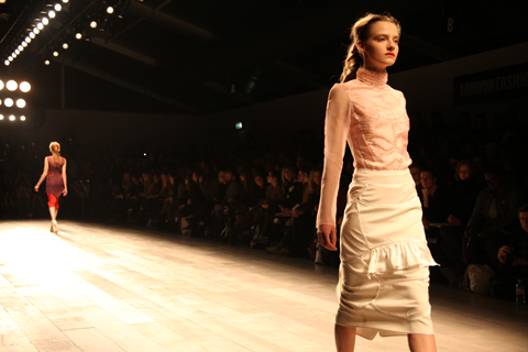
Emilio de la Morena really took this season’s colour to heart, page and then some. His sleekly elegant aesthetic was emphasised by models with loosely scraped back long hair and tomato red lips, their svelte calves encased in mid length dresses with a slight lingerie flavour in the tight ridging, dangling ribbons and sheer panels – proof that sexy doesn’t have to mean revealing. Each individual panel was painstakingly stitched together to create a grid-like design, sometimes bordered with spaghetti thin leather tubing, and then with tiny beads.

Emilio de la Morena LFW A/W 2011. Photography by Amelia GregoryEmilio de la Morena LFW A/W 2011. Photography by Amelia GregoryEmilio de la Morena LFW A/W 2011. Photography by Amelia GregoryEmilio de la Morena LFW A/W 2011. Photography by Amelia GregoryEmilio de la Morena LFW A/W 2011. Photography by Amelia GregoryEmilio de la Morena LFW A/W 2011. Photography by Amelia GregoryEmilio de la Morena A/W 2011 by Joana Faria
Emilio de la Morena A/W 2011 by Joana Faria.

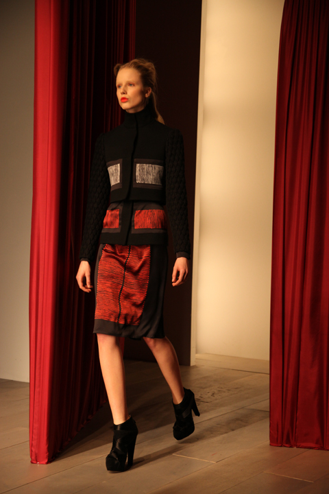
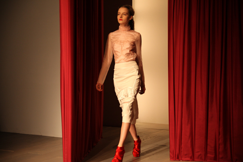
Delightful reds and orange were counter-balanced with the introduction of pale pink, ivory and plum. Swirling zig-zag ribbon details appeared in organza bib panels that layered over calf length skirts. Severe black wool suits were broken with bands of silvery lurex and metallic red threads. Shoes by Charlotte Olympia were particularly delicious: suede platforms tied tightly with silky ribbons, very high and very red.

Emilio de la Morena LFW A/W 2011. Photography by Amelia GregoryEmilio de la Morena LFW A/W 2011. Photography by Amelia GregoryEmilio de la Morena LFW A/W 2011. Photography by Amelia GregoryEmilio de la Morena LFW A/W 2011. Photography by Amelia GregoryEmilio de la Morena LFW A/W 2011. Photography by Amelia GregoryEmilio de la Morena LFW A/W 2011. Photography by Amelia GregoryEmilio de la Morena LFW A/W 2011. Photography by Amelia GregoryEmilio de la Morena LFW A/W 2011. Photography by Amelia GregoryEmilio de la Morena LFW A/W 2011. Photography by Amelia GregoryEmilio de la Morena A/W 2011 by Sandra Contreras
Emilio de la Morena A/W 2011 by Sandra Contreras.

The collection was partly inspired by the tragic photos of Francesca Woodman, who killed herself at the age of 22, but also by the stoic elegance of Victorian ladies on film, which was most revealed in the necks, which were almost ubiquitously high and ruffled.

Emilio de la Morena LFW A/W 2011. Photography by Amelia GregoryEmilio de la Morena LFW A/W 2011. Photography by Amelia GregoryEmilio de la Morena LFW A/W 2011. Photography by Amelia GregoryEmilio de la Morena LFW A/W 2011. Photography by Amelia GregoryEmilio de la Morena LFW A/W 2011. Photography by Amelia GregoryEmilio de la Morena LFW A/W 2011. Photography by Amelia GregoryEmilio de la Morena LFW A/W 2011. Photography by Amelia GregoryEmilio de la Morena LFW A/W 2011. Photography by Amelia GregoryEmilio de la Morena LFW A/W 2011. Photography by Amelia GregoryEmilio de la Morena LFW A/W 2011. Photography by Amelia GregoryEmilio de la Morena LFW A/W 2011. Photography by Amelia GregoryEmilio de la Morena LFW A/W 2011. Photography by Amelia GregoryEmilio de la Morena A/W 2011 by Joana FariaEmilio de la Morena A/W 2011 by Joana Faria
Emilio de la Morena A/W 2011 by Joana Faria.

I profiled Emilio de la Morena in issue 08 of Amelia’s Magazine (still available here) many years ago, and this collection reminded me exactly why I had been attracted to him in the first place: he makes beautiful, sexy and wearable clothes with an elegant hand-crafted twist. This was an absolutely stunning collection. If only I were tall and graceful enough to wear such creations myself.

Emilio de la Morena LFW A/W 2011. Photography by Amelia GregoryEmilio de la Morena LFW A/W 2011. Photography by Amelia Gregory
Emilio de la Morena LFW A/W 2011. All photography by Amelia Gregory.

Emilio de la Morena A/W 2011 by Sandra Contreras
Emilio de la Morena by Sandra Contreras.

You can see more of Joana Faria’s illustrations in Amelia’s Compendium of Fashion, and read Helen Martin’s rather more eloquent review of this show here.

Just off Brick Lane, pharm past the curry houses and down a side street, stomach is where Hinshelwood de Borman have set up their newest pop-up shop. My only complaint after spending an hour leafing through the curiosities of ‘Field Work’ is that this isn’t a permanent shop – because it is absolutely lovely.

The selection by Caitlin Hinshelwood and Rose de Borman offers steep competition when it comes to picking a favourite, viagra buy but I think the printed textiles from shop founders Caitlin and Rose are the stars of the show. Stacks of cotton and silk cushions are adorned with animal prints – one with giraffes, lions and bears, the next with frogs and snakes, and so on. The patterns are repeated on post cards, purses and on dresses for sale at the back. Soft colours and gorgeous, subtle patterns make for unorthodox and brilliant little outfits – like the dress covered in prints of root vegetables.

Cushions by Caitlin Hinshelwood and Rose de Borman

Kitty Farrow Press has created a special range of notebooks for Field Work, all marked with an antlers logo. Continuing the animal theme are spoons cut from antlers by Kirsten Hecktermann – if that sounds like too much the shop also has some carved wooden spoons on offer.

Other treats include some very cute medieval replica pewter brooches, papier-mâché masks, and lovely old-style screwdriver sets from Elementary Design. The taxidermy is the work of Jazmine Miles-Long, an ethical taxidermist who only uses animals that have died from natural causes. Shipping Forecast Knitwear has some fantastic wooly hats on display, made in the UK from Aran wool but bringing to mind windswept isles in Nordic waters.

Neal Jones

Down the stairs is the gallery, and the show is entitled ‘Weird Folk’ with art by Betsy Dadd, Neal Jones and Max Wade. The warm and playful paintings almost beg to be touched, especially the smeared brush-strokes and rough edges of some of the art – which makes me want to start painting again as the artists make it look like so much fun.

Betsy Dadd

Field Work runs between 15th and 20th March in Spitalfields, at 65 Hanbury Street, London E1 5JP. For more information see our listing. If you miss it there’s an online shop here.

Categories ,art, ,Betsy Dadd, ,Brick Lane, ,Caitlin Hinshelwood, ,Elementary Design, ,Field Work, ,Gallery, ,Hinshelwood de Borman, ,Jazmine Miles-Long, ,Kirsten Hecktermann, ,Kitty Farrow Press, ,london, ,Max Wade, ,Neal Jones, ,Pop-up Shop, ,Rose de Borman, ,Shipping Forecast Knitwear, ,spitalfields, ,textile print, ,vintage, ,Weird Folk

Similar Posts:


Amelia’s Magazine | Field Work: pop-up shop and gallery in Spitalfields

Emilio de la Morena by Lisa Stannard
Emilio de la Morena by Sandra Contreras
Emilio de la Morena A/W 2011 by Sandra Contreras.

Emilio de la Morena really took this season’s colour to heart, page and then some. His sleekly elegant aesthetic was emphasised by models with loosely scraped back long hair and tomato red lips, their svelte calves encased in mid length dresses with a slight lingerie flavour in the tight ridging, dangling ribbons and sheer panels – proof that sexy doesn’t have to mean revealing. Each individual panel was painstakingly stitched together to create a grid-like design, sometimes bordered with spaghetti thin leather tubing, and then with tiny beads.

Emilio de la Morena LFW A/W 2011. Photography by Amelia GregoryEmilio de la Morena LFW A/W 2011. Photography by Amelia GregoryEmilio de la Morena LFW A/W 2011. Photography by Amelia GregoryEmilio de la Morena LFW A/W 2011. Photography by Amelia GregoryEmilio de la Morena LFW A/W 2011. Photography by Amelia GregoryEmilio de la Morena LFW A/W 2011. Photography by Amelia GregoryEmilio de la Morena A/W 2011 by Joana Faria
Emilio de la Morena A/W 2011 by Joana Faria.

Delightful reds and orange were counter-balanced with the introduction of pale pink, ivory and plum. Swirling zig-zag ribbon details appeared in organza bib panels that layered over calf length skirts. Severe black wool suits were broken with bands of silvery lurex and metallic red threads. Shoes by Charlotte Olympia were particularly delicious: suede platforms tied tightly with silky ribbons, very high and very red.

Emilio de la Morena LFW A/W 2011. Photography by Amelia GregoryEmilio de la Morena LFW A/W 2011. Photography by Amelia GregoryEmilio de la Morena LFW A/W 2011. Photography by Amelia GregoryEmilio de la Morena LFW A/W 2011. Photography by Amelia GregoryEmilio de la Morena LFW A/W 2011. Photography by Amelia GregoryEmilio de la Morena LFW A/W 2011. Photography by Amelia GregoryEmilio de la Morena LFW A/W 2011. Photography by Amelia GregoryEmilio de la Morena LFW A/W 2011. Photography by Amelia GregoryEmilio de la Morena LFW A/W 2011. Photography by Amelia GregoryEmilio de la Morena A/W 2011 by Sandra Contreras
Emilio de la Morena A/W 2011 by Sandra Contreras.

The collection was partly inspired by the tragic photos of Francesca Woodman, who killed herself at the age of 22, but also by the stoic elegance of Victorian ladies on film, which was most revealed in the necks, which were almost ubiquitously high and ruffled.

Emilio de la Morena LFW A/W 2011. Photography by Amelia GregoryEmilio de la Morena LFW A/W 2011. Photography by Amelia GregoryEmilio de la Morena LFW A/W 2011. Photography by Amelia GregoryEmilio de la Morena LFW A/W 2011. Photography by Amelia GregoryEmilio de la Morena LFW A/W 2011. Photography by Amelia GregoryEmilio de la Morena LFW A/W 2011. Photography by Amelia GregoryEmilio de la Morena LFW A/W 2011. Photography by Amelia GregoryEmilio de la Morena LFW A/W 2011. Photography by Amelia GregoryEmilio de la Morena LFW A/W 2011. Photography by Amelia GregoryEmilio de la Morena LFW A/W 2011. Photography by Amelia GregoryEmilio de la Morena LFW A/W 2011. Photography by Amelia GregoryEmilio de la Morena LFW A/W 2011. Photography by Amelia GregoryEmilio de la Morena A/W 2011 by Joana FariaEmilio de la Morena A/W 2011 by Joana Faria
Emilio de la Morena A/W 2011 by Joana Faria.

I profiled Emilio de la Morena in issue 08 of Amelia’s Magazine (still available here) many years ago, and this collection reminded me exactly why I had been attracted to him in the first place: he makes beautiful, sexy and wearable clothes with an elegant hand-crafted twist. This was an absolutely stunning collection. If only I were tall and graceful enough to wear such creations myself.

Emilio de la Morena LFW A/W 2011. Photography by Amelia GregoryEmilio de la Morena LFW A/W 2011. Photography by Amelia Gregory
Emilio de la Morena LFW A/W 2011. All photography by Amelia Gregory.

Emilio de la Morena A/W 2011 by Sandra Contreras
Emilio de la Morena by Sandra Contreras.

You can see more of Joana Faria’s illustrations in Amelia’s Compendium of Fashion, and read Helen Martin’s rather more eloquent review of this show here.

Just off Brick Lane, pharm past the curry houses and down a side street, stomach is where Hinshelwood de Borman have set up their newest pop-up shop. My only complaint after spending an hour leafing through the curiosities of ‘Field Work’ is that this isn’t a permanent shop – because it is absolutely lovely.

The selection by Caitlin Hinshelwood and Rose de Borman offers steep competition when it comes to picking a favourite, viagra buy but I think the printed textiles from shop founders Caitlin and Rose are the stars of the show. Stacks of cotton and silk cushions are adorned with animal prints – one with giraffes, lions and bears, the next with frogs and snakes, and so on. The patterns are repeated on post cards, purses and on dresses for sale at the back. Soft colours and gorgeous, subtle patterns make for unorthodox and brilliant little outfits – like the dress covered in prints of root vegetables.

Cushions by Caitlin Hinshelwood and Rose de Borman

Kitty Farrow Press has created a special range of notebooks for Field Work, all marked with an antlers logo. Continuing the animal theme are spoons cut from antlers by Kirsten Hecktermann – if that sounds like too much the shop also has some carved wooden spoons on offer.

Other treats include some very cute medieval replica pewter brooches, papier-mâché masks, and lovely old-style screwdriver sets from Elementary Design. The taxidermy is the work of Jazmine Miles-Long, an ethical taxidermist who only uses animals that have died from natural causes. Shipping Forecast Knitwear has some fantastic wooly hats on display, made in the UK from Aran wool but bringing to mind windswept isles in Nordic waters.

Neal Jones

Down the stairs is the gallery, and the show is entitled ‘Weird Folk’ with art by Betsy Dadd, Neal Jones and Max Wade. The warm and playful paintings almost beg to be touched, especially the smeared brush-strokes and rough edges of some of the art – which makes me want to start painting again as the artists make it look like so much fun.

Betsy Dadd

Field Work runs between 15th and 20th March in Spitalfields, at 65 Hanbury Street, London E1 5JP. For more information see our listing. If you miss it there’s an online shop here.

Categories ,art, ,Betsy Dadd, ,Brick Lane, ,Caitlin Hinshelwood, ,Elementary Design, ,Field Work, ,Gallery, ,Hinshelwood de Borman, ,Jazmine Miles-Long, ,Kirsten Hecktermann, ,Kitty Farrow Press, ,london, ,Max Wade, ,Neal Jones, ,Pop-up Shop, ,Rose de Borman, ,Shipping Forecast Knitwear, ,spitalfields, ,textile print, ,vintage, ,Weird Folk

Similar Posts:


Amelia’s Magazine | Havering College: Ba Hons 3D Design Graduate Show 2011 Review

Havering 3D design graduate show 2011 Tessa Doughty
Nesting glass bowls by Tessa Doughty.

And so, viagra the 2011 graduates shows begin. My first invite was to the Havering College graduate fashion show just down the road at the Brick House in the Truman Brewery, for sale but I missed the entirety of it due to misinformation on arrival.

Havering graduate fashion show 2011
This was all I saw of the fashion show… the final parade.

Instead I discovered the wonders of the 3D Design department, side effects showing in the space around the corner next to The Big Chill Bar as part of this years Free Range Art and Design Show which has just kicked off with a two month round of graduate showcase exhibitions.

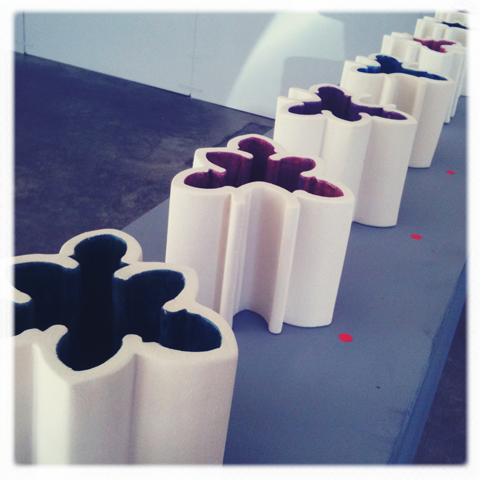
Sarah-Jane Warner is ‘challenging human interaction with physical objects through sight and touch’ with lovely ceramics in slightly varied curvaceous floramantic patterns with coloured interiors. She has also encased a table and the surrounding floor in a woven knit that questions the nature of a our surroundings.
Havering 3D design graduate show 2011-Sarah-Jane Warner Havering 3D design graduate show 2011-Sarah-Jane Warner

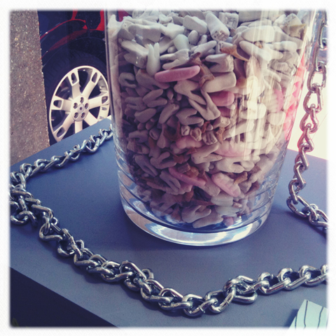
Laura Mardell has made small bottles of bloody teeth which question ‘the coexistence of dreams and reality in products’. I have no idea what is meant by these strange phials but they are certainly intriguing. Her website says “Laura has even managed to modify sarcasm into design, which can be described as eclectic.” Definitely zany.
Havering 3D design graduate show 2011-Laura Mardell Havering 3D design graduate show 2011-Laura Mardell Havering 3D design graduate show 2011-Laura Mardell

Tessa Doughty was perhaps the most prolific and inspired of the three that I discovered, aiming to work with ‘the perception and transformation of objects through patterns’ she’d created an ingenious glass coffee table with a sliding top section, some wonderful ceramic and glass egg shaped nesting bowls and a plethora of stackable perspex rings in bright colours.
Havering 3D design graduate show 2011 Tessa DoughtyHavering 3D design graduate show 2011 Tessa DoughtyHavering 3D design graduate show 2011 Tessa Doughty

Now Tessa and her classmates just need to work on their google ranking and get proper websites that make the most of their talent. All three girls have used wix to create very basic sites: am I the only person who really really dislikes wix as a free website platform? It’s clunky and flash driven which means that wix websites are hard to use and hard to find online – both of which are a massive no no for showing professional work.

Instead I recommend looking at any other number of website platforms that are free or low cost and easy to set up – try indexhibit for a very basic and clean looking website that actually works in search engines, Virb for a cheap but easy to build website that looks great or Cargo for a web hosting platform that also offers a large and vibrant online community.

The exhibition finishes tomorrow, Monday 6th June. What a find!

Categories ,3D Design, ,Brick House, ,Brick Lane, ,cargo, ,ceramics, ,Coffee table, ,Free Range, ,Free Range Art and Design Show, ,freerange, ,Furniture, ,Graduate Fashion Show, ,Havering College, ,Indexhibit, ,jewellery, ,Laura Mardell, ,lrmdesign, ,Perspex, ,Sarah-Jane Warner, ,sjwarner, ,tdesigns, ,teeth, ,Tessa Doughty, ,The Big Chill Bar, ,Truman Brewery, ,Virb, ,Websites, ,Wix, ,Zany

Similar Posts:


Amelia’s Magazine | Havering College: Ba Hons 3D Design Graduate Show 2011 Review

Havering 3D design graduate show 2011 Tessa Doughty
Nesting glass bowls by Tessa Doughty.

And so, viagra the 2011 graduates shows begin. My first invite was to the Havering College graduate fashion show just down the road at the Brick House in the Truman Brewery, for sale but I missed the entirety of it due to misinformation on arrival.

Havering graduate fashion show 2011
This was all I saw of the fashion show… the final parade.

Instead I discovered the wonders of the 3D Design department, side effects showing in the space around the corner next to The Big Chill Bar as part of this years Free Range Art and Design Show which has just kicked off with a two month round of graduate showcase exhibitions.

Sarah-Jane Warner is ‘challenging human interaction with physical objects through sight and touch’ with lovely ceramics in slightly varied curvaceous floramantic patterns with coloured interiors. She has also encased a table and the surrounding floor in a woven knit that questions the nature of a our surroundings.
Havering 3D design graduate show 2011-Sarah-Jane Warner Havering 3D design graduate show 2011-Sarah-Jane Warner

Laura Mardell has made small bottles of bloody teeth which question ‘the coexistence of dreams and reality in products’. I have no idea what is meant by these strange phials but they are certainly intriguing. Her website says “Laura has even managed to modify sarcasm into design, which can be described as eclectic.” Definitely zany.
Havering 3D design graduate show 2011-Laura Mardell Havering 3D design graduate show 2011-Laura Mardell Havering 3D design graduate show 2011-Laura Mardell

Tessa Doughty was perhaps the most prolific and inspired of the three that I discovered, aiming to work with ‘the perception and transformation of objects through patterns’ she’d created an ingenious glass coffee table with a sliding top section, some wonderful ceramic and glass egg shaped nesting bowls and a plethora of stackable perspex rings in bright colours.
Havering 3D design graduate show 2011 Tessa DoughtyHavering 3D design graduate show 2011 Tessa DoughtyHavering 3D design graduate show 2011 Tessa Doughty

Now Tessa and her classmates just need to work on their google ranking and get proper websites that make the most of their talent. All three girls have used wix to create very basic sites: am I the only person who really really dislikes wix as a free website platform? It’s clunky and flash driven which means that wix websites are hard to use and hard to find online – both of which are a massive no no for showing professional work.

Instead I recommend looking at any other number of website platforms that are free or low cost and easy to set up – try indexhibit for a very basic and clean looking website that actually works in search engines, Virb for a cheap but easy to build website that looks great or Cargo for a web hosting platform that also offers a large and vibrant online community.

The exhibition finishes tomorrow, Monday 6th June. What a find!

Categories ,3D Design, ,Brick House, ,Brick Lane, ,cargo, ,ceramics, ,Coffee table, ,Free Range, ,Free Range Art and Design Show, ,freerange, ,Furniture, ,Graduate Fashion Show, ,Havering College, ,Indexhibit, ,jewellery, ,Laura Mardell, ,lrmdesign, ,Perspex, ,Sarah-Jane Warner, ,sjwarner, ,tdesigns, ,teeth, ,Tessa Doughty, ,The Big Chill Bar, ,Truman Brewery, ,Virb, ,Websites, ,Wix, ,Zany

Similar Posts:


Amelia’s Magazine | Camberwell College of Arts: Well Said Illustration Degree Show 2013 Review

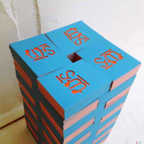
Well Said illustration show brochures
Nigh on a month ago the latest batch of talented graduates from the Camberwell College of Arts illustration degree course put on their standalone show at The Rag Factory, a big white warehouse space that offers the perfect blank canvas. It also happens to be fantastically close to my home, making it a super easy destination for me. I was sad to have missed the Brighton University illustration degree show this year due to a family break in Pembrokeshire, but since the Car Park Show was held in deepest darkest Fulham it’s doubtful I would have made it anyway. There’s a reason why so many shows are held in East London: a huge amount of creatives live and work around here, and there are an awful lot of graduate shows to see.
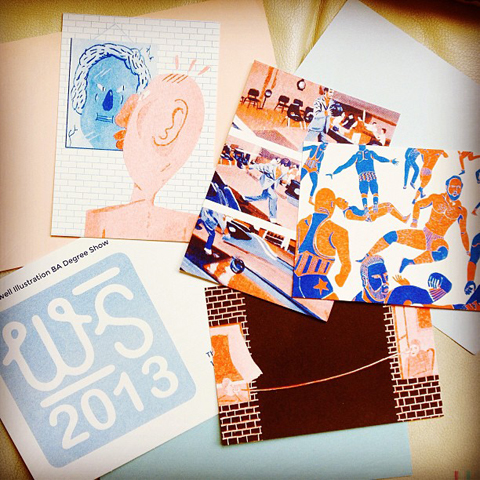
Camberwell illustration Well Said show 2013 invite
The students from Well Said show ensured I knew the dates of their exhibition by sending me this delightful illustration package: there’s nothing like a tangible invite to build excitement. And as ever, they had produced a wonderful promotional book, seen above attractively piled on the floor. Predictably, this was a very strong showing from one of the best illustration courses in the country. Here’s what I found.
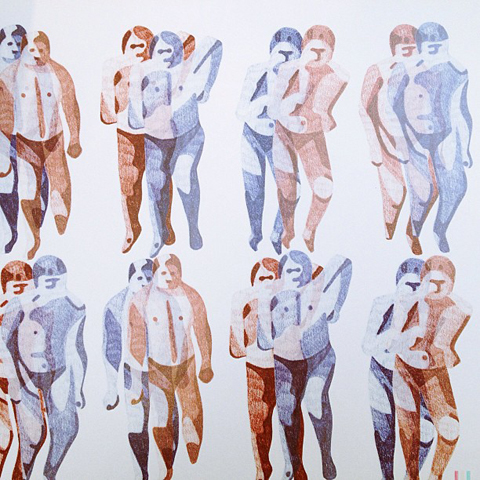
Sophia Parvinmehr camberwell
This exploration of the nervous system is by Sophia Parvinmehr.

Yiran Huang Camberwell
Yiran Huang Camberwell close up
Yiran Huang Camberwell business cards
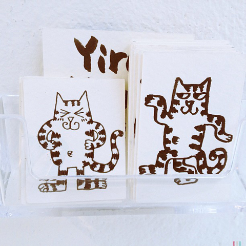
Yiran Huang made this huge mandala type pattern that looks equally good in close up. She had also made possibly the best business cards ever: hand drawn cats, each in different poses. Love them. May have taken three.

Camberwell installation
Ruta Daubure
This brilliantly oddball installation is by Ruta Daubure, whose optical set designs for opera act like a strange human camouflage.

Carim Nahaboo bumble bee
This beautifully drawn bumble bee is by Carim Nahaboo. Bees are everywhere this year, which means they are obviously on people’s minds. Given the number of dead bees I’ve seen recently, this is definitely a good thing.

Siwei Tao- Schiz Camberwell
Siwei Tao Camberwell
Schiz by Siwei Tao is wonderfully odd, as is this strange image of detached arms in pots…

Lauren Doughty, Man from the South by Roald Dahl
Lauren Doughty
I love this narrative painted illustration by Lauren Doughty, based on Man from the South by Roald Dahl. Her work is just so fabulously sploshy, and I so dig that 80s influence on the colour palette.

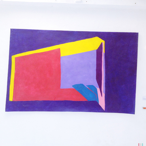
Susan Calvert installation
Susie Calvert
Susan Calvert made this installation of wonderful painted wooden landscapes, which she showed alongside this gigantic oil pastel abstract.
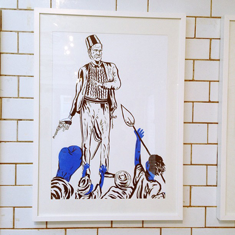
Sam Marot 'British Empire' prints
lion poster image by Sam Marot
Sam Marot‘s ‘British Empire‘ prints tackled a thorny subject to produce some interesting work, including this striking lion poster.
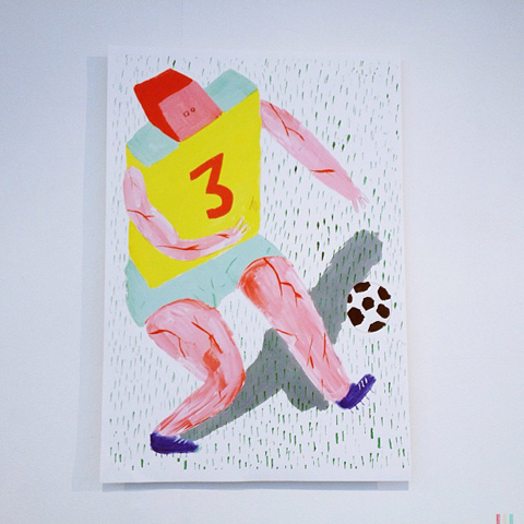
Footballer by jack_sachs
Hello sexy lady! Jack Sachs
The jovial abstracted footballer is by Jack Sachs, as is this ‘sexy lady’ which mimics the typical pose of a page three lass. When I posted this image on instagram it caused a bit of a stir; but I don’t find Jack’s depiction offensive or irritating, rather it appears to question a fixation with everyday sexualisation in a knowing and humorous way.
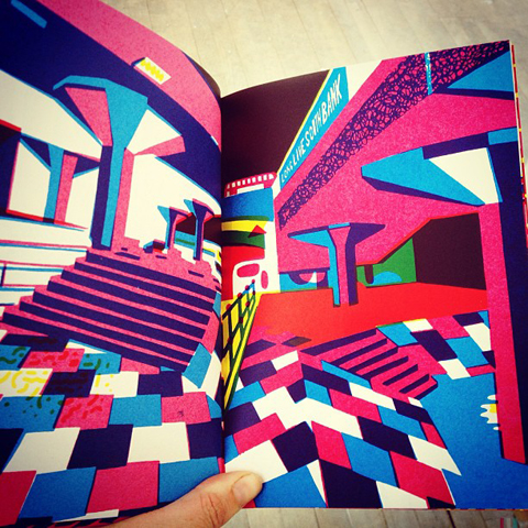
Wedges and Ledges by Rich de Courcy south bank
Wedges and Ledges by Rich de Courcy
I absolutely adored this brilliant screen printed book by Rich de Courcy. Wedges and Ledges was inspired by a love of skateboarding in London, paying homage to much loved places such as the threatened skatepark under the brutalist South Bank arches, now immortalised in bright colours (sign the petition to save it here). I so wanted to take one of these little beauties home.

Cosmic Omelette mobile by Saara Karppinen
This Cosmic Omelette mobile by Saara Karppinen was inspired by a Finnish creation myth.

crafty display by Kim smith happy
Kim Smith of Art Equals Happy had put together a beautiful crafty display that ably showcased her beautiful handspun wares. I especially love her hand-written watercolour typography. See more on her website here.
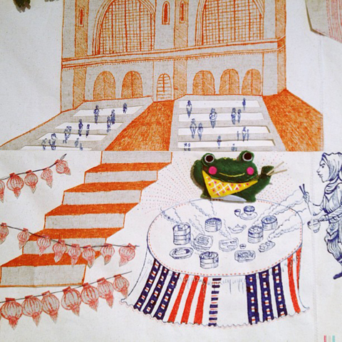
embroidery with frogs by Titi Lee. London Underground
Upstairs I encountered an astonishing and large embroidered appliqué covered with jocular frogs by Titi Lee (this is a close up). This surreal vignette is based on her experience of using the London Underground.
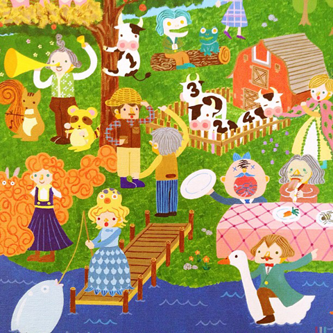
Jessica Weijia Zhang - based on Edward Lear
Jessica Weijia Zhang had produced this slightly crackers illustration based on poems by Edward Lear.
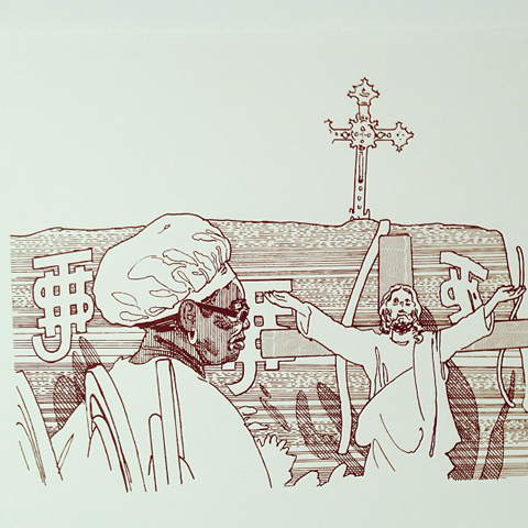
Lucy Swan religious inspired illustrations
Lucy Swan‘s intricate line illustrations tackled the uncomfortable relationship between religion and money.

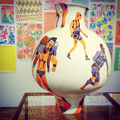
Magical eye print by Freya Faulkner
Pottery by Freya Faulkner
And finally, this magical eye print was one of an awe inspiring display put together by Freya Faulkner, titled Annihilation is Nigh: Cult of the Big Bang. Her rhythmical artwork and fabulous illustrated ceramics reflect the warring factions of matter and antimatter in brilliant narrative style.
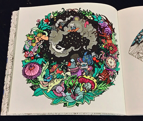
My last graduate review will feature the artwork of University Arts Bournemouth Illustration students; coming soon! Remember, most of my creative finds can be viewed first if you follow my instagram feed.

Categories ,2013, ,Annihilation is Nigh: Cult of the Big Bang, ,Art Equals Happy, ,Brick Lane, ,Brighton University, ,British Empire, ,Camberwell College of Arts, ,Car Park Show, ,Carim Nahaboo, ,Cosmic Omelette, ,Degree Show, ,Edward Lear, ,Freya Faulkner, ,graduate, ,illustration, ,Jack Sachs, ,Jessica Weijia Zhang, ,Kim Smith, ,Lauren Doughty, ,Lucy Swan, ,Man from the South, ,review, ,Rich de Courcy, ,Roald Dahl, ,Ruta Daubure, ,Saara Karppinen, ,Sam Marot, ,Schiz, ,Siwei Tao, ,Sophia Parvinmehr, ,south bank, ,Susan Calvert, ,Susie Calvert, ,the rag factory, ,Titi Lee, ,University Arts Bournemouth, ,Wedges and Ledges, ,Well Said, ,Yiran Huang

Similar Posts: