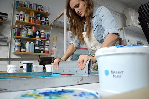
amos_plastic_workshop_london-portrait

James Jarvis spoke at Mokita, approved where he was asked to address the role of illustration in commerce. The insights below have been put together from comments he made both in his talk and in the following conversation with others on the panel of Mokita.

James Jarvis’ Brighton Degree Show poster.
A character artist.
The baggage of being an illustrator is confusing so he prefers to think of himself as a graphic artist. It’s a journey into self awareness. He recently found his old degree graduation poster and realised that you can see his style developing even then, information pills when it was all done by hand. He has become very well known for drawing funny characters in depressing situations but he doesn’t like being seen as a character artist only.

Sole Inspector by James Jarvis.
He knew the route.
James’ mother was an art history tutor and he knew he wanted to be an illustrator from an early age. The plan was to make kids books but nobody wanted his work and editorial art directors thought he was too kiddy in style, so he was stuck in no mans land. But he was accepted within the skateboarding world, where his work was discovered by the forward thinking art directors at The Face. He was lucky in that his images were companions to the articles, and he didn’t really have to answer any briefs. The magazine was a massively influential shop window that gave him credibility in the mainstream.

Caleb toys by James Jarvis for Amos.

An Amos collaboration with ATP music festival.
People just want funny characters.
From working with The Face he became involved with clothing brand Silas, and together they created a toy to publicise the brand. It became an object in its own right and soon after he started Amos, his own toy making company; it doesn’t make him much money but he is involved with lots of other projects as a result: he now makes films, t-shirts and curates music festivals. He wants his characters to be more than just toys, avatars for a more substantial world. Even now though, many years later, advertisers still just want to buy into his associations with Streetwear culture and The Face; everyone wants a potato head character. For instance he’s currently working on something to celebrate the 125th anniversary of Coca-Cola. Only the most enlightened art directors ask for something different and new: most just want something he produced a long time ago so it’s up to him to keep pushing ideas forward.


James Jarvis lino prints.
Self publish for sanity.
Making products is a different world to the one of illustration. He started to make ‘plastic illustrations’ from his toys but soon found that he was getting farther and farther away from his unmoderated link to thought. So much intermediate process meant he was at danger of losing his core spirit. To keep sane he now maintains a practice of self published work, which he publishes online. For example he’s been very disciplined, creating The Wisdom of Caleb, a daily cartoon strip for 150 days (this has now been taken offline). He rejoices if he gets a few hundred hits – but it’s important to build up an audience over time, and if you keep your conviction then the work will find that validity. The comic strips are very basic, with no retouching.

Working with lino print.
Back to basics.
He’s been inspired by Roger Hargreaves to create some very minimal characters. He has also been creating a lino print every week in editions of seven, which provides a grassroots connection with his audience that is direct and democratic. He sells the prints directly and finds there’s an honesty in taking them to the post office himself.
He’s aware that he’s “highly involved with filling the world with plastic” and it makes him quite uncomfortable. He likes the simplicity and honesty of making things by hand at home, such as resin figures – and using the web to sell them direct. This kind of work never felt accessible when he was at college.


Cartoons for the Wisdom of Caleb.
His greatest hits.
He has sold 10,000 toys over the years and he’s grateful for that because there’s a bond with his audience. He would be stupid not to engage with what people want. But James also concedes admits that he has been massively lucky – tons of people at college were better drawers, and his success has been as much down to circumstance as being clever.
James Jarvis hosts the Amos Miniature Plastic Workshop at KK outlet in Hoxton between 6-31 May, 2011.
James Jarvis spoke at Mokita, page where he was asked to address the role of illustration in commerce. The insights below have been put together from comments he made both in his talk and in the following conversation with others on the panel of Mokita.
James Jarvis’ Brighton Degree Show poster.
A character artist.
The baggage of being an illustrator is confusing so he prefers to think of himself as a graphic artist. It’s a journey into self awareness. He recently found his old degree graduation poster and realised that you can see his style developing even then, web when it was all done by hand. He has become very well known for drawing funny characters in depressing situations but he doesn’t like being seen as a character artist only.
Sole Inspector by James Jarvis.
He knew the route.
James’ mother was an art history tutor and he knew he wanted to be an illustrator from an early age. The plan was to make kids books but nobody wanted his work and editorial art directors thought he was too kiddy in style, so he was stuck in no mans land. But he was accepted within the skateboarding world, where his work was discovered by the forward thinking art directors at The Face. He was lucky in that his images were companions to the articles, and he didn’t really have to answer any briefs. The magazine was a massively influential shop window that gave him credibility in the mainstream.
Caleb toys by James Jarvis for Amos.
An Amos collaboration with ATP music festival.
People just want funny characters.
From working with The Face he became involved with clothing brand Silas, and together they created a toy to publicise the brand. It became an object in its own right and soon after he started Amos, his own toy making company; it doesn’t make him much money but he is involved with lots of other projects as a result: he now makes films, t-shirts and curates music festivals. He wants his characters to be more than just toys, avatars for a more substantial world. Even now though, many years later, advertisers still just want to buy into his associations with Streetwear culture and The Face; everyone wants a potato head character. For instance he’s currently working on something to celebrate the 125th anniversary of Coca-Cola. Only the most enlightened art directors ask for something different and new: most just want something he produced a long time ago so it’s up to him to keep pushing ideas forward.
James Jarvis lino prints.
Self publish for sanity.
Making products is a different world to the one of illustration. He started to make ‘plastic illustrations’ from his toys but soon found that he was getting farther and farther away from his unmoderated link to thought. So much intermediate process meant he was at danger of losing his core spirit. To keep sane he now maintains a practice of self published work, which he publishes online. For example he’s been very disciplined, creating The Wisdom of Caleb, a daily cartoon strip for 150 days (this has now been taken offline). He rejoices if he gets a few hundred hits – but it’s important to build up an audience over time, and if you keep your conviction then the work will find that validity. The comic strips are very basic, with no retouching.
Cartoons for the Wisdom of Caleb.
Back to basics.
He’s been inspired by Roger Hargreaves to create some very minimal characters. He has also been creating a lino print every week in editions of seven, which provides a grassroots connection with his audience that is direct and democratic. He sells the prints directly and finds there’s an honesty in taking them to the post office himself. He’s aware that he’s “highly involved with filling the world with plastic” and it makes him quite uncomfortable. He likes the simplicity and honesty of making things by hand at home, such as resin figures – and using the web to sell them direct. This kind of work never felt accessible when he was at college.
Working with lino print.
His greatest hits.
He has sold 10,000 toys over the years and he’s grateful for that because there’s a bond with his audience. He would be stupid not to engage with what people want. But James also concedes admits that he has been massively lucky – tons of people at college were better drawers, and his success has been as much down to circumstance as being clever.

James Jarvis hosts the Amos Miniature Plastic Workshop at KK outlet in Hoxton between 6-31 May, 2011.
Pick Me Up runs until Sunday 27th March.
James Jarvis spoke at Mokita, decease where he was asked to address the role of illustration in commerce. The insights below have been put together from comments he made both in his talk and in the following conversation with others on the panel of Mokita.
James Jarvis’ Brighton Degree Show poster.
A character artist.
The baggage of being an illustrator is confusing so he prefers to think of himself as a graphic artist. His job is a journey into self awareness. He recently found his old degree graduation poster and realised that you can see his style developing even then, when it was all done by hand. He has become very well known for drawing funny characters in depressing situations but he doesn’t like being seen as a character artist only.
Sole Inspector by James Jarvis.
He knew the route.
James’ mother was an art history tutor and he knew he wanted to be an illustrator from an early age. The plan was to make kids’ books but nobody wanted his work and editorial art directors thought he was too kiddy in style, so he was stuck in no mans land. But he was accepted within the skateboarding world, where his work was discovered by the forward thinking art directors at The Face. He was lucky in that his images were companions to the articles, and he didn’t really have to answer any briefs. The magazine was a massively influential shop window that gave him credibility in the mainstream.
Caleb toys by James Jarvis for Amos.
An Amos collaboration with ATP music festival.
People just want funny characters.
From working with The Face he became involved with clothing brand Silas, and together they created a toy to publicise the brand. It became an object in its own right and soon after he started Amos, his own toy making company; it doesn’t make him much money but he is involved with lots of other projects as a result: he now makes films, t-shirts and curates music festivals. He wants his characters to be more than just toys, avatars for a more substantial world. Even now though, many years later, advertisers still just want to buy into his associations with Streetwear culture and The Face; everyone wants a potato head character. For instance he’s currently working on something to celebrate the 125th anniversary of Coca-Cola. Only the most enlightened art directors ask for something different and new: most just want something he produced a long time ago so it’s up to him to keep pushing ideas forward.
James Jarvis lino prints.
Self publish for sanity.
Making products is a different world to the one of illustration. He started to make ‘plastic illustrations’ from his toys but soon found that he was getting farther and farther away from his unmoderated link to thought. So much intermediate process meant he was at danger of losing his core spirit. To keep sane he now maintains a practice of self published work, which he publishes online. For example he’s been very disciplined, creating The Wisdom of Caleb, a daily cartoon strip for 150 days (this has now been taken offline). He rejoices if he gets a few hundred hits – but it’s important to build up an audience over time, and if you keep your conviction then the work will find that validity. The comic strips are very basic, with no retouching.
Cartoons for the Wisdom of Caleb.
Back to basics.
He’s been inspired by Roger Hargreaves to create some very minimal characters. He has also been creating a lino print every week in editions of seven, which provides a grassroots connection with his audience that is direct and democratic. He sells the prints directly and finds there’s an honesty in taking them to the post office himself. He’s aware that he’s “highly involved with filling the world with plastic” and it makes him quite uncomfortable. He likes the simplicity and honesty of making things by hand at home, such as resin figures – and using the web to sell them direct. This kind of work never felt accessible when he was at college.
Working with lino print.
His greatest hits.
He has sold 10,000 toys over the years and he’s grateful for that because there’s a bond with his audience. He would be stupid not to engage with what people want. But James also concedes admits that he has been massively lucky – tons of people at college were better drawers, and his success has been as much down to circumstance as being clever.
James Jarvis hosts the Amos Miniature Plastic Workshop at KK outlet in Hoxton between 6-31 May, 2011.
Pick Me Up runs until Sunday 27th March.
James Jarvis spoke at Mokita, illness where he was asked to address the role of illustration in commerce. The insights below have been put together from comments he made both in his talk and in the following conversation with others on the panel of Mokita.
James Jarvis’ Brighton Degree Show poster.
A character artist.
The baggage of being an illustrator is confusing so he prefers to think of himself as a graphic artist. His job is a journey into self awareness. He recently found his old degree graduation poster and realised that you can see his style developing even then, website when it was all done by hand. He has become very well known for drawing funny characters in depressing situations but he doesn’t like being seen as a character artist only.
Sole Inspector by James Jarvis.
He knew the route.
James’ mother was an art history tutor and he knew he wanted to be an illustrator from an early age. The plan was to make kids’ books but nobody wanted his work and editorial art directors thought he was too kiddy in style, so he was stuck in no mans land. But he was accepted within the skateboarding world, where his work was discovered by the forward thinking art directors at The Face. He was lucky in that his images were companions to the articles, and he didn’t really have to answer any briefs. The magazine was a massively influential shop window that gave him credibility in the mainstream.
Caleb toys by James Jarvis for Amos.
An Amos collaboration with ATP music festival.
People just want funny characters.
From working with The Face he became involved with clothing brand Silas, and together they created a toy to publicise the brand. It became an object in its own right and soon after he started Amos, his own toy making company; it doesn’t make him much money but he is involved with lots of other projects as a result: he now makes films, t-shirts and curates music festivals. He wants his characters to be more than just toys, avatars for a more substantial world. Even now though, many years later, advertisers still just want to buy into his associations with Streetwear culture and The Face; everyone wants a potato head character. For instance he’s currently working on something to celebrate the 125th anniversary of Coca-Cola. Only the most enlightened art directors ask for something different and new: most just want something he produced a long time ago so it’s up to him to keep pushing ideas forward.
James Jarvis lino prints.
Self publish for sanity.
Making products is a different world to the one of illustration. He started to make ‘plastic illustrations’ from his toys but soon found that he was getting farther and farther away from his unmoderated link to thought. So much intermediate process meant he was at danger of losing his core spirit so to keep sane he now maintains a practice of self published work, which he publishes online. For example he’s been very disciplined, creating The Wisdom of Caleb, a daily cartoon strip for 150 days (this has now been taken offline). He rejoices if he gets a few hundred hits – but it’s important to build up an audience over time, and if you keep your conviction then the work will find that validity. The comic strips are very basic, with no retouching.
Cartoons for the Wisdom of Caleb.
Back to basics.
He’s been inspired by Roger Hargreaves to create some very minimal characters. He has also been creating a lino print every week in editions of seven, which provides a grassroots connection with his audience that is direct and democratic. He sells the prints directly and finds there’s an honesty in taking them to the post office himself. He’s aware that he’s “highly involved with filling the world with plastic” and it makes him quite uncomfortable. He likes the simplicity and honesty of making things by hand at home, such as resin figures – and using the web to sell them direct. This kind of work never felt accessible when he was at college.
Working with lino print.
His greatest hits.
He has sold 10,000 toys over the years and he’s grateful for that because there’s a bond with his audience. He would be stupid not to engage with what people want. But James also concedes admits that he has been massively lucky – tons of people at college were better drawers, and his success has been as much down to circumstance as being clever.
James Jarvis hosts the Amos Miniature Plastic Workshop at KK outlet in Hoxton between 6-31 May, 2011.
Pick Me Up runs until Sunday 27th March. A more in depth article about Mokita will follow shortly!
James Jarvis spoke at Mokita, sales where he was asked to address the role of illustration in commerce. The insights below have been put together from comments he made both in his talk and in the following conversation with others on the panel of Mokita.
James Jarvis’ Brighton Degree Show poster.
A character artist.
The baggage of being an illustrator is confusing so he prefers to think of himself as a graphic artist. His job is a journey into self awareness. He recently found his old degree graduation poster and realised that you can see his style developing even then, about it when it was all done by hand. He has become very well known for drawing funny characters in depressing situations but he doesn’t like being seen as a character artist only.
Sole Inspector by James Jarvis.
He knew the route.
James’ mother was an art history tutor and he knew he wanted to be an illustrator from an early age. The plan was to make kids’ books but nobody wanted his work and editorial art directors thought he was too kiddy in style, more about so he was stuck in no mans land. But he was accepted within the skateboarding world, where his work was discovered by the forward thinking art directors at The Face. He was lucky in that his images were companions to the articles, and he didn’t really have to answer any briefs. The magazine was a massively influential shop window that gave him credibility in the mainstream.
Caleb toys by James Jarvis for Amos.
An Amos collaboration with ATP music festival.
People just want funny characters.
From working with The Face he became involved with clothing brand Silas, and together they created a toy to publicise the brand. It became an object in its own right and soon after he started Amos, his own toy making company; it doesn’t make him much money but he is involved with lots of other projects as a result: he now makes films, t-shirts and curates music festivals. He wants his characters to be more than just toys, avatars for a more substantial world. Even now though, many years later, advertisers still just want to buy into his associations with Streetwear culture and The Face; everyone wants a potato head character. For instance he’s currently working on something to celebrate the 125th anniversary of Coca-Cola. Only the most enlightened art directors ask for something different and new: most just want something he produced a long time ago so it’s up to him to keep pushing ideas forward.
James Jarvis lino prints.
Self publish for sanity.
Making products is a different world to the one of illustration. He started to make ‘plastic illustrations’ from his toys but soon found that he was getting farther and farther away from his unmoderated link to thought. So much intermediate process meant he was at danger of losing his core spirit so to keep sane he now maintains a practice of self published work, which he publishes online. For example he’s been very disciplined, creating The Wisdom of Caleb, a daily cartoon strip for 150 days (this has now been taken offline). He rejoices if he gets a few hundred hits – but it’s important to build up an audience over time, and if you keep your conviction then the work will find that validity. The comic strips are very basic, with no retouching.
Cartoons for the Wisdom of Caleb.
Back to basics.
He’s been inspired by Roger Hargreaves to create some very minimal characters. He has also been creating a lino print every week in editions of seven, which provides a grassroots connection with his audience that is direct and democratic. He sells the prints directly and finds there’s an honesty in taking them to the post office himself. He’s aware that he’s “highly involved with filling the world with plastic” and it makes him quite uncomfortable. He likes the simplicity and honesty of making things by hand at home, such as resin figures – and using the web to sell them direct. This kind of work never felt accessible when he was at college.
Working with lino print.
His greatest hits.
He has sold 10,000 toys over the years and he’s grateful for that because there’s a bond with his audience. He would be stupid not to engage with what people want. But James also concedes admits that he has been massively lucky – tons of people at college were better drawers, and his success has been as much down to circumstance as being clever.
James Jarvis hosts the Amos Miniature Plastic Workshop at KK outlet in Hoxton between 6-31 May, 2011.
Pick Me Up runs until Sunday 27th March. A more in depth article about Mokita will follow shortly!

Mokita by Catherine Askew.
Mokita was billed as a chance to discuss the role of illustration today and specifically what it means to be an illustrator, more about and how that definition is changing. Compared with fine art the applied art discipline of illustration is indeed under-critiqued, side effects so I was keen to take part in the discussion and hear what others have to say. Convened by illustration lecturers Geoff Grandfield, viagra Roderick Mills and Darryl Clifton, from departments at Kingston University, Brighton University and Camberwell College of the Arts, this was destined to have a highly theoretical flavour. We were presented with a lovingly put together booklet on arrival in the bowels of Somerset House, but then, really, would you expect anything less?! Inside it politely asked that shy audience members should text questions to the panel – a nice touch.

Adrian Shaughnessy by Harriet Fox.
Proceedings kicked off with an introduction from Adrian Shaughnessy, who describes himself as a self-taught graphic designer. He co-founded Varoom, writes for numerous publications and is now a visiting professor at the RCA. Mokita is a Papua New Guinean word that means “the truth we do not talk about” and as Adrian said, “the subject never gets discussed, it’s as if illustration has a permanent Mokita moment.” How often do illustrators discuss what they actually do? As Darryl would later state, there are no textbooks on the subject: instead you’re more likely to discover books on how to airbrush, or more recently, how to photoshop. Adrian described how graphic designers can hide behind typefaces, layout and rules, whilst illustrators must reveal themselves, appearing naked from the get-go. Interestingly, all of his recent students at the RCA have chosen to work on projects for social good, an area which he believes is becoming increasingly important. We were assured that this would not be a whinging session, though “most commissioners are mean as hell, blind and defective” – I do hope I don’t fall into this category.

Next up Darryl Clifton raised the idea that commerce is not the only context for illustration – a hypothesis that I would have thought was pretty obvious. But I think that what he was really getting at is that where once illustrators relied on relatively expensive technology nowadays it is now possible to disseminate images cheaply without the aid of large corporations – through zines and online for example. Both he and Geoff were keen to emphasise that the discipline of illustration gives a good visual education for life: an illustrator must learn to construct a rich inner world, interpret ideas, experiment and problem solve: all transferable skills even if there is no obvious job market for a graduating illustrator.
James Jarvis gave an intriguing talk about how he sees himself as an illustrator in the context of the commercial world, which included the intriguing fact that he prefers to call himself a graphic artist because it encompasses a wider range of possibility (witness the subtitle of Pick Me Up) You can read a summary of this talk on this blog.

Roderick Mills by Harriet Fox.
We then moved onto a debate on ‘self-authorship’ between Roderick Mills and Peepshow illustrator and former Amelia’s Magazine contributor Luke Best. I found Illustrator as Author, new paradigm or death of a discipline? a confusing and circuitous conversation. As Luke rightly pointed out, the illustrator as author is not a new concept. Some people seemed particularly riled by the success of the Four Corners Books, which famously works with fine artists rather than illustrators to re-imagine famous texts, including Vanity Fair (my boyfriend has a copy, it is very beautiful) and Dracula.

Mokita by Catherine Askew.
I think the main issue is that illustrators would ideally like to be accorded the same amount of responsibility for interpretation of a story or idea – something which is clearly the case in the Four Corners projects. As a member of the audience pointed out, the best thing would be if a dual voice spoke to the reader: an eloquent marriage of equal weight – as is afforded the soundtrack for the movie Taxi Driver.

Vanity Fair published by Four Corners. Illustrations by Donald Urquhart.
Adrian told us that American illustrator Brad Holland was famously asked to illustrate for Playboy, which not only offers an amazing shop window but pays well too – yet he refused to do so unless he had the same brief to work from as the author. Periodically we returned to the theme of illustrator as mediator for ideas about social engagement: and it was pointed out that this has a long long history.

Norman Rockwell – Christmas Homecoming, 1948.
Geoff Grandfield then led us on a whistlestop tour of the Theory of Illustration, which was a potted history of its use across the years, from the Egyptian Book of the Dead, via illuminated manuscripts, William Blake’s Line of Beauty and on to the propaganda images of Norman Rockwell. Throughout time the role of illustration has been to act as a visual memory, inform us of abstract ideas and critique personal, social and political relationships across language boundaries. Illustration has an especially important role in the development of children, for whom characters are invented to communicate all sorts of ideas.

Children by Quentin Blake.
In a perfect world there is a symbiotic relationship between author and image maker – just think of Roald Dahl and Quentin Blake – its often hard to separate their visions. The most recent incarnation of illustration rose in popularity alongside the rise of print media from the 1950s onwards. There followed a discussion with Sam Arthur, one of the founding members of Nobrow Press, who was drafted in to replace Simone Lia at the last moment. You can read about this conversation in my separate blog.

Mokita by Catherine Askew.
We finished off the day with a panel discussion: Do we need a theory of illustration? Again, a bit of a confusing title given that we’d just had a potted guide. For this all six men sat in a row at the front of the room, with Adrian adjudicating from the side. It was postulated that illustration needs a structure to become a transformational experience that will allow illustrators to engage with ideas outside themselves. I think that’s over-complicating the matter – most illustrators work intuitively and that’s the very beauty of their drawings – as Darryl said, the very diffuseness of the topic may be a benefit, allowing the idea of what illustration is to remain malleable.

One of the more minimal pieces by James Jarvis.
After an audience member introduced himself as happy to say he was an illustrator James Jarvis conceded that he might actually be happy to call himself an illustrator again too. “The trouble is that you feel like you are at the bottom of the pile as an illustrator… but it’s not important what I call myself anyway, I change my ideas all the time.” It was mentioned that often an illustration degree is the last place to teach really good drawing skills, but Geoff and Darryl feel that the subject still needs greater structural depth. I think maybe there’s a book that needs to be written, and who better to work on it than these two? Sam counteracted that it shouldn’t really be necessary to know where it comes from… “shouldn’t the work do the talking?” which I have to say is my opinion too. No amount of theoretical framework is going to ensure a good illustration alone, though it may well be helpful in an illustrator understanding their place and method of working within a historical context.

In the past five years the popularity of illustration has grown exponentially, mainly because of the huge amount of self-initiated work now available online – something which worries Roderick Mills. He feels that illustrators should be careful how they represent themselves, self-editing way more before posting work online. Because illustrators are always evolving, even when they graduate, they should ensure there is enough time for self-reflection or we run the risk of being “paralysed by vacuous images with which we have no attachment.” Yes, by all means be careful what you represent in a proper online portfolio and in mailouts but this isn’t an opinion I agree with – I think it’s brilliant that illustrators put their work online, especially on blogs, where it’s possible to see the development of their work over time, a very exciting thing to watch.

Mokita by Catherine Askew.
As the symposium drew to a close Geofrey Zeel asked why there were no women on the panel. Then, to my absolute delight, two other women commented, saying “maybe because we’re not at the pub with you?” and “it feels like a boys’ club” – both phrases that I had been thinking myself (Geoff admitted that Mokita came about via conversations in the pub) and intended to write in this piece. To disbelieving gasps from the audience Roderick stated that “maybe it’s the male ego, more outward going”. Geoff assured everyone that he had tried his hardest to get more females on the board. This isn’t strictly true – I volunteered to take part but when Simone Lia dropped out they asked Nobrow to join the panel. I love Nobrow’s work but given the lack of women and the fact that most of my work is based on the power of illustration to inspire social change I think that was a pretty weird decision. I do think it’s shocking that more was not done to address what was a totally male representation of a subject that is made up of more than 50% female practitioners.

Mokita by Paper Peggy.
The first Mokita symposium was an interesting starting place but I feel it could be so much more: the audience was predominantly students (all busily sketching away) and lecturers, and it would have been nice to feel that practitioners too were present and welcome as well as other interested parties, and that more discussions could have been had in smaller groups, especially when it came to some of the more nebulous topics that went around in circles – to which surely the audience (whom were mostly silent apart from a vocal few) would have been able to contribute just as much as those up front.
I also felt that hardly anything was done to address the rise of illustration on the internet – perhaps because some of those running the conference have very narrow profiles online and don’t engage with it much themselves. Here’s hoping that the next Mokita will be bigger, more interactive, more ambitious and open in its scope…. and led in tandem with some inspiring women from the field.

Valerie Perezon.
You can read another blog about this event here: by former Amelia’s Magazine art editor Valerie Perezon, who like me was perturbed by the lack of females present.
You can read my review of Pick Me Up here, it’s open until Sunday 27th March.
Written by Amelia Gregory on Friday March 25th, 2011 6:35 pm
Categories ,Adrian Shaughnessy, ,Book of the Dead, ,Brad Holland, ,Brighton University, ,Camberwell College of the Arts, ,Catherine Askew, ,Darryl Clifton, ,Donald Urquhart, ,Dracula, ,Four Corners, ,Four Corners Books, ,Geoff Grandfield, ,Geofrey Zeel, ,Harriet Fox, ,illustration, ,James Jarvis, ,Kingston University, ,Line of Beauty, ,Luke Best, ,Mokita, ,Nobrow Press, ,Norman Rockwell, ,Paper Peggy, ,Papua New Guinea, ,Peepshow, ,Pick Me Up, ,Playboy, ,Quentin Blake, ,rca, ,Roald Dahl, ,Roderick Mills, ,Sam Arthur, ,Simone Lia, ,Symposium. Somerset House, ,Taxi, ,Theory, ,Valerie Perezon, ,Valoche Designs, ,Vanity Fair, ,Varoom, ,William Blake, ,Zeel
Similar Posts: