Amelia’s Magazine | An interview with Harriet Plaskitt: Amelia’s Colourful Colouring Companion featured artist.

HARRIET PLASKITT RECIPE 2
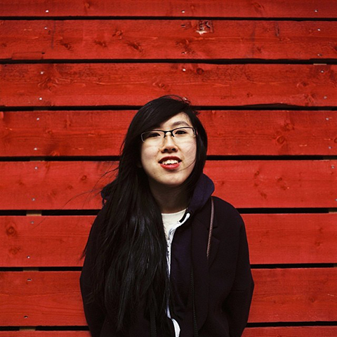
Harriet Plaskitt contributes a fabulous tableaux featuring food for Amelia’s Colourful Colouring Companion, inspired by her own travails. She tells us more about this, and gaining a brilliant commission for the Stereophonics thanks to Instagram.

HARRIET PLASKITT PORTRAIT
I believe your are most interested in 3 areas of illustration, what are these and why do they interest you the most?
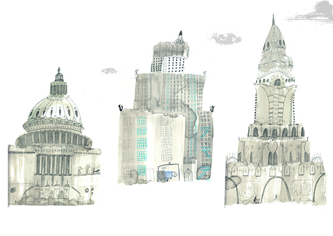
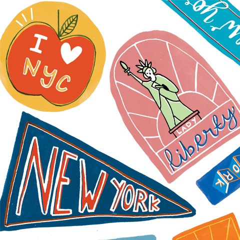
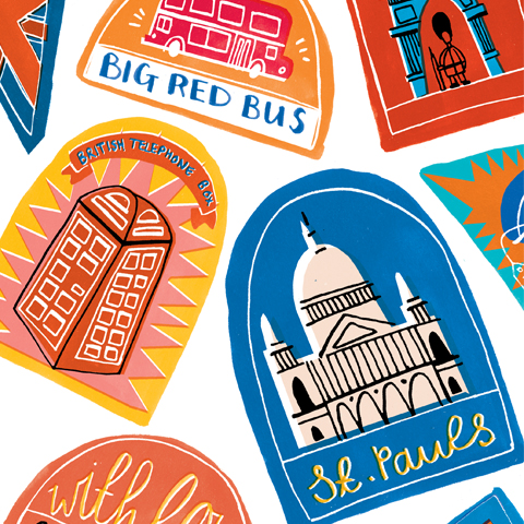
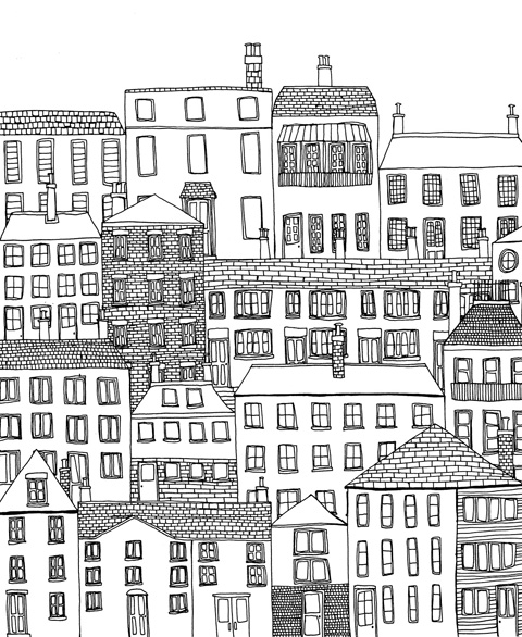
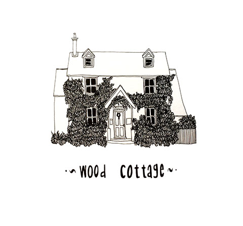
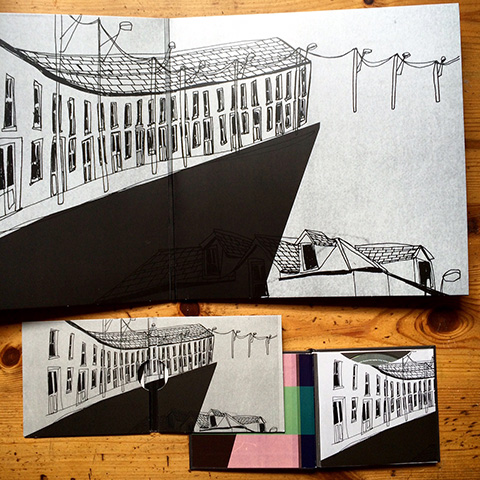
Yes, I tend to draw three main areas, buildings and maps, food and recipes, and hand drawn typography. I enjoy travelling, and like to capture the places I have been by drawing the buildings there. And not just the ornate landmarks, but the ordinary terraces and high streets. Having been recently diagnosed with IBS, I enjoy exploring what meals I can make with the limited and unusual list of foods I can eat. When I was researching this I realised there was a gap in the market for illustrated IBS friendly recipes. Hand drawn typography has always been something that I’ve enjoyed doing, I like creating my own fonts and experimenting with what can and cannot work.

HARRIET PLASKITT - TOWN
What is your preferred way to work?
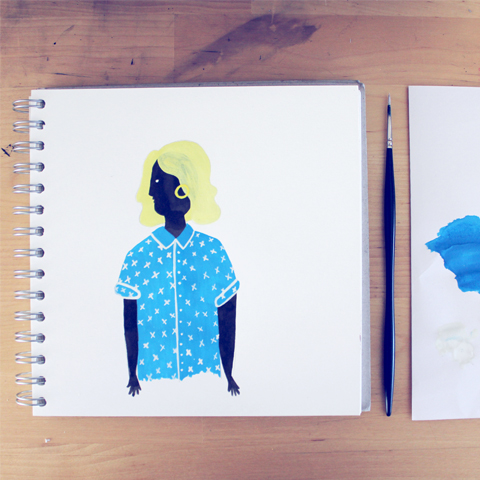
I like to work at my desk, so that I have all my materials and laptop and printer readily available. I work mainly with a set of Rotring Isograph pens with black ink. I usually draw all the components of my illustrations separately, and then scan them in and compile them on photoshop. If I colour them I either do it with colouring pencils, or on photoshop.

HARRIET PLASKITT HOUSE PORTRAIT
What was the best part of your course at the University of Gloucestershire?
I really enjoyed the independence of being at university. We did a module about promotion and I liked creating a brand for myself, and making promotional items, making sure everything you do looks like it is done by you.

HARRIET PLASKITT DOUBLE PAGE
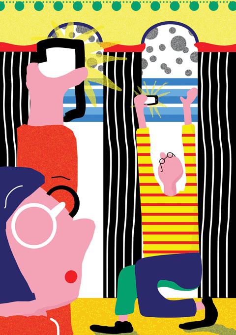
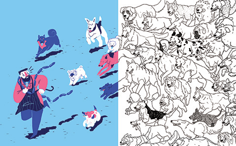
In what way has your personal life inspired your artwork for my colouring book?
Due to being on a restrictive and unusual diet called FODMAP, I have to be creative and inventive with that I eat. The two pages for the colouring book show what I can eat on one side, and what I can’t eat on the other.

HARRIET PLASKITT STEREOPHONICS 2
How did you get your first commission from the Stereophonics and what was it for?
The wife of the lead singer found my instagram page and commissioned me to do a house portrait. She then showed her husband Kelly my website and he liked my work, so they contacted me to design their logo and do drawings which they used for the album cover and inside the album booklet. It was all very lucky and an amazing experience.

HARRIET PLASKITT QUOTE
How have you become skilled in hand lettering?
I spend a lot of time practicing and experimenting, with different fonts, different materials and different subjects. I also really like discovering other people who do hand drawn typography, and often look through Instagram for inspiration.

HARRIET PLASKITT COPPER CARD
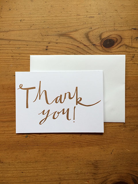
What project have you recently done using the Adana Eight Five printing press?
I recently created a range of hand printed letterpress greetings cards. These are now all in my Etsy shop and include birthday cards, thank you cards and various hello cards. I’ve used colours that you can’t print with digitally, like gold and copper.

How do you motivate yourself to work on personal projects and why are these important to you?
When I get stuck on a commissioned project, I like to do something personal to reinspire me. I think it is really important to keep going with what you want to do, not only because it expands your portfolio, but because you can develop and experiment with your style.

HARRIET PLASKITT - CITY
What quotes from pop songs are you likely to illustrate, and in what context?
I liked the idea of creating a series of ‘motivational’ quotes, that when initially looked at appear to be the normal “live laugh love” etc which are popular at the moment, but instead are quotes from cheesy pop songs, for example S Club 7. I’ve got some ongoing commissions at the moment so this has been put on hold, but I look forward to getting back to it!

Where can we find you online?
Instagram is where I am most active @harrietplaskittillustration. My etsy shop is here and my website is www.hpillustration.co.uk.

Harriet Plaskitt is featured in Amelia’s Colourful Colouring Companion, alongside 40 other fabulous artists, funding now on Kickstarter. Make sure you get a copy or a few as soon as possible!

Categories ,#ameliasccc, ,Adana Eight Five, ,Adult Coloring Book, ,Adult Colouring Book, ,Amelia’s Colourful Colouring Companion, ,Coloring, ,Coloring Book, ,Colouring, ,Colouring Book, ,etsy, ,FODMAP, ,Food, ,Harriet Plaskitt, ,IBS, ,illustration, ,instagram, ,interview, ,Kickstarter, ,Rotring Isograph, ,S Club 7, ,Stereophonics, ,University of Gloucestershire

Similar Posts:


Amelia’s Magazine | 8 Things You Didn’t Know About Colouring Books For Adults

Amelia Gregory portrait
Adult Colouring is a trend you can’t escape, so why not embrace the phenomenon with gusto this Christmas? You might be surprised by how much you and your loved ones enjoy it. I first became fascinated by the growth in popularity of adult colouring a year ago, and although sure it would not appeal to me as a personal hobby I thought the format provided the perfect forum for artists to showcase their work. So I posted a brief on Amelia’s Magazine and set about making Amelia’s Colourful Colouring Companion. In the interests of research I decided to try adult colouring myself, and before I knew it I was a total convert: from intrigued sceptic to full on addict, here’s what I’ve learnt during my colouring journey so far.

Sophie Corrigan by Sua Agape Adult Colouring Book
Sophie Corrigan coloured by Sua Agape.

1. Colouring Can Be Daunting
Yes, really! Making marks on a blank bit of paper can be daunting to most, but colouring is not necessarily the easy route out. Choosing the right medium and colours can be a scary process, so don’t be surprised if you occasionally find yourself stumped. Colouring is given a bad rap as uncreative but as a colourist you impose your own creativity on that page. Yes, I said colourist. Being a colourist is a thing in the adult colouring world. And I’m not talking hair dye.

2. Colouring Is For Everyone
Don’t let the above put you off: there are many ways to make the creative choices less stressful. Try the wonderful website Color Hunt for simple colour palettes if you’re stuck on what to use. Or, don’t think about what colour you pick up, just use whatever medium you have to hand and be impulsive. There are no rights and wrongs so enjoy the process; it’s supposed to be fun and relaxing. Colouring builds creative confidence so it is a great entry point into further artistic endeavour.

Lorna Scobie by Libby Parra Adult Colouring Book
Lorna Scobie coloured by Libby Parra.

3. Colouring Is A Creative Collaboration
You may be colouring someone else’s creation, but your decisions enable that line drawing to come to life – so don’t underestimate your input. When you spend a lot of time colouring in you get to know the artist’s artwork intimately, so it really helps if you like their style. Go for a theme that appeals to you: from mandalas to mohicans, there are thousands of books now available with designs to suit all tastes. Why not seek your interests out? A good colouring book artist will keep you inspired for days on end.

4. The Colouring Community Thrives Online
You know how colouring is touted as the best way to switch off and step away from the screen? Well that’s true, but there is a thriving adult colouring community sharing artwork online, swapping tips and admiring each other’s work. Facebook is the best place to ogle at some true masterpieces, learn how to achieve the best shading and get into discussions about the pros and cons of vaseline versus baby oil (for blending, nothing nefarious I promise.) No one person will colour a picture the same way and it’s a real thrill to see how differently everyone approaches a similar image.

Suzanne Carpenter Adult Colouring Book
Double page by Suzanne Carpenter.

5. Be Prepared To Be Peaceful
If you really want to get in the zone it’s a good idea to set yourself up with the right equipment. Colouring at night with scratchy pencils under a low wattage lamp without a sharpener to hand does not make for a pleasant experience, so be prepared to invest in some super duper accessories like a lap desk with integral lamp. Headaches are far from restful!

6. Colouring Soon Gets Costly
The online colouring world is full of colourists with hundreds of colouring books and cupboards that spilleth over with pens and pencils. There are many options and they all give different results, so be prepared to spend money on your new habit and become a pencil/pen geek with alarming rapidity. If you are anything like me you will need only the merest excuse to buy new art materials: so before you know it you’ll be salivating over Marco Raffines, comparing Prismacolor colours and experimenting with Gelly Rolls.

Enchanted Forest by Johanna Basford Hack by Colour With Claire
Enchanted Forest by Johanna Basford, Hack by Colour With Claire.

7. Colouring Pages Get Hacked
It seems that everything can be hacked these days, and by this I do not mean steal – you should always get your colouring pages from a legitimate source and ensure the artists are paid for their work. But why not have a bit of fun and hack an original colouring page image? There’s no law to say you have to stay within the lines, so go wild and add your own elements to the original creation, such as these Disney characters in a Johanna Basford tree by Colour with Claire.

8. Lastly, Colouring Is Addictive
It’s exciting. You can make an image come alive with colour, and there’s a real sense of achievement when you finish colouring a page, especially one that has taken a long time to complete. Which probably explains why colouring is so darn addictive… and can become very time consuming if your addiction really takes hold. Don’t say you haven’t been warned!

Amelia’s Colourful Colouring Companion is funding now on Kickstarter and features 40 artists from all over the world.

AmeliasCCC Kickstarter campaign image
This article also appears on the Huffington Post.

Categories ,#ameliasccc, ,Adult Colouring, ,Adult Colouring Books, ,Amelia’s Colourful Colouring Companion, ,Christmas, ,Color Hunt, ,Coloring Books, ,Colour with Claire, ,Colouring Books, ,Colouring Books For Adults, ,Gelly Rolls, ,Hobbies, ,Huffington Post, ,Johanna Basford, ,Kickstarter, ,Libby Parra, ,Lorna Scobie, ,Marco Raffine, ,Prismacolor, ,Sakura, ,Sophie Corrigan, ,Sua Agape, ,Suzanne Carpenter

Similar Posts:


Amelia’s Magazine | An interview with Hazel Partridge: Amelia’s Colourful Colouring Companion featured artist.

Hazel Partidge Image 5
Beautiful nature themed artworks by Hazel Partridge were one of my top picks at this year’s New Designers show, so I was thrilled that she took up the offer to submit for Amelia’s Colourful Colouring Companion. Her gorgeous papercut piece was inspired by a poem from Black Country poet Liz Berry.

Hazel Partridge Image 11
I found you at New Designers, what was the best thing about that show for you?
New Designers was really inspiring and informative, the atmosphere was great and it was packed the whole time! I really enjoyed looking at the work from all of the different disciplines and Universities; it was really encouraging to see such diverse ideas and products from this year’s graduates. The most useful aspect of the show was that it gave a great opportunity to speak to representatives from the creative industry; at the Falmouth University stand we met people from publishers, agencies and design companies, all of whom were really enthusiastic about our work.

Hazel Partidge Image 9
Hazel Partidge Image 6
How did studying at Falmouth Uni inform your illustrations, it’s such a beautiful town!?
Falmouth is such an inspiring location, and I think everyone studying there would agree! Working in a collaborative studio environment is something that I really miss, it’s so useful to be able to see what others are working on, and get reliable feedback on your own work as well. Nature is a recurring theme for me, and exploring the local Cornish landscapes definitely influences my illustrations. I scuba dive and rock-climb regularly, seeing the world from a different perspective- whether it’s underwater or from halfway up a sea cliff – gets me away from my desk, and more productive when I am back there.

Hazel Partridge Image 4
Where do you like to go when you are at home in the Cotswolds and in need of inspiration?
I’m lucky to live close to so many beautiful places; I love a good long walk through the woods and fields with friends, and heading over to Wales with my family on our motorcycles. I also find a lot of inspiration through reading, I’ve recently finished The Worm Forgives the Plough by John Stewart Collis, which I enjoyed.

HAZEL PARTRIDGE
Can you tell us what inspired your double page for my book?
My colouring page was inspired by imagery from Bird by the Black Country poet Liz Berry. I caught a snatch of the poem; the lines ‘I shed my nightdress to the drowning arms of the dark, my shoes to the sun’s widening mouth’ on the radio, and jotted them down so that I could find out the rest. A little research later and I had discovered an amazing poem that was rich with themes of metamorphosis and migration, and which evoked an enticing yet slightly unsettling atmosphere.

Hazel Partidge Image 8
What are your preferred methods when making artwork?
My illustration was created using cut paper, inks and digital editing. My current favourite mediums to work in are lino print and papercutting, I really enjoy how the process flows- starting with a blank surface and then removing bits of it until the design emerges (hopefully) unbroken. Although working traditionally is by no means the fastest method of producing images in these styles, I find that the results have a warmer and more authentic quality than they would if created digitally as I have put a lot more of myself into their creation.

Hazel Partridge Image 3
Hazel Partidge Image 7
You obviously have a great love for birds as they feature widely in your work, what is your favourite bird and why?
My favourite bird is probably the magpie, because not only are they intelligent and beautiful, but they have such a rich folklore surrounding them – most people know the One for Sorrow rhyme, for example. My illustrative work reflects my interests in natural history and science, and although my images are often decorative I enjoy researching the background information on my subjects and trying to keep the designs accurate.

Hazel Partridge Image 3
What new projects are you working on now?
I am currently working on a series of privately commissioned images featuring various birds in their natural habitats. It’s always hard to part with my original artworks, but it’s lovely to know that they are going to a good home where they will be displayed properly rather than sat in a folder in my studio. I’ve got a few print-based projects in the pipeline as well, but I can’t say more about them at the moment, and as Christmas is on its way I’m beginning to plan some festive projects too. I post on social media frequently, so updates can be found there.

Find Hazel on Facebook, Twitter @HP_Illustrates, Instagram @hazelpartridgeillustration and Tumblr. You can colour Hazel Partridge‘s art in Amelia’s Colourful Colouring Companion alongside that of 40 other international artists. Funding on Kickstarter with only 10 days left, so get your copy now, it makes a fantastic Christmas gift!

Categories ,#ameliasccc, ,Adult Coloring, ,Adult Colouring, ,Amelia’s Colourful Colouring Companion, ,Bird, ,Christmas, ,Coloring for Adults, ,Colouring Book, ,Cotswolds, ,Falmouth University, ,Hazel Partridge, ,illustration, ,interview, ,John Stewart Collis, ,Kickstarter, ,Lino printing, ,Liz Berry, ,nature, ,New Designers, ,One for Sorrow, ,Papercut, ,The Worm Forgives the Plough, ,wales

Similar Posts:


Amelia’s Magazine | An interview with Alex McGinn: Amelia’s Colourful Colouring Companion featured artist.

Alex McGinn Artwork example 2
Illustrator Alex McGinn was one of a slew of graduates discovered at this summer’s New Designers show. Her distinctive artwork features a strong palette of autumnal colours, which lend themselves perfectly to a host of subjects.

Alex McGinn Artwork example 2
What was the best bit about studying at Falmouth Uni?
At Falmouth University I think the most helpful part of our course was the amount of tutor time and group critiques we had to discuss the development of our work. The university felt like a community, probably because the campus is situated in such a small town. As a student, I really felt the tutors really knew me and were always aware of what particular problem I was trying to overcome.

Alex McGinn Artwork example 4
How do you start a piece of artwork and what is your favourite part of the art making process?
Generally my favourite part of creating an illustration is the ‘thumbnail’ stage. Which is where I am literally laying out every idea that pops into my head until I have this massive page filled with plenty of different visuals to compare and choose from. At this part of the creative process I feel very liberated as I don’t have a fixed idea about what my final outcome will be.

Alex McGinn Artwork example 7
You favour a very particular colour palette, where do you find inspiration for the colours you use?
I think when I was starting to create more editorial illustrations I looked into the kind of colour palettes other successful editorial illustrators use, such as Neil Webb and David Doran. My main aim was however to make the illustrations really jump out at the viewer which is why my colour palette is vivid and bright.

Alex McGinn Double Page colouring book
How did you create the artwork for the colouring book?
I started off by making a few sketches and thumbnails and decided what subject matter would work best for a wide audience. Once I had decided I wanted to create a nature themed image the rest of the process was fairly simple. All my drawings are rather large so I can place all the necessary detail, and then digitally edit using the Adobe Suite.

Alex McGinn Artwork example 6
What are your favourite Dorset landscapes and why?
I personally enjoy the view from the Purbeck peninsula looking towards Corfe Castle which is an area I visited regularly as a child.

Alex McGinn Artwork example 3
How did you get involved with Write to Freedom and what have you done for them?
One of my Falmouth tutors was in contact with a member of Write to Freedom who were collaborating with the Workers’ Educational Association (WEA), and it was through this connection I got one of my first commissions. For this particular commission I was asked to produce a leaflet depicting the History of the Workers’ Educational Association within Dartington, and an illustrated map. The illustrated map was designed to lead the viewer along a trail around Dartington Estate and the surrounding countryside. It was called the ‘Dartington Then and Now‘ Trail. Throughout the trail there were a series of ‘then’ and ‘now’ statements displayed, explaining the past and current projects the WEA undertook in Dartington.

Alex McGinn Artwork example 1
What kind of illustration are you producing for Workers’ Educational Association?
At the moment I am working on another commission now specifically for the Workers’ Educational Association. I am creating large illustrations summarising the development of the WEA over the last 100 years. These illustrations will eventually be displayed in an exhibition towards the end of the year.

Alex McGinn Artwork example 5
Why have you decided to train as a teacher and where do you hope to pass on your skills in the future?
I decided to train to be a teacher whilst keeping up with my freelance work as I really do have a passion for passing on the knowledge I have learnt throughout my education. I enjoy the opportunity to inspire creative thinking at any given opportunity which is why teaching was a logical path for me to undertake. At the moment I am training to teach Secondary Level Art and Design but potentially, in the future, I may qualify to teach at University level as well.

Stay tuned for many more interviews with featured artists from Amelia’s Colourful Colouring Companion.

Categories ,Adult Coloring Book, ,Adult Colouring Book, ,Alex McGinn, ,Amelia’s Colourful Colouring Companion, ,Coloring, ,Coloring Book, ,Colouring, ,Colouring Book, ,Corfe Castle, ,Dartington Estate, ,Dartington Then and Now, ,David Doran, ,Dorset, ,Falmouth University, ,illustration, ,interview, ,Neil Webb, ,New Designers, ,Purbeck peninsula, ,Workers’ Educational Association, ,Write to Freedom

Similar Posts:


Amelia’s Magazine | An interview with Ignacia Ruiz: Amelia’s Colourful Colouring Companion featured artist.

Ignacia Ruiz
Ignacia Ruiz was born near the Andes but has chosen London as her home. Since graduation from her degree she’s had a packed schedule, featuring in numerous exhibitions but happily finding time to produce some artwork for Amelia’s Colourful Colouring Companion too.

ignacia Ruiz Portrait
What has prompted your lifelong obsession with greenhouses and plants in general?
I think it started with the very first place I lived in. There was a small greenhouse in the centre of the house and I can remember being about 4 years old and going in to water plants with my mum. It always seemed like the most magical place! I think that has remained my impression ever since. Being from the city and surrounded mostly by buildings has made me see plants and greenery as a precious thing.

Ignacia Ruiz
Ignacia Ruiz
You love to sketch on location – how did you set about capturing the hothouse atmosphere of the greenhouse?
For me it was getting the mix of the delicate architecture of the steel frame and glass against the organic structural shapes of the plants themselves. The tropical heat of the greenhouse hopefully comes across on the vivid colours of the plants in the drawings!

Ignacia Ruiz
What was the best bit about growing up in Santiago de Chile?
Weirdly enough I think it was probably the topography of it. You can drive from the city to the seaside in an hour to have a swim and later drive up the snowy mountains all in the same day. The variety of landscapes is lovely. My favourite thing in Santiago is seeing the Andes mountains at sunset. The snow turns red and orange and you can see the beauty of them in stark contrast with the glass and steel of the buildings.

Ignacia Ruiz
Why did you pick London for your study?
Initially I was only coming to London for maybe a year, but a lot happened in that time and I felt like it was the right place for me. I then applied to do the Graphic Design and Illustration BA at Central Saint Martins and got offered a place. That’s when I decided I wanted to stay here and try to develop my career. It’s been going well ever since!

Ignacia Ruiz
How do you translate your location sketches into finished works of art and what is the process?
My sketches are usually very fast and loose, so I like to have finished work that retains some of that quality. I have found that with print methods like linocut and woodcut I can emulate the drawing pen with the chisel. I guess it’s the same idea, just a different tool. I love playing with negative space and the bold flat colour you get with relief printing. I also like the imperfections of the print that relate to the initial rough sketch. I’m not a perfectionist printmaker at all!

Ignacia Ruiz
I believe you’ve just completed a residency in Italy – can you tell us more about this?
Yes, I was very lucky to have been asked by the print studio Opificio della Rosa to come and work in an artist book. I decided to make a reportage project of the area the studio is located in, the Conca Valley. I travelled around with my sketchbook documenting the people and places I encountered. Later I returned to the studio to turn the drawings into woodcuts. It is an ongoing project that will be finished and published in 2016.

Ignacia Ruiz
How did you get the commission to illustrate a Penguin book and what was the process of producing your final artwork?
One of Penguin‘s art editors came to our second year illustration exhibition and liked some of the work I was exhibiting. We kept in touch until finally she said she had a project that would suit my work. It was a book about the planning and logistics of the Crusades. I was so excited, especially since all the research consisted in looking at beautiful period illuminations and films depicting the Crusades. The artwork went through several roughs before it was approved by Penguin and was finally rendered in a woodcut style with thick black outline and very little colour.

Ignacia Ruiz
Can you tell us more about the recent exhibitions you have taken part in?
There has been a few this year apart from my degree show. I had a piece in the AOI’s Places and Spaces exhibition at the London Transport Museum, I did a cover for Alice in Wonderland which was featured at the YCN Student Awards at the Barbican Centre, I had a project about depicting boxers training in a gym in Islington featured in the Reportager Award at the UWE in Bristol and my City linocuts series appeared at the Cheltenham Illustration Awards. It’s been a busy year!

Ignacia Ruiz
What next, will you stay in London and if so why?
I have some commissions and teaching jobs on at the moment so London feels like the right place to be. We shall see what the future brings!

You will be able to own your very own copy of Amelia’s Colourful Colouring Companion featuring the work of Ignacia and many others… just make sure you grab your book once my Kickstarter campaign launches in a few weeks time.

Categories ,#ameliasccc, ,Adult Coloring Book, ,Adult Colouring Book, ,Amelia’s Colourful Colouring Companion, ,AOI, ,Central Saint Martins, ,Cheltenham Illustration Awards, ,Coloring, ,Colouring, ,Conca Valley, ,Crusades, ,Ignacia Ruiz, ,illustation, ,Kickstarter, ,linocut, ,London Transport Museum, ,Opificio della Rosa, ,Penguin, ,Places and Spaces, ,Reportager Award, ,Santiago de Chile, ,woodcut, ,YCN Student Awards

Similar Posts:


Amelia’s Magazine | An interview with Ana Jaks: Amelia’s Colourful Colouring Companion featured artist.

ANAJAKS-FigurePracticeInspiredbyHoliday_Season
I found Ana Jaks at New Designers, where she was also discovered by the likes of Creative Review. She contributes a bold design for Amelia’s Colourful Colouring Companion inspired by recent holidays.

ANAJAKSDRAWING
What did you learn and how did you develop as an artist at university?
I’m a recent graduate who studied illustration at Falmouth University which was probably one of the best environments anyone could ever ask to develop in. Before going to university I already had a very set drawing style which was mainly black and white and was all done in fine liner with barely any colour – it had more of a fine art feel to it than illustration, and being at Falmouth meant I had to break that down, strip everything back and start again. This did prove to be a massive struggle for me and at one point I didn’t think I was good enough to continue the course but the tutors there are honestly some of the most supportive I have ever been around and they really taught me how to use colour and not be afraid to take risks and so I really embraced my time there and I honestly don’t think I could have developed the style I did if it wasn’t for being there.

ANAJAKS-NY
What was the best part about studying at Falmouth Uni?
The best part about being there meant going to New York and showing massive clients like Vice and 3×3 your work, where you would get really focused feedback and as soon as I got back to the UK I took it all on board and tried to really bring my work together a lot more and realised how inspiring architecture is, which is why I created my New York piece. This piece of work really felt like a landmark for me, it was finally something that I thought “yes this is how I want my work to look to an audience.”

ANAJAKS-theselfiephenomenon
ANAJAKS-CreativeReviewBillboard2
I found your work at New Designers, what was the most exciting bit to come out of your show there?
The Selfie Phenomenon, which was a project I showed at both New Designers and New Blood, and was fortunately lucky enough to be chosen by the Creative Review and JCDecaux’s Talent Spotting Showcase 2015 where 20 graduates got chosen to have their work shown nationwide. I thought I would include this in the images I have sent to you because it was one of the most exciting things to have happened straight after finishing my degree and seemed somewhat unbelievable. 

ANAJAKS-EcoCallobforToteBag
What recent projects have you been working on?
Recently I have been working on an image for a collaborative project to do with helping the environment and focuses around the idea of stopping people from using plastic bags and so instead are selling tote bags for a pound in order to get people to help the environment. I was invited to design an image for the tote bags which involved me drawing animals which is really something I never do and so it was quite interesting for me I suppose? I usually stick to buildings, figures and environments as it’s something I much prefer but this was actually really fun!

`ANAJAKS-Inspiredbyrecentholiday
What areas of illustration do you hope to work on in the future?
My main interests lie in editorial because I always think you manage to get the most interesting images out of them. I also really love fashion and so the idea of being able to work on advertising campaigns with some sort of fashion house would be my absolute dream. Anything that I can apply bright colour, pattern, shape and an element of design to is perfect for me and I’ve even found that children’s books (although not what I had originally expected to like) are something I could really see myself enjoying.

ANAJAKS-CommissionbyFTMagazine2
ANAJAKS-CommissionbyFTMagazine
How did you become a member of YCN and what have you been commissioned for as a result of being on the website?
I am currently a member of YCN and am lucky enough to have my portfolio showcased on their website which has meant I am able to say my first ever commission was for the Financial Times Magazine which was amazing. It was an article about Gastropubs and so I had to draw pubs and food which was bloody great as they are both things I love! This was really important for me as it really gave me a taste of how the professional world worked in terms of being a freelance illustrator.

`ANAJAKS-dblepg
What inspired your double page for my book?
My colouring book pages for you were inspired by my summer holiday I had in summer. I wanted each page to contain an element I enjoyed most about the holiday, which is obviously why there is just one page full of people lying down doing nothing because I felt like I’d been on my feet for a full 3 years doing my degree and being able to do nothing for 2 weeks was bliss haha. When I was drawing this image it was the first time in quite a while that I had actually gone back to hardcore drawing and it was really good for me because it meant I pushed myself a lot on what I was doing. The other half of the image that is in black and white of the buildings is supposed to be the part I enjoy most which is walking around and discovering things – I actually much prefer this page and can’t wait to see how people colour it in!

ANAJAKS-FigurePracticeInsipredbySeasons
How does your interest in social media materialise in your work?
Being on holiday also inspired me to draw other images like tourists flouncing around trying to maniacally take pictures of everything but not really looking at anything. Social media is a big thing for me and my work and a lot of focus tends to lie around it. It’s interesting because we are obviously in a day and age where it can be detrimental to a creative’s career, but then you see how much it takes over some peoples lives and I love trying to wrap my head around it and create solutions to it through illustration.

ANAJAKS-FigurePractice
How do you try and evolve your style?
I am constantly trying to recreate and evolve my style because I think it’s incredibly important not to get stuck or comfortable in what you’re doing and so I always try and develop the way I draw the figure. Fashion has a huge influence on how I create my pictures and so I always try and do portraits just as little fun experiments! It’s also good to do just to let everyone know you are still working, because I want the world to know I am still drawing and I am still enjoying it and that I am really serious about it all and not just getting lazy, but it does get hard difficult running out of inspiration.

ANAJAKS-CreativeReviewBillboard3
What are you working on next?
I have plans for an upcoming project which I don’t want to reveal just yet but I feel like it’s something a lot of people my age can relate to. I tried for ages to think about something that would be “cool” or “appealing” or about something I love. It’s hard to stay inspired straight after your degree and I think it’s a really important time to keep pushing – especially when you are just working a job you don’t want to be to pay the bills. Ideally I would love to work freelance and be working within a company too.

You can colour Ana Jaks‘ art in Amelia’s Colourful Colouring Companion alongside that of 40 other international artists. Funding on Kickstarter now! Make sure you grab a copy or two, it makes a fantastic Christmas gift!

Categories ,#ameliasccc, ,Adult Colouring, ,Amelia’s Colourful Colouring Companion, ,Ana Jaks, ,Coloring, ,Colouring Book, ,Creative Review, ,Falmouth University, ,Financial Times Magazine, ,Holiday, ,illustration, ,interview, ,JCDecaux’s Talent Spotting Showcase 2015, ,New Blood, ,New Designers, ,The Selfie Phenomenon, ,YCN

Similar Posts:


Amelia’s Magazine | An interview with Jack Bailey: Amelia’s Colourful Colouring Companion featured artist.

JACK BAILEY illustration
Jack Bailey was one of the fantastic new illustrators I discovered at this year’s New Designers graduate show who answered my callout to take part in the colouring book open brief. His energetic art is created on a large scale then turned into fantastically busy pictures like his colouring book page, inspired by the game of Ultimate Frisbee.

JACK BAILEY illustration
Where do you find inspiration for your characters?
The inspiration for my characters comes from a mix of sketching outdoors and making loose marks on a large sheet of paper. When I apply the loose marks to a piece of paper I relate back to my original outdoor sketches and start to interpret the mark as the shape of a body or a facial expression. The characters barely resemble the original sketches however I find studying from life allows me to interpret the marks made in a variation of forms. Previous to this brief my characters where always produced in colour, so it was fun to experiment in black and white for the colouring page and this is something I have continued doing.

JACK BAILEY illustration
Can you tell us more about what is going on in your artwork for my colouring book? who are all those people?
The piece for the colouring book was inspired by an article I read in the New Yorker about the chances of Ultimate Frisbee becoming an Olympic sport. Immediately, due to the word ‘ultimate’, I imagined a huge, chaotic game of Frisbee where only those playing understood what was going on. Almost like looking at a London underground map for the first time. The characters in the image are the people playing the sport and I packed the image full of people to show its rise in popularity. Unfortunately not many people play Frisbee in Liverpool so I picked up on the dynamic poses through watching youtube videos, which also contributed to the hectic feel of the image.

JACK BAILEY illustration
What led you to study at the Lincoln University and what was the best bit about your course?
In all honesty studying at Lincoln was totally by chance as I was still unsure if I was going to go to university at the time. I attended a university fair in Manchester where I picked up information packs and Lincoln University was one of them. When I got to Lincoln for the interview however I knew it was the place for me. It was quiet enough for me to be able to get on with my work and the old architecture of the city really appealed to me. As well as this everywhere was in walking distance and so really accessible. I guess you could say it was destiny! The best bit of the course for me was having tutors from a variety of backgrounds. It really enhanced a brief when you knew a tutor was passionate about the subject and had experience in the field. Another aspect of the course I enjoyed was the encouragement to try different media and new ways of working. Before the course I believed a single image had to be produced using the same mediums and on a single surface. Now I’ll use a whole bunch of mediums on separate surfaces allowing me to be a lot more expressive and confident in the way I work.

JACK BAILEY illustration
How do you translate your ideas between 2D and 3D artworks?
It works in a similar way to how I translate a sketch from life into one of my characters, in that they often don’t appear anything like the original influence. Between the 2-D and 3-D image they will often only share similar characteristics such as the amount of legs, hair style and facial features. Working in paper mache means capturing a dynamic pose is often difficult. This is why I use string to decorate the creatures. I feel the shape and swirl helps add movement to a static creature.

JACK BAILEY illustration
What is the process of creating your 3D pieces?
To create my 3-D pieces I start with a single sheet of paper, often from an old book as I like the stained colour of the pages. I dip this into a wallpaper paste and begin moulding it into any shape that feels natural. Similar to when I create my characters I try not to think too much about the early steps of the process and make shapes with papier mache whilst not thinking of the end product. This is so I don’t miss out on a nice, natural shape for the character. Once I have combined a few sheets of paper I use this as the body, from here I will refer back to my 2-D character and begin creating a head and other features. I finish by adding a face and decorating it with string and found objects.

JACK BAILEY illustration
Why do you find it easier to work on a large scale?
Working on a large scale is easier for me as I find it enhances my creativity. I find the characters look a lot more natural on large sheets due to me not being worried about them running off the page. The marks I make on large sheets are more expressive and full of energy as it is my whole arm moving the brush, not just my wrist. I also find working on a large scale creates new ideas. The sheets become a visual mind map. If I need a tree for an image, on a small scale I will produce one whereas on a larger scale I will produce as many as I can to fill the length of the sheet. This then becomes a new image for me to play around with.

JACK BAILEY illustration
What is it about drawing buildings that appeals to you?
Mainly that they don’t walk off as I try to draw them! What I enjoy to study on a building is the smaller details, often found towards the tops of buildings. I find the top of buildings to have the most character. There are unusual patterns and decorations, small windows and chimneys. You can interpret these as faces, creating relationships between two buildings or as body parts and the buildings can become giants peeping over trees.

JACK BAILEY illustration
How has living in Liverpool influences your approach?
I think the diversity of Liverpool has influenced my illustrations. The city centre is a collection of classic and modern architecture, renovated buildings and desolate warehouses. I also think it encourages creativity here too, with a variety of contemporary and classical art galleries there are always avenues to explore for inspiration.

JACK BAILEY illustration
Why is your new project with Cygnet Ink inspired by Quentin Blake? what is it you love about his work?
What I love about Quentin Blake’s artwork is the energy and looseness of the characters. Each line contributes to the personality of the character and he includes just enough information in each image to depict a scene. His characters also have a nice balance about them too, the positions are believable and you almost move with the character as you look at it. Blake’s backgrounds are a huge influence to me as he approaches them so cleverly. They depict real environments, but he will leave sections out or use a splash of watercolour to describe an area so the characters are the centre of attention.

JACK BAILEY illustration
You can find Jack Bailey‘s lively art in Amelia’s Colourful Colouring Companion, available soon from Kickstarter, and the ideal present for that special person this Christmas!

Categories ,#ameliasccc, ,Adult Coloring Book, ,Adult Colouring Book, ,Amelia’s Colourful Colouring Companion, ,Coloring, ,Colouring, ,Colouring Book, ,illustration, ,interview, ,Jack Bailey, ,Kickstarter, ,Lincoln University, ,Liverpool, ,New Designers, ,Quentin Blake, ,Ultimate Frisbee

Similar Posts:


Amelia’s Magazine | An interview with Antonia Parker: Amelia’s Colourful Colouring Companion featured artist.

Antonia Parker
The lovely Antonia Parker has contributed artwork to several of my books now. This time she was inspired by the multitude of lanterns that adorn her house to create a beautiful colouring page for Amelia’s Colourful Colouring Companion. She tells us about her current work practice and fitting creativity around motherhood, a challenge I can well relate to.

Antonia Parker Amelia's Colouring Book Douple Page Spread
Antonia Parker
What is your double page inspired by?
I have all these gorgeous lanterns at home that I adorn the house with for parties and Christmas and I thought it’d be nice to sit down and paint them. They’re so bright and colourful and ‘zang-y’! I thought about putting them outside and fireflies having a flutter about, so I’ve got all these insects having a sneaky after-party!

Antonia Parker
House Of Holland A_W 2014 by Antonia Parker
How did you put the artwork together?
I used gouache, collage and colouring pencils for my full-colour illustration and had a great time using different widths of nib for my colouring-in page. I planned out the picture in pencil first to make sure I was using the space how I wanted. I love drawing in detail in pen, so using different nib-widths was fun. It’s not often I get the opportunity to make a black and white illustration. With the colouring-in page, I used gouache and colouring-in pencils.

Pam-Hogg-SS14-Antonia-Parker-Amelias-Magazine-web
Antonia-Parker-The-Birth-Of-Miley-web
You are a multi-disciplinary artist – what are you favourite mediums to use and why?
I like to make things. It might be organic forms painted in gouache, wonky drawings in my travel sketchbook, glossy fashion illustrations, lumpy ceramics, cutting up and collaging together old polaroids or creating props for my day job. Artwork-wise I’m in a time of transition. I used to mainly work in acrylic paint on acetate, and that is mostly what people ask me for, but it is such a structured way of working that I felt like I was just churning them out. So I have moved more recently into gouache and pottery, and less people and more organic forms, because I wasn’t sure I was stretching myself enough. Sometimes they’re great, and I think ‘why did I limit myself to people for so long?‘ and other times I see how far I have to go. I never studied ceramics or gouache at art college, which is possibly why they are so fascinating now – making pottery is such a different process, and uses my brain in a different way! I love it! I still have so much to learn, and it is a bit challenging not knowing how the work will look at the end of the firing process – but it’s an excellent excuse to keep making and produce better batches every time. My degree was graphic design, specialising in illustration, but I’m not a naturally neat person – so I think pottery suits me much better – getting messy and crossing my fingers about what comes out after a firing. It’s relaxing in a way that I don’t often find drawing is anymore – although I suppose that is the flip-side of trying to make a career out of a passion.

Antonia Parker NW board up close
Antonia Parker NW Boards in Progress
Since becoming a mum, how has your approach to art and creativity altered?
I also had a baby a few months ago, so I’m settling into a new stage of life. Whilst she’s small, so far I’ve found I need to be slow for all of us. When she was 10 weeks old, amongst a few other things, my husband and I found out that we were losing our jobs at the end of the year, and it threw off what had been quite a lovely start to parenthood. I needed to put myself apart from it and be in tune with my baby, which has meant taking more time out than I had originally intended. In January I’ll restart classes at my local adult education centre so I have access to a kiln again. My concentration span is much lower at the moment. It was a challenge to make this piece, and made me realise that at this moment in time, I just want/need to go at my baby’s pace. With this project I had to really make something I wanted to make, (getting to paint in my favourite shades of gouache and delicious line-drawing) as I felt guilty making her sit watching me and her toys and just getting on. She was grumpy, and I just had to stop sometimes and be with her. It’s a frustrating pace to work at…. I can manage balancing house jobs and picking up the threads of things I was doing in the times I get, but sitting down and working is very challenging! I have so much admiration for mothers who are actually focussing on and achieving things besides their babies; I do not feel like one of them at the moment! It is sort of easier now she can crawl and occupy herself for a few moments, but then you have to run and check they’re playing with something safe. There is a reason that childcare exists! Currently I take my sketchbook around with me, and draw the odd thing when I get the opportunity.

The Mucky Hound Dog Walkers Betty by Antonia Parker web
Antonia Parker The Mucky Hound Logo Vinyl on Vehicle
What have been some of your most recent projects, can you tell us more about them?
Most recently I created desert and cacti scenery for New Wine conference, six 1.2 x 2.4m paintings. These were a huge undertaking as my baby was 3 months old, but with the help of Lily, James and Becky, we made them happen! When I’m painting like that, I try to take quite a relaxed ‘we’ll just see how they turn out!‘ approach, but you have to know what’s happening so your team can help you! I did a lot of drawing, mixing paint and painting by numbers so that it could carry on when I was feeding or getting her off to sleep. My logo for The Mucky Hound (one of my first forays into animal drawing) has been translated into vinyl and is driving around Tunbridge Wells as they pick up local dogs for walks. In my own work, I have also been making cacti in gouache and clay. When working with clay, I like to make small sculptures and slabs to illustrate using underglaze. I’m inspired by the things that excite me – so with this piece beautiful, colourful lanterns, things which are interesting to draw e.g. cacti variety of shapes and detail to draw, pottery: just a different way of working from how I have before and loving growing my understanding of it.

Antonia Parker
Antonia Parker
You’ve been involved in a few of my books now, what is it about them that keeps you coming back?
They tend to be interesting briefs: after I graduated, I made mostly fashion illustrations, and having always been interested in the environment, how could I not get involved in promoting sustainable fashion? Your last book ‘That Which We Do Not Understand‘ was inspired by your miscarriages – I had lost two babies myself and finally understood the grief. If we’re all silent about our losses, we’re part of the loneliness you might feel afterwards. I was pregnant at the time and was able to create something that hopefully, cautiously-optimistically spoke to others.

Antonia-Parker-St-Justin-web
Where do you live and what else excites you besides art?
I live in Tunbridge Wells with my husband and daughter and I’m lucky to know some fantastic local artists and makers. I love gardening (currently I am waiting for the rain to stop so I can plant my spring bulbs!) I am also very interested in rights issues, like genital mutilation and female sexuality, and now of course all of the work/family balance things that I’ve always followed are becoming more of a reality for me! I try not to bore on about my baby’s reusable nappies, but I love them! I have quite a nurturing day job focussed on children and their communities, but I find that I am also interested in women and their lives as mothers-to be and parents, and then of course fathers and how they find their way to fatherhood without the biological changes women go through, and also, how they support mothers. Can you tell that I’m spending my Maternity Leave doing a lot of thinking?!

Antonia Parker Anyone for Pimms

There are just a few hours left to secure your copy of Amelia’s Colourful Colouring Companion, featuring the work of Antonia Parker and over 40 other international artists. Visit my Kickstarter page here.

Categories ,#ameliasccc, ,Adult Colouring, ,Amelia’s Colourful Colouring Companion, ,Antonia Parker, ,ceramics, ,Coloring, ,Colouring Book, ,Fashion Illustration, ,interview, ,kent, ,Kickstarter, ,Motherhood, ,New Wine, ,Parenting, ,Pottery, ,That Which We Do Not Understand, ,The Mucky Hound, ,Tunbridge Wells

Similar Posts:


Amelia’s Magazine | An interview with Jenny Tang: Amelia’s Colourful Colouring Companion featured artist.

Jenny Tang The Jaguar
Jenny Tang contributes a vibrant image to Amelia’s Colourful Colouring Companion, featuring loads of excitable dogs chasing some sausages, I love it! Jenny is a recent graduate of Bucks New Uni with a degree in Graphic Arts and would one day like to get into publishing and editorial.

Jenny Tang The Jaguar
Why did you decide to enter an image for the colouring book and what inspired your choice of subject matter?
Well, a while back I had seen the Kickstarter campaign for your 10th anniversary magazine, That Which We Do Not Understand. I was really intrigued by the brief and thought it was a great project (I’m also inexplicably drawn to anything printed with gold). Unfortunately I was a little late to it so I was unable to get involved, however since then I popped in now and again and was delighted to see another interesting open brief; I couldn’t resist! The rest as they say, is history.

I thought about what current colouring books offered and most were of intricate patterns or detailed flora, which were good and all but not really my cup of tea. I love engaging people with characters or stories, so I wanted to create something that a person could use a starting point for their own narrative whilst they were colouring. What are each of the dog’s names? What are their personalities? Who is the pack leader? Will they ever outrun that butcher? I love the playful nature of dogs, which is an aspect I hope to convey in the image as well as encourage readers to be more like them!

Jenny tang dog spread
How did you set about creating your picture?
I always start with thumbnails to explore what ideas might work, one of the first ideas for the brief was lots of cats following a crazy cat lady. When I eventually settled on an idea I sketch it all out and use a light box to line everything. I find that doing line work on another sheet makes clearing up a lot easier as you don’t have to worry about getting rid of the pencil marks. I then scan it in and colour using Photoshop.

Jenny Tang The Interview
Why did you decide to combine studies in illustration and graphic arts and what is your favourite part in the process of creation?
Interesting question, I guess being able to know different skills outside of illustration can only ever be a good thing in my eyes. I originally wanted to be a ‘pure’ graphic designer but my heart never left illustration. I was lucky in that my university course openly encouraged exploring different disciplines and had many students with different ambitions, we had graphic designers, children’s book illustrators; even people that wanted to start their own clothing brand. In terms of graphic design, I loved doing layout, editorial and publishing; learning design for me was pushing what I could do with my illustrations and vice versa. Why just do an illustration when you can create and design your own illustrated publication? The skills were also pretty handy when I had to design my business cards and CV…

My favourite part of the process is sketching, you don’t have to worry much about ‘failing’, it’s the bit where if it ends of looking a bit rubbish you can just hide it away and everyone else is none the wiser. Colouring is starting to become a favourite too, it never used to be; I hated it but after practising and a lot of cajoling from my tutor I’ve gotten better at it and it’s quite satisfying seeing an image come to life.

Jenny Tang Interchange Cover
Can you tell us more about the inspiration behind your Interchange comic strip?
Sure, I was in a long-distance relationship for around 2 years with a charming man from Leeds. I was down South and since neither of us had a car the train was next best option. We saw each other on average 3 days per month, usually the weekend just before or after payday! Subsequently, I had a stack of train tickets which catalogued each time we saw each other and the other places we went to. (One of my favourite tickets is my 1st January ticket to London; we celebrated New Year’s Eve on a Thames boat cruise.) I’m a sucker for soppy stories and have always wanted to create a comic, so armed with a mapped out timeline and plenty of soppy fodder I set about creating Interchange. For those that may be wondering, we’re still happily together and he’s recently moved down!

jenny Tang Garden of Eden an Experimental Illustration
Why do you love rabbits so much?
Since my sister is allergic to cat and dog fur my parents compromised and got us rabbits instead. I’ve always had at least one throughout my childhood, with imaginative names like Blackie, Smudge and Patch. I loved them all to bits and to this day rabbits still incite such a strong dose of cute aggression not many animals can match. I think they’re under appreciated creatures when compared to cats and dogs, but I love the shapes they make and some of the mannerisms they have. For example when a rabbit expresses pure joy they run and jump erratically about, flicking their bodies; rabbit enthusiasts call them ‘binkies’ and it’s so unrestrained that they often land/crash into walls and furniture.

Jenny Tang Fluorescent Animal Posters
Where do you look for inspiration when you are most in need?
Strange as it may seem, most of the time it’s from reading newspaper articles or watching a documentary. Usually they involve something controversial but not always. The subject matter is always thought-provoking though and gets my mind thinking about the wider world and how I could portray it in a illustration. For example my jaguar illustration was inspired by a National Geographic article called ‘Path of the Jaguar‘ and a more recent documentary I was inspired by was about whether video games really do make people violent. If I get stuck on something more technical like perspectives or backgrounds I look to graphic novels. They are really good for top notch illustration, and they always have interesting compositions and layouts.

Jenny Tang Interchange Artwork
Jenny Tang Interchange Artwork 2
Can you describe the space where you work, what would we find there?
At the moment I’m a bit of an nomad illustrator, I don’t have a permanent studio yet and have to find some pretty, er, interesting places to work at. I’ve drawn on the bus, in bed, on an ironing board, a glass chopping board from that time I tried to make a makeshift light box (it didn’t work out) and occasionally a table when I sneak into the university studio despite graduating. There’s this awkward transitioning period after you graduate for illustrators; do you get a full-time job to be financially secure or do you just go for it and jump straight into freelance? Of course, unless you’re very lucky to already have clients under your belt before you leave university you have that catch 22 of a full-time job with more money but less time to draw or starting freelance with more time but less/no money. There’s this pressure from friends, family and yourself to get your career kick started and I must admit when I see fellow graduates seemingly move straight into the professional sphere I sweat about what I’m not doing. I guess that I’m still trying to figure things out in that department.

However, I am saving up for a studio space and already have optimistic dream of what will go in it. I would love to have a Risograph printer and a bunch of nice looking furniture (probably from Ikea) that will house my growing collection of graphic novels. You’ll probably also find lots of paper and work in progresses dotted around the place, a worn out drawing tablet, a dying succulent and a giant inflatable T-Rex.

Jenny Tang Spot the Difference Dinosaurs
Jenny tang Spot the Difference Dinosaurs 2
What kind of art do you hope to be making in the future?
At the moment I know I’ve still got a lot to learn and still have an open mind as what to do. However, eventually I would love to become a freelance illustrator or something that would combine both design and illustration together; like children’s publication or editorial. As long as I’m able to draw and design, I’ll know I’ll be a happy person.

Jenny Tang 100 Likes Promo Illustration
Jenny Tang is one of the contibutors to Amelia’s Colourful Colouring Companion, available really really soon on Kickstarter.

Categories ,#ameliasccc, ,Adult Coloring Book, ,Adult Colouring Book, ,Amelia’s Colourful Colouring Companion, ,Bucks New Uni, ,Coloring, ,Coloring Book, ,Colouring, ,Colouring Book, ,illustration, ,interview, ,Jenny Tang, ,Kickstarter, ,Path of the Jaguar, ,Risograph, ,That Which We Do Not Understand

Similar Posts:


Amelia’s Magazine | An interview with Ashley Le Quere: Amelia’s Colourful Colouring Companion featured artist.

Ashley Le Quere_Sketchbook_1
Ashley Le Quere creates colourful artwork with a twist, often accompanied by her beautiful typography, learnt from a master calligraphist in Australia. Here she shares her lovely ‘peeping cat’ colouring book artwork and tells us more about her design practice.

Ashley Le Quere_At Studio Desk Pic
How would you describe your style and what art materials can you not live without?
I always find it so hard to describe my style, but I would say it is hand drawn, as it looks natural and flowing. My favourite material would have to be my black Winsor and Newton ink, which I use for every project! I hand draw everything with my ink and my favourite paintbrush, which is now very old so I probably need a new one.

Ashley Le Quere_Sketchbook_2
Where do you find most of your inspiration?
If I’m really stuck for inspiration I tend to have a look though a magazine and pick out a few of my favorite books like Paris Kitchens, and if all else fails I go take a walk in the park. While I’m walking I tend to look for bits and bobs to collect, like really big leaves, petals or flowers that I find interesting and sometimes I make a collage of them!

Ashley Le Quere_At Studio Screen Printing Pic
What do you find so special about the screen printing process?
I love to screen print really because it is such a quick process; you can have an idea and by the end of the day (if all goes to plan) you will have a beautiful print or product.

Ashley Le Quere_colouring book pages
How did a peeping cat inspire your colouring book pages?
I drew the peeping cat in my sketchbook first off and it was playing on my mind… I wanted to take it further but I didn’t know how. That’s when I saw your open brief and thought it would be amazing opportunity to make more out of my peeping cat sketch.

Ashley Le Quere_Cat doodles
What did you learn at Ella Doran?
Working in Ella Doran’s studio was such a great experience but I think my favourite time was while I was helping her set up for the Home show in 2012. I think the main lesson I took from her was to keep calm under pressure and when working to tight deadlines… keep working through it and it will all work out eventually.

Ashley Le Quere_suitcase project
How did your time in Australia inform your work?
I think the time that most influenced my work while I was in Australia was while I was living near Byron Bay working on a coffee farm. I was in the middle of this tropical, beautiful country side and alone with my thoughts and all the flora and fauna for most of the day: I think that was the calmest time of my life.

Wuthering-Heights-by-Ashley-Le-Quere
You were chosen as one of the featured artists for the East End Prints Valentines exhibition, what inspired that artwork?
I illustrated a quote from one my favourite books for the True Romance Valentines Exhibition, which is Wuthering Heights. I love a good romantic period drama! (read more about Ashley’s artwork here)

Ashley Le Quere_suitcase project_2
How did you come to work with a suitcase company and what has been the best part of the project so far?
They approached me to create designs for their ‘Artist Create’ range. I think the best part of the project was that they trusted me and let me create whatever I wanted. I left very relaxed and enjoyed creating the designs: I think that it shows through in your work when you have fun doing it.

Ashley Le Quere_Hand Drawn Lettering
Your typography is beautiful, how did you learn this art?
Thank you, I have been playing with typography and lettering for years now but it was when I was in Melbourne that I really fell in love with it. I had a studio space in an converted warehouse where I met an amazing calligraphist called Maria Montes, so when she started to do workshops I couldn’t say no. I joined up and learnt so much from her: now I can’t stop!

Ashley Le Quere_My Firends Pattern
How exciting that you are taking part in the Crafty Fox Market for LDF. Can you tell us anymore about your products?
Yes, I’m working on creating cushions and some tableware textiles. My Gran (who I called Nanina) was a huge inspiration to me; she was an amazing women who I spent a lot of my child hood with. She died a couple of years ago and since then I have found myself drawn to the things she was passionate about or things she loved, like Ferns! So this project has been a very personal project, full of love.

There are many more interviews with Amelia’s Colourful Colouring Companion artists to come, so stay tuned.

Categories ,#ameliasccc, ,Adult Colouring Book, ,Amelia’s Colourful Colouring Companion, ,Artist Create, ,Ashley Le Quere, ,australia, ,Byron Bay, ,Coloring Book, ,Colouring Book, ,Crafty Fox Market, ,East End Prints, ,Ella Doran, ,Home show, ,interview, ,Maria Montes, ,Paris Kitchens, ,Peeping cat, ,screenprint, ,True Romance, ,typography, ,Winsor and Newton, ,Wuthering Heights

Similar Posts: