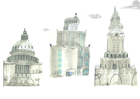
Amelia’s Magazine | Art Exhibition Preview: PayneShurvell present 4×4

Delorean by Daisy Delaney

4×4 the new exhibition at PayneShurvell opens on Wednesday, more about in association with the anti-design festival. For four weeks, the gallery will be home to four separate exhibitions each on view for four days. The first curated by James Payne, features Daisy Delaney’s Dreams of Desire.

The doors of the gallery are currently nestled between two cars customised by Daisy for the Liverpool Biennale 5 and 6. The biennale sponsors appearance on the cars (a Pininfarina Fiat Coupe 20v and a Mitsubishi Lancer Evo IV) mimic the advertisers stack usually associated with racing car tournments. The spoiler -added by the artist- on the Pininfarina Fiat Coupe 20v evokes the Fast and the Furious trilogy as the sports car image is transformed into that of a drifting car.

Upon entering PayneShurvell the viewer is greeted by the framed remnants of Delaney’s most recent performance. These beautifully presented receipts document an interaction between the artist and several unaware cashiers of major London Galleries. The act of consumerism encouraged within a gallery space is made apparent by Daisy’s act of deciding and controlling the order through which the purchases passed through the tills .

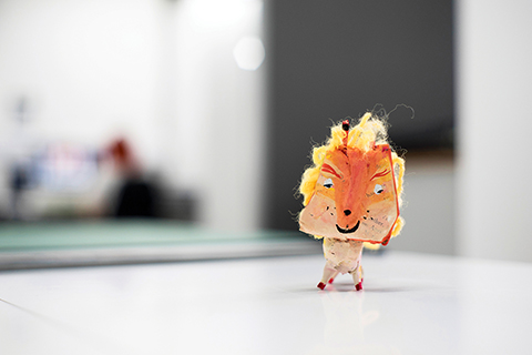
Sensation by Daisy Delaney

By presenting the receipts within frames along the crisp white walls of an exhibition space, the viewer is provided with the opportunity to reconsider the ‘everydayness’ usually associated with a receipt. Elevated by their presence in the white walled gallery, there is time to muse over the thought, that at some point a designer would have been required to design the layout in accordance to individual Galleries requirements (as discussed by James Payne in an introductory tour) of something most of us throw away without event a glance.

This Wednesday (8th September) PayneShurvell will be open from 6-8 and Daisy Delaney’s Dreams of Desire will be showing until Saturday 11th September.

Wednesday 15th September: The opening of an exhibition curated by Dermot O’Brien exploring the use of text and typography within works of art, the show will include Ian Whittlesea, Daniel Rapley and Gary O’Connor.

Ian Whittlesea has devised ‘Sol Sans’, a typeface with a singular purpose to allow anyone to rewrite Sol LeWitt’s Sentances on Conceptural Art.

Ian Whittlesea, ‘Sol Sans Typeface’

Wednesday 22nd September: Edward Vince presents Matthew Robinson and himself in ‘How Am I Not Myself’.

325 by Edward Vince

Week four opens on the 29th September with the gallery transformed by the requirements of sound art in the last exhibition ‘Silencer’ curated by Mark Jackson. This exhibition will include ‘Not Playing,’ Corrado Morgana’s handicapped helicopter which despite the players best attempt will never take over. Lastly this show will include Audio Research Editions’ ‘Real English Tea Made Here,’ a sound piece which includes tapes by Willam S. Burroughs previously unheard in the UK.

Amelia’s Magazine had the pleasure of visiting a PayneShurvell preview of 4×4 on Friday and will be visiting the gallery each week to see how this ambitious project plays out. We recommend you do the same.

PayneShurvell: 16 Hewett Street, London, EC2A 3NN
4×4 runs from 6th September to 2nd October 2010.

Categories ,Audio Research Editions, ,Clare Delaney, ,Dermot O’Brien, ,Edward Vince, ,Image Music Text, ,Liverpool, ,Mark Jackson, ,Matthew Robinson, ,PayneShurvell, ,Willam S. Burroughs

Similar Posts:


Amelia’s Magazine | An interview with Jack Bailey: Amelia’s Colourful Colouring Companion featured artist.

JACK BAILEY illustration
Jack Bailey was one of the fantastic new illustrators I discovered at this year’s New Designers graduate show who answered my callout to take part in the colouring book open brief. His energetic art is created on a large scale then turned into fantastically busy pictures like his colouring book page, inspired by the game of Ultimate Frisbee.

JACK BAILEY illustration
Where do you find inspiration for your characters?
The inspiration for my characters comes from a mix of sketching outdoors and making loose marks on a large sheet of paper. When I apply the loose marks to a piece of paper I relate back to my original outdoor sketches and start to interpret the mark as the shape of a body or a facial expression. The characters barely resemble the original sketches however I find studying from life allows me to interpret the marks made in a variation of forms. Previous to this brief my characters where always produced in colour, so it was fun to experiment in black and white for the colouring page and this is something I have continued doing.

JACK BAILEY illustration
Can you tell us more about what is going on in your artwork for my colouring book? who are all those people?
The piece for the colouring book was inspired by an article I read in the New Yorker about the chances of Ultimate Frisbee becoming an Olympic sport. Immediately, due to the word ‘ultimate’, I imagined a huge, chaotic game of Frisbee where only those playing understood what was going on. Almost like looking at a London underground map for the first time. The characters in the image are the people playing the sport and I packed the image full of people to show its rise in popularity. Unfortunately not many people play Frisbee in Liverpool so I picked up on the dynamic poses through watching youtube videos, which also contributed to the hectic feel of the image.

JACK BAILEY illustration
What led you to study at the Lincoln University and what was the best bit about your course?
In all honesty studying at Lincoln was totally by chance as I was still unsure if I was going to go to university at the time. I attended a university fair in Manchester where I picked up information packs and Lincoln University was one of them. When I got to Lincoln for the interview however I knew it was the place for me. It was quiet enough for me to be able to get on with my work and the old architecture of the city really appealed to me. As well as this everywhere was in walking distance and so really accessible. I guess you could say it was destiny! The best bit of the course for me was having tutors from a variety of backgrounds. It really enhanced a brief when you knew a tutor was passionate about the subject and had experience in the field. Another aspect of the course I enjoyed was the encouragement to try different media and new ways of working. Before the course I believed a single image had to be produced using the same mediums and on a single surface. Now I’ll use a whole bunch of mediums on separate surfaces allowing me to be a lot more expressive and confident in the way I work.

JACK BAILEY illustration
How do you translate your ideas between 2D and 3D artworks?
It works in a similar way to how I translate a sketch from life into one of my characters, in that they often don’t appear anything like the original influence. Between the 2-D and 3-D image they will often only share similar characteristics such as the amount of legs, hair style and facial features. Working in paper mache means capturing a dynamic pose is often difficult. This is why I use string to decorate the creatures. I feel the shape and swirl helps add movement to a static creature.

JACK BAILEY illustration
What is the process of creating your 3D pieces?
To create my 3-D pieces I start with a single sheet of paper, often from an old book as I like the stained colour of the pages. I dip this into a wallpaper paste and begin moulding it into any shape that feels natural. Similar to when I create my characters I try not to think too much about the early steps of the process and make shapes with papier mache whilst not thinking of the end product. This is so I don’t miss out on a nice, natural shape for the character. Once I have combined a few sheets of paper I use this as the body, from here I will refer back to my 2-D character and begin creating a head and other features. I finish by adding a face and decorating it with string and found objects.

JACK BAILEY illustration
Why do you find it easier to work on a large scale?
Working on a large scale is easier for me as I find it enhances my creativity. I find the characters look a lot more natural on large sheets due to me not being worried about them running off the page. The marks I make on large sheets are more expressive and full of energy as it is my whole arm moving the brush, not just my wrist. I also find working on a large scale creates new ideas. The sheets become a visual mind map. If I need a tree for an image, on a small scale I will produce one whereas on a larger scale I will produce as many as I can to fill the length of the sheet. This then becomes a new image for me to play around with.

JACK BAILEY illustration
What is it about drawing buildings that appeals to you?
Mainly that they don’t walk off as I try to draw them! What I enjoy to study on a building is the smaller details, often found towards the tops of buildings. I find the top of buildings to have the most character. There are unusual patterns and decorations, small windows and chimneys. You can interpret these as faces, creating relationships between two buildings or as body parts and the buildings can become giants peeping over trees.

JACK BAILEY illustration
How has living in Liverpool influences your approach?
I think the diversity of Liverpool has influenced my illustrations. The city centre is a collection of classic and modern architecture, renovated buildings and desolate warehouses. I also think it encourages creativity here too, with a variety of contemporary and classical art galleries there are always avenues to explore for inspiration.

JACK BAILEY illustration
Why is your new project with Cygnet Ink inspired by Quentin Blake? what is it you love about his work?
What I love about Quentin Blake’s artwork is the energy and looseness of the characters. Each line contributes to the personality of the character and he includes just enough information in each image to depict a scene. His characters also have a nice balance about them too, the positions are believable and you almost move with the character as you look at it. Blake’s backgrounds are a huge influence to me as he approaches them so cleverly. They depict real environments, but he will leave sections out or use a splash of watercolour to describe an area so the characters are the centre of attention.

JACK BAILEY illustration
You can find Jack Bailey‘s lively art in Amelia’s Colourful Colouring Companion, available soon from Kickstarter, and the ideal present for that special person this Christmas!

Categories ,#ameliasccc, ,Adult Coloring Book, ,Adult Colouring Book, ,Amelia’s Colourful Colouring Companion, ,Coloring, ,Colouring, ,Colouring Book, ,illustration, ,interview, ,Jack Bailey, ,Kickstarter, ,Lincoln University, ,Liverpool, ,New Designers, ,Quentin Blake, ,Ultimate Frisbee

Similar Posts: