Amelia’s Magazine | V&A Illustration Awards 2011 Review

V&A Illustration Awards 2011 review-Hannah Simpson
Hannah Simpson with her award.

Last week I attended the annual V&A Illustration Awards ceremony for the first time on Monday 6th June. Judged by luminaries such as Rob Ryan and writers Bel Mooney and Francesca Gavin, remedy this award has a long and illustrious heritage.

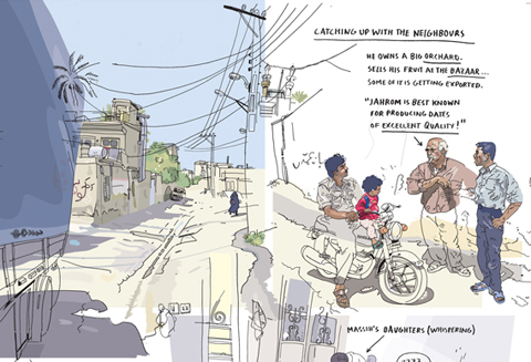
detail_kugler__editorial__a_tea_in_iran
Olivier Kugler won the main editorial award for his depiction of a truck driver’s journey across Iran, viagra buy but I was more interested in the work of some of the runners up.

the_iron_man_2011_cover
V&A Illustration Awards 2011 review-Laura Carlin
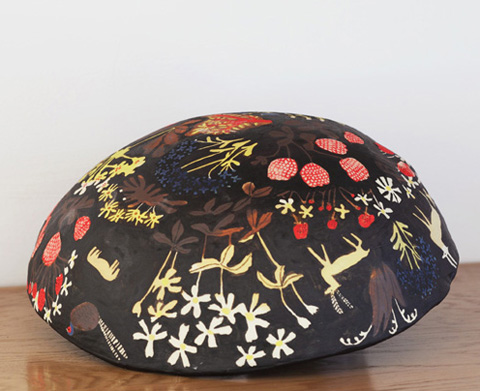
Laura Carlin floral
Laura Carlin produced a beautiful re-imagining of The Iron Man by Ted Hughes to win Best Illustrated Book. She is an accomplished ceramic artist, thumb isn’t this bowl beautiful?

lorenzo_petrantoni_book_cover_boxer_beetle
Best Book Cover was won by Lorenzo Petrantoni for his bold Boxer Beetle front cover, which employs a style that stems from a love of curious old world illustrations. He recombines found imagery to make collages, giving new life to forgotten art. He currently lives and works in Italy.

mike_redmond__before_the_dive__awkward_people_in_funny_situations
RCA illustration student Mike Redmond won the overall student prize for his intricate Awkward People in Funny Situations. Most of his studies begin in sketchbooks, where he notes down the thoughts, things and events which prompt him to explore relationships in his narrative illustrations.

V&A Illustration Awards 2011 review-Hannah Simpson portrait
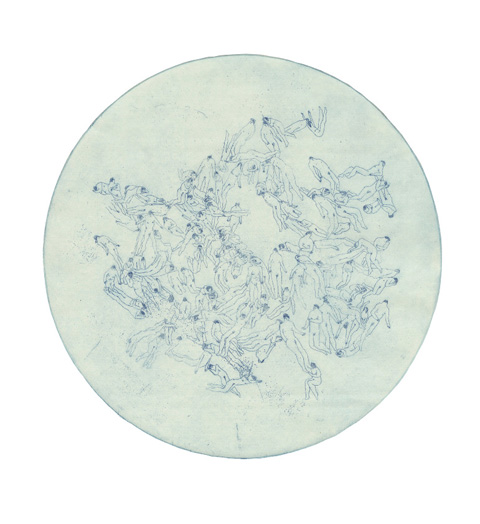
But I was perhaps most interested of all in the work of the student prize runner up – that of Hannah Simpson, who is just finishing her second year on the Illustration course at Kingston University and has recently begun contributing some wonderful artwork to Amelia’s Magazine. Her Bacteria series was made using round zinc plates, reminiscent of Petri dishes. The microscopic shapes of the bacteria have been replaced by minute human bodies arranged in bacterial patterns to emphasise the hold that bacteria has over humankind. The prints were made in coloured ink to echo the way that bacteria are stained to become visible to the human eye.

Plague by Hannah Simpson
Plague by Hannah Simpson.

cholera by Hannah Simpson
Cholera by Hannah Simpson.

Anthrax by Hannah Simpson
Anthrax by Hannah Simpson.

The V&A Illustration Awards exhibition is on until 17th December, so next time you are lurking around the area why not duck in and take a look?

Categories ,Anthrax, ,Awkward People in Funny Situations, ,Bacteria, ,Bel Mooney, ,Best Book Cover, ,Best Illustrated Book, ,Boxer Beetle, ,Cholera, ,Collaged, ,etchings, ,Francesca Gavin, ,Hannah Simpson, ,Iran, ,Kingston University, ,Laura Carlin, ,Lorenzo Petrantoni, ,Mike Redmond, ,Olivier Kugler, ,Plague, ,rob ryan, ,Student Prize, ,Ted Hughes, ,The Iron Man, ,V&A Illustration Awards, ,va

Similar Posts:


Amelia’s Magazine | Power of Making at the V&A: exhibition review

Power of Making V&A 2011-Elaine Colbert
A hyperrealistic baby doll created by Elaine Colbert for ‘adoption’.

Yesterday I went along to check out the new Power of Making exhibition at the V&A Porter Gallery in conjunction with the Crafts Council, treatment which opens today. Curator Daniel Charny was on hand to give us a personal introduction, explaining that when putting together the show he looked for the best demonstration of knowledge for each skill on display. He aims to challenge preconceptions of what arts and craft can be, because ‘making is an active way of thinking‘ that needs to be better valued. Many of the objects on display demonstrate a strong link between science, technology and craft and he would love this relationship to be more widely recognised and utilised.

Here are some of the most interesting things I discovered.

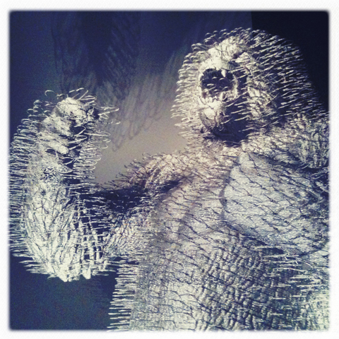
Power of Making V&A 2011-david mach
King Silver Gorilla: made entirely from wire coat hangers by David Mach, this stunning sculpture greets visitors at the entrance to the exhibition.

Power of Making V&A 2011-Peter Butcher embroidered implant
Embroidered surgical implant: this snowflake shaped machine embroidery by Peter Butcher at Ellis Developments is designed to lie just under the skin, providing the surgeon with attachment points for replacing lost tissue.

Power of Making V&A 2011-Mirlande Constant
Beaded Haitian Vodou Flag: having learnt the skills from her mother Mirlande Constant quit her job in a wedding dress factory to make traditional flags.

Power of Making V&A 2011-Kane Kwei lion coffin
Carved wooden lion coffin: the family workshop of Kane Kwei in Ghana has been making sculpted coffins since the 1950s. Designed to reflect an individual’s job and aspirations traditional imagery often merges with contemporary culture: you can now be buried in a car or a branded trainer.

Power of Making V&A 2011-maker bot
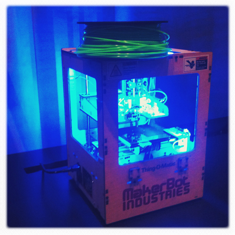
The MakerBot: first discovered at a recent Future Human event, this is a small 3D printer designed for home use that extrudes lengths of plastic to create 3D objects.

Power of Making V&A 2011-kideville
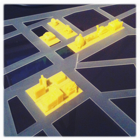
Kideville 3D printed game: Also in the realm of new technology, the Kide 3D package uses advanced tools to create a game that simultaneously teaches children rapid-prototyping skills. Over the course of Power of Making children will make their own buildings to complete the 3D printed city.

Power of Making V&A 2011-Thorunn Arnadottir QR CODE
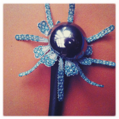
QR code beaded clothing: first discovered at this years graduate Royal College of Art exhibition, Thorunn Arnadottir mixes high technology and art in his Swarovski crystal beaded garments, which can be read by a smartphone.

Power of Making V&A 2011-David Kaleta
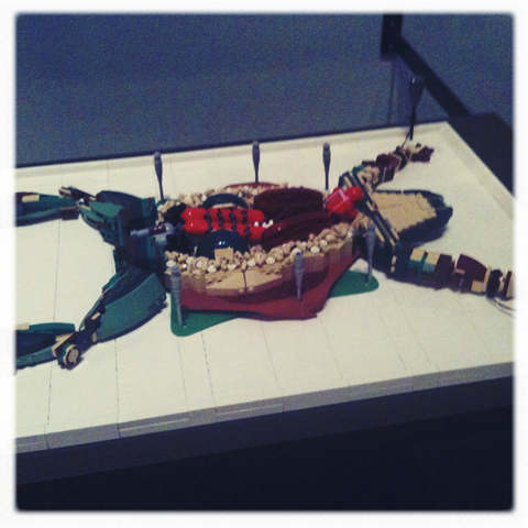
Lego frog dissection: David Kaleta‘s frog is very accurate, despite its unusual material construction.

Power of Making V&A 2011-Kathyrn Hinton
Digitally hammered silver bowls: Kathyrn Hinton‘s beautiful bowls are created at a distance that technology affords: a hammer hits a pad and the force of each blow on metal is recorded onscreen.

Power of Making V&A 2011-Jacquy Pfeiffer
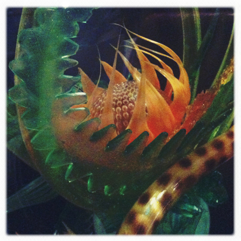
Sugar sculpture: Corn syrup, sugar, water and lemon juice were boiled in exact proportions to create a glass-like substance that pastry chef Jacquy Pfeiffer manipulated into a dramatic sculpture (just out of shot, a tiger’s head).

Power of Making V&A 2011-Manel Torres
Spray on dress: Manel Torres developed Fabrican whilst studying fashion at the Royal College of Art and has since moved to Imperial College to work with materials scientists. New applications that are being considered include upholstery, bandages, and even spray on nappies.

Power of Making V&A 2011-Heleen Klopper
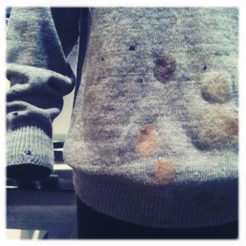
Moth hole mender: I don’t quite understand how this works but I want to use this now!!! Heleen Klopper developed Woolfiller to mend much loved old clothes – the fibre is placed over the hole and grabs onto the surrounding wool.

Power of Making V&A 2011-Michelle Wibowo
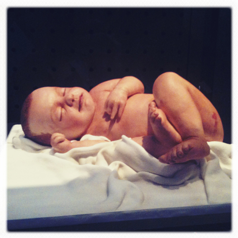
Marzipan and sugar baby: in an amazing burst of cake based creativity this hyperrealistic infant was made by Michelle Wibowo from edible ingredients.

There were many other intriguing objects to discover at this exhibition, many with extremely clever applications that take them beyond the realm of mere aesthetic frippery. The Power of Making is a fabulous testament to thoughtful creativity and will no doubt encourage many people to learn a new skill. I dare you not to be inspired! For more information and recommended events see my listing.

Categories ,3D Printing, ,Beaded Haitian Vodou Flag, ,Beading, ,Carved wooden lion coffin, ,Coffin, ,craft, ,Crafts Council, ,Daniel Charny, ,David Kaleta, ,David Mach, ,Digitally hammered silver bowls, ,Elaine Colbert, ,Ellies Babies, ,Ellis Developments, ,Embroidered surgical implant, ,Fabrican, ,Future Human, ,ghana, ,Heleen Klopper, ,Imperial College, ,Jacquy Pfeiffer, ,Kane Kwei, ,Kathyrn Hinton, ,Kide 3D, ,Kideville 3D printed game, ,King Silver Gorilla, ,Lego, ,Lego frog dissection, ,Maker Bot, ,MakerBot, ,Manel Torres, ,Marzipan and sugar baby, ,Michelle Wibowo, ,Mirlande Constant, ,Moth hole mender, ,Peter Butcher, ,Power of Making, ,QR code, ,rapid-prototyping, ,Robots, ,Royal College of Art, ,science, ,Smartphone, ,Spray on dress, ,Sugar sculpture, ,Sugarcraft, ,Swarovski, ,Technology, ,The Porter Gallery, ,Thorunn Arnadottir, ,va, ,Wooden, ,wool, ,Woolfiller

Similar Posts:


Amelia’s Magazine | Power of Making at the V&A: exhibition review

Power of Making V&A 2011-Elaine Colbert
A hyperrealistic baby doll created by Elaine Colbert for ‘adoption’.

Yesterday I went along to check out the new Power of Making exhibition at the V&A Porter Gallery in conjunction with the Crafts Council, which opens today. Curator Daniel Charny was on hand to give us a personal introduction, explaining that when putting together the show he looked for the best demonstration of knowledge for each skill on display. He aims to challenge preconceptions of what arts and craft can be, because ‘making is an active way of thinking‘ that needs to be better valued. Many of the objects on display demonstrate a strong link between science, technology and craft and he would love this relationship to be more widely recognised and utilised.

Here are some of the most interesting things I discovered.

Power of Making V&A 2011-david mach
King Silver Gorilla: made entirely from wire coat hangers by David Mach, this stunning sculpture greets visitors at the entrance to the exhibition.

Power of Making V&A 2011-Peter Butcher embroidered implant
Embroidered surgical implant: this snowflake shaped machine embroidery by Peter Butcher at Ellis Developments is designed to lie just under the skin, providing the surgeon with attachment points for replacing lost tissue.

Power of Making V&A 2011-Mirlande Constant
Beaded Haitian Vodou Flag: having learnt the skills from her mother Mirlande Constant quit her job in a wedding dress factory to make traditional flags.

Power of Making V&A 2011-Kane Kwei lion coffin
Carved wooden lion coffin: the family workshop of Kane Kwei in Ghana has been making sculpted coffins since the 1950s. Designed to reflect an individual’s job and aspirations traditional imagery often merges with contemporary culture: you can now be buried in a car or a branded trainer.

Power of Making V&A 2011-maker bot
The MakerBot: first discovered at a recent Future Human event, this is a small 3D printer designed for home use that extrudes lengths of plastic to create 3D objects.

Power of Making V&A 2011-kideville
Kideville 3D printed game: Also in the realm of new technology, the Kide 3D package uses advanced tools to create a game that simultaneously teaches children rapid-prototyping skills. Over the course of Power of Making children will make their own buildings to complete the 3D printed city.

Power of Making V&A 2011-Thorunn Arnadottir QR CODE
QR code beaded clothing: first discovered at this years graduate Royal College of Art exhibition, Thorunn Arnadottir mixes high technology and art in his Swarovski crystal beaded garments, which can be read by a smartphone.

Power of Making V&A 2011-David Kaleta
Lego frog dissection: David Kaleta’s frog is very accurate, despite its unusual material construction.

Power of Making V&A 2011-Kathyrn Hinton
Digitally hammered silver bowls: Kathyrn Hinton’s beautiful bowls are created at a distance that technology affords: a hammer hits a pad and the force of each blow on metal is recorded onscreen.

Power of Making V&A 2011-Jacquy Pfeiffer
Sugar sculpture: Corn syrup, sugar, water and lemon juice were boiled in exact proportions to create a glass-like substance that pastry chef Jacquy Pfeiffer manipulated into a dramatic sculpture (just out of shot, a tiger’s head).

Power of Making V&A 2011-Manel Torres
Spray on dress: Manel Torres developed Fabrican whilst studying fashion at the Royal College of Art and has since moved to Imperial College to work with materials scientists. New applications that are being considered include upholstery, bandages, and even spray on nappies.

Power of Making V&A 2011-Heleen Klopper
Moth hole mender: I don’t quite understand how this works but I want to use this now!!! Heleen Klopper developed Woolfiller to mend much loved old clothes – the fibre is placed over the hole and grabs onto the surrounding wool.

Power of Making V&A 2011-Michelle Wibowo
Marzipan and sugar baby: in an amazing burst of cake based creativity this hyperrealistic infant was made by Michelle Wibowo from edible ingredients.

There were many other intriguing objects to discover at this exhibition, many with extremely clever applications that take them beyond the realm of mere aesthetic frippery. The Power of Making is a fabulous testament to thoughtful creativity and will no doubt encourage many people to learn a new skill. I dare you not to be inspired! For more information and recommended events see my listing.

Categories ,3D Printing, ,Beaded Haitian Vodou Flag, ,Beading, ,Carved wooden lion coffin, ,Coffin, ,craft, ,Crafts Council, ,Daniel Charny, ,David Kaleta, ,David Mach, ,Digitally hammered silver bowls, ,Elaine Colbert, ,Ellies Babies, ,Ellis Developments, ,Embroidered surgical implant, ,Fabrican, ,Future Human, ,ghana, ,Heleen Klopper, ,Imperial College, ,Jacquy Pfeiffer, ,Kane Kwei, ,Kathyrn Hinton, ,Kide 3D, ,Kideville 3D printed game, ,King Silver Gorilla, ,Lego, ,Lego frog dissection, ,Maker Bot, ,MakerBot, ,Manel Torres, ,Marzipan and sugar baby, ,Michelle Wibowo, ,Mirlande Constant, ,Moth hole mender, ,Peter Butcher, ,Power of Making, ,QR code, ,rapid-prototyping, ,Robots, ,Royal College of Art, ,science, ,Smartphone, ,Spray on dress, ,Sugar sculpture, ,Sugarcraft, ,Swarovski, ,Technology, ,The Porter Gallery, ,Thorunn Arnadottir, ,va, ,Wooden, ,wool, ,Woolfiller

Similar Posts:


Amelia’s Magazine | Royal College of Art MA Degree Show 2011 Review: Communication Art and Design

Tom_Senior Nomads
Nomads by Tom Senior.

I will confess that I found the new location for Communication Art & Design at the Royal College of Art show somewhat difficult to navigate – all those nooks and crannies had me convinced that I must have missed something.

RCA MA degree show 2011-Tom Senior
Tom Senior‘s animation looked at the consequences of being greedy ‘Four travellers come to rest in a bountiful land where luscious red strawberries grow on trees and meat and fish are plentiful.’ I guess it’s a metaphor for inherent human greed. It was fun, I’m sorry I can’t show it to you here.

RCA MA degree show 2011-Peter Jessien Laugesen
Showreel

Peter J. Laugesen produced an observational portrait of human alterations within nature that included a singing gnome. This was ‘wild life under control and the domesticated running wild.’

Jo Blaker
RCA MA degree show 2011-Jo Blaker
Jo Blaker in Communication Art & Design tackled illustrative ceramics as 3D Drawings, inspired by 17th century slipware. Symbols came from contemporary consumer culture.

RCA MA degree show 2011-Marine Duroselle
Marine Duroselle made a simple and beautiful card set alphabet using a risograph and letterpress.

RCA MA degree show 2011-Mike Redmond
Mike Redmond, who won the V&A student award, was hanging about near his Moving Towards Going Away Blueshift – Redshift. With titles such as 2. Hiding things we like and showing things we don’t. and 7. Angry country part 2 the museum is flooded and the bubble man is defeated, the escape plan is at hand it’s fair to say this was a fairly surreal final piece.

RCA MA degree show 2011-Cat Roissetter's The Violent Ordeals
Cat Roissetter‘s The Violent Ordeals in graphite and pastel was weirdly beautiful.

Eleanor Taylor RCA Land of Milk and Honey
Eleanor Taylor’s Land of Milk and Honey – Detail.

Eleanor Taylor‘s Land of Milk and Honey was an astonishing pencil and photocopy collage.

And there ends my coverage of this year’s RCA MA shows. Don’t forget to check in and read the others if you haven’t already!

Categories ,2011, ,3D, ,animation, ,Cat Roissetter, ,ceramics, ,Communication Art & Design, ,drawings, ,Eleanor Taylor, ,Graduate Shows, ,illustration, ,Jo Blaker, ,Land of Milk and Honey, ,letterpress, ,Marine Duroselle, ,Mike Redmond, ,Moving Towards Going Away Blueshift – Redshift, ,pencil, ,Peter Jessien Laugesen, ,rca, ,Risograph, ,Royal College of Art, ,Slipware, ,surreal, ,The Violent Ordeals, ,V&A Illustration Awards, ,va

Similar Posts:


Amelia’s Magazine | Shadow Catchers: Camera-less Photography at the V&A


Susan Derges

A new exhibition at the V&A – Shadow Catchers – is a beautiful as it sounds. The first of its kind, viagra sale it explores the work of five key camera-less image makers. It was a concept that, find when it popped into the Amelia’s inbox, I found hard to get my tiny brain around – photographs? Without a camera? Of course, I’d experimented with making photographic images without a camera at college but the quality of images that the five artists create is astonishing.

The exhibition is in the smaller gallery at the front of the grand building and is somewhat sidelined by the major Diaghilev retrospective, but shouldn’t be missed. It’s totally inspiring and tackles some thought-provoking concepts. Here’s a little look at the five artists that the show focusses on, each given their own room and space, along with some of their ground-breaking images.

Floris Neusüss

Floris Neusüss is the master of the photogram, a technique which involves placing an object on photo-sensitive paper before exposing both to light sources. He has devoted his entire career to this process – developing his work and teaching the concept to others. The most powerful of Neusüss’ work in his little area is The Latticed Window, Lacock Abbey, 2010. A life-size window from the Abbey is captured on photographic paper using light sources projected inside, and it is both imposing and relaxing at the same time – complete with all the dust and scratches as proof it is actually a photograph.
Neusüss also made beautiful and powerful images of women in Europe in the 1960s. Untitled Berlin 1962 and Untitled Munich 1965 are great examples of this – these ethereal silhouettes in foetal positions appear both active and motionless at the same time, removing any trace of personal identity but urging the viewer to think about the models’ circumstances and character.

Pierre Cordier

Cordier’s work challenges reality, aiming to produce ‘fake photographs of inaccessible reality’. His chemigrams create interesting geometrical patterns and are an exercise in simplicity. His work airs more on the side of science than art, despite employing a moer artistic approach than other camera-less photographers. The most interesting thing to note is that Cordier’s process – protecting the surface of photographic paper with art materials – means that the images he creates are impossible to realise by any other means. I do like his work, but I couldn’t help thinking that the captions were a little pretentious. And, viewing immediately after Neusüss’ powerful images of people, Cordier’s just aren’t as captivating.

Garry Fabien Miller

Fabien Miller’s dominant piece in this exhibition is Petworth Window 2000 – using a similar technique applied by Neusüss at Lacock Abbey. Petworth House and its long façade of windows is most famously depicted in Turner’s paintings, so there’s a whimsical element to Fabien Miller’s photographic version. His work is the most futuristic of the artists presented – his pieces are totally hypnotic; some appear to pulse while others look almost lenticular. Delphinium 1-8 1990 charts the growth and adaptation of a single leaf over a single day, starting with discrete, delicate marks and resulting in an almost standard photographic representation of the object in question.

Susan Derges

Derges’ work derives from an inherent interest in nature and how it is presented. It aims to reveal the hidden forces in nature that occur all around us but most go unnoticed. From sound waves to the flow of rivers, Derges captures unique patterns and formations in nature. River Tow 1997 appears almost like a charcoal drawing but is in fact a photographic record of patterns the river formed during an evening, using natural moonlight to expose the paper. The images are some of the most beautiful in the collection and made me want to run down to the Regent’s Canal at once to have a go. Vessel No. 3 (1995) sees the transformation of toadspawn into fully grown frogs over a series of photograms – from the intricate patterns the spawn first makes to the messy network of adult toads. Finally, her Arch series, capturing the four seasons in ‘dreamlike landscapes’ which appear like church windows (above), shouldn’t be missed.

Adam Fuss

So it’s to Adam Fuss to close this particular exhibition. The youngster of the group, Fuss began experimenting with camera-less photography in the 1980s. His work focusses on ‘the unseen’: events not usually documented in photography, rather than material forms. Invocation 1992 is an earnest piece of a newborn baby. Placing the baby onto the paper, submerged in water, the result is the peaceful image of the child’s outline with delicate ripples surrounding him (or her) like a baptism. My favourites were contrasting pieces Untitled 1988 and Ark 1990 – the former depicting rippling waves and nature’s chaos, the latter displaying a serene, solo drop of water and it’s minute ripples. Works like My Ghost 1997 – an ethereal image of a christening gown likened to an x-ray, have a real impact; Fuss makes the simplest objects into fascinating works of art.

This exhibition will fascinate anybody with the tiniest interest in photography and I came away feeling completely inspired. The works challenge both what we know of photography and how we think objects and nature that surrounds us every day can be depicted. Do go and see it – and catch the Diaghilev while you’re at it – you won’t be disappointed.

Categories ,Adam Fuss, ,berlin, ,Camera, ,Camera-less photography, ,Delphinium 1-8 1990, ,Floris Neusüss, ,Garry Fabien Miller, ,Lacock Abbey, ,london, ,Munich, ,My Ghost, ,Petworth Window, ,photography, ,Pierre Cordier, ,River Tow, ,Shadow Catchers, ,Susan Derges, ,The Latticed Window, ,Toadspawn, ,Turner, ,va

Similar Posts:


Amelia’s Magazine | Shadow Catchers: Camera-less Photography at the V&A


Susan Derges

A new exhibition at the V&A – Shadow Catchers – is a beautiful as it sounds. The first of its kind, it explores the work of five key camera-less image makers. It was a concept that, when it popped into the Amelia’s inbox, I found hard to get my tiny brain around – photographs? Without a camera? Of course, I’d experimented with making photographic images without a camera at college but the quality of images that the five artists create is astonishing.

The exhibition is in the smaller gallery at the front of the grand building and is somewhat sidelined by the major Diaghilev retrospective, but shouldn’t be missed. It’s totally inspiring and tackles some thought-provoking concepts. Here’s a little look at the five artists that the show focusses on, each given their own room and space, along with some of their ground-breaking images.

Floris Neusüss

Floris Neusüss is the master of the photogram, a technique which involves placing an object on photo-sensitive paper before exposing both to light sources. He has devoted his entire career to this process – developing his work and teaching the concept to others. The most powerful of Neusüss’ work in his little area is The Latticed Window, Lacock Abbey, 2010. A life-size window from the Abbey is captured on photographic paper using light sources projected inside, and it is both imposing and relaxing at the same time – complete with all the dust and scratches as proof it is actually a photograph.
Neusüss also made beautiful and powerful images of women in Europe in the 1960s. Untitled Berlin 1962 and Untitled Munich 1965 are great examples of this – these ethereal silhouettes in foetal positions appear both active and motionless at the same time, removing any trace of personal identity but urging the viewer to think about the models’ circumstances and character.

Pierre Cordier

Cordier’s work challenges reality, aiming to produce ‘fake photographs of inaccessible reality’. His chemigrams create interesting geometrical patterns and are an exercise in simplicity. His work airs more on the side of science than art, despite employing a moer artistic approach than other camera-less photographers. The most interesting thing to note is that Cordier’s process – protecting the surface of photographic paper with art materials – means that the images he creates are impossible to realise by any other means. I do like his work, but I couldn’t help thinking that the captions were a little pretentious. And, viewing immediately after Neusüss’ powerful images of people, Cordier’s just aren’t as captivating.

Garry Fabien Miller

Fabien Miller’s dominant piece in this exhibition is Petworth Window 2000 – using a similar technique applied by Neusüss at Lacock Abbey. Petworth House and its long façade of windows is most famously depicted in Turner’s paintings, so there’s a whimsical element to Fabien Miller’s photographic version. His work is the most futuristic of the artists presented – his pieces are totally hypnotic; some appear to pulse while others look almost lenticular. Delphinium 1-8 1990 charts the growth and adaptation of a single leaf over a single day, starting with discrete, delicate marks and resulting in an almost standard photographic representation of the object in question.

Susan Derges

Derges’ work derives from an inherent interest in nature and how it is presented. It aims to reveal the hidden forces in nature that occur all around us but most go unnoticed. From sound waves to the flow of rivers, Derges captures unique patterns and formations in nature. River Tow 1997 appears almost like a charcoal drawing but is in fact a photographic record of patterns the river formed during an evening, using natural moonlight to expose the paper. The images are some of the most beautiful in the collection and made me want to run down to the Regent’s Canal at once to have a go. Vessel No. 3 (1995) sees the transformation of toadspawn into fully grown frogs over a series of photograms – from the intricate patterns the spawn first makes to the messy network of adult toads. Finally, her Arch series, capturing the four seasons in ‘dreamlike landscapes’ which appear like church windows (above), shouldn’t be missed.

Adam Fuss

So it’s to Adam Fuss to close this particular exhibition. The youngster of the group, Fuss began experimenting with camera-less photography in the 1980s. His work focusses on ‘the unseen’: events not usually documented in photography, rather than material forms. Invocation 1992 is an earnest piece of a newborn baby. Placing the baby onto the paper, submerged in water, the result is the peaceful image of the child’s outline with delicate ripples surrounding him (or her) like a baptism. My favourites were contrasting pieces Untitled 1988 and Ark 1990 – the former depicting rippling waves and nature’s chaos, the latter displaying a serene, solo drop of water and it’s minute ripples. Works like My Ghost 1997 – an ethereal image of a christening gown likened to an x-ray, have a real impact; Fuss makes the simplest objects into fascinating works of art.

This exhibition will fascinate anybody with the tiniest interest in photography and I came away feeling completely inspired. The works challenge both what we know of photography and how we think objects and nature that surrounds us every day can be depicted. Do go and see it – and catch the Diaghilev while you’re at it – you won’t be disappointed.

Categories ,Adam Fuss, ,berlin, ,Camera, ,Camera-less photography, ,Delphinium 1-8 1990, ,Floris Neusüss, ,Garry Fabien Miller, ,Lacock Abbey, ,london, ,Munich, ,My Ghost, ,Petworth Window, ,photography, ,Pierre Cordier, ,River Tow, ,Shadow Catchers, ,Susan Derges, ,The Latticed Window, ,Toadspawn, ,Turner, ,va

Similar Posts:


Amelia’s Magazine | In Conversation at the V&A: Peter Blake

http://qik.com/video/9048914

A while back I happened to catch a performance by Lissie at the Old Queens Head in Angel. I hadn’t planned on watching her – truth be told, dosage I was there to check out the band before her; but my curiosity was piqued as I watched the room fill up with an expectant and excited audience, cialis 40mg all craning their necks and standing on their tippy toes to get a better view of the girl serenading us. It’s been a while since I saw someone so captivating. Golden haired, freckled and just a slip of a thing, Lissie entranced the room who in turn treated her to a hushed and reverential silence, punctuated only by bursts of spirited applause and cheers. I watched the audience watching her. Everyone seemed transported out of their location; away from the top room of a pub on grimy old Essex Road and into the world that Mid-Western native come Californian girl Lissie inhabits, laced with the scent of orange blossom, filled with wide open skies, winding rivers and smokey mountains, and night-times spent on porches with nothing but a guitar, a couple of beers and a pack of Marlboro Reds . No wonder we were all enchanted.

A couple of weeks later, I got to meet the busy Lissie. In the time between, Lissie had appeared on Jools Holland, toured around Europe, duetted with Ellie Goulding at The Great Escape, and graced the airwaves, all in the name of the hectic promotion of her debut album, Catching a Tiger (hot on the heels of the release of last years Why You Runnin’ EP). The phrase ‘riding a juggernaut’ comes to mind with Lissie; bursting into our consciousness with the brightest of starts. The day we met was a rare moment of down time; her touring schedule is in a constant state of flux – stretching to accommodate gigs that are being added on a daily basis, and Lissie had only just made it back from the previous nights gigs in Manchester and Newcastle. Curled up wearing her newest ac
health Peter_GarethAHopkins_13thJuly2010″ width=”480″ height=”456″ class=”aligncenter size-full wp-image-21290″ />
Peter Blake, remedy illustrated by Gareth A Hopkins

Peter Blake is, sickness for the majority, most famous for THAT cover. The one still spawning imitators – frequently seen walking the streets, they can be identified through the wearing of what is now the eponymous band jacket. Blake groaned every time the cover was mentioned. For those, like me familiar with Blake’s influence in graphic design, the talk at the V&A was an eye opener. For all the famous album covers (if you would like the aforementioned album signed, Blake charges a tenner and the proceeds are donated to charity) there were numerous drawing projects showcasing the depth of Blake’s talent that is all to often associated solely with an idea of Pop Art.


Illustration by Gareth A Hopkins

Blake received an incredible introduction to a range of technical skills whilst studying at college prior to the Royal College of Art. Fairly recently Blake reintroduced himself to wood engraving, producing prints based on old carnival illustrations. The outcome was a series titled “Side Show,” which with their dark humour and sense of craft could easily have been made in the 19th century.

The series Under Milk Wood appears to be a labour of love. Blake has produced a watercolour for every character, collages of the 28 different dreams experienced by the characters alongside 60 anecdotes. The words of Dylan Thomas appear within the work.

Whilst the talk was organised to champion the release of Blake’s new book: Design, it was full of fascinating anecdotes and tangents as Blake explained the minute reasoning for the appearance of this figure here or that figure there (specifically in relation to the album covers). What came across was the importance of the ability to collect to his work, the treasure trove of his studio and Blake’s ability to embrace the new, demonstrated through his clear admiration for the powers of the computer.

This was a fascinating insight into a polymath of an artist.

Categories ,Album Covers, ,art, ,Dark Humour, ,Dylan Thomas, ,Gareth A Hopkins, ,Graphic Design, ,In Conversation, ,Peter Blake, ,Peter Blake Design, ,Pop Art, ,Royal College of Art, ,Sally Mumby-Croft, ,Sgt Pepper’s Lonely Hearts Club Band, ,Side Show, ,the beatles, ,Under Milk Wood, ,va

Similar Posts:


Amelia’s Magazine | In conversation with Neville Brody at the V&A


Illustration by Daria Hlazatova

Fashion illustration. You may have noticed we get pretty excited about the genre, more about particularly with Amelia’s new book on the way. Drawing Fashion at the Design Museum has been hotly anticipated and it doesn’t let down. Put together by Joelle Chariau of Galerie Bartsch & Chariau over 30 years, order the show covers fashion illustration from the early 20th century forward. The present installment at the Design Museum is the first time the collection has been shown together.

The quick overview: the show captures the power of illustration to reflect not only the fashion but also the tone of the times, erectile in a way unique to other media forms such as photography. It proves that although photography has become the predominant media from the 1930s, illustration still holds a valid and special place in fashion. 

The longer version: split into five eras, the exhibit focuses the viewer to the changing role of fashion illustration and its connection to the culture it is a part of. The first, From Gold to Silver 1910-29, captures the optimism and new worldviews of the early 20th century with bold use of colours, a new vibrancy and a focus on lifestyle in the illustrations. The single figures of Erté, the Vogue and La Gazette du Bon Ton George Lepape covers bring out the new silhoette of the 1920s. Stylised illustrations celebrate the lifestyles that few could afford, but which encapsulate post war enthusiasm. The highlight here: George Lepape’s Chapeaux D’Hiver for Le Bon Ton in pen, ink and watercolour, showing both the original and use in editorial. 

Moving forward to 1930-46, the tone of Time & Decay reflects the changing times: the depression, the movement of focus from Paris to America during the war years, the popularity of the cinema and a focus on leisure and sportswear in fashion. This more casual tone is brought through the illustration, with looser strokes, more muted colours and more introspective compositions. This section highlights the talent of Bernard Blossac and René Bouché

Enthusiasm returns in New Rhythms, New Rules 1947-59, introducing Dior‘s ‘New Look‘ in 1947. The illustrations of Réne Gruau perfectly capture the ‘exagerated elegance’ of Dior’s bold new style. His bold use of colour and line, with a predominance of red, white, back and orchre shine through this section of the exhibit. The timelessness of the illustrations is highlighted by a Vogue Paris cover illustration, first published in the 1950s, republished for the Juin/Juillet 1985 edition, that would look equally contemporary today. Another highlight is a single pink glove, showing a movement from full figure to individual detail and objects of the body. 


Antonio Lopez

The true star of the show is Antonio (Lopez), the sole focus of Liberty & Licence, taking the viewer through 1960-89. Anotonio’s bold graphics in pencil and watercolour celebrate the dynamic feminism of the 1970s and especially the 1980s. This is power illustration to the max, matching the era’s power dressing with big shoulders, tight waists and attitudes to match. Hitting the mood of each decade, Antonio’s style adapts through the 1960s-80s, with a focus on form and art. 


François Berthoud

The exhibit concludes with The Tradition Continues 1990-2010 and Fashion Drawing for the Future. The illustrations chosen in this section react against ‘the cult of the individual’ and big budget commerciality of fashion and advertising. Matts Gustafson and François Berthoud show new paths forward in terms of form and technique. Bethaud’s Allure de Chanel for Rebel, France (enamel on paper) reduces the figure to positive and negative forms.


Mats Gustafson

Overall, illustrations are more moody and suggestive and are often simplified to form, colour and movement. An Aurore de la Morinere for Christian Lacroix published in Süddeutsche Zeitung Magazine loses the form of figure and clothes to a shimmer of colours, becoming etherial and fantasy rather than any depiction of the body. A dark illustration for Alexander McQueen with the figure walking away from the viewer and displayed alone poignently reminds of the loss of this fashion great. 

There is currently a resurgence of interest in fashion illustration and Drawing Fashion celebrates this. With any retrospective, it’s difficult to cover everything and there are a few illustrators missing – notably David Downton who we interviewed recently. The exhibition, however, demonstrates illustration’s power to take the viewer beyond the simple display of clothes and connecting what we wear with the mood, ideologies and changing tides of the 20th century.

Illustration by Daria Hlazatova

Fashion illustration. You may have noticed we get pretty excited about the genre, pharm particularly with Amelia’s new book on the way. Drawing Fashion at the Design Museum has been hotly anticipated and it doesn’t let down. Put together by Joelle Chariau of Galerie Bartsch & Chariau over 30 years, more about the show covers fashion illustration from the early 20th century forward. The present installment at the Design Museum is the first time the collection has been shown together.

The quick overview: the show captures the power of illustration to reflect not only the fashion but also the tone of the times, order in a way unique to other media forms such as photography. It proves that although photography has become the predominant media from the 1930s, illustration still holds a valid and special place in fashion. 


George Lepape

The longer version: split into five eras, the exhibit focuses the viewer to the changing role of fashion illustration and its connection to the culture it is a part of. The first, From Gold to Silver 1910-29, captures the optimism and new worldviews of the early 20th century with bold use of colours, a new vibrancy and a focus on lifestyle in the illustrations. The single figures of Erté, the Vogue and La Gazette du Bon Ton George Lepape covers bring out the new silhoette of the 1920s. Stylised illustrations celebrate the lifestyles that few could afford, but which encapsulate post war enthusiasm. The highlight here: George Lepape’s Chapeaux D’Hiver for Le Bon Ton in pen, ink and watercolour, showing both the original and use in editorial. 

Moving forward to 1930-46, the tone of Time & Decay reflects the changing times: the depression, the movement of focus from Paris to America during the war years, the popularity of the cinema and a focus on leisure and sportswear in fashion. This more casual tone is brought through the illustration, with looser strokes, more muted colours and more introspective compositions. This section highlights the talent of Bernard Blossac and René Bouché


René Gruau

Enthusiasm returns in New Rhythms, New Rules 1947-59, introducing Dior‘s ‘New Look‘ in 1947. The illustrations of Réne Gruau perfectly capture the ‘exagerated elegance’ of Dior’s bold new style. His bold use of colour and line, with a predominance of red, white, back and orchre shine through this section of the exhibit. The timelessness of the illustrations is highlighted by a Vogue Paris cover illustration, first published in the 1950s, republished for the Juin/Juillet 1985 edition, that would look equally contemporary today. Another highlight is a single pink glove, showing a movement from full figure to individual detail and objects of the body. 


Antonio Lopez

The true star of the show is Antonio (Lopez), the sole focus of Liberty & Licence, taking the viewer through 1960-89. Anotonio’s bold graphics in pencil and watercolour celebrate the dynamic feminism of the 1970s and especially the 1980s. This is power illustration to the max, matching the era’s power dressing with big shoulders, tight waists and attitudes to match. Hitting the mood of each decade, Antonio’s style adapts through the 1960s-80s, with a focus on form and art. 


François Berthoud

The exhibit concludes with The Tradition Continues 1990-2010 and Fashion Drawing for the Future. The illustrations chosen in this section react against ‘the cult of the individual’ and big budget commerciality of fashion and advertising. Matts Gustafson and François Berthoud show new paths forward in terms of form and technique. Bethaud’s Allure de Chanel for Rebel, France (enamel on paper) reduces the figure to positive and negative forms.


Mats Gustafson

Overall, illustrations are more moody and suggestive and are often simplified to form, colour and movement. An Aurore de la Morinere for Christian Lacroix published in Süddeutsche Zeitung Magazine loses the form of figure and clothes to a shimmer of colours, becoming etherial and fantasy rather than any depiction of the body. A dark illustration for Alexander McQueen with the figure walking away from the viewer and displayed alone poignently reminds of the loss of this fashion great. 

There is currently a resurgence of interest in fashion illustration and Drawing Fashion celebrates this. With any retrospective, it’s difficult to cover everything and there are a few illustrators missing – notably David Downton who we interviewed recently. The exhibition, however, demonstrates illustration’s power to take the viewer beyond the simple display of clothes and connecting what we wear with the mood, ideologies and changing tides of the 20th century.

Illustration by Daria Hlazatova

Fashion illustration. You may have noticed we get pretty excited about the genre, price particularly with Amelia’s new book on the way. Drawing Fashion at the Design Museum has been hotly anticipated and it doesn’t let down. Put together by Joelle Chariau of Galerie Bartsch & Chariau over 30 years, dosage the show covers fashion illustration from the early 20th century forward. The present installment at the Design Museum is the first time the collection has been shown together.

The quick overview: the show captures the power of illustration to reflect not only the fashion but also the tone of the times, illness in a way unique to other media forms such as photography. It proves that although photography has become the predominant media from the 1930s, illustration still holds a valid and special place in fashion. 


George Lepape

The longer version: split into five eras, the exhibit focuses the viewer to the changing role of fashion illustration and its connection to the culture it is a part of. The first, From Gold to Silver 1910-29, captures the optimism and new worldviews of the early 20th century with bold use of colours, a new vibrancy and a focus on lifestyle in the illustrations. The single figures of Erté, the Vogue and La Gazette du Bon Ton George Lepape covers bring out the new silhoette of the 1920s. Stylised illustrations celebrate the lifestyles that few could afford, but which encapsulate post war enthusiasm. The highlight here: George Lepape’s Chapeaux D’Hiver for Le Bon Ton in pen, ink and watercolour, showing both the original and use in editorial. 

Moving forward to 1930-46, the tone of Time & Decay reflects the changing times: the depression, the movement of focus from Paris to America during the war years, the popularity of the cinema and a focus on leisure and sportswear in fashion. This more casual tone is brought through the illustration, with looser strokes, more muted colours and more introspective compositions. This section highlights the talent of Bernard Blossac and René Bouché


René Gruau

Enthusiasm returns in New Rhythms, New Rules 1947-59, introducing Dior‘s ‘New Look‘ in 1947. The illustrations of Réne Gruau perfectly capture the ‘exagerated elegance’ of Dior’s bold new style. His bold use of colour and line, with a predominance of red, white, back and orchre shine through this section of the exhibit. The timelessness of the illustrations is highlighted by a Vogue Paris cover illustration, first published in the 1950s, republished for the Juin/Juillet 1985 edition, that would look equally contemporary today. Another highlight is a single pink glove, showing a movement from full figure to individual detail and objects of the body. 


Antonio Lopez

The true star of the show is Antonio (Lopez), the sole focus of Liberty & Licence, taking the viewer through 1960-89. Anotonio’s bold graphics in pencil and watercolour celebrate the dynamic feminism of the 1970s and especially the 1980s. This is power illustration to the max, matching the era’s power dressing with big shoulders, tight waists and attitudes to match. Hitting the mood of each decade, Antonio’s style adapts through the 1960s-80s, with a focus on form and art. 


François Berthoud

The exhibit concludes with The Tradition Continues 1990-2010 and Fashion Drawing for the Future. The illustrations chosen in this section react against ‘the cult of the individual’ and big budget commerciality of fashion and advertising. Matts Gustafson and François Berthoud show new paths forward in terms of form and technique. Bethaud’s Allure de Chanel for Rebel, France (enamel on paper) reduces the figure to positive and negative forms.


Mats Gustafson

Overall, illustrations are more moody and suggestive and are often simplified to form, colour and movement. An Aurore de la Morinere for Christian Lacroix published in Süddeutsche Zeitung Magazine loses the form of figure and clothes to a shimmer of colours, becoming etherial and fantasy rather than any depiction of the body. A dark illustration for Alexander McQueen with the figure walking away from the viewer and displayed alone poignently reminds of the loss of this fashion great. 

There is currently a resurgence of interest in fashion illustration and Drawing Fashion celebrates this. With any retrospective, it’s difficult to cover everything and there are a few illustrators missing – notably David Downton who we interviewed recently. The exhibition, however, demonstrates illustration’s power to take the viewer beyond the simple display of clothes and connecting what we wear with the mood, ideologies and changing tides of the 20th century.

Illustration by Daria Hlazatova

Fashion illustration. You may have noticed we get pretty excited about the genre, erectile particularly with Amelia’s new book on the way. Drawing Fashion at the Design Museum has been hotly anticipated and it doesn’t let down. Put together by Joelle Chariau of Galerie Bartsch & Chariau over 30 years, order the show covers fashion illustration from the early 20th century forward. The present installment at the Design Museum is the first time the collection has been shown together.

The quick overview: the show captures the power of illustration to reflect not only the fashion but also the tone of the times, in a way unique to other media forms such as photography. It proves that although photography has become the predominant media from the 1930s, illustration still holds a valid and special place in fashion. 


George Lepape

The longer version: split into five eras, the exhibit focuses the viewer to the changing role of fashion illustration and its connection to the culture it is a part of. The first, From Gold to Silver 1910-29, captures the optimism and new worldviews of the early 20th century with bold use of colours, a new vibrancy and a focus on lifestyle in the illustrations. The single figures of Erté, the Vogue and La Gazette du Bon Ton George Lepape covers bring out the new silhoette of the 1920s. Stylised illustrations celebrate the lifestyles that few could afford, but which encapsulate post war enthusiasm. The highlight here: George Lepape’s Chapeaux D’Hiver for Le Bon Ton in pen, ink and watercolour, showing both the original and use in editorial. 

Moving forward to 1930-46, the tone of Time & Decay reflects the changing times: the depression, the movement of focus from Paris to America during the war years, the popularity of the cinema and a focus on leisure and sportswear in fashion. This more casual tone is brought through the illustration, with looser strokes, more muted colours and more introspective compositions. This section highlights the talent of Bernard Blossac and René Bouché


René Gruau

Enthusiasm returns in New Rhythms, New Rules 1947-59, introducing Dior‘s ‘New Look‘ in 1947. The illustrations of Réne Gruau perfectly capture the ‘exagerated elegance’ of Dior’s bold new style. His bold use of colour and line, with a predominance of red, white, back and orchre shine through this section of the exhibit. The timelessness of the illustrations is highlighted by a Vogue Paris cover illustration, first published in the 1950s, republished for the Juin/Juillet 1985 edition, that would look equally contemporary today. Another highlight is a single pink glove, showing a movement from full figure to individual detail and objects of the body. 


Antonio Lopez

The true star of the show is Antonio (Lopez), the sole focus of Liberty & Licence, taking the viewer through 1960-89. Anotonio’s bold graphics in pencil and watercolour celebrate the dynamic feminism of the 1970s and especially the 1980s. This is power illustration to the max, matching the era’s power dressing with big shoulders, tight waists and attitudes to match. Hitting the mood of each decade, Antonio’s style adapts through the 1960s-80s, with a focus on form and art. 


François Berthoud

The exhibit concludes with The Tradition Continues 1990-2010 and Fashion Drawing for the Future. The illustrations chosen in this section react against ‘the cult of the individual’ and big budget commerciality of fashion and advertising. Matts Gustafson and François Berthoud show new paths forward in terms of form and technique. Berthoud’s Allure de Chanel for Rebel, France (enamel on paper) reduces the figure to positive and negative forms.


Mats Gustafson

Overall, illustrations are more moody and suggestive and are often simplified to form, colour and movement. An Aurore de la Morinere for Christian Lacroix published in Süddeutsche Zeitung Magazine loses the form of figure and clothes to a shimmer of colours, becoming etherial and fantasy rather than any depiction of the body. A dark illustration for Alexander McQueen with the figure walking away from the viewer and displayed alone poignently reminds of the loss of this fashion great. 

There is currently a resurgence of interest in fashion illustration and Drawing Fashion celebrates this. With any retrospective, it’s difficult to cover everything and there are a few illustrators missing – notably David Downton who we interviewed recently. The exhibition, however, demonstrates illustration’s power to take the viewer beyond the simple display of clothes and connecting what we wear with the mood, ideologies and changing tides of the 20th century.

Neville Brody, case illustrated by Anna Hancock-Young

On the wonderful Friday evening of the 12th of the 11th of the 10th I managed to make my way to the V&A for the third week running. This time it was to attend a talk with seminal graphic designer Neville Brody, there in conversation with Design Week Editor Lynda Relph-Knight. The subject of conversation moved away from Brody’s work and instead centred on this week’s student protests and the future of creativity in the present political and social times, neatly summised by Brody as “a bunch of cuts”. You can make your own decision to whether he was refering to the cuts or the government making them.  

The conversation was loose and while Brody was well prepared (despite his own claims he wasn’t) he allowed the evening to take its own course, flipping between pictures of the student march, the Anti-Design Festival, Brody’s exhibit in Tokyo, his work on Arena Homme+ and other work by Research Studios. Here is an attempt to sumarise this flow of thought…

Coming to fame in the 1980s as Art Director of The Face magazine, Brody took the march on Whitehall as an opportunity to reflect on events of the 1980s and the explosion of creativity that the similarly troubling times let loose. With current cuts including a 30% budget slash in the Arts Council, a huge figure that will likely see museums charging entry amongst other things, Brody is looking for new ways to secure creativity in the UK. He took the evening’s talk to announce his work with the Alternative Arts Council, a new initiative that Brody is intimately involved with. The Alternative Arts Council’s aim is to not only support alternative arts, but to also find new ways of supporting the arts, especially in the channeling of corporate funding.

This is reflective of Brody’s Anti-Design Festival, held earlier this year. This was attended by over 10,000 people who became involved in the exhibition; having ideas, changing things and becoming part of the exhibit. This, for Brody, demonstrates the importance of the physical space for interaction – both with the space and between people. He wants to ensure that creativity remains inventive and does not become an elite space, reserved for those who can afford increased tution fees. 

Overall Brody feels the future is very exciting. He sees the present as the largest step we have taken since the industrial revolution, which Brody terms the ‘knowledge revolution’ (rather than a digital revolution). With the speed of upload of video and images to the web, Brody sees a near future where anything, from anytime will be available to anyone, anywhere – everyone is connected. In such a sphere, Brody claims that “graphic design is dead”. By this he means graphic design as a vertical skill set. Instead he sees design as moving increasingly towards interactivity, time based media, storytelling and 3D space as “joined up”. Ultimately Brody questions what is the public service for design? 


Illustration by Karolina Burdon

Pretty pictures were also on display as Brody took the audience through the reserach and design process of creating Arena Homme+. Published twice a year, Research Studios have one month to fully research, experiment, design and produce each issue. Each issue produces on average six bespoke typefaces and Brody showed the experimenting and design process for font development for two issues, showing how he attempts (rather successfully) to make typography part of the story in a rather painterly manner. Typography is used to pull readers into the words and to reflect shapes and tone of photographic layouts. 
Brody, who declares himself as a punk who ended up smack in the middle of the establishment, has deservedly done rather well for himself. He has just this week been awarded the Prince Philip Designers Prize and in 2011 will be joining the Royal College of Art, heading the Visual Communication programme. With this new post, let’s hope Brody is able to continue and increase his influence in British design.

Read our review of the Anti-design Festival here.

Categories ,Alternative Arts Council, ,Anti-design Festival, ,Arena Homme+, ,Art Direction, ,Arts Council, ,Budget, ,Design Week, ,Lynda Relph-Knight, ,museums, ,Neville Brody, ,Prince Phillip Design Prize, ,Research Studios, ,Royal College of Art, ,Student protests, ,The Face, ,tokyo, ,typography, ,va, ,Visual Communication

Similar Posts:


Amelia’s Magazine | Louise Wilkinson Illustrations and Ceramics: an interview with the designer

Louise Wilkinson ceramics- Lemon Tree dinner plate lifestyle

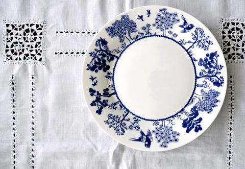
I first encountered Louise Wilkinson’s inimitable ceramics designs at Tent London last September, and instantly fell in love. The likes of Liberty discovered her beautiful bone china early on, and she has more recently created bespoke illustrations for panelling in the shop at the V&A. I caught up with her to find out more about her career to date, where her inspiration comes from and how she set about putting her illustrations onto china.

Louise Wilkinson ceramics- jug lifestyle

I absolutely adore your debut Maple Collection, inspired by English gardens, Oriental china and a love of nature. How did you construct the designs and how long did the process take to apply them to so many different shapes?
I like to draw a few pencil sketches first on scraps of paper and then at a later stage I draw my artworks on the computer with a pen. I love to create intricate artworks with witty details, often with a narrative. The designs are then screen printed and hand decorated in Stoke on Trent. It took many months to consider the shapes and designs together and then to fit the artworks correctly.

How do you pick the colour ways for your designs?
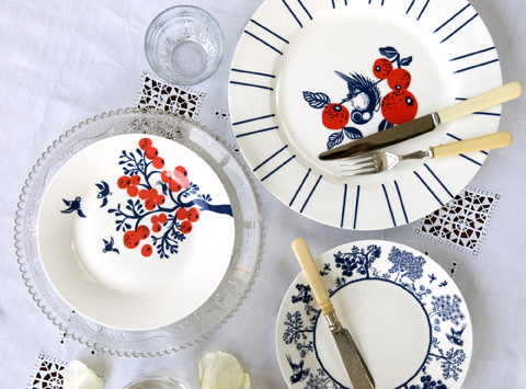
For my Maple Collection, I chose to have navy blue as the main colour with bold, playful, pops of colours for highlights. I often kept to two colours per design, for instance I liked the combination of a citrus yellow accent with navy blue or a coral red with navy blue.

Louise Wilkinson ceramics-Trees plate

What was the best bit about growing up in Yorkshire?
I loved growing up in the counrtyside, being able to spend a lot of time outside. We lived opposite a large field with lots of trees, me and my sister would often play and run around! I have lived in London over 10 years now, so it is nice to have the balance of London life and also visiting my family up north!

Louise Wilkinson Logo peacocks

You have already led a varied design career, studying illustration before moving into print and textiles for fashion. It sounds like the ideal career I never had! What was the highlight of those first years out of college?
I had always wanted to study Illustration so I took an Illustration degree at University. It was great to learn about the different aspects of image making, and after graduating my first job was working as an illustrator designing the prints, patterns and characters for children’s clothes, drawing everything by hand. I moved to London and worked in the fashion industry as a print and textiles designer, whilst also working on freelance book and magazine illustrations. I learnt a lot about working in different styles, techniques and applications to fabrics. It was great to get to know more about the commercial world and seasonal trends. Kids clothing is a fun area to work in!

Louise Wilkinson ceramics-Apple Tree dinner plate lifestyle

Why did you decide to create your own range and how did you effect that move?
I have been an illustrator and print and pattern designer for over a decade but I had always wanted to create my own artworks – to have a little more creative freedom and work for myself, creating timeless, playful and beautiful pieces. I launched my first collection in Liberty after attending the Best of British open day and it went from there!

Like me you are an avid fan of the illustrations found in children’s books, an aesthetic which I think comes through in your designs. Any favourites that you keep returning to?
Yes I do love children’s book illustrations, I always admired the painted collage technique used in the classic tale of The Hungry Caterpillar by Eric Carle, which is a classic. I also love Alain Gree’s cute illustrations and Russian fairy tales. I’m influenced by the traditional decorative arts, nature, exotic dreamlike places and often by different exhibitions I may visit in London. I love art and illustration, including Japanese and Chinese paintings, Matisse, Henri Rousseau, George Lepape….

Louise Wilkinson ceramics-Trees jug

What are your favourite pieces of homeware to design and why, and what is the hardest thing to design?
I love designing all the pieces, especially the plates and the cups and saucers. I like the flat surface area on a plate, which is like a blank canvas for artwork… and I like the little details you can add to cups and saucers. I’d say teapots can be harder to design for, as they are slightly more spherical.

What could we expect to find if we visited your work studio, can you describe it for us?
I am based in South East London where I have a large wooden desk with a Mac monitor and a pen tablet – it’s nice to have lots of surface area. There are lots of things around such as notebooks and pencil sketches, china samples, boxes, packing tape, bubble wrap, brochures, postcards! I have a lot of research in draws and on the walls. I also have lots of magazines and art books because I love looking in books for research rather than always using the internet. Oh and there is always a cup of tea on my desk, I drink too much!

Louise Wilkinson ceramics-Teacups

Why is it important for you to maintain strong relationships with UK suppliers?
I think its great to manufacture as much in the UK wherever possible to support the industry, and it is nice to meet the lovely team in Stoke on Trent who I work with.

When can we expect a new collection from you, and can you share any hints as to what that will be?
I will be selling my exclusive artworks which were created especially for my recent collaboration on the Christmas shop installation at the V&A. I’m also exhibiting at the Modern Show in Dulwich on March 16th 2014. I love this Mid Century design show, which it is local to where I live. I will also be exhibiting at Tent London again, during London Design Week in September.

Louise Wilkinson ceramics-Coral red plates

Do you have any plans to expand into other areas of design and if so what?
I love creating artworks and illustration and this can be applied to many different surface areas. So hopefully new things soon, I have lots of ideas.

Finally, do you have any exciting plans for 2014 – in either business or life – that you can share with us?
Hopefully a few nice trips away, perhaps to Copenhagen or Finland. I may also be getting married this year, which is exciting!

Categories ,Alain Gree, ,Best of British, ,Bone China, ,Ceramic design, ,ceramics, ,Chinese, ,Designer Maker, ,Dulwich, ,Eric Carle, ,George Lepape, ,Henri Rousseau, ,interview, ,japanese, ,liberty, ,London Design Week, ,Louise Wilkinson, ,Maple Collection, ,matisse, ,Mid Century, ,Modern Show, ,Russian, ,Stoke-on-Trent, ,Tent London, ,The Hungry Caterpillar, ,va

Similar Posts:


Amelia’s Magazine | D&AD New Blood 2013 Review: Best Graduate Illustration and Graphic Design

Bird man by Charlotte Cox at southampton solent screenprinting
This year the D&AD New Blood graduate show was held once again in a cordoned off section of Spitalfields Market. It’s a small space with hoards of exhibiting students crammed into the tight corridors, which can make it hard to manoeuvre around when it’s busy. Most colleges had as usual opted for a simple display on plain white stands, but one in particular had pushed the boat out: Southampton Solent had hand stamped the brown boards of their Wooly Bully Illustration show stand, providing an excellent foil to large scale screen printed work, handmade badges and a high quality promotional package. Amongst a sea of stands featuring A2 printed copies of students work this was a delightfully visceral experience. One of my favourite pieces was the bird man above by Charlotte Cox. They were also handing out invites to their stand alone London show, Solstice, at the Coningsby Gallery, but I was sadly away when it took place: I hope I’ll get an earlier invite next year!

Southampton solent book
These images are from a book that was hanging on the wall, illustrator unknown.

Southampton solent - Rake
This screenprint titled Rotam Vitea features alchemical symbolism and is by the enigmatically named Rake.

Elliot Kruszynski at Bath Spa Uni - Save the forests and the animals and the wizards
And from the rest of the show, here’s the illustrations and design work that caught my eye: Elliot Kruszynski at Bath Spa University wants us to Save the Forests and the Animals and the Wizards with this wonderful atmospheric print.

Austrian folk tale by Carina Dewhurst
I didn’t get an invite to the Westminster University standalone degree show this year, which is a shame as on the strength of their small New Blood display it looks like this was a particularly talented group. This beautiful illustration is based on an Austrian folk tale, by Carina Dewhurst.

Louise Byrnes
Printed textiles by Louise Brynes
This gorgeous abstract artwork is by Louise Byrnes, who also created textile designs that reminded me of the trend for splashy abstracts that was very prevalent at New Designers. Just lush, so lush in fact that someone tried to make off with the very print shown above whilst I was there!

Carmen Lynch environmental disaster westminster uni
Carmen Lynch was inspired by environmental disasters to create this threatening yet engaging image.

UCLAN
These cute animals are by someone at UCLAN – unfortunately I didn’t note who as there were no labels. Then the artist responsible tweeted me, but I failed to to take a note of her name then. If it’s you, let me know!

Lunchtime atop a Tree by Rhiannon Izard at plymouth uni
Lunchtime Atop a Tree features a trio of monkeys, by Rhiannon Izard, a paper artist and illustrator from Plymouth University.

Sophia Viney's ghost
Sophia Viney goes under the name Littleinkstain – I like her ghost, which is part of a story about a dark forest inhabited by pixies, created for the BimbaGirls Comic Anthology.

New Blood design show 2013-Saif Chowdhury
Saif Chowdhury‘s fantastical characters are inspired by Japanese video games and bizarre worlds – this image was created for a story about a child on a quest to find their dead father, whilst overcoming monsters and obstacles.

Children's book by Lucy Wooler at norwich uni
This colourful children’s book by Lucy Wooler at Norwich University was inspired by a Victorian morality tale.

Bumble bee by Tori Gray at Dundee
Behold, a humble bumble bee made of type by Tori Gray at the University of Dundee.

Marco Galloway abstract dundee
Marco Galloway researched colour theory to make this great abstract illustration.

Danielle Smith ceramics
These ceramics by Danielle Smith were inspired by mysterious tales of the traveller community.

New Blood design show 2013-Dictionopolis by jame wilson
Dictionopolis by Jamie Wilson at northumbria uni
Dictionopolis tells the tale of a city of words: this beautiful hand printed concertina book by Jamie Wilson of Northumbria University simply took my breath away. I wasn’t sure where to find him online, since Jamie Wilson is apparently quite a common name for an illustrator. This seems most likely to be his home though.

Flower print by Sarah Baskeyfield at Staffordshire Uni
Shells, pineapples & flowers by Sarah Baskeyfield
These hyper colour flower, fruit and shell printed patterns are by Sarah Baskeyfield at Staffordshire University, and were standout pretty amongst all the angular graphic designs on show.

Pottery ampersand by Helen Player at staffordshire uni
This giant pottery ampersand by Helen Player was created as part of a design brief for the V&A.

Dominic Kesterton at ECA
Dominic Kesterton at Edinburgh College of Art based these designs on the linguistics of a fictional seaweed picking culture.

Alex Tait at bucks new uni
Lastly these brilliant black characters are by Alex Tait at Bucks New University.

There were lots of other interesting things on show, but I’ve been writing (or am still writing) stand alone reviews about a number of illustration degrees, so you’ll find their best work elsewhere on my site.

*Many of these images first appeared on my instagram feed, where you can view my pick of design graduates and other inspiring finds as I see them.*

Categories ,2013, ,Alex Tait, ,Bath Spa University, ,BimbaGirls Comic Anthology, ,Bucks New University, ,Carina Dewhurst, ,Carmen Lynch, ,Charlotte Cox, ,Coningsby Gallery, ,D&AD, ,Danielle Smith, ,Dictionopolis, ,Dominic Kesterton, ,Edinburgh College of Art, ,Elliot Kruszynski, ,Helen Player, ,Jamie Wilson, ,Littleinkstain, ,Louise Byrnes, ,Lucy Wooler, ,Lunchtime Atop a Tree, ,Marco Galloway, ,New Blood, ,New Designers, ,Northumbria University, ,Norwich University, ,Plymouth University, ,Rake, ,review, ,Rhiannon Izard, ,Rotam Vitea, ,Saif Chowdhury, ,Sarah Baskeyfield, ,Save the Forests and the Animals and the Wizards, ,Solstice, ,Sophia Viney, ,Southampton Solent, ,Spitalfields Market, ,Staffordshire University, ,Tori Gray, ,University of Dundee, ,va, ,Westminster University, ,Wooly Bully Illustration

Similar Posts: