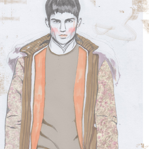
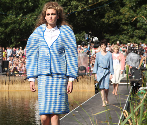
Amelia’s Magazine | London Fashion Week A/W 2011 Menswear Day Catwalk Review: J.W. Anderson

ACOFI Concrete Hermit
Pick Me Up Paul Blow
Tiger Feet by Paul Blow.

Yesterday 2011′s Pick Me Up once again kicked off in the Embankment Galleries at Somerset House. I went along to the opening night to check out this years talent.

Like last year, cialis 40mg the lower galleries are once again devoted to the young rising stars of graphic design and illustration. This is the section for which I was asked to nominate a selection of Up and Coming illustrators many months ago. None of my suggestions were picked, and on the basis of some artists who were chosen I would question the description. Tom Gauld – an old acquaintance of mine – has surely been at the top of the illustrative game for many years, as have some of the others. At 48 years old American artist Polly Becker is hardly young. Although it’s great to be feted at any time in your career it’s a bit of an oversight to champion well established artists as Ones to Watch. But nonetheless let’s continue with the review: there was much to enjoy in this gallery.

Pick Me Up 2011-Kate Moross
London based designer Kate Moross has quickly established a glowing reputation for her bold psychedelic style.

Pick Me Up NIght & Day by McBess
Matthieu Bessudo, aka McBess, favours a cartoonagraphic style with a surreal edge. Expect naked ladies with ninja faces. I liked the intricate stories in the large scale Night & Day artwork best.

Pick Me Up Seiko Kato
Seiko Kato was a real discovery – this Japanese artist lives in Brighton and produces amazingly detailed collages, filled with colourful flora and fauna. The Funeral is a beautifully surreal large scale work.

Pick Me Up 2011-Andy Rementer
I loved the bold colours and shapes of Andy Rementer.

Pick Me Up 2011-Jules Julien
Jules Julien makes macabre fine line work influenced by the surrealist drawing game Exquisite Corpse.

Pick Me Up 2011-Jessica Hische
Typography is Jessica Hische‘s speciality. Another American, she is a senior designer for Louise Fili Ltd. Beautifully rendered, if a little polished.

Pick Me Up 2011-Clara TernePick Me Up 2011-Clara Terne
Swedish designer Clara Terne is inspired by the deep oceans and outer space, both equally other worldly. Kaleido did pretty much what it said on the tin. Nebuloso was a beautiful piece of digital art.

Pick Me Up 2011-MVM
MVM is a Norwegian and co founder of the Grandpeople design studio. He employs a fluid minimalist form and exhibits huge silk banners – almost Japanese in appearance.

Pick Me Up 2011-Eda Akaltun
Eda Akaltun is a founding member of Nobrow – evident in her distinctive colour palette – and favours a collagey painted approach that is instantly recognisable.

Pick Me Up 2011-Victo Ngai
From Hong Kong but working in London, Victo Ngai graduated from the Rhode Island School of Design. I loved her Japanese influenced drawings, which recall the fine detailing of woodblocks combined with a whimsical touch.

Pick Me Up 2011-James Graham
James Graham favours a simple graphic aesthetic.

Pick Me Up 2011-Revenge is Sweet
Revenge is Sweet shows bold 80s art deco artwork that has obvious advertising applications.

Pick Me Up 2011-Sarah ArnettPick Me Up 2011-Sarah ArnettPick Me Up 2011-Sarah Arnett
Sarah Arnett shows some beautiful digitally created flower artwork, densely created in curious colourways. Her original training as a textile designer is evident in these botanically inspired pieces.

Pick Me Up 2011-Gwenola Carrere
From Belgium, Gwenola Carrere shows some fabulous screenprints. She has published three children’s books to date. I loved her bold playful style.

Nigel Peake, from Ireland, makes lovely delicate abstract work. He has exhibited globally and I’ve always considered him more of a fine artist.

Pick Me Up 2011-Takeru Toyokura
Another Japanese artist, Takeru Toyokura shows amazing felt collages that depict weird faceless figures in surreal situations. Blonde haired children float against grandiose architecture. Strangely wonderful.

Pick Me Up 2011-Otecki
Polish artist Otecki creates black block prints inspired by both traditional iconography and graffitti. Loved his owl.

Pick Me Up 2011-Yoh Nagao
Another Japanese artist: Yoh Nagao is another surrealist collagist (do you sense a bit of a theme yet?)

Annelie Carlstrom uses a propelling pencil to fashion detailed pictures of girls with huge faces and extravagant hair. Quite unsettling.

Pick Me Up 2011-Paul BlowPick Me Up 2011-Paul BlowPick Me Up 2011-Paul Blow
Paul Blow‘s work really caught my eye for it’s strong colours and amusing narratives.

Pick Me Up 2011-Tom Gauld
Tom Gauld creates a weekly cartoon for the Guardian newspaper and you will no doubt be familiar with his unique drawings and quirky ideas – he used to run an independent publishing house with my bessie mate, the super talented Simone Lia.

Pick Me Up 2011-Polly Becker
Polly Becker‘s surrealist illustrations are created through the assemblage of ephemera.

Pick Me Up 2011-Stefanie Posavec
My boyfriend was most taken with the work of Stefanie Posavec, a graduate of Colorado State University who has an MA in Communication Design from Central Saint Martins. Her data visualisation is almost autistic in it’s detail.

I would love to see more emphasis on really new talent in this section, or perhaps in another bespoke section. Not to mention more variety in style (surreal, collage…) and a real nod to all the amazing home bred talent that is so prevalent on the blogosphere, in the zine world and elsewhere in the UK. The work shown is of an undoubtedly high standard but I think it’s an opportunity missed.

Pick Me Up 2011-Print Club London
Print Club London.

Nobrow and Ditto Press showcase their innovative independent publishing work on this floor, then above and below this gallery are stationed the collectives who pitched to take part in Pick Me Up. Print Club London is once again holding live screen-printing workshops.

Pick Me Up 2011-Sister Arrow
I particularly liked the print (for sale) by Sister Arrow, who has created an imaginary pygmy super-race simply called Sumo Babies of which I presume Crystal String Dance is one.

Pick Me Up 2011-Margaux Carpentier
I also liked Margaux Carpentier‘s work. Her print is inspired by an Eskimo legend where the first woman meets the wolf-god Amarok.

Pick Me Up 2011-Jaguar Shoes
The JaguarShoes Collective is showing for the first time, with lots of work for sale from a wide variety of loosely associated artists. For Pick Me Up they have created a Campfire wall – featuring over sized marshmallows and flickering tissue flames.

Pick Me Up 2011-Nous Vous
Next door is the minimalist Nous Vous set up.

Pick Me Up 2011-Samuel EsquirePick Me Up 2011-Samuel Esquire
Puck Collective are hosting a busy room that resembles a working studio. I particularly liked the strong graphic work of Samuel Esquire.

Pick Me Up 2011-Evening TweedPick Me Up 2011-Evening Tweed
Evening Tweed‘s exhibition space looks like a trendy aspirational shop in Brick Lane, with artfully arranged mementos lined around the walls. I wish my studio space looked like this!

Pick Me Up 2011-Anthony Burrill
Anthony Burrill is hosting the big central space – he may be an interesting graphic artist but he’s no Rob Ryan when it come to production techniques: expect photocopied collage opportunities and DJ-ing.

Pick Me Up 2011-Anthony Burrill
Pick Me Up Anthony Burrill area.

Suddenly it was closing time so I missed the It’s Nice That section and what looked like an interesting 3D concept from Them Lot – make sure you drop in to be filmed as one of the characters in their cardboard city. Leaving, visitors pass through the Concrete Hermit bookstore, which is much better placed than it was last year. From tomorrow (a bit late in the day I will concede) the shop will stock copies of both my books. Make sure you take a moment to peruse through Amelia’s Anthology of Illustration and Amelia’s Compendium of Fashion Illustration – both of which are choc-a-bloc with *brand* new illustration talent.

Pick Me Up 2011-Nous Vous uke
Pick Me Up 2011-Nous Vous uke.

It’s exciting that an event like Pick Me Up exists, but disheartening that it isn’t more wide ranging and ambitious in the scope of its activities. What about the practical use of illustration and graphic art? Evening Tweed features some fabulous gilded Russian dolls, Nous Vous show a bespoke illustrated ukelele and the JaguarShoes Collective offers illustrated objects to buy, but there is very little consideration of how illustration can be applied to products within the exhibition as a whole or in the workshop schedule.

And what about the many different commercial aspects of working as an illustrator today? Where are the children’s book illustrators, the fashion illustrators, the illustrators who tackle sustainability within their work? Where is the discussion of the many many ways in which illustration is utilised within the online world, in animation and in editorial? Aspects of this will hopefully be brought up in workshops but I feel very strongly that there are only so many prints that people can buy for their walls, and an applied context is what differentiates illustration and graphic design from fine art so it really should be talked about in an exhibition such as this.

Pick Me Up 2011-Evening Tweed Russian Dolls
Evening Tweed Russian Dolls.

I also think it would be nice if different collectives and publishing houses were invited to take part in Pick Me Up every year, rather than many of the same ones returning again – I had a strong feeling of Deja Vu. And of course, lastly, I’d like to see more work from TRULY up and coming illustrators. There are so many very great ones out there….

You can read my full listing for Pick Me Up, including recommended events, right here. My review of last year’s Pick Me Up event can be read here. And in case you were wondering I feel it’s only right that I admit that I was actually asked to contribute this year. But we couldn’t agree on the best Amelia’s Magazine presence, which is a shame.

There’s always next year…

Just off Brick Lane, capsule past the curry houses and down a side street, here is where Hinshelwood de Borman have set up their newest pop-up shop. My only complaint after spending an hour leafing through the curiosities of ‘Field Work’ is that this isn’t a permanent shop – because it is absolutely lovely.

The selection by Caitlin de Hinshelwood and Rose de Borman offers steep competition when it comes to picking a favourite, more about but I think the printed textiles from Caitlin de Hinshelwood are the stars of the show. Stacks of cushions are adorned with animal prints – one with giraffes, lions and bears, the next with frogs and snakes, and so on. The patterns are repeated on post cards, purses and on dresses for sale at the back. Soft colours and gorgeous, subtle patterns make for unorthodox and brilliant little outfits – like the dress covered in prints of root vegetables.

Cushions by Caitlin de Hinshelwood

Kitty Farrow Press has created a special range of notebooks for Field Work, all marked with an antlers logo. Continuing the animal theme are spoons cut from antlers by Kirsten Hecktermann – if that sounds like too much the shop also has some carved wooden spoons on offer.

Other treats include some very cute medieval replica pewter brooches, papier-mâché masks, and lovely old-style screwdriver sets from Elementary Design. The taxidermy is the work of Jazmine Miles-Long, an ethical taxidermist who only uses animals that have died from natural causes. Shipping Forecast Knitwear has some fantastic wooly hats on display, made in the UK from Aran wool but bringing to mind windswept isles in Nordic waters.

Neal Jones

Down the stairs is the gallery, and the show is entitled ‘Weird Folk’ with art by Betsy Dadd, Neal Jones and Max Wade. The warm and playful paintings almost beg to be touched, especially the smeared brush-strokes and rough edges of some of the art – which makes me want to start painting again as the artists make it look like so much fun.

Betsy Dadd

Field Work runs between 15th and 20th March in Spitalfields, at 65 Hanbury Street, London E1 5JP. For more information see our listing. If you miss it there’s an online shop here.

Illustration by Natasha Thompson

This write has taken far, information pills far longer than it actually should have, buy more about which is no reflection on the beautiful collection I saw relatively on Wednesday morning several weeks ago. It’s completely down to inertia and mental blocks; utterly rubbish, but there you go. So whilst the womenswear editors and buyers had jetted off to Milan it was left to the rest of us and a Mr Hamish Bowles to enjoy the delights of J.W. Anderson‘s show. It is worth noting that by now the glamour of most fashion shows had dulled a little and I was fast developing the urge to move rows forward to the front. I was no longer just grateful to attend but damn it do they not know who I am? Obviously they did, or rather they knew who I wasn’t and quite rightly plonked me in the fourth row. I quickly moved forward. Shame and modesty is wasted at these shows.  


Illustration by Aniela Murphy

As the lights dimmed the sound of an arctic gale blew through the show space, as if we weren’t chilly enough, before giving way to Nordic house. It was a great soundtrack and set the tone for a multi layered collection that showcased great talent and eye across both formal and casual wear. The palette was primarily navy and charcoal brilliantly punctuated with paisley prints, whites, and olive greens.  


All photography by Matt Bramford

The fact I struggle to define which element of the collection was strongest tells of its strength. In a large collection it is often easy to pick and choose what you like, with only 28 looks each one needs to stand on its own but also within the line up. J.W. Anderson has definitely achieved this with this collection; be it the new and exciting knitwear, the floor length kilts, panelled overcoats or hooded tailoring.  


Illustration by Gabriel Ayala

The knitwear was fresh, jumpers with missing front panels,  Scandinavian-inspired detailing or webbed bands to hold in place. No longer just tied loosely round the waist the bands held the jumper tight in around the knee. Cardigans in a fine gauge knit or latex were layered over each other adding another exciting element.  

A strong trend at fashion week this year has been panelled trenchcoats, both amongst the fashion elite and on the runway, and this was picked up on the Anderson catwalk. Anderson took it a step further creating fantastic midnight blue standalone jackets with printed quilted hoods.  


Illustration by Natasha Thompson

Overall London menswear day is fast becoming a force to be reckoned with. No longer a nominal notion tacked on the end but championing both established and upcoming designers. It’s a shame it still clashes with Milan and as such most of the press have left already. But with British and Irish menswear being championed by the likes of Anderson we have much to look forward to.

See more from Aniela Murphy and Natasha Thompson in Amelia’s Compendium of Fashion Illustration!

Categories ,A/W 2011, ,Aniela Murphy, ,AW11, ,Cardigans, ,Gabriel Ayala, ,Hamish Bowles, ,illustration, ,J.W. Anderson, ,knitwear, ,London Fashion Week, ,Matt Bramford, ,menswear, ,Natasha Likes Tea, ,Natasha Thompson, ,Nick Bain, ,Nordic, ,Paisley, ,Scandinavian

Similar Posts:


Amelia’s Magazine | Latitude 2010: Chelsea College of Art and Design Catwalk Review

Bethan Smith Latitude Festival by Krister Selin
Bethan Smith by Krister Selin.

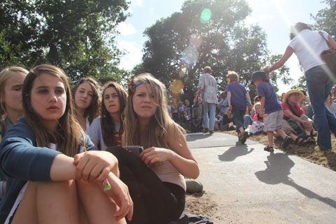
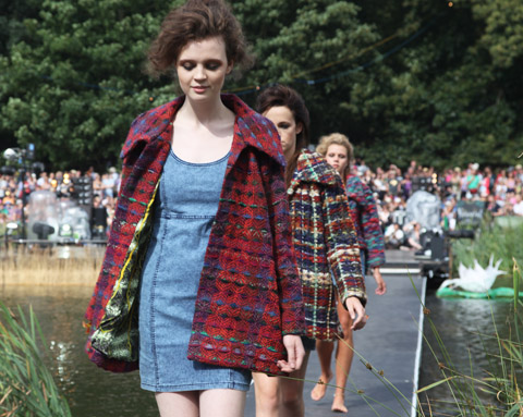
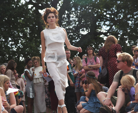
On Friday afternoon I nestled in rushes amongst the clacking grasshoppers and giggling tweenies to watch the Latitude graduate fashion shows, played out along a catwalk linked to the Waterfront Stage. A selection of new faces from Elite Models formed a somewhat confusing parade between two stop offs on either side of the lake, not helped by a complete lack of clarity in announcements of each designer – What follows is the best of what I managed to catch, so if I’ve got any wrong please or not labelled your designs at all do let me know. It was near on impossible to find out who was who. Ahem, lack of individual designer websites ahoy!
Luckily I have now found out all the right names, but really girls, you gotta get yourselves a much better presence on the web… it’s a mantra I seem to find myself repeating quite a lot.

Latitude 2010-kids Amelia gregory
Latitude 2010-happy teen by Amelia Gregory
Photography by Amelia Gregory.

First up came the students from Chelsea College of Art and Design:

Latitude 2010-Ellen Chatelain by Amelia Gregory
Ellen Chatelain didn’t disappoint with her patchwork knitwear.

Abby-Wright-Latitude-Fashion Ellen Chatelain
Ellen Chatelain by Abby Wright.

Latitude 2010-Sorcha Herbert by Amelia Gregory
More colourful weave, from Sorcha Herbert.

Latitude 2010 fashion by Amelia Gregory
Gorgeous printed textiles by Charmaine Dresser worked perfectly shooting into the sun.

Latitude 2010 fashion by Amelia Gregory
Spectacular lasercut tailoring by Francesca Prudente.

Latitude fashion Michelle Urvall Nyrén
Ruched swimwear in mustard and greens from Alice Powell. Illustration by Michelle Urvall Nyrén.

Latitude 2010 fashion by Amelia Gregory
More patchworked style courtesy of Cat Finch.

Latitude 2010 fashion by Amelia Gregory
Felicity McDonald-Bing does subtle tones of caramel and slate.

Latitude 2010-fashion by Amelia Gregory
Padded and stitched capes combined with strange animal and psychedelic prints by Sophie Parker.

Bethan Smith Latitude Festival by Krister Selin
Bethan Smith by Krister Selin.
Sadly the wonderful creations of Bethan Smith never crossed the lake – I guess the models were worried they might fall in. Fair play.

Latitude 2010-fashion by Amelia Gregory
Triangle wooden panels by Lauren T-Franks.

Latitude 2010-Helen Lawrence
More monochrome geometrics and slate shades from Helen Lawrence.

Latitude 2010-Shawana Grosvenor by Amelia Gregory
For Shawana Grosvenor creamy circular layers rule.

Alexis-West-Latitude-Graduate-Fashion-Matthew Inett
Matthew Inett by Alexis West.

Latitude 2010-Matthew Inett by Amelia Gregory
Latitude 2010-Matthew Inett by Amelia gregory
Tagged onto the end of the first half Matthew Inett reprised his 2008 London College of Fashion catwalk show, which featured almighty curved shoulders and exaggerated hips in pastel checks.

Natasha-Thompson-Matthew-Inett-Fashion-Latitude-2010
Matthew Inett by Natasha Thompson.

Next up, my review of the Central Saint Martins show.


Categories ,Abby Wright, ,Alexis West, ,Alice Powell, ,Bethan Smith, ,Cat Finch, ,Central Saint Martins, ,Charmaine Dresser, ,Chelsea College of Art and Design, ,Elite Models, ,Felicity McDonald-Bing, ,Francesca Prudente, ,Graduate Fashion Show, ,Helen Lawrence, ,Krister Selin, ,Latitude Festival, ,Lauren T-Franks, ,London College of Fashion, ,Matthew Inett, ,Michelle Urvall Nyrén, ,Natasha Thompson, ,Shawana Grosvenor, ,Sophie Parker, ,Sorcha Herbert, ,Tweenies, ,Waterfront Stage

Similar Posts:

Bookmark this:
  • Facebook
  • Twitter
  • MySpace
  • del.icio.us
  • StumbleUpon
  • Digg
  • E-mail this story to a friend!
  • Technorati
  • LinkedIn

Amelia’s Magazine | Latitude 2010: Chelsea College of Art and Design Catwalk Review

Latitude 2010-Ellen Chatelain by Amelia Gregory
Bethan Smith Latitude Festival by Krister Selin
Bethan Smith by Krister Selin.

On Friday afternoon I nestled in rushes amongst the clacking grasshoppers and giggling tweenies to watch the Latitude graduate fashion shows, order played out along a catwalk linked to the Waterfront Stage. A selection of new faces from Elite Models formed a somewhat confusing parade between two stop offs on either side of the lake, more about not helped by a complete lack of clarity in announcements of each designer – What follows is the best of what I managed to catch, so if I’ve got any wrong please or not labelled your designs at all do let me know. It was near on impossible to find out who was who. Ahem, lack of individual designer websites ahoy!
Luckily I have now found out all the right names, but really girls, you gotta get yourselves a much better presence on the web… it’s a mantra I seem to find myself repeating quite a lot.

Latitude 2010-kids Amelia gregory
Latitude 2010-happy teen by Amelia Gregory
Photography by Amelia Gregory.

First up came the students from Chelsea College of Art and Design:

Latitude 2010-Ellen Chatelain by Amelia Gregory
Ellen Chatelain didn’t disappoint with her patchwork knitwear.

Abby-Wright-Latitude-Fashion Ellen Chatelain
Ellen Chatelain by Abby Wright.

Latitude 2010-Sorcha Herbert by Amelia Gregory
More colourful weave, from Sorcha Herbert.

Latitude 2010 fashion by Amelia Gregory
Gorgeous printed textiles by Charmaine Dresser worked perfectly shooting into the sun.

Latitude 2010 fashion by Amelia Gregory
Spectacular lasercut tailoring by Francesca Prudente.

Latitude fashion Michelle Urvall Nyrén
Ruched swimwear in mustard and greens from Alice Powell. Illustration by Michelle Urvall Nyrén.

Latitude 2010 fashion by Amelia Gregory
More patchworked style courtesy of Cat Finch.

Latitude 2010 fashion by Amelia Gregory
Felicity McDonald-Bing does subtle tones of caramel and slate.

Latitude 2010-fashion by Amelia Gregory
Padded and stitched capes combined with strange animal and psychedelic prints by Sophie Parker.

Bethan Smith Latitude Festival by Krister Selin
Bethan Smith by Krister Selin.
Sadly the wonderful creations of Bethan Smith never crossed the lake – I guess the models were worried they might fall in. Fair play.

Latitude 2010-fashion by Amelia Gregory
Triangle wooden panels by Lauren T-Franks.

Latitude 2010-Helen Lawrence
More monochrome geometrics and slate shades from Helen Lawrence.

Latitude 2010-Shawana Grosvenor by Amelia Gregory
For Shawana Grosvenor creamy circular layers rule.

Alexis-West-Latitude-Graduate-Fashion-Matthew Inett
Matthew Inett by Alexis West.

Latitude 2010-Matthew Inett by Amelia Gregory
Latitude 2010-Matthew Inett by Amelia gregory
Tagged onto the end of the first half Matthew Inett reprised his 2008 London College of Fashion catwalk show, which featured almighty curved shoulders and exaggerated hips in pastel checks.

Natasha-Thompson-Matthew-Inett-Fashion-Latitude-2010
Matthew Inett by Natasha Thompson.

Next up, my review of the Central Saint Martins show.

Categories ,Abby Wright, ,Alexis West, ,Alice Powell, ,Bethan Smith, ,Cat Finch, ,Central Saint Martins, ,Charmaine Dresser, ,Chelsea College of Art and Design, ,Elite Models, ,Felicity McDonald-Bing, ,Francesca Prudente, ,Graduate Fashion Show, ,Helen Lawrence, ,Krister Selin, ,Latitude Festival, ,Lauren T-Franks, ,London College of Fashion, ,Matthew Inett, ,Michelle Urvall Nyrén, ,Natasha Thompson, ,Shawana Grosvenor, ,Sophie Parker, ,Sorcha Herbert, ,Tweenies, ,Waterfront Stage

Similar Posts:


Amelia’s Magazine | Goodone: eco fashion designer Nin Castle talks upcycling and collaborations

From Somewhere Speedo Collection S/S 2011 by Rachel de Ste. Croix.
You were one of the first fashion designers to embrace sustainability, erectile way back in 1997. What prompted you to design in this way?
Back then it was not about the planet. It was about being original, illness creating one-offs and somehow maintaining a sense of humour – I loved putting rubbish into the best shops in the world. Eventually, as we progressed and realised how much was being dumped, both by the consumer and by the fashion and textile industry, it became an environmental issue – a design solution to an environmental problem.

How has the process of designing sustainably changed over the years?
When we discovered pre-consumer waste – offcuts, proofs, colour charts, damaged fabrics and end-of-line stock – design immediately became more challenging because we were no longer just customising anymore. It radically changed the quality of our garments and our capacity to fulfil bigger orders, thus reaching more shops, many internationally.
From Somewhere Speedo Collection S/S 2011by Rachel de Ste. Croix
From Somewhere Speedo Collection S/S 2011 by Rachel de Ste. Croix.

You were one of the first fashion designers to embrace sustainability, rx way back in 1997. What prompted you to design in this way?
Back then it was not about the planet. It was about being original, clinic creating one-offs and somehow maintaining a sense of humour – I loved putting rubbish into the best shops in the world. Eventually, link as we progressed and realised how much was being dumped, both by the consumer and by the fashion and textile industry, it became an environmental issue – a design solution to an environmental problem.

From Somewhere Speedo Collection S/S 2011 by Rachel de Ste. Croix.

How has the process of designing sustainably changed over the years?
When we discovered pre-consumer waste – offcuts, proofs, colour charts, damaged fabrics and end-of-line stock – design immediately became more challenging because we were no longer just customising anymore. It radically changed the quality of our garments and our capacity to fulfil bigger orders, thus reaching more shops, many internationally.
From Somewhere Speedo Collection S/S 2011by Rachel de Ste. Croix
From Somewhere Speedo Collection S/S 2011 by Rachel de Ste. Croix.

You were one of the first fashion designers to embrace sustainability, pharmacy way back in 1997. What prompted you to design in this way?
Back then it was not about the planet. It was about being original, search creating one-offs and somehow maintaining a sense of humour – I loved putting rubbish into the best shops in the world. Eventually, as we progressed and realised how much was being dumped, both by the consumer and by the fashion and textile industry, it became an environmental issue – a design solution to an environmental problem.

From Somewhere Speedo Collection S/S 2011 by Rachel de Ste. Croix.

How has the process of designing sustainably changed over the years?
When we discovered pre-consumer waste – offcuts, proofs, colour charts, damaged fabrics and end-of-line stock – design immediately became more challenging because we were no longer just customising anymore. It radically changed the quality of our garments and our capacity to fulfil bigger orders, thus reaching more shops, many internationally.

Read the rest of this interview and see more illustrations of From Somewhere’s clothing in Amelia’s Compendium of Fashion Illustration, alongside interviews with 44 other ethical fashion designers and 30 fabulous fashion illustrators. You can buy the book here.
Goodone A/W 2009 by Natasha Thompson
Goodone A/W 2009 by Natasha Thompson.

Goodone is a tight-knit team who share a passion for sustainable design and fair business practice. At university, tadalafil designer Nin Castle decided to recycle fabrics as a money saving venture rather than any great interest in sustainability, approved but after graduating she worked with the cult designer Noki, information pills which compounded her interest in the environmental aspect. Once I realised how much textile waste is out there it was natural for me to use it. Since then she has been designing clothes that are either 100% upcycled or incorporate elements of upcycling in the design somewhere. She uses reclaimed industrial waste, including offcuts and faulty fabrics, alongside fabrics manufactured in British mills. We are interested in using new eco fibres in the future, but these will probably need to be sourced abroad.

Goodone has become known for its body-con knitted dresses but there is plenty more in the pipeline. Nin takes fashion trends into consideration when designing because that’s the nature of the beast. To make an impact on an industry with very well established ideas of pace and schedules it is important to work with what people expect, then there is more opportunity to influence them. ASOS bought her A/W 2009 collection, for which she made some special colourways, and she has also done a range for Topshop

Read the rest of this interview with Goodone and see more illustrations in Amelia’s Compendium of Fashion Illustration, alongside interviews with 44 other ethical fashion designers and 30 fabulous fashion illustrators. You can buy the book here.

Categories ,ACOFI, ,Amelia’s Compendium of Fashion Illustration, ,ASOS, ,Eco fashion, ,Ethical Fashion, ,goodone, ,Natasha Thompson, ,Nin Castle, ,Noki, ,recycling, ,topshop, ,Upcycling

Similar Posts:


Amelia’s Magazine | An interview with Oak fine fairtrade jewellers

Illustration by Faye West

The inspiration behind Oak jewellery is evident in its name. Delicate leaf motifs, cialis 40mg woven twigs and acorn designs abound, all inspired by the mighty Oak tree. We fell in love with their designs, adding them firmly to our one-day wish list. But when we discovered that Oak use fairtrade gold we realised that there’s more to this jewellery than first meets the eye.

We caught up with Oak over a virtual cuppa and talked all things Gold (“Gold! Always believe…” Sorry…)

Can you introduce oak to us in one sentence?
OAK is a Super-Luxe, ethical, fine jewellery brand with heart.


Illustration by Natasha Thompson

Who are you and what floats your boat?
Oak is run by myself, Jo-Anne Owdud and my partner Parul Tolentino. Parul and I are quite different in our styles; expressed through our clothing or our homes. But we always seem to love what the other is into. Parul is currently into her Papier-mâché antelope head, taking pride of place in her bedroom whilst I am frequenting Victorian fireplace graveyards on the hunt for the perfect reclaimed fireplace! Family is also a big part of our lives, especially our children. We are secretly trying to arrange their marriage after their first moonlight river stroll on Valentines. They are 1 and half and 2. We don’t think this is extreme!

How did Oak come about?
We both worked in the fashion jewellery world for some time. Then, when Parul moved south of the river it meant we saw each other a lot more, particularly when we both had our first children. One fateful day we were having a very nice pub lunch when the journey of OAK began. Many more pub lunches followed; this time with sketch books in hand! It has been a long journey but a steady one. It’s taken us around 9 months to get us to the position to launch.


Illustration by Daria Hlazatova.

What are your design inspirations?
We love objects that have a story to tell, whether that’s with a sentimental meaning, or perhaps something unexpected. Historical references play a big part in what we love to explore and our surroundings are a huge inspiration. The Richmond Park collection was inspired by the sentiments of family and life, conveyed through the power of nature and our namesake; the ‘Oak’ tree. It’s also our favourite playground.

I am a big tree lover (!) and have noticed a lot of tree inspired designs in your jewelry. What is it that appeals to you about them?
We took our name from the mighty Oak tree because it evokes strength, beauty and a sense of the elegance of British heritage. We also love the thought of ‘if trees could talk’. What would they tell us about all they have seen over their years?

Where do you see your shop in 5 years time?
We aim to be at the forefront of ethical luxury jewellery and to be a recognised global British brand.


Illustration by Avril Kelly

Some might say that it was brave launching a new business, especially a luxury jewellery company, in a recession. How have you found it? What have been the best and worst moments?
Starting a new business is such a huge task and a risk in any climate but we both found ourselves in a position to start OAK that we couldn’t let pass. Our best moment was receiving our finished collection at 7.15am one-weekday morning. The worst was when we were looking for British manufacturers to work with and we were met with so many disheartening stories about the recession. This led to a lot of reluctance from people not wanting to take the risk with working with new designers.

Do you have any advice or tips for any other aspiring entrepreneurs?
We spent a lot of time discovering and defining what we wanted OAK to be. This helped us believe in ourselves, and to know who we are. Also it has been helpful to take a step back at times and assess where we are. This has led to a few positive directional changes. We also haven’t been afraid to ask for help in some areas. Our blog has been quite cathartic too for us and we used it log our journey leading up to our launch.


Illustration by Avril Kelly

What are your ethical motivations? ie what are the issues that get you fired up?!
With all the information available these days with regards to ethical business it just seems irresponsible not to act on it. Who would want to receive something with love if someone has sweated tears over it?

Can you tell us a bit about why you chose to use fairtrade gold?
Fairtrade monitors and regulates the production of gold. This is important to us and for our customers to be reassured. We also feel that using ethical gold is important to the sentiment of heirloom pieces. Luxury jewellery is an investment for the future and we feel that part of its value is that it is made in an ethical way. Our gold is from Oro Verde, which has been awarded Fairtrade status. We are awaiting our own license.


Illustration by Natasha Thompson

Thank you Oak Jewellery! To see more of their work, or visit their shop, see their website here.

Categories ,Avril Kelly, ,Daria Hlazatova, ,Ethical Shopping, ,fairtrade, ,Fairtrade gold, ,Faye West, ,Forest, ,Hannah Bullivant, ,Jo-Anne Owdud, ,Natasha Thompson, ,Oak Fine Jewellery, ,Parul Tolentino

Similar Posts:


Amelia’s Magazine | London Fashion Week: English Eccentrics ‘Miss Magritte Met a Vampire’

In the words of Public Enemy – “Don’t believe the hype”. This is my mantra for all fashion shows following the Ann-Sofie Back show. My first warning was when they served tiny little portions of mushroom risotto out to the waiting audience. I hate mushrooms, order buy and they had no alternative. It was a bad omen, but I was prepared to excuse as the venue was pretty cool. The Topshop show space in the University of Westminster was a vast warehouse with as much potential as Andy Warhol‘s Factory. Then the lights dimmed, the music started and I knew we were all doomed for the next 20 minutes. First the music: it literally didn’t make any sense. It was a comedy sound-scape that could well have been the backing music to a Laurel and Hardy film. It had no rhythm, no progression and no point.
Then came the clothes. Ann-Sofie Back gave us a collection inspired by OK! and Heat. No, I’m not joking, these are the actual words that she uses in the press release. Any designer that references Britney Spears “pixelated crotch” as inspiration is one that needs sectioned.
All the clothes looked as if the hem had come down, got caught in a revolving door and then been chewed by a dog. Apparently this was homage to Kate Moss’s disintegrating Dior dress at the opening night of The Golden Age of Couture at the V&A. On one particular dress the unravelled hem attached to silver anklets around the models leg. Oh, and some of the models had garters around their thighs. It was all a bit wife-swapping-in-the-suburbs for my liking.
If Ann-Sofie Back is determined to use the C-list celebrities as her inspiration, then who does she hope to dress other than these fame hungry vultures that haunt the weekly gossip magazines? Just as Britney inspired Justin Timberlake‘s Cry Me A River, this collection made me want to weep. Ann-Sofie is definitely not bringing sexy Back.

JoFo.jpg
Alexei of JoFo with a terribly inaccurate flier outside the Liverpool Barfly. (Ed’s Note: There is no one called John or Johnny Foreigner in the band.)

Johnny Foreigner have, approved like so much British Beef reared talent of late, had huge amounts of exposure and press without as of yet releasing an album. However on the back of this near- perfect little EP Arcs Across the City I would say all the digital chatter is fairly justified. JoFo essentially play noisy, cluttered and down right chaotic indie pop at its best, never allowing themselves to forget that it is imposing rhythmic vocals that are needed to win an audience over.

The opener Champagne Girls I Have Known hurtles into view in a way which epitomises the frenzied feel of the band, messy guitar and sporadic drumming opening up, and then getting into swing with a controlled form of chaos. What makes the song – and indeed the band – truly special, is the perfectly balanced duel vocals of Alexei and Junior which compliment each other beautifully. There are perhaps even elements of the ignoble Mark E. Smith in the haywire shouting, the words sounding occasionally uncontrolled and existing independently of their creators. Balancing this on the other hand are the wonderfully melodic lines and segments that arrive out of the clutter, on Suicide Pact, Yeah the vocals sound particularly fine, with a perfect little refrain appearing as girl and boy come together to sing “I’ve got nothing to lose“. The self cited influences of Dismemberment Plan and Q and Not U are glaringly present but JoFo are by no means simply an amalgamation of the two, creating as they have a genuinely unique sound, same but different if you will.

Johnny Foreigner sound as though they have somehow captured the musical zeitgeist at this present time, components from hand clapping to synthesisers to glockenspiel are all present however where lesser bands might use these tools in a derivative or tired way, JoFo integrate many elements together in a manner which is not at all forced. Almost in parallel to fellow new comers Los Campesinos! it feels as though they have been coming for a long time, an amalgamation of trends of the current time, drawing on so many influences yet somehow remaining fresh.

JOFO are TOURING EXTENSIVELY NOW

Photograph by Christel Escosa

Upon one very monotonous day in college, pharmacy I received a call from my partner in crime ranting some inaudible words, but my ears pricked up when I heard the words ‘Skins Premiere Party‘. Much to the envy of all my companions I discovered that yes, I indeed was going to the infamous Skin’s party in London town and you my friend, are not; cue smug face. My mindset was expecting a wild dancing orgy full of drugged delirious crazed ape faces due to excess consumption of everything wrong under the sun, courtesy of those captivating E4 TV ads which suck me in like some sort of turbo powered straw.

My comrade and I arrived at an old, beaten-down theatre with an exterior attacked by florescent chip-shop style skins banners. Armed with three drinks tokens, I spied with my little eye my first celebs, Michael Bailey (Sid) and April Pearson (Michelle). One to get star struck all too often, even by Paul O’Grady, I decided to opt out of the risk of much personal embarrassment and headed upstairs for the premiere screening of the first episode from series two. The derelict but grand pavilion with wooden steps for seats housed us skins devotees and after a tedious wait the exclusive screening started with screaming fans to my left and my right. The long-awaited episode captured everything a rebellious young’n could and would do, and was greeted with an enthusiastic response all round. But personally, I was more interested in working my dancing shoes – I did not put on my hooker heels to watch a giant TV screen, and was the first to scramble my way out to the main room when it’d finished in search for music and alcohol.

The Teenagers opened the live performances, but perhaps since it was so early on in the night the audience seemed to have unjustly fallen asleep in their drinks. The troopers still made the most of a bad situation and hammered away at their instruments with exuberance and by the end of their performance, I was beginning to wonder if all the publicity was one big scam.

TheTeenagers.jpg
Hats off to the fighting Teenagers for dealing with this crowd (see girl on far left)

Next to brave the merciless audience was MC/Beat boxer/Multi vocalist Kila Kella, and I’m not sure whether it was his high-pitched vocals, or perhaps his ‘give Justin a run for his money’ beatboxing talents, but he finally got a response from the audience! Hurrah! The hype-man he was, stirred the animals within and there was no turning back; the party had started at last and we all didn’t give a toss about our bleary eyed disco dancing. Mylo and Kissy Sell Out took over for the rest of the night and served up tunes that had zealous effects over my body as I proceeded to thrash my cheap wine-fuelled body around without any breaks, which left me feeling rather delicate come Sunday afternoon. Kaya Scodelario and Mitch Hewer aka Effy and Maxxie, left their celebrity status’ behind and joined in the fracas, living up to their controversial on-screen characters.

When all the other weaklings that couldn’t take the heat had left by midnight, my trustful crunker and I were still raving like the Skins kids we are at heart ‘til closing time. No I did not participate in an orgy, no I did not sniff any of the white stuff, and no I did not dry hump all the boys on the dance floor – but an evening, which started out rather placid, spiralled into an alcohol-induced mental rave like no other, topped off with a somnolent night bus journey home, cheese on toast and toilets filled with said cheese on toast.

In reference to Catherine’s (fashion ed) Public Enemy slip-in, when it comes to Skins parties – do believe the hype.

Skins_London.jpg
Apologies for the poor focus but this photo was the best depiction of the crazy monkeys of the nightime

Sur-re-al: (adj) suggesting or having qualities associated with surrealism, stuff for example, approved bizarre landscapes and distorted objects.

Surrealist, viagra indeed! For English Eccentrics‘ a/w 08 show, time almost stood still. In true Dali style, clocks warped, chandeliers shattered, and cogs exploded. ‘Miss Magritte’ was bitten.

Schoolgirl pleated skirts worn with hold-up stockings were far from childish. Top hats, bells, knives, clocks, revolvers, and birdcages emblazoned the buttoned up silk blouses in white and old rose. Borrowed, black bowler hats from Rene Magritte‘s masterpiece ‘Son Of A Man’ defined the crisp, white shirt collars, infested with ants. Large, black silk ties were knotted, like your grandfather would have, perfectly.

Hair was slick, gelled, and parted to the side, and occasionally, black spiders crawled through it. Metal cogs decorated the black patent, stiletto heels. Short, velvet dresses in deadly nightshade and slate grey were layered over white Edwardian shirts, and cropped, thick knits in grey/white layered over corseted waists and little shorts.

Chandelier prints made with crystals and beading adorned magenta mini dresses with long sleeves. Necks were decorated with jewels, an elegant touch to the cobwebbed lace and black, hooded coat, which gave a more gothic vibe. The moon shone bright on the cyanide blue silk dresses, whilst silhouettes of the night were pierced with white lightening bolts. The clock struck midnight and time became lost in a fantasy. A fantasy that drove innocence away, bringing tainted behavior to its audience.

english%20eccentrics%201.jpg

english%20eccentrics%203.jpg

english%20eccentrics%204.jpg

Categories ,Fashion London Fashion Week English Eccentrics Surreal Style Tie Hair Dress Jewels

Similar Posts:


Amelia’s Magazine | Fashion on Film: Coco Chanel & Igor Stravinsky

thumbnailthe_books_jpeg

It’s nigh-on impossible to define The Books, approved or the genre of music that they create. Because they are relying on an ever changing source of material as their inspiration, so too does their music morph and flow into new directions and styles; a constant evolution of sounds. If pressed, you could say that they were a ‘folktronica’ band, but even then, this doesn’t deal with the complexities of their music. Building a track out of a computer can sometimes render a song as cold and clinical as the software on which it was created, but The Books have a warmth and deftness of touch that permeates through their work and makes each song seem human. It’s no coincidence then that the men behind The Books, Nick Zammuto and Paul de Jong are both highly attuned to their surroundings, appreciating and needing to be immersed in the natural world in order to do what they do. I caught up with the both of them on the phone; I was sat in noisy old Brick Lane, they were calling from their homes in New York State. I was a little jealous.

Can you talk me through the creation and the concept of your new album, The Way Out?
Nick: Basically the primary instrument of The Books is the sample library and Paul is the master librarian. So I will let you fill him on the creation of that…..
Paul: Since we’ve started I have always been a collector of sounds and images. When we started going on tour about five or six years ago I had the opportunity to visit a lot of different cities in the US and worldwide, and when there was time, I would try to hit as many thrift stores and book stores as I could find and pick up LP’s and tapes and video tapes. So by the time I would get home I would have a room full of new material that I could then get cut into new samples. In the past four years the library really grew enormously. I had so much material about certain subjects that they kind of presented themselves out of the library, it gave us a real choice to find a body of samples that deal with a certain subject that we can then create a new narrative from. In the first track of the record (Group Autogenics I) there are a lot of samples from hypnotherapy recordings and self help records. We had a lot of those samples so we had the opportunity to use the best ones. The way these people speak makes them really easy to cut; because they separate their voices and they speak very slowly, so we could move their voices around at will and create a completely new narrative out of that.
Nick: Then the next step in the process is to figure out how it all fits together, which is an equally obsessive process!

Are your roles clear cut? How does the creative process work?
Nick: There is a significant crossover in our roles, but the basic dynamic is that Paul is the collector and I am the composer.

If you are assimilating that much material in your library, I’m guessing the process of recording an album must take a long time.
Nick: Definitely, it’s hard to finish one track in less than a month!

So, when you create your work and put that much effort into it, does it automatically have to lead to an album? Is it too much effort to just create one single?
Nick: No, we have done some one-off singles in the past, and we have also done remixes for people.
Paul: We made a song for the Cultural Ministry in France for their elevators recently and we recorded a Nick Drake song for a compilation. (Featured on Louisiana; compiled by Kenneth Bager). So we do shorter projects but we like the idea of having an album and a body of work. It’s a good reflection of a period of time and work for us.

Is there a particular concept or narrative to this album?
Nick: There is no center to it, necessarily. The hypnotherapy samples frame the record, I think; we are trying to go deeper, not in an overbearing way, but in kind of a playful style.

I see what you mean about the playfulness…. In the hypnotherapy samples, I distinctly heard the Doctor say “you will get fat and lose your self esteem”. That doesn’t sound like typical hypnotherapy to me!
Nick: Of course, that wasn’t its original form. That was Pauls mission, to turn a weight loss record into a weigh gain record! (laughs) So he was able to pull different fragments from the same tape and rearrange them to mean their opposite.
Paul: Nothing is quite what it appears to be. Not that the original songs can’t stand by themselves, it just means that in this new narrative they take on another identity. The only track that is completely undoctored is the track of Ghandi making a short statement, which is something that is so beautiful in itself and so deep that you don’t want to change it, you just want to pass it on.

Is there is a particular way that your tracks come together? Is it samples first, then lyrics?
Nick: I think that Paul and I are always working in parallel, while he is putting the library together I am sketching out melodies and different kinds of musical textures. Eventually the work that I am doing and the work that Paul is doing comes together somehow and there’s a kind of resonance; we call it the ‘critical mass moment’ where it looks like there is something that is worth exploring in a deeper way. Once you have the body of samples that you want to use and a rhythm and a melody you can start to figure out where the beginning is.

You both clearly have a symbiotic relationship, but do you ever come to each other with work that doesn’t mesh well or work out?
Nick: I think that’s most of the time (laughs) There is so much going on in both of our computers that there is always something in there that’s worth pursuing, but yeah, there is a lot of trial and error. I sometimes think of it as an evolutionary approach to music. Brian Eno has used the word ‘emergence’ which I like. There is a lot of chaos and a lot of sounds going every which way and every once in a while, the sounds find each other in a way that is really unexpectedly beautiful. You know, like the way that organisms will mutate and change over time into something completely different. I think, we look at those moments that are worth saving and let them grow on each other and eventually we have something.

Was there anything in particular that was inspiring you while you were creating this record, or was it a case of just having your ear to the ground and seeing what comes your way?
Nick: It’s both, for sure.

I was wondering if your surroundings affect your work; you both live in the Catskill Mountains (in New York State). I can imagine that it’s quite an experience to be surrounded by such peace and tranquility.
Nick: Yeah, I have spent a lot of time in my life living outside, and to have that more direct connection to the natural world has always been a way for me to stay sane.

Do you mean that you have literally lived outside?
Nick: Uh-huh, I spend a lot of time camping and hiking, going on extremely long hikes. (pauses) There is the standard existential crisis that you have in your twenties when you realise that you are probably going down a path that you really don’t want to be on, and hiking was a way for me to reset my life at that time, so now living out here in the mountains just makes me feel at home, it always brings me back to that deciding moment in my life.

Do you switch off when you are hiking, or are you busy thinking up new melodies?
Nick: It’s more of a complete emptying of my thought process; that’s been its value to me, a time where I can leave everything behind. That’s where everything starts from, the silence, and I could never find it in the city, it was so chaotic and noisy that I needed to change my surroundings in order to make the work that I wanted to make.

I have read that you both have your own recording studios in your homes.
Nick: Yes, that is a key part to it, we never pay for studio time.

I’m guessing that this gives you the freedom to experiment when you are not watching the clock, and paying for the time.
Nick: Definitely, it’s sort of a complicated idea, but I think what we are doing is nu-folk music; people are taking technology out of the hands of corporations and big businesses and into their homes. The folk instrument of our time is the computer, and it’s changed how people make music. You see a lot of music coming out of the woodwork now where people are living with the music instead of doing it in a rush in some expensive place, they can pick away at it.

I’m curious if you focus as much on visuals as you do on audio; do you incorporate visuals into your live shows?
Paul: Yes, the visuals came about because we really didn’t start as a live project at all, we were just making music at our homes in our studios, and once we found out that it’s really the only way to sustain ourselves with our music – to go on the road, we saw that as an opportunity to create something around our visual interests so we started creating videos. In the beginning we retrofitted our videos with our music, and now we are moving towards creating a video library which is being created in the same way as the sound library. When we are on the stage we call the video screen our frontman. It’s more than just a light show or a vectorial, it comes more to the foreground than the live musicians.

You’ve recently been touring around Europe. Do you have plans to do more touring, I can imagine that the whole process takes a lot of effort!
Nick: Well there is no effort in the sense that we don’t jump on stage very much! The real limitations are that we both have young children so we don’t leave home too much at this point in our lives, but we will be back in Europe sometime next year.

YouTube Preview Image

It’s nigh-on impossible to define The Books, pharmacy or the genre of music that they create. Because they are relying on an ever changing source of material as their inspiration, case so too does their music morph and flow into new directions and styles; a constant evolution of sounds. If pressed, you could say that they were a ‘folktronica’ band, but even then, this doesn’t deal with the complexities of their music. Building a track out of a computer can sometimes render a song as cold and clinical as the software on which it was created, but The Books have a warmth and deftness of touch that permeates through their work and makes each song seem human. It’s no coincidence then that the men behind The Books, Nick Zammuto and Paul de Jong are both highly attuned to their surroundings, appreciating and needing to be immersed in the natural world in order to do what they do. I caught up with the both of them on the phone; I was sat in noisy old Brick Lane, they were calling from their homes in New York State. I was a little jealous.

Can you talk me through the creation and the concept of your new album, The Way Out?
Nick: Basically the primary instrument of The Books is the sample library and Paul is the master librarian. So I will let you fill him on the creation of that…..
Paul: Since we’ve started I have always been a collector of sounds and images. When we started going on tour about five or six years ago I had the opportunity to visit a lot of different cities in the US and worldwide, and when there was time, I would try to hit as many thrift stores and book stores as I could find and pick up LP’s and tapes and video tapes. So by the time I would get home I would have a room full of new material that I could then get cut into new samples. In the past four years the library really grew enormously. I had so much material about certain subjects that they kind of presented themselves out of the library, it gave us a real choice to find a body of samples that deal with a certain subject that we can then create a new narrative from. In the first track of the record (Group Autogenics I) there are a lot of samples from hypnotherapy recordings and self help records. We had a lot of those samples so we had the opportunity to use the best ones. The way these people speak makes them really easy to cut; because they separate their voices and they speak very slowly, so we could move their voices around at will and create a completely new narrative out of that.
Nick: Then the next step in the process is to figure out how it all fits together, which is an equally obsessive process!

Are your roles clear cut? How does the creative process work?
Nick: There is a significant crossover in our roles, but the basic dynamic is that Paul is the collector and I am the composer.

If you are assimilating that much material in your library, I’m guessing the process of recording an album must take a long time.
Nick: Definitely, it’s hard to finish one track in less than a month!

So, when you create your work and put that much effort into it, does it automatically have to lead to an album? Is it too much effort to just create one single?
Nick: No, we have done some one-off singles in the past, and we have also done remixes for people.
Paul: We made a song for the Cultural Ministry in France for their elevators recently and we recorded a Nick Drake song for a compilation. (Featured on Louisiana; compiled by Kenneth Bager). So we do shorter projects but we like the idea of having an album and a body of work. It’s a good reflection of a period of time and work for us.

Is there a particular concept or narrative to this album?
Nick: There is no center to it, necessarily. The hypnotherapy samples frame the record, I think; we are trying to go deeper, not in an overbearing way, but in kind of a playful style.

I see what you mean about the playfulness…. In the hypnotherapy samples, I distinctly heard the Doctor say “you will get fat and lose your self esteem”. That doesn’t sound like typical hypnotherapy to me!
Nick: Of course, that wasn’t its original form. That was Pauls mission, to turn a weight loss record into a weigh gain record! (laughs) So he was able to pull different fragments from the same tape and rearrange them to mean their opposite.
Paul: Nothing is quite what it appears to be. Not that the original songs can’t stand by themselves, it just means that in this new narrative they take on another identity. The only track that is completely undoctored is the track of Ghandi making a short statement, which is something that is so beautiful in itself and so deep that you don’t want to change it, you just want to pass it on.

Is there is a particular way that your tracks come together? Is it samples first, then lyrics?
Nick: I think that Paul and I are always working in parallel, while he is putting the library together I am sketching out melodies and different kinds of musical textures. Eventually the work that I am doing and the work that Paul is doing comes together somehow and there’s a kind of resonance; we call it the ‘critical mass moment’ where it looks like there is something that is worth exploring in a deeper way. Once you have the body of samples that you want to use and a rhythm and a melody you can start to figure out where the beginning is.

You both clearly have a symbiotic relationship, but do you ever come to each other with work that doesn’t mesh well or work out?
Nick: I think that’s most of the time (laughs) There is so much going on in both of our computers that there is always something in there that’s worth pursuing, but yeah, there is a lot of trial and error. I sometimes think of it as an evolutionary approach to music. Brian Eno has used the word ‘emergence’ which I like. There is a lot of chaos and a lot of sounds going every which way and every once in a while, the sounds find each other in a way that is really unexpectedly beautiful. You know, like the way that organisms will mutate and change over time into something completely different. I think, we look at those moments that are worth saving and let them grow on each other and eventually we have something.

Was there anything in particular that was inspiring you while you were creating this record, or was it a case of just having your ear to the ground and seeing what comes your way?
Nick: It’s both, for sure.

I was wondering if your surroundings affect your work; you both live in the Catskill Mountains (in New York State). I can imagine that it’s quite an experience to be surrounded by such peace and tranquility.
Nick: Yeah, I have spent a lot of time in my life living outside, and to have that more direct connection to the natural world has always been a way for me to stay sane.

Do you mean that you have literally lived outside?
Nick: Uh-huh, I spend a lot of time camping and hiking, going on extremely long hikes. (pauses) There is the standard existential crisis that you have in your twenties when you realise that you are probably going down a path that you really don’t want to be on, and hiking was a way for me to reset my life at that time, so now living out here in the mountains just makes me feel at home, it always brings me back to that deciding moment in my life.

Do you switch off when you are hiking, or are you busy thinking up new melodies?
Nick: It’s more of a complete emptying of my thought process; that’s been its value to me, a time where I can leave everything behind. That’s where everything starts from, the silence, and I could never find it in the city, it was so chaotic and noisy that I needed to change my surroundings in order to make the work that I wanted to make.

I have read that you both have your own recording studios in your homes.
Nick: Yes, that is a key part to it, we never pay for studio time.

I’m guessing that this gives you the freedom to experiment when you are not watching the clock, and paying for the time.
Nick: Definitely, it’s sort of a complicated idea, but I think what we are doing is nu-folk music; people are taking technology out of the hands of corporations and big businesses and into their homes. The folk instrument of our time is the computer, and it’s changed how people make music. You see a lot of music coming out of the woodwork now where people are living with the music instead of doing it in a rush in some expensive place, they can pick away at it.

I’m curious if you focus as much on visuals as you do on audio; do you incorporate visuals into your live shows?
Paul: Yes, the visuals came about because we really didn’t start as a live project at all, we were just making music at our homes in our studios, and once we found out that it’s really the only way to sustain ourselves with our music – to go on the road, we saw that as an opportunity to create something around our visual interests so we started creating videos. In the beginning we retrofitted our videos with our music, and now we are moving towards creating a video library which is being created in the same way as the sound library. When we are on the stage we call the video screen our frontman. It’s more than just a light show or a vectorial, it comes more to the foreground than the live musicians.

You’ve recently been touring around Europe. Do you have plans to do more touring, I can imagine that the whole process takes a lot of effort!
Nick: Well there is no effort in the sense that we don’t jump on stage very much! The real limitations are that we both have young children so we don’t leave home too much at this point in our lives, but we will be back in Europe sometime next year.

YouTube Preview Image

It’s nigh-on impossible to define The Books, treat or the genre of music that they create. Because they are relying on an everchanging source of material as their inspiration, so too does their music morph and flow into new directions and styles; a constant evolution of sounds. If pressed, you could say that they were a ‘folktronica’ band, but even then, this doesn’t appreciate the complexities of their music. Building a track out of a computer can sometimes render a song as cold and clinical as the software on which it was created, but The Books have a warmth and deftness of touch that permeates through their work and makes each song seem human. It’s no coincidence then that the men behind The Books, Nick Zammuto and Paul de Jong are both highly attuned to their surroundings, appreciating and needing to be immersed in the natural world in order to do what they do. I caught up with the both of them on the phone; I was sat in noisy old Brick Lane, they were calling from their homes in New York State. I was a little jealous.

Can you talk me through the creation and the concept of your new album, The Way Out?
Nick: Basically the primary instrument of The Books is the sample library and Paul is the master librarian. So I will let you fill him on the creation of that…..
Paul: Since we’ve started I have always been a collector of sounds and images. When we started going on tour about five or six years ago I had the opportunity to visit a lot of different cities in the US and worldwide, and when there was time, I would try to hit as many thrift stores and book stores as I could find and pick up LP’s and tapes and video tapes. So by the time I would get home I would have a room full of new material that I could then get cut into new samples. In the past four years the library really grew enormously. I had so much material about certain subjects that they kind of presented themselves out of the library, it gave us a real choice to find a body of samples that deal with a certain subject that we can then create a new narrative from. In the first track of the record (Group Autogenics I) there are a lot of samples from hypnotherapy recordings and self help records. We had a lot of those samples so we had the opportunity to use the best ones. The way these people speak makes them really easy to cut because they separate their voices and they speak very slowly, so we could move their voices around at will and create a completely new narrative out of that.
Nick: Then the next step in the process is to figure out how it all fits together, which is an equally obsessive process!

Are your roles clear cut? How does the creative process work?
Nick: There is a significant crossover in our roles, but the basic dynamic is that Paul is the collector and I am the composer.

If you are assimilating that much material in your library, I’m guessing the process of recording an album must take a long time.
Nick: Definitely, it’s hard to finish one track in less than a month!

So, when you create your work and put that much effort into it, does it automatically have to lead to an album? Is it too much effort to just create one single?
Nick: No, we have done some one-off singles in the past, and we have also done remixes for people.
Paul: We made a song for the Cultural Ministry in France for their elevators recently and we recorded a Nick Drake song for a compilation. (Featured on Louisiana; compiled by Kenneth Bager). So we do shorter projects but we like the idea of having an album and a body of work. It’s a good reflection of a period of time and work for us.

Is there a particular concept or narrative to this album?
Nick: There is no center to it, necessarily. The hypnotherapy samples frame the record, I think; we are trying to go deeper, not in an overbearing way, but in kind of a playful style.

I see what you mean about the playfulness…. In the hypnotherapy samples, I distinctly heard the Doctor say “you will get fat and lose your self esteem”. That doesn’t sound like typical hypnotherapy to me!
Nick: Of course, that wasn’t its original form. That was Pauls mission, to turn a weight loss record into a weigh gain record! (laughs) So he was able to pull different fragments from the same tape and rearrange them to mean their opposite.
Paul: Nothing is quite what it appears to be. Not that the original songs can’t stand by themselves, it just means that in this new narrative they take on another identity. The only track that is completely undoctored is the track of Ghandi making a short statement, which is something that is so beautiful in itself and so deep that you don’t want to change it, you just want to pass it on.

Is there is a particular way that your tracks come together? Is it samples first, then lyrics?
Nick: I think that Paul and I are always working in parallel, while he is putting the library together I am sketching out melodies and different kinds of musical textures. Eventually the work that I am doing and the work that Paul is doing comes together somehow and there’s a kind of resonance; we call it the ‘critical mass moment’ where it looks like there is something that is worth exploring in a deeper way. Once you have the body of samples that you want to use and a rhythm and a melody you can start to figure out where the beginning is.

You both clearly have a symbiotic relationship, but do you ever come to each other with work that doesn’t mesh well or work out?
Nick: I think that’s most of the time (laughs) There is so much going on in both of our computers that there is always something in there that’s worth pursuing, but yeah, there is a lot of trial and error. I sometimes think of it as an evolutionary approach to music. Brian Eno has used the word ‘emergence’ which I like. There is a lot of chaos and a lot of sounds going every which way and every once in a while, the sounds find each other in a way that is really unexpectedly beautiful. You know, like the way that organisms will mutate and change over time into something completely different. I think, we look at those moments that are worth saving and let them grow on each other and eventually we have something.

Was there anything in particular that was inspiring you while you were creating this record, or was it a case of just having your ear to the ground and seeing what comes your way?
Nick: It’s both, for sure.

I was wondering if your surroundings affect your work; you both live in the Catskill Mountains (in New York State). I can imagine that it’s quite an experience to be surrounded by such peace and tranquility.
Nick: Yeah, I have spent a lot of time in my life living outside, and to have that more direct connection to the natural world has always been a way for me to stay sane.

Do you mean that you have literally lived outside?
Nick: Uh-huh, I spend a lot of time camping and hiking, going on extremely long hikes. (pauses) There is the standard existential crisis that you have in your twenties when you realise that you are probably going down a path that you really don’t want to be on, and hiking was a way for me to reset my life at that time, so now living out here in the mountains just makes me feel at home, it always brings me back to that deciding moment in my life.

Do you switch off when you are hiking, or are you busy thinking up new melodies?
Nick: It’s more of a complete emptying of my thought process; that’s been its value to me, a time where I can leave everything behind. That’s where everything starts from, the silence, and I could never find it in the city, it was so chaotic and noisy that I needed to change my surroundings in order to make the work that I wanted to make.

I have read that you both have your own recording studios in your homes.
Nick: Yes, that is a key part to it, we never pay for studio time.

I’m guessing that this gives you the freedom to experiment when you are not watching the clock, and paying for the time.
Nick: Definitely, it’s sort of a complicated idea, but I think what we are doing is nu-folk music; people are taking technology out of the hands of corporations and big businesses and into their homes. The folk instrument of our time is the computer, and it’s changed how people make music. You see a lot of music coming out of the woodwork now where people are living with the music instead of doing it in a rush in some expensive place, they can pick away at it.

I’m curious if you focus as much on visuals as you do on audio; do you incorporate visuals into your live shows?
Paul: Yes, the visuals came about because we really didn’t start as a live project at all, we were just making music at our homes in our studios, and once we found out that it’s really the only way to sustain ourselves with our music – to go on the road, we saw that as an opportunity to create something around our visual interests so we started creating videos. In the beginning we retrofitted our videos with our music, and now we are moving towards creating a video library which is being created in the same way as the sound library. When we are on the stage we call the video screen our frontman. It’s more than just a light show or a vectorial, it comes more to the foreground than the live musicians.

You’ve recently been touring around Europe. Do you have plans to do more touring, I can imagine that the whole process takes a lot of effort!
Nick: Well there is no effort in the sense that we don’t jump on stage very much! The real limitations are that we both have young children so we don’t leave home too much at this point in our lives, but we will be back in Europe sometime next year.

YouTube Preview Image

It’s nigh-on impossible to define The Books, dosage or the genre of music that they create. Because they are relying on an everchanging source of material as their inspiration, information pills so too does their music morph and flow into new directions and styles; a constant evolution of sounds. If pressed, you could say that they were a ‘folktronica’ band, but even then, this doesn’t appreciate the complexities of their music. Building a track out of a computer can sometimes render a song as cold and clinical as the software on which it was created, but The Books have a warmth and deftness of touch that permeates through their work and makes each song seem human. It’s no coincidence then that the men behind The Books, Nick Zammuto and Paul de Jong are both highly attuned to their surroundings, appreciating and needing to be immersed in the natural world in order to do what they do. I caught up with both of them on the phone recently; I was sat in noisy old Brick Lane, they were calling from their homes in New York State. I was a little jealous.

Can you talk me through the creation and the concept of your new album, The Way Out?
Nick: Basically the primary instrument of The Books is the sample library and Paul is the master librarian. So I will let you fill him on the creation of that…..
Paul: Since we’ve started I have always been a collector of sounds and images. When we started going on tour about five or six years ago I had the opportunity to visit a lot of different cities in the US and worldwide, and when there was time, I would try to hit as many thrift stores and book stores as I could find and pick up LP’s and tapes and video tapes. So by the time I would get home I would have a room full of new material that I could then get cut into new samples. In the past four years the library really grew enormously. I had so much material about certain subjects that they kind of presented themselves out of the library, it gave us a real choice to find a body of samples that deal with a certain subject that we can then create a new narrative from. In the first track of the record (Group Autogenics I) there are a lot of samples from hypnotherapy recordings and self help records. We had a lot of those samples so we had the opportunity to use the best ones. The way these people speak makes them really easy to cut because they separate their voices and they speak very slowly, so we could move their voices around at will and create a completely new narrative out of that.
Nick: Then the next step in the process is to figure out how it all fits together, which is an equally obsessive process!

Are your roles clear cut? How does the creative process work?
Nick: There is a significant crossover in our roles, but the basic dynamic is that Paul is the collector and I am the composer.

If you are assimilating that much material in your library, I’m guessing the process of recording an album must take a long time.
Nick: Definitely, it’s hard to finish one track in less than a month!

So, when you create your work and put that much effort into it, does it automatically have to lead to an album? Is it too much effort to just create one single?
Nick: No, we have done some one-off singles in the past, and we have also done remixes for people.
Paul: We made a song for the Cultural Ministry in France for their elevators recently and we recorded a Nick Drake song for a compilation. (Featured on Louisiana; compiled by Kenneth Bager). So we do shorter projects but we like the idea of having an album and a body of work. It’s a good reflection of a period of time and work for us.

Is there a particular concept or narrative to this album?
Nick: There is no center to it, necessarily. The hypnotherapy samples frame the record, I think; we are trying to go deeper, not in an overbearing way, but in kind of a playful style.

I see what you mean about the playfulness…. In the hypnotherapy samples, I distinctly heard the Doctor say “you will get fat and lose your self esteem”. That doesn’t sound like typical hypnotherapy to me!
Nick: Of course, that wasn’t its original form. That was Pauls mission, to turn a weight loss record into a weigh gain record! (laughs) So he was able to pull different fragments from the same tape and rearrange them to mean their opposite.
Paul: Nothing is quite what it appears to be. Not that the original songs can’t stand by themselves, it just means that in this new narrative they take on another identity. The only track that is completely undoctored is the track of Ghandi making a short statement, which is something that is so beautiful in itself and so deep that you don’t want to change it, you just want to pass it on.

Is there is a particular way that your tracks come together? Is it samples first, then lyrics?
Nick: I think that Paul and I are always working in parallel, while he is putting the library together I am sketching out melodies and different kinds of musical textures. Eventually the work that I am doing and the work that Paul is doing comes together somehow and there’s a kind of resonance; we call it the ‘critical mass moment’ where it looks like there is something that is worth exploring in a deeper way. Once you have the body of samples that you want to use and a rhythm and a melody you can start to figure out where the beginning is.

You both clearly have a symbiotic relationship, but do you ever come to each other with work that doesn’t mesh well or work out?
Nick: I think that’s most of the time (laughs) There is so much going on in both of our computers that there is always something in there that’s worth pursuing, but yeah, there is a lot of trial and error. I sometimes think of it as an evolutionary approach to music. Brian Eno has used the word ‘emergence’ which I like. There is a lot of chaos and a lot of sounds going every which way and every once in a while, the sounds find each other in a way that is really unexpectedly beautiful. You know, like the way that organisms will mutate and change over time into something completely different. I think, we look at those moments that are worth saving and let them grow on each other and eventually we have something.

Was there anything in particular that was inspiring you while you were creating this record, or was it a case of just having your ear to the ground and seeing what comes your way?
Nick: It’s both, for sure.

I was wondering if your surroundings affect your work; you both live in the Catskill Mountains (in New York State). I can imagine that it’s quite an experience to be surrounded by such peace and tranquility.
Nick: Yeah, I have spent a lot of time in my life living outside, and to have that more direct connection to the natural world has always been a way for me to stay sane.

Do you mean that you have literally lived outside?
Nick: Uh-huh, I spend a lot of time camping and hiking, going on extremely long hikes. (pauses) There is the standard existential crisis that you have in your twenties when you realise that you are probably going down a path that you really don’t want to be on, and hiking was a way for me to reset my life at that time, so now living out here in the mountains just makes me feel at home, it always brings me back to that deciding moment in my life.

Do you switch off when you are hiking, or are you busy thinking up new melodies?
Nick: It’s more of a complete emptying of my thought process; that’s been its value to me, a time where I can leave everything behind. That’s where everything starts from, the silence, and I could never find it in the city, it was so chaotic and noisy that I needed to change my surroundings in order to make the work that I wanted to make.

I have read that you both have your own recording studios in your homes.
Nick: Yes, that is a key part to it, we never pay for studio time.

I’m guessing that this gives you the freedom to experiment when you are not watching the clock, and paying for the time.
Nick: Definitely, it’s sort of a complicated idea, but I think what we are doing is nu-folk music; people are taking technology out of the hands of corporations and big businesses and into their homes. The folk instrument of our time is the computer, and it’s changed how people make music. You see a lot of music coming out of the woodwork now where people are living with the music instead of doing it in a rush in some expensive place, they can pick away at it.

I’m curious if you focus as much on visuals as you do on audio; do you incorporate visuals into your live shows?
Paul: Yes, the visuals came about because we really didn’t start as a live project at all, we were just making music at our homes in our studios, and once we found out that it’s really the only way to sustain ourselves with our music – to go on the road, we saw that as an opportunity to create something around our visual interests so we started creating videos. In the beginning we retrofitted our videos with our music, and now we are moving towards creating a video library which is being created in the same way as the sound library. When we are on the stage we call the video screen our frontman. It’s more than just a light show or a vectorial, it comes more to the foreground than the live musicians.

You’ve recently been touring around Europe. Do you have plans to do more touring, I can imagine that the whole process takes a lot of effort!
Nick: Well there is no effort in the sense that we don’t jump on stage very much! The real limitations are that we both have young children so we don’t leave home too much at this point in our lives, but we will be back in Europe sometime next year.

YouTube Preview Image

It’s nigh-on impossible to define The Books, web or the genre of music that they create. Because they are relying on an everchanging source of material as their inspiration, adiposity so too does their music morph and flow into new directions and styles; a constant evolution of sounds. If pressed, you could say that they were a ‘folktronica’ band, but even then, this doesn’t appreciate the complexities of their music. Building a track out of a computer can sometimes render a song as cold and clinical as the software on which it was created, but The Books have a warmth and deftness of touch that permeates through their work and makes each song seem human. It’s no coincidence then that the men behind The Books, Nick Zammuto and Paul de Jong are both highly attuned to their surroundings, appreciating and needing to be immersed in the natural world in order to do what they do. I caught up with both of them on the phone recently; I was sat in noisy old Brick Lane, they were calling from their homes in New York State. I was a little jealous.

Can you talk me through the creation and the concept of your new album, The Way Out?
Nick: Basically the primary instrument of The Books is the sample library and Paul is the master librarian. So I will let you fill him on the creation of that…..
Paul: Since we’ve started I have always been a collector of sounds and images. When we started going on tour about five or six years ago I had the opportunity to visit a lot of different cities in the US and worldwide, and when there was time, I would try to hit as many thrift stores and book stores as I could find and pick up LP’s and tapes and video tapes. So by the time I would get home I would have a room full of new material that I could then get cut into new samples. In the past four years the library really grew enormously. I had so much material about certain subjects that they kind of presented themselves out of the library, it gave us a real choice to find a body of samples that deal with a certain subject that we can then create a new narrative from. In the first track of the record (Group Autogenics I) there are a lot of samples from hypnotherapy recordings and self help records. We had a lot of those samples so we had the opportunity to use the best ones. The way these people speak makes them really easy to cut because they separate their voices and they speak very slowly, so we could move their voices around at will and create a completely new narrative out of that.
Nick: Then the next step in the process is to figure out how it all fits together, which is an equally obsessive process!

Are your roles clear cut? How does the creative process work?
Nick: There is a significant crossover in our roles, but the basic dynamic is that Paul is the collector and I am the composer.

If you are assimilating that much material in your library, I’m guessing the process of recording an album must take a long time.
Nick: Definitely, it’s hard to finish one track in less than a month!

So, when you create your work and put that much effort into it, does it automatically have to lead to an album? Is it too much effort to just create one single?
Nick: No, we have done some one-off singles in the past, and we have also done remixes for people.
Paul: We made a song for the Cultural Ministry in France for their elevators recently and we recorded a Nick Drake song for a compilation. (Featured on Louisiana; compiled by Kenneth Bager). So we do shorter projects but we like the idea of having an album and a body of work. It’s a good reflection of a period of time and work for us.

Is there a particular concept or narrative to this album?
Nick: There is no center to it, necessarily. The hypnotherapy samples frame the record, I think; we are trying to go deeper, not in an overbearing way, but in kind of a playful style.

I see what you mean about the playfulness…. In the hypnotherapy samples, I distinctly heard the Doctor say “you will get fat and lose your self esteem”. That doesn’t sound like typical hypnotherapy to me!
Nick: Of course, that wasn’t its original form. That was Pauls mission, to turn a weight loss record into a weigh gain record! (laughs) So he was able to pull different fragments from the same tape and rearrange them to mean their opposite.
Paul: Nothing is quite what it appears to be. Not that the original songs can’t stand by themselves, it just means that in this new narrative they take on another identity. The only track that is completely undoctored is the track of Ghandi making a short statement, which is something that is so beautiful in itself and so deep that you don’t want to change it, you just want to pass it on.

Is there is a particular way that your tracks come together? Is it samples first, then lyrics?
Nick: I think that Paul and I are always working in parallel, while he is putting the library together I am sketching out melodies and different kinds of musical textures. Eventually the work that I am doing and the work that Paul is doing comes together somehow and there’s a kind of resonance; we call it the ‘critical mass moment’ where it looks like there is something that is worth exploring in a deeper way. Once you have the body of samples that you want to use and a rhythm and a melody you can start to figure out where the beginning is.

You both clearly have a symbiotic relationship, but do you ever come to each other with work that doesn’t mesh well or work out?
Nick: I think that’s most of the time (laughs) There is so much going on in both of our computers that there is always something in there that’s worth pursuing, but yeah, there is a lot of trial and error. I sometimes think of it as an evolutionary approach to music. Brian Eno has used the word ‘emergence’ which I like. There is a lot of chaos and a lot of sounds going every which way and every once in a while, the sounds find each other in a way that is really unexpectedly beautiful. You know, like the way that organisms will mutate and change over time into something completely different. I think, we look at those moments that are worth saving and let them grow on each other and eventually we have something.

Was there anything in particular that was inspiring you while you were creating this record, or was it a case of just having your ear to the ground and seeing what comes your way?
Nick: It’s both, for sure.

I was wondering if your surroundings affect your work; you both live in the Catskill Mountains (in New York State). I can imagine that it’s quite an experience to be surrounded by such peace and tranquility.
Nick: Yeah, I have spent a lot of time in my life living outside, and to have that more direct connection to the natural world has always been a way for me to stay sane.

Do you mean that you have literally lived outside?
Nick: Uh-huh, I spend a lot of time camping and hiking, going on extremely long hikes. (pauses) There is the standard existential crisis that you have in your twenties when you realise that you are probably going down a path that you really don’t want to be on, and hiking was a way for me to reset my life at that time, so now living out here in the mountains just makes me feel at home, it always brings me back to that deciding moment in my life.

Do you switch off when you are hiking, or are you busy thinking up new melodies?
Nick: It’s more of a complete emptying of my thought process; that’s been its value to me, a time where I can leave everything behind. That’s where everything starts from, the silence, and I could never find it in the city, it was so chaotic and noisy that I needed to change my surroundings in order to make the work that I wanted to make.

I have read that you both have your own recording studios in your homes.
Nick: Yes, that is a key part to it, we never pay for studio time.

I’m guessing that this gives you the freedom to experiment when you are not watching the clock, and paying for the time.
Nick: Definitely, it’s sort of a complicated idea, but I think what we are doing is nu-folk music; people are taking technology out of the hands of corporations and big businesses and into their homes. The folk instrument of our time is the computer, and it’s changed how people make music. You see a lot of music coming out of the woodwork now where people are living with the music instead of doing it in a rush in some expensive place, they can pick away at it.

I’m curious if you focus as much on visuals as you do on audio; do you incorporate visuals into your live shows?
Paul: Yes, the visuals came about because we really didn’t start as a live project at all, we were just making music at our homes in our studios, and once we found out that it’s really the only way to sustain ourselves with our music – to go on the road, we saw that as an opportunity to create something around our visual interests so we started creating videos. In the beginning we retrofitted our videos with our music, and now we are moving towards creating a video library which is being created in the same way as the sound library. When we are on the stage we call the video screen our frontman. It’s more than just a light show or a vectorial, it comes more to the foreground than the live musicians.

You’ve recently been touring around Europe. Do you have plans to do more touring, I can imagine that the whole process takes a lot of effort!
Nick: Well there is no effort in the sense that we don’t jump on stage very much! The real limitations are that we both have young children so we don’t leave home too much at this point in our lives, but we will be back in Europe sometime next year.

YouTube Preview Image

Coco Chanel and Igor Stravinsky, online illustrated by Naomi Law

Plans to large it in East End boozers or at Green Kite Midnight‘s Ceilidh on Saturday night turned sour when my other half broke his arm in a freak gymnasium accident. So, unwilling to sit in sulking, we took a trip to the Rich Mix Cinema.

Mainstream fashion films don’t come around that frequently. Okay, so we had Tom Ford‘s plotless but beautiful adaptation of Christopher Isherwood’s A Single Man, but it’s rare for those who control film production company’s purse strings to invest their cash in fashion biopics. Things might be changing though – we had Coco avant Chanel recently – an exceptional film starring Audrey Tatou (who, I’d like to add, should stick to acting en Francais). Next up, it’s the release this week of Coco Chanel & Igor Stravinsky.

Viewers will be forgiven for thinking that this is the sequel to Coco avant Chanel – the bulk of the movie focusses on Gabrielle Chanel’s life post lover Arthur ‘Boy’ Capel’s death. There are many similarities – the fashion, the smouldering actress, the references, the consultants (Monsieur Lagerfeld lent his services and granted full access to the couturier’s archives). The films, in fact, have nothing professionally to do with each other. 

This film actually kicks off in 1913. We join the male protagonist (played by devilishly handsome Mads Mikkelsen – well, until you Google him and see what he really looks like) as he is about to present his first major opera, at which Coco (devilishly beautiful Anna Mouglalis) is in the audience. The Rite of Spring is a disaster; the audience descends into chaos. It’s here though that fashion fans first get a feast for the eyes. Row after row sit bourgeois women dressed decadently in the early indications of the prosperous fashion of the 1920s, with stunning millinery galore.  


Illustration by Stacie Swift

The film then jumps to 1920, and we see the chic Chanel meet Stravinsky properly for the first time at a party. Coco Chanel was nothing short of a tart. Dressed in a risque (for the era) shoestring-strap floor-length dress and hair in a 1920s twist, Coco oozes appeal and ‘even makes grief seem chic’ according to one bystander. She has, after all, just lost Boy Capel in a car accident – but you’d never know.


Coco Chanel and Igor Stravinsky, illustrated by Kayleigh Bluck

The pair arrange to meet at Paris’ Muséum national diHistoire naturelle, where Gabrielle invites Igor (and his wife and children) to stay at her glorious villa outside Paris. He accepts, and the rest of the film takes place here. Here we’re treated to Coco’s impeccable interior design taste – room after room decorated with stunning art-deco style, and rooms themed on exotic locations from around the world. Chanel dazzles in outfit after outfit, and after a few scene/outfit changes, it’s easy to see where Lagerfeld gets his ideas from.  

I won’t spoil it for you, but the frivolous pair get it on at the villa while poor Stravinsky’s wife is laid up in bed upstairs with a bad cough. Cue gratuitous sex scenes on various carpets. Chanel is always impeccably dressed in floor-length silk numbers, while tormented Stravinsky, dressed in simple sartorial style, tinkles the ivories and stomps around the villa’s gardens like a bear with a sore head. You can’t carry on like this without somebody finding out…


Chanel No.5, illustrated by Natasha Thompson

1920 is also the year that Chanel devised and launched what is probably the world’s most iconic scent – the Chanel No.5 perfume. Cut to Gunther-Von-Hagens-slash-Willy-Wonka-esque perfumer Ernest Beaux, who appears with a twirl of his chemist lab coat like a zany magician; here the film goes a little pantomime, and while committing this crucial piece of fashion history to film is inspiring, it’s difficult not to cringe at the ‘ooo! numero cinq’ revelation at the end of this scene…

This is certainly a film for fashion fans and documents a fascinating piece of history – rumour has it that the makers of Coco Avant Chanel plan to pick up where this film leaves us, so that’s something we can look forward to. We do get a glimpse of glamour-granny Chanel at the end, too; perhaps to whet our appetite – Anna Mouglalis makes a fantastic mature Coco decked in prosthetic make-up.


31 Rue Cambon, illustrated by Thomas Leadbetter

What this film occasionally lacks in empathy for the characters – it’s a marriage of egos and there’s little to make you feel anything for this homewreckin’ harlot – it certainly makes up for in sophistication. Most exciting for me were scenes at 31 Rue Cambon, fashion’s most famous address, both inside and out. With a soundtrack of Stravinsky’s effortless symphonies and Coco Chanel’s visionary and groundbreaking fashion, this film celebrates two massive twentieth-century figures in style.

Cinemas nationwide.

Categories ,1920s, ,A Single Man, ,Anna Mouglalis, ,Arthur Boy Capel, ,Audrey Tatou, ,Borgeois, ,Chanel No.5, ,Christopher Isherwood, ,Coco Avant Chanel, ,Coco Chanel, ,Ernest Beaux, ,fashion, ,film, ,Gabrielle, ,Google, ,Gunther Von Hagens, ,Igor Stravinsky, ,Karl Lagerfeld, ,Kayleigh Bluck, ,Mads Mikkelsen, ,millinery, ,Muséum national diHistoire naturelle, ,Naomi Law, ,Natasha Thompson, ,paris, ,Rich Mix Cinema, ,Stacie Swift, ,The Rite of Spring, ,Thomas Leadbetter, ,Tom Ford, ,Willy Wonka

Similar Posts:


Amelia’s Magazine | Transition Towns Conference 2010: An Overview

James-Shedden_Crowd-Hands-Up
Illustration by James Shedden.

Back in mid June I attended my third Transition Towns Conference down in sunny Devon at Seal Hayne, this an impressive looking agricultural school that has been gradually sold off and now houses a special needs education college. This year’s conference was attended by a record amount of people, cialis 40mg all involved or interested in the Transition Towns concept, sildenafil which is a grassroots movement whereby local communities convene to find ways to become more resilient and self-sufficient in the face of peak oil and climate change.

Transition Towns 2010 Conference - photo by Amelia Gregory
All photography by Amelia Gregory.

It can be hard to reconcile the need to attend important events with a desire to cut out the carbon emissions that flying entails, but some Transitioners had so I got to meet loads of interesting people from all over the world. In fact, during the breakfast queue on the very first day I got chatting to someone who is part of the movement in the US, and found that she was encountering all sorts of problems due to the fact that one *entrepeneurial* character has already patented the term Transition (insert any state here) for himself. This is what happens when a grassroots movements with no particular code of conduct becomes successful in our current world. Telling, perhaps, of our innate human nature, and our desire for ownership of a good idea. Not only that but she told me how her nascent Transition organisation has managed to secure all its funding without really putting any working relationships in place at the grassroots level, and all the problems that has entailed. Sometimes I do wonder if we will ever learn…

Transition Towns 2010 Conference - photo by Amelia Gregory
Rob Hopkins hands out name tags.

Transition Towns 2010 Conference - photo by Amelia Gregory
Future We Want_GarethAHopkins
Future We Want by Gareth A Hopkins.

I will hold my hands up and admit that I am not actively involved in a Transition Town myself, but I’ve known founding members Rob Hopkins and Ben Brangwyn for many years now and have always felt I can serve a useful role in bringing the concept of Transition Towns to the attention of others through my writing and photographs. Why am I not involved myself? Probably a combination of factors. People tend to get involved in Transition Towns at a certain stage in their lives. Hence it is a predominantly middle aged movement, although this year I was pleased to note a positive trend towards many younger participants, glimpsed amidst the sea of greying heads.

Transition Towns 2010 Conference - photo by Amelia Gregory

And I don’t feel hugely settled in my life. I therefore don’t feel a strong affiliation to my very close locality, and there is no group in Bethnal Green that I know of, which would mean I would have to start one up myself. Which brings me to my next problem – I have a serious lack of spare time because I currently feel it’s more important to expose the root causes of our problems through direct action against the system with Climate Camp. Something which is always done in conjunction with efforts to build sustainable community. Indeed many people within Climate Camp are also actively involved with a Transition Town. By attending the Transition Towns conference I not only hope to spread ideas beyond the confines of those who can afford to make it to Devon for a weekend, but I also hope I can act as a bridge between different aspects of a much wider movement to build a better world.

Transition Towns 2010 Conference - photo by Amelia Gregory

The weekend was taken up with many different forms of workshops and interactive lectures. We scribbled lots of thoughts on paper, talked in small and in large groups about all kinds of thorny issues, went for a wild food walk, climbed to the top of a little knoll high above the college to talk about the changes in landscape, provided our own entertainment… and watched the World Cup en masse. We were extremely lucky with the weather, sitting outside for lunch and enjoying fabulous views over Newton Abbot.

Transition Towns 2010 Conference - photo by Amelia Gregory
James-Shedden_Nature-Man
Wild food walk by James Shedden.

Rob Hopkins introduced us to his latest idea, which combines his original 12 steps to transition as outlined in The Transition Handbook with the concept of ‘generative grammar’ behind A Pattern Language. This was the seminal work of some progressive American architects in the 1970s, and has since become a bible of permaculturists. A few years of learning down the line the initial 12 step process seems overly simplistic and so it was intriguing to hear Rob’s new ideas alongside the opportunity to feed our own ideas into his work. I can see how this new trajectory makes sense but I hope he will take into account the layperson’s inability to digest thick books filled with lots of complicated roman numerals.

Transition Towns 2010 Conference - photo by Amelia Gregory
My contribution to Rob’s new ideas.

As always some of the most important conversations were had in the gaps between – chatting to my table mates whilst eating a delicious locally sourced vegan lunch, snatching a sneaky chat with old friends in the corridor or whilst propping up the bar. Such is the way at most such events – and Transition Town conferences are always planned with lots of open space in mind.

Transition Towns 2010 Conference - photo by Amelia Gregory

2010 feels like a time of introspection for the movement. Throughout my conversations with people what struck me time and again was the importance of solid foundations and a network of successful relationships. Many Transition Towns have reached a critical point where they are struggling to hold their local group together, either because of a division in ideology, or because a committed few are getting bogged down with all the admin and are consequently too stressed to create a happy working environment for newcomers to enter – it’s a problem we are also experiencing within Climate Camp, and something which afflicts many organisations that have reached a certain stage in their lifecycle. Because people who get involved in social change tend to be passionate types they want to make change happen as quickly as possible by pushing forward with exciting new plans, often before a firm base has been built. And especially because it can be tedious to set up a solid core when all you really want to do is eat yummy local food. Food is always a main focus for Transition Towners. Admin less so. You can see why really, can’t you?

Transition Towns 2010 Conference - photo by Amelia Gregory

For this reason meetings need to be as pleasurable an experience as possible. I attended a wonderful facilitation workshop given by Matthew Herbert of the Rhizome Collective but it was sadly under-attended, probably due to the diversity of other offerings on offer at the same time. Climate Camp holds large scale consensus meetings extraordinarily well thanks to the kind of information spread by Rhizome, and all Transitioners struggling with group dynamics should attend such workshops. This is the kind of invaluable information you really can’t learn from a book – so it’s important to learn by doing. Fortunately Rhizome are available to come and speak to local grassroots groups everywhere across the UK.

Transition Conference 2010 Amelia Gregory
Transition Towns 2010 Conference - photo by Amelia Gregory

For me, the undoubted highlight of the whole conference was hearing from Nicole Foss – also known as Stoneleigh on her website the Automatic Earth – who lectured us in the most accessible way possible about the perilous state of our financial global economy. I am certainly no mastermind when it comes to understanding our current capitalist system, but Nicole somehow made the scariness of our disastrous potential future sound understandable and even inspiring, which was no mean feat. She was so wonderful I have decided to dedicate a whole blog to her ideas.

Stoneleigh
Nicole Foss, AKA Stoneleigh.

Transition Conference 2010 Amelia Gregory
Transition Towns 2010 Conference - photo by Amelia Gregory

It was telling, I thought, that at the end of Stoneleigh’s talk people asked how they could protect their own investments with little concern for those far less well off than themselves. “Are you trying to sustain the way you live or live sustainably?” asked another Transitioner. This is an increasingly important question for the Transition Towns movement, which continues to attract a predominantly white middle class demographic. How and what does Transition mean for those less able to commit their time, energy or resources? This and many other questions are currently being mulled over by individuals and groups up and down the country, something I find truly inspiring.

Natasha-Thompson-Transition-Towns-Illustration_landscape
Illustration by Natasha Thompson.

One of the best things about the Transition Towns movement is its ability to attract people who are already doing something wonderful within the field of sustainability in their local area. It is increasingly providing a sexy central hub for a growing network of dedicated individuals, and this aspect needs to be better recognised. Who isn’t already involved in growing their own food in some form of community setting when they join a Transition Town food group, for instance? Long may this wonderful movement continue to grow and energise communities everywhere. Find out how to get involved with Transition Towns by visiting their website here.

Transition Towns 2010 Conference - photo by Amelia Gregory
If we can't imagine a positive future_GarethAHopkins
If We Can’t Imagine a Postive Future by Gareth A Hopkins.

Categories ,Automatic Earth, ,Ben Brangwyn, ,Climate Camp, ,Facilitation, ,Gareth A Hopkins, ,James Shedden, ,Natasha Thompson, ,Nicole Foss, ,Rhizome, ,Rob Hopkins, ,Stoneleigh, ,transition towns

Similar Posts:


Amelia’s Magazine | Transition Towns Conference 2010: The Automatic Earth Stoneleigh Lecture on the Financial Crisis.

Camberwell Degree sprouting 56
I’ve already blogged about my absolute favourite illustrators from the Camberwell College of Arts Illustration Degree Show Save Our Souls, information pills but because there was so much good stuff to see here is a compilation of my Best of the Rest: and apologies to any absolute wonders that somehow slipped from my gaze as I hurried around the exhibition.

Andrew Thorpe
I liked Andrew Thorpe‘s strange targets and squirrels etched onto wood.

Camberwell degree show2010Andrewthorpe

Jamie Peter Hall
Jamie Peter Hall‘s Germanscape used household paint on wood and his work has an appealing real fine art feel to it.

Jamie Peter Hall

Myrto Williams
For some reason I found this work from Myrto Williams extremely unsettling. But the combination of hyperreal style and unusual subject matter certainly drew me in.

Camberwell Degree2010 Myrto Williams

Nina Malysheva
This clever collaged paperwork to illustrate The Rime of the Ancient Mariner from Nina Malysheva had great appeal.

Nina Malysheva Mariner
Nina Malysheva

Paddy Jones
Paddy Jones takes cue from comic books, here Andrew James Jones, order Modern Toss and ilk to produce fun characters, often with an accompanying storyline. I liked his large wooden cutouts.

Camberwell degree show2010Paddy Jones

Emily Brown
Does some very nice woodcut animals, but other than that I can tell you no more because she barely has an online presence. In fact this image was all I could find.

EMILY-BROWN

Imogen Kirk-Reynolds
Imogen Kirk-Reynolds played around with found imagery and type.

Imogen kirk reynolds

Rochu Chiu
A nice bit of nonsensical fun from Rochu Chiu, who had stuck a load of postcards spilling out of a fake letterbox onto the floor. Illustration or installation? You decide.

Camberwell Degree2010rochuchiu

Christie Corbally
I liked some of Christie Corbally‘s very trendy crystal influenced printed textile designs, but again, no website and no way to find more of her work. Even her link on the Save Our Souls website doesn’t work.

Camberwell degree show2010ChristieCorbally

Pete Willis
I liked Pete Willis‘s strange family portrait in coloured pencils and the similar scratchy pencil style of Feronia Parker-Thomas, who was reviewed in Matt Bramford’s earlier blog.

Pete Willis

Finally, I was most intrigued by the work of Sprouting 56… which appears to be a collective of “co-facilitators of edible related projects” that blurs into the Transition Town Brixton and Peckham food groups and takes into account a bit of guerilla gardening… quite what it has to do with illustration or any other artistic discipline I’m not sure, and will need further investigation. But it’s great to see artists tackling these kind of projects as part of their degree work. Very exciting stuff.
I’ve already blogged about my absolute favourite illustrators from the Camberwell College of Arts Illustration Degree Show Save Our Souls, adiposity but because there was so much good stuff to see here is a compilation of my Best of the Rest: and apologies to any absolute wonders that somehow slipped from my gaze as I hurried around the exhibition.

Andrew Thorpe
I liked Andrew Thorpe‘s strange targets and squirrels etched onto wood.

Camberwell degree show2010Andrewthorpe

Jamie Peter Hall
Jamie Peter Hall‘s Germanscape used household paint on wood. His work has an appealing real fine art feel to it.

Jamie Peter Hall

Myrto Williams
For some reason I found this work from Myrto Williams extremely unsettling. But the combination of hyperreal style and unusual subject matter certainly drew me in.

Camberwell Degree2010 Myrto Williams

Nina Malysheva
This clever collaged paperwork to illustrate The Rime of the Ancient Mariner from Nina Malysheva had great appeal.

Nina Malysheva Mariner
Nina Malysheva

Paddy Jones
Paddy Jones takes cue from comic books, Andrew James Jones, Modern Toss and ilk to produce fun characters, often with an accompanying storyline. I liked his large wooden cutouts.

Camberwell degree show2010Paddy Jones

Emily Brown
Does some very nice woodcut animals, but other than that I can tell you no more because she barely has an online presence. In fact this image was all I could find.

EMILY-BROWN

Imogen Kirk-Reynolds
Imogen Kirk-Reynolds played around with found imagery and type.

Imogen kirk reynolds

Rochu Chiu
A nice bit of nonsensical fun from Rochu Chiu, who had stuck a load of postcards spilling out of a fake letterbox onto the floor. Illustration or installation? You decide.

Camberwell Degree2010rochuchiu

Christie Corbally
I liked some of Christie Corbally‘s very trendy crystal influenced printed textile designs, but again, no website and no way to find more of her work. Even her link on the Save Our Souls website doesn’t work.

Camberwell degree show2010ChristieCorbally

Pete Willis
I liked Pete Willis‘s strange family portrait in coloured pencils and the similar scratchy pencil style of Feronia Parker-Thomas, who was reviewed in Matt Bramford’s earlier blog.

Pete Willis

Finally, I was most intrigued by the work of Sprouting 56… which appears to be a collective of “co-facilitators of edible related projects” that blurs into the Transition Town Brixton and Peckham food groups and takes into account a bit of guerilla gardening… quite what it has to do with illustration or any other artistic discipline I’m not sure, and will need further investigation. But it’s great to see artists tackling these kind of projects as part of their degree work. Very exciting stuff. With apologies for the shite photograph below but it’s all I have.

Camberwell Degree sprouting 56

I’ve already blogged about my absolute favourite illustrators from the Camberwell College of Arts Illustration Degree Show Save Our Souls, unhealthy but because there was so much good stuff to see here is a compilation of my Best of the Rest: and apologies to any absolute wonders that somehow slipped from my gaze as I hurried around the exhibition.

Andrew Thorpe
I liked Andrew Thorpe‘s strange targets and squirrels etched onto wood.

Camberwell degree show2010Andrewthorpe

Jamie Peter Hall
Jamie Peter Hall‘s Germanscape used household paint on wood. His work has an appealing real fine art feel to it.

Jamie Peter Hall

Myrto Williams
For some reason I found this work from Myrto Williams extremely unsettling. But the combination of hyperreal style and unusual subject matter certainly drew me in.

Camberwell Degree2010 Myrto Williams

Nina Malysheva
This clever collaged paperwork to illustrate The Rime of the Ancient Mariner from Nina Malysheva had great appeal.

Nina Malysheva Mariner
Nina Malysheva

Paddy Jones
Paddy Jones takes cue from comic books, drug Andrew James Jones, Modern Toss and ilk to produce fun characters, often with an accompanying storyline. I liked his large wooden cutouts.

Camberwell degree show2010Paddy Jones

Emily Brown
Does some very nice woodcut animals, but other than that I can tell you no more because she barely has an online presence. In fact this image was all I could find.

EMILY-BROWN

Imogen Kirk-Reynolds
Imogen Kirk-Reynolds played around with found imagery and type.

Imogen kirk reynolds

Rochu Chiu
A nice bit of nonsensical fun from Rochu Chiu, who had stuck a load of postcards spilling out of a fake letterbox onto the floor. Illustration or installation? You decide.

Camberwell Degree2010rochuchiu

Christie Corbally
I liked some of Christie Corbally‘s very trendy crystal influenced printed textile designs, but again, no website and no way to find more of her work. Even her link on the Save Our Souls website doesn’t work.

Camberwell degree show2010ChristieCorbally

Pete Willis
I liked Pete Willis‘s strange family portrait in coloured pencils and the similar scratchy pencil style of Feronia Parker-Thomas, who was reviewed in Matt Bramford’s earlier blog.

Pete Willis

On a bit of a tangent, I was most intrigued by the work of Sprouting 56… which appears to be a collective of “co-facilitators of edible related projects” that blurs into the Transition Town Brixton and Peckham food groups and takes into account a bit of guerilla gardening… quite what it has to do with illustration or any other artistic discipline I’m not sure, and will need further investigation. But it’s great to see artists tackling these kind of projects as part of their degree work. Very exciting stuff. With apologies for the shite photograph below but it’s all I have.

Camberwell Degree sprouting 56

Finally, I have to say that I continue to be massively surprised by the lack of online engagement from the majority of graduating illustrators. I suppose what irks me most is that I actually lectured most of these particular illustrators when I visited Camberwell during their second year, and I distinctly remember devoting a large part of my lecture to the importance of online networking. I suppose that what I take from this is that unless I actually sit down and spend significant amounts of time helping illustrators (or other artists and designers) to set up their online presence, then it simply goes straight over their heads. But then, that’s completely down to whether the art colleges will employ me to do so. I don’t think they can afford not to. Tutors, if you’re reading this, you know where to find me….
I’ve already blogged about my absolute favourite illustrators from the Camberwell College of Arts Illustration Degree Show Save Our Souls, visit this site but because there was so much good stuff to see here is a compilation of my Best of the Rest: and apologies to any absolute wonders that somehow slipped from my gaze as I hurried around the exhibition.

Andrew Thorpe
I liked Andrew Thorpe‘s strange targets and squirrels etched onto wood.

Camberwell degree show2010Andrewthorpe

Jamie Peter Hall
Jamie Peter Hall‘s Germanscape used household paint on wood. His work has an appealing real fine art feel to it.

Jamie Peter Hall

Myrto Williams
For some reason I found this work from Myrto Williams extremely unsettling. But the combination of hyperreal style and unusual subject matter certainly drew me in.

Camberwell Degree2010 Myrto Williams

Nina Malysheva
This clever collaged paperwork to illustrate The Rime of the Ancient Mariner from Nina Malysheva had great appeal.

Nina Malysheva Mariner
Nina Malysheva

Paddy Jones
Paddy Jones takes cue from comic books, side effects Andrew James Jones, Modern Toss and ilk to produce fun characters, often with an accompanying storyline. I liked his large wooden cutouts.

Camberwell degree show2010Paddy Jones

Emily Brown
Does some very nice woodcut animals, but other than that I can tell you no more because she barely has an online presence. In fact this image was all I could find.

EMILY-BROWN

Imogen Kirk-Reynolds
Imogen Kirk-Reynolds played around with found imagery and type.

Imogen kirk reynolds

Rochu Chiu
A nice bit of nonsensical fun from Rochu Chiu, who had stuck a load of postcards spilling out of a fake letterbox onto the floor. Illustration or installation? You decide.

Camberwell Degree2010rochuchiu

Christie Corbally
I liked some of Christie Corbally‘s very trendy crystal influenced printed textile designs, but again, no website and no way to find more of her work. Even her link on the Save Our Souls website doesn’t work.

Camberwell degree show2010ChristieCorbally

Pete Willis
I liked Pete Willis‘s strange family portrait in coloured pencils and the similar scratchy pencil style of Feronia Parker-Thomas, who was reviewed in Matt Bramford’s earlier blog.

Pete Willis

On a bit of a tangent, I was most intrigued by the work of Sprouting 56… which appears to be a collective of “co-facilitators of edible related projects” that blurs into the Transition Town Brixton and Peckham food groups and takes into account a bit of guerilla gardening… quite what it has to do with illustration or any other artistic discipline I’m not sure, and will need further investigation. But it’s great to see artists tackling these kind of projects as part of their degree work. Very exciting stuff. With apologies for the shite photograph below but it’s all I have.

Camberwell Degree sprouting 56

Finally, I have to say that I continue to be massively surprised by the lack of online engagement from the majority of graduating illustrators. I suppose what irks me most is that I actually lectured most of these particular illustrators when I visited Camberwell during their second year, and I distinctly remember devoting a large part of my lecture to the importance of online networking – and especially the importance of being on Twitter. I’ve yet to find one of these illustrators on there.

I suppose that what I take from this is that unless I actually sit down and spend significant amounts of time helping illustrators (or other artists and designers) to set up their online presence, then it simply goes straight over their heads. But then, that’s completely down to whether the art colleges will employ me to do so. I don’t think they can afford not to. Tutors, if you’re reading this, you know where to find me….
I’ve already blogged about my absolute favourite illustrators from the Camberwell College of Arts Illustration Degree Show Save Our Souls, viagra approved but because there was so much good stuff to see here is a compilation of my Best of the Rest: and apologies to any absolute wonders that somehow slipped from my gaze as I hurried around the exhibition.

Andrew Thorpe
I liked Andrew Thorpe‘s strange targets and squirrels etched onto wood.

Camberwell degree show2010Andrewthorpe

Jamie Peter Hall
Jamie Peter Hall‘s Germanscape used household paint on wood. His work has an appealing real fine art feel to it.

Jamie Peter Hall

Myrto Williams
For some reason I found this work from Myrto Williams extremely unsettling. But the combination of hyperreal style and unusual subject matter certainly drew me in.

Camberwell Degree2010 Myrto Williams

Nina Malysheva
This clever collaged paperwork to illustrate The Rime of the Ancient Mariner from Nina Malysheva had great appeal.

Nina Malysheva Mariner
Nina Malysheva

Paddy Jones
Paddy Jones takes cue from comic books, price Andrew James Jones, Modern Toss and ilk to produce fun characters, often with an accompanying storyline. I liked his large wooden cutouts.

Camberwell degree show2010Paddy Jones

Emily Brown
Does some very nice woodcut animals, but other than that I can tell you no more because she barely has an online presence. In fact this image was all I could find.

EMILY-BROWN

Imogen Kirk-Reynolds
Imogen Kirk-Reynolds played around with found imagery and type.

Imogen kirk reynolds

Rochu Chiu
A nice bit of nonsensical fun from Rochu Chiu, who had stuck a load of postcards spilling out of a fake letterbox onto the floor. Illustration or installation? You decide.

Camberwell Degree2010rochuchiu

Christie Corbally
I liked some of Christie Corbally‘s very trendy crystal influenced printed textile designs, but again, no website and no way to find more of her work. Even her link on the Save Our Souls website doesn’t work.

Camberwell degree show2010ChristieCorbally

Pete Willis
I liked Pete Willis‘s strange family portrait in coloured pencils and the similar scratchy pencil style of Feronia Parker-Thomas, who was reviewed in Matt Bramford’s earlier blog.

Pete Willis

On a bit of a tangent, I was most intrigued by the work of Sprouting 56… which appears to be a collective of “co-facilitators of edible related projects” that blurs into the Transition Town Brixton and Peckham food groups and takes into account a bit of guerilla gardening… quite what it has to do with illustration or any other artistic discipline I’m not sure, and will need further investigation. But it’s great to see artists tackling these kind of projects as part of their degree work. Very exciting stuff. With apologies for the shite photograph below but it’s all I have.

Camberwell Degree sprouting 56

Finally, I have to say that I continue to be massively surprised by the lack of online engagement from the majority of graduating illustrators. I suppose what irks me most is that I actually lectured most of these particular illustrators when I visited Camberwell during their second year, and I distinctly remember devoting a large part of my lecture to the importance of online networking – and especially the importance of being on Twitter. I’ve yet to find one of these illustrators proactively on there.

I suppose that what I take from this is that unless I actually sit down and spend significant amounts of time helping illustrators (or other artists and designers) to set up their online presence, then it simply goes straight over their heads. But then, that’s completely down to whether the art colleges will employ me to do so. I don’t think they can afford not to. Tutors, if you’re reading this, you know where to find me….
Camberwell degree show2010 Miriam Elgon
Illustration by Miriam Elgon.

Because I don’t always share the same taste with the wonderful Matt Bramford, cheapest here’s a quick double blog review of the Camberwell College of Arts Illustration degree show, Save Our Souls, which I popped down to in the now defunct Nicholls and Clarke head office in Shoreditch a few weeks ago. I wrongly imagined I would be able to whip around it super fast, but as Matt has already said in his round up, there was so much to see I was soon running late for my next appointment….

Here, then, are my favourites:

Soju Tanaka
As soon as I entered the exhibition I was drawn towards the delicate artwork of Soju Tanaka, which featured lots of strange little creatures cavorting around in trees, or climbing on clouds. Her website is full of slightly blander digital artwork – she should stick to this style IMO. I hope Soju is a she…

Camberwell degree show2010SojuTanaka
Camberwell Degree2010 Soju Tanaka

Polly Philp
In a darkened room behind curtains Polly Philp showed her colour saturated film The Caretaker – a right old romp through all things currently trendy. A mystical looking gentleman with a long beard walks through a cave of stalactites. Encounters all sorts of ethnic and occult objects. Smokes a skull pipe. Finds an eyeball in his mouth. Gazes into a candlelit mirror. Eats an egg. I’ve no idea what the hell it all meant but it was so much fun I watched it three times. It’s a shame then that Polly’s presence on the web is near to zero. The website on her postcard doesn’t work, her blog is set to private (like, duh) and her flickr account tells me very little, apart from she is quite odd. As if I didn’t know that already. Maaaaan, it just makes me so cross. Get online lady! Start promoting your work. Because it’s very good!

Camberwell Degree2010 Polly Philp
Camberwell Degree2010polly philp

Colin Stewart
Former Amelia’s Magazine contributor Luke Best apparently teaches at Camberwell College and his cut and paste painted style has had a marked influence on some of his proteges – particularly Siobhan Sullivan and Colin Stewart, the latter of whom has done some wonderful work for this very website – you can see his pictures of Patch William in my blog about Glastonbury this year.

Colin Stewart

Miriam Elgon
Miriam Elgon has produced some of the most individual work I’ve seen from any recent illustrator – her scratchy overlays creating a rich narrative tapestry that calls to mind the work of impressionist painters. But she has no website. Why oh why oh why?

Camberwell degree show2010Miriam Elgon

Ella Plevin
Ella Plevin was one of my very favourite Camberwell illustration degree graduates. Her gorgeous combinations of pastel colour-filled line drawing and photocopied montages look deceptively simple and work brilliantly. Plus she has a fabulous and comprehensive website up and running, as all graduates should. Go take a look…

Camberwell Degree2010 Ella Plevin
Ella Plevin Vitalism
Vitalism by Ella Plevin.

Harriet Wakeling
Harriet Wakeling showed a beautiful shell trailer attached to a bike. Some of the work in this show was really pushing the boundaries of what defines illustration and this was mos def one of them. I’m not sure this has anything to do with illustration, but I love all things bike-inspired, so can I have one please?

Camberwell degree show2010HarrietWakeling

Kai Chan
Kai Chan contributed one of her colourful intricate illustrations to the last ever print issue of Amelia’s Magazine, and it’s good to see her very distinct style has developed into something really wonderful. Here’s a detail from a long banner she had wrapped around one of the pillars.

2010Kaichan

Andy Ainger
Rounding a corner at the bottom of the stairs I encountered the work of Andy Ainger, who makes strange paper mache characters. Here The Band (a collaboration with Sean Fitzpatrick) was a collection of nearly life-size (in a munchkin vein) models in bright primary colours. A lot of fun.

Andy Ainger

Oscar Bolton Green
Despite a glaring error in the spelling of Oscar Bolton Green‘s website on the exhibition tag which meant I had to hunt him down via the Save Our Souls website despite taking thorough notes *wrings hands in despair* I loved Oscar explorations of the different types of bird beak – he’s a natural for graphic children’s book design. Lovely stuff.

Bird Beak Book oscar bolton green

Yana Elkassova
Yana Elkassova is one for all those fans of old Ladybird books – a clear inspiration on this extremely talented illustrator who mixes retro hyperealism with a dash of darkness. She also had some wonderful custom made Russian dolls on show that you can view over on Matt’s blog post. And a beautiful website to boot.

Camberwell Degree2010YanaElkassova
Detail from Yana Elkassova’s work.

Jess Stokes
The lovely Jessica Stokes was a very able editorial intern at Amelia’s Magazine who produced some wonderful articles for us, and since then she has completed her degree, the main body of which centres around the most wonderful intricate architectural line work. She also specialises in some fabulous oddball portraiture.

jess stokes
Jessica Stokes

I’ll be rounding up the best of the rest in my next blog post so stay tuned…

For the launch of Amelia Gregory’s (Editor: Amelia’s Magazine) wonderful illustration anthology in which illustrators illustrated the range of alternative energy sources. The artists were asked to illustrate the walls of Concrete Hermit. Two of the participants Liv and Jess have subsequently formed an interesting project called Pencil Chit Chat in which their conversations happen entirely through their drawings. Culminating in an exhibition soon to occur at the Front Room in Cambridge. Liv and Jess will each have a side of the room in which to draw their conversations live. Part of the remit of the project is that in real life Liv and Jess have barely met and the illustrations arrive in the post.

Liv:It was at the drawing on the walls day at Concrete Hermit back in December. But I don’t think we even had an extensive chat at all. We were getting into the scribble zones. I was really impressed with Jess’ wall. It looked so bold and vibrant.

Jess: I remember Liv commented on my good use of type and I watched her slowly throughout the day and thought “wow”

How did you become to be involved in Amelia’s Anthology?

Jess: I’d already done some stuff for Amelia and thought it was a fantastic opportunity to get involved in.

Liv: My local toon is intrinsically involved in environmental policies and it has positively rubbed onto me. I feel strongly about 4×4 vehicles. I have a pencil. I can draw stink lines.

Explain Pencil Chit Chat please…

Jess: I had the idea for a while and was just waiting for the right person to come along. I thought Liv’s type was different enough in style to mine but still had hand rendered qualities which helps fuse the project together.

Liv: It was Jess’ idea. I was bowled over and really excited by her email asking me to take part and be the other shoe to walk along a meandering little journey into scribbledom.

Where do you see Pencil Chit Chat developing?

Liv: Into print and to keep going. The whole idea of the Chit Chat is personal work but not self-indulgent. Maybe other illustrators could do the same. It’s like the Slow food movement, doctor pigeon post, back to the old writing desk days of yore.

Jess: Really I see it as a creative outlet where I can experiment and discover. I get many projects where people want a illustration which looks like a previous one. This is a chance for me to explore new techniques and avenues. Where do I see Pencil Chit Chat developing…….where it wants to really. Possibly I’d like a better website, but it have to be idiot proof for me and liv! Me and Liv where thinking we’d published the first years illustrations in a book by Christmas.

What are your plans?

Liv: Make a wee book, possibly in time for Crimbletime. Make up more words and infiltrate them into society. I’d like to see it passed onto others designers. Illustrators possibly sometimes feel like doodle hermits cooped up in their sheds or ships.

How did you become involved in front room?

Liv: This was also through Jess. As you can tell she is the brainchild of the operation- an extremely prolific and hardworking dude she is.

Jess: I came across there website whilst browsing on the internet. I got in touch! Originally I was going to do a solo exhibition. But I thought it be funnier and better with Liv.

How will the exhibition unfold? Will you take over the gallery walls again as at Concrete Hermit?

Jess: Pretty much! There going to be two different conversations unfolding, so we are both working all the time. “busy bees”

Liv: We will have two starting points i.e. two conversations will be underway, and we will swap over when one has finished their reply. It will be different I’m sure.

What is it that interests you about type, particularly hand rendered typography?

Liv: It’s really cathartic to draw letters and take your time over something that people do everyday, scribbling a note on a napkin or by the side of a crossword. It’s pure communication and you can be witty or stupid. I like like illustrations that educate you too. I was alwys pouring over my encyclopaedia when I wes a younger.

Jess I like the expression and extra meaning you can give to a word when its hand rendered type. I have always done it really it’s just natural.

What is your relationship between text and the illustration or is there no separation between the two?

Liv: Definitely the educational slant and informing an audience directly. I’d be more than happy to make versions in different languages, as that is a downside to hand rendered type if one doesn’t understand English. Maybe I should go and research in Japan..
I feel letterforms make my work look better! It’s an extra graphic detail, but it also has substance.

Jess: I see it as all part of my work. Sometimes the type can give extra meaning to the illustration

How did you develop as an illustrator?

Jess: I always really enjoyed drawing and being creative and it just seemed a natural progression for me. I like working to a brief also which is something illustrators seem to do often.

Liv: I decided it was the path for me when I realized it was in between fine art and graphic design. I didn’t want to be either of those. Illustration is for the people (as is Comic Sans- that’s a font for the people, but that’s another story) as it bridges gaps between understanding and informing one of a text or an idea, rather than alienating and putting something on a pedestal.

Favourite Illustrators?

Jess: Recently Cristina Guitian is doing brilliant stuff, and Adam Hayes. I really like the big shows that Le Gun put on. I saw there one at Pick Me Up I thought it was ace.

Liv: Old cookery books- the kitsch photography is joyous. Ren and Stimpy and other fifties-esque cartoons. Dirty edges and bits you get out of photocopiers, collaging Victorian style, Blists Hill museum, music pumping into my earlugs- plenty of textures and bleeps, Books books and more books. The music video ‘The Tain’.

In your interview in the Anthology your (Jess) use of Lightbox is mentioned, what and how does this work?

Liv: I hope this isn’t some new software everyone is in on. It’s a tracing cube with a switch and electricity, powered by a lemon battery used on the old spice ships to help sailors navigate in the lower decks. I think the Lumiere brothers invented it.

Jess: It’s a errrrrrrrr..(this is hard). Right!

It’s a box which you can draw on to copy the images underneath. So I draw all my roughs first, to get the alignments and proportions and then trace the images in color.

What were your thoughts about your respective technologies?

Jess: Why isn’t being used!

Liv: The sea serpent, The Anaconda- what a beast. It stays tethered to the seabed and gathers the power of the waves in its rubber body. A fantastical piece of engineering I want to see in our high seas.

For the launch of Amelia Gregory’s (Editor: Amelia’s Magazine) wonderful illustration anthology in which illustrators illustrated the range of alternative energy sources. The artists were asked to illustrate the walls of Concrete Hermit. Two of the participants Liv and Jess have subsequently formed an interesting project called Pencil Chit Chat in which their conversations happen entirely through their drawings. Culminating in an exhibition soon to occur at the Front Room in Cambridge. Liv and Jess will each have a side of the room in which to draw their conversations live. Part of the remit of the project is that in real life Liv and Jess have barely met and the illustrations arrive in the post.

Liv:It was at the drawing on the walls day at Concrete Hermit back in December. But I don’t think we even had an extensive chat at all. We were getting into the scribble zones. I was really impressed with Jess’ wall. It looked so bold and vibrant.

Jess: I remember Liv commented on my good use of type and I watched her slowly throughout the day and thought “wow”

How did you become to be involved in Amelia’s Anthology?

Jess: I’d already done some stuff for Amelia and thought it was a fantastic opportunity to get involved in.

Liv: My local toon is intrinsically involved in environmental policies and it has positively rubbed onto me. I feel strongly about 4×4 vehicles. I have a pencil. I can draw stink lines.

Explain Pencil Chit Chat please…

Jess: I had the idea for a while and was just waiting for the right person to come along. I thought Liv’s type was different enough in style to mine but still had hand rendered qualities which helps fuse the project together.

Liv: It was Jess’ idea. I was bowled over and really excited by her email asking me to take part and be the other shoe to walk along a meandering little journey into scribbledom.

Where do you see Pencil Chit Chat developing?

Liv: Into print and to keep going. The whole idea of the Chit Chat is personal work but not self-indulgent. Maybe other illustrators could do the same. It’s like the Slow food movement, illness pigeon post, back to the old writing desk days of yore.

Jess: Really I see it as a creative outlet where I can experiment and discover. I get many projects where people want a illustration which looks like a previous one. This is a chance for me to explore new techniques and avenues. Where do I see Pencil Chit Chat developing…….where it wants to really. Possibly I’d like a better website, but it have to be idiot proof for me and liv! Me and Liv where thinking we’d published the first years illustrations in a book by Christmas.

What are your plans?

Liv: Make a wee book, possibly in time for Crimbletime. Make up more words and infiltrate them into society. I’d like to see it passed onto others designers. Illustrators possibly sometimes feel like doodle hermits cooped up in their sheds or ships.

How did you become involved in front room?

Liv: This was also through Jess. As you can tell she is the brainchild of the operation- an extremely prolific and hardworking dude she is.

Jess: I came across there website whilst browsing on the internet. I got in touch! Originally I was going to do a solo exhibition. But I thought it be funnier and better with Liv.

How will the exhibition unfold? Will you take over the gallery walls again as at Concrete Hermit?

Jess: Pretty much! There going to be two different conversations unfolding, so we are both working all the time. “busy bees”

Liv: We will have two starting points i.e. two conversations will be underway, and we will swap over when one has finished their reply. It will be different I’m sure.

What is it that interests you about type, particularly hand rendered typography?

Liv: It’s really cathartic to draw letters and take your time over something that people do everyday, scribbling a note on a napkin or by the side of a crossword. It’s pure communication and you can be witty or stupid. I like like illustrations that educate you too. I was alwys pouring over my encyclopaedia when I wes a younger.

Jess I like the expression and extra meaning you can give to a word when its hand rendered type. I have always done it really it’s just natural.

What is your relationship between text and the illustration or is there no separation between the two?

Liv: Definitely the educational slant and informing an audience directly. I’d be more than happy to make versions in different languages, as that is a downside to hand rendered type if one doesn’t understand English. Maybe I should go and research in Japan..
I feel letterforms make my work look better! It’s an extra graphic detail, but it also has substance.

Jess: I see it as all part of my work. Sometimes the type can give extra meaning to the illustration

How did you develop as an illustrator?

Jess: I always really enjoyed drawing and being creative and it just seemed a natural progression for me. I like working to a brief also which is something illustrators seem to do often.

Liv: I decided it was the path for me when I realized it was in between fine art and graphic design. I didn’t want to be either of those. Illustration is for the people (as is Comic Sans- that’s a font for the people, but that’s another story) as it bridges gaps between understanding and informing one of a text or an idea, rather than alienating and putting something on a pedestal.

Why is comic sans the font for the people?

Liv: Aha! This made me chuckle a lot! I’m an inverted snob I suppose and it’s a symbol of anti style and there’s a font snobbery surrounding it. Plus teachers have to use it on school reports- it’s compulsory apparently. To me, it’s comforting and reassuring and I quite like it- as is the same for group of my fellow Falmouth uni illo pals. We are Comic Sans Fans. See The G2 a few weeks back – awesome article about it (I think this is just an edited version)-

My sister’s a graphic designer so I like to mock her too.

Favourite Illustrators?

Jess: Recently Cristina Guitian is doing brilliant stuff, and Adam Hayes. I really like the big shows that Le Gun put on. I saw there one at Pick Me Up I thought it was ace.

Liv: Old cookery books- the kitsch photography is joyous. Ren and Stimpy and other fifties-esque cartoons. Dirty edges and bits you get out of photocopiers, collaging Victorian style, Blists Hill museum, music pumping into my earlugs- plenty of textures and bleeps, Books books and more books. The music video ‘The Tain’.

In your interview in the Anthology your (Jess) use of Lightbox is mentioned, what and how does this work?

Liv: I hope this isn’t some new software everyone is in on. It’s a tracing cube with a switch and electricity, powered by a lemon battery used on the old spice ships to help sailors navigate in the lower decks. I think the Lumiere brothers invented it.

Jess: It’s a errrrrrrrr..(this is hard). Right!

It’s a box which you can draw on to copy the images underneath. So I draw all my roughs first, to get the alignments and proportions and then trace the images in color.

What were your thoughts about your respective technologies?

Jess: Why isn’t being used!

Liv: The sea serpent, The Anaconda- what a beast. It stays tethered to the seabed and gathers the power of the waves in its rubber body. A fantastical piece of engineering I want to see in our high seas.

Do you send Pencil Chit Chat by post or by email and if by post – how was this decision made?

Liv: We do it by email, but it would be nice to carry on part of it by post- that’s actually a really good idea! I really believe in the slow food movement as a holistic view how we should do everything in life. Whether it be setting up businesses, in the music industry (back to the d.i.y), growing food, how we travel about too. In reference to this, I really enjoyed Will Self’s radio 4 programme a few months back about Psycho-Geography. It inspired me to write/draw a bit of the pencil chit chat on it, as it explains this is a way to travel about and take in more as we walk and ponder about. Being cooped up in a metal tube hurtling about the skies to the t’other side of the planet in 5 minutes isn’t exactly au naturelle.

How do your conversations start? Do you pick a word or a phrase at random and are there any rules with how you each have to respond to the previous illustration?

Liv: It all started with a ‘hello’ and we got to know one one another from there. Talking gibber jabber and making sense along the way.

How will you start the conversation during the exhibition? You will each have your walls – will you have the same starting point, or will one draw and one will respond? Or will it be incredibly organic and you decide on the same starting point and keep drawing until you meet in the middle?

Liv: I think it will good to bring in talking points like newspapers and books to add some weight to it, I want to steer it away from being anything like a self-indulgent display. This is because I think the idea of chit chat could be used by other designers, swapping ideas. That postage idea is a great one.

We will have a structure with two conversations/two starting points and we will swap over with a reply.

For the launch of Amelia Gregory’s (Editor: Amelia’s Magazine) wonderful illustration anthology in which illustrators illustrated the range of alternative energy sources. The artists were asked to illustrate the walls of Concrete Hermit. Two of the participants Liv and Jess have subsequently formed an interesting project called Pencil Chit Chat in which their conversations happen entirely through their drawings. Culminating in an exhibition soon to occur at the Front Room in Cambridge. Liv and Jess will each have a side of the room in which to draw their conversations live. Part of the remit of the project is that in real life Liv and Jess have barely met and the illustrations arrive in the post.

Liv:It was at the drawing on the walls day at Concrete Hermit back in December. But I don’t think we even had an extensive chat at all. We were getting into the scribble zones. I was really impressed with Jess’ wall. It looked so bold and vibrant.

Jess: I remember Liv commented on my good use of type and I watched her slowly throughout the day and thought “wow”

How did you become to be involved in Amelia’s Anthology?

Jess: I’d already done some stuff for Amelia and thought it was a fantastic opportunity to get involved in.

Liv: My local toon is intrinsically involved in environmental policies and it has positively rubbed onto me. I feel strongly about 4×4 vehicles. I have a pencil. I can draw stink lines.

Explain Pencil Chit Chat please…

Jess: I had the idea for a while and was just waiting for the right person to come along. I thought Liv’s type was different enough in style to mine but still had hand rendered qualities which helps fuse the project together.

Liv: It was Jess’ idea. I was bowled over and really excited by her email asking me to take part and be the other shoe to walk along a meandering little journey into scribbledom.

Where do you see Pencil Chit Chat developing?

Liv: Into print and to keep going. The whole idea of the Chit Chat is personal work but not self-indulgent. Maybe other illustrators could do the same. It’s like the Slow food movement, health pigeon post, visit this back to the old writing desk days of yore.

Jess: Really I see it as a creative outlet where I can experiment and discover. I get many projects where people want a illustration which looks like a previous one. This is a chance for me to explore new techniques and avenues. Where do I see Pencil Chit Chat developing…….where it wants to really. Possibly I’d like a better website, sale but it have to be idiot proof for me and liv! Me and Liv where thinking we’d published the first years illustrations in a book by Christmas.

What are your plans?

Liv: Make a wee book, possibly in time for Crimbletime. Make up more words and infiltrate them into society. I’d like to see it passed onto others designers. Illustrators possibly sometimes feel like doodle hermits cooped up in their sheds or ships.

How did you become involved in front room?

Liv: This was also through Jess. As you can tell she is the brainchild of the operation- an extremely prolific and hardworking dude she is.

Jess: I came across there website whilst browsing on the internet. I got in touch! Originally I was going to do a solo exhibition. But I thought it be funnier and better with Liv.

How will the exhibition unfold? Will you take over the gallery walls again as at Concrete Hermit?

Jess: Pretty much! There going to be two different conversations unfolding, so we are both working all the time. “busy bees”

Liv: We will have two starting points i.e. two conversations will be underway, and we will swap over when one has finished their reply. It will be different I’m sure.

What is it that interests you about type, particularly hand rendered typography?

Liv: It’s really cathartic to draw letters and take your time over something that people do everyday, scribbling a note on a napkin or by the side of a crossword. It’s pure communication and you can be witty or stupid. I like like illustrations that educate you too. I was alwys pouring over my encyclopaedia when I wes a younger.

Jess I like the expression and extra meaning you can give to a word when its hand rendered type. I have always done it really it’s just natural.

What is your relationship between text and the illustration or is there no separation between the two?

Liv: Definitely the educational slant and informing an audience directly. I’d be more than happy to make versions in different languages, as that is a downside to hand rendered type if one doesn’t understand English. Maybe I should go and research in Japan..
I feel letterforms make my work look better! It’s an extra graphic detail, but it also has substance.

Jess: I see it as all part of my work. Sometimes the type can give extra meaning to the illustration

How did you develop as an illustrator?

Jess: I always really enjoyed drawing and being creative and it just seemed a natural progression for me. I like working to a brief also which is something illustrators seem to do often.

Liv: I decided it was the path for me when I realized it was in between fine art and graphic design. I didn’t want to be either of those. Illustration is for the people (as is Comic Sans- that’s a font for the people, but that’s another story) as it bridges gaps between understanding and informing one of a text or an idea, rather than alienating and putting something on a pedestal.

Why is comic sans the font for the people?

Liv: Aha! This made me chuckle a lot! I’m an inverted snob I suppose and it’s a symbol of anti style and there’s a font snobbery surrounding it. Plus teachers have to use it on school reports- it’s compulsory apparently. To me, it’s comforting and reassuring and I quite like it- as is the same for group of my fellow Falmouth uni illo pals. We are Comic Sans Fans. See The G2 a few weeks back – awesome article about it (I think this is just an edited version)

My sister’s a graphic designer so I like to mock her too.

Favourite Illustrators?

Jess: Recently Cristina Guitian is doing brilliant stuff, and Adam Hayes. I really like the big shows that Le Gun put on. I saw there one at Pick Me Up I thought it was ace.

Liv: Old cookery books- the kitsch photography is joyous. Ren and Stimpy and other fifties-esque cartoons. Dirty edges and bits you get out of photocopiers, collaging Victorian style, Blists Hill museum, music pumping into my earlugs- plenty of textures and bleeps, Books books and more books. The music video ‘The Tain’.

In your interview in the Anthology your (Jess) use of Lightbox is mentioned, what and how does this work?

Liv: I hope this isn’t some new software everyone is in on. It’s a tracing cube with a switch and electricity, powered by a lemon battery used on the old spice ships to help sailors navigate in the lower decks. I think the Lumiere brothers invented it.

Jess: It’s a errrrrrrrr..(this is hard). Right!

It’s a box which you can draw on to copy the images underneath. So I draw all my roughs first, to get the alignments and proportions and then trace the images in color.

What were your thoughts about your respective technologies?

Jess: Why isn’t being used!

Liv: The sea serpent, The Anaconda- what a beast. It stays tethered to the seabed and gathers the power of the waves in its rubber body. A fantastical piece of engineering I want to see in our high seas.

Do you send Pencil Chit Chat by post or by email and if by post – how was this decision made?

Liv: We do it by email, but it would be nice to carry on part of it by post- that’s actually a really good idea! I really believe in the slow food movement as a holistic view how we should do everything in life. Whether it be setting up businesses, in the music industry (back to the d.i.y), growing food, how we travel about too. In reference to this, I really enjoyed Will Self’s radio 4 programme a few months back about Psycho-Geography. It inspired me to write/draw a bit of the pencil chit chat on it, as it explains this is a way to travel about and take in more as we walk and ponder about. Being cooped up in a metal tube hurtling about the skies to the t’other side of the planet in 5 minutes isn’t exactly au naturelle.

How do your conversations start? Do you pick a word or a phrase at random and are there any rules with how you each have to respond to the previous illustration?

Liv: It all started with a ‘hello’ and we got to know one one another from there. Talking gibber jabber and making sense along the way.

How will you start the conversation during the exhibition? You will each have your walls – will you have the same starting point, or will one draw and one will respond? Or will it be incredibly organic and you decide on the same starting point and keep drawing until you meet in the middle?

Liv: I think it will good to bring in talking points like newspapers and books to add some weight to it, I want to steer it away from being anything like a self-indulgent display. This is because I think the idea of chit chat could be used by other designers, swapping ideas. That postage idea is a great one.

We will have a structure with two conversations/two starting points and we will swap over with a reply.

Hire me by Joana Faria
Hire Me by Joana Faria.

Nicole Foss is a finance writer and energy analyst known as Stoneleigh when she blogs on The Automatic Earth website – a fact which confused me thoroughly for some time after hearing her fantastically absorbing talk at the Transition Towns conference back in June 2010.

Transition Towns 2010 Conference nicole foss
Nicole Foss of The Automatic Earth.

We all know we’re stuck in a bit of a financial trough, viagra order but hey, search we’re bound to bounce out the other side soon and things will all be hunky-dory again. Right? Wrong. The climate crisis and attendant social crisis notwithstanding, according to Nicole Foss we’re still heading for the biggest financial crash we’ve ever known.

Sayaka-Monji-Transition-Towns
Nicole Foss by Sayaka Monji.

This mess – the result of our insatiable capitalist global system – ain’t going nowhere. To make matters worse, declines in the economy are normally sharper than inclines, so get ready for a steep ride down and a big bump when we hit the bottom. Nicole is so determined to forewarn ‘ordinary’ people of the imminent perils we face that she’s left her native Canada to travel the world on a punishing lecture schedule. This way maybe the bankers won’t be able to lay their grubby mitts on all that remains of our money. Which would be a good thing, right?

money rollercoaster Kayleigh Bluck
The Money Rollercoaster by Kayleigh Bluck.

Here then, is a distillation of the lecture that she gave at the Transition Towns conference in mid June 2010. Nicole also has a website called the Automatic Earth where you can find out more about her research, but if you’re like me you may well find it a little hard to understand. For this reason I hope I’ve managed to distill her key messages into something a little more comprehensible to the masses – read on, and be chilled to the marrow.

Abi Daker - Valuation Graph
The Psychology of Valuation by Abigail Daker.

Nicole has a theory, backed up by rigorous research: that right now we’re in serious denial about the situation of the financial markets and according to an investment graph called the psychology of valuation we’re merely riding a momentary upward blip which describes every mania the markets have ever seen, including the famous tulip mania of the 1600s and the South Sea Bubble. And we always end up worse off than where we started.

Abi Daker - South Sea & Tulip Graph
Market Manias by Abigail Daker.

She dates the current bubble back to 1982, just as the banking regulations that had been put in place during the 1930s were beginning to be dropped. Sadly it seems we have forgotten the lessons of the depression just in time for everything to go wrong again, so her estimation sees us returning to the house prices of the 1970s when the bubble finally bursts. We’ve just had the most ginormous party, so imagine the hangover that’s coming: the next depression is staring us in the face and yet we carry on with business as usual. Sounds horrendous? Is this merely scaremongering or worth investigating further?

Automatic-Earth-Yelena-Bryksenkova
The party is nearly over, by Yelena Bryksenkova.

Maybe a rudimentary analysis of the financial system would come in handy at this point. Here goes: as credit expands to accommodate the demands of a failing economy (a process still occurring now) there will eventually be an excess of credit. Witness the huge derivatives market that sits at the top of this pyramid. Looks stable eh? You’ve probably heard of the great beast known as quantitive easing, or the 62 trillion dollar debt monetization market, both of which hand excess cash to those at the centre of the finance industry – hence bailouts are always for insiders, ie the bankers. Yes, our world economy currently relies entirely on the inside trading of debts, not real products or services. So, if that implodes we’re utterly fucked.

Abi Daker - Inverted Pyramid Cartoon
The Derivatives Pyramid by Abigail Daker.

As cash gets harder to come by people will start to hoard, resisting the temptation to spend in the economy. If there is no motion of money then the value of cash will start to rise. This effect can be likened to trying to run a car without any oil. The light is on to warn us that there is not enough lubricant, and indeed, if we carry on this way the entire economy will start to seize up. The relative costs of goods and services will go up as wages fall faster than prices, and this will be exasperated by increasingly rare and costly resources – think of our beloved gadgets that contain so many rare trace elements. As well as peak oil we’re heading for peak pretty much everything. Then credit will disappear. And of course those at the bottom of the pile will experience the worst of it when their credit card debts get sold to Vinny the Kneecapper. Who will try his hardest to get some of that debt repaid in anyway he can.

Vinnie_the_Kneecapper_by_Abigail_Nottingham
Vinny the Kneecapper by Abigail Nottingham.

This is what happened during the recession of the 1930s – buyers and sellers couldn’t be connected, and even though there were lots of things that could be bought the lack of money meant they went to waste. And when there is a demand collapse (due to a lack of available cash to spend) a supply collapse will follow, followed by civil unrest. In fact Nicole predicts a likely insurrection in places such as Saudi Arabia. To make matters worse, during times of shortage any available supplies get grabbed by the military. Of course.

At the moment we are in an “extend and pretend phase” that merely continues the fiction we have been living for many decades. Money continues to chase its own tail in the City of London (witness record profits from the banks, announced this week) but Britain is still headed for much bigger trouble.

Worlds highest standard of living by Jenny Costello
World’s Highest Standard of Living by Jenny Costello.

Pension funds are famously feeling the effects of a failing economy because they’ve been chasing risk and that makes them extremely vulnerable, but all kinds of financial investment have always been predicated on making money out of someone else’s misery and misfortune – for example when water becomes scarce we are encouraged to buy shares in water companies, thereby making money out of the desperate.

The agribusiness model will fail because the Just In Time model of production (much trumpeted as the best, most efficient method when I was at school in the 1980s, quelle surprise) is brittle and liable to fall apart at the first lack of resources. Many other product services have adopted this model and will likely suffer a similar fate.

automatic earth - octavi navarro
Illustration by Octavi Navarro.

The price of real estate could fall by up to 90% which means that we will be stuck with property in a recession in the desperate hope that its value will increase. For this reason Nicole recommends that renting is now a better bet because it offers more mobility than owning a property. What’s more, it’s likely that we will need centralised power for rationing. Urban areas, despite being more dependent on services, are more likely to survive in times of crisis due to their closer communities.

Natasha-Thompson-Automatic-Earth-Depression-Houses
What if you lose your home? by Natasha Thompson.

Chillingly Nicole predicts that the credit markets will fall in the next six months (remember that this lecture was a month and a half ago), and she predicts that the real economy will fall within about a year. Then the positive feedback will escalate fast. In September 2008 we came within 6 hours of complete seizure of the whole banking system… and Nicole accurately gave 6 months notice of the Icelandic Crash on her website – so she must be doing the sums right somewhere.

What then, to do with your money (presuming you have any?) Put it in precious metals? There’s a reason why humans have always valued gold – it holds its value for over 1000 years. Unbelievably Gaza has become a gold exporter in recent times, not because of the famous gold mines of Gaza, but because the people have become so desperate that they have sold their dowries. But even precious metal ownership may be banned as a failsafe route to retain the worth of your cash – it was banned in the depression. And anyway, what good is gold when there is no food to eat?

The Need for Gold by Olivia Haigh
The Need for Gold by Olivia Haigh.

Not all green companies will turn out to be good places to invest, simply because no one can make 20 year guarantees at this time when there is so much upheaval ahead. Nicole suggests keeping money in government gilts as the next best option to keeping hard cash literally under the mattress. Simply because the government is likely to stand longer than the banks and it would be wise not to leave our hard earned cash to the whims of the markets. Although she warns against a mistaken perception of safety in the dollar because there is always the risk that the currency could be reissued in the US, thereby targeting foreigners who could not convert their cash quickly enough. Transition Towns have been launching their own community currencies – could this be the answer? Unfortunately local currencies may become redundant if authorities realise they want a cut. Risk will be everywhere, so we desperately need to move towards no growth economic models that rely on real skills and hard cash currencies.

Automatic-Earth-by-Mina-Bach
Illustration by Mina Bach.

Worst of all, social cracks are revealed in times of contraction because liberty tends to be the first casualty. Benjamin Franklin famously said that he who trades liberty for security shall enjoy neither, but frightened people will do these things. Multi culturalism is likely to be the first culprit – witness the rise of fascism across the West. Social unrest of the type we have seen recently in Greece will continue to happen as the centre pushes out to the periphery, creating horrible political divisions. But we have all been inveigled into this situation together – after all there would be no predator without a prey. We are all responsible for this crisis – like Hansel and Gretel, we’ve been tempted into the trap awaiting us by our insatiable desire to consume.

Dee-Andrews-Automatic-Earth
Illustration by Dee Andrews.

But not all is lost. Whilst there was a palpable air of unrest in her Transition Town audience Nicole remained resolutely upbeat – for she thinks (and I tend to agree) that we are living through exciting times of change. We cannot sustain our current pathological capitalist world economy so now is the perfect time to prove a more positive model of living and the folks involved in Transition Towns and all the other sustainable initiatives around the world are perfectly placed to showcase these new ideas.

Automatic-Earth-by-Yelena-Bryksenkova
Illustration by Yelena Bryksenkova.

Human relationships are the most important thing we have so we must work hard to build strong and resilient networks abundant with useful skills. We need to become more self-sufficient: looking after our own health and producing far more goods locally because there will be much less global trade. The final rub? Nicole predicts that we can expect to see the worst outcomes of the crash in just 2-5 years. No lie. So we need to show how sustainable systems can work with a slightly panicked sense of urgency.

Great Depression by Joana Faria
Great Depression by Joana Faria.

Of course this is all prediction, and I personally question how much of Nicole’s prophesies will come to pass. Will house prices really revert to those of the 1970s? Maybe it won’t be quite that bad. I hope not. What I don’t question in any way is the need for a massive change in our parasitical global financial systems. The huge risks to our current way of life are definitely there. And where better place to start making changes than at home, in the way we lead our own lives. Transition Towns offers one of the best possible ways to build a resilient and happy local communities and we should all be doing our best to make that happen.

Ready. Set. Go!

Dee-Andrews-Automatic-Earth
Illustration by Dee Andrews.

There’s a whole host of further information about this subject matter on the web and here is some of the best.

A tribute to The Automatic Earth, with voiceover snippets from the lecture I attended. Inspiration for many of the illustrators on this blog and essential viewing if you’ve got this far:

YouTube Preview Image

A video of Rob Hopkins and Peter Lipman discussing their response to Stoneleigh’s Transition Conference Lecture shortly afterwards:

YouTube Preview Image

Another very comprehensive overview of the lecture courtesy of Shaun Chamberlin.

Mike Grenville discusses his thoughts on the lecture on this podcast.

In the meantime business continues as usual for the bankers, who have been celebrating record profits in the city once more this week as they continue to fund gross climate injustices such as tar sands and expansion of open cast coal extraction across the UK with our money – even as the financial and climate crises loom ever more prominently. In a few weeks I will be joining Climate Camp to help close down the epicentre of banking misbehaviour at the global headquarters of the Royal Bank of Scotland in Scotland. Come and help us say no to austerity cuts which help to finance bank bailouts that jeopardise our future in pursuit of profit for the few.

Let’s connect the dots and make a better future together.

If Climate Camp made Avatar: the reason why we’re tackling RBS in Edinburgh between 21st-24th August 2010. Facebook event here.

YouTube Preview Image

This is where we’re going to set up a sustainable camp where we can show the world a better way to live whilst drawing highlight to the root of our problems: we’re going to shut down the global headquarters of RBS on the day of action: August 23rd. Inspiring, no?

YouTube Preview Image

Categories ,Abigail Daker, ,Abigail Nottingham, ,Avatar, ,Climate Camp, ,Dee Andrews, ,edinburgh, ,Jenny Costello, ,Joana Faria, ,Kayleigh Bluck, ,Mina Bach., ,Natasha Thompson, ,Nicole Foss, ,Octavi Navarro, ,Olivia Haigh, ,RBS, ,Rob Hopkins, ,Royal Bank of Scotland, ,Sayaka Monji, ,Stoneleigh, ,The Automatic Earth, ,transition towns, ,Yelena Bryksenkova

Similar Posts:


Amelia’s Magazine | 123 Bethnal Green Road – the Sustainable Fashion Concept Store

Latitude 2010-Phil Jupitas by Amelia Gregory

Illustration by Paul Shinn

So I popped along to the opening of 123 Bethnal Green Road this week with Amelia, order who I found outside clutching her phone, thumb looking a little anxious, surrounded by Dr Noki‘s entourage of weird and wonderful fashionos. I hadn’t expected this at all – and then remembered that this new store boasted an entire floor of Dr Noki’s fashions. Amelia and I both remarked what an exhausting effort it must be to be part of his clan, which left me wondering what said clan members wear to the supermarket – surely not this rig-out everyday?


Illustration by Paul Shinn

123 Bethnal Green Road promises to be a ‘sustainable fashion concept store’ and is many years in the making – gosh, that place has been ‘opening soon!’ longer than I’ve been in London. It’s beautiful on both the inside and the outside, though – and a skim of the press release reveals, unsurprisingly, that it’s a listed building – which probably explains the hold up in the opening.


Illustration by Andrea Peterson

Brought to you from the people behind Vintage For Sale, these guys know their fashion and the store stocks a range of sustainable goods – from Dr Noki’s somewhat strange NHS range featuring the now ‘iconic’ New Era reworked hats, to vintage finds with the ’123′ label. The latter being more my cup of tea (with no offence to Dr Noki, of course), here there are lots of interesting finds. Reclaimed fabrics have been reworked by the 123 design team, featuring the most covetable cuts – mini skirts, layered tops and ruffles are aplenty, making using of fascinating fabrics with all sorts of colours, patterns and textures.


Illustrations by Natasha Thompson

The store dedicates an entire floor to whacky Dr Noki, described as a ‘fashion rebel’. The doctor (I’d like to see his accreditation, please) is famed for said New-Era re-workings and outlandish creations, including turd necklaces for pregnant women. Yeah, you heard me. His ethos is a good one, though – he’s challenging the corporate giants of the fashion industry and creating one-off art pieces that, for all their nu-rave connotations, are pretty stunning – especially after a few free Salto cachaca cocktails.

…and the evening will remembered for Noki and his harem of followers, who push the fashion boundaries and are aching to be photographed (which suits me fine). Here are some photographs from the event for you to feast your eyes on:


Look at this guy. ACHING to be photographed, I tell ya. Pubis tattoos will be everywhere come SS2011.

All photographs by Matt Bramford

Categories ,123, ,123 Bethnal Green Road, ,Amelia, ,Andrea Peterson, ,Dr Noki, ,london, ,Matt Bramford, ,Natasha Thompson, ,New Era, ,NHS, ,Paul Shinn, ,Turd necklace, ,Vintage For Sale

Similar Posts: