
Danielle Reed, viagra buy illustrated by Gabriel Ayala
The Central Lancashire show was an upbeat, patriotic affair. Models strutted down the catwalk to a stonking soundtrack provided by students from the performing arts department, and we waved collections along with the cute Union Jack flags left on each seat.
The clothes were a lot of fun too – with the standout students playing around with conventional British icons – from Beefeaters and Big Ben to British school uniforms.

Kirsty Stringfellow created interesting textures with her whimsical collection of knitted designs. Column dresses in thick, appliquéd floral cream ruched across the models’ chests like a curtain, and were adorned with sparkly crochet, printed lace and gold netting. Whilst some of the curtain-esque dresses seemed a little heavy, Stringfellow is clearly gifted at manipulating different textures – the fine-knit cream designs with intricate layers of ruffles were sheer romance.

Kirsty Stringfellow, illustrated by Zarina Liew
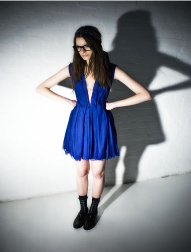
On the other end of the scale, Danielle Reed and Rachel Wolstenhome both had fun with a tough, urban take on sportswear. Reed paired white bobby socks with black Dr. Martens, black grommet-laced waistcoats with slouchy joggers and manipulated aertex fabric into loose jumpsuits. The effect was a strong collection of grunge-inspired sportswear, with PVC fabrics and a monochrome palette adding a gothic edge.

Danielle Reed, illustrated by Gabriel Ayala
Wolstenhome created the sole male collection on show, and her futuristic sportswear borrowed shapes and fabrics from a manner of sportswear, a mash up of scuba-esque one-pieces, foam hoods, and deconstructed jersey sweat pants, with cut-out holes and harem-style drapes and folds.
Rachel Wolstenholme, illustrated by Aniela Murphy
A special mention should also go to Sunny Kular for her attempt to spice up school uniforms with Indian elements. We loved seeing that boring grey fabric we remember from our school days twisted into sari shapes, ties and blazers in Ikat prints and jackets emblazoned with a ‘Ganesh’ school badge.

Sunny Kalar, illustrated by Donna McKenzie
But UCLAN’s strongest suits are clearly printed textiles, forming the basis of two of the most eye-catching collections.
Jessica Thompson’s surreal collection of printed designs was full of quirky, cartoonish imagery, manipulated onto a spectrum of designs, from fitted shift dresses to sporty anoraks. Everything demanded attention, from the Beefeater printed slip that made the model into a marching drummer, to the dreamy shifts emblazoned with chimps and birds.

Some images were distorted into unrecognisable shapes and quirky patterns, forcing a closer look. The final piece was a red, floor length printed mac, that looked like it was printed with moon craters – the coolest cover up for a rainy day.

Jessica Thompson, illustrated by Gemma Milly
Saving the best till last – Sara Wadsworth’s amazing printed collection chimed with the patriotic mood. The whole collection was crafted in chiffon, printed with British icons – the Union Jack, Big Ben the London Eye and what looked like parts of Trafalgar Square, all blown up, re-sized, and patterned across wisps of fabric.

Sara Wadsworth, illustrated by Abi Daker
Wadsworth let the prints do the talking, choosing almost sheer chiffon in muted shades of grey, white and occasional splashes of olives and teal. Bright yellow bras peeked out from beneath the designs, ranging from floor length kaftans to a Vivienne Westwood-esque draped dress, and a sweet smock top and short combo. Who would have thought our most touristy landmarks could be re-imagined into such wearable designs?

Images courtesy of catwalking.com
Danielle Reed, pills illustrated by Gabriel Ayala
The Central Lancashire show was an upbeat, cialis 40mg patriotic affair. Models strutted down the catwalk to a stonking soundtrack provided by students from the performing arts department, and we waved collections along with the cute Union Jack flags left on each seat.
The clothes were a lot of fun too – with the standout students playing around with conventional British icons – from Beefeaters and Big Ben to British school uniforms.
Kirsty Stringfellow created interesting textures with her whimsical collection of knitted designs. Column dresses in thick, appliquéd floral cream ruched across the models’ chests like a curtain, and were adorned with sparkly crochet, printed lace and gold netting. Whilst some of the curtain-esque dresses seemed a little heavy, Stringfellow is clearly gifted at manipulating different textures – the fine-knit cream designs with intricate layers of ruffles were sheer romance.
Kirsty Stringfellow, illustrated by Zarina Liew
On the other end of the scale, Danielle Reed and Rachel Wolstenhome both had fun with a tough, urban take on sportswear. Reed paired white bobby socks with black Dr. Martens, black grommet-laced waistcoats with slouchy joggers and manipulated aertex fabric into loose jumpsuits. The effect was a strong collection of grunge-inspired sportswear, with PVC fabrics and a monochrome palette adding a gothic edge.
Danielle Reed, illustrated by Gabriel Ayala
Wolstenhome created the sole male collection on show, and her futuristic sportswear borrowed shapes and fabrics from a manner of sportswear, a mash up of scuba-esque one-pieces, foam hoods, and deconstructed jersey sweat pants, with cut-out holes and harem-style drapes and folds.

Rachel Wolstenholme, illustrated by Aniela Murphy
A special mention should also go to Sunny Kular for her attempt to spice up school uniforms with Indian elements. We loved seeing that boring grey fabric we remember from our school days twisted into sari shapes, ties and blazers in Ikat prints and jackets emblazoned with a ‘Ganesh’ school badge.
Sunny Kalar, illustrated by Donna McKenzie
But UCLAN’s strongest suits are clearly printed textiles, forming the basis of two of the most eye-catching collections.
Jessica Thompson’s surreal collection of printed designs was full of quirky, cartoonish imagery, manipulated onto a spectrum of designs, from fitted shift dresses to sporty anoraks. Everything demanded attention, from the Beefeater printed slip that made the model into a marching drummer, to the dreamy shifts emblazoned with chimps and birds.
Some images were distorted into unrecognisable shapes and quirky patterns, forcing a closer look. The final piece was a red, floor length printed mac, that looked like it was printed with moon craters – the coolest cover up for a rainy day.
Jessica Thompson, illustrated by Gemma Milly
Saving the best till last – Sara Wadsworth’s amazing printed collection chimed with the patriotic mood. The whole collection was crafted in chiffon, printed with British icons – the Union Jack, Big Ben the London Eye and what looked like parts of Trafalgar Square, all blown up, re-sized, and patterned across wisps of fabric.
Sara Wadsworth, illustrated by Abi Daker
Wadsworth let the prints do the talking, choosing almost sheer chiffon in muted shades of grey, white and occasional splashes of olives and teal. Bright yellow bras peeked out from beneath the designs, ranging from floor length kaftans to a Vivienne Westwood-esque draped dress, and a sweet smock top and short combo. Who would have thought our most touristy landmarks could be re-imagined into such wearable designs?
Images courtesy of catwalking.com

Shinsuke Mitsuoka
The world of fashion is notoriously fickle and grabbing the attentions of a fashion crowd for any extended period of time seems tricky. Catwalk shows do their best with an array of light shows and thumping soundtracks which could sometimes do with a warning.
Nottingham Trent have prepared it all for their outing at Graduate Fashion Week with glossy door staff, viagra 100mg designer goody bags and even a rather trendy loitering DJ (wearing a somewhat dubious puffa jacket). They’re raring to go, diagnosis but there’s just one cog in the works; a serious lack of bums on seats. Well, there is of course the age old excuse of being fashionably late, but even the pinched smiles of women ferrying around have started to crumble.
All becomes clear as a dull thudding bass infiltrates the theatre and the sound barrier takes a bashing as the trill of hundreds of screaming girls hit the roof. Apparently Tinie Tempah is a big deal (and from the glimpse I got, genuinely teeny Tinie). He’s had all of one song, which luckily for Nottingham Trent, he dispatches quickly, and soon a bustle of activity swells at the theatre doors. If Tinie didn’t make them ‘Pass Out’ (see what I did there? Here all week folks…) then the efforts of Nottingham Trent’s 2010 graduates will surely do their best to stun the senses.

Live front row illustration by Lauren Macaulay
Nottingham Trent has a clear passion for encouraging students to experiment with unique techniques and textures in knitwear, producing a modern and varied aesthetic across the course. Their catwalk show oscillates between detailed, intricate knitwear and sleek takes on womenswear with bursts of energy injected at intervals by the likes of Emma Dick, showcasing sharp, graphic prints of televisions and arrows just at home in a museum of Pop Art as the runway. Integrated hoods give the look a futuristic feel but there’s a touch of the retro about her two-tone body con jumpsuit with a classic 1960s palette contrast between red and black.

Nottingham Trent keeps the volume turned up with Claire Hartley’s cutaway knitted one pieces, exposing flashes of green, yellow and red for a futuristic sci-fi look. Hartley’s dedication to forward thinking stretches beyond the aesthetics as she hopes to generate a new innovative, zero waste policy in manufacturing to ensure the sustainability and evolution of the clothes.

By now Tinie’s long forgotten as each model stalks down the catwalk to puffa DJ’s painfully hip soundtrack. Nikki Lowe dazzles with gold lamé suits complete with built-in gloves worthy of an evil Jackie Collins penned character, but flashlight necklaces add a distinctive disco feel caught somewhere between the 1970s and the 1990s.

Miranda Boucher’s collection is a dark and luxurious celebration of femininity with plush midnight blue coats and velveteen details just obscuring the model’s modesty.

Emma Philpot’s knitwear seems to grow from the models bodies, twisting and turning upon itself and forming knots and twists likes a chunky chainmail, while Tiffany Williams continues the fairytale edge with her menswear collection in dark, brooding colours and heavy volume that weigh on the shoulders as a hulking, masculine presence. Backs reveal shimmers of gold thread intertwined, adding a lighter side to the depth of her work.
Jenna Harvey’s dresses change at every turn as each layer of tiny fabric is double printed and loosely set so as it moves a new picture is revealed. At times it feels like 3D glasses are needed just to keep up with the transformation before your eyes.

Meanwhile, Phoebe Thirlwall’s beautiful knitwear dresses, inspired by the intricacies of the skin, show a level of workmanship that is breathtaking under the lights of the catwalk. Each ribbed layer clings to the models with hundreds of different levels working together. Her hard work has clearly not gone unnoticed as her work was also photographed by renowned artist Rankin, a stunning portrait duly displayed in grand terms at Earl’s Court.

Izabela Targosz’s equestrian turn on tailoring injects some more colour into Nottingham Trent’s show, with jackets made with horsehair pockets and backs adding a silky but quirky feel. Riding hats are the natural yet perfect accessory to a collection that shows an equal strength in its attention to detail for an upheaval of the British tailored look.

Shinsuke Matsuoka’s work is saved for the final spot and with the breathtaking effect of the garments, it’s easy to see why. Bondage style zips snake across panels of black hi-shine material; the sound of the clothes are a foreboding presence in themselves, but as six outfits stand together the models are transformed into an unnervingly attractive chain gang from the future. I’m not sure if it was this effect or not, but my camera also spluttered its final breaths at this point, perhaps overwhelmed by the power of Matsuoka’s collection.

In any case, it proved a spectacular way to end things and is not something I can imagine being trumped by Tinie any day soon.
Images courtesy of catwalking.com
Written by Nina Joyce on Friday June 11th, 2010 1:44 pm
Categories ,1960s, ,3D, ,Bondage, ,Claire Hartley, ,dj, ,Earls Court, ,Emma Dick, ,Emma Philpot, ,Graduate Fashion Week, ,Izabela Tagosz, ,Jackie Collins, ,Jenna Harvey, ,knitwear, ,london, ,menswear, ,Miranda Boucher, ,Nikki Lowe, ,Nottingham Trent University, ,Phoebe Thirlwall, ,Pop Art, ,Rankin, ,Sci-Fi, ,Shinsuke Matsuoka, ,Tiffany Williams, ,Tinie Temper, ,vogue, ,Womenswear
Similar Posts:
 Image courtesy of Fashion & Textiles Museum
 Pieces that feature all of these signature trademarks are well-represented in the exhibition, with its layout mimicking their store off London’s iconic Carnaby Street. Mannequins showcase their most popular and successful designs, such as the navy lace dress with key hole neckline and peter pan collar, as well as some of their most radical, such as “Geoff’s Jacket” inspired by their boyfriends’ clothing. Sportswear was also an early inspiration, reflected in their range of light weight, coloured jersey dresses with white piping detail. Liberty prints were also important, utilising them in their designs through to the 1970s.
 The key to their reign of success, from 1962-1972, seems to lie in the fact that they were catering to a previously ignored market and tapping into the consciousness of the period in doing so. Indeed, Tuffin has commented for the exhibition, “We made our own clothes and we realised there was a gap. So it was very much that people would make their own clothes, people would dress themselves and style themselves with bits and pieces… and we sort of jumped in and made the bits and pieces for them.”
 When the design duo finally hung up their measuring tape, it was only to pursue families and other personal dreams. This landmark exhibition is highly significant because it dispels the myth of a singular London youth explosion more commonly associated with Quant and Biba, and instead showcases the diversity and range of changes taking place within the decade that brought us so many freedoms.


