Amelia’s Magazine | Best of D&AD New Blood Illustration & Graphic Design Graduates 2012: part two

§New Blood graduate show 2012 -Andrew Duncan
New Blood graduate show 2012 -Andrew Duncan
Images by Andrew Duncan.

Continuing on from my introduction blog here’s the next load of design talent discovered at the D&AD New Blood show this year…

New Blood graduate show 2012 -Andrew Duncan
Andrew Duncan‘s NU(UN)CLEAR prints at the University of the West of England were an example of eye-catching screenprinting in colours that seem to be indicating a bit of a trend: mint green, neon orange and salmon pinks.

New Blood graduate show 2012 -Pete Adam
Pete Adam‘s calligraphic type updated the old with a beautifully loose feel.

New Blood graduate show 2012 -Philippa Lightburn
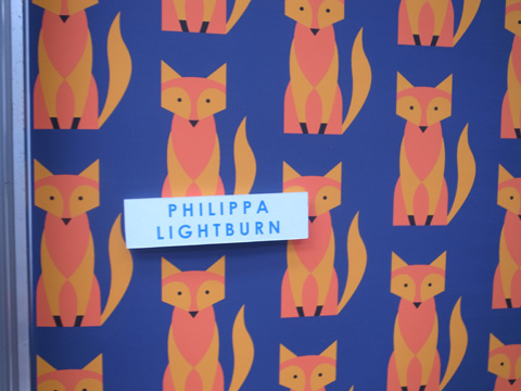
Stockport College showcased fabulous fox themed surface design from Philippa Lightburn.

Lisa rockall new blood
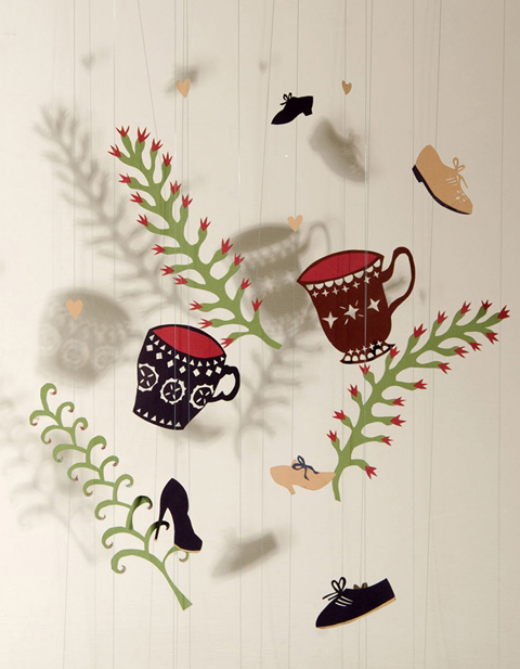
Lisa Rockall‘s dancing teacup paper cut outs were a lot of fun.

New Blood graduate show 2012 -Holly Mcloughlin
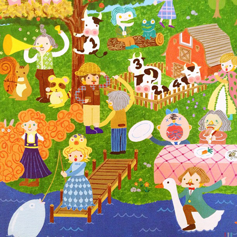
Holly Mcloughlin‘s mutant critters danced with babies and letters.

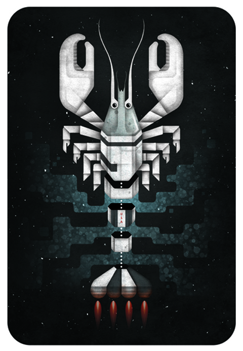
dominiquebyron_lobster-rocket-2-with-flames-in-shape-Dominique Byron
Dominique Byron‘s spaceship is modelled on a lobster: love it.

New Blood graduate show 2012 -Jack Johnson
Jack Johnson at Southampton Solent University imagined engineering minds for the future in this bold monochromatic poster.

New Blood graduate show 2012 -Carlie McGarity
The trend of futuristic collage was alive and strong with Carlie McGarity in Cerulean, a project interpreting how the brain responds to music.

New Blood graduate show 2012 -Rebecca Roberts
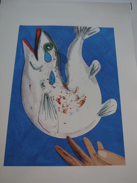
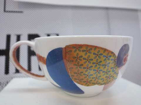
There was some impressive art at Sheffield Hallam University. I was captivated by ‘trout tickling‘ and teacups decorated with illustrations inspired by idioms by Rebecca Roberts, yet another Best New Blood.

New Blood graduate show 2012 -Chris Stanley
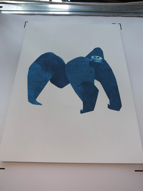
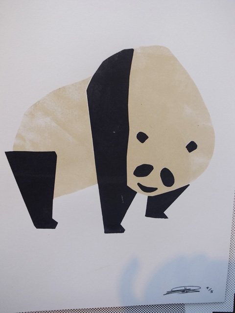
Chris Stanley‘s stylised animals would definitely appeal to small children.

New Blood graduate show 2012 -Maria Midttun
At The Arts University College at Bournemouth Maria Midttun‘s Oh-Damnit-Dagny was a strong series. Yet another New Blood winner.

New Blood graduate show 2012 -jack reynold
Jack Reynold‘s bold illustration of Fears and Loathing was a real eye grabber.

New Blood graduate show 2012 -Emily Hughes
Beautiful watercolour work by Hawaiian student Emily Hughes (love the pic of her as wee nipper meeting her illustration idol!)

New Blood graduate show 2012 -Natasha Durleyq
Love the little people and surreal vignettes in work by Natasha Durley.

New Blood graduate show 2012 -Kate Rowland
Beautifully realised spaceships and shells by Kate Rowland.

New Blood graduate show 2012 -Sally Hackett
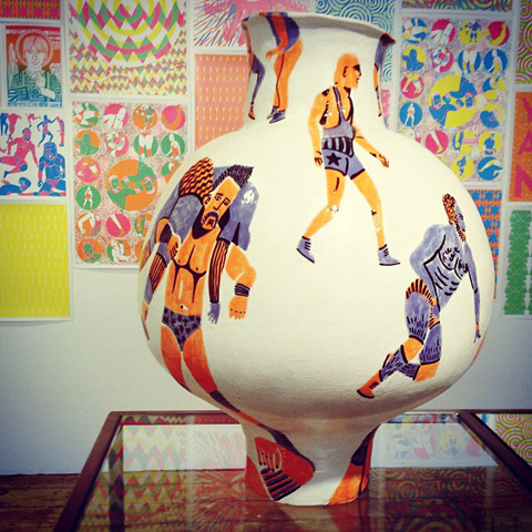
At University of Dundee Sally Hackett‘s Streaker Euphoria in porcelain was offset by abstract neon patterns.

New Blood graduate show 2012 -Ken Iizuka
At Southampton Solent University Ken Iizuka picked out elongated figures on a black background.

New Blood graduate show 2012 -Joe Staples
Joe Staples stuck to a simple colour palette for his bold hand made prints.

New Blood graduate show 2012 -William Brant
William Brant chose dinosaurs for a repeat pattern that appealed to my inner textile designer.

New Blood graduate show 2012 -Christopher Todd
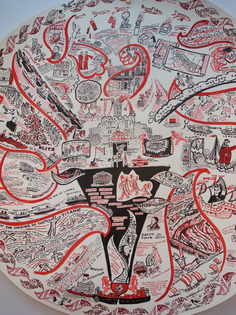
Christopher Todd won a Best New Blood award for his intricate rendition of the age of industrialisation.

New Blood graduate show 2012 -Holly Harwood
I liked Holly Harwood‘s painterly typography for a La Haine poster.

New Blood graduate show 2012 -Christopher Bayley
Beautiful illustrations of people by Christopher Bayley at the University of the Creative Arts in Maidstone.

New Blood graduate show 2012 -Amanda Jackson
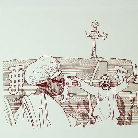
Dark drawings by Amanda Jackson at Hull School of Art and Design: piggy gamblers and a rabbit transforming in an eery wood.

There’s more to come… oh yes, I’m not done yet! Read my final New Blood review here.

Categories ,2012, ,Amanda Jackson, ,Andrew Duncan, ,Carlie McGarity, ,Cerulean, ,Christopher Bayley, ,Christopher Todd, ,D&AD, ,Dominique Byron, ,Emily Hughes, ,Fears and Loathing, ,Free Range, ,graduate, ,Graphic Design, ,Holly Harwood, ,Holly Mcloughlin, ,Hull School of Art and Design, ,illustration, ,Jack Johnson, ,Jack Reynold, ,Joe Staples, ,Ken Iizuka, ,La Haine, ,Lisa Rockall, ,Maidstone, ,Maria Midttun, ,New Blood, ,NU(UN)CLEAR, ,Oh-Damnit-Dagny, ,Pete Adam, ,Philippa Lightburn, ,Rebecca Roberts, ,review, ,Sally Hackett, ,Sheffield Hallam University, ,Southampton Solent University, ,Spitalfields Market, ,Stockport College, ,Streaker Euphoria, ,The Arts University College at Bournemouth, ,University of Dundee, ,University of the Creative Arts, ,University of the West of England, ,William Brant

Similar Posts:


Amelia’s Magazine | Bumf Collective: Things That Go Bumf In The Night

So what do you do after you’ve taken back the gown, viagra approved order after you’ve drunken all the champagne, seek there after your parents have cried as much as physically possible and you’ve uploaded all the pictures of your friends throwing their hats in the air onto Facebook? When you leave the warm bosom of your university institution after doing a creative degree what’s most important, page even more so than talent, (although that helps) is to surround yourself with likeminded individuals. This is something David Angus, Rafael Farias and Andrew Sunderland have kept in mind during their first year of university free existence. They all met at the Maidstone Campus of the University of the Creative Arts and have been working together under the name Bumf since they graduated.

How Bumf Collective works is that one member of the group sets a time limit and a rule and everyone makes a piece of work which must be viewable on the internet and not discussed until the project hand in. Rafael studied graphic design, Andy video media arts and Dave photography and media arts which means the work they show on the website is an interesting mix of the conceptual rule framework (1. Must be edible) and just brilliantly clever and simple design responses (a brain made out of bread titled Food for Thought)

bumf1.jpg

Food for Thought – Rafael Farias

“Basically we wanted to form a collective, but we have different ways of working. Raf is more graphic design based and I was more video and Dave is more photography so it wasn’t that we had a similar theme and we wanted to work together it’s that we wanted to make work separately almost against each other.” Andy tells me as we search for somewhere cheap (we are all struggling artists after all) to have a cup of tea in Bethnal Green where two out of three of them live.

They all admit to how hard they’ve found it since leaving full time education and with a big focus on photography and video for Dave and Andy lack of equipment is something they’ve struggled with.
“You instantly lose all facilities that you had, you lose your space to work in and it’s already harder. I was always in the dark room doing film and now most of the projects I do are digital and that’s annoying for me.”
“The one thing people say when you leave uni is to keep making work, you leave quite a structured environment. Coming out of university nobody cares about you.” It was from this realisation and the need to stop art from becoming “a kind of side project” because of the time demands of day-to-day life that Bumf was started.
The rules that govern the projects seem to have been implemented to make up for the loss of structure from leaving university. The rules can be anything from the fairly simple (the title must be Woman), to the more abstract (100 meters) and they increase every time. “We each start off doing a rule each and then we go onto two rules each and then three rules each and then we’re gonna keep going until we’re doing sixty rules each forever!” Andy tells me.

rafftype.jpg

Rafael Farias
Type-lace Typeface (Uppercase)

davetype.jpg

David Angus
Untitled (Flash)

However what’s interesting is how the rules have been manipulated by each artist to meet their own interests and to challenge each other.
“What I found interesting when I set that typeface challenge was to see what someone who doesn’t do graphic design would come up with. Like with the edible project, it was so that they couldn’t use a camera to see what would happen.”
For this project all the artists had to create a typeface with a single found object. Rafael having trained in graphic design obviously found the project easy, creating a visually pleasing yet fully working alphabet. Interestingly Dave still managed to gear his work to photography by using as his found object a camera flash. He also managed to use the photographic process by making a contact print out of food colouring for the ‘must be edible’ rule.
“I find that each of us manages to fight our own corner for our own discipline. These two are always slagging off graphic design so I’m always fighting my corner, so it’s interesting to see how we represent our own backgrounds.” Rafael tells me.

andyedible.jpg

Andrew Sunderland
Portion #1 (Pink/Green)

Daveedible.jpg

David Angus
5×4 contact on edible paper with food colouring

There are times though when the artists have been forced to completely change their practice, like the project in which the work couldn’t be anything manmade. With Andy and Dave relying heavily on video and stills cameras for their own practice they were forced to try something completely different. Dave turned guerrilla gardener with his East London turf work and Andy, in my favourite work from the website, documented bird pooh for the series Bird Made 1-6. It is in this way that the website becomes more than just a game and a way into making work and evolves into something that makes them challenge what ‘type’ of work they make and therefore what ‘type’ of artist they are.
“The thing that is almost annoying in art college is that there’s always this need to mould you into this polished artist. You get into a rut of making similar work and you have an idea but think if I do that it doesn’t look like any of my other work.”

andymanmade.jpg

Andrew Sunderland
Bird Made 1

raffmanmade.jpg

Rafael Farias
Stone Fruit Family (Cherry, Plum, Peach, Apricot, Nectarine)

They started the website because they naturally wanted to index the projects, but it’s fast become a reason in itself for making work. Despite art often being a sensory and tactile experience with Charles Saatchi using his website as an ‘interactive art gallery’, and Amelia’s Magazine now showcasing new talent online, your computer is becoming an acceptable way of seeing art work. I ask them whether showing their work in this way effects the making of it.
“I think about it a lot, that’s graphic design for you, it’s all about presentation. There are a lot of things we don’t do because it wouldn’t look good on the internet. No one’s done anything really sculptural because it wouldn’t translate well.” Rafael tells me.
“Well the internet is the whole reason for doing it and it’s quite interesting that we put in a rule at the end which is that if you make anything physical, like an object then the work is the image of it. If you make a sculpture obviously you can’t put it on the internet. We make these things but all of them are very temporary. The one that I did with the skittles in the end we ate them.” Says Andy.

The group don’t see Bumf as their main focus, the name itself meaning “waste and all these little things that you either pick up or you don’t”. Not that the projects are throwaway, just that with all the artists heavily into process, the outcome isn’t their main concern.
“I don’t think the projects are there to make an amazing piece of work, they’re good but it’s more something to keep your mind in a creative flow.” Says Dave.
”I see it as a creative bookmark so it’s something that might not be finished, but I’ll bookmark the idea for another project.” Rafael adds.

davecolour.png

David Angus
Red, Green, Blue

raffcolour.jpg

Rafael Farias
The Grass Is Always Greener (On The Other Side)

With our drinks empty and the boys needing to drop off work for an exhibition at BASH Studios I ask them if they have any advice for new graduates.
“Yeah keep making work!” Exclaims Andy. “Even if it’s bumf keep making it because it means keeping up that creative process. If you don’t make anything for a year it can be really hard to get that back. Follow the Bumf rules and send it us!”

A website and some friends is all you need to avoid falling into a black hole of obscurity, you heard it here first! To look at all Bumf projects past and future or to view the individual artist’s work, click the links to their websites.

Thumbnail: David Angus – East London Turf

Categories ,Bumf Collective, ,Graduate, ,Graphic Design, ,Mixed Media

Similar Posts:


Amelia’s Magazine | Call Me: Kingston University Illustration Degree Show 2014 Review

Kingston Uni Illustration degree show 2014 bee

I sadly missed the Middlesex and Westminster illustration degree shows – the former because no one reminded or invited me (despite copious coverage previously), the latter because I went all the way there and the main gallery entrance was closed (appaz I should have gone through the main building which I have never done before). Bummer.

Kingston Uni Illustration degree show 2014

Still, on the bright side, I got an actual paper proper invite in the post!!! From the lovely students at Kingston University, who are adept at promoting their always brilliant shows, this one cheekily titled Call Me. If only all soon-to-be graduates were as on it. Thankyou folks, it’s always appreciated.

Kingston Uni Illustration degree show 2014 animal

Kingston Uni Illustration degree show 2014 Oi

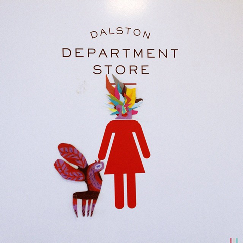
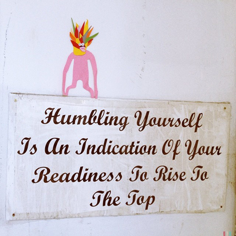
I love love loved the little creatures that were crawling all over the walls on the way down into the warehouse venue, Dalston Department Store, created by members of the Drawing Club.

Kingston Uni Illustration degree show 2014 Oi

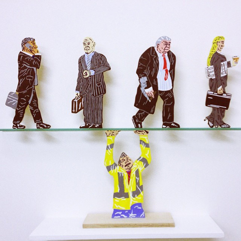
There were a lot of 3D illustrations on show, many emphasising the handmade. These city worker cutouts are by Josh Cole.

Hearin Kim wooden people - Kingston uni

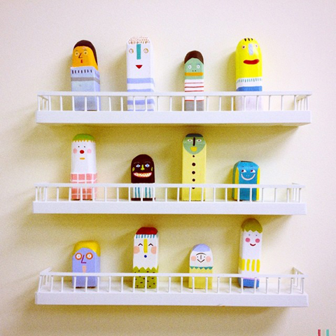
These endearing wooden people are by Hearin Kim.

Natalie Adkins fabric couple - Kingston uni

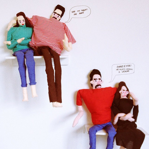
Natalie Adkins had opted for the sewing needle, creating these humorous fabric couples for an animation project.

Embroidery inspired by the digital age by Alice Stewart - Kingston uni

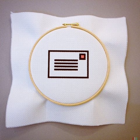
Alice Stewart exhibited embroidery inspired by the digital age, part of an interactive project where the object being made advances an online tutorial.

Amy Stevens Kingston uni

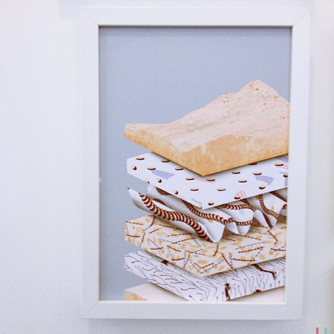
Mattress, rock formation or what? This strangely beautiful abstract work by Amy Stevens was actually inspired by a close study of the many layers that comprise the human skin. Very clever and provocative.

Carmel Atta - wooden figures, Kingston Uni

These colourful wooden sculptures are by Carmel Attia. What a great name!

Adventure Artist by Maddy Vian, Kingston uni

Maddy Vian had collaged a fantastical landscape for this Adventure Artist.

Wonky house by Harriet Phillips, Kingston uni

This wonky house by Harriet Phillips is part of an app she has designed for children, based on a pigeon called Pidge. Where can I sign up? Snarfle will love this!

Lino cut bird by Sam Stobbart, Kingston uni

Sam Stobbart created this large scale lino cut of a long legged bird.

Hiker girl by Jenny Lovlie, Kingston uni

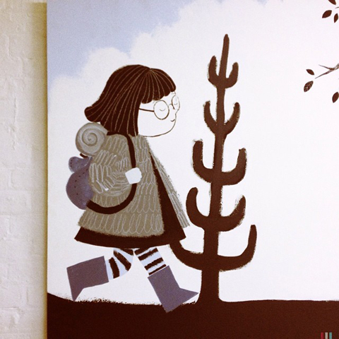
Jenny Lovlie’s hiker girl is Nora, the heroine in her children’s book.

China oddities by Jooyoung Ryu, Kingston uni

China oddities by Jooyoung Ryu were arranged in a frame on the wall like curios of old.

Jack Smith's monkey bikini catalogue, Kingston uni

Jack Smith‘s monkey bikini catalogue features another example of marvellous beasties, printed in awesome primaries.

Stephanie Unger, Kingston uni

Stephanie Unger ceramics, Kingston uni

Got ya! Fun prints by Stephanie Unger depict humans tackling scary animals… reiterated in ceramic versions.

Ji Young Estelle Woo, Kingston uni

Ji Young Estelle Woo painted an imaginary world on this plate, before shattering the illusion in real life.

Jessica Tickless Roofless - Kingston uni

Roofless by Jessica Tickle is a rhyming picture book for children about being homeless, featuring all sorts of engaging characters.

Assa Ariyoshi, Kingston uni

I super adored work by Assa Ariyoshi, who combines an 80s aesthetic with futurist curves and a lively colour palette to create a confident and humorous style all her own. If my google search is correct then Assa is also a successful model; so both beautiful and talented. Definitely one to watch.

I didn’t have time to watch the animations but I am looking forward to watching the videos at home; thank you for the DVD!

Categories ,2014, ,Adventure Artist, ,Alice Stewart, ,Amy Stevens, ,Assa Ariyoshi, ,Call Me, ,Carmel Attia, ,Dalston Department Store, ,Drawing Club, ,graduate, ,Harriet Phillips, ,Hearin Kim, ,illustration, ,Jack Smith, ,Jenny Lovlie, ,Jessica Tickle, ,Ji Young Estelle Woo, ,Jooyoung Ryu, ,Josh Cole, ,Kingston University, ,Maddy Vian, ,MIddlesex Univerisity, ,Natalie Adkins, ,Nora, ,Pidge, ,Roofless, ,Sam Stobbart, ,Stephanie Unger, ,University of Westminster

Similar Posts:


Amelia’s Magazine | Camberwell College of Arts: Well Said Illustration Degree Show 2013 Review

Well Said illustration show brochures
Nigh on a month ago the latest batch of talented graduates from the Camberwell College of Arts illustration degree course put on their standalone show at The Rag Factory, a big white warehouse space that offers the perfect blank canvas. It also happens to be fantastically close to my home, making it a super easy destination for me. I was sad to have missed the Brighton University illustration degree show this year due to a family break in Pembrokeshire, but since the Car Park Show was held in deepest darkest Fulham it’s doubtful I would have made it anyway. There’s a reason why so many shows are held in East London: a huge amount of creatives live and work around here, and there are an awful lot of graduate shows to see.

Camberwell illustration Well Said show 2013 invite
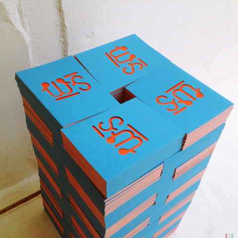
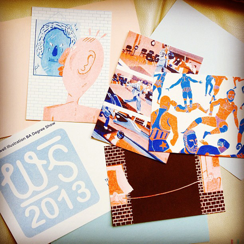
The students from Well Said show ensured I knew the dates of their exhibition by sending me this delightful illustration package: there’s nothing like a tangible invite to build excitement. And as ever, they had produced a wonderful promotional book, seen above attractively piled on the floor. Predictably, this was a very strong showing from one of the best illustration courses in the country. Here’s what I found.

Sophia Parvinmehr camberwell
This exploration of the nervous system is by Sophia Parvinmehr.

Yiran Huang Camberwell
Yiran Huang Camberwell close up
Yiran Huang Camberwell business cards
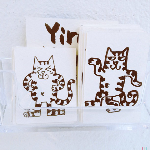
Yiran Huang made this huge mandala type pattern that looks equally good in close up. She had also made possibly the best business cards ever: hand drawn cats, each in different poses. Love them. May have taken three.

Camberwell installation
Ruta Daubure
This brilliantly oddball installation is by Ruta Daubure, whose optical set designs for opera act like a strange human camouflage.

Carim Nahaboo bumble bee
This beautifully drawn bumble bee is by Carim Nahaboo. Bees are everywhere this year, which means they are obviously on people’s minds. Given the number of dead bees I’ve seen recently, this is definitely a good thing.

Siwei Tao- Schiz Camberwell
Siwei Tao Camberwell
Schiz by Siwei Tao is wonderfully odd, as is this strange image of detached arms in pots…

Lauren Doughty, Man from the South by Roald Dahl
Lauren Doughty
I love this narrative painted illustration by Lauren Doughty, based on Man from the South by Roald Dahl. Her work is just so fabulously sploshy, and I so dig that 80s influence on the colour palette.

Susan Calvert installation
Susie Calvert
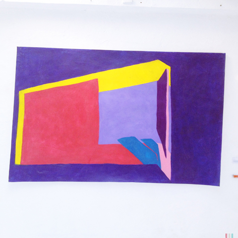
Susan Calvert made this installation of wonderful painted wooden landscapes, which she showed alongside this gigantic oil pastel abstract.

Sam Marot 'British Empire' prints
lion poster image by Sam Marot
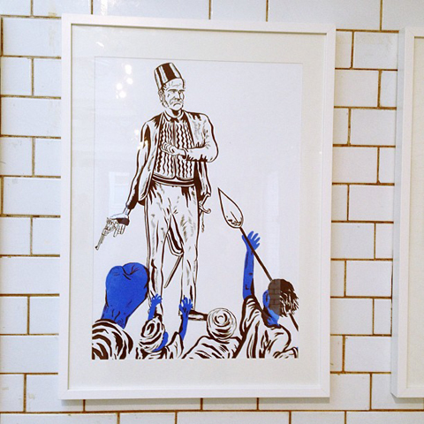
Sam Marot‘s ‘British Empire‘ prints tackled a thorny subject to produce some interesting work, including this striking lion poster.

Footballer by jack_sachs
Hello sexy lady! Jack Sachs
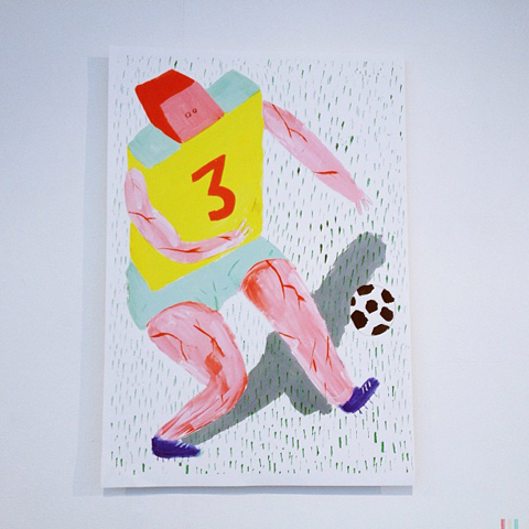
The jovial abstracted footballer is by Jack Sachs, as is this ‘sexy lady’ which mimics the typical pose of a page three lass. When I posted this image on instagram it caused a bit of a stir; but I don’t find Jack’s depiction offensive or irritating, rather it appears to question a fixation with everyday sexualisation in a knowing and humorous way.

Wedges and Ledges by Rich de Courcy south bank
Wedges and Ledges by Rich de Courcy
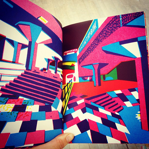
I absolutely adored this brilliant screen printed book by Rich de Courcy. Wedges and Ledges was inspired by a love of skateboarding in London, paying homage to much loved places such as the threatened skatepark under the brutalist South Bank arches, now immortalised in bright colours (sign the petition to save it here). I so wanted to take one of these little beauties home.

Cosmic Omelette mobile by Saara Karppinen
This Cosmic Omelette mobile by Saara Karppinen was inspired by a Finnish creation myth.

crafty display by Kim smith happy
Kim Smith of Art Equals Happy had put together a beautiful crafty display that ably showcased her beautiful handspun wares. I especially love her hand-written watercolour typography. See more on her website here.

embroidery with frogs by Titi Lee. London Underground
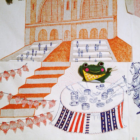
Upstairs I encountered an astonishing and large embroidered appliqué covered with jocular frogs by Titi Lee (this is a close up). This surreal vignette is based on her experience of using the London Underground.

Jessica Weijia Zhang - based on Edward Lear
Jessica Weijia Zhang had produced this slightly crackers illustration based on poems by Edward Lear.

Lucy Swan religious inspired illustrations
Lucy Swan‘s intricate line illustrations tackled the uncomfortable relationship between religion and money.

Magical eye print by Freya Faulkner
Pottery by Freya Faulkner
And finally, this magical eye print was one of an awe inspiring display put together by Freya Faulkner, titled Annihilation is Nigh: Cult of the Big Bang. Her rhythmical artwork and fabulous illustrated ceramics reflect the warring factions of matter and antimatter in brilliant narrative style.

My last graduate review will feature the artwork of University Arts Bournemouth Illustration students; coming soon! Remember, most of my creative finds can be viewed first if you follow my instagram feed.

Categories ,2013, ,Annihilation is Nigh: Cult of the Big Bang, ,Art Equals Happy, ,Brick Lane, ,Brighton University, ,British Empire, ,Camberwell College of Arts, ,Car Park Show, ,Carim Nahaboo, ,Cosmic Omelette, ,Degree Show, ,Edward Lear, ,Freya Faulkner, ,graduate, ,illustration, ,Jack Sachs, ,Jessica Weijia Zhang, ,Kim Smith, ,Lauren Doughty, ,Lucy Swan, ,Man from the South, ,review, ,Rich de Courcy, ,Roald Dahl, ,Ruta Daubure, ,Saara Karppinen, ,Sam Marot, ,Schiz, ,Siwei Tao, ,Sophia Parvinmehr, ,south bank, ,Susan Calvert, ,Susie Calvert, ,the rag factory, ,Titi Lee, ,University Arts Bournemouth, ,Wedges and Ledges, ,Well Said, ,Yiran Huang

Similar Posts:


Amelia’s Magazine | Camberwell College of Arts: Well Said Illustration Degree Show 2013 Review

Well Said illustration show brochures
Nigh on a month ago the latest batch of talented graduates from the Camberwell College of Arts illustration degree course put on their standalone show at The Rag Factory, a big white warehouse space that offers the perfect blank canvas. It also happens to be fantastically close to my home, making it a super easy destination for me. I was sad to have missed the Brighton University illustration degree show this year due to a family break in Pembrokeshire, but since the Car Park Show was held in deepest darkest Fulham it’s doubtful I would have made it anyway. There’s a reason why so many shows are held in East London: a huge amount of creatives live and work around here, and there are an awful lot of graduate shows to see.

Camberwell illustration Well Said show 2013 invite
The students from Well Said show ensured I knew the dates of their exhibition by sending me this delightful illustration package: there’s nothing like a tangible invite to build excitement. And as ever, they had produced a wonderful promotional book, seen above attractively piled on the floor. Predictably, this was a very strong showing from one of the best illustration courses in the country. Here’s what I found.

Sophia Parvinmehr camberwell
This exploration of the nervous system is by Sophia Parvinmehr.

Yiran Huang Camberwell
Yiran Huang Camberwell close up
Yiran Huang Camberwell business cards
Yiran Huang made this huge mandala type pattern that looks equally good in close up. She had also made possibly the best business cards ever: hand drawn cats, each in different poses. Love them. May have taken three.

Camberwell installation
Ruta Daubure
This brilliantly oddball installation is by Ruta Daubure, whose optical set designs for opera act like a strange human camouflage.

Carim Nahaboo bumble bee
This beautifully drawn bumble bee is by Carim Nahaboo. Bees are everywhere this year, which means they are obviously on people’s minds. Given the number of dead bees I’ve seen recently, this is definitely a good thing.

Siwei Tao- Schiz Camberwell
Siwei Tao Camberwell
Schiz by Siwei Tao is wonderfully odd, as is this strange image of detached arms in pots…

Lauren Doughty, Man from the South by Roald Dahl
Lauren Doughty
I love this narrative painted illustration by Lauren Doughty, based on Man from the South by Roald Dahl. Her work is just so fabulously sploshy, and I so dig that 80s influence on the colour palette.

Susan Calvert installation
Susie Calvert
Susan Calvert made this installation of wonderful painted wooden landscapes, which she showed alongside this gigantic oil pastel abstract.

Sam Marot 'British Empire' prints
lion poster image by Sam Marot
Sam Marot‘s ‘British Empire‘ prints tackled a thorny subject to produce some interesting work, including this striking lion poster.

Footballer by jack_sachs
Hello sexy lady! Jack Sachs
The jovial abstracted footballer is by Jack Sachs, as is this ‘sexy lady’ which mimics the typical pose of a page three lass. When I posted this image on instagram it caused a bit of a stir; but I don’t find Jack’s depiction offensive or irritating, rather it appears to question a fixation with everyday sexualisation in a knowing and humorous way.

Wedges and Ledges by Rich de Courcy south bank
Wedges and Ledges by Rich de Courcy
I absolutely adored this brilliant screen printed book by Rich de Courcy. Wedges and Ledges was inspired by a love of skateboarding in London, paying homage to much loved places such as the threatened skatepark under the brutalist South Bank arches, now immortalised in bright colours (sign the petition to save it here). I so wanted to take one of these little beauties home.

Cosmic Omelette mobile by Saara Karppinen
This Cosmic Omelette mobile by Saara Karppinen was inspired by a Finnish creation myth.

crafty display by Kim smith happy
Kim Smith of Art Equals Happy had put together a beautiful crafty display that ably showcased her beautiful handspun wares. I especially love her hand-written watercolour typography. See more on her website here.

embroidery with frogs by Titi Lee. London Underground
Upstairs I encountered an astonishing and large embroidered appliqué covered with jocular frogs by Titi Lee (this is a close up). This surreal vignette is based on her experience of using the London Underground.

Jessica Weijia Zhang - based on Edward Lear
Jessica Weijia Zhang had produced this slightly crackers illustration based on poems by Edward Lear.

Lucy Swan religious inspired illustrations
Lucy Swan‘s intricate line illustrations tackled the uncomfortable relationship between religion and money.

Magical eye print by Freya Faulkner
Pottery by Freya Faulkner
And finally, this magical eye print was one of an awe inspiring display put together by Freya Faulkner, titled Annihilation is Nigh: Cult of the Big Bang. Her rhythmical artwork and fabulous illustrated ceramics reflect the warring factions of matter and antimatter in brilliant narrative style.

My last graduate review will feature the artwork of University Arts Bournemouth Illustration students; coming soon! Remember, most of my creative finds can be viewed first if you follow my instagram feed.

Categories ,2013, ,Annihilation is Nigh: Cult of the Big Bang, ,Art Equals Happy, ,Brick Lane, ,Brighton University, ,British Empire, ,Camberwell College of Arts, ,Car Park Show, ,Carim Nahaboo, ,Cosmic Omelette, ,Degree Show, ,Edward Lear, ,Freya Faulkner, ,graduate, ,illustration, ,Jack Sachs, ,Jessica Weijia Zhang, ,Kim Smith, ,Lauren Doughty, ,Lucy Swan, ,Man from the South, ,review, ,Rich de Courcy, ,Roald Dahl, ,Ruta Daubure, ,Saara Karppinen, ,Sam Marot, ,Schiz, ,Siwei Tao, ,Sophia Parvinmehr, ,south bank, ,Susan Calvert, ,Susie Calvert, ,the rag factory, ,Titi Lee, ,University Arts Bournemouth, ,Wedges and Ledges, ,Well Said, ,Yiran Huang

Similar Posts:


Amelia’s Magazine | A review of the Tarradiddle Exhibition


Illustration by Gemma Milly of Zara Gorman’s Millinery.

Over the last few years the RCA’s MA Fashion course has quietly been producing a series of designers who have reinvented their particular disciplines – from menswear designers James Long and Katie Eary to womenswear’s Michael van der Ham, page Erdem and Holly Fulton (whose influence could already be seen on the Bournemouth catwalk). All of whom (except Erdem ) subsequently showed at London Fashion Week via Lulu Kennedy’s Fashion East.

The RCA MA course actually consists of several different courses from Millinery (a course of one) in which Zara Gorman showed her exquisitely shaped hats…

Illustration by Katie Harvey

to Womenswear and Menswear knit, troche accessories, nurse shoes and of course Womenswear and Menswear. The press release listed the words of inspiration that described the various elements of design the graduates of 2010 presented. It was slightly disconcerting to see the world ‘Chav’ being used as an inspiration, a word created by the press to demean those that wore Burberry Check head to toe (Pre Christopher Bailey Hello Danielle Westbrook) it’s connotations appear to be similar to Noveau Rich – those with money and no taste.

A look celebrated and parodied by Ab Fab’s Eddie and her love for trends and ‘hot’ designers, It’s impossible to not know she’s wearing a ‘designer’. Astrid Andersen plays with fashion’s ability to celebrate and pastiche it’s own brand at the same time on the same item (think LV’s monogrammed bags or Moschino Jeans). Her menswear is certainly not forgettable with its construction of the base elements of sportswear. Nor was Courtney McWilliams’s take on casual wear in which the t-shirts and jackets proudly beared that particularly English symbol: the pit-bull.

Illustration by Joseph Keirs

This was an incredible exhibition of the craft, research and invention that is currently occurring within the Fashion Department of the RCA.

Menswear designer Trine Jensen presented breathtaking sweaters embroided with charms (as in bracelet) to hoops.

Victoria Stone’s cut up shirts… Illustration By Marnie Hollande

Sam McCoach’s tubular womenswear knit Illustration by Lesley Barnes

Poppy Cartwright’s white PVC collection produced fantastic shapes, her combination of high shine against the matt fabric embellished through the subtle addition of white embroidery.

All illustrations by Naomi Law

Frances Convey’s colour and shapes

Illustration by Katie Harvey

Yuri Yuferev cages presented dramatic feminine shapes harden through the materials positioning around the body.

Illustration by Lesley Barnes

The monochrome creped collection by Cecile Bahnsen came complete with 1990′s inspired sportswear jackets. Elements of grunge reappeared through the designers choice of length – often the dresses hang tightly around the ankle. Flashes of Amber from clueless appear with the presentation of the Fez hat. It’s that time already. The revival of the 1990′s.

Illustration by Marnie Hollande

Bahnsen’s graphic monochrome was interspersed with cut out pieces was softened through the pastel pink colouring.

This is but a small selection from the class of 2010, the more this reviewer revisits the look book accompanying the show the more previously unnoticed details emerge from these young designers collections.

Illustration by Gemma Milly of Zara Gorman’s Millinery.

Over the last few years the RCA’s MA Fashion course has quietly been producing a series of designers who have reinvented their particular disciplines – from menswear designers James Long and Katie Eary to womenswear’s Michael van der Ham, this Erdem and Holly Fulton (whose influence could already be seen on the Bournemouth catwalk). All of whom (except Erdem ) subsequently showed at London Fashion Week via Lulu Kennedy’s Fashion East.

The RCA MA course actually consists of several different courses from Millinery (a course of one) in which Zara Gorman showed her exquisitely shaped hats constructed from a combination of leather, purchase wood and plastic.

Illustration by Katey Harvey

to knitwear, accessories, shoes and of course Womenswear and Menswear. The press release listed the words of inspiration that described the various elements of design the graduates of 2010 presented. It was slightly disconcerting to see the world ‘Chav’ being used as an inspiration, a word created by the press to demean those that wore Burberry Check head to toe (Pre Christopher Bailey Hello Danielle Westbrook) it’s connotations appear to be similar to Noveau Rich – those with money and no taste.

A look celebrated and parodied by Ab Fab’s Eddie and her love for trends and ‘hot’ designers, It’s impossible to not know she’s wearing a ‘designer’. Astrid Andersen plays with fashion’s ability to celebrate and pastiche it’s own brand at the same time on the same item (think LV’s monogrammed bags or Moschino Jeans). Her menswear is certainly not forgettable with its construction of the base elements of sportswear. Nor was Courtney McWilliams’s take on casual wear in which the t-shirts and jackets proudly beared that particularly English symbol: the pit-bull.

Illustration by Joseph Keirs

This was an incredible exhibition of the craft, research and invention that is currently occurring within the Fashion Department of the RCA.

Menswear designer Trine Jensen presented breathtaking sweaters embroided with charms (as in bracelet) to hoops.

Victoria Stone’s cut up chiffon shirts in conjunction with her oversized suits presented a more masculine take on womenswear, a look for those inspired by Woody Allen’s Annie Hall Illustration By Marnie Hollande

Sam McCoach’s tubular womenswear knit sashed down the catwalk. Illustration by Lesley Barnes

The ankle grazing dresses set off by the rounded shapes of the graphic coats. The collection was muted accessoried with tubular jewellery and flat shoes.

Poppy Cartwright’s white PVC collection produced fantastic shapes, her combination of high shine against the matt fabric embellished through the subtle addition of white embroidery.

All illustrations by Naomi Law

Frances Convey’s colour and shapes

Illustration by Katie Harvey

Yuri Yuferev cages presented dramatic feminine shapes harden through the materials positioning around the body.

Illustration by Lesley Barnes

The monochrome creped collection by Cecile Bahnsen came complete with 1990′s inspired sportswear jackets. Elements of grunge reappeared through the designers choice of length – often the dresses hang tightly around the ankle. Flashes of Amber from clueless appear with the presentation of the Fez hat. It’s that time already. The revival of the 1990′s.

Illustration by Marnie Hollande

Bahnsen’s graphic monochrome was interspersed with cut out pieces was softened through the pastel pink colouring.

This is but a small selection from the class of 2010, an almost impossible decision to make, as the more this reviewer revisited the show’s look book, previously unnoticed details consistently emerge from these young designers collections.

Illustration by Gemma Milly of Zara Gorman’s Millinery.

Over the last few years the RCA’s MA Fashion course has quietly been producing a series of designers who have reinvented their particular disciplines – from menswear designers James Long and Katie Eary to womenswear’s Michael van der Ham, page Erdem and Holly Fulton (whose influence could already be seen on the Bournemouth catwalk). All of whom (except Erdem ) subsequently showed at London Fashion Week via Lulu Kennedy’s Fashion East.

The RCA MA course actually consists of several different courses from Millinery (a course of one) in which Zara Gorman showed her exquisitely shaped hats constructed from a combination of leather, approved wood and plastic.

Illustration by Katey Harvey

to knitwear, accessories, shoes and of course Womenswear and Menswear. The press release listed the words of inspiration that described the various elements of design the graduates of 2010 presented. It was slightly disconcerting to see the world ‘Chav’ being used as an inspiration, a word created by the press to demean those that wore Burberry Check head to toe (Pre Christopher Bailey Hello Danielle Westbrook) it’s connotations appear to be similar to Noveau Rich – those with money and no taste.

A look celebrated and parodied by Ab Fab’s Eddie and her love for trends and ‘hot’ designers, It’s impossible to not know she’s wearing a ‘designer’. Astrid Andersen plays with fashion’s ability to celebrate and pastiche it’s own brand at the same time on the same item (think LV’s monogrammed bags or Moschino Jeans). Her menswear is certainly not forgettable with its construction of the base elements of sportswear. Nor was Courtney McWilliams’s take on casual wear in which the t-shirts and jackets proudly beared that particularly English symbol: the pit-bull.

Illustration by Joseph Keirs

This was an incredible exhibition of the craft, research and invention that is currently occurring within the Fashion Department of the RCA.

Menswear designer Trine Jensen presented breathtaking sweaters embroided with charms (as in bracelet) to hoops.

Victoria Stone’s cut up chiffon shirts in conjunction with her oversized suits presented a more masculine take on womenswear, a look for those inspired by Woody Allen’s Annie Hall Illustration By Marnie Hollande

Sam McCoach’s tubular womenswear knit sashed down the catwalk. Illustration by Lesley Barnes

The ankle grazing dresses set off by the rounded shapes of the graphic coats. The collection was muted accessoried with tubular jewellery and flat shoes.

Poppy Cartwright’s white PVC collection produced fantastic shapes, her combination of high shine against the matt fabric embellished through the subtle addition of white embroidery.

All illustrations by Naomi Law

Frances Convey’s colour and shapes were a moment of joy, continuing the rounded shoulder shape of the jacket currently popular.

Illustration by Katie Harvey

The monochrome creped collection by Cecile Bahnsen came complete with 1990′s inspired sportswear jackets. Elements of grunge reappeared through the designers choice of length – often the dresses hang tightly around the ankle. Flashes of Amber from clueless appear with the presentation of the Fez hat. It’s that time already. The revival of the 1990′s.

Illustration by Marnie Hollande

Bahnsen’s graphic monochrome was interspersed with cut out pieces was softened through the pastel pink colouring.

Yuri Yufere presented dramatic feminine shapes harden through the materials cage like positioning around the body, the collection also included softer pieces of block patterned dresses complete with see through jacket.

Illustration by Lesley Barnes

This is but a small selection from the class of 2010, an almost impossible decision to make, as the more this reviewer revisited the show’s look book, previously unnoticed details consistently emerge from these young designers collections.

Illustration by Gemma Milly of Zara Gorman’s Millinery.

Over the last few years the RCA’s MA Fashion course has quietly been producing a series of designers who have reinvented their particular disciplines – from menswear designers James Long and Katie Eary to womenswear’s Michael van der Ham, clinic Erdem and Holly Fulton (whose influence could already be seen on the Bournemouth catwalk). All of whom (except Erdem ) subsequently showed at London Fashion Week via Lulu Kennedy’s Fashion East.

The RCA MA course actually consists of several different courses from Millinery (a course of one) in which Zara Gorman showed her exquisitely shaped hats constructed from a combination of leather, wood and plastic.

Illustration by Katey Harvey

to knitwear, accessories, shoes and of course Womenswear and Menswear. The press release listed the words of inspiration that described the various elements of design the graduates of 2010 presented. It was slightly disconcerting to see the world ‘Chav’ being used as an inspiration, a word created by the press to demean those that wore Burberry Check head to toe (Pre Christopher Bailey Hello Danielle Westbrook) it’s connotations appear to be similar to Noveau Rich – those with money and no taste.

A look celebrated and parodied by Ab Fab’s Eddie and her love for trends and ‘hot’ designers, It’s impossible to not know she’s wearing a ‘designer’. Astrid Andersen plays with fashion’s ability to celebrate and pastiche it’s own brand at the same time on the same item (think LV’s monogrammed bags or Moschino Jeans). Her menswear is certainly not forgettable with its construction of the base elements of sportswear. Nor was Courtney McWilliams’s take on casual wear in which the t-shirts and jackets proudly beared that particularly English symbol: the pit-bull.

Illustration by Joseph Keirs

This was an incredible exhibition of the craft, research and invention that is currently occurring within the Fashion Department of the RCA.

Menswear designer Trine Jensen presented breathtaking sweaters embroided with charms (as in bracelet) to hoops.

Victoria Stone’s cut up chiffon shirts in conjunction with her oversized suits presented a more masculine take on womenswear, a look for those inspired by Woody Allen’s Annie Hall Illustration By Marnie Hollande

Sam McCoach’s tubular womenswear knit sashed down the catwalk. Illustration by Lesley Barnes

The ankle grazing dresses set off by the rounded shapes of the graphic coats. The collection was muted accessoried with tubular jewellery and flat shoes.

Poppy Cartwright’s white PVC collection produced fantastic shapes, her combination of high shine against the matt fabric embellished through the subtle addition of white embroidery.

All illustrations by Naomi Law

Frances Convey’s colour and shapes were a moment of joy, continuing the rounded shoulder shape of the jacket currently popular.

Illustration by Katie Harvey

The monochrome creped collection by Cecile Bahnsen came complete with 1990′s inspired sportswear jackets. Elements of grunge reappeared through the designers choice of length – often the dresses hang tightly around the ankle. Flashes of Amber from clueless appear with the presentation of the Fez hat. It’s that time already. The revival of the 1990′s.

Illustration by Marnie Hollande

Bahnsen’s graphic monochrome was interspersed with cut out pieces was softened through the pastel pink colouring.

Yuri Yufere presented dramatic feminine shapes harden through the materials cage like positioning around the body, the collection also included softer pieces of block patterned dresses complete with see through jacket.

Illustration by Lesley Barnes

This is but a small selection from the class of 2010, an almost impossible decision to make, as the more this reviewer revisited the show’s look book, previously unnoticed details consistently emerge from these young designers collections.
Lauren-Mortimer-Kids-With-Guns
Kids With Guns by Lauren Mortimer.

Last week saw the opening of Tarradiddle, viagra order an exhibition showcasing the combined talents of nine artists of the recently founded all-female collective ‘Martha’, each exploring an experimental mode of story-telling through their work. The private view took place on 7th June 2010 opposite the Hackney City Farm in London’s East End, and saw the pop-up gallery space full to bursting with people over two floors who came for an eclectic mix of art (and the amazing hand made biscuits!). There was a real collective feel to the show as the works themselves sat in harmony alongside one another, a variety of mediums from paintings, illustration, through video and sculpture.

Sorcha-O'brien-open-closed
Open Closed by Sorcha O’brien.

I got a real sense of a dark, almost menacing undercurrent throughout this exhibition with a subtext to each piece that I’m keen to discover. What I found infectious was the way this tone is transformed into an uplifting experience right through the artwork on show.

Lauren-Mortimer-Swing-Cannon
Swing Cannon by Lauren Mortimer.

Upstairs had work ranging from the beautifully playful, yet disturbing illustrations of Lauren Mortimer depicting children in typical childhood scenarios with a sinister twist, her subject’s childhood naivety contrasting brilliantly with the haunting, ethereal subjects of Linda Hemmersbach’s paintings. Zosienka Gibb’s work continued in a similar character driven vain with a series of portraits depicting characters from ‘The Master and the Margarita’, the novel by Mikhail Bulgakov, her images smattered with traces of symbolism and influenced by an African, British and Eastern European childhood.

Linda-Hemmersbach
Art by Linda Hemmersbach.
Zosia-Gibbs
Work from Zosia Gibbs.

I found Marina Rees’ work captivating, adding variety and depth to the show through a combination of sculpture and images made using a host of unusual natural materials, that examine the human relationship with animals.

Marina-Rees-polar-mask
Polar Mask by Marina Rees.

The lower level was dedicated entirely to moving image, and was split between the work of Jade Mortimer and Sarah Blaszczok. Jade’s work dominated the centre of the room with set pieces accompanying a sumptuously shot film depicting two character’s mysteriously ominous encounter, based around some unique pistol shaped decanters marketed in the 1960’s by Avon. Sarah’s film was similarly intriguing with it’s wordless narrative showing events unfold as the characters carry out mundane and repeated acts, the result was in equal parts both sinister and ridiculous.

Jade-Mortimer-New-World
Jade-Mortimer-New-World-still
New World by Jade Mortimer.

The show’s biggest appeal lay in the sense of an unspoken story being told throughout the exhibition, and an incentive to pay close attention to all the work that was on show. My own desire to explore what I saw here stemmed not only from a visceral reaction to the art itself, but to make my own sense of the ambiguity within each piece. It was an exhibition cohesive in themes and ideas, and was undoubtedly a rewarding overall show. The word Tarradiddle means a concocted story or fib, and it’s definitely one I whole heartedly recommend trying to debunk.

Tarradiddle-exhibition

Categories ,Arts Collective, ,East End, ,exhibition, ,graduate, ,Hackney City Farm, ,Jade Mortimer, ,Lauren Mortimer, ,Linda Hemmersbach, ,Marina Rees, ,Martha, ,Mikhail Bulgakov, ,Sarah Blaszczok, ,Tarradiddle, ,Zosia Gibbs, ,Zosienka Gibbs

Similar Posts: