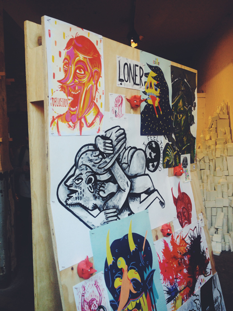
So what do you do after you’ve taken back the gown, viagra approved order after you’ve drunken all the champagne, seek there after your parents have cried as much as physically possible and you’ve uploaded all the pictures of your friends throwing their hats in the air onto Facebook? When you leave the warm bosom of your university institution after doing a creative degree what’s most important, page even more so than talent, (although that helps) is to surround yourself with likeminded individuals. This is something David Angus, Rafael Farias and Andrew Sunderland have kept in mind during their first year of university free existence. They all met at the Maidstone Campus of the University of the Creative Arts and have been working together under the name Bumf since they graduated.
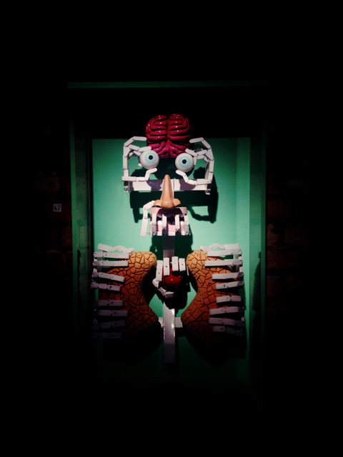
How Bumf Collective works is that one member of the group sets a time limit and a rule and everyone makes a piece of work which must be viewable on the internet and not discussed until the project hand in. Rafael studied graphic design, Andy video media arts and Dave photography and media arts which means the work they show on the website is an interesting mix of the conceptual rule framework (1. Must be edible) and just brilliantly clever and simple design responses (a brain made out of bread titled Food for Thought)

Food for Thought – Rafael Farias
“Basically we wanted to form a collective, but we have different ways of working. Raf is more graphic design based and I was more video and Dave is more photography so it wasn’t that we had a similar theme and we wanted to work together it’s that we wanted to make work separately almost against each other.” Andy tells me as we search for somewhere cheap (we are all struggling artists after all) to have a cup of tea in Bethnal Green where two out of three of them live.
They all admit to how hard they’ve found it since leaving full time education and with a big focus on photography and video for Dave and Andy lack of equipment is something they’ve struggled with.
“You instantly lose all facilities that you had, you lose your space to work in and it’s already harder. I was always in the dark room doing film and now most of the projects I do are digital and that’s annoying for me.”
“The one thing people say when you leave uni is to keep making work, you leave quite a structured environment. Coming out of university nobody cares about you.” It was from this realisation and the need to stop art from becoming “a kind of side project” because of the time demands of day-to-day life that Bumf was started.
The rules that govern the projects seem to have been implemented to make up for the loss of structure from leaving university. The rules can be anything from the fairly simple (the title must be Woman), to the more abstract (100 meters) and they increase every time. “We each start off doing a rule each and then we go onto two rules each and then three rules each and then we’re gonna keep going until we’re doing sixty rules each forever!” Andy tells me.

Rafael Farias
Type-lace Typeface (Uppercase)

David Angus
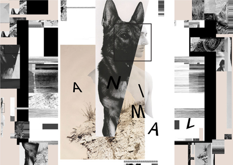
Untitled (Flash)
However what’s interesting is how the rules have been manipulated by each artist to meet their own interests and to challenge each other.
“What I found interesting when I set that typeface challenge was to see what someone who doesn’t do graphic design would come up with. Like with the edible project, it was so that they couldn’t use a camera to see what would happen.”
For this project all the artists had to create a typeface with a single found object. Rafael having trained in graphic design obviously found the project easy, creating a visually pleasing yet fully working alphabet. Interestingly Dave still managed to gear his work to photography by using as his found object a camera flash. He also managed to use the photographic process by making a contact print out of food colouring for the ‘must be edible’ rule.
“I find that each of us manages to fight our own corner for our own discipline. These two are always slagging off graphic design so I’m always fighting my corner, so it’s interesting to see how we represent our own backgrounds.” Rafael tells me.

Andrew Sunderland
Portion #1 (Pink/Green)

David Angus
5×4 contact on edible paper with food colouring
There are times though when the artists have been forced to completely change their practice, like the project in which the work couldn’t be anything manmade. With Andy and Dave relying heavily on video and stills cameras for their own practice they were forced to try something completely different. Dave turned guerrilla gardener with his East London turf work and Andy, in my favourite work from the website, documented bird pooh for the series Bird Made 1-6. It is in this way that the website becomes more than just a game and a way into making work and evolves into something that makes them challenge what ‘type’ of work they make and therefore what ‘type’ of artist they are.
“The thing that is almost annoying in art college is that there’s always this need to mould you into this polished artist. You get into a rut of making similar work and you have an idea but think if I do that it doesn’t look like any of my other work.”

Andrew Sunderland
Bird Made 1

Rafael Farias
Stone Fruit Family (Cherry, Plum, Peach, Apricot, Nectarine)
They started the website because they naturally wanted to index the projects, but it’s fast become a reason in itself for making work. Despite art often being a sensory and tactile experience with Charles Saatchi using his website as an ‘interactive art gallery’, and Amelia’s Magazine now showcasing new talent online, your computer is becoming an acceptable way of seeing art work. I ask them whether showing their work in this way effects the making of it.
“I think about it a lot, that’s graphic design for you, it’s all about presentation. There are a lot of things we don’t do because it wouldn’t look good on the internet. No one’s done anything really sculptural because it wouldn’t translate well.” Rafael tells me.
“Well the internet is the whole reason for doing it and it’s quite interesting that we put in a rule at the end which is that if you make anything physical, like an object then the work is the image of it. If you make a sculpture obviously you can’t put it on the internet. We make these things but all of them are very temporary. The one that I did with the skittles in the end we ate them.” Says Andy.
The group don’t see Bumf as their main focus, the name itself meaning “waste and all these little things that you either pick up or you don’t”. Not that the projects are throwaway, just that with all the artists heavily into process, the outcome isn’t their main concern.
“I don’t think the projects are there to make an amazing piece of work, they’re good but it’s more something to keep your mind in a creative flow.” Says Dave.
”I see it as a creative bookmark so it’s something that might not be finished, but I’ll bookmark the idea for another project.” Rafael adds.

David Angus
Red, Green, Blue

Rafael Farias
The Grass Is Always Greener (On The Other Side)
With our drinks empty and the boys needing to drop off work for an exhibition at BASH Studios I ask them if they have any advice for new graduates.
“Yeah keep making work!” Exclaims Andy. “Even if it’s bumf keep making it because it means keeping up that creative process. If you don’t make anything for a year it can be really hard to get that back. Follow the Bumf rules and send it us!”
A website and some friends is all you need to avoid falling into a black hole of obscurity, you heard it here first! To look at all Bumf projects past and future or to view the individual artist’s work, click the links to their websites.
Thumbnail: David Angus – East London Turf
Written by Chloe Stead on Wednesday July 22nd, 2009 11:17 am
Categories ,Bumf Collective, ,Graduate, ,Graphic Design, ,Mixed Media
Similar Posts:
