Installation by Charlie Barrows
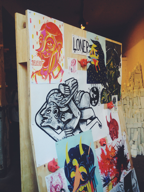
Over the weekend more than 70 students from the University of Brighton‘s Graphic Design and Illustration programme brought their wares to The Bargehouse, a cavernous part of the Oxo Tower building with a labyrinth of bare brick rooms over four floors. It was the perfect setting for this show, where viewers were invited to explore the whole building featuring print, illustration and film in various rooms.
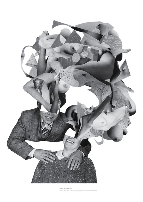
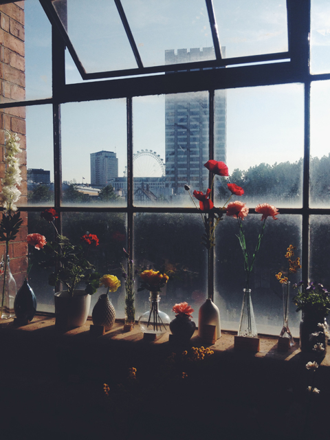
It was a mammoth task trying to check everything out, but a task I thoroughly enjoyed. Here’s a rundown of some of my favourites, beginning with Charlie Barrows, whose flowers installation (top) was the first thing that caught my eye. She’d also produced some striking collage prints that at first looked pretty but up close revealed a sinister message (a key theme in her work) – like this one featuring Fred and Rose West.
Providing light relief in juxtaposition was Marcus Connor. I loved his Patrick Caulfield/Michael Craig-Martin-esque line illustrations.
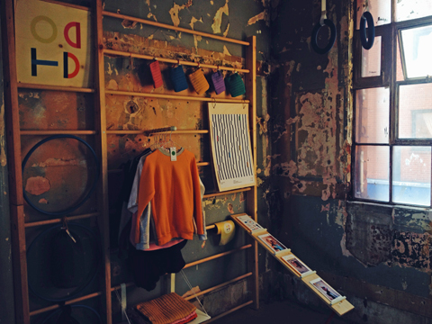
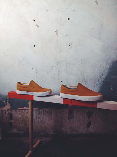
Sarah Todd had curated an entire offshoot room, erecting a vintage gym complete with climbing frame, bench and hoops to display her mixture of retro apparel and printed matter.
I loved Richard Henley‘s bold, Memphis-like prints. The geometric shapes and marble patterns were right up my strasse, based loosely on childrens’ building blocks.
Dan Mountford has courted much press attention with his ethereal photography. I was mesmerised by this side portrait with ripple effect. His double exposure portraits (which I must have missed at the exhibition) are definitely worth checking out – have a look over on his website.
Florence Wood dominated one corner of a room with her all white sculpture, made from bottles, tins and other household packaging items. Her aim was to raise awareness of the level of poverty in Brighton itself.
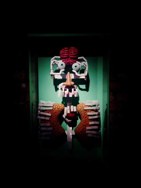
There was nothing not to love about Andrew Morley‘s skeleton man, a sculpture based on his comic drawing style.
Ralph Pederson‘s Tear Back project aims to reimagine some of Brighton’s derelict buildings.
I loved the minimalist aesthetic of Elina Linina‘s photography, in particular this shot of Copenhagen concrete.
Chantal Caduff produced, amongst other things, this wonderful post-modernist stop-frame animation, featuring multiple magazine collages:
Jordan Pryke lives with bi-polar disorder and his aim is to spread awareness of its complications; his unique visual style resulted in many effective and eye-catching images.
Abi Overland presented some classic, organic, forestry illustrations with a nice mix of different styles.
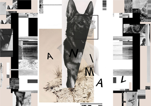
I really liked Luisa Lloyd‘s abstract graphic design – fragments of images and text combined to form images based on Friedrich Nietzsche‘s works.
And lost but not least, a quick mention to Lawrence Dodgson‘s hilarious ‘Horny Trains’ zine cover…
Nice one, Brighton!
Photographs of exhibition by Matt Bramford; work images courtesy of graduates.
Categories ,2014, ,Abi Overland, ,Andrew Morley, ,art, ,BA, ,Bargehouse, ,brighton, ,Chantal Caduff, ,Charlie Barrows, ,Dan Mountford, ,Elina Linina, ,Florence Wood, ,Fred West, ,graduates, ,Graphic Design, ,horny trains, ,illustration, ,installation, ,Jordan Pryke, ,Lawrence Dodgson, ,Luisa Lloyd, ,Marcus Connor, ,Matt Bramford, ,Mixed Media, ,Oxo Tower, ,Ralph Pederson, ,review, ,Richard Henley, ,Rose West, ,Sarah Todd, ,Screenprints, ,show, ,University of Brighton, ,Visual Communication
Similar Posts:
- Studio 350 – University of Brighton Graphic Design & Illustration Graduate Show 2015
- Free Range Art & Design Show 2013: Week Two Review
- University of Brighton Graphic Design Graduate Show 2011 Review
- University of Brighton Illustration Graduate Show 2011 Review: the 80s
- Camberwell College of Arts Illustration MA Graduate Show 2011 Review: part one

