Conformist Illustration by Marnie Hollande
Blythe House, order once a colossal bustling post office savings bank full of clerks’ activity now stands (almost) empty as a memorial to times past. Currently the home of not only the Victoria and Albert Archives but the British and Science Museum it double doors remain closed even to those who work in the museums. It takes a special request to get inside these vaults.

Luckily for a limited time (these doors swing back tight at the end of June) the V&A section has had its doors pushed slightly ajar by fashion curator Judith Clark and psychoanalyst Adam Philips. Together they have curated a delicate show examining ideas and understandings of dress alongside concepts of preservation in the midst of a vast archive that documents humanity’s progression.
 Essential Illustration by Marnie Hollande
Titled The Concise Dictionary of a Dress, the exhibition consists of 11 exhibits nestling amongst the archives, taking up position in the nooks and crannies of the ghostly building. The audience is shepherded silently though the sections of the building we were allowed to see, at times overwhelmed by the space and the delicate nature of the objects it protects. The wondrous treasures awaiting selection by V&A curators, their position elevated from extensive hoard into status objects, indicative (so stated) of the human condition, all too often caught ones eye.
 Loose
Loose
11 exhibits accompanied by 11 pieces of card form a mini-lexicon of dress or a concise representation of ideas of what it is to ‘dress’:
Armoured
Comfortable
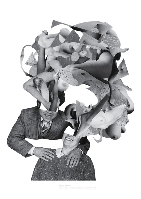
Conformist
Creased
Essential
Fashionable
Loose
Measured
Plain
Pretentious
Tight
Is it as Comfortable suggests: 1 A Refuge; a nostalgia; the calm before or after. 5. Space protected to forget that protection is required. or do you find yourself agreeing with Loose: 1. Never knowingly over-attached; a disappearing act. 3 Of Uncertain Boundary? Or do the words fall flat?
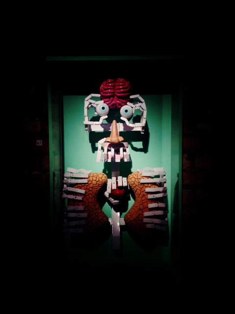
 Pretentious
Words and their meanings can provide a point of conflict: at times the words on the card and the image of dress produced a harmonious moment of why people chose particular items of dress. In this moment the dictionary of a dress becomes clear as the exhibition mirrors the dictionary’s almost circular nature of providing two meanings for one word.
The curators have invited the audience into a hidden world; the vast depths of the museum. The audiences’ eye drawn to objects not in the exhibition but whose presence demands attention: Why is it there? Why did they choose this room or that cupboard? Can meanings be created between the juxtaposition of dress and the objects in the room?
 Measured
A weekly definition taken from the website: MEASURED 1. Against chaos; a way of thinking about disarray; calculated excess. 2. The fitted as fitting. 3. Proportion as the mother of virtue. 4. The milder ecstasies of the considered. 5. Contained by the idea of containment.
The word and their phrases present one idea of what it is you are viewing, whilst the objects potentially visualise and neuter simultaneously. The sentences add conflict as they embellish the meaning of the single word and the idea of why we dress, collect and preserve.
 Comfortable
No word is mealy a word, it becomes heavy through each individual understanding of it’s context. Each interpretation of the exhibits arrived upon by our unique thought processes formed by our own experiences. It is an oddly lonely experience wandering though the locked archives looking at how meaning is embedded into objects. Can meanings be created from the idea that a function of the archive is personal, an act of preservation and eventually historical.
The final exhibit; Creased presented a Junya Watanabe dress behind the bars of an old coal bunker open to the outside world. The end mimicing the beginning; the first exhibit high on the roof stands a ghostly gown open to the elements, it’s resin skeleton delicate in the glare and heat of the sun. These two decisions scream against the museum’s usual desire to keep everything hidden and preserved in temperature controlled rooms.
 Armoured Illustration by Marnie Hollande
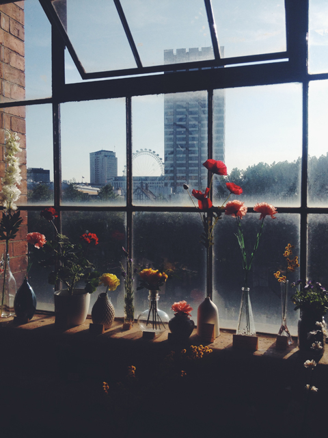
Seen against the sky scape of London, the resin dress showed just how delicate the human body, our sense of dress and concepts of who we are can be against the hard bustling ever moving city.
Take yourself on a guided walk through an unseen section of our national museums, question the ideas of preservation and the difference between the museum’s archive and your personal ‘hoard’.
Watch the trailer here: The Concise Dictionary of a Dress
All photographs by: Julian Abrams
Categories ,A Concise Dictionary of a Dress, ,Adam Phillips, ,Archive, ,Art Angel, ,Blythe House, ,British Museum, ,Costume, ,Dress, ,fashion, ,Judith Clarke, ,Julian Abrams, ,Marnie Hollande, ,Science Museum, ,va, ,Vaults
Similar Posts:
- Curating Yamamoto: An interview with Ligaya Salazar, the V&A’s Yohji Yamamoto exhibition curator
- ‘Flexible Values’: Vanessa Billy Exhibition
- 6 Day Riot: On This Island – Album Review
- Anish Kapoor warps the very fabric of the Royal Academy’s being
- Exhibition: HIPSTAMATICS at the Orange Dot Gallery, Bloomsbury