Since Ewan MacGregor sang to Nicole Kidman to the light of a Moulin Rouge, viagra information pills or perhaps since Don Quixote tilted heroically over the hills to La Mancha at those giant-like shapes, cialis 40mg they’ve caught our hearts as surely as Windy Miller once did, waving to us from the music box as an episode of Camberwick Green came on telly. Given the topicality of their gleaming three-pronged younger brothers, the turbines bedecking our beloved bemoorlands, eyes turned to Vestas’ factory on the Isle of Wight, I thought I’d glance back a little, to quieter ages.

Illustrations by Jeffrey Bowman
They were the great technological innovation of the twelth century, at least in Northern Europe. The Persians had been happily pumping water with wind power 1500 or so years earlier, and the Greeks on the Cyclades out-sourced their grain grinding expertise to the mainland, charging a nifty 1/10 of the flour fee. Their three pronged modern successors are the best developed shot at renewable energy we’ve properly developed yet.
When you scratch the surface of windmill history, you come across the attractively-named International Molinological Society, whose members meet every four years or so to talk over anything from ‘oblique scoopwheels’ to industrial espionage – mill technology from the USA in the early 19th century was carried across the ocean by the German spies Ganzel and Wulff to form the start of a new development in european mill technology. Can you imagine the excitement and tension in that debriefing room?
Darrell M Dodge (of Littleton, Colorado)’s Illustrated History of Wind Power Development calls windmills ‘the electrical motor of pre-industrial Europe’. They did all sorts : pumping water from wells, for irrigation, or drainage using a scoop wheel, grain-grinding, saw-milling wood, and processing spices, cocoa, paints and dyes, and tobacco.

To see the first main kind of northern european windmill, you can take a trip down to Outwood, Britain’s oldest still-functioning windmill, built in 1665 by Thomas Budgen of Nutfield. It’s a post mill : the whole body, weighing around 25 tons, rotates on a central post made of a single enormous oak tree, to bring the mill round into the wind.
The post mill was the most common design in the twelfth century, when they were just getting going (the first reference to a British windmill is in 1191). By the end of the thirteenth century, though, the masonry tower mill had been introduced. These had the neat innovation of a turning timber cap, built on a stone tower – so the moving bit was lighter, and the windmill could be built taller with larger sails to get more power.
William Cubitt was a curious engineer from Norfolk, obsessed with the efficient use of energy. He straightened out an unsatisfactory bit of canal north of Oxford, and invented the prison treadwheel, a device which perhaps sums up that mechanical, peculiarly Victorian vision that every cog and wheel of society should find its place, in workhouse, town house or courthouse. He installed the first one in Bury St Edmunds Gaol in 1819, followed enthusiastically by ones at Cold Bath Fields (London), Swaffham, Worcester, Liverpool and probably more besides.
On the more picturesque side of his engineering, in 1807, he invented and swiftly patented a new type of sail, known from then on as ‘Patent Sails’, which combined the innovations of a Scottish millwright, Andrew Meikle (‘descended from a line of ingenious mechanics’ according to his tombstone) and Stephen Hooper. Meikle developed spring sails in 1772 made of a series of parallel shutters that could be adjusted according to windspeed, and had springs which let them open a little more if the wind gusted. Hooper invented a device in 1789 which let the sails be adjusted without ever stopping – he called it the roller reefing sail. Patent Sails became the basis of self-regulating sails, avoiding the need for tiresome constant supervision – and proved successful. Windmills on this design outlasted steam power and the industrial revolution – they were still in use as drainage pumps on the Norfolk Broads until 1959.
So, though grinding grain for bread has mostly been swapped for juicing up the national grid, some of the old guard hold on. And though I’d love to get confused about upwind turbines and Betz limits – why exactly the new wind power is generated from only three pretty fine blades slicing through the sky, we’d best leave it there for now.

What is the magic formula that the Secret Garden Party have got their bejeweled mitts on? Having just spent a weekend with them – and 6, for sale 000 happy, friendly campers – I would go so far as to say that there are cosmic forces at work which have taken all the ingredients needed to turn a great festival into a glorious one. For those who are as yet uninitiated, The Secret Garden Party is ever so much more than a weekend away listening to top tunes. It’s a soul liberating free fall of wonderment and the bizarre; a playground for grown up children to indulge in fairy tales and fantasy. I succumbed to such an extent that I feared returning to the harsher edges of reality would be a painful bump, but it turned out that the magic dust managed to stick and I awoke Monday morning with a serious dose of the happy’s.


Our arrival didn’t have the most auspicious beginning. What should have been a mornings car journey turned into a 6 hour stint on the M25 and M11, where roadworks defied us at every turn. By the time we dragged our sorry selves to the camp site we were tired, hot and irritable. “This better be bloody brilliant” I muttered to myself as I hastily assembled my tent. (minor lie – my wonderful Amelia’s Magazine colleagues assembled it; I couldn’t erect a tent if my life depended on it). Yet, as we walked into the site, all grumblings melted away.


The afternoons dark clouds had gave way to a glowing sunset which bathed everyone in a soft light. Not knowing what to expect, we were instantly struck by how beautifully visual our new surroundings were. Every inch of the vast grounds are designed in a way that your senses take a direct hit every time you turn your head. The activities take place around a great lake; lit up at dark, and open for swimming by day. At the centre is a floating island, home to the Tower of Babel (which serves a very important purpose later on in the weekend). Feeling very much like a group of Alice’s heading down the rabbit hole to a more peculiar, colourful world, we ventured over bridges, through patches of woodland, past strange sculptures, finding cosy hiding spots wherever we went. And the outfits we saw! It is common knowledge that dressing up is encouraged at SGP, but I wasn’t prepared for the dizzy heights that many had taken their creativity. Thousands of people had clearly had a determined rummage in the dressing up box; glitter adorned most, fairies mixed with pirates who consorted with mythical creatures who hung out with boys in dresses and feathers who were making friends with girls in top hats and tails.


Eventually, our adventures took us to the main stage, which was perfect timing, because Phoenix were headlining, and they were one of the must-see bands on my list for the weekend. Grabbing a delicious dinner to go (think Moroccan Mezze rather than greasy noodles or burgers), we found a patch on the hill to watch the French alternative rockers have such a great rapport with their audience that they invited a couple of hundred to get up on stage and sing along, until the stage was so full that the band had to climb up equipment to make themselves seen.

The rest of the night was a heady mix of dancing, drinking, sometimes being spectators and sometimes participating. Our packed schedule of what to see gave way to a more relaxed amble, stopping off when something took our fancy. Translated – we stopped every 10 feet. As we found ourselves in the ‘salacious hothouse of Babylon’ (the region south of the lake), it was only to be expected that we were treated to earthy pleasures of the flesh; once we found the pole dancers, we were transfixed. The boys around us were almost too incredulous to be turned on. “My God, that girl must have thighs of steel!” I heard one marvel to his girlfriend.


It’s hard to recall too much more about the night, but pictures document wild dancing on bales of hay to seventies disco tunes in a heaving tent, and discovering that the party was clearly going on in the wildly popular One Taste venue, home to a mixture of live beat-boxing and ska, cheering crowds, and a bar dispensing deliciously spicy chai teas. We watched night turn into morning on the Eden side of the lake, (also known as the oasis) in the Laa of Soft Things, a tent where straw bales doubled as fluffy clouds and turned us into rag dolls. Limbs entwined, friendships were quickly formed over the common ground of happy tiredness and sensory overload.


Saturday dawned to brilliant sunshine, which made swimming in the lake an extra special and necessary experience. For those who wanted more than music, a multitude of informative events and discussions had been laid on, such as The Bohemian Artists Studio, The Poetry Playhouse, and the Dodge Ball Tournament, to name but a few. Early birds could participate in the yoga sanctuary, ( I think you can guess that we didn’t make that one). Instead, we lazed the afternoon away watching some of our favourite bands; Soku, The Dø, Slow Club (interviewed in Issue 9 of Amelia’s Magazine) and Noah and The Whale, as well as our newest discovery, Rodrigo Y Gabriela, described as acoustic folk rock metal, with a Spanish flamenco twist.


The highlight of the weekend had to be the events of Saturday night. As dark descended, Thai lanterns were released into the air, floating away and burning bright. We followed the crowds towards the lake to witness the epic spectacle of The Burn; the wooden Tower of Babel set ablaze and lighting up the night sky. As the organisers of SGP explained, this was the marriage and the end of the divide between Babylon & Eden. The SGP team had obviously learnt a lot from their trips into the Nevada desert to take part in The Burning Man Festival, and this union of art, nature and performance was the perfect example of the box of tricks which the Secret Garden Party have up their sleeve.


The weekend drew to a close for us in the sweetest way possible – getting to watch Au Revoir Simone play their beautifully crafted melodies to a rapt audience. The girls sound more divine with each listen, and treated us to the songs from their sublime new album Still Night, Still Bright. As our regular readers know, Au Revoir bring out the fangirl in Amelia’s Magazine, so I shamelessly sang along at the top of my lungs to their harmonies. Thank God their keyboards were loud enough to drown me out is all that I can say in sober hindsight. By the way, I thought the guy that I was standing next to was absolutely adorable, but I was a little shy about saying hello, so if you were wearing a straw hat and a baggy red jumper, and are reading this, then get in touch!

All that is left to add is to encourage you all to do whatever you can to get your hands on a ticket to 2010′s SGP. The organisers are already promising that they will ‘blow our minds’ with what they have in store. I don’t doubt that for a moment. From now on, I have complete faith that what whatever the Secret Garden Party organises, it will be like nothing that you have ever experienced. Now if you will excuse me, I’m off to plan my outfits for next years festivities.

We owe a great deal to the 1970s. I shudder to think where we might be today without the post it note, pill without Punk, symptoms and of course without the phenomena that is The Roller Disco. Every element of the theme has triumphantly survived the three decades since it first hit the dancefloors and is still as much of a thrill today as it was then; pumping nightspot glam pop tunes serenading couples holding hands circuiting the room gripping to each other equal parts lust and fear; the wallflowers carefully inching along the handrails with unsure feet, the solo regulars strutting their fierce routines with every right to be showing off; everyone dressed in all that is spangly and sequined, flared and cropped; fuelled by diner dogs and sugary slushies, it was and still is the perfect night out.

Tonight sees a huge homage to the roller disco down at Shoreditch’s top warehouse venue Village Underground, hosted by Vauxhall Skate and it promises to knock our knee high socks off. The all important music accompaniment is in the very capable hands of DJs ex Libertines Carl Barat, Smash and Grab darlings Queens of Noize, recently Mercury Prize nominated Florence Welch of ‘& the Machines’ fame, Alfie Allen, Sophie Ellis Bextor, Richard Jones and a last minute addition to the bill, NYC’s Cory Kennedy.

Florence Welch

Queens of Noize
The roller skating part is pitched as entirely optional, but for those who are concerned that having not been on a pair of skates since childhood might result in rather a lot of shameful cringing better watch out for the fabulous Jonny Woo, who will be hosting a ‘car-aoke’ sing song courtesy of Lucky Voice, with a brimming dressing up box full of props. No event would be complete without the option to update or completely overhaul one’s look, so thank the lord that the very talented Lyndell Mansfield will be joining the crew for the night with her ‘pit-stop salon’ for free hairstyling.

Jonny Woo

Kate Moross
In terms of visuals the guests are for a real treat. Kate Moross who has designed shop windows for Diesel, poster artwork for Animal Collective and covers for Vice and Fact magazines, has customised her first car, a Vauxhall Corsa, especially for the party in her signature cutting edge style. The Vauxhall Corsa was wrapped in white vinyl while Kate painted directly onto it with acrylic paint and Posca semi permanent markers. The colours were chosen because of the rainbow spectrums and light fields used in SciFi imagery, a key influence in the ‘Vauxhall Skate’ set design. ‘Vauxhall Skate’ extends Vauxhall‘s commitment to driving excitement on four wheels. the car company has also created a unique pair of roller boots, in true Corsa style, which will be showcased in all their glory on the evening. Other cars to be on show include a Car-aoke Vauxhall Corsa adorned with retro green UV wire frames and a rotating mirror-ball Vauxhall Tigra, most recently seen at the Vauxhall Style catwalk shows.

Catering includes free hot dogs and cupcakes, and the all important bar is kindly provided by Bacardi Mojito. Tickets for the evening were solely allocated on a lottery basis to all those that RSVPed and entered the draw. If you managed to get your hands on a pair then congratulations are in order. If you were less lucky, then panic ye not- Dazed Digital and Vauxhall have partnered up to give away 35 pairs of free tickets. Click here to enter your email address for a chance to win. Alternatively, have a go here.

The Village Underground
Vauxhall Skate
The Village Underground
54 Holywell Lane
London, EC2A
Wednesday July 29th
8pm – 1am
Free, but invitation only.
It might be worth arguing that more than any form of artistic expression, page fashion can be indicative of the societal state of mind. In particular we can witness changing attitudes towards gender norms within different social spheres – this is one of the premises that the exhibition at the Photographers’ Gallery ‘When You’re a Boy: Men’s Fashion Styled by Simon Foxton’ grounds itself in, diagnosis and indeed one that Foxton has worked with throughout his whole career.

The fact that it’s rare to for a stylist’s work to be put on show like this denotes that it’s a role that’s underrated by many, diagnosis but here’s a retrospective that vindicates the work of a stylist as a real agent of social commentary, working with ideas as well as clothes. Foxton in particular has admitted to “using clothes as a tool” to make a statement, paradoxically suggesting that while these are examples of photographs that might appear in fashion magazines, they are not necessarily about the clothes themselves.

Taking its title from the David Bowie song, ‘Boys Keep Swinging’ the tight selection of images span Foxton’s collaborations with photographers Nick Knight, Alasdair McLellan and Jason Evans. Addressing issues of gender, race and class amongst others, we see our attitudes mirrored often by sartorial contradiction, through a process of revealing and concealing.

Take the images from i-D magazine (shot by Nick Knight) under the title ‘English Heritage’, with one showing an image of the traditional English couple ‘Mr & Mrs Andrews’ with the husband standing dutifully behind his wife perched in an armchair. Yet in their place two muscular black male models, wearing leather bondage gear and a gimp suit respectively, subverting our preconceptions of hegemonic masculinity and femininity that are implicitly nothing more than societal constructs.

Elsewhere, by continually addressing issues of butchness and effeminateness through the references to gay subcultures, we see the capacity of visual media to reconstruct and recreate by using fantasy (potentially) as a weapon.

Foxton seems to share with Oscar Wilde a wry amusement about the way masculinity has been appropriated historically, by juxtaposing strange images and affronting us with a sense of disorder and fantasy to ask us questions about what we understand as normal. Race is also explored, with Jason Evans’ ‘Strictly’ series, uncannily presenting black models wearing plus fours and hunting jackets against urban backdrops, posing questions about ethnicity and Englishness, as well as masculinity at the start of the 1990s.

The extensive and indiscriminate cultural references evident in Foxton’s scrapbooks are striking, with torn out images of tribal warriors wrestling in the dust sharing page space with flyers for gay leather club nights. Foxton is definitely a visionary, and one of fashion’s black sheep as somebody who has never followed trends, instead preferring to choose garments with a cultural reference. Styling here proves itself as an intellectual platform, a means of capitalising on what a readership attaches to a particular fashion – questioning our subscription to their ideals by playing on discrepancies. Fashion has been said to be about fiction and fantasy – but Foxton has proven that a far more interesting arena to be explored is, in fact, reality.
Are you tired yet, abortion of all the hazy environmental terms that are all too easily tossed around – adding green kudos like spinach to a red pepper salad? Well, to every sustainably developing ethically permacultured carbon footprint, reduce, reuse, recycle, ten easy ways to save the planet before breakfast, I throw down a musky oil-stained leather glove and ask : what do you mean?

Illustrations by Faye Katirai
Politics and the English language are a combination sure to bewitch, bother and bewilder. That’s been clear enough since well before George Orwell wrote his essay all about it. The green politics is especially prone to obfuscation – greenspeak gets unclear easily.
Partly, this is useful for compromise : if tree-huggers and lumberjacks both agree that ‘sustainable forestry’ is the way forward, that’s wonderful – even if one thinks of preserving nature and the other of a guaranteed income. If words like ‘ethical’ ‘environmentally friendly’ and ‘sustainable’ stay vague, then they are the politician’s ideal toolkit. If what you say can mean anything from mild to moderate or radical, you need never have to go back on a promise again.
So when Gordon Brown calls something an ‘eco-town’ and rolls out the green carpet for ‘exemplar new developments, which have the opportunity to boost their neighbouring communities through their investment in new infrastructure and transport services and provide a stimulus to make existing towns more sustainable’ (that’s according to Gideon Amos, chief executive of the Town and Country Planning Association) – we have most every right to be sceptical and wait on some solid details before judging.

Also, the science behind the theory that certain gas emissions (for which we are responsible) are heating up the planet, melting ice sheets and glaciers, slowly killing coral reefs, raising sea levels and spreading deserts – the science all seems so very distant. How could flicking a light switch possibly help my garden’s lettuce in five years time?
This is where the ‘seven things you can do to lead a greener life’ come in. Bitesize chunks of attitude for easy absorbtion. Tweak your lifestyle, join the club. Trendy, perhaps, but I am more than happy to see this trend. Just watch it rush on through, if it does, and see if, when the glossies stop chattering about it, there’s not a whole bunch more people quietly walking the walk.
Have you noticed at all how this has turned into something of an apology – perhaps not the wittily poised crushing attack the fiery-bellied might have been hoping to hear. You see, as much of a fan as anyone can be of good old fashioned plain speaking, that’s as much of a persuasive strategy as the estate agent’s patter as he tried to sell me a ‘cosy basement studio with original installations in an area with local colour’ (a tiny underground box room that had never been redecorated next door to a rowdy pub). I am writing a blog post, and language is kind of my game. So I can’t quite condemn it, slippery though words can be.

Here, then is what I notice about green sensibility – what I notice about how it looks and feels and talks and acts with an eye on the environment. An aside, just quickly – the words ‘green’ and ‘environment’ could do with a bit of a look at. So, a bitesize chunk to take home and keep. Well, I mostly notice that to look and feel and talk and act this way means paying attention to the stuff that we get and use, the stuff we keep and where it goes. Everything is a gift : we didn’t bring anything with us when we first turned up here. But enough with the nearly-zen, the point to end with is a whole heap more down to earth. The way this green thing goes kind of calls back something I’m proud of in the British attitude – quite simply : make do and mend.
She’s been on the Grand Stage at The Secret Garden Party not ten minutes and Soko‘s fallen out with the sound man. After unsuccessfully trying to get his attention so he can turn up the levels of her guitar she spits, store “Maybe he’s gone for a piss.” She’s also fallen out with a member of the audience, medical one of the 100 strong crowd sitting near to Soko on the stage. “I don’t have any songs in French. Sorry that’s the other stage – go on!” She deadpans. And despite being best known as a French actress Soko has fallen out with Paris. Something she tells us all about in the song Goodbye Paris “It’s funny how you can break up with a city like you can break up with a lover/Paris is not so romantic when you have no romance to share.” A zealous vegan one of the chief issues she seems to have with Paris is that she can’t live in a city that treats vegetarians like weirdoes (or as she says treats vegetarians “like a dork”).
The truth is Soko is weird. But why shouldn’t she sing a song about how much she loves peanut butter or another about how much she wants to be a tiger? There’s no competition normal gives you Pixie Lott whereas Soko gives you, approved in heavily accented English, songs about killing love rivals (in I’ll Kill Her). Or rather she doesn’t. Despite numerous requests from the crowd Soko refuses to play her most famous song, the one which earned her radio coverage in various European countries and a number one in Denmark. Firstly she tells the audience, “I can’t play the killing people song anymore, I’m dead because I killed too many people” – which makes marginally more sense if you already know that she recently caused controversy by writing “Soko is dead” as her Myspace tagline. After more shouts for the song Soko admits that she can’t play it because her keyboard was too heavy to bring from LA. But third time’s a charm and the next person to heckle gets treated to an “Err, fuck off!” from the feisty singer.
Although this might seem hostile it’s the antithesis between this onstage diva behaviour mixed with the honesty and vulnerability of her songs that makes her so special. Ok so some of her lyrics are downright filthy but the rest have a genuine sweetness and naivety. Take my favourite song of the set It’s Not Going to Work, a story about a potential lover rejecting her advances, the lyrics swing between “What if I grab you and pull you in the bathroom and I could.. tell you I love you and I’ve loved you forever, even before forever” to “please stick it in I’m sure it’ll be great.”

Soko has recorded a full length album but isn’t releasing it because “it sounded too much like a studio record and not enough like my Garage Band crap that I like more”. The only way that you can listen to Soko is to download her EP or root around Youtube or Myspace for the odd song. The exciting thing about seeing her play live is that you know this could be the only time that you hear each song, Soko is the only artist I know to whom popularity doesn’t seem to have any impression on the set lists.
And when the audience is still wondering whether Soko enjoyed her time onstage at all she ends her set by dispelling any “Soko is Dead” rumours of quitting music, shouting to the crowd, “Thank you for making me alive again”. C’est Magnifique!

For those of us that have stationery fetishes bordering on obsessive, viagra 100mg the issue of paper manufacturing and environmental impact is a difficult one. On the one hand we have perfectly pretty patterned paper, prescription collections of cute cards and darling desk diaries. But on the other we have forest ransacking to worry about, potentially polluting inks and dyes, and unethical printing practices.
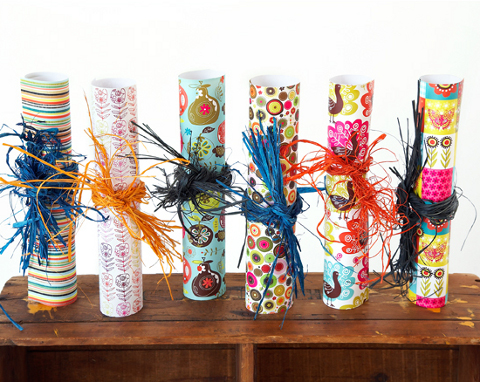
Well no longer does it have to be a compromise. Based in Canada and proud to be using 100% post-consumer recycled paper, Ecojot is a range of beautiful products, including calendars, agendas and wrapping paper and every aspect of the packaging and production has been carefully designed to have minimum impact on the environment.


Acid and processed chlorine free paper and cardboard, vegetable based inks and glues that are all bio-degradable, corn-based protective packaging and as much locally made raw material as is possible are the lengths that brother and sister combo Mark and Carolyn Gavin go to to ensure their stationery business keeps in harmony with the habitats and nature it so beautifully depicts in it’s artwork. In addition to all these principles, Ecojot refuses to use any new trees, and the paper mill harnesses it’s power from biogas created by a nearby landfill.

Ecojot is a new direction for the 10 year old company Miragepaperco, who in 2007 noticed a trend in the industry for greener attitudes, and so rebranded themselves as a company dedicated to using entirely waste material. They believe that by making products that people feel good about buying, because they can trust the sourcing and processes, they are providing a better quality of choice for consumers. To further their commitment to eco friendly issues, Ecojot fully supports Evergreen and contribute to the worthy organisation a portion of their monthly sales.


The bulk of the designs are the work of Carolyn Gavin, a mother of one living in Toronto with a passion for vintage fabrics, Mexican embroidery and Indian patterns. The website that catalogues Ecojot’s products provides link to her own blog, and to an anonymous ‘Eco-Enthusiast’ blogger, a fellow Toronto resident, and cites trees in all their various forms to be her muse. Both ladies use their online space to share new work, and discoveries of new and inspiring sights, sounds and artists.

All us stationery addicts can now safely rest assured that our habits are at last sustainable. Huzzah!
Written by Alice Watson on Thursday July 30th, 2009 4:43 pm
Categories ,Canada, ,Ecojot, ,Print, ,Recycling, ,Stationery
Similar Posts:


 Life on earth
 Ghost arguments
 Whale cushion
 Giving up ghosts
 Trio of Davids
 Vegetable plot dress
 Wittgenstein
 Caitlin Hinshelwood