Amelia’s Magazine | Johanna Basford presents Johanna’s Christmas: Giveaway and Interview Exclusive!

johannas-christmas-giveaway-for-blog
johannas-christmas-name-page-by-amelia-gregory
The latest adult colouring book by the phenomenonal Johanna Basford is released this week, a crafty Christmas colouring book designed to be used in multiple ways. As Johanna herself is fond of saying “I make colouring books so you can make masterpieces!” Colouring has moved out of books and spread through the crafting community, and Johanna perfectly captures this moment with a book of one sided images on perforated pages that can easily be removed to share as Christmas cards, decorations, gift tags… or whatever you dream of doing. “Johanna’s Christmas: A Festive Colouring Book (Colouring Books)” is chock full of traditional Christmas imagery such as deer, festive birds, trees, presents, gingerbread, sleighs, bells, baubles, stockings, curlicues and a series of hidden robins. Expect a mix of evocative narrative scenes, her signature mirror images and more of her ribbon designs, where decorative elements stretch across the page. Johanna’s Christmas is a book sure to engage fans old and new, and best of all, I have THREE copies to give away so hop on over to my Facebook Page HERE and leave a comment telling me what you love most about Christmas time to be in with a chance to win… better still, the giveaway is OPEN WORLDWIDE, so if you live outside the UK this is your chance to get the book with a gold foiled cover! Now read on for my exclusive interview, in which we also discuss her last release Magical Jungle.

johannas-christmas-sydney-polar-bear
johannas-christmas-sarahp-polar-bear
johannas-christmas-kocialka-polar-bear
johannas-christmas-jenny-polar-bear
johannas-christmas-chiblla-polar-bear
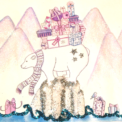
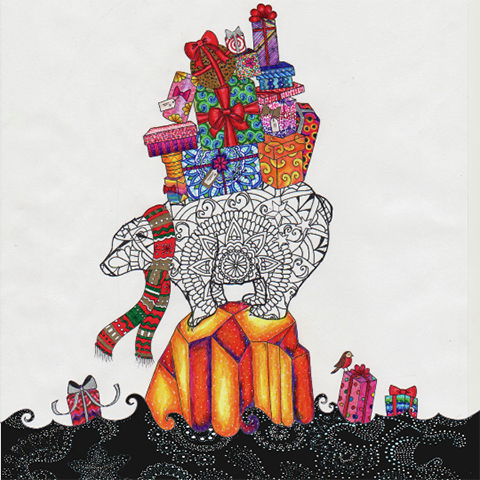
The winners of Johanna’s polar bear Christmas colouring competition: Sydney, Sarah P, Kocialka, Jenny and Chiblla. Read why Johanna chose these versions of her polar bear here.

johannas-christmas-deer-by-amelia-gregory
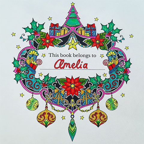
Johanna’s Christmas. Colourist: Amelia

How did you choose your top colourists to receive advance copies of your new book?
They were all Colourists who’s work had caught my eye on social media or on my colouring gallery (or I watch their YouTube channels!). I liked the fact that instead of trying to woo traditional journalists or book reviewers, we were getting the books straight into the hands of colourists so they could start making some masterpieces!

johanna-basford-johannas-christmas-hare
What are your favourite coloured pages, and why?
Literally far too many to choose from! It’s like asking a mother which of her children is her favourite! I think the great thing about colouring is that you never see the same image twice and that every colourist brings something completely new to the black and white drawings. Having said that, I’m always partial to a stunning background technique. Those people that do the ‘starry night sky’ effect will never fail to amaze me!

johanna-basford-johannas-christmas-us-cover
American cover.

johanna-basford-johannas-christmas-1
UK cover.

You create an incredible amount of pages for each new book – do you ever find yourself getting bored of drawing a particular object, and if so, how do you make it exciting?
I genuinely never get bored of drawing! Admin? Yes. Digital updates? Yes. Drawing? Never! I think nature is an amazing, unlimited melting pot of inspiration and although every jungle is leafy, no 2 leaves are the same! I spent hours pouring over foliage reference books and sweating it out in the Botanical Garden hot houses admiring every type of leaf and vine you can imagine – there was not shortage of inspiration!

magical-jungle-vicki-walsh
Magical Jungle. Colourist: Vicki Walsh

magical-jungle-susie-pala-loir
magical-jungle-susie-pala-loir-2
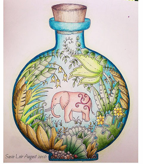
Magical Jungle. Colourist: Susie Pala-Loir

How did you source the specialist paper used in Magical Jungle and Johanna’s Christmas?
I worked with the Penguin US team to find a paper that was the perfect weight, texture, tooth and colour for my books. After rejecting many, many samples, we worked with a paper manufacturer to make my very own paper that matched my ideal specifications perfectly. Think of it as paper couture! It was a huge honour to have this opportunity to get THAT geeky about paper. We then used the spec of this paper as the benchmark for all my foreign publishers, which in this instance includes the UK, to match their paper to. There will always be slight difference and nuances between paper stocks, (it is after all a product of nature and no 2 trees are the same!) but we aim to create consistant, beautiful books across the world that offer colourists the finest papers on which to make their masterpieces and develop their creative practice.

magical-jungle-morena-vajak
magical-jungle-morena-vajak-3
magical-jungle-morena-vajak-2
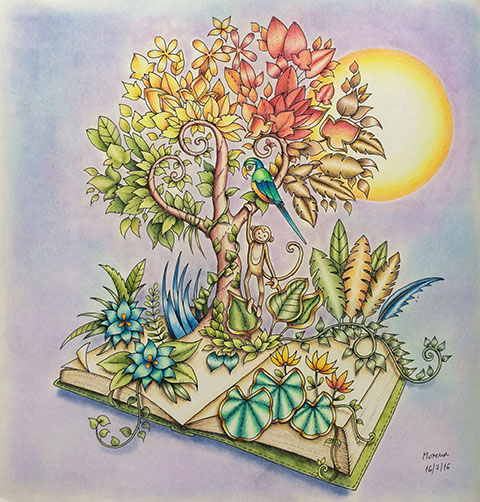
Magical Jungle. Colourist: Morena Vajak

How much have you listened to colourists in the making of Magical Jungle? Everyone seems to be very happy about the fact that the images don’t go into the spine, for example. 
A LOT. This is a partnership, a collaboration. If one half of the require need certain things in order to make the best final outcome, then it’s up to me to supply them with what they need. I’m very active on social media and value my place in our colouring community, it would be entirely odd to be in this space, communicating with colourists and not take notice of what they say! It’s a privilege to have this job and as I always say, I make books so Colourists can make masterpieces!

magical-jungle-maureen-langham
Magical Jungle. Colourist: Maureen Langham

magical-jungle-lucy-fyles
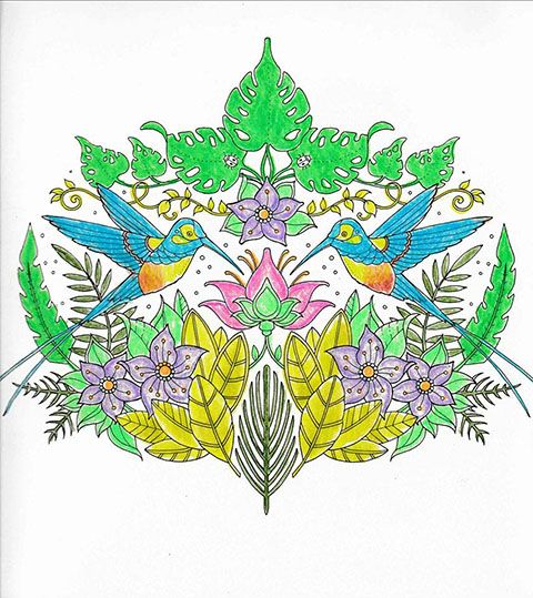
Magical Jungle. Colourist: Lucy Fyles

magical-jungle-kerri-taylor
Magical Jungle. Colourist: Kerri Taylor

Roughly how many hours went into Magical Jungle?
Heaps! A book takes me about 5 months to draw, then another few months in production with the publisher. I also have a few months at the start to mull over ideas and research. The reality is I never stop thinking about a book when I’m in the midst of creating it, I even dream about my books!

magical-jungle-hazel-smithies
Magical Jungle. Colourist: Hazel Smithies

What has the reception been like at your book signings? You have any particular events jumped out at you? (do you recognise the names of any of the colourists that you meet for example?)
Book signings are always lovely as it’s a chance to meet the people behind the profile pics! I spend so long interacting with the colouring community online that it a real treat to finally say hello and give them a hug in person! And yes, there’s been a few that I’ve known online for some time now that travelled huge distances to come along to the events, it’s very humbling and also very special to finally get a selfie with them!

magical-jungle-amanda-pinchbeck
magical-jungle-amanda-pinchbeck-3
magical-jungle-amanda-pinchbeck-2
Magical Jungle. Colourist: Amanda Pinchbeck

As you create more colouring books have you found yourself getting more into the act of colouring itself? There seems to be quite a demand for your tutorials!
Yes. Initially I was hesitant to share my colouring as I felt my role was to create the artwork, not colour it. I’ve always enjoyed working in coloured pencil though and did a lot of this type of work when I was at school because colouring pencils were so accessible (a 17 year old has a rather limited materials budget!). I colour a lot, it’s important to test run the artwork and check the shapes and scale are suitable for colouring, the line weight is just right and also that the paper is good. And of course, it allows me to test a lot of pens and pencils so when people ask questions about what art supplies work well, I can give an honest and informed answer. I guess it’s like being a chef; you have to taste your food to know if it’s good or not!

johannas-christmas-by-sseungei
Johanna’s Christmas. Colourist: @sseungei

What can we expect from your upcoming Christmas book?
I’ve tried to capture the sense of excitement, charm and whimsy of the festive season within the pages of this book. There’s an owl in a Christmas jumper, a robin delivering gifts, lots of tangles of holly and ivy and some beautiful big poinsettia blooms! In total there are 37 illustrations, all printed single sided and with a detachable spine so Colourists can remove their creations when complete and share them as Christmas gifts or use them in craft projects. It also means some art materials likes solvent based markers and heavy glitter pens can be used without fear of bleeding through to the design on the reverse. Finally, there’s no list of things to find in this book, instead there is a flock of festive robins hidden throughout the pages for you to find.

johannas-christmas-by-eugenechin39
Johanna’s Christmas. Colourist: @ugenechin39

Can you tell us about the musical notes on the front cover?
I’m not the musical one in my family (my sister is!) so when I drew a few bars of music flowing along the front of the cover and posted a WIP sketch on facebook, the colouring community were quick to point out the my scribbly notes were back to front and upside now – musical gibberish! Thank goodness for feedback – that could have been embarrassing if that went to print! I amended the cover and now those musical notes play out the first 4 bars of Jingle Bells. I love that the colouring community helped shape the cover and that now there’s a secret little hidden festive reference in those notes at the bottom. Jingle all the way!

johannas-christmas-by-kourtney-ferro-art
Johanna’s Christmas. Colourist: @kourtneyferroart

What is your starting point when you hide something on a page, and why did you choose a robin?
Usually I hide as many things in a book as possible. I love tiny details and things you have to search for. When I was little we would often visit Brodick Castle on the Isle of Arran where there was chair carved by Robert Thompson (aka Mouseman). He carved a little mouse onto every piece of furniture he made, it was like a little hidden signature. I loved that charming way of stamping his work. I try to do something similar by hiding little intricate details in all my drawings. This can be anything from a butterfly to a lizard but for Johanna’s Christmas I wanted a single festive motif that people could find. The robin seemed perfect. Also, who doesn’t love spotting a robin on a snowy morning? They are like nature’s treasure hunt! I draw the entire picture first, then add the hidden elements at the end, so I can find the perfect hiding place for them!

johannas-christmas-by-claire-eadie
Johanna’s Christmas. Colourist: Claire Eadie

How will you be celebrating Christmas this year? What family traditions do you have?
Food. Lots and lots of food! I tackled Christmas dinner myself once many years ago and swore I’d never do it again! There was a terrifying incident involving turkey giblets… My skills lie firmly in helping with the washing up! I like all the traditional elements of Christmas day, the crackers on the table, the awful jokes inside, cheap paper crowns, mountains of crumpled wrapping paper and perhaps best of all, the left overs! Cold kilted sausages (I believe these are called Pigs in Blankets to the rest of the world outside of Scotland!) are my favourite Christmas evening snack!

magical-jungle-by-daphnesgallery
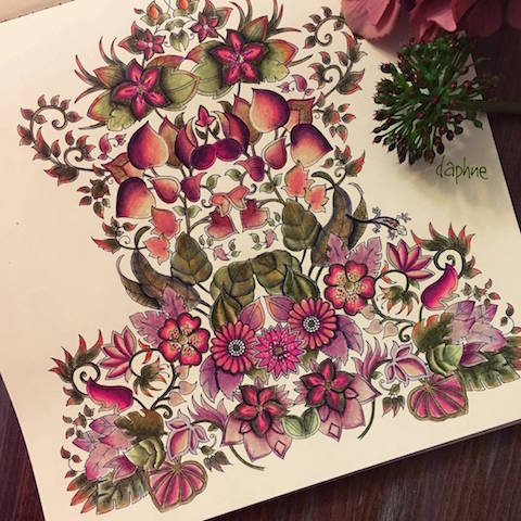
Magical Jungle. Colourist: @daphnesgallery

Finally, what are you working on next?
I’ve just completed a project with Canon to create 4 new colouring images that can be downloaded throughout the year and a wonderful collaboration with Method, the cleaning products company. I have some limited edition products launching with them next year that I cannot wait to share with the world! We’re also putting the final touches to some colouring books marks, a candle and home fragrance collection (with scents I helped develop inspired by books!) and just this morning I spoke with my jigsaw puzzle partners about the Magical Jungle puzzles we’ll be launching soon.


Magical Jungle tutorial by Chris Cheng.

And of course, there is a new book in the pipepline – but I’m keeping that a bit secret for now!

Johanna’s Christmas is published by Virgin Books/Penguin Books. Win your very own copy of this book by telling me your favourite thing about Christmas in the comments on my Facebook Page HERE. THREE winners will be picked on Saturday 12th November. OPEN WORLDWIDE.

Or order your books from Amazon – these are affiliate links so if you order through them you will help support this website. Thank you!
Amazon UK:
Johanna’s Christmas: A Festive Colouring Book (Colouring Books)
Magical Jungle: An Inky Expedition & Colouring Book (Colouring Books)

Amazon US:
Johanna’s Christmas: A Festive Coloring Book for Adults
Magical Jungle: An Inky Expedition and Coloring Book for Adults

Categories ,Adult Coloring, ,Adult Coloring Book, ,Adult Colouring, ,Brodick Castle, ,Canon, ,Chris Cheng, ,Christmas Coloring, ,Christmas Colouring, ,Colourist, ,Exclusive, ,Hazel Smithies, ,interview, ,Isle of Arran, ,Johanna Basford, ,Johanna’s Christmas, ,Johanna’s Christmas: A Festive Colouring Book, ,Lucy Fyles, ,Magical Jungle, ,Maureen Langham, ,Method, ,Morena Vajak, ,Penguin Books, ,Susie Pala-Loir, ,Virgin Books

Similar Posts:


Amelia’s Magazine | An interview with award-winning typeface designer and Royal College of Art lecturer Henrik Kubel


Fifteen typefaces designed for commercial use, seek 2010 (A2-TYPE, doctor London)

On a bitingly chilly but sunny Saturday afternoon, sildenafil I sauntered down to the A2/SW/HK design studio in the heart of Hoxton to meet Henrik Kubel, one half of the talented A2/SW/HK duo. With a blink-and-you’ll-miss-it entrance, the studio is housed on the third floor of an old textile warehouse, exuding understated coolness. On entering, I feel as if I have reached some kind of design nirvana where the huge windows splash a radiant bright light onto the pristine white walls, furniture and Macs. I quickly glance around the room to see work tops sprawled with rolled up papers and intricate-looking sketches; a vintage Remington Standard typewriter nestles comfortably amongst a collection of art titles on the glossy white shelves – the mother of type. Standing tall and smart-nonchalantly dressed in a well-fitted navy blue jacket with a thin red trimming, off-white shirt and faded blue jeans, Kubel looks picture-perfect in his surroundings.


Zadie Smith: On Beauty, 2005—06 (Penguin Books, New York); hardback and paperback cover designs including bespoke typefaces

For typography and branding enthusiasts, viewing the latest A2/SW/HK typeface collection that recently launched online is the equivalent of setting a restrained, hyperactive child free in a sweet shop. Spanning over 15 years of work, the array of fonts range from the delicate, swirling Zadie, commissioned by Penguin Books New York for the US version of the novel On Beauty by Zadie Smith (hence the name), to the heavier, more robust Impacto, which cuts a dashing and authorative figure, as its name suggests. Similar to walking into a department store to choose an appropriate outfit for a function, A2/SW/HK have meticulously crafted a typeface for every occasion, depending on the message and feeling the consumer would like to convey.


Impacto typeface, 2010 (A2-TYPE, London); bespoke typefaces

The impressive collection comprises of 15 typefaces, many of which have multiple weights (fonts), with each font containing 256 characters. Overall, there are 53 fonts to marvel at totaling 13,568 individual glyphs (these include all members of the alphabet, diacritics, numbers, symbols and punctuations).


Psycho Buildings, 2008 (Hayward Gallery, London); art direction, bespoke typefaces and design

The typefaces were previously designed for bespoke projects across various media platforms including print, screen and interiors, however, the launch of the collection in their entirety means that, for the first time ever, the fonts are available for general use. “The typefaces can be used for any type of advertising now; even by two different fashion brands if they want,” says Kubel. “A typeface can work for many people in different ways, depending on who the creative director is and how they choose to use it. You’d be surprised at how many times a single typeface can be used to present different meanings for different jobs.”


Lisson Gallery, 2008 (Lisson Gallery, London); redesign of existing identity

Although A2/SW/HK is essentially a two-man strong team, don’t be fooled by their size. Formed in 2000, the pair have worked with a number of leading national and international clients, providing design consultancy, art direction, brand identity, website design and bespoke typography. Their recent client list includes Hayward Gallery, Lisson Gallery, Tate, Design Museum London, Phaidon Press, Faber & Faber, Penguin Press New York, Royal Mail, Danish Post, Vogue UK and MoMA. “I don’t see ourselves in the category of a small business,” says Kubel. “We are a creative design studio and it doesn’t matter whether we are ten people or two people. If you look at big businesses, they might have a work force of fifteen people but from a creative point of view there’s only two. We’re very self-sufficient.”


Fabric of Fashion, 2001 (British Council, London); bespoke typefaces and design

Born in Denmark, Kubel was exposed to art from an early age (his mother was an artist and encouraged painting) and developed a passion for type at the age of eleven when he discovered graffiti. In 1997, after graduating from Denmark’s Design School in Copenhagen, Kubel moved to London to do his Masters at the Royal College of Art where he met his design and business partner Scott Williams. “When Scott and I graduated, we just thought ‘lets do our own thing’ which is ridiculous now come to think of it. We had no network, no clients, no idea of anything – all we had was our creativity.” Yet following their graduation, with minimal resources, their gritty determination and hard work led to them being selected by highly acclaimed visual communications magazine Creative Review to feature in their annual ‘Creative Futures’ show, an initiative showcasing the most promising graduates to watch from across the country.


Radical Fashion, 2001 (V&A Museum, London); art direction, bespoke typefaces and design

Although Kubel downplays his and Williams’ achievement, attributing their selection by Creative Review to ‘just luck’, it is clear the raw talent that the duo possessed was enough to capture the attention of a representative at the British Council who subsequently signed them up to their first ever commission. “We ran a very successful project called Fabric of Fashion in 2001 and at the opening of the show, we met one of the editors who worked at the V&A so landed our next stint, which was about radical fashion – it was all very exclusive.” Post-radical fashion, more commissions ensued and as word got out of the duo’s work and their creative circles widened, their client list began to grow.


Samuel Beckett, complete works, 2009—2010 (Faber & Faber, London); cover design & bespoke typefaces

With an eclectic (and damn cool) portfolio which includes the cover design and bespoke typefaces for the complete works of Samuel Beckett (2009-2010; commissioned by Faber and Faber), sheet and typeface designs for Ian Fleming’s James Bond limited edition stamps (2008; commissioned by Royal Mail UK), and the ‘Reading Room’ exhibition design and print campaign for the Turner Prize Exhibition (2002-2007; commissioned by Tate Britain), which also made the front page of The Independent, to name a few, it is a collaboration with Margaret Calvert, an old tutor of Kubel’s at the Royal College of Art, on the New Rail Alphabet, which he names as being one of his career highlights. A revival of the British Rail alphabet originally designed by Calvert in 1965, which was used nationwide with British Rail, BAA and the NHS, was digitised, updated and re-launched in 2009 with a family of six weights.


New Rail Alphabet, 2009 (A2-TYPE, London); typeface in six weights; designed in close collaboration with Margaret Calvert

In the higher echelons of the graphic design industry, A2/SW/HK’s work has not gone unnoticed. They have picked up a plethora of global accolades along the way including awards from The International Society of Typographers, British Design & Art Directors and Art Directors Club of New York. In 2007, Kubel and Williams received recognition as members of the prestigious Alliance Graphique Internationale, which is a testament to years of tireless dedication to their craft, talent and skill.

Despite a well-decorated mantelpiece, complacency is not something that festers within the fabric of Kubel’s work ethic. “We may have achieved a lot but it doesn’t get any easier. You’re always judged by your last piece of work and I’m worried about looking back at my career and not being happy with the work I’ve produced.” He pauses briefly before calmly adding: “But there are only a few pieces that I feel this way about. Overall, I’m pretty happy with the work we’ve done and don’t mind looking back.”


Ian Fleming’s James Bond, 2008 (Royal Mail, UK); miniature sheet design and bespoke typeface

The weekend that I meet Kubel, he is in particularly fine form. Earlier in the week, he received news that he had been awarded a three-year working grant by the Danish Art Foundation, which is one of the most sought for and prestigious working grants awarded by the Nordic country for exceptional quality of artistic production and artistic talent. Kubel has worked almost non-stop over the past decade, and the grant means that he can now afford to invest some time in himself, creating more headspace for new ideas. “I shed a tear when I found out and called my mom; imagine how proud she is?” he says with a content but tired smile.


Turner Prize Exhibition design, 2002—07 (Tate Britain, London); art direction, design and bespoke typeface

In an industry which constantly strives to be ‘achingly hip’ and ‘cutting-edge’, A2/SW/HK’s approach to their work is refreshingly non-pretentious, which is what many of their clients may find appealing. “It’s the thinking and sensibility behind the solutions that makes us strong. I don’t see us as being ‘trendy’ but I don’t see us as being ‘old fashioned’ either – we are probably somewhere in between,” Kubel expresses. “We don’t work to trends, we work on what we feel best complements our clients’ brand values.”


Ergonomics — Real Design, 2009—2010 (Design Museum, London); exhibition identity, applied graphics and brochure including bespoke display typeface; exhibition design by Michael Marriot; photography courtesy of Luke Hayes & A2/SW/HK

In the design and communication industries, the choice of type may have many different connotations and certain typefaces are chosen to represent a brand because they effectively embody the product’s philosophy. This may, in turn, help to explain why we have a certain affinity for some brands more than others. For A2/SW/HK, understanding this psychological aspect of branding is the crux of their trade. “Typography is hugely important. Everything you look at contains letters – it’s used for direction, it’s used for instruction, it’s everywhere. If you can’t read and write you’re lost, aren’t you? That’s what binds society together, it’s communication.”

In a market that already contains 200,000 typefaces, does Kubel think there will be a day when the typeface market will be saturated and there will be no more typefaces to explore? “It’s already saturated but that doesn’t mean you should stop designing. It’s been said many times before, we need new films, new music, new exhibitions, new chairs, new painters and we need new typefaces.”


Summer of Love: Art of the Psychedelic Era, 2005 (Tate Liverpool); art direction, design and bespoke typeface

During the course of the interview, Kubel shows me some of his sketch books, a collection of sketches and scribbles, images torn out of newspapers/magazines, and various other eclectic items which looks like an art project in itself. “It’s very personal but this is how I keep my inspiration and ideas,” he says. As we talk at his spotless white ‘consultation’ table, there is a moment when I mentally take a snapshot of him casually drawing a letter ‘R’ with a graphite pencil on a sheet of paper in front of him. The letter is so perfectly formed that it looks as if it has been produced with a Letraset font style pack, with angles and lines drawn like a ruler has been pressed against their edges – I couldn’t help but comment. “People say that if you spend 10,000 hours on something, you become a master…,” he coolly replies. “…I’ve probably spent 8,000 drawing typefaces.”


A2/SW/HK Process AGI Poster, 2010


Typography Workshop Posters, 2000—06 (Buckinghamshire Chilterns University College); posters (40+ in series)

Kubel strikes me as somewhat of a paradoxical figure, humble yet self-assured, content yet massively ambitious. Speaking of his life prior to London, he says: “I remember when I was at the Danish Design School and we visited the Royal College (of Arts) and I knew I wanted to get in. I knew I wanted to go to London, learn the language and find someone to set up a design studio with. I was very naïve.” Naïve he may have been but in effect, he has achieved everything he set out to do – and then some. Having realised his dream of studying at the Royal College of Arts, he now teaches at the world-renowned institution twice a month. “My students are scarily talented – I am teaching my competitors of the future but I was taught there myself. The Royal College means a lot to me and I will give back as much as I can for as long as I can.”


Cold War Modern, Design 1945—1970, 2008 (V&A Museum, London); art direction and bespoke typefaces

As our interview draws to a close, and my mind is buzzing with more questions about typefaces and I entertain myself with the thought that on some level, humans and fonts are quite similar in relation to their variety, heritage and what they stand for, I ask Kubel which font he thinks would best describe him. He ponders for a moment, cocking his head to one side and glances out of the window onto the terrace, which is beginning to speckle with raindrops, to gather his thoughts. “You’d have to put a lot of typefaces together to describe me; I’m not one, I’m very broad,” he says with a glimmer of mischief in his eye. “I draw all styles, from very eclectic to very bland; it’s me and my personality. I’m a chameleon typeface.”

The new A2/SW/HK typeface collection is now available online and can be found here.

A2/SW/HK have also teamed up with Playtype who will releasing additional fonts from the A2/SW/HK library in December 2010.

Categories ,A2/SW/HK, ,Alliance Graphique Internationale, ,Art Directors Club of New York, ,baa, ,British Design & Art Directors, ,British Rail, ,British Rail Alphabet, ,Creative Futures, ,Creative Review, ,Danish Art Foundation, ,Denmark’s Design School, ,Design Museum London, ,Faber & Faber, ,Hayward Gallery, ,Henrik Kubel, ,Ian Fleming, ,James Bond, ,Kat Phan, ,Lisson Gallery, ,Margaret Calvert, ,New Rail Alphabet, ,NHS, ,On Beauty, ,Penguin Books, ,Phaidon Press, ,Playtype, ,Remington Standard, ,Royal College of Art, ,Royal Mail, ,Scott Williams, ,Tate, ,The Independent, ,The International Society of Typographers, ,Turner Prize Exhibition, ,Vogue UK, ,Zadie Smith

Similar Posts: