Amelia’s Magazine | Love Art London: A Victorian Walking Tour around the Hyde Park Sculptures

Climate Camp No Tar Sands
Chris Pensa of Love Art London 2010 by Amelia Gregory
Chris Pensa of Love Art London. All photography by Amelia Gregory.

When members only art club Love Art London invited me to join them on a sculpture art walk through Hyde Park I jumped at the chance. I love a guided stroll, order especially on a balmy summer evening. But dressing up straight from work? Nice idea, here but unlikely for most despite the lure of a fiver off the ticket price if you dressed up as a Victorian. Instead we all (briefly) donned fake stick-on moustaches – that universal symbol of Victoriana – and marvelled at the outrageous attire of the goth girl from Florida.

Love Art London 2010 by Amelia Gregory

Gathered beneath the Wellington Monument we were given a brief history of Hyde Park, more about romping from visions of Henry VII shooting deer through to the biggest event of recent times, Live Aid. We were then introduced to our two knowledgeable tour leaders, a pair of ladies studying for PhDs at the Courtauld Institute. Katie Faulkner led the first group off whilst we followed Ayla Lepine, an expert in Revivalist Gothic Architecture and a Pugin aficionado.

Love Art London 2010 by Amelia Gregory
Ayla Lepine and Katie Faulkner. Love Art London 2010 by Amelia Gregory
Katie Faulkner and Ayla Lepine from the Courtauld Institute of Art.

The Wellington Monument is a nude statue of Achilles, made from melted canons and commissioned of sculptor Richard Westmacott by some aristocratic ladies as a symbol of Empire. But it didn’t quite turn out as they expected, and thoroughly embarrassed by his exposed dangly bits they insisted on a fig leaf to protect his modesty.

Love Art London 2010 by Amelia Gregory Wellington Monument
Achilles by Faye West
Achilles by Faye West.

A bit of a walk westwards soon brought us right out of the park and across the road to our next statue – created in the 1950s by Jacob Epstein as his swansong, Pan, or the Rites of Spring, shows a joyous family accompanied by a dog, rushing away from the city smog towards the parkland to symbolise progress and community. It was built in front of an unprepossessing 50s office block and was largely ignored. At present it is girdled with a construction company‘s wire fencing as a new prestigious address, One Hyde Park rises behind it. We learnt that there is some confusion over the fact that this isn’t actually a real postal address, thus annoying the extremely rich owners of these new condominiums. One can only hope they at least appreciate this fabulous work of art in their front drive.

Love Art London 2010 by Amelia Gregory Jacob Epstein One Hyde Park
The Jacob Epstein statue in front of One Hyde Park.

Jacob Epstein Rush of Green by Gareth A Hopkins
Jacob Epstein Rush of Green by Gareth A Hopkins. This sculpture seems to have numerous names.

A quick jaunt back towards the Serpentine – accompanied by a bit of impromptu Owl and the Pussycat poetry – brought us to the newest statue in Hyde Park, Isis by Simon Gudgeon. Erected only last year the smooth statue of a bird takes its name from the goddess of nature and sales of commemorative plaques and miniature versions of the sculpture will raise money for a wildlife centre.

Love Art London 2010 by Amelia Gregory poetry
Reading the Owl and the Pussycat.

Isis Love Art London group by Amelia Gregory
amelia's magazine - hyde park sculpture - Simon Gudgeon Isis - jenny robins
Isis by Jenny Robins.

Crossing the road past the Serpentine Gallery we came to the next imposing sculpture. GF Watts was also a painter and brought his rough brush strokes to the figure of Physical Energy – a muscled man and horse charging towards the statue of Albert in the distance. It was made during a time when ideas and places were things to be conquered and took inspiration from multiple ancient warriors including Mohammed, Attila the Hun and Genghis Khan.

Love Art London 2010 by Amelia Gregory GF Watts Physical Energy
Physical-Energy - Octavi-Navarro
Physical Energy by Octavi Navarro.

Our next visit was to Brampton’s Peter Pan standing just inside Kensington Gardens, a popular statue that caused a lot of controversy when it was first built. Even as the story of Peter Pan held the nation in its grasp, how was an author granted such a fabulous spot? We can wonder this now as they did back at the turn of the last century… Barrie claimed that he created to give pleasure, and from the gasps of excitement as we surrounded Peter Pan and stroked the worn rabbit ears like excited tourists, he succeeded.

Love Art London 2010 by Amelia Gregory Brampton Peter Pan
Peter Pan Statue by Vicky Yates
Peter Pan Statue by Vicky Yates.

An undoubted highlight of the walk was a mini rendition of a scene from Peter Pan given by two wandering actors.

Love Art London 2010 by Amelia Gregory Brampton Peter Pan

Then it was onward to catch up with the other half of our group under the daunting glittery gold structure of the Albert Memorial, built by George Gilbert Scott and finished in 1872, over ten years after Prince Albert died and 20 years after the Great Exhibition it commemorated. As we chomped on handmade iced moustache biscuits we learnt that by the time it was completed the majority of tasteful Victorians considered this Gothic wonder a gaudy affair, and for 80 years, up until recent times, Albert ended up covered in black paint.

Love Art London-cookies
Albert-Memorial-by-Lisa-Stannard
The Albert Memorial by Lisa Stannard.

Two hours after we started it was time for the walkers to adjourn to a nearby pub. Learning obscure facts to impress friends and chatting with some friendly art lovers as we wandered through the leafy environs of Hyde Park was a delightful way to spend an evening.

Love Art London – The art scene, exclusively tailored – is the brain child of Chris Pensa, who left Sothebys to create an accessible club for people who love art. For a very reasonable fixed membership fee you get to attend three events every month, from glass blowing to twilight tours of grand houses. And I can’t help thinking… if one were single… this could be an even better use of your money than joining an online dating service. Don’t the profiles always say “I love to travel, watch films, and go to art galleries” anyway? *ponders*

Next up Love Art London will run a guided tour around the new Ernesto Neto exhibition at the Hayward Gallery.

Categories ,Achilles, ,Albert Memorial, ,Art Membership Club, ,Ayla Lepine, ,Brampton, ,Chris Pensa, ,courtauld institute, ,Ernesto Neto, ,Faye West, ,Gareth A Hopkins, ,George Gilbert Scott, ,GF Watts, ,gothic, ,Hayward Gallery, ,Hyde Park, ,Hyde Park Sculptures, ,Isis, ,Jacob Epstein, ,Jenny Robins, ,Katie Faulkner, ,Lisa Stannard, ,Love Art London, ,Octavi Navarro, ,One Hyde Park, ,Online Dating, ,Peter Pan, ,Physical Energy, ,Pugin, ,sculpture, ,Simon Gudgeon, ,Vicky Yates, ,Victorian, ,Wellington Monument, ,Westmacott

Similar Posts:


Amelia’s Magazine | Art Listings: 3rd August – 9th August

Oxfam’s Pedal Powered Outdoor Cinema

Laban
Creekside
London SE8 3DZ

Thursday 6th August
7:30pm
Free

august3outdoorcinema.jpg

“A screening of Franny Armstrong’s ‘The Age of Stupid’, sickness cheapest starring Pete Postlethwaite, followed by a panel discussion with contributors from Oxfam, the GLA and the team behind the film. The event is completely powered by bike and those attending are invited to contribute some pedal power. Booking essential.”

—————————————————————————————-

Dan Garson and Henry Diltz – The Woodstock Experience

Idea Generation Gallery
11 Chance Street
London E2 7JB

5th August – 30th August
Monday – Friday 12pm – 6pm
Saturday & Sunday 12pm -5pm

Free

august3woodstock2.jpg

“Woodstock Experience provides a visual trip through those legendary days, 40 years ago, in a field outside New York, featuring scores of photographs from official Woodstock photographer Henry Diltz and unseen and unpublished images by star-struck but quick-witted teen photographer Dan Garson.”

—————————————————————————————-

Paper City: Urban Utopias

In the Architecture Space
Royal Academy
Burlington House
Piccadilly
London W1J 0BD

31 July—27 October 2009
10am-6pm every day except Friday
10am-10pm Friday

august3papercitieslauriechetwood.jpg

Laurie Chetwood

“Paper City: Urban Utopias showcases a selection of extraordinary drawings, collages and photomontages that have been produced for Blueprint as part of their back-page ‘Paper City’ commissions over the past three years. Architects, designers, artists and illustrators including James Wines, Steven Appleby and Ian Ritchie RA articulate their ideas about the city, suggesting imaginative possibilities for the future. The exhibition also includes new commissions from Peter Cook RA, Chris Orr RA, Marc Atkins, Javier Mariscal and RA Schools students Inez de Coo and Rachael Champion.”

—————————————————————————————

The Tomorrow People

Elevator Gallery
Mother Studios
Queens Yard
White Post Lane
Hackney Wick
London E9 5EN

Friday – Sunday 12pm – 5pm
Until 14th August
Free

august3elevatorgallery.jpg

“Part of Hackney Wicked festival, The Tomorrow People and Elevator Gallery presents you ‘the artists of the future’ with exciting work by recent graduates across a broad range of different media, including Amy Clarke, Vicky Gold, Andrew Locke and Jon Moscow.”

—————————————————————————————-

Clare Shilland – Girls! Girls! Girls!

House of Propellers
5 Back Hill
London EC1R 5EN

Until 23rd September
Tuesday – Friday 10am – 6pm, Saturday 11am – 4pm

august3clareshilland.jpg

This is the debut solo exhibition from south Londoner and fashion photographer Clare Shilland. From a lifelong urge to be a female drummer comes this documentation of girls who are just that, an ambition she says was thwarted when she realised she had an inability to play the drums. Contrasting the two poles of Shilland’s personality, the tomboy and the femme, as well as beauty and bravado, movement and stillness, these images are both intimate and honest, qualities that are the backbone to all Shilland’s work.

—————————————————————————————-

Deceitful Moon

Hayward Gallery
South Bank Centre
Belvedere Road
London SE1 8XZ

Until 31st August
Open daily 10am – 6pm, late nights Friday until 10pm
Free

august3deceitfulmoon.jpg

“Opening 40 years after the Apollo 11 moon landings, the group exhibition Deceitful Moon does not mark the anniversary of this world-shaping event, but rather commemorates the longstanding doubt that it took place at all. Featuring work by British and international artists, the show explores the moon as a site for misrepresentation and mistrust, touching on a tradition of hoaxes and conspiracy theories that reaches back to at least the 18th century.”

Artists include: Tom Dale, William Hogarth, Aleksandra Mir, Karen Russo, Amalia Pica, Sam Porritt, Johannes Vogl, Grant Morrison & Cameron Stewart, Carey Young and Keith Wilson.

Categories ,Cinema, ,Clare Shilland, ,Hayward Gallery, ,Listings, ,London, ,Paper, ,Photography, ,Royal Academy

Similar Posts:


Amelia’s Magazine | A preview of the National Trust Brutal Utopias Tour at the Southbank Centre

Brutal_Utopias_south_bank_centre_ventilation
It’s no great secret that I’m a big fan of Brutalist architecture, so I pulled out all the stops to join a preview of the Brutal Utopias tour hosted by the National Trust over the next few weeks (tickets sadly already sold out). The tour offers a unique chance to see areas of the Southbank Centre that are not usually open to the public before the Queen Elizabeth Hall and the Hayward Gallery close their doors for a major refurb. Baby Carys came along in my wrap and was admirably well behaved for a not quite two month old.

Brutal_Utopias_south_bank_centre_passage
We began our adventure with Joseph Watson (London creative director of the National Trust) in the bowels of the complex, tracing the routes of the service pipes in an underground passage between the buildings. I can see why they filmed episodes of Doctor Who down in these atmospheric innards.

Brutal_Utopias_south_bank_centre_ventilation_turbine
A trek up the stairs to the roof of the building revealed an astonishing and unexpected sight. I’ve never got quite so excited about ventilation before but these great machines have been operating continuously since the 1960s which is pretty amazing. The vast turbines suck air in from the sky and send it down to the concert halls, but because this is not exactly energy efficient they will be replaced in the two year refit. Thankfully some parts will be saved and left in situ. I’m not sure you can tell from this great fluttering bank of filters but there was quite the breeze in this antechamber where the air gets sucked in to be processed. It felt like entering a hurricane and gave Carys quite a jolt!

Brutal_Utopias_south_bank_centre_projectors
The original 1960s projection unit looming over the wood panelled Queen Elizabeth Hall includes these hulking beasts that will be restored for use once more: I was dwarved beside them.

Brutal_Utopias_south_bank_centre_hayward_Gallery
Finally, we admired the walls of the Queen Elizabeth Hall and the Hayward Gallery, which were lovingly cast in concrete from slabs of Arctic pine showing amazing attention to detail. It’s really great to see this under-loved architectural style finally getting the attention it deserves before all the best examples are ripped down, let’s hope a few more wonderful buildings can be saved before they befall the fate of the Tricorn Centre.

For more information on these tours visit the National Trust website here.

Categories ,1960s, ,60s, ,architecture, ,Brutal Utopias, ,Brutalism, ,Brutalist, ,Carys, ,Doctor Who, ,Hayward Gallery, ,Joseph Watson, ,National Trust, ,Queen Elizabeth Hall, ,South Bank Centre, ,Southbank centre, ,tour, ,Tricorn, ,Tricorn Centre

Similar Posts:


Amelia’s Magazine | An interview with award-winning typeface designer and Royal College of Art lecturer Henrik Kubel


Fifteen typefaces designed for commercial use, seek 2010 (A2-TYPE, doctor London)

On a bitingly chilly but sunny Saturday afternoon, sildenafil I sauntered down to the A2/SW/HK design studio in the heart of Hoxton to meet Henrik Kubel, one half of the talented A2/SW/HK duo. With a blink-and-you’ll-miss-it entrance, the studio is housed on the third floor of an old textile warehouse, exuding understated coolness. On entering, I feel as if I have reached some kind of design nirvana where the huge windows splash a radiant bright light onto the pristine white walls, furniture and Macs. I quickly glance around the room to see work tops sprawled with rolled up papers and intricate-looking sketches; a vintage Remington Standard typewriter nestles comfortably amongst a collection of art titles on the glossy white shelves – the mother of type. Standing tall and smart-nonchalantly dressed in a well-fitted navy blue jacket with a thin red trimming, off-white shirt and faded blue jeans, Kubel looks picture-perfect in his surroundings.


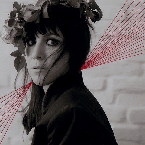
Zadie Smith: On Beauty, 2005—06 (Penguin Books, New York); hardback and paperback cover designs including bespoke typefaces

For typography and branding enthusiasts, viewing the latest A2/SW/HK typeface collection that recently launched online is the equivalent of setting a restrained, hyperactive child free in a sweet shop. Spanning over 15 years of work, the array of fonts range from the delicate, swirling Zadie, commissioned by Penguin Books New York for the US version of the novel On Beauty by Zadie Smith (hence the name), to the heavier, more robust Impacto, which cuts a dashing and authorative figure, as its name suggests. Similar to walking into a department store to choose an appropriate outfit for a function, A2/SW/HK have meticulously crafted a typeface for every occasion, depending on the message and feeling the consumer would like to convey.


Impacto typeface, 2010 (A2-TYPE, London); bespoke typefaces

The impressive collection comprises of 15 typefaces, many of which have multiple weights (fonts), with each font containing 256 characters. Overall, there are 53 fonts to marvel at totaling 13,568 individual glyphs (these include all members of the alphabet, diacritics, numbers, symbols and punctuations).


Psycho Buildings, 2008 (Hayward Gallery, London); art direction, bespoke typefaces and design

The typefaces were previously designed for bespoke projects across various media platforms including print, screen and interiors, however, the launch of the collection in their entirety means that, for the first time ever, the fonts are available for general use. “The typefaces can be used for any type of advertising now; even by two different fashion brands if they want,” says Kubel. “A typeface can work for many people in different ways, depending on who the creative director is and how they choose to use it. You’d be surprised at how many times a single typeface can be used to present different meanings for different jobs.”


Lisson Gallery, 2008 (Lisson Gallery, London); redesign of existing identity

Although A2/SW/HK is essentially a two-man strong team, don’t be fooled by their size. Formed in 2000, the pair have worked with a number of leading national and international clients, providing design consultancy, art direction, brand identity, website design and bespoke typography. Their recent client list includes Hayward Gallery, Lisson Gallery, Tate, Design Museum London, Phaidon Press, Faber & Faber, Penguin Press New York, Royal Mail, Danish Post, Vogue UK and MoMA. “I don’t see ourselves in the category of a small business,” says Kubel. “We are a creative design studio and it doesn’t matter whether we are ten people or two people. If you look at big businesses, they might have a work force of fifteen people but from a creative point of view there’s only two. We’re very self-sufficient.”


Fabric of Fashion, 2001 (British Council, London); bespoke typefaces and design

Born in Denmark, Kubel was exposed to art from an early age (his mother was an artist and encouraged painting) and developed a passion for type at the age of eleven when he discovered graffiti. In 1997, after graduating from Denmark’s Design School in Copenhagen, Kubel moved to London to do his Masters at the Royal College of Art where he met his design and business partner Scott Williams. “When Scott and I graduated, we just thought ‘lets do our own thing’ which is ridiculous now come to think of it. We had no network, no clients, no idea of anything – all we had was our creativity.” Yet following their graduation, with minimal resources, their gritty determination and hard work led to them being selected by highly acclaimed visual communications magazine Creative Review to feature in their annual ‘Creative Futures’ show, an initiative showcasing the most promising graduates to watch from across the country.


Radical Fashion, 2001 (V&A Museum, London); art direction, bespoke typefaces and design

Although Kubel downplays his and Williams’ achievement, attributing their selection by Creative Review to ‘just luck’, it is clear the raw talent that the duo possessed was enough to capture the attention of a representative at the British Council who subsequently signed them up to their first ever commission. “We ran a very successful project called Fabric of Fashion in 2001 and at the opening of the show, we met one of the editors who worked at the V&A so landed our next stint, which was about radical fashion – it was all very exclusive.” Post-radical fashion, more commissions ensued and as word got out of the duo’s work and their creative circles widened, their client list began to grow.


Samuel Beckett, complete works, 2009—2010 (Faber & Faber, London); cover design & bespoke typefaces

With an eclectic (and damn cool) portfolio which includes the cover design and bespoke typefaces for the complete works of Samuel Beckett (2009-2010; commissioned by Faber and Faber), sheet and typeface designs for Ian Fleming’s James Bond limited edition stamps (2008; commissioned by Royal Mail UK), and the ‘Reading Room’ exhibition design and print campaign for the Turner Prize Exhibition (2002-2007; commissioned by Tate Britain), which also made the front page of The Independent, to name a few, it is a collaboration with Margaret Calvert, an old tutor of Kubel’s at the Royal College of Art, on the New Rail Alphabet, which he names as being one of his career highlights. A revival of the British Rail alphabet originally designed by Calvert in 1965, which was used nationwide with British Rail, BAA and the NHS, was digitised, updated and re-launched in 2009 with a family of six weights.


New Rail Alphabet, 2009 (A2-TYPE, London); typeface in six weights; designed in close collaboration with Margaret Calvert

In the higher echelons of the graphic design industry, A2/SW/HK’s work has not gone unnoticed. They have picked up a plethora of global accolades along the way including awards from The International Society of Typographers, British Design & Art Directors and Art Directors Club of New York. In 2007, Kubel and Williams received recognition as members of the prestigious Alliance Graphique Internationale, which is a testament to years of tireless dedication to their craft, talent and skill.

Despite a well-decorated mantelpiece, complacency is not something that festers within the fabric of Kubel’s work ethic. “We may have achieved a lot but it doesn’t get any easier. You’re always judged by your last piece of work and I’m worried about looking back at my career and not being happy with the work I’ve produced.” He pauses briefly before calmly adding: “But there are only a few pieces that I feel this way about. Overall, I’m pretty happy with the work we’ve done and don’t mind looking back.”


Ian Fleming’s James Bond, 2008 (Royal Mail, UK); miniature sheet design and bespoke typeface

The weekend that I meet Kubel, he is in particularly fine form. Earlier in the week, he received news that he had been awarded a three-year working grant by the Danish Art Foundation, which is one of the most sought for and prestigious working grants awarded by the Nordic country for exceptional quality of artistic production and artistic talent. Kubel has worked almost non-stop over the past decade, and the grant means that he can now afford to invest some time in himself, creating more headspace for new ideas. “I shed a tear when I found out and called my mom; imagine how proud she is?” he says with a content but tired smile.


Turner Prize Exhibition design, 2002—07 (Tate Britain, London); art direction, design and bespoke typeface

In an industry which constantly strives to be ‘achingly hip’ and ‘cutting-edge’, A2/SW/HK’s approach to their work is refreshingly non-pretentious, which is what many of their clients may find appealing. “It’s the thinking and sensibility behind the solutions that makes us strong. I don’t see us as being ‘trendy’ but I don’t see us as being ‘old fashioned’ either – we are probably somewhere in between,” Kubel expresses. “We don’t work to trends, we work on what we feel best complements our clients’ brand values.”


Ergonomics — Real Design, 2009—2010 (Design Museum, London); exhibition identity, applied graphics and brochure including bespoke display typeface; exhibition design by Michael Marriot; photography courtesy of Luke Hayes & A2/SW/HK

In the design and communication industries, the choice of type may have many different connotations and certain typefaces are chosen to represent a brand because they effectively embody the product’s philosophy. This may, in turn, help to explain why we have a certain affinity for some brands more than others. For A2/SW/HK, understanding this psychological aspect of branding is the crux of their trade. “Typography is hugely important. Everything you look at contains letters – it’s used for direction, it’s used for instruction, it’s everywhere. If you can’t read and write you’re lost, aren’t you? That’s what binds society together, it’s communication.”

In a market that already contains 200,000 typefaces, does Kubel think there will be a day when the typeface market will be saturated and there will be no more typefaces to explore? “It’s already saturated but that doesn’t mean you should stop designing. It’s been said many times before, we need new films, new music, new exhibitions, new chairs, new painters and we need new typefaces.”


Summer of Love: Art of the Psychedelic Era, 2005 (Tate Liverpool); art direction, design and bespoke typeface

During the course of the interview, Kubel shows me some of his sketch books, a collection of sketches and scribbles, images torn out of newspapers/magazines, and various other eclectic items which looks like an art project in itself. “It’s very personal but this is how I keep my inspiration and ideas,” he says. As we talk at his spotless white ‘consultation’ table, there is a moment when I mentally take a snapshot of him casually drawing a letter ‘R’ with a graphite pencil on a sheet of paper in front of him. The letter is so perfectly formed that it looks as if it has been produced with a Letraset font style pack, with angles and lines drawn like a ruler has been pressed against their edges – I couldn’t help but comment. “People say that if you spend 10,000 hours on something, you become a master…,” he coolly replies. “…I’ve probably spent 8,000 drawing typefaces.”


A2/SW/HK Process AGI Poster, 2010


Typography Workshop Posters, 2000—06 (Buckinghamshire Chilterns University College); posters (40+ in series)

Kubel strikes me as somewhat of a paradoxical figure, humble yet self-assured, content yet massively ambitious. Speaking of his life prior to London, he says: “I remember when I was at the Danish Design School and we visited the Royal College (of Arts) and I knew I wanted to get in. I knew I wanted to go to London, learn the language and find someone to set up a design studio with. I was very naïve.” Naïve he may have been but in effect, he has achieved everything he set out to do – and then some. Having realised his dream of studying at the Royal College of Arts, he now teaches at the world-renowned institution twice a month. “My students are scarily talented – I am teaching my competitors of the future but I was taught there myself. The Royal College means a lot to me and I will give back as much as I can for as long as I can.”


Cold War Modern, Design 1945—1970, 2008 (V&A Museum, London); art direction and bespoke typefaces

As our interview draws to a close, and my mind is buzzing with more questions about typefaces and I entertain myself with the thought that on some level, humans and fonts are quite similar in relation to their variety, heritage and what they stand for, I ask Kubel which font he thinks would best describe him. He ponders for a moment, cocking his head to one side and glances out of the window onto the terrace, which is beginning to speckle with raindrops, to gather his thoughts. “You’d have to put a lot of typefaces together to describe me; I’m not one, I’m very broad,” he says with a glimmer of mischief in his eye. “I draw all styles, from very eclectic to very bland; it’s me and my personality. I’m a chameleon typeface.”

The new A2/SW/HK typeface collection is now available online and can be found here.

A2/SW/HK have also teamed up with Playtype who will releasing additional fonts from the A2/SW/HK library in December 2010.

Categories ,A2/SW/HK, ,Alliance Graphique Internationale, ,Art Directors Club of New York, ,baa, ,British Design & Art Directors, ,British Rail, ,British Rail Alphabet, ,Creative Futures, ,Creative Review, ,Danish Art Foundation, ,Denmark’s Design School, ,Design Museum London, ,Faber & Faber, ,Hayward Gallery, ,Henrik Kubel, ,Ian Fleming, ,James Bond, ,Kat Phan, ,Lisson Gallery, ,Margaret Calvert, ,New Rail Alphabet, ,NHS, ,On Beauty, ,Penguin Books, ,Phaidon Press, ,Playtype, ,Remington Standard, ,Royal College of Art, ,Royal Mail, ,Scott Williams, ,Tate, ,The Independent, ,The International Society of Typographers, ,Turner Prize Exhibition, ,Vogue UK, ,Zadie Smith

Similar Posts:


Amelia’s Magazine | Red Lines: an interview with Danish musician Hannah Schneider

Hannah-Schneider-by-Essi-Kimpimaki
Hannah Schneider by Essi Kimpimaki.

Danish born Hannah Schneider comes from an illustrious musical heritage: her grandfather was famed violinist Alexander Schneider, a member of the celebrated Budapest String Quartet and her mother was a violinist with the Royal Danish Theatre. Coming from such a background it is unsurprising that Hannah is a ‘melody fanatic’ with an ear for a good tune and an innovative arrangement. Red Lines is her third album, a glorious miss mash of electronica and classical influences. Here she answers some revealing questions…

What are you up to today?
Right now I’m enjoying the last rays of sun outside on a café in Copenhagen, so right now I’m doing very well! I’m working a lot these days, getting ready for my album release, so a little break is very much appreciated.


How does Red Lines differ from your previous two albums?
My new album Red Lines is very “open” towards people compared to my last album. On Me vs. I (2012) I looked very much inwards, and worked with themes that were very personal. On my new album Red Lines I guess I’m looking out on the world and opening up a little more. This album is very much built by the different songs, more than an overall sound – I felt a great freedom in giving each song what it needed. Also I have gone from a “one-woman-army” who produced it all myself, to working with the two Danish producers Andreas “Maskinen” Sommer and Lasse Baunkilde, and of course that has changed the process a lot. I guess you can also actually hear a little more of a masculine sound mixed with my dreamy and feminine vocals. I like that mix. The songs have very different themes, and I have been inspired by everything around me – from a gripping Chinese contemporary art exhibit at the Hayward Gallery in London, to a lonesome walk in a storm in the Danish countryside. Since my last album, I had a baby girl, and I think that influences my writing a lot – not in the sense that the songs have all become lullabies or talks about diaper change, but more in the sense of the strength and empowerment it has made me feel to be a mother.

hannah_schneider
The album features quite a lot of synths and electronica, who are your influences in this area?
I’m quite the synthesiser geek – I love old synths, I often hunt small Casios down on flea markets, and spend a lot of time experimenting with synths and pedals. I also write most of my songs on keys/synths, and have production ideas just as fast as melody ideas. On this album we were inspired by the sound of the movie Drive – this 80′s cinematic, synths driven sound- but also very much by one of my great heroes Kate Bush.

There are a lot of classical musicians in your family, how do you think this has shaped your approach to music making?
I think very much in orchestral arrangements, I always have lots of strings, and my brother (cello) and sister (violin) always find their way into the productions. I think it is very much in my blood, thinking in classical melodic structures, and I still listen a lot to classical music.

Hannah Schneider by Carly Watts for Amelia's Magazine
Hannah Schneider by Carly Watts.

You have been described as a ‘melody fanatic’, is this where you start with your songwriting or if not, where do you start?
I love that description – makes me sound like a crazy-person – I think it refers to my great love for melodies that catches you- I try to work with that in my music. I have an extremely broad taste, and love very different kinds of artists, but the common denominator I think, is strong melodies. A tiny bit of melody hummed by someone can be so haunting, sad, interesting and lovely, and I’m fascinated by the structure of melody.

What’s the music scene like over in Denmark?
A lot of great artists right now, and a lot of strong female acts, setting the tone. I think that what we lack in size, we are starting to gain in originality – it seems there’s a “nordic sound” evolving these days..

Hannah_Schneider_2
Out of all the tracks on the album, which is your favourite?
I think the first track on the album, Butterfly Lovers, sums up the album very well- I wrote it with one of my favorite collaborators Kim Richey, in London last year. It was just a great process of writing – we had been to a Chinese Modern Art exhibit at Hayward Gallery on the Southbank, and there was this very scary and gripping lady who did a performance on this old Chinese myth about two lovers who cannot have each other, and the vibe of this story totally set us in motion.. I also really love the song Dreaming Kind – my tribute to the sensitive kinds of people (very much like myself) and the song Everything, that’s basically a happy song about realizing that the facts aren’t as grave as they seem..

If you could bring back one musician from the dead to collaborate with, who would it be and why?
I think I would have a whole festival of dead people!! But to name one, it would probably be Nick Drake – I think he’s absolutely gripping, and he died so young that he didn’t get to do a lot of records – I would love to pick his brain and see what we would come up with!

What’s the maddest thing a fan has ever done for you?
Travelled all the way to the US to see a show !

hannah_schneider-cover artwork
What are your forthcoming plans for the UK with this new album?
I just played a show in London, and I really enjoyed it – hopefully I’ll be back soon to play some shows – we’re working on a couple of opportunities right now. It is my first release in the UK, so in a sense I start all over- it will be fun to build up an audience from the ground- I love performing and working on my live set.

Red Lines by Hannah Schneider is out on the 27th of October on Lojinx in the UK.

Categories ,Alexander Schneider, ,Andreas “Maskinen” Sommer, ,Budapest String Quartet, ,Butterfly Lovers, ,Carly Watts, ,Chinese Modern Art, ,copenhagen, ,Danish, ,Dreaming Kind, ,Drive, ,Essi Kimpimaki, ,Everything, ,Hannah Schneider, ,Hayward Gallery, ,Kate Bush, ,Kim Richey, ,Lasse Baunkilde, ,Lojinx, ,Me vs. I, ,Motherhood, ,Nick Drake, ,Nordic, ,Red Lines, ,Robyn, ,Royal Danish Theatre, ,Synth

Similar Posts: