Amelia’s Magazine | London Art Fair 2014 Review: Our Top Picks

London Art Fair review 2014-Jin-Young Yu at Union Gallery

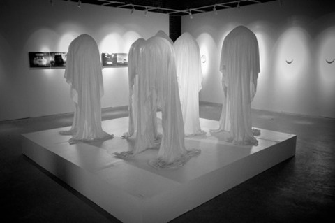
Jin-Young Yu at Union Gallery.

This year I received invites to the London Art Fair in January thanks to the nice folks at the Catlin Art Prize, but sadly I did not make it along myself because Snarfle was ill. Instead I sent his dad Tim along, with a mission to snap the stuff he liked. I hope you enjoy a round up of the work that caught his eye.

London Art Fair review 2014-ophelia finke

Ophelia Finke’s Explorer has an eery quality to it – why is there a red anorak abandoned on the floor? Did the child wander off into the virtual jungle behind? Where are they now? A closer inspection reveals that the raincoat is delicately crafted from a combination of resin, plastic and paint, it’s immovability rendering it even more strange. Ophelia is one of the finalists who is featured in the Art Catlin Guide for 2014.

London Art Fair review 2014-michael o'reilly

Michael O’Reilly is another artist chosen by Art Catlin, specialising in frantically daubed, bright and often surreal paintings. Greetings, above, suggests a melting animal face, but could the title hint at more?

London Art Fair review 2014-Charlotte Roseberry

The copious squiggles, firm lines and joyful colours used by Charlotte Roseberry call to mind the best of 1980s graphic art – a style that will always find appeal with me, and one that continues to be popular in its modern incarnation. She is our final pick from the Catlin Art Prize selection.

London Art Fair review 2014-dido crosby

Moving on, these enigmatic sheep heads are by Dido Crosby at Jagged Art, who combines a training in both zoology and sculpture. Apparently One Goat and Eight Sheep is made out of unglazed china and taxidermy with glass eyes. I’m a little freaked out, where are the actual goat heads in these? Buried beneath clay? Certainly eye-catching, though I’m not sure I’d want it on my wall.

London Art Fair review 2014-fairies

The Fairies Series by multi-disciplinary duo Davy & Kristin McGuire features tiny videos projected onto kilner jars.

London Art Fair review 2014-Zac freeman

Found objects are assembled into a face by Florida based Zac Freeman at Woolff Gallery, artwork that is best viewed at a distance.

London Art Fair review 2014

This photo comes without any description but I had to include it because it is just so weird. What on earth are those women doing in a bath tub?

London Art Fair review 2014-sarah ball

Sarah Ball’s painting has an intensity that normally only comes from a photograph, with styling that hints at both the modern (that petulant face) and the traditional (the earrings, the hair).

London Art Fair review 2014-envie d'art

London Art Fair review 2014-envie d'art

Robert Bradford at Envie D’Art has glued all sorts of strange objects onto wood to construct this pooch, which takes on a particularly cool quality when viewed from the front.

London Art Fair review 2014-Alexander Korzer-Robinson

Alexander Korzer-Robinson makes intricate collages from cut out books.

London Art Fair review 2014-Nick Jeffrey

Bugs remain a popular decorative theme, as used in this Beetle Orb by Nick Jeffrey at Panter and Hall.

London Art Fair review 2014-magda archer

I saw some photos on instagram as this was being printed at Jealous Gallery, so how apt that Tim should pick out Magda Archer‘s My Life Is Crap, which features a prancing lamb sprinkled with diamond dust.

London Art Fair review 2014-Dave Anderson

A blue English Heritage style plaque bearing the immortal words ‘The Woman Who Sleeps With Your Husband lives here’ comes as a screen print by the brilliant Dave Anderson, also known as Blood Sausage.

London Art Fair review 2014-Tom Butler

London Art Fair review 2014-Tom Butler

Tom Butler at Charlie Smith London makes scary monsters by painting delicate gouache on top of old photographs.

London Art Fair review 2014-Jin-Young Yu

London Art Fair review 2014-Jin-Young Yu

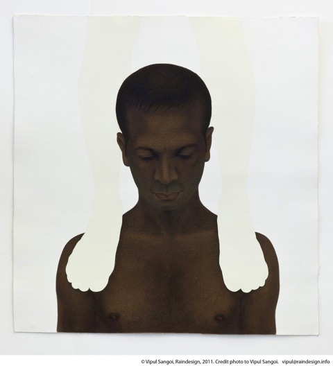
Girls with floating appendages by Jin-Young Yu at Union Gallery look even weirder on closer inspection, with tears of blood, surgical bandages, a bullet wound.

London Art Fair review 2014-alice mara

A digitally printed council flat urn by ceramicist Alice Mara combines tradition and modernity incredibly well. I love this piece.

London Art Fair review 2014-Katharine Morling

London Art Fair review 2014-Katharine Morling

Katharine Morling recreates the debris of everyday life in carefully painted porcelain, arranging them to make curious vignettes.

London Art Fair review 2014-frida kahlo

I am not sure who made Frida Kahlo out of old tiles but she’s fun.

London Art Fair review 2014-Back in 5 Minutes by Valerie Kolakis

A small note bearing the words Back in 5 Minutes by Valerie Kolakis was on sale for £1000, but I am not sure that a push pin cast in 14 carat gold justifies the price tag.

London Art Fair review 2014-African prints

London Art Fair review 2014-African prints

London Art Fair review 2014-African prints

London Art Fair review 2014-African prints

Finally, this collection of joyful African prints made a big impression. Thankyou Tim Adey, I think it’s safe to say we have pretty similar tastes. Just as well eh?!

Categories ,African Prints, ,Alexander Korzer-Robinson, ,Alice Mara, ,Art Catlin Guide, ,Back in 5 Minutes, ,Beetle Orb, ,Blood Sausage, ,Business Design Centre, ,Catlin Art Prize, ,Charlie Smith London, ,Charlotte Roseberry, ,Dave Anderson, ,Davy & Kristin McGuire, ,Dido Crosby, ,English Heritage, ,Envie D’Art, ,Explorer, ,Frida Kahlo, ,Greetings, ,Islington, ,Jagged Art, ,Jealous Gallery, ,Jin-Young Yu, ,Katharine Morling, ,London Art Fair, ,Magda Archer, ,Michael O’Reilly, ,My Life Is Crap, ,Nick Jeffrey, ,One Goat and Eight Sheep, ,Ophelia Finke, ,Panter and Hall, ,Robert Bradford, ,Sarah Ball, ,Snarfle, ,The Fairies Series, ,The Woman Who Sleeps With Your Husband lives here, ,Tim Adey, ,Tom Butler, ,Union Gallery, ,Valerie Kolakis, ,woolff gallery, ,Zac Freeman

Similar Posts:


Amelia’s Magazine | An interview with artist Tom Howse, as featured in The Catlin Guide

TOM HOWSE (AM) - SEARCHING FOR THE ONE YOU WANT
SEARCHING FOR THE ONE YOU WANT by Tom Howse.

A few months ago we interviewed Justin Hammond, the creator of the The Catlin Guide and Catlin Art Prize for the best new up and coming artists – currently represented at an exhibition being held at the Londonewcastle Project Space in Redchurch Street in East London. Amongst many interesting artists (I like the work of Adeline de Monseignat, who is also promoted by Art Grab) the mystical paintings of Tom Howse stand out as particularly unique. I decided to find out what makes him tick.

TOM HOWSE (AM) - RADIANT BAZAAR
RADIANT BAZAAR by Tom Howse.

You say that you attempt to create a sense of mystery and unknowing in your paintings – often with a monolith like appearance to a possibly everyday object – why do you think you are drawn to this kind of seeing?
I think that there is something poignant about solitary objects, they give a sense of unity and completion. Where other things may need to be combined and joined together to create a meaning, the impact is sometimes diluted with each component. Mono-imagery has the responsibility to represent all the themes which multiple images would otherwise share. I like the idea that a solitary object can attempt to convey multiple themes, to a point where it becomes implausible to transmit so many ideas through a direct representation, therefore the image resorts to a higher level of omnipotent representation. Which is ludicrous, they can’t do that, but I like the thought that they can, because it feels more exciting.
 
TOM HOWSE (AM) - SPHERICAL MANOEUVRES
SPHERICAL MANOEUVRES by Tom Howse.

Where do the original ideas and objects come from? For instance what is the Spherical Manoeuvres? It calls to mind both a snowglobe and one of those things from the 80s with electrical currents zipping around a sphere.
I like that these things can be interpreted in a variety of ways, that they don’t have to remain fixed in one state of being. An example of what I was saying before is that the object is attempting to be a snowglobe and an 80’s plasma ball thing at the same time, its impossible for it to do both things, so it attempts to become both things at the same time and results in becoming something else altogether. In an alchemical manner it has become a new element, existing between states. I want it to appear to be trying to do this act seriously, but I also want it to fail to do so, and just make itself look ridiculous. There is an absurdity in my work, like trying to express really deep, meaningful pearls of enlightenment, but through the eyes of a buffoon.
 
THE TOWER by Tom Howse
THE TOWER by Tom Howse.

There is something deceptively simple about your final artworks, but I imagine they take some time to create – what is the process of putting an artwork together? 
I can end up painting dozens of images on each canvas. Sometimes I’ll be really excited about something I’ve painted, but after an hour I may have completely lost interest in it, other times I may see something I like in a painting I’ve not touched in months. I think it takes a long time to really understand what you’ve painted. Also, to achieve that simplicity, the image will often have started off being far more complex, I then tend to get annoyed with the busyness of it, I begin to try and single out the most vital aspects of the image, and go about turning the volume down on the peripheral irrelevancies.
 
LANTERN by Tom Howse
LANTERN by Tom Howse.

How do you choose what medium to work in and why is it your preferred medium?
I almost solely use oil paints and pastels, I think that I’ve developed my approach to painting not through what I want to paint, but through how I want to paint. I don’t tend to wash my brushes out between colours and I don’t tend to wait for wet layers to dry, this results in loads of unexpected effects, really dirty colours but with brilliant streaks of virgin paint running through. I usually draw figures in with pastels as apposed to with a brush because it feels more like working with pencil on paper, makes it feel more relaxed and natural. I also hate to waste paint, so you can leave the oil paints on your palette for weeks then still pick them open like scabs filled with beautiful gems.
 
UNCONQUERED MAGIC by Tom Howse
UNCONQUERED MAGIC by Tom Howse.

The colours you use are very vibrant – so much so they seem to take on a 3D life of their own, almost as if the paintings are lit from within. What other artists or movements have inspired your work?
I really like colourful work, but I also quite grimy, dirty paintings too, and best of all when their combined together. There is a list of painters who have inspired my work in different ways, such as Henri Rousseau’s portraits and jungles, Phoebe Unwin had a show at Wilkinson Gallery a year or two ago, that’s still in my mind. I saw a painting by Daniel Richter at Frieze last year that has stuck with me called London Is The Place For Me. Recently I’ve been looking at the patterns in Gustav Klimt’s work.
 
TOM HOWSE (AM) - RAINBOW WAND
RAINBOW WAND by Tom Howse.

Your sense of magic is very prevalent in Rainbow Wand – what do you hope viewers will feel when they look at this image?
I hope they feel magic. If viewers felt magic in all my work I’d be pretty chuffed. I hope that it can attract people to look at it, and look at it long enough to try and think what the image may mean for them. Chances of anyone feeling anything profound when they look at my paintings is pretty far-fetched, but I think it’s a pretty good aim to have in mind when I’m painting.
 
TOM HOWSE (AM) - LEMURIA
LEMURIA by Tom Howse.

If Lemuria is inspired by a cat is it inspired by a real live one? Can you tell us more about this character… real or imaginary.
Well there is a real live cat in my life, and he’s a nasty piece of work! Not all the time though, he can be a real darling too. He goes out most nights and gets into trouble. He doesn’t really have a name, it doesn’t mean anything to him what he’s called, and he never listens. Sometimes I call him Teacake, sometimes Susan. Recently I’ve been calling him Fun House. I like that he’s not got a proper name, makes him seem more elusive.
 
SPOTTED MONOBROW by Tom Howse
SPOTTED MONOBROW by Tom Howse.

What next after Art Catlin?
I’m going to enjoy some good studio time, main thing I want to do is get on with some more painting. I’m meeting with a couple of different people to discuss doing some shows later in the year and I’ve been asked to put in a piece of work for a group show at The China Shop Gallery in Oxford, the show’s titled Apophenia and it opens 7th July.

Check in with Tom Howse here. The Catlin Art Prize exhibition runs from 4th – 25th May at Londonewcastle Project Space. Read my full listing here.

Categories ,Apophenia, ,Catlin Art Prize, ,Daniel Richter, ,Henri Rousseau, ,Justin Hammond, ,Londonewcastle Project Space, ,Phoebe Unwin, ,The Catlin Guide, ,The China Shop Gallery, ,Tom Howse, ,Wilkinson Gallery

Similar Posts:


Amelia’s Magazine | An interview with Justin Hammond, Curator of the The Catlin Guide and Catlin Art Prize

A highly collectible work of art in itself, The Catlin Guide for 2012 is the premiere place to discover the best new graduate artists from across the UK. We decided to quiz curator Justin Hammond on the history of The Catlin Guide. Read on to find out more!

You are about to launch the 2012 edition of The Catlin Guide at the London Art Fair, between the 18th – 22nd of January at the Business Design Centre in Islington. What can people expect?
Due to the financial implications of most art fairs, galleries tend to pack out their stands with large and expensive statement pieces. So I’m going to do the opposite and curate a show of small scale drawings, photography and works on paper. I’ve asked artists like Gabriella BoydTom Howse to make very small paintings. I’m showing eleven artists from the Guide – a real mixture – and for most of them it’s the first time they’ve shown in that kind of environment. We’ll also be giving away copies of The Catlin Guide, of course.

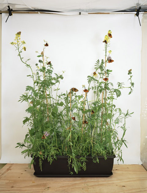
Dark Green Fritillery on Wildlife Attracting Mix, installation by Alison Stolwood
.

You’ve picked 40 graduates for inclusion in the guide: what criteria determines who you pick, and what are you looking for?
Potential is the key criteria. I’m looking for artists with the ability and desire to progress and really make their mark in the art world over a prolonged period. Ultimately, I choose the final 40 artists but a big part of the initial long-list is made up of recommendations from course tutors, curators, collectors, gallerists, artists, critics and bloggers.

Rowena Hughes, twofold interleaf
Twofold Interleaf by Rowena Hughes.

What is your background?
I studied Art History in Manchester in the early 90′s, but didn’t open my first space in Hackney until 2005. Along with my brother, I ran MLIA in Broadway Market for a couple of years showing new grads and generally making it up as we went along. That was when I decided to start the prize and Catlin came on board as the sponsors almost immediately. The first year was held at the now defunct Ada Street Gallery with a first prize of £1000.


Portrait of the artist on vacation and the door opening for a Byronic Hero by Hannah Harkes.

How do you support the up and coming artists that you choose, so that their career gets off to the best start it can?
The Catlin Guide functions as an index; a bang-up-to-date ‘who’s who’ of the new wave in contemporary art, and that’s a great platform. If the Guide can help to facilitate exhibition opportunities or encourage interest from galleries and collectors, then I see it as a success. Last year, the winner of the Catlin Art Prize was awarded £5,000, whileCatlin bought work by participating artists and commissioned two new pieces for their collection, so there’s financial support too.


Catlin Art Prize 2008 at LSO St. Luke’s

How is The Catlin Guide related to the Catlin Art Prize, and how do they work alongside each other?
In a way, they’re quite separate. The Catlin Art Prize came first and The Catlin Guidewas initially a supplement to that and a way of documenting the shortlisting process. Now, I think The Catlin Guide has taken on its own identity and individual worth. All artists for the Prize are selected from the book, but there’s a gap of four months between publication and exhibition, so The Guide has its own lifespan.


Victoria Matkin‘s ‘Ladies in Waiting’ – Catlin Art Prize 2010 at Village Underground Victoria Matkin’s © Justin Green Photography.

What are your particular hot tips from the current batch of featured artists in the guide?
All 40 artists are in with a shout, but some are already streets ahead in terms of attention and publicity. The press will always focus on new grads from the Royal College of Art or other major schools, so I’m going to pick out Mandy Barker from De Montfort University and Hannah Harkes from Gray’s School of Art in Aberdeen. I like the way that both artists are forging their own paths. Neither is primarily concerned with producing commercial work, but what they make is very desirable. Hannah is on a residency in Tallinn and has just sent me through a fantastic new piece called Desert Picnic Imposter. I’ll be showing it at the launch.


David Malone.

What has happened with previous artists that were featured? Have they gone onto great things, if so what?
The Catlin Guide is only three years old, but lots of artists have gone on to feature in high-profile exhibitions in the UK and abroad. Leah Capaldi and Joshua Bilton from the 2011 Guide have just finished showing as part of Bloomberg New Contemporariesand Noemie Goudal has been selected for Out of Focus: Photography, at the Saatchi Gallery in May. But I’m taking a long-term view; it’s all about what happens over the next decade or more.


Untitled byAli Kazim.

How is the guide itself produced and how do you ensure that it is a desirable object destined for collectibility?
The slipcase makes The Catlin Guide very expensive to produce but we’re not looking to make a profit or even recoup the production costs. We print a limited number so that all adds to its collectibility. The first edition has sold out and there are just a few of the 2011 edition remaining. OK, here’s the technical stuff: For the slipcase we’ve used Lockwood Green 135gsm from the GF Smith Colorplan range. The Guide itself is printed onto 170gsm Munken Polar. All the paper products are FSC certified. There are 128 pages.

TOM HOWSE - MOSSY LICHENS  (CATLIN GUIDE)
Mossy Lichens by Tom Howse.

Why did you decide to print your guide with Principal Colour? Was it important to use a printer based in the UK and if so why?
Catlin came across Principal Colour and we were impressed with their green credentials. Printing abroad was not an option due to the tight deadlines. It’s imperative that the information in the Guide is as relevant as possible, so we sign off in the week leading up to Christmas and publish in mid January. Principal Colour were prepared to go in and work on The Catlin Guide over the Christmas break.


Tom Howse at work.

For information on the design of the guide and tips for how future graduates can best make an impression on curator Justin Hammond make sure you visit the rest of this blog at the Principal Colour Tumblr feed. You can check out The Catlin Guide for 2012 at the London Art Fair between the 18th – 22nd of January at the Business Design Centre.

Categories ,Ada Street Gallery, ,Alex Ball, ,Ali Kazim, ,Alison Stolwood, ,Bloomberg New Contemporaries, ,Broadway Market, ,Business Design Centre, ,Catlin Art Prize, ,David Malone, ,De Montfort University, ,Desert Picnic Imposter, ,FSC certified, ,Gabriella Boyd, ,GF Smith Colorplan, ,Gray’s School of Art, ,Hannah Harkes, ,Joshua Bilton, ,Justin Hammond, ,Leah Capaldi, ,Lockwood Green, ,London Art Fair, ,Mandy Barker, ,MLIA, ,Moje Sabz, ,Mossy Lichens, ,Munken Polar, ,Noemie Goudal, ,Out of Focus: Photography, ,Peter Saville, ,principal colour

Similar Posts: