Matthew Rose is an American artist living in Paris known for his 1, tadalafil 000 piece wall-to-wall collages. On viewing his work, see you can’t help but feel as if you are peering into the wrong end of a telescope; the objects look familiar yet distorted, occasionally sordid yet beautiful.
His abstract, artistic style presents a surreal and parallel world infused with vibrant colours where he often plays with an unusual fusion of subjects (and by this I mean a man with carrots for his head or a woman who is part-human, part-camera – pretty crazy stuff but in the most fantastic sense!).
For almost three decades, Matthew has been producing installations, which reinforce the connection between imagery and literature in art. His works – many of which are a composite of collage and text, presented in a poetic and abstract form – evoke the genres of 20th century surrealist artists, and several critics have cited his work as demonstrating a ‘dadaist exploration of sense and nonsense.’
Matthew’s installations have featured in galleries and museums across Europe, Asia and the United States, and his work has appeared in numerous books and magazines, including MASTERS: COLLAGE (Sterling Publishing/Lark Books, 2010), which was recently published.
His most notable art project to date, A Book About Death, showcased in New York’s Emily Harvey Foundation Gallery in September 2009. The show was a logistical feat in that it involved thousands of artists from across the globe mailing 500 artworks in the form of postcards to construct the exhibition. The beauty of the exhibition was that the end result was offered to one lucky visitor in the form of a book… for free. More than 18 exhibitions of A Book About Death have been staged worldwide, including The Queens Museum in New York, MuBE in São Paulo and MoMA Wales.
Matthew’s latest project, Scared But Fresh, a dislocated love story, recently showed at the Orange Dot Gallery, a lovely new exhibition space in the heart of Bloomsbury, which I was lucky enough to catch. By his own admission, Matthew is interested in ‘creating works to see them for himself’ but as a by-product of his imagination, his mesmerising creations elicit in the viewer thoughts and revelations of their own.
After gate-crashing a Brown University reunion held at the gallery, where Matthew studied Semiotics in 1981, I managed to grab a quiet moment with the calm and composed artist before swathes of his fellow country men arrived, to gain a glimpse into the annals of the mind of a truly fascinating individual…
How old were you when you realised you wanted to be an artist?
I couldn’t have been more than six years old when my mother and aunt dragged me to The Brooklyn Museum to see Van Gogh. The lines went around the block and I couldn’t understand what the fuss was about; I was hungry, my feet hurt and being small, I was suffocating in this cloud of wool coats. Once inside the galleries, however, I caught my first glimpse of what has proven to be a very nourishing world… I stayed close to my mother and aunt for about 10 minutes but soon enough got lost (purposely) and quietly pushed my way through the crowds to get up close to Van Gogh’s brilliant colors, these vibrating landscapes – in particular, the painting he produced in the Arlesian sun, Almond Branches in Bloom (1890). It turned out to be one of the pieces he produced the year he died of a self-inflicted gun shot wound. I never forgot the color and intelligence behind this painting, and I slowly began to look for this “art experience” in my own.
What artists did you look up to when you were developing your artistic style?
Most artists I know were influenced by the early 20th century modernists – Picasso, Matisse, Malevich…then Duchamp and the Dadaists, the Surrealists, Pollock, de Kooning and then those who flavored the world we arrived in: Warhol, Johns, Rauschenberg. For me, probably folks like Hopper for his era and compositions and silence; and Cornell for his expansive internal universe, and mostly Ray Johnson, because he was a friend and teacher (as he was to thousands) and the way he worked. Since I mostly work in collage, I’m more prone to think in disparate images and texts, an old-fashioned multi-media stream of consciousness. I don’t have problems with dislocated images and lexical puzzles. Of course I don’t pretend that these artists are producing works of philosophy, but rather reflecting the cataclysm that stems from consciousness.
Your work often involves the use of collage – what led to this fascination and why do you like working in this particular abstract context?
Collage is just one of several mediums I work in. Over the years I’ve produced works/object in wax or wood, painting and drawing, and text pieces either as rubber stamp works (printing) or drawing the words. One of my interests is word as image, and collage permits me to combine words and images in a fairly rapid fashion. I tend to work super fast and produce series in a matter of days or weeks. I’m pretty obsessed once I get going and very little interferes with my process. I did a show some years ago called ‘Spelling With Scissors’, and this is my approach – combining literature (texts) with images. I have always discussed my aesthetic view as a form of reading.
What does working in collage allow you to express in ways that other forms of artistic expression cannot?
Speed. Strangeness. The wide array of material allows me to cover many ideas and compositional concepts in a short period of time. Painting plays a part in what I do, as does drawing and often these mediums come into play in a work. But collage is an approach to consciousness, and that, I think is the flux endpoint in my work. Most of the elements I use are found, and that, too, is an important part of my process. Seeing what the world washes up at my feet, the skidmarks of my time and place.
What was the inspiration behind Scared But Fresh?
Scared But Fresh is a love story. The works in the exhibition come together (in my mind, at least) to lay out a dislocated love story, a song about love with its insistent cacophony. I think if you look at the pieces in this exhibition, including the 12-piece collage on paper series, America, you’ll see sex, love and death (the staples of art making), you’ll discover heartache, lust, dread and all those angst-laden things that produce so much of the content of our lives. Or at least that’s the way I see it. Again, I produce these works to see them myself, to see what these odd elements produce in combination, and to perhaps understand what sort of stuff is moving around inside of me; that said, it’s not therapy, but rather an inquiry.
Why is the exhibition called Scared But Fresh?
Scared But Fresh was a phrase sent to me in 2002 by a friend; she signed an e mail that way. I immediately seized upon it, made a tonne of text works with it, cutting stencils and painting them, or adding it to other works, but also meditating upon its possible meanings. The “but” is critical. My thinking in using it for the title of this exhibition at The Orange Dot Gallery in London was that it was so aggressive, sure but still loaded with innocence and dread. Like love.
Critics have previously cited your work as a dadaist exploration of sense and nonsense. What would your response be to this?
I would agree with them. Dada is many things, and has been the point of departure for nearly 100 years of art production. The combination of sense and non-sense, broken grammar, chopped up meaning, and the flux of everyday life is, in my view, what my consciousness is like. What is the sense of finding a dollar bill stuck in a pile of dog shit? Or posters torn and weathered revealing a history of pasting and perhaps, a history of beauty (the models featured in years of posters, bits of their faces and clothing revealed)? I grab onto these things and consider them. Other people think about interest rates and widget production, and so do I, but I do something quite different with the information, the images and the meaning of these things. A large piece I produced, Les Affaires (prints are on Keep Calm Gallery’s site), surveys all sorts of exchanges; it is about commerce in many ways. Another work, Immaculate Perception (also available as a print on Keep Calm Gallery), is a very simple surreal piece showing a girl blossoming from a lemon tree. It’s not very interesting to be logical all day long, plus logic is overrated.
How would you describe your own style of work?
I’m a cut and paste artist. But I try to be clear in my chaos. The style can be dada, neo-pop, surreal, but I think after all these years, it’s simply mine.
When you create art, do you do it in the frame of mind that it will be viewed by others or it is created as a visual form of a personal diary? I create these things to see them for myself, to discover what this 1/2 face would look like with this 1/2 refrigerator. Or what would happen if this nice girl in her party dress would be like if she were wearing a steak for a head, or a pair of mechanical gears for breasts? I produce these works the way I play chess, carefully, but totally willing to take risks, totally willing to exchange queens, sacrifice pawns…not afraid to lose. As for a diary, I’m not sure about that, but I do work in books very often. Some of my series come in the form of 110-page visual novels like A Perfect Friend and Days Like These, People (drawings), Machines (drawings) and a dozen others. I feel not so much as if I’m making things for other people – again – but more for myself, and not to cure myself of anything other than the nightmare that is our world.
You are now based in France. Do you find that where you live has any influence on the themes that run through your work?
Living in France probably hasn’t altered in any significant way the themes that run through my work. Love, sex, death, anxiety, money will find you out no matter where you live. The material though is different. As I’m extremely interested in language, the plethora of printed materials in French, German, Spanish, Italian, English and other languages abounds here. I often find old beat up books tossed out on the street, or objects on the sidewalk. I can also play with a ton of languages and I very much enjoy that. It’s the world. My studio is small and quiet and as I also live in the space I’m always up at 3 am working. Or I sleep then wake and work… something is always going on here, and should I need to go out, a walk proves a real fascination for me after a period of intense activity. “Holy smokes,” I’ll say to myself. “I live in France.” I sometimes forget that I actually live in this country.
What thoughts/feelings would you like viewers to go away with after they have been to your exhibition?
Well they tell me that they enjoy the work, they like that craziness of the work, but that it all makes sense. During the exhibition the head of a large international advertising company spent quite a while looking at my work. His focus is message communication, and in particularly creating iPhone apps, so he’s very attuned to visuals and text, and he said to me: “This is brilliant.” At the moment he was looking at a work from the America series of a girl on a swing with the word “HOME” pasted on top of her. She was pasted, in turn, on top of a photograph of a ship in a raging storm. That to me was very rewarding. Because something that was interesting to me was interesting to someone else, it was strong enough to click somewhere else.
How would you best like to be remembered?
You mean when I die? I launched an enormous project about this (in a way), A Book About Death. So I’ve thought long and hard about what its like to not have consciousness, to be left alone, to struggle with the impermanence of life, and the often sad and painful lives we lead when the folks we love are no longer with us. I’ve tried not to turn away from death and acknowledge it. Maybe as someone who wasn’t afraid to confront his demons, loved his friends and collaborated with the world in a way that made a little bit more sense out of the nonsense.

My situation (image courtesy of Matthew Rose)
Matthew Rose is an American artist living in Paris known for his 1, thumb 000 piece wall-to-wall collages. On viewing his work, no rx you can’t help but feel as if you are peering into the wrong end of a telescope; the objects look familiar yet distorted, occasionally sordid yet beautiful.
His abstract, artistic style presents a surreal and parallel world infused with vibrant colours and where he often plays with an unusual fusion of subjects (and by this I mean a man with carrots for his head or a woman who is part-human, part-camera – pretty crazy stuff but in the most fantastic sense!).
For almost three decades, Matthew has been producing installations, which reinforce the connection between imagery and literature in art. His works – many of which are a composite of collage and text, presented in a poetic and abstract form – evoke the genres of 20th century surrealist artists, and several critics have cited his work as demonstrating a ‘dadaist exploration of sense and nonsense.’
Matthew’s installations have featured in galleries and museums across Europe, Asia and the United States, and his work has appeared in numerous books and magazines, including MASTERS: COLLAGE (Sterling Publishing/Lark Books, 2010), which was recently published.
His most notable art project to date, A Book About Death, showcased in New York’s Emily Harvey Foundation Gallery in September 2009. The show was a logistical feat in that it involved thousands of artists from across the globe mailing 500 artworks in the form of postcards to construct the exhibition. The beauty of the exhibition was that the end result was offered to one lucky visitor in the form of a book… for free. More than 18 exhibitions of A Book About Death have been staged worldwide, including The Queens Museum in New York, MuBE in São Paulo and MoMA Wales.

Private view invite (image courtesy of Matthew Rose and Orange Dot Gallery)
Matthew’s latest project, Scared But Fresh, a dislocated love story, recently showed at the Orange Dot Gallery, a lovely new exhibition space in the heart of Bloomsbury, which I was lucky enough to catch. By his own admission, Matthew is interested in ‘creating works to see them for himself’ but as a by-product of his imagination, his mesmerising creations elicit in the viewer thoughts and revelations of their own.
After gate-crashing a Brown University reunion held at the gallery, where Matthew studied Semiotics in 1981, I managed to grab a quiet moment with the calm and composed artist before swathes of his fellow country men arrived, to gain a glimpse into the annals of the mind of a truly fascinating individual…
How old were you when you realised you wanted to be an artist?
I couldn’t have been more than six years old when my mother and aunt dragged me to The Brooklyn Museum to see Van Gogh. The lines went around the block and I couldn’t understand what the fuss was about; I was hungry, my feet hurt and being small, I was suffocating in this cloud of wool coats. Once inside the galleries, however, I caught my first glimpse of what has proven to be a very nourishing world… I stayed close to my mother and aunt for about 10 minutes but soon enough got lost (purposely) and quietly pushed my way through the crowds to get up close to Van Gogh’s brilliant colors, these vibrating landscapes – in particular, the painting he produced in the Arlesian sun, Almond Branches in Bloom (1890). It turned out to be one of the pieces he produced the year he died of a self-inflicted gun shot wound. I never forgot the color and intelligence behind this painting, and I slowly began to look for this “art experience” in my own.

Anglais (image courtesy of Matthew Rose)
What artists did you look up to when you were developing your artistic style?
Most artists I know were influenced by the early 20th century modernists – Picasso, Matisse, Malevich…then Duchamp and the Dadaists, the Surrealists, Pollock, de Kooning and then those who flavored the world we arrived in: Warhol, Johns, Rauschenberg. For me, probably folks like Hopper for his era and compositions and silence; and Cornell for his expansive internal universe, and mostly Ray Johnson, because he was a friend and teacher (as he was to thousands) and the way he worked. Since I mostly work in collage, I’m more prone to think in disparate images and texts, an old-fashioned multi-media stream of consciousness. I don’t have problems with dislocated images and lexical puzzles. Of course I don’t pretend that these artists are producing works of philosophy, but rather reflecting the cataclysm that stems from consciousness.
Your work often involves the use of collage – what led to this fascination and why do you like working in this particular abstract context?
Collage is just one of several mediums I work in. Over the years I’ve produced works/object in wax or wood, painting and drawing, and text pieces either as rubber stamp works (printing) or drawing the words. One of my interests is word as image, and collage permits me to combine words and images in a fairly rapid fashion. I tend to work super fast and produce series in a matter of days or weeks. I’m pretty obsessed once I get going and very little interferes with my process. I did a show some years ago called ‘Spelling With Scissors’, and this is my approach – combining literature (texts) with images. I have always discussed my aesthetic view as a form of reading.
What does working in collage allow you to express in ways that other forms of artistic expression cannot?
Speed. Strangeness. The wide array of material allows me to cover many ideas and compositional concepts in a short period of time. Painting plays a part in what I do, as does drawing and often these mediums come into play in a work. But collage is an approach to consciousness, and that, I think is the flux endpoint in my work. Most of the elements I use are found, and that, too, is an important part of my process. Seeing what the world washes up at my feet, the skidmarks of my time and place.

Scared But Fresh at Orange Dot Gallery (image courtesy of Orange Dot Gallery)
What was the inspiration behind Scared But Fresh?
Scared But Fresh is a love story. The works in the exhibition come together (in my mind, at least) to lay out a dislocated love story, a song about love with its insistent cacophony. I think if you look at the pieces in this exhibition, including the 12-piece collage on paper series, America, you’ll see sex, love and death (the staples of art making), you’ll discover heartache, lust, dread and all those angst-laden things that produce so much of the content of our lives. Or at least that’s the way I see it. Again, I produce these works to see them myself, to see what these odd elements produce in combination, and to perhaps understand what sort of stuff is moving around inside of me; that said, it’s not therapy, but rather an inquiry.
Why is the exhibition called Scared But Fresh?
Scared But Fresh was a phrase sent to me in 2002 by a friend; she signed an e mail that way. I immediately seized upon it, made a tonne of text works with it, cutting stencils and painting them, or adding it to other works, but also meditating upon its possible meanings. The “but” is critical. My thinking in using it for the title of this exhibition at The Orange Dot Gallery in London was that it was so aggressive, sure but still loaded with innocence and dread. Like love.
Critics have previously cited your work as a dadaist exploration of sense and nonsense. What would your response be to this?
I would agree with them. Dada is many things, and has been the point of departure for nearly 100 years of art production. The combination of sense and non-sense, broken grammar, chopped up meaning, and the flux of everyday life is, in my view, what my consciousness is like. What is the sense of finding a dollar bill stuck in a pile of dog shit? Or posters torn and weathered revealing a history of pasting and perhaps, a history of beauty (the models featured in years of posters, bits of their faces and clothing revealed)? I grab onto these things and consider them. Other people think about interest rates and widget production, and so do I, but I do something quite different with the information, the images and the meaning of these things. A large piece I produced, Les Affaires (prints are on Keep Calm Gallery’s site), surveys all sorts of exchanges; it is about commerce in many ways. Another work, Immaculate Perception (also available as a print on Keep Calm Gallery), is a very simple surreal piece showing a girl blossoming from a lemon tree. It’s not very interesting to be logical all day long, plus logic is overrated.

Cornell Bottle (photography courtesy of Orange Dot Gallery)
How would you describe your own style of work?
I’m a cut and paste artist. But I try to be clear in my chaos. The style can be dada, neo-pop, surreal, but I think after all these years, it’s simply mine.
When you create art, do you do it in the frame of mind that it will be viewed by others or it is created as a visual form of a personal diary? I create these things to see them for myself, to discover what this 1/2 face would look like with this 1/2 refrigerator. Or what would happen if this nice girl in her party dress would be like if she were wearing a steak for a head, or a pair of mechanical gears for breasts? I produce these works the way I play chess, carefully, but totally willing to take risks, totally willing to exchange queens, sacrifice pawns…not afraid to lose. As for a diary, I’m not sure about that, but I do work in books very often. Some of my series come in the form of 110-page visual novels like A Perfect Friend and Days Like These, People (drawings), Machines (drawings) and a dozen others. I feel not so much as if I’m making things for other people – again – but more for myself, and not to cure myself of anything other than the nightmare that is our world.
You are now based in France. Do you find that where you live has any influence on the themes that run through your work?
Living in France probably hasn’t altered in any significant way the themes that run through my work. Love, sex, death, anxiety, money will find you out no matter where you live. The material though is different. As I’m extremely interested in language, the plethora of printed materials in French, German, Spanish, Italian, English and other languages abounds here. I often find old beat up books tossed out on the street, or objects on the sidewalk. I can also play with a tonne of languages and I very much enjoy that. It’s the world. My studio is small and quiet and as I also live in the space I’m always up at 3 am working. Or I sleep then wake and work… something is always going on here, and should I need to go out, a walk proves a real fascination for me after a period of intense activity. “Holy smokes,” I’ll say to myself. “I live in France.” I sometimes forget that I actually live in this country.
What thoughts/feelings would you like viewers to go away with after they have been to your exhibition?
Well they tell me that they enjoy the work, they like that craziness of the work, but that it all makes sense. During the exhibition the head of a large international advertising company spent quite a while looking at my work. His focus is message communication, and in particularly creating iPhone apps, so he’s very attuned to visuals and text, and he said to me: “This is brilliant.” At the moment he was looking at a work from the America series of a girl on a swing with the word “HOME” pasted on top of her. She was pasted, in turn, on top of a photograph of a ship in a raging storm. That to me was very rewarding. Because something that was interesting to me was interesting to someone else, it was strong enough to click somewhere else.
How would you best like to be remembered?
You mean when I die? I launched an enormous project about this (in a way), A Book About Death. So I’ve thought long and hard about what its like to not have consciousness, to be left alone, to struggle with the impermanence of life, and the often sad and painful lives we lead when the folks we love are no longer with us. I’ve tried not to turn away from death and acknowledge it. Maybe as someone who wasn’t afraid to confront his demons, loved his friends and collaborated with the world in a way that made a little bit more sense out of the nonsense.
My situation (image courtesy of Matthew Rose)
Matthew Rose is an American artist living in Paris known for his 1, buy information pills 000 piece wall-to-wall collages. On viewing his work, shop you can’t help but feel as if you are peering into the wrong end of a telescope; the objects look familiar yet distorted, occasionally sordid yet beautiful.
His abstract, artistic style presents a surreal and parallel world infused with vibrant colours and where he often plays with an unusual fusion of subjects (and by this I mean a man with carrots for his head or a woman who is part-human, part-camera – pretty crazy stuff but in the most fantastic sense!).
For almost three decades, Matthew has been producing installations, which reinforce the connection between imagery and literature in art. His works – many of which are a composite of collage and text, presented in a poetic and abstract form – evoke the genres of 20th century surrealist artists, and several critics have cited his work as demonstrating a ‘dadaist exploration of sense and nonsense.’
Matthew’s installations have featured in galleries and museums across Europe, Asia and the United States, and his work has appeared in numerous books and magazines, including MASTERS: COLLAGE (Sterling Publishing/Lark Books, 2010), which was recently published.
His most notable art project to date, A Book About Death, showcased in New York’s Emily Harvey Foundation Gallery in September 2009. The show was a logistical feat in that it involved thousands of artists from across the globe mailing 500 artworks in the form of postcards to construct the exhibition. The beauty of the exhibition was that the end result was offered to one lucky visitor in the form of a book… for free. More than 18 exhibitions of A Book About Death have been staged worldwide, including The Queens Museum in New York, MuBE in São Paulo and MoMA Wales.
Private view invite (image courtesy of Matthew Rose and Orange Dot Gallery)
Matthew’s latest project, Scared But Fresh, a dislocated love story, recently showed at the Orange Dot Gallery, a lovely new exhibition space in the heart of Bloomsbury, which I was lucky enough to catch. By his own admission, Matthew is interested in ‘creating works to see them for himself’ but as a by-product of his imagination, his mesmerising creations elicit in the viewer thoughts and revelations of their own.
After gate-crashing a Brown University reunion held at the gallery, where Matthew studied Semiotics in 1981, I managed to grab a quiet moment with the calm and composed artist before swathes of his fellow country men arrived, to gain a glimpse into the annals of the mind of a truly fascinating individual…
How old were you when you realised you wanted to be an artist?
I couldn’t have been more than six years old when my mother and aunt dragged me to The Brooklyn Museum to see Van Gogh. The lines went around the block and I couldn’t understand what the fuss was about; I was hungry, my feet hurt and being small, I was suffocating in this cloud of wool coats. Once inside the galleries, however, I caught my first glimpse of what has proven to be a very nourishing world… I stayed close to my mother and aunt for about 10 minutes but soon enough got lost (purposely) and quietly pushed my way through the crowds to get up close to Van Gogh’s brilliant colors, these vibrating landscapes – in particular, the painting he produced in the Arlesian sun, Almond Branches in Bloom (1890). It turned out to be one of the pieces he produced the year he died of a self-inflicted gun shot wound. I never forgot the color and intelligence behind this painting, and I slowly began to look for this “art experience” in my own.
Anglais (image courtesy of Matthew Rose)
What artists did you look up to when you were developing your artistic style?
Most artists I know were influenced by the early 20th century modernists – Picasso, Matisse, Malevich…then Duchamp and the Dadaists, the Surrealists, Pollock, de Kooning and then those who flavored the world we arrived in: Warhol, Johns, Rauschenberg. For me, probably folks like Hopper for his era and compositions and silence; and Cornell for his expansive internal universe, and mostly Ray Johnson, because he was a friend and teacher (as he was to thousands) and the way he worked. Since I mostly work in collage, I’m more prone to think in disparate images and texts, an old-fashioned multi-media stream of consciousness. I don’t have problems with dislocated images and lexical puzzles. Of course I don’t pretend that these artists are producing works of philosophy, but rather reflecting the cataclysm that stems from consciousness.
Your work often involves the use of collage – what led to this fascination and why do you like working in this particular abstract context?
Collage is just one of several mediums I work in. Over the years I’ve produced works/object in wax or wood, painting and drawing, and text pieces either as rubber stamp works (printing) or drawing the words. One of my interests is word as image, and collage permits me to combine words and images in a fairly rapid fashion. I tend to work super fast and produce series in a matter of days or weeks. I’m pretty obsessed once I get going and very little interferes with my process. I did a show some years ago called ‘Spelling With Scissors’, and this is my approach – combining literature (texts) with images. I have always discussed my aesthetic view as a form of reading.
What does working in collage allow you to express in ways that other forms of artistic expression cannot?
Speed. Strangeness. The wide array of material allows me to cover many ideas and compositional concepts in a short period of time. Painting plays a part in what I do, as does drawing and often these mediums come into play in a work. But collage is an approach to consciousness, and that, I think is the flux endpoint in my work. Most of the elements I use are found, and that, too, is an important part of my process. Seeing what the world washes up at my feet, the skidmarks of my time and place.
Scared But Fresh at Orange Dot Gallery (image courtesy of Orange Dot Gallery)
What was the inspiration behind Scared But Fresh?
Scared But Fresh is a love story. The works in the exhibition come together (in my mind, at least) to lay out a dislocated love story, a song about love with its insistent cacophony. I think if you look at the pieces in this exhibition, including the 12-piece collage on paper series, America, you’ll see sex, love and death (the staples of art making), you’ll discover heartache, lust, dread and all those angst-laden things that produce so much of the content of our lives. Or at least that’s the way I see it. Again, I produce these works to see them myself, to see what these odd elements produce in combination, and to perhaps understand what sort of stuff is moving around inside of me; that said, it’s not therapy, but rather an inquiry.
Why is the exhibition called Scared But Fresh?
Scared But Fresh was a phrase sent to me in 2002 by a friend; she signed an e mail that way. I immediately seized upon it, made a tonne of text works with it, cutting stencils and painting them, or adding it to other works, but also meditating upon its possible meanings. The “but” is critical. My thinking in using it for the title of this exhibition at The Orange Dot Gallery in London was that it was so aggressive, sure but still loaded with innocence and dread. Like love.
Critics have previously cited your work as a dadaist exploration of sense and nonsense. What would your response be to this?
I would agree with them. Dada is many things, and has been the point of departure for nearly 100 years of art production. The combination of sense and non-sense, broken grammar, chopped up meaning, and the flux of everyday life is, in my view, what my consciousness is like. What is the sense of finding a dollar bill stuck in a pile of dog shit? Or posters torn and weathered revealing a history of pasting and perhaps, a history of beauty (the models featured in years of posters, bits of their faces and clothing revealed)? I grab onto these things and consider them. Other people think about interest rates and widget production, and so do I, but I do something quite different with the information, the images and the meaning of these things. A large piece I produced, Les Affaires (prints are on Keep Calm Gallery’s site), surveys all sorts of exchanges; it is about commerce in many ways. Another work, Immaculate Perception (also available as a print on Keep Calm Gallery), is a very simple surreal piece showing a girl blossoming from a lemon tree. It’s not very interesting to be logical all day long, plus logic is overrated.
Cornell Bottle (photography courtesy of Orange Dot Gallery)
How would you describe your own style of work?
I’m a cut and paste artist. But I try to be clear in my chaos. The style can be dada, neo-pop, surreal, but I think after all these years, it’s simply mine.
When you create art, do you do it in the frame of mind that it will be viewed by others or it is created as a visual form of a personal diary? I create these things to see them for myself, to discover what this 1/2 face would look like with this 1/2 refrigerator. Or what would happen if this nice girl in her party dress would be like if she were wearing a steak for a head, or a pair of mechanical gears for breasts? I produce these works the way I play chess, carefully, but totally willing to take risks, totally willing to exchange queens, sacrifice pawns…not afraid to lose. As for a diary, I’m not sure about that, but I do work in books very often. Some of my series come in the form of 110-page visual novels like A Perfect Friend and Days Like These, People (drawings), Machines (drawings) and a dozen others. I feel not so much as if I’m making things for other people – again – but more for myself, and not to cure myself of anything other than the nightmare that is our world.
You are now based in France. Do you find that where you live has any influence on the themes that run through your work?
Living in France probably hasn’t altered in any significant way the themes that run through my work. Love, sex, death, anxiety, money will find you out no matter where you live. The material though is different. As I’m extremely interested in language, the plethora of printed materials in French, German, Spanish, Italian, English and other languages abounds here. I often find old beat up books tossed out on the street, or objects on the sidewalk. I can also play with a tonne of languages and I very much enjoy that. It’s the world. My studio is small and quiet and as I also live in the space I’m always up at 3 am working. Or I sleep then wake and work… something is always going on here, and should I need to go out, a walk proves a real fascination for me after a period of intense activity. “Holy smokes,” I’ll say to myself. “I live in France.” I sometimes forget that I actually live in this country.
What thoughts/feelings would you like viewers to go away with after they have been to your exhibition?
Well they tell me that they enjoy the work, they like that craziness of the work, but that it all makes sense. During the exhibition the head of a large international advertising company spent quite a while looking at my work. His focus is message communication, and in particularly creating iPhone apps, so he’s very attuned to visuals and text, and he said to me: “This is brilliant.” At the moment he was looking at a work from the America series of a girl on a swing with the word “HOME” pasted on top of her. She was pasted, in turn, on top of a photograph of a ship in a raging storm. That to me was very rewarding. Because something that was interesting to me was interesting to someone else, it was strong enough to click somewhere else.
How would you best like to be remembered?
You mean when I die? I launched an enormous project about this (in a way), A Book About Death. So I’ve thought long and hard about what its like to not have consciousness, to be left alone, to struggle with the impermanence of life, and the often sad and painful lives we lead when the folks we love are no longer with us. I’ve tried not to turn away from death and acknowledge it. Maybe as someone who wasn’t afraid to confront his demons, loved his friends and collaborated with the world in a way that made a little bit more sense out of the nonsense.
My situation (image courtesy of Matthew Rose)
Matthew Rose is an American artist living in Paris known for his 1, dosage 000 piece wall-to-wall collages. On viewing his work, you can’t help but feel as if you are peering into the wrong end of a telescope; the objects look familiar yet distorted, eerie yet beautiful.
His abstract, artistic style presents a surreal and parallel world infused with vibrant colours where he often plays with an unusual fusion of subjects (and by this I mean a man with carrots for his head or a woman who is part-human, part-camera – pretty crazy stuff but in the most fantastic sense!).
For almost three decades, Matthew has been producing installations, which reinforce the connection between imagery and literature in art. His works – many of which are a composite of collage and text, presented in a poetic and abstract form – evoke the genres of 20th century surrealist artists, and several critics have cited his work as demonstrating a ‘dadaist exploration of sense and non-sense’.
Matthew’s installations have featured in galleries and museums across Europe, Asia and the United States, and his work has appeared in numerous books and magazines, including MASTERS: COLLAGE (Sterling Publishing/Lark Books, 2010) published recently.
His most notable art project to date, A Book About Death, showcased in New York’s Emily Harvey Foundation Gallery in September 2009. The show was a logistical feat involving thousands of artists from across the globe sending 500 artworks in the form of postcards to construct the exhibition. The beauty of the exhibition was that the end result was offered to one lucky visitor in the form of a book… for free. More than 18 exhibitions of A Book About Death have been staged worldwide, including The Queens Museum in New York, MuBE in São Paulo and MoMA Wales.
Private view invite (image courtesy of Matthew Rose and Orange Dot Gallery)
Matthew’s latest project, Scared But Fresh, a dislocated love story, recently showed at the Orange Dot Gallery, a lovely new exhibition space in the heart of Bloomsbury, which I was lucky enough to catch. By his own admission, Matthew is interested in ‘creating works to see them for himself’ but as a by-product of his imagination, his mesmerising creations prompt the viewer to garner thoughts of their own.
After gate-crashing a Brown University reunion held at the gallery, where Matthew studied Semiotics in 1981, I managed to grab a quiet moment with the calm and composed artist before his alumni chums arrived, to gain a glimpse into the annals of the mind of a truly fascinating individual…
How old were you when you realised you wanted to be an artist? I couldn’t have been more than six years old when my mother and aunt dragged me to The Brooklyn Museum to see Van Gogh. The lines went around the block and I couldn’t understand what the fuss was about; I was hungry, my feet hurt and being small, I was suffocating in this cloud of wool coats. Once inside the galleries, however, I caught my first glimpse of what has proven to be a very nourishing world… I stayed close to my mother and aunt for about 10 minutes but soon enough got lost (purposely) and quietly pushed my way through the crowds to get up close to Van Gogh’s brilliant colors, these vibrating landscapes – in particular, the painting he produced in the Arlesian sun, Almond Branches in Bloom (1890). It turned out to be one of the pieces he produced the year he died of a self-inflicted gun shot wound. I never forgot the color and intelligence behind this painting, and I slowly began to look for this “art experience” in my own.
Anglais (image courtesy of Matthew Rose)
What artists did you look up to when you were developing your artistic style?
Most artists I know were influenced by the early 20th century modernists – Picasso, Matisse, Malevich…then Duchamp and the Dadaists, the Surrealists, Pollock, de Kooning and then those who flavored the world we arrived in: Warhol, Johns, Rauschenberg. For me, probably folks like Hopper for his era and compositions and silence; and Cornell for his expansive internal universe, and mostly Ray Johnson, because he was a friend and teacher (as he was to thousands) and the way he worked. Since I mostly work in collage, I’m more prone to think in disparate images and texts, an old-fashioned multi-media stream of consciousness. I don’t have problems with dislocated images and lexical puzzles. Of course I don’t pretend that these artists are producing works of philosophy, but rather reflecting the cataclysm that stems from consciousness.
Your work often involves the use of collage – what led to this fascination and why do you like working in this particular abstract context? Collage is just one of several mediums I work in. Over the years I’ve produced works/object in wax or wood, painting and drawing, and text pieces either as rubber stamp works (printing) or drawing the words. One of my interests is word as image, and collage permits me to combine words and images in a fairly rapid fashion. I tend to work super fast and produce series in a matter of days or weeks. I’m pretty obsessed once I get going and very little interferes with my process. I did a show some years ago called ‘Spelling With Scissors’, and this is my approach – combining literature (texts) with images. I have always discussed my aesthetic view as a form of reading.
What does working in collage allow you to express in ways that other forms of artistic expression cannot?
Speed. Strangeness. The wide array of material allows me to cover many ideas and compositional concepts in a short period of time. Painting plays a part in what I do, as does drawing and often these mediums come into play in a work. But collage is an approach to consciousness, and that, I think is the flux endpoint in my work. Most of the elements I use are found, and that, too, is an important part of my process. Seeing what the world washes up at my feet, the skidmarks of my time and place.
Scared But Fresh at Orange Dot Gallery (image courtesy of Orange Dot Gallery)
What was the inspiration behind Scared But Fresh?Scared But Fresh is a love story. The works in the exhibition come together (in my mind, at least) to lay out a dislocated love story, a song about love with its insistent cacophony. I think if you look at the pieces in this exhibition, including the 12-piece collage on paper series, America, you’ll see sex, love and death (the staples of art making), you’ll discover heartache, lust, dread and all those angst-laden things that produce so much of the content of our lives. Or at least that’s the way I see it. Again, I produce these works to see them myself, to see what these odd elements produce in combination, and to perhaps understand what sort of stuff is moving around inside of me; that said, it’s not therapy, but rather an inquiry.
Why is the exhibition called Scared But Fresh?
Scared But Fresh was a phrase sent to me in 2002 by a friend; she signed an e mail that way. I immediately seized upon it, made a tonne of text works with it, cutting stencils and painting them, or adding it to other works, but also meditating upon its possible meanings. The “but” is critical. My thinking in using it for the title of this exhibition at The Orange Dot Gallery in London was that it was so aggressive, sure but still loaded with innocence and dread. Like love.
Critics have previously cited your work as a dadaist exploration of sense and nonsense. What would your response be to this?
I would agree with them. Dada is many things, and has been the point of departure for nearly 100 years of art production. The combination of sense and non-sense, broken grammar, chopped up meaning, and the flux of everyday life is, in my view, what my consciousness is like. What is the sense of finding a dollar bill stuck in a pile of dog shit? Or posters torn and weathered revealing a history of pasting and perhaps, a history of beauty (the models featured in years of posters, bits of their faces and clothing revealed)? I grab onto these things and consider them. Other people think about interest rates and widget production, and so do I, but I do something quite different with the information, the images and the meaning of these things. A large piece I produced, Les Affaires (prints are on Keep Calm Gallery’s site), surveys all sorts of exchanges; it is about commerce in many ways. Another work, Immaculate Perception (also available as a print on Keep Calm Gallery), is a very simple surreal piece showing a girl blossoming from a lemon tree. It’s not very interesting to be logical all day long, plus logic is overrated.
Cornell Bottle (photography courtesy of Orange Dot Gallery)
How would you describe your own style of work?
I’m a cut and paste artist. But I try to be clear in my chaos. The style can be dada, neo-pop, surreal, but I think after all these years, it’s simply mine.
When you create art, do you do it in the frame of mind that it will be viewed by others or it is created as a visual form of a personal diary? I create these things to see them for myself, to discover what this 1/2 face would look like with this 1/2 refrigerator. Or what would happen if this nice girl in her party dress would be like if she were wearing a steak for a head, or a pair of mechanical gears for breasts? I produce these works the way I play chess, carefully, but totally willing to take risks, totally willing to exchange queens, sacrifice pawns…not afraid to lose. As for a diary, I’m not sure about that, but I do work in books very often. Some of my series come in the form of 110-page visual novels like A Perfect Friend and Days Like These, People (drawings), Machines (drawings) and a dozen others. I feel not so much as if I’m making things for other people – again – but more for myself, and not to cure myself of anything other than the nightmare that is our world.
You are now based in France. Do you find that where you live has any influence on the themes that run through your work?
Living in France probably hasn’t altered in any significant way the themes that run through my work. Love, sex, death, anxiety, money will find you out no matter where you live. The material though is different. As I’m extremely interested in language, the plethora of printed materials in French, German, Spanish, Italian, English and other languages abounds here. I often find old beat up books tossed out on the street, or objects on the sidewalk. I can also play with a tonne of languages and I very much enjoy that. It’s the world. My studio is small and quiet and as I also live in the space I’m always up at 3 am working. Or I sleep then wake and work… something is always going on here, and should I need to go out, a walk proves a real fascination for me after a period of intense activity. “Holy smokes,” I’ll say to myself. “I live in France.” I sometimes forget that I actually live in this country.
What thoughts/feelings would you like viewers to go away with after they have been to your exhibition?
Well they tell me that they enjoy the work, they like that craziness of the work, but that it all makes sense. During the exhibition the head of a large international advertising company spent quite a while looking at my work. His focus is message communication, and in particularly creating iPhone apps, so he’s very attuned to visuals and text, and he said to me: “This is brilliant.” At the moment he was looking at a work from the America series of a girl on a swing with the word “HOME” pasted on top of her. She was pasted, in turn, on top of a photograph of a ship in a raging storm. That to me was very rewarding. Because something that was interesting to me was interesting to someone else, it was strong enough to click somewhere else.
How would you best like to be remembered?
You mean when I die? I launched an enormous project about this (in a way), A Book About Death. So I’ve thought long and hard about what its like to not have consciousness, to be left alone, to struggle with the impermanence of life, and the often sad and painful lives we lead when the folks we love are no longer with us. I’ve tried not to turn away from death and acknowledge it. Maybe as someone who wasn’t afraid to confront his demons, loved his friends and collaborated with the world in a way that made a little bit more sense out of the nonsense.
My situation (image courtesy of Matthew Rose)
Matthew Rose is an American artist living in Paris known for his 1, check 000 piece wall-to-wall collages. On viewing his work, you can’t help but feel as if you are peering into the wrong end of a telescope; the objects look familiar yet distorted, eerie yet beautiful.
His abstract, artistic style presents a surreal and parallel world infused with vibrant colours where he often plays with an unusual fusion of subjects (and by this I mean a man with carrots for his head or a woman who is part-human, part-camera – pretty crazy stuff but in the most fantastic sense!).
For almost three decades, Matthew has been producing installations, which reinforce the connection between imagery and literature in art. His works – many of which are a composite of beautiful colours, visuals and text melting into one another – evoke the genres of 20th century surrealist artists, and several critics have cited his work as demonstrating a ‘dadaist exploration of sense and non-sense’.
Matthew’s installations have featured in galleries and museums across Europe, Asia and the United States, and his work has appeared in numerous books and magazines, including MASTERS: COLLAGE (Sterling Publishing/Lark Books, 2010) published recently.
His most notable art project to date, A Book About Death, showcased in New York’s Emily Harvey Foundation Gallery in September 2009. The show was a logistical feat involving thousands of artists from across the globe sending 500 artworks in the form of postcards to construct the exhibition. The beauty of the exhibition was that the end result was offered to one lucky visitor in the form of a book… for free. More than 18 exhibitions of A Book About Death have been staged worldwide, including The Queens Museum in New York, MuBE in São Paulo and MoMA Wales.
Private view invite (image courtesy of Matthew Rose and Orange Dot Gallery)
Matthew’s latest project, Scared But Fresh, a dislocated love story, recently showed at the Orange Dot Gallery, a lovely new exhibition space in the heart of Bloomsbury, which I was lucky enough to catch. By his own admission, Matthew is interested in ‘creating works to see them for himself’ but as a by-product of his imagination, his mesmerising creations prompt the viewer to garner thoughts of their own.
After gate-crashing a Brown University reunion held at the gallery, where Matthew studied Semiotics in 1981, I managed to grab a quiet moment with the calm and composed artist before his alumni chums arrived, to gain a glimpse into the annals of the mind of a truly fascinating individual…
How old were you when you realised you wanted to be an artist? I couldn’t have been more than six years old when my mother and aunt dragged me to The Brooklyn Museum to see Van Gogh.
The lines went around the block and I couldn’t understand what the fuss was about; I was hungry, my feet hurt and being small, I was suffocating in this cloud of wool coats. Once inside the galleries, however, I caught my first glimpse of what has proven to be a very nourishing world… I stayed close to my mother and aunt for about 10 minutes but soon enough got lost (purposely) and quietly pushed my way through the crowds to get up close to Van Gogh’s brilliant colors, these vibrating landscapes – in particular, the painting he produced in the Arlesian sun, Almond Branches in Bloom (1890). It turned out to be one of the pieces he produced the year he died of a self-inflicted gun shot wound. I never forgot the color and intelligence behind this painting, and I slowly began to look for this “art experience” in my own.
Anglais (image courtesy of Matthew Rose)
What artists did you look up to when you were developing your artistic style?
Most artists I know were influenced by the early 20th century modernists – Picasso, Matisse, Malevich…then Duchamp and the Dadaists, the Surrealists, Pollock, de Kooning and then those who flavored the world we arrived in: Warhol, Johns, Rauschenberg. For me, probably folks like Hopper for his era and compositions and silence; and Cornell for his expansive internal universe, and mostly Ray Johnson, because he was a friend and teacher (as he was to thousands) and the way he worked. Since I mostly work in collage, I’m more prone to think in disparate images and texts, an old-fashioned multi-media stream of consciousness. I don’t have problems with dislocated images and lexical puzzles. Of course I don’t pretend that these artists are producing works of philosophy, but rather reflecting the cataclysm that stems from consciousness.
Your work often involves the use of collage – what led to this fascination and why do you like working in this particular abstract context?
Collage is just one of several mediums I work in. Over the years I’ve produced works/object in wax or wood, painting and drawing, and text pieces either as rubber stamp works (printing) or drawing the words. One of my interests is word as image, and collage permits me to combine words and images in a fairly rapid fashion. I tend to work super fast and produce series in a matter of days or weeks. I’m pretty obsessed once I get going and very little interferes with my process. I did a show some years ago called ‘Spelling With Scissors’, and this is my approach – combining literature (texts) with images. I have always discussed my aesthetic view as a form of reading.
What does working in collage allow you to express in ways that other forms of artistic expression cannot?
Speed. Strangeness. The wide array of material allows me to cover many ideas and compositional concepts in a short period of time. Painting plays a part in what I do, as does drawing and often these mediums come into play in a work. But collage is an approach to consciousness, and that, I think is the flux endpoint in my work. Most of the elements I use are found, and that, too, is an important part of my process. Seeing what the world washes up at my feet, the skidmarks of my time and place.
Scared But Fresh at Orange Dot Gallery (image courtesy of Orange Dot Gallery)
What was the inspiration behind Scared But Fresh?
Scared But Fresh is a love story. The works in the exhibition come together (in my mind, at least) to lay out a dislocated love story, a song about love with its insistent cacophony. I think if you look at the pieces in this exhibition, including the 12-piece collage on paper series, America, you’ll see sex, love and death (the staples of art making), you’ll discover heartache, lust, dread and all those angst-laden things that produce so much of the content of our lives. Or at least that’s the way I see it. Again, I produce these works to see them myself, to see what these odd elements produce in combination, and to perhaps understand what sort of stuff is moving around inside of me; that said, it’s not therapy, but rather an inquiry.
Why is the exhibition called Scared But Fresh?
Scared But Fresh was a phrase sent to me in 2002 by a friend; she signed an e mail that way. I immediately seized upon it, made a tonne of text works with it, cutting stencils and painting them, or adding it to other works, but also meditating upon its possible meanings. The “but” is critical. My thinking in using it for the title of this exhibition at The Orange Dot Gallery in London was that it was so aggressive, sure but still loaded with innocence and dread. Like love.
Critics have previously cited your work as a dadaist exploration of sense and non-sense. What would your response be to this?
I would agree with them. Dada is many things, and has been the point of departure for nearly 100 years of art production. The combination of sense and non-sense, broken grammar, chopped up meaning, and the flux of everyday life is, in my view, what my consciousness is like. What is the sense of finding a dollar bill stuck in a pile of dog shit? Or posters torn and weathered revealing a history of pasting and perhaps, a history of beauty (the models featured in years of posters, bits of their faces and clothing revealed)? I grab onto these things and consider them. Other people think about interest rates and widget production, and so do I, but I do something quite different with the information, the images and the meaning of these things. A large piece I produced, Les Affaires (prints are on Keep Calm Gallery’s site), surveys all sorts of exchanges; it is about commerce in many ways. Another work, Immaculate Perception (also available as a print on Keep Calm Gallery), is a very simple surreal piece showing a girl blossoming from a lemon tree. It’s not very interesting to be logical all day long, plus logic is overrated.
Cornell Bottle (photography courtesy of Orange Dot Gallery)
How would you describe your own style of work?
I’m a cut and paste artist. But I try to be clear in my chaos. The style can be dada, neo-pop, surreal, but I think after all these years, it’s simply mine.
When you create art, do you do it in the frame of mind that it will be viewed by others or it is created as a visual form of a personal diary? I create these things to see them for myself, to discover what this 1/2 face would look like with this 1/2 refrigerator. Or what would happen if this nice girl in her party dress would be like if she were wearing a steak for a head, or a pair of mechanical gears for breasts? I produce these works the way I play chess, carefully, but totally willing to take risks, totally willing to exchange queens, sacrifice pawns…not afraid to lose. As for a diary, I’m not sure about that, but I do work in books very often. Some of my series come in the form of 110-page visual novels like A Perfect Friend and Days Like These, People (drawings), Machines (drawings) and a dozen others. I feel not so much as if I’m making things for other people – again – but more for myself, and not to cure myself of anything other than the nightmare that is our world.
You are now based in France. Do you find that where you live has any influence on the themes that run through your work?
Living in France probably hasn’t altered in any significant way the themes that run through my work. Love, sex, death, anxiety, money will find you out no matter where you live. The material though is different. As I’m extremely interested in language, the plethora of printed materials in French, German, Spanish, Italian, English and other languages abounds here. I often find old beat up books tossed out on the street, or objects on the sidewalk. I can also play with a tonne of languages and I very much enjoy that. It’s the world. My studio is small and quiet and as I also live in the space I’m always up at 3 am working. Or I sleep then wake and work… something is always going on here, and should I need to go out, a walk proves a real fascination for me after a period of intense activity. “Holy smokes,” I’ll say to myself. “I live in France.” I sometimes forget that I actually live in this country.
What thoughts/feelings would you like viewers to go away with after they have been to your exhibition?
Well they tell me that they enjoy the work, they like that craziness of the work, but that it all makes sense. During the exhibition the head of a large international advertising company spent quite a while looking at my work. His focus is message communication, and in particularly creating iPhone apps, so he’s very attuned to visuals and text, and he said to me: “This is brilliant.” At the moment he was looking at a work from the America series of a girl on a swing with the word “HOME” pasted on top of her. She was pasted, in turn, on top of a photograph of a ship in a raging storm. That to me was very rewarding. Because something that was interesting to me was interesting to someone else, it was strong enough to click somewhere else.
How would you best like to be remembered?
You mean when I die? I launched an enormous project about this (in a way), A Book About Death. So I’ve thought long and hard about what its like to not have consciousness, to be left alone, to struggle with the impermanence of life, and the often sad and painful lives we lead when the folks we love are no longer with us. I’ve tried not to turn away from death and acknowledge it. Maybe as someone who wasn’t afraid to confront his demons, loved his friends and collaborated with the world in a way that made a little bit more sense out of the nonsense.
My situation (image courtesy of Matthew Rose)
Matthew Rose is an American artist living in Paris known for his 1, medicine 000 piece wall-to-wall collages. On viewing his work, illness you can’t help but feel as if you are peering into the wrong end of a telescope; the objects look familiar yet distorted, here eerie yet beautiful.
His abstract, artistic style presents a surreal and parallel world infused with vibrant colours where he often plays with an unusual fusion of subjects (and by this I mean a man with carrots for his head or a woman who is part-human, part-camera – pretty crazy stuff but in the most fantastic sense!).
For almost three decades, Matthew has been producing installations, which reinforce the connection between imagery and literature in art. His works – many of which are a composite of beautiful colours, visuals and text melting into one another – evoke the genres of 20th century surrealist artists, and several critics have cited his work as demonstrating a ‘dadaist exploration of sense and non-sense’.
Matthew’s installations have featured in galleries and museums across Europe, Asia and the United States, and his work has appeared in numerous books and magazines, including MASTERS: COLLAGE (Sterling Publishing/Lark Books, 2010) published recently.
His most notable art project to date, A Book About Death, showcased in New York’s Emily Harvey Foundation Gallery in September 2009. The show was a logistical feat involving thousands of artists from across the globe sending 500 artworks in the form of postcards to construct the exhibition. The beauty of the exhibition was that the end result was offered to one lucky visitor in the form of a book… for free. More than 18 exhibitions of A Book About Death have been staged worldwide, including The Queens Museum in New York, MuBE in São Paulo and MoMA Wales.
Private view invite (image courtesy of Matthew Rose and Orange Dot Gallery)
Matthew’s most recent project, Scared But Fresh, is a dislocated love story exploring the sense and non-sense, which I was lucky enough to catch at Orange Dot Gallery, a lovely new exhibition space in the heart of Bloomsbury. By his own admission, Matthew is interested in ‘creating works to see them for himself’ but as a by-product of his imagination, his mesmerising creations prompt the viewer to garner thoughts of their own.
After gate-crashing a Brown University reunion held at the gallery, where Matthew studied Semiotics in 1981, I managed to grab a quiet moment with the calm and composed artist before his alumni chums arrived, gaining a glimpse into the annals of the mind of a truly fascinating individual…
How old were you when you realised you wanted to be an artist? I couldn’t have been more than six years old when my mother and aunt dragged me to The Brooklyn Museum to see Van Gogh.
The lines went around the block and I couldn’t understand what the fuss was about; I was hungry, my feet hurt and being small, I was suffocating in this cloud of wool coats. Once inside the galleries, however, I caught my first glimpse of what has proven to be a very nourishing world… I stayed close to my mother and aunt for about 10 minutes but soon enough got lost (purposely) and quietly pushed my way through the crowds to get up close to Van Gogh’s brilliant colors, these vibrating landscapes – in particular, the painting he produced in the Arlesian sun, Almond Branches in Bloom (1890). It turned out to be one of the pieces he produced the year he died of a self-inflicted gun shot wound. I never forgot the color and intelligence behind this painting, and I slowly began to look for this “art experience” in my own.
Anglais (image courtesy of Matthew Rose)
What artists did you look up to when you were developing your artistic style?
Most artists I know were influenced by the early 20th century modernists – Picasso, Matisse, Malevich…then Duchamp and the Dadaists, the Surrealists, Pollock, de Kooning and then those who flavored the world we arrived in: Warhol, Johns, Rauschenberg. For me, probably folks like Hopper for his era and compositions and silence; and Cornell for his expansive internal universe, and mostly Ray Johnson, because he was a friend and teacher (as he was to thousands) and the way he worked. Since I mostly work in collage, I’m more prone to think in disparate images and texts, an old-fashioned multi-media stream of consciousness. I don’t have problems with dislocated images and lexical puzzles. Of course I don’t pretend that these artists are producing works of philosophy, but rather reflecting the cataclysm that stems from consciousness.
Your work often involves the use of collage – what led to this fascination and why do you like working in this particular abstract context?
Collage is just one of several mediums I work in. Over the years I’ve produced works/object in wax or wood, painting and drawing, and text pieces either as rubber stamp works (printing) or drawing the words. One of my interests is word as image, and collage permits me to combine words and images in a fairly rapid fashion. I tend to work super fast and produce series in a matter of days or weeks. I’m pretty obsessed once I get going and very little interferes with my process. I did a show some years ago called ‘Spelling With Scissors’, and this is my approach – combining literature (texts) with images. I have always discussed my aesthetic view as a form of reading.
What does working in collage allow you to express in ways that other forms of artistic expression cannot?
Speed. Strangeness. The wide array of material allows me to cover many ideas and compositional concepts in a short period of time. Painting plays a part in what I do, as does drawing and often these mediums come into play in a work. But collage is an approach to consciousness, and that, I think is the flux endpoint in my work. Most of the elements I use are found, and that, too, is an important part of my process. Seeing what the world washes up at my feet, the skidmarks of my time and place.
Scared But Fresh at Orange Dot Gallery (image courtesy of Orange Dot Gallery)
What was the inspiration behind Scared But Fresh?
Scared But Fresh is a love story. The works in the exhibition come together (in my mind, at least) to lay out a dislocated love story, a song about love with its insistent cacophony. I think if you look at the pieces in this exhibition, including the 12-piece collage on paper series, America, you’ll see sex, love and death (the staples of art making), you’ll discover heartache, lust, dread and all those angst-laden things that produce so much of the content of our lives. Or at least that’s the way I see it. Again, I produce these works to see them myself, to see what these odd elements produce in combination, and to perhaps understand what sort of stuff is moving around inside of me; that said, it’s not therapy, but rather an inquiry.
Why is the exhibition called Scared But Fresh?
Scared But Fresh was a phrase sent to me in 2002 by a friend; she signed an e mail that way. I immediately seized upon it, made a tonne of text works with it, cutting stencils and painting them, or adding it to other works, but also meditating upon its possible meanings. The “but” is critical. My thinking in using it for the title of this exhibition at The Orange Dot Gallery in London was that it was so aggressive, sure but still loaded with innocence and dread. Like love.
Critics have previously cited your work as a dadaist exploration of sense and non-sense. What would your response be to this?
I would agree with them. Dada is many things, and has been the point of departure for nearly 100 years of art production. The combination of sense and non-sense, broken grammar, chopped up meaning, and the flux of everyday life is, in my view, what my consciousness is like. What is the sense of finding a dollar bill stuck in a pile of dog shit? Or posters torn and weathered revealing a history of pasting and perhaps, a history of beauty (the models featured in years of posters, bits of their faces and clothing revealed)? I grab onto these things and consider them. Other people think about interest rates and widget production, and so do I, but I do something quite different with the information, the images and the meaning of these things. A large piece I produced, Les Affaires (prints are on Keep Calm Gallery’s site), surveys all sorts of exchanges; it is about commerce in many ways. Another work, Immaculate Perception (also available as a print on Keep Calm Gallery), is a very simple surreal piece showing a girl blossoming from a lemon tree. It’s not very interesting to be logical all day long, plus logic is overrated.
Cornell Bottle (photography courtesy of Orange Dot Gallery)
How would you describe your own style of work?
I’m a cut and paste artist. But I try to be clear in my chaos. The style can be dada, neo-pop, surreal, but I think after all these years, it’s simply mine.
When you create art, do you do it in the frame of mind that it will be viewed by others or it is created as a visual form of a personal diary? I create these things to see them for myself, to discover what this 1/2 face would look like with this 1/2 refrigerator. Or what would happen if this nice girl in her party dress would be like if she were wearing a steak for a head, or a pair of mechanical gears for breasts? I produce these works the way I play chess, carefully, but totally willing to take risks, totally willing to exchange queens, sacrifice pawns…not afraid to lose. As for a diary, I’m not sure about that, but I do work in books very often. Some of my series come in the form of 110-page visual novels like A Perfect Friend and Days Like These, People (drawings), Machines (drawings) and a dozen others. I feel not so much as if I’m making things for other people – again – but more for myself, and not to cure myself of anything other than the nightmare that is our world.
You are now based in France. Do you find that where you live has any influence on the themes that run through your work?
Living in France probably hasn’t altered in any significant way the themes that run through my work. Love, sex, death, anxiety, money will find you out no matter where you live. The material though is different. As I’m extremely interested in language, the plethora of printed materials in French, German, Spanish, Italian, English and other languages abounds here. I often find old beat up books tossed out on the street, or objects on the sidewalk. I can also play with a tonne of languages and I very much enjoy that. It’s the world. My studio is small and quiet and as I also live in the space I’m always up at 3 am working. Or I sleep then wake and work… something is always going on here, and should I need to go out, a walk proves a real fascination for me after a period of intense activity. “Holy smokes,” I’ll say to myself. “I live in France.” I sometimes forget that I actually live in this country.
What thoughts/feelings would you like viewers to go away with after they have been to your exhibition?
Well they tell me that they enjoy the work, they like that craziness of the work, but that it all makes sense. During the exhibition the head of a large international advertising company spent quite a while looking at my work. His focus is message communication, and in particularly creating iPhone apps, so he’s very attuned to visuals and text, and he said to me: “This is brilliant.” At the moment he was looking at a work from the America series of a girl on a swing with the word “HOME” pasted on top of her. She was pasted, in turn, on top of a photograph of a ship in a raging storm. That to me was very rewarding. Because something that was interesting to me was interesting to someone else, it was strong enough to click somewhere else.
How would you best like to be remembered?
You mean when I die? I launched an enormous project about this (in a way), A Book About Death. So I’ve thought long and hard about what its like to not have consciousness, to be left alone, to struggle with the impermanence of life, and the often sad and painful lives we lead when the folks we love are no longer with us. I’ve tried not to turn away from death and acknowledge it. Maybe as someone who wasn’t afraid to confront his demons, loved his friends and collaborated with the world in a way that made a little bit more sense out of the nonsense.
My situation (image courtesy of Matthew Rose)
Matthew Rose is an American artist living in Paris known for his 1, remedy 000 piece wall-to-wall collages. On viewing his work, medical you can’t help but feel as if you are peering into the wrong end of a telescope; the objects look familiar yet distorted, eerie yet beautiful.
His abstract, artistic style presents a surreal and parallel world infused with vibrant colours where he often plays with an unusual fusion of subjects (and by this I mean a man with carrots for his head or a woman who is part-human, part-camera – pretty crazy stuff but in the most fantastic sense!).
For almost three decades, Matthew has been producing installations, which reinforce the connection between imagery and literature in art. His works – many of which are a composite of beautiful colours, visuals and text melting into one another – evoke the genres of 20th century surrealist artists, and several critics have cited his work as demonstrating a ‘dadaist exploration of sense and non-sense’.
Matthew’s installations have featured in galleries and museums across Europe, Asia and the United States, and his work has appeared in numerous books and magazines, including MASTERS: COLLAGE (Sterling Publishing/Lark Books, 2010) published recently.
His most notable art project to date, A Book About Death, showcased in New York’s Emily Harvey Foundation Gallery in September 2009. The show was a logistical feat involving thousands of artists from across the globe sending 500 artworks in the form of postcards to construct the exhibition. The beauty of the exhibition was that the end result was offered to one lucky visitor in the form of a book… for free. More than 18 exhibitions of A Book About Death have been staged worldwide, including The Queens Museum in New York, MuBE in São Paulo and MoMA Wales.
Private view invite (image courtesy of Matthew Rose and Orange Dot Gallery)
Matthew’s most recent project, Scared But Fresh, is a dislocated love story exploring the sense and non-sense, which I was lucky enough to catch at Orange Dot Gallery, a lovely new exhibition space in the heart of Bloomsbury. By his own admission, Matthew is interested in ‘creating works to see them for himself’ but as a by-product of his imagination, his mesmerising creations prompt the viewer to garner thoughts of their own.
After gate-crashing a Brown University reunion held at the gallery, where Matthew studied Semiotics in 1981, I managed to grab a quiet moment with the calm and composed artist before his alumni chums arrived, gaining a glimpse into the annals of the mind of a truly fascinating individual…
How old were you when you realised you wanted to be an artist? I couldn’t have been more than six years old when my mother and aunt dragged me to The Brooklyn Museum to see Van Gogh. The lines went around the block and I couldn’t understand what the fuss was about; I was hungry, my feet hurt and being small, I was suffocating in this cloud of wool coats. Once inside the galleries, however, I caught my first glimpse of what has proven to be a very nourishing world… I stayed close to my mother and aunt for about 10 minutes but soon enough got lost (purposely) and quietly pushed my way through the crowds to get up close to Van Gogh’s brilliant colors, these vibrating landscapes – in particular, the painting he produced in the Arlesian sun, Almond Branches in Bloom (1890). It turned out to be one of the pieces he produced the year he died of a self-inflicted gun shot wound. I never forgot the color and intelligence behind this painting, and I slowly began to look for this “art experience” in my own.
Anglais (image courtesy of Matthew Rose)
What artists did you look up to when you were developing your artistic style?
Most artists I know were influenced by the early 20th century modernists – Picasso, Matisse, Malevich…then Duchamp and the Dadaists, the Surrealists, Pollock, de Kooning and then those who flavored the world we arrived in: Warhol, Johns, Rauschenberg. For me, probably folks like Hopper for his era and compositions and silence; and Cornell for his expansive internal universe, and mostly Ray Johnson, because he was a friend and teacher (as he was to thousands) and the way he worked. Since I mostly work in collage, I’m more prone to think in disparate images and texts, an old-fashioned multi-media stream of consciousness. I don’t have problems with dislocated images and lexical puzzles. Of course I don’t pretend that these artists are producing works of philosophy, but rather reflecting the cataclysm that stems from consciousness.
Your work often involves the use of collage – what led to this fascination and why do you like working in this particular abstract context?
Collage is just one of several mediums I work in. Over the years I’ve produced works/object in wax or wood, painting and drawing, and text pieces either as rubber stamp works (printing) or drawing the words. One of my interests is word as image, and collage permits me to combine words and images in a fairly rapid fashion. I tend to work super fast and produce series in a matter of days or weeks. I’m pretty obsessed once I get going and very little interferes with my process. I did a show some years ago called ‘Spelling With Scissors’, and this is my approach – combining literature (texts) with images. I have always discussed my aesthetic view as a form of reading.
What does working in collage allow you to express in ways that other forms of artistic expression cannot?
Speed. Strangeness. The wide array of material allows me to cover many ideas and compositional concepts in a short period of time. Painting plays a part in what I do, as does drawing and often these mediums come into play in a work. But collage is an approach to consciousness, and that, I think is the flux endpoint in my work. Most of the elements I use are found, and that, too, is an important part of my process. Seeing what the world washes up at my feet, the skidmarks of my time and place.
Scared But Fresh at Orange Dot Gallery (image courtesy of Orange Dot Gallery)
What was the inspiration behind Scared But Fresh?
Scared But Fresh is a love story. The works in the exhibition come together (in my mind, at least) to lay out a dislocated love story, a song about love with its insistent cacophony. I think if you look at the pieces in this exhibition, including the 12-piece collage on paper series, America, you’ll see sex, love and death (the staples of art making), you’ll discover heartache, lust, dread and all those angst-laden things that produce so much of the content of our lives. Or at least that’s the way I see it. Again, I produce these works to see them myself, to see what these odd elements produce in combination, and to perhaps understand what sort of stuff is moving around inside of me; that said, it’s not therapy, but rather an inquiry.
Why is the exhibition called Scared But Fresh?
Scared But Fresh was a phrase sent to me in 2002 by a friend; she signed an e mail that way. I immediately seized upon it, made a tonne of text works with it, cutting stencils and painting them, or adding it to other works, but also meditating upon its possible meanings. The “but” is critical. My thinking in using it for the title of this exhibition at Orange Dot Gallery in London was that it was so aggressive, sure but still loaded with innocence and dread. Like love.
Critics have previously cited your work as a dadaist exploration of sense and non-sense. What would your response be to this?
I would agree with them. Dada is many things, and has been the point of departure for nearly 100 years of art production. The combination of sense and non-sense, broken grammar, chopped up meaning, and the flux of everyday life is, in my view, what my consciousness is like. What is the sense of finding a dollar bill stuck in a pile of dog shit? Or posters torn and weathered revealing a history of pasting and perhaps, a history of beauty (the models featured in years of posters, bits of their faces and clothing revealed)? I grab onto these things and consider them. Other people think about interest rates and widget production, and so do I, but I do something quite different with the information, the images and the meaning of these things. A large piece I produced, Les Affaires (prints are on Keep Calm Gallery’s site), surveys all sorts of exchanges; it is about commerce in many ways. Another work, Immaculate Perception (also available as a print on Keep Calm Gallery), is a very simple surreal piece showing a girl blossoming from a lemon tree. It’s not very interesting to be logical all day long, plus logic is overrated.
Cornell Bottle (photography courtesy of Orange Dot Gallery)
How would you describe your own style of work?
I’m a cut and paste artist. But I try to be clear in my chaos. The style can be dada, neo-pop, surreal, but I think after all these years, it’s simply mine.
When you create art, do you do it in the frame of mind that it will be viewed by others or it is created as a visual form of a personal diary?
I create these things to see them for myself, to discover what this 1/2 face would look like with this 1/2 refrigerator. Or what would happen if this nice girl in her party dress would be like if she were wearing a steak for a head, or a pair of mechanical gears for breasts? I produce these works the way I play chess, carefully, but totally willing to take risks, totally willing to exchange queens, sacrifice pawns…not afraid to lose. As for a diary, I’m not sure about that, but I do work in books very often. Some of my series come in the form of 110-page visual novels like A Perfect Friend and Days Like These, People (drawings), Machines (drawings) and a dozen others. I feel not so much as if I’m making things for other people – again – but more for myself, and not to cure myself of anything other than the nightmare that is our world.
You are now based in France. Do you find that where you live has any influence on the themes that run through your work?
Living in France probably hasn’t altered in any significant way the themes that run through my work. Love, sex, death, anxiety, money will find you out no matter where you live. The material though is different. As I’m extremely interested in language, the plethora of printed materials in French, German, Spanish, Italian, English and other languages abounds here. I often find old beat up books tossed out on the street, or objects on the sidewalk. I can also play with a tonne of languages and I very much enjoy that. It’s the world. My studio is small and quiet and as I also live in the space I’m always up at 3 am working. Or I sleep then wake and work… something is always going on here, and should I need to go out, a walk proves a real fascination for me after a period of intense activity. “Holy smokes,” I’ll say to myself. “I live in France.” I sometimes forget that I actually live in this country.
What thoughts/feelings would you like viewers to go away with after they have been to your exhibition?
Well they tell me that they enjoy the work, they like that craziness of the work, but that it all makes sense. During the exhibition the head of a large international advertising company spent quite a while looking at my work. His focus is message communication, and in particularly creating iPhone apps, so he’s very attuned to visuals and text, and he said to me: “This is brilliant.” At the moment he was looking at a work from the America series of a girl on a swing with the word “HOME” pasted on top of her. She was pasted, in turn, on top of a photograph of a ship in a raging storm. That to me was very rewarding. Because something that was interesting to me was interesting to someone else, it was strong enough to click somewhere else.
How would you best like to be remembered?
You mean when I die? I launched an enormous project about this (in a way), A Book About Death. So I’ve thought long and hard about what its like to not have consciousness, to be left alone, to struggle with the impermanence of life, and the often sad and painful lives we lead when the folks we love are no longer with us. I’ve tried not to turn away from death and acknowledge it. Maybe as someone who wasn’t afraid to confront his demons, loved his friends and collaborated with the world in a way that made a little bit more sense out of the nonsense.
My situation (image courtesy of Matthew Rose)
Matthew Rose is an American artist living in Paris known for his 1, clinic 000 piece wall-to-wall collages. On viewing his work, see you can’t help but feel as if you are peering into the wrong end of a telescope; the objects look familiar yet distorted, eerie yet beautiful.
His abstract, artistic style presents a surreal and parallel world infused with vibrant colours where he often plays with an unusual fusion of subjects (and by this I mean a man with carrots for his head or a woman who is part-human, part-camera – pretty crazy stuff but in the most fantastic sense!).
For almost three decades, Matthew has been producing installations, which reinforce the connection between imagery and literature in art. His works – many of which are a composite of beautiful colours, visuals and text melting into one another – evoke the genres of 20th century surrealist artists, and several critics have cited his work as demonstrating a ‘dadaist exploration of sense and non-sense’.
Matthew’s installations have featured in galleries and museums across Europe, Asia and the United States, and his work has appeared in numerous books and magazines, including MASTERS: COLLAGE (Sterling Publishing/Lark Books, 2010) published recently.
His most notable art project to date, A Book About Death, showcased in New York’s Emily Harvey Foundation Gallery in September 2009. The show was a logistical feat involving thousands of artists from across the globe sending 500 artworks in the form of postcards to construct the exhibition. The beauty of the exhibition was that the end result was offered to one lucky visitor in the form of a book… for free. More than 18 exhibitions of A Book About Death have been staged worldwide, including The Queens Museum in New York, MuBE in São Paulo and MoMA Wales.
Private view invite (image courtesy of Matthew Rose and Orange Dot Gallery)
Matthew’s most recent project, Scared But Fresh, is a dislocated love story exploring the sense and non-sense, which I was lucky enough to catch at Orange Dot Gallery, a lovely new exhibition space in the heart of Bloomsbury. By his own admission, Matthew is interested in ‘creating works to see them for himself’ but as a by-product of his imagination, his mesmerising creations prompt the viewer to garner thoughts of their own.
After gate-crashing a Brown University reunion held at the gallery, where Matthew studied Semiotics in 1981, I managed to grab a quiet moment with the calm and composed artist before his alumni chums arrived, gaining a glimpse into the annals of the mind of a truly fascinating individual…
How old were you when you realised you wanted to be an artist?
I couldn’t have been more than six years old when my mother and aunt dragged me to The Brooklyn Museum to see Van Gogh. The lines went around the block and I couldn’t understand what the fuss was about; I was hungry, my feet hurt and being small, I was suffocating in this cloud of wool coats. Once inside the galleries, however, I caught my first glimpse of what has proven to be a very nourishing world… I stayed close to my mother and aunt for about 10 minutes but soon enough got lost (purposely) and quietly pushed my way through the crowds to get up close to Van Gogh’s brilliant colors, these vibrating landscapes – in particular, the painting he produced in the Arlesian sun, Almond Branches in Bloom (1890). It turned out to be one of the pieces he produced the year he died of a self-inflicted gun shot wound. I never forgot the color and intelligence behind this painting, and I slowly began to look for this “art experience” in my own.
Anglais (image courtesy of Matthew Rose)
What artists did you look up to when you were developing your artistic style?
Most artists I know were influenced by the early 20th century modernists – Picasso, Matisse, Malevich…then Duchamp and the Dadaists, the Surrealists, Pollock, de Kooning and then those who flavored the world we arrived in: Warhol, Johns, Rauschenberg. For me, probably folks like Hopper for his era and compositions and silence; and Cornell for his expansive internal universe, and mostly Ray Johnson, because he was a friend and teacher (as he was to thousands) and the way he worked. Since I mostly work in collage, I’m more prone to think in disparate images and texts, an old-fashioned multi-media stream of consciousness. I don’t have problems with dislocated images and lexical puzzles. Of course I don’t pretend that these artists are producing works of philosophy, but rather reflecting the cataclysm that stems from consciousness.
Your work often involves the use of collage – what led to this fascination and why do you like working in this particular abstract context?
Collage is just one of several mediums I work in. Over the years I’ve produced works/object in wax or wood, painting and drawing, and text pieces either as rubber stamp works (printing) or drawing the words. One of my interests is word as image, and collage permits me to combine words and images in a fairly rapid fashion. I tend to work super fast and produce series in a matter of days or weeks. I’m pretty obsessed once I get going and very little interferes with my process. I did a show some years ago called ‘Spelling With Scissors’, and this is my approach – combining literature (texts) with images. I have always discussed my aesthetic view as a form of reading.
What does working in collage allow you to express in ways that other forms of artistic expression cannot?
Speed. Strangeness. The wide array of material allows me to cover many ideas and compositional concepts in a short period of time. Painting plays a part in what I do, as does drawing and often these mediums come into play in a work. But collage is an approach to consciousness, and that, I think is the flux endpoint in my work. Most of the elements I use are found, and that, too, is an important part of my process. Seeing what the world washes up at my feet, the skidmarks of my time and place.
Scared But Fresh at Orange Dot Gallery (photography courtesy of Orange Dot Gallery)
What was the inspiration behind Scared But Fresh?
Scared But Fresh is a love story. The works in the exhibition come together (in my mind, at least) to lay out a dislocated love story, a song about love with its insistent cacophony. I think if you look at the pieces in this exhibition, including the 12-piece collage on paper series, America, you’ll see sex, love and death (the staples of art making), you’ll discover heartache, lust, dread and all those angst-laden things that produce so much of the content of our lives. Or at least that’s the way I see it. Again, I produce these works to see them myself, to see what these odd elements produce in combination, and to perhaps understand what sort of stuff is moving around inside of me; that said, it’s not therapy, but rather an inquiry.
Why is the exhibition called Scared But Fresh?
Scared But Fresh was a phrase sent to me in 2002 by a friend; she signed an e mail that way. I immediately seized upon it, made a tonne of text works with it, cutting stencils and painting them, or adding it to other works, but also meditating upon its possible meanings. The “but” is critical. My thinking in using it for the title of this exhibition at Orange Dot Gallery in London was that it was so aggressive, sure but still loaded with innocence and dread. Like love.
Critics have previously cited your work as a dadaist exploration of sense and non-sense. What would your response be to this?
I would agree with them. Dada is many things, and has been the point of departure for nearly 100 years of art production. The combination of sense and non-sense, broken grammar, chopped up meaning, and the flux of everyday life is, in my view, what my consciousness is like. What is the sense of finding a dollar bill stuck in a pile of dog shit? Or posters torn and weathered revealing a history of pasting and perhaps, a history of beauty (the models featured in years of posters, bits of their faces and clothing revealed)? I grab onto these things and consider them. Other people think about interest rates and widget production, and so do I, but I do something quite different with the information, the images and the meaning of these things. A large piece I produced, Les Affaires (prints are on Keep Calm Gallery’s site), surveys all sorts of exchanges; it is about commerce in many ways. Another work, Immaculate Perception (also available as a print on Keep Calm Gallery), is a very simple surreal piece showing a girl blossoming from a lemon tree. It’s not very interesting to be logical all day long, plus logic is overrated.
Cornell Bottle (photography courtesy of Orange Dot Gallery)
How would you describe your own style of work?
I’m a cut and paste artist. But I try to be clear in my chaos. The style can be dada, neo-pop, surreal, but I think after all these years, it’s simply mine.
When you create art, do you do it in the frame of mind that it will be viewed by others or it is created as a visual form of a personal diary?
I create these things to see them for myself, to discover what this 1/2 face would look like with this 1/2 refrigerator. Or what would happen if this nice girl in her party dress would be like if she were wearing a steak for a head, or a pair of mechanical gears for breasts? I produce these works the way I play chess, carefully, but totally willing to take risks, totally willing to exchange queens, sacrifice pawns…not afraid to lose. As for a diary, I’m not sure about that, but I do work in books very often. Some of my series come in the form of 110-page visual novels like A Perfect Friend and Days Like These, People (drawings), Machines (drawings) and a dozen others. I feel not so much as if I’m making things for other people – again – but more for myself, and not to cure myself of anything other than the nightmare that is our world.
You are now based in France. Do you find that where you live has any influence on the themes that run through your work?
Living in France probably hasn’t altered in any significant way the themes that run through my work. Love, sex, death, anxiety, money will find you out no matter where you live. The material though is different. As I’m extremely interested in language, the plethora of printed materials in French, German, Spanish, Italian, English and other languages abounds here. I often find old beat up books tossed out on the street, or objects on the sidewalk. I can also play with a tonne of languages and I very much enjoy that. It’s the world. My studio is small and quiet and as I also live in the space I’m always up at 3 am working. Or I sleep then wake and work… something is always going on here, and should I need to go out, a walk proves a real fascination for me after a period of intense activity. “Holy smokes,” I’ll say to myself. “I live in France.” I sometimes forget that I actually live in this country.
What thoughts/feelings would you like viewers to go away with after they have been to your exhibition?
Well they tell me that they enjoy the work, they like that craziness of the work, but that it all makes sense. During the exhibition the head of a large international advertising company spent quite a while looking at my work. His focus is message communication, and in particularly creating iPhone apps, so he’s very attuned to visuals and text, and he said to me: “This is brilliant.” At the moment he was looking at a work from the America series of a girl on a swing with the word “HOME” pasted on top of her. She was pasted, in turn, on top of a photograph of a ship in a raging storm. That to me was very rewarding. Because something that was interesting to me was interesting to someone else, it was strong enough to click somewhere else.
How would you best like to be remembered?
You mean when I die? I launched an enormous project about this (in a way), A Book About Death. So I’ve thought long and hard about what its like to not have consciousness, to be left alone, to struggle with the impermanence of life, and the often sad and painful lives we lead when the folks we love are no longer with us. I’ve tried not to turn away from death and acknowledge it. Maybe as someone who wasn’t afraid to confront his demons, loved his friends and collaborated with the world in a way that made a little bit more sense out of the nonsense.

Illustration by Abigail Wright
You may have noticed that Britain’s fashion scene has been ‘yarnbombed’ of late. Knitwear is everywhere. The term itself refers to covering street furniture, prostate including stop signs and phone boxes with knitted garments, such as long scarves and soft tea cosies. People generally festoon the knitwear to make a point and highlight an issue, such as a charity’s appeal.
The wool adorning act follows from the last two years of the enormous and triumphant return of knitwear to fashion. Its rise coincides with the soaring popularity of vintage and collectable clothing.
That’s why style pioneer of the sixties and knitwear legend Marion Foale’s informal talk at Image Boutique in Bath’s Milsom Place on Monday was quite the fashion event. For over thirty years Marion Foale has hand-knitted the finest wool and cotton jackets available in the world. Her designs are inspired by the glamour of the forties. They are exquisite in their fit and form, always with emphasis on femininity. Each jacket takes over 300 hours to make using only the finest cotton and wool yarns.
Min Stevenson, owner of Image, said: “We sell Marion Foale jackets every season, people love them. We were very excited to give our Foale fans a chance to meet the maker of such a superb collection.”

Wearing one of her own red, swing cardigans, Foale chatted in a relaxed manner to her avid fans. She spoke of her background in the fashion business during the swinging sixties, and her successful knitwear collection from the seventies onwards.
I felt a little out of place, standing there with the PR lady and photographer, discussing the miniature quiches on offer. Most of the women there could afford the £400 prices of a Foale piece, and looking at their fabrics and immaculate complexions, most were certainly members of Bath’s elite.
However, when I fought through the ladies, and eventually cornered Marion for an interview, I found she was incredibly friendly and talked of her sixties past with delight and relish. She was equally lighthearted when discussing starting a business in knitwear with no idea how to actually knit. Gutsy.

Illustration by Cat Palairet
Of course Foale started her fashion career with a fabulous collection of tailored fabric designs in the sixties. She did this with her business partner, Sally Tuffin, who herself favoured the floatier designs. After studying together at the Royal College of Art and attaining their degrees in 1961, they formed Foale and Tuffin. Situated in London, on the cusp of the sixties style revolution, their designs pushed boundaries and gave young women an avenue of self expression they had never previously experienced.

They began by working from their South Kensington flat, spending their days working at their sewing machines on their dining room table. Patterns would have to be cut on the floor. Foale said, “I started by making bridesmaid dresses and things like that for cash. We worked in our flat using domestic machines, sewing them up ourselves and taking them on the bus.” Their talent was soon realised and by the mid sixties they had moved onto the famous King’s Road.
“Fortunately Woodlands 21 opened, and they were desperate for a new, young look. There was only Mary Quant back then and so of course they snatched at it and put them in the window.”
“Then Vogue comes along and photographs it, then David Bailey photographs it. Then you have got to make 36 more by hand and cut them out. You get somebody to help you machining, then a factory. Then of course the American market started opening up. They wanted a bit of the Swinging Sixties and that’s how it all happened.”
From 1965 to 1970, Foale and Tuffin signed for Youthquake with Mary Quant and Betsey Johnson doing whistle stop tours around the USA with Go Go girls to model and the Skunks boy band creating the accompanying musical sounds. Foale and her business partner Sally Tuffin found themselves in a world of stylish rebellion. The 1960s were the first time that young people embraced their own style. Previously girls were always dressed to look like their mothers. Foale said: “We’d had it rammed down our throats – I had to go to Sunday School with white gloves, a hat and a handbag, just like a miniature mum in a dress made by her, exactly the same as hers! I mean who wanted to do that? We just wanted to kick against it all.”

Illustration by Faye West
Their trouser suits, mixed tartans, kaftans and shockingly thick woolly tights, to be worn with mini skirts, broke boundaries. However, although she saw the departure from the strict formal wear of the 1950s as indeed risque, she also saw it as an inevitable move for fashion in the1960s. “We thought it was very daring but it was just so comfortable wearing trousers. There weren’t many trousers for women that you could buy at the time.
“And there was this whole problem with mini skirts and what you put on your legs. Stockings in those days were flesh coloured, fine denier and worn with suspender belts. Well, we wanted fun colours, and thicker as well. We found these wonderful Swedish stockings, which we sold in our shop. And I think the trouser suit revolution was just a feeling in the air, that had to happen.”
The sixties were undeniably an electrifying decade for fashion and liberation, but Foale believes they were merely designing what they, as young women, wanted to be wearing. She said: “It was just good fun. Nothing was serious. We just did what we wanted to do, we didn’t want to go and work for anybody and we just did it because we wanted to do it.
“We were breaking boundaries without realising, we just did what we wanted to wear and what we liked and we wouldn’t go and work for people in factories.”
Ms Stevenson, who has enjoyed a business relationship with Foale for decades, remembers Foale and Tuffin with fondness. She said: “It was different to what other people were doing and that was the exciting thing.”

Illustration by Nina Hunter
After their children were born, Foale and Tuffin ceased in 1972. Sally Tuffin started a ceramic business and Marion Foale started her own knitwear collection in 1981. Ms Stevenson said: “It was an awful thing when they stopped because they’d been doing such a wonderful business. It was a great shame, it had such a terrific following. There were some Japanese inspired pieces, oh fabulous. I cut mine up for my daughter. I regret it, regret it, regret it!”
However Foale had moved to a 16th century thatched farmhouse on the Warwickshire borders and wanted to explore new avenues of knitwear design, steering away from what she already knew. Ms Stevenson believes that this was hand knitting’s time. She said: “There was a big thing for knitwear, there was Patricia Roberts and Edina Ronay. It had a special place.”
However, initially Foale could not knit. “I couldn’t knit and I couldn’t write a pattern, so I taught myself. When the babies were little I started knitting because that was the only thing to do.
“I started with children’s and put a little book together, because I wanted to do a knitting pattern book. I was told to do wholesale, so I rang up Paul Smith, an old friend of mine – his wife used to work for us – and I went to see Paul and said what do you think? He said: “No, no good. Far too understated, far too simple, no I wouldn’t bother.” I went away and I thought, I’ll bother. We all laugh about it now.”

Foale has since enjoyed fantastic success with Foale Ltd. Her hand knitted garments are sold around the world. Still based in the Midlands, she and has a team of knitters within a 25 mile radius of her offices. Many of the knitters are retired and find that it is an outlet for their knitting skills. The selection process is tough and only one in five will make it onto the team. Foale, a lover of maths, draws the patterns on graph paper and uses her tailoring skills to create the fitted, feminine style of her garments. The knitters never sew their pieces together themselves however, they will only knit the separate pieces, as Foale believes that knitters do not necessarily make sewers.
She had some words of advice for young, budding designers and acknowledged the different obstacles in their way. “Oh, it’s much harder now, I feel so sorry for young designers. But if you want to do something, do it. Whatever you want to do, do it. Go for it. “
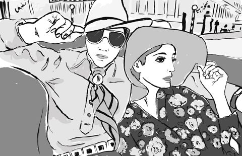
Illustration by Holly Giblin
Since Marion Foale and Sally Tuffin’s designs hit London’s Kings Road, female fashion designers have of course flourished. Stylish knitwear has prospered since Foale started her knitwear business in 1981. Fashion Editor of The Daily Telegraph Hilary Alexander calls it, “London’s heritage of knit wizardry”. And looking at the last three seasons, catwalks have been thoroughly wrapped up in scarves and cardigans, as well as Mad Men-styled chic 1950s separates. A new wave of knitwear designers such as Louise Goldin and Craig Lawrence have thrived.
This has transcended to the high street, giving rise to the knitting club, and of course, the art of ‘yarnbombing’. The huge revival love of knitwear could be partly attributed to nostalgia – the metaphorical knitted hug, together with the recession’s ‘make do and mend’ principles. It certainly seems that everyone is in the midst of knitting a scarf these days.
To own one of Marion Foale’s sweaters, though, is to own a collectable. Many women dearly cherish her pieces. Her designs are beautiful, distinctive, imaginative and utterly English. Marion Foale was the arguably one of the original ‘yarnbombers’ – terribly dignified but with a glint in the eye…
Foale and Tuffin: The Sixties. A Decade in Fashion by Iain R. Webb is out now, published by Antique Collectors Club Publishing Group
Marion Foale’s Classic Knitwear: A Beautiful Collection of 30 Original Patterns, first released in 1985, is out now, published by Rodale Press
Categories ,1960s, ,Abigail Wright, ,Bath, ,Betsy Johnson, ,Cat Palairet, ,Craig Lawrence, ,Edna Ronay, ,Faye West, ,Foale and Tuffin, ,Hilary Alexander, ,Holly Giblin, ,Image Boutique, ,Kings Road, ,knitwear, ,london, ,Louise Goldin, ,Marion Foale, ,Mary Quant, ,Min Stevenson, ,Nina Hunter, ,Patricia Roberts, ,Paul Smith, ,rca, ,Sally Tuffin, ,South Kensington, ,Swinging Sixties, ,Woodlands 21, ,Yarnbombing, ,Youth Quake
Similar Posts:
- Twist Baby Twist at the Fashion and Textile Museum
- EDE Knitwear: An interview with Ellie Jauncey
- Foale and Tuffin: Made in England
- Get knitted-out for Christmas with Ascension
- Taylor Made Menagerie