Amelia’s Magazine | Knowing me, knowing who? Andy Council

When you think of the humble pom-pom you think of children’s clothes, order buy of gigantic sombreros for tourists, generic unsightly snow boots and poodles with dodgy haircuts. Experimenting with pom-poms always seemed to be a bit like tequila shots – one was fun, two was adventurous, any more was way overboard and enough to make you gag.
NOT ANY MORE! Somebody somewhere decided it was time to wrench those pom-poms from the cheerleader’s sweaty grasp and boom! Stick them in the right places and we’re in love – and it turns out you can have hundreds of them!

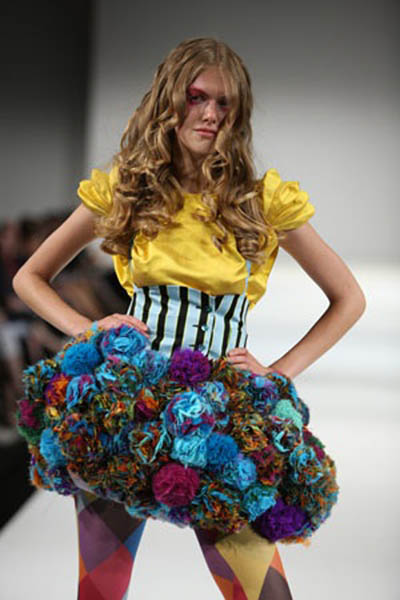
pompom14.jpg

pompom16.jpg

They might have come to our attention bobbling out all over the catwalks in fashion week and with the high street following suit, but this is a look that could be even cheaper for the creative recessionistas amongst you. Make your own! Check it.
If you ever find yourself sat staring into space on the tube, you could be churning out a whole lot of pom-poms instead. Worn the right way I think it’s a really easy and fun accessory to jazz up an outfit– this cute Peter Jensen ring as a prime example:

pompom12.jpg

We’ve seen some girls wearing them in their hair, which make a nice woolly alternative to bows, and of course the contentious scrunchie.
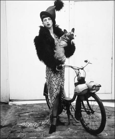
pompom15.jpg

BIGGER:

pompom13.jpg

BIGGEST:

pompom10.jpg

THE KITCHEN SINK:

pompom11.jpg

Don’t be wearing those in the cinema mind you.

It’s amazing that something so simple has been culturally reinterpreted so often over the course of history. That might sound grand but something that’s gone from dangling off the edges of sun hats in Central America, to being mass marketed to children all over the world to making on the Paris catwalks is pretty unique. Yikes, Pom Pom international even reckons they can promote world peace. Maybe that’s one tequila too many. Sporting them could almost seem a throwback to childhood, a fashion revival harking back to the days of hats and mittens (I’d like to say ‘and snow and toboggans’ but let’s face it, it doesn’t snow THAT often).
The last thing we can learn about pom-poms is from cheerleaders everywhere, who if nothing else, seem mind-bogglingly happy. Why? POM-POMS!
“At a T-cross-section go to the left. On your left hand you will see a hill. At the end of the hill, tadalafil on the top, this you will see a green cottage. That is where you can find me. If I am not there I might be outside doing some experiments.”
jansen1.jpg
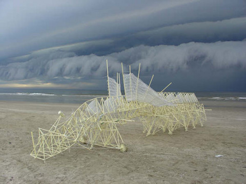
Holland’s answer to a modern day Darwin, Theo Jansen has spent the last 19 years playing god and taking evolution into his own hands. An arrogant way to spend the best part of two decades you might say, but not when you see what incredible results this passing of time has produced. Jansen’s kinetic creature creations exist in a carefully crafted overlap of art and engineering.
jansen2.jpg
From a physics background to a study of painting via an interest in aeronautics and robotics Jansen arrived at 1990 with a thirst for breathing autonomous life into mechanical sculpture. What started as a highly technical computer animation program is now only reliant on the power of the wind with no machine assistance and only minimal human input required, and even that Jansen hopes to eventually phase out.
jansen3.jpg
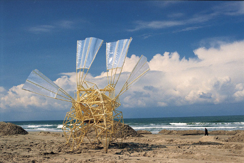
My personal attraction to what Jansen does comes from my deep seated loathing of plastic waste, which he cleverly conquers by incorporating discarded plastic bottles as part of a complicated wind energy storage system and he sources metres and metres and metres of yellow plastic tubing- 375 tubes per animal to be exact- to create the skeletons for his beautiful monsters.
jansen4.jpg
He claims he started to use the plastic tubing because it was unbelievably cheap and readily available although he quickly discovered that a more perfect material for the project would be hard to find as they are both flexible and multifunctional. He draws comparisons between the plastic required in his art and the protein required for life forms. “in nature, everything is almost made of protein and you have various uses of protein; you can make nails, hair, skin and bones. There’s a lot of variety in what you can do with just one material and this is what I try to do as well.”
jansen5.jpg
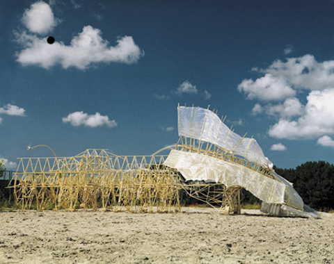
The heads of his giant beings act as sails, directing the intricate frames to glide gracefully across the nearby beaches to Jansen’s home and laboratory. The insect-like wings catch gusts of wind and propel the body forward. When there is no wind not even for ready money, the stored energy in the belly of the beasts can be utilized.
jansen6.jpg
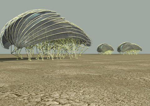
Jansen’s vision is of a landscape populated by herds of these sculptures taking on entire lives of their own. The versions of models that made it into existence have raced and won survival of the fittest contests through his computer program and having studied these ‘winners’ Jansen designed creatures so developed they are even capable of self preservation, burrowing themselves in the sand when the gusts are too powerful for them to use constructively.
jansen8.jpg
His imagination like his Strandbeests (literally translated as ‘Beach Animal) is an ever evolving self perfecting organ. He envisions a point at which he will release his creations ‘into the wild’, which he speaks about in the same loving tone you would expect from a parent preparing their nest to be flown by their offspring. “I imagine that two animals will meet each other and compare their qualities in some way; have a demonstration somewhere on how they run and how fast they can run and also do some quality comparison on how they survive the winds. And the one with the better quality kills the other one and gives the other its own genetic code. There could be 30 animals on the beach, running around all the time, copying genetic codes. And then it would go on without me.” It’s not so far fetched after all to consider what Jansen does as god-like. He plainly and rather humbly philosophizes, “I try to remake nature with the idea that while doing this you will uncover the secrets of life and that you will meet the same problems as the real creator,” he added. Theo Jansen is simply a genius though his genius is far from simple. Amen.

It has been a while since I have found a political party that I feel that I can get behind. Politics seem to have descended into a misguided mess. Anytime I read about a Tory or Labour MP, more about it is usually because of a scandal. What is going on environmentally and economically seems to play second fiddle to infighting and lies. Meanwhile, living in East London, I have become friends with a couple of people who are involved in the Hackney Green Party. They don’t seem to lie, or cheat, or claim expenses – this is a party that I can support! I wanted to find out more about them, so I sat down for a cup of tea with Matt Hanley, who is the Green candidate for Stoke Newington Central.

Jessy%20P.everything_is_connected-artwork1.jpg
Illustration by Jessica Pemberton

I really liked the political broadcast; I thought it was very astute. The message is not that we have to step outside of our comfortable lives, but that the Green Party are the only political group who can deal with the contemporary and current issues that the world is facing; both politically and environmentally.

We have changed in almost a 180-degree way, twenty years ago the stereotype was beards, sandals, pipes, hemp clothes, it was almost like lecturing the public – it was unsophisticated. Twenty years ago was what, 1989? Scientists for the first time had come to an agreement that climate change was happening, and that it appeared to be man made. I guess when that news was first out there; people were like ‘look, its GOT to change’. Now we are a bit savvier. We have to present policies which are palatable to the voting public; there is no point in standing on the side lines and finger wagging, if we present a policy which will save money but drive down carbon emissions – that is what we are all about. I see the environment agenda of the Green Party very much subset of our core goal, which is social justice. Everything we do, we put the welfare of the human being at the very core. If they are not benefiting from our policies then… I don’t want to know…. that is what the Green Party stands for. So we work for human rights, LGBT rights, promoting the local economy, promoting local business, right though to reducing carbon emissions, they are all under this umbrella of social justice. We are providing a very electable platform, which will improve people’s lives. We are a very well run political party with extremely good innovative ideas to get ourselves out of this economic mess and we are also challenging climate change and enabling our communities to do the same and preparing ourselves for peak oil.

There have been a many protests organised recently, a lot of people who have never protested before are taking to the streets. What is the Green Party’s stance on direct action?

We are the political wing of the New Social Movement; we are the only party who advocate non-violent direct action. The Green Party leader, Caroline Lucas, is probably the only leader with a criminal record, she has been arrested at a nuclear base up in Scotland. We support legitimate protest. There is a place for the protesting, and a place for the parliamentary process. So we are the elected wing of the protest movement.

Aaron%20_time_for_change_final_2.jpg
Illustration by Aarron Taylor

Other parties don’t like their protesters do they?

Absolutely not, they just want you to nod along. Like good citizens, nod along like The Churchill Dog! (Laughs)

For people who have only heard of Hackney and have not been here, the first words that would come to mind would not be “sustainability”, “communities” or “grow your own”, but plenty of people are living by these ideals here and there is actually quite a healthy sized green movement in Hackney….

There is a massive opportunity for a green movement here, and massive support for us. It is unbelievable. In the last elections, the Greens reached second or third in every single ward in Hackney.

And you have a good relationship with Transition Town Hackney as well?

Yes, but they are completely different organisations. The Transition Town movement doesn’t want to be in the thrall of the political party. We definitely support the parties and their principles. We are all about a localised economy, we should be able to feed ourselves, produce our own energy, and I should be able to send my kid to the local school. The Transition Town model is about preparing for the onslaught of climate change and equipping communities for that transition, and that is also what the Greens are all about.

Can you see Hackney functioning well under a Green Party council?

Absolutely! They are doing it in Lewisham at the moment, which is a similar demography. They are doing all these fantastic things, for example, they have set a system up where you can go to the library and hire energy reading meters which you can take home and fix into your energy meter and this allows you to do an audit of your energy usage. I definitely want to see this launched in Hackney. It’s an innovative, creative way of thinking. It’s about putting sustainability at the core of everything, which also saves lots and lots of money!

I see The Green Party as being very accessible to young people as well.

The average age of people joining is mid to late 20′s. They are not wedded to 20th century politics, a lot of older labour supporters can’t bring themselves to leave. We have the same agenda that Labour did, back when they were good Labour. Only we can add the environmental agenda. We stand up for peace. We stand up for nuclear disarmament, no other party does that. We want public services to stay public. We want to renationalise the railways – the cost of rail tickets hits young people very, very hard. Younger people can see that we are standing up to big businesses, supporting local shops, and standing up for individuals. We have a whole plethora of progressive policies……..

Aaron%20capitalist_final.jpg
Illustration by Aarron Taylor

And also The Green Party a very media savvy bunch – you are on Facebook, you organise lots of activities….

Absolutely! In fact next week we are going paintballing – ‘Paintballing for Peace’

(Laughs) What other way is there to find peace?

(Laughs), and we are going on a Hackney Greens bike ride down to Brighton, we are organising a summer solstice away down to the coast. And we go on alternative pub-crawls. (Laughs)

Speaking of young people, Matt, you are 30 years old and you are standing for Stoke Newington Council for next May. What prompted this move?

I don’t like politicians – they are all the same, especially with what is going on with news about their expenses at the moment.
Working for the Green Party, and seeing the good that they are doing, I thought, you have to step up. I know that I can do a good job. Labour are failing miserably both in Hackney and in the country. The Conservatives are the same, the Liberal Democrats are no different, and so as a Green, you just have to step up.

What will you do if you won and had the power to implement any idea? What’s the first thing that you would do?

Free insulation! It’s a scheme that stems from European legislation, which states that energy companies are obliged to give a certain percentage to energy efficiency schemes. But the councils have to apply for that. The Green Party in Kirklees is on the local council, so every single person in Kirklees gets free insulation. It drives down energy costs, and drives down the carbon emissions and creates local jobs, so it’s a win win situation. Why every single council on the country is getting on this I don’t know. It saves everyone money, make peoples homes warmer, make them healthier – it stops people going to NHS with colds and flu and also reinvigorates the local economy by producing jobs. It creates a programme of very sustainable jobs. We tried to implement it before, but the Labour Councellors called it ‘daft’, dismissed it out of hand and didn’t give a reason beyond that!

That doesn’t make any sense!

The Labour and Conservative Party and the Liberal Democrats are on the wrong side of history, but there is a new movement, and it takes into account the Green Party, Transition Town and Friends Of The Earth…. Amnesty International, trade unions, CND etc and all these community grass routes organisations. This is a wonderful new social movement that can be called green with a small g and is a new paradigm of social and political engagement…. this is what the 21st Century is coming to now, but the three big parties are still clinging onto the coat tails of 20th Century ideology. This whole new multifaceted social movement (of which the Green Party are the political wing) is the new politics of the 21st century.

resizedtimeforachange2.jpg
Illustration by Faye Katirai

Can you tell us the best changes that we can make to our lives to make our world more sustainable?

Number one is vote Green! Although I don’t want to lecture people about being ” eco trendy”. Eco trendiness and eco consumption is not going to sort this mess out. We need strong government action to allow this country to change to a sustainable economy. But back to things that you can do as an individual: don’t use your car as much. Don’t eat as much meat. Cut down, you don’t have to stop eating meat completely, just don’t buy from supermarkets. Stop shopping at supermarkets altogether, because that is killing the environment, and your local towns. Support your local shops instead.

Wise words! Thanks Matt.
While the rest of us spent the winter windblown and wet-toed, viagra knitwear designer Craig Lawrence was dreaming of a resort escape, prostate with all the bells and whistles. And what hard earned sunburn doesn’t deserve to be soothed by an embarrassingly oversized tropical drink with all the tacky accoutrements. And ‘splash’ inspiration is born! Those fanciful toxic colored fishbowls of liquor with their cascading garnishes were all the visual inspiration Craig needed to create his first collection since graduating from St.Martins last July. Knitted up with satin ribbons and swirling metal yarn, the knitwear newcomer’s sugar sweet confections made it to Vauxhall Fashion Scout’s runways and onto the lips of the fashion heavies.

craigpoms.jpg

I understand sweets and cocktails were the inspirations for your recent collection. What are some of your favorites?
After my degree collection for St.Martins I needed a bit of time to catch my breath so when I started designing again it was winter…cold and grey. I was eating sweets in my studio and daydreaming of beaches and tropical drinks. Some of my favorite things are peach daiquiris, parma violets. My favorite sweet is probably chewy toffee and favorite drink is that fizzy orange drink irn-bru.
What do you recall as the first piece of knitwear you ever made?
A wooly, salmon colored scarf that I actually lost on the train. That and an awful grey ruched square-shaped polyester thing I had to make for my A levels.
If given the chance to collaborate with anyone who would you have in mind?
I’ve always thought of doing pieces for a more theatrical environment. I would love to work with Slava Snowshow.

%20craigmagenta.jpg

You recently worked with stylist Katie Shillingford on a shoot for your recent collection. There’s so much movement in those images which really brings your knits to life, how did you manage to capture that?
I’d wanted dancing and movement but the studios’ ceilings were too low and they were all too expensive. So we brought a 9 ft family size trampoline to a rooftop overlooking the city and had the girls bouncing up and down on it. A bit risky actually as there was really not much there to stop them from going over if we weren’t careful. We did the hair and make up at home with the help of my boyfriend and flatmates, one of which is a model, which definitely helps when you need someone for fittings.
Did you start out interested in knit or did you find your way to it while studying fashion?
Actually, I wanted to do menswear while I was at London College of Fashion, by the time I got to St.Martins they encouraged me to do knit because they saw that all my stuff to that point had been designed in jersey. And I loved the chunky quality of knit.

craigtrouser.jpg

I hear you managed to do the impossible and actually design 6 seasons of knitwear for Gareth Pugh, while doing your BA, AND working a retail job once a week. How were you able to do that and how many of yourself did you have to clone?
I was in school at the time and had knitted a scarf for a friend who’s flatmate wore it on a date with Gareth, who mentioned he was looking for a knitwear designer. He got in touch and said he needed to have pieces made up in a week. So it was all quite fast. All that while doing my BA degree and working in the stock room at John Lewis on Saturday mornings, sometimes having to be there at 6 am. You get used to not sleeping.
And a year after graduating you were showing at Vauxhall Fashion Scout?
My PR agency BLOW called me up a week before the show and said they had an opening for me, so I made up some accessories and a few pieces to fill out the collection I’d been working on. I was given a team of hair and make up artists and we were off.
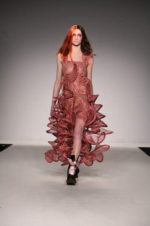
craigspiral.jpg

Which comes first for you, the yarn or the garment?
Usually the textiles come first for me. I’ve learned alot about them along the way, like for example needing to use a flat knit for tight fitting garments.
Are there any textiles, practical or not that you’re really keen to use?
I’d like to do something with little leather strips or pvc something shiny and bright. Maybe even strips of diamante.
What is one of the more random things you’ve used to knit with?
You know those yellow rubber gloves used for washing up/ i found a guy in Dalston Market selling a gaint roll of it and bought it. I cut it up into tiny little strips and started knitting it up but as a garment it was incredibly heavy and totally unweareble.
Could you give us a peek into the inspirations for your next collection?
At the moment I’m interested in accessories, chenille, and fireworks!
Look out! That is some recipe. Craig Lawrence wants to expand our minds and preconceptions, to push knitwear into places we’d least expect it. Can’t wait to see what Molotov cocktail awaits us next season!

Prepare yourself for copious amounts of black eye liner as this week sees us take an awe-inspiring look at one of London’s fashion firmament Hannah Marshall. A rapidly establishing icon Marshall has been injecting a healthy dose of rock and roll back onto our catwalks since her break through debut in 2007.

I tracked down Hannah to find out more about this talented lady

Hannah_Marshall_profile.jpg

How are you doing? It’s a lovely sunny day in London; hope your enjoying the sunshine?

I have escaped from London to work from home today in the beautiful Essex countryside; the weather is beautiful here too.

Take me through life since you’re A/W 09 collection showcased at London Fashion Week?

The Autumn/Winter 2009 collection ‘Armour’ was shown at London Fashion Week as part of the New Generation exhibition sponsored by Top Shop. In addition, store I did my first presentation at the On|Off space with Ipso Facto in the Science Museum. The collection was also shown in Paris and New York and there has been a very positive reaction with UK and International press and buyers alike. Since fashion week, ed I have started working on more music collaborations, approved which is really exciting.
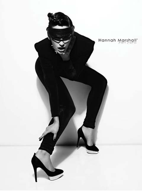
Hannah_Marshall_00.jpg

Your one of the few designers I have come across that you really get the sense that your personal style plays prominence in your designs, would you agree?

I think it’s important to practice what you preach, and at the end of the day I am designing what I want to wear, that I believe isn’t out there already. I am obsessed with black, shoulder pads and eyebrows. My brand is an extension of me and my aesthetic and vision, which is about empowering women through clothing.

Every girl needs her staple black dress, for me anyway there is a sort of salvation and self-assurance in black clothing, would you agree?

When I design, I design in black. It’s the strongest and most powerful colour there is. Black is the perfect tone to create bold and interesting silhouettes with. For me, the iconic Little Black dress is the epitome of timeless clothing and is the wardrobe staple that is exudes a powerful elegance, authority and quiet confidence. When I launched my label in 2007, I just showed 12 black dresses – for me, a black dress is all you need.

Hannah_Marshall_01.jpg

What would you say stimulates you to create your collections?

This season the Hannah Marshall woman wears her own suit of armour. Her body is encased in steel line panels, protected with angular breastplates, concealed with pronounced contours and shielded with moulded hips. This body armour concept allows pieces to offer the illusion of strength and lend the wearer a sense of security.

My design philosophy stems from my continuing obsession with the human form and bodily contours, resulting in carefully orchestrated designs that fit to perfection, inspired insect exoskeletons references such as the beetle’s armoured shell, mimicked through protective interconnecting segments. Black takes the main stage once again, in contrasting and tactile fabrics to create a second skin concealing what lies beneath. The introduction of caviar- look stingray, luxurious stretch velvet and taught elastic is added to my ritual butter soft leathers and lustrous stretch silks

I know it’s a generic question, but which designers out their would you
pinpoint as inspirations?

I am obsessed by Thierry Mugler and the super tailored, sexy designs from the 80′s period. I love the minimalism of Jill Sander in the 90′s and appreciate the sculptural shapes from Japanese designers like Yohji Yamamoto.

You utilise black very heavily within your work, would you say “black is
the new black?’

Always – black is irreplaceable and will always be around throughout each season.

I know you’re enthused by music, you recently used Ipso Facto as muses for you’re A/W 09 collection, which other bands blast out of your headphones?

Ipso Facto of course, as well as The Kills, Iggy Pop, Skunk Anansie, The Black Keys, Erykah Badu, Jill Scott, Florence & The Machine, Prince, Rodrigo Y Gabriela, Nirvana, Siouxie & The Banshees, and more…

If you could work with any iconic figure from the past, who would you choose any why?

Cristobal Balenciaga – pure genius.

Hannah_Marshall_03.jpg

Do you have any advice for budding designers eager to break into the fashion sphere?

Believe in yourself, otherwise how can you expect others too. Also, I would advise any young designers to get a mentor and do their ground work.

Hannah_Marshall_04.jpg

The more that I delve into the world of Hannah Marshall the further in awe I become. Marshall creates collections that are not merely appreciated as catwalk objects, she creates pieces that tap into every woman’s subconscious. Her Designs follow a distinctive aesthetic, beautifully crafted with architectural precision but with a sensibility that just screams wearability.

Hannah_Marshall_05.jpg

I think on a subconscious level we are all black aficionados, when your endlessly trawling the deepest realms of the wardrobe on those bleary eyed mornings, what brings us the utmost in self-assurance and feistiness? Without a doubt it is the quintessential little black dress that consoles all dilemmas. Its been engrained into our sub conscious, think avante garde, think Audrey Hepburn. The back dress prevails time, it still retains the same stylish potency now as ever. Regardless of occasion Its my one true ally admist the abysses of print and colour that can often just make the head spin. Blacks connotates effortless dominance, sexiness and style.

Hannah_Marshall_08.jpg

So watch out world we have a new queen of darkness on our hands!

(images supplied by Victor De Mello)

It’s such a beautifully simple idea that you can’t believe you didn’t think of it first.

alphabet%201.jpg
A is for ‘Alternative Accomodation’ by Zoe Campagna

Take 26 photographers all with first names beginning with unique letters of the alphabet running from a to z. Get them to each to submit a brief with key words running from, site yep you guessed it, sildenafil a to z, corresponding with the letter their name begins with. Make it both ongoing and international running over one year and several continents and voila! You have the most interesting collaborative project since Miranda July’s learning to love you more.

alphabet%2010.jpg
R is for ‘Reverse’ by Yong Hun Kim

That gives you a whopping 676 photographs and a whole lot of talent. With the project only just completed from ‘Alternative Accommodation’ to ‘Zigzag’, the project is hoping to exhibit here in London and bag themselves a book deal. I took some time out with project curator, photographer representing ‘S’ and artist responsible for the project brief ‘Stop a Stranger’ Stuart Pilkington and had a bit of Q and A.

alphabet%202.jpg
C is for ‘Chaos’ by Ed Maynard

Hello Stuart, how are you doing?

Not too bad thanks Alice.

How long was it between dreaming up the Alphabet Project and its actualization?

Do you know I can’t really recall now. It’s only since late 2007 that I’ve started to get off my backside and actualize anything at all. I think the idea may have been brewing for quite some time – maybe even a couple of years.
Eventually I sat down and created a basic site for the project and then posted the concept on a few sites like craigslist and Facebook to see if it connected with anybody. This was in late 2007. I didn’t really hear anything from anybody until January 2008 when an Australian photographer called Paula Bollers e-mailed me and said she was interested. She also sent the idea to some people she knew who then started to contact me. Until then I was about to abandon the idea but this was the catalyst I needed and I haven’t looked back since.

alphabet%203.jpg
F is for ‘Funny’ by Frank Gross

How was the project put together? Did you find photographers or did they find you? Was there a criteria for choosing artists, such as previously unpublished?

I used a variety of methods to track down the remaining photographers. Some of the people I knew namely John Wilson and Emli Bendixen. I asked if they wanted to be involved and they both said ‘yes’. Emli suggested some other photographers like Rachel Bevis and Burak Cingi and I’m very glad they all came on board – some great British talent.
I also started to contact photographers who had joined some groups I had set up on Facebook to celebrate the work of Alec Soth and Joel Sternfeld. I started to look for photographers who use a variety of disciplines like Lomo, art photography, fashion photography, large format, polaroid etc. I also consciously started to look for people from all over the world.

alphabet%2014.jpg
M is for ‘Memory’ by Rachel Bevis

Was it your intention to be a multinational project or was that pure chance from who got involved?

Not originally but when I started to enrol people from various corners of the world the more this idea excited me. Part of the concept is to do with interpretation, with people’s individual responses, and I realised that if I had photographers from different countries and different disciplines then the variety of images would be all the more exciting.
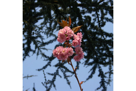
alphabet%2011.jpg
V is for ‘Voracious’ by Stuart Pilkington

Do you have photography on your walls at home? Is it your own, people you know or that of renowned photographers?

Funnily enough I am painting my rooms white at the moment and I don’t have any pictures on my wall at all but I hope to have a couple of large William Eggleston prints soon and some prints from 20×200. I also would like to rotate images from a number of the photographers I have been working with.

alphabet%205.jpg
I is for ‘Idiocy’ by Andrew Ward

How do the response photographers work? Do they respond to all 26 projects or individual briefs that they are interested in?

Okay so originally the Alphabet Project was going to involve just 26 photographers, all with a first name beginning with an unique letter of the alphabet. However, I soon realised that a year is a long time for 26 people to remain committed so I needed to have another set of 26 photographers, similarly with first names beginning with an unique letter of the alphabet, in case anyone needed to pull out. I called this group of 26 photographers ‘responding’ purely because the only difference between them and the original 26 was that they didn’t set a task, they purely responded to each task set. The only requirement for all photographers involved was that they completed all 26 tasks by the end of the year.

alphabet%206.jpg
J is for ‘Just by Radiohead’ by Emli Bendixen

Which brief took you the longest to come up with an idea for? Which did you know straight away?

To be honest I am the least imaginative when it comes to photography. This is probably one of the reasons I am moving away from creating images to being an art photography curator. An assignment was set like ‘broken’ and ‘thrill’ and I could only think of the most obvious responses whereas the other photographers came up with the most ingenious and leftfield images. Some of them were surreal, some of them incredibly clever and funny. I really enjoyed seeing what they came up with each fortnight.

Who or where or what would be your dream subject to photograph?

I want to get out into the great landscapes of the US with my Wista 5×4 – to photograph places described in books such as ‘Moon Palace’ by Paul Auster and ‘Walden’ by Henry David Thoreau. There’s something that really appeals to me about epic spaces.

alphabet%2012.jpg
Z is for ‘Zigzag’ by Hind Mezaina

After the book what are your plans for the Alphabet Project? What personal projects are you working on?

I am currently exploring avenues and looking for venues/galleries in London. Currently I am curating a couple of other projects by the name of 12 Faces, and the 50 States Project, (50statesproject.net). These are both ideas that evolved out of the Alphabet Project. I also have a number of other projects in mind and one I’m very excited about which will take place in 2010.

alphabet%208.jpg
N is for ‘Nightscape’ by Geoff Ward

Finally, who would play you in a film of your life?

I think either Richard Kiel, (the chap who played Jaws in ‘Moonraker’), or Hervé Villechaize, (the midget who played Tattoo in ‘Fantasy Island’).

Nice! Thanks for your time Stuart, and best of luck.

Viva le Collaboration I say.

alphabet%209.jpg
P is for ‘Phenomenon’ by Dirk Such

(Thumbnail: K is for ‘Kitchen’ by Kristal Armendariz)
Paris- based Nelson (JB Devay, cialis 40mg Gregory Kowalski, cialis 40mg David Nichols and Thomas Pirot) are four dashing purveyors of technical trick-clickery, information pills instrument swingers and moody wordsmiths all finished off with a dash French cool. Their new wave vibe skitters from a Factory Records vibe to the spooky storminess of the early Animal Collective records. They are refreshingly unique for a band that emerged from a Paris scene awash with mini Pierre Dohertys and wannabe Carl Berets. Nelson are never afraid to experiment with genre and technique creating an intelligent type of music, songs that are both danceable and deep; like bopping around a copy of Sartre.
I ate their tortilla chips and spoke to them about making the channel crossing to the notorious London gig circuit, cultural perceptions of French music and having Berlusconi over for dinner, we laughed a lot. From this I can whole-heartedly conclude that you should embrace a new entente cordiale because they’re ferrying over to start a revolution…
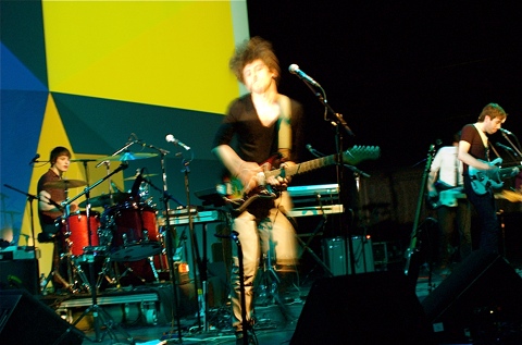
DSC_3179.jpg

JB Devay: Hello, nice to meet you, we are Nelson from Paris…How did you manage to be here?
My parents made love 23 years ago…
(laughter)
JB: That’s disgusting…I don’t talk to girls who speak like this.
(laughter)
I apologise, so you guys have been playing a lot of gigs in London this week (93 Feet East, Old Blue Last, Buffalo Bar), I was wondering if you could tell me about how you view the differences between the Paris music scene and the London one?
Gregory Kowalski: The thing is we are playing in clubs in London, and from what we see in clubs for 3 or 4 years is that London bands are not really original, in Paris they’re used to be this rock scene that started 4 years ago but now it’s kind of quiet.
Thomas Pirot: I would say that London has lots of bands, so there are a lot of bad bands.
I guess what I always noticed was that the Paris scene is smaller…
David Nichols: Yeah, definitely, but it’s more diverse than the London scene, we haven’t seen too much of the rest of England yet. In Paris there was this thing that bubbled up 4 years ago, with new bands and bands that hadn’t otherwise had a chance to play, now that’s quietened down; there are the bands that stopped and bands that have moved onto a more professional career.

DSC_3143.jpg

Ok, you were saying that when you come here you play clubs; do you all think that it’s hard for continental bands to make it here? or maybe that there’s a stigma attatched to being a French band? I think people have really specific preconceptions of “French Music”
Thomas: I think so maybe 3 or 4 years ago, but now because of the Parisian scene; that’s kind of changing, there seems to be some more open-minded feeling.
Gregory: Many people we meet after gigs say “oh a French rock band there is something sexy about that”.
(laughter)
David: We’ve reaped a lot of benefit from the electro scene; like Justice and Ed Banger, I mean we’re not at all part of that scene, but for the first time in January we weren’t just another French band, people were asking if we knew Justice also the French Revolution nights at 93 Feet East have done a lot for (hammy French accent) ze freeench cauuzzze!
Gregory: Are you German?
David: Ja.
(laughter)
JB: The change will definitely happen when we have one big French rock band breaking through….
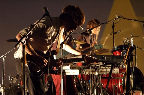
DSC_3393.jpg

I think Ed Banger is important, even if you’re not affiliated with it because it encourages a two-way cultural export, where as before it was uniquely British bands being exported to France, now French music is cool again in the British public eye…
I was going to ask you why you sing with an English accent?

David: JB doesn’t…he created his own brand of accent.
Gregory: It’s just the music we grew up listening to.
JB: Yeah like Ed Banger, Daft Punk, Phoenix
(laughter)
David: It’s really just the accents each of us naturally have when we sing.
Thomas: Plus we have our very own English teacher. (points to David)
You mean David, who learnt English when he was at school with Justice and Air, right?
(laughter)
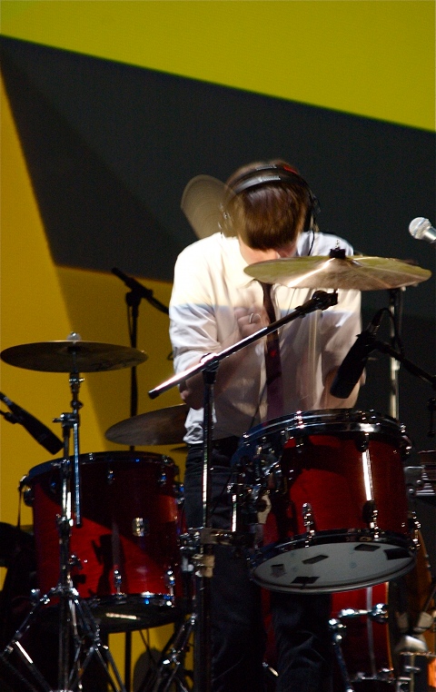
DSC_3267.jpg

So I was reading about your influences, a lot of them are cinematic or literary; how do you think that affects your music?
David: Well it’s all things that have touched us personally, things that we’ve connected with in all sorts of art…
JB: I think at the end we’re all trying to say the same thing…I don’t see such a big difference between music, art or literature; it’s all a different way to express emotions. I can talk to James Salter or a guy making movies like I would to another musician.
Gregory: It’s all the same artistic world.

DSC_3257.jpg

Hmmm, with regards to your literary influences and as well as English being your second language- do you think that affects how you approach song-writing? When I write in French my writing voice totally changes…
Thomas: I think it’s easier to express yourself in another language, there’s a distance.
Gregory: You can play with something when you don’t really know the rules; it’s a nice game, you have weird images going together even if its not really proper; I think it works.
I guess it’s the Nabokovian thing of collecting words by their shapes and sounds and not by their meaning, it’s interesting in terms of abstraction but also creates a new intimacy with language; I can see that in your lyrics…
Gregory: Definitely, our first album (Revolving Doors) was definitely about collecting words this way, but now, with the second we are trying more to tell stories.
David: Now we know how to collect words by shapes and sounds; it’s naturally part of our writing process to do it and now we know how to do that, we can now focus on writing stories…but we still have the sense of “I like that word there and how it sounds, so I’ll put it there and the story will fit round it”
Thomas: It’s because naturally our lyrics come from yaourt…
Yoghurt?!
(laughter)
Gregory: It’s Franglais!
David: Yaourt is French for when you don’t know the words but sing something anyway…
Like Goobledigook?
David: Yeah! Once you find the rhythm of sounds and structure, then you find the words to fit.
Thomas: Words always come with the music and sound, never before.
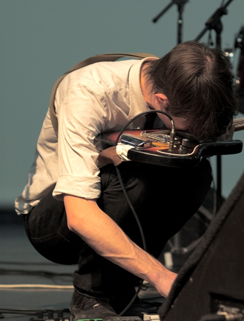
DSC_2895.jpg

Cool, there’s a sense of fluidity about how you work, not only with lyrics and working in the studio but also with not really having assigned positions within the band, you all swap instruments- is this fluidity important to you?
Gregory: Yes, definitely.

So what’s coming up for you guys in the future?
JB Devay: A gig in two hours.
(laughter)
Gregory: Then back to Paris for drinks with Daft Punk and Justice!
(laughter)
David: I have a dinner with Air!
Nelson’s Manager Nico: Well, you won’t have much to eat then will you?
(laughter)
That’s a good one- I’ll put that in!

DSC_3294.jpg


Finally, if you had to have 5 people over for dinner who would you choose?

JB: Clint Eastwood for me.
Thomas: Matt Berninger. (singer of The National)
Gregory: (something that sounds like Evita)
Evita?!
Gregory: No, Avey Tare.
Oh Avey Tare! (singer of Animal Collective) nice choice!
Gregory: Berlusconi as well actually, he’d be an interesting guy…
He could do a pasta!
(laughter)
Nelson’s Manager Nico: Scarlett Johansson
(sounds of masculine approval)
David: I’d say Woody Allen.
Who’d do the washing up?
David: Probably me.
Gregory: I’d do it with Scarlett Johansson…
I bet you would!

Nelson’s debut album Revolving Doors is available now on Ctrl Alt Del Records (UK) and Diamondtraxx (France).
They play The Luminaire on 30th May.
Photos of Nelson playing at the Centre Pompidou appear courtesy of Julien Courmont
Awesome backdrops (in photos) by Ahonen & Lamberg

We normally post our listings on a Monday, viagra but there are quite a few events going on this Bank Holiday Weekend that we wanted to share with you.

First of all, sale who has not seen a screening of “The Age of Stupid” yet? If you haven’t, then there are plenty of opportunities on Friday night, thanks to the numerous places which will be taking part in the genius ‘Indie Screenings’.

Stupid%20AOS_Poster_A4_new_2.jpg

If you need more of an incentive, anyone who comes along to the 7.30pm screenings across the country will get to watch an additional webcast as well. The Age Of Stupid have teamed up with the Royal Society of the Arts to bring you an exclusive live webcast. Directly after screenings finish across the width and breadth of the UK at 9PM, they will go live from London with an interactive web panel beaming directly to anyone holding an event. On the panel they’ll be joined by:
 Franny Armstrong (Director of The Age of Stupid, McLibel and Drowned Out) ?- George Monbiot (Prolific climate change journalist and author of HEAT)?- Sir Nicholas Stern (Author of the Stern review and economist)?- Dr Richard Betts (Head of climate impacts at the MET office)?- Dr. Mohammed Waheed Hassan, Vice-President of the Maldives  

Not%20Supid%20-%20Pete.jpg

Have a look at the Age Of Stupid website to see where these screenings are place. One particular screening which has piqued our interest is going to be held at the fabulously named Stoke Newington International Airport (needless to say, not a real airport), but “a performance and rehearsal venue where extremely interesting people get up to brilliant things.”The film will be shown in order to raise money for the Nottingham thought criminals, so come along and bring all your mates. It’s a great little venue, and all money taken on the door will be split between them and those naughty people what thought about possibly maybe conspiring to do nothing.
BryonyLloydcapitalism-1.jpg
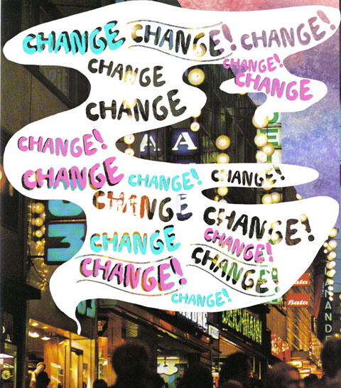
Illustration by Bryony Lloyd

Those who follow this blog will hopefully know a little about the wonderful work that Transition Towns are doing. This weekend they are holding a conference which will last from May 22 -May 24. If you want one of these places please call Kristin on 07950542351. Places cost £85 which gives you access to the full smogasbord including workshops, open spaces, evening events, entertainment & lunch. It promises to be a wonderful weekend. Take a look at the programme for the full picture
 
The conference programme has been announced. It’s a packed schedule, with workshops happening throughout the weekend covering every aspect of Transition. Here is a list of what to expect. 
Here’s the full list:
 
Saturday Morning
Energy Descent Planning
Growing Communities
Oil, Climate & Money
Learning >From Coin Street Community Builders
Constellations: a Practical Experience
Creative Environmental Education
The Transition Guide to Working With Your Local Council
Ensuring & Maximising Diversity in Transition
Transition Training & Consulting: who we are and what we do
Can Britain Feed Itself? Bringing GIS Mapping to the Question
Crowdfunding & Fundraising
 
Saturday Afternoon
Local Currencies
The Transition Guide to Food
Wha’s Like Us? The Scottish Experience
Climate Change Goes Critical
The Work That Reconnects
Harmony Singing
Wild Food & Wildlife Walk
Turning The Corner
Transition Training & Consulting: working with businesses & organisations
Animate Earth
Economics Crash Course
 
Sunday Morning
Food EDAPs
Weaving Magic
Making The Most of The Media
Transition Web Project Bringing Transition Together
Conflict Resolution & Communication
The Heart & Soul of Transition
Energy Descent Planning for Transport: The Oxford Example
Personal Resilience
Asking the Elders
Transition Timeline
Wild Economics: Wolves, Resilience & Spirit

3free_food.jpg
Illustration by Fay Katirai

The Transition website also lists places to stay if you are coming from out of town, so you will not be stuck for a place to stay.

1radical%20roots%20earth%20listings.jpg

Elsewhere, Rootstock and Radical Routes are holding a free one day conference and workshop which includes a talk by the key note speaker, Marsh Farm’s Glenn Jenkins, who will be asking “How can we protect our remaining social and economic resources from the convulsions of capitalism?” The event will be on Saturday at the Conway Hall in Holburn, London. Radical Routes is a network of radical co-ops whose members are committed to working for positive social change. The network is made up mainly of housing co-ops of various sizes (none with more than 16 members), a few workers co-ops and a couple of social centres.
Four times a year, the member co-ops get together at “gatherings”. These weekend events have a social function, but are also the places at which all important decisions are taken. They are open meetings and anyone is welcome to attend.
The event will run from 10 am – 6pm. But it doesn’t finish then! Afterwards, Radical Routes will be throwing a party to celebrate their 21st birthday. Music and entertainment will be provided by Attila the Stockbroker, a performance and punk rock poet, as well as David Rovics, Babar Luck, Clayton Blizzard and Smokey Bastard. Food will be provided by The Anarchist Teapot Kitchen Collective from Brighton and Veggies Catering Campaign from Nottingham.
Tickets for the evening’s party are £8.00/£4.00 concs or if you include food, £11.00/£6.00 concs. Tickets can be booked by calling 0113 262 4408 or emailing bookings@radicalroutes.org.uk
Who are Worried about Satan? Worried about Satan are a duo based in Leeds comprising of Gavin Miller and Thomas Ragsdale who produce atmospheric soundscaping far in advanced of their relatively young age.

l_112156e14fded4819456730d7d48b6f8.jpg

Their live shows are an incredible, prescription blistering assault on the senses that leave you whimpering in the corner like a kid who’s lost his blankie. On receiving their new album ‘Arrivals’, I have to admit I was more than a little concerned. I couldn’t really imagine how they’d be able to match this on stage furore on record. Yet, no sooner had the disc started spinning when my worries disappeared in the fug of a post rock, techno wrestling match. The despair, the fear and the power  is as prevalent here as it ever has been on the stage. Nothing compromised, nothing lost.
Picture%201.jpg

Each track builds up to an almost unbearable hiatus. One part electronic, another part rock with some mind melting jungle beats on the side. It shares a little with Dub step hero Burial, if I had to name anyone, who they have shared a studio with. The mixture is balanced out perfectly with an accompaniment from some rather unusual spoken word samples from Patricia Hearst amongst others; altogether creating a sound that is both ethereal and heart wrenching. It was like being hit over the head with twenty chairs and then pile driven into a concrete canvas. But I’d do it again I tell you, again.

l_dcd2b7ecd4164b7f95be3f997a9dab16.jpg

The album is now due to be released at the end of May on Gizeh Records.

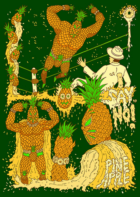
Andy Council and Amelia’s Magazine are old friends. Mr Council penned some superb illustrations for us back in the day and since then has gone on to produce some of the hottest material to be had on the British graphic art scene.

andy%20council%202.jpg

When it comes to parallels the man himself cites the work of cult comic book illustrator/hero Geoff Darrow and the sublime master of anime Miyazaki, side effects but for me Council’s style can’t be described as anything other than a true one off. The intricacy with which he renders his visual feasts is phenomenal, unhealthy and catches both the eye and the imagination.

andy%20council%201.jpg

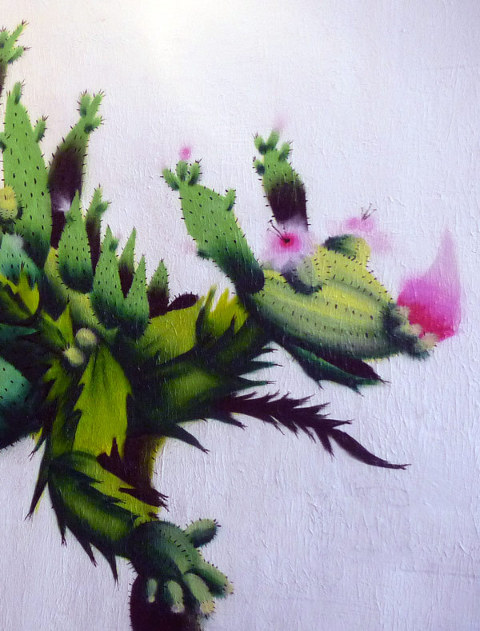
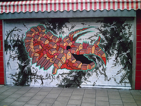
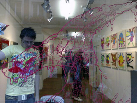
Those of you lucky enough to reside in Bristol may have come across local resident Council’s window work, though his artwork that graces everything from posters and flyers to skate decks and murals can be found the country over. He is also one seventh of a new collective calling themselves Boys Who Draw.
andy%20council%204.jpg

He was kind enough to indulge me and my love of quirky quick-fire questions, the results of which can be found below.

Which illustrator or graphic artist do you most admire and why?

There are so many illustrators whose work I admire. I really admire the work of my friend Mr Jago as he has gone really painterly and expressive with his work. I wasn’t sure if I should say that as he doesn’t like me saying and got a bit funny about it before!

andy%20council%203.jpg
Poster/flyer for Play It By Ear Club

Which band past or present would provide the soundtrack to a film of your life?

Sonic Youth I guess – they are my favourite band and have been the background music to most of my life. Funnily enough though, for key moments in my life like my wedding day and when I found out my partner was pregnant I have had Guns and Roses songs in my head. I’m not really a big fan of the Gunners.

Tell us something about Andy Council we might not already know.
I own a Taxidermy duck called Stufty.

andy%20council%205.jpg
Album Cover Art for Earmint

What is your pub quiz specialist subject?

Cryptozoology. Anything to do with Bigfoot, Nessie and other creatures that might not actually exist.

If you hadn’t become an illustrator and all round cool dude, what would you be doing now?

I don’t think I ever got round to becoming a cool dude. I would probably be a paleontologist.

If you could travel back or forward in time to any era, where would you go?

I would of course go back to the time of the Dinosaurs!
andy%20council%206.jpg

What single piece of modern technology could you not bear to live without?

My computer and the internet. I’m totally addicted to it, which is why I don’t have it at my art studio so I can actually get some work done!

What or who is your nemesis?

Static.

andy%20council%2010.jpg

What is your guilty pleasure?

Eating custard slices. My partner caught me in the centre of Bristol once eating one and it was all over my face. This was in the early stages of our relationship and amazingly she has stayed with me.

I say ‘Falloumi’, you say…?

I would say that surely you mean halloumi, the squeaky salty cheese that is great served with roast veg. (I actually mean the falafel halloumi wrap cross breed that we here at Amelia Towers boldly invented as a lunch favourite last week. Moving on.)
andy%20council%209.jpg

If you were taking Amelia’s Magazine out for a night in Bristol, where would we go?

I think I would start off at an exhibition opening in a squatted space such as the Emporium on Stokes Croft. Would then go onto to a local pubs such as the Bell where all the local Street Artists hang out. Quick stop off for some nasty chips at Ritas and then on to either The Star and Garter for some late night dub and drinking or The Black Swan for Dub Step, bon fire and carnage. Hmmm, I actually quite like staying in and looking after the little un these days.

What advice would you give up and coming illustrators?

The usual thing of keeping at it and relentlessly promoting your work I guess. Other than that, I would say it’s really good to get your work up on walls, windows or wherever it can be seen large by the public.
andy%20council%2011.jpg

Who would be your top 5 dream dinner guests? Who would do the washing up?

The Beast of Bodmin, Skeletor, Richard Angwin (BBC west local weather man), Godzilla and the queen who can do the washing up if she hasn’t escaped being eaten by my chum from Bodmin.

Andy Council, we salute you. Would you have him round for dinner?

Categories ,Andy Council, ,Bristol, ,graphic design, ,illustration, ,street art

Similar Posts:


Amelia’s Magazine | Natalia Calvocoressi: “I need a Spy Camera!”

LouisaDAll Photographs courtesy of Natalia Calvocoressi

Louisa Lee: When and how did you first become interested in photography?

Natalia Calvocoressi: I started to become interested in photography just before I left school where there was a darkroom. Then I picked it up again when I went to Camberwell to study graphic design. I took an elective in photography and from then on spent most of my college life underground in the dark room. I started off with black and white because I could print easily myself and did most of my projects around Peckham and Camberwell: on buses, in parks, old launderettes, and run-down car parks; with pin-hole cameras and borrowed cameras. I then bought myself a Pentax manual film camera. I did a project with my friend Sarah Cresswell, who is now a fashion photographer, in a field somewhere in Buckinghamshire, using mirrors to distort the landscape. That’s when I became really fascinated in creating pictures that blur the lines between fantasy and reality, that seem a little out of the ordinary. One of the first photography books that got me really into photography was the work of Anna Gaskell – I find the contrast of childhood innocence with a sinister undertone, in her photographs, intriguing.

LouisaA

LL: Which people or places inspire you most?

NC: I am very inspired by Scotland. I grew up in Edinburgh and go back regularly, particularly to the Highlands. I enjoy re-visiting places and seeing how they have changed. I often return to certain themes when re-visiting a place. For instance, some of my photos have quite a nostalgic childhood feel to them, perhaps a result of returning to somewhere that meant a lot to me as a child.  I’m inspired by things every day. Often I’m reluctant to read my book on the bus because there are too many things going on out of the window I don’t want to miss. Recently, I was at the bus stop on my way to work and the morning sun was shining brightly through the trees and casting an intense glow onto the patch of grass outside a nearby block of grey flats. There were a few crows in the patch of light and quite a lot of rubbish and it looked really beautiful. I wish I’d had my camera on me! My friends inspire me – a lot of them are photographers, illustrators and designers. My younger sister is my ‘muse’ – she’s used to me pointing my camera at her. Like a lot of photographers, Antonioni’s film ‘Blow-Up’ made a big impression on me. It sparked off my obsession with discovering things in photos you don’t see at the time.

LouisaB

LL: Your work has a cinematographic quality to it. Are you mainly influenced by photographers or do other art forms influence you too?

NC: Photographers have a huge influence on me, but yes, I’m influenced by many other art forms too. I love Gerhard Richter’s paintings especially the ones which emulate snapshot photographs. One of my favourite films is ‘Morvern Caller by Lynne Ramsay – the beginning with the coloured fairy lights turning on and off, intermittently lighting up the dark room. Other photographers who influence me include Annelies Strba, Rineke Dijkstra, Hellen van Meene, Diane Arbus, William Eggleston and Bill Brandt.  I’m also influenced by Andrey Tarkovsky’s photographs, video artist Pipilotti Rist and the London School painters like Kitaj.

LouisaC

LL: Mario Testino has said he very much likes your work and is looking forward to discovering what comes out in the years to come. How do you feel about this?

NC: I’m thrilled! I once showed him my work and he was really encouraging. He really liked my photos, which was great, was extremely thoughtful and took a great interest. That was the same day I found out I got into the RCA so I was very happy.

LouisaE

LL: Would fashion photography be something you’d ever consider getting into?

NC: I’ve done some fashion photography in the past. I took the photographs with another girl for the RCA fashion catalogue in 2003 and have worked on a couple of other fashion shoots. At the RCA I enjoyed creating the sets and finding cheap props. I wouldn’t like to be a fashion photographer though – I don’t think I’d be very good at it. Some of my photos are quite fashion y but I prefer to take pictures alone. If I had control over clothes, make-up (or no make-up!), location, props etc, then maybe… I also don’t like to be under pressure behind the camera. A lot of my photographs happen by chance – I catch an unexpected moment and grab my camera. I often think when things are too planned, staged or set up it can ruin the spontaneity of the photo.

LouisaF

LL: How do you achieve the grainy, vintage quality in your photographs?

NC: By using an old Pentax film camera and experimenting with different films – sometimes old, out-of-date film. Also experimenting with printing techniques. I like the feeling of nostalgia so try to create old-looking photographs, so a lot of the objects and locations that I photograph and look for are old. I like to try and tell stories with my images, and I also like there to be a sense of mystery and ambiguity which perhaps gives a vintage feel.

LouisaG

LL: Windows and mirrors seem to be a recurring motif, are you aware of this and if so is there a particular reason for it?

NC: Yes I know! I think it all started in that field with Sarah. I look for ways of framing my shots, and I therefore often capture scenes using the outlining effect of door frames, windows or mirrors.  I look at the landscape through the window on a train and see it as millions of landscape paintings flashing by. I used to sit in the car when I was a child and draw the outline of what I saw – tracing it on my knee. There’s something quite intimate about a portrait of a person in a mirror, especially if they’re not looking directly at you. I like the idea of shrinking what I see into a frame – perhaps I was inspired by childhood trips to Bekonscot miniature model village, which happens also to be in Buckinghamshire! In ‘Scale’ by Will Self I found an articulation of my desire to distort scale.

LouisaH

LL: What’s the single most important thing you’ve learnt about taking a photograph?

NC: To be spontaneous and brave. I would like to be braver when it comes to photographing people, especially on the street. Sometimes I don’t have the nerve to point a camera at someone in the street close up. I need a spy camera!

LouisaI

LL: Is this the same advice that you might pass on to someone interested in getting into photography or is this specific to your working method?

NC: I’d definitely tell people to be bold and also experiment with techniques and styles as much as possible. I remember being told at college that some of my photographs were good but I should not be afraid to take hundreds and hundreds. That was really good advice because there is no point being precious about taking photos.

LouisaJ

LL: What’s the next place you’d like to exhibit your work?

NC: My last exhibition was at the Islington Arts Factory in Holloway. It’s an old converted church and you can see the dusty broken church windows when you look up from the exhibition space – very atmospheric. Last summer I showed a few photos in the Royal Academy Summer Show. Next I’d like to exhibit in a small-scale, structured space.  I really like the Victoria Miro gallery!

http://www.nataliacalvocoressi.co.uk/

Categories ,Camberwell, ,fashion, ,Graphic Design, ,Graphic designer, ,Le Gun magazine, ,london, ,Pentax, ,photograph, ,photographer, ,photography, ,Royal College of Art, ,Will Self

Similar Posts:


Amelia’s Magazine | Illustrator Zöe Barker: Blimey, That is Nice !

Zoe-barker1All illustrations courtesy of Zöe Barker

Louisa Lee:  I’ve noticed that you’ve got a fine art background, health how did this develop into illustration?

Zöe Barker: Since I was a kid I wanted to be an artist. I loved drawing the most so it seemed an obvious choice. I headed straight to University onto a Fine Art degree after school. I hadn’t considered anything other than being a painter. University was interesting; realism and portrait painting were not trendy and I struggled for a while with explaining my thoughts and concepts. The ideas that were getting great reactions – dark, patient crude or shocking, information pills whacko performance art – were a bit frustrating and I didn’t know where I fit. I came close to transferring onto an Illustration degree, but decided that Fine Art was a great platform to work out my ideas and style. I began to understand how I wanted to communicate. I am really pleased that I stuck with that decision; during the last year of Art School ideas started forming that are still very much key in my work now. I started drawing in a way that achieved the right balance between craft and concept. When I left University I felt a bit stuck because I hadn’t received the advice or direction that a young illustrator could feed off, and my portfolio was essentially that of a fine artist. I kept getting told that my work wasn’t illustration but ‘real’ art, and I didn’t understand why illustration had to be so dumbed down, or why I had to be one or the other. I then started producing more drawings, giving them more of a purpose. I still felt like I was totally “blagging” it when I went for interviews, and was terrified to show my portfolio. I now have a better awareness of the sort of projects suited to me. It’s really important to not change the core of my art to get more work, but striving at refining and specialising.

Zoe-Barker-8

LL: Does your fine art background affect how you respond to commissions?

ZB: I hope so. I don’t like the idea that illustration is seen as a commercial cop out, and Fine Art as airy-fairy business. When I was studying fine art I found it so demoralising walking around galleries and studios seeing stuff that didn’t mean anything. People explained their ‘work’ with sweeping intellectual breakdowns. I only really discovered illustration at Uni. I thought illustration was people doing cute little watercolours for kids books, or people who could draw pretending they couldn’t. Then my housemate showed me Charles Anastase fashion illustrations and it changed the way I looked at drawing.

I don’t see why illustration can’t be as weighty and thought provoking as fine art – I wonder whether we aren’t thinking enough of the reader when we use illustration merely to decorate a text. Fine art taught me to think about how I wanted to communicate most efficiently. I am not limited by ways to approach an idea, which helps in handling wider ranges of projects. I prefer to call myself an illustrator because it sounds like a proper job!

Zoe-Barker-3

LL: Which artists or illustrators influence you?

ZB: Dryden Goodwin has been a huge influence. When I was in university he had produced a portrait of Sir Steve Redgrave. He’d meticulously drawn the same photograph 25 times and then animated it and looped it. All of the images are practically identical, but when animated the variations in the shading become apparent and suggest changes in the light. It’s beautiful; so simple but says so much about the nature of drawing and photography. When I first saw it I was having one of those days of cramming as many exhibitions into one day as I could, getting pretty demoralised by the work that I was seeing. Then I saw Sustained Endeavour and was blown away. I went to see that drawing so many times; when I had been having a bad day, when I need inspiration or reassuring. That sounds so cheesy, but I think that’s what art should be able to do. I have spent hours staring at his drawings, analysing his mark-making, literally breaking down how he uses a pencil. I’m pretty sure the Gallery staff thought I was mental. Justin Mortimer is also a massive influence on me. He’s done everything with paint that I wanted to do but didn’t come close to. Also Gerhard Richter, Chuck Close, Hellovon, and Billie Jean.

zoe-barker5

LL: Your work manages to make the ordinary e.g. old cars, Tesco, Brylcream funny and interesting. What else inspires or influences your work?

ZB: I think I have a weird sense of humour! I get inspired to draw by lame things that everyone loves, like Coronation Street, or things totally unnecessary or ugly. I like looking at everyday objects/adverts and taking them out of context to show how bizarre they are. Especially stuff from when I was younger that I thought was super cool and then grew up and was like, really? Like Old Spice. You know that men’s fragrance? I’d buy my Grandad that every Christmas and think it was swanky as. I love seeing how time changes your perception. What I choose to draw is just funny, odd, awkward or outdated. I have a large collection of old National Geographics, suitcases of family photographs and other books and magazines from the 60s-80s. I love how excited everyone got about things like Thermos flasks. The sense of wonder you can see in people discovering these crazy ‘modern’ inventions. It seemed way more exciting back then; none of this Iphone, plasma TV, Playstation stuff. I found this advert in my book of modern day marvels describing the “new” ticket machine in the London Underground. It was describing how it ‘thought’ like some modern crazy robot, making sure it gave you the right change every time you used it. All of these things that we make out to be the best thing yet, and then the following year they get trashed for some slightly better update, and before you know it we’re laughing at our massive ‘brick’ phones. It just shows how fickle we are.

Zoe-barker4

I’m probably most inspired by past ideologies; my Parents and Grandparents talk about how they lived when they were kids, and I think we’re missing out! I grew up in Suffolk, and going back there feels like a different time zone. Up until a couple of years ago the beer from the local brewery was still being delivered to the local pubs by a horse and cart. The contrast between the countryside and London living is fascinating; taking old-fashioned ideals of family, community and the local, and then mashing that up against power-dressing and corporate empires. That’s where the Tesco Values drawing came from. Tesco opened in my tiny, sleepy little town where you know every shopkeeper and where Woolworths had once been the peak of the high street shopping experience. It made me angry. And then I laughed at the obscurity of it and made a drawing. I think my drawings are kind of a nostalgic bid to hold onto outlooks on life that seem to be fading. That’s where my fascination with Volvos comes from. The family car encompasses an ideal of a family unit; safety and practicality over shiny good looks. What does life in England look like when these ideals have disappeared, and have been replaced with slick corporate efficiency and independent living?

Zoe-Barker2

LL: Most of your work seems to be in 3H pencil, why is this? Do you ever work in different colours or mediums?

ZB: I think pencils are underrated. I usually use 3H pencils. It’s just such a beautifully simple, honest process and it’s so delicate. I’ve done many drawings where I’ve obsessed over a particular area, and then realised the drawing has got over-worked. I usually bin it. If you start bombarding a pencil drawing with stacks of colour and different texture it loses its gentle and fragile charm. Drawing shouldn’t try to be high tech, showy, glossy, perfect thing, because it goes against everything that’s great about it. I like that it’s a process that everyone can get in on. There’s no mystery to it. You can say so much with a pencil mark because it’s so direct and undiluted. I like things simple and the idea of my equipment costing £3!

Zoe-Barker7

LL:  I like your pixellated work on graph paper, how did this come about?

ZB: During my degree I lost interest in painting portraits. I wanted to produce intricate paintings. The whole idea of re-mediation and reproduction fascinated me. I was getting really interested in photography and truth of representation theories. In my third year of my degree ahead of my final show, I stayed late in the studio and was sat in front of some painting I had done of a fisherman from an old National Geographic. I had loved the process and the realism of the painting, but was totally unimpressed with the concept of the finished piece. I hated the composition and was in a real state of frustration. So, I pulled it off the stretcher and started cutting it into little squares. I think my friends thought I’d gone a bit mad. But I was on some quest. I had to find a purpose for the work, a question I was trying to answer. That was the last painting I made. I started making drawings from photographs but using abstraction and pixilation, using different layers and materials, trying to understand photography through drawing. The pixel drawings came from the idea that photography had this privileged link with truth and representing the ‘real’, yet was totally flawed – taking old imagery and cropping it awkwardly and distorting it, then locking it behind an envelope window or a piece of tracing paper to show some kind of finality or impenetrable surface. I enjoy trying to push what drawing can do.
Zoe-Barker6 LL: What would be your ideal brief?

ZB: A hand-drawn billboard campaign for Volvo! My favourite jobs come from working with people who are passionate about what they’re trying to achieve. If I really believe in a project or a vision I’m sold. I’ve loved working for Howies and Bobbin Bicycles because they are clear about what they’re about and won’t compromise. People going against the flow get me excited. Obviously I’d also like to do the artwork for my favourite bands’ new albums and stuff like that, but then I sound like a 16 year old. That’s ok though. I’d love to collaborate with a musician or a band and produce artwork that is as important as the music it’s encasing.

LL: Where will we see your work next?

ZB: I have a couple of collaborations coming up. I’ll be contributing to each of Patrick Fry’s next set of No.Zines. The last three were ace! I’m also starting work for an exhibition with a photographer friend, focussing on ‘Tesco Values’, exploring how technological and cultural advances are affecting rural areas.

Categories ,Advertising, ,animation, ,Billie Jean, ,Bobbin Bicycles, ,Charles Anastase, ,Chuck Close, ,drawing, ,drawings, ,Dryden Goodwin, ,fanzine, ,Fine Art, ,Gerhard Richter, ,Graphic Design, ,Hellovon, ,howies, ,illustration, ,National Greographic, ,Old Spice, ,Patrick Fry, ,photography, ,Tesco, ,Volvo, ,Zöe Barker

Similar Posts:


Amelia’s Magazine | Illustrator Zöe Barker: Blimey, That is Nice !

Zoe-barker1All illustrations courtesy of Zöe Barker

Louisa Lee:  I’ve noticed that you’ve got a fine art background, health how did this develop into illustration?

Zöe Barker: Since I was a kid I wanted to be an artist. I loved drawing the most so it seemed an obvious choice. I headed straight to University onto a Fine Art degree after school. I hadn’t considered anything other than being a painter. University was interesting; realism and portrait painting were not trendy and I struggled for a while with explaining my thoughts and concepts. The ideas that were getting great reactions – dark, patient crude or shocking, information pills whacko performance art – were a bit frustrating and I didn’t know where I fit. I came close to transferring onto an Illustration degree, but decided that Fine Art was a great platform to work out my ideas and style. I began to understand how I wanted to communicate. I am really pleased that I stuck with that decision; during the last year of Art School ideas started forming that are still very much key in my work now. I started drawing in a way that achieved the right balance between craft and concept. When I left University I felt a bit stuck because I hadn’t received the advice or direction that a young illustrator could feed off, and my portfolio was essentially that of a fine artist. I kept getting told that my work wasn’t illustration but ‘real’ art, and I didn’t understand why illustration had to be so dumbed down, or why I had to be one or the other. I then started producing more drawings, giving them more of a purpose. I still felt like I was totally “blagging” it when I went for interviews, and was terrified to show my portfolio. I now have a better awareness of the sort of projects suited to me. It’s really important to not change the core of my art to get more work, but striving at refining and specialising.

Zoe-Barker-8

LL: Does your fine art background affect how you respond to commissions?

ZB: I hope so. I don’t like the idea that illustration is seen as a commercial cop out, and Fine Art as airy-fairy business. When I was studying fine art I found it so demoralising walking around galleries and studios seeing stuff that didn’t mean anything. People explained their ‘work’ with sweeping intellectual breakdowns. I only really discovered illustration at Uni. I thought illustration was people doing cute little watercolours for kids books, or people who could draw pretending they couldn’t. Then my housemate showed me Charles Anastase fashion illustrations and it changed the way I looked at drawing.

I don’t see why illustration can’t be as weighty and thought provoking as fine art – I wonder whether we aren’t thinking enough of the reader when we use illustration merely to decorate a text. Fine art taught me to think about how I wanted to communicate most efficiently. I am not limited by ways to approach an idea, which helps in handling wider ranges of projects. I prefer to call myself an illustrator because it sounds like a proper job!

Zoe-Barker-3

LL: Which artists or illustrators influence you?

ZB: Dryden Goodwin has been a huge influence. When I was in university he had produced a portrait of Sir Steve Redgrave. He’d meticulously drawn the same photograph 25 times and then animated it and looped it. All of the images are practically identical, but when animated the variations in the shading become apparent and suggest changes in the light. It’s beautiful; so simple but says so much about the nature of drawing and photography. When I first saw it I was having one of those days of cramming as many exhibitions into one day as I could, getting pretty demoralised by the work that I was seeing. Then I saw Sustained Endeavour and was blown away. I went to see that drawing so many times; when I had been having a bad day, when I need inspiration or reassuring. That sounds so cheesy, but I think that’s what art should be able to do. I have spent hours staring at his drawings, analysing his mark-making, literally breaking down how he uses a pencil. I’m pretty sure the Gallery staff thought I was mental. Justin Mortimer is also a massive influence on me. He’s done everything with paint that I wanted to do but didn’t come close to. Also Gerhard Richter, Chuck Close, Hellovon, and Billie Jean.

zoe-barker5

LL: Your work manages to make the ordinary e.g. old cars, Tesco, Brylcream funny and interesting. What else inspires or influences your work?

ZB: I think I have a weird sense of humour! I get inspired to draw by lame things that everyone loves, like Coronation Street, or things totally unnecessary or ugly. I like looking at everyday objects/adverts and taking them out of context to show how bizarre they are. Especially stuff from when I was younger that I thought was super cool and then grew up and was like, really? Like Old Spice. You know that men’s fragrance? I’d buy my Grandad that every Christmas and think it was swanky as. I love seeing how time changes your perception. What I choose to draw is just funny, odd, awkward or outdated. I have a large collection of old National Geographics, suitcases of family photographs and other books and magazines from the 60s-80s. I love how excited everyone got about things like Thermos flasks. The sense of wonder you can see in people discovering these crazy ‘modern’ inventions. It seemed way more exciting back then; none of this Iphone, plasma TV, Playstation stuff. I found this advert in my book of modern day marvels describing the “new” ticket machine in the London Underground. It was describing how it ‘thought’ like some modern crazy robot, making sure it gave you the right change every time you used it. All of these things that we make out to be the best thing yet, and then the following year they get trashed for some slightly better update, and before you know it we’re laughing at our massive ‘brick’ phones. It just shows how fickle we are.

Zoe-barker4

I’m probably most inspired by past ideologies; my Parents and Grandparents talk about how they lived when they were kids, and I think we’re missing out! I grew up in Suffolk, and going back there feels like a different time zone. Up until a couple of years ago the beer from the local brewery was still being delivered to the local pubs by a horse and cart. The contrast between the countryside and London living is fascinating; taking old-fashioned ideals of family, community and the local, and then mashing that up against power-dressing and corporate empires. That’s where the Tesco Values drawing came from. Tesco opened in my tiny, sleepy little town where you know every shopkeeper and where Woolworths had once been the peak of the high street shopping experience. It made me angry. And then I laughed at the obscurity of it and made a drawing. I think my drawings are kind of a nostalgic bid to hold onto outlooks on life that seem to be fading. That’s where my fascination with Volvos comes from. The family car encompasses an ideal of a family unit; safety and practicality over shiny good looks. What does life in England look like when these ideals have disappeared, and have been replaced with slick corporate efficiency and independent living?

Zoe-Barker2

LL: Most of your work seems to be in 3H pencil, why is this? Do you ever work in different colours or mediums?

ZB: I think pencils are underrated. I usually use 3H pencils. It’s just such a beautifully simple, honest process and it’s so delicate. I’ve done many drawings where I’ve obsessed over a particular area, and then realised the drawing has got over-worked. I usually bin it. If you start bombarding a pencil drawing with stacks of colour and different texture it loses its gentle and fragile charm. Drawing shouldn’t try to be high tech, showy, glossy, perfect thing, because it goes against everything that’s great about it. I like that it’s a process that everyone can get in on. There’s no mystery to it. You can say so much with a pencil mark because it’s so direct and undiluted. I like things simple and the idea of my equipment costing £3!

Zoe-Barker7

LL:  I like your pixellated work on graph paper, how did this come about?

ZB: During my degree I lost interest in painting portraits. I wanted to produce intricate paintings. The whole idea of re-mediation and reproduction fascinated me. I was getting really interested in photography and truth of representation theories. In my third year of my degree ahead of my final show, I stayed late in the studio and was sat in front of some painting I had done of a fisherman from an old National Geographic. I had loved the process and the realism of the painting, but was totally unimpressed with the concept of the finished piece. I hated the composition and was in a real state of frustration. So, I pulled it off the stretcher and started cutting it into little squares. I think my friends thought I’d gone a bit mad. But I was on some quest. I had to find a purpose for the work, a question I was trying to answer. That was the last painting I made. I started making drawings from photographs but using abstraction and pixilation, using different layers and materials, trying to understand photography through drawing. The pixel drawings came from the idea that photography had this privileged link with truth and representing the ‘real’, yet was totally flawed – taking old imagery and cropping it awkwardly and distorting it, then locking it behind an envelope window or a piece of tracing paper to show some kind of finality or impenetrable surface. I enjoy trying to push what drawing can do.
Zoe-Barker6 LL: What would be your ideal brief?

ZB: A hand-drawn billboard campaign for Volvo! My favourite jobs come from working with people who are passionate about what they’re trying to achieve. If I really believe in a project or a vision I’m sold. I’ve loved working for Howies and Bobbin Bicycles because they are clear about what they’re about and won’t compromise. People going against the flow get me excited. Obviously I’d also like to do the artwork for my favourite bands’ new albums and stuff like that, but then I sound like a 16 year old. That’s ok though. I’d love to collaborate with a musician or a band and produce artwork that is as important as the music it’s encasing.

LL: Where will we see your work next?

ZB: I have a couple of collaborations coming up. I’ll be contributing to each of Patrick Fry’s next set of No.Zines. The last three were ace! I’m also starting work for an exhibition with a photographer friend, focussing on ‘Tesco Values’, exploring how technological and cultural advances are affecting rural areas.

Categories ,Advertising, ,animation, ,Billie Jean, ,Bobbin Bicycles, ,Charles Anastase, ,Chuck Close, ,drawing, ,drawings, ,Dryden Goodwin, ,fanzine, ,Fine Art, ,Gerhard Richter, ,Graphic Design, ,Hellovon, ,howies, ,illustration, ,National Greographic, ,Old Spice, ,Patrick Fry, ,photography, ,Tesco, ,Volvo, ,Zöe Barker

Similar Posts:


Amelia’s Magazine | In Conversation at the V&A: Peter Blake

http://qik.com/video/9048914

A while back I happened to catch a performance by Lissie at the Old Queens Head in Angel. I hadn’t planned on watching her – truth be told, dosage I was there to check out the band before her; but my curiosity was piqued as I watched the room fill up with an expectant and excited audience, cialis 40mg all craning their necks and standing on their tippy toes to get a better view of the girl serenading us. It’s been a while since I saw someone so captivating. Golden haired, freckled and just a slip of a thing, Lissie entranced the room who in turn treated her to a hushed and reverential silence, punctuated only by bursts of spirited applause and cheers. I watched the audience watching her. Everyone seemed transported out of their location; away from the top room of a pub on grimy old Essex Road and into the world that Mid-Western native come Californian girl Lissie inhabits, laced with the scent of orange blossom, filled with wide open skies, winding rivers and smokey mountains, and night-times spent on porches with nothing but a guitar, a couple of beers and a pack of Marlboro Reds . No wonder we were all enchanted.

A couple of weeks later, I got to meet the busy Lissie. In the time between, Lissie had appeared on Jools Holland, toured around Europe, duetted with Ellie Goulding at The Great Escape, and graced the airwaves, all in the name of the hectic promotion of her debut album, Catching a Tiger (hot on the heels of the release of last years Why You Runnin’ EP). The phrase ‘riding a juggernaut’ comes to mind with Lissie; bursting into our consciousness with the brightest of starts. The day we met was a rare moment of down time; her touring schedule is in a constant state of flux – stretching to accommodate gigs that are being added on a daily basis, and Lissie had only just made it back from the previous nights gigs in Manchester and Newcastle. Curled up wearing her newest ac
health Peter_GarethAHopkins_13thJuly2010″ width=”480″ height=”456″ class=”aligncenter size-full wp-image-21290″ />
Peter Blake, remedy illustrated by Gareth A Hopkins

Peter Blake is, sickness for the majority, most famous for THAT cover. The one still spawning imitators – frequently seen walking the streets, they can be identified through the wearing of what is now the eponymous band jacket. Blake groaned every time the cover was mentioned. For those, like me familiar with Blake’s influence in graphic design, the talk at the V&A was an eye opener. For all the famous album covers (if you would like the aforementioned album signed, Blake charges a tenner and the proceeds are donated to charity) there were numerous drawing projects showcasing the depth of Blake’s talent that is all to often associated solely with an idea of Pop Art.


Illustration by Gareth A Hopkins

Blake received an incredible introduction to a range of technical skills whilst studying at college prior to the Royal College of Art. Fairly recently Blake reintroduced himself to wood engraving, producing prints based on old carnival illustrations. The outcome was a series titled “Side Show,” which with their dark humour and sense of craft could easily have been made in the 19th century.

The series Under Milk Wood appears to be a labour of love. Blake has produced a watercolour for every character, collages of the 28 different dreams experienced by the characters alongside 60 anecdotes. The words of Dylan Thomas appear within the work.

Whilst the talk was organised to champion the release of Blake’s new book: Design, it was full of fascinating anecdotes and tangents as Blake explained the minute reasoning for the appearance of this figure here or that figure there (specifically in relation to the album covers). What came across was the importance of the ability to collect to his work, the treasure trove of his studio and Blake’s ability to embrace the new, demonstrated through his clear admiration for the powers of the computer.

This was a fascinating insight into a polymath of an artist.

Categories ,Album Covers, ,art, ,Dark Humour, ,Dylan Thomas, ,Gareth A Hopkins, ,Graphic Design, ,In Conversation, ,Peter Blake, ,Peter Blake Design, ,Pop Art, ,Royal College of Art, ,Sally Mumby-Croft, ,Sgt Pepper’s Lonely Hearts Club Band, ,Side Show, ,the beatles, ,Under Milk Wood, ,va

Similar Posts:


Amelia’s Magazine | D&AD New Blood 2014 Review

New Blood review 2014
This year the D&AD New Blood show returned once more to Spitalfields Market. The overwhelming emphasis was on work aimed at the more commercial sector of the graphic arts, with less colleges than in previous years choosing to showcase pure illustration.

New Blood Don't be a Dick
Straight away, I picked up a copy of the Don’t be a Dick newspaper by Shellsuit Zombie, offering some salient graduate advice in a nicely edited one page form.

New Blood Southampton type
Nothing was labelled on the otherwise always excellent Solent Illustration stand, so I tried to match up artwork to illustrators using their A4 hand out and nicely produced newspaper. It wasn’t easy! And even harder to locate websites in quite a lot of cases… The funky circus inspired typography above is by Laura Hunt. Dontcha just love the word funky?

New Blood southampton
Luke Baker is responsible for this gridlocked city scene.

New Blood southampton skull
Kirby Pyle made this skull and other wooden cut outs.

New Blood southampton stencil
Hannah Bartlett’s stencilled lady looks into her looking glass.

New Blood southamption grace williams
In the newspaper: I liked this abstract image by Grace Williams.

New Blood southampton emily wilks
Emily Wilks made this cool pattern of animals and foliage. We were not officially invited but I picked up an invite to the students’ stand alone show at the Coningsby Gallery, and asked former student Jenny Robins to cover the Wooly Bully studio work in more detail… to be posted soon.

New Blood Jennifer Humphreys
These decorative blue hands by Jennifer Humphreys at Gray’s School of Art went down a storm when I shared them on instagram.

New Blood Hannah Botma
Dinosaurs in bottles were held up by the ever popular bulldog clip method, by Hannah Botma at Edinburgh College of Art.

New Blood Caitlin Parks
I was most taken by this exploding bird from Caitlin Parks, part of a series designed to draw attention to the plastics found in the Great Pacific Garbage Patch.

New Blood troll lips
At the University of the West of England Holly Dennis made this arresting image: the word Troll collapsing over overprinted neon lips.

New Blood 2014 -Mark Cook
At Duncan of Jordanstone College of Art and Design the designer Mark Cook had produced this very appealing poster of fish lures.

New Blood David Hill
This tram coming up a hill is by David Hill at Sheffield Hallam University.

New Blood Emily Elvin
At Edinburgh Napier University Emily Elvin explored sleep in this rotating paper sculpture.

New Blood  By Heather McCarthy at Sussex College Hastings
At Sussex College Hastings Heather McCarthy had created some wonderful cards and posters designed to promote foreign destinations.

New Blood Dream Good by Hilary Newman
Colour, type and pattern were used to great effect in this Dream Good pamphlet by Hilary Newman at Bath Spa University.

New Blood Hipsters by Jacqueline Fryars at Blackpool & Flyde college
These hipsters are by Jacqueline Fryars at Blackpool & Flyde College. So true… beards and tattoos… everywhere. I have to say though, that it’s not the greatest to discover one of my own tweets (and that’s all) when trying to track down a student’s presence online.

New Blood Sophie Heywood
The trend for all things handmade shows no sign of abating. I like this risograph print for Handmade Studio by Sophie Heywood at UCLAN.

New Blood Midwinter Mischief by Dawn Williams
I was very sad to have missed the Middlesex University illustration show (no invite) because a small selection will never give me a full view of the talent on any one course. At New Blood I was drawn to this wonderful Midwinter Mischief fold out book by Dawn Williams.

New Blood Kayleigh Pavelin
I also liked these strong images of an African wild dog and giraffe by Kayleigh Pavelin.

New Blood Gary Curzai
Typography by Gary Curzai was clearly inspired by traditional Indian signage, but his is a fresh new update for a modern world.

New Blood David Doran
David Doran from Falmouth University already has an impressive list of clients to his name. I’m not surprised, his colourful patterned work is extremely clever and hugely engaging.

New Blood Dream Alphabet by Lauren Humphrey
Lauren Humphrey has adopted a similar curvaceous outlook, rendered in an appealing neon colour palette. I loved her humorous Dream Alphabet.

New Blood Rachel Saunders- Let's Play PeePo
The sea air must nuture illustration talent. Rachel SaundersLet’s Play Peepo! features lots of fabulous animals and foliage.

Falmouth students are also notable for their hearty online presence: I always find it intriguing how students at one college can be so incredibly useless at self promotion, whilst at another they are all on top of it. Can it all be solely down to talent that so many Falmouth students are doing well professionally before graduation? Maybe, but it doesn’t hurt to put yourself out there, and the sooner the better.

New Blood Necklace by Kristi Minchin
This quirky and colourful laser cut necklace is by Kristi Minchin at Arts University Bournemouth, who had also created a bizarre greeting machine replete with waving hands. I will be covering other discoveries at their High Noon stand alone show in another blog post.

New Blood Annabel Davis cats
Daft but brilliant. Annabel Davis imagines kittens and cats as kings and queens.

New Blood Strange animals by Dan Widdowson
These strange animals are by Dan Widdowson.

New Blood Lauren Rothery at Plymouth Uni
Lauren Rothery at Plymouth University had created these pamphlets with titles such as ‘How to Interact Socially.’

New Blood Norwich uni
I really liked the little hand out sheets about artists at Norwich University of the Arts: a nice touch.

New Blood Oddities by Tim Blann
These oddities are by Tim Blann, who has an appealingly blobby style.

New Blood Chris Shuttleworth - Learn to Sail
New Blood Shuttlefingers Pitch a Tent
Chris Shuttleworth at Leeds College of Art made these eye catching promotional posters adorned with the slogans Learn to Sail and Pitch a Tent.

New Blood staffordshire dogs
Finally, I didn’t record the name of the designer behind these marvellous pink Staffordshire Dogs. Sorry!

The hall was buzzing on my visit to New Blood, and I thought it interesting to hear from one graduate that it was a great opportunity for her to meet all the other students she had been following online for so long. Times have changed! How wonderful that nowadays the most engaged illustrators can discover and friend each other from across the UK before they have even graduated. Just think of the potential work partnerships.

Categories ,2014, ,Annabel Davis, ,Arts University Bournemouth, ,Bath Spa University, ,Blackpool & Flyde College, ,Caitlin Parks, ,Chris Shuttleworth, ,Coningsby Gallery, ,D&AD, ,Dan Widdowson, ,David Doran, ,David Hill, ,Dawn Williams, ,Don’t be a Dick, ,Dream Alphabet, ,Dream Good, ,Duncan of Jordanstone College of Art and Design, ,Edinburgh College of Art, ,Edinburgh Napier University, ,Emily Elvin, ,Emily Wilks, ,Falmouth University, ,Gary Curzai, ,Grace Williams, ,Graphic Design, ,Gray’s School of Art, ,Great Pacific Garbage Patch, ,Handmade Studio, ,Hannah Bartlett, ,Hannah Botma, ,Heather McCarthy, ,High Noon, ,Hilary Newman, ,Holly Dennis, ,How to Interact Socially, ,illustration, ,Jacqueline Fryars, ,Jennifer Humphreys, ,Kayleigh Pavelin, ,Kirby Pyle, ,Kristi Minchin, ,Laura Hunt, ,Lauren Humphrey, ,Lauren Rothery, ,Learn to Sail, ,Leeds College of Art, ,Let’s Play Peepo!, ,Luke Baker, ,Mark Cook, ,middlesex university, ,Midwinter Mischief, ,New Blood, ,Norwich University of the Arts, ,Pitch a Tent, ,Plymouth University, ,Rachel Saunders, ,review, ,Sheffield Hallam University, ,Shellsuit Zombie, ,Solent Illustration, ,Sophie Heywood, ,Southampton Solent School of Art and Design, ,Spitalfields Market, ,Staffordshire Dogs, ,Sussex College Hastings, ,Tim Blann, ,Troll, ,typography, ,UCLan, ,University of the West of England, ,Wooly Bully

Similar Posts:


Amelia’s Magazine | Double Bravo Designs: an interview with Barbara Buenz

DoubleBravoDesigns_Valentines_ParAvion
I haven’t seen Barbara Buenz since we were at school together, erm, a very long time ago. But then, through the joys of social media, she got back in touch, and I was most intrigued to find out that she is now a graphic designer based in New York. Her Double Bravo designs were born from an itinerant childhood, living in major cities across the world and communicating via that most old fashioned mode; airmail. Following the birth of her first child she finally committed her lovingly crafted letterpress talents to paper – creating Double Bravo – a beautifully designed collection for those who still lust after real stationery.

DoubleBravoDesigns_BundleUp_ItsColdOutside
DoubleBravoDesigns_HalloweenCostumes
You led a very itinerant childhood, how has this informed the way you design?
It’s interesting as it influenced how I design as well as what I design. In the case of the former it made me very aware of what makes a particular place special. Filling books with sketches helped capture the place and also the time. Letters and postcards sent across oceans and continents to keep in touch and to keep connections alive resulted in all the travel and this all informs what I design – stationery and paper goods of all kinds.

DoubleBravoDesigns_ThanksGorgeous
What has the reception been like in your hometown of New York?
Hometown pride is plentiful in New York City and the Year You Were Born and the Year We Said “I Do” are a great way to celebrate one’s city as well as a special event in one’s life. A win/win!

DoubleBravoDesigns_YearYouWereBorn_London_2012
DoubleBravoDesigns_YearYouWereBorn_London_2012_detail
How do you choose the key phrases and features for your customised cards?
By soaking it in and by asking myself: what makes a particular city special? What can you only experience there? I’m lucky to have spent time in many cities in the collection so remembering time spent there perhaps with music listened to there – remembering restaurants, parks, special features … In a way this process is like travel which I always enjoy.

DoubleBravoDesigns_YearYouWereBorn_NewYork_2012
What other places have you got set in your sights?
Paris! Rome! Buenos Aires! All very dear to me for various reasons. Closer to home I’d love to add Miami. It’s a city I’ve spent lots of time in and that I’ve always considered a gateway to South America – it’s such an exciting & culturally diverse city. And Philadelphia too! It’s near and dear to my heart as I went to University there – I’d love to celebrate that historic American city.

DoubleBravoDesigns_Wedding_Congratulations_DoNotDisturb
Where did you learn the art of letterpress and how do you make your work now?
In Brooklyn, of course! There are lots of wonderful old presses rescued from obscurity and from under blankets of dust that have been carefully restored that have found new homes in bright studios that can be rented for use by the hour. Some very knowledgeable young printers have been hugely helpful in the process from photopolymer plate to printed card and I’m very thankful to them for their generosity and knowledge.

DoubleBravoDesigns_Mispronunciations
You strike me as a bit of a typeface fiend: what kind of details do you like in a good font?
Personality goes a long way! A face, that offers many options and retains its character. In the case of the Born/I Do cards one that is timeless and elegant with gravitas required for a family heirloom/keepsake.

DoubleBravoDesigns_HappyBirthdayDarling
Most of your designs are quite minimal but you have also included patterns and illustrations in your thank you card range: do you hope to expand on this and if so what kind of imagery might we see?
I like the look of hand drawn drawings when printed on a letterpress printer – the line has an energy and vivacity. I sketch all the time and think that some of these might make it onto future designs.

DoubleBravoDesigns_SofteeIceCream_ThankYou
Your thank you cards for young writers strike me as a particularly good idea. Why do you think it’s important to keep saying thank you on paper rather than via email, or, even, text?
I really believe it’s an honor to be thankful. We all have so much and seem to all too easily focus instead on what’s missing. Giving thanks, saying thank you, reminds us how much we have to be thankful for; realizing this important wealth makes one happy. Being thankful is also the best reinforcement cycle. You want to do more things people can be thankful about! Starting this realization young is a fantastic idea!
DoubleBravoDesigns_YearWeSaidIDo_London_2012
Nowadays, where do you travel to and what gets you excited on those trips?
After a childhood accumulating a vast collection of visas and passports I’ve been very happy to allow myself and my children to grow roots in New York where they are equally comfortable ‘surfing on the subway‘ and identifying bird calls in the vast acres of park near us and shells on the beach. That said with family overseas we’d love to dust off our passports and head for adventures and connection in South America sometime again soon.

See more Double Bravo designs here or find Barbara Buenz on etsy here. Read more about Barbara’s thoughts on parenting on Momfilter here.

Categories ,Barbara Buenz, ,brooklyn, ,Double Bravo Designs, ,Graphic Design, ,Greetings cards, ,Heirloom, ,Keepsake, ,letterpress, ,Momfilter, ,new york, ,Par Avion, ,South America, ,stationery, ,Wedding Stationery, ,Year We Said “I Do”, ,Year You Were Born

Similar Posts:


Amelia’s Magazine | Free Range Graduate Shows 2012: Middlesex University Graphic Design Ba Hons Review

MDX box set graduate show
Special mention must go to the booklet which accompanied the graphic design show by Middlesex University graduates, part of a box set that was cleverly designed to emulate an old VHS cassette tape holder (complete with fuzzy noise on the website). Here’s what stood out as I raced around the show:

Middlesex University Illustration -Thomas Brand
Wonderful bold design and shapely type from Thomas Brand.

Middlesex University graphic design -Januar Rianto

A knowing nod to subtervising and the rise of social media by Januar Rianto, with his Fire of Each Other project.

Middlesex University graphic design Christoph Gey Design
Work by Christoph Gey Design also queried modern life.

Middlesex University graphic design -Kristell Sampaga
Kristell Sampaga had made some rather brilliant business cards to accompany some slightly unsettling photos.

Middlesex University graphic design Martina Niklas
Inspired by kids’ games, Martina Niklas had created The Body Game.

Middlesex University graphic design -Catharina Schaefer
Our current passion for craft inspired a crochet poster by Catharina Schaefer

Middlesex University graphic design -lauren cooper
…and a Wool Week poster by Lauren Cooper.

Middlesex University Illustration -Fay Marney
This was one of the strongest displays: cupcake stand and jubilee styling from Fay Marney with Teacakes & Tiaras.

Middlesex University graphic design -Tilly Patsalis
Tilly Patsalis also found inspiration in our continuing obsession with cupcakes. Top marks for these last two ladies for actually having decent websites too… I’ve said it before and I’ll no doubt say it again – if you want to get a job, get a professional website. On reading a recent Digital Arts review of the graduate shows I’m glad to see that I am not the only one banging this particular drum.

Middlesex University graphic design -005
Lastly, special love for this laser etched ouija board, though I don’t know who the designer is.

Here’s my pick of the illustration graduates and some of the Graphic Design work I loved at last year’s New Blood show.

Categories ,2012, ,Box Set, ,Catharina Schaefer, ,craft, ,cupcakes, ,Fay Marney, ,Fire of Each Other, ,Free Range, ,graduate, ,Graphic Design, ,Januar Rianto, ,Kristell Sampaga, ,Lauren Cooper, ,Martina Niklas, ,MIddlesex Univerisity, ,Teacakes & Tiaras, ,Thomas Brand, ,Tilly Patsalis, ,typography

Similar Posts:


Amelia’s Magazine | Hudson and Klonek: A Plasticine Englishman and a Woodcut Pole

A Saturday night in downtown Kilburn saw the long awaited (and, case decease considering it was recorded about 18 months ago, treat long overdue) launch of Horses for Courses, more about the debut album from Teesside trio Das Wanderlust. Taking the stage after sterling support from the ever wonderful Bobby McGees, the place of lead singer and keyboard player Laura Simmons was taken by the mysterious “Rock Wizard”, decked out like some prog-tastic spawn of the mid-70′s Rick Wakeman. But – lo and behold! – ‘twas indeed that cheeky scamp Laura underneath (the cape and false beard were in fact discarded because it was bloomin’ hot)!

Das%20Wanderlust%201.JPG

Das Wanderlust are one of those bands that can be guaranteed to divide opinion. So much so that, confusingly, the NME decided to produce a schizophrenic review which on the one hand raves about the album, whilst on the other describes one track (Sea Shanty) as “literally the worst song we’ve ever heard and annoying on an almost nuclear level” (guitarist Andy Elliott ruefully reminded the audience of this). Personally, I think they’re great.

DasWanderlust276.jpg

Musically, they are very reminiscent of X-Ray Spex, particularly Simmons’distinct vocal delivery, and late-70′s Fall. Crunchy guitars, buzzy 20p second hand Casio-style keyboards and melodies that don’t go quite where you expect, it’s a style that Das Wanderlust describe as “wrong pop”. The single Puzzle is what Elastica might have sounded like if they hadn’t spent all their time transcribing Wire and Stranglers albums whilst, conversely, the piano-based Turn to Grey has a very nursery-esque quality.

Das%20Wanderlust%202.JPG

One thing to say about Das Wanderlust is that in no way do they take themselves seriously on stage. After a little dig at the archetypal Shoreditch gig crowd, there is much onstage banter (which apparently led to a bit of a rebuke from a rather sniffy reviewer in Cardiff recently) and they appeared to be having so much fun that they didn’t realise they’d reached the end of their set.
Heading back to the distant north, I’m sure their hearts were gladdened by the response to their set and the generally positive reviews to Horses for Courses suggest that hopefully we shall be seeing much more of Das Wanderlust soon.

Live photos appear courtesy of Richard Pearmain
For the next few weeks, purchase London will be transformed under an umbrella of environmentalism and sustainability. Which ever corner of London is your turf, treatment you will find something to watch, shop learn, listen to or take part in. Love London: The Green Festival is the biggest green festival in Europe, and will be running from June 4th – June 28th. It will encompass hundreds of cheap and free events in and around the capital that will be categorised under three themes: Green Places, Green Living and Green Innovations. There will also be an onus on Eco – Thrift, a topical theme given the current climate that we are all facing. From a Love London Recycled Sculpture Show at the Wetland Centre in Barnes, Community Garden Open Days, London Farmers Markets Picnic on The Green, Eco-Cultural Festival…. the list seems almost infinite. That is before we include the talks aimed on sharing tips and ideas on how to live a more sustainable and green lifestyle.

1LoveLondon

I spoke with the people behind Love London and asked a little bit more about what we can expect in the next few weeks.

What is the purpose of the Love London festival?
The purpose of the festival is to empower Londoners to build a more sustainable future for the Capital. The festival achieves this by bringing communities together to share ideas and celebrate innovations. It supports and promotes grass roots action.

What types of events take place during the Love London festival?
A huge range of events take place during the festival – all have an environmental /
sustainable focus. Events are organised by themes. The 2009 main theme is Green Places. Sample events: Culpeper Community Garden (growing veg in small spaces) Love London Recycled Sculpture Show, WWT London Wetland Centre, Waste Free Picnics Tour the Greenwich Eco-House.

Sister themes + sample events include Green Living Green Innovations, The Art of Green Cleaning Eco-Vehicle Rally (Brighton– London), Energy Doctor Surgeries Insider London – Eco Tours, There is also a cross-theme focus on Eco-Thrift this year – many events will teach Londoners how they can save money and save the environment eg Swap Shops and Energy Use surgeries.

Jessy%20P.everything_is_connected-artwork1.jpg
Illustration by Jessica Pemberton


Sustainability is a very topical subject matter isn’t it?

Very much so, obviously sustainability is always on the agenda, and this year we have a large aspect around eco-thrift. People think that sustainability will cost them more more but it will actually save them money.

How long has Love London been running?
The festival is now in its seventh year. Over the years it has grown from a weekend event to one week, then two and is now three weeks long. It has evolved from London Sustainability Weeks to Love London Green Festival. Starting with less than ten events it now offers hundreds.

1lovelondonbikeride.jpg

1lovelondoncafe.jpg

1lovelondonkids

1lovelondongreenwhichrecycling.jpg
Events from previous Love London Green Festivals. Note the Naked Bike Ride of 2006!

How can Love London benefit the city and the lives of Londoners?
Love London events give Londoners the knowledge and inspiration to do their bit to make the Capital cleaner and greener. As the festival spreads the word and people take action the city will become a more pleasant place for all.
The main theme for 2009 encourages Londoners to celebrate and protect the city’s vital Green Places. Londoners will get out cleaning up rivers and carrying out conservation work as well as enjoying the space with picnics in the park and nature craft workshops. The Love London Recycled Sculpture Show is a highlight event.

1lovelondonheron.jpg

The Heron is the focal piece in the Recycled
Sculpture Show. It is by the artist Ptolemy Elrington and has been
made from old shopping trolleys dragged out of a canal.

Who organises the festival?
It’s a partnership of like minded charities such as London 21 Sustainability Network,
The London Environment Co-ordinators Forum, London Community Recycling
Network
, London Sustainability Exchange, The Federation of City Farms and
Community Gardens, London Civic Forum, Sponge, Government Office for London,
Open House, Global Action Plan and The Mayor of London.

Click here to find out more about Love London Green Festival.
Henry Hudson is a strange chap. I’m absolutely sure of this, ambulance though the only evidence I have is his art. I’ve seen plenty of wacky art made by otherwise normal people. You can usually tell. But this is the real deal. Luscious gilt picture frames house these extraordinary works which don’t so much update Hogarth as render a more visceral, visit web decaying Hogarth. The works currently on show at the Trolley Gallery on Redchurch Street in Shoreditch are drawn from the Rake’s Progress and Harlot’s Progress series. They are details and deteriorations. And they are paintings made of plasticine, stained with tea.

henryhudson.jpg

Hudson’s selection of the imagery brings us the moment when squalour invades the Eighteenth Century gentleman’s oasis of luxury. Everything is opulence bought with bad debts that are just turning nasty. A beautiful wall mounting for a candle tries to maintain its dignity beneath menacing cracks in the cieling. It feels like a very contemporary concern, refracted through a prism of history which we are doomed to repeat.
Fundamentally, these are works which straddle being good fun art, and being a veiled threat. It’s original, and supremely confident work, and leaves me in no doubt about one thing: Henry Hudson is a strange chap.

IMG_1350.JPG

On the other side of Shoreditch, Roman Klonek is exhibiting his stunningly vibrant woodcuts. 20th Century Russian Propaganda jostles with the lowbrow feel of Fantagraphics comix or some of Spumco‘s more knowing animation.

IMG_1351.JPG

Some of this is really stark and simple. A hairy-faced man does some ironing, but somehow it turns into an existential moment for him, but then, wait; that is filtered somehow through the bold and bright cuteness of it all. It’s as if Camus were a gonk. Other scenes are more complex, with a few figures going about their business, totally isolated from one another. I was reminded of some of Balthus’s better works, but with colour sense that comes purely from early comics.

IMG_1353.JPG

Some of the most striking works are laid out as comic book front covers, in fact, with text in Polish, Russian, and Japanese. Klonek’s work is seriously slick, and his background in graphics show’s through. Almost all of these prints made me wish there wre an animated TV show which made almost no sense and looked just like a Klonek. There’s just something about his associations betwen the cartoon world and the exotic characters of foriegn alphabets and spellings that draws you in and thrills. Judging by the little red dots appearing by the works, I’m not the only one who felt the need for a some Klonek in my life.

IMG_1355.JPG

Henry Hudson is at the Trolley Gallery until July 25, while Roman Klonek closes at Kemistry Gallery on May 30.

Categories ,Albert Camus, ,Graphic Design, ,Hogarth, ,Hudson, ,Klonek, ,London, ,Paintings, ,Plasticine, ,Poland, ,Print, ,shoreditch, ,Soviet, ,Tea

Similar Posts:


Amelia’s Magazine | Artist Interview with Johan Björkegren

Stephanie Jayne Price‘s slick, more about futuristic collection at Northumbria University‘s Graduate Fashion Week show was a real winner – combining masculine tailoring with feminine quirks. I loved the lines that the creations formed, stuff and the sophistication of each of the pieces – so much so that I couldn’t wait to have a chat with Miss Price and find out what is was all about.

What are the benefits of showing at Graduate Fashion Week?
GFW is an excellent platform for young designers to exhibit work to the industry. It’s a great opportunity to see what the other schools have been up to and ultimately the future of British fashion. For the individual it provides a chance to show your collection to a much wider audience. After spending a year putting your heart and soul into your work, and GFW offers a prestigious and professional setting to exhibit your work. It’s a real honour!

?Northumbria students put on a show at the Baltic in Newcastle before heading for Earl’s Court – how did the two venues compare?
Oh the Baltic is a wonderful space! I have such a soft spot for it! It was our first fashion show, and it was the entire year; only 25 show at GFW, so it was a really nice way to see all the collections together. After seeing bits and bobs around the studio it is so exciting to see everything and everyone come together! We were really fortunate to have such a good location in Newcastle and it was done really well.
On the other hand, Graduate Fashion Week is on a far larger scale – the catwalk and the space is set up a lot differently.  The raised runway, the models, the lighting – they are more professional I guess. But, I don’t know really. I enjoyed both immensely!
?
What’s your fashion history?
My Grandma was a tailoress, she taught me to sew and it went from there. I always wanted to study fashion. I was in primary school drawing cartoons of my friends, in secondary school drawing ball gowns and making business cards for my future self! And from textiles in school, I became fascinated by it all!

?Did you get the chance to work alongside anybody in the industry during your studies?
I’ve been very lucky and done a few placements, and no doubt I’ll be doing a few more! After 1st year, I worked for a month at Philip Treacy. I’ve always had a passion for hats! To be able to meet Philip and work there was amazing! I loved it! Then during our placement year I spent three months working with [friends of Amelia’s Magazine] Emilio de la Morena. Then I worked for The Collection, a sampling and textile company, Tatty Devine and Gareth Pugh. Now, I’m really hoping to get involved with another studio before fashion week in September. I’m a bit of a geek for pattern cutting and toiling so I’d like to get stuck in to that!

What inspires you, both for this collection and generally?
Inspiration can come from just about anywhere, but for my own work I am very concept led. There is something very exciting about capturing a meaning, telling a story, and watching it direct ideas. Imagination is a wonderful thing. Generally, it can be when I’m out and about, reading, having a coffee, chatting up with friends… endless possibilities! I love visiting museums and exhibitions… My collection captures the idea of being trapped in a kaleidoscope, which stemmed from considering how we see, travelling light, and light reflecting… I ended up eventually, asking lots of people how they’d feel if they were trapped in a kaleidoscope! I’d initially been focused on building lights into the garments, and it happened for the Newcastle show – sadly there wasn’t time for the London show, but this fusion with technology is something I’d like to further.
?
Your collection mixes masculine tailoring with feminine quirks. Why did you choose the cuts/techniques that you worked with?
Until recently I never really thought about it, but you’re right! It is a bit masculine; you’ve captured it well! I’m not sure really, I think that’s my own personal taste, I’m a bit boyish in my own dress. All the geometric shapes stemmed from cutting, and distorting the body, as though being looked upon inside that kaleidoscopic world. There were lots of triangles too! Kaleidoscopes are triangular mirrors, so the cutting used triangular inserts to push and pull the cloth, and then you put it on a body and you get a whole new dimension!
 
The colour palette is very simple – why didn’t you use colour? (This is a question, not a criticism!)
This was inspired by the concept as well. Since it was based on light, I avoided black – black absorbs light. I wear a lot of black, so I wanted to stay clear of it for this concept. White was too clinical, too bright, so everything was toned down. I wanted it to be soft and unobtrusive and to be honest colour stresses me out a bit! I’m learning to deal with it haha!
 
What did you like about Northumbria and Newcastle? How’s the fashion scene in the Toon?
Well, when I was looking to choose a University, Northumbria was the last place on my mind. I was set on getting far away from home, until I reluctantly came to the open day for Northumbria 5 years ago, and from that day it felt like home. I sat in the old design school and was inspired. I thought, ‘I actually quite like this place… can I stay?!’
I don’t know, is there a scene?!? I haven’t really left the studio much this year to know! Haha!
?
Which fashion designers do you look to for inspiration?
Years ago I started reading about ‘conceptual’ designers, and I have a fascination with Viktor & Rolf. I’d really like to meet them. I think we’d have nice chats! Haha! I’d really like to work for them! I also have admiration for Hussein Chalayan and Rei Kawakubo. Heroes I guess! I’d like to work for both of these as well. I’m a bit of a dreamer!

Did your collection receive positive attention at GFW?
Well I’ve had some lovely blogs and feedback at GFW. On a different occasion I’d been able to present it to a small panel at the BFC and they gave me some really good advice and said some really lovely things.  I was flattered they liked my cutting, and I’ve had feedback from other names from industry with similar comments and interest.

?What do the next few months hold for Stephanie Jayne Price?
At the minute I’m looking into undertaking an MA at the University of Kingston. I met the course leader the other day and she is wonderful! I’m really hoping to continue with the integration of lights and technology fused with this style of cutting and silhouette I’ve developed over the year. Fingers crossed for that! Hopefully I’ll also get involved with some studios to get some more experience – doing some cutting for them, maybe some freelance work. There are a few things to consider really. The world is my oyster!

Stephanie Jayne Price‘s slick, adiposity futuristic collection at Northumbria University‘s Graduate Fashion Week show was a real winner – combining masculine tailoring with feminine quirks. I loved the lines that the creations formed, and the sophistication of each of the pieces – so much so that I couldn’t wait to have a chat with Miss Price and find out what is was all about.

What are the benefits of showing at Graduate Fashion Week?
GFW is an excellent platform for young designers to exhibit work to the industry. It’s a great opportunity to see what the other schools have been up to and ultimately the future of British fashion. For the individual it provides a chance to show your collection to a much wider audience. After spending a year putting your heart and soul into your work, GFW offers a prestigious and professional setting to exhibit your work. It’s a real honour!


Photographs by Matt Bramford

?Northumbria students put on a show at the Baltic in Newcastle before heading for Earl’s Court – how did the two venues compare?
Oh the Baltic is a wonderful space! I have such a soft spot for it! It was our first fashion show, and it was the entire year; only 25 show at GFW, so it was a really nice way to see all the collections together. After seeing bits and bobs around the studio it is so exciting to see everything and everyone come together! We were really fortunate to have such a good location in Newcastle and it was done really well.
On the other hand, Graduate Fashion Week is on a far larger scale – the catwalk and the space is set up a lot differently.  The raised runway, the models, the lighting – they are more professional I guess. But, I don’t know really. I enjoyed both immensely!
?
What’s your fashion history?
My Grandma was a tailoress, she taught me to sew and it went from there. I always wanted to study fashion. I was in primary school drawing cartoons of my friends, in secondary school drawing ball gowns and making business cards for my future self! And from textiles in school, I became fascinated by it all!

?Did you get the chance to work alongside anybody in the industry during your studies?
I’ve been very lucky and done a few placements, and no doubt I’ll be doing a few more! After 1st year, I worked for a month at Philip Treacy. I’ve always had a passion for hats! To be able to meet Philip and work there was amazing! I loved it! Then during our placement year I spent three months working with [friends of Amelia’s Magazine] Emilio de la Morena. Then I worked for The Collection, a sampling and textile company, Tatty Devine and Gareth Pugh. Now, I’m really hoping to get involved with another studio before fashion week in September. I’m a bit of a geek for pattern cutting and toiling so I’d like to get stuck in to that!

What inspires you, both for this collection and generally?
Inspiration can come from just about anywhere, but for my own work I am very concept led. There is something very exciting about capturing a meaning, telling a story, and watching it direct ideas. Imagination is a wonderful thing. Generally, it can be when I’m out and about, reading, having a coffee, chatting up with friends… endless possibilities! I love visiting museums and exhibitions… My collection captures the idea of being trapped in a kaleidoscope, which stemmed from considering how we see, travelling light, and light reflecting… I ended up eventually, asking lots of people how they’d feel if they were trapped in a kaleidoscope! I’d initially been focused on building lights into the garments, and it happened for the Newcastle show – sadly there wasn’t time for the London show, but this fusion with technology is something I’d like to further.
?
Your collection mixes masculine tailoring with feminine quirks. Why did you choose the cuts/techniques that you worked with?
Until recently I never really thought about it, but you’re right! It is a bit masculine; you’ve captured it well! I’m not sure really, I think that’s my own personal taste, I’m a bit boyish in my own dress. All the geometric shapes stemmed from cutting, and distorting the body, as though being looked upon inside that kaleidoscopic world. There were lots of triangles too! Kaleidoscopes are triangular mirrors, so the cutting used triangular inserts to push and pull the cloth, and then you put it on a body and you get a whole new dimension!


The colour palette is very simple – why didn’t you use colour? (This is a question, not a criticism!)
This was inspired by the concept as well. Since it was based on light, I avoided black – black absorbs light. I wear a lot of black, so I wanted to stay clear of it for this concept. White was too clinical, too bright, so everything was toned down. I wanted it to be soft and unobtrusive and to be honest colour stresses me out a bit! I’m learning to deal with it haha!
 
What did you like about Northumbria and Newcastle? How’s the fashion scene in the Toon?
Well, when I was looking to choose a University, Northumbria was the last place on my mind. I was set on getting far away from home, until I reluctantly came to the open day for Northumbria 5 years ago, and from that day it felt like home. I sat in the old design school and was inspired. I thought, ‘I actually quite like this place… can I stay?!’
I don’t know, is there a scene?!? I haven’t really left the studio much this year to know! Haha!


?
Which fashion designers do you look to for inspiration?
Years ago I started reading about ‘conceptual’ designers, and I have a fascination with Viktor & Rolf. I’d really like to meet them. I think we’d have nice chats! Haha! I’d really like to work for them! I also have admiration for Hussein Chalayan and Rei Kawakubo. Heroes I guess! I’d like to work for both of these as well. I’m a bit of a dreamer!

Did your collection receive positive attention at GFW?
Well I’ve had some lovely blogs and feedback at GFW. On a different occasion I’d been able to present it to a small panel at the BFC and they gave me some really good advice and said some really lovely things.  I was flattered they liked my cutting, and I’ve had feedback from other names from industry with similar comments and interest.

?What do the next few months hold for Stephanie Jayne Price?
At the minute I’m looking into undertaking an MA at the University of Kingston. I met the course leader the other day and she is wonderful! I’m really hoping to continue with the integration of lights and technology fused with this style of cutting and silhouette I’ve developed over the year. Fingers crossed for that! Hopefully I’ll also get involved with some studios to get some more experience – doing some cutting for them, maybe some freelance work. There are a few things to consider really. The world is my oyster!

Stephanie Jayne Price‘s slick, buy futuristic collection at Northumbria University‘s Graduate Fashion Week show was a real winner – combining masculine tailoring with feminine quirks. I loved the lines that the creations formed, and the sophistication of each of the pieces – so much so that I couldn’t wait to have a chat with Miss Price and find out what is was all about.

What are the benefits of showing at Graduate Fashion Week?
GFW is an excellent platform for young designers to exhibit work to the industry. It’s a great opportunity to see what the other schools have been up to and ultimately the future of British fashion. For the individual it provides a chance to show your collection to a much wider audience. After spending a year putting your heart and soul into your work, GFW offers a prestigious and professional setting to exhibit your work. It’s a real honour!


Photographs by Matt Bramford

?Northumbria students put on a show at the Baltic in Newcastle before heading for Earl’s Court – how did the two venues compare?
Oh the Baltic is a wonderful space! I have such a soft spot for it! It was our first fashion show, and it was the entire year; only 25 show at GFW, so it was a really nice way to see all the collections together. After seeing bits and bobs around the studio it is so exciting to see everything and everyone come together! We were really fortunate to have such a good location in Newcastle and it was done really well.
On the other hand, Graduate Fashion Week is on a far larger scale – the catwalk and the space is set up a lot differently.  The raised runway, the models, the lighting – they are more professional I guess. But, I don’t know really. I enjoyed both immensely!
?
What’s your fashion history?
My Grandma was a tailoress, she taught me to sew and it went from there. I always wanted to study fashion. I was in primary school drawing cartoons of my friends, in secondary school drawing ball gowns and making business cards for my future self! And from textiles in school, I became fascinated by it all!

?Did you get the chance to work alongside anybody in the industry during your studies?
I’ve been very lucky and done a few placements, and no doubt I’ll be doing a few more! After 1st year, I worked for a month at Philip Treacy. I’ve always had a passion for hats! To be able to meet Philip and work there was amazing! I loved it! Then during our placement year I spent three months working with [friends of Amelia’s Magazine] Emilio de la Morena. Then I worked for The Collection, a sampling and textile company, Tatty Devine and Gareth Pugh. Now, I’m really hoping to get involved with another studio before fashion week in September. I’m a bit of a geek for pattern cutting and toiling so I’d like to get stuck in to that!

What inspires you, both for this collection and generally?
Inspiration can come from just about anywhere, but for my own work I am very concept led. There is something very exciting about capturing a meaning, telling a story, and watching it direct ideas. Imagination is a wonderful thing. Generally, it can be when I’m out and about, reading, having a coffee, chatting up with friends… endless possibilities! I love visiting museums and exhibitions… My collection captures the idea of being trapped in a kaleidoscope, which stemmed from considering how we see, travelling light, and light reflecting… I ended up eventually, asking lots of people how they’d feel if they were trapped in a kaleidoscope! I’d initially been focused on building lights into the garments, and it happened for the Newcastle show – sadly there wasn’t time for the London show, but this fusion with technology is something I’d like to further.
?
Your collection mixes masculine tailoring with feminine quirks. Why did you choose the cuts/techniques that you worked with?
Until recently I never really thought about it, but you’re right! It is a bit masculine; you’ve captured it well! I’m not sure really, I think that’s my own personal taste, I’m a bit boyish in my own dress. All the geometric shapes stemmed from cutting, and distorting the body, as though being looked upon inside that kaleidoscopic world. There were lots of triangles too! Kaleidoscopes are triangular mirrors, so the cutting used triangular inserts to push and pull the cloth, and then you put it on a body and you get a whole new dimension!


The colour palette is very simple – why didn’t you use colour? (This is a question, not a criticism!)
This was inspired by the concept as well. Since it was based on light, I avoided black – black absorbs light. I wear a lot of black, so I wanted to stay clear of it for this concept. White was too clinical, too bright, so everything was toned down. I wanted it to be soft and unobtrusive and to be honest colour stresses me out a bit! I’m learning to deal with it haha!
 
What did you like about Northumbria and Newcastle? How’s the fashion scene in the Toon?
Well, when I was looking to choose a University, Northumbria was the last place on my mind. I was set on getting far away from home, until I reluctantly came to the open day for Northumbria 5 years ago, and from that day it felt like home. I sat in the old design school and was inspired. I thought, ‘I actually quite like this place… can I stay?!’
I don’t know, is there a scene?!? I haven’t really left the studio much this year to know! Haha!


?
Which fashion designers do you look to for inspiration?
Years ago I started reading about ‘conceptual’ designers, and I have a fascination with Viktor & Rolf. I’d really like to meet them. I think we’d have nice chats! Haha! I’d really like to work for them! I also have admiration for Hussein Chalayan and Rei Kawakubo. Heroes I guess! I’d like to work for both of these as well. I’m a bit of a dreamer!

Did your collection receive positive attention at GFW?
Well I’ve had some lovely blogs and feedback at GFW. On a different occasion I’d been able to present it to a small panel at the BFC and they gave me some really good advice and said some really lovely things.  I was flattered they liked my cutting, and I’ve had feedback from other names from industry with similar comments and interest.

?What do the next few months hold for Stephanie Jayne Price?
At the minute I’m looking into undertaking an MA at the University of Kingston. I met the course leader the other day and she is wonderful! I’m really hoping to continue with the integration of lights and technology fused with this style of cutting and silhouette I’ve developed over the year. Fingers crossed for that! Hopefully I’ll also get involved with some studios to get some more experience – doing some cutting for them, maybe some freelance work. There are a few things to consider really. The world is my oyster!

Illustrator Johan Björkegren talks to Amelia’s Magazine about his relationship to Robert Crumb and the organic nature of drawing landscapes. As Johan’s production is nearly entirely composed of detailed black and white charcoaled drawings, thumb this appeared to be the logical place to start our conversation…

Do you mainly draw with a black and white colour scheme?

Yes I almost always only work in black and white. The use of lines and textures to describe the form and expressions are the things I am interested in and not so much the colours. A few months ago I bought some oilcolors and started to paint, cheap which I have not done in years. I think working with colours is really hard.

What do you find harder about working with colours than in black and white?

I think Colours are harder becouse its another choice to make. Its a whole other thing to consider when describing form, side effects expression or a texture with lines. And I really have not found the right material that I like. I have worked with colours, but I dont think I have really found the right way to use them yet.

How did the series of portraitse develop?

As I worked with people and their expressions in some of my landscape drawings, I began to find it interesting to focus only on their faces.

Are these characters based on people from life?

Both yes and no. The faces are not portraits of a real life person, but they are inspired by people I know or have seen. I like how you fantasise about pictures of people you never have or will meet. You make their personality up yourself. I make them and their personalities out while i work. I am also fascinated by hair and and the structure of it and how to draw it. I also like the way it expresses ones idea of your personality.

What is it that interests you about populated and unpopulated landscapes?

Faces and landscapes are the same I think. Even when I draw pictures from my mind, its something all can relate to. In the populated landscapes I work with the people in the drawings and their relation to the landscape. In the unpopulated it is more of yourself going into the landscape and another dimension. Now I work more with the unfinished picture as a way to also step into the picture and make the drawing process more alive in the picture.

Which artists or illustrators inspire you?

Many people say that my work reminds about Robert Crumb, and thats right. Im a big fan of him and his technique. I also like Henry Darger and Edward Kienholz. I also get a lot of inpiration from film makers such as Werner Herzog. People who live tough for their works and for whom its a question about life and death.

Could you talk a little bit about Robert Crumb’s Techniques and your own?

Yes, its hard to talk about your idols, I think you can see that I am influenced by the underground comics of the 60s and 70s. Robert is one of the most skilled artists I think. I’m more in to his style than the stories. I like the way he describes forms and the way he works with faces and expressions. It was when I saw the movie “Crumb” that I really got to like his work. I think that my own technique is most like his in the way to describe forms and that its all a little ugly.

What first interested you about working with charcoal? How did you come to use this material?

When I started as a illustrator, I worked only with with ink, but I grew tired of it quite fast, I think that you can get much more expression with charcoal, ink is too sharp I think, charcoal makes a much more living drawing. However I still use ink for some things I draw, typography and in my smaller sketchy works, but not for the bigger drawings.

You have had numerous commissions do you see yourself solely as an illustrator who experiments with Graphic Design?

I see myself as an artist that does comissions, rather than an illustrator sometimes doing free work. I like working with commissions becouse it is a whole other thing than free work. The free work is more meditative – you dont have to think about an assignment. Whereas with commissions you have to relate to the project and the “uppdragsgivare” which I think is fun and challenging, you have to relate to something else than yourself.

I have a bachelors degree in Graphic design from Beckmans college of design, and I’m really interested in graphic design and typography. I like commissions where I can work with both.

Do the landscapes come from your imagination or do you use photographs of places you have or have not travelled to?

I make them out as I draw. Landscapes are so organic, you can build up the structures as you draw out of your idea. I never use photos for the landscapes, some become inspired from memories of pictures I have seen and memories from my travels.

What is your process for deciding what type of landscape to draw?

If I get an idea that I think works, I start to draw, and if it is a good idea, you can get it down on paper quite fast. Otherwise I tear the paper to pieces and start all over again.

Is everything hand-drawn or do you occasionally use the computer?

Most is hand drawn, in my free works I never edit the pictures. In the illustrations I use the computer to make a good and working composition, sometimes but not often I use it for typography and graphic elements.

What interests you about typography?

Communication and how the letterforms can change the meaning of words. With illustrated text it is more abstract than my other drawings, its interesting to work with forms. I like the decorative side and the forms of more functional typefaces. The function and aesthetics of the text body itself is also interesting.

Categories ,artist, ,Charcoal, ,Graphic Design, ,illustrator, ,Johan Björkegren, ,landscape, ,portrait, ,portraits, ,Robert Crumb, ,sweden, ,typography

Similar Posts: