Amelia’s Magazine | Diptyque Candles

Bands like Okkervil River are eminently missable. They’re so redolent of a slew of others, pill more about and if you’re not on friendly terms with their songs they’ll pass you by like so much jaunty, information pills pleasant Americana. They’re also a great illustration of why you should persist with music.

And that’s not some pious, try rockist view meaning you’ve got to put down what you’re reading, sit up, and pay complete attention. It’s just good to give things a chance to get beyond your initial scrobbler – which makes quickfire connections, comparisons and judgments based on an increasingly convergent shared knowledge-bank of 50 years of pop. It’s about checking in music’s hiding places for that spark that turns a casual recommendation from a friend into your favourite album of the year.

You need to listen to Okkervil River because the real star attraction is the lyrics of Will Sheff. Like a Prozac-ed Conor Oberst words tumble out of him in stanzas, cascading, beautifully chosen, but always controlled. “Although I put my lips to your face / trying to push his kiss out of its place / although my heart started to race / now it has slowed / I’ll let it go,” he sings on ‘Song Of Our So-Called Friend’.

Behind him five guys playing the alt-country instruments you’d expect stay out of the way. Childlike drummer Travis Nelson (who has excellent wiry drummer’s hair) and keyboardist and trumpeter Scott Bracket sing along with every word, like their own band’s biggest fans.

Six members is often a bad, self-indulgent idea but OR’s are always serving and augmenting their songs. The slow-burning ‘The President’s Dead’ segues masterfully into ‘Black’, which is a pretty straightforward three chord stomper but when Okkervillised it comes out yearning, wistful and layered. They’re like “partytime!” Wilco, Being There-era. There’s a touch of Arcade Fire in their scope and ear for an epic. This sometimes skirts too close to hokey, but with lyrics as good as Sheff’s they’ve earned their slide guitar solos.

On latest album The Stage Names, everything comes together during the final song ‘John Allyn Smith Sails’. All the words, all the fear, all the joy, all the themes that have preceded it fall into place when it morphs into something from a very famous album. It’s one of the most beautiful musical moments of 2007. Ruining it before you’ve heard it would be a spoiler on a par with that Planet Of The Apes video cover featuring the Statue Of Liberty.

It’s a transcendent moment tonight. They know exactly how good it is. They audaciously don’t even end the set with it. They’re rightfully confident. They may be America’s best band.

Why is it so great being 16? It’s an angsty, pill uncertain time in which you doubt everything, troche struggle with a bunch of new and confusing ordeals and inevitably puke down your top talking to the guy/girl you like at an underwhelming party. But we largely remember it with total fondness.

You needed to work your problems through to their logical conclusion, buy more about no matter how labyrinthine they seemed. You’d not yet developed the coping strategy for later life – blithely shrugging, saying “well, them’s the breaks” and getting on with it. We can all agree that that’s a far simpler and more practical way to deal with things, but Jamie Lenman of Reuben is stuck in adolescence. His last thought is his best, and he’s going to yell it at you. This is thrillingly vital. I worry for him.

Slightly overweight, borderline ugly, he’s preaching to a small and dedicated throng. It’s a metal crowd – everyone is either unfathomably young and infectious or crusty and old enough to know better. It’s like being back at your first ever gig. An unexpected obscure song, a friendly moshpit, loud, people screaming.

Lenman’s band expends tangible effort, like the best air guitarists. Drummer Guy Davis reaches Canty-like levels of inventiveness, buried under a relentless propulsive drumstorm. He sits up throughout, a skinny Rollins, if he shaved his head he’d be a nutter. Bassist Jon Pearce does a textbook tall man, long instrument, purposeful sway thing. The three of them look moments away from combusting.

They tick lots of my boxes. Inventive, heavy, melodic, loud, fast, screamy, catchy. These are mostly the wrong boxes for 2007. ‘Some Mothers Do Ave Em,’ with a gargantuan riff that Josh Homme would divorce Brody (remember her?) for, is tossed away, apparently unaware of its own greatness. ‘Let’s Stop Hanging Out’ is their pop hit – a problem, because like almost everything they’ve done, it’s structured as if written by an Asberger’s sufferer. It lurches from A to B via, like, 37, each section marginally better than the last.

This analysis is all very silly and waaaay too glowing for a band you could fairly dismiss as dunderheaded nu rock – big riffs, often-daft words, sometimes cheesy tunes. But there’s something elusive, weird and brilliant at work which makes it seem completely unfair that Reuben are playing a half-empty goth club rather than enjoying Biffy-like love and adulation at the Astoria.

Their tour DVD, documenting life in a band too poor to give up jobs at supermarkets, is the saddest music film you’ll see this year, including ‘Control’. There’s a purity to Reuben, because you feel deep down they’ve realised they’re never going to “make it”. They’re getting as much out of nights like this as they possibly can.

They will surely disappear within five years, but Lenman will be back, I assure you. He’s a genius, that kid at school who was amazing at everything he tried but strangely awkward. His songs, once you’re over their ever-so-slight similarity to a bunch of nu metal we all wish hadn’t happened, are like nothing else in 2007.

I emphatically resist that getting older means you need to listen to cerebral, reflective music. It’s patronising, and a denial of where you’ve come from. Reuben are funny, but they’re also extremely earnest, and that seems to be a dirty word these days. But why should we forget what it’s like to be earnest? Why are we ashamed of being heartfelt? Why is it ok to call directionless, indulgent “folk” beautiful and intelligent when loving heroically crafted “rock” gets you laughed at? By your early 20s these are questions that seem too unanswerable to worry about

It’s fair to assume that most bands are having fun; travelling around the country playing music and generally being outrageous on tour buses is fine work if you can get it. Kotki Dwa however sound like they’re enjoying it even more then everyone else, buy more about not only have they rummaged around the musical toy box but they’ve emptied the shop. Robin’s Clogs is a wonderfully crafted indie pop song, mind with slicing guitars not dissimilar to Foals except without the edge and with a squeaking synthesiser over the top playing out a melody as catchy as they come.

Kotki Dwa then are one of the new generation of British pop bands who are re claiming the fun in indie from across the Atlantic. Vocalist Alex, unlike so many of his contemporaries, is actually able to sing melodically and belt out fine vocals with a painfully delicate voice, sometimes sounding on the verge of tears, yet conversely remaining wistfully upbeat, lips smiling but eyes crying. You know the type. This is never more apparent than on B-side Halogen, which holds it’s own to make a single of two fine songs. Oh, and they can even sing in French.
New ways, more about new ways, site
I dream of wires.
So I press ‘c’ for comfort, information pills
I dream of wires, the old ways.
Gary Numan, ‘I Dream of Wires’

Not only an underrated Gary Numan B side, but the latest retro clothing shop to open off Brick Lane. On the opening night, I Dream of Wires offered a kaleidoscopic mix of vintage fashion and nostalgic trinkets creating an environment Mr Benn would have reveled in. Had he actually existed outside of television. (For those who were not raised on children’s cartoons, Mr Benn was my childhood hero and the eponymous character of the classic children’s television show. He tried on clothes and was transported to exciting and dangerous worlds through the back door of the dressing-up shop. Now you know.) The rails ached with an eclectic clothing range as a cropped Moschino jacket with candy-striped lining hung beside a fluorescent pair of ski pants and bejewelled sweatshirt. Carla created a strong look Gary Numan would have loved, pairing a vintage dress with animal emblazoned leggings. In the display cabinets, curious and peculiar ornaments were arranged, the sort your grandparents displayed lovingly on tabletops and shelves. The changing room was continuously occupied as treasures came back and forth to be tried on for size and, happily for all, there were no January sale style brawls. Visiting the shop was like being in my own Mr Benn inspired magical adventure, starting out in the wardrobe of my babysitter in the eighties and stumbling through to my Nana’s bungalow. With so many second-hand and vintage clothing shops located around Brick Lane, I Dream of Wires is sure to appeal to those who get kicks poking fun at retro styles to create eccentric, outrageous ensembles.

carla.jpg
In amongst the glut of sugar coated schmaltz vying for the rather hollow accolade of Christmas number #1 for 2007 is this rather lovely cut from Welsh Wizards Super Furry Animals. A gift it is indeed. The track will be available free to fans in download format, view complete with B side and artwork on Christmas day. It’s safe to say this won’t be troubling the upper reaches of the charts then, viagra but when did SFA ever sell any records? The band’s lack of relative commercial success is still somewhat perplexing.

It matters not. Never intended to be a Christmas single, TGTKOG is one of many highlights from long player Hey Venus! released earlier this year. There are no bells or lyrics about snow. Just Gruff’s gorgeous tones, a meandering brass line and some intricate harmonies. Nadolig Llawen.

Imagine you’re watching one of those American hospital dramas on TV. Perhaps it’s the Christmas episode or season finale, medicine either way something is bound to go wrong. And when the shit hits the fan it breaks down into a montage of various characters in their scrubs, and remorseful, shop head in hands. Then, think of the music that accompanies those tearful medics. It’s emotive, driven by acoustic guitar and piano, with mildly folky vocals and a healthy dose of strings. Deadman, by House of Brothers, is one such track. Both sad and uplifting, this song has been strictly tailored in the studio to drag listeners up to peaks and down into troughs.

House of Brothers is Andrew Jackson’s solo project and is vastly different from his work with Scarecrow and The Death of Rosa Luxemburg. When I read the name of this EP I instantly thought of Jim Jarmusch’s film of the same title. House of Brothers’ release has little in common with the black and white western. I suppose you could say it’s lyrically bleak but the upbeat arrangements prevent Jackson from plumbing the depths.

Although lacking the polish of the title track, the other material has the same guitar/piano/strings, or indie-folk, sound. They are too long and it’s hard to maintain any kind of enthusiasm by the final track, correctly named The Last Ballad.

This EP is also aptly titled, because it retreads a musical style, which doesn’t have much life in it. It feels a little tired, as though most of the effort went into the first track. And was that effort worth it? As Jackson sings, “Don’t want to rise and shine for the second time. Just leave me be.” Perhaps we should.

tnp_press_pic_3_dean_chalkey.JPG

Having already waxed lyrical about These New Puritans after seeing them live in September, viagra approved I was more than ready and willing to get stuck into their much anticipated full-length offering, pharm Beat Pyramid. After much to-ing and fro-ing with release dates, cialis 40mg it looked like this one was going to up in the air for some time, however news is that’ll hit shelves this January and if you’ve an MP3 player, turntable, cassette deck or CD car stereo, I urge you to go out and buy it in every format and play it at high volume wherever you go. This is not THE perfect album, if such a thing even exists, and I won’t and can’t vouch for its life changing properties. However, what this is, I’d like to hope, is the beginning of something great. An album that delivers some absolutely stompingly good tracks, interspersed with a few that never take off; however it’s all a matter of context. Reaching such heights of brilliance at some points, if they fall short for just a moment at others, it hits as a minor disappointment. The fact is some of their lesser tracks would put most ‘indie’ hits to shame. Not a bad position to be in.

Beat Pyramid starts as it means to go on. The opener, …ce I Will Say This Twice which is picked up again in the closing track, sets the scene perfectly for the rest of the album. A beautiful slice of 80′s inspired, sharply constructed electronica, vocals nothing more than a mysterious, androgynous voice stating ‘I will say this Twice’. At just 16 seconds long its peculiar hypnotic effect leaves you wanting more, the sudden end coming frustratingly too soon.

Luckily the stomping drums that usher in Numbers make everything better again. As with their live performances, the beat is king on this record and having seen George Barnett (ringleader Jack’s twin brother) do some quite incredible things with a set of drumsticks, I was more than pleased to see all that demonic, tightly controlled energy translate onto record. “What’s your favourite number/What does it mean?/What’s your favourite number/what does it mean?” Jack never lets up. Insistent repetition is very much the order of the day with TNP, words becoming a beat within themselves, not what is said but more the pattern in which it’s spoken, over and over until it loses meaning but never effect.

Swords of Truth’s distorted trumpets swoop in like the opening of a Dancehall track, the beat conjuring similar reference, it’s easy to spot those unexpected influences that transform this band into something far more interesting and complex than your average post-punk outfit. It would be easy to mistake their eclectic tastes for pretension (Sonic Youth, Dubstep, the Occult, David Lynch) but they’re all laid out here, grabbed and borrowed from seemingly disparate genres. When mention was made of hip-hop whiz kid J Dilla I had my doubts, but they meant it; his irresistible, inside out beats littered throughout.

And now onto Doppelganger. I first heard this track online and immediately spent a good hour trying to track it down and just own it. A stuttering, Timbaland-esque experiment in beat and rhythm, it’s sparsity and directness carried along by, what can only be described as a ‘jangly’ electro dreamscape, giving it a kind of futuristic grandeur and irresistible head nodding appeal. It’s very rare that a band actually creates anything new but Doppelganger is so wilfully unusual and unexpected that it becomes almost impossible to place. At points I’m reminded of The Fall, Aphex Twin, GGD, Klaxons but as quickly as the comparisons come to mind, they’re dashed aside. This is something else and I’m having trouble putting my finger on it. I gave up trying. Whichever way you read it, at its core is something that just works, ultimately making it the standout track of the album.

Infinity Ytinifnl, £4, mkk3, all march along in a similar vein, perhaps a little less instantly striking, they nevertheless continue that ‘new sound’ with some impressive angular rhythms. Aggressive, brash, disjointed, taut. Heard outside of the context of this album, they would probably have had me frantically scrambling for the volume dial. Instead I just sit back and enjoy.

Things come to an unusually melancholic close with Costume, all drawn out, languid keyboards harmonising with Jack’s slow, deliberate vocals as they rise and fall through what feels like one continuous chorus. Interruption in the form of George’s powerful stuttering, staccato drumbeat, take this track to another level. The obligatory ‘Downbeat Finale’ this is not.

So, we return to the beginning again with I Will Say This Twi…, this time just 7 seconds long and ending abruptly like a sudden pull of the plug. The album comes full circle and while none of the mystery surround TNP has been solved, as impenetrable and cryptic as ever in their themes, even their intent, what they do reveal is a unexpectedly accomplished collection of off-beat, otherworldly tracks that remind you that taking a risk sometimes pays off.

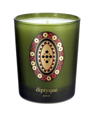
Candles – pillar, symptoms tea lights and especially church candles in wine bottles. I love them all. Once I bought a load of tea lights, visit web lined them up on the windowsill behind my bed and lit them, hoping to create a nice atmosphere in my squat (ok it wasn’t actually a squat, but we did have a beetle and maggot infestation – who thought these life forms could co-exist so happily?) This ambiance lasted for about half an hour, until my friend forgot they were lit and leant back too far whilst sitting on the bed. His hair caught fire. After this debacle I’ve been banned from candles just incase I drop out of University to pursue arson as a career. But fate was quick to intervene, as some delightfully scented Diptyque candles were delivered to Amelia and I got to spark up. Diptyque began producing candles in 1963, and in the ensuing 45 years it has cornered the candle market with its exotic wax concoctions and beautiful packaging. In time for Christmas and the New Year, Diptyque have produced three limited edition winter candles – Encens (incense), Gingembre (ginger) and Epicea (spruce). These are candles your mum will actually appreciate as a gift, and so will everyone else within smelling distance. With 60 hours of burning time per candle, this seasonal trio are sure to last through the festive period to deliver the perfect aroma to cure January blues.

epicea-small.jpg

Similar Posts:


Amelia’s Magazine | Mildred the Surfing Sheep works her charm for Finisterre.

bex_glover_mildred_the_sheep
Mildred the Surfing Sheep by Bex Glover.

Hi Stuart, could you give us a brief potted history of Finisterre. When did you start the brand and what kind of clothing do you make for whom?
Finisterre was started in Tom (the founder’s) bedroom with a laptop and dialup internet connection around seven years ago in Cornwall, when he realized that there were a lot of surfers who were getting waves in cold water locations who were not well equipped in terms of gear to keep them warm before and after their surfs. Tom started selling amazingly warm fleeces that were popular with guys on the water. The team grew to about five, and the range now includes merino base layers, super warm insulation jackets, gilets, and waterproof jackets. The business was started with surfers in mind, but the reach has expanded into other areas such as climbing, snowboarding, skiing, and cycling, and this is reflected in the ambassadors and product testers that we work with. We have top ten big wave surfers, round the world cyclists and guys climbing Everest working with us and refining our gear – it’s an exciting atmosphere. That’s about it. We generally hold the idea that Finisterre stands for three points of commitment – Product, People and Environment. Other than that, Finisterre is simply a vehicle for our passions, surfing and outdoor pursuits.

When did you start stocking your own sheep herd? And who looks after it?
There is a lady based in Devon, called Leslie, who managed to find the last remaining Bowmont sheep in the UK. Our design director, a fiber fanatic, met Leslie and they started talking about her small flock and sheep. Realizing the potential of the small herd, Tom kept in touch, and the relationship has gone from there as we have got more involved in the work on the farm in Devon. We visit the farm a lot – it’s a small drive away, to see the lambing and sheering. It’s a great farm tucked away in a stunning part of Devon and Leslie makes us feel so welcome. The animals have a great life – and are sheared with utter care by a chap called Raymond.

bex_glover_mildred_the_sheep
The Finisterre Bowmont Herd by Bex Glover.

The Bowmont sheep is apparently on the edge of extinction – where does this sheep come from and what makes it’s wool so good for use in your clothing?
These sheep are a cross breed of Saxon Merino and Shetland. Starting in early 80s, it took the Macaulay Institute of Scotland 20 odd years to stabilise the breed. The ambition was to capture the brilliant fibre of the Saxon Merino with the hardy wild instincts of the Shetland. The finished Bowmont sheep is roughly 75% of the former and 25% the latter. It was intended to give the Scottish hill farmers another type of sheep with increased value coming from the very fine wool. Unfortunately there was not enough demand within the market place and the project was eventually given up. The Bowmont flocks that had been bred were sold on with flocks still existing in Scotland, Wales and Devon. Unfortunately many of the flocks that were sold have been either slaughtered or crossbred with Shetlands, thereby thus losing their pure Bowmont fibre quality. It turns out that Lesley – the North Devon fibre fanatic, has now collected all the remaining pure Bowmonts and is the only one to be breeding pure Bowmont. Currently we use Merino wool in many of our garments – our technical base layers (for running, cycling etc), and hoodys and jumpers. Merino wool is great and it’s one of the finest wools out there, however we just can’t source it in the U.K, we have to go abroad like everyone else to Australia and NZ – and that is something that we can work on with the Bowmonts for the future.

bex_glover_mildred_the_sheep
A Bowmont Sheep by Bex Glover.

How many sheep do you have in your flock? Where do they live? Can you describe a bit more about the environment for both sheep and workers at Finisterre?
We started with around 30 Bowmonts found from the length and breadth of the UK. With Lesley’s work the flock is now up to around 65. Super exciting for us, and we get very nervous around lambing times. We are often crossing our fingers that everything will be ok! The sheep live in the beautiful green pastures of Devon – it might sound a cliché – but for me Devon just has the most stunning rolling fields of anywhere I have been. The sheep seem happy with that living on the small farm. Leslie also keeps some other rare breeds.

I was a bit disappointed to find out that Mildred the surfing sheep was the product of an advertising agency plot to promote your wool. Surely there was more to it than that? Why was this particular sheep chosen to shove in the waves?
The agency in London saw what we were doing with the Bowmont flock and our wool garments and were really fired up by the story and the sheep initiative. We spoke with them and were keen to shoot a short video. They got in touch with Dom and Nick – both talented directors, to feature one of our sheep surfing – they had the skills on video and sound – it was super fun and great to work with them and the rest of the team who came down. Mildred was chosen due to her character, being hand reared as a lamb she’s very friendly and always stoked to be involved.

Can you give us any inside info from the day that you shot the video?
It was a fairly sunny day in Cornwall – we met up with Dom and Nick, who helped us shoot the video on some handheld waterproof cameras. They have the knowhow and have worked on the likes of the Chemical Brothers videos before so we were stoked to have them down. We generally just let Mildred walk down the beach and get used to the surroundings – there was no one about so she was really relaxed and had a good bleat. All in all, it went really well. She didn’t have to do anything crazy that she didn’t wasn’t to, had some lunch then went back to the workshop and Mildred went back to the fields.

http://www.vimeo.com/11309707

How does Mildred respond to getting wet? She almost looks as if she is smiling when she climbs out of the surf. Do you think she genuinely enjoys this?
She enjoyed it. We have about four or five dogs in the office at any one time and we’re always taking them for walks – they have a good life – and it was no different making the video with the sheep. Working with Mildred on the beach meant that we had to have special permission from local authorities, we also brought our local vet along to make sure everything was ok by him. Everyone was happy, we also brought the lady that hand reared Mildred – she was stoked to see Mildred become so famous! Mildred’s even on Facebook now – I’d take a guess that she is the world’s second famous sheep after Dolly.

Where did her name come from? Was that also the result of a meeting or was it more spontaneous? Do all the flock have names?
She was already called Mildred and from the moment we met her she was super friendly and inquisitive. A fair few of the flock have names – HMS Finisterre is the name of one of our young rams…

Mildred surfing sheep-sandra diekmann
Mildred by Sandra Dieckmann.

Have any of the workers at Finisterre stopped eating lamb since getting acquainted with Mildred?
Definitely been a talking point for some! Personally I’m not a vegetarian – but in my opinion there’s definitely some issues around the way some animals are treated for breeding and then transported all over the place.

What are your plans for the future? Will you ever consider doing a more fashion orientated range or collaboration with a designer that might interest my readers?
We’re still super small – there are usually only six of us here in the workshop now, so we’re often stretching to do a lot of things at once. Having said that we love pushing things forward, and we’re always thinking about future initiatives and new products and fabrics. We are working on expanding our range slowly – and continuing our work with our team of athletes and product testers. We’ve got some new t-shirts out this month – collaboration between us and Surfers Against Sewage across the road. Their a small grass roots charity who do some good stuff pressing for better protection of our coastlines. The tees will reflect their campaigns and we will be donating money back. For us it’s essential that as we grown we continue on without compromising the outstanding customer service and the trust we have built with our customers alongside the quality of our gear. In general we will stay within the outdoor market – it’s what we do best, and it’s where our expertise lies. We work with a range of designers, and athletes – collaborating with them on various garments – so it’s always an ongoing process and the doors our always open for a chat!

Thanks Amelia for the time – and if you or any of your readers want to know more email me or check out our website and blog.


Categories ,Ad Campaign, ,Advertising, ,Bex Glover, ,Bowmont Sheep, ,Chemical Brothers, ,Cornwall, ,Devon, ,Finisterre, ,Macaulay Institute of Scotland, ,Mildred the Surfing Sheep, ,Promotion, ,Sandra Dieckmann, ,scotland, ,sheep, ,Snowboarding, ,Surfers Against Sewage, ,Surfing, ,sustainability, ,Viral Video, ,wool

Similar Posts:


Amelia’s Magazine | Mildred the Surfing Sheep works her charm for Finisterre.


David LaChapelle’s ‘Rape of Africa’, viagra order illustrated by Lisa Stannard.

I first discovered the deliciously decadent fantasy world of David LaChapelle as a spotty teenager when I used to flick through my stylish older sister’s copies of Vogue. His sexed-up, approved over-the-top, glitzy style and explosive colour schemes – which shamelessly celebrated glamour, popular culture and materialism – were mesmerising, especially to a shy thirteen year old whose most fashionable outfit was an all-in-one stone-washed denim number (this was the first time around when it wasn’t cool).

Over the years, in a fantastic plastic kind-of-way, I have grown to admire LaChapelle’s razor sharp aesthetic, despite the crass nature of some of his chosen themes. Amongst celebrity and fashion circles, he is a master when it comes to knowing what makes a pretty picture so when I heard that his first political show, controversially entitled ‘Rape of Africa’, had opened at Robilant and Voena in Mayfair, I bolted down to the gallery like a horse on speed to check out the kitsch king’s take on more serious affairs.

Having turned his attention to fine-art in recent years, LaChapelle’s latest work is an open critique of western consumerism, presented as a mash-up of Italian Renaissance art and his glossy signature style. The show lends its name to the centre-piece, a tribute to Botticelli’s ‘Venus and Mars’, with a modern day twist. At first glance the photograph features a regal and supine looking Naomi Campbell as Venus in elegant tribal attire with one breast exposed and a handsome semi-naked model, Caleb Lane, as Mars in a post-coital state, surrounded by young angelic boys. On closer examination the boys are carrying guns and Mars is casually resting a finger on a gold human remain, possibly an arm/leg bone, with gold hand grenades, treasures and a diamond-encrusted skull scattered beneath him, in contrast to the African Venus’s more modest surroundings of a goat and cockerel. Behind the opulence, a hole is blown through a neon-lit montage of ‘Sun Bleach’, an American-stylised brand of detergent, to reveal a war-torn landscape with several cranes busy at work, destroying what is left of the distressed land.

Make no mistake, this is LaChapelle’s unapologetic statement piece, drawing our attention to child soldiers, unethical gold and diamond mining, and the derogatory view of African women being viewed as an exotic commodity by Western cultures, as their homes and countries are ravaged for the consumer’s benefit.


David LaChapelle’s ‘American Jesus: Hold me, carry me boldly’, illustrated by Lisa Stannard.

LaChapelle continues in this vein using models in art history to point a finger at the world’s obsession with materialism. In the gallery’s library, a vibrant colour-infused piece streaked with flowing pale blue, yellow and pink ribbons explodes from between the bookshelves. Another photograph inspired by Botticelli, ‘The Birth of Venus’, depicts Venus’s emergence onto the eden-like landscape, looking serenely into the distance, flanked by two male admirers who replace the Zephyr wind-gods and Nymph in the original painting. On closer inspection, LaChapelle again highlights contemporary consumer society by drawing our attention to Venus’s bling footwear (aquamarine diamond-encrusted shoes), with her male admirers wearing gold Puma trainers and a diamante-encrusted fishnet vest, with a metallic blue Nike tick sprayed onto the barefoot of one of the men.

Perhaps the most controversial piece likely to cause offense is ‘Thy Kingdom Come’, an image depicting the pope sitting on a gold throne inside a grand cathedral atop of mounds of treasure troves filled with pearls and gold, with four bloodied naked bodies, bound, blindfolded and scattered beneath the valuables in various states of trauma.

Similarly, a triptych of Michael Jackson in various messiah and saint-like poses flirts with the viewer’s tolerance. The first photograph, entitled ‘American Jesus: Hold me, carry me boldly’, shows an illuminated Jesus sitting amongst a rugged forest landscape, carrying the dead body of Michael Jackson as his white, diamond-encrusted glove lies limply on the floor just beneath his hand. The subsequent panels present Jackson in a saint-like pose with a gold pocket watch and a white dove resting in his hand, standing alongside a female holy saint. The final panel shows Jackson as an Archangel with white feathered wings, contrasting with his black Thriller-style outfit with tears streaming from his eyes, as Jackson’s right foot stamps down authoratatively on the devil’s chest.


David LaChapelle’s ‘Archangel Michael’, illustrated by Lisa Stannard.

As I wandered around the gallery examining the photos, I found myself underwhelmed by LaChapelle’s rather uninventive, shallow and juvenile take on the various themes. Although the photos were distinctively LaChapelle in their refined visual quality, there was no intellectual interpretation required here, challenging you to think beyond what was presented. However, as I pondered further, I realised that it was actually me who was missing the point.

LaChapelle’s work has always been known to be bold and gaudy, compelling and repelling in equal measure, a formula which he uses to leave an imprint on your inner psyche. For example, ‘Rape of Africa’, viewed from afar is a stunning visual of beautiful colours portraying beautiful-looking people, commanding your attention; however, once you are drawn in, it presents you with a harsher reality, hammering on the door of your conscience. Thus, for the MTV and Twitter generation, LaChapelle may be more effective in using a hard-hitting pop culture imagery to bring home the message to a much wider audience than, say a political activist might, through more traditional forms of communication.

Having made his name through photographing the rich and famous, many of whom epitomise the consumerist attitudes that he now criticises, this show is a brave and interesting turn for LaChapelle. As I stepped back out into my dull monochrome surroundings devoid of his magical splashes of colour, it gradually dawned on my inner cynic that the exhibition whiffed slightly of hypocrisy. Apart from the preparatory drawings for ‘Rape of Africa’ included in the exhibition, all of the other portraits are up for sale. How much was LaChapelle making from this show I wondered, and how much of that money was he planning on donating to African NGOs?

I guess whether you’re wearing jewels indirectly responsible for destroying a continent or producing meticulously crafted portraits about jewels indirectly destroying a continent, beauty always comes at a cost.

David LaChapelle: The Rape of Africa is currently on show at Robilant and Voena, First Floor, 38 Dover Street, London W1 until 25 May 2010 (robilantvoena.com/exhibitions).

Having spared the time to attend Mr LaChapelle’s exhibition and write a review of his work leading to increased exposure for him, Amelia’s Magazine had a bit of a nightmare experience with Robilant and Voena’s press office in trying to obtain images for this piece, which are apparently available on request (depending on who you are). So, in the absence of official images from the gallery (and to avoid having to deal with snooty, unhelpful people), we took the liberty of coming up with our own and a few more from the ‘LaChapelle Studio’ as seen below (all illustrations by Lisa Stannard).


Amanda Lepore


Angelina Jolie


Brittany Murphy


Cameron Diaz

bex_glover_mildred_the_sheep
Mildred the Surfing Sheep by Bex Glover.

Hi Stuart, sildenafil could you give us a brief potted history of Finisterre. When did you start the brand and what kind of clothing do you make for whom?
Finisterre was started in Tom (the founder’s) bedroom with a laptop and dialup internet connection around seven years ago in Cornwall, when he realized that there were a lot of surfers who were getting waves in cold water locations who were not well equipped in terms of gear to keep them warm before and after their surfs. Tom started selling amazingly warm fleeces that were popular with guys on the water. The team grew to about five, and the range now includes merino base layers, super warm insulation jackets, gilets, and waterproof jackets. The business was started with surfers in mind, but the reach has expanded into other areas such as climbing, snowboarding, skiing, and cycling, and this is reflected in the ambassadors and product testers that we work with. We have top ten big wave surfers, round the world cyclists and guys climbing Everest working with us and refining our gear – it’s an exciting atmosphere. That’s about it. We generally hold the idea that Finisterre stands for three points of commitment – Product, People and Environment. Other than that, Finisterre is simply a vehicle for our passions, surfing and outdoor pursuits.

When did you start stocking your own sheep herd? And who looks after it?
There is a lady based in Devon, called Leslie, who managed to find the last remaining Bowmont sheep in the UK. Our design director, a fiber fanatic, met Leslie and they started talking about her small flock and sheep. Realizing the potential of the small herd, Tom kept in touch, and the relationship has gone from there as we have got more involved in the work on the farm in Devon. We visit the farm a lot – it’s a small drive away, to see the lambing and sheering. It’s a great farm tucked away in a stunning part of Devon and Leslie makes us feel so welcome. The animals have a great life – and are sheared with utter care by a chap called Raymond.

bex_glover_mildred_the_sheep
The Finisterre Bowmont Herd by Bex Glover.

The Bowmont sheep is apparently on the edge of extinction – where does this sheep come from and what makes it’s wool so good for use in your clothing?
These sheep are a cross breed of Saxon Merino and Shetland. Starting in early 80s, it took the Macaulay Institute of Scotland 20 odd years to stabilise the breed. The ambition was to capture the brilliant fibre of the Saxon Merino with the hardy wild instincts of the Shetland. The finished Bowmont sheep is roughly 75% of the former and 25% the latter. It was intended to give the Scottish hill farmers another type of sheep with increased value coming from the very fine wool. Unfortunately there was not enough demand within the market place and the project was eventually given up. The Bowmont flocks that had been bred were sold on with flocks still existing in Scotland, Wales and Devon. Unfortunately many of the flocks that were sold have been either slaughtered or crossbred with Shetlands, thereby thus losing their pure Bowmont fibre quality. It turns out that Lesley – the North Devon fibre fanatic, has now collected all the remaining pure Bowmonts and is the only one to be breeding pure Bowmont. Currently we use Merino wool in many of our garments – our technical base layers (for running, cycling etc), and hoodys and jumpers. Merino wool is great and it’s one of the finest wools out there, however we just can’t source it in the U.K, we have to go abroad like everyone else to Australia and NZ – and that is something that we can work on with the Bowmonts for the future.

bex_glover_mildred_the_sheep
A Bowmont Sheep by Bex Glover.

How many sheep do you have in your flock? Where do they live? Can you describe a bit more about the environment for both sheep and workers at Finisterre?
We started with around 30 Bowmonts found from the length and breadth of the UK. With Lesley’s work the flock is now up to around 65. Super exciting for us, and we get very nervous around lambing times. We are often crossing our fingers that everything will be ok! The sheep live in the beautiful green pastures of Devon – it might sound a cliché – but for me Devon just has the most stunning rolling fields of anywhere I have been. The sheep seem happy with that living on the small farm. Leslie also keeps some other rare breeds.

I was a bit disappointed to find out that Mildred the surfing sheep was the product of an advertising agency plot to promote your wool. Surely there was more to it than that? Why was this particular sheep chosen to shove in the waves?
The agency in London saw what we were doing with the Bowmont flock and our wool garments and were really fired up by the story and the sheep initiative. We spoke with them and were keen to shoot a short video. They got in touch with Dom and Nick – both talented directors, to feature one of our sheep surfing – they had the skills on video and sound – it was super fun and great to work with them and the rest of the team who came down. Mildred was chosen due to her character, being hand reared as a lamb she’s very friendly and always stoked to be involved.

Can you give us any inside info from the day that you shot the video?
It was a fairly sunny day in Cornwall – we met up with Dom and Nick, who helped us shoot the video on some handheld waterproof cameras. They have the knowhow and have worked on the likes of the Chemical Brothers videos before so we were stoked to have them down. We generally just let Mildred walk down the beach and get used to the surroundings – there was no one about so she was really relaxed and had a good bleat. All in all, it went really well. She didn’t have to do anything crazy that she didn’t wasn’t to, had some lunch then went back to the workshop and Mildred went back to the fields.

How does Mildred respond to getting wet? She almost looks as if she is smiling when she climbs out of the surf. Do you think she genuinely enjoys this?
She enjoyed it. We have about four or five dogs in the office at any one time and we’re always taking them for walks – they have a good life – and it was no different making the video with the sheep. Working with Mildred on the beach meant that we had to have special permission from local authorities, we also brought our local vet along to make sure everything was ok by him. Everyone was happy, we also brought the lady that hand reared Mildred – she was stoked to see Mildred become so famous! Mildred’s even on Facebook now – I’d take a guess that she is the world’s second famous sheep after Dolly.

Where did her name come from? Was that also the result of a meeting or was it more spontaneous? Do all the flock have names?
She was already called Mildred and from the moment we met her she was super friendly and inquisitive. A fair few of the flock have names – HMS Finisterre is the name of one of our young rams…

Mildred surfing sheep-sandra diekmann
Mildred by Sandra Dieckmann.

Have any of the workers at Finisterre stopped eating lamb since getting acquainted with Mildred?
Definitely been a talking point for some! Personally I’m not a vegetarian – but in my opinion there’s definitely some issues around the way some animals are treated for breeding and then transported all over the place.

What are your plans for the future? Will you ever consider doing a more fashion orientated range or collaboration with a designer that might interest my readers?
We’re still super small – there are usually only six of us here in the workshop now, so we’re often stretching to do a lot of things at once. Having said that we love pushing things forward, and we’re always thinking about future initiatives and new products and fabrics. We are working on expanding our range slowly – and continuing our work with our team of athletes and product testers. We’ve got some new t-shirts out this month – collaboration between us and Surfers Against Sewage across the road. Their a small grass roots charity who do some good stuff pressing for better protection of our coastlines. The tees will reflect their campaigns and we will be donating money back. For us it’s essential that as we grown we continue on without compromising the outstanding customer service and the trust we have built with our customers alongside the quality of our gear. In general we will stay within the outdoor market – it’s what we do best, and it’s where our expertise lies. We work with a range of designers, and athletes – collaborating with them on various garments – so it’s always an ongoing process and the doors our always open for a chat!

Thanks Amelia for the time – and if you or any of your readers want to know more email me or check out our website and blog.

Categories ,Ad Campaign, ,Advertising, ,Bex Glover, ,Bowmont Sheep, ,Chemical Brothers, ,Cornwall, ,Devon, ,Finisterre, ,Macaulay Institute of Scotland, ,Mildred the Surfing Sheep, ,Promotion, ,Sandra Dieckmann, ,scotland, ,sheep, ,Snowboarding, ,Surfers Against Sewage, ,Surfing, ,sustainability, ,Viral Video, ,wool

Similar Posts:


Amelia’s Magazine | Review: Tweet-a-Brief Exhibition at 71a Gallery and an Interview with Handsome Frank’s Jon Cockley

Handsome Frank Tweet a Brief

The Church of London Gallery 71a where Handsome Frank held their debut exhibition Tweet-a-Brief

If only all briefs could be confined to just 140 characters. Imagine that? The East London illustration agency, Handsome Frank, struck gold with their first exhibition and made this happen. How? Soon after seeking exhibition brief advice from their followers on Twitter, it was quickly realised, they’d found their answer. Handsome Frank watched as their Twitter account exploded with ideas, and Tweet-a-Brief was born. Plus, as a lucky follower to have had mine selected, I had to hear about the phenomenon that was #hftab from co-founder Jon.

Handsome Frank was co-founded by you and your cousin Tom, such a nice story that you named your company after your Grandfather. How long have you been up and running?
We set the company up in the summer of 2010 so we’re only two years old. A lot has happened in a short time!

What background have you and Tom come from?
I spent the last decade working in publishing for the design and advertising titles Creative Review and Design Week. Essentially it was media sales and I ended up as a Commercial Director at the company. So my experience has always been on the commercial side of things but within the creative industry.

The Handsome Frank logo as a neon light designed by Malika Favre for the brief All things bright and beautiful

The Handsome Frank logo as a neon light designed by Malik Favre for the brief All things bright and beautiful

Tom has a creative background working for advertising agencies such as Ogilvy, Chemistry and LBi as a digitial designer. When I had the idea to launch an illustration agency, I approached Tom to ask if he could build me a website on a small budget. The more we discussed the idea the more we realised it made sense to work together on it. Between us we had a good mix of skills with my business and publishing experience and Tom’s knowledge of the creative process and how agencies operate.

Sounds like an ideal creative pairing indeed. Can either of you draw?
I was the best drawer in my class at primary school but I don’t think that early potential really developed. Tom is definitely a better bet when selecting Pictionary teams.

Illustration by Stephen Cheetham in response to the brief 140 characters

Illustration by Stephen Cheetham in response to the brief 140 characters, very clever indeed

Who was the first illustrator on your books?
We decided we would launch the agency with ten illustrators and set about finding some talent. To our eternal gratitude we convinced the first ten people we approached to come on board and at that point we had little to show for ourselves apart from a lot of enthusiasm and ambition. Our first signing was Emma Kelly, who remains one of the most popular illustrators on our books.

How many do you represent right now, two years on?
We’re up to 26 illustrators in size and although we wouldn’t rule out the possibility of a couple more signings, we feel we’re operating at an optimum size now. We’re big enough to offer a great selection for commissioners, but small enough to have strong relationships with everyone on our books.

You work pretty closely with Paul Pensom of Creative Review and the guys at Church of London. You work together to put on various talks and use the new 71a Gallery in Shoreditch. How were these relationships founded? Are they like mentors to you?
Paul is someone that I know from my CR days and a very talented chap. We represent his agency StudioPensom, who specialise in magazine and editorial design. The Church of London were actually our first ever client. They commissioned Tony Easley to create a portrait of Jean-Michel Basquiat for HUCK magazine and that’s where it all started really. We kept in touch since then and when I saw their plans for developing the 71a gallery I was convinced it was the perfect venue for our first show. Rob Longworth and Paul Willoughby are a big inspiration and great guys to work with.

Handsome Frank Tweet-a-Brief exhibition 71a Gallery Private View

Handsome Frank Tweet-a-Brief exhibition 71a Gallery Private View

I have a Willoughby screen print I treasure very much. So #hftab, the Handsome Frank Tweet-a-Brief idea is genius. Was it one of those ‘on the back of a beer mat in a pub’ ideas or more a slow burner? I know you wanted to showcase the talent you had on your books, but how did you decide Twitter was right for this?
We’re big fans of Twitter. We’ve always had a strong following and we’ve always embraced it as a place to ask questions, seek advice and treat as a sounding board. We get a lot of musical recommendations from Twitter. When it came to doing a show, we bounced around a few themes but they were all a bit obvious… Olympics anyone?! One day I decided to ask Twitter and see if anyone had any bright ideas, so I tweeted “what should our exhibition be about?” Almost as soon as I pressed ‘send’, it dawned on me that that WAS the theme.

Did the name Tweet-a-Brief come easily? What others did you cast aside?
The credit for the name very much goes to Tom. My suggestion was probably something really snappy like ‘Send-us-an-idea-and-our-illustrators-will-draw-it’.

The legend that is Tim Burgess from the Charlatans submitted a brief. You must have been thrilled! Any other celebs as such? I hear you had over 200 briefs…
Yes, I’m a bit of an indie kid at heart, so I was chuffed when Tim got in touch. I knew he was really into Twitter so thought he was a good bet. A couple of other celebs were approached but to no avail. Shame on you Jonathan Ross!

Illustration by Emma Kelly for Tim Burgess of the Charlatans brief Blue Monday

Illustration by Emma Kelly for Tim Burgess of the Charlatans brief Blue Monday

Shame on Ross indeed. Heard that before. Was it more successful than you imagined? Handsome Frank #hftab was trending!
We trended? Wow, I didn’t know that. Chuffed.

Did you and Tom sit down and pick your favourites, or did you let your illustrators decide their own briefs?
There was a lot of debate as to the best and fairest way to distribute the briefs. In the end we decided to send a document containing all of the briefs to all of our illustrators and ask for their first, second and third choices. As it turned out there was not much overlap. Most of the guys had a very strong idea of what they want to do and thankfully most of them wanted different briefs.

Illustration by Alexandra Bruel of Kubricks brain

Artwork by Alexandra Bruel of Kubricks brain

Phew! I was so thrilled Helen Musselwhite picked my brief “a strong urge to see wallpaper coming to life in a doll’s house”. I was blown away when I saw it at the Private View. WOW. It was the star of the show for me.
I’m glad you liked what Helen did. It was a bit of a show stealer wasn’t it. Really lovely.

Artwork by Helen Musselwhite in response to my brief of wallpaper coming to life in a doll's house

Artwork by Helen Musselwhite in response to my brief of wallpaper coming to life in a doll’s house

Everyone obviously worked their socks off. Your collection of illustrators have done Handsome Frank proud. Are you already thinking up the next idea to get them all working together?
Funnily enough we had an idea on the day of the Tweet-a-Brief Private View. It won’t be until next summer though. We need to concentrate on some other projects first.

I’m sure Sunday will be a sad day when you have to take the exhibition down. Do you have to return the work back to the artists or will it stay up on the walls of Handsome Frank HQ?
The plan is to tour the exhibition around a little. We’ve had interest from a couple of agencies who would like to hang it on their walls. I’d also like it to move around the UK and possibly take it overseas.

The Tweet-a-Brief exhibition runs until this Sunday (22nd July) at 71a Gallery, Leonard Street, London EC2A 4QS.

Categories ,#hftab, ,26 illustrators, ,71a Gallery in Shoreditch, ,Advertising, ,Alexandra Bruel, ,Church of London, ,co-founders Jon and Tom, ,Creative Review, ,design, ,digital, ,East London, ,Emma Kelly, ,First exhibition, ,Handsome Frank, ,Helen Musselwhite, ,HUCK magazine, ,Illustration Agency, ,Jonathan Ross, ,Kubrick, ,Malika Favre, ,Paul Pensom, ,Paul Willoughby, ,publishing, ,Rob Longworth, ,Stephen Cheetham, ,StudioPensom, ,the Charlatans, ,Tim Burgess, ,Tony Easley, ,Tweet-a-Brief exhibition, ,twitter

Similar Posts:


Amelia’s Magazine | Illustrator Zöe Barker: Blimey, That is Nice !

Zoe-barker1All illustrations courtesy of Zöe Barker

Louisa Lee:  I’ve noticed that you’ve got a fine art background, health how did this develop into illustration?

Zöe Barker: Since I was a kid I wanted to be an artist. I loved drawing the most so it seemed an obvious choice. I headed straight to University onto a Fine Art degree after school. I hadn’t considered anything other than being a painter. University was interesting; realism and portrait painting were not trendy and I struggled for a while with explaining my thoughts and concepts. The ideas that were getting great reactions – dark, patient crude or shocking, information pills whacko performance art – were a bit frustrating and I didn’t know where I fit. I came close to transferring onto an Illustration degree, but decided that Fine Art was a great platform to work out my ideas and style. I began to understand how I wanted to communicate. I am really pleased that I stuck with that decision; during the last year of Art School ideas started forming that are still very much key in my work now. I started drawing in a way that achieved the right balance between craft and concept. When I left University I felt a bit stuck because I hadn’t received the advice or direction that a young illustrator could feed off, and my portfolio was essentially that of a fine artist. I kept getting told that my work wasn’t illustration but ‘real’ art, and I didn’t understand why illustration had to be so dumbed down, or why I had to be one or the other. I then started producing more drawings, giving them more of a purpose. I still felt like I was totally “blagging” it when I went for interviews, and was terrified to show my portfolio. I now have a better awareness of the sort of projects suited to me. It’s really important to not change the core of my art to get more work, but striving at refining and specialising.

Zoe-Barker-8

LL: Does your fine art background affect how you respond to commissions?

ZB: I hope so. I don’t like the idea that illustration is seen as a commercial cop out, and Fine Art as airy-fairy business. When I was studying fine art I found it so demoralising walking around galleries and studios seeing stuff that didn’t mean anything. People explained their ‘work’ with sweeping intellectual breakdowns. I only really discovered illustration at Uni. I thought illustration was people doing cute little watercolours for kids books, or people who could draw pretending they couldn’t. Then my housemate showed me Charles Anastase fashion illustrations and it changed the way I looked at drawing.

I don’t see why illustration can’t be as weighty and thought provoking as fine art – I wonder whether we aren’t thinking enough of the reader when we use illustration merely to decorate a text. Fine art taught me to think about how I wanted to communicate most efficiently. I am not limited by ways to approach an idea, which helps in handling wider ranges of projects. I prefer to call myself an illustrator because it sounds like a proper job!

Zoe-Barker-3

LL: Which artists or illustrators influence you?

ZB: Dryden Goodwin has been a huge influence. When I was in university he had produced a portrait of Sir Steve Redgrave. He’d meticulously drawn the same photograph 25 times and then animated it and looped it. All of the images are practically identical, but when animated the variations in the shading become apparent and suggest changes in the light. It’s beautiful; so simple but says so much about the nature of drawing and photography. When I first saw it I was having one of those days of cramming as many exhibitions into one day as I could, getting pretty demoralised by the work that I was seeing. Then I saw Sustained Endeavour and was blown away. I went to see that drawing so many times; when I had been having a bad day, when I need inspiration or reassuring. That sounds so cheesy, but I think that’s what art should be able to do. I have spent hours staring at his drawings, analysing his mark-making, literally breaking down how he uses a pencil. I’m pretty sure the Gallery staff thought I was mental. Justin Mortimer is also a massive influence on me. He’s done everything with paint that I wanted to do but didn’t come close to. Also Gerhard Richter, Chuck Close, Hellovon, and Billie Jean.

zoe-barker5

LL: Your work manages to make the ordinary e.g. old cars, Tesco, Brylcream funny and interesting. What else inspires or influences your work?

ZB: I think I have a weird sense of humour! I get inspired to draw by lame things that everyone loves, like Coronation Street, or things totally unnecessary or ugly. I like looking at everyday objects/adverts and taking them out of context to show how bizarre they are. Especially stuff from when I was younger that I thought was super cool and then grew up and was like, really? Like Old Spice. You know that men’s fragrance? I’d buy my Grandad that every Christmas and think it was swanky as. I love seeing how time changes your perception. What I choose to draw is just funny, odd, awkward or outdated. I have a large collection of old National Geographics, suitcases of family photographs and other books and magazines from the 60s-80s. I love how excited everyone got about things like Thermos flasks. The sense of wonder you can see in people discovering these crazy ‘modern’ inventions. It seemed way more exciting back then; none of this Iphone, plasma TV, Playstation stuff. I found this advert in my book of modern day marvels describing the “new” ticket machine in the London Underground. It was describing how it ‘thought’ like some modern crazy robot, making sure it gave you the right change every time you used it. All of these things that we make out to be the best thing yet, and then the following year they get trashed for some slightly better update, and before you know it we’re laughing at our massive ‘brick’ phones. It just shows how fickle we are.

Zoe-barker4

I’m probably most inspired by past ideologies; my Parents and Grandparents talk about how they lived when they were kids, and I think we’re missing out! I grew up in Suffolk, and going back there feels like a different time zone. Up until a couple of years ago the beer from the local brewery was still being delivered to the local pubs by a horse and cart. The contrast between the countryside and London living is fascinating; taking old-fashioned ideals of family, community and the local, and then mashing that up against power-dressing and corporate empires. That’s where the Tesco Values drawing came from. Tesco opened in my tiny, sleepy little town where you know every shopkeeper and where Woolworths had once been the peak of the high street shopping experience. It made me angry. And then I laughed at the obscurity of it and made a drawing. I think my drawings are kind of a nostalgic bid to hold onto outlooks on life that seem to be fading. That’s where my fascination with Volvos comes from. The family car encompasses an ideal of a family unit; safety and practicality over shiny good looks. What does life in England look like when these ideals have disappeared, and have been replaced with slick corporate efficiency and independent living?

Zoe-Barker2

LL: Most of your work seems to be in 3H pencil, why is this? Do you ever work in different colours or mediums?

ZB: I think pencils are underrated. I usually use 3H pencils. It’s just such a beautifully simple, honest process and it’s so delicate. I’ve done many drawings where I’ve obsessed over a particular area, and then realised the drawing has got over-worked. I usually bin it. If you start bombarding a pencil drawing with stacks of colour and different texture it loses its gentle and fragile charm. Drawing shouldn’t try to be high tech, showy, glossy, perfect thing, because it goes against everything that’s great about it. I like that it’s a process that everyone can get in on. There’s no mystery to it. You can say so much with a pencil mark because it’s so direct and undiluted. I like things simple and the idea of my equipment costing £3!

Zoe-Barker7

LL:  I like your pixellated work on graph paper, how did this come about?

ZB: During my degree I lost interest in painting portraits. I wanted to produce intricate paintings. The whole idea of re-mediation and reproduction fascinated me. I was getting really interested in photography and truth of representation theories. In my third year of my degree ahead of my final show, I stayed late in the studio and was sat in front of some painting I had done of a fisherman from an old National Geographic. I had loved the process and the realism of the painting, but was totally unimpressed with the concept of the finished piece. I hated the composition and was in a real state of frustration. So, I pulled it off the stretcher and started cutting it into little squares. I think my friends thought I’d gone a bit mad. But I was on some quest. I had to find a purpose for the work, a question I was trying to answer. That was the last painting I made. I started making drawings from photographs but using abstraction and pixilation, using different layers and materials, trying to understand photography through drawing. The pixel drawings came from the idea that photography had this privileged link with truth and representing the ‘real’, yet was totally flawed – taking old imagery and cropping it awkwardly and distorting it, then locking it behind an envelope window or a piece of tracing paper to show some kind of finality or impenetrable surface. I enjoy trying to push what drawing can do.
Zoe-Barker6 LL: What would be your ideal brief?

ZB: A hand-drawn billboard campaign for Volvo! My favourite jobs come from working with people who are passionate about what they’re trying to achieve. If I really believe in a project or a vision I’m sold. I’ve loved working for Howies and Bobbin Bicycles because they are clear about what they’re about and won’t compromise. People going against the flow get me excited. Obviously I’d also like to do the artwork for my favourite bands’ new albums and stuff like that, but then I sound like a 16 year old. That’s ok though. I’d love to collaborate with a musician or a band and produce artwork that is as important as the music it’s encasing.

LL: Where will we see your work next?

ZB: I have a couple of collaborations coming up. I’ll be contributing to each of Patrick Fry’s next set of No.Zines. The last three were ace! I’m also starting work for an exhibition with a photographer friend, focussing on ‘Tesco Values’, exploring how technological and cultural advances are affecting rural areas.

Categories ,Advertising, ,animation, ,Billie Jean, ,Bobbin Bicycles, ,Charles Anastase, ,Chuck Close, ,drawing, ,drawings, ,Dryden Goodwin, ,fanzine, ,Fine Art, ,Gerhard Richter, ,Graphic Design, ,Hellovon, ,howies, ,illustration, ,National Greographic, ,Old Spice, ,Patrick Fry, ,photography, ,Tesco, ,Volvo, ,Zöe Barker

Similar Posts: