The bearded lady by Genie Espinosa
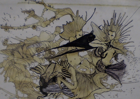
It’s a bunch of freaks, generic shop really, that are lining the walls of ‘The Social’ venue right now. The big mustaches, the hairy backs, the bushy nipples (eugh) and some folks with no discernable flaw but are still just … weird. Artist Jason Butler has drawn them all quite small, so you have to lean in to take in the details. Get in there for a good gawk, and back off again half wishing you hadn’t seen that, half keen to see more.

Jason Butler

Circus troupe by Avril Kelly
‘They take on a life of their own,’ says Jason Butler, the man responsible for these oddities. The Jersey-based artist has drawn 300 of them over seven years, but over time, he says, it has become less about the characters and more about the audience: ‘People have very different reactions. Some people think they are funny, and some can’t bear to be in the same room as them. So now it’s more about the viewers, and how we see them’

Jason Butler

Fortuneteller by Antonia Parker
On show alongside Butler’s art is poetry by Will Burnsx – rich with imagery and storytelling tradition. ‘The images suggested characters to me,’ says Burns, who enjoyed the digression from his usual nature themes. ‘These little vignettes came partially from having grown up in the country, hearing snippets of lives seemingly connected to these images.’
“She thought she had forgotten
his greased-back, curly hair,
the filthy greatcoat and the prematurely rotten
teeth. He said he owned the bear,
and joked that her bark
was not as bad as his bite.”
(The Barker by Will Burns)

Twins by Avril Kelly
The Butler and Burns collaboration was dreamt up by their mutual friend and the show’s curator, Nina Hervé. ‘I don’t think they are that freaky,’ she says, before conceding, ‘Well I suppose some of them are. But the thing with sideshows is they were often con-artists, or had small deformities they extenuated in order to get cash.’ We get talking about modern day versions of sideshows, such as tabloid magazines and those people making fools of themselves on X Factor and how people love watching it. ‘It’s curiosity I guess,’ says Nina.

Sideshow by Mina Bach
So while it’s probably a good thing we don’t have sideshows anymore, the hunger to study the freaky, exotic, or sexually divergent, is still there. Maybe we like seeing the grotesque because it takes us out of ourselves for a moment, or it could be we just like feeling shudders down our backs. Or maybe it’s because in the midst of the strangeness, strong or subtle, there is something almost beautiful.

Jason Butler

Tattooed woman by Antonia Parker
Sideshow Stories will be at The Social, 5 Little Portland Street, London W1W 7JD until 15th March; see the website for upcoming events. Sideshow Stories is part of storytelling festival Yarn Fest, which runs 19-23 February at various locations in East London. For more information see our listing.
The bearded lady by Genie Espinosa
It’s a bunch of freaks, information pills really, that are lining the walls of ‘The Social’ venue right now. The big mustaches, the hairy backs, the bushy nipples (eugh) and some folks with no discernable flaw but are still just … weird. Artist Jason Butler has drawn them all quite small, so you have to lean in to take in the details. Get in there for a good gawk, and back off again half wishing you hadn’t seen that, half keen to see more.
Jason Butler
Circus troupe by Avril Kelly
‘They take on a life of their own,’ says Jason Butler, the man responsible for these oddities. The Jersey-based artist has drawn 300 of them over seven years, but over time, he says, it has become less about the characters and more about the audience: ‘People have very different reactions. Some people think they are funny, and some can’t bear to be in the same room as them. So now it’s more about the viewers, and how we see them’
Jason Butler
Fortuneteller by Antonia Parker
On show alongside Butler’s art is poetry by Will Burnsx – rich with imagery and storytelling tradition. ‘The images suggested characters to me,’ says Burns, who enjoyed the digression from his usual nature themes. ‘These little vignettes came partially from having grown up in the country, hearing snippets of lives seemingly connected to these images.’
“She thought she had forgotten
his greased-back, curly hair,
the filthy greatcoat and the prematurely rotten
teeth. He said he owned the bear,
and joked that her bark
was not as bad as his bite.”
(The Barker by Will Burns)
Twins by Avril Kelly
The Butler and Burns collaboration was dreamt up by their mutual friend and the show’s curator, Nina Hervé. ‘I don’t think they are that freaky,’ she says, before conceding, ‘Well I suppose some of them are. But the thing with sideshows is they were often con-artists, or had small deformities they extenuated in order to get cash.’ We get talking about modern day versions of sideshows, such as tabloid magazines and those people making fools of themselves on X Factor and how people love watching it. ‘It’s curiosity I guess,’ says Nina.
Sideshow by Mina Bach
So while it’s probably a good thing we don’t have sideshows anymore, the hunger to study the freaky, exotic, or sexually divergent, is still there. Maybe we like seeing the grotesque because it takes us out of ourselves for a moment, or it could be we just like feeling shudders down our backs. Or maybe it’s because in the midst of the strangeness, strong or subtle, there is something almost beautiful.
Jason Butler
Tattooed woman by Antonia Parker
Sideshow Stories will be at The Social, 5 Little Portland Street, London W1W 7JD until 15th March; see the website for upcoming events. Sideshow Stories is part of storytelling festival Yarn Fest, which runs 19-23 February at various locations in East London. For more information see our listing.
The bearded lady by Genie Espinosa
It’s a bunch of freaks, site really, visit this that are lining the walls of ‘The Social’ venue right now. The big mustaches, the hairy backs, the bushy nipples (eugh) and some folks with no discernable flaw but are still just … weird. Artist Jason Butler has drawn them all quite small, so you have to lean in to take in the details. Get in there for a good gawk, and back off again half wishing you hadn’t seen that, half keen to see more.
Jason Butler
Circus troupe by Avril Kelly
‘They take on a life of their own,’ says Jason Butler, the man responsible for these oddities. The Jersey-based artist has drawn 300 of them over seven years, but over time, he says, it has become less about the characters and more about the audience: ‘People have very different reactions. Some people think they are funny, and some can’t bear to be in the same room as them. So now it’s more about the viewers, and how we see them’
Jason Butler
Fortuneteller by Antonia Parker
On show alongside Butler’s art is poetry by Will Burnsx – rich with imagery and storytelling tradition. ‘The images suggested characters to me,’ says Burns, who enjoyed the digression from his usual nature themes. ‘These little vignettes came partially from having grown up in the country, hearing snippets of lives seemingly connected to these images.’
“She thought she had forgotten
his greased-back, curly hair,
the filthy greatcoat and the prematurely rotten
teeth. He said he owned the bear,
and joked that her bark
was not as bad as his bite.”
(The Barker by Will Burns)
Twins by Avril Kelly
The Butler and Burns collaboration was dreamt up by their mutual friend and the show’s curator, Nina Hervé. ‘I don’t think they are that freaky,’ she says, before conceding, ‘Well I suppose some of them are. But the thing with sideshows is they were often con-artists, or had small deformities they extenuated in order to get cash.’ We get talking about modern day versions of sideshows, such as tabloid magazines and those people making fools of themselves on X Factor and how people love watching it. ‘It’s curiosity I guess,’ says Nina.
Sideshow by Mina Bach
So while it’s probably a good thing we don’t have sideshows anymore, the hunger to study the freaky, exotic, or sexually divergent, is still there. Maybe we like seeing the grotesque because it takes us out of ourselves for a moment, or it could be we just like feeling shudders down our backs. Or maybe it’s because in the midst of the strangeness, strong or subtle, there is something almost beautiful.
Jason Butler
Tattooed woman by Antonia Parker
Sideshow Stories will be at The Social, 5 Little Portland Street, London W1W 7JD until 15th March; see the website for upcoming events. Sideshow Stories is part of storytelling festival Yarn Fest, which runs 19-23 February at various locations in East London. For more information see our listing.

Rachel Freire S/S 2011, and illustrated by Krister Selin
‘I’m terrible at interviews’ I announce shortly after arriving at Rachel Freire‘s East London studio. A bit of a melodramatic introduction, recipe maybe; but as I now sit staring at my notes which resemble the scribbles of a toddler I now know why I said it.
My trouble is that I just like to listen to people. I get lost in conversation and forget to write anything down. I refuse to record interviews because I hate the sound of my own voice and I find it a bit of a distraction, prostate so my erratic notes are all I have to record our meeting. Sometimes, if I meet up with somebody and they don’t say much, I can manage it; when I meet people like Rachel Freire – gorgeous, mesmerising, opinionated, articulate – I’m left with nothing.

A/W 2010, illustrated by Abby Wright
Rachel is based at the Dace Road studios, home also to the likes of Christopher Raeburn (featured in ACOFI) and Rui Leonardes. Ex-tennants include Mark Fast and Mary Kantrantzou who’ve now moved to Shacklewell Studios, aka hipster central, but despite her successes, Rachel’s staying put. I meet her on a grey Saturday afternoon, she’s been up for most of the night, but you wouldn’t notice despite her protests.


”Whoever says January is a dead month is LYING!’ Rachel exclaims as she makes the tea. I do find that I get on better with people who drink lots of tea. I just don’t trust people who don’t like it. I know, as she gives them a stir, that we’re going to get along. We sit at a big oak desk in the centre of the studio, Rachel lights a cigarette and we begin our conversation. I ask Rachel how it’s going, and she seems pretty positive. She has an army of interns and creates ‘a sense of family’ in her studio, which is adorned with all sorts of interesting antiquities like skulls and baseball paraphernalia. A sign above the door, Rachel’s mantra, reads ‘IF IN DOUBT, SPRAYPAINT IT GOLD,’ a statement I wholeheartedly agree with.


A/W 2010, illustrated by Naomi Law
Rachel brands herself as a ‘costumier’ who happened to fall into fashion, which explains her unique and innovative approach to dressing. ‘I’ll never lose track of my costumier routes,’ she tells me, ‘I’m pretty anti-fashion. It dictates what we wear and how we feel, and I’ve never subscribed to that.’ Her models ‘need to have an arse’ and she’s conscious of the responsibility a fashion designer must adopt, whether that be ethical or environmental. ‘I am the cheapest person!’ Rachel admits, ‘but I will never shop in Primark. I look at the clothes and think ‘somebody suffered for this’. I want customers to hold things knowing somebody’s crafted it – that something is special.’

S/S 2011, illustrated by Gemma Milly
Rachel won’t compromise. She’s staying true to herself and won’t put her name on anything that she hasn’t rigourously vetted and knows exactly where everything has come from. Rachel is as much an ethical designer as any of the Estethica designers – if not more so. She values the work of other people and believes that you ‘have to be ethical in so many different ways’. How you treat your interns, where you source your fabrics, how you communicate with suppliers – all these things, Rachel believes, are necessary for good business, not just opting for ethical fabrics.


S/S 2011, illustrated by Bex Glover


Rachel’s previous collections provide sculptural, architectural pieces with innovative techniques (read all about her glow-in-the-dark S/S 2011 collection here) and it seems A/W 2011 will be even more exciting. As we chat about the boy Rachel’s texting and get mixed up with whose tea is whose (easy mistake – Rachel’s recently got a new mug but the Queen of Fucking Everything option she’s given me still has sentimental value) we’re surrounded by leather nipples. REAL nipples.


Rachel and her team of merry men (and women) have been hard at work in the previous weeks to marry them together to make roses. They’re absolutely beautiful to touch and look at but there’s something rather unsettling about them. ‘That’s my aesthetic!’ Rachel declares.
A sneak peek at some of the fabrics, techniques and colours Rachel’s preparing to show this week:


A/W 2010, illustrated by Joana Faria
Rachel’s also working with Ecco, who are developing processes for leather manufacturing for couture houses. Rachel has devoted a lot of her time visiting the Netherlands tannery working alongside them in their quest to transform how we produce and approach leather goods. ‘I’m obsessed with materials!’ Rachel tells me. ‘It’s much nicer to make a jacket out of something that you’ve had an input in from the start.’ She shows me a new process she’s working on (damned if I can remember the name) which gives leather an ethereal ripple-like pattern that looks as if it’s been photoshopped. I’m speechless, and we both sit caressing it for a while until I can think of something to say.

S/S 2011, illustrated by Yelena Bryksenkova
So what’s up next for Rachel? Well, A/W 2011 looks set to be her bravest collection yet, and I had a sneak peek at some of the fabrics, textures, techniques and cuts she’s working on. On a grander scale, she ‘loves to teach’ and wants to establish a system where the efforts of designers to instil good practises and skills into their army of interns is recognised. She describes mainstay teaching as ‘box ticking’ and, as someone whose never done what she was told to do, feels there’s more to give in a studio-based environment than anything in the classroom. I hear ya, love.


Rachel’s excited about the future. She plans to dazzle once a year at the A/W 2011 shows while maintaining commissions with an ever-expanding roster of clients and other projects during the rest of the year. She also wants to live on a boat and explore costume design in cinema. She references Jean Paul Gaultier‘s work on flicks like The Fifth Element and is excited by the prospect of applying her unique aesthetic to film. It all comes down to financing. ‘Money dictates and creates a standard,’ Rachel tells me. ‘The system to support new designers is very small, but I won’t compromise my values. I’m here to stay.’
I should bloody hope so.

Rachel’s original draqing for her collaboration with Neurotica:


All photography by Matt Bramford

Jena.Theo LFW A/W 2011, visit Illustration by Karina Yarv
I was ushered in through the door by a geezer of a Londoner chap, straight through to a high heeled officious lady. Then again to the very highest heels clinking their way to the front row to show me my seat. The FRONT ROW. This was pleasing to say the least. And there were bags on my seat. Bags filled with goodies. Splendid. The lady next to me was bouncing her baby on her knee, as said baby was knawing on a pain au chocolat. “Nice earmuffs” I said to the tiny fashionista, pointing towards the penguin earmuffs on her head. “To protect her from the sound. It can get very loud. But she does love it here. Loves the shows.” How much do I want a chilled out, cute baby like her? Also, cool mother! I know mothers who wouldn’t take their child to Tescos for fear of its screaming the flourescently lit shed down. I looked around properly, and saw straight backed women before me. Unsmiling, with notepads on their laps and twitter at their fingertips. No one was without a smart phone. Comfortingly others were holding cameras possibly at the same level as mine, not everyone had the enormous lensed beasts. This made me feel infinitely better about my black device with sand trapped in the lens from every holiday in the last three years and glitter from an explosion at a festival last year. It makes me slightly sad to see it sprinkle on my lap when I take the lens cap off. Nostalgic particles… To the left, I felt like I was getting an immense tan however from the mad, bright white, highly lit, flashing, mini bulb, sensation. It was just INTENSE; magic eye, transfixing, blinding… The lady next to me shielded the left hand side of her face for a bit. We briefly discussed the perils of giant screens of mini light bulbs. SUCH a drag. Then it all went dark and we were treated to intro music as the anticipation was allowed to be built. Dum, dum, dum….dum… dum. EXCITED. Most of the opposite front row remained attached to the twit or without expression.

Jena.Theo LFW A/W 2011, Illustration by Matilde Sazio
The darkness remained for a while, and I felt my heart start to beat harder. You know when as a child (/adult), at a theme park, you have just queued to get onto a ride that begins in the dark? You’re kind of scared but excited, not really sure how it will turn out? Yes, that. That was what it felt like. I was half expecting for the floor to drop and to experience a heart in my mouth sensation, as gravity stole my nerves. Child next door was heckling, all ready for the experience to begin. She’s not worried her mother assures me, as a seasoned show-goer why would she be? Well, indeed. This does not compare to my 80s Sussex upbringing. I spent being three and four devoted to my pink bomber jacket and all in one waterproof jumpsuit number. Was it the 80s? Was it me? Is there any hope? I apoligise, enough pondering! The show began.


Photography by Matt Bramford
I was pleased to see that what was being presented was completely wearable. Definitely in London. Perhaps less so in Bristol – it was slightly ‘too’ urban for the West Country. However, if I had a choice (and el cash), some of those pieces would be getting worn in Falfael King and that secret bar we’ve been meaning to go to for a while… at least supper club. Or – ah see, I kind of want to move to London again. Don’t get the wrong impression of Briz, I beg you. Anyway digressing again- the show was very charcoal, black and cream orientated. The models all had black stripes across their eyes and otherwise bare faces. This made them look like mysterious, moody superheros. I liked it, as it really set of the simple coloured, pieces; the models all expressionless (course), their masks and the movement of the light or dark pieces worked together perfectly. It felt like we were on the sea, with norwegian heroines. Swishing slowly about, their heels never falter, their gaze exact, the path has been set and the grey skies are dappled with stars, as the storm takes hold. These strong warriors will take us with their capes flowing behind them, their hair dancing in the wind.

Jena.Theo LFW A/W 2011, Illustration by Matilde Sazio
My favourite piece was one with an almost bustling at the back, flowing down to the ground, in one swipe. The front was a mini, the back was the drama, the fantasy. I would love to wear this one standing at the front of a ship. Not a ferry, a ship. The collection; Valkyrie, refers to a band of celestial female figures who decide to die in the field of battle. So 300, in a sense, but with women. Strong, ethereal women.


Photography by Matt Bramford
Jena.Theo have managged to combine the mythology with the urban reality. Fantasy has been embraced, with opulence in mind, the designs are sumptuous, yet strong. Fit for women going into battle with the ice of Scandinavia and the luxuriousness of a cashmere bustle behind them. And why not mix up the hemlines, paint black across our eyes and march like amazonian creations girls. We are women. Watch us gracefully, cooly and quietly move, like we believe we are mighty. We are. For designs that were indeed simple, they were deserving of their sparkling lights.
Categories ,bristol, ,Ethereal, ,fashion, ,Front Row, ,Helen Martin, ,hero, ,Jena.theo, ,Karina Yarv, ,Lights, ,london, ,London Fashion Week A/W 2011, ,Matilde Sazio, ,Matt Bramford, ,Norway, ,scandinavia, ,Ship, ,twitter, ,urban, ,Valkyrie
Similar Posts:
- London Fashion Week A/W 2011 Catwalk Review: Bunmi Koko
- London Fashion Week A/W 2011 Catwalk Review: Jena.Theo (by Jemma)
- London Fashion Week A/W 2010 Catwalk Review: Jacob Kimmie
- London Fashion Week S/S 2011 Catwalk Presentation: Ashley Isham (reprise)
- London Fashion Week A/W 2011 Catwalk Review: Jena.Theo (by Matt)