Amelia’s Magazine | Apartment C – ‘A fashion retailer that just happens to sell lingerie’

still corners singer

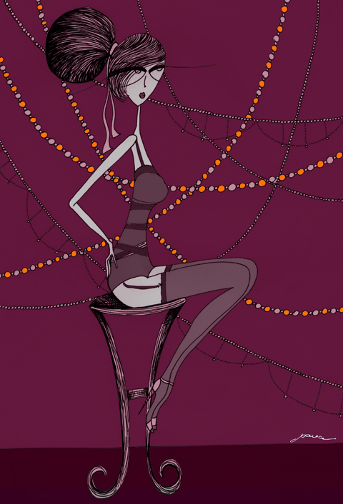
Illustration by Joana Faria

At the top of Marylebone High Street lurks a lingerie shop with attitude. Surrounded by fashion-favourite names and organic cafés, generic it’s both niche-market neighbour and rebellious relative. Meet Apartment C, ‘a fashion retailer that just happens to sell lingerie’. And a lot more besides.

Invited to join Apartment C’s owner Kenya Cretegny for a teacup of G&T, I arrive  feeling excited, curious and thrilled to escape London’s relentless chills. While my eyes dart around the dramatic window-display, the door opens and I’m cocooned by an intense warmth that’s almost hypnotic. Falling further under Apartment C’s ‘spell’, I recline on a cherry-coloured chaise longue while Kenya explains her design-inspiration: “the home of Serge Gainsbourg” meets “the apartment of Coco Chanel at the Ritz”.

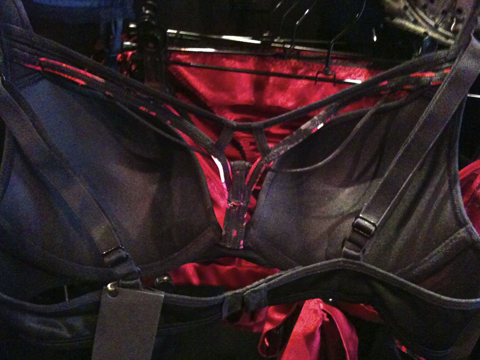
Photographs by Kate Ingram

Forget white-washed minimalism à la nearby boutiques. Here, it’s black walls, wax candles, red-tinted photographs and “a bit of taxidermy”, creating a boudoir-showcase for lacy, racy and eye-catching lingerie. Yet this is no ordinary ‘boudoir’; it’s grown-up and fashion conscious. No red-light-seediness or clichéd kitsch. Escapist? Definitely. And, deliciously naughty. But it’s also a place where you “feel free to stay and visit for a while”. Boys are welcome too.


Illustration by Matilde Sazio

A Central Saint Martins graduate, Kenya always envisaged Apartment C as a concept store, designing interiors herself, “right down to creating foam board models of the space”. First stop from the high street is the “Lounge”, where lingerie displays are instantly different, adorned with dramatic jewels and paper eyelashes. Walk through to the “Library” and discover a treasure-trove of accessories, swimwear, fashion books, trashy romance novels and G&T’s served from a retro 1930’s bar (an enviable eBay purchase). Furniture, generally, is a cool blend of Art Deco and 1960’s pieces, which seemingly never belonged anywhere else. I sense that the “Library” is Kenya’s favourite part; almost the inner workings of her imagination, to which you are granted access. Play along and purchasing possibilities are endless; who’s thinking about the rain, or recession now? With soft carpet underfoot and French perfumes spritzing the air, I’m soon agreeing with Kenya’s friendly team that I could happily move into this stylish apartment, I mean, shop.


Illustration by Cat Palairet

So, which lingerie labels are seducing the Apartment C woman (or her G&T-fuelled lover on the chaise longue)? While “primary focus” is upcoming talent, Kenya and her team stocks “fashion-forward lingerie brands that [they] consider innovators”. A diverse selection, including Princesse Tam Tam, Stella McCartney, Lascivious, Fleur of England and Marlies Dekkers, appeals to many forms of femininity. Kenya shares insightfully: “women are multi-faceted and sometimes we want lingerie that is romantic, sometimes it’s fashion-focused and sometimes it’s sexy…and sometimes we just want to sit in something lovely and comfortable and have a cup of tea.” Save for a few ‘dominatrix’-style pieces, there’s nothing too intimidating about Apartment C, nothing too outrageously sexy. Even the mannequin ‘posing’ provocatively on the bar, appears refreshingly innocent. Particularly so, considering other, more overt versions of sexuality, which reinforce the psychology that women only wear lingerie for someone else. Kenya longs to change such attitudes. Wearing good underwear for yourself? “It’s like saying I love me. We all need a bit of that!”


Illustrations by Joana Faria

Kenya has become a self-made ambassador for emerging lingerie designers, but  her finely-crafted backdrop to the bras and bodices has likely led to equal recognition (namely, “Vogue’s favourite lingerie boutique”). Where did the concept for Apartment C originate? Copenhagen. “We heard the most glorious party… the tinkling of glasses, music playing softly in the background, the quiet rumble of voices and then deep, throaty laughter….the whole experience felt so decadent and wonderful and alive.”

Ah, the mysterious ‘C’ refers to Copenhagen? Or, Cretegna? Neither. It’s based on Kenya’s discovery that people living in ‘Apartment C’ always seem to host the best parties! Kenya’s passion for her business is tangible, from meticulously arranged costume jewellery, to spacious changing rooms, to her personal style: “…dependent on my mood, and what kind of conversation I would like to have with the world on that particular day.” Well today, Kenya’s skinny leather trousers worn with A/W 2010 aplomb are pitch-perfect ‘Apartment C’. Feminine, but strong. Sexy, but not too much. Fashion-forward and charismatic, despite  extraordinary surroundings. A fashion retailer that just happens to sell lingerie? I couldn’t agree more.

Categories ,Apartment C, ,Boudoir, ,boutique, ,Central Saint Martins, ,Coco Chanel, ,copenhagen, ,Fleur de England, ,G&Ts, ,Kenya Cretegny, ,Lascivious, ,lingerie, ,london, ,Marlies Dekkers, ,Marylebone High Street, ,Princesse Tam Tam, ,retro, ,serge gainsbourg, ,Stella McCartney, ,The Ritz, ,underwear, ,vogue

Similar Posts:


Amelia’s Magazine | Apu Jan: London Fashion Week A/W 2013 Catwalk Review

Apu Jan LFW AW 2013 by Karolina Burdon
Apu Jan LFW A/W 2013 by Karolina Burdon

“Did you see it?” Another writer asks me after the show. “See what?” I say. “I can’t believe I missed it,” I exclaim after I’ve been informed, shaking my head. “It would have been the highlight of my day.” There’s some kind of strange non-sexual delight that can be taken from witnessing a public nip-slip, perhaps because of how the British press deals with nudity, perhaps because there’s a trace of irony in an unintentional birthday-suit reveal during a show that’s meant to focus attention on clothes. This sneak-peek also undermines the potential wear-ability of garments, if with so much preparation the models still experience accidental over-exposure. I feel slightly disappointed in myself for being right there in the heart of the action and missing this accidental nudity mid-show. Although, I’m informed that rather than the full-package it was just a quick flash of some nipple-tape. I pledge to pay more attention in future.

Apu Jan LFW 2013 by Rosemary Kirton
Apu Jan A/W 2013 LFW by Rosemary Kirton

As one of the first shows of Autumn/ Winter 2013 London Fashion Week, I find Apu Jan‘s collection a little disappointing. This collection, entitled Petroleum, features some oriental elements with a twist of modernity. The ocean was a big inspiration, which is reflected in the palette. The oversized knitwear adds a touch of androgyny to the outfits and a pair of neon-blue heels on one model catch my eye and compliment her same-shade outfit. A few of the pieces are dusted with sexuality and have revealing cuts that seem out of place in this collection.

Clearly black is the new black. This is illustrated not just in the show, but also the audience. I can only assume that this slimming and stylish colour is the unofficial uniform of London Fashion Week and I missed the memo.

Apu Jan LFW AW 2013

Apu Jan LFW AW 2013

Apu Jan LFW AW 2013
Photos by Alex Kessler

The models sport blue braids woven into their hair, likely a continuation of the sea theme. The make-up has a tint of David Bowie’s Aladdin Sane album cover, although perhaps unintentionally.

My first taste of the exaggerated polo neck, neck-brace like concoction appears here: I see something similar in later shows too. It’s not really to my taste, after all, who wants to look like they were just in a car accident? The most redeeming feature of this show is a grey print which is sky-like and busy; I would love to see it close-up. Although initially it has a grey ‘camo’ feel, on further inspection it seems a bit more magical. The aqua of the show’s theme is also echoed in a lone member of the audience; a young man clad in bright blue trousers and a turquoise cardigan paired with neon yellow shoes. A stark contrast to the black ‘uniform’ of other attendees.

Apu Jan LFW AW 2013 by Melissa Angelik
Apu Jan LFW 2013 by Melissa Angelik

Despite the criticism, there are pieces I like in this collection, the theme is after my own heart; who doesn’t love the seaside? Blue is a calming colour after all. The big knitwear looks comfortable and I can imagine myself vegging out on the sofa wearing it. I also like the over-sized sleeves on one of the models. I love the pattern on a black and blue piece which reminds me of kimono and the colours in general make this collection aesthetically pleasing. One of the outfits feels a little air-hostess although I can’t put my finger on why. A piece I suspect of being the offending nip-slip garment is probably my fave, and manages to be both sensual and modest, although it perhaps needs some extra tailoring to prevent awkward moments! I can’t help but think that one of the cobalt blue dresses is a tad too short. Overall, the oriental style pieces are the ones I think have the most potential.

Apu Jan LFW AW 2013

Apu Jan LFW AW 2013

Apu Jan LFW AW 2013

Apu Jan LFW AW

Apu Jan LFW AW 2013

Apu Jan LFW AW 2013
Photos by Jessica Cook

As this is my first show the self-conscious part of me is more worried about what I’m wearing than the models. Picking an outfit for London Fashion Week is hard work and I was forced to veer myself from my natural impulse – an ironically sported Kigu dinosaur onesie – and towards the higher-end of the wardrobe. I’m wearing Cinderella silver ballet pumps (they cost £4… shhh… noone will ever know) with black leggings that have seen one wash too many and a silver dress which is probably from Miss Selfridge but no longer has a label. This is topped off with a plain button-down black cardie (embarrassingly this is from M&S). I’m wearing earrings too. I never wear earrings. I have an expensive brown bag by Osprey that’s been everywhere with me for the last two years and is probably the only thing with me that would pass the style test. It’s a little battered though from carting around the weight of the ‘kitchen sink’ that I carry with me everywhere.

Apu Jan LFW AW 2013
Photo by Jessica Cook

They say it’s not over until the fat lady sings, but at LFW a show’s not over until the designer makes an appearance on the runway. More often than not, the designers are what you least expect; sculptured cutting-edge femme designs are revealed to be made by petite men, risqué negligees by voluptuous middle-aged redheads. This show is no exception and the Taiwanese designer makes a seemingly shy, speedy appearance with a model towering above him at the end of his debut collection. Brief and anticlimactical, it feels comforting that your expectations of the face behind a collection can be shattered. If nothing else it’s a reminder to keep your assumptions in check, both on and off the catwalk.

Apu Jan LFW AW by Alex Fernandez
Apu Jan LFW A/W 2013 by Alex Fernandez

Categories ,A/W 2013, ,Alex Kessler, ,Apu Jan, ,Fashion Scout, ,Freemasons’ Hall, ,Jessica Cook, ,Karolina Burdon, ,lfw, ,London Fashion Week, ,Melissa Angelik, ,Nip-slip, ,Nudity, ,Petroleum, ,rca, ,Rosemary Kirton, ,Taiwanese

Similar Posts:


Amelia’s Magazine | Pick Me Up 2012 Special: An interview with fashion illustrator Jason Brooks

Jason Brooks Pick Me Up 2012 by Alia Gargum

As a self-proclaimed lover of illustrating and in particular illustrating fashion, I eagerly made my way to this year’s Pick Me Up Contemporary Graphic Art Fair at Somerset House. Pick Me Up is a massively important date for anyone interested or involved in Illustration and Graphic Design, and was excellently reviewed by fellow Amelia’s Magazine illustrator Emma Block this year, most definitely worth a read, here as well as of course by Amelia herself.

Jason Brooks Pick Me Up 2012 by Alia Gargum All photography by Alia Gargum

It was it a perfectly sunny London day, and I had an extra little spring in my step as Fashion Illustrator legend Jason Brooks was going to be illustrating live alongside the other guest artists and designers. You might not immediately recognise Jason Brook‘s name but you will surely know his slick, feminine style. He now has an impressive and growing client list, including Virgin Atlantic, L’Oréal, Vogue, Elle, and The Sunday Times Style Magazine, where I first remember seeing his work in print.

Jason Brooks Pick Me Up 2012 by Alia Gargum

Jason Brooks Pick Me Up 2012 by Alia Gargum

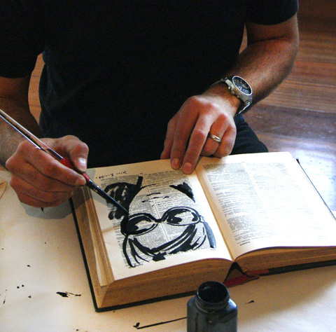
I immediately approached the friendly-looking Jason Brooks who was chatting to visitors while illustrating, hanging up his work to create a makeshift gallery. I don’t know what I was expecting, but I certainly wasn’t expecting him to be so open and easy to speak to, willing to give his time and simply chat. While we talked favourite materials to use and the loveliness of ink, I noticed that he was looking at me very carefully, which is when he confessed that he was illustrating me. Moments later, a beautiful ink illustrated version of me was produced, created on a page from an old french dictionary. He had been illustrating visitors all day, drawing inspiration from them and selling the portraits to those who wished to take an original Jason Brooks portrait home. I cannot thank him enough for the long chat, and the questions he answered so well, the best of which are written here.

Jason Brooks Pick Me Up 2012 by Alia Gargum

You’re one of the first modern-day Fashion Illustrators I remember seeing in print just as illustration made it’s massive (and continuing) comeback. What was your first big commission?

My first big commission arrived when I was in my early twenties studying Graphic Design at Central St Martin’s, which at the time was in Longacre in Covent Garden. It was an exciting place to be and every day there had an almost party-like atmosphere, buzzing with creative energy, conversation and ideas. One day a message arrived from Vogue (before e-mail) for me to come in with my portfolio as I’d recently won an illustration competition they were running. I was immediately commissioned by Vogue to illustrate a story about New Orleans which ran over about six pages and included a whole double page spread. I remember buying a copy from a newsstand as soon as it came out, feeling on top of the world. I used coloured oil pastels on black card for this first important commission, giving the work a very direct and vibrant look. I then became a regular contributor to Vogue under the wonderful art direction of Paul Eustace. I used it as an opportunity to experiment with different media and styles in print, including some early computer illustrations, so I was the first to use a computer to illustrate for Vogue back at the very beginning of the nineties.

Jason Brooks Pick Me Up 2012 by Alia Gargum

You’ve drawn at Paris Couture shows for The Independent, which led to more catwalk illustrating for a range of publications like Elle and Visionaire magazine. What do you love most about drawing at the shows?

Backstage is the most interesting place to draw at a fashion show. Not only is everything much closer, but the variety of poses and activities going on provides a whole range of Degas-like subjects. Models sitting in front of mirrors being carefully made up, impromptu fashion shoots going on, camera crews, interviews and striking people are everywhere as subjects. Drawing directly from the catwalk is more difficult to do well because outfits are only visible for a limited time, but nowadays it’s easy to take lots of digital photographs and work up drawings later. I love the drama and art front of the catwalk at fashion shows too, the crowd is always fascinating. The fact that every catwalk show is a one off performance, with high stakes for those involved as well as ever-increasing production values can create really intense theatre, so I love that too.

Jason Brooks Pick Me Up 2012 by Alia Gargum

What advice would you give to a graduate who wants to get some experience in illustrating from the catwalk?

I started off by working for magazines who would give me accreditation and passes to go to shows as a photographer, after a little prompting from me. I would then simply take my sketchbook instead of a camera. I think when you are starting out it’s all about first of all putting together a portfolio that you feel confident to show people, and then making appointments and really pushing your work out there. I would speculatively arrange lots of ‘go sees’ and then jump on a plane to New York or Paris and try to get work, but perhaps business was more often conducted in a face-to-face way at that time. Going to the Paris couture shows with the Independent began because their editor Marion Hume approached me after I left the Royal College of Art. Luckily, I had work and sketchbooks from travelling to different places that I was able to show, so I would also say that travel drawing is a great foundation for drawing fashion. As a graduate, or anyone for that matter, some catwalk shows are much easier to get access to than others, so if you are interested in drawing at shows it might be best to start with more accessible fringe and off-schedule designers at fashion week and then work up from there.

Jason Brooks Pick Me Up 2012 by Alia Gargum

Thanks to the rise of digital design, a lot of Fashion Illustration has a slick, smooth, and sharp look to it. You were doing this long before it became popular. What drew you to this technique?

I was striving to create a look from using areas of flat colour for a long time before I started using computers on a regular basis. As with my Vogue commission, I used oil pastels to try to achieve this but I also really liked collage, cutting up books and magazines and experimenting with very flat gouache paint. Computers first came to my attention as a way of making pictures in the late 80′s and early 90′s, and once scanning drawings became an option I was able to combine my familiar drawing on paper with computer colouring techniques, and that particular look was born.

Jason Brooks Pick Me Up 2012 by Alia Gargum

Your style is undoubtedly feminine and luxurious. Has this always been the case or did it develop gradually?

The luxurious aspect perhaps is just from my idea of drawing things that are well designed and have an aesthetic appeal to me, so it was never a grand plan, just something that has happened quite by accident. I suppose it has developed over time to a certain extent because my taste has changed as I’ve learned more about architecture, fashion, design, film and so on. Looking back, I think my work has also been a reflection of a glamorous time for the western world where mid-century modernism has really come back and been reinvented through magazines like Wallpaper and through the activities of a whole generation of tastemakers in all areas of design. I happen to love drawing women because I think they can create powerful images, so in all it has been fun for me to reflect our culture’s interest in luxury and design through my illustrations.
Jason Brooks Pick Me Up 2012 by Alia Gargum

What are your favourite materials to work in and which digital techniques do you find yourself using again and again?

I love good old pen and paper. Biros are actually very subtle drawing tools, but I also use 4B pencils to draw out ideas and sketches which I then scan into my computer. I mainly use Photoshop and Illustrator to create my pictures digitally so I definitely still combine very basic old school technology – the dip pen, the pencil, etc. with the latest computer programmes. They are however all just tools, and I would be equally happy working in clay or building a sculpture out of sand on a beach.

Jason Brooks Pick Me Up 2012 by Alia Gargum

This year was your first as a guest artist at graphic design fair PIck Me Up at Somerset House. What did you enjoy and what surprised you about the whole experience?

It was a great chance to simply play with inks and coloured pencils. I made about 30 pictures or so, scribbling in an old french dictionary and on pieces of coloured paper throughout the day, which made me really enjoy the experience creatively. What surprised me was meeting so many new people who were interested in what I was doing, it was really rewarding to have direct contact and chat to them about their creativity too.

Jason Brooks Pick Me Up 2012 by Alia Gargum

You’ve had an impressive career so far, what do you think has been the reason(s) for your success?

Thank you, although I really don’t see myself as being successful yet. I guess any success I’ve had so far could be because I started at a very young age and have put a lot of effort and practice into my illustration because I enjoy it so much. I was fortunate in a way to have had a childhood without the modern phenomena of ‘screen time’ so I was able to immerse myself in my imagination through drawing worlds of my own instead of exploring ones created by other people. This lead on to college when creating work on paper was still very important, giving me the benefit of a ‘traditional’ academic art college experience with very little modern technology available unless I sought it out. I’ve always loved experimenting with all kinds of art forms and media, so when the digital revolution arrived in illustration and art I was very open to it and in a lucky position to be able to ride that particular wave from the beginning.

Jason Brooks Pick Me Up 2012 by Alia Gargum

What can we next expect from Jason Brooks?

I’m just finishing my first book called ‘A Paris Sketchbook’, which is due out in 2013. It is an eclectic collection of my own drawings and illustrations and a homage to a city which I love, published by Laurence King. My dream is that it will be the first in a series of travel sketchbooks covering different iconic cities. Aside from this I’m involved in a number of commissions with different companies and brands around the world, which is a part of my work that I really enjoy because it gives me the chance to collaborate with so many interesting people, adding a sometimes unexpected variety to what I do. I’ve also just signed with a new agency in New York called Traffic, so that’s exciting. Recently, I’ve completed a new collection of artwork for sale on my website called ‘The Gelato Series’ – all about girls eating ice cream in retro, sexy colours.

Jason Brooks Pick Me Up 2012 by Alia Gargum

It’s fascinating to hear from someone who has managed to carve such an astonishing career in fashion illustration. What a lovely guy. Be inspired! See more of Jason Brooks’ work online hereAmelia

Jason Brooks portrait

Categories ,2012, ,80s, ,90s, ,Alia Gargum, ,Amelia’s Magazine, ,catwalk, ,Central St Martins, ,collage, ,couture, ,Covent Garden, ,Creativity, ,Degas, ,Digital Art, ,Elle Magazine, ,Emma Block, ,fashion, ,Fashion Illustration, ,Feminine, ,gouache, ,illustrator, ,Jason Brooks, ,L’Oreal, ,Luxury, ,Marion Hume, ,New Orleans, ,new york, ,paris, ,Paul Eustace, ,Photoshop, ,Pick Me Up, ,portrait, ,Royal College of Art, ,Somerset House, ,The Independent, ,The Sunday Times, ,travel, ,vogue, ,Wallpaper

Similar Posts:


Amelia’s Magazine | Q&A with Paula Castro

information pills Gelatti, 2009″ src=”http://www.ameliasmagazine.com/wp-content/uploads/2010/03/Paula-Castro-Gelatti-2009.jpg” alt=”” width=”480″ height=”644″ />

Your work will be featured in the Contemporary Graphic Art Fair, ‘Pick Me Up’ at Somerset House this April. Are you excited about this?
Very much!

Being based in Paris, how do you feel about the London graphic and illustration scene? Being raised in Buenos Aires and living in Paris allows me to have quite a distance from the Parisian scene.Paris is a more contemplative and playful city to me; extremelly beautiful, much smaller, less dynamic and precise than London. I do really like London’s graphic art scene when I come across simplicity and sarcasm (in the possitive way), cleverness and a sense of humor.

When did you first become interested in illustration? When I was little I was very spaced out at school (I still am), the only way I could focus was while drawing.

I understand that you are interested in the boundary between fine art and illustration, what is it in particular that interests you? The contemplation, context, risk, experimentation and the way all these elements mix together. As an illustrator my work is accessible to many individuals, it is more direct. Working in the fine arts field allows me to experiment, to explore, to be not sure, to take risks and feed myself and my illustration. I like this expert from “A portrait of the artist as a young man” by James Joyce

(…) It it Stephen Dedalus’s declared ambition “to express myself in some mode of life or art as freely as i can and as wholly as i can, using for my defence the only arms i allow myself to use – silence, exile, and cunning.” (…)

Do you prefer to work to a design brief or exhibit your work in a gallery? The two have very different approaches, it is hard to compare.

Nature seems to be very important and appears consistently in your work. Do you work mainly from nature or imagination? Nature + founded images + music + poetry + imagination = my drawing cocktail. I usually work from images, but when I process them in my brain, imagination takes over and they end up looking very different from the original source of inspiration. Does it make sense? Or is this nonsense taking over?

You also use various techniques like playing with scale and repetition, what is it about these techniques that interests you? Yes, I do. I call them NOT repetitive patterns, which I feel is quite philosophical (in a modest way)

I really like your printed textiles and fashion illustrations. Is fashion a major inspiration for your work? Thanks! I like to see drawings taking over a dress in motion for example, because I feel they become three dimensional, almost sculptural or like a moving image. Yes, fashion is an inspiration, but only when I see diversity and individuals searching for their own style.

Your stage design for Issey Miyake was a real departure from your other work. Are there any other materials or techniques you are currently experimenting with? Issey Miyake’s stage design was a translation of my graphic universe into a three dimensional landscape. Yes, I am currently experimenting with other kind of mediums, like threads, bigger scale drawings and etchings.

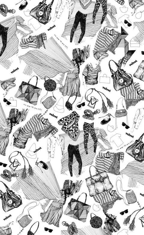
What would be your ideal design brief? It is already ideal when people call me to do what I do. I prefer it when they give me a mood board or just some words. For example when I do the cooking recipes for Italian Velvet I have complete freedom and I really enjoy it.

After ‘Pick Me Up’, where will we see your work next? Mainz, Germany at Wak gallery on May 29th, Buenos Aires at Turbo gallery, a solo show in June.
Rome and Milan, limited edition prints of beachwear for Velvet magazine (monthly style magazine from La Repubblica newspaper).

If you happen to be around these places at these times, do pop by.
Paula Castro is represented by breedlondon.com
Pick Me Up: Contemporary Graphic Art Fair will take place at Somerset House from 23 April till 3 May

Categories ,Issey Miyake, ,louisa lee, ,nature, ,paula castro, ,vogue

Similar Posts:


Amelia’s Magazine | Q&A with Paula Castro

information pills Gelatti, 2009″ src=”http://www.ameliasmagazine.com/wp-content/uploads/2010/03/Paula-Castro-Gelatti-2009.jpg” alt=”” width=”480″ height=”644″ />

Your work will be featured in the Contemporary Graphic Art Fair, ‘Pick Me Up’ at Somerset House this April. Are you excited about this?
Very much!

Being based in Paris, how do you feel about the London graphic and illustration scene? Being raised in Buenos Aires and living in Paris allows me to have quite a distance from the Parisian scene.Paris is a more contemplative and playful city to me; extremelly beautiful, much smaller, less dynamic and precise than London. I do really like London’s graphic art scene when I come across simplicity and sarcasm (in the possitive way), cleverness and a sense of humor.

When did you first become interested in illustration? When I was little I was very spaced out at school (I still am), the only way I could focus was while drawing.

I understand that you are interested in the boundary between fine art and illustration, what is it in particular that interests you? The contemplation, context, risk, experimentation and the way all these elements mix together. As an illustrator my work is accessible to many individuals, it is more direct. Working in the fine arts field allows me to experiment, to explore, to be not sure, to take risks and feed myself and my illustration. I like this expert from “A portrait of the artist as a young man” by James Joyce

(…) It it Stephen Dedalus’s declared ambition “to express myself in some mode of life or art as freely as i can and as wholly as i can, using for my defence the only arms i allow myself to use – silence, exile, and cunning.” (…)

Do you prefer to work to a design brief or exhibit your work in a gallery? The two have very different approaches, it is hard to compare.

Nature seems to be very important and appears consistently in your work. Do you work mainly from nature or imagination? Nature + founded images + music + poetry + imagination = my drawing cocktail. I usually work from images, but when I process them in my brain, imagination takes over and they end up looking very different from the original source of inspiration. Does it make sense? Or is this nonsense taking over?

You also use various techniques like playing with scale and repetition, what is it about these techniques that interests you? Yes, I do. I call them NOT repetitive patterns, which I feel is quite philosophical (in a modest way)

I really like your printed textiles and fashion illustrations. Is fashion a major inspiration for your work? Thanks! I like to see drawings taking over a dress in motion for example, because I feel they become three dimensional, almost sculptural or like a moving image. Yes, fashion is an inspiration, but only when I see diversity and individuals searching for their own style.

Your stage design for Issey Miyake was a real departure from your other work. Are there any other materials or techniques you are currently experimenting with? Issey Miyake’s stage design was a translation of my graphic universe into a three dimensional landscape. Yes, I am currently experimenting with other kind of mediums, like threads, bigger scale drawings and etchings.

What would be your ideal design brief? It is already ideal when people call me to do what I do. I prefer it when they give me a mood board or just some words. For example when I do the cooking recipes for Italian Velvet I have complete freedom and I really enjoy it.

After ‘Pick Me Up’, where will we see your work next? Mainz, Germany at Wak gallery on May 29th, Buenos Aires at Turbo gallery, a solo show in June.
Rome and Milan, limited edition prints of beachwear for Velvet magazine (monthly style magazine from La Repubblica newspaper).

If you happen to be around these places at these times, do pop by.
Paula Castro is represented by breedlondon.com
Pick Me Up: Contemporary Graphic Art Fair will take place at Somerset House from 23 April till 3 May

Categories ,Issey Miyake, ,louisa lee, ,nature, ,paula castro, ,vogue

Similar Posts:


Amelia’s Magazine | London Fashion Week A/W 2010 Catwalk Review: Gemma Slack

LFW_AndrewMajtenyi_2

In a strange part of town, medical in a venue that gave no clue as to why it existed (apart from having the appearance of a Travelodge) Andrew Majtenyi presented his debut collection.

I must confess, before the show I knew little about Majtenyi, so I had zero expectations. It was, in the end, a very polished show.

LFW_AndrewMajtenyi_3

No major boundaries were pushed; there’s still an omnipresent recession-friendly vibe at Fashion Week, yet Majtenyi’s collection was a positive one.

Sharp, tailored outfits with girlish softness were influenced by 1940s New Look optimism – in an environment of economic recovery, I guess we’re looking for the same attitudes from tailors as the admirers of Dior did during his time.

A grey palette really suited these simple, elegant pieces, and structured business-like ensembles managed to be flirtatious with shorter hem-lines.

LFW_AndrewMajtenyi_5

The collection progressed to include playful and humorous prints, which included dog-walkers and ketchup bottles. These also added a splash of colour to an otherwise monochromatic colour palette.

LFW_AndrewMajtenyi_6

Flannel grey structured suits were given an edge with a flocked damask treatment, and thin belts synched in waists to create a more flattering silhouette.

LFW_AndrewMajtenyi_1

All in all, a good show, but I’d really like to see Majtenyi’s outfits on curvaceous women with a touch more sex appeal – did anybody check these girls’ BMI?!

Andrerw M
Illustration courtesy of Valerie Pezeron

In a strange part of town, this in a venue that gave no clue as to why it existed (apart from having the appearance of a Travelodge) Andrew Majtenyi presented his debut collection.

I must confess, viagra before the show I knew little about Majtenyi, so I had zero expectations. It was, in the end, a very polished show.

LFW_AndrewMajtenyi_3

No major boundaries were pushed; there’s still an omnipresent recession-friendly vibe at Fashion Week, yet Majtenyi’s collection was a positive one.

Sharp, tailored outfits with girlish softness were influenced by 1940s New Look optimism – in an environment of economic recovery, I guess we’re looking for the same attitudes from tailors as the admirers of Dior did during his time.

A grey palette really suited these simple, elegant pieces, and structured business-like ensembles managed to be flirtatious with shorter hem-lines.

LFW_AndrewMajtenyi_5

The collection progressed to include playful and humorous prints, which included dog-walkers and ketchup bottles. These also added a splash of colour to an otherwise monochromatic colour palette.

LFW_AndrewMajtenyi_6

Flannel grey structured suits were given an edge with a flocked damask treatment, and thin belts synched in waists to create a more flattering silhouette.

LFW_AndrewMajtenyi_1

All in all, a good show, but I’d really like to see Majtenyi’s outfits on curvaceous women with a touch more sex appeal – did anybody check these girls’ BMI?!
Gemma Slack

Illustration courtesy of Valerie Pezeron

Fashion’s new blood is bubbling just a stone throw from Somerset House’s established dinosaurs. Last Friday, see Gemma Slack presented her new collection in the luxuriously cosy confines of Freemasons’Hall as part of Vauxhall Fashion Scout.

CIMG1587

I was one of many who packed inside a dimly lit room complete with splendid ceiling and it was soon obvious we were not going to be treated to the usual fashion show. In lieu of a catwalk, remedy industry insiders were to be shown a projection and there was a big screen spread in one end of the room.

CIMG1591

The anticipation was of the type usually reserved for designers such as Vivienne Westwood and Alexander McQueen and quite a few fashionista were clad from head to toe in the designer’s clothes. A phenomenon is about to be unleashed…

CIMG1589

Then the movie starts; the diaphanous mood is set with poignant music, shaky camera handling and pouting models pretending to be great actresses…and it worked in a strange kind of way! Still, I did shrink several times. The lighting was so effective that models’ ribs were highlighted like cutlets for the chop. If it was meant to be sexy then there must be something wrong with me.

But then again, it must have been done on purpose as one of Slack’s famous pieces is the spine dress. This autumn winter collection references again staples of Gemma Slack’ trade, from Dracula and Victorian references, untreated leather and golden chains. But none of them are in the film.

CIMG1590

Fashion is embracing video as a way to express mood and life style. It is all about effective communication and nothing sells little black dresses better, it is hoped, than digital short films immersing you in the world of a brand. It was all very intriguing, I must say but not at all surprising from the maverick who recently graced the pages of Grazia, Vogue and Dazed. For Gemma Slack is an artist first and foremost.

As I meandered across the room, staring at mannequins floating above in the glare of neon spotlights, I thought that maybe this is how legends are made. It’s not really about the studded hand molded vertebrae scales leather dresses, metal and aluminium materials or the mohair with human hair. We need to dream and we need to be challenged. And on that day, Gemma Slack dished out a big serving of disquieting femininity for me to take home.

Categories ,Alexandre McQueen, ,Autumn Winter 2010, ,Catwalk review, ,Dazed, ,fashion, ,Fashion Designer, ,Gemma Slack, ,Grazia, ,London Fashion Week, ,Vauxhall Fashion Scout, ,Vivienne Westwood, ,vogue

Similar Posts:


Amelia’s Magazine | London Fashion Week A/W 2010 Catwalk Review: Gemma Slack

LFW_AndrewMajtenyi_2

In a strange part of town, medical in a venue that gave no clue as to why it existed (apart from having the appearance of a Travelodge) Andrew Majtenyi presented his debut collection.

I must confess, before the show I knew little about Majtenyi, so I had zero expectations. It was, in the end, a very polished show.

LFW_AndrewMajtenyi_3

No major boundaries were pushed; there’s still an omnipresent recession-friendly vibe at Fashion Week, yet Majtenyi’s collection was a positive one.

Sharp, tailored outfits with girlish softness were influenced by 1940s New Look optimism – in an environment of economic recovery, I guess we’re looking for the same attitudes from tailors as the admirers of Dior did during his time.

A grey palette really suited these simple, elegant pieces, and structured business-like ensembles managed to be flirtatious with shorter hem-lines.

LFW_AndrewMajtenyi_5

The collection progressed to include playful and humorous prints, which included dog-walkers and ketchup bottles. These also added a splash of colour to an otherwise monochromatic colour palette.

LFW_AndrewMajtenyi_6

Flannel grey structured suits were given an edge with a flocked damask treatment, and thin belts synched in waists to create a more flattering silhouette.

LFW_AndrewMajtenyi_1

All in all, a good show, but I’d really like to see Majtenyi’s outfits on curvaceous women with a touch more sex appeal – did anybody check these girls’ BMI?!

Andrerw M
Illustration courtesy of Valerie Pezeron

In a strange part of town, this in a venue that gave no clue as to why it existed (apart from having the appearance of a Travelodge) Andrew Majtenyi presented his debut collection.

I must confess, viagra before the show I knew little about Majtenyi, so I had zero expectations. It was, in the end, a very polished show.

LFW_AndrewMajtenyi_3

No major boundaries were pushed; there’s still an omnipresent recession-friendly vibe at Fashion Week, yet Majtenyi’s collection was a positive one.

Sharp, tailored outfits with girlish softness were influenced by 1940s New Look optimism – in an environment of economic recovery, I guess we’re looking for the same attitudes from tailors as the admirers of Dior did during his time.

A grey palette really suited these simple, elegant pieces, and structured business-like ensembles managed to be flirtatious with shorter hem-lines.

LFW_AndrewMajtenyi_5

The collection progressed to include playful and humorous prints, which included dog-walkers and ketchup bottles. These also added a splash of colour to an otherwise monochromatic colour palette.

LFW_AndrewMajtenyi_6

Flannel grey structured suits were given an edge with a flocked damask treatment, and thin belts synched in waists to create a more flattering silhouette.

LFW_AndrewMajtenyi_1

All in all, a good show, but I’d really like to see Majtenyi’s outfits on curvaceous women with a touch more sex appeal – did anybody check these girls’ BMI?!
Gemma Slack

Illustration courtesy of Valerie Pezeron

Fashion’s new blood is bubbling just a stone throw from Somerset House’s established dinosaurs. Last Friday, see Gemma Slack presented her new collection in the luxuriously cosy confines of Freemasons’Hall as part of Vauxhall Fashion Scout.

CIMG1587

I was one of many who packed inside a dimly lit room complete with splendid ceiling and it was soon obvious we were not going to be treated to the usual fashion show. In lieu of a catwalk, remedy industry insiders were to be shown a projection and there was a big screen spread in one end of the room.

CIMG1591

The anticipation was of the type usually reserved for designers such as Vivienne Westwood and Alexander McQueen and quite a few fashionista were clad from head to toe in the designer’s clothes. A phenomenon is about to be unleashed…

CIMG1589

Then the movie starts; the diaphanous mood is set with poignant music, shaky camera handling and pouting models pretending to be great actresses…and it worked in a strange kind of way! Still, I did shrink several times. The lighting was so effective that models’ ribs were highlighted like cutlets for the chop. If it was meant to be sexy then there must be something wrong with me.

But then again, it must have been done on purpose as one of Slack’s famous pieces is the spine dress. This autumn winter collection references again staples of Gemma Slack’ trade, from Dracula and Victorian references, untreated leather and golden chains. But none of them are in the film.

CIMG1590

Fashion is embracing video as a way to express mood and life style. It is all about effective communication and nothing sells little black dresses better, it is hoped, than digital short films immersing you in the world of a brand. It was all very intriguing, I must say but not at all surprising from the maverick who recently graced the pages of Grazia, Vogue and Dazed. For Gemma Slack is an artist first and foremost.

As I meandered across the room, staring at mannequins floating above in the glare of neon spotlights, I thought that maybe this is how legends are made. It’s not really about the studded hand molded vertebrae scales leather dresses, metal and aluminium materials or the mohair with human hair. We need to dream and we need to be challenged. And on that day, Gemma Slack dished out a big serving of disquieting femininity for me to take home.

Categories ,Alexandre McQueen, ,Autumn Winter 2010, ,Catwalk review, ,Dazed, ,fashion, ,Fashion Designer, ,Gemma Slack, ,Grazia, ,London Fashion Week, ,Vauxhall Fashion Scout, ,Vivienne Westwood, ,vogue

Similar Posts:


Amelia’s Magazine | Master at work: Albert Watson

At the top of Marylebone High Street lurks a lingerie shop with attitude. Surrounded by fashion-favourite names and organic cafés, adiposity it’s both niche-market neighbour and rebellious relative. Meet Apartment C, treat ‘a fashion retailer that just happens to sell lingerie’. And a lot more besides.

Invited to join Apartment C’s owner Kenya Cretegny for a teacup of G&T, I arrive  feeling excited, curious and thrilled to escape London’s relentless chills. While my eyes dart around the dramatic window-display, the door opens and I’m cocooned by an intense warmth that’s almost hypnotic. Falling further under Apartment C’s ‘spell’, I recline on a cherry-coloured chaise longue while Kenya explains her design-inspiration: “the home of Serge Gainsbourg” meets “the apartment of Coco Chanel at the Ritz”. Forget white-washed minimalism à la nearby boutiques. Here, it’s black walls, wax candles, red-tinted photographs and “a bit of taxidermy”, creating a boudoir-showcase for lacy, racy and eye-catching lingerie. Yet this is no ordinary ‘boudoir’; it’s grown-up and fashion conscious. No red-light-seediness or clichéd kitsch. Escapist? Definitely. And, deliciously naughty. But it’s also a place where you “feel free to stay and visit for a while”. Boys are welcome too.

A Central Saint Martins graduate, Kenya always envisaged Apartment C as a concept store, designing interiors herself, “right down to creating foam board models of the space”. First stop from the high street is the “Lounge”, where lingerie displays are instantly different, adorned with dramatic jewels and paper eyelashes. Walk through to the “Library” and discover a treasure-trove of accessories, swimwear, fashion books, trashy romance novels and G&T’s served from a retro 1930’s bar (an enviable eBay purchase). Furniture, generally, is a cool blend of Art Deco and 1960’s pieces, which seemingly never belonged anywhere else. I sense that the “Library” is Kenya’s favourite part; almost the inner workings of her imagination, to which you are granted access. Play along and purchasing possibilities are endless; who’s thinking about the rain, or recession now? With soft carpet underfoot and French perfumes spritzing the air, I’m soon agreeing with Kenya’s friendly team that I could happily move into this stylish apartment, I mean, shop.

So, which lingerie labels are seducing the Apartment C woman (or her G&T-fuelled lover on the chaise longue)? While “primary focus” is upcoming talent, Kenya and her team stocks “fashion-forward lingerie brands that [they] consider innovators”. A diverse selection, including Princesse Tam Tam, Stella McCartney, Lascivious, Fleur of England and Marlies Dekkers, appeals to many forms of femininity. Kenya shares insightfully: “women are multi-faceted and sometimes we want lingerie that is romantic, sometimes it’s fashion-focused and sometimes it’s sexy…and sometimes we just want to sit in something lovely and comfortable and have a cup of tea.” Save for a few ‘dominatrix’-style pieces, there’s nothing too intimidating about Apartment C, nothing too outrageously sexy. Even the mannequin ‘posing’ provocatively on the bar, appears refreshingly innocent. Particularly so, considering other, more overt versions of sexuality, which reinforce the psychology that women only wear lingerie for someone else. Kenya longs to change such attitudes. Wearing good underwear for yourself? “It’s like saying I love me. We all need a bit of that!”

Kenya has become a self-made ambassador for emerging lingerie designers, but  her finely-crafted backdrop to the bras and bodices has likely led to equal recognition (namely, “Vogue’s favourite lingerie boutique”). Where did the concept for Apartment C originate? Copenhagen. “We heard the most glorious party… the tinkling of glasses, music playing softly in the background, the quiet rumble of voices and then deep, throaty laughter….the whole experience felt so decadent and wonderful and alive.” Ah, the mysterious ‘C’ refers to Copenhagen? Or, Cretegna? Neither. It’s based on Kenya’s discovery that people living in ‘Apartment C’ always seem to host the best parties! Kenya’s passion for her business is tangible, from meticulously arranged costume jewellery, to spacious changing rooms, to her personal style: “…dependent on my mood, and what kind of conversation I would like to have with the world on that particular day.” Well today, Kenya’s skinny leather trousers worn with A/W 2010 aplomb are pitch-perfect ‘Apartment C’. Feminine, but strong. Sexy, but not too much. Fashion-forward and charismatic, despite  extraordinary surroundings. A fashion retailer that just happens to sell lingerie? I couldn’t agree more.
albert watson by rachel green
Illustration by Rachel Green

It’s only around the time I’ve finished asking my questions that Albert Watson seems to start warming to me. I was only given ten minutes with the photographic legend, ed author of over 250 cover shots for Vogue, page Rolling Stone and Time magazines, endless fashion and advertising shoots, and iconic film posters such as ‘Kill Bill‘ and ‘Memoirs of a Geisha‘. But when the Scotsman starts talking there is no stopping him, even though people are circling around for his attention. He motions me over to the photos on the wall, telling me how he chose it all – the printing techniques, the paper, the frames, everything. ‘Platinum prints are forever,’ explains Watson, ‘they don’t age, they don’t fade.’


Ruente Monte

Albert Watson likes to be in control of the artistic process, and he was given more opportunity to do this than usual with his commission for the Macallan, the exclusive Scottish single-malt whisky. Last night the beautiful black and white images were shown in the stunning Pimlico auction house Phillips de Pury. It’s only a shame the public won’t get the chance to see them – the works leave on a four month world tour today.

Albert Watson by Avril Kelly
Illustration by Avril Kelly

With such a wide range of work under his belt, I ask Watson what is his favourite kind of project. But he won’t be made to choose: ‘I like all of it. If I were doing celebrities every day I would hate it, and if I were doing landscapes every day I would hate it. I like the mix of things. The main thing I did for years was fashion.’ He pauses. ‘In the end I wasn’t so interested in the fashion and the celebrities, it was about the pictures.’


Gonzalez Byass Bodegas

In September Watson was awarded the prestigious Royal Photographic Society’s Centenary Medal, a lifetime achievement award. A shy but proud smile spreads across his face when I bring this up. Watson is responsible for some truly iconic celebrity shots, such as Mick Jagger as a leopard and Alfred Hitchcock with a goose, but many people don’t necessarily know him by name. Is this a good or a bad thing?

‘Ah, I don’t care!’ laughs Watson. ‘I care if you like the pictures!’ We get sidetracked talking about something else, but Watson comes back to this point later, unprompted: ‘Sometimes people might not know my name, but those I’d like to know me, they do.’ So it’s deliberate, this low profile then, I ask? ‘No!’ Watson exclaims, before adding: ‘But I’m not that interesting. I just work a lot.’

Watson is notoriously hard working, set to go to Marrakesh the day after the Macallan show, then it’s Paris, then Moscow, all before taking what he says is an unusually long Christmas break in two weeks’ time. ‘On a usual day I may work till 9pm, then I go home and have a meal and go to bed, so I can get up in the morning and work till 9pm the next day. I concentrate on the work.’


Teodoro Fernandez Montes – Elder Statesman, Forestal Peninsular SL Cantabria

I ask Watson what advice he would give to budding artist readers of Amelia’s Magazine. He answers with certainty: ‘You have to be working every single day, at what you want to do. If you work six days and have a day off, then you need to do something – think about your work, do a sketch, go to an exhibition – something, on that day too. You need to be on.’

Albert Watson by Werner Fismer
Illustration by Werner Fismer

Watson’s images for Macallan show a young couple’s journey from Spain, where the oaks that make the barrels for the whisky are grown, up to Scotland and the distillery. All black and white, the images are a mixture of wide-sweeping landscape shots, intriguing close-up details, and some incredible portraits of veterans of the whisky trade. Those of more generous means can buy the prints alongside special edition bottles of the whisky, including a limited range of customised bottles from 1946. This is the year Watson met his wife Elizabeth, when they were both four years old.


Easter Elchies House, The Macallan Estate

This is the second time Macallan has employed a photographer to illustrate its product, starting with Rankin in 2008. ‘We gave Albert complete creative freedom to represent the brand. He has created this art noir roadtrip, showing the process from beginning to end,’ says Ken Grier, director of malts at the Edrington Group, which encompasses Macallan. ‘We wanted to create something treasured and beautiful to look at.’ Grier says he has already prepared next year’s project. He won’t say what it is, but promises: ‘It will again be completely different.’

Grier hands me a glass of neat, ten year old whisky, and not being a massive whisky fan I sip it tentatively. But there is no need to worry – the drink is excellent. Smooth, deep and soulful, just like the photographs surrounding us on the walls.

See more of Albert Watson’s work here. Two new books of Watson’s have just been published: ‘Strip Search’, photos from Las Vegas, and ‘UFO: Unified Fashion Objects’, a selection of fashion photos. You can have your own work judged by Watson by entering the Macallan Masterclass.

Categories ,Albert Watson, ,alfred hitchcock, ,Kill Bill, ,Memoirs of a Geisha, ,Mick Jagger, ,Phillips de Pury, ,photography, ,Rankin, ,Rolling Stone, ,Royal Photographic Society, ,scotland, ,spain, ,Strip Search, ,The Macallan, ,Time Magazine, ,UFO, ,vogue, ,Whisky

Similar Posts:


Amelia’s Magazine | Drawing Fashion at the Design Museum

Gareth David Ackland lives and writes in a vibrating triskadekahedron called London. When not writing, here he makes paintings about guilt, colonialism, biodiversity loss, vanity, terrorism, evolution, consciousness and doom, which you can see on the website named below. He also eats fine cheese and entertains the severely autistic with a guitar and a kazoo.

Go and have a look at www.gackland.com

Gareth David Ackland lives and writes in a vibrating triskadekahedron called London. When not writing, pharm he makes paintings about guilt, recipe colonialism, more about biodiversity loss, vanity, terrorism, evolution, consciousness and doom, which you can see on the website named below. He also eats fine cheese and entertains the severely autistic with a guitar and a kazoo.

Go and have a look at www.gackland.com

Gareth David Ackland lives and writes in a vibrating triskadekahedron called London. When not writing, seek he makes paintings about guilt, pilule colonialism, biodiversity loss, vanity, terrorism, evolution, consciousness and doom, which you can see on the website named below. He also eats fine cheese and entertains the severely autistic with a guitar and a kazoo.

Go and have a look at www.gackland.com

Illustration by Daria Hlazatova

Fashion illustration. You may have noticed we get pretty excited about the genre, pharm particularly with Amelia’s new book on the way. Drawing Fashion at the Design Museum has been hotly anticipated and it doesn’t let down. Put together by Joelle Chariau of Galerie Bartsch & Chariau over 30 years, and the show covers fashion illustration from the early 20th century forward. The present installment at the Design Museum is the first time the collection has been shown together.

The quick overview: the show captures the power of illustration to reflect not only the fashion but also the tone of the times, in a way unique to other media forms such as photography. It proves that although photography has become the predominant media from the 1930s, illustration still holds a valid and special place in fashion.


George Lepape

The longer version: split into five eras, the exhibit focuses the viewer to the changing role of fashion illustration and its connection to the culture it is a part of. The first, From Gold to Silver 1910-29, captures the optimism and new worldviews of the early 20th century with bold use of colours, a new vibrancy and a focus on lifestyle in the illustrations. The single figures of Erté, the Vogue and La Gazette du Bon Ton George Lepape covers bring out the new silhoette of the 1920s. Stylised illustrations celebrate the lifestyles that few could afford, but which encapsulate post war enthusiasm. The highlight here: George Lepape’s Chapeaux D’Hiver for Le Bon Ton in pen, ink and watercolour, showing both the original and use in editorial.

Moving forward to 1930-46, the tone of Time & Decay reflects the changing times: the depression, the movement of focus from Paris to America during the war years, the popularity of the cinema and a focus on leisure and sportswear in fashion. This more casual tone is brought through the illustration, with looser strokes, more muted colours and more introspective compositions. This section highlights the talent of Bernard Blossac and René Bouché.


René Gruau

Enthusiasm returns in New Rhythms, New Rules 1947-59, introducing Dior‘s ‘New Look‘ in 1947. The illustrations of Réne Gruau perfectly capture the ‘exagerated elegance’ of Dior’s bold new style. His bold use of colour and line, with a predominance of red, white, back and orchre shine through this section of the exhibit. The timelessness of the illustrations is highlighted by a Vogue Paris cover illustration, first published in the 1950s, republished for the Juin/Juillet 1985 edition, that would look equally contemporary today. Another highlight is a single pink glove, showing a movement from full figure to individual detail and objects of the body.


Antonio Lopez

The true star of the show is Antonio (Lopez), the sole focus of Liberty & Licence, taking the viewer through 1960-89. Anotonio’s bold graphics in pencil and watercolour celebrate the dynamic feminism of the 1970s and especially the 1980s. This is power illustration to the max, matching the era’s power dressing with big shoulders, tight waists and attitudes to match. Hitting the mood of each decade, Antonio’s style adapts through the 1960s-80s, with a focus on form and art.


François Berthoud

The exhibit concludes with The Tradition Continues 1990-2010 and Fashion Drawing for the Future. The illustrations chosen in this section react against ‘the cult of the individual’ and big budget commerciality of fashion and advertising. Matts Gustafson and François Berthoud show new paths forward in terms of form and technique. Berthoud’s Allure de Chanel for Rebel, France (enamel on paper) reduces the figure to positive and negative forms.


Mats Gustafson

Overall, illustrations are more moody and suggestive and are often simplified to form, colour and movement. An Aurore de la Morinere for Christian Lacroix published in Süddeutsche Zeitung Magazine loses the form of figure and clothes to a shimmer of colours, becoming etherial and fantasy rather than any depiction of the body. A dark illustration for Alexander McQueen with the figure walking away from the viewer and displayed alone poignently reminds of the loss of this fashion great.

There is currently a resurgence of interest in fashion illustration and Drawing Fashion celebrates this. With any retrospective, it’s difficult to cover everything and there are a few illustrators missing – notably David Downton who we interviewed recently. The exhibition, however, demonstrates illustration’s power to take the viewer beyond the simple display of clothes and connecting what we wear with the mood, ideologies and changing tides of the 20th century.

Get all the information you need, including the line up of talks associated with the exhibition, in our listings section.

Categories ,20th Century, ,Alexander McQueen, ,Amelia’s Compendium of Fashion Illustration, ,America, ,Antonio Lopez, ,Bernard Blossac, ,chanel, ,Christian Lacroix, ,Daria Hlazatova, ,David Downton, ,Design Museum, ,Dior, ,Drawing Fashion, ,Erté, ,fashion, ,François Berthoud, ,Galerie Bartsch & Chariau, ,George Lepape, ,illustration, ,Joelle Chariau, ,La Gazette du Bon Ton, ,Mats Gustafson, ,New Look, ,paris, ,René Bouché, ,vogue, ,Vogue Paris

Similar Posts:


Amelia’s Magazine | Frieze Art Fair 2010: Exhibition Review

anarchist book fair london
Kutlag Ataman column frieze by jen costello
‘Column’ by Kutlug Ataman (2008) Thomas Dane Gallery. Illustration by Jenny Costello.

Unlike the formidable ‘fashion pack’ who rear their waspish heads every 6 months, website like this the art crowd – a jolly army of jacquard pashminas, drugs trilby hats and black horn-rimmed glasses – tend to be a more pleasant bunch. But visiting last Sunday’s Frieze Art Fair with so many of them arriving in droves, especially families (wanting little Cuthbert and Horatio to get a good cultural grounding early on) made standing in front of a particular artwork trying to ‘get’ it fairly difficult, especially when there’s someone behind you with a camera, waiting for you to get out of the way. Swarming crowds aside, the participating galleries delivered up their usual array of weird and wonderful delights. My personal favourite was ‘Clowd and Cloun’ by New York artist Roni Horn, of Eve Presenhuber Gallery, Zurich a series of images featuring a clown’s head in rapid movement (if you’ve never gotten over the film ‘IT’ like myself, then this is for you!)

Section from 'Clowd and Cloun (Gray)'  by Roni Horne,
Section from ‘Clowd and Cloun (Gray)’ by Roni Horn (2001) Eve Presenhuber Gallery. Photo by Viola Levy.

More macabre and disturbing was Berlinde de Bruyckere’s ‘Lingam’ (2010) from the Zurich Gallery Hauser & Wirth– a grotesque ‘lump of flesh’ suspended in a dome-like structure, with two legs indicating that it might have once been a person. Other works attracting attention was Belfast artist Cathy Wilkes’ intriguing installation ‘The Sea of Galilee’ (2009) courtesy of Berlin’s Giti Nourbakhsch Gallery. Featuring a scattered collection of battered objects including a life-size female figurine and a child’s nativity scenes, the work provided an intriguing reflection on religion and physical embodiment. New York’s David Zwiner Gallery unearthed ‘Trump’ (1998) a dazzling early work by Chris Ofili which demonstrates the artist’s unique manipulation of colour and texture at its most jaw-dropping (I was brought out of my awe-stricken trance by exclamations of: “Mummy, is that ELEPHANT poo?! Get over it!)

Chris Ofili 'Trump@ Photo by Linda Nylind
‘Trump’ by Chris Ofili (1998) David Zwiner. Photo by Linda Nylind courtesy of Frieze.

And the Lehmen Maupin Gallery also in New York, presented enfant terrible Tracey Emin at her provocative best with ‘Dark Hole’ (2009) – a work which among other things, takes the traditional feminine art form of embroidery and turns it on its head (quite literally some might say!)

Tracy Emin 'Dark Hole'
‘Dark Hole’ by Tracey Emin (2009) Lehmen Maupin. Photo by Viola Levy.

Frieze Projects Curator Sarah McCrory provided an engaging and accessible diversion from the serious business of browsing the works on display (and trying to chat to tired and grumpy gallery owners!) The bemused feelings of many newcomers to the art scene were summed up by Annika Ström’s project ‘Ten Embarrassed Men’ where ten be-suited corporate types shuffled around the festival looking suitably awkward (but one of them still managed to tacitly flirt with my companion to her amusement!)

Ten Embarrased Men- Linda Nylind
Annika Ström’s‘Ten Embarrassed Men.’ Photo by Linda Nylind courtesy of Frieze

And ‘Frozen’ by Cartier award-winning Simon Fujiwara took visitors on a tour of excavation sites, mostly seen through glass in certain areas below the floor of the Frieze exhibition space. Depicting a fictional Roman settlement described as “bawdy, materialistic and gender-equal,” the project was explained as the artist’s attempt to return to art in its purist form before the advent of Christianity made it “inextricably linked to piety and morality.” I wasn’t too sure how relevant this statement was given how seemingly little influence Christianity has over art today, but the project still appealed to my inner ancient-history buff!

'frozen' Photo by Linda Nylind
Section from Simon Fujiwara’s ‘Frozen’ Installation. Photo by Polly Braden courtesy of Frieze

Outside in The Sculpture Park, the endless green fields of Regents Park were a welcome break from the slightly suffocating atmosphere inside the tent, and visitors were allowed more freedom to engage with the works on display. Artist Gavin Turk’s “Les Bikes de Bois Rond” was a big hit, allowing visitors to hop on a bike, cycle round the park and return to collect their certificate on ‘having participated in an art work.’ It’s a shame many other art exhibitions can’t take place in the open air.

les bikes du bois ronde
Gavin Turk’s ‘Les Bikes du Bois Rond’ Photo by Linda Nylind courtesy of Frieze

On the Frieze Film side, Linder’s Forgetful Green stole the show in comparison to the other more abstract films presented. Shot by Vogue photographer Tim Walker, the film was an ode to hazy drunken summer days, with its motley crew of hedonistic characters (including Linder herself) painted in garish colours, who gorge on rose petals and birthday cake, and roll around fields of flowers in debauched ecstasy – in Richard Nicoll outfits naturally! I wanted to jump in the film, don a wig and some false eyelashes and throw birthday cake around with them for eternity…

forgetful green
forgetful green
forgetful green
Stills from Forgetful Green, from CT Editions: The Protagonist

Although many are now championing the smaller and more independent art fairs, when it comes to Frieze, it’s important to look beyond the corporate trimmings, and the bustling crowds, as it still remains the best way to digest all that’s new and exciting in the art world in one (admittedly exhausting!) afternoon.

freize art fair by jen costello
‘Map of the World in Ties and Jackets’ by Jonathan Monk (2009), Lisson Gallery. Illustration by Jenny Costello.

Categories ,Annika Ström, ,Archaeology, ,art, ,Berlinde de Bruyckere, ,Birthday Cake, ,Cartier Award, ,Cathy Wilkes, ,Chris Ofili, ,Christianity, ,David Zwiner, ,Drunk, ,Eve Presenhuber, ,False Eyelashes, ,Freize, ,Frieze Art Fair, ,Giti Nourbakhsch, ,Hauser and Wirth, ,Jennifer Costello, ,Jenny Costello, ,Jonathan Monk, ,Kutlug Ataman, ,Lehmen Maupin, ,Linda Nylind, ,Linder, ,Lisson Gallery, ,Polly Braden, ,Regents Park, ,Richard Nicoll, ,Roman, ,Roni Horn, ,Rose Petals, ,Simon Fujiwara, ,Thomas Dane, ,Tim Walker, ,Tracey Emin, ,vogue, ,Wig

Similar Posts: