Amelia’s Magazine | Camberwell College of Arts: Mixed Special Illustration Graduate Show 2012 Review

Mixed Special Camberwell illustration 2012
Painting by Charlotte Mei.

This year’s graduate shows are nearly upon us so what better way to kick off the new season than with a reminder of some of the brilliant talent that I discovered last year. (And failed to blog about back then, due to the demanding needs of a very small baby. Now I just have a slightly larger very demanding baby, but at last I’ve found the time to catch up.) Mixed Special was the great name given to the show from Camberwell College of Arts illustration graduates, many of whom have gone on to create new collaborative projects. Since it’s been so long in the making this review will also pick up on what’s been happening for some graduates in the year since their show.
Mixed Special Camberwell illustration 2012
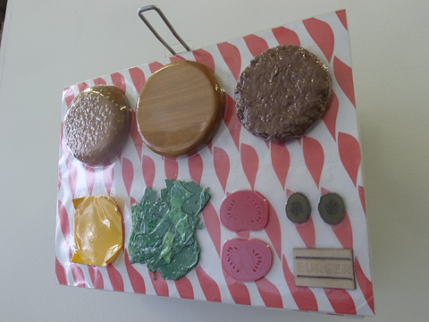
First up, the fun work of Lewis Wade Stringer, who created an ‘added value’ burger out of silicone, acrylic and plywood. Shown vacuum packed as a finished object, I imagine that in it’s separate pieces it would hold great appeal for small children. The burger theme continues to be strong in Lewis’ life – you can purchase his burger tote bag, delivered in a disposable carton with bespoke sticker, over here on Burgerac.
Mixed Special Camberwell illustration 2012
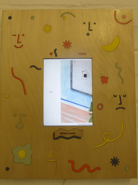
I wonder if an obsession with the 80s will continue to be a major influence amongst the graduates of the more progressive illustration courses this summer. Aaron Ziggy Cook is a member of the Day Job illustration collective, who showcased a stunning array of goodies at Pick Me Up in April. His love of 80s iconography and painterly pastels is evident in a series of interior themed designs.

Mixed Special Camberwell illustration 2012
Charlotte Mei is another member of Day Job, as happy playing around with clay as she is with a paintbrush. A sense of humour is a key component of her wonderfully tactile clay creations. At Pick Me Up I was particularly taken with her human and vehicle sculptures; and a plethora of editorial jobs undertaken since graduation testify that her unique creations are in demand. She was also part of the marvellous Jiggling Atoms exhibition that took place last October.

Mixed Special Camberwell illustration 2012
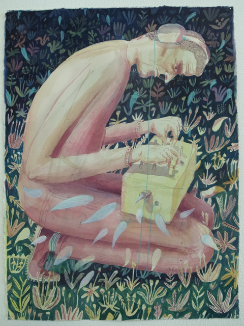
Completely Unexpected Tales by Holly Mills are a series of illustrations based on short stories by Roald Dahl which combine delicate swathes of watercolour, fine line detail and integral typography. Holly won the V&A student illustrator award in 2012. Confusingly, there is another Holly Mills illustrator, based in Melbourne (also well worth checking out).
Mixed Special Camberwell illustration 2012
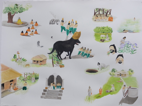
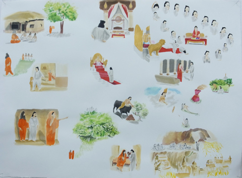
Hasmita Hirani was inspired by the Mahabharata epic poem to doodle a series of narrative scenes across large sheets of paper – read an interview about her process here. Hasmita has recently collaborated with old friend Hana to create Rolled Paper Pencils featuring beautiful abstract designs in bright colours, available at the brilliant Poundshop.
Mixed Special Camberwell illustration 2012
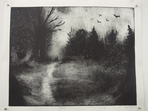
Ellie Denwood‘s End of the Line are a series of eery atmospheric monochrome prints based on trips to the end of the Underground Line.

Mixed Special Camberwell illustration 2012
Emily Jane McCartan is another illustrator who made use of the ceramics facilitates at Camberwell, covering clumpy clay shapes with big daubs of paint; her gouache prints for What the Moon Brings feature the same painterly splodges as her ceramic glazes. Her mission, to encourage a 70s craft revival. I like it! You can buy some of Emily’s wonderful creations on Etsy here.
Mixed Special Camberwell illustration 2012
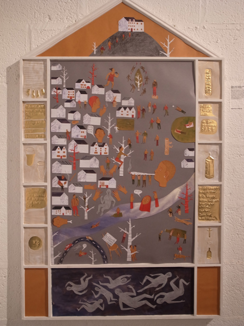
Phoebe Stella Garrick Summers‘ modern take on medieval maps features pubs rather than churches at the centre of daily life. Her interests lie in art psychotherapy.

Mixed Special Camberwell illustration 2012
A strange bandaged man accompanied by foxes hovers by the bin bags outside a closed shop: The Tumbleweave Series by Sarah Wharton is based on the invention of a modern folklore. I’d love to know what Sarah is up to now.

Mixed Special Camberwell illustration 2012
I like the simplicity of mushrooms by Katie Johnston. More recently I admired her stuffed rocking horse head, on display at Pick Me Up with Day Job.

Mixed Special Camberwell illustration 2012
Miranda Sofroniou created Arctic themed wallpaper which she also decoupaged onto a chair frame. She is currently working on her third children’s book.
Mixed Special Camberwell illustration 2012
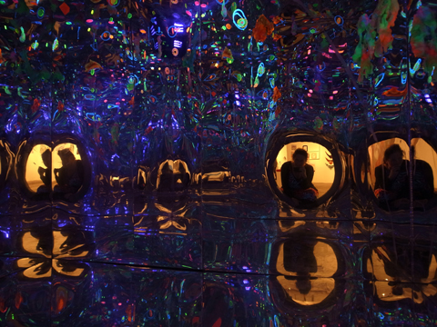
The Infinite Space by Acktarr Khedoo was an intense psychedelic installation that used neon colours, hanging shapes and sparkling textures to create a playful experience, all lit by UV. It was a lot of fun to explore: it’s a shame I can’t figure out what he is up to now.

Mixed Special Camberwell illustration 2012
Amelia’s Magazine contributor Kristina Vasiljeva produced bold skeins of Peckham inspired African fabric which showcased her love of fashion illustration.

Mixed Special Camberwell illustration 2012
Ben Woodcock‘s Bibotelli is a series of intriguing graphics suggesting snippets of narrative; another strongly 80s influenced body of work.

Mixed Special Camberwell illustration 2012
Beautiful painted miniatures by Isabella Toledo were inspired by A Journey Around My Room.

Mixed Special Camberwell illustration 2012
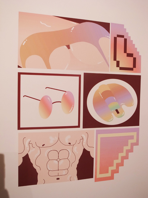
Yet more 80s style from Ellie Andrews, this time combining a rounded airbrushed style with a pastel palette & plenty of colour shading, some produced as risograph prints. One of her designs was used for the launch of Boxpark in Shoreditch. Check out some of Ellie’s latest work in It’s Nice That.


Using animation Daniel Clarke created an ode to J.G. Ballard‘s short story Chronopolis – depicted here in sombre darks and swirling pastels, viewed through a round porthole. Daniel’s obsession with architectural form is evident in his work with Day Job.
Mixed Special Camberwell illustration 2012
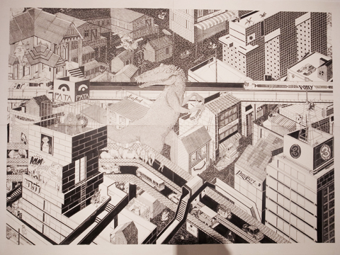
Tim Cockburn used fine black pen to describe a monster eating the city. He is now part of the Brothers of Stripe collective, who showed at Pick Me Up.

Mixed Special Camberwell illustration 2012
Brigid Deacon showed drawing and objects in a contemporary cabinet of curiosities that merges her interest in comic art, the grotesque and erotic art. She has since become involved in People of Print.
Kraggy Mixed Special
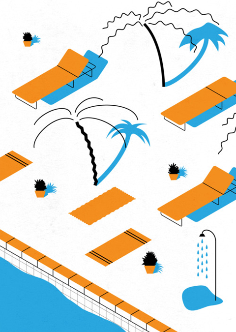
This 80s-tastic palm tree t-shirt design by Kraggy was adapted as a repeat pattern for his website. Buy the look here.

ruxandra ene bird
Ruxandra Ene‘s intricate and eye-catching depiction of Utopia was inspired by William Morris‘ News from Nowhere.

Mixed Special Camberwell illustration 2012
Ella McLean chose the environs of Peckham as the basis for a great risograph zine created using her favoured palette of limited colours. She too is now part of the great Day Job collective: make sure you check them out.

It’s been great to check back in on the illustrators I liked nearly a year ago and find out what some of my favourites are doing now… but it begs the question of what to do with old websites, blogs and social media feeds. Quite a few of the illustrators above have not updated their websites with anything new in a whole year: perhaps an indication that illustration has been left behind? Some twitter feeds built expressly for the promotion of student shows are dead as a dodo, but I was pleased to see that someone is sporadically maintaining the @MixedSpecial feed to promote last year’s graduates. University of Brighton students have taken over the feed created by the previous year and are continuing to tweet full pelt with a new name @carparkshow: surely the best way to make use of a ready made following for the newest batch of graduates. I look forward to what 2013 brings…

Categories ,80s, ,@MixedSpecial, ,A Journey Around My Room, ,Aaron Ziggy Cook, ,Acktarr Khedoo, ,Arctic, ,Ben Woodcock, ,Bibotelli, ,Boxpark, ,Brigid Deacon, ,Brothers of Stripe, ,Burgerac, ,Camberwell College of Arts, ,Charlotte Mei, ,Chronopolis, ,Completely Unexpected Tales, ,Daniel Clarke, ,Day Job, ,Ella McLean, ,Ellie Andrews, ,Ellie Denwood, ,Emily Jane McCartan, ,end of the line, ,Folklore, ,Hana, ,Hasmita Hirani, ,Holly Mills, ,illustration, ,Isabella Toledo, ,J.G. Ballard, ,Jiggling Atoms, ,Katie Johnston, ,Kraggy, ,Kristina Vasiljeva, ,Lewis Wade Stringer, ,Mahabharata, ,Miranda Sofroniou, ,Mixed Special, ,News from Nowhere, ,Peckham, ,People of Print, ,Phoebe Stella Garrick Summers, ,Pick Me Up, ,Risograph, ,Roald Dahl, ,Rolled Paper Pencils, ,Ruxandra Ene, ,Sarah Wharton, ,The Infinite Space, ,The Poundshop, ,The Tumbleweave Series, ,Tim Cockburn, ,University of Brighton, ,utopia, ,va, ,What the Moon Brings, ,William Morris

Similar Posts:


Amelia’s Magazine | An interview with Illustrator Andy Rementer

Andy Rementer PENCIL
I discovered the colourful and imaginative work of US based Andy Rementer at the Pick Me Up show last year. Since then he’s stayed in touch with me about new projects, and I’ve been delighted to receive the occasional surprise package in the post: sometimes good old snail mail really is the best possible way to keep in touch. After all, printed matter is my first love and there’s nothing like a gorgeous postcard, poster or zine. From window displays and animations for Kiehls to comic strips for Nobrow and duck t-shirts for Lazy Oaf, this innovative illustrator is engaged in loads of interesting projects that are bringing him to a wider audience in the UK.

Andy Rementer BANANA
What kind of feedback did you get from exhibiting at Pick Me Up last year?
The feedback and response from Pick Me Up was huge. I got a lot of positive words of support from other creatives and fans. After the show, Gavin Lucas from Creative Review wrote a nice piece about my work. Also, I have started a relationship with Nobrow, who invited me to be in their 6th issue, and am working on more projects with them as we speak. As another positive note, my work on display sold out, which hopefully means people liked it.

Andy Rementer SKITSCH_01
Andy Rementer SKITSCH_02
Andy Rementer SKITSCH_03
Andy Rementer SKITSCH_04
Tell us more about your illustrated Skitsch catalogue, how did that come about and where did your Mr. Bello character come from?
The Skitsch catalog was a project made in collaboration with Apartamento magazine. I worked with them previously on a coloring book for their 4th issue, so they were familiar with my work. Skitsch approached them to create a character and narrative around their products and designers. I think they liked my style and color palette, so they chose me to illustrate a small booklet. The Apartamento team along with Skitsch developed the idea and character traits of Mr. Bello, and I worked on the look, feel and development of him and his world. There was a lot of back and forth concerning the way everything looked, but it was worth it and I’m very happy with this project that had a lot of exposure in Milan and London.

Andy Rementer KIEHLS_01
Andy Rementer KIEHLS_02
I love Kiehl’s – but I wouldn’t necessarily put your drawing style together with the cosmetics brand. And are you a Keihls man? tell the truth now… what’s your favourite guy beauty tip?

Yes I am a Kiehl’s man! Love the shaving cream and hand cream—important to keep the drawing hand moisturized. Kiehl’s incorporates a lot of illustration actually, so while my work may be surprising at first, I feel it fits in well. The campaign had a very big response worldwide, and I received a lot of fan photos from Malaysia to Berlin. It was really exciting to collaborate with a brand that I admire so much like Kiehl’s, and I was amazed at how respectful and supportive they were with my work.
 
Andy Rementer NY TIMES_02
Andy Rementer NY TIMES_01
Work for the New York Times.

What were your favourite projects of 2011 and what are you looking forward to in 2012?
Participating in Pick Me Up was a major highlight of 2011 and for my career in general. Being part of something so big, and along with so many talented people was insanely awesome. I met some heroes there like Tom Gauld, NoBrow and the It’s Nice That crew to mention a few. Rob Ryan even picked up a piece of mine!

Andy Rementer MADAMA_01
Andy Rementer MADAMA_02
Another great project I enjoyed doing was a comic interpretation of Madama Butterfly. It was made for the Bavarian State Opera House‘s magazine Max Joseph, which is the coolest opera publication imaginable. They gave me four spreads and free reign to interpret Puccini‘s classic play in my own style and visual world. The project entailed quite a bit of research and translating as the final story was in German, and even if I can’t read it, I’m very happy with the final result.

Andy Rementer BLOOMBERG
Andy Rementer BALLIN
This year, I am really looking forward to participating in Pictoplasma Berlin. I will be giving a talk and showing some work as well. I was a part of the NYC version last year and it was a blast.

Andy Rementer GET_REAL
How would you describe your drawing style?
Fun on the outside, slightly dark on the inside.

Andy Rementer EAT
What are the bonuses of working pastel colours? 
I am naturally prone to using brighter colors in my work. I am technically color blind and have a difficult time distinguishing between muted tones. However in certain cases, I really like the contrast of my clear line style paired with pastel colors, and it’s a nice way to break out of my color comfort zone.

Andy Rementer CITY
What are the good and bad things about living in Philadelphia?
Good thing is the location, with an International Airport. There are plenty of good art stores too, so that is a major plus. Bad thing is it’s a bit of an anachronistic city.

Andy Rementer NIEVES_01
Andy Rementer NIEVES_02
Why are books so good?
Books are the best. They smell good and the tactile quality is irreplaceable.

Andy Rementer NIEVES_03
Andy Rementer NIEVES_04
Where can folks in the UK find your work, other than online?
Good Press in Glasgow sells my latest zine with Nieves (above). Nobrow features my work in issue #6. I have a full page in the first issue of Cagoule published by Present Joys.

Andy Rementer LAZY_01
Andy Rementer LAZY_02
And Lazy Oaf sells some T-shirts I made.

In the future I hope to have an even bigger presence in the UK! *so do we!* Check in with the latest work by Andy Rementer on his website.

Categories ,Andy Rementer, ,Apartamento, ,Bavarian State Opera House, ,Cagoule, ,Creative Review, ,Good Press, ,It’s Nice That, ,Kiehls, ,Lazy Oaf, ,Madama Butterfly, ,Max Joseph, ,Mr. Bello, ,New York Times, ,Nieves, ,Nobrow, ,Pick Me Up, ,Pictoplasma Berlin, ,Present Joys, ,Puccini, ,rob ryan, ,Skitsch

Similar Posts:


Amelia’s Magazine | An interview with Illustrator Andy Rementer

Andy Rementer PENCIL
I discovered the colourful and imaginative work of US based Andy Rementer at the Pick Me Up show last year. Since then he’s stayed in touch with me about new projects, and I’ve been delighted to receive the occasional surprise package in the post: sometimes good old snail mail really is the best possible way to keep in touch. After all, printed matter is my first love and there’s nothing like a gorgeous postcard, poster or zine. From window displays and animations for Kiehls to comic strips for Nobrow and duck t-shirts for Lazy Oaf, this innovative illustrator is engaged in loads of interesting projects that are bringing him to a wider audience in the UK.

Andy Rementer BANANA
What kind of feedback did you get from exhibiting at Pick Me Up last year?
The feedback and response from Pick Me Up was huge. I got a lot of positive words of support from other creatives and fans. After the show, Gavin Lucas from Creative Review wrote a nice piece about my work. Also, I have started a relationship with Nobrow, who invited me to be in their 6th issue, and am working on more projects with them as we speak. As another positive note, my work on display sold out, which hopefully means people liked it.

Andy Rementer SKITSCH_01
Andy Rementer SKITSCH_02
Andy Rementer SKITSCH_03
Andy Rementer SKITSCH_04
Tell us more about your illustrated Skitsch catalogue, how did that come about and where did your Mr. Bello character come from?
The Skitsch catalog was a project made in collaboration with Apartamento magazine. I worked with them previously on a coloring book for their 4th issue, so they were familiar with my work. Skitsch approached them to create a character and narrative around their products and designers. I think they liked my style and color palette, so they chose me to illustrate a small booklet. The Apartamento team along with Skitsch developed the idea and character traits of Mr. Bello, and I worked on the look, feel and development of him and his world. There was a lot of back and forth concerning the way everything looked, but it was worth it and I’m very happy with this project that had a lot of exposure in Milan and London.

Andy Rementer KIEHLS_01
Andy Rementer KIEHLS_02
I love Kiehl’s – but I wouldn’t necessarily put your drawing style together with the cosmetics brand. And are you a Keihls man? tell the truth now… what’s your favourite guy beauty tip?

Yes I am a Kiehl’s man! Love the shaving cream and hand cream—important to keep the drawing hand moisturized. Kiehl’s incorporates a lot of illustration actually, so while my work may be surprising at first, I feel it fits in well. The campaign had a very big response worldwide, and I received a lot of fan photos from Malaysia to Berlin. It was really exciting to collaborate with a brand that I admire so much like Kiehl’s, and I was amazed at how respectful and supportive they were with my work.
 
Andy Rementer NY TIMES_02
Andy Rementer NY TIMES_01
Work for the New York Times.

What were your favourite projects of 2011 and what are you looking forward to in 2012?
Participating in Pick Me Up was a major highlight of 2011 and for my career in general. Being part of something so big, and along with so many talented people was insanely awesome. I met some heroes there like Tom Gauld, NoBrow and the It’s Nice That crew to mention a few. Rob Ryan even picked up a piece of mine!

Andy Rementer MADAMA_01
Andy Rementer MADAMA_02
Another great project I enjoyed doing was a comic interpretation of Madama Butterfly. It was made for the Bavarian State Opera House‘s magazine Max Joseph, which is the coolest opera publication imaginable. They gave me four spreads and free reign to interpret Puccini‘s classic play in my own style and visual world. The project entailed quite a bit of research and translating as the final story was in German, and even if I can’t read it, I’m very happy with the final result.

Andy Rementer BLOOMBERG
Andy Rementer BALLIN
This year, I am really looking forward to participating in Pictoplasma Berlin. I will be giving a talk and showing some work as well. I was a part of the NYC version last year and it was a blast.

Andy Rementer GET_REAL
How would you describe your drawing style?
Fun on the outside, slightly dark on the inside.

Andy Rementer EAT
What are the bonuses of working pastel colours? 
I am naturally prone to using brighter colors in my work. I am technically color blind and have a difficult time distinguishing between muted tones. However in certain cases, I really like the contrast of my clear line style paired with pastel colors, and it’s a nice way to break out of my color comfort zone.

Andy Rementer CITY
What are the good and bad things about living in Philadelphia?
Good thing is the location, with an International Airport. There are plenty of good art stores too, so that is a major plus. Bad thing is it’s a bit of an anachronistic city.

Andy Rementer NIEVES_01
Andy Rementer NIEVES_02
Why are books so good?
Books are the best. They smell good and the tactile quality is irreplaceable.

Andy Rementer NIEVES_03
Andy Rementer NIEVES_04
Where can folks in the UK find your work, other than online?
Good Press in Glasgow sells my latest zine with Nieves (above). Nobrow features my work in issue #6. I have a full page in the first issue of Cagoule published by Present Joys.

Andy Rementer LAZY_01
Andy Rementer LAZY_02
And Lazy Oaf sells some T-shirts I made.

In the future I hope to have an even bigger presence in the UK! *so do we!* Check in with the latest work by Andy Rementer on his website.

Categories ,Andy Rementer, ,Apartamento, ,Bavarian State Opera House, ,Cagoule, ,Creative Review, ,Good Press, ,It’s Nice That, ,Kiehls, ,Lazy Oaf, ,Madama Butterfly, ,Max Joseph, ,Mr. Bello, ,New York Times, ,Nieves, ,Nobrow, ,Pick Me Up, ,Pictoplasma Berlin, ,Present Joys, ,Puccini, ,rob ryan, ,Skitsch

Similar Posts: