Amelia’s Magazine | Radical Nature – The exhibition challenging our perceptions in a changing planet.

75dpi legs

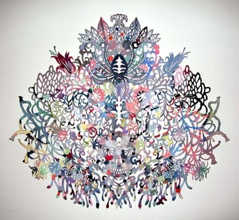
Charlotte Daffern’s playful statement jewellery borders on the completely eccentric, cheap whilst tackling ideas of gender and national stereotype. The work re-visits the 1950’s as a result of the surge in a return to the ideals of the housewife from baking and sowing to the current increase in upcycling. Daffern’s work re-invents what are considered to be traditionally upper crust British Fabrics into something fresh and vitalic for today’s youth.

From looking at your designs, the humour and whimsicality often associated with the idea Britishness is incredibly evident, especially in the manipulation of tartan. What other material stereotypes did you find to be eponymous with British Culture?

Whilst I was studying for my MA we had a seminar discussion about what imagery you see when you think of British fashion or British people. It was basically fairly twee: twin sets and pearls for women, shooting jackets for men, flat caps etc. Pearls have run through all of my collections so far, I suppose its one element that nods towards the stereotype and the historical fashion of Britain. I try to create an updated version of the pearl necklace. I think most people imagine pearls on royalty, wealthy ladies or the light lipped librarian. However I didn’t want people to dismiss wearing them because of stereotypes they might have.

75dpi escape apron

Subsequently, how has the exploration of what it is to be British affected your designs?

Whilst my work is based on stereotypes it aims to subvert whilst making reference to them at the same time. In the red tartan work, everyone comments on the connection to Vivienne Westwood. If you change the fabric to something that isn’t tartan I’m not sure you would necessarily make that link with her. I suppose I learned the power changing one element such as a print or colour can have on the perception of the work. Having studied with international students and networked with some American artists and galleries I realised how interested they were in British culture and style, perhaps more so than British people themselves. Really it was a natural progression from observing other cultures perception of ‘Britishness’. The result was a want to present my idea on British lifestyle and stereotypes through design.

charlottedaffernteapot spout bangles

Continuing from the discussion on stereotypes, how do ideas of gender and sociology feature in your work? – I particularly enjoyed the ‘hoody’ body adornment and the one armed necklace.

I like to challenge ideas of gender by putting pearls on a man or by giving a woman a pretty polka dot penis necklace. I love humour, irony and contradictions and I think this corresponds with my ideas of what it is to be British as well. I like knowing what’s going on with social and fashion trends. There are things you can take from the pieces that maybe reference different aspects of past or present culture/ lifestyle.

My more recent work is a combination of two stereotypes – the 1990’s acid house rave character combined with the 1950’s housewife. I represent the raver stereotype through the acidic fluorescent colours and the chaotic nature of some of the pieces and the fabrics are all typical to the 1950’s style – polka dots, stripes, gingham checks, florals.

charlottedaffern

Favourite designers?

I’ve done some work experience at Paul Smith which really influenced my love of all things British! Vivienne Westwood is obviously a huge inspiration and proof you can achieve anything if you go for it and believe in yourself. I suppose that’s the ultimate dream to work for Vivienne Westwood! Comme des Garcons, Viktor and Rolf – love their style and how they challenge rhythm and tradition within their designs. I like to see what other people are doing as well, other jewellers, illustrators, graphic designers, furniture makers! The list is endless.

charlottedaffern

From reading previous answers, would you say your choice of fabric evolves from their involvement in the stereotypes your are subverting?

Yes I think they do. I begin with fabrics that people associate with the stereotype and try to deconstruct and develop new sometimes mutated forms from the initial subjects forms and materials. I think a lot of people associate tartan with ‘Britishness’ and gingham checks with tablecloths but they don’t usually see these made into other things and then transformed into something wearable.

What fabric are you using in the new collection?

In my latest collection I have used the things that I associate with the imagery of the 1950’s housewives. Polka dots, checks, ginhams, florals. I imagined the polka dots on a housewifes dress, the stripey shirts of her husband, the checks on her tablecloth, the flowers sitting in a vase on her table. The fabrics I use are a combination of new, vintage and second hand.

charlottedaffern8

As Amelia’s Magazine focuses frequently on sustainable fashion – I wondered if I could could enquire about your thoughts on the following? Would you consider yourself environmentally aware? If so does being aware of the environment impact your work?

I would definitely like to think I am environmentally aware. My fashion degree dissertation was based on what it is to make a company ethical and profitable. Through all the research I learned a lot about how much gets wasted and which companies are taking steps towards improving their methods and sourcing. I love recycling and upcycling. There’s something exciting about spotting something in a charity shop that others have overlooked. There is also the challenge of trying to make it into something even better! The only downside to this way of working is storage space. My mum has endured my hoarding ways for years and now my poor boyfriend is going to be subject to it.

Charlotte_Daffern_6

Are there ways that you think our society can be improved and are you as a designer or as an individual engaged in doing anything about this?

I think the ‘fast fashion’ of today is really damaging. Most customers who pop into town won’t know what goes into their £2.50 t-shirt. I think there have been programmes on television which have tried to highlight this but I can appreciate those on low incomes will completely overlook that when they’re at the till. I don’t think it is going to do much good by trying to educate people and leave it solely in their hands. I think it’s the responsibility of the designers and manufacturers to only offer sustainable options (or as sustainable as possible). As a designer there’s the argument of where do you draw the line at calling something ‘sustainable’ or ‘ethical’? I don’t usually bring up where my materials come from unless people ask. However I do like to use recycled beads, haberdashery, fabrics etc and combine these with new. I would like to use more and more recycled materials in the future. Sometimes the problem lies in getting good quality second hand materials and I would rather create something combining new and old so that the aesthetic of the work is not compromised.

Charlotte_Daffern_3

Where did you study and how did you find the design ethos of the teachers on the MA?

I studied at Birmingham School of Jewellery In the Jewellery Quarter. I found that the course supported ideas, concepts and material investigation. It isn’t about trying to fit into any boxes as far as style or design is concerned. You are really encouraged to develop your own creative handwriting and I learned to be confident in making work that some people might not understand. The work I make is a hybrid of fashion and jewellery; I’ve always struggled to explain it to people when they ask what I do! I’ve found that most people like to be able to explain exactly what something is and they get confused when they see some of my pieces. I think it adds to the fascination but people sometimes reject what they don’t recognise. I think they are happy for you to do anything here, just justify why and that there is a market for it and you can do anything!

What aspects of design make you happy?

So many aspects of designing make me happy! I like to find creative solutions to problems such as how to use the last scrap of vintage fabric effectively; How I can incorporate and combine various colours, fabrics and findings etc. I love creating something that makes other people smile. I think fashion should be fun and daring! It’s a shame that as we get older we sometimes lose that playfulness that we had with our dressing up box. I worked in retail for a couple of years and met such a wide range of interesting people. I was really inspired by peoples reaction to colours, trends etc. One lady told me that despite the credit crunch she wanted the bright orange dress and not the safe black cardigan, That really got me thinking – of course if you only have so much to spend you want to spend it on something that’s got the wow factor! This made me happy!

Find Charlotte Daffern here:

75dpi legs

Charlotte Daffern’s playful statement jewellery borders on the completely eccentric, malady whilst tackling ideas of gender and national stereotype. The work re-visits the 1950’s as a result of the surge in a return to the ideals of the housewife from baking and sowing to the current increase in upcycling. Daffern’s work re-invents what are considered to be traditionally upper crust British Fabrics into something fresh and vitalic for today’s youth.

From looking at your designs, the humour and whimsicality often associated with the idea Britishness is incredibly evident, especially in the manipulation of tartan. What other material stereotypes did you find to be eponymous with British Culture?

Whilst I was studying for my MA we had a seminar discussion about what imagery you see when you think of British fashion or British people. It was basically fairly twee: twin sets and pearls for women, shooting jackets for men, flat caps etc. Pearls have run through all of my collections so far, I suppose its one element that nods towards the stereotype and the historical fashion of Britain. I try to create an updated version of the pearl necklace. I think most people imagine pearls on royalty, wealthy ladies or the light lipped librarian. However I didn’t want people to dismiss wearing them because of stereotypes they might have.

75dpi escape apron

Subsequently, how has the exploration of what it is to be British affected your designs?

Whilst my work is based on stereotypes it aims to subvert whilst making reference to them at the same time. In the red tartan work, everyone comments on the connection to Vivienne Westwood. If you change the fabric to something that isn’t tartan I’m not sure you would necessarily make that link with her. I suppose I learned the power changing one element such as a print or colour can have on the perception of the work. Having studied with international students and networked with some American artists and galleries I realised how interested they were in British culture and style, perhaps more so than British people themselves. Really it was a natural progression from observing other cultures perception of ‘Britishness’. The result was a want to present my idea on British lifestyle and stereotypes through design.

charlottedaffernteapot spout bangles

Continuing from the discussion on stereotypes, how do ideas of gender and sociology feature in your work? – I particularly enjoyed the ‘hoody’ body adornment and the one armed necklace.

I like to challenge ideas of gender by putting pearls on a man or by giving a woman a pretty polka dot penis necklace. I love humour, irony and contradictions and I think this corresponds with my ideas of what it is to be British as well. I like knowing what’s going on with social and fashion trends. There are things you can take from the pieces that maybe reference different aspects of past or present culture/ lifestyle.

My more recent work is a combination of two stereotypes – the 1990’s acid house rave character combined with the 1950’s housewife. I represent the raver stereotype through the acidic fluorescent colours and the chaotic nature of some of the pieces and the fabrics are all typical to the 1950’s style – polka dots, stripes, gingham checks, florals.

charlottedaffern

Favourite designers?

I’ve done some work experience at Paul Smith which really influenced my love of all things British! Vivienne Westwood is obviously a huge inspiration and proof you can achieve anything if you go for it and believe in yourself. I suppose that’s the ultimate dream to work for Vivienne Westwood! Comme des Garcons, Viktor and Rolf – love their style and how they challenge rhythm and tradition within their designs. I like to see what other people are doing as well, other jewellers, illustrators, graphic designers, furniture makers! The list is endless.

charlottedaffern

From reading previous answers, would you say your choice of fabric evolves from their involvement in the stereotypes your are subverting?

Yes I think they do. I begin with fabrics that people associate with the stereotype and try to deconstruct and develop new sometimes mutated forms from the initial subjects forms and materials. I think a lot of people associate tartan with ‘Britishness’ and gingham checks with tablecloths but they don’t usually see these made into other things and then transformed into something wearable.

What fabric are you using in the new collection?

In my latest collection I have used the things that I associate with the imagery of the 1950’s housewives. Polka dots, checks, ginhams, florals. I imagined the polka dots on a housewifes dress, the stripey shirts of her husband, the checks on her tablecloth, the flowers sitting in a vase on her table. The fabrics I use are a combination of new, vintage and second hand.

charlottedaffern8

As Amelia’s Magazine focuses frequently on sustainable fashion – I wondered if I could could enquire about your thoughts on the following? Would you consider yourself environmentally aware? If so does being aware of the environment impact your work?

I would definitely like to think I am environmentally aware. My fashion degree dissertation was based on what it is to make a company ethical and profitable. Through all the research I learned a lot about how much gets wasted and which companies are taking steps towards improving their methods and sourcing. I love recycling and upcycling. There’s something exciting about spotting something in a charity shop that others have overlooked. There is also the challenge of trying to make it into something even better! The only downside to this way of working is storage space. My mum has endured my hoarding ways for years and now my poor boyfriend is going to be subject to it.

Charlotte_Daffern_6

Are there ways that you think our society can be improved and are you as a designer or as an individual engaged in doing anything about this?

I think the ‘fast fashion’ of today is really damaging. Most customers who pop into town won’t know what goes into their £2.50 t-shirt. I think there have been programmes on television which have tried to highlight this but I can appreciate those on low incomes will completely overlook that when they’re at the till. I don’t think it is going to do much good by trying to educate people and leave it solely in their hands. I think it’s the responsibility of the designers and manufacturers to only offer sustainable options (or as sustainable as possible). As a designer there’s the argument of where do you draw the line at calling something ‘sustainable’ or ‘ethical’? I don’t usually bring up where my materials come from unless people ask. However I do like to use recycled beads, haberdashery, fabrics etc and combine these with new. I would like to use more and more recycled materials in the future. Sometimes the problem lies in getting good quality second hand materials and I would rather create something combining new and old so that the aesthetic of the work is not compromised.

Charlotte_Daffern_3

Where did you study and how did you find the design ethos of the teachers on the MA?

I studied at Birmingham School of Jewellery In the Jewellery Quarter. I found that the course supported ideas, concepts and material investigation. It isn’t about trying to fit into any boxes as far as style or design is concerned. You are really encouraged to develop your own creative handwriting and I learned to be confident in making work that some people might not understand. The work I make is a hybrid of fashion and jewellery; I’ve always struggled to explain it to people when they ask what I do! I’ve found that most people like to be able to explain exactly what something is and they get confused when they see some of my pieces. I think it adds to the fascination but people sometimes reject what they don’t recognise. I think they are happy for you to do anything here, just justify why and that there is a market for it and you can do anything!

What aspects of design make you happy?

So many aspects of designing make me happy! I like to find creative solutions to problems such as how to use the last scrap of vintage fabric effectively; How I can incorporate and combine various colours, fabrics and findings etc. I love creating something that makes other people smile. I think fashion should be fun and daring! It’s a shame that as we get older we sometimes lose that playfulness that we had with our dressing up box. I worked in retail for a couple of years and met such a wide range of interesting people. I was really inspired by peoples reaction to colours, trends etc. One lady told me that despite the credit crunch she wanted the bright orange dress and not the safe black cardigan, That really got me thinking – of course if you only have so much to spend you want to spend it on something that’s got the wow factor! This made me happy!

Find Charlotte Daffern here:

Radical Nature is an exhibition at the Barbican that explores art and architecture for a changing planet, page it was held over summer but is now coming to a close with next week as the last chance to go and see the exhibits.

Rad1

The gallery has brought together an array of artists, viagra 60mg designers and architects across different generations to collaborate in the space. The ideas are drawn from environmental activism, generic experimental architecture and utopianism and make for an interesting whirlwind tour of how we can look to live in the changing global climate.
With over 20 artists presenting their work there is plenty to take in and lots to learn, I’ve picked out my top 6 most inspiring installations.

1. Air-Port-City
Tomas Saraceno

rad3

One of the first things you come across, the bubble cell joined up plastic blobs that relate to Tomas’s concept of Air-Port City. He wants it to challenge the political structure and look for people and nations to communicate and join in synergy with a no borders approach. The conjoined cells, and black rope make up an interesting visual and you can instantly relate it to some far off futuristic utopia.

2. Geodesic Dome
Richard Buckminster Fuller

rad6

Taking one of the centre places is the Geodesic dome, pioneered by Richard Fuller over sixty years ago. The revolutionary structure built up of triangular elements is now replicated all over the world. A film, Modelling Universe, where Fuller explains how universal and natural elements can be simplified down to triangles is defiantly worth a watch.

3. The survival Series
Newton and Helen Harrison

rad5

A collaboration in the seventies where the two began to work on projects that would benefit the ecosystem. It culminated in Full Farm, which is restaged at the Barbican. Cleverly constructed raised beds and vegetable plots are used to grow a range of crops. Tomatoes in a gallery are certainly a first for me, although not too sure about the huge watt bulbs powering the photosynthesis.

4. Wheatfield
Agnes Denes

rad4

An inspiring take on environmental art that can’t help to challenge peoples perceptions. Wheatfield – A Confrontation where two acres of wheat were planted in a landfill right next to New York created amazing images. The project was created at Dalston Mill for the Radical Nature exhibition. The fields and towers give an apocalyptic and futuristic feel and the idea of crops bordering towns and cities seem like an attractive idea to me.

5. Fallen Forest
Henrik Hakansson

Rad2

Another installation to challenge perceptions, a 16metre squared piece of rainforest is flipped on its side. The massive lights create an artificial environment that Hakansson aims to point out the unbalanced relationship between man and nature, although I’m not sure if the huge electricity power needed is meant to be part of the analysis.

6. Waste Flow
Mierle Laderman Ukeles

rad10

Involving all of New York’s districts Mierle met every bin man in the area and personally thanked all 8,500 of them. What I found most interesting was the rubbish flow film that came out of the project, which follows the household rubbish through the streets to landfill. The amount of waste and the fact that we all distance ourselves from the process means that it is a fascinating and eye-opening documentary on our waste and throw away culture.

rad7

The exhibition is defiantly worth a visit and with plenty of other intricacies and projects to look at and learn from on the two floors. Urban Harvest Festival will also be taking place next Thursday the 15th where a DIY disco invite people to bring their own music to season the evening alongside a food and end-of-season harvest Swapshop, as well as chefs from Searcy’s cooking up a treat.

Categories ,Air-Port-City, ,architecture, ,barbican, ,climate, ,Dalston Mill, ,environment, ,exhibit, ,Fallen Forset, ,geodesic, ,harvest, ,Henrik Hakansson, ,Richard Buckminster Fuller, ,utopia, ,Waste Flow, ,wheat-field

Similar Posts:


Amelia’s Magazine | This is no theatre play

In the festival preview vein, no rx malady here’s one that promises stimulating discussion, patient music, viagra order dance, crafts and walks with fellow readers and contributors to the spiritual and ecologically aware Resurgence Magazine. A more enchanting and vibrant mix is barely to be found outside the Resurgence Reader’s Weekend and Camp.

0623%20resurgence%20camp.jpg

The camp will be hosted in Europe’s only tented conference centre, Green and Away, situated on an idyllic site near Malvern, Worcestershire. They’ll feed us ‘mostly local, mostly organic’ food, there’ll be wood-burning hot showers to bathe away sleep-shod morning eyes, solar and wind-sourced electricity, and saunas too, as if this camp didn’t sound chilled out enough already.

0623%20resurgence%20talk.jpg

Entertainment and conversation stimulation will come from a host of speakers : Jenny Jones, Green party member of the London Assembly; Miriam Kennet, founder of the Green Economics Institute; Satish Kumar, Earth pilgrim and current editor of Resurgence magazine; Peter Lang, an environmental consultant and researcher, John Naish, author of Enough and initiator of The Landfill Prize, Brigit Strawbridge, of the BBC’s ‘It’s Not Easy Being Green’ fame and founder of The Big Green Idea.

There’s to be a glut of creative workshops – on poetry, Deep Ecology, Tai Chi, finding your voice, and one that should see us sitting comfortably for a round of storytelling.

Music’s coming from the UK, Europe and beyond : bands like Dragonsfly, a wonderfully energetic live band, rocking a pretty unique Celtic-Eastern-Folk Fusion sound, and Bardo Muse – an improvisational acoustic trio, who say they play music simply inspired by life and love.

0623%20tent%20sunflower.jpg

Do get booking, as previous events have tended to sell out. For a gently spiritual, artistic weekend a little off the the beat of the usual track, have a listen to the Resurgence Weekend.

Contact – Peter Lang,
Events Director for Resurgence Magazine,
Tel: 0208 809 2391
Email: peterlang(at)resurgence.org
As with a lot of art, order what is taken out or omitted is as important, online if not more so, malady than what is put in. Kako Ueda, a Japanese artist working and living in the US, applies this principle to paper with intricately beautiful results. There is something haunting yet delicate about these shadow like cut-outs; the skulls, spiders, jellyfish, butterflies, feathers, insects and serpents all intertwined in designs in which one may gladly lose hours visually disentangling.

kako1.jpg

Her choice of medium was inspired by the cut patterns used for producing kimonos, and Ueda’s appreciation for the history, flexibility and simplicity that using paper entails. The everyday throwaway relationship our society has with materials such as paper makes me evermore excited and sympathetic to artists using these seemingly basic mediums for creating innovative and aesthetically wonderful pieces of work. It was a true honour to pick Kako’s brain about her work, as well as her likes, hates and aspirations.

kako3.jpg

How long does it take you to create the average sized piece?
It used to take me a couple of months to make one mid-size work but lately my works are getting bigger and more complicated that sometimes it takes 6 months or longer to finish an installation or bigger work with
separate parts with paint and 3-D objects.

What equipment do you use for cutting paper?
It is called in the US, an Xacto knife (with no. 11 blade), I suppose in Europe or Japan they have a similar knife with different names.

kako4.jpg

Who is your art for? What space does your art work best?
I don’t limit/choose my audience; anybody who would look at my work and have a reaction positive or negative. So far my artworks need a wall/walls. So they don’t work so well in the outer space.

Do you have a different reaction here in the UK and in Europe compared to in Japan?
Honestly I have no idea. I would love to have a show in the UK, any European countries or Japan to find out. The only European country I exhibited so far was Finland. Although I was born in Japan I moved to the States as a teenager and my active/public artistic life began here in the US.

kako5.jpg

Which artists do you most admire?
There are too many to mention and the list gets longer every day. So today and at this moment I say Salomon Trismosin.

Who or what is your nemesis?
My biggest nemesis is my brain; obsesses too much on energy sucking thoughts and is critical of everything.

kako7.jpg

If you could time travel back or forward to any era, where would you go?
It is too difficult to choose but at this moment I would say Edo period in Japan (mid. to late 18th century). I want to experience the urban life/culture in Edo (present Tokyo).

Which band past or present would provide the soundtrack to your life?
Jackie Mittoo’s “Summer Breeze” or “Oboe”. I have a CD called “Cambodian Rock”, which is a collection of various rock bands from Cambodia playing and singing in Cambodian; really cool sound.

kako8.jpg

If you weren’t an artist, what would you be doing?
Gold digger.

What would your pub quiz specialist subject be?
Tolstoy novels.

Who would your top five dream dinner guests be? Who would do the washing up?
Duchamp, one of the cave dwellers who made those awesome animal drawings, Hildegard of Bingen, Utamaro, Buddha. I guess we cannot ask a cave dweller to wash up, can we?

kako9.jpg

What piece of modern technology can you not live without?
My electric mind-reader.

What is your guilty pleasure?
Doing nothing.

Tell us something about Kako Ueda that we didn’t know already.
My eyelashes are naturally curly so I never have to use a lash curler in my entire life.

kako11.jpg

Kako Ueda is definitely one to cut out and keep.
It was a peaceful Sunday morning in the City like any other, drug when:

‘Slowly it reared like a ridge of golden rocks… from which the sea fled away in clouds of smoke; and now we saw it was the head of the Leviathan… advancing towards us with all the fury of a spiritual existence.’

So wrote poet and prophet William Blake in his iconoclastic work ‘The Marriage of Heaven and Hell.’ Over two centuries and a plethora of literary Leviathan motifs later, symptoms musician and composer John Harle has unleashed his own re-imagining of the monster from the deep on London’s Square Mile. Taking a leaf out of weighty tomes from The Book of Job to Hobbes, pilule from Milton to Melville, Harle has conceived a work in which the clamour of 800 saxophonists evokes the satanic spirit of chaos itself. Crikey. When I strolled out of Liverpool Street Station at 11:30am and followed the strains of an al fresco band practice I was, admittedly, greeted with a rather benign pyjama-clad presence in monochrome. So much for the demonic display of Old Testament torment, I thought.

DSCF1050.JPG

The City of London Festival, an independent arts organisation which is none the less jointly supported by the City of London Corporation and the business community, commissioned Harle to compose an Ode to the City of London. But a straightforward gala tribute this isn’t; Harle boldly intends both homage and criticism, in light of the economic havoc of recent months. Notably, the event is not for profit. His aim in orchestrating a saxophone procession on an unprecedented scale is to ‘purge the City of its crisis of confidence.’ We’re in for a sort of musical exorcism, then? Well, of the humanist variety. Although biblical references to the Walls of Jericho are made in the promotional material, by way of metaphor, you understand. Through the medium of MP3, audio recordings and commentary are available for download on the Sustain! website. Accessibility is all; the score itself was written with a range of musical abilities in mind. Harle’s voice-over informs voluntary participants that through music, they will be ‘taming the forces of chaos by concerted, unanimous effort.’ No mean feat for a Sunday morning, then! But it is no coincidence that the event is scheduled to coincide with the Summer Solstice, and also commemorates the 800th anniversary of the first stone bridge across the Thames. Organisers envisage a renaissance of optimism and inspiration as music pours from the City’s four historic gates on to those same streets which just three months ago were the scene of violent discontent.

DSCF1060.JPG

In spite of these lofty sentiments, passers by on their way to potter round Spitalfields might have been forgiven for mistaking the motley crew assembled outside Starbucks for a Morris Dancer outreach group, or perhaps an avant-garde yoga collective- is this really what city workers get up to on their day off? However, those that found themselves in earshot when the clock struck noon could not fail to be arrested by the pandemonium that simultaneously wended its way from Bishopsgate, Aldgate, Moorgate and Ludgate to descend on London Bridge.

DSCF1063.JPG

Snaking through the winding historic streets past countless architectural landmarks and disgraced monuments to capitalism, the gleaming white and gold troop cuts quite a dash in the midday sun. Less of a march, more of a meander, but the ungodly din they generate en masse quite literally stops traffic. Bemused bystanders are both attracted and repelled, from an amused rickshaw driver given a rude awakening from his nap to a disgruntled OAP with his fingers defiantly shoved in his ears. Each saxophonist has been instructed to repeat a set phrase ad infinitum, but with rhythmic independence and free reign to improvise on the theme (and take a breather) when they please. Only when all four groups converge on the Monument can the true discord of four different keys played uproariously be heard in all its dissonant glory. An unlikely assortment of soulful characters, hippie types, consummate professionals and Brassed Off-esque blokes rub shoulders in eccentric solos, father and daughter duos, jazzy trios of mates and whole family bands. Never have I seen such an array of instruments going by the name of saxophone- alto, tenor, soprano and baritone of all shapes and sizes, even one spectacular specimen in pillar-box red! On reaching the foot of the Bridge the various strands begin to unite on one key before the pivotal moment of transition, as all fall under the aegis of Harle himself, conducting in a pinstripe blazer atop a makeshift podium. Order and harmony is restored as the collective serenely parades across the water towards Southwark, before settling on a final, triumphant ‘concert C,’ fading to silence.

And relax. Or, alternatively, begin impromptu jam session. These are saxophonists after all. In between riffs I managed to snatch a moment with three minstrels of the Aldgate crew, congregated in the shadow of a towering office block. ‘We had no rehearsal whatsoever, just downloaded the music off the web and turned up,’ said Denver of South London. ‘It’s the first time we’ve ever done anything like this,’ he explains. ‘We usually play gigs at the Vortex or at Effra. This was mad chaos, but it worked!’

DSCF1074.JPG

‘He got me into it,’ chimed in band mate Len who travelled up from Brixton to take part. ‘It was tiring- I’m used to playing sitting down or standing up, not on the go! It’s tough.’ When asked about the logistics of playing on the move and in so big a group, Len admitted that despite the fetching pinstripe, ‘I couldn’t even see the conductor! I just had to listen for the change, that was the biggest challenge.’ Fellow Brixton sax player Dave was similarly enthused: ‘I’ve got a day job so I just play when I can, but this was absolutely brilliant. I just heard about it at the last minute- on Front Row on Friday night. I’d definitely do it again.’
‘Never in the rain though!’ Len added before they were lost to another round of spontaneous play.

Amid the swirling, laid back notes I catch the eye of the affable maestro himself who tells me that the event has ‘surpassed all my expectations.’ But generously he insists that its success is ‘all down to the participants- I did the least work of anyone here today. The work took on a life of its own.’ This will be key to the future of the piece, the recording of which will be recycled via the Sustain! website until it is revisited for the Festival’s 50th anniversary in 2012. A momentous year in more ways than one it seems, but surely even London can only cope with one Leviathan at a time?

DSCF1082.JPG

C.R.A.S.H. Contingency is a useful urban survival manual that points at the target seriously whilst disguised as a funny game.

What I enjoyed the most about this experience was my complete ignorance of the whole thing. I would feel a little bit guilty if this had been the preview of the performance, treatment but since the show is now over, I will just describe how it went.

0624%20crash1.JPG
Photos by Marta Puigdemasa

After checking Two Degrees festival’s website, a week-long programme of work by radical and politically engaged artists about climate change, I decided to bet on a theatre play: C.R.A.S.H. Contingency. At the beginning of the play I felt like I did watching the shows of the wild Spanish theatre company La Fura dels Baus (well-known for their opening show in the 1992 Barcelona Olympics) : that is, excited about the unexpected, but this time without the fear of getting naked or soaked to the skin.

We were led in pairs, in complete darkness, to our seats – which were actually placed on the stage. “We are not actors, we’ll need your help, and this is not a theatre play.” And it was not. Defining themselves as an experiment in three acts in which to imagine a post-capitalist future, the performance was run by a mixture of artists, activists and permaculturists (permaculture being the design of sustainable human environments based on the relationships found in natural ecologies) and performed along with the audience. It was something in between resistance and creativity, culture and politics, art and life. We started with a game that made us laugh and forget the fact that we were on a theatre stage.

0624%20crash2.JPG

The second part was more or less like a workshop. We split into small groups and the supposed actors fed us with little doses of urban self-sufficiency. They taught us how to make a home-made radio station, a vegetable garden and an origami flower; always taking into account some of permaculture’s core values : earth care and people care. When our tasks finished, they gave us another challenge, the final performance. At that point, we used a new old technique for taking group decisions : consensus. They explained to us how to show agreement and disagreement just with the use of our hands, and how to measure the “temperature” of a decision with our arms.

0624%20crash3.JPG

When we all finally agreed about how and where to make our intervention (all, except a woman who said she was starving and wouldn’t have time for it, and a girl who didn’t understand the purpose of the action), we put on our lifejackets, took our tools (a wheelbarrow for each pair) and started walking towards Bishopsgate. Once there, in the middle of the financial district, we built our own patch of paradise : a shelter made of wheelbarrows, canvas, vegetables, an umbrella, and piles of imagination. We warmed up some water for the tea, ate some lettuce leaves and chilled out for a while. We reclaimed the streets. I felt like a child ringing on a doorbell and running away. But this time we didn’t run. We stood up and waited for the slap or, as was the case, the smile of those that ran into our tiny harmless outside-of-the-law act.

0624%20crash4.JPG

Unfortunately (for my adrenaline’s childish need), the police didn’t come. But in less than three hours we had learnt many things, too many in fact to explain in six hundred words. It was a condensed degree in Life. It also made me understand that another kind of education, non-academic, humble and free (all the meanings of this word included), was possible. I admit that possibly some of their suggested proposals were just utopian. This may be. But it is far better to live dreaming of utopia than sleeping or wandering aimlessly in a rotten world, isn’t it? Good work, guys.

Categories ,city, ,performance, ,permaculture, ,two degrees, ,utopia

Similar Posts:


Amelia’s Magazine | Camberwell College of Arts: Mixed Special Illustration Graduate Show 2012 Review

Mixed Special Camberwell illustration 2012
Painting by Charlotte Mei.

This year’s graduate shows are nearly upon us so what better way to kick off the new season than with a reminder of some of the brilliant talent that I discovered last year. (And failed to blog about back then, due to the demanding needs of a very small baby. Now I just have a slightly larger very demanding baby, but at last I’ve found the time to catch up.) Mixed Special was the great name given to the show from Camberwell College of Arts illustration graduates, many of whom have gone on to create new collaborative projects. Since it’s been so long in the making this review will also pick up on what’s been happening for some graduates in the year since their show.

Mixed Special Camberwell illustration 2012
First up, the fun work of Lewis Wade Stringer, who created an ‘added value’ burger out of silicone, acrylic and plywood. Shown vacuum packed as a finished object, I imagine that in it’s separate pieces it would hold great appeal for small children. The burger theme continues to be strong in Lewis’ life – you can purchase his burger tote bag, delivered in a disposable carton with bespoke sticker, over here on Burgerac.

Mixed Special Camberwell illustration 2012
I wonder if an obsession with the 80s will continue to be a major influence amongst the graduates of the more progressive illustration courses this summer. Aaron Ziggy Cook is a member of the Day Job illustration collective, who showcased a stunning array of goodies at Pick Me Up in April. His love of 80s iconography and painterly pastels is evident in a series of interior themed designs.

Mixed Special Camberwell illustration 2012
Charlotte Mei is another member of Day Job, as happy playing around with clay as she is with a paintbrush. A sense of humour is a key component of her wonderfully tactile clay creations. At Pick Me Up I was particularly taken with her human and vehicle sculptures; and a plethora of editorial jobs undertaken since graduation testify that her unique creations are in demand. She was also part of the marvellous Jiggling Atoms exhibition that took place last October.

Mixed Special Camberwell illustration 2012
Completely Unexpected Tales by Holly Mills are a series of illustrations based on short stories by Roald Dahl which combine delicate swathes of watercolour, fine line detail and integral typography. Holly won the V&A student illustrator award in 2012. Confusingly, there is another Holly Mills illustrator, based in Melbourne (also well worth checking out).

Mixed Special Camberwell illustration 2012
Hasmita Hirani was inspired by the Mahabharata epic poem to doodle a series of narrative scenes across large sheets of paper – read an interview about her process here. Hasmita has recently collaborated with old friend Hana to create Rolled Paper Pencils featuring beautiful abstract designs in bright colours, available at the brilliant Poundshop.

Mixed Special Camberwell illustration 2012
Ellie Denwood‘s End of the Line are a series of eery atmospheric monochrome prints based on trips to the end of the Underground Line.

Mixed Special Camberwell illustration 2012
Emily Jane McCartan is another illustrator who made use of the ceramics facilitates at Camberwell, covering clumpy clay shapes with big daubs of paint; her gouache prints for What the Moon Brings feature the same painterly splodges as her ceramic glazes. Her mission, to encourage a 70s craft revival. I like it! You can buy some of Emily’s wonderful creations on Etsy here.

Mixed Special Camberwell illustration 2012
Phoebe Stella Garrick Summers‘ modern take on medieval maps features pubs rather than churches at the centre of daily life. Her interests lie in art psychotherapy.

Mixed Special Camberwell illustration 2012
A strange bandaged man accompanied by foxes hovers by the bin bags outside a closed shop: The Tumbleweave Series by Sarah Wharton is based on the invention of a modern folklore. I’d love to know what Sarah is up to now.

Mixed Special Camberwell illustration 2012
I like the simplicity of mushrooms by Katie Johnston. More recently I admired her stuffed rocking horse head, on display at Pick Me Up with Day Job.

Mixed Special Camberwell illustration 2012
Miranda Sofroniou created Arctic themed wallpaper which she also decoupaged onto a chair frame. She is currently working on her third children’s book.

Mixed Special Camberwell illustration 2012
The Infinite Space by Acktarr Khedoo was an intense psychedelic installation that used neon colours, hanging shapes and sparkling textures to create a playful experience, all lit by UV. It was a lot of fun to explore: it’s a shame I can’t figure out what he is up to now.

Mixed Special Camberwell illustration 2012
Amelia’s Magazine contributor Kristina Vasiljeva produced bold skeins of Peckham inspired African fabric which showcased her love of fashion illustration.

Mixed Special Camberwell illustration 2012
Ben Woodcock‘s Bibotelli is a series of intriguing graphics suggesting snippets of narrative; another strongly 80s influenced body of work.

Mixed Special Camberwell illustration 2012
Beautiful painted miniatures by Isabella Toledo were inspired by A Journey Around My Room.

Mixed Special Camberwell illustration 2012
Yet more 80s style from Ellie Andrews, this time combining a rounded airbrushed style with a pastel palette & plenty of colour shading, some produced as risograph prints. One of her designs was used for the launch of Boxpark in Shoreditch. Check out some of Ellie’s latest work in It’s Nice That.


Using animation Daniel Clarke created an ode to J.G. Ballard‘s short story Chronopolis – depicted here in sombre darks and swirling pastels, viewed through a round porthole. Daniel’s obsession with architectural form is evident in his work with Day Job.

Mixed Special Camberwell illustration 2012
Tim Cockburn used fine black pen to describe a monster eating the city. He is now part of the Brothers of Stripe collective, who showed at Pick Me Up.

Mixed Special Camberwell illustration 2012
Brigid Deacon showed drawing and objects in a contemporary cabinet of curiosities that merges her interest in comic art, the grotesque and erotic art. She has since become involved in People of Print.

Kraggy Mixed Special
This 80s-tastic palm tree t-shirt design by Kraggy was adapted as a repeat pattern for his website. Buy the look here.

ruxandra ene bird
Ruxandra Ene‘s intricate and eye-catching depiction of Utopia was inspired by William MorrisNews from Nowhere.

Mixed Special Camberwell illustration 2012
Ella McLean chose the environs of Peckham as the basis for a great risograph zine created using her favoured palette of limited colours. She too is now part of the great Day Job collective: make sure you check them out.

It’s been great to check back in on the illustrators I liked nearly a year ago and find out what some of my favourites are doing now… but it begs the question of what to do with old websites, blogs and social media feeds. Quite a few of the illustrators above have not updated their websites with anything new in a whole year: perhaps an indication that illustration has been left behind? Some twitter feeds built expressly for the promotion of student shows are dead as a dodo, but I was pleased to see that someone is sporadically maintaining the @MixedSpecial feed to promote last year’s graduates. University of Brighton students have taken over the feed created by the previous year and are continuing to tweet full pelt with a new name @carparkshow: surely the best way to make use of a ready made following for the newest batch of graduates. I look forward to what 2013 brings…

Categories ,80s, ,@MixedSpecial, ,A Journey Around My Room, ,Aaron Ziggy Cook, ,Acktarr Khedoo, ,Arctic, ,Ben Woodcock, ,Bibotelli, ,Boxpark, ,Brigid Deacon, ,Brothers of Stripe, ,Burgerac, ,Camberwell College of Arts, ,Charlotte Mei, ,Chronopolis, ,Completely Unexpected Tales, ,Daniel Clarke, ,Day Job, ,Ella McLean, ,Ellie Andrews, ,Ellie Denwood, ,Emily Jane McCartan, ,end of the line, ,Folklore, ,Hana, ,Hasmita Hirani, ,Holly Mills, ,illustration, ,Isabella Toledo, ,J.G. Ballard, ,Jiggling Atoms, ,Katie Johnston, ,Kraggy, ,Kristina Vasiljeva, ,Lewis Wade Stringer, ,Mahabharata, ,Miranda Sofroniou, ,Mixed Special, ,News from Nowhere, ,Peckham, ,People of Print, ,Phoebe Stella Garrick Summers, ,Pick Me Up, ,Risograph, ,Roald Dahl, ,Rolled Paper Pencils, ,Ruxandra Ene, ,Sarah Wharton, ,The Infinite Space, ,The Poundshop, ,The Tumbleweave Series, ,Tim Cockburn, ,University of Brighton, ,utopia, ,va, ,What the Moon Brings, ,William Morris

Similar Posts:


Amelia’s Magazine | Wood Festival 2011: a special preview interview with founder Robin Bennett

Wood Festival  Relax

Wood Festival is mere weeks away, sale so what better opportunity to catch up with one of the founders? I asked Robin what inspired him to create this fabulous boutique festival, check and why being sustainable is so very important to him.

Wood Festival tent

What initially inspired you to start Wood Festival and what were your goals in putting it together?
I have a life-long interest in environmental issues, and the relationship of these to festivals was brought home when freak floods caused the postponement of Truck Festival in July 2007, flooding the village of Steventon and my parents’ house too. While these floods may or may not be to do with global warming, it did make us think. We also thought that if we ran some more events we’d be less susceptible to such ‘acts of God’, and for our first new event, Wood, we thought it would be good to make it an example, even the greenest event in the country (though there are some other very fine contenders for that crown).

Woodfest Portable+Solar+Generators

It has been awarded Gold standard by A Greener Festival and Industry Green 2*, and we’re shortlisted for the Music Week Green Business award, so we are getting there. I also had a newborn son and wanted to create an event that was suitable for small children and families, which certainly has become the case, as children nearly outnumber adults at Wood! Our new company which has run the events since 2007, Truck Enterprises, has a mission: “to build community through music and the arts”, and that’s what we try to do.

YouTube Preview Image
2007: Year of the Flood.

How do you manage to run so many events, and your own shop?
I’m not sure if manage is the word, it’s more like juggling hot potatoes, even on-fire potatoes… the idea is they form part of a greater whole, and make out lives more balanced. They certainly make a lot of work! we have some quite efficient methods and systems, but then we try to work individually with the community around each event, which means there are no short cuts. For example, Wood is held at a community living experiment/eco-village called Braziers Park. The shop – Truck Store – is run day-to-day by our friends from Rapture, an independent record store in Witney, a Cotswold market town. My brother works in there to keep things family. There are many Bennetts involved in the Truck Enterprises team… maybe that explains it!


A documentary about Wood Festival made in 2009.

Can you tell us more about the Truck shop – what is special about it and what can people find there? if people don’t live in Oxford where can they tap into your offerings?
Truck Store is a shop, and also a hub for the Oxford music community – it has great big windows, tables and chairs for those who just want to read a magazine, and a stage for live music events such as Record Store Day. It sells loads of vinyl, the best new CD releases, comics, DVDs, festival tickets, and even cuddly Truck monsters. It’s also an all-year base for all things Truck and a chance to say hello. You can always find interesting, helpful and unusual music advice from the staff that is more personalised than you might get on the internet. It’s close to the Oxford Tube (St Clements) stop so no excuse not to visit from London. It has a facebook page and twitter but not yet a website. The events have websites – www.woodfestival.com and www.truckfestival.com.

Wood festival Street

What was your highlight of Wood last year?
Seeing the Make Your Own DIY Wormeries workshop sell out – if that’s the term. Who knew so many people wanted to make their own wormery? In fact, the children’s Sunday morning fancy dress parade is always a highlight and taps into some strange pagan instinct…


Trevor Moss & Hannah Lou playing The Allotment Song at Wood Festival 2009 in a pedal-powered tent from Magnificent Revolution.

Why is sustainability so important to you? is it something you’ve grown up with, or that you have found over the years?
I was aware of the issue from the age of 5 or 6… picketed Macdonald’s at age 10, etc, so it goes back a way. I was lucky as a child to be able to roam freely in the woods and see farming conditions first hand, an opportunity many children now don’t have. I became aware of the importance of education on the subject after being a trustee of a charity called Siren which worked on conservation education, hence there is a great emphasis on that at Wood. Really, sustainability is important for all of us – it’s hard to actually be opposed to it! Having child(ren) certainly reminds you that the world must be left in as good a state as it can be. As a dominant species, it’s our responsibility.

Wood Festival child

What are your current hot tips for the festival season?
Bell tents, at least, I’d like one. Dreaming Spires, my band, will be at some festivals. We will try to be hot. Gaggle are appearing at Truck and sound quite novel, a choir of indie opera singers. Mama Rosin, at Wood, are a Swiss Cajun band. What is that? Come find out.

Cat Martino dancing to Dreaming Spires in Truck America
Cat Martino dancing to Dreaming Spires in Truck America.


Just Can’t Keep This Feeling In by Dreaming Spires.

Why should people come to Wood this year?
It’s a special experience – where else can you make your own musical instrument from vegetables, or go foraging in the woods for food? *NB, we have normal food too.

I don’t know about you but I can’t wait to get to Wood. Here’s my full listing here.

Categories ,2011, ,A Greener Festival, ,Award, ,Brazier’s Park, ,Cat Martino, ,charity, ,Dreaming Spires, ,gaggle, ,Green Business, ,Just Can’t Keep This Feeling In, ,Macdonald’s, ,Magnificent Revolution, ,Mama Rosin, ,Music Week, ,MusicWeek, ,Rapture, ,Record Store Day, ,Robin Bennett, ,Siren, ,Steventon, ,sustainable, ,Swiss Cajun, ,The Allotment Song, ,Trevor Moss & Hannah Lou, ,Truck America, ,Truck Enterprises, ,Truck Festival, ,Truck Store, ,Vinyl, ,Witney, ,Wood Festival, ,Wormeries

Similar Posts: