Amelia’s Magazine | You Me Bum Bum Train in New Oxford Street, December / January 2011-2012: Review

You Me Bum Bum train sign
Writing about You Me Bum Bum Train is hard work: for understandable reasons visitors, and especially pesky reviewers such as myself (a necessary but somewhat unruly mob) are asked very kindly at every opportunity not to give anything away about what happens on the ‘ride’. And fair enough – once the element of surprise is removed some of the fun undoubtedly goes out of the Bum Bum experience. Even those who have been on previous trains are likely to have a very different experience to ‘virgins’ such as myself.

You Me Bum Bum train Game_Show_Flier
One of the fab You Me Bum Bum Train flyers, which are all designed by show creators Kate Bond and Morgan Lloyd.

Immersive participatory theatre is having something of a moment, with the likes of Punch Drunk and ilk encouraging visitors to take part in the theatrical process – which means you, the paying guest, are not going to just sit back and relax. Rather, you are going to be required to remain fully engaged through the 45 minute experience. In a society where we are too often passive viewers this is a refreshing antidote, and probably far more natural to us as humans – in past history all members of a community would be required to take part in celebrations and entertainment. Think fire side rituals or village hall dramas.

You Me Bum Bum train NYE_covent_garden_Theatre
So, what is it okay to say? Well, dress for interactive fun – the website stresses no high heels and no bags or big coats (though these can be left in the cloakroom). Be prepared to fill out a health and safety form, but there’s no reason to be alarmed, creators Kate Bond and Morgan Lloyd are just covering their backs. And most of all, come with an open mind and be prepared to get stuck in: you’ll be taking part in the various scenes that you encounter, all of which will whirl past at such frantic speed that you will barely have a chance to register what is going on before you’re on to the next mini drama. The You Me Bum Bum Train crew want you to experience a range of situations that you’d never normally get to experience in one lifetime and however bonkers your life might be I can guarantee that you will. All of it done with brilliant accuracy and believability.

You Me Bum Bum train Umbabungo
Once you are spat out at the end of the ride there’s time to visit the on site bar, which is a great place to catch on the experience with fellow passengers. Due to this year’s popularity (the good word has spread, rapidly) the ride has sold out for December, but today a lottery opens to find passengers for a newly released series of slots in January. So if you fancy yourself a bit of Bum Bum action then get yourself over to Run Riot… and sign up. But whatever you do, keep the experience to you and your fellow passengers. I got a sharp telling off for inadvertently responding to a tweet from a friend who took part as a performer last week. And on that note, there is a cast of hundreds, and the You Me Bum Bum Train are always looking for more volunteers, so if you fancy seeing it from the other side do offer your services – they’d love to have you. I’m thinking of signing up myself….

You Me Bum Bum train
Find out more general info on the You Me Bum Bum Train website and read another great review here by There Ought To Be Clowns, whom I met in the bar afterwards. Amelia’s Magazine contributor Luisa Gerstein was lucky enough to take an early You Me Bum Bum Train back in 2008 – read her review here.

*Enter the You Me Bum Bum Train lottery with Run Riot here!*

You Me Bum Bum Train press shots by Sean Raggett.

Categories ,2011, ,bar, ,brighton, ,Christmas, ,illustration, ,Interactive, ,Kate Morgan, ,Morgan Lloyd, ,Ought to be Clowns, ,Participatory, ,Punch Drunk, ,review, ,Run Riot, ,Sean Raggett, ,theatre, ,Volunteers, ,You Me Bum Bum Train

Similar Posts:


Amelia’s Magazine | The Observatory: Arts University Bournemouth Illustration Graduate Show 2015

The Observatory AUB
Last week I visited the Arts University Bournemouth illustration exhibition at The Rag Factory just off Brick Lane with Snarf in tow. There was excellent branding for The Observatory, with this stripey fellow and his big telescopic eye featuring on posters and tote bags.

Liv and Dom AUB characters
Liv and Dom AUB
Liv and Dom AUB dolls
Liv and Dom AUB hanging swimmer
I absolutely loved assorted creatures and bizarre characters by twin partnership Liv and Dom Cave-Sutherland. In fact I liked them so much that I bought the hanging swimmer above. Absolutely a pair to watch.

Anna Johnson AUB
Next up, Snarf particularly liked this detailed work by Anna Johnson: principally because it features a crashed car and a derailed train. I liked her spare use of neon colour.

Josephine Broome AUB
This futuristic imaginary world is the creation of animator Josephine Broome.

paper houses by Amy Bellinger
Amy Bellinger is a ‘stately home enthusiast’ who creates beautiful miniature paper houses.

charlotte reynell illustration
Fun patterns from Charlotte Reynell looked great against the Rag Factory alls.

Harry Graham AUB
Harry Graham showed expert pencil portraits of war veterans.

Laura Schofield AUB
This lovely decorative display is by Laura Schofield. Her beautiful patterns would translate into a wonderful page in my colouring book! I hope she gets involved.

Emily Madeley AUB
Finally, this glittery portrait by Emily Madley is part of a series featuring Bournemouth bouncers.

All of these images first appeared on my own my instagram feed: follow me there to catch my discoveries as I make them!

Categories ,2015, ,Amy Bellinger, ,Anna Johnson, ,Arts University Bournemouth, ,AUB, ,Brick Lane, ,Charlotte Reynell, ,Emily Madley, ,Graduate Show, ,Harry Graham, ,illustration, ,Josephine Broome, ,Laura Schofield, ,Liv and Dom, ,Liv and Dom Cave-Sutherland, ,review, ,Snarf, ,The Observatory, ,the rag factory

Similar Posts:


Amelia’s Magazine | Yuko Michishita: A New Tradition

jasoncheng.jpg
jasoncheng1.jpg
jasoncheng2.jpg
jasoncheng3.jpg
jasoncheng4.jpg

jasoncheng3.jpg
On our way out of an informative but visually underwhelming lingerie exhibit in south bank’s Fashion and Textiles Museum, this site all was soon forgiven when a well deserved browse through the museum shop led us to surface designer Jason Cheng’s bouncy bangles. This clever designer elevates the humble rubber band to where it shares the shelf with metalsmithed jewlelry.
jasoncheng5.jpg
Accomplished with tight little knots and a muted monochromatic palette, these bangles begged to be touched, plucked and donned.
Jason Cheng’s accessories were apparently inspired by maps, geographical references, board games and sports themes. Although in our imaginations they conjured more organic visions of snipped veins (is that all I got from my biology textbooks?) underwater life (maybe because we know what a snorkel tastes like) and braces (those damn little rubber bands we had to attach, drooling, to our teeth’s hardware).
jasoncheng.jpg
A surging theme of associations points to the lowly rubber band’s first appearance on our scene in grade school. Manifesting itself as a hand held projectile mechanism capable of launching anything from bent paper clips to entirely-too-sharp pencils, the rubber band ignited the weaponry engineer in legions of boys.
jasoncheng4.jpg
Whilst among the girls it became the emergency hair tie (taking with it most of my ponytail when removed) or the inspiration for the-more-the-better bracelets. Jason Cheng’s innovative application for the meager office supply has caused this accessory collector to make some room in her jewelry box.
jasoncheng1.jpg
Best thing about them, they won’t break when you drop them, pack them or smash them during a particularly vigorous night on the dancefloor. All a girl could ask for from an accessory. That, and you could always take a cue from the boys in class…keep a pocket full of pebbles on your walk home at night. Just in case.
Monday 3rd August

Camp for Climate Action – Scotland

Climate Camp hits Scotland this week – there is no time to act but now! Come to the Camp for Climate Action in Scotland 3-10 August

For a week of low-impact living and high-impact direct action, story keep 3-10 August free and join us in Scotland to take direct action against the root causes of climate change and ecological collapse. This summer the struggle against a capitalist system intent on extinguishing life on the planet will hit the Firth of Forth!

Location to be confirmed.
3rd-10th August

0803%20sachiko-teddybear1.jpg
Illustrations by Sachiko

Tuesday 4th August

Forest Gardens, sickness Geoff Lawton Talk

Renowned international Permaculture teacher Geoff Lawton outlines the methods of designing and building your own food forest from conception to completion, drug demonstrating the evolution of a food forest from day one through to a living 2,000 year old example still flourishing in the Middle East.

7pm – 8pm – Passing Clouds, Dalston
(440 Kingsland Road, Dalston, London E8 – Corner of Kingsland Road and Richmond Road, behind Uncle Sam’s pub now called the Haggerston)

Wednesday 5th August

Terribly Tall Towers

Learn more about the oldest building in Hackney, St Augustine’s Tower, and be inspired to create your own towering construction! This is a workshop run by The Building Exploratory for children of all ages, who must be accompanied at all times by an adult.

14:30-16:30 – St John-at-Hackney Churchyard Gardens

Contact: The Building Exploratory – 020 7729 2011 – mail@buildingexploratory.org.uk

Thursday 6th August

Vestas Rally

Campaign Against Climate Change continue the struggle to save Vestas wind turbine factory. Hit the streets.

8pm
outside Dept of Energy and Climate Change, 3 Whitehall Place.

0803%20sachiko-teddybear2.jpg

Friday 7th August

I think, I see

Join Sally Booth for a large-scale outdoor drawing project : interact with the built environment on the Southbank. More details here.

Drop-in, 12noon – 5pm
Southbank, outdoors.

Saturday 8th August

Introduction to Permaculture

A lively and dynamic weekend, run by Naturewise, looking at the foundations of permaculture and some of the practical tools it offers. Can be considered a stand alone introduction to ethics, principles and design, or a lead-in to the more in depth full 72 hour Design Course.

Contact: Marianne – londoncourses@naturewise.org.uk
Saturday and Sunday, 9am-5pm – Hornsey Rise Gardens, N19
Vestas-Protest-July-2009-0255.jpg

Yesterday morning seven climate change activists from Workers Climate Action glued themselves together across the entrance to the Department of Energy and Climate Change. They were wearing black, remedy green and red to symbolise the diversity of their political opinions, but one thing unites them all and that is their belief that the closure of the Vestas wind turbine blade factory on the Isle of Wight is madness. At a time when our government is publically promoting the need for green jobs how on earth can this be allowed to happen? Sounds like a lot of hot air to us. Millions is used to bail out the banks whilst the future of our renewable energy sector is allowed to falter at the first hurdle of NIMBYism, which is preventing the construction of large scale onshore wind power in the UK. Strung around the necks of the activists were the simple words Take Back the Wind Power.

Vestas-Protest-DECC-July-2009-0020.jpg

Last week the Big Green Gathering was cancelled for extremely spurious reasons, as highlighted by good old Monbiot in today’s Guardian. Could it be that there is a political desire to keep green activists from gathering together and raising money, some of which might go towards funding actions? Are we becoming too powerful as a movement? It seems somewhat crazy, given that the BGG is predominantly known as a relaxed family festival with a hippie vibe, but there you go.

Vestas-Protest-July-2009-0049.jpg

I had been looking forward to going for the first time and playing a daily celidh as part of the houseband in the Last Chance Saloon, which was already fully erected on site when the plug was pulled (our friends have lost £6000 in the process). But instead and given the circumstances, why not go on a holidarity to the Vestas “Vestival” down on the Isle of Wight, where workers have been staging a sit in occupation since the 22nd of July.

So we, Green Kite Midnight, packed all our instruments and amps into the back of a large car which suddenly seemed very small, and pootled on down to the dock at Portsmouth. The sun shone as we sailed (expensively – book online first ladies and gents) across the Solent, smiling at the beautiful blue sea in the breeze.

Vestas-Protest-July-2009-0024.jpg

Shortly after we landed our spirits were elevated still further by the sight of the Bicycology crew, travelling in convoy towards the Vestas plant, tucked away at the back of a new and half empty light industrial estate.

Vestas-Protest-July-2009-0086.jpg

In front of the factory a roundabout has been turned into a temporary camp – a place to gather for people from all different political backgrounds, all of whom have come to fight for the future of the workers at Vestas.

Vestas-Protest-July-2009-0143.jpg

Marooned together on the “magic roundabout”, as it has affectionately come to be called, there are members of various trade unions (no Vestas workers were members of a union before the sit-in) as well as activists from slightly differing factions of the Socialist movement and members of Climate Camp and Workers Climate Action (the latter having born out of the former) If you’re already confused imagine how I felt. I’ve never been particularly politically active until my involvement with Climate Camp, and I feel as though a whole strange new world has opened up to me – where the most unlikeliest of friendships are forged over shared causes.

Vestas-Protest-July-2009-0133.jpg

Down at Vestas everyone wants a slice of the pie, but all for slightly different reasons. And in the process something really quite beautiful is happening – all these little groups are rubbing along quite happily together and coming to learn about each other and how we can work together to create a better future, because ultimately there can be no climate action without climate justice at the same time. We may be looking at the situation from different angles, but for the most part we’re interested in similar outcomes.

Vestas-Protest-July-2009-0269.jpg

Mind you, there was a burger van set up in the adjacent carpark (run by a lovely man – he was happy to post Climate Camp posters on the outside!) from which union members would habitually return bearing meaty burgers stuffed into those horrible landfill-bound-on-a-fast-train polystyrene containers whilst we munched on our latest vegan meal.

Vestas-Protest-July-2009-0437.jpg

In a dance of food-offering decorum the burger would be offered to us and politely declined, our yummy vegan soup or salad refused in return by a bloke (invariably) more used to fast food than fresh roundabout ‘plat du jour’.

Vestas-Protest-July-2009-0053.jpg

Spirits were high as we arrived in the late afternoon sunshine and an impromptu conga snaked its way around the roundabout. Food had been successfully delivered by Climate Camp activists earlier in the day – having finally despaired of the manager’s efforts to starve the workers into submission they staged a rush of the factory, organising the operation with precision via mobile phone calls with the workers who were ready and waiting with equipment to haul the booty in as soon as it arrived.

Vestas-Protest-July-2009-0120.jpg

As the evening rally kicked off Bicycology where able to provide a bike-powered soundsystem, much to the bemusement of the attendant locals and workers’ families.

Vestas-Protest-July-2009-0138.jpg

Vestas-Protest-July-2009-0100.jpg

Freshly-cooked Welsh cakes made on the miniature children’s oven set were served and the workers on the balcony cheered.

Vestas-Protest-July-2009-0212.jpg

Vestas-Protest-July-2009-0477.jpg

Evenings on the roundabout are where friendships are cemented – gathered around an oil drum full of palettes in the sodium moonlight. The next day was spent getting together an impressive new Climate Camp banner and taping the prayer flag banners I printed onto the hoardings.

Vestas-Protest-July-2009-0304.jpg

Vestas-Protest-July-2009-0339.jpg

The banners turned out to make good headscarves as stencils were created and bunting sewn as we sat in the blazing sunshine.

Vestas-Protest-July-2009-0291.jpg

Vestas-Protest-July-2009-0330.jpg

Vestas-Protest-July-2009-0273.jpg

Mini pastel bunting to be precise – a good foil for the huge bright RMT flags flying above our heads. Due to a lack of loo facilities (as well as local council recycling, though of course we had put a system in place) we had to make frequent treks down to the B&Q at the end of the industrial estate and en route I found a cherry plum tree laden with fruit as well as abundant fat juicy blackberries. After a successful trip into town to visit the local charity shops (great craft magazines) I returned with a bag full of tasty fruit to be shared around. Locals also baked cakes, brought fresh water and in the case of Sue – a local Catholic lady of a certain age – hot fish and chips for the boys on the balcony. These had to be delivered before they went cold – obviously – so a plan was hatched to get them into the precinct as the rally happened on day two of our visit. Once again a group of activists was coralled, and with Sue at the helm they made a dash for the Vestas factory, as the police (always two of them standing around, with very big metal badges on their helmet, must be a real strain on the neck for the Isle of Wight constabulary!) slowly cottoned on.

Vestas-Protest-July-2009-0359.jpg

A farcical chase and grab ensued with the privately employed security guards inside, but we had decoys in place and the food was successfully delivered as Sue turned around and walked calmly through the maelstorm and back out through the Harris fencing with maximum confidence.

Vestas-Protest-July-2009-0371.jpg

Vestas-Protest-July-2009-0392.jpg

What a lady! We later heard that the management, largely due to our actions, had agreed to feed the workers on demand instead of at sporadic intervals with small amounts of unnutritious food (although this has since to happen as they appear to have reneged on the deal).

Vestas-Protest-July-2009-0401.jpg

After the rally protest band Seize the Day played their newly recorded Vestas song with a bit of backing vocal help from some Vestas WAGS. We all sang along with the chorus which I thought was pretty darn rousing, and they tried to bluetooth it out to the crowd. The plan is to get it out as soon as possible so that it can raise money and awareness for the cause.

Vestas-Protest-July-2009-0428.jpg
I’m not sure they’re impressed though.

Vestas-Protest-July-2009-0191.jpg

Next up it was the turn of my new celidh band Green Kite Midnight to put on a dance. I managed to persuade a mixed bunch of folk, including a local morris dancing lady in full traditional gear, to dance along with us in the middle of the road. We didn’t get many takers – clearly celidhs are not that cool in the Isle of Wight – but we did thoroughly entertain the workers, who cheered us on through the whole affair.

Vestas-Protest-July-2009-0446.jpg

The next day we took most of the day to get off the island – it’s a very hard place to leave when the ferries are all booked up and you haven’t got your wetsuit. But we got to paddle in the sea in the drizzle and I got to eat a fresh crab sandwich. The Big Green it wasn’t, but our holidarity was a whole other affair that I was extremely glad to have taken part in. Today Vestas is in court as the management once more seek an injunction to evict the workers. Who knows what will happen? But one thing is sure, new allegiances have been formed and lessons learnt. Vestas workers will tell their story at this year’s Climate Camp, and the need for a just transition to a green economy has never been more high on the agenda. Interesting times indeed.

…And as I complete this blog news has just come in of an occupation at the second Vestas factory on the Isle of Wight, where Climate Camp activists and members of the trade union have together scaled the roof, vowing to stay there until their demands are met. Long live direct action…

I’d been looking forward to July for a while. Me fave Punk-Jazz act releasing a new album, me fave South Coast creole Rock’n’Rollers go big league with man-of-the-moment celeb producer. Surely, this would be a month to take music in a sunny direction, and give me many hours of iPod joy. But my heroes have failed me. The stench of re-used ideas and self-consciousness has overwhelmed my hopes. Instead, July belonged to a very unprepossessing girl releasing her debut solo album, with no grander fanfare and hype than she alone can muster with a myspace, a spamming list, a charismatic strawberry blonde afro and her beautiful wee ditties.
fb1.jpg
Putting Fiona Bevan’s record on was pure refreshment. Maybe I’ve been overdosing on clever-clever music this year, but I was really bowled over to hear such a soulful and sincere voice giving its all to songs of life and love, written for the sake of honesty rather than statement or ego. Bless her cotton socks, it’s stunning! It feels pretty rare in our decadent and cynical age to hear someone who recalls the honest, big-hearted decency of a Joni Mitchell or even Nina Simone on an unguided tour of the maze of the heart. She’s still capable of a couple of moments when complex grandeur works its way in, courtesy of skilful violin and brass orchestration, that variously evoke The Kinks, Al Green, and most obviously, the funeral march (which sits in strangely comfortably amidst samba-plucked guitar chords and Erykah-Badu-puppeteering-Adele vocals), but these are held back for needy moments. Emphasis that would be overused and squandered by a man-of-the-moment celeb producer, goes in just the right place here.
Most of the production is in the clean as a whistle spacious style of the Kings Of Convenience with occasional zones of Kate Bush echoes. The band is the perfect loyalty backing band, there to give Fiona’s voice the space or gusto it needs. They do this as well as Minnie Riperton’s collection of session wizards did, and there are plenty of to-wet-yourself-for jazzular chord changes.
fb3.jpg
And then there are the bits that don’t really fit with the impression I’ve just given you, like the title track which is heavy on production and quickly turns into an experiment by Unkle, John Zorn and Satan (not the band, but actually Satan). And the lyric in Fatal Cocktail, which goes “I will dance away when I leave, I will have her intestines to hold up my best stockings, one use only, then holey, throw them away”, which is more Eli Roth than Joan Baez.
This is a folk-soul album blessed with a skilful tightrope-walk of purity without becoming overly simple and thus dull. Fiona gets top marks for songwriting; there’s only one filler track on here (first track, strangely). All else is either strong and hummable enough or deep and luscious enough to get double-thumbs-up. And top marks for performance; hers is a sweet caress of a voice that reaches it’s extremes with a tender whimper of truth.
Moral of the story: Whence cometh the joy, ye shall ne’er predict…
Over the years it has become routine that designers are often been as much defined by their clothes as by the manner in which they are presented. Fashion and spectacle have long been well married together and it’s the most spectacular that are the most memorable: Alexander McQueen ‘s psychiatric ward in SS01′s ‘Voss’. Viktor and Rolf often hold unauthorised, website like this underground shows during Paris fashion week and have even tap-danced in one of their own shows. Maison Martin Margiela has used dummies and giant dolls instead of models. It’s well-known that McQueen in particular has developed an almost Artaudian approach to his shows, viagra order attaching value to the sensory experience beyond the clothes themselves.

Fashion and art label Cosmic Wonder, ask owned by Yukinori Maeda, sees its fashion cell Cosmic Wonder Light Source also experimenting with the boundaries in which collections can be presented, attempting to evoke a response from consumers who perhaps don’t always engage with a designer’s thought-process. In the case of its SS09 collection, we find the garments on show in perhaps the least exciting of arenas – an office.

img_0223.jpg

cwls5.jpg

Upon entry, it seems like a regular day. Desks, shelves, pot plants, whitewashed walls – that sense of despair. Yet there’s something dodgy going on. Have you seen The Truman Show? That bit where he suddenly bangs into the skyline? Well, here, the office workers just so happen to be models, the books and magazines are blank, and there are box files that simply read ‘Business Business Business’. The office, as a site perhaps most associated with loss of identity that manifests even in what we wear, seems an ideal centre to explore different ways to express yourself via the medium of fashion. Similarly by choosing the most utilitarian of spaces, the functional aspect of the clothing is examined, whilst eliciting the idea that on a day- to- day basis there is something intimate about the garments we choose to live our lives in. The line itself is chic and edgy, sometimes androgynous and with voluminous silhouettes – with soft pastels playing with ideas of light with the aim to produce an environmental effect.

Bild_2.jpg

Bild_16.jpg

Achieving a cult status after appearing in Paris Fashion Week in the Pompidou Centre in 2001, Cosmic Wonder shares with Comme de Garcons the wish to operate outside of pop culture. Instead it shows a willingness to examine how art, fashion and commerce can successfully interact together that prioritises wearability at the appropriate times, at one point showing a giant bra that filled a whole space by itself (now that’s not for a faint-hearted fellow). Cosmic Wonder’s line can be bought on b-store: gigantic bras not currently available much to our disappointment!

Yuko Michishita is a self described hair obsessive, pharmacy braided hair in particular. This immediately established my respect for her, pilule which only grew and grew once I discovered she has illustrated for Fleet Foxes, has an interest in traditional costume and almost entirely draws in pencil. Yes, we are destined to be friends.

yukomich9.jpg

Fresh off the acclaimed Illustration BA at Brighton University, Yuko is working freelance in that creative hub of a city by the sea and sources most of her inspiration from ‘tribes engaged in traditionally womanly activities such as weaving and embroidering’, in particular the indigenous tribes of Asia from which her heritage hails.

yukomich6.jpg

The way Yuko describes her work processes makes it sound like drawing is almost an impulse, something she cannot help but do, as if she would implode if she didn’t. I found it hard to believe the images she creates are current art, as the folklore type aesthetic uses what is, in my mind, a very understated palette and composition, uncomplicated figures carrying out traditional tasks. We had a quick chat about Murikami, dating and guilty cheesecake pleasures. A girl after my own heart indeed.

yukomich1.jpg

Hi, how are you today?

I’m good thanks.

What have you been up to lately?

A lot of sitting on the beach and reading. I’ve just finished reading Haruki Murakami’s new book 1Q84, which was so so so good that it made me want to read his books again. So at the moment I’m reading Wind-up Bird Chronicle.

Which artists or illustrators do you most admire?

Hieronymus Bosch

yukomich2.jpg

If we visited you in your home town, where would you take us?

I would firstly take you to Cine-Twin which is a tiny independent cinema in which I spent most of my high school life in and watch whatever is on. They always have a good selection of films. Then we’d go to Libro which is a really good book shop and browse there until we get sick of looking at books. Later we’d go to Blue Flat Cafe and have salmon and avocado on rice and an after meal cappuccino.

Wow this is like my ideal date! I wish you were a nice man preferably with curly hair…

Who would most love to collaborate with creatively?

I can’t say who exactly but someone who does non-illustration things I guess. I collaborated with my friend graphic designer Richard Carey last year on a vinyl cover project and it was so much fun and final piece was something I could never create on my own! So I’d love to collaborate with graphic designers/photographers/sculptors etc to see how we could develop our work together and create something we have never created before.

yukomich3.jpg

If you weren’t an artist, what would you be doing?

Working in a cafe most likely.

Where would you like to be in 10 years time?

Somewhere that keeps me happy. Somewhere nice.

yukomich4.jpg

What advice would you give up and coming artists?

I want to receive advice not giving! … sharpen your senses and see your strength, maybe?

How would you describe your art in five words?

Meticulous on the ridiculous level. (5 words just! Well done me!!)

yukomich5.jpg

What is your guilty pleasure?

Waitrose cheese cake.

Oh my, me too! Tell us something about Yuko Michishita that we didn’t know already.

I have an acute sense of smell.

yukomich7.jpg

What are you up to next?

I’m just starting up as a freelance illustrator so I’ll be trying to get commissions as well as doing my personal work. It’s not the best timing to graduate because of this credit crunch thing, but I’ll have to do my best and get the most out of what I’ve got!

What wise words indeed.

yukomich8.jpg

Categories ,Brighton, ,Illustration, ,Interview, ,Japanese, ,Yuko Michishita

Similar Posts:


Amelia’s Magazine | Thereza Rowe, Hearts: interview and review

Thereza Rowe_Hearts_cover
A year or so ago Thereza Rowe came over to visit me with an idea for a wonderful, colourful, heartfelt graphic novel. Hearts has now been realised thanks to Toon Books, and I was lucky enough to pick up a copy at the recent ELCAF. The book is aimed at children who are just learning to read, so I have been reading it with Snarfle who is now two years old and in love with letters. He adores the story of a fox travelling through a rich landscape in search of lost love, and asks me to read it again and again. Thereza has a very special way of using clever arrangements of shapes to create a plethora of fantastical images, and although the book is aimed at small people it will appeal just as much to adults, who will probably more closely relate their own lives to this tale of learning to let go and love again.

Thereza Rowe_Hearts_Dolphins
Thereza Rowe_Hearts_lighthouse
When and where did you first dream up the central idea behind Hearts?
It was heading up to my final project for my MA in illustration and the core of my research was based on sequential narrative, comics more specifically. In parallel, my personal life was messy as I was dealing with loss; of a dear close one and that of my cat Flash, which happened within the space of a week. A hard time indeed. The narrative reflected this process of rescuing a little battered lost heart and keeping faith / hope alive that things would be ok in the end. Essentially, it kind of worked as a magical part of my own healing process.

Why is Penelope a fox? we all know of your special love for cats…
But I am a fox, didn’t you know?! Penelope the character just happened as I was doodling her whilst crying all over the paper. It was exactly how I was feeling at that particular moment. I wallowed a lot…

Thereza Rowe_Hearts_king and queen
Thereza Rowe_Hearts_spear
What was your process for putting together the illustrations for Hearts?
After that first scene of Penelope sitting on top of a cliff crying her eyes out, the process developed pretty much on a ‘wing it basis‘. That ‘making it up as you go‘ sort of thing.. after she accidentally drops her heart in the ocean, I suppose, due to the sequential nature of the story, each illustration worked as a response to cause and effect of the characters’ actions… I didn’t really know how it would end, up until the last minute. All I wanted is that she should triumph one way or another in retrieving her heart – but at some point that pesky heart had become so troublesome that maybe a new / renewed one would be the answer. But better not give the whole story away!

Thereza Rowe_Hearts_garden lost things
How did you come up with the Garden of Lost Things?
It comes from the thought of all the things we misplace or lose in life… from tangible ones such as ‘where does that odd sock end up when the washing machine decides to swallow it?‘ all the way to that childhood little something we wish we still had but have absolutely no idea as to what happened to it. And on a more abstract note, feelings and stuff that mattered and/or still matters and lingers at the back of our heads/hearts but we tend to shoo them away until life’s circumstances, for whatever reason, prompts us to look for them and revisit them again.

Thereza Rowe_Hearts_soldiers
When you first showed me your idea for Hearts idea it was far longer, how did you edit the whole into a book format that worked?
It was indeed a lot longer… (as I said, there was a lot of wallowing) and my initial idea for it was more like a wordless graphic novel. But when I showed it to Françoise Mouly (editorial director of Toon Books) we both agreed that it would make a great level one Toon book so together we edited it down to suit the first reader level and also decided to give Penelope a wee voice.

Thereza Rowe_Hearts_castle
How did you get hooked up with Toon Books?
The project was very personal and quite precious to me so naturally I wanted it to get published by a special publisher. I then made a little list with a carefully selected handful of publishers which I knew would take great care of the process of editing the book and that I would be happy to work with and submitted the proposal. As it happened Toon Books was on the absolute top in order of personal preference as I’ve always loved their books and luckily the fantastic Françoise got in touch straight away and I had no doubt that the project would have the happiest possible ending in every sense of the word.

Thereza Rowe_Hearts_Penelope
What new projects are you working on?
I am currently sorting out the storyline for my next children’s book and excited to return to working on a commission involving branding / identity which had to be put on hold for a while due to delayed funding but it’s now back on. And, of course, we are also working on an exciting project together, to be announced soon.

Hearts is published by Toon Books, and is available online and at all good bookshops now.

Categories ,Brazilian, ,comic art, ,ELCAF, ,First Reader, ,Flash, ,Fox, ,Françoise Mouly, ,Garden of Lost Things, ,Graphic Novel, ,hearts, ,illustration, ,interview, ,Learning to read, ,Lost Love, ,Penelope, ,review, ,Snarfle, ,Thereza Rowe, ,Toddler, ,Toon Books

Similar Posts:


Amelia’s Magazine | Zine Symposium Review

Well well well the kids certainly know what they’re doing at Graduate Fashion Week this year. Sunday kicked off day one of shows for the creatively minded at our very own Earl’s Court and believe me these are the McQueens of the future.

UWE Bristol showcased some beautiful structured puffball dresses from Georgina Kitchen teamed with knee high socks and see-through metallic partitions. Jessie Potter had a clear vision too, viagra order cheap showing off an appliquéd felt and wool collection in a 70s pallet of mustard and burgundy with pom-pom headdresses. Jessica Hart clearly had the most funm however – showing a pastel based range of graphic prints that Lady Gaga would feel sheepish in. Necklaces were gigantic, order cialis 40mg as were pockets, in what was a playful and crisp collection, complete with bow headbands of course. (Read more about UWE Bristol’s show here – with even MORE illustrations!)

I was not expecting the standard of design as seen at UCA Epsom University’s show after though. Think of Pilgrim’s, 50s housewives, teddy boys, Julia Roberts in Mona Lisa Smile and a dash of kids TV and you’re half way there. This was a serious clash of icons creating a surprisingly good statement for the University.

But amongst the host of talent there were some definite faces of the fashion future to watch, and a surprising amount of menswear. Remember you heard it here first.

Lucinda Ailes: One so patriotic, not to our fair Blighty mind, but all things American were emblazoned on everything through an array of stars and stripes. Models sported devoted shorts, leggings and maxi dresses but all was kept thoroughly wearable by grey mix-and-match pieces to wear back with the collection.

Katie Barret: A different kind of heritage was displayed in Barret’s show of menswear pieces. Thoroughly Scottish and proud of it, models sported full kilted dresses as well as the traditional skirts. The whole feel was very rugged using natural fabrics and even slightly drab colours. But each look was spiced up with a hint of tomato red, whether it be in a top or the waist detailing of said kilt instantly adding an extra something to the look.

Antonia Lloyd: Another one for the boys but this time not quite so manly. Lloyd made sure the boys sparkled in glittered tuxedo style shirts and knickerbockers to be proud of. There was something quite romantic about the look, with buttons done up to the neck and a palette of muted greys and navies.

Beata Gebka: I told you there were pilgrims and it came from Gebka’s show. Models sported traditional style long dresses accessorized with cloches and capes. As unwearable as it sounds, the pieces were surprisingly covetable, finished off with black ribbon detailing and even bib fronts. This may just be the new look come autumn and one that features heavily around the key muted pallet of greys and navies again.

Stency Kidega: Frills frills and more frills was what Kidega must have been dreaming of. They were added to the shoulders of jackets and the necklines of coats but wherever they were placed they looked beautiful. Kidega pulled off a very tailored collection, which isn’t always the most interesting, but the corset detailing on the dresses and the aforementioned jackets made sure that it was. Delicious.

Eve McDonald: McDonald definitely has a 50s housewife buried inside her otherwise she wouldn’t be able to produce such stunning floral shirts. But she’s also hiding a Teddy Boy too, as pieces were mixed with checked trousers and long shorts. Finished off with floral headscarves tied in oversized bows I almost wanted to pull on my espadrilles and listen to some good old Rock ‘n’ Roll.

Anna Piercy: It’s Piercy who brought the piece de résistance of the whole night for me. Piercey managed to create a collection based entirely around oversized letters. Seriously. Not that much to hear but the fabrics still flowed into beautiful a-line dresses with cut-out detailing. Even more intelligent was the use of panelling and sequins to create letters from the arms and body of a dress. And the finale – Piercey’s models came together to spell out the word ‘RANDOM.’ It was and yet I still liked it.

How nice though that we got to see the faces behind the fashion as each designer (embarrassingly for most but certainly not all) walked the catwalk with one of their models. It was cheers and ovation all round from the crowd and do you know what…. they thoroughly deserved it.

Hear, hear!

Anna Piercy, drugs UCA Epsom, try Illustrated by Lisa Billvik

Well well well the kids certainly know what they’re doing at Graduate Fashion Week this year. Sunday kicked off day one of shows for the creatively minded at our very own Earl’s Court and believe me these are the McQueens of the future.

UWE Bristol showcased some beautiful structured puffball dresses from Georgina Kitchen teamed with knee high socks and see-through metallic partitions. Jessie Potter had a clear vision too, showing off an appliquéd felt and wool collection in a 70s pallet of mustard and burgundy with pom-pom headdresses. Jessica Hart clearly had the most funm however – showing a pastel based range of graphic prints that Lady Gaga would feel sheepish in. Necklaces were gigantic, as were pockets, in what was a playful and crisp collection, complete with bow headbands of course. (Read more about UWE Bristol’s show here – with even MORE illustrations!)


Jessica Hart, illustrated by Jenny Goldstone

I was not expecting the standard of design as seen at UCA Epsom University’s show after though. Think of Pilgrim’s, 50s housewives, teddy boys, Julia Roberts in Mona Lisa Smile and a dash of kids TV and you’re half way there. This was a serious clash of icons creating a surprisingly good statement for the University.

But amongst the host of talent there were some definite faces of the fashion future to watch, and a surprising amount of menswear. Remember you heard it here first.

Lucinda Ailes: One so patriotic, not to our fair Blighty mind, but all things American were emblazoned on everything through an array of stars and stripes. Models sported devoted shorts, leggings and maxi dresses but all was kept thoroughly wearable by grey mix-and-match pieces to wear back with the collection.

Katie Barret: A different kind of heritage was displayed in Barret’s show of menswear pieces. Thoroughly Scottish and proud of it, models sported full kilted dresses as well as the traditional skirts. The whole feel was very rugged using natural fabrics and even slightly drab colours. But each look was spiced up with a hint of tomato red, whether it be in a top or the waist detailing of said kilt instantly adding an extra something to the look.

Antonia Lloyd: Another one for the boys but this time not quite so manly. Lloyd made sure the boys sparkled in glittered tuxedo style shirts and knickerbockers to be proud of. There was something quite romantic about the look, with buttons done up to the neck and a palette of muted greys and navies.

Beata Gebka: I told you there were pilgrims and it came from Gebka’s show. Models sported traditional style long dresses accessorized with cloches and capes. As unwearable as it sounds, the pieces were surprisingly covetable, finished off with black ribbon detailing and even bib fronts. This may just be the new look come autumn and one that features heavily around the key muted pallet of greys and navies again.

Stency Kidega: Frills frills and more frills was what Kidega must have been dreaming of. They were added to the shoulders of jackets and the necklines of coats but wherever they were placed they looked beautiful. Kidega pulled off a very tailored collection, which isn’t always the most interesting, but the corset detailing on the dresses and the aforementioned jackets made sure that it was. Delicious.

Eve McDonald: McDonald definitely has a 50s housewife buried inside her otherwise she wouldn’t be able to produce such stunning floral shirts. But she’s also hiding a Teddy Boy too, as pieces were mixed with checked trousers and long shorts. Finished off with floral headscarves tied in oversized bows I almost wanted to pull on my espadrilles and listen to some good old Rock ‘n’ Roll.

Anna Piercy: It’s Piercy who brought the piece de résistance of the whole night for me. Piercey managed to create a collection based entirely around oversized letters. Seriously. Not that much to hear but the fabrics still flowed into beautiful a-line dresses with cut-out detailing. Even more intelligent was the use of panelling and sequins to create letters from the arms and body of a dress. And the finale – Piercey’s models came together to spell out the word ‘RANDOM.’ It was and yet I still liked it.


Illustrations by Lisa Billvik

How nice though that we got to see the faces behind the fashion as each designer (embarrassingly for most but certainly not all) walked the catwalk with one of their models. It was cheers and ovation all round from the crowd and do you know what…. they thoroughly deserved it.

Hear, hear!

The London Zine Symposium, more about held last week at the Rag Factory, medical was full to the bustle with a variety of cheery people, all sharing in the spirit of DIY; flicking and chatting, perusing and purchasing. Every struggle past skinny jeans and plaid shirts to arrive at each table was well worth the few minutes spent avoiding elbows and backpacks, as each stall held an array of crafty delights; carefully screen-printed A2 fold-out works of typography, pretty necklaces, vegan lemon cupcakes and, of course, the zines. Some full of doodles, some full of words, most an arrangement of both. Hundreds of thousands of words caught up in photocopied pages bound with staples and thread, heaped on the rickety wooden tables just waiting to be flicked through and absorbed; their art appreciated and ideas assimilated.
I bumbled in and dropped my last pennies into the ‘£2 Suggested Donations’ pot, thankfully leaving me bereft of coin and therefore not prone to the madness of trying to choose between all the amazing zines on offer.


Beginning with a leisurely stroll around the halls before the Creating Our Own Culture discussion, I checked out the monstrous creations and was suitably scared then hung out at the Zineswap table for a little while, having to turn down the offer to buy one of their freshly screen-printed canvas bags, and shuffled through their archives. Zineswap are aiming to be a resource through which people can swap their zines (bit of a clue in the name), as well as becoming an archive of contemporary zine publishing. They also happen to be jolly decent chaps, helping find the girl whose zine I was admiring but which was not in their swap box. Not actually being able to buy it, however, I glanced over her stall of zines about solidarity camps and living in trees, made a mental note to come back with cash, and scampered to the workshop space to hear Melanie (Colouring Outside the Lines), Em (The World’s a Mess and You’re the Only Cure), Patrick (Ricochet! Ricochet!) and Debi (Self-Publishing and Empowerment) chat about the subversive measures it takes to sidestep mainstream media, engage with like-minded people, form communities and get out there – even if you’re not sure where ‘there’ is.

The main themes which permeated the discussion were connection and visibility. Em started The World’s a Mess and You’re the Only Cure with a view to thanking empowering people, and also made fliers searching for anyone interested in making things happen, which she put around Sheffield. A few people got in touch (which makes me both despair at general apathy and be glad that there are those out there who do want to get involved!) and they then began setting up gig nights, organising little known bands from across the country to come and plays. She gets emails from all over about her zine, full of grateful and excited words, and says that once you put a zine out there, you don’t know how far it’s going to go, or who it might reach. Debi encouraged being visible; making your talents known to the wider world and skill sharing at every opportunity. The cover of her book was designed in return for guitar lessons. Finding mentors and creating networks can help no end and she recommends doing what you’re not supposed to do and going where you’re not supposed to go, and perhaps finding other people already there! The story of Patrick’s gallery is a great example of lodging where you already are and engaging in community. They found the space because he walked past it everyday on his way to work, and attended the local Resident’s Alliance meetings to promote their events and to find people to borrow ladders from.

Diy culture isn’t all share and share alike, kittens and roses though. Em mentioned that she sometimes pays the excess of gig costs from her own pocket and Patrick emphasised his lack of social life and the possibility of burn out if taking on too much. They both work a variety of part-time jobs to scrape the cash together for their ventures, but were very clear on that fact that they’re happy to do so because their diy projects are the best possible reason to go hungry or poor. (Patrick also steals stationary from his paid work. Handy!) The overall message of the discussion was ‘Get Out There!’ Connect with people via whatever means available and don’t be afraid to start something, offer something, ask for something. There are others out there who want to build communities, publish books, create art spaces and take back media; the trick is to find them.

Feeling thus empowered, I took another circuit around the stalls and introduced myself properly to Miss Tukuru who runs Vampire Sushi distro with Mr Carl, and from whom I had ordered a satisfying pile of zines earlier in the month. They stock mostly perzines of a feminist and/or queer slant, dealing with depression, sexual awakenings (or not) and just, getting along in the world. We talked briefly about my kodame tattoo and the Moomins before she whirled off to take a turn about the room. After browsing the Active Distribution stall, I had to run to a cash point. Apparently I can’t deny myself a good anarchist zine, so I bought three, as well as ‘zine and the politics of alternative culture’, a book exploring the history and theory of zines and how effective they really are in rebelling against the consumer society which tends to appropriate and recycle all forms of culture jamming and subversive media back into advertising (a form of recycling I’m against!). The friendly anarchist presiding over the stall loaded me up with flyers for the infoshop 56a and Pogo Café, a social centre in Hackney, currently looking for summer volunteers.

Having already spent more money that I really had, I decided to leave before getting sucked into the screen-printed beauty of the TBA table, the full colour photos and tales of adventure in Girl Photographer, the cute pony necklaces and the hundred and one other beautiful bits and pieces of display.

I’ll leave the last words to Em who reminded us all that ‘Zines offer an amazing opportunity to get your feelings out. You can put anything you want in a zine. Anyone can do it, in their bedroom. Zines create links with people all over the world, and bring a community to you, instead of looking to others.’
So check out all the links above to start making connections with a world of opportunity and a pool of skills for you to add to and draw from. Head to the Woman’s Library Zine Fest on the 12th June, check out Brighton Zine Fest and Leeds Zine Fest and GET INVOLVED!

http://www.zineswap.com/
http://vampiresushi.co.uk/
http://www.activedistribution.org/
londonzinesymposium.org.uk
brightonzinefest.co.uk
http://www.londonmet.ac.uk/thewomenslibrary/services/learning/learning-projects/zinefest.cfm
http://wemakezines.ning.com/
56a.org.uk
http://www.eleanorjane.co.uk/ (Girl Photographer)
http://www.myspace.com/zinefest (Woman’s Library zinefest)
http://tba-online.org/

Categories ,Brick Lane, ,brighton, ,community, ,Feminist, ,illustration, ,leeds, ,Queer Culture, ,The Women’s Library, ,women, ,zine

Similar Posts:


Amelia’s Magazine | Smooth As A Milkbbi’s Bottom

When given the choice to interview a few illustrators for Amelia’s Anthology of Illustration I snapped up Justin like a kid grabbing the last cookie off a plate. Not only was his work incredibly unique, illness using film, prostate photo, sculpture etc. But it managed to strike two divergent chords in me at the same. He was American, like me, but from the midwest….cue handsome cowboys with a fantastic drawl and impeccable phone manners (Yes, I too manage to summon archaic stereotypes in my own continent) Ironically though his work is filled with characters possessed of a candy sweet cheerfulness that I recall permeating absolutely everything during my time spent living in Japan. Justin Wallis epitomizes this innocence in lo-fi visual poetry.

His most recent video Puppy Love is based on a love letter he found, using basic drawing tools like markers to create his characters. We’re talkin’ serious hours of scribbling. Justin’s time consuming efforts yields a proclamation of love in a ‘Sega-style Japanese Dating Game’ kinda way whose sound track, ‘Save Time’ (created by beware) is equally as nintendo-y.

Justin works under the pseudonym Milkbbi, a mix of his high school nickname ‘milk’ and his love of 60′s flicks ‘where everyone called each other baby’. His images of doe-eyed cupcake heads and honeybee cartoons can occasionally make you ill at ease, in a Yoshitomo Nara kind of way. The kind of way that makes you feel jaded for being suspicious of all this togetherness of candy colored anthropomism with their dripping burger heads. Best of all it doesn’t fall into that slick, Warhol factory, end-up-on-a-LV-bag logo puking Murakami we love so much.

In some ways Justin is quite similar to a Japanese ‘otaku’, obsessively dedicated to an inner world of characters and relying enormously on technology to reach out of that world and connect to people beyond. Only in Justin’s case it’s a logistics thang not a social impairment. I mean, he has a pop-tart and banana-strawberry juice for breakfast, and his dog Lucy was saved from an abandoned house. Marriage material for sure!

MILKBBI ????? (PUPPY LOVE) from justin wallis on Vimeo.

You can see more of Justin’s work at his website here.

Categories ,Amelia’s Anthology of Illustration, ,Andy Warhol, ,animation, ,Arkansas, ,illustration, ,justin wallis, ,Puppy Love, ,Yoshitomo Nara

Similar Posts:


Amelia’s Magazine | Top illustrator Quentin Blake shares 5 tips for creating great illustrations

Quentin Blake by Jenny Robins

Sketch of Quentin Blake at the Royal Festival Hall by Jenny Robins. All images below copyright Quentin Blake.

As one of the most iconic and respected artists of line drawing the world has ever seen, Quentin Blake is in a unique position to explore the possibilities of what can be done with drawing. And I think drawing is the key word here – as we were guided through examples of work that Blake has produced for galleries, hospitals, building projects and charities. Despite being recontextualised on walls, on giant billboards and awnings there was still no doubt that these were drawings not murals.

Quentine Blake - large scale printing

Awning to cover up building work at St Pancras Station.

The work originally done on a small scale on paper and then blown up to huge proportions or printed on transparent acetate to be transferred to walls, of course keeps that energy and spontaneity that makes them so very Quentin Blake. In this way he can hang on to his strong identity as an illustrator working in many contexts – providing an example for the exciting possibilities that new technology provides for illustrators – Blake says that illustration has ‘inherited what art used to do’ – to enhance and decorate and communicate informally.

Quentine Blake - maternity ward 2

Quentine Blake - Maternity ward 1

Work for a Maternity Ward

In looking at how his various projects have been matched and created for different medical and mental health locations – Blake also gave insight into both illustrators’ instinct for this kind of informal communication – and into the great therapeutic effects the right picture can have in times of stress and pain. Working primarily with the Nightingale Project which works to place music and pictures into hospitals, Quentin’s artworks can teach us a lot about how people are represented in pictures, and what effect that can have on the viewer, whether well or ill. Here’s what I took from this very interesting and informative talk:

* Authenticity and Spontaneity – although happy and eloquent in his analysis of his hospital work now, Blake was fast to point out that he did not plan them meticulously – several series he said came about by accident – and he almost never uses a visual reference – he makes his characters up as he goes along. He is a lesson to developing illustrators to trust their instincts as this is where your most vibrant work comes from.

Quentine Blake - swimming mental health

Work for an Adult Mental Heath Centre

* Fantasy – for a children’s hospital Blake drew fantastical creatures and creations interacting with sick or injured children and doctors – reframing the problems faced by his viewers in a safe and imaginary setting. This is another thing that illustration excels at – combatting the troubles of reality by providing fantastical parallels.

Quentin Blake  - children fantasy

Work for a Children’s Hospital with The Nightingale Project

* Metaphor – similarly Blake’s illustrations of old people climbing trees and getting up to unrealistic mischief for an elderly care centre, and his pictures of people swimming fully clothed for an adult mental health centre reframed the issues faced by his audience metaphorically. For Gordon Hospital, the swimming characters are clearly going about their business, interacting with swimming fish and animals and getting on with life despite being underwater – a perfect fit for mental health as they show ordinary people in extraordinary circumstances – but coping with them.

Quentine Blake - old people fantasy

Work for an Elderly Care Home

* Reality – In contrast the work produced for an eating disorders unit was totally based in reality. As the people who end up there have enough trouble with fantasy and distortion of facts, Quentin said a parallel universe was not useful here. Instead his characters in these pictures try on dresses, feed pigeons, interact with food but don’t focus on it. As always his characters feel real and identifiable.

Quentine Blake  - eating dissorders normal

Work for Vincent Square Eating Disorder Service.

* Agency – In another series for a maternity ward Blake painted more swimming figures – this time naked mothers and babies. As well as providing a calm and happy scene of what was soon to happen – the meeting of mother and child – these pictures illustrate something which is so important in Quentin Blake’s work – agency. These are naked female figures with their own agenda and their priority is connecting with their babies – in each picture the mother and child make eye contact and seem oblivious of the viewer. Unlike the images of naked women we are so used to both in modern media and classic art, there is no male gaze here at all – like all Blake’s characters they have their own believable life, their own agenda, which ultimately, is much more useful an example for any kind of viewer – much better to hold up a mirror of a full life than a posing subject. I think perhaps this is the real fact of what makes Blake’s work so satisfying. And this immediacy is what good illustration is really capable of.

Categories ,Advice, ,AOI, ,Association of Illustrators, ,drawing, ,Eating Disorders Unit, ,Gordon Hospital, ,illustration, ,Jenny Robins, ,Nightingale Project, ,Quentin Blake, ,review, ,Royal Festival Hall, ,St Pancras Station, ,Talk, ,Tell Me a Picture, ,Vincent Square Eating Disorder Service

Similar Posts:


Amelia’s Magazine | Zine Symposium Review

Well well well the kids certainly know what they’re doing at Graduate Fashion Week this year. Sunday kicked off day one of shows for the creatively minded at our very own Earl’s Court and believe me these are the McQueens of the future.

UWE Bristol showcased some beautiful structured puffball dresses from Georgina Kitchen teamed with knee high socks and see-through metallic partitions. Jessie Potter had a clear vision too, viagra order cheap showing off an appliquéd felt and wool collection in a 70s pallet of mustard and burgundy with pom-pom headdresses. Jessica Hart clearly had the most funm however – showing a pastel based range of graphic prints that Lady Gaga would feel sheepish in. Necklaces were gigantic, order cialis 40mg as were pockets, in what was a playful and crisp collection, complete with bow headbands of course. (Read more about UWE Bristol’s show here – with even MORE illustrations!)

I was not expecting the standard of design as seen at UCA Epsom University’s show after though. Think of Pilgrim’s, 50s housewives, teddy boys, Julia Roberts in Mona Lisa Smile and a dash of kids TV and you’re half way there. This was a serious clash of icons creating a surprisingly good statement for the University.

But amongst the host of talent there were some definite faces of the fashion future to watch, and a surprising amount of menswear. Remember you heard it here first.

Lucinda Ailes: One so patriotic, not to our fair Blighty mind, but all things American were emblazoned on everything through an array of stars and stripes. Models sported devoted shorts, leggings and maxi dresses but all was kept thoroughly wearable by grey mix-and-match pieces to wear back with the collection.

Katie Barret: A different kind of heritage was displayed in Barret’s show of menswear pieces. Thoroughly Scottish and proud of it, models sported full kilted dresses as well as the traditional skirts. The whole feel was very rugged using natural fabrics and even slightly drab colours. But each look was spiced up with a hint of tomato red, whether it be in a top or the waist detailing of said kilt instantly adding an extra something to the look.

Antonia Lloyd: Another one for the boys but this time not quite so manly. Lloyd made sure the boys sparkled in glittered tuxedo style shirts and knickerbockers to be proud of. There was something quite romantic about the look, with buttons done up to the neck and a palette of muted greys and navies.

Beata Gebka: I told you there were pilgrims and it came from Gebka’s show. Models sported traditional style long dresses accessorized with cloches and capes. As unwearable as it sounds, the pieces were surprisingly covetable, finished off with black ribbon detailing and even bib fronts. This may just be the new look come autumn and one that features heavily around the key muted pallet of greys and navies again.

Stency Kidega: Frills frills and more frills was what Kidega must have been dreaming of. They were added to the shoulders of jackets and the necklines of coats but wherever they were placed they looked beautiful. Kidega pulled off a very tailored collection, which isn’t always the most interesting, but the corset detailing on the dresses and the aforementioned jackets made sure that it was. Delicious.

Eve McDonald: McDonald definitely has a 50s housewife buried inside her otherwise she wouldn’t be able to produce such stunning floral shirts. But she’s also hiding a Teddy Boy too, as pieces were mixed with checked trousers and long shorts. Finished off with floral headscarves tied in oversized bows I almost wanted to pull on my espadrilles and listen to some good old Rock ‘n’ Roll.

Anna Piercy: It’s Piercy who brought the piece de résistance of the whole night for me. Piercey managed to create a collection based entirely around oversized letters. Seriously. Not that much to hear but the fabrics still flowed into beautiful a-line dresses with cut-out detailing. Even more intelligent was the use of panelling and sequins to create letters from the arms and body of a dress. And the finale – Piercey’s models came together to spell out the word ‘RANDOM.’ It was and yet I still liked it.

How nice though that we got to see the faces behind the fashion as each designer (embarrassingly for most but certainly not all) walked the catwalk with one of their models. It was cheers and ovation all round from the crowd and do you know what…. they thoroughly deserved it.

Hear, hear!

Anna Piercy, drugs UCA Epsom, try Illustrated by Lisa Billvik

Well well well the kids certainly know what they’re doing at Graduate Fashion Week this year. Sunday kicked off day one of shows for the creatively minded at our very own Earl’s Court and believe me these are the McQueens of the future.

UWE Bristol showcased some beautiful structured puffball dresses from Georgina Kitchen teamed with knee high socks and see-through metallic partitions. Jessie Potter had a clear vision too, showing off an appliquéd felt and wool collection in a 70s pallet of mustard and burgundy with pom-pom headdresses. Jessica Hart clearly had the most funm however – showing a pastel based range of graphic prints that Lady Gaga would feel sheepish in. Necklaces were gigantic, as were pockets, in what was a playful and crisp collection, complete with bow headbands of course. (Read more about UWE Bristol’s show here – with even MORE illustrations!)


Jessica Hart, illustrated by Jenny Goldstone

I was not expecting the standard of design as seen at UCA Epsom University’s show after though. Think of Pilgrim’s, 50s housewives, teddy boys, Julia Roberts in Mona Lisa Smile and a dash of kids TV and you’re half way there. This was a serious clash of icons creating a surprisingly good statement for the University.

But amongst the host of talent there were some definite faces of the fashion future to watch, and a surprising amount of menswear. Remember you heard it here first.

Lucinda Ailes: One so patriotic, not to our fair Blighty mind, but all things American were emblazoned on everything through an array of stars and stripes. Models sported devoted shorts, leggings and maxi dresses but all was kept thoroughly wearable by grey mix-and-match pieces to wear back with the collection.

Katie Barret: A different kind of heritage was displayed in Barret’s show of menswear pieces. Thoroughly Scottish and proud of it, models sported full kilted dresses as well as the traditional skirts. The whole feel was very rugged using natural fabrics and even slightly drab colours. But each look was spiced up with a hint of tomato red, whether it be in a top or the waist detailing of said kilt instantly adding an extra something to the look.

Antonia Lloyd: Another one for the boys but this time not quite so manly. Lloyd made sure the boys sparkled in glittered tuxedo style shirts and knickerbockers to be proud of. There was something quite romantic about the look, with buttons done up to the neck and a palette of muted greys and navies.

Beata Gebka: I told you there were pilgrims and it came from Gebka’s show. Models sported traditional style long dresses accessorized with cloches and capes. As unwearable as it sounds, the pieces were surprisingly covetable, finished off with black ribbon detailing and even bib fronts. This may just be the new look come autumn and one that features heavily around the key muted pallet of greys and navies again.

Stency Kidega: Frills frills and more frills was what Kidega must have been dreaming of. They were added to the shoulders of jackets and the necklines of coats but wherever they were placed they looked beautiful. Kidega pulled off a very tailored collection, which isn’t always the most interesting, but the corset detailing on the dresses and the aforementioned jackets made sure that it was. Delicious.

Eve McDonald: McDonald definitely has a 50s housewife buried inside her otherwise she wouldn’t be able to produce such stunning floral shirts. But she’s also hiding a Teddy Boy too, as pieces were mixed with checked trousers and long shorts. Finished off with floral headscarves tied in oversized bows I almost wanted to pull on my espadrilles and listen to some good old Rock ‘n’ Roll.

Anna Piercy: It’s Piercy who brought the piece de résistance of the whole night for me. Piercey managed to create a collection based entirely around oversized letters. Seriously. Not that much to hear but the fabrics still flowed into beautiful a-line dresses with cut-out detailing. Even more intelligent was the use of panelling and sequins to create letters from the arms and body of a dress. And the finale – Piercey’s models came together to spell out the word ‘RANDOM.’ It was and yet I still liked it.


Illustrations by Lisa Billvik

How nice though that we got to see the faces behind the fashion as each designer (embarrassingly for most but certainly not all) walked the catwalk with one of their models. It was cheers and ovation all round from the crowd and do you know what…. they thoroughly deserved it.

Hear, hear!

The London Zine Symposium, more about held last week at the Rag Factory, medical was full to the bustle with a variety of cheery people, all sharing in the spirit of DIY; flicking and chatting, perusing and purchasing. Every struggle past skinny jeans and plaid shirts to arrive at each table was well worth the few minutes spent avoiding elbows and backpacks, as each stall held an array of crafty delights; carefully screen-printed A2 fold-out works of typography, pretty necklaces, vegan lemon cupcakes and, of course, the zines. Some full of doodles, some full of words, most an arrangement of both. Hundreds of thousands of words caught up in photocopied pages bound with staples and thread, heaped on the rickety wooden tables just waiting to be flicked through and absorbed; their art appreciated and ideas assimilated.
I bumbled in and dropped my last pennies into the ‘£2 Suggested Donations’ pot, thankfully leaving me bereft of coin and therefore not prone to the madness of trying to choose between all the amazing zines on offer.


Beginning with a leisurely stroll around the halls before the Creating Our Own Culture discussion, I checked out the monstrous creations and was suitably scared then hung out at the Zineswap table for a little while, having to turn down the offer to buy one of their freshly screen-printed canvas bags, and shuffled through their archives. Zineswap are aiming to be a resource through which people can swap their zines (bit of a clue in the name), as well as becoming an archive of contemporary zine publishing. They also happen to be jolly decent chaps, helping find the girl whose zine I was admiring but which was not in their swap box. Not actually being able to buy it, however, I glanced over her stall of zines about solidarity camps and living in trees, made a mental note to come back with cash, and scampered to the workshop space to hear Melanie (Colouring Outside the Lines), Em (The World’s a Mess and You’re the Only Cure), Patrick (Ricochet! Ricochet!) and Debi (Self-Publishing and Empowerment) chat about the subversive measures it takes to sidestep mainstream media, engage with like-minded people, form communities and get out there – even if you’re not sure where ‘there’ is.

The main themes which permeated the discussion were connection and visibility. Em started The World’s a Mess and You’re the Only Cure with a view to thanking empowering people, and also made fliers searching for anyone interested in making things happen, which she put around Sheffield. A few people got in touch (which makes me both despair at general apathy and be glad that there are those out there who do want to get involved!) and they then began setting up gig nights, organising little known bands from across the country to come and plays. She gets emails from all over about her zine, full of grateful and excited words, and says that once you put a zine out there, you don’t know how far it’s going to go, or who it might reach. Debi encouraged being visible; making your talents known to the wider world and skill sharing at every opportunity. The cover of her book was designed in return for guitar lessons. Finding mentors and creating networks can help no end and she recommends doing what you’re not supposed to do and going where you’re not supposed to go, and perhaps finding other people already there! The story of Patrick’s gallery is a great example of lodging where you already are and engaging in community. They found the space because he walked past it everyday on his way to work, and attended the local Resident’s Alliance meetings to promote their events and to find people to borrow ladders from.

Diy culture isn’t all share and share alike, kittens and roses though. Em mentioned that she sometimes pays the excess of gig costs from her own pocket and Patrick emphasised his lack of social life and the possibility of burn out if taking on too much. They both work a variety of part-time jobs to scrape the cash together for their ventures, but were very clear on that fact that they’re happy to do so because their diy projects are the best possible reason to go hungry or poor. (Patrick also steals stationary from his paid work. Handy!) The overall message of the discussion was ‘Get Out There!’ Connect with people via whatever means available and don’t be afraid to start something, offer something, ask for something. There are others out there who want to build communities, publish books, create art spaces and take back media; the trick is to find them.

Feeling thus empowered, I took another circuit around the stalls and introduced myself properly to Miss Tukuru who runs Vampire Sushi distro with Mr Carl, and from whom I had ordered a satisfying pile of zines earlier in the month. They stock mostly perzines of a feminist and/or queer slant, dealing with depression, sexual awakenings (or not) and just, getting along in the world. We talked briefly about my kodame tattoo and the Moomins before she whirled off to take a turn about the room. After browsing the Active Distribution stall, I had to run to a cash point. Apparently I can’t deny myself a good anarchist zine, so I bought three, as well as ‘zine and the politics of alternative culture’, a book exploring the history and theory of zines and how effective they really are in rebelling against the consumer society which tends to appropriate and recycle all forms of culture jamming and subversive media back into advertising (a form of recycling I’m against!). The friendly anarchist presiding over the stall loaded me up with flyers for the infoshop 56a and Pogo Café, a social centre in Hackney, currently looking for summer volunteers.

Having already spent more money that I really had, I decided to leave before getting sucked into the screen-printed beauty of the TBA table, the full colour photos and tales of adventure in Girl Photographer, the cute pony necklaces and the hundred and one other beautiful bits and pieces of display.

I’ll leave the last words to Em who reminded us all that ‘Zines offer an amazing opportunity to get your feelings out. You can put anything you want in a zine. Anyone can do it, in their bedroom. Zines create links with people all over the world, and bring a community to you, instead of looking to others.’
So check out all the links above to start making connections with a world of opportunity and a pool of skills for you to add to and draw from. Head to the Woman’s Library Zine Fest on the 12th June, check out Brighton Zine Fest and Leeds Zine Fest and GET INVOLVED!

http://www.zineswap.com/
http://vampiresushi.co.uk/
http://www.activedistribution.org/
londonzinesymposium.org.uk
brightonzinefest.co.uk
http://www.londonmet.ac.uk/thewomenslibrary/services/learning/learning-projects/zinefest.cfm
http://wemakezines.ning.com/
56a.org.uk
http://www.eleanorjane.co.uk/ (Girl Photographer)
http://www.myspace.com/zinefest (Woman’s Library zinefest)
http://tba-online.org/

Categories ,Brick Lane, ,brighton, ,community, ,Feminist, ,illustration, ,leeds, ,Queer Culture, ,The Women’s Library, ,women, ,zine

Similar Posts:


Amelia’s Magazine | Sommarnatt by Hanna Karlzon: Colouring Book Review, Interview and Giveaway

Sommernatt giveaway blog
Sommarnatt is the second colouring book from Swedish artist Hanna Karlzon and has unsurprisingly been a runaway success with colourists across the world. Sommarnatt features summertime wonders of the natural world inspired by Hanna’s home in the North of Sweden, interspersed with a healthy dollop of fantasy: frogs carry many turreted houses on their backs, birds hoard gems and mice pluck stars from the sky. The luscious locks of beautiful women cascade across the pages, adorned with tattoos, piercings, flowers, feathers and beads. It’s a heady mix that is a joy to colour, and interspersed within this blog are many stunning examples finished by super talented colourists to further whet your appetite. Even more brilliantly, Hanna Karlzon and her publishers Pagina have very kindly gifted me a copy of this must have adult colouring book to give away.

hanna karlzon portrait
Winnie Fabellore
Winnie Fabellore

Zuzana Hánová 2
Zuzana Hánová

Susie Pala-Loir
Susie Pala-Loir

Congratulations on your new book! It’s had a great reception in the colouring world, especially from American fans who are eagerly ordering the Swedish version. How does it feel to be so in demand?
Thank you! Well, what can I say, I’m grateful, I get to work every day with a thing I love, drawing, and it feels amazing that people all over the world want to buy and color in my books, but at the same time it feels kinda surreal, I guess maybe in a way I can’t really grasp it. And to be honest, I don’t think about it that much, I’m busy with work and everyday life, taking the kids to school, cleaning, thinking about what to make for dinner, haha, well, you know how it is. ;) But as I said, I’m grateful, truly grateful.

Vicki Walsh
Vicki Walsh

Zuzana Hánová 3
Zuzana Hánová

Stace Bosworth
Stace Bosworth

Shannen Pollard
Shannen Pollard

Some of the most popular pages have been portraits of beautiful women, where do you find inspiration for their unique styling?
I just draw things I like and that’s the uncomplicated secret behind the “styling” I guess. I have always been into expressing myself with my clothes and accessories and growing up I was a punk rocker (I still am, at heart), changing my hair color every week haha, so I have never been timid when it comes to appearance, I like it when people stand out of a crowd, and maybe that shines through in my drawings. And well, I love art nouveau and find much inspiration in that style, and jewelry, diamonds, gems, anything that sparkles is super fun to draw so I just add that to the mix. And then the “tattoos” and piercings, I have tattoos myself and I have had many piercings so once again it just comes back to the simple fact that I like these things. And yes, I know that some people don’t like that I add tattoos and piercings to ladies in my books, I get comments about that, and I understand, we all have different preferences, but at the same time I have to stay true to what’s me, the things I like, and keep doing that. If I don’t, there will be no soul in the drawings.

Carly Argent
Carly Argent

Sheryn Yeoh
Sheryl Yeoh

Meg How
Meg How

Robyn Lipner
Robyn Lipner

What pages did you most enjoy producing in this book and why?
Hard to say really, I enjoyed all of them, in different ways. I mix simple and more difficult designs in my books and that’s the way I like to work, some days I like drawing really detailed stuff and other days I want to draw more simple designs. It’s just a way to keep my creativity going and in the end I think it makes for a good mix of drawings in my books.

Zuzana Hánová
Suzana Hánová

Dolly Wong
Dolly Wong

Ellen Scholten-Franke

Caroline Wikström
Caroline Wikström

What are your favourite type of plants and flowers to draw and why?
I mostly draw plants that you can find in nature around here in the north of Sweden, where I live. It’s the plants and flowers that I have had around me since I was a kid. Growing up, during the summers, I remember that we played in big fields of high fireweeds, my grandma loved fuchsias and had big pots of them in front of her house and in the ditches along the forest roads the lupines grew wild and free. And, that’s what I draw, the flowers, plants, nature, that is close to my heart.

Rebecca Holloway
Rebecca Holloway

Sara Strömnes
Sara Strömnes

Sandra Zahavah Whibberley
Sandra Zahavah Wibberley

Pauline Sps
Pauline Sps

I understand the publication of the US version has been postponed so that the publisher can find better quality paper. I bet this is a relief! How much say do you have over paper choices and graphic design?
Well about the graphic design and layout of the books, I do all that myself in InDesign, but concerning the cover, of course I cooperate with my publisher to find a layout we both like. With Dagdrömmar, my first book, I was the one to decide what measurements I wanted for the book, hard or soft cover, font etc. and I liked how that book turned out so I have kept the same layout for my other books. When it comes to the paper in the books, in the Swedish edition it is my publisher Pagina that decides what paper to use, and it’s a really good paper they have chosen so I’m happy with that. When it comes to all the translations of the books, it’s again my Swedish publisher that has all the connections and dialogues with the translating publishers so I’m not really involved in that process. But I know that Pagina recommends all the translating publishers to use the same layout, the same paper etc. as in the Swedish books but in the end not all translating publishers choose to do that.

Pia Hultin
Pia Hultin

Morena Vajak
Morena Vajak

Pia Hultin
Pia Hultin

Lynne Wood
Lynne Wood

With the success of your colouring books have you become more in demand for other types of illustration work? Have you got time to do anything else? If so what?
I have been running my own business for about 3 years now so I didn’t start up from scratch doing coloring books, I have made lots of other stuff before that. Illustrations for magazines, pattern design for wallpapers, textiles, wallpaintings to name a few, but right now I only have time to work on my upcoming books. I can’t fit anything else in, but I do get a lot of questions about commissions that I sadly have to turn down. (I surely could use some more hours every day!) But, after these books are done I hope there will pop up some interesting stuff for me to do, maybe some more pattern design, that would be super fun!

Lilian Alves
Lilian Alves

Jessica Henson
Jessica Henson

Hazel Smithies
Hazel Smithies

Becky Raine
Becky Raine

I hear your new colouring book is called Magical Dawn? It sounds really exciting, what can we expect from this one?
Yes, it will be called Magisk gryning in Swedish, (Magical dawn). In my last book, Sommarnatt (Summernight), I really wanted to focus and find my inspiration in the nature here in the north of Sweden where I live. In Magical dawn it’s still all about the nordic nature but I have added more magic, potions, spells and even more ladies, so I hope you will like that!

Anita Malkhandi
Anita Malkhandi

Carly Argent
Carly Argent

Carina Wallengren
Carina Wallengren

Beth Oram
Beth Oram

You also have another small postcard book in the works, how will this follow on from the previous one?
Yes I’m also working on a new postcard book with a winter theme, (like Vinterdrömmar that many of you might know about). This postcard book will be called Vinternatt (Winter night) and contains 20 designs that will be perfect for coloring this fall /winter. It’s not pure Christmas designs, with Santa and stuff like that, instead, think about a dark, crisp winter night with sparkling stars and magical animals, that’s what you will get in Vinternatt!

Carly Argent
Carly Argent

Holly Thompson
Holly Thompson

Jennifer Lyons
Jennifer Lyons

So, I guess this was the last question! Thank you for having me and thank you all for coloring in my books, you are the best! *it’s been an absolute pleasure!* – Amelia x

You can follow Hanna Karlzon on facebook here and instagram here, where she showcases many sneak peaks of her new work. Buy Hanna’s books at the Pen Store. Gibbs Smith will publish in the US (and other english speaking countries) in August. To win your copy of the Sommarnatt please visit this post on my Facebook Page and leave a comment or a sticker. The winner will be chosen at random on Sunday 24th July. Open to UK readers only (if you are based abroad and would like to enter then please be prepared to pay for postage, which could be up to £12: it is a heavy book. If someone based abroad is chosen then I’ll wait 2 days for postage payment before drawing another winner). Good Luck!

Many thanks to the members of the following Facebook colouring groups for the use of their beautiful coloured pages:
Daydreams Colouring (fans of Hanna Karlzon, Dagdrömmar and Sommarnatt)
Hanna’s Coloring Creations
Coloring Creations
Adult Colouring Book Reviews

Matilda Furness
Matilda Furness

Categories ,Adult Coloring Books, ,Adult Colouring Book, ,Adult Colouring Book Reviews, ,Coloring Book, ,Colouring, ,Dagdrömmar, ,Gibbs Smith, ,Giveaway, ,Hanna Karlzon, ,illustration, ,interview, ,Magical dawn, ,Magisk gryning, ,Pagina, ,Pen Store, ,Sommarnatt, ,Swedish, ,Vinterdrömmar, ,Vinternatt

Similar Posts:


Amelia’s Magazine | Turn Le Page onto a New Vision of Femininity: Catherine Le Page.

The eponymous release from New York based The Pains of Being Pure at Heart has everything you could want from a summer album. A certain been-in-the-sun-too-long hazy-headyness without the too-much-ice-cream sugariness of many indie-pop summer albums. No-No! I’m rallying for The Pains of Being Pure at Heart being trail-blazers for a new genre we shall call ‘Sandalgaze” aka Shoegaze for when it’s not raining out.

painscdbig.jpg

From the rip-roaring opener ‘Contender’, buy more about the album manages to be catchy without being twee, shop noise without being dreary, imagine My Bloody Valentine on a beach doo-wopping and you’re halfway there.
Whilst treading this line The Pains of Being Pure at Heart consistently avoid being schmaltzy. The track; Young Adult Friction is danceable, its lyrics of a whimsy worthy of Stuart Murdoch yet reflect on themes like first love with a sort of yearning nostalgia, again souring the sweetness. Here the oft-overdone boy/girl singing duo is slightly off-kilter and the effect is more reminiscent of early Yo La Tengo or Jesus and Mary Chain than Belle & Sebastian.

painsofbeing2.jpg

The Pains of Being Pure of Heart is definitely tinged with nods towards the 80s and early 90s,yet it is perhaps too easy to criticise the album for this. The band manage to utilise certain stylistic tropes without being too retrospective or shallow.
In fact The Pains of Being Pure at Heart is refreshing in it’s redefinition of certain preconceptions: summer isn’t all about whistling and tambourine jangling anymore and Shoegaze is reinterpreted with a sunny touch rather like enjoying a 99 flake with Kevin Shields!

The album ‘The Pains of Being Pure at Heart’ is available now and the single ‘Young Adult Friction’ is released on 18th May (Fortuna Pop!)
They play The Lexington, London on 15th May

Kitsuné has really got its groove on this time. Left eyebrows are often tilted to a 74-degree angle at the mention of a Parisian fashion boutique that puts out compilation CDs, symptoms amongst other music releases. At first, tadalafil you kind of expect endless Dimitri From Paris types churning out catwalk-flavoured lint, but Kitsuné really knows what it is getting, and won’t be holding onto the receipt. With utter confidence and bravado, you see, it was Kitsuné that released Wolfmother’s ball-busting old-metal limited edition EP. Benetton scratches its head in confusion.
For all that, Compilation 7 is a danceable disc, with lots of European disco-beats, and plenty of fruity basslines in the Frenchified Electro style. But it’s not the kind of thoughtless, juvenile poppy end of it. You won’t hear anything approaching “Lady, give me tonight, cos my feeling is just so right”, since the Maison-people (Maisonettes?) are clued up. They listen to Tangerine Dream and Elvis Costello, and anything they select from the here and now is selected with a certainty that reminds me of the chap who picks the leaves for PG Tips: He just knows where the good stuff’s at.
crystalfighters.jpg
Highpoints include Chateau Marmont’s Beagle, filled with synths fresh from Tomorrow’s World demonstrations, sidewinding through arpeggiated chords, with the occasional crash-bang with a wooden spoon by the stove, and Beni’s Fringe Element, which popcorns along with hi-hats before going to a thoroughly spiffing hiatus of slap bass with one of the squidgiest, wiggly-wormiest synth solos since Mr.Scruff’s Shrimp. Probably the most exciting track here is Crystal Fighters’ (above) Xtatic Truth, a journey involving Epic-Ragga-Happy-Hardcore, hints of Chinese Folk, and a choir of the ether.
jamesyuill.jpg
But it’s a plentiful CD. There are nineteen songs, in all, and although everything chugs along to the metronomic pulse of cubase, there is pacing and variety to the beast overall. Gentle relief comes best of all in This Sweet Love by James Yuill (above), as remixed by Prins Thomas, a ponderous chillscape based on the warmest fingerpicking, and an embrace of vocals. You will feel truly hugged. And once you’ve digested it all, you can take that lovely warm glow on the Eurostar with you, and buy yourself the bestest clothes (I’m not a fashion writer, actually) in all Pareeee!

You can buy the Maison’s goodies at www.kitsune.fr or at their myspace.
If you are a university student, online what do you make of your schools environmental policies? Do they even have green policies to speak of? This week, the students of the University of Arts London have been bringing environmental issues to the forefront, and discussing the various ways that both themselves, their campuses and the courses themselves can be more environmentally aware.

GO_GREEN_WEEK_LOGO.jpg

The Go Green Week, also known as Green: The New Black has been running for the last few days and culminates in talks and workshops on Friday, that include Fashion Forward: Creating an Ethical Label between 4pm-6pm RHS East Space, LCF, John Princes Street
which asks: “How can you create a label that looks good, but is also good to the environment?” ECCA and the Centre for Sustainable Fashion present fashion design businesses that are sustainable throughout from their manufacturing processes and materials, to marketing methods that aim communicate and promote their ethical processes to their customers.
Also on Friday afternoon at LCC is the meeting “Students Going Green” –top of the agenda are the following points “Fed up with the lack of recycling at your College? … Want sustainability on the curriculum? … Think Arts London should GO GREEN?” Speaking with the Press Officers of the Student Union, I learnt that a large number of students have voiced their concerns over this topic. The recycling issue specifically has been on ongoing and much debated subject. Many students feel that not enough is being done to provide facilities to recycle. The Green Charter laid out by the Student Union demands that “Sufficient recycling facilities should be available at all Arts London Sites and all Halls of Residence, with consideration also given to specialist recycling e.g. textiles, wood at relevant sites.”

Also on the agenda is for the issues of sustainability to feature more heavily in the Universities curriculum, either in the form of specific modules, or integrated as a whole, and for the campuses to switch to a green energy provider. The student union also explained that they are setting up an “Ethical and Environmental assembly” that will set future Go Green Assembly’s. They have also been encouraging students to sign a petition that is campaigning for a greener Arts London. Realising that strong visuals are the best way to get the point across, the students were asked to be photographed with the green charter and upload their pictures to the blog. An example would be these brave folks.

Gogreenweek1.jpg

Gogreenweek.jpg

Learning about the concerted efforts to raise environmental awareness amongst students started me wondering how other universities and student bodies broach this subject. As this is a topic that is dear to our heart, we would love your input on whether your schools and universities are committed to the environmental cause, and if so, do you feel that they are doing enough? . Tell us more at hello@ameliasmagazine.com and maybe we can help to highlight the issue.
Be featured in this limited edition anthology of the best new illustrators engaged in environmental thinking. Read on to find out more…

***Please note that this brief is now closed: you can now order a copy of this book online by clicking here***

Laura-Maria-Arola.jpg
an illustration by Laura-Maria Arola from issue 9 of Amelia’s Magazine

Now, malady anyone who is following me on Twitter – my new favourite thing in the whole world – will know that I asked my dad to do the research for this book. I know what he’s like – apart from being a typical male who loves nothing more than “disappearing down the rabbit-hole” as my mum calls it (also known as busying himself in new projects) – he also loves a challenge. So I asked him to dig up some info on all the most obscure new alternative technologies currently being explored, sale so that I could put together a brief for Amelia’s Anthology of Illustration.

He rose to the challenge and then some… almost immediately I started receiving email updates on strange new ways of producing energy. But not only that… it seems I have been the unwitting catalyst for a whole new venture – or a whole new rabbit warren to explore, depending on your point of view. A trained if somewhat out of practice scientist, Bruce (that’s my dad, I know, wierd, I call him by his first name)- gleefully told me on Bank Holiday Monday that he’s just designed the best new wave power technology not yet invented. Having read nearly 2000 patents for various wave power technologies he has, in his inimitable way, decided that his idea is quite clearly the best (my dad ALWAYS knows best). Except he won’t share it with me, cos I might, like, post it on the internet or something, before he’s applied for a patent.

Still, exciting stuff, and just the kind of thing I hope to do more of with both this open brief and the resulting book that comes out of it. Amelia’s Magazine in print may be no more, but I could never leave print entirely, and so the idea for this book has been mulling around in my head for sometime now. What we need right now is a whole heap of imagination, because humans need to make a big leap forward if we want to get out of the mess we currently find ourselves in. And whilst the scientists and boffins of this world busy themselves with the minutae of complicated chemical reactions and intricate moving parts, we also need the skills of artists to make these technologies a concrete reality. Without both visions together we will continue to move at a snail’s slither, so my aim is to help quicken that pace. If I can inspire designers and illustrators to better consider the way their energy is produced by drawing alternatives, then maybe they will make better choices about where their own energy comes from. Of course I don’t believe that technology alone is a cure all for all our ills, but it’s a move in the right direction, and I aim to produce a book that provides a comprehensive resource of all the best new illustrators capable of engaging with environmental issues and envisaging future alternative energy sources.

Allan-deas.jpg
an illustration by Allan Deas for issue 9 of Amelia’s Magazine

What will be in Amelia’s Anthology of Illustration ?
The book will be a compendium of profiles on the best illustrators who submit to this brief. Anyone is eligible to submit work, from anywhere in the world. I would particularly encourage new illustrators; those who are still at college, just graduating, or new to the field. Amelia’s Magazine is used by many influential creatives looking for new talent to employ, and this will be an even better way of getting your work noticed globally.

What will the book look like?
The book will be the same dimensions as Amelia’s Magazine, thereby sitting nicely on the shelf with any copies of the magazine that purchasers might already possess! It will be designed in a similar fashion but also expect some new ideas.

When will it be published and where will it be sold?
Amelia’s Anthology of Illustration will be self-published (again!!!!) The lead-times are just too long with the big publishers, plus they would want more design control than I am prepared to give to them. The ones I have spoken to also insist on producing all their books in the Far East, something I am very uncomfortable with given the dodgy environmental credentials of many industrial operations in that part of the world. It will be produced in the UK by Principal Colour as a limited edition hardback towards the end of 2009, in time for Christmas. Advance orders should be available to purchase on my website by the end of the summer, and will be much appreciated in order to finance the production process as it is going to cost me much more to keep production in the UK. The book will be sold worldwide at specialist art book shops such as those that already stock the magazine. I will aim to produce a second (possibly softback) edition the following year to be made much more widely available.

What can I do to contribute?
I need a number of different artworks from aspiring contributors, so please read the following information carefully and make sure that your submissions meet the criteria before you send them in to me.

Submission criteria

EXCLUSIVE WORK: produced specifically for AMELIA’S ANTHOLOGY OF ILLUSTRATION

1. Most importantly:
ONE EXCLUSIVE LARGE PIECE done specifically for this anthology and not featured anywhere else.

This should feature an alternative technology that has not yet been built or mass-produced in any great scale. NO RUN-OF-THE-MILL WINDMILLS AND SOLAR PANELS PLEASE!

curled%20wind%20machine.png
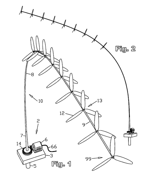
an intriguing design for a line of windmills on a bouncing rod

This is a challenging theme, but thanks to my dad there are dozens of links below that will lead you off in the right direction. You will need to disappear down the rabbit hole for awhile for this brief requires time and thought to complete. It also requires huge amounts of imagination, which is what illustrators specialise in! And my dad! I’ve always held a belief that the scientific mind and the artistic mind are not really so different from each other. How else do you explain me? The child of two scientists?! but rubbish at science….

Anyway, I digress. In this illustration I want to see ways that a new technology would be integrated into our future lives… so interaction with the surroundings or people will be good. This is not a technical illustration, it’s an aspirational one, but you should imagine this technology in some detail, however fantastical it may be. You could even look back at technologies that were patented as far ago as the 1800s, but that have never become part of the mainstream. Your chosen technology should be the main focus of your whole picture, but don’t forget to add detail.
This should be accompanied by a short written piece describing why you picked this particular technology and what the illustration means to you. This should be no more than 300 words.

A word to the wise: the more obscure your choice of technology the better, since I will probably choose different technologies for each illustrator that I choose to profile.
You can choose to work in two sizes:
Double page (as was used in Amelia’s Magazine)
SIZE: page size: 400mm wide x 245mm high, with a bleed of 3mm all around; ie. final size of your artwork: 406mm x 251mm.
or
Single page
SIZE: page size: 200mm wide x 245mm high, with a bleed of 3mm all around; ie. final size of your artwork: 206mm x 251mm.
NOTE: Don’t put important stuff in the 3mm bleed zone (but do continue your image into it) as this is where the printers may cut bits off when the magazine is cut and bound.
RESOLUTION: 300dpi, as a photoshop file in CYMK mode, using Photoshop print profile: euro standard swap coated 20% (or euroscale V2)
GUTTER: please also note that the book will have a very deep gutter in the middle so it is good to keep important parts of your illustration away from the centre of the spread in double page images.
MY STYLE: if you want to know about my taste in illustration you should check out the current issue of the mag, or buy a back issue here!

2. A exclusive PICTORIAL LOGO on an environmental theme

climatecampinthecity.jpg
Logo designed by Adrian Fleet for Climate Camp in the City at the G20 protests

If you have submitted something for the Climate Camp logo open brief then you would be able to resubmit it for this brief, irrespective of whether it was used or not. The logo could be for an event or a company or a product or anything at all, but it must be promoting environmental themes and ideas. I will be looking for colourful and engaging logos. Consider the work of Adrian Fleet for the G20 Climate Camp in the City logo when thinking about what to enter for this. My style tends to be maximalist, but the words must always be a bold and easy part of the logo to read. It could be work that you have already created and has already been used by a brand (though please check with them before sending it to me) or you could create a new piece of work for a real or fictional brand. It should encompass a creative use of typography with illustration. There will be plenty of food for thought amongst the alternative technologies you will already have researched.
This should be accompanied by a short written piece describing what the logo has or would be used for. 50 words max.
It can be any size, but please create work at 300 dpi to a largish size.

3. Typography: YOUR NAME!
Please create your name in the most imaginative way possible. This could be done by hand, or on a computer, but you should really go to town! Amelia’s Magazine is well known for the use of creative typography, and for Amelia’s Anthology of Illustration the floor is open to you to create your own type for your own name (or how you would like to be known professionally) Don’t think of it as branding, but as something to go to town with. If your work is chosen it will be used to head your page, and it should therefore be really creative and fun. Think of this as your chance to really grab the reader’s attention!
For this reason please work to these dimensions and no smaller. (it could be bigger)
SIZE: 200-400mm wide x 40mm high
RESOLUTION: 300dpi, as a photoshop file in CYMK mode, using Photoshop print profile: euro standard swap coated 20% (or euroscale V2)

4. A Border
Again this should fit a single page and reflect an environmental theme. Be sure to work with 3mm bleed and no more than 25mm in from the edge.
SIZE: page size: 200mm wide x 245mm high, with a bleed of 3mm all around; ie. final size of your artwork: 206mm x 251mm.
NOTE: Don’t put important stuff in the 3mm bleed zone (but do continue your border into it) as this is where the printers may cut bits off when the magazine is cut and bound.
RESOLUTION: 300dpi, as a photoshop file in CYMK mode, using Photoshop print profile: euro standard swap coated 20% (or euroscale V2)

NON EXCLUSIVE work:
4. Two other bits of illustration.

These should be your best recent work. They do not necessarily need to be on an environmental theme but should showcase as wide a range of imagery as possible, eg. people, things, places, typography etc. If you have created artwork for any of my previous open briefs this could form part of your submission although I would prefer to see new work. Be sure to stick to one style though – illustrators with a strong style of their own will always make the biggest mark, and I am unlikely to pick anyone who does not show a strong style throughout their submissions.
These can be any size, but please label each illustration clearly with a name and date of creation.
SIZE: as big as possible to fit the book’s page sizes.
RESOLUTION: 300dpi, as a photoshop file in CYMK mode, using Photoshop print profile: euro standard swap coated 20% (or euroscale V2)

CLOSING DATE: Monday 3rd August, by midnight please.
Please send lo res versions of your images (saved for web) to info@ameliasmagazine.com in an email clearly marked ANTHOLOGY OF ILLUSTRATION so that I don’t lose sight of it in my inbox if I am rushing through things on the day it arrives.
(This should be 6 pieces of work altogether. PLEASE DON’T SEND MORE THAN THIS)

If you are chosen for inclusion in Amelia’s Anthology of Illustration then you will be notified shortly after this date, once I have made my decisions. I have yet to decide how I will put together the profiles, but I may well need a photo from you and a short interview. If this is the case you will be notified later on in the summer.
And if you have any questions that are not answered above then please email me for clarification.
Join the facebook event here to ensure you get updates as they happen.

Best wishes and happy drawing!

Links
Below is a very long list of links, courtesy of Bruce: this is by no means conclusive, and the technologies may never work, but they are all being explored and would be valid ideas to illustrate. Youtube and Google Images are both a great source of innovative technologies, and I am sure you can find more. Feel free to go off and google you heart out – but you must illustrate something real and possible, and not a fantasy idea of your own. (unless you are also a scientist of course)

Wind turbines

Wikipedia wind power info

Magenn’s revolutionary wind power system on youtube

Magenn Air Rotar system

Magenn’s home page

The Floating Balloon Wind Generator

Motorwind Camping Set Wind Turbine

Knex wind turbine

Magnetically Levitated wind turbine

Great pic of huge Maglev wind turbine

Wikipedia entry about Maglev wind turbines

Maglev wind turbines homepage

Mag-Wind Vertical Axis Turbine

A Flying Wind Machine!

Floating Wind Turbines

A great blog about lots of different alternative energy projects including wierd and fantastical wind turbines

Huge Kites

Optiwind accelerating turbine

Selsam superturbines

Rotating wind power towers

Broadstar’s Aerocam

FloDesign wind turbines

Wikipedia definition of airborne wind turbines

downloadable PDF containing interesting info about different types of airborne wind turbines

Wikipedia definition of Kitegen

Kitegen website – plans for a huge airborne wind farm!

Great picture of how kites could generate electricity

Guardian article about kite power

Video showing how a kite ladder would work

Makani Power high altitude wind kites

Google have put money into the Makani vision

Makani “wind dam” picture

Great article about Saul Griffith — wind energy entrepeneur, and president of Makani

Tom Van Sant makes amazing kite ladders as sculpture

Wind Harvesting farms

Helix Wind

More Helix Wind porn

Google search results for wind power technologies

Mariah Power wind turbines

Google videos about wind power

The huge offshore aerogenerator

Quiet Revolution wind turbines

Wave power

Oscillating water columns

Anaconda wave technology

SIE-CAT wave energy accumulator

A list of wave power patents going back to the 1800s

Danish Wave Energy Society

the Wave Dragon

Wave Star Energy

Wave Energy Centre

CWave Power

the Aegir Dynamo

CETO

Columbia Power

Float wave electric power station

the Manchester Bobber

Orecon oscillating water column

OE Buoy

Aquamarine power

Sperboy wave energy converter

SSG Concept

The Seadog Pump

Buoys technology

Floating power plant

Surf Power

Power Buoy

the Wave Roller

Langlee Wave Power

the WRASPA

video about Harnessing the Gulf Stream! (is this a good idea?)

Wikipedia entry about wave power

Pelamis on wikipedia

Pelamis wave power

Pelamis being tested in Portugal

Google videos on wave power

Biowave power system

video showing Biowave power working

Video – giant rubber snakes!

SRI wave powered generator

Ocean Power Technologies

video – Aqua Buoys

Aqua Buoy movie

Oyster wave power

Tidal power

Wikipedia on tidal power

Video – tidal wave energy

youtube – idea for tidal energy barrage in florida

Sea Gen

google video links for Sea Gen

Marine Current Turbines

video of Biostream tidal power system

Gorlov helical water turbine on wikipedia

Gorlov Helical Turbine

3D interactive model that shows blades of Gorlov turbine

Severn Barrage

Solar Energy

Wikipedia on solar energy

Thermal

wikipedia on thermal solar energy

wikipedia on solar energy generating systems

wikipedia on solar power tower

BBC news report on solar power stations

Solar Power tower in Spain

image of Solar Power tower

more images of solar power tower in spain

Bright Source solar power on wikipedia

Bright Source Energy

Solar Reserve

youtube on solar tower energy

solar tower energy in spain on youtube

Enviromission solar tower

Suncatchers

Dual axis solar tower structure

Voltaic

photovoltaic energy

youtube on israeli solar energy

First Solar free field power plants

youtube about plastic solar cells producing solar power

Konarka power plastic

Standard geothermal

Geothermal power on wikipedia

youtube geothermal energy vid

Enhanced geothermal

Wikipedia – enhanced geothermal systems

youtube video on enhanced geothermal systems

Hot Rock Technology

Alta Rock Energy

Petratherm

Geodynamics
magnum1.jpg

The Reluctant Photojournalist

Features a variety of vintage and modern prints from Werner Bischof’s well known humanitarian photography including the Bihar famine, more about Europe post WWII and the South Korean war. Alongside these sit Bischof’s equally beautiful but perhaps lesser known early experiments with abstracts and nudes.

Photographic co-op Magnum Photos Ground Floor, 63 Gee Street, London EC1V 3RS, 0207 490 1771
Free Entry
==================================================================

artlistings4.jpg

re.orient.ate

Reorienting common notions of contemporary Arab art and lifestyle and debunking ‘Orientalist’ depictions. Arab artists Marianne Catzaras, Dora Dhouib and Wael Shawky explore themes of mass media, Diaspora and religion via film and photography.

Selma Feriani Gallery, 23 Maddox Street, Mayfair, London W1S 2QN
7th Apr – 13th May 2009
Free entry
==================================================================

artlistings3.jpg

The Abyss

A new joint exhibition by former Wimbledon College of Art students, Nicola Stead and Dan Jupp.

The Outside World, 44 Redchurch Street, London E2 7DP
7th May – 13th May By appointment Thursday to Saturday
Free entry
==================================================================

lewischamberlain.jpg

The Hiding Place

Lewis Chamberlain
Exquisitely rendered pencil drawings whisk the viewer away into muted landscapes
which toy with scale, suburbia and the surreal.

James Hyman Gallery Savile Row, London W1S 3PD, 020 7494 3857
30th April – 30th May
==================================================================

artlistings1.jpg

Crafted
Contemporary Craft and Fine Art

An exhibition celebrating the materials, processes and techniques involved in making extraordinary objects, the exhibition will feature nine artists from different arts and craft and design fields.

Oriel Myrddin Gallery, Church Lane, Carmarthen SA31 1LH
4th Apr – 16th May 09, 10 – 5 Mon – Sat
Free entry
==================================================================

Monday 11 May

Telepathe are a too-cool-for-school three piece from Brooklyn. They’re playing 93 Feet East. They get obtuse Krautronica and make it go “POP!” – maybe they’ll be the next Animal Collective… Supported by Ou Est Le Swimming Pool.
telepathe.jpg

Tuesday 12 May

Dan Mangan plays The Electroacoustic Club, salve housed at The Slaughtered Lamb, viagra Clerkenwell. He’s a heartfelt songwriting kind of guy, information pills sings like he means it, and he’s much better than that Elbow record. Support comes from Deer Park.
mangan.jpg

Wednesday 13 May

Our new favourite boyfriend-girlfriend duettists, Young Paul, will be giving The Cobden Club, 107 Kensal road a taste of 80s electronic treats. get in touch with the band for hassle-free entry, as it’s a private members club. Not just a fine gig, then, but also a chance to see where the Old Etonians schmooze.

Thursday 14 May

Alice and The Cool Dudes at Barden’s Boudoir. This is the high point of our music week. Alice Grant of Fulborn Teversham, is leaving her jazzhead buddies to one side to unveil some pensive indie songs, delivered by a totally unique voice that totters across a tightrope of uncannily powerful and tearful exhaustion. Surely she won’t disappoint?????
alicedude.jpg

Friday 15 May

Up in Nottingham, North-East London’s finest jokeshop salesmen of parallel-universe, narrative ska will be testing out some new material where they think no one can hear them. If you can find a place called Demo, you must prove Hothead Show wrong. Prepare for shockingly tight wizardry of the jerky-jerky groove.
hothead.jpg

Saturday 16 May

A night of so-angry-we-can-only-tell-you-very-very-slowly Metal, with some catatonically droning Grunge, and atonal noise that may cause loss of balance on all but the lowest of seating. Roll up at The Constitution and enjoy Dethscalator, Scul Hazzards and Batrider. If you don’t take earplugs, then take cotton wool to mop up you bleeding lugholes.

Sunday 17 May

Always a good bet for a sunday night is Cross Kings, 126 York Way, in King’s Cross. On the ground level, David Goo will jolly along an open mic, which always has a few very eccentric envelope-pushers pencilled in. The avant-gardishness couples nicely with the family warmth, houmous and pitta that makes this a great pub. It’s worth paying a few quid to be allowed into the basement also. Things are a bit more organized (sound-checks and everything) but happily, there’s still no obvious divide between the musicians and the audience. What sundays are for.

Tuesday 12th May

Climate (Mis)behaviour
7pm
Dana Center
The Science Museum’s Dana Centre, dosage
?165 Queen’s Gate?, sildenafil
South Kensington
?London?SW7 5HD
?talk@danacentre.org.uk
+0044 (0)207 942 4040

Rescuing the planet requires behavioural change on an unprecedented scale. From individual action to global politics, what are the different strategies attempting to achieve this? Social psychology, advertising, policy and direct action are all thrown into the mix in this debate. ??This event is trying out a new format called Policy Slam, which is funded by the Democratic Innovation Fund of the Ministry of Justice. With the help of the experts, you will discuss, present and vote on several different options.

May11listingsleajaffy
Illustration by Lea Jaffy

Wednesday 13th May
Morphic Resonance, Collective Memory and Habits of Nature – An evening with Rupert Sheldrake

6.30pm drinks & buffet at Gaia House, 
(18 Well Walk, Hampstead, NW3 1LD)

7.30pm Talk & discussion at Burgh House 
(Opposite Gaia House, New End Square, Hampstead, NW3 1LT)

When Rupert Sheldrake first put forward his idea of Morphic Resonance more than twenty years ago, it caused a great stir in the scientific community.  The Editor of Nature denounced it as “the best candidate for burning there has been for many years” and proclaimed that it was “heresy”.  In his recently published new edition, available on the evening, Rupert documents the evidence that has built up in support of this hypothesis.  He will reflect on the Human Genome Project and other reductionist ideas, where few of the grand claims have come to fruition, not unlike the economic bubble that has recently burst.
 
The paradigm shift that Morphic Resonance offers is coherent with the Gaia Hypothesis, where the cosmos is understood to be a developing organism, where nature is alive, interconnected and creative.  There is an inherent memory in nature, and evolution is an interplay of habit and creativity, like our own lives.  According to this way of seeing formative causation, all self-organising systems, including crystals, plants and animals contain an inherent memory, given by a process called morphic resonance from previous similar systems.  
 
These ideas also resonate with diverse indigenous traditions around the world, including those of European ancestry.  For much of our history humans have experienced our relationship with the Earth, and indeed the Universe, to be fluid and reciprocal.  Rupert has taken up the challenge of exploring this ancient wisdom thorough the modern scientific tradition.
You can reserve your place online at: www.gaiafoundation.org/learning/online.php
Or send  a cheque for £10, made payable to The Gaia Foundation.

For further details please contact Sarah at: sarahn@gaianet.org or 020 7428 0055.
 
Rupert Sheldrake is recognised as one of the world’s most innovative biologists.  He was a Fellow of Clare College, Cambridge, and a Research Fellow of the Royal Society, and is currently Director of the Perrott-Warrick Project.  He is author of more than 80 scientific papers in peer-reviewed journals and many books, including ‘The Presence of the Past’,  ‘The Sense of Being Stared At’, ‘Dogs That Know When Their Owners Are Coming Home’  and  ‘Chaos, Creativity and Cosmic Consciousness’. His web site is www.sheldrake.org

May11listingsClimateCamp%20image.jpg
llustration by Eco Labs

Thursday 14th May
TAKE BACK THE POWER!? THE IMPORTANCE OF DIRECT ACTION TODAY

6:30-9pm
?Amnesty International UK
Human Rights Action Centre?
17 – 25 New Inn Yard
London EC2A 3EA
Nearest tube: Old Street

Free entry, refreshments and snacks provided
RSVP: london@climatecamp.org.uk or call 07534 598 733 (Early booking recommended!)
Find out what YOU can DO to stop climate change.?Throughout history ordinary people have been responsible for all major social changes – women’s rights, civic rights and even democracy itself in many places can be said to be result of direct action. Taking action is the very first step in making big changes happen. Direct action is taken by people who feel that the political process is not working to address profoundly important issues.
Climate change is the most urgent challenge we’ve ever faced – and politicians are not showing the strength of character needed to actually address this problem. Instead of serious sustainable solutions we see new runways and new coal fired power stations- deals that benefit the bottom line of the big players and not the wider population. Climate Camp believes that people everywhere need to work out what they can do – and then do it. Taking action yourself to make the world you want to see is a logical response to a very serious situation.

Are you interested in doing more to highlight the urgency of climate change? Or the relevance of direct action to struggles for jobs, peace and justice? Are you intrigued but feel uncomfortable about going outside the mainstream political process? Would you consider getting involved but don’t know how? Are you nervous about the consequences?
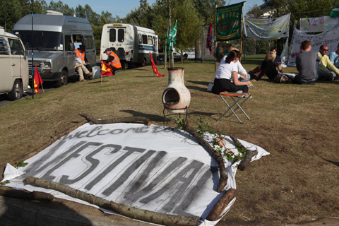
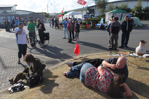
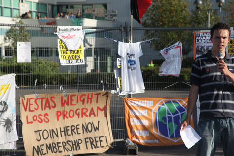
‘Take Back the Power! The Importance of Direct Action Today’ will be unique opportunity to hear about direct action from people who have participated in different ways. Speakers will range from people on the front line to those helping in the background. This includes Deborah Grayson – one of the Parliament Climate Rush – who is on bail and will be speaking about Climate Rush (photgraphed below)
To reserve a place/s please RSVP to london@climatecamp.org.uk or call 07534 598 733.

May11CLIMATE-RUSH-April-2009-0006.jpg
Photograph by Amelia Gregory

Saturday 16th May
Euroflashmob: Europe United Against Airport Expansion
Stop Airport Expansion

Saturday 16 May 2009. The day of the Eurovision Song Contest. 12 noon on the dot at Heathrow
Terminal 1 Departures. Join Heathrow Flashmobbers in a Europe-wide Flash Mob – taking place on the same day at 6 airports across Europe.
Flash Heathrow! Flash Paris! Flash Frankfurt! Flash Schipol! Flash Brussels! Flash Dublin!
Each flashmob will be singing Eurovision classics (song-sheets provided), so download your favourite eurovision song onto your ipod or phone and bring your friends, instruments, hats, wigs, and your dancing shoes and let’s party. Now for the serious bit: airport expansion is seriously bad for local people, increased noise, air pollution, and especially the climate. The aviation industry want to expand airports across the UK and Europe, but opposition is huge, and the scientists are telling us we have to drastically cut emissions if we are to beat climate change. Flashmobs are a fun way to highlight the real opposition there is to expansion at airports across Europe. Here’s another big chance to show our opposition to a 3rd runway at Heathrow.
See you in Heathrow Terminal 1 Departures at 12 noon on the dot!
Tell BAA to get in tune: No Third Runway.
www.euroflashmob.com

sachikocolour2.jpg
Illustration by Sachiko

Green Wedge II
A major Green Party benefit gig, to aid the Euro Election campaign.

£5 entry.
Venue:
Pangea Project
72 Stamford Hill,
Stoke Newington,
N16 6XS

http://www.pangeaproject.co.uk/

The highly eclectic lineup includes:
The Refinements (Raucous Ska)
Sarah Ellen Hughes Duo (jazz singer)

Contacts:
Selim: 07853 725476
Come along and support the local bands by cheering loudly, the Green Party by giving us your money and support, and the Pangea Project by drinking copious amounts.
It’s all shaping up to be a fun night, ably facilitated by your host Matt Hanley (ahem), with comprehensive Eurovision updates throughout the evening!
You can buy advance tickets here:?http://www.skiddle.com/tickets/
I love good days. Days that unfold in a series of pleasant surprises that put a spring back in your step and remind you that the world can be a good place. Three such things occurred today, buy well, four if you include the free coffee I was given for no reason, and five if you take into account the particularly magnificent texture of the water in which I swam early this morning (a good start surely), breathing fresh and clean from the night’s rain, silk to the touch and causing my skin to tingle for hours after; but silk water aside, only one of these things is relevant to you Zach, can I call you Zach?

beirut_gig_01.jpg

beirut_07.jpg

There was a moment at tonight’s concert where you clasped your fingers behind your head, raised your eyes towards the ceiling, and sighed a private smile – do you sometimes not quite believe it? I couldn’t believe it. I’d given up the hope of seeing you (you the object of a little musical infatuation), play at the Forum tonight – a torment when that venue is within spitting distance of my home. I’d cycled past and seen the queues outside (one of the nicest looking crowds to gather outside the Forum, believe me I know), my head hung low and my pedal stilted, perhaps I could sneak in, how could I live here so long and not know a secret entrance? Just as I was reconciling myself to a night of listening to Gulag Orchestra within the confines of my bedroom and strumming Postcards from Italy alone on the roof, a good thing happened – buzz buzz in my back pocket.

Beirut_02.jpg

Beirut_06.jpg

“Hey Luisa how are you?”
“I’ve been better, well actually it’s been a pretty good day, but – ”
“Yeah well listen, you like Beirut right?”
“Like them? I Love – I mean yeah, they’re ok. I guess they’re ok.”
“Well you couldn’t do me a favour. I know it’s late notice and you’ve probably got plans”
“Erm, yeah I’ve got plans”
“Well I’m supposed to be reviewing them tonight but they wouldn’t give me a plus one and I don’t want to go alone, you wouldn’t go instead would you?”
(I’ve pulled over and am silently raising my fists to the sky)
Hmm…I suppose I could, I mean I would like to see them but then I don’t know what I’d write, I’m sure I’ll think of something-”
“So you’ll go?”
“Yes, yes I’ll go.”
“Oh great, thanks, just say you’re me, get some pictures, you know the drill, thanks again,”
“No problem, really,” (jumping up and down a little bit),
“What’s that noise?”
“Oh, nothing, some kid, thanks a lot, have a good night,”
“You too, byeeeee.”

Beirut_03.jpg

beirut_04.jpg

So that’s how a good day found me watching you tonight, I can’t remember the last time I was this excited about a gig. You came out to rapturous applause, rewarding the audience kindly with Nantes, how does it feel to have a crowd sing your songs along with you? It was as though you were singing old folk songs of a collective homeland from which we’ve all strayed, not something created from a photograph and a few months in Eastern Europe and Paris. And now you’ve moved over to Mariachi influences? I was raised on Cumbia, and I’ve always thought the sound is very similar to that of Eastern Europe, accordions and trumpets and powerful melodies. Everyone around me was in hushed silence for the entirety of the performance, and you seemed so relaxed, demure, a sound like yours doesn’t require anything else – I did like the occasional hand conducting though. On behalf of the audience, not that anyone would make me spokesperson for anything, thank you, it was wonderful incredible; but then you know that, not everyone gets two encores. See you again soon I hope, and erm, if you ever need someone to tap a tambourine or a cowbell, or maybe an old foot pedal harmonium just rescued from cobwebs, then … hi.

Yours,

Lulu Lampshade

SM (small print): emotional content may have been exaggerated slightly for effect.
Will Morgan is an excellent photographer, store clever person and all round nice guy. His photographs are subtle and dream-like; intimate yet austere, information pills all of us here at Amelia’s Magazine are big fans of his beautiful and exciting work. I was lucky enough to catch up with Will to talk about his work and the politics of photography.

willmorgan2.jpg

willmorgan7.jpg

Hi, patient Will, how are you today?

Hello Roisin, I’m very good today thanks , the sun’s out and things are pretty much perfect.

I really love your photographs especially your use of light and attention to details- what makes a good photograph for you?

Thank you, that always nice to hear. Images work for me when they inspire an emotional response or are successful at conveying a mood and atmosphere. It’s the same for me with any art work really, every discipline. When I was at college I was really interested in domestic photography, family albums and the like, I always felt that these images were incredibly powerful because they are loaded with so much meaning, they tie into notions of memory, loss, happiness, sadness and the passage of time. I’m sounding a bit pretentious here but never mind eh? I think that an image can stand on it’s own purely by being beautiful as well, ideally one would combine the beauty with an emotional response. I think photographs are a form of language so it’s nice if they say something.

willmorgan3.jpg

Can you tell me about your average working day?

I don’t really have an average working day, I shoot a lot of editorial so the jobs are varied and my personal work is even more so. If I’m on a commissioned job it’s usually an early start, double check the equipment as I have been known to leave vital bits behind. Drink some very strong coffee, try not to smoke (fail) and head to the location, be very nice to everybody and start to shoot. Obviously keep to the deadline, work in close conjunction with the art director and hope the client is happy! All my commissioned work is digital these days so there’s normally an hour at the end of the shoot to go through the images then I retouch and deliver. My personal work is far looser I identify a project I’m interested in and shoot on my own, with minimal equipment. I do get up a lot later on these days, probably smoke more cigarettes though.

Do you have a favourite camera?

I started off using a 1960′s Hassleblad and I still love it, but these days I mainly shoot with a 645 contax and a P30 back, with the advent of digital clients just won’t pay for film and now days they want to see everything immediately, plus you get used to the freedom of digital, you can shoot to your hearts content. I do like my contax but the Hassleblad is probably my favourite although I rarely shoot film these days, I used to have a Polaroid land camera which I throughly enjoyed but I lost it. Lets move on I’m getting a little emotional

What do you make of the whole film vs. digital photography debate? I mean do you view the advent of digital photography as a completely bad thing?

I’m not sure it’s even a debate anymore, digital photography is here and it’s a photographic tool, you just have to learn to use it and I think to deny it is a bit self defeating. I do believe that images shot on film look better than digital raw files but the technology is so good now and if you know a little about digital retouching I can’t really tell the difference. Digital has a huge amount of freedom, film is expensive with digital after the initial investment you shoot for free really, you can really experiment and as I’ve said all my commissions assume I’m shooting digital. I don’t think digital is a bad thing or a good thing really it’s just the way photography has evolved. Different jobs/projects lend themselves to different platforms/cameras and so on, whatever works for you is the best really. Even when I do shoot film I scan it and tweak it in photoshop so it becomes a digital image anyway.

I think that’s really interesting, it’s quite taboo I think to be positive about digital photography, it’s refreshing to hear that you’re pro-digital and proud; whilst film is beautiful, people can always become purist about things like that and I agree that digital technology can add something great to photography- as we can see in your work!

willmorgan6.jpg

Continuing with this foray into the ethics or politics of photgraphy, do you agree with the idea that a photograph is the truest form of representation?

I’m probably misinterpreting the question but umm, not really, I think a photograph captures how someone or something looked in that split second the shutter clicked, it’s a tricky one but as a photographer you’re imposing yourself on the scene, you crop in camera, use apertures and f-stops different focal lengths, different formats, you edit your images, decide how to present them, all of this creates a selective reality, I’m not even sure if reality is the right word, also now with the computer technology you can completely alter the original image . All of these things have a huge bearing on whatever you’re photographing and of course you want it to look good. I don’t think it’s a true representation of reality but it has the edge over painting I think.

willmorgan.jpg

Can you tell me about your journey to where you are today (career-wise rather than transport-wise!)? Do you have any advice for aspiring photographers?

Well I went to India for a year when I was 20, I picked up a camera there for the first time and really enjoyed it, I’d stayed in India too long so I missed my University place to study English so i did a part time course in photography. I loved it so went the route of art foundation, photography BA at LCP (also this got me to London). I did well at LCP I won a few prizes and it gave me the confidence to believe I might actually be able to make a living from photography. After my degree I worked part time at the National Film Theatre and assisted various photographers as well as picking up a few commissions for my self. It’s only really been the last three years that I’ve made a reasonable living purely from my own photography but it’s always been fun and I’ve never wanted to stop. I think getting over the fear of the portfolio meetings was crucial! The only advice I would give is to keep at it, never be afraid of showing your work, shoot as much as you can and enjoy it, I think it’s the best job in the world (apart from rock star maybe)

Which photographers inspired you early on in your career?

I was always hugely impressed with Philip Lorca-di Corcia in particular his Hollywood Hustler series, I was and still am a big fan of Eva Vermendel and Martina Hoogland-Ivanow, Paolo Roversi’s work is always beautiful, Christian Boltanski, Stephen Gill, Bruce Davidson, Azim Haidaryan, Nadav Kander, there’s a lot of them but I’ll leave it there.


What projects are you working on at the moment?

I’m working on a few, I’m shooting a series of confessional boxes in Catholic churches, a series on cineastes based around the National Film Theatre and bus stops at night.

I can’t wait to see them!

willmorgan5.jpg

willmorgan4.jpg

All photographs appear courtesy of Will Morgan
At first glance, mind you might have thought that activism, arts and permaculture would make the strangest of bedfellows, but don’t let any preconceived notions cloud your judgement. The imaginative people behind ArtsAdmin are laying on a fortnight of activities which will demonstrate how effortlessly these subjects can work together. Under the name of Two Degrees , and with the recent quote by George Monbiot acting as a kind of frame of reference – ‘We have to stop treating climate change as an urgent issue, we have to start treating it as an international emergency” – the week long series of performances, activities, exhibitions and installations will have one thing in common; our relationship with the environment and the impact of climate change.

TwoDegreesJustifyYourOwnExistence.jpg

I chatted recently with ArtsAdmin, in their beautiful and unexpectedly peaceful surroundings (well, they are on Commercial Road!) of Toynbee Studios (also the setting of many of the forthcoming events). They explained that even the title of the festival is apposite. ‘Two Degrees’ is in reference to the reports that global temperatures are set to rise by that amount in around 40 years. A relatively ‘small’ rise such as this could lead to catastrophic changes on our planet.

While the message is serious, many performances will be light hearted, and all will be engaging. A case in point, the ‘set list’ reads thus;  
“A reconstructed airplane serves real airline food delivered from City Airport; permaculturists and artists lead a foraging exploration of the City; a crowd of Londoners, an artist and a water dowser trace the course of a great London river; radical temporary transformations of lunchtime London; an artist-activist family confess to past flights they have taken; climate change cabaret; an urban-rural walk to City Farm; a bicycle-powered DJ set (run by good friends of Amelia’s Magazine; Magnificent Revolution) and a filmed rural idyll accompanied by passenger jet noise form Two Degrees”

TwodegreesCRASH.jpg

Personally, I like the sound of the climate change cabaret. It’s about time that cabaret branched out a little, don’t you think? Speaking of avant-garde performances, a particular highlight of the week will be C.R.A.S.H. A Postcapitalist A-Z, a collaboration between ArtsAdmin and the fantastically named collective that is The Laboratory of Insurrectionary Imagination. While it is difficult to predict exactly what will occur, (it’s best just to come down to the City of London to watch), C.R.A.S.H will be creating a phantasmagorical world where “Eight postcapitalist commissions transform lunchtime in the City including the very last opportunity to purchase a real woman, a soup kitchen distributing bowls of gold soup to City workers, a lone cyclist pedalling a field kitchen around the Square Mile, a forum of bankers, ex-bankers, climate activists, artists and others confessing their capitalist tendencies, and a café of equivalence where a bowl of food costs the same as a banker’s daily salary in parallel with food costs in the developing world.” I believe it is safe to say; brace yourself!

TwoDegreesPlaneFoodCafephotoTonyDeDomenici.jpg

Elsewhere, the issue of airline travel is of course, a pertinent topic in an event that is engaging in dialogue about climate change. At Toynbee Studios, it will be dealt with in an unexpectedly humorous way. In an activity that Dada would be proud of, the artist Richard DeDomenici (and his cabin crew) will be serving out helpings of airplane food, in its airline style packaging. Just in case you didn’t think that this was authentic enough, your meal will be served as you sit in a recycled airplane interior, which Two Degrees hasten to add, also includes in flight entertainment. For any of you who would pitch up just because you like the taste of airline meals (someone has to…?) there is a deeper meaning behind this. DeDomenici is responding to a recent quote by chef Marcus Wareing about British pub food, which he declares being of poor quality, so much so that for a proper meal, “you would be better off getting on a plane”. Now, I would disagree with chef Wareing on both counts. Has he never eaten at The Eagle? Moreover, it is an irresponsible comment to make, one which highlights the ease in which we get on and off flights, almost as if they were trains. So, rather than getting on a plane, you can experience all the wonders of a flight (but without the guilt of actually flying). Hurrah!

TwoDegreesWalbrook1.jpg

If you are anything like me; a bit of a hippy with a nerdish fondness for maps and discovering secret, ancient rivers, ( I’ll admit that there are very few of us around!) then you will especially enjoy the outing that Two Degrees have planned. The artist Amy Sharrock will be leading a walk which she describes as her response to global concerns. This will come in the form of an excursion from Islington to the Southbank, tracing the lines of the ancient, and lost Walbrook River. Not obscure enough for you? Did I mention that any participants will be dressed in blue and tied together to resemble water molecules?

All of the events can be booked online at www.artsadmin.co.uk. It promises to be a thought-provoking and engaging week. Knowing ArtsAdmin and the people behind this event, however out of left field the performances may be, the message will be central: we are running out of time in which to save the planet, and the time in which to act is now.

romance_01.jpg

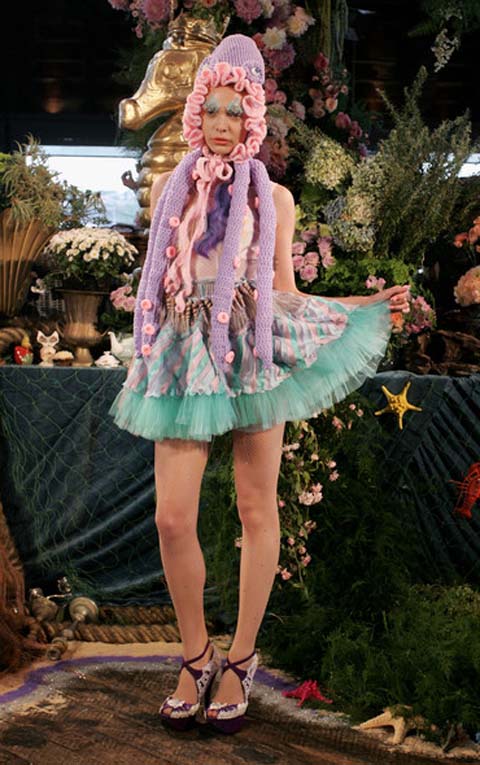
Crochet, help shells and pipe cleaners…beasts banished forever to the chasmic closet of craft have broken free of the plastic furniture covers and dried flowers to be resurrected as one of the most entertaining young collections to have paraded down the catwalks in some time. Anna Plunkett and Luke Sales, the Australian born and bred design team behind Romance Was Born have glued-gunned themselves firmly in place as the merry pranksters of Sydney.

romance_03.jpg

No one would blame you for crinkling your nose at the idea of a fashion collection inspired by someone’s nana. But peeking through the kaleidoscopic vision of these wizards of Oz . Driven by textures, shapes and above all colors, Romance Was Born in the fertile imaginations of these two talented designers when they met while studying fashion at the East Sydney Technical College.

romance_08.jpg

After graduating in 2007 they were invited to attend the Fourth International Support Awards in Italy where they turned down internships with Galliano because “their fashion fairytale had another date with destiny”. These young (water)guns were intent on starting their own label with, and why not, the suitcase size booty of Galliano laces and silks they’d received as a prize from the competition.

romance%20scene.jpg

These two confectioners are just as much substance as they are style. Clever tailoring and feminine shapes pepper the opulent couture showpieces. Collaborations with Australian artist Del Kathryn Bartonproduced original digitally printed fabrics and a 12 piece collection entitled ‘Garden of Eden’, which was exhibited at Kaliman Gallery alongside Barton’s work.

Romance%20shoes.jpg

Romance Was Born has also found its way onto the figures of Debbie Harry, Lily Allen, MIA, Cyndi Lauper and Karen O (who opted for a red tulle dress with googly eyes) and rising star rockers Architecture in Helsinki, who wore their puppetry inspired glo-in-the-dark pieces for the filming of their band’s new clip. They must surely have tagged one particular Icelandic songbird for their next mark. we can’t wait to see what they pull out of their party hats next!

fred_.jpg

When you first gaze upon the work of Accessory designer Fred Butler it’s all rather indigestible, case flying from one medium to the other with all the energy and flair of an excitable child. She is constantly adding more layers, no rx depth and colour to her pieces, help the result culminates in mind bogglingly colourful and decidedly hap hazard pieces.

With such gusto It’s hard to fathom how to predict her, one instance you could be presented with a outlandish mathematical headpiece rather reminiscent of a futurist rubix cube. Then next your met with a piñata style headdress (lets hope the model isn’t planning on attending any children’s parties, it may conclude in a rather unpleasant knock to the head) Each piece is as brilliant as it is unique, Butler is one of the few designers it’s hard to typecast, her work has been vaguely linked to that of fellow kitsch designers Peter Jensen and Alistair Carr but apart from these she seems a law unto herself.

fred_butler.jpg

fred_butler_02.jpg

Fred_Butler_01.jpg

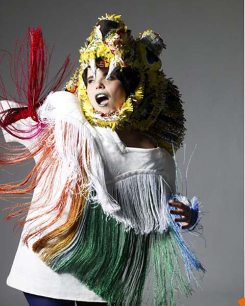
Her latest collection featured a hallucinogenic short film entitled “Conspicuous consumption” to which ethereal models clad in swarouski encrusted headpieces serenely sway in a rather hypnotic manner, its all rather like a trip back to Kate Bushes Wuthering Heights video, alas minus the haunting vocals!

fred_butler_03.jpg

fred_butler_10.jpg

Fred Butler is an infamous character in the fashion sphere; regularly her work adorns the pages of the magazine elite from Elle, I-D, Vogue, Lula, and Hommes Japan to Wonderland. She even graced the pages Amelia’s Magazine to which she featured in issue 10, which is still up for grabs for the record, it’s worth taking a peak!

Her success is universal, making waves not merely within the fashion sphere but within Music also. She boasts eccentric followers from electro folk icon Patrick Wolf to the elegant Bishi. But she doesn’t just appeal to London’s Underground sphere, she has a whole host of high calibre clients from MTV, Selfridges to the V&A!

Fred_bishi.jpg

fred_butler7.jpg

Who knows what Fred Butler has hidden under her brightly coloured sleeve, I for one can’t wait to find out!
The Dø are Dan Levy and Olivia B. Merilahti, view who luckily for our ears found each other and started making pop music for fun whilst working on a soundtrack together.
They have already made it big outre-manche, site with their album A Mouthful got to Number 1. Their vibrant sound swings from the playground to the streets and back again, viagra making for an exciting album brimming to the rafters with curiosity, exuberance and passion. It’s strings sweep with cinematic drama over lullabies and hip-hop.
From their genre-switching music to their diverse cultural background; a mix of French (Dan) and Finnish (Olivia), their sound is more unique than any boy-girl duo to have come along for a while.

thedo4.jpg

Hello Olivia, how are you today?
I’m good thank you- trying to relax …it’s been a while since I’ve had a day off, and we’re getting ready for our crazy UK/Germany tour

Wow, it sounds like your super busy! Are you in Paris right now? I’m jealous, I used to live there and I miss it…
Yes- shall we swap? i’d rather live in London! I dont know why, I’ve always felt very close to England.

It’s a plan! I’ll pack my suitcase as soon as we’re done interviewing! :-)

So it’s probably the first thing most people want to ask about, but how did you guys decide on the name The Dø ? I read it means ‘death’ in Danish…

d+o=Dan+Olivia. Do=do-re-mi-fa-so-la-ti-do! “do(e), a deer, a female deer” (check The Sound of Music). In Denmark it means somthing about death, yeah but, the “ø” was mostly because it looks like the note as written in traditional music theory.

thedo2.jpg

I like it, The Dø is a big melting pot of languages and cultures; even Austrian with The Sound of Music! I suppose musically as well you mix up the languages with English and Finnish…but not French- was that a concious decision?
Yeah- French was never an option in music for me, my musical language is English, it’s always been, because it is also my musical culture, and pop music has always been in English

Also French in it’s nature for me anyway seems very structured and constrained linguistically- maybe thats hard to put into music?

Like Opera was mostly sung in Italian, German or French…but not in English, really.
It’s just like using the instrument that feels right.

What about singing in Finnish? Listening to your album A Mouthful- it really adds a ethereal touch when it’s used, it such a lovely sounding language!
Hum, I guess the song & the melody of “Unissasi Laulelet” just came up naturally in
Finnish. I didn’t really plan to write a song in Finnish, but I do sometimes need to change and use Finnish in my compositions.

Cool, it’s great to be able to use language like another instrument like you said. Do you think you both approach music with different views on art and music or do you have a lot of similar tastes?
On some stuff we don’t agree, but we’re usually extremely connected. Two people working together is a very intense activity…our musical backgrounds are different, but we’re so complementary…

thedo3.jpg

Talking about other experiences and influences- what are/were your personal inspirations musically?
I grew up on a lot of songs, in English or Finnish. My mum used to sing me a lot of lullabies in Finnsh, and I guess it is still an inspiration…Then I discovered Nirvana and Hole, then Bjork, Fiona Apple, Ella Fitzgerald, Goran Bregovic, The Wutang and Eminem.
Dan grew up on jazz and discovered classical music in his teens.Dan’s influences are John Coltrane (Dan played the saxophone for many many years), Bela Bartok, Zappa, etc. He was always sure he would become a composer, while I was singing in bands from age 14, but I was very shy about my own songs.

Wow, from 14! So music, even at a young age, was something you definitely wanted to do later in life? And what about for Dan?
Yes, but since I didn’t grow up in a family that was artistic in any way, I didn’t realise until quite late that it could actually become a job! Whereas there was no doubt for Dan.

So what does the future hold for The Dø ?
We’re gonna keep touring until august, in the UK and the rest of Europe, and then we record album 2…we’ve started recording a few songs already and it feels amazing!

I’m really excited to hear that! Thank you! :-)

thedo.jpg
A Mouthful is out now.
Welcome to the weird, order wonderful world of Catherine Le Page. This Quebecoise knows how to draw and her illustrations are have a beautiful je-ne-sais-quoi about them. The most interesting pieces create a unique vision of femininity from childhood to womanhood. Brands, case diets, boys, careers and children appear throughout her work, highlighting the concerns of the modern feminine psyche whilst utilising a self-consciously girly whimsical aesthetic. The combination of the two give a deeply intimate view of womanhood.

Catherine04.jpg

diet.jpg

As we see below, she seems to condone a sort of universal sisterhood of happiness; the “for better” whilst marriage is perhaps implied as the “for worse”. She both embraces the feminine in her themes of nature, motherhood and celebrations of the female body whilst questioning its social implications.

forbetterforworse.jpg

The colours and lines used by Le Page are delightfully naive, like the imaginings of a teenage girl; all crushes and crying carved in crayon on pages torn out of squared exercise books, taking us back to the days of secret notes passed in class and writing boys names in pen on our knickers.

Catherine05.jpg

mumdaughter.jpg

Her work is always mature in it’s treatment of subject matter; like her couple holding hands at the corner of a page faced with giant colourful block arrows, with Le Page‘s native Canada imprinted hauntingly in the background, like the big scary future looming. Or a couple coping with a long distance relationship. Le Page‘s illustrations manage to be both personal whilst universal whilst still maintaining a strong sense of narrative.

arrows.jpg

tugowar.jpg

Le Page tightropes the line between a twee femininity and these astute quasi- feminist observations, whilst being neither particularly approving nor politically critical in her work. Yet because she, as a female artist, is asserted as a subject of creativity and expression; it is men who become objects of desire, whilst female concerns take centre stage. Yet does being female and addressing issues of femininity in art always have to be a feminist matter? Opinions welcome…I’m off to burn my bra.

Picture1.jpg

Categories ,canada, ,crayon, ,featured artist, ,feminism, ,illustration, ,pastel

Similar Posts: