Amelia’s Magazine | The Purple Book: Sensuality & Symbolism in Contemporary Art & Illustration – Review

The Purple Book - Laurence King, review
The latest offering from preeminent art publisher Laurence King is a huge purple and pink tome put together by two leading thinkers in the graphic design world. Angharad Lewis was behind the brilliant (and now sadly defunct) Grafik Magazine, and Angus Hyland is a partner with mega design consultancy Pentagram. Their beautiful joint creation sets out to explore the relationship between illustration and the written word when it comes to describing desire and eroticism.

The Purple Book_cover. The Purple Book - Laurence King, review
Contributions from illustrators are paired with quotes, poetry and short stories from famous characters and writers such as the Marquis de Sade, Edgar Allan Poe and James Joyce. Most of the artists work in a predominantly monochrome or subdued palette, using fine line detail to create swirly lines and decorative patterns reminiscent of art nouveau, and there is an exemplary use of typography and layout throughout, the pale pink of the pages ensuring that even the most obviously erotic artwork never seems crass or in your face. At intervals a selection of the illustrators explain their working process, making this a must read for any fans of delicate decadence and erotic fantasy.

The Purple Book - Laurence King, review
Everything about the curation and design of The Purple Book has been thought through to make it as tactile and desirable an object as possible: one that you will want to hold and pore over, caressing the thick matte paper and marvelling at its weightiness. This publication is the antithesis of fast internet imagery: it’s one you’ll return to again and again, reminding you why beautiful books will never be usurped by the worldwide web.

Categories ,Angharad Lewis, ,Angus Hyland, ,Edgar Allan Poe, ,Erotica, ,Grafik magazine, ,illustration, ,James Joyce, ,Laurence King, ,Marquis de Sade, ,Pentagram, ,Sensuality

Similar Posts:


Amelia’s Magazine | Pick Me Up Contemporary Graphic Art Fair 2012: Pick Me Up Selects Review

Pick Me Up 2012 - Zim & Zou
Pick Me Up Selects – Zim & Zou.

There is one major problem with a trip to Pick Me Up contemporary graphic art fair: the vast choice of amazing artwork. Where then does one start when writing a review, or making a purchase for the wall? From what I hear most people come away with far more than they planned to, so make sure you set yourself a realistic budget before you go in. You have been warned…

Pick Me Up 2012 -Zeloot
Pick Me Up Selects – Zeloot.

The ground floor entrance is this year devoted to Pick Me Up Selects, the work of up and coming artists who have been chosen by a group of industry insiders, including Camilla Parsons of Outline Editions, John O’Reilly of Varoom Magazine and Angharad Lewis of Grafik Magazine. I was delighted by this year’s selection, which seemed more diverse and truly representative of little known artists than has been true in previous years. Here’s my highlights: some new discoveries as well as old favourites!
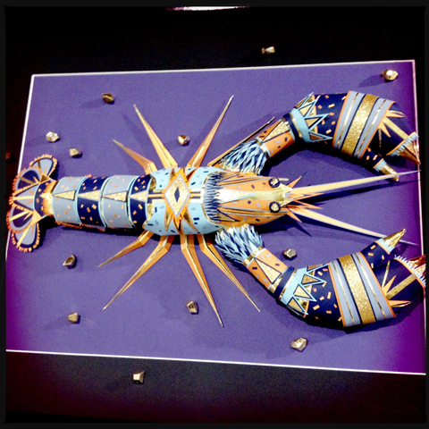
Pick Me Up 2012 - Zim & Zou
First up are some stunning neon and metallic papercut artworks by a duo: Zim & Zou, who are Lucie Thomas of the UK and Thibault Zimmerman, now working together in Nancy, France.

Riikka Sormunen
It was great to see work that has a distinct if not overt fashion illustration flavour: Riikka Sormunen‘s background in fashion design is evident in her intricate narrative pictures of elegantly dressed women.

Niki Pilkington
Similarly Nikki Pilkington combines fine pencil drawn figures with colourful collaged details.

Pick Me Up 2012 -http://mcdonaghillustration.com/
Opposite this are pictures by Tim McDonagh, a graduate of the University of Westminster whom I raved about when I discovered him at his graduate show in 2010. I am not sure how his mind works but as this detail shows it must be a complicated place.
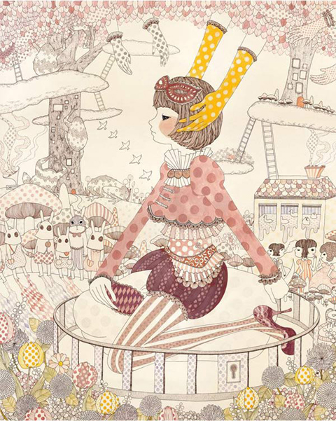
Yoko Furusho
Next up, another familiar face. The New York based illustrator Yoko Furusho features in my first book Amelia’s Anthology of Illustration, and her beautiful work is looking as uniquely fantastic as ever.

Sarah maycock bear
Sarah Maycock is another artist who I spotted at the Kingston University graduate show last year: I even own my very own screenprinted version of her fox! #luckyme
Pick Me Up 2012 -matthew the horse
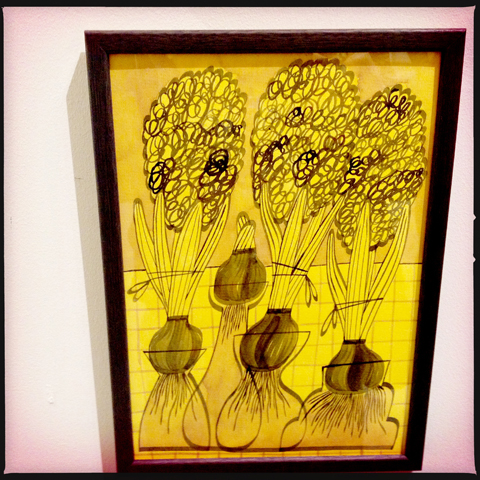
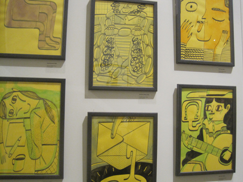
Matthew the Horse is the zany pseudonym of a graduate from Bath Spa University. He is inspired by language and feelings and his very yellow collection of images is based around jobs and identities. I especially like the hyacinth bulbs and a curious monkey.

Pick Me Up 2012 -Sac Magique
There is definitely a strain of 80s inspired illustration coming through at the moment – Finnish designer Sac Magique is one example…
Pick Me Up 2012 -Martin Nicolausson
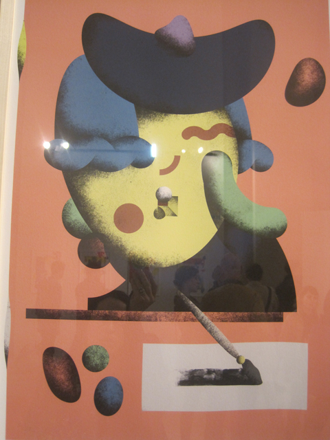
as is Swedish designer Martin Nicolausson, who veers ever more towards the surreal.
Pick Me Up 2012 -Zeloot
Pick Me Up 2012 -zeloot
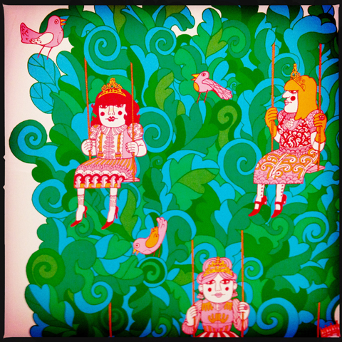
I was also most taken with psychedelic work by Dutch designer Zeloot that has a distinct 60s flavour in both colour and content. She likes designing within the limitations of silk screenprinting.

Pick Me Up 2012 -Kristjana S Williams
Kristjana S Williams is the creative director of Beyond the Valley so you may well already be familiar with her magical landscapes created out of collage and metallic elements.
Pick Me Up 2012 -Sarah Beeston
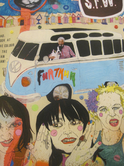
Australian illustrator Sarah Beeston studied at Falmouth College of Arts before settling in London, where she became preoccupied with politics and perversities of popular culture. She is creating live portraits at Pick Me Up every day!

Pick Me Up 2012 -Yuko Michishita
S for Shells by Yuko Michishita is a beautiful example of handdrawn typography, a swirl of intricate pen lines.

And then it’s on upstairs, where a host of collectives have been invited to display their wares in the long gallery space… find out who to catch in my next instalment…. in the meantime check out my listings for recommended workshops and talks.

Categories ,2012, ,60s, ,80s, ,Amelia’s Anthology of Illustration, ,Angharad Lewis, ,Bath Spa University, ,Beyond the Valley, ,Camilla Parsons, ,Falmouth College of Arts, ,Fashion Illustration, ,Grafik magazine, ,illustration, ,John O’Reilly, ,Kingston University, ,Kristjana S Williams, ,Lucie Thomas, ,Martin Nicolausson, ,Matthew the Horse, ,Niki Pilkington, ,Outline Editions, ,Papercraft, ,Pick Me Up London, ,Pick Me Up Selects, ,review, ,Riikka Sormunen, ,Sac Magique, ,Sarah Beeston, ,Thibault Zimmerman, ,Tim McDonagh, ,Type, ,University of Westminster, ,Varoom Magazine, ,Yoko Furusho, ,Yuko Michishita, ,Zeloot, ,Zim & Zou

Similar Posts:


Amelia’s Magazine | Best of D&AD New Blood Graphic Design Graduates 2011: Typography
New Blood show review 2011-Maria Rajka
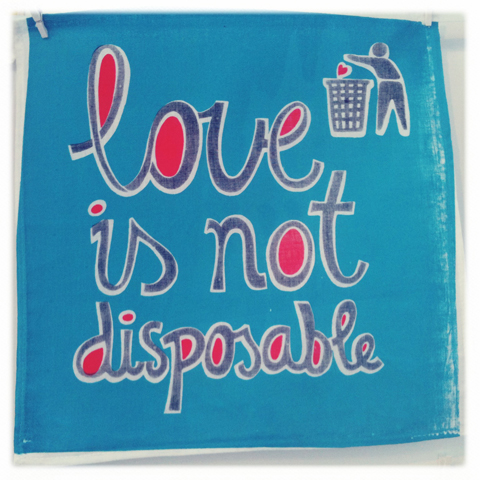
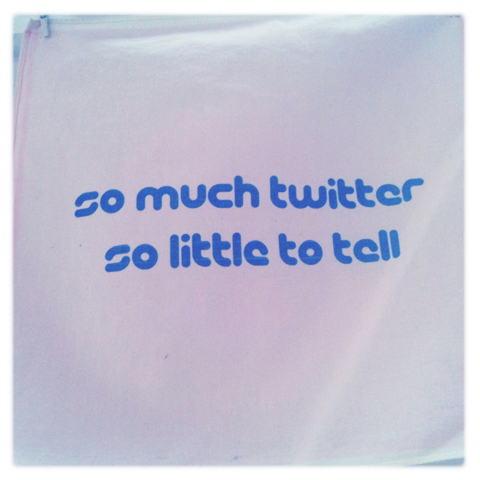
Edinburgh Napier University boasted a wall of screenprinted handkerchiefs by Maria Rajka, visit this site each with imaginative new designs overlaying the traditional motifs and patterns that I remember from childhood. (Yes my mum really did try to get me to use an old fashioned hankie. Needless to say she failed.)

New Blood show review 2011-Maria RajkaNew Blood show review 2011-Maria RajkaNew Blood show review 2011-Maria RajkaNew Blood show review 2011-Maria RajkaNew Blood show review 2011-Maria Rajka
Maria believes in ‘bicycles, carrots and thoughtful design.’ Sounds good to me!

New Blood show review 2011-john ellisNew Blood show review 2011-john ellis
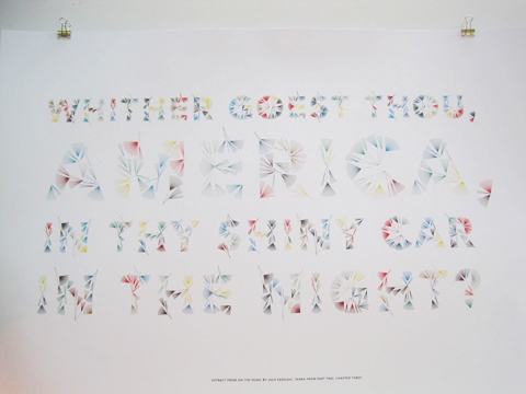
Fakery by John Ellis at Staffordshire University featured some wonderful old school usage of type, as did his record sleeve History Repeating Itself.

New Blood show review 2011-RSA award
One Staffordshire student won the RSA Student Design Award for stamp design but had failed to pin any information near her exhibit so I had to squeeze it out of her tutor. I’ve since lost it. *update* I’ve found it! She’s Charlotte Lench.

New Blood show review 2011-Lilly Blythe
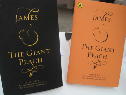
Lily Blythe envisaged the typeface for a book cover of James and the Giant Peach in beautiful calligraphic style.

New Blood show review 2011-Josephine Kibuka
Josephine Kibuka at Buckinghamshire New University also designed this popular book in a hand drawn style with a giant peach head.

New Blood show review 2011-emma kingNew Blood show review 2011-emma king
Emma King‘s delicate typography wowed at Sheffield Institute of Arts, part of Sheffield Hallam. She has been snapped up as an intern at Grafik magazine. Good choice!

New Blood show review 2011-James Rogers
Hull School of Art and Design students were particularly strong for typography; James Rogers took inspiration from the Deepwater Horizon oil spill.

New Blood show review 2011-ben keith
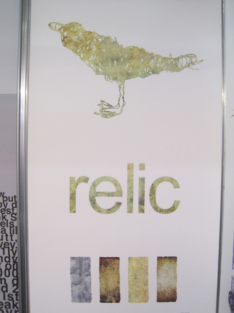
Ben Keiths bird is intended for a fashion label but I think it works in its own right.

New Blood show review 2011-james watkins
New Blood show review 2011-joe stayte
Hereford College of Art was also very strong for typography. Especially by James Watkins and Joe Stayte.

Categories ,2011, ,ames and the Giant Peach, ,Ben Keith, ,Charlotte Lench, ,D&AD, ,Emma King, ,Grafik magazine, ,Graphic Design, ,Hereford College of Art, ,History Repeating Itself, ,Hull School of Art and Design, ,James Watkins, ,Joe Stayte, ,John Ellis, ,Josephine Kibuka, ,Lily Blythe, ,Maria Rajka, ,New Blood, ,RSA award, ,Staffordshire University, ,Stamp Design, ,typography

Similar Posts: