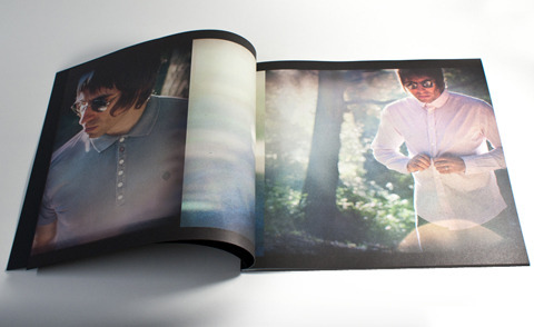
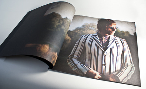
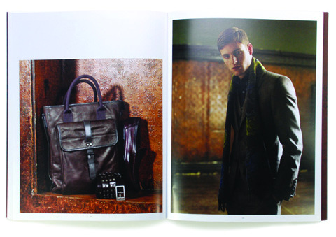
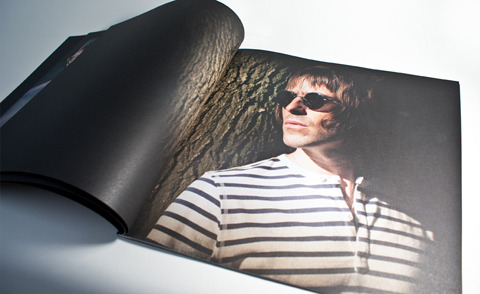
Creative design agency One Big Company designed the new S/S 2012 look book for Liam Gallagher’s clothing brand Pretty Green, which was then printed by Principal Colour in Kent. This beautifully made object was inspired by record sleeves and features stunning photography shot on London’s Hampstead Heath. We caught up with designer Dave Uprichard to find out what goes into putting a look book together.
Your most recent project has been the creation of a look book for Liam Gallagher’s clothing company Pretty Green. How did the collaboration come about?
Myself, Matt and Neil (the other members of the One Big Company team) were contacted by a former colleague from our time at Ted Baker who now designs the collections for Pretty Green.
Have you worked on the design of many look books over the years?
Yes indeed, working at Ted Baker they were one of the bi-annually repeated projects we looked forward to most and as a bonus towards the end of my time there they started creating a High Summer mini-lookbook too so I got to turn my hand to that as well.
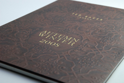
One of Dave’s Ted Baker look books (also printed by Principal Colour).
What do you think sets the Pretty Green collection apart from other fashion collections for men?
Apart from the inherent sense of cool which comes through its associations withLiam Gallagher and the best bits of the British music scene what’s great about Pretty Green compared to other fashion collections is that each season is different – obviously your staples are still there but there’s no taking the best selling styles from previous collections, adding a different button or pocket to it and rolling out something which is 99% the same as last year.
What inspired the design of the look book?
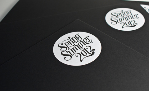
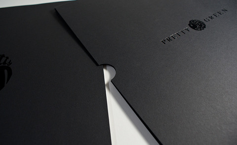
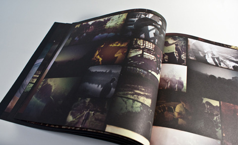
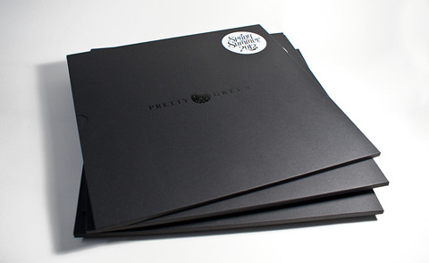
It’s inspired by the British music scene of the 60s & 70s, the format is a 12” with a black slipcase to echo a record sleeve and then all the shots have been graded to give an aged analogue feel. There’s no digital crispness with this book, we wanted it to look raw.
The sleeve was die-cut and foiled.
How did you choose the materials and print production techniques for your look book?
Firstly the paper stock had to be uncoated to be in keeping with the grading we’d added to the photography, we knew this would darken up any imagery so that had to be taken into account when printing. We picked Challenger Offset by Antalis McNaughton for this. Other than that it was a case of picking a great black stock for the cover and slipcase (Colorset by Fenner Paper) and ensuring that the foiling of the logos was of the highest quality. We haven’t been let down!

You’ve clocked up 10 years in the print design industry – what have your design highlights been?
The biggest highlight would be breaking free of corporate shackles and setting up with Matt & Neil, maybe not a design highlight but a highlight of my design career! Other than that, it’s hard to say… I’ve worked with so many great clients and brands from MTV to Ted Baker to Pretty Green. Can I just say that the past 10 years have been a highlight?
Where did you work before setting up One Trick Pony? And what skills did you learn at each different place?
I started at a boutique creative agency called Point Blank which was lead bySteve Wallington, it was the perfect place to cut my teeth as everyone had input into creative briefs – the ethos of PB was that a great idea was a great idea no matter whether it came from the Creative Director, Junior Designer or company accountant! After that I went in-house in fashion, working at Ted Baker for just over three years. Then I took a foray into retail design with Portland Associatesbefore setting up One Trick Pony with Matt Bishop and ultimately One Big Company with Matt & Neil.
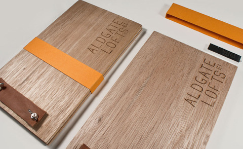
Aldgate Lofts property brochure – produced for BMOR
What prompted you to start out on your own?
Without wanting to sound bitter it was getting made redundant for the third time! Admittedly Matt and myself had been freelancing for a year or so as One Trick Pony before my employment was cut short and it couldn’t have happened at a better time as Neil had just approached us with a very exciting offer of a monthly retainer from a fairly sizeable property client so everything fell into place perfectly.
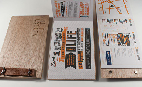
Aldgate Lofts property brochure – produced for BMOR
One Trick Pony is about to become One Big Company – what’s the difference?
Pretty much the name is the only difference…
…you can read the rest of this blog over on the Principal Colour tumblr. Please do visit!
Categories ,Aldgate Lofts, ,Antalis McNaughton, ,Bluewater, ,BMOR, ,Challenger Offset, ,Colorset, ,Dave Uprichard, ,Die-cut, ,Fenner Paper, ,Foiled, ,Hampstead Heath, ,Liam Gallagher, ,Matt Bishop, ,O’Dear, ,One Big Company, ,One Trick Pony, ,Point Blank, ,Portland Associates, ,Pretty Green, ,principal colour, ,Ted Baker
Similar Posts:
- Music Listings
- Colchester School of Art, Design and Media: Ba Fashion and Textiles 2011 Graduate Fashion Week Review
- Bernard Chandran Interview
- Moshi Moshi: Matt & Kim/ Best Fwends
- Pretty Rubbish: Interview with the eco-couture company, devoted to making bespoke items of recycled fashion


