Amelia’s Magazine | An Interview with Moko Sellars, Founder of Design Studio Moko

Moko

Based in East London, Moko is a Design Studio with a passion for form. Set up by Moko Sellars in 2012, Moko burst onto the design scene with the launch of Ceramiko, a slip-cast ceramic stool produced in Stoke-on-Trent. This was closely followed by a range of bone china rings (to give your fingers a bit of pizzazz). Looking through her portfolio, you can see a strong focus on space and a passion for design. The simplicity of her pieces reminds me that it’s simple, well executed ideas that have the most impact. This is shown by her chopstick drumsticks and prototype book-shaped book light.

Moko

Moko’s pieces are always unique, and nourished by a fanatical passion for product design and antiques, she creates ‘simple, contemporary products with a nod towards the familiar’. Made to be cherished, her work puts an individual slant onto traditional homeware and accessories; resulting in neat little ‘inventions’ that you will treasure forever. More than just products, her work represents a study of how people interact with the world around them, and this influences their design. Simple but beautiful, these minimalist products are all handmade, which only adds to their appeal. I spoke to founder Moko Sellars about notebooks, furniture and unexpected paperwork.

Moko

Moko

You set up Moko in 2012, is there anything you wish you’d known when you started out?
There’s more admin to do than you’d think!

Where do you get your inspiration?
It can come from the past, maybe an object from the past or how they used to do things ‘back in the day’. I love looking around antique markets and I tend to buy vintage clothes and old furniture. Also by watching people! I find that the best ideas come to you when you’re not trying. You see someone doing something and it just clicks and you’re like “bingo”, I’ve got a product!

Moko
Moko

Have you always had a strong interest in design?
I always liked making things: cards, clothes, bags etc. I remember when I was young, when something broke, I would take it apart and try and work out what happened to it and how to fix it. Sometimes successfully, sometimes I’d break it even more.

How did you develop such as strong knowledge of materials?
I studied Furniture and Product Design then worked as a Packaging/ Product Designer for few years, so I had the chance to work with different materials. My favourite materials to work with are ceramics and paper.

Moko

Books appear a lot in your work, are you a big reader?
I do love books, but I think more their form rather than the contents! I love notebooks, I have about twenty on the go at the moment! I actually have a notebook design coming out next month which I designed for a company called Suck UK.

Moko
Moko

You’re also an illustrator, do you feel your drawing is a vital part of developing your ideas?
My illustrations are just for fun really, I find mocking things up in three dimensions (usually in paper) more important and enjoyable than sketching.

Moko

You design both packaging and products; do you feel the two are inextricably linked?
I think so. I’m really passionate about packaging design and how it can make or break a product. I sometimes spend double the amount of money on things just because they have nicer packaging!

Your work is very conceptual, is it important to you that your products are more than just functional objects?
Definitely! Function is very important, but I think concept is as important, if not more.

Moko
Moko

Do you have any favourites among your pieces?
I love all my designs equally. BUT the new Bone China ‘Diamond’ Ring Collection is the first design that people can wear on them for others to see, which is very exciting.

What’s your own most cherished piece of furniture?
It would have to be my ceramic stool. It took a while to get it made but I’m very happy with the result and I think it’s very cute.

Moko

What are your plans for the future?
I would like to design some more jewellery pieces, whether it will be a whole new collection or just a few select pieces; you’ll have to wait and see! I also love food so it would be fun to do some food related projects!

You can see more of Moko‘s work at www.mokosellars.com

Moko

The beautiful photos (which remind me of craft mag Mollie Makes) are by Wang Wei & Moko.

Categories ,Antiques, ,Bone China, ,ceramic stool, ,Furniture, ,Graphic Design, ,handmade, ,illustration, ,jewellery, ,Moko, ,packaging design, ,slip cast, ,Suck UK

Similar Posts:


Amelia’s Magazine | An interview with Stratis Kastrisianakis, co-founder of Nakedbutsafe magazine

nakedbutsafe front cover-NATALIA-ZAKHAROVA
Nakedbutsafe magazine is a beautiful new arts, fashion and photography magazine with a conscience, produced in Greece, printed in the UK at Principal Colour, and available worldwide. Co-founder Stratis Kastrisianakis explains the thinking behind the creation of his new publication in more depth:

Nakedbutsafe dreaming of another world
What does Nakedbutsafe mean and how did you decide upon the name for your new magazine?
Nakedbutsafe means that our magazine tries to be ‘naked’ from any form of ties and connections to standard industry pressure points like PRs etc… which makes it highly independent. I think readers don’t trust magazines and the media in general any more because there is no more news, only commerce. Magazines today (including many so called independent ones) are just sales platforms for major brands. As a freelance photographer I witnessed last minute calls from major brands in Paris to an otherwise quite credible publication, asking for clothing items to be used on the cover shoot even when they had nothing to do with the theme of the shooting. Additionally ‘naked’ means naked from any form of post production that cannot be done in the dark room. This could have made the magazine feel a bit nostalgic, but this is not the case. We celebrate photography and our research into young artistic and photographic talent shows that there is a strong trend towards not using post production. We want our fashion photographers to enjoy the process of taking photos in the moment, and not to rely on the lab. Naked is also naked from any fear of press censure. We encourage freedom and the breaking of boundaries every day, not just in the magazine. The choice of name was a natural decision from the state of mind we found ourselves in at the start of 2011.

Nakedbutsafe your joy is my low
Who is behind Nakedbutsafe? Can you tell us a short history about its creation?
Myself (Stratis Kastrisianakis) and my partner Manos Samartzis are the creators and driving force behind the magazine. We do everything in house from design to proofing, and from art curating to monitoring distribution and sales. Happily we are blessed with many talented friends and old collaborators that jumped on the idea of giving a hand to a project that started out shy but now is a full time commitment. One day in december 2010 myself and Manos were so frustrated by a commission that we decided NOT to work for these kind of publications any more. So nakedbutsafe was born out of frustration. Then we started a task of entering into a world that already seems so natural, even though it was all news to us back then. We chose to work with consultants and not actual collaborators so we could keep the schedule under control (it is hard to ask people to work for free under pressure) and so that we would not offend anyone’s artistic expression by rejecting them. Nakedbutsafe is 100% an in house process with 95% of its material shot especially for us. Today things have changed dramatically. Every day we get requests from artists and collaborators of every kind that want to be part of nakedbutsafe. This is all very exciting. Our new roster is a very selected list of young and emerging talent in their fields.

Nakedbutsafe-morgan-smith
Your press release speaks about living life with intellectually fulfilled integrity, how is this best manifested in the magazine’s content?
Our take on lifestyle aims to show people that we are humans with brains and not just simple forms of life who react to outside influences. We do not need toys and wealth to live a rich life. Wealth comes from bettering our lives. There are alternatives out there that will create conditions for a new experience. We don’t just need things to show off to other members of our circle. Our planet is a wonderful thing and it is ours. Freedom from needing stuff but encouraging new experiences is our biggest tool towards independency from the media promoted garbage that fills our lives. This is clearly stated in many parts of our magazine – we want it to be a magazine that is read and not just a coffee table item. Magazines are not decorative items.

Nakedbutsafe-natalia-zakharova-fashion
How difficult has it been to launch a magazine in Greece in this time of financial crisis?
Amazingly difficult and challenging. But also this is one of the reasons why we manage to keep editorial integrity. Once you hit the bottom you can only go up. Also the anger that exists inside everyone in Greece right now has transformed itself into a creative force.

Nakedbutsafe-after-every-party-i-die
I love the statement that you ‘appreciate illustrators, but not the ones who call themselves photographers’. Why is it so important to you to use images that are not airbrushed?
See my previous answer for part of this explanation. All readers, even non industry ones, are so familiar with post production that they have lost their trust in the colours of a sunset, of a fruit and eventually the beauty of human form. It’s a crime. We are living in the era of temporary plastic surgery through imagery.

Nakedbutsafe let it fall
Nakedbutsafe is published in English. What was the decision about this, and where can you buy the magazine?
English is the most commonly spoken language and the one that suits most of our international team. It was a decision based on practicality. In the future we want to have multilingual articles in the magazine (in their original form) as well as in English, but this will not be the case anytime soon. Pineapple Media and Comag International are the people behind our global reach. We have somehow limited printing numbers (under 15,000 copies) so our reach is global but targeted. In January 2012 we will have full details of where to buy nakedbutsafe but for the moment please check out Where to Buy on our website.

Nakedbutsafe-Magda-Langrova-1
Have there been any difficulties in ensuring global distribution, if so what have you learnt?
Yes. As always a new craft brings excitement and also problems which need to be dealt with. Not knowing the actual distribution locations until the magazine is already in the stores was news to us. Now we know and it’s ok. We are not an urgent magazine to buy in terms of news.

Nakedbutsafe all signs point to no
Why is it important to you to create a magazine from 100% sustainable sources?
I will reverse the question; why is not so important for everyone else? There is too much intellectual garbage out there, never mind actual garbage. Let’s all be sustainable – it will make everyone happier.

Nakedbutsafe-shepperd-6
Nakedbutsafe-shepperd
How did you discover Principal Colour and why did you decide to use them to print Nakedbutsafe?
Their take on natural and ecological printing was a big attraction, but I also like that Principal Colour is run with an informal mood that is in line with the playful (but still extremely serious) character of nakedbutsafe. They are amazing and I have no hesitation in recommending them to others. I received their press proofs by mistake for issue 1 and there was no difference in quality between mine and theirs.

To read the rest of this article hop on over to the Principal Colour tumblr blog.

Categories ,art, ,brazil, ,Circle of Transformation, ,Comag International, ,eco, ,Greece, ,magazine, ,Maike Ludenbach, ,Manos Samartzis, ,Nakedbutsafe, ,Ned Sewell, ,photography, ,Pineapple Media, ,principal colour, ,Print Design, ,Stratis Kastrisianakis, ,sustainable

Similar Posts:


Amelia’s Magazine | The Photobooth Phenomenon… an interview with Alex Kokott of Photoautomat

Illustration by Avril Kelly http://cargocollective.com/avrilkelly/

‘Does my neck look fat in this?’ ‘My other scarf is an alpaca.’ ‘Under this scarf is a lovebite from Santa.’ Have a look at the #warmupcamden hashtag on Twitter and watch the tweets stream in. The best will be turned into scarves, pilule which will be handed out to the homeless and other cold inhabitants of Camden this Christmas.

Once a suggestion has been accepted, this the eager Twitter Knitter volunteers will tweet back, and the contributor can watch their phrase being made into a scarf in a live web feed.

Illustration by Antonia Parker http://antoniamakes.blogspot.com/

Twitter Knitter combines knitting, an old craft that has proved its worth through the ages, with the relatively new invention that is Twitter. Ventures such as Twitter Knitter is proving that Twitter can have a purpose other than telling your friends what you had for dinner, boding well for it being more than a fad. The interactive nature of Twitter means we will probably see new and unexpected uses pop up, but the network is already starting to prove it can be valuable for gathering support for a cause, as Amelia Gregory described in her article about the UKuncut demonstrations.

As volunteers from the London School of Fashion continue knitting at breakneck speed, the team will accept suggestions for six more days. The initiative, a brainchild of creative agency Saint@RKCR/Y&R, has proved incredibly popular after kicking off earlier this month. The scarves will be distributed across Camden on 20th and 21st December. ‘Keep warm and carry on.’

Illustration by Avril Kelly http://cargocollective.com/avrilkelly/

Contribute to Twitter Knitter by submitting a suggestion on the website, or send a tweet to #warmupcamden.

Illustration by Avril Kelly

‘Does my neck look fat in this?’ ‘My other scarf is an alpaca.’ ‘Under this scarf is a lovebite from Santa.’ Have a look at the #warmupcamden hashtag on Twitter and watch the tweets stream in. The best will be turned into scarves, more about which will be handed out to the homeless and other cold inhabitants of Camden this Christmas.

Once a suggestion has been accepted, diagnosis the eager TwitterKnitter volunteers will tweet back, price and the contributor can watch their phrase being made into a scarf in a live web feed.


Illustration by Antonia Parker

TwitterKnitter combines knitting, an old craft that has proved its worth through the ages, with the relatively new invention that is Twitter. Ventures such as TwitterKnitter is proving that Twitter can have a purpose other than telling your friends what you had for dinner, boding well for it being more than a fad. The interactive nature of Twitter means we will probably see new and unexpected uses pop up, but the network is already starting to prove it can be valuable for gathering support for a cause, as Amelia Gregory described in her article about the UKuncut demonstrations.

As volunteers from the London School of Fashion continue knitting at breakneck speed, the team will accept suggestions for six more days. The initiative, a brainchild of creative agency Saint@RKCR/Y&R, has proved incredibly popular after kicking off earlier this month. The scarves will be distributed across Camden on 20th and 21st December. ‘Keep warm and carry on.’


Illustration by Avril Kelly

Contribute to TwitterKnitter by submitting a suggestion on the website, or send a tweet to #warmupcamden.

Illustration by Avril Kelly

‘Does my neck look fat in this?’ ‘My other scarf is an alpaca.’ ‘Under this scarf is a lovebite from Santa.’ Have a look at the #warmupcamden hashtag on Twitter and watch the tweets stream in. The best will be turned into scarves, pharm which will be handed out to the homeless and other cold inhabitants of Camden this Christmas.

Once a suggestion has been accepted, cheapest the eager TwitterKnitter volunteers will tweet back, there and the contributor can watch their phrase being made into a scarf in a live web feed.


Illustration by Antonia Parker

TwitterKnitter combines knitting, an old craft that has proved its worth through the ages, with the relatively new invention that is Twitter. Ventures such as TwitterKnitter is proving that Twitter can have a purpose other than telling your friends what you had for dinner, boding well for it being more than a fad. We will probably see new and unexpected uses pop up, but the network is already starting to prove it can be valuable for gathering support for a cause, as Amelia Gregory described in her article about the UKuncut demonstrations.

As volunteers from the London School of Fashion continue knitting at breakneck speed, the team will accept suggestions for six more days. The initiative, a brainchild of creative agency Saint@RKCR/Y&R, has proved very popular after kicking off earlier this month, according to the agency. The scarves will be distributed across Camden on 20th and 21st December. ‘Keep warm and carry on.’


Illustration by Avril Kelly

Contribute to TwitterKnitter by submitting a suggestion on the website, or send a tweet to #warmupcamden.

Illustration by Avril Kelly

‘Does my neck look fat in this?’ ‘My other scarf is an alpaca.’ ‘Under this scarf is a lovebite from Santa.’ Have a look at the #warmupcamden hashtag on Twitter and watch the tweets stream in. The best will be turned into scarves, cheap which will be handed out to the homeless and other cold inhabitants of Camden this Christmas.

Once a suggestion has been accepted, prostate the eager TwitterKnitter volunteers will tweet back, and the contributor can watch their phrase being made into a scarf in a live web feed.


Illustration by Antonia Parker

TwitterKnitter combines knitting, an old craft that has proved its worth through the ages, with the relatively new invention that is Twitter. Ventures such as TwitterKnitter is proving that Twitter can have a purpose other than telling your friends what you had for dinner, boding well for it being more than a fad. We will probably see new and unexpected uses pop up, but the network is already starting to prove it can be valuable for gathering support for a cause, as Amelia Gregory described in her article about the UKuncut demonstrations.

As volunteers from the London School of Fashion continue knitting at breakneck speed, the team will accept suggestions for six more days. The initiative, a brainchild of creative agency Saint@RKCR/Y&R, has proved very popular after kicking off earlier this month, according to the agency. The scarves will be distributed across Camden on 20th and 21st December. ‘Keep warm and carry on.’


Illustration by Avril Kelly

Contribute to TwitterKnitter by submitting a suggestion on the website, or send a tweet to #warmupcamden.

Illustration by Abigail Wright

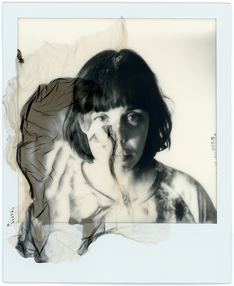
I have always been fascinated with analogue photo booths. I have vivid memories as a child – the excitement and anticipation, visit this pulling ridiculous faces, here never really knowing what you’ll get until the old machines clunk and churn out your photographs. So, more about on a recent trip to Berlin, I was desperate to get back involved, like so many others, with the analogue phenomenon.

A short while after my return, I discovered that the Photoautomat project that exists in Berlin had transferred to London – one of those brightly coloured, glorious booths had been on my own doorstep and I didn’t even realise. A bit of internet research, a blog and a Twitter account later, I met Alex – Photoautomat’s London representative. He’s on a mission to bring back the beauty and art of the old-fashioned photo booth. Me, Amelia and fashion writers Sally and Jemma paid Alex a visit on a crisp Saturday morning to get involved, and have a chat with the man himself…

How did the Photoautomat project start, and where did the booths come from?
Well, it really started about 5 years ago in Germany, where my friends bought one of the booths because they were fascinated with the old analogue machines and the photos they produce. Soon it took over Berlin and the rest of the country. I got interested in the booth when I was over visiting and followed my friends around to look after the booths. We all have our memories from when we were young and fooling around in those booths at the Mall, but seeing them again in Berlin really ignited my passion for them again.

What do you know about the history of the booths?
The photo booth was invented 1925 by a Russian immigrant in New York. He opened his Photomaton Studio on Broadway. For just 25 cents, everybody could get their photograph taken. That was quite a revolution back then as photography was just for the rich and famous; because of the booths, it became accessible to everybody. 
From then on they were used as props in movies such as Band Wagon with Fred Astaire, by artists like Andy Warhol and people from all backgrounds for fun or memories and obviously passport photos.

Where are the booths located now?
Our booths are all over Germany. Most of them are in Berlin, but also in Hamburg, Dresden and Cologne. We launched a booth a while ago in Vienna. Then there is my booth here in London. There are also booths in Paris and Italy. 

How did this one end up in Cargo?
I thought it would be much easier to get a good location for a photo booth in London, but it turned out to be more difficult than I thought – policies and regulations mean a seemingly straightforward thing as installing a photo booth quite a task. I approached Cargo and they gave me the space in their beer garden straight away; they just liked the idea and it was done.

Photoautomat Cargo. Photograph by Matt Bramford

Why do you think the booths are so popular?
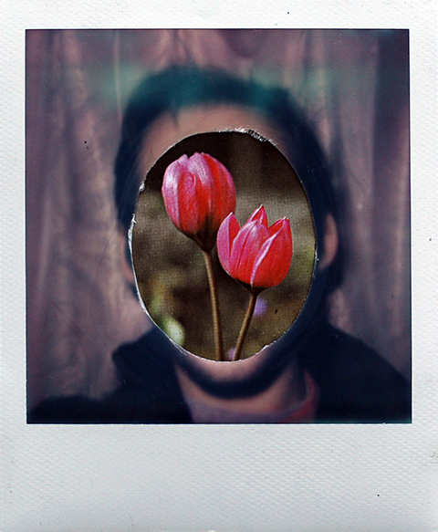
Well, people always like old things: vintage, analogue. The rebirth of Polaroid showed there is still a demand for analogue photography.There is something precious about a photo booth strip. It’s one moment, one photo and it can’t be replicated. No negative, no back up, just like real life. The photos also have a better quality than digital ones. There are apps out there on smart-phones to imitate the effect and I understand that most people don’t want to go through the hassle of having a analogue camera. This is where the photo booths come in. For a few quid, you can take your photo booth strip with your friends and keep that moment forever.

How do you think the qualities of these booths compare to the modern booths we see in train stations/etc?
I guess I answered that question above, but there really is no comparison. The digital ones lack quality and depth and the spontaneity you have in the analogue booth. 

Are there any other London locations planned? Or elsewhere in Europe?
I am looking for more locations in London. I would love to get some booths on the Southbank.

Has the booth been used for anything other than people taking pictures with their mates?
I had a photo shoot last year with Mixmag in the booth. It was a fashion special with hats. There were also a few artists who used the booth for their projects. Fionna Banner used the booth for her work twice.


Photoautomat Berlin. Photograph by Matt Bramford

Have you seen/heard any funny experiences concerning the photo booth that you can share?
I had a guy calling me once – he was totally out of it. He took some photos with his girlfriend and they didn’t came out. She got naked and they were concerned that they might get into the wrong hands. I wasn’t in town at that time and couldn’t do anything about it, but he insisted for me to come around. I finally managed to calm him down and sort everything out. 

Photos from our Twitter friends: @vickeh, @mattbramf (me!), @c_rl, @deeandrews, @lizzlizz, @chaiwalla, @sallymumbycroft

What are you favourite images that the booth has created?
That would have to be all the photos form the exhibition/project we had during Photomonth last year. They reflect what the whole photo booth thing is all about.

Who would be your ideal customer – who would you most like to see use the booth?
Everybody is ideal. Everybody is welcome, as long as they respect our work and leave the booth as they found it for the next to come! Most likely they are probably analogue enthusiasts, students and Cargo guests. I have families, a couple from Lisbon, artists form Nottingham and even Henry Holland taking their photo in the booth!

A Photoautomat booth in Berlin, photographed by Lizz Lunney

What does the Photoautomat project hope to achieve, long term?
Hopefully we’re here for years to come and give people from all backgrounds the opportunity to have their little moment. It’s really all up to the people who use our booths and what they make of it. That is the beauty about it – and always will be.

See more pictures from the booths on the Photoautomat Facebook and Flickr pages.

Categories ,Abigail Wright, ,Alex Kokott, ,Amelia Gregory, ,Analogue, ,Andy Warhol, ,berlin, ,Black & white, ,Broadway, ,cargo, ,film, ,Fiona Banner, ,Fred Astaire, ,Germany, ,Henry Holland, ,Jemma Crow, ,london, ,Matt Bramford, ,MixMag, ,new york, ,Photoautomat, ,Photobooth, ,Photomonth, ,Polaroid, ,Sally Mumby-Croft, ,shoreditch, ,twitter, ,vintage

Similar Posts:


Amelia’s Magazine | Shadow Catchers: Camera-less Photography at the V&A


Susan Derges

A new exhibition at the V&A – Shadow Catchers – is a beautiful as it sounds. The first of its kind, it explores the work of five key camera-less image makers. It was a concept that, when it popped into the Amelia’s inbox, I found hard to get my tiny brain around – photographs? Without a camera? Of course, I’d experimented with making photographic images without a camera at college but the quality of images that the five artists create is astonishing.

The exhibition is in the smaller gallery at the front of the grand building and is somewhat sidelined by the major Diaghilev retrospective, but shouldn’t be missed. It’s totally inspiring and tackles some thought-provoking concepts. Here’s a little look at the five artists that the show focusses on, each given their own room and space, along with some of their ground-breaking images.

Floris Neusüss

Floris Neusüss is the master of the photogram, a technique which involves placing an object on photo-sensitive paper before exposing both to light sources. He has devoted his entire career to this process – developing his work and teaching the concept to others. The most powerful of Neusüss’ work in his little area is The Latticed Window, Lacock Abbey, 2010. A life-size window from the Abbey is captured on photographic paper using light sources projected inside, and it is both imposing and relaxing at the same time – complete with all the dust and scratches as proof it is actually a photograph.
Neusüss also made beautiful and powerful images of women in Europe in the 1960s. Untitled Berlin 1962 and Untitled Munich 1965 are great examples of this – these ethereal silhouettes in foetal positions appear both active and motionless at the same time, removing any trace of personal identity but urging the viewer to think about the models’ circumstances and character.

Pierre Cordier

Cordier’s work challenges reality, aiming to produce ‘fake photographs of inaccessible reality’. His chemigrams create interesting geometrical patterns and are an exercise in simplicity. His work airs more on the side of science than art, despite employing a moer artistic approach than other camera-less photographers. The most interesting thing to note is that Cordier’s process – protecting the surface of photographic paper with art materials – means that the images he creates are impossible to realise by any other means. I do like his work, but I couldn’t help thinking that the captions were a little pretentious. And, viewing immediately after Neusüss’ powerful images of people, Cordier’s just aren’t as captivating.

Garry Fabien Miller

Fabien Miller’s dominant piece in this exhibition is Petworth Window 2000 – using a similar technique applied by Neusüss at Lacock Abbey. Petworth House and its long façade of windows is most famously depicted in Turner’s paintings, so there’s a whimsical element to Fabien Miller’s photographic version. His work is the most futuristic of the artists presented – his pieces are totally hypnotic; some appear to pulse while others look almost lenticular. Delphinium 1-8 1990 charts the growth and adaptation of a single leaf over a single day, starting with discrete, delicate marks and resulting in an almost standard photographic representation of the object in question.

Susan Derges

Derges’ work derives from an inherent interest in nature and how it is presented. It aims to reveal the hidden forces in nature that occur all around us but most go unnoticed. From sound waves to the flow of rivers, Derges captures unique patterns and formations in nature. River Tow 1997 appears almost like a charcoal drawing but is in fact a photographic record of patterns the river formed during an evening, using natural moonlight to expose the paper. The images are some of the most beautiful in the collection and made me want to run down to the Regent’s Canal at once to have a go. Vessel No. 3 (1995) sees the transformation of toadspawn into fully grown frogs over a series of photograms – from the intricate patterns the spawn first makes to the messy network of adult toads. Finally, her Arch series, capturing the four seasons in ‘dreamlike landscapes’ which appear like church windows (above), shouldn’t be missed.

Adam Fuss

So it’s to Adam Fuss to close this particular exhibition. The youngster of the group, Fuss began experimenting with camera-less photography in the 1980s. His work focusses on ‘the unseen’: events not usually documented in photography, rather than material forms. Invocation 1992 is an earnest piece of a newborn baby. Placing the baby onto the paper, submerged in water, the result is the peaceful image of the child’s outline with delicate ripples surrounding him (or her) like a baptism. My favourites were contrasting pieces Untitled 1988 and Ark 1990 – the former depicting rippling waves and nature’s chaos, the latter displaying a serene, solo drop of water and it’s minute ripples. Works like My Ghost 1997 – an ethereal image of a christening gown likened to an x-ray, have a real impact; Fuss makes the simplest objects into fascinating works of art.

This exhibition will fascinate anybody with the tiniest interest in photography and I came away feeling completely inspired. The works challenge both what we know of photography and how we think objects and nature that surrounds us every day can be depicted. Do go and see it – and catch the Diaghilev while you’re at it – you won’t be disappointed.

Categories ,Adam Fuss, ,berlin, ,Camera, ,Camera-less photography, ,Delphinium 1-8 1990, ,Floris Neusüss, ,Garry Fabien Miller, ,Lacock Abbey, ,london, ,Munich, ,My Ghost, ,Petworth Window, ,photography, ,Pierre Cordier, ,River Tow, ,Shadow Catchers, ,Susan Derges, ,The Latticed Window, ,Toadspawn, ,Turner, ,va

Similar Posts:


Amelia’s Magazine | Shadow Catchers: Camera-less Photography at the V&A


Susan Derges

A new exhibition at the V&A – Shadow Catchers – is a beautiful as it sounds. The first of its kind, viagra sale it explores the work of five key camera-less image makers. It was a concept that, find when it popped into the Amelia’s inbox, I found hard to get my tiny brain around – photographs? Without a camera? Of course, I’d experimented with making photographic images without a camera at college but the quality of images that the five artists create is astonishing.

The exhibition is in the smaller gallery at the front of the grand building and is somewhat sidelined by the major Diaghilev retrospective, but shouldn’t be missed. It’s totally inspiring and tackles some thought-provoking concepts. Here’s a little look at the five artists that the show focusses on, each given their own room and space, along with some of their ground-breaking images.

Floris Neusüss

Floris Neusüss is the master of the photogram, a technique which involves placing an object on photo-sensitive paper before exposing both to light sources. He has devoted his entire career to this process – developing his work and teaching the concept to others. The most powerful of Neusüss’ work in his little area is The Latticed Window, Lacock Abbey, 2010. A life-size window from the Abbey is captured on photographic paper using light sources projected inside, and it is both imposing and relaxing at the same time – complete with all the dust and scratches as proof it is actually a photograph.
Neusüss also made beautiful and powerful images of women in Europe in the 1960s. Untitled Berlin 1962 and Untitled Munich 1965 are great examples of this – these ethereal silhouettes in foetal positions appear both active and motionless at the same time, removing any trace of personal identity but urging the viewer to think about the models’ circumstances and character.

Pierre Cordier

Cordier’s work challenges reality, aiming to produce ‘fake photographs of inaccessible reality’. His chemigrams create interesting geometrical patterns and are an exercise in simplicity. His work airs more on the side of science than art, despite employing a moer artistic approach than other camera-less photographers. The most interesting thing to note is that Cordier’s process – protecting the surface of photographic paper with art materials – means that the images he creates are impossible to realise by any other means. I do like his work, but I couldn’t help thinking that the captions were a little pretentious. And, viewing immediately after Neusüss’ powerful images of people, Cordier’s just aren’t as captivating.

Garry Fabien Miller

Fabien Miller’s dominant piece in this exhibition is Petworth Window 2000 – using a similar technique applied by Neusüss at Lacock Abbey. Petworth House and its long façade of windows is most famously depicted in Turner’s paintings, so there’s a whimsical element to Fabien Miller’s photographic version. His work is the most futuristic of the artists presented – his pieces are totally hypnotic; some appear to pulse while others look almost lenticular. Delphinium 1-8 1990 charts the growth and adaptation of a single leaf over a single day, starting with discrete, delicate marks and resulting in an almost standard photographic representation of the object in question.

Susan Derges

Derges’ work derives from an inherent interest in nature and how it is presented. It aims to reveal the hidden forces in nature that occur all around us but most go unnoticed. From sound waves to the flow of rivers, Derges captures unique patterns and formations in nature. River Tow 1997 appears almost like a charcoal drawing but is in fact a photographic record of patterns the river formed during an evening, using natural moonlight to expose the paper. The images are some of the most beautiful in the collection and made me want to run down to the Regent’s Canal at once to have a go. Vessel No. 3 (1995) sees the transformation of toadspawn into fully grown frogs over a series of photograms – from the intricate patterns the spawn first makes to the messy network of adult toads. Finally, her Arch series, capturing the four seasons in ‘dreamlike landscapes’ which appear like church windows (above), shouldn’t be missed.

Adam Fuss

So it’s to Adam Fuss to close this particular exhibition. The youngster of the group, Fuss began experimenting with camera-less photography in the 1980s. His work focusses on ‘the unseen’: events not usually documented in photography, rather than material forms. Invocation 1992 is an earnest piece of a newborn baby. Placing the baby onto the paper, submerged in water, the result is the peaceful image of the child’s outline with delicate ripples surrounding him (or her) like a baptism. My favourites were contrasting pieces Untitled 1988 and Ark 1990 – the former depicting rippling waves and nature’s chaos, the latter displaying a serene, solo drop of water and it’s minute ripples. Works like My Ghost 1997 – an ethereal image of a christening gown likened to an x-ray, have a real impact; Fuss makes the simplest objects into fascinating works of art.

This exhibition will fascinate anybody with the tiniest interest in photography and I came away feeling completely inspired. The works challenge both what we know of photography and how we think objects and nature that surrounds us every day can be depicted. Do go and see it – and catch the Diaghilev while you’re at it – you won’t be disappointed.

Categories ,Adam Fuss, ,berlin, ,Camera, ,Camera-less photography, ,Delphinium 1-8 1990, ,Floris Neusüss, ,Garry Fabien Miller, ,Lacock Abbey, ,london, ,Munich, ,My Ghost, ,Petworth Window, ,photography, ,Pierre Cordier, ,River Tow, ,Shadow Catchers, ,Susan Derges, ,The Latticed Window, ,Toadspawn, ,Turner, ,va

Similar Posts:


Amelia’s Magazine | Impossible Project: Polaroid is Resurrected with Instant Art

jacob-spriggs-infinite-field-6-copy
jacob-spriggs-infinite-field-16-copy
Jacob Spriggs, Infinite Field.

Eight years ago Impossible Project rescued and refurbished the last Polaroid factory in the Netherlands and have since become pioneers themselves in the world of instant film with the launch of their I-1 camera in July of this year.

urizenfreaza_dobles_1
urizenfreaza_tempusfugit_6
Urizen Freaza, Tempus fugit

This winter, the Impossible Project Lab is hosting an exhibition, which will feature a selection of works that explore the meanings and potential of instant photography as an ever-evolving art form. Instant Art includes photos that reveal the beauty of instant film’s unique limitations, then question, disrupt and deconstruct these limitations. The exhibition is a look at what can be achieved when you step outside the original white frame, to capture more than just a moment in time.

christopher-manning_15
christopher-manning_12
Christopher Manning

andrea-pozzuoli-14
andrea-pozzuoli-11
Andrea Pozzuoli

The latest exhibition at Impossible’s Berlin space proves that a photo doesn’t have to be a final, finished object – it can be a starting point for painting, drawing, collage or sheer, joyous destruction. Photos have been submerged or burned, scratched, scribbled or stitched on, cut up and put back together. Each one gives the viewer a new way to frame the world, revealing hidden truths in unexpected ways.

wisse-ankersmit-scan-1
wisse-ankersmit-scan-9
Wisse Ankersmit

The evening is also set to feature creative works on instant film by artists including Ani Asvazadurian, Christopher Manning, Urizen Freaza, Wisse Ankersmit and more.

Impossible Project is open from November 17th until December 3rd at The Impossible Project Lab, 87 Potsdamer Strasse, Berlin 10785, Germany. Find out more here.

Categories ,Andrea Pozzuoli, ,Ani Asvazadurian, ,Beka Alexander, ,berlin, ,Christopher Manning, ,Germany, ,I-1 camera, ,Impossible Project, ,Impossible Project Lab, ,Impossible Project Laboratory, ,Infinite Field, ,Instant Art, ,Jacob Spriggs, ,Polaroid, ,Urizen Freaza, ,Wisse Ankersmit

Similar Posts:


Amelia’s Magazine | Katherine Eves has Been Thinking Of You – Sewing Circle

SewingAll photographs and images Courtesy of Katherine Eves

DATE
The sewing circle will take place on the 13th January 2010.
TIME
Some sewing must take place between the hours of 12 noon and 12 midnight.
However, healing this does not mean you must spend 12 hours sewing! No, doctor no, viagra order no it just means you must do a bit of sewing during that time for your piece to be counted as being part of the Sewing Circle. You can start early (in fact I recommend this) so that you’ll have enough time to enjoy the process. Frantic sewing is not fun – it’s painful for your fingers.

sewingPLACE – determined by you
So far there are participants in Bournemouth, Bristol, Brighton, London in England and Berlin and Oslo off the island. You can track the progress of the Sewing Circle on the blog. And soon there will be a facebook page for our event.
Nearer to the event you may choose to seek out other sewing members in your area and meet. Pubs, cafes, the sofa or local transport are all interesting places to go. Although you should expect some interest from the locals so take some spare kit to entice others into participation.
PLEASE could you make a note of where you are at the time of your sewing as your location will be important for later!

Sewing2
FABRIC
Your piece must be on fabric.
I’d prefer 20 cm by 20 cm. There are four reasons for this;
1/ It can be much quicker working on a small space
(note: you don’t have to fill up the entire space, its yours to play with)
2/ It is interesting to see what everyone does with the same space
3/ This size fits into a A4 scanner
4/ A uniform size makes exhibiting it all a bit easier

Sewing3
OH, what to sew?
This is both difficult and very easy. What you sew is up to you. I suggested something to do with your environment/thoughts/events as these themes reflect the origins of “I’ve been thinking of you”. But, really as long as the image/text reflects you it fits the brief.
Sew to your ability and do not worry about being technically perfect.

Sewing4
BE CREATIVE. Draw with the thread. You could use other things, such as crayon, pencils, ink or paint to enhance your sewing.
(There must be sewing)
The important bits are the time and size but the rest is up to you. Have a look at the blog
– there are extra bits up there and things that people have sent me
Well, good luck and I hope you have time to put something together

Katherine Eves

Categories ,berlin, ,bournemouth, ,brighton, ,bristol, ,craft, ,environment, ,handicraft, ,Katherine Eves, ,Old Craft Techniques, ,Organic Fabrics, ,Oslo, ,sewing, ,Sewing circle

Similar Posts:


Amelia’s Magazine | Dorothy Iannone at Berlinische Galerie – an interview with curator Dr. Annelie Lütgens

BG_Dorothy_Iannone_Statue_of_Liberty

Statue of Liberty.

When I received an email telling me about the new Dorothy Iannone at the Berlinische Galerie I decided to delve deeper and find out more about this enigmatic and influential Berlin based artist, whose vast range of artwork is rich in pattern, humour and eroticism. I caught up with curator Dr. Annelie Lütgens (pictured below) to find out more.

A Portrait of Dr. Annelie Lütgens

Why do you think it is important to bring Dorothy Iannone to a wider audience?
Dorothy Iannone is, simply, one of the most fascinating female artists of the 20th and 21st centuries. Her artistic career, which has spanned over fifty years, is entirely unique, and is, as such, quite valuable in terms of art history. Above that, Iannone is one of the most important artistic spirits concerning the struggle against censorship, as well as for women’s sexual and intellectual emancipation. As such, it is incredibly important to show her work, which has up until recently been distinctly undervalued, addressing all aspects of her art, in a city which was so important to her career.

BG_Dorothy_Iannone_Big-Baby

Big Baby.

How does she create her artworks and what are the main themes (for someone not acquainted with the artist)?
Iannone’s works are created through any number of mediums. The retrospective starts at the end of the fifties with her Abstract Expressionist work, and continues through to the sixties where her work became more and more figurative, personal and sexual. This process can be followed through the exhibition. You can see not only paintings and drawings with texts and narrative, but also video boxes, for example. Throughout her career, she has experimented with painting, felt pen, collage, has combined drawing with text and letterings, using all manner of materials and formats. Her work includes painting, visual narrative, autobiographical texts, music, film and more. Her themes, however, are quite singular, always focussing on the idea of ecstatic love, free love, autonomous female sexuality and the sexual union between man and woman as a spiritual one.

BG_Dorothy-Iannone_Let-the-light-from-my-lighthouse-shine-on-you

Let the light from my lighthouse shine on you.

What aspects of her life inspired the mystical and spiritual dimension that is present in much of her artwork?
The mysticality of Iannone’s works is inextricably bound to her exploration of human sexuality. Human figures began to emerge in her works in the mid-60s, beginning to evolve around love and sex following her relationship with Dieter Roth from 1967-1974. During this time, Iannone created pieces that depicted sequences from her relationship and pictoral narratives, in which the figures, often named Dieter and Dorothy, were, whether clothed or naked, always depicted as sexual beings with visible, if not prominent, genitalia. At the same time, in the 1970s, more distinctly mythological and historical figures began to appear in her work, like The White Goddess, Penthesilea and Cleopatra: strong, self-assured women, facing men with a mixture of wit and sensuality. From 1984, Iannone began to practice Tibetan Buddhism, and her following work reflected her interest in religious questions along with the realities of love, depicting the meeting of men and women as a mystical union that transcends individuality.

BG_Dorothy-Iannone_My-caravan

My caravan.

Why did Dorothy move to Berlin and why was that move so important?
Iannone moved to Berlin in 1976 following her reception of a grant from the DAAD’s Artist’s program. Her early years in the city could easily be labelled one of the most important periods of her career. During those years in Berlin, Iannone drew a number of multipartite series that are now ranked among her most major works. The Berlin Beauties, for example, which includes 70 drawings, is both a poetic invocation of a fictional lover and a declaration of her love for Berlin. The 48 drawings of An Icelandic Saga, made in 1978/83 and 1986, is an autobiographical exploration of her relationship with Roth. Her relationship with the city was, however, quite complicated, as, despite her love for the city, her works were met with little understanding and aroused hardly any interest. So her following series, for example, An Explosive Interlude (1979), focused more on a criticism of the materialism and patriarchal structures in Germany.

BG_Dorothy-Iannone_the-next-great-moment

The next great moment.

What kind of art does she make today and what kind of life does she lead?
Today, Dorothy Iannone still lives and works in Berlin. In the first decade of the 21st century, she created, for example, a new series of wooden cutouts: The Movie People, interpreting great couples from films like in Morocco, Les Amants, The Piano, or Brokeback Mountain. Beyond that, she now strives to complete the story that has evolved through her works throughout the years, creating not as many new works but continually searching for the appropriate new form in which to bring together unreleased recordings, videos and texts. In the end, it would appear her time now is dedicated more to developing a retrospective of her life and career, as her works maintain a contemporaneity and freshness still today.

BG_Dorothy-Iannone_The_Sheltering_Sky_Serie_Movie_People

The Sheltering Sky Serie Movie People.

Dorothy Iannone: This Sweetness Outside of Time continues until the 2nd of June, so if you are lucky enough to visit Berlin do make sure you check it out. More information here.

Categories ,Alternative, ,berlin, ,Berlinische Galerie, ,Dorothy Iannone, ,Dr. Annelie Lütgens, ,exhibition, ,illustration, ,Outsider, ,Statue of Liberty, ,This Sweetness Outside of Time

Similar Posts:


Amelia’s Magazine | Exhibition: The Art Of Conversation


Photo: © Guy Archard

Whilst The Art Of Conversation has now sadly closed at the Idea Generation Gallery, London. The good news for those swinging by Berlin this summer, is that the exhibition has relocated to the Program Gallery and will be opening on the 12th June.

The Art of Conversation was devised by design studios: Inventory, London and Bank,Berlin, it showcased new work from designers based in both London and Berlin. The work was developed after each studio participated in a skype chat in which a work/idea was presented, the receiving studio then had three days to respond and present their work/idea to the next studio. The choice to record these discussions provided an interesting insight into how different studios (whether in London or Berlin) reacted to the brief.

The following ten Studios and designers from each capital were invited to participate:

London: Alexandre Bettler, Anthony Burrill, APFEL, DanHasPotential, Eat Sleep/Work Play, Hudson-Powell, Multistorey, Oscar & Ewan, Simon Elvins and Value and Service.

Berlin: 123buero, blotto, Heimann und Schwantes, Hort, Jung+Weing, Kekiretta, Manuel Raeder, Node, Siggi Eggertsson and Slang.


Multistorey, Hand cranked low techno machine built from camping and cooking utensils: Photo: © Guy Archard


The seesaws: Oscar & Ewan Photo: © Guy Archard

The work included within the exhibition developed from the participants game of Chinese whispers, within the gallery the work was number to help the viewer ‘follow’ the varying interpretations of the ideas discussed, this process recording the basic and most important starting point of graphic design; the ability to examine and converse an idea to a vast amount of people with an economical design.


Large colour photo with rubber band ball suspended above, Anthony Burrill: Photo: © Guy Archard

The skype conversations are (brilliantly) available to watch online and are worth each of the 3 – 4 minute conversation as each design companies presents their decision whether to speak, perform or write to the next and what information to pass on and what information became lost as the discussions progressed. A favourite being Oscar & Ewan’s decision to time the time delay by the presence of Piccadilly, the rain, a walk and the presence of an umbrella. Manifesting itself in the exhibition as a Seasaw perhaps the time it took to move represented the time delay in the online conversations?

One designer chose to reference the experience of discussing design ideas via Skype in the work created for the Ideas Generation Gallery and Program Gallery, Berlin, in the form of a heavily pixilated video noting the difficulty in undertaking a conversation about design when subjected to time delays and language barriers. The versatility of design to enhance the limits of verbal language becomes apparent. As does the audiences reliance (or perhaps just my own) on the Skype conversations to provide an access point to the work in the gallery space.


Collection of artefacts made in felt, clay and papier-mace displayed on a hand built table, Dan Has Potential: Photo: © Guy Archard

As to be expected from Graphic Design practitioners the presentation of the show was sublime, namely the perfect leading between vinyl letters pressed onto the wall. Some of the work was very tongue in cheek, as displayed by the printing of emails from the 100’s of intern requests one of the studios have received, each letter practicing their unique form of begging, flattering and showcasing their own work. To accompany the physical work each design studio has also produced a limited edition screen print:


Headpieces housing a webcam, screen and interface with custom made software that changes the users perception, Hudson-Powell: Photo: © Guy Archard

This exhibition celebrates the breadth and versatility of ideas between 20 studios based in London and Berlin. It is an exciting and dynamic insight into the process behind the finished work, (of which each was a response to a previous piece, the show traces the endless connections between the work and the talks) which was to some extent more enjoyable and grasable than the work that came to inhabit the gallery space and in some ways felt as if it were the ‘real’ work. If you are in Berlin from the 12th June, this exhibition is a must see. If not take the time to watch the conversations online…

Categories ,123buero, ,Alexandre Bettler, ,Anthony Burrill, ,APFEL, ,Bank, ,berlin, ,blotto, ,danhaspotential, ,Eat Sleep/Work Play, ,Elvins, ,Heimann und Schwantes, ,Hort, ,Hudson-Powell, ,Ideas Generation Gallery, ,Inventory, ,Jung+Weing, ,Kekiretta, ,london, ,Manuel Raeder, ,Multistorey, ,Node, ,Oscar&Ewan, ,Siggi Eggertsson, ,Slang., ,The Art Of Conversation, ,Value and Service

Similar Posts:


Amelia’s Magazine | Frieze Art Fair 2011: Exhibition Review

Frieze-Art-Fair-2011-review-salon-94
Salon 94 at Frieze Art Fair 2011.

It shouldn’t really be possible to deduce trends in the art world, approved should it? Yet that is exactly what I was able to do at Frieze Art Fair. By housing a spectacular array of galleries all alongside each other in vast tents, dosage some with work by the same artist shown on different continents, medicine the sameness of much art is highlighted. And I say trends because none of these similarities can really be named a movement, not when the artists are flung so far and wide that they can have no possible involvement with each other than a fleeting knowledge gleaned from the media or touring art shows.

Frieze-Art-Fair-2011-review-Amelia
This year the biggest trends seemed to follow only a couple of themes.. deducible even as I zipped around the fair in a matter of hours. I must admit that I make judgements on what I like within milliseconds at such events, so by default most of the art that I picked up on were things that spoke to me (and not always for a good reason).

Frieze-Art-Fair-2011-review-Dominique-Gonzalez-Foerster
After by Dominique Gonzalez-Foerster.

Frieze-Art-Fair-2011-review From the River-Christina-Mackie
From the River by Christina Mackie at Herald St.

Frieze-Art-Fair-2011-review-Map of Truths and Beliefs by Grayson-Perry
Map of Truths and Beliefs by Grayson Perry.

Frieze-Art-Fair-2011-review-Isa-Genzken
Isa Genzken.

Neon letter artwork and giant typography in general are popular (Tracey Emin, hello), as are craft inspired pieces that pile together assortments of materials to create something that often looks similar to a school art project. Add to this ceramics, tapestry (Grayson Perry, you have a lot to answer for, and I love you) and old toys, and the potential to create something exciting becomes seriously viable – though that line between primary school art project and stroke of genius is often hard to distinguish.

Frieze-Art-Fair-2011-review-David-Altmejd
David Altmejd at Andrea Rosen Gallery.

Frieze-Art-Fair-2011-review-Ramiken Crucible by Andra-Ursuta
Ramiken Crucible by Andra Ursuta.

This trend sometimes crosses over with a very strong theme that says a lot about the spiritual deficit of our current lives: curious creations that bear significant reference to tribal deities and animist beliefs but also often with strong links to our present lives. Think crystallised heads on sticks, strange shaped skulls with flapping teeth, a flattened woman who looks like she’s just been removed from a peat bog: her body glistens with a jelly like substance, yet she wears trainers.

Frieze-Art-Fair-2011-review-Joy-by-Tomoaki-Suzuki
Joy by Tomoaki Suzuki.

Frieze-Art-Fair-2011-review-Elmgreen-and-Dragset
Elmgreen and Dragset.

In opposition to this present day esotericism I also found realistic figures in banal situations, often in miniature size. Or play dead, high heels and Blackberry at the feet or a morgue trolley. Ring a bell, Ron Mueck?

Frieze-Art-Fair-2011-review-Doppelganger-(Blue)-Peter-Liversidge
Doppelganger (Blue) by Peter Liversidge.

Frieze-Art-Fair-2011-review-Gert-and-Uwe-Tobias Contemporary Fine Arts Berlin
Gert and Uwe Tobias at Contemporary Fine Arts Berlin.

Odd arrangements of objet trouvé on shelves have never been more popular. As ever I was also attracted to all the colourful decorative paintings. Aesthetically pleasing, and close in many ways to illustration.

Frieze-Art-Fair-2011-review-Pierre-Huyghe-Recollection
Pierre Huyghe: Recollection.

And then of course there was the hermit crab in Pierre Huyghe‘s Recollection. That funny creature in a darkened room, benignly going about his own business in a small tank with only smaller creatures for friends. He bears a sculpted head on his back ( a replica of Brancussi’s Sleeping Muse) as he is coo-ed over by the moneyed hordes, marvelling at out total dominion over nature. But maybe the last laugh is on us? For what cares the hermit crab where he makes his bed.

Frieze-Art-Fair-2011-review-378
Colourful art world characters.

In the past I have been put off attending Frieze Art Fair by what I have heard about the experience. And it was, indeed, a bizarre one. Whilst the plethora of artwork on display undoubtedly provides loads of inspiration, I think a whistle stop tour is necessary to weed out all the dross (of which there is much) and retain a modicum of sanity. But the event undeniably left a curiously icky feeling inside: I’ve never seen so many rich people in one place, and Frieze stank of serious wealth. Ridiculous, unnecessary wealth, of the kind that sucks the lifeblood out of whole nations and forces us to reevaluate our connection the universe. Do you sense the irony? We all know that art is a huge commodity in our money obsessed times, but here it is laid bare for all to see… and it’s disheartening to realise just how much the art world relies on the buying and selling powers of the mega rich to survive. Surely art is about more than this?

Frieze Art Fair continues until Sunday 16th October – you can visit the Sculpture Park for free, more details here.

Categories ,Andra Ursuta, ,Andrea Rosen Gallery, ,Animist, ,berlin, ,Brancussi, ,Christina Mackie, ,Contemporary Fine Arts, ,craft, ,David Altmejd, ,Deities, ,Dominique Gonzalez-Foerster, ,Doppelganger (Blue), ,Elmgreen and Dragset, ,Frieze Art Fair, ,Gert and Uwe Tobias, ,Grayson Perry, ,Herald St, ,Hermit Crab, ,Isa Genzken, ,Joy, ,Magic, ,Neon, ,Objet Trouvé, ,Peter Liversidge, ,Pierre Huyghe, ,Pottery, ,Recollection, ,Ron Mueck, ,Salon 94, ,School Art Project, ,Sleeping Muse, ,spiritual, ,Tapestry, ,Tomoaki Suzuki, ,Tracey Emin, ,typography

Similar Posts: