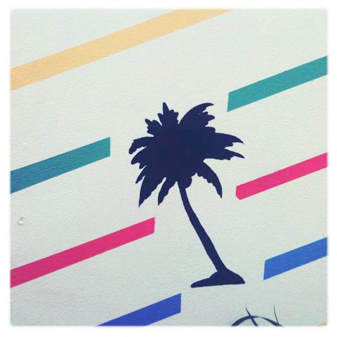
Detail from Dan Woodger.
There was a certain 80s flavour going on at the Brighton Graphic Design and Illustration Graduate Show, story with strong playful graphics in a limited colour range and lots of pastel tones found in abundance. From boys, I might add. It can only mean the 80s are back. As if they ever went away round my gaff…


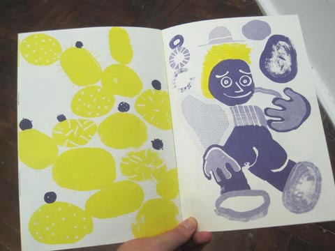


Pat Bradbury had put together some extremely strong images in clashing yellow, purple and reds – again using a cut and paste approach, but also with a strong 80s graphic influence that came through in colours and pattern. He’d also put together some lovely little booklets for purchase. Follow Pat Bradbury on Twitter.


James Hines mounted a series slightly changing images together in a frame. Paradiso. Even the name is 80s sounding!


Dan Woodger had the 80s theme turned up to maximum for his fully realised installation, including striped palm tree wallpaper. Even his business card featured a swirly 80s font. I liked the pastel croc in a frame. Follow Dan Woodger on Twitter.


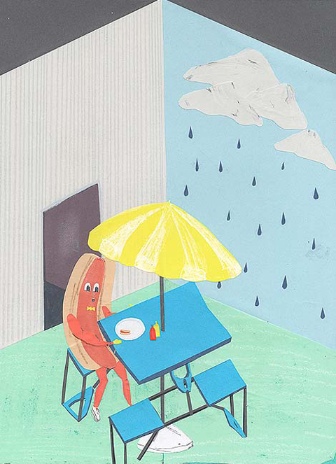
Joseph Prince had put together a remarkable installation – a wonky painted dollhouse triptych. Whilst his main piece was not overtly 80s I think the banana at a picnic table certainly has a hint of the decade.

I loved metallic sign influenced typography from Jerome Caine Miller.
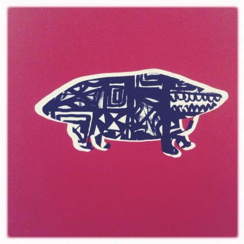


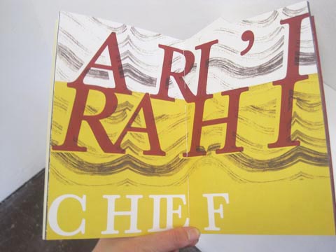


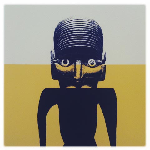
Absolutely adored the very simple but clever work of Grace Coombes. Using a palette of mustard yellows, grey and earthy browns she created a sextet of Tahiti inspired images. Her screenprinted books were a beautiful combination of photo collage and very graphic decorated imagery. 80s because those graphic shapes are so bold. Okay I’m grasping at straws here but if she’d had a copy of Tahiti for sale I would have nabbed it. Her work was gorgeous. Follow Grace Coombes on Twitter.
Categories ,2011, ,80s, ,Brighton Graphic Design and Illustration Graduate Show, ,Dan Woodger, ,Grace Coombes, ,Haitian, ,James Hines, ,Jerome Caine Miller, ,Joseph Prince, ,pastel, ,Pat Bradbury, ,Rochelle School, ,Tahiti
Similar Posts:
- University of Brighton Graphic Design Graduate Show 2011 Review
- Designer Spotlight: Joelle Jerome hits the ground running
- Camberwell College of Arts: Ovo Show Illustration Graduate Show 2011 Review – Downstairs 2
- University of Brighton Illustration Graduate Show 2011 Review: Fine Techniques
- BRIGHTON SHOW: University of Brighton 2014 Graphic Design and Illustration Degree Show Review
