Amelia’s Magazine | Made You Look Kickstarter Campaign

Made you Look-Work by Anthony Burrill 5
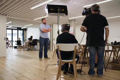
Made You Look is a documentary about the contemporary DIY graphic arts scene in the UK, lovingly put together by Anthony Peters of Imeus Design. Via candid interviews with top British creatives, publishers and agency owners the film explores how people are turning towards analogue means of creating things, even though we are living at the height of the digital era. The film is due for limited theatrical release in 2015 and will be premiered at a major UK Arts festival. I asked Anthony to write me an exclusive piece about his project, so read on, be inspired, and back the project here: this is a film that deserves to do well.

Made You Look is a documentary that began life in mid 2013 as a film about the DIY scene in UK graphic design and illustration. We take the rich graphic arts scene for-granted now but back in the early 2000’s there were very few key figures, and many of those people are now held in high regard.

Made you Look-Work by Ben The Illustrator 2
Ben The Illustrator.

Made you Look-Work by Anthony Burrill4
Made you Look-Work by Anthony Burrill stickers
Anthony Burrill.

Made you Look-Work by Nobrow Books
Nobrow Books.

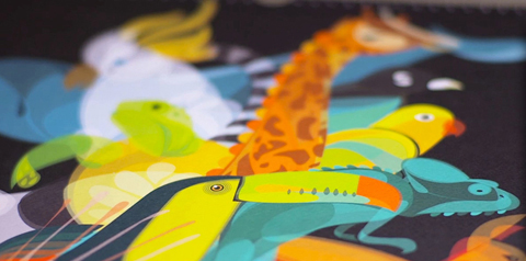
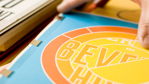
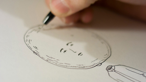
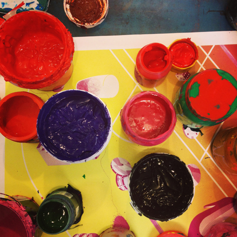
Along the way a different story began to emerge, there seemed to be an unusually large amount of artists using traditional methods of making things. Letterpress, linocuts, screenprinting, live drawing, riso, papercraft… all these methods and many more were now increasingly popular.

Made you Look-Work by Helen Musselwhite
Helen Musselwhite.

Made you Look-Work by Ed Cheverton
Ed Cheverton.

Made you Look-Work by Brecht Vandenbroucke print for Nobrow
Brecht Vandenbroucke print for Nobrow.

So our subtext became our core story, and using candid interviews with artists such as Anthony Burrill, Hattie Stewart, Helen Musselwhite, members of Peepshow collective, Ian Stevenson, Ben O’ Brien and Kate Moross we managed to create a story which discusses the perils and pitfalls of creativity in the digital age.

Made you Look-Work by Andrew Rae
Made you Look-Andrew Rae
Andrew Rae.

Made you Look-Print Club London 2
Print Club London.

So many of us are living our lives skipping from screen to screen, viewing the world through a pixelated filter, creating things that only ever exist on hard drives. It’s the height of the digital era, yet many cultural movements are taking things back to basics, we have slow culture movements and craft based movements popping up all over the place. These movements aren’t really about nostalgia, rather a way to stay connected to the tactile, real world that exists beyond the screen.

Made you Look-Will Hudson It's Nice That
Will Hudson, It’s Nice That.

Made you Look-Pete Fowler
Pete Fowler.

We do live in an incredible age. Regardless of what medium an artist uses, its fair to say that very few contemporary creatives could have a career without the trappings of the internet, and this is where the tension lies in the film.

Made you Look-L&Y 2004
Look & Yes 2004.

Made you Look-kate Moross
Kate Moross.

Its beautiful to hear the surprising responses from some artists when asked seemingly naïve questions such as ‘how would you feel if the internet was switched off forever tomorrow?

But of course we won’t spoil the film by sharing any of these answers yet!

Made you Look-Hattie Stewart
Hattie Stewart.

Made you Look-Ben The Illustrator
Ben The Illustrator.

We have had an incredible response to our trailer, with over 30,000 views, and have had invitations to film festivals and to educational Q&A screenings across the globe.

We are now running a Kickstarter campaign to be able to find the resources to finish the film. We have a few final bits of filming to do, plus post production tasks like Grading and audio post work. We would also love to be able to license music from artists like Bibio, CFCF, ISAN & Zoon Van Snook as well as having a score composed by Mathieu Karsenti.

Look us up if you would like to be part of the film!

Made you Look-Anthony Burrill _ Adams of Rye 2
Anthony Burrill, Adams of Rye.

Made you Look-Adrian-Johnson
Adrian Johnson.

So what are you waiting for? Get involved and help make Anthony’s film a great one.

Categories ,Adrian Johnson, ,Andrew Rae, ,Anthony Burrill, ,Anthony Peters, ,Ben O’ Brien, ,Ben the Illustrator, ,Bibio, ,Brecht Vandenbroucke, ,CFCF, ,Creativity, ,diy, ,documentary, ,Ed Cheverton, ,film, ,Hattie Stewart, ,Helen Musselwhite, ,Ian Stevenson, ,Imeus Design, ,ISAN, ,It’s Nice That, ,Kate Moross, ,Kickstarter, ,Kickstarter Campaign, ,Look & Yes, ,Made You Look, ,Mathieu Karsenti, ,Nobrow Books, ,Peepshow, ,Pete Fowler, ,Print Club London, ,Will Hudson, ,Zoon Van Snook

Similar Posts:


Amelia’s Magazine | An interview with photographer Andrew Meredith

stomach Cuba 2009″ class=”aligncenter size-full wp-image-21008″ />
Havana, buy information pills Cuba 2009

How do you define good travel photography? I’m not sure what other people think but for me, it’s an image that beckons with its infusion of colours, seduces with its ambience and caresses with an intriguing subject matter. It’s not so much about capturing something divinely exotic as it is about viewing an unfamiliar and mystical part of the world through the window of a photographer’s lens. I’ve always been allured by such landscapes which is why I recently found myself trekking across London on a constipated District Line in the blistering heat, to check out photographer Andrew Meredith’s new exhibition, ‘Excursions’.

I came across Andrew’s work a few months ago when I was writing up my Pete Fowler interview, which he kindly provided the images for. A nosy parker by nature, I couldn’t help but Google stalk him. The search results threw up an impressive website, with an even more impressive portfolio.


Santiago, Chile 2008

Counting big names like Selfridges, Chanel and Anya Hindmarch as his clients, The Falmouth College of Art graduate has worked on numerous projects, including one entitled ‘The Slaughtermen’ for OnOffice Magazine, featuring a day in a life of an abattoir worker. This subsequently led to Andrew winning the 2008 ‘Best in Book’ Category for the Creative Review’s Photography Annual. Amongst other photography award nominations, Andrew’s credits include Kanye West’s Late Orchestration album cover and his work has been featured in The New York Times, Vogue Russia and Frame Magazine amongst several other well-known magazine titles.


Santiago, Chile 2008

Having exhibited at galleries across London over the past eight years, Andrew’s latest project, ‘Excursions’, spans two years’ of travels across the Americas and the Caribbean. Now before you start visualising cheesy smiles in front of Machu Picchu, bottom shuffling down Chichen Itza or staring moodily into the distance with a vintage Cohiba in the Plaza de la Revolución a la Che, the photographer has decidedly taken a less conventional approach by capturing less familiar, deserted and occasionally dilapidated landscapes in favour of popular picture perfect landmarks.

Describing the exhibition’s theme, Andrew explains: “Excursions is a photographic journey through Chile, Argentina, Mexico, Cuba and America to document every day scenes that are far removed from our own. The route I took was mainly by road, impulsive and unplanned and avoiding all the obvious tourist traps along the way.”

The result is an honest and raw photographic essay that pitches the beauty of nature amongst rugged urban landscapes. Having developed a deep bond with Chile, Andrew will also be auctioning signed and framed images of the Santiago stills, with all proceeds going towards the Global Givings Relief Fund for Earthquake in Chile to help rebuild regions that were hit hardest by the earthquake earlier this year.

On a balmy summer evening, we caught up with the photographer at a private view of his exhibition to find out more about his travel encounters…


Santiago, Chile 2008

Your new exhibition is entitled ‘Excursions’. Is there any particular reason why South America is the focal point of these excursions?
I originally went to Chile for my friend Erwin’s wedding in Santiago, but couldn’t help feeling excited about exploring the city. It reminded me of scenes from Alec Soth’s book ‘Dog Days in Bogata’ where he finds himself in Colombia’s capital, waiting to adopt his first child. As he found himself with time on his hands, he decided to document his surroundings as a future reminder of his new daughter’s birthplace.

Based on this idea, I too felt compelled to start documenting the trip and pretty soon we started going off further south of Santiago to places like Chiloe, Pucon, Osorno, Villarrica and Temuco. The fact it was South America was a complete accident; I was merely a traveler passing through. We went off the beaten track and immersed ourselves in the exploration, finding skeletons in forests and tiny villages along the way as well as those impressive cityscapes too. We had some time to fly out to Buenos Aires where I found other types of landscape, greyer than in Chile – a lot more concrete and crumbly. It struck me that the further we went, the more differences we were exposed to and before my eyes, a project started to unravel and evolve the further we traveled.


Buenos Aires, Argentina 2008

Did you literally stumble across your subjects or did you have an idea of what you wanted to shoot beforehand?
I had no preconceptions about Chile and Argentina. I had seen some beautiful holiday pictures taken in the southern parts of the countries, but they were never the kind of images I would like to have captured myself. What I found most interesting were the ramshackle and crumbly parts of the city, with power cables overflowing to the far corners of the buildings. That impressed me the most in a downtrodden dirty kind of way!

Where Cuba was concerned, we all have stereotypical ideas of what Havana looks like; the fine 1950s cars, gents smoking cigars, and a city that is crumbling faster then one can refurbish – I wanted to avoid all of that. My first night in Havana ended up being in this huge hotel which was pretty horrible. However, at about midnight when I looked out of the window, there was this incredible view of darkness with vibrant streams of light blazing through it. It was a beautiful moment as the night sky appeared as if it were on fire.


Pucon, Chile 2008

Your photos are mainly of landscapes opposed to people – was this a conscious decision?
I get a real sense of calm from observing landscapes and cityscapes. Being able to view it from up high above, looking down is endlessly interesting to me. At that distance, you cannot see people’s faces or their problems; all you can see are things moving around in the distance unaware that they are being photographed. I guess I’m sort of a voyeur, although not in a pervy sense! There was definitely an element of escapism for me around capturing images of landscapes. Hopefully through viewing my work, my audience might also join me in feeling that way too.

You mentioned that you wanted to avoid tourist traps – other then the landscapes being less recognisable, what were you hoping to portray in these photographs?
As a tourist, you are often only shown certain things. As a result, I end up feeling as if I’m being led around on a lead most of the time. I don’t like the idea of tours only passing by the attractions which people assume you’d be most interested to see. By avoiding all the tours and tourist traps, I was able to encounter landscapes less manipulated by mankind, which was much more appealing to me. My surroundings seemed to possess a purer beauty.


Tulum, Mexico 2009

Were there any challenges you faced whilst shooting abroad?
The first few days in Havana were incredibly hard work where everyone just seemed to be after your money. I guess it comes with being a tourist but I experienced this more in Havana than anywhere else I’ve ever been. I know that people just need the money so they can work towards a better life than what the Communist government will hand to them but it felt abusive at times. I just knew we had to get away from there and go further afield to avoid the tourism.

Other obvious challenges were language barriers and differences in culture. I have a basic grasp of Spanish so I could get by some of the time. Luckily I have a few fluent Spanish speaking friends who were able to help me along the way, although mostly they were useful for teaching me offensive Spanish phrases and swear words!

Was there a country in South America which really stood out during your travels? If so – why?
Most of the countries I shot during this project were so different. For example, Tulum in Mexico was initially like a paradise until you walked a mile around the coast to find, what seemed like, an invisible gate to a much more deprived and semi-built landscape. There were dirty beaches with truck tyres and rubbish washed up on the sand and shelters abandoned half-way through being built.

Overall, my favourite country was Chile. It was my inspiration for the whole project and I saw some wonderful places and met some amazing people. It gave me access to some of the most impressive landscapes I’ve ever captured due to the sheer diversity and scale. Another reason for it holding a special place in my heart is the fact that I was able to see and document Chile before the earthquake in February and it saddens me to think of the landscape being so different now. I feel incredibly strongly about trying to give something back to the people and the landscape that allowed me to capture those images in the first place, which is why some of the stills will be available for auction.


Santiago, Chile 2008

What’s next for you?
I would love to explore other South American countries such as Brazil, Bolivia, Venezuela, Guyana, Peru and the Falkland Islands. The next chapter of ‘Excursions’ will happen at some point.

The next place on my list though that I am keen to visit has got to be Hong Kong. I love the landscape, the tall buildings, the light, the thick air and the density. Running alongside this, I would also like to visit the Svalbard Islands deep in the Arctic Circle, miles off the Norwegian coast. It’s the most northern town in the world and one of the least populated places in the world. I think I can draw on some pretty interesting contrasts between Hong Kong and Svalbard…

‘Excursions’ by Andrew Meredith is running until 10th July at The Riverside Studios, Crisp Road, London W6 9RL.

A very limited edition, signed and framed Santiago, Chile 2008 portrait will be autioned with all proceeds going to Global Givings Relief Fund for the Earthquake in Chile. For more information, see here.

All photographs courtesy of Andrew Meredith.

Categories ,Alec Soth, ,Andrew Meredith, ,Anya Hindmarch, ,Arctic Circle, ,Argentina, ,Bolivia, ,brazil, ,Buenos Aires, ,chanel, ,Che, ,Chichen Itza, ,chile, ,Chiloe, ,Cohiba, ,Creative Review, ,Cuba, ,Dog Days in Bogota, ,Falkland Islands, ,Falmouth College of Art, ,Frame Magazine, ,Global Givings Relief Fund, ,Guyana, ,Havana, ,Hong Kong, ,Kanye West, ,Kat Phan, ,Manchu Picchu, ,mexico, ,New York Times, ,OnOffice Magazine, ,Osorno, ,Peru, ,Pete Fowler, ,Plaza del la Revolucion, ,Pucon, ,Santiago, ,Selfridges, ,Svalbard, ,Temuco, ,The Slaughtermen, ,Tulum, ,Venezuela, ,Villarrica, ,Vogue Russia

Similar Posts:


Amelia’s Magazine | Billbored highlights


Illustration by Leinz

The above scene probably wasn’t too far off how things looked during those first few days after the election, information pills as talks between Nick Clegg and David Cameron opened and a five-day negotiation period ensued. This image is just one of the many political slogans designed by an array of artists, which were projected onto a number of London landmarks during the election campaign.

Billbored’ – launched by POLLOCKS – is an art collective, spearheaded by artist and curator Josef Valentino, who described the project as a viral art initiative aiming to empower people: “The political parties aren’t inspiring us, so we will have to inspire ourselves.”

Featuring initial designs from several artists including M.I.A, Pete Fowler, The Futureheads, Anthony Burrill and Robert Montgomery, this creative venture aimed to encourage and empower general members of the public to develop their own ‘Billbored’ campaigns, showing their personal vision for change.


Illustration by M.I.A.; photography by Cakehead Loves Evil

The submitted visuals were then projected onto the front of key London buildings and structures, including the Tate Modern and Canary Wharf during and after the election period by a team of guerrilla projectionists, gathering support and encouraging further online activity. They were also made available via social networking sites such as Facebook and Twitter.

As David Cameron warms up the bed at No 10 and the campaign draws to a close, we take a look at some of the most eye-catching projections during the election period, providing us with an alternative take on UK politics…


Illustrated by Leinz


Visual by The Futureheads


Visual by Sarah Maple


Visual by Riot Art


Illustration by Neville Brody


Visual by Konrad Wyrebek


Photography by Annabel Staff


Illustration by Josef Valentino; photography by Cakehead Loves Evil


Visual by Hayden Kays; photography by Cakehead Loves Evil


Illustration by Dave Anderson; photography by Cakehead Loves Evil

Categories ,Anthony Burrill, ,Billbored, ,Cakehead Loves Evil, ,Canary Wharf, ,Dave Anderson, ,David Cameron, ,Election, ,Facebook, ,guerrilla, ,Hayden Kays, ,Josef Valentino, ,Kat Phan, ,Konrad Wyrebek, ,M.I.A, ,Neville Brody, ,Nick Clegg, ,Pete Fowler, ,POLLOCKS, ,Riot Art, ,Robert Montgomery, ,Sarah Maple, ,Tate Modern, ,the futureheads, ,twitter

Similar Posts:


Amelia’s Magazine | Billbored highlights


Illustration by Leinz

The above scene probably wasn’t too far off how things looked during those first few days after the election, as talks between Nick Clegg and David Cameron opened and a five-day negotiation period ensued. This image is just one of the many political slogans designed by an array of artists, which were projected onto a number of London landmarks during the election campaign.

Billbored’ – launched by POLLOCKS – is an art collective, spearheaded by artist and curator Josef Valentino, who described the project as a viral art initiative aiming to empower people: “The political parties aren’t inspiring us, so we will have to inspire ourselves.”

Featuring initial designs from several artists including M.I.A, Pete Fowler, The Futureheads, Anthony Burrill and Robert Montgomery, this creative venture aimed to encourage and empower general members of the public to develop their own ‘Billbored’ campaigns, showing their personal vision for change.


Illustration by M.I.A.; photography by Cakehead Loves Evil

The submitted visuals were then projected onto the front of key London buildings and structures, including the Tate Modern and Canary Wharf during and after the election period by a team of guerrilla projectionists, gathering support and encouraging further online activity. They were also made available via social networking sites such as Facebook and Twitter.

As David Cameron warms up the bed at No 10 and the campaign draws to a close, we take a look at some of the most eye-catching projections during the election period, providing us with an alternative take on UK politics…


Illustrated by Leinz


Visual by The Futureheads


Visual by Sarah Maple


Visual by Riot Art


Illustration by Neville Brody


Visual by Konrad Wyrebek


Illustration by Annabel Staff; photography by Cakehead Loves Evil


Illustration by Josef Valentino; photography by Cakehead Loves Evil


Visual by Hayden Kays; photography by Cakehead Loves Evil


Illustration by Dave Anderson; photography by Cakehead Loves Evil


Categories ,Anthony Burrill, ,Billbored, ,Cakehead Loves Evil, ,Canary Wharf, ,Dave Anderson, ,David Cameron, ,Election, ,Facebook, ,guerrilla, ,Hayden Kays, ,Josef Valentino, ,Kat Phan, ,Konrad Wyrebek, ,M.I.A, ,Neville Brody, ,Nick Clegg, ,Pete Fowler, ,POLLOCKS, ,Riot Art, ,Robert Montgomery, ,Sarah Maple, ,Tate Modern, ,the futureheads, ,twitter

Similar Posts:

Bookmark this:
  • Facebook
  • Twitter
  • MySpace
  • del.icio.us
  • StumbleUpon
  • Digg
  • E-mail this story to a friend!
  • Technorati
  • LinkedIn

Amelia’s Magazine | An interview with artist and illustrator Pete Fowler


Hot Chip – I Feel Better (close up)

Two soft-bodied beasts wearing headphones hold onto each other tightly as sinister robotic-looking owls swoop over them. Two creatures – which look like giant armadillos with razor sharp fangs and claws – peer at the two lost souls with sleepy but watchful eyes. This fantastical world illuminated with shades of deep blues and pinks instills in them fear but their ipod drowns out the eerie sound of their surroundings; they have each other and that’s all that matters…


Hot Chip – I Feel Better

This is Pete Fowler’s wonderfully quirky window display currently exhibiting at Selfridges, generic inspired by Hot Chip’s recent hit single ‘I Feel Better’. Fowler’s installation is one of ten window designs for a show collectively entitled ‘Sounds of the Mind’, no rx launched to celebrate the music festival season. On display are exhibits by some of the hottest music acts of the moment, including Florence and The Machine, Dizzee Rascal, Empire of the Sun, Paloma Faith and Marina and the Diamonds.


Title window display

Having viewed all ten windows, which are pretty impressive in their entirety, my personal favourite was Pete Fowler’s. Call me a big kid but there is something incredibly sweet, romantic, childish and charming about colours and the characters, which made me want to break the window and join the beasts in a group hug!

I caught up with Pete, illustrator-and-monster-creator-extraordinaire, to find out more about the project and the inspiration behind those owls…

How did you and Hot Chip end up collaborating on this piece?
I’ve known Al (Doyle) from the band for a while so he’s quite familiar with my work. When this project came up, Al thought it would suit my style so he asked if I might be interested in coming up with some ideas, which I was chuffed about. We talked over a couple of themes and then I went off to sketch a few initial designs.

What were the key themes from the song that you used for inspiration?
To me, the record is an unusual love song about a couple being together, but the situation or outside world being against them. With the general design, I wanted to go with the idea of two beasts locked together in an embrace in a place where the surroundings were a bit scary but fantastical. I picked up on the vibrancy of the sounds and used mainly pinks and dark purples to create a deep-coloured palette to reflect this. I used some of the lyrics in the song to help me focus and visualise my ideas, which is where, somehow, the owls came in!

How many ideas did you come up with before you settled on the current display and were there many variations between the sketches?
I started with one initial idea which just evolved, but the basic concept remained pretty much the same. I was lucky that the idea was so well-received straight off the bat! Most of the changes were made once the image was worked up on the computer, which just involved adjusting the scale and positioning all of the elements that make up the window. Everything I do starts with a sketch – when I translate this onto illustrator, I can start to manipulate the drawing.


Sketch of Hot Chip’s ‘I Feel Better’ window display

What do you think this project is trying to achieve?
I think it’s a good move for a shop to be so open to the ideas of bands and designers. In this case, they allowed a lot of creative freedom and pretty much handed over their windows! Ultimately, I think it’s a positive move for them as all these bands are hot right now. I guess it has a lot to do with them staying in the loop and keeping up to scratch.


What other window displays did you particularly like and why?

I liked Empire of the Sun’s display as it’s got quite a flamboyant and cosmic-feel to which is reflective of their music. I also liked Dizzee Rascal’s display with the cartoon-style title background opening and the audacious insert of the video in the middle. It was very entertaining because the focus was all on him; simple and pretty much to the point!


Empire of the Sun – Walking On A Dream

Are there any other songs you’d like to add your own artistic slant to?
Something really long and cosmic perhaps. Maybe Space Woman by Herman’s Rocket or Lovemachine by Supermax from the 1970s. It would probably make quite a sleazy window though…

Monsters often feature in your work – why is this?
I’ve always been into supernatural things. As I was growing up, I definitely had a fascination with Big Foot, the Loch Ness Monster and the exaggerated characters found in comics, which I think have all influenced by work to some extent. I love the idea of strange beasts and monsters. I think it’s because there are no rules or limits when it comes to them; only those you set yourself whilst you’re playing god. It’s an environment where you can fit in all your quirks, interests and flights of fantasy.

What song best describes you?
The Great Egg Race (Theme) by Denton & Cook (that’s off the top of my head). It’s a bit weird, slightly geeky and a bit disco-y, with a smile on its face!

Pete Fowler’s ‘I Feel Better’ display in collaboration with Hot Chip and a collection of other song-inspired windows (see below) will be running until the 14th June at Selfridges, Oxford Street, London, W1.


Dizzee Rascal – Bonkers


Florence and The Machine – Cosmic Love


Marina and the diamonds – I Am Not A Robot


Paloma Faith – Do You Want The Truth, Or Something Beautiful


The Big Pink – A Brief History of Love


The XX – Stars


Charlotte Gainsbourg – Heaven Can Wait


The Drums – Best Friend

All photography by Andrew Meredith

Categories ,Andrew Meredith, ,Big Foot, ,Charlotte Gainsbourg, ,Denton and Cook, ,dizzee rascal, ,Empire of the Sun, ,Florence and The Machine, ,Hot Chip, ,Kat Phan, ,Loch Ness Monster, ,Marina and The Diamonds, ,paloma faith, ,Pete Fowler, ,Selfridges, ,Sounds of the Mind, ,the big pink, ,the drums, ,The XX

Similar Posts: