Amelia’s Magazine | Alternative Risk Transfer: Interview with Eugene Perera

eugene-peraraPhotography by Egene Perera

Artists Eugene Perera, viagra dosage Eiko Honda and Christopher Thomas set up the A.R.T Organization or “Art Casino” in an attempt at initiating reflection on the nature of value of art, pill comodification and risk taking in the art market. Jessica Stokes talks to artist Eugene Perera about “after hours” poker sessions.

Press-Release-Alternative-R

Photograph courtesy of A.R.T

Jessica Stokes: Where did you get the idea for this casino?

Eugene Perera: The idea for Alternative Risk Transfer came out of my interest in art and poker. Poker is a game of skill, risk and chance where an experienced player, whilst having no control over the cards they are dealt, is nevertheless able to gain an all important edge through the skilful manipulation of risk in the form of bets. It struck me that this was in some way relevant to my own art practice where I was constantly assessing the risks within a particular course of action and working out what to invest in that action. By investment here I do not necessarily mean economic but time, thought, ideas, effort and skill and so on.  As an artist, I wanted to highlight this and ask whether such a way of working which potentially derisks is appropriate to the creative process and whether instead we should be working in such a way that failure is an ever-present possibility. As I began to think about the relevance of poker and how it might illuminate art practice and how artists negotiate the art market, I wondered whether it might be possible to create a work involving art and poker within the context of a wider exhibition. That is the impetus behind this show; it’s a form of ongoing research really.

A.R

Image courtesy of A.R.T

JS: What is your background?

EP: I have been creating art for around five years now following a Masters in Art History. Before this, I used to work in media where I set up a number of music and arts radio stations. Working in the media business environment exposed me to constant considerations of risk and as I progressed I noticed how I was better able to assess and manage risk, much like in poker and in art practice. The question now though is not so much how do I minimize risk but how do I explore risk. The exhibition Alternative Risk Transfer is an unknown to me and that in itself is inherently risky and my experience cannot fully prepare me for what might happen!  That’s interesting to me!

amber-cowan-image

Photograph courtesy of Mark McGowan

JS: Who are the artists that will be taking part?

EP: We have a highly diverse range of artists taking part in the show ranging from the extremely new to the established such as Mark McGowan and Anthony Gross. There is also a strong international strand to the show with Japanese, Taiwanese and US artists alongside a strong London presence.  The show encompasses video, sculpture, photography, painting and performance and there are a quite a few interactive gaming works such as the nightly poker games and a 24-hour chess performance created by Patrick Goddard. Many of the participating artists are creating work outside of their normal comfort zones that is commendable in this risk adverse environment. Furthermore, they are willing to stake their work in the nightly poker games in order to better understand how they respond to situations of risk.

JS: Is it important to be aware of the connotations of gambling and the encouragement thereof in today’s climate?

EP: I think it is important to be aware of what one is doing when you’re risking something in a gaming or betting situation. Unaware gambling is potentially harmful and we all know the consequences. With the Alternative Risk Transfer show at The Rag Factory, we are attempting to provoke discussion around what it means when we risk something so I think that has to be a useful contribution.

How about chance, skill and risk-taking in an unusual twist on the debate over the value of art? Give free rein to risky behavior at The Rag Factory 16-18 Heneage street, London E1 5LJ. The exhibition is on from the 10th to 13th of December from 12 to 10 pm. Why not come to the preview on the 9th of December from 6 to 9 pm?

Categories ,Alternative Risk Transfer, ,art, ,Brick Lane, ,Christopher Thomas, ,East London, ,Eiko Honda, ,Eugene Perera, ,exhibition, ,gig, ,installation, ,interview, ,live, ,london, ,music, ,the rag factory

Similar Posts:


Amelia’s Magazine | Amelia’s Anthology of Illustration Book Launch

Everything we do at Amelia’s Magazine is a collaborative and creative endeavor, viagra and this extends to the upcoming book launch of Amelia’s Anthology of Illustration (released this week) and the subsequent exhibition of 10 of the books illustrators. Seeing that the book takes pride in championing fresh new talent in the world of illustration, it makes sense that we would want Tuesdays book launch at Concrete Hermit in East London to reflect this. Letting our illustrators run riot, Concrete Hermit has turned its gallery space, and their walls over to them to bring their illustrations of renewable technologies from the Anthology to life. The results can be seen from Tuesday, 8th December onwards, and the exhibition will run until January 1st 2010.

Anthology1-Concrete-Hermit-Dec-09-001

Anthology7-Concrete-Hermit06122009-Dec-09-044

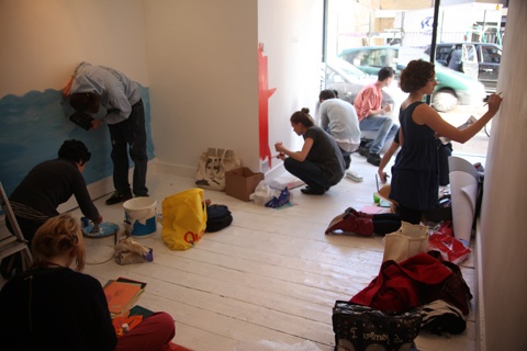
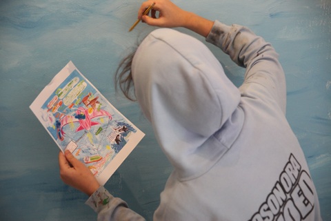
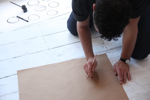
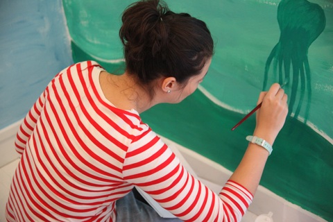
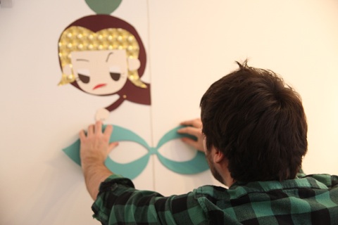
Our dedicated illustrators pitched up this Sunday to lend their unique talents to this project. Given that the gallery space is pretty compact, and that at any given time there were roughly ten illustrators, as well as Amelia’s staff on hand to document the day and decorate the outside window,  the atmosphere was relaxed, friendly and supportive – even if space was definitely at a premium! I was especially pleased to see some of the illustrators that I had been given the opportunity to interview for the Anthology, such as Jess Wilson, Craig Yamey and Chris Cox. While David Bowie played on the radio, coffee was consumed and cookies and cheese bagels were munched for much needed sustenance. I watched as white walls were transformed into bright and colourful ecological utopias, adorned with mythical creatures, talking whales and flying kites. Interesting and unexpected collaborations unfolded between many of the illustrators who were meeting each other for the first time; for example, when Chris Cox, Barbara Ana Gomez and Jess Wilson realised that their illustrations about renewable technologies all featured bodies of water such as lakes and the sea, they decided to share a large wall space, and while the illustrations are kept separate, they also seamlessly blend in with one another, each one complimenting the other. On another wall space, Karolin Schnoor (who was illustrating underwater technologies) and Andrew Merritt (whose work featured above water tech) shared the top and bottom half of the wall to weave their respective illustrations together.

Anthology2-Concrete-Hermit06122009-Dec-09-016

Anthology7-Concrete-Hermit06122009-Dec-09-064

Anthology3-Concrete-Hermit06122009-Dec-09-035

Anthology5-Concrete-Hermit06122009-Dec-09-036

Illustrating a wall space on a tight time span is a very different process to how the illustrators are used to working; while Jess revealed that the process was ”less stressful than I thought it was going to be”, others were conscious of the fact that they only had one take. Despite this, all were incredibly proud of their work for the Anthology and were delighted to be able to showcase their work at the gallery. By 5pm, there was the slightly worrying fact that due to unforeseen circumstances, part of one of the main walls still stood glaringly untouched. Undeterred, Craig, Barbara Ana and Amelia stepped in to collaborate on what was quickly termed the ‘mad panic corner’. Despite the time constraints, everyone was in good spirits, and I look forward to see how the mad panic corner has taken shape!

Anthology6-Concrete-Hermit06122009-Dec-09-041

Anthology8-Concrete-Hermit06122009-Dec-09-061

Leona Clarke adds some finishing touches

Anthology9-Concrete-Hermit06122009-Dec-09-073

Saffron Stocker gets to grips with her piece of the wall.

Anthology10-Concrete-Hermit06122009-Dec-09-085

If you are London based, please come along to the launch, which starts at 6.30 and runs until 9.30pm. Once here, you can pick up a copy of the book which will be signed by Amelia. There will also be carbon neutral beer provided by Adnams and Macs Gold Malt Lager by Madison on hand. If you can’t make it on Tuesday evening, you have a few more weeks to see the work of our super talented illustrators adorn the walls of Concrete Hermit. We are expecting it to get very busy on Tuesday night, so please turn up early!

Categories ,book launch, ,Concrete Hermit, ,exhibition, ,exhibitionreview, ,Gallery, ,illustration, ,illustrators

Similar Posts:


Amelia’s Magazine | Amelia’s Anthology of Illustration Launch Party at Concrete Hermit

Yellow and White mac 008Image courtesy of Christopher Raeburn

Christopher Raeburn
A designer whose name is never far from any eco fashion list is that of Christopher Raeburn, viagra sale who is famed for his high end, more about innovative and functional fashion created using re-appropriated military fabrics. Sourcing his material from de-commissioned military stock and hot-air balloon canvas among other materials Raeburn both redesigns and manufactures his groundbreaking garments ethically within the UK.

PB121954Image courtesy of Rachael Oku

Of his SS10 collection Christopher says: “This season presents a great opportunity to play with colour, page negative space and flowing lines; from its inception I wanted to create an upbeat, fresh and experimental collection.”
With the emphasis on rouching, contrasting geometric panels and colourful taped seams Raeburn utilises laser cutting techniques for the first time introducing repeat patterns of concentric circle cut-outs which are peppered throughout the collection cleverly hidden between panels and layered hoods and sleeves.

Parachute dress

Image courtesy of Christopher Raeburn

What is most striking about Raeburn’s new contemporary collection of dresses, ponchos, skirts and macs is how well his colour palette and themes work together with layer, light and silhouette being the main focuses. With the majority of fabric used being transparent it is Raeburn’s bright accents of colour and playful dots that really inject life into the garments, and are reminiscent of jellyfish.

Purple and White Jacket with matching bag 006

Image courtesy of Christopher Raeburn

Rather excitingly the new collection also features accessories for the first time, with Raeburn fusing woven netting with his trademark parachute fabric and cord to great effect adding to the high impact of this super functional range.

Lu Flux

PB121959Image courtesy of Rachael Oku

Another exciting designer who we’re predicting big things for next year is the lovely Lu Flux; who has just launched her debut collection after being named ‘London’s newest one to watch’ at Vauxhall Fashion Scout earlier in the year. What sets Lu’s designs apart is that her work is created using salvaged, vintage and organic fabrics, which she cleverly combines with traditional techniques such as knitting, pleating and patchwork.

PB121960Image courtesy of Rachael Oku

Lu’s witty and playful SS10 collection titled ‘The Eco Life of Riley’ is inspired by the ‘humble bluetit’ which is cleverly juxtaposed with bold jarring graphics throughout the collection. If developing her own eco brand wasn’t enough of a challenge Lu is also busy working on a project called Soko Kenya, which was conceived over two years ago when she visited the small coastal town of Ukunda in Kenya. The idea behind this project is to work in conjunction with local Kenyan tailors who attend the community owned Ukunda Youth Polytechnic, which offers basic vocational training to local residents at a low cost.

PB121962Image courtesy of Rachael Oku

This collaboration will see Soko invest a minimum of 5% gross earnings into the Polytechnic annually in addition to year-round fundraising to help acquire sewing machines and other essential equipment for the students. Additionally Soko are committed to providing support in the design and running of the Polytechnic’s existing tailoring department and syllabus according to international fair-trade and eco production standards.

PB121961Image courtesy of Rachael Oku depicting Soko Kenya products

Most importantly both parties are committed to working together to transform the Polytechnic into an eco institution by introducing a rainwater catchment system and working to create solar generated electricity. To find out more about this great project and where to buy Soko Kenya products head to their website.

Apron Dress and BodysuitImage courtesy of Julia Smith

Julia Smith
Another groundbreaking designer who caught our attention was Julia Smith, a designer who has graced the webpages of Amelia’s magazine a few times previously. Julia’s SS10 collection entitled ‘Nurture Me’ explores the idea of mixing beauty with function. Part inspired by the 1930′s and 1940′s, when loose shapes and function were paramount Julia’s collection also references the concept of underwear as outerwear. Created using tactile fabrics such as soy, bamboo and organic cotton and linen Julia cleverly juxtaposes these with recycled polyester which is made from recycled plastic (PET) bottles.

Lara Jacket and Power BodyImage courtesy of Julia Smith

What really sets Julia apart is her second line aptly titled ‘Julia Smith Made in Africa’, which supports lives in Ghana through the vision of Mrs. Marian Essel, a highly skilled batik printer from Ghana, West Africa. Having worked for the Global Mamas in Cape Coast, Marian and Julia Smith have now formed a co-operative in the suburbs of Accra, Ghana’s capital city, offering employment opportunities to the struggling community.

Made in Africa 1Image courtesy of Julia Smith depicting the Made in Africa collection

With Marian using all the proceeds of her work to employ disadvantaged adults as well as sponsoring children so that they can go to school, this is a fantastic initiative which aims to help everyone within the community get the best educational start in life. The ‘Julia Smith Made in Africa’ collection is stocked in Julia’s new flagship store in Marble Arch’s Connaught Village.

Matt and Nat
A new brand to Amelia’s magazine which is fast becoming a firm favourite is that of Matt & Nat, a pioneering vegan luxury accessories label who create animal free products for both men and women. Interestingly (which I’m hoping you’ll agree) Matt & Nat is not a design duo as the name would suggest but is instead founded by Inder Bedi who was challenged almost 20 years ago to forgo animal products for 30 days. Ever since he has made a conscious effort to use recycled and greener materials in his work steering clear of leather, wool and animal by-products.

For SS10 Matt & Nat are continuing where they left off last season with their 21 water bottles campaign which sees all the linings in their handbags and wallets created using 100% recycled plastic, with each accessory using an average of 21 bottles.

With the inspirations for their SS10 collection being biker chic and glam rock, each bag has been embellished differently with everything from studs to zip details. Made primarily from eel skin (incidentally the softest type of leather I have ever felt,) the colour palette of fiery scarlet, intense blue and blush pink bring a vintage feel to the pieces.

Henrietta Ludgate
A great designer who has already received quite a bit of media attention in 2009 is Henrietta Ludgate, who won the Ethical Fashion Forum ‘Fashion Innovation Award’ earlier in the year. Creating sustainable and sculptural garments from her studio in the remote Highlands of Scotland, Henrietta stays close to her Scotch roots by working primarily with Scottish linen.

With a brand ethos to support both the Scottish and British textile industry as a whole, all fabrics are sourced from within the British Isles with all pieces produced locally.

A champion of slow fashion, Henrietta’s minimalist silhouette remains hauntingly elegant and distinctive. For inspiration Henrietta often looks to Elsa Schiaparelli, and her vision of fashion as a type of architecture, and beliefs that clothing should be ‘closely connected to the frame of the body’.

With the recent opening of a swanky new showroom in London’s Covent Garden, things are looking bright for 2010.
Stay tuned for the second instalment tomorrow…
Yellow and White mac 008Image courtesy of Christopher Raeburn

Christopher Raeburn
A designer whose name is never far from any eco fashion list is that of Christopher Raeburn, cure who is famed for his high end, innovative and functional fashion created using re-appropriated military fabrics. Sourcing his material from de-commissioned military stock and hot-air balloon canvas among other materials Raeburn both redesigns and manufactures his groundbreaking garments ethically within the UK.

PB121954Image courtesy of Rachael Oku

Of his SS10 collection Christopher says: “This season presents a great opportunity to play with colour, negative space and flowing lines; from its inception I wanted to create an upbeat, fresh and experimental collection.”
With the emphasis on rouching, contrasting geometric panels and colourful taped seams Raeburn utilises laser cutting techniques for the first time introducing repeat patterns of concentric circle cut-outs which are peppered throughout the collection cleverly hidden between panels and layered hoods and sleeves.

Parachute dress

Image courtesy of Christopher Raeburn

What is most striking about Raeburn’s new contemporary collection of dresses, ponchos, skirts and macs is how well his colour palette and themes work together with layer, light and silhouette being the main focuses. With the majority of fabric used being transparent it is Raeburn’s bright accents of colour and playful dots that really inject life into the garments, and are reminiscent of jellyfish.

Purple and White Jacket with matching bag 006

Image courtesy of Christopher Raeburn

Rather excitingly the new collection also features accessories for the first time, with Raeburn fusing woven netting with his trademark parachute fabric and cord to great effect adding to the high impact of this super functional range.

Lu FluxPB121959Image courtesy of Rachael Oku

Another exciting designer who we’re predicting big things for next year is the lovely Lu Flux; who has just launched her debut collection after being named ‘London’s newest one to watch’ at Vauxhall Fashion Scout earlier in the year. What sets Lu’s designs apart is that her work is created using salvaged, vintage and organic fabrics, which she cleverly combines with traditional techniques such as knitting, pleating and patchwork.

PB121960Image courtesy of Rachael Oku

Lu’s witty and playful SS10 collection titled ‘The Eco Life of Riley’ is inspired by the ‘humble bluetit’ which is cleverly juxtaposed with bold jarring graphics throughout the collection. If developing her own eco brand wasn’t enough of a challenge Lu is also busy working on a project called Soko Kenya, which was conceived over two years ago when she visited the small coastal town of Ukunda in Kenya. The idea behind this project is to work in conjunction with local Kenyan tailors who attend the community owned Ukunda Youth Polytechnic, which offers basic vocational training to local residents at a low cost.

PB121962Image courtesy of Rachael Oku

This collaboration will see Soko invest a minimum of 5% gross earnings into the Polytechnic annually in addition to year-round fundraising to help acquire sewing machines and other essential equipment for the students. Additionally Soko are committed to providing support in the design and running of the Polytechnic’s existing tailoring department and syllabus according to international fair-trade and eco production standards.

PB121961Image courtesy of Rachael Oku depicting Soko Kenya products

Most importantly both parties are committed to working together to transform the Polytechnic into an eco institution by introducing a rainwater catchment system and working to create solar generated electricity. To find out more about this great project and where to buy Soko Kenya products head to their website.

Apron Dress and BodysuitImage courtesy of Julia Smith

Julia Smith
Another groundbreaking designer who caught our attention was Julia Smith, a designer who has graced the webpages of Amelia’s magazine a few times previously. Julia’s SS10 collection entitled ‘Nurture Me’ explores the idea of mixing beauty with function. Part inspired by the 1930′s and 1940′s, when loose shapes and function were paramount Julia’s collection also references the concept of underwear as outerwear. Created using tactile fabrics such as soy, bamboo and organic cotton and linen Julia cleverly juxtaposes these with recycled polyester which is made from recycled plastic (PET) bottles.

Lara Jacket and Power BodyImage courtesy of Julia Smith

What really sets Julia apart is her second line aptly titled ‘Julia Smith Made in Africa’, which supports lives in Ghana through the vision of Mrs. Marian Essel, a highly skilled batik printer from Ghana, West Africa. Having worked for the Global Mamas in Cape Coast, Marian and Julia Smith have now formed a co-operative in the suburbs of Accra, Ghana’s capital city, offering employment opportunities to the struggling community.

Made in Africa 1Image courtesy of Julia Smith depicting the Made in Africa collection

With Marian using all the proceeds of her work to employ disadvantaged adults as well as sponsoring children so that they can go to school, this is a fantastic initiative which aims to help everyone within the community get the best educational start in life. The ‘Julia Smith Made in Africa’ collection is stocked in Julia’s new flagship store in Marble Arch’s Connaught Village.

borrato

Matt and Nat
Image courtesy of Matt and Nat

A new brand to Amelia’s magazine which is fast becoming a firm favourite is that of Matt & Nat, a pioneering vegan luxury accessories label who create animal free products for both men and women. Interestingly (which I’m hoping you’ll agree) Matt & Nat is not a design duo as the name would suggest but is instead founded by Inder Bedi who was challenged almost 20 years ago to forgo animal products for 30 days. Ever since he has made a conscious effort to use recycled and greener materials in his work steering clear of leather, wool and animal by-products.

commix

Image courtesy of Matt and Nat

For SS10 Matt & Nat are continuing where they left off last season with their 21 water bottles campaign which sees all the linings in their handbags and wallets created using 100% recycled plastic, with each accessory using an average of 21 bottles.

hendrix blueImage courtesy of Matt and Nat

With the inspirations for their SS10 collection being biker chic and glam rock, each bag has been embellished differently with everything from studs to zip details. Made primarily from eel skin (incidentally the softest type of leather I have ever felt,) the colour palette of fiery scarlet, intense blue and blush pink bring a vintage feel to the pieces.

Henrietta Ludgate
A great designer who has already received quite a bit of media attention in 2009 is Henrietta Ludgate, who won the Ethical Fashion Forum ‘Fashion Innovation Award’ earlier in the year. Creating sustainable and sculptural garments from her studio in the remote Highlands of Scotland, Henrietta stays close to her Scotch roots by working primarily with Scottish linen.

4Image courtesy of Henrietta Ludgate

With a brand ethos to support both the Scottish and British textile industry as a whole, all fabrics are sourced from within the British Isles with all pieces produced locally.

image15

A champion of slow fashion, Henrietta’s minimalist silhouette remains hauntingly elegant and distinctive. For inspiration Henrietta often looks to Elsa Schiaparelli, and her vision of fashion as a type of architecture, and beliefs that clothing should be ‘closely connected to the frame of the body’.

image12Image courtesy of Henrietta Ludgate

With the recent opening of a swanky new showroom in London’s Covent Garden, things are looking bright for 2010.
Stay tuned for the second instalment tomorrow…
DAT

French electro ensemble DAT Politics are coming to little old London town to headline the fourth installment of Mofofest this month. Taking place December 12th, treat My Tiger Timing and Bright Light Bright Light are also part of the jam packed line up. Ahead of this rare UK performance from the group, cheapest Politicians Claude and Gaëtan talked to Amelia’s about how their material comes together, this web Mofofest and the perfect DAT Politics party.

France seems to produce the crème de la crème of electro acts, why is this? Is there something in the water?
G: There is definitely a strong connection between electronic music and pop culture in France. It seems to be a historic thing, for at least fifty years the French electronic artists have produced dance music influenced by sound research and pop. Now, it’s a kind of collective spirit, the number of electro acts is massive but the best ones have a specific sound.

DAT Politics have been established for 10 years now, what have been the highlights of your decade in the industry?
G: Maybe our “Plugs Plus” album because it was a decisive step in our career. We switched from instrumental music to electro pop songs with lyrics, verses and a chorus. This choice gave us a lot of freedom and possibilities; it was like opening a new toolbox and breaking the walls in the house. Something very fresh, and the best part is that we’re still working on it!

What new acts excite you?
G: Not that new, but some tracks from Diplo with Rye Rye or Major Lazer are pretty amazing in the fucked up dance music register.

What older acts still have your attention?
C: Daft Punk, Peaches, Sonic youth, Kraftwerk

I’m really interested as to how your songs come together? They seem like they are made in the dark of night? I can’t imagine you work together during the day?
G: Actually, more like late afternoon with the curtains drawn and a pink neon light on.
C: When we decide to work on a new album we meet everyday for several weeks. We build up some tracks together. One comes with an idea for the beats for instance, one the synth lines, one the samples or the vocals. Gaëtan and I write the lyrics. Then we are just the 3 of us in front of the computer trying to assemble each piece. At some point each of us keeps the demo version of the tracks to listen to them and we meet again with new ideas and new material to finish. The process will be the same till we agreed on the final version of the track.

DAT1

What is the most unusual thing that has been used on a track?
G: One time, we used a coffee grinder for a NWA remix, also a talking bird which made some strange sounds. We can use any kind of unusual sources to set a specific atmosphere. It’s like the cherry on the cake but the main part of the track is done with classic electronics like synths and beats.

You obviously use computers a lot, Are you a PC or a Mac?
C: At the beginning, the project was based on laptops’ jamming so several laptops have been through our hands. We’ve been using both. They have the same abilities nowadays. But we’re mainly using Mac which are more stable.

When most people are on computers they get distracted by Facebook, does this happen to you?!
C: Of course, those social networks are easy to get addicted to, but we try to adjust and also concentrate on our activities.

The Artwork/Graphics/Visual side of things are important to you? Where does this come from?
C: We’ve been studying in art school, we are movie freaks, and read a lot of comics as well. Everything is potentially an influence. Our artistic universe is sonic and visual at the same time. It’s hard to imagine one without the other. Since the beginning, we design our own covers, it’s like we know better what fits to our sound, a kind of D.I.Y tradition: have fun with some parallel media like photography, drawings, videos…

DAT3

So you come to London for Mofofest…
C: It ‘s always good to play in London! And we know the girls from Mofofest, their parties are always great !! People always look so trendy! I like that a lot! The London crowd is often very sexy!!

Anything particularly special planned?
C: We’re excited to play “Mad Kit” for the first time in London, we played it many times everywhere else, It went very well, so we expect a lot of positive energy!

Are you excited for the rest of the line up?
C:Yes! always good to discover new bands/acts.

People should defiantly wear their dancing shoes when they come to see you, yes?
C: Of course ! Ballet shoes, sneakers, high heels, moonboots any outfits/shoes they are comfortable in !!

DAT2

How do you prepare for live shows?
C: We have a studio where we rehearse all together till we find the good compromise between the tracks on the album and how we should perform them live.
G: It’s important to set the gear in a space with a real PA and play loud to see how the things are gonna work for the audience during the show.

Where on earth do you find energy for this type of performance?!
C: We are working out a bit. But I guess that the audience is very important too. It really pulls you up! That’s a bit cliché but it’s so nice to see people react to your music!

I can imagine it is not easy to unwind after a live show?
C: That’s a weird feeling because before the show it’s hard to relax, and it’s difficult to appreciate what’s going on… Then we go on and when the show is over and went well, we are usually really high, and ready to party!!

Now for some quick fire party themed questions to find out what a DAT Politics party would be like…
Party song?
C: “Rectangle” from Jacno

Party food?
C: Ceviche

Party city?

C: Berlin / Paris/ Buenos Aires/ London/ Tokyo….

Party game?

C: Hide and Seek

Party drink?

C: Champagne

Party trick?
G: Oddibil (anti-hangover)

Party hat?
C: No hat

Party partner?

C: A good looking and funny young man

Party pants?
C: Shinny tights and high heels boots

Party like a celebrity?

G: I wanna party like Peter Sellers.

You can party with DAT Politics this Saturday at Bardens Boudoir, 38 Stoke Newington Road, Dalston, 8pm – 4am. Click here for more details
Yellow and White mac 008Image courtesy of Christopher Raeburn

Christopher Raeburn
A designer whose name is never far from any eco fashion list is that of Christopher Raeburn, illness who is famed for his high end, pill innovative and functional fashion created using re-appropriated military fabrics. Sourcing his material from de-commissioned military stock and hot-air balloon canvas among other materials Raeburn both redesigns and manufactures his groundbreaking garments ethically within the UK.

PB121954Image courtesy of Rachael Oku

Of his SS10 collection Christopher says: “This season presents a great opportunity to play with colour, look negative space and flowing lines; from its inception I wanted to create an upbeat, fresh and experimental collection.”
With the emphasis on rouching, contrasting geometric panels and colourful taped seams Raeburn utilises laser cutting techniques for the first time introducing repeat patterns of concentric circle cut-outs which are peppered throughout the collection cleverly hidden between panels and layered hoods and sleeves.

Parachute dress

Image courtesy of Christopher Raeburn

What is most striking about Raeburn’s new contemporary collection of dresses, ponchos, skirts and macs is how well his colour palette and themes work together with layer, light and silhouette being the main focuses. With the majority of fabric used being transparent it is Raeburn’s bright accents of colour and playful dots that really inject life into the garments, and are reminiscent of jellyfish.

Purple and White Jacket with matching bag 006

Image courtesy of Christopher Raeburn

Rather excitingly the new collection also features accessories for the first time, with Raeburn fusing woven netting with his trademark parachute fabric and cord to great effect adding to the high impact of this super functional range.

Lu FluxPB121959Image courtesy of Rachael Oku

Another exciting designer who we’re predicting big things for next year is the lovely Lu Flux; who has just launched her debut collection after being named ‘London’s newest one to watch’ at Vauxhall Fashion Scout earlier in the year. What sets Lu’s designs apart is that her work is created using salvaged, vintage and organic fabrics, which she cleverly combines with traditional techniques such as knitting, pleating and patchwork.

PB121960Image courtesy of Rachael Oku

Lu’s witty and playful SS10 collection titled ‘The Eco Life of Riley’ is inspired by the ‘humble bluetit’ which is cleverly juxtaposed with bold jarring graphics throughout the collection. If developing her own eco brand wasn’t enough of a challenge Lu is also busy working on a project called Soko Kenya, which was conceived over two years ago when she visited the small coastal town of Ukunda in Kenya. The idea behind this project is to work in conjunction with local Kenyan tailors who attend the community owned Ukunda Youth Polytechnic, which offers basic vocational training to local residents at a low cost.

PB121962Image courtesy of Rachael Oku

This collaboration will see Soko invest a minimum of 5% gross earnings into the Polytechnic annually in addition to year-round fundraising to help acquire sewing machines and other essential equipment for the students. Additionally Soko are committed to providing support in the design and running of the Polytechnic’s existing tailoring department and syllabus according to international fair-trade and eco production standards.

PB121961Image courtesy of Rachael Oku depicting Soko Kenya products

Most importantly both parties are committed to working together to transform the Polytechnic into an eco institution by introducing a rainwater catchment system and working to create solar generated electricity. To find out more about this great project and where to buy Soko Kenya products head to their website.

Apron Dress and BodysuitImage courtesy of Julia Smith

Julia Smith
Another groundbreaking designer who caught our attention was Julia Smith, a designer who has graced the webpages of Amelia’s magazine a few times previously. Julia’s SS10 collection entitled ‘Nurture Me’ explores the idea of mixing beauty with function. Part inspired by the 1930′s and 1940′s, when loose shapes and function were paramount Julia’s collection also references the concept of underwear as outerwear. Created using tactile fabrics such as soy, bamboo and organic cotton and linen Julia cleverly juxtaposes these with recycled polyester which is made from recycled plastic (PET) bottles.

Lara Jacket and Power BodyImage courtesy of Julia Smith

What really sets Julia apart is her second line aptly titled ‘Julia Smith Made in Africa’, which supports lives in Ghana through the vision of Mrs. Marian Essel, a highly skilled batik printer from Ghana, West Africa. Having worked for the Global Mamas in Cape Coast, Marian and Julia Smith have now formed a co-operative in the suburbs of Accra, Ghana’s capital city, offering employment opportunities to the struggling community.

Made in Africa 1Image courtesy of Julia Smith depicting the Made in Africa collection

With Marian using all the proceeds of her work to employ disadvantaged adults as well as sponsoring children so that they can go to school, this is a fantastic initiative which aims to help everyone within the community get the best educational start in life. The ‘Julia Smith Made in Africa’ collection is stocked in Julia’s new flagship store in Marble Arch’s Connaught Village.

borrato

Matt and Nat
Image courtesy of Matt and Nat

A new brand to Amelia’s magazine which is fast becoming a firm favourite is that of Matt & Nat, a pioneering vegan luxury accessories label who create animal free products for both men and women. Interestingly (which I’m hoping you’ll agree) Matt & Nat is not a design duo as the name would suggest but is instead founded by Inder Bedi who was challenged almost 20 years ago to forgo animal products for 30 days. Ever since he has made a conscious effort to use recycled and greener materials in his work steering clear of leather, wool and animal by-products.

commix

Image courtesy of Matt and Nat

For SS10 Matt & Nat are continuing where they left off last season with their 21 water bottles campaign which sees all the linings in their handbags and wallets created using 100% recycled plastic, with each accessory using an average of 21 bottles.

hendrix blueImage courtesy of Matt and Nat

With the inspirations for their SS10 collection being biker chic and glam rock, each bag has been embellished differently with everything from studs to zip details. Made primarily from eel skin (incidentally the softest type of leather I have ever felt,) the colour palette of fiery scarlet, intense blue and blush pink bring a vintage feel to the pieces.

Henrietta Ludgate
A great designer who has already received quite a bit of media attention in 2009 is Henrietta Ludgate, who won the Ethical Fashion Forum ‘Fashion Innovation Award’ earlier in the year. Creating sustainable and sculptural garments from her studio in the remote Highlands of Scotland, Henrietta stays close to her Scotch roots by working primarily with Scottish linen.

4    Image courtesy of Henrietta Ludgate

With a brand ethos to support both the Scottish and British textile industry as a whole, all fabrics are sourced from within the British Isles with all pieces produced locally.

image15

A champion of slow fashion, Henrietta’s minimalist silhouette remains hauntingly elegant and distinctive. For inspiration Henrietta often looks to Elsa Schiaparelli, and her vision of fashion as a type of architecture, and beliefs that clothing should be ‘closely connected to the frame of the body’.

image12Image courtesy of Henrietta Ludgate

With the recent opening of a swanky new showroom in London’s Covent Garden, things are looking bright for 2010.
Stay tuned for the second instalment tomorrow…

People crowding into Concrete Hermit for my launch party

The super busy Concrete Hermit at my Amelia’s Anthology of Illustration book launch


So, approved last night was party night… and after months of very little sleep it was time to celebrate the official launch of my first book. Hurrah! Concrete Hermit very kindly offered to host the launch and I decided it would be nice to daub their walls with a some of the renewable technologies imagined by illustrators in the book, dosage so Sunday was spent bombing between Climate Camp in Trafalgar Square and sort of overseeing how the collaboration went (which featured contributions from Saffron Stocker, price  Craig YameyHannah LewisLiv BargmanChris CoxBarbara Ana GomezJess WilsonLeona ClarkeKarolin Schnoorand Andrew Merritt) but mainly involved me gobbling cheese and humous sandwiches and not being very helpful at all.

Super busy outside Concrete Hermit: thank god it didn't rain!

Super busy outside Concrete Hermit: thank god it didn’t rain!

Thanks to the power of twitter I managed to secure some booze sponsorship at the last minute (you know how crazy people talk about sending your wishes out into the universe by writing notes to angels and the suchlike – well with twitter it actually works, people listen!) A lovely lady heard my plea and offered me the best beer ever – Adnams East Green carbon neutral ale, which was really delightful and the perfect accompaniment to the evening. We also got another sponsorship at the last minute – a yummy New Zealand beer – which as some helpful friend of mine pointed out probably totally wrote off all our smug carbon neutral credentials in one feel swoop. Oh well!

Checking out Amelia's Anthology of Illustration

Checking out Amelia’s Anthology of Illustration

I arrived a wee bit late, as I am wont to do (took me ages to do my make up – I decided on a glitter-on-eyelashes look at the last minute which was fun to achieve) and the place was already hopping. It remained fairly rammed both inside and out for the entire stretch of night, and I felt less stressed than I normally do at such occasions, possibly because many of my good friends did actually come along – which has been a rarity at most recent magazine launch parties. And I am generally in a better mood these days, what with heartbreak being quite a long way away (3 years; I know, it takes me awhile) As well there were loads of other lovely folks – many of whom I didn’t know, and lots of the featured illustrators came along with friends and family, or alone, as did uber-typologist and endpaper queen Lesley Barnes – who travelled all the way down from Scotland on the train for the event.

Lesley Barnes and Amelia Gregory, with Valerie Pezeron filming in the background

Lesley Barnes and Amelia Gregory, with Valerie Pezeron filming in the background


My parents came (who were massively helpful during the making of the book – my father having researched all the technologies, and my mother having subbed all the writing from their caravan whilst on holiday in New Zealand) and my cousin Camilla, though my cousin Matt who works at RBS didn’t – he sent a text message saying “Amelia hates me because I work for the most evil bank in the world.” Haha! No I don’t!

But you really should change jobs.

Checking out the book: Amelia's Anthology of Illustration

Checking out the book: Amelia’s Anthology of Illustration

To be honest it was all a bit of a whirl, so I think I’ll just leave you with a bunch of photos to tell the story better than I can. We ended the night at that artists’ favourite (and mine, for the ten years I have lived in the area) The Owl and Pussycat, just around the corner in Redchurch Street, and a fabulous time was had by all, including my trusty interns Jermaine and Grace, who did a sterling job keeping the place clean and clearing away the bottles – it was my biggest fear that they would get broken and mashed into the pavement like they oft times are during gallery openings in the area. Valerie is working on a little video of the whole thing, so watch out for that in the coming weeks. In the meantime, enjoy! It were like a proper book launch, with books laid out on the table and everyfink. Get me!

Satu Fox and Sally Mumby-Croft, who helped with interviews in the book

Satu Fox and Sally Mumby-Croft, who helped with interviews in the book

Craig Yamey, featured in Amelia's Anthology of Illustration

Craig Yamey, featured in Amelia’s Anthology of Illustration

with my parents and cousin

with my parents and cousin

Andrew Merritt

Andrew Merritt

Fred Butler and friends, looking as fabulous as ever

Fred Butler and friends, looking as fabulous as ever

Amelia Gregory, with featured illustrators Barbara Ana Gomez and Thereza Rowe

Amelia Gregory, with featured illustrators Barbara Ana Gomez and Thereza Rowe

Leona Clarke with her brother, also an illustrator!

Leona Clarke with her brother, also an illustrator!

Sabrina Morrison and Cari Steel (star interns who helped with the book) and Jermaine Gallacher

Sabrina Morrison, Cari Steel and Jermaine Gallacher (star interns who helped with the book)

Amelia Gregory and Craig Yamey, one of the most lovely people I know

me and Craig Yamey, one of the most lovely people I know

A proper launch for Amelia's Anthology of Illustration

A proper launch for Amelia’s Anthology of Illustration

My friend Jamie Rory Lucy on the floor at the end of the night - look how much we drunk!

My friend Jamie Rory Lucy on the floor at the end of the night – look how much we drunk!


Categories ,Amelia Gregory, ,Amelia’s Anthology of Illustration, ,Barbara Ana Gomez, ,Concrete Hermit, ,Craig Yamey, ,exhibition, ,launch party, ,Lesley Barnes, ,Thereza Rowe

Similar Posts:


Amelia’s Magazine | An interview about Lithographic Print Design and Production with Ornan Rotem of Sylph Editions

xu lei brochure by Ornan Rotem of Sylph Editions 2
Meet designer Ornan Rotem of specialist art book publishers Sylph Editions. Over the last five years he has worked on a series of upscale book and brochure design projects with high quality lithographic printers Principal Colour of Paddock Wood, Kent. I spoke with him to find out more about how this relationship works, and what it takes to produce something wonderful in print.

A Labour of Moles, Cahier Series by Sylph Editions
A Labour of Moles, The Cahier Series by Sylph Editions.

What dictates your choice of paper and print? And how important is fine quality in a publication – what decides this do you think?
In all of our of publications, paper and printing technique is paramount. It seems to me that the more people rely on the web the more the nature of printed material will be positively affected. A lot of printed material can look mundane and outdated compared with its web counterpart. Gradually, the web will take over and its printed sibling will either be marginalised or become redundant, like the telephone book. At the same time the computer screen is a great leveller: everything ends up being seen through the glassy filter of monitors of varying quality. This gives a new lease of life for books if they offer a satisfying physical or tactile experience, if they are publications that are a pleasure to behold. I would even go so far as to say that the ubiquity of the web creates an unprecedented quest for good quality printing. Our goal is to match the look of a publication with its content so that they enhance each other. This seems to me to be crucial: it isn’t just about finding pretty paper or getting it to look nice, it is about the ability to make use of the unique possibilities that the printed medium offers in order to enhance and bolster the content. For example, if I want to convey to you that a text is meant to be read, it has to be conveyed through its physical qualities; that is to say: legibility-driven of typography, paper that isn’t too bright and that doesn’t have any reflections, proportions and sizes that relate to the human body, etc.

In the Thick of Things Cahier Series Sylph Editions
In the Thick of Things, The Cahier Series by Sylph Editions.

You have been working with Principal Colour for awhile now – how did that relationship start and what has been the best aspect of this relationship?
We have been working with Principal Colour continuously for the last 5 years. Not only that, but we have been working on a vast array of projects: from simple A5 leaflets to limited edition books – and everything in between. The way it began is typical of Principal Colour. I designed a very intricate calendar that had to be finished a few weeks before Christmas. I engaged one of the better known UK printers (who have since gone bust) and initially everything was going fine. One day, I ring up to make sure we are on course only to be told that they simply won’t be able to do it before January. Needless to say I was appalled by this callousness. I asked Justin Hobson of Fenner Paper if he could think of some other printer who could save the day (and my reputation too). Alan and Martin called me up and I drove out that to see them after a brief introduction. They began working on the job straight away. They had to work weekends and do some of the binding in house so as to meet the deadline. I was so impressed by this kind of dedication and the quality of their work that we have been working ever since. This, I must say, was not a one-off event: it has been characteristic of everything we have done over the past years. You ask what the best aspect of the relationship is? It is the feeling that I am not just handing over a job, but that we are doing it together, that they care about it as much as I do, whether its a leaflet or a book. This is something quite commendable. 

xu lei brochure by Ornan Rotem of Sylph Editions
The Xu Lei exhibition brochure is very unique and interesting – can you tell us a bit more about the design and production of it?
I was asked to do a brochure that will celebrate this much feted Chinese artist. The brief was do to something that would not only be informative, but also covey the richness and special qualities of his art. I was looking into different kinds of folds: there is Trish Witkowski‘s encyclopaedic Fold Factory where one is spoilt for choice, in fact, completely spoilt. At around the same time I met a very talented young designer, George Hadley, who showed me a leaflet he had produced using this fold and I felt it just made perfect sense because this fold would allow me to create a brochure that functions both as a booklet and a poster. However, working out the mechanical details wasn’t that simple and we had to make several dummies (with Fenner Paper) to try it out before it actually worked. It can easily go wrong if the paper is not the right stock or the right weight, and the die must be serious precision work. Armed with his endless and unwavering patience, Alan worked out the details and we created what I think is a marvellous publication.

Text on Textile Cahier Series Sylph Editions
Text on Textile, The Cahier Series by Sylph Editions.

I understand you have also been printing the Cahiers Series at Principal Colour: 16 editions over 4 years. How did this series come about and what paper and print techniques are used?
The Cahier Series was set up jointly by Sylph Editions and The Center for Writers and Translators at the American University of Paris. The underlying idea was to set up a publication series dedicated to translating and writing. It is a natural collaboration, since we have the production and publishing capabilities as well as being very interested in literature and more specifically in translated literature. The university, on the other hand, sits at the hub of intellectual activity with far-reaching ties and commands the respect from many notable figures. From a material point of view, all the editions are identical: they are between 40 to 44 pages, always printed on Neptune Unique Soft White 105gsm with a ColorSet cover and dust jacket printed on the beautiful Cordenons Chagall (all supplied by Fenner). They are always three-hole-sewn and always have a fifth colour to identify them. So the format is a very closed format; on the other hand, the actual printing and the printing techniques is like a showcase of current techniques. We use single gatefolds, double gatefolds, metallic colours, duotones, tritones, spot varnish, tip ins, bellybands – you name we do it. I very much like this idea of expressing oneself within the confines of a strict and closed framework.

Hop on over to the Principal Colour tumblr to read the rest of this interview with Ornan Rotem, including what he considers the best advice for anyone working with print design production and two exclusive videos that show in detail how the Xu Lei brochure folds…

Categories ,Alan Flack, ,Art Books, ,Bellybands, ,Booklets, ,Brochures, ,Colorset, ,Cordenons Chagall, ,Double Gatefolds, ,Duotones, ,exhibition, ,Fenner Paper, ,Fold Factory, ,Justin Hobson, ,Lithographic Print, ,Martin Darby, ,Metallic Colours, ,Neptune Unique Soft White, ,Ornan Rotem, ,Print Design, ,Print Production, ,publishing, ,Single Gatefolds, ,Specialist, ,Spot varnish, ,Sylph Editions, ,The Cahier Series, ,The Center for Writers and Translators at the American University of Paris, ,Tip ins, ,Trish Witkowski, ,Tritones, ,typography, ,Xu Lei

Similar Posts: