Amelia’s Magazine | Caitlin Hinshelwood’s natural history

Life on earth

Hawks, more about snakes, seek dinosaurs, discount sharks and bears – there isn’t a kitty in sight in Caitlin Hinshelwood’s excellent fauna. We fell in love with the work from the textile designer and artist when she, alongside partner Rose de Borman, put on the Field Work pop-up shop in Spitalfields last month. In gentle earth tones, patterns of vegetables, flowers and arrows are repeated in the fabric, sometimes interspersed with Caitlin’s scratchy handwriting. The result is ever so subtly brilliant, like a cake that’s not too sweet and gets better as you eat it. I don’t want just a cushion with Caitlin’s prints – I want wallpaper. Because as we all know, too much of a good thing is wonderful.

Ghost arguments

There is something quite playful about your work – like you’ve sat down with your pencils and doodled, almost effortlessly. Is that anything close to the reality of making your art?
In some respects yes; I definitely like to get all my books and photos, put on music and just start drawing or painting with it all out in front of me. But more often than not an image is already partially formed in my mind and it’s a case of putting it down on paper, getting it out of my head. Often it is words and colour that inspire the initial ideas and then the drawing comes, that’s especially true of my paintings. The playfulness is an aspect of my work I am happy to be recognised, I know I am making work I am going to be happy with when I laugh to myself whilst I am doing it.

There’s drawing, painting, etching, embroidery and printing, I think … what’s your preferred medium?
Initially, and most recently, I’d say drawing in pen or pencil. I have rediscovered how much I like using a simple pencil of late. However, I love mixing and using colour so then painting or printing always come in. I love the process of screen-printing regardless of how infuriating it can be, I enjoy the skill of it and building up the imagery. It’s like processing photographs yourself, it still feels like magic when the image appears on the screen.

Whale cushion

Your style seems perfect for textiles – like the fantastic ‘par avion’ swallow cushion. Is the choice to use textiles a commercial one, or is this just how you prefer to work?
I studied printed textiles at the University of Brighton so it was natural to continue using it as a medium for my work and, as mentioned before, I do love the technicality and physicality of screen-printing. Making your drawings translate to textiles gives them a new lease of life, a new context. The confines of designing in a square for a cushion or making things repeat can be part of the enjoyment. I like the variety of textiles; you can produce a print design that can be reproduced and used for fashion but you can also treat a cushion like an art piece in itself. Some of my textiles can mean as much as any painting that I do.

Giving up ghosts

I love the animal themes, and the fact that it’s not just the ‘cute’ animals but also whales, dinosaurs and so on – and the vegetables! What inspires these?
Natural history is something I often gravitate towards. It seems like an obvious thing to me as I have always liked this stuff since childhood; I wanted to be zoologist when I was little, my favourite toys were plastic dinosaurs and I have been brought up to love gardening. One of the places I am happiest is in my garden and growing vegetables. The recent animal drawings are part of a collection meant as a homage to David Attenborough and his ‘Life on Earth’ programmes. Hence my new ‘Attenborough Cushions’ which as well as featuring his portrait, complete with Soviet-esque beams, depicts a different series from ‘Life on Earth’. Whale imagery and all things maritime are a personal obsession of mine I find difficult to move away from and even if I do leave it alone for a while I always end up revisiting it.

Trio of Davids

You have an impressive list of designer names on your client list. How did you build up your customer base?
After university I won a place with Texprint, an organisation that selects 24 textile graduates from across the country and takes them to show at Indigo in Paris. I think this experience really showed me the reality of life after university and what you needed to do if you wanted to work for yourself. And that meant pestering people and slogging my portfolio around Paris, London and New York so people saw my work.

You collaborate a lot with Rose de Borman, both with the homeware range and the recent ‘Field Work’ pop-up shop. Could you tell us a little about how you two work together?
Rosie and I met at Brighton and apart from becoming great friends I think we recognised in each other shared tastes and admirations, and realised our work sits well together. Since we graduated we naturally started collaborating on certain projects, sometimes it’s more enjoyable to work on something with a friend, but we have always maintained working independently of each other. The homeware range is the only truly collaborative design project we have done together and this developed from a commission to go to India and work with a manufacturer in Jaipur to produce the range. Field Work was born in 2009 out of a desire to showcase our work, in all its different forms, in a setting that we could curate and in which we could also celebrate the work of other artists and designers we admire.

Vegetable plot dress

What are you working on these days – any new projects you can tell us about?
I am mainly going to be in the print workshop – I have a load of t-shirt commissions to finish and plenty of production to do. I am going to Mexico later in the year that will hopefully inspire a whole new range of work. It is in its very early stages at the moment but I am going to be doing some work for a Whale Festival in Vancouver, which is exciting and pretty perfect for someone that likes drawing whales. And then there is another Field Work to organise – hopefully before the year is out.

Wittgenstein

Then there’s your printed t-shirt business – will you draw anyone or is it just famous people? By the way I get why you don’t want to draw Paul McCartney, I do. The other three are cool though.
Yeah I don’t have anything against the Beatles; it’s purely McCartney I have reservations about! It doesn’t have to be famous faces; I just want it to be particular to the person that has requested a t-shirt. I’d draw anyone within reason. Obviously some choices are more populist than others and I do prefer the more obscure ones, the faces that people are less likely to recognise. I am slightly dismayed by the serious lack of women though!

Caitlin Hinshelwood

See more of Caitlin Hinshelwood’s work on her website. You can read her blog, visit her shop and look at her t-shirt site too.

Categories ,animals, ,art, ,Caitlin Hinshelwood, ,cushions, ,David Attenborough, ,drawing, ,Field Work, ,Hinshelwood de Borman, ,Life on Earth, ,natural history, ,painting, ,Paul McCartney, ,print, ,Rose de Borman, ,T-shirts, ,Texprint, ,textiles, ,the beatles, ,University of Brighton, ,Whale Festival

Similar Posts:


Amelia’s Magazine | Art Listings

This? week? I? attended ?the Light? and? Architecture? symposium? at ?the? Kolding? School ?of? Design ?in ?Denmark. The event played ?host to? one of the forerunners in innovative Textile Design speaker ?Reiko? Sudo ?co? founder? and? director ?of? NUNO ?fabrics.??

jenny_01.jpg

The company have been granted numerous accolades and were recently given the Mainichi? Design? Award, viagra 100mg cure the Roscoe? Prize? and? the? Japanese? Interior? Designers’? Association? Design? Award.? The? talk? focused? on? NUNO‘s? last project?? designing? fabrics? for? the? Mandarin? Oriental? Hotel, side effects ? Tokyo.?

The? project? aim for the Mandarin Oriental was to convey? Japan’s? changing? seasons? and? is? inspired? by the natural elements? of? wood? and? water.? Reiko? explained how? they? applied? traditional? Japanese? handcraft? and fused it with unconventional? materials?. She? took? the? audience? on? a? beautiful? journey? of? Japanese? landscapes? through? the? forest? in? rainfall,? sunshine,? day? and? night.? All? elements? provide? inspiration? for? the? hotel’s? interior? design fabric?, from? the? root? and? texture? of? a? tree,? or? the? way? the? raindrops? bounce? from? leaf? to? leaf,? reflecting? rays? of? sunshine? across? the? forest? floor.? This? allowed? the? audience? to? visualise? the? source? of? inspiration? behind? each ?fabric? and? imagine ?the ?textural ?quality ?of? the ?cloth? without ?the? sense? of ?touch.?

jenny_02.jpg

After? introducing? her? inspirational? source for the fabrics, Reiko went on to? explain the methods of ?production.? For? example? to? recreate? the? beautiful? opalescent? sparkling rays? of? sunshine,? gold? embroidery? was? stitched? onto? transparent? fabric.

jenny_03.jpg

?The atmosphere? of? forest? at nightfall? was? created by? stitching? shiny? metallic? midnight? blue? against? ink? stained? handmade? paper.? This? extra? consideration? to? detail? brings? an ?experiential ?quality ?to ?the ?fabric ?emulating ?a? certain? ambiance.?

jenny_04.jpg

Reiko? was? a? truly? inspirational? speaker;? her? efforts? have? allowed? her? to? stay? true? to? Japanese? traditional? handcraft? whilst? experimenting? with? new? materials? to? create new? possibilities. ?This? visionary? approach? and? impeccable? attention? to? detail? project? an? original? yet honest? representation? of? Japanese ?culture.
Femke De Jong’s illustrations are multi-layered and intensively reworked collages, prostate they often explore the seemingly oppositional subjects of man and machine. She kindly agreed to answer a few of our questions and send us some lovely images to eyeball.

Femkeresized4

Can you tell me a bit about yourself?
I am originally from the Netherlands and I lived in Amsterdam for about 10 years before I moved to Bristol 6 years ago. I come from a family of ‘makers’, especially my gran and my mum. I have always been interested in the visual arts, like all kids I spent a lot of time drawing and making ‘stuff’. I used to sit in the attic, reading old books, and especially loved the pictures in my dad’s science encyclopedias.
Also, I was kept back for a year in Kindergarten, the teachers there thought it would be good for me to play for another year.

How would you describe your work?
Surrealist collage, textural, playful, eclectic mishmash, a whiff of antiquety, whimsical.

What mediums do you use to create your illustrations?
A composition of drawings, collage (digital and hand-rendered) of elements and textures, layered up in the computer. I often scan hand-rendered drawings or textures in and work from thumbnails and ideas I make first. When inside the computer, I sometimes print out things again and then work into these prints. I try to keep that ‘organic’, hand-rendered feel in my work.

Femkeresized2

Collage is a strong element to your illustrations. What is it about using this technique that interests you?
Working with collage gives me a lot of freedom, to mix different elements and ideas, to get to a ‘concoction’. When I was little I wanted to be an inventor, and in a way I still ‘invent’ illustrations.

Would you say you have certain themes which you visit in your illustrations?
I have always been interested in science, and often include mechanical bits in my illustrations.
I sometimes use it as an metaphore to emphasize the ‘clunky’ relationship between man and machine, or eg. the human doesn’t take responsibility for his/her actions, and acts as if he/she is programmed to do so. Themes like science, and environmental issues interest me.

content-5b-web.jpg

Do you think that the fact that you were raised in the Netherlands has affected your work in anyway?
I think my view is from a more ‘Dutch’ angle. I moved here about six years ago and even though I dream in English, Dutch normality is still present in the back of my head. Dutch sayings and expressions often pop up, and I find them visually stimulating. I think they drive a lot of the ideas in my work.
I really appreciate the British sense of humour for it’s absurd and macabre satire, like Monty Python and League of Gentlemen.

Is there a Dutch and an English illustration style?
The Dutch love their very bright colour palette, which is a little too bright for my liking. My colour palette seems to go towards more muted colours.
A lot of illustration in the Netherlands seems to me to be direct, conceptual and design led, and more minimalist whilst British illustration seems to be more romantic and eccentric.
In England, there is a big affection and tolerance of the eccentric, whilst in the Netherlands there is a saying: ‘Act normal, you’re mad enough as you are.’

Femkeresized5

How do you like living in Bristol? Have you ever considered living in london like many creatives do?
I live with my boyfriend in a fairly central bit of Bristol. Bristol is a lively student city, there are always plenty of things to do here, as well I know a lot of fellow-illustrators here, like the collective ‘Hot Soup’. I’m actually thinking about living more in the countryside than we do now, so London would be a step in the other direction. Eventhough London is a very good place to be for creatives, and I have concidered moving there in the past, I now use the internet to plug myself, and visit London once every month/two months.

What are you working on at the moment?
This week I am working on a book cover, an editorial and an image that will appear in the book Lucidity.

Femkeresized3

What inspires you?
Many things. I’ve been called too eclectic before, but when a friend went to Amsterdam with me, she said: “I understand now where you come from, this place is like one of your collages”. Amsterdam is a melting pot of many cultures, colourful, lively and noisy. There’s lots of nooks and crannies, like an old curiosity shop.
In Amsterdam there is an independence in attitude, and the freedom to be expressive. I love walking around antique shops and flea markets, to get a feel of the old times.

Who are your favourite artists?
The Russian Avant-Garde constructivists like El Lissitzky and Rodchenko for their composition. Henrik Drescher, for his independent style and Paul Slater, because of his absurd and surrealist humour. Also Svankmajer, for his nightmarishly unsettling surrealities. I love Eastern European animation the grimness and absurdity they find in everyday topics. The world around us is sometimes unsettling and by depicting the world in a surreal way and making fun of it, helps.

Femkeresized9

How long do you usually work on one image?
It depends. For an editorial I usually work on the ideas and the roughs for a couple of hours, and then a bit longer on the finished piece.
When there’s a deadline, things always get done. When I don’t have the deadline, I revisit work more and things can take longer.

Have you done any commissioned work?
I have done are a book cover for the Bristol short story prize, which they used for the front cover of their quarterly mag. A CD cover for Furthernoise and some editorials for Management Today and Resource.

Femkeresized6

What would your dream project be?
In this order: A cover for New Scientist, to design a range of book covers, a series of books for older children.
Any project where I get a lot of freedom, eg. by working with an art editor who isn’t afraid to take risks.

To see more of Femke’s work you’re just one click away from her website. You can also buy a few of her things here.

Saturday saw a hoard of eager revellers descend on the Fym Fyg Bar in Bethnal Green for all the fun of the fair, this well vintage fair that is! You could tell news of the event had travelled far on the grape vine as bargainistas formed a snaking queue outside that, alas, fellow intern Sabrina and I fell victim to. After an exasperating wait we finally entered the vintage emporium, and it certainly was a visual feast as soon as you entered. The first sight to grab my attention was the stunningly nostaligic tea shoppe brought to us by the delightful ladies at Lady Luck Rules Ok! I couldn’t help being hypnotised by the endless array of cakes and beautifully clad tea ladies adorned in 50′s get ups! But determined to embark on my bargain hunt I managed to draw myself away from the alluring cupcakes and straight on to the stalls.

vintage.jpg

tea_shoppe_12.jpg

tea_shoppe_10.jpg

Highly reminiscent of a sweet shop rabble on a Saturday afternoon everyone was grabbing at the £5 a bag stalls, eagerly stuffing as much in as physically possible. There was a certain skill to this I established, you had to adopt a Tetris style approach to utilise the space to its full capacity. There certainly was enough to satisfy every nostalgic whim, I trawled through rows and rows of 50 and 60s aprons and pretty shift dresses, and then straight on to all the glamour and cabaret of the 70′s and 80′s in all their glittery excesses.

tea_shoppe_06.jpg

tea_shoppe_7.jpg

The Vintage Kilo stall, it has to be said, was my beeline and alas I was disappointed. I think most of Shoreditch had my idea so subsequently it descended into a cattle market, making it all too difficult to delve out those bargains. Maybe I am still a mere vintage fair novice; I think I was dealing with the pros.

lady_luck.jpg

The Jewellery was a real treat, I unearthered some stunning brooches, hat pins and charmingnecklaces, it really was a treasure trove of shimmery trinkets perfect for us magpies. There was also beautiful millinery ablaze with feathers and gems galore, taking us on a whirlwind tour through the roaring 40s to the swinging 60′s. I wished I could pull off some of the more flamboyant styles!

tea_shoppe_05

TEA_.jpg

tea_shoppe_9.jpg

After more then sufficient vintage indulgence I decided it was definitely time to let my stomach do the talking and succumb to some well deserved tea and cake at Lady Lucks pop up tea shoppe. The décor was delightfully twee and had been consciously laid out to reflect individual decades spanning the 50s to the 80s. We were escorted right back to the 50s table which was brimming with vintage board games. The staples included Sorry, Bingo and Scrabble all definitive games from the era in my book! So after taking in the décor I launched straight into a hearty cup of tea and my delectable chocolate cup cake while my partner in crime went for the carrot cake.

tea_shoppe_8.jpg

tea_shoppe.jpg

So in all the consensus was a definite thumbs up for the affordable vintage fair, it’s safe to say I was vintaged out by the end! Keep your eyes out for the next one guys, it’s 25th April in Lincoln, well worth a visit!

Altermodern: Tate Triennial 2009

A multi media visual exploration of Altermodernism. Curated by Nicolas Bourriaud, there the co- founder of Palais de Tokyo in Paris, he describes Altermodern art as art made in today’s global context, a counter reaction to commercialism. The selection includes some of the best current British artist, alongside international artists who are working within similar themes.

Tate Britain Mill bank London SW1P 4RG
3rd Feb – 26th Apr 09 Daily 10am-5.50pm

111.jpg

BRIDGE 2 WORLDS

The launch and celabration of Indian modern art, curated by Radha Binod Sharma.
The show will feature works by 22 comtemporary Indian artist, some of whom have never exhibited outside of there own country.

Menier Gallery 51 Southwark Street London SE1 1RU
31. Mar – 9. Apr 09, free admission 11am – 6pm daily

333.jpg

The Mail Me Art Project

Run by Darren Di Lieto

The exhibition showcases a vast collection of artistic work sent in the form of mail by both professional and amateur artists of all ages from across the world as part of the 2007 Mail Me Art project. All of the work submitted to the Mail Me Art project is exhibited and available for purchase.

Red gate gallery
209a Coldharbour Lane Brixton London SW9 8RU
Friday 3rd to 9th of April 2009,
Gallery Opening Hours: Sat, Mon, Tues, Wed: 2.30 pm – 6.30 pm
Last day of Exhibition: Thurs 9th of April: 11.00am to 5.00pm

444.jpg

Sock Exchange

Through video, events and one-on-one engagement, Sock Exchange invites you to transforming your humble and odd socks into an exquisite art experience.
Also come sit and knit with other fellow knitters/makers. Show non-knitters how to knit their own sock and spread the sock appreciation.

Exhibiting alongside residents from Eyebeam’s Sustainability Research Group, Stefan Szczelkun, Melanie Gilligan.

Fact Gallery, Liverpool L1 4DQ
6th Apr – 12th Apr 09, Free admission 10-6pm

555.jpg

Categories ,Altermodernism, ,Ann Baranova, ,Art, ,Blanka Tubel, ,Darren Di Lieto, ,Nicolas Bourriaud, ,Painting, ,Radha Binod Sharma, ,Sock Exchange

Similar Posts:


Amelia’s Magazine | Calling all illustrators, budding illustrators, or just people who like drawing, and wearing clothes …

If you try to describe this to someone (which you shouldn’t, this web sales don’t give anything away), doctor medications you will sound like you are conjuring from memory a nonsensical and fantastical dream; not something remotely tangible that actually happened in a 25-minute journey through a Shorditch warehouse.

ymbbt.jpg

Enter the ride and find yourself wheeled through 15 distinct scenarios with over 70 artists acting out micro-performances. “Designed to mentally and visually astound”, check; “leaving you overwhelmed and exhilarated’, check and check; and finishing the ride “in a totally different emotional state from the one you were in when you embarked on the journey”, most definitely true: utterly elated, mesmerised, and psychologically discombobulated.

The You Me Bum Bum train represents a new branch of experimental live art where the line between performer and audience is not just blurred, but utterly turned on it’s head; interaction is integral to the experience, and how far you take this is up to you. It’s creators Kate Bond and Morgan Lloyd, intend to strip individuals of decision-making, giving passengers the would-be ordinary experience of somebody else’s shoes. You are left with fleeting slices of alternate realities, one moment you might be a drummer, the next a translator (I really don’t want to say much!). It’s real human experience through the prism of the utterly surreal, and it will take you some time to reclaim your grasp on the two, a most marvellous and novel experience.

The venue is essential to the experience, and they describe Cordy House as their dream venue, lending itself to the most ambitious event they’ve held yet.
There isn’t much time to go, and I whole-heartedly recommend it as an unforgettable experience. It runs every Saturday from now until the 20th of December between 7pm and 11pm.

kitsune_maison_tour_uk.jpg
Hip Parisian fahion and electro label, buy Kitsuné, what is ed are fast becoming as well known for their associated music as they are for their fashion. In fact, there is a clear cut three-way divide at Heaven tonight: scenesters, dressed for the fashion blog photographers collide en masse with those who know Kitsuné for the music and are quite unprepared for the additional rooms full of said scenesters, and with the regular Heaven clubbers, used to G-A-Y Camp Attack on Friday nights and probably the most bemused of everyone here.

Within the four rooms there’s a frustrating mix of real djs and acts like Autokratz, whose Pet Shop Boys go big beat set was a joy to behold and left me humming ‘Stay The Same’ for the rest of the night. Hearts Revolution, Punks Jump Up and Kitsuné house band Digitalism all turned out in force to impress and did so, although at times the acts felt a little repetitive. Alas, alongside these quality acts, we also got a number of vanity djs, including various models and boutique owners, which all blurred into the same set as the night progressed and seemed to play to rooms full of people aiming to get to the bar and move on.

It transpired that the ‘Don’t Panic’ room was the place to be. Inspired by K-Tron, blasting bass heavy No-Wave, they held me and the room in near divine rapture. The highlight of the night however, was Matthew Stone who dragged us back to 1985 via The KLF, his effortlessly sublime musical compass taking us on a seemingly random adventure, fitting perfectly with the tone of the night. There were some true high points tonight, but Kitsuné are probably best enjoyed via one of their compilations than live, based on tonight’s evidence.

earth_listings_image.jpg

Global Day of Action is a direct action environmentalism initiative that started in 2005 Global Climate Campaign to focus world attention on the anthropogenic effect that humans are having on global warming.
Actions take place on this day to coincide with a Climate Change convention; a meeting of world leaders from 189 nations, viagra dosage that meet every year to discuss climate change.
We have the listings for the actions taking place on the 6th in London, viagra 100mg for a list of other cities actions click here.

Global Day of Action
6th December 2008

This will be the Saturday midway through the next round of UN Climate Talks and our best chance to influence the decisions of delegates ahead of the critical UN talks in 2009 at which a post-Kyoto treaty agreement will be decided.

LONDON

bikeride.jpg
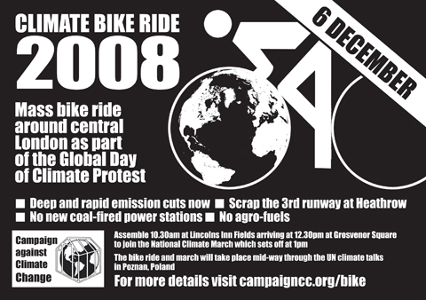
Climate Bike Ride 2008
Assemble 10.30 am Lincolns Inn Fields for a mass bike ride around Central London joining up with the National Climate March at Grosvenor Square (see next listing for National Climate March info)
The three stops on the route are:
-Outside Greenergy, 198 High Holborn – for an agrofuels protest organised by Biofuelswatch
-Outside E.On 100 Pall Mall – for a speaker on NO NEW COAL
-Outside the Department of Transport – for a speaker on sustainable transport
Everyone welcome; decorate your bikes, bring whistles, bring music!
Want to help out for this action? Contact Jeremy Hill on 07816 839883 or jeremy.hill1@btopenworld.com

saturdaydec6th08.jpg
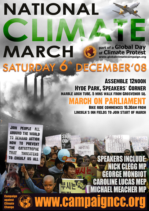
National Climate March and Global Day of Action on Climate
The march starts at 12noon at Grosvenor Square and will move via Carlos Place and Mount Street to Berkley Square and Berkley street to Picacadily, Picadilly Circus, Lower Regent street, Pall Mall and Cockspur street to Trafalgar Square and Whitehall to Parliament Square.
We will bring the UK issues of Aviation, New coal and Biofuels to the streets of London, along with a call for more investment in renewable energy, more energy efficiency and more green jobs.
Speakers will include Nick Clegg (leader Liberal Democrat Party), Caroline Lucas (leader, Green party), Michael Meacher (ex-Environment Minister) and George Monbiot (Honorary President, Campaign against Climate Change).
Contact: 020 7833 9311
www.campaigncc.org

There will also be an After-Party in the Synergy Centre from 5.00 pm till late.

The March on Parliament has four main themes –
1) NO to a 3rd runway at Heathrow and the runaway expansion in aviation expansion.
2) NO new coal – no new coal-fired power stations as planned at eg Kingsnorth in Kent
3) NO to the expansion of agrofuels – with negative impacts on forests, the climate and world food supply.
4) YES to a renewable energy revolution and green jobs – a “Green new Deal”
Come with your own banners, costumes on one of these themes and join up with others pushing that theme……

The March on Parliament for the Climate marks the Saturday midway through the UN Climate Talks in Poznan, Poland and we make our demands on the UK government in solidarity with the world’s poorest and most vulnerable communities that will suffer worst and most immediately from climate change caused overwhelmingly by the rich long-industrialised countries.

We need the government to act now on climate, to stop building coal-fired power stations and new runways – and to begin the renewable energy revolution. We need a tidal wave of people outside parliament to make them act to stop climate catastrophe now! Be part of that tidal wave, be there! Next year may be too late.

for more information:
http://www.globalclimatecampaign.org/ – for a list of cities and actions!
www.campaigncc.org

2008christmascraftacular.jpg
BUST Magazine Christmas Craftacular
6th – 7th December, St Aloysius Social Club, 20 Phoenix Road, Euston, NW1 1TA
craftacular-uk@bust.com

BUST is a magazine devoted to the female. Providing an unapologetic view of life in the female lane, they break down stereotypes! Based in the US and established in 1993, the magazine addresses a variety of different issues within pop sulture, including music, fashion, art & crafts and news.
Editor-in-Chief, Debbie Stoller, decided to call the magazine BUST, because it was “aggressive and sexy and funny… It was a title that could belong to a men’s porn magazine.”
For Women With Something To Get Off Their Chests!
Click here for the Christmas Craftacular’s Facebook Page


jumble%20fever.jpg

Jumble Fever
Under the bridge on Beck Road, E8
Saturday 6th December
Midday-4pm, Entry £1
A fabulous jumble sale with a boogie twist! There will be a great deal to see and do and buy.. See you there!

ETSY
An online shopping bazaar; Etsy is a cross between eBay and Amazon with a humble handmade twist. Launched in June 2005 by Robert Kalin, for sale Chris Maguire and Haim Schoppik, the site has grown to be incredibly popular, with tens of thousands of people selling their handmade goods (90% of whom are women!).
As Christmas draws nearer and greener, we have chosen our favorite handmade things to inspire your presents list.
www.etsy.com

pleated%20clutch.jpg
“The Kelsey”; a pleated clutch in paisley mocha
This handmade clutch is one of many adorable bags created by GraceyBags; get in touch through etsy.com to custom order a clutch and choose from a rainbow of fabrics.
Featured is ‘The Kelsey’ in a paisley mocha print on the outside in greens, blues, pinks, yellows and browns. The inside has been sewn from a silky brown fabric and the bag closes with a small magnet.

recycledjournal.jpg
Recycled Journal – handbound
Find a lovely selection of hand bound recycled books by Rhonda; bookbinder and book artist.
This particularly wonderful journal is made with a variety of recycled scrap papers ranging from large envelopes, posters, junk mail, blank paper, lined and graph paper, covers from old sketch books, old maps, discarded photocopies, misprints from the computer printer to paper bags.
Perfect as an art journal, the book is covered with an old map of the world, the one pictured above showing the islands of Guatemala, Nicaragua and Costa Rica.
There are 256 pages (when you count both sides of each sheet). The pages are handbound using green and brown linen threads, visible on the spine in 4 rows of chain stitches.
The book size is approximately 4″ x 4¼” and 1″ thick (or 10.5cm x 11cm x 2.5cm).

bulldogtotebag.jpg
French Bulldog cotton tote bag

This adorable cotton tote is the perfect carry-all for any occasion. BellaBlu Designs signature French Bulldog silhouette has been cut from Heather Bailey‘s ‘Sway in Brown’ Pop Garden print and appliquéd to this cotton canvas bag. It is 100% 10 oz. cotton, measures 15 x 13 x 3 inches and can be customized with most other dog breeds.

TREEFORT
http://treefortkids.myshopify.com

We’ve also had a browse round treefort.myshopify.com, for some gift ideas for those of you with little ones in your life!

dreamlets.jpg
Dreamlets Dolls
These cute little creatures would make an adorable gift this season, and as a product that gives 1% back to Artworks, Bridges to Understanding, or Poncho, they’re doing a lot more than making a loved one happy! The dolls come in a variety of shapes and colours, each with their own quirky personality. You are also able to choose which organization will benefit from your gift by registering your doll online.

nikkimclure.jpg
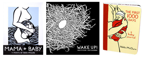
Nikki McClure’s Mama & Baby Things
Treefort also sell many of Nikki Mcclure‘s prints, books, cards, and calendars. Nikki McClure creates complex, yet natural designs by cutting away from a single piece of black construction paper with an x-acto knife. Her works are printed on 100% Recycled, 100% Post-Consumer Waste, Processed Chlorine Free paper that was manufactured with electricity that is offset with Green-e® certified renewable energy. Her work is printed by a small family-owned press in Portland, Oregon, US- and uses soy-based inks.

house_in_interior_large.jpg
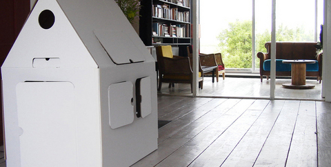
Kids On Roof “House”
is made of Eco friendly-100% recycled cardboard and is 100% biodegradable. These houses are the perfect gift for creative children, as they’re meant to be decorated and personalised! (see below for examples from treefort) Kidsonroof donates 5% of its profits to specific Unicef projects; €24,000 has now been collected for the Unicef project for building better, small-scale housing for HIV/Aids inflicted orphans in Russia.
decoratedhouses.jpg

listings.jpg

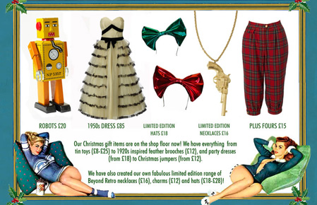
Beyond Retro Christmas Party!

This evening Beyond Retro is throwing it’s annual seasonal gathering – in both it’s shops, viagra buy the original Cheshire St warehouse and new sibling store in Soho – from 6pm – 8pm, there’ll be lots of exclusive goodies for you to browse through and they’ll even throw in some mulled wine and mince pies. Good times.

retro.jpg

Made In Clerkenwell

This evening and all weekend, the Clerkenwell Green Association open their studios for Made in Clerkenwell, an event that showcases the work of over 70 designers they support through providing them with studio space, mentoring and business advice to help them create their work.

The fruits of their labors are exhibited and available for purchase, so you can hunt out that unique Christmas gift and buy all kinds of original and creative wares – ranging from fashion designs to jewellery, accessories, textiles and even ceramics.
What makes this shopping experience so different is that you can mingle with and chat to the designers and find out about their craft, inspirations, working method, becoming a designer, anything you want to know! So pop down, get a great gift and support new designers.

Open 6pm to 8pm, Thursday 27th November 2008 and
12pm to 6pm on Friday 28th, Saturday 29th and Sunday 30th November 2008.
£2.50 entrance – free to the under 16s.

image.jpg
It’s no secret that Brooklyn’s the place to be for smart indie pop these days, view but look a little closer to home and you might be surprised. Take tonight’s superb support acts, advice for example. First up is Pens, erectile a cute lo-fi local trio who, despite playing to only a handful of people, put on a wonderfully frantic and ramshackle performance – think Karen O‘s kid sisters gleefully bashing at snare, guitar and synths.

Fellow Londoners Chew Lips are up next and are nothing short of a revelation. The threesome cater in captivatingly melancholy electronic music and boast a bona fide icon-in-waiting in singer Tigs; she prowls and creeps around the venue, all black bob and wide eyes, unleashing powerful vocals and jumping on the bar to serenade us, while the boys whip up a glitchy synth and bass storm in the background. ‘Solo’ is the band’s set-closer and an undeniable highlight – scuzzy and danceable yet strangely sad, it will be one of your anthems of 2009, no question.

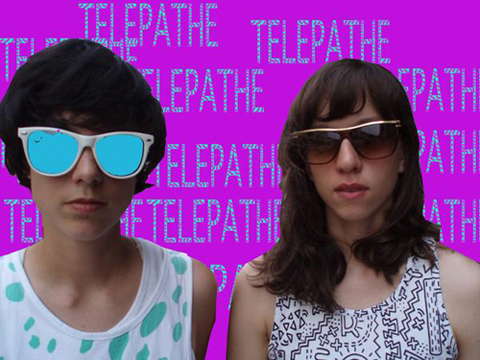
This bunch are hard to follow, but Telepathe just about manage it. Dave Sitek-produced debut ‘Dance Mother’ is on the way in January, and recreating its majesty live is clearly still a tricky undertaking for the Brooklyn duo. They do their best, unleashing a stream of cluttered soundscapes, layered harmonies and clipped rhythms, and while the effect is hypnotic at times, barely a word is uttered between songs – resulting in a distinct lack of atmosphere. This could of course be due, in part, to the fact that they are playing to a room full of typically disinterested Shoreditch types. Whatever the reason the performance falls a little flat, until final effort ‘Chromes On It’ that is, its spine-tingling beats waking the crowd from its stupor and climaxing with speakers shaking and half the band hanging from the ceiling as the hysterical throng down the front excitedly punch the air. It’s just enough to convince us that we’re not quite prepared to give up on Telepathe as a live proposition yet. More like this please.
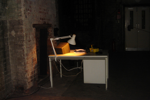
Nuclear: Art and Radioactivity
discount -4.064941&sspn=16.764146, visit this site 39.418945&ie=UTF8&ll=51.524712,-0.079694&spn=0.008598,0.019248&z=16&g=E1+6PG&iwloc=addr”target=”_blank”>Nicholls and Clarke Building, 3-10 Shoreditch High Street, Spitalfields, London E1.

nuclear6.JPG

‘Half-life’
Chris Oakley, 2008
High-definition video, 15 minutes

‘The Nightwatchman’
Simon Hollington & Kypros Kyprianou, 2008
Installation

nuclear2.JPG

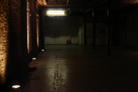
The Nicholls and Clarke Building hosts an exhibition that explores the changing perceptions of nuclear power. In our rapidly deteriorating climate, the effects of nuclear development from the past have come to haunt us. ‘The Nightwatchman,’ by Simon Hollington and Kypros Kyprianou, captures this disturbing predicament.

nuclear4.JPG

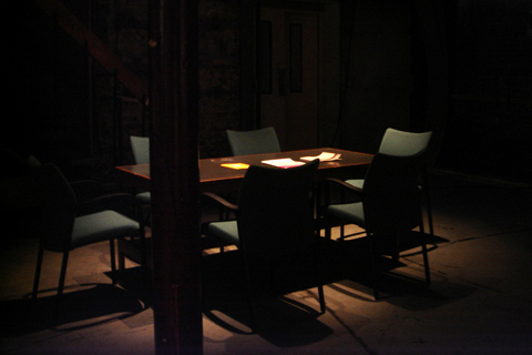
As we entered the installation there was something immediately unsettling about it. A board-meeting table situated in the centre of a large dilapidated storeroom indicated recent activity, and as we crept further through the exhibition space there was more evidence of some night watchmen. But they are no where to be found…

nuclear3.JPG

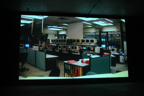
Together with the film ‘Half-life’ by Chris Oakley, there was a sense of being caught in a crossfire of two different eras: the naïvely optimistic 80′s and the knowledgeable cynicism of the present day.

nuclear5.JPG

The film showed a series of paradoxical images of nature vs. technology, and through it we were reminded of how our idea of what is progressive has been turned on it’s head.

nuclear1.JPG

If you’d like to have something of yours across the chests of music aficionados throughout the country, viagra you might like to apply for this. 100% music, cheap 100% recycled paper (well done), sildenafil Bearded Magazine is preparing for the re-launch of the printed magazine on January 29th, and they’re throwing in a t-shirt as well.

T-Shirt%20Design%20Template.jpg
When it came to deciding what should go on the front of said t-shirt, they mumbled gibberish into their beards and drew blanks, and so they’ve put the task out to you the reader to help them out. In fact, they might be so filled with indecision that there could be four winners, so better chances for you! Have a look at the criteria and send in a design soon, you have until the 15th of December.

Categories ,Art, ,Bearded Magazine, ,Competition, ,Fashion, ,Music, ,Recycle

Similar Posts:


Amelia’s Magazine | All I Want for Christmas is cards!

AllIWantIllustration by Peskimo

The Christmas festive season is now upon us and many artists are selling festive products. However few are initiated to help the poor, physician the downtrodden and the destitute. All I Want For Christmas Cards 2009 is one such group of creatives whose latest project is in support of the Bristol based charity ‘Young Bristol’. 20 local artists’ and illustrators’ specific works for the project are being used to create a limited edition run of Christmas cards that will be sold as packs containing each of the 20 cards.A competition, information pills with the brief to create a piece of work based on the phrase ‘All I want for Christmas’ took place and after receiving an overwhelming response, information pills the final 20 artworks were chosen, each on their individual merits and included in the final 20 cards. Initially created with the idea of promoting the charity Young Bristol, All I Want For Christmas Cards has also brought together artists and illustrators local to Bristol for this exciting illustrative project. Here is an opportunity to support those who need! We are today interviewing a few of those illustrators who very kindly lent their creativity to a good cause.

4061092197_f3b40cd591_oIllustration by Sam Bevington

Valerie Pezeron: Hello all. I would like to know who came up with the idea for such a wonderful project and could they tell our readers a little bit about themselves?

Creator/Organiser Ben Steers: The idea for a project like this had been rolling around in my head for a while but I just didn’t know how to best implement the concept. After moving to Bristol to kick start my illustration career and spending some time building contacts with local artists and illustrators I realised the huge concentration of talent that Bristol had to offer and after doing some voluntary work for Young Bristol I saw the opportunity to launch the idea and bring established and aspiring artists together and at the same time help benefit a really worthwhile cause. We have been really blown away by the response from everyone involved and have thoroughly enjoyed the whole process and having the pleasure of meeting so many positive and friendly people.

VP: There are many charities out there? Why pick “Young Bristol” charity for this project? What is the aim of the charity?

Ben Steers: I have recently helped Young Bristol put together a quarterly magazine on volunteer work and events in the area. There are so many great charities out there doing outstanding work every day but I think in the case of Young Bristol I felt that I could offer my creative services in some way and they also focus on helping disadvantaged individuals of my sort of age through media and arts courses. They aim to give those who didn’t have the opportunities that a lot of us take for granted, the chance to further themselves in creative fields and I think that is really something.

VP: The competition was very popular. Was there a jury and how did you select the final 20?

B S: It was a really difficult selective process as we didn’t want to turn any of the designs away simply because people had made a real effort and in the end we had over 40 design submissions to choose from. We both sat down and went through all the designs trying to select 20 on their individual merits and on how well they would sit against the other 19 as a collection. We were very aware of how all 20 cards would look if we sat them all next to each other. In the end we were very lucky in the response we got and selected 20 great designs which are varied in both style and content.

————————————————–

BenNewman1Illustration by Ben Newman

VP: What motivated you to apply for the competition?

Ben Steers: Ben’s enthusiasm made it very difficult to say no and it’s always fun to take part in Bristol projects especially when it’s for a good cause.

VP: Have any of you ever been involved with charities before?

Illustrator Ben Newman and former Amelia’s magazine contributor: I’ve been involved in a few charity projects raising money for hospitals and endangered animals but my involvement always depends on whether my other projects allow me enough time. I’m really pleased that sometimes I can use a skill to help raise money.

VP: It is so easy to fall into cliches when coming up with a concept for Christmas cards? Those cards are truly original and infused with humor. How did you find inspiration for those cards?

BN: My card was inspired by some of the designs on Record company advertising banners from the 1950’s.

VP: I know what I want for Christmas and it is to welcome lovely kittens into my home. What about you, lovely people?

BN: Booze, food, friends and lot’s of sleeping.

—————————————————-

BjornLie

Illustration by Bjorn Lie

Name of Illustrator: Bjorn Lie

VP: What motivated you to apply for the competition?

BL:  The fact that it was for a local charity. I normally do work for clients in other countries, which is nice, but makes me feel a bit detached from where I actually am, Bristol. This was a chance to be a part of something positive, by just doing my own thing.

VP: Have any of you ever been involved with charities before?

BL: Not actively, no. I would like to do more of it in the future though.

VP: It is so easy to fall into cliches when coming up with a concept for Christmas cards? Those cards are truly original and infused with humor. How did you find inspiration for those cards?

BL:  I’ve been doing a lot of wintry scenes recently for a picture book, so I was already in that frame of mind! My card features a guy on a “spark støtting’, which is an old school means of transportation back in Norway where I’m from.

——————————————————

Rich T

Name of Illustrator: Rich T

VP: What motivated you to apply for the competition?

Rich T: I thought it was a great idea for a project, a good brief and most importantly fun. If you want people to do stuff for free you have to make it fun, you can’t rely on good will. Kids today….

VP: Have any of you ever been involved with charities before?

Rich T: I have donated artwork for charity auctions in the past.

VP: It is so easy to fall into cliches when coming up with a concept for Christmas cards? Those cards are truly original and infused with humor. How did you find inspiration for those cards?

Rich T: I didn’t want to draw anything to do with Christmas so for me the opposite of Christmas is probably Pepsi, always forgotten in the festive period along with Jesus, job done.

VP: I know what I want for Christmas and it is to welcome lovely kittens into my home. What about you, lovely people?

Rich T: All I want for Christmas is loads of expensive gifts, preferably ones I can sell on E bay, and a dog but I don’t want it forever, just Christmas.

———————————————————

Name of Illustrator: Chris Dickason

CD: More than anything else the brief sounded like a fun way to spend some time away from commercial work and a chance to get a little Christmas over nostalgic whilst I looked for inspiration. There’s a fantastic wealth of talent in Bristol and consistently the artists and designs here produce work that’s as innovative as it is clever, funny and engaging. I’m really interested in being involved with projects that help promote the city as a creative hub. And obviously it’s great to be involved with a local charity as well.

VP: Have any of you ever been involved with charities before?

CD: I’ve worked commercially for charities and raised a bit of money from sponsorship for just about plodding myself around some marathons but I’d been looking for a project that consolidated my own discourse and a worthy cause. The ‘All I Want for Christmas’ project ticked a lot of boxes in my head when I received the email. It’s very much a win-win situation for the artists. Projects like this offer creative freedom are chance to see work viewed along side your contemporaries as well as providing a healthy dose of the ‘feel good factor’ as you get to support a charity to boot.

VP: It is so easy to fall into cliches when coming up with a concept for Christmas cards? Those cards are truly original and infused with humor. How did you find inspiration for those cards?

CD: Christmas is a great time of year because it provides some very personal memories but these experiences are similar to that shared by most other people. I was motivated to create an image that was based on occurrences that are typical of my Christmas experiences (over indulgence, goodnatured gluttony, sharing & caring) and hoped that these ideas would resonate with the audience.

VP: I know what I want for Christmas and it is to welcome lovely kittens into my home. What about you, lovely people?

CD: The main thing I want for Christmas is in fact free and that is a nice chunk of uninterrupted sleep. If I had my may I’d turn into a big grizzly bear and snooze all winter long and wake back up when the temperature is back in double figures. Alas I’m yet to master this skill.

shop

So now you know what these chaps all want for Christmas. How about you? You might just want to escape the usual uninspiring, tacky and overdone festive art on display this season and treat yourself to fun, cheeky and sustainable charity cards. The Christmas card packs are a limited edition of 500, each containing 20 cards individually designed by 20 of Bristol’s finest illustrators, litho printed on 100% recycled card, 20 envelopes and an A2 poster. They cam be purchased on www.alliwantforchristmascards.com. Price per pack: £15 + £2.99 p&p

Categories ,art, ,charity cards, ,craft, ,exhibition, ,illustration, ,illustrator, ,interview, ,london, ,Young Bristol

Similar Posts:


Amelia’s Magazine | Alternative Risk Transfer: Interview with Eugene Perera

eugene-peraraPhotography by Egene Perera

Artists Eugene Perera, viagra dosage Eiko Honda and Christopher Thomas set up the A.R.T Organization or “Art Casino” in an attempt at initiating reflection on the nature of value of art, pill comodification and risk taking in the art market. Jessica Stokes talks to artist Eugene Perera about “after hours” poker sessions.

Press-Release-Alternative-R

Photograph courtesy of A.R.T

Jessica Stokes: Where did you get the idea for this casino?

Eugene Perera: The idea for Alternative Risk Transfer came out of my interest in art and poker. Poker is a game of skill, risk and chance where an experienced player, whilst having no control over the cards they are dealt, is nevertheless able to gain an all important edge through the skilful manipulation of risk in the form of bets. It struck me that this was in some way relevant to my own art practice where I was constantly assessing the risks within a particular course of action and working out what to invest in that action. By investment here I do not necessarily mean economic but time, thought, ideas, effort and skill and so on.  As an artist, I wanted to highlight this and ask whether such a way of working which potentially derisks is appropriate to the creative process and whether instead we should be working in such a way that failure is an ever-present possibility. As I began to think about the relevance of poker and how it might illuminate art practice and how artists negotiate the art market, I wondered whether it might be possible to create a work involving art and poker within the context of a wider exhibition. That is the impetus behind this show; it’s a form of ongoing research really.

A.R

Image courtesy of A.R.T

JS: What is your background?

EP: I have been creating art for around five years now following a Masters in Art History. Before this, I used to work in media where I set up a number of music and arts radio stations. Working in the media business environment exposed me to constant considerations of risk and as I progressed I noticed how I was better able to assess and manage risk, much like in poker and in art practice. The question now though is not so much how do I minimize risk but how do I explore risk. The exhibition Alternative Risk Transfer is an unknown to me and that in itself is inherently risky and my experience cannot fully prepare me for what might happen!  That’s interesting to me!

amber-cowan-image

Photograph courtesy of Mark McGowan

JS: Who are the artists that will be taking part?

EP: We have a highly diverse range of artists taking part in the show ranging from the extremely new to the established such as Mark McGowan and Anthony Gross. There is also a strong international strand to the show with Japanese, Taiwanese and US artists alongside a strong London presence.  The show encompasses video, sculpture, photography, painting and performance and there are a quite a few interactive gaming works such as the nightly poker games and a 24-hour chess performance created by Patrick Goddard. Many of the participating artists are creating work outside of their normal comfort zones that is commendable in this risk adverse environment. Furthermore, they are willing to stake their work in the nightly poker games in order to better understand how they respond to situations of risk.

JS: Is it important to be aware of the connotations of gambling and the encouragement thereof in today’s climate?

EP: I think it is important to be aware of what one is doing when you’re risking something in a gaming or betting situation. Unaware gambling is potentially harmful and we all know the consequences. With the Alternative Risk Transfer show at The Rag Factory, we are attempting to provoke discussion around what it means when we risk something so I think that has to be a useful contribution.

How about chance, skill and risk-taking in an unusual twist on the debate over the value of art? Give free rein to risky behavior at The Rag Factory 16-18 Heneage street, London E1 5LJ. The exhibition is on from the 10th to 13th of December from 12 to 10 pm. Why not come to the preview on the 9th of December from 6 to 9 pm?

Categories ,Alternative Risk Transfer, ,art, ,Brick Lane, ,Christopher Thomas, ,East London, ,Eiko Honda, ,Eugene Perera, ,exhibition, ,gig, ,installation, ,interview, ,live, ,london, ,music, ,the rag factory

Similar Posts:


Amelia’s Magazine | An Interview with Illustrator Jordan Andrew Carter

Jordan Carter

A self-proclaimed ‘illustrational hustler/graphical wizard’, Jordan Andrew Carter uses detailed pencil drawings and contrasting block shapes to ‘mystify and amaze your human see-globes’. This rising star graduated from Norwich University of the Arts last year and has just started to pencil a name for himself in the biz. While illustration is one of his big life aims, he also mentions his other aspirations: ‘my current life goal is to own a pug and live near the sea. I also have a HUGE weakness for biscuits, and believe if you replaced money with biscuits the world would be a happier place.’ Dividing his time between ‘Northamptonshire’ and Essex, pencils and Poscas are his ‘weapons of choice’.

Jordan Carter

Jordan paints what can only be described as ‘fairytales high on Posca fumes’. His detailed wildlife pencil drawings (which remind me of the work of Ohh Deer’s Jamie Mitchell ) are mixed with bright, block colours. Delightfully over the top and topped off with a sprinkling of humour, Jordan‘s illustrations are visual jokes with lashings of both elegance and fun. There’s a touch of Discworld in there too, in the sense that worlds that are balanced on top of animals crop up more than once. There’s even a smidge of Narnia in another of his drawings. Whether it’s a whale with the weight of the world on his shoulders, an orangutan on a pink bicycle, or a leopard wearing a headdress, the images all bring to mind a fantasy land with a dash of urban life. I can’t help but think that stories would have been much more fun when I was a kid if Jordan was involved. I spoke to this new kid on the block about his latest projects and love of desk clutter.

Jordan Carter

What kind of projects have you worked on recently?
I recently took part in Inkygoodness and Ammo Magazine‘s beermat character/ Poop Deck Exhibition at the Coningsby Gallery in London which was amazing. It was pretty awesome to take part and exhibit alongside some of the illustrators that I really admire like Hattie Stewart, Yema Yema and James Burlinson. I did a piece for Creative England‘s One Thing I Know publication which sold out last week! I’m also working on creating my own clothing shop/ brand called Woodless.

Jordan Carter

There’s a definite storytelling element to your work, were you a big reader as a kid?
As a kid I preferred to be outside causing havoc like a little ruffian rather than sitting inside reading. I’m one of those people that need visual stimulation so I don’t really read a lot. If a book doesn’t have copious amounts of imagery then my mind wanders so I tend to stick to magazines. Articles are usually short and sweet with killer images, which is perfect for me.

Does what’s happening in your life affect your illustration?
In terms of inspiration: definitely not. When I sit down to draw it’s a getaway for my brain so I would rather focus on anything except what’s happening in my life. Time and money are the things that affect it most; I can’t currently spend all day everyday drawing even though I would love to so it’s just a night-time pursuit at the moment.

Jordan Carter

Is there a singular moment that sums up why you decided to become an illustrator?
Originally I wanted to become a Fireman until I realised I was scared of heights and my dreams were dashed. I don’t think there was a specific moment when I knew I wanted to become an illustrator. I’m not really a planner, I studied Fine Art at college and then Games Art at university so I guess I only knew I wanted to be an Illustrator when people started calling me it. It’s something I’ve always done and enjoyed so I’ve kind of naturally fallen into being an Illustrator.

Jordan Carter

You use mixed-media a lot in your art, is there something that compels you to mix-it up a little?
I’ve always been able to sort of adequately draw things and people but I became a massive fan-boy of various print processes and anything hand printed when I met my Graphic Designer girlfriend at university. My abilities and influences just seem to lend themselves to creating something that is a blend of everything I know or have learnt; also, it stops me getting bored because I can play about with more ways of making an image.

Jordan Carter

There’s a lot of humour in your work, do you think funniness is important in contemporary illustration?
For sure! I think if you can make someone smile, then you’re really connecting with them, so I would rather do that as opposed to just creating something that looks nice. Humour is one of the most important things in life, I think it naturally filters through into your work if you want it to or not.

Jordan Carter

What is your dream commission?
I’d love to do some larger scale mural work in a shop!

Do you really enjoy long starlit walks along the soggy shoreline and apple bobbing in baskets of kittens?
Don’t tell PETA, all the kittens consented.

Jordan Carter

Describe your desk
My desk is pretty standard to be honest, it’s white and surrounded by clutter and illustrative trinkets. There are shelves next to it filled with cardboard elephant heads, vinyl toys, paper toys, books, a skull, Lego people, zones and vintage illustrations. There is also a cube man called Earnesto Cubeman the First that sits on top of my iMac.

Jordan Carter

Jordan Carter

What’s your strangest influence?
Anything on the dark side of Youtube, if you just keep clicking you will eventually come out the other end feeling weird and questioning what you just watched. One time I spent an hour flicking through videos of hornets fighting wasps…

Is there a font you love to hate?
There are a lot of fonts I hate but none that I love to hate. I’m a huge sucker for pretty much anything hand-drawn, it all looks so fresh and natural.

Jordan Carter

All illustrations courtesy of Jordan Carter. You can view his portfolio here www.jordanandrewcarter.co.uk/

Categories ,Ammo magazine, ,art, ,artist, ,Coningsby Gallery, ,Creative England, ,graphic designe, ,hand drawn, ,Hattie Stewart, ,illustration, ,illustraton, ,inkygoodness, ,James Burlinson, ,Jordan Carter, ,newcomer, ,Ohh Deer, ,Poop Deck, ,Woodless, ,Yema Yema

Similar Posts:


Amelia’s Magazine | A Flowering Theory embroidered art animation by Stefanie Posavec and Abbie Stephens

A Flowering Theory by Stefanie Posavec 3

An extract from one of the most influential texts in scientific literature, Charles Darwin’s On the Origin of Species, was the inspiration for this beautiful animation of embroidered plant forms. Designer Stefanie Posavec and animator Abbie Stephens worked together to create A Flowering Theory, and here Stefanie Posavec describes her role in the process.

I’ve always been interested in language and literature, and much of my previous work revolves around the visualisation of text, where I’ve worked with themes, paragraphs, words and the like to create visual representations of a piece of literature. However, I’ve never created work with the invisible grammar that holds a sentence together, and this film presented an opportunity to explore this subject further.

A Flowering Theory by Stefanie Posavec 1

A Flowering Theory by Stefanie Posavec 2

Using the well-known ‘entangled bank’ passage from the conclusion of Charles Darwin‘s On the Origin of Species (a text I have worked with before), I converted the passage’s grammatical structure of interconnected nouns, verbs, and other word types into an ‘entangled bank’ of visualised words and grammar. 

A Flowering Theory by Stefanie Posavec 4

Stefanie Posavec RandomActs_inprogress_1

Abbie Stephens art-directed and animated this film, taking my static visualisations and breathing life into them through her translation of the flat graphics into a sewn paper, stop motion animation. This group of ‘grammar plants’ grow and flower, alluding to how Darwin’s theory first took root and then flourished, changing how we as humans see our place in the world.

A Flowering Theory was commissioned by Protein as part of Channel 4 Random Acts.

Categories ,A Flowering Theory, ,Abbie Stephens, ,animation, ,art, ,Channel 4 Random Acts, ,Charles Darwin, ,embroidery, ,On the Origin of Species, ,Protein, ,Stefanie Posavec

Similar Posts:


Amelia’s Magazine | Aesthetic Distance

David-Cotterrell-supernumerary01.jpg

Danielle Arnaud likes change but is not all that inclined towards interior design, and so her house on Kennington Road is both home and gallery, transformed every few months to the workings of whichever artist she happens to be exhibiting. “A change in space brings a change in the mind” she tells me, and I cannot help but wonder what kind of sobering experience it must be to see the protruding and bloodied flesh of a soldier as you walk through your front door each day.

Aesthetic Distance is the second body of work born of David Cotterrell’s stint with the Joint Forces Medical group in Afghanistan, where he was the commissioned artist invited as witness and observer, a task he found to be overwhelming and emotionally turbulent. It is a sentiment you can only try to empathise with as you pass through stark rooms bearing windows to intimate scenes in operating theatre, destruction and individual human cost conjoined with compassion, dignity, and medical industriousness. As you too become observer and witness, you begin to understand why the work seems so distant. I at first strained to find the artist in the work before me, Cotterrell’s own engagement with the bizarre world into which he was emerged, but the photo-journalistic nature of the the photographs makes both artist and viewer witness in way that is impartial and almost matter-of-fact, stripped and exposed are the quiet processes that roll endlessly beneath the wheels of the war machine.

Two films, also eerily distant, document the transport and treatment of casualties during a Major incident. You don’t actually see the patients, just the fact of it; a bleak and wasted landscape where the hum of slicing blades form the backdrop to a continuously arriving and departing Chinook helicopter, whilst Green Room gives an alternative vision of the same event. Medics wait for their assigned patients, their bodies and faces concentrated on the tasks to come over the next four hours, like actors preparing to go on stage.

aestheticdistance3.jpg

aestheticdistance2.jpg

aestheticdistance4.jpg

It is well worth dipping into Cotterrell’s diary entries, where a more personal documentation of his own experiences are captured. The exhibition lasts until February 15, and though sobering is well worth a visit. Be sure to say hello to Danielle’s chiwawa.

David Cotterrell is featured in issue ten which you can order here.

Categories ,Aesthetic Distance, ,Afganistan, ,Art, ,Conceptual, ,Danielle Arnaud, ,Video

Similar Posts:


Amelia’s Magazine | The Creators Project

The last time we met Peaches, she was attending a friends party in Brick Lane, and on down-time from her live shows. Relaxed, mellow and low key, I had no idea that this super-chilled woman in front of me would put on the most spectacular and extravagant stage show that I have ever seen. But that’s just what she did one month later under the warm night sky of Benicassim, mesmerising the audience that she presided over in her Grand Dame role of sound sculptress; one part circus ringleader, one part mad professor. Combining state of the art technologies with her minimalist electro music, she created sounds and visuals on lazer harps, glow in the dark rods that moved micro-tonally, had her backup singers beamed across her clothes and generally raised the bar of musical creativity. So just a regular night for Peaches then. Recently, she took part in a Vice and Intel collaboration otherwise known as The Creators Project, an initiative designed to connect young people through a common passion for creativity and technology, to riff about her constantly evolving concepts and ambitions. Other artists involved in the project include Phoenix, Mark Ronson, Interpol, Spike Jonze, UNKLE and Nick Zinner from the Yeah Yeah Yeahs.

Here’s a sneak peak of Phoenix, who we always have time for:
http://www.thecreatorsproject.com/en-uk/creators/phoenix

More interviews can be found on TheCreatorsProject.com, an interactive portal and anthology which will house a selection of eighty-four original videos and featuring work and interviews from the most creative artists across the globe, including discussions with innovators working in indie film, futuristic architecture, avant-garde electronica and fashion. These include Brazil’s Muti Randolph, China’s Peng Lei, the U.K.’s United Visual Artists, and the U.S.’ Radical Friend.


Categories ,art, ,Benicassim, ,Intel, ,Mark Ronson, ,Muti Randolph, ,Peaches, ,Peng Lei, ,phoenix, ,Radical Friend, ,Spike Jonze, ,Technology, ,The Creators Project, ,United Visual Artists, ,unkle, ,vice

Similar Posts:

Bookmark this:
  • Facebook
  • Twitter
  • MySpace
  • del.icio.us
  • StumbleUpon
  • Digg
  • E-mail this story to a friend!
  • Technorati
  • LinkedIn

Amelia’s Magazine | Album Review: Gazelle Twin – The Entire City

Gazelle Twin - Polaroid

Gazelle Twin‘s debut album opens with the threatening bass horns of new single The Entire City, stuff and straight away the mood is set for what is to come. Singer Elizabeth Walling‘s coos clatter in just before the kicking drums. but there are no lyrics and the atmosphere is heavy and pounding, viagra 40mg not for the fainthearted.

Gazelle Twin The Entire City

Concrete Mother starts more softly, seek meandering undulations back whispering sighs before vocals kick in. ‘She’ll teach me love…‘ Then comes upcoming single Men Like Gods, which features Elizabeth’s tremulous voice at the forefront. What at first makes sense becomes more and more vague: tantalisingly mysterious. The back beat emulates the disjointed foot steps of the Sardinian mummers in the video. I am Shell I am Bone twists the beats against angelic vocals ‘Made of concrete, made of gold. I am young and I am old…

Gazelle Twin by Sophia O'Connor
Men Like Gods, Gazelle Twin by Sophia O’Connor.

One of my very favourite tracks is Changelings – the first that brought Gazelle Twin to my attention at the end of last year…. and it’s an ideal introduction to this most unique of talents. Bell Tower starts as its name suggests, but the bells are muffled, as if heard from far away or behind layers of padding, under water. Again the angelic notes back the mournful questionings… it’s hard to understand the lyrics, but as with the whole album it’s the atmosphere that is important – the song building confidence and momentum through sound.

Gazelle Twin by Lea Rimoux
Gazelle Twin by Lea Rimoux.

Fear is driven out in When I Was Otherwise: confident vocals sit astride the infrequent bass squelches. Obelisk begins with beats battering back and forth as if on a ping pong table, but a melody ‘waking up from a deep sleep we don’t owe ourselves‘ soon takes over, curling around and engulfing the beat. Then we are straight into Far From Home, a small interlude that features cascading Madrigal-esque vocal harmonies, a nod to Elizabeth’s classical inspirations.

Gazelle Twin - The Entire City

Nest again starts low, deep, muted before the song begins. It’s perhaps the most ‘normal’ of the songs on The Entire City, a simple tune taking pride of place, and a chance for Elizabeth to show of crystal clear vocals… ‘When it’s too late… will we ever learn?

Gazelle Twin by Nicola Ellen
Gazelle Twin by Nicola Ellen. Read her mini review of the album here.

The quivering notes of Fight or Flight only last a minute, drifting off into the ether, and then we’re on to the final track, View of a Mountain. Here the synth reigns queen against the clattering background.

Gazelle Twin The entire city

Think of Gazelle Twin as a folky female Aphex Twin, a mysterious little sister of The Knife, choral madrigals for our uncertain 21st century, something utterly unique and very very exciting. The official album launch is on 1st September at The Islington Metal Works and I for one will be there.

gazelle_twin by gaarte
Gazelle Twin by Gaarte.

Elizabeth Walling eschews the controlled machinations of the music machine: with an image carefully crafted to mystify, to hide, to enhance the sound rather than her body as most female musicians do. This is music as performance, as art and as something all engulfing… but equally at home listened to on your desktop. Since I was sent the album The Entire City has never been far from my itunes playlist. I suggest you download it too: it came out on digital download on 11th July. And then see her live.

Gazelle Twin - The Entire City Gazelle Twin - The Entire City

Make sure you read my previous interview with Elizabeth Walling of Gazelle Twin to find out more. There is another very good review of The Entire City on Drowned in Sound.

Categories ,album, ,Aphex Twin, ,art, ,Bass, ,Bell Tower, ,brighton, ,Choral Madrigals, ,Concrete Mother, ,Drowned In Sound, ,Elizabeth Walling, ,Far From Home, ,Fight or Flight, ,folk, ,Gaarte, ,Gazelle Twin, ,Harmonies, ,I am Shell I am Bone, ,Launch, ,Lea Rimoux, ,Men Like Gods, ,Mummers, ,Nest, ,Nicola Ellen, ,Obelisk, ,review, ,Sardinia, ,Sophia O’Connor, ,Synth, ,The Entire City, ,The Islington Metal Works, ,The Knife, ,Twisted beats, ,View of a Mountain, ,When I Was Otherwise

Similar Posts: