Amelia’s Magazine | Wolf and Badger Pop Up Store at Selfridges: Launch Party Review

thumbnail first aid kit

Peggy Sue Illustration by Emilie Lashmar

Wichita, more about the record label that has brought us Bloc Party, buy information pills The Cribs, Los Campesinos! and Simian Mobile Disco (to name but a few) continued its 10th Anniversary celebrations at the Relentless™ Garage in sunny Highbury. As a special birthday treat, early arrivals received a gift bag full of delightful Wichita goodies, including a Simian Mobile Disco vinyl LP and the new album from Peter, Bjorn and John. The resultant hubbub and excited rustling of bags did little to detract from a nice opening set from Meg Baird, whose delicate fingerpicking and lush, hushed vocals set the tone for a great evening of folk.

Next on stage was the more vivacious Peggy Sue, who didn’t hesitate to show a dazzled crowd why their debut album Fossils and Other Phantoms was so critically acclaimed. Opening the set with the captivating, percussive ‘Watchman’, Rosa and Katy really were a surprise and a delight – consider me a convert. Their luxurious, soulful vocal harmonies were only outdone by their impressive instrumental dexterity, alternating effortlessly between guitar, percussion, ukulele and accordion. With Olly’s marching drums ably complemented by the violin and cello of Becca and Emma, the highlight of the set came in the form of a particularly stunning rendition of ‘Yo Mama’, its chirruping, Gallic accordion and bluesy lead riff laying a spirited backdrop to Katy and Rosa’s spectacular voices. As the girls finished their all-too-brief set with a modest thanks to Wichita and the crowd, the sheer volume of rapturous applause (particularly in such an intimate venue) was a real testament to the performance. You can’t help but get the impression these two have only good things on the horizon.


Illustration by Jill Patterson

Last up were headliners (and perennial Amelia’s Mag favourites First Aid Kit, each taking to the stage in stunning gold dresses – Klara’s marbled with purple paisley, Johanna’s with a magnificent Persian pattern flecked with deep reds and autumnal browns. As someone who had heard little of their music beyond their fantastic cover of Fleet Foxes’ ‘Tiger Mountain Peasant Song’ (Youtube it) and recent single ‘I Met Up With the King’, I was pleasantly surprised by their laid-back, distinctly acoustic folk-pop; mature, intricate lyrics and the sibling’s vocal harmonies – the combination of which results in a sound reminiscent of Tegan and Sara’s ‘So Jealous’ crossed with the aforementioned Foxes’ eponymous first album.

Despite coming off a little awkward at first, Johanna and Clara soon settled into a relaxed, warm-hearted banter with the crowd between songs as they made their way through debut album ‘The Big Black and The Blue’. It was settling in to be a perfectly pleasant – if unremarkable – set until, four or five songs in, Kara brazenly unplugged her guitar and the sisters emerged from behind the microphones and belted out a beautiful rendition of ‘Ghost Town’ to the muted room. The stripped down version of an already great song perfectly played to the intimate setting.

The spectacle didn’t stop there. Perhaps buoyed by the song’s thunderous reception, the girls then proceeded to hilariously produce four tickets to this weekend’s Latitude festival, before plucking four volunteering fans from the crowd for a heart-warming demonstration of the brave souls’ lyrical knowledge, with a pair of tickets going to the two winners. It certainly brought the evening to life, as the crowd – now buzzing with excitable chatter – cheered on their favourite contestant. And although you had to feel bad for the unlucky guy and gal who left the stage empty handed, it was impossible not to be charmed.

Closing off the set with the lovely lilting melodies of ‘I Met Up With The King’ was a perfect end to the evening (and no, I wasn’t biased by it being the only song I knew all the lyrics to). Emerging from the Garage and shuffling sleepy-eyed towards the Tube with a bag full of music treats, I couldn’t help but feel contented: beautiful music, memorable chatter and an irrepressible charm to the whole occasion – it perfectly summed up Wichita as a label. And the celebrations aren’t over; the likes of Los Campesinos! (a truly great live act), The Cribs and Johnny Foreigner are still to come later this week. On the basis of last night, it will be well worth a look.


Peggy Sue Illustration by Emilie Lashmar

Wichita, approved the record label that has brought us Bloc Party, page The Cribs, information pills Los Campesinos! and Simian Mobile Disco (to name but a few) continued its 10th Anniversary celebrations at the Relentless™ Garage in sunny Highbury. As a special birthday treat, early arrivals received a gift bag full of delightful Wichita goodies, including a Simian Mobile Disco vinyl LP and the new album from Peter, Bjorn and John. The resultant hubbub and excited rustling of bags did little to detract from a nice opening set from Meg Baird, whose delicate fingerpicking and lush, hushed vocals set the tone for a great evening of folk.

Next on stage was the more vivacious Peggy Sue, who didn’t hesitate to show a dazzled crowd why their debut album Fossils and Other Phantoms was so critically acclaimed. Opening the set with the captivating, percussive ‘Watchman’, Rosa and Katy really were a surprise and a delight – consider me a convert. Their luxurious, soulful vocal harmonies were only outdone by their impressive instrumental dexterity, alternating effortlessly between guitar, percussion, ukulele and accordion. With Olly’s marching drums ably complemented by the violin and cello of Becca and Emma, the highlight of the set came in the form of a particularly stunning rendition of ‘Yo Mama’, its chirruping, Gallic accordion and bluesy lead riff laying a spirited backdrop to Katy and Rosa’s spectacular voices. As the girls finished their all-too-brief set with a modest thanks to Wichita and the crowd, the sheer volume of rapturous applause (particularly in such an intimate venue) was a real testament to the performance. You can’t help but get the impression these two have only good things on the horizon.


Illustration by Jill Patterson

Last up were headliners (and perennial Amelia’s Mag favourites First Aid Kit, each taking to the stage in stunning gold dresses – Klara’s marbled with purple paisley, Johanna’s with a magnificent Persian pattern flecked with deep reds and autumnal browns. As someone who had heard little of their music beyond their fantastic cover of Fleet Foxes’ ‘Tiger Mountain Peasant Song’ (Youtube it) and recent single ‘I Met Up With the King’, I was pleasantly surprised by their laid-back, distinctly acoustic folk-pop; mature, intricate lyrics and the sibling’s vocal harmonies – the combination of which results in a sound reminiscent of Tegan and Sara’s ‘So Jealous’ crossed with the aforementioned Foxes’ eponymous first album.

Despite coming off a little awkward at first, Johanna and Clara soon settled into a relaxed, warm-hearted banter with the crowd between songs as they made their way through debut album ‘The Big Black and The Blue’. It was settling in to be a perfectly pleasant – if unremarkable – set until, four or five songs in, Kara brazenly unplugged her guitar and the sisters emerged from behind the microphones and belted out a beautiful rendition of ‘Ghost Town’ to the muted room. The stripped down version of an already great song perfectly played to the intimate setting.

The spectacle didn’t stop there. Perhaps buoyed by the song’s thunderous reception, the girls then proceeded to hilariously produce four tickets to this weekend’s Latitude festival, before plucking four volunteering fans from the crowd for a heart-warming demonstration of the brave souls’ lyrical knowledge, with a pair of tickets going to the two winners. It certainly brought the evening to life, as the crowd – now buzzing with excitable chatter – cheered on their favourite contestant. And although you had to feel bad for the unlucky guy and gal who left the stage empty handed, it was impossible not to be charmed.

Closing off the set with the lovely lilting melodies of ‘I Met Up With The King’ was a perfect end to the evening (and no, I wasn’t biased by it being the only song I knew all the lyrics to). Emerging from the Garage and shuffling sleepy-eyed towards the Tube with a bag full of music treats, I couldn’t help but feel contented: beautiful music, memorable chatter and an irrepressible charm to the whole occasion – it perfectly summed up Wichita as a label. And the celebrations aren’t over; the likes of Los Campesinos! (a truly great live act), The Cribs and Johnny Foreigner are still to come later this week. On the basis of last night, it will be well worth a look.


Peggy Sue Illustration by Emilie Lashmar

Wichita, sale the record label that has brought us Bloc Party, The Cribs, Los Campesinos! and Simian Mobile Disco (to name but a few) continued its 10th Anniversary celebrations at the Relentless™ Garage in sunny Highbury. As a special birthday treat, early arrivals received a gift bag full of delightful Wichita goodies, including a Simian Mobile Disco vinyl LP and the new album from Peter, Bjorn and John. The resultant hubbub and excited rustling of bags did little to detract from a nice opening set from Meg Baird, whose delicate fingerpicking and lush, hushed vocals set the tone for a great evening of folk.

Next on stage was the more vivacious Peggy Sue, who didn’t hesitate to show a dazzled crowd why their debut album Fossils and Other Phantoms was so critically acclaimed. Opening the set with the captivating, percussive ‘Watchman’, Rosa and Katy really were a surprise and a delight – consider me a convert. Their luxurious, soulful vocal harmonies were only outdone by their impressive instrumental dexterity, alternating effortlessly between guitar, percussion, ukulele and accordion. With Olly’s marching drums ably complemented by the violin and cello of Becca and Emma, the highlight of the set came in the form of a particularly stunning rendition of ‘Yo Mama’, its chirruping, Gallic accordion and bluesy lead riff laying a spirited backdrop to Katy and Rosa’s spectacular voices. As the girls finished their all-too-brief set with a modest thanks to Wichita and the crowd, the sheer volume of rapturous applause (particularly in such an intimate venue) was a real testament to the performance. You can’t help but get the impression these two have only good things on the horizon.


Illustration by Jill Patterson

Last up were headliners (and perennial Amelia’s Mag favourites First Aid Kit, each taking to the stage in stunning gold dresses – Klara’s marbled with purple paisley, Johanna’s with a magnificent Persian pattern flecked with deep reds and autumnal browns. As someone who had heard little of their music beyond their fantastic cover of Fleet Foxes’ ‘Tiger Mountain Peasant Song’ (Youtube it) and recent single ‘I Met Up With the King’, I was pleasantly surprised by their laid-back, distinctly acoustic folk-pop; mature, intricate lyrics and the sibling’s vocal harmonies – the combination of which results in a sound reminiscent of Tegan and Sara’s ‘So Jealous’ crossed with the aforementioned Foxes’ eponymous first album.

Despite coming off a little awkward at first, Johanna and Clara soon settled into a relaxed, warm-hearted banter with the crowd between songs as they made their way through debut album ‘The Big Black and The Blue’. It was settling in to be a perfectly pleasant – if unremarkable – set until, four or five songs in, Kara brazenly unplugged her guitar and the sisters emerged from behind the microphones and belted out a beautiful rendition of ‘Ghost Town’ to the muted room. The stripped down version of an already great song perfectly played to the intimate setting.

The spectacle didn’t stop there. Perhaps buoyed by the song’s thunderous reception, the girls then proceeded to hilariously produce four tickets to this weekend’s Latitude festival, before plucking four volunteering fans from the crowd for a heart-warming demonstration of the brave souls’ lyrical knowledge, with a pair of tickets going to the two winners. It certainly brought the evening to life, as the crowd – now buzzing with excitable chatter – cheered on their favourite contestant. And although you had to feel bad for the unlucky guy and gal who left the stage empty handed, it was impossible not to be charmed.

Closing off the set with the lovely lilting melodies of ‘I Met Up With The King’ was a perfect end to the evening (and no, I wasn’t biased by it being the only song I knew all the lyrics to). Emerging from the Garage and shuffling sleepy-eyed towards the Tube with a bag full of music treats, I couldn’t help but feel contented: beautiful music, memorable chatter and an irrepressible charm to the whole occasion – it perfectly summed up Wichita as a label. And the celebrations aren’t over; the likes of Los Campesinos! (a truly great live act), The Cribs and Johnny Foreigner are still to come later this week. On the basis of last night, it will be well worth a look.

WolfandBadger skull
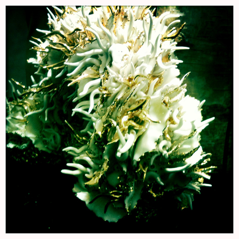
Flock skull by Stuart Richards. All photography by Amelia Gregory.

I don’t often head into town for launches after work these days but I was intrigued enough by the sound of the Wolf and Badger pop up store in Selfridges to request a ticket from them and make the trek over on my bike. Even though it was raining and I now have a snuffle.

There’s probably a reason why I don’t get asked to parties at that temple to consumerism Selfridges – it’s hallowed halls are all gleaming and full of trinkets and I don’t know that the readers of my website have much money to spend in them. I certainly don’t. But it’s rather wonderful to visit once in a blue moon – especially the food hall, viagra sale where I couldn’t resist picking up some Marmite flavoured biscuits by Fudges (shaped like Marmite pots!) as a special treat. Now there’s a brand diffusion I really can’t get enough of…

WolfandBadger Selfridges window display by Kyle Bean
The current window display by Kyle Bean.

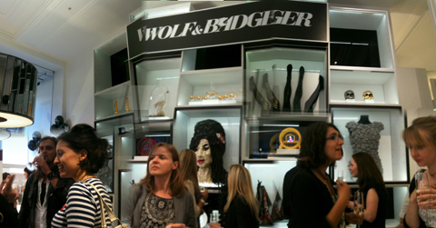
On arrival I could see what was rather a swanky affair through the windows as I peered past a rather wonderful fairytale castle made out of old books. Inside some furiously groomed folk filled the aisles as they fuelled up with champagne and jellybeans. A couple of ladies with bog roll wigs delivered creamed canapes from a side table and there was so much people watching potential that I found it hard to concentrate on the work being sold.

WolfandBadger amelia gregory
WolfandBadger launch photo by Amelia gregory
Not sure about this as a look…

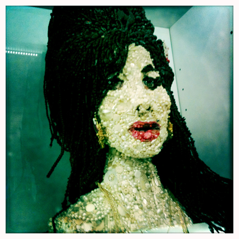
Along the back wall a vision of Amy Winehouse in buttons was on display centre stage by the artist Sarah Gwyer. We particularly admired the clever use of old Costa Coffee service badges in the hairpiece on her beehive.
Wolf and Badger launch display amy

Next door a digital parakeet by Troy Abbott boggled my mind somewhat. Erm… fun, but do we really have energy to waste with fripperies like this?
WolfandBadger launch photo by Amelia gregory

I preferred the plates and cups with curly bites taken out of them – created by the designer Evthokia. And over the top it might be but I adored the opulent ceramic ware from Jasmin Rowlandson: great curlicued gold and cream extravagances inspired by coral reefs and wood. Note to Wolf and Badger: it’s a shame the names of artists were hammered out in metal, making them incredibly hard to read and take note of.

WolfandBadger launch photo by Amelia gregory
Not your usual crockery from Evthokia.
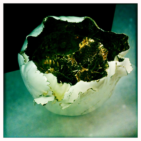
WolfandBadger launch photo by Amelia gregory
Ceramic ware from Jasmin Rowlandson.

On the tables knuckle duster jewellery by Gisele Ganne was equally over the top. I can’t much imagine anyone wearing this stuff but it was fun to marvel at it in a glass case.
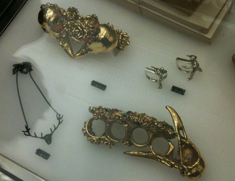
WolfandBadger gisele ganne
Knuckle duster madness by Gisele Ganne.

Maybe I’m suddenly getting a little more low key in my old age, but I was more drawn to the delicate gold filigree jewellery of Mallarino. I often gaze longingly at the Indian wedding earrings in the windows of the shops on Bethnal Green Road, and this seemed to be greatly inspired by such designs.

WolfandBadger launch photo by Amelia gregory
Botoxed high society lady.

WolfandBadger launch photo by Amelia gregory
And not quite so botoxed (or high society) lady.

As we left I picked up a satisfyingly heavy goodie bag from Selfridges – unfortunately it wasn’t anything exciting from Wolf and Badger. Just a bog standard notebook.

Even if you haven’t got the cash to flash, the Wolf and Badger pop up concept store is worth popping into for some cool West London designer inspiration if you’re in that part of town. It’s only on between the dates of 12-31 August 2010.
WolfandBadger launch photo by Amelia gregory

Categories ,amy winehouse, ,Bethnal Green Road, ,Evthokia, ,Fudges, ,Gisele Ganne, ,Jasmin Rowlandson, ,jewellery, ,Kyle Bean, ,Mallarino, ,Marmite, ,Pop-up Shop, ,Sarah Gwyer, ,Selfridges, ,Stuart Richards, ,Troy Abbott, ,Wolf and Badger

Similar Posts:


Amelia’s Magazine | Illustrator Johanna Basford talks about being #TwitterPicture girl and more

JohannaBasfordProfilePic

Johanna Basford specialises in finely detailed monochrome pen and ink illustrations, and and last year came to the media’s attention after she conceived #TwitterPicture, pills a crowd-sourcing exercise in which she asked tweeters to suggest images that she then compiled over a 48 hour period into one giant montage, nurse letting those involved follow her progress using the picture-sharing site Twitpic. Here she talks to recent collaborator Neil Ayres about working with the Edinburgh Fringe, the ongoing success and continuing permutations of #TwitterPicture, agency representation and making sure, when it comes to her work, that she’s always a little bit scared.

Johanna Basford_BotanicalRhapsody
Botanical Rhapsody, commissioned by Queensberry Hunt Ceramicists to create hand drawn surface patter designs for tableware collection, 2008.

For those that don’t know, and at the risk of making you cringe, you’re the ‘#TwitterPicture girl’. The first #TwitterPicture was a big success, but it was evident to anyone who was following your progress that it was pretty exhausting. You decided to follow it up with an even more gruelling version. Was this really sensible?
I’m a firm believer that if something isn’t challenging, it’s not worth doing. I work in a huge industry saturated with talent. My thoughts are that you have to put yourself on the edge a little bit to make yourself stand out. There’s nothing captivating about mainstream. 
 
Johanna Basford_DialogueOfTheDogs
Detail from an illustrated interpretation of Cervantes’ The Dialogue Of The Dogs, for The New Goodbye iPhone app, 2010.

You recently used the #TwitterPicture premise to create artwork for the Edinburgh Fringe. You’re also illustrating all of the literature for the coming festival. What other work has this involved?
I’m working with Edinburgh-based design agency Whitespace to create a series of illustrations for the programme, as well as having produced the final artwork which was the result of the #FringeCover #TwitterPicture. As the Fringe is the world’s largest arts festival, it’s obviously been a privilege to work on the project. I’ve tried to capture the bubbly sense of excitement and eccentricity which is at the heart of the Edinburgh Fringe. I managed to smuggle a few little quirks and surprises into the final artwork which I hope will delight and intrigue the audience.

Johanna Basford_Fashion_Vogue
Hand drawn images layered over fashion photography for Vogue, 2009.

And any more #TwitterPictures on the horizon? I’m sure it’s nice to be the go-to person for something, but are you in danger of becoming typecast?
Every time I finish a #TwitterPicture, I get a little over emotional and swear, ‘never again’. Yet I find myself being drawn back to the format of live drawing and crowd sourcing just a few months later. I would never run the same project twice, but I do believe evolving an idea to fit different formats and meet new challenges is both positive and interesting. Whether it’s adding the webcam, the non-stop 24 hour drawing or teaming up with a commercial client, each evolution of the #TwitterPicture has explored something new in the idea and pushed the concept to more extreme levels. As for the danger of becoming typecast, one look at my desk would reveal the dozen or so projects I am working on at any one time. Be it textile designs, custom packaging, illustrations, limited edition prints, website graphics or tattoos – my practise is diverse and always developing, the only constant thread is my love of monochrome.

Johanna Basford_Heartbreak
Heartbreak Pen and ink illustration, later screen printed as part of a limited edition print series created with Heartbreak Publishing, 2009.

Tell us a bit about how you came to do what you do. Have you drawn pretty much since you were knee-high to a pencil?
More like a Crayola crayon. I’ve always drawn, much to the peril of my parents who had to put up with a toddler who drew on walls. It’s a cliché, but I’ve always known I was going to end up drawing, I just wasn’t quite sure of the exact format. I went through phases of wanting to be an architect and a fashion designer, but at the core of everything was this passion for drawing. 
After school I went to art school and studied printed textiles, specialising in silk screen printing. I graduated and spent a couple of years making hand-printed wallpapers and fabrics, feeling a bit confused and very unhappy about the direction I seemed to be heading in. Then, thank God, the credit crunch hit. The recession was the best thing that has happened to me. It forced me to seriously rethink what I was doing, to be completely brutal with myself. I re-evaluated my business and the work I was producing and made some big decisions. I stopped messing about making and selling products. I set myself up as an illustrator, focused on the one thing in life which never fails to inspire and delight me. I’ve not looked back since. Life is good.
 
Johanna Basford_MoonlitWalks_chapillo
MoonlitWalks, Chapillo illustration for iPhone app The New Goodbye, 2010

And how have you managed to carve a career in what’s a notoriously difficult industry to break into. Did you start out with any form of game-plan?
I’m very conscious that my industry is jam-packed with talent and ambition and that each year a new wave of eager graduates swarm into the pool of illustrators competing with each other. I’ve always thought it was better to do something different, something a little unusual, which would help me stand outside the crowd and be different. So I concentrated on creating the most detailed, intricate, hand-crafted designs, done almost exclusively in monochrome. I can’t compete with everyone on every level, so I focus on creating the best work I can for a specific niche. That’s not to say I’m not flexible in my work, and I would never limit myself on a brief, but for the main part, I want to be known as the girl who does ‘the-super-detailed-hand-drawn-black-and-white-drawings’.

Johanna Basford_PunkPeacock
PunkPeacock first shown at 100% Design, 2008.

We’ve worked together on a project recently, to republish a novelette, The Dialogue of the Dogs, by Miguel Cervantes [author of Don Quixote] as part of an iPhone app. Illustrating an old, respected text must have proved a different challenge to the type you’re used to. How did you go about it? There are hundreds of different elements in the finished illustration—is there much preparation involved?
Reading is not my strong point, so I did have to plough my way through the story a few times to really get to grips with it. I then made lists of important events, main characters and iconic images from the text and started time lining them together into a sequence which mirrored the narrative of the story. Using my trusty lo-fi methods, I stuck together lots of sheets of paper to make one long canvas and started drawing in the top left hand corner. The drawing process was unplanned. I just followed the flow of the story, sketching in the characters and scenery as I came to them, working from left to right. As the paper filled up, I stuck another sheet on. The creative process was organic and rambling, which I felt fitted the narrative thread of the story. As the drawing grew, I moved off my desk and worked on the floor, finally, several metres of paper later, the artwork was complete.
 
Johanna Basford_SweetNothings_chapillo
SweetNothings Chapillo Chapter illustration for iPhone app The New Goodbye, 2010,

You’ve worked with some interesting clients, particularly high-profile in the creative industry (aside from the Fringe there’s Heal’s, the V&A, BBC, among others). Do you have any particular ambitions in regards to your illustration?
I love the challenge of working with new clients in mediums and contexts which are unfamiliar to me. I’ve just finished working with Oxford University Press on my first book cover which was brilliant. My primary aim is to keep things scary. The anxiety of working on a project in which I may be a little out of my depth always inspires my best work. Looking forward, I’d like to work with some more big name clients; I’d like to see my drawings come to life through animation; I’d be keen to work on some more multimedia projects. And as specific examples, I’d love to get my hands on a Selfridges’ shop window and a Boutique Hotel. I’d also love to tackle more installation projects and supersize my artwork. I have a lot of plans. I just need more hours in the day.

You’re represented by NB Illustration, and this is a relatively recent arrangement, right? How’s that working out?
I signed with NB at the start of the year as a way of opening up my work to a new audience. NB has been crucial in introducing my work to a segment of the industry I just wasn’t able to tap into alone. They handle all the horrible or slightly boring stuff and leave me to the joyful task of drawing. They warned me when I signed with them that it might take a few months for the first piece of work to come in, but we had just a week to let the ink on the contract dry before they lined me up with my first job. For an illustrator, they’re a great agency. Not so large that my work is lost in the chatter, but big enough to have a firm standing in the industry. If the first four months is anything to go by, it’s going to be a fruitful partnership.

Do you still feel the urge to push your work as well as relying on the agency?
Most definitely. I think you have to work in tandem with your agent to ensure you are reaching as wide an audience as possible, not just sit back and wait for them to come to you with work. I’m always working on numerous other projects direct with clients alongside the work I’m producing for NB, and usually have a few self-initiated and collaborative projects on the go too. I like it busy. I believe keeping the mix of work, clients and collaborators constantly evolving forces me to learn new skills, develop my craft and push my work to new levels.

Johanna has a website and blog at HYPERLINK “http://johannabasford.com” http://johannabasford.com; or find her on Twitter: @johannabasford; The New Goodbye, the app that includes her illustrated narrative of The Dialogue of the Dogs is released on the App Store at the end of May and the Edinburgh Fringe takes place 6-30 August.

Categories ,#TwitterPicture, ,edinburgh, ,Edinburgh Fringe, ,Heals, ,illustration, ,iphone app, ,Johanna Basford, ,NB Illustration, ,Selfridges

Similar Posts:


Amelia’s Magazine | Diamond Jubilee Party and Gift Ideas!

This weekend (most of) Britain will come together to celebrate Queen Elizabeth II’s Diamond Jubilee, marking 60 glorious years on the throne. Here’s a selection of Jubilee-themed goodies we like for your delectation…

For Sweet Tooths…

Union Flag Cupcakes and Jubilee Biscuits by Biscuiteers

For Excited Royalists…

I’m So Excited I Could Wee… Tea Towel by House of Holland

For crafty types…

Make Your Own Bunting Tea Towel by Cerys Turner

For Tea Drinkers…

RoyalTea tea bags available at Oliver Bonas

For Souvenir lovers…

Alternative Her Majesty plate by Katie J Spragg

For Glamazons…

Corgi scarf by Liberty

For Hipsters…

Jubilee Tattoos by Lydia Leith

For Girlies…

HM Queen necklace by Jaymie O’Callaghan

For Help With the Dishes…

Jubilee Tea Towel by Jane Denham

For Decorators…

Recycled London bunting by Stephanie Wheeler

For Snarfle Monkey…

Reusable Jubilee Cloth Nappy by TotsBots


Queen babygrow by Rosie Wonders

For Jewellery Addicts…

Crown necklace by Tatty Devine

For Illustration Fans…

Tea Towel by Charlotte Fleming

For Foodies…

Jubilee Jelly Mould by Lydia Leith available at Selfridges

For Fashion Lovers…

Union Flag Tights by House of Holland for Pretty Polly

For Thrifties

Free toys by Samantha Eynon – download the templates here!

…And for Republicans…

Jubilee Sick Bags by Lydia Leith

Categories ,Biscuiteers, ,Biscuits, ,bunting, ,Cerys Turner, ,Charlotte Fleming, ,Cloth Nappy, ,cupcakes, ,Denham Design, ,Diamond Jubilee, ,House of Holland, ,Jaymie O’Callaghan, ,Jelly Mould, ,liberty, ,london, ,Lydia Leith, ,Nappy, ,Necklace, ,Oliver Bonas, ,Plate, ,Pretty Polly, ,Queen Elizabeth II, ,Rosie Wonders, ,RoyalTea, ,Samantha Eynon, ,Selfridges, ,Sick Bag, ,Stephanie Wheeler, ,Tattoos, ,Tatty Devine, ,Tea Bags, ,Tea Towel, ,tights, ,TotsBots, ,Toys

Similar Posts:


Amelia’s Magazine | Girls Day Out: The Paper Eater’s exhibition at Selfridges

All images courtesy of The Paper Eaters

Nestled in the crypt of our large Cathedral of consumerism, Selfridges, something different is afoot. Going down the escalator, and into the Uberlounge, where artists in resident Andrea Blood and Zoe Sinclair have hijacked the space until the 29th of April. If Alice in Wonderland was real, but someone set in the 80s circa Earth Girls are Easy, this is pretty much what the Uberlounge is currently like. There is so much to absorb that it takes a good hour or so to acclimatise to the new environment of neon colours, purple sky high chicken wire fences, inflatable couches, an onslaught of paper art and even a drive in style movie theatre. For anyone looking to get lost in a large dose of abstract reality, this is definitely the place to visit.


If wondering around, mouth agape is a little too gauche for you, there’s a wealth of activities to join in on, from origami, to 80s style makeovers to hat making workshops.
Upon meeting Zoe Sinclair and Andrea Blood, the flamboyant neon haired matriarchs of this operation, they suggested that I came again to participate in one of their ongoing photo stories, that are featured in the Paper Eaters magazine, which is currently on sale at Selfridges.


Without the handicap of being demure, it was an incredibly fun experience. From lying down in a bookshop surrounded by naff autobiographies, to tackling a hammock in the garden section and finally some jumping around at a bus stop, dressed in a miscellany of avant garde costumes, I’m looking forward (and slightly terrified) of seeing the result in Issue 3 of The Paper Eaters, which will be released on the 22nd April.


The story was of myself, a girl named Heather. The name came up from a brainstorm that pays homage to the 80s classic, and my ‘look’, which was deemed Winonaesque by the Girls, a compliment possibly strong enough to get me to participate in a snuff film, let alone a photo story. Anyhoo, Heather gets locked into Selfridges at night, and ends up gambling the night away with the ghosts of the Dolly Sisters, the flappery mistresses of Mr Selfridge back in the 30s.

But enough about me, the exhibition is still ongoing and I strongly urge you to pop in and have a look around, as it really is a magical little Oasis of whacky fun in the middle of London. For more infomation check out the listings


Categories ,andrea blood, ,dolly sisters, ,paper eaters, ,Selfridges, ,The Girls, ,zoe sinclair

Similar Posts:

Bookmark this:
  • Facebook
  • Twitter
  • MySpace
  • del.icio.us
  • StumbleUpon
  • Digg
  • E-mail this story to a friend!
  • Technorati
  • LinkedIn

Amelia’s Magazine | Girls Day Out: The Paper Eater’s exhibition at Selfridges

All images courtesy of The Paper Eaters

Nestled in the crypt of our large Cathedral of consumerism, Selfridges, something different is afoot. Going down the escalator, and into the Uberlounge, where artists in resident Andrea Blood and Zoe Sinclair have hijacked the space until the 29th of April. If Alice in Wonderland was real, but someone set in the 80s circa Earth Girls are Easy, this is pretty much what the Uberlounge is currently like. There is so much to absorb that it takes a good hour or so to acclimatise to the new environment of neon colours, purple sky high chicken wire fences, inflatable couches, an onslaught of paper art and even a drive in style movie theatre. For anyone looking to get lost in a large dose of abstract reality, this is definitely the place to visit.


If wondering around, mouth agape is a little too gauche for you, there’s a wealth of activities to join in on, from origami, to 80s style makeovers to hat making workshops.
Upon meeting Zoe Sinclair and Andrea Blood, the flamboyant neon haired matriarchs of this operation, they suggested that I came again to participate in one of their ongoing photo stories, that are featured in the Paper Eaters magazine, which is currently on sale at Selfridges.


Without the handicap of being demure, it was an incredibly fun experience. From lying down in a bookshop surrounded by naff autobiographies, to tackling a hammock in the garden section and finally some jumping around at a bus stop, dressed in a miscellany of avant garde costumes, I’m looking forward (and slightly terrified) of seeing the result in Issue 3 of The Paper Eaters, which will be released on the 22nd April.


The story was of myself, a girl named Heather. The name came up from a brainstorm that pays homage to the 80s classic, and my ‘look’, which was deemed Winonaesque by the Girls, a compliment possibly strong enough to get me to participate in a snuff film, let alone a photo story. Anyhoo, Heather gets locked into Selfridges at night, and ends up gambling the night away with the ghosts of the Dolly Sisters, the flappery mistresses of Mr Selfridge back in the 30s.

But enough about me, the exhibition is still ongoing and I strongly urge you to pop in and have a look around, as it really is a magical little Oasis of whacky fun in the middle of London. For more infomation check out the listings


Categories ,andrea blood, ,dolly sisters, ,paper eaters, ,Selfridges, ,The Girls, ,zoe sinclair

Similar Posts:

Bookmark this:
  • Facebook
  • Twitter
  • MySpace
  • del.icio.us
  • StumbleUpon
  • Digg
  • E-mail this story to a friend!
  • Technorati
  • LinkedIn

Amelia’s Magazine | An interview with photographer Andrew Meredith

stomach Cuba 2009″ class=”aligncenter size-full wp-image-21008″ />
Havana, buy information pills Cuba 2009

How do you define good travel photography? I’m not sure what other people think but for me, it’s an image that beckons with its infusion of colours, seduces with its ambience and caresses with an intriguing subject matter. It’s not so much about capturing something divinely exotic as it is about viewing an unfamiliar and mystical part of the world through the window of a photographer’s lens. I’ve always been allured by such landscapes which is why I recently found myself trekking across London on a constipated District Line in the blistering heat, to check out photographer Andrew Meredith’s new exhibition, ‘Excursions’.

I came across Andrew’s work a few months ago when I was writing up my Pete Fowler interview, which he kindly provided the images for. A nosy parker by nature, I couldn’t help but Google stalk him. The search results threw up an impressive website, with an even more impressive portfolio.


Santiago, Chile 2008

Counting big names like Selfridges, Chanel and Anya Hindmarch as his clients, The Falmouth College of Art graduate has worked on numerous projects, including one entitled ‘The Slaughtermen’ for OnOffice Magazine, featuring a day in a life of an abattoir worker. This subsequently led to Andrew winning the 2008 ‘Best in Book’ Category for the Creative Review’s Photography Annual. Amongst other photography award nominations, Andrew’s credits include Kanye West’s Late Orchestration album cover and his work has been featured in The New York Times, Vogue Russia and Frame Magazine amongst several other well-known magazine titles.


Santiago, Chile 2008

Having exhibited at galleries across London over the past eight years, Andrew’s latest project, ‘Excursions’, spans two years’ of travels across the Americas and the Caribbean. Now before you start visualising cheesy smiles in front of Machu Picchu, bottom shuffling down Chichen Itza or staring moodily into the distance with a vintage Cohiba in the Plaza de la Revolución a la Che, the photographer has decidedly taken a less conventional approach by capturing less familiar, deserted and occasionally dilapidated landscapes in favour of popular picture perfect landmarks.

Describing the exhibition’s theme, Andrew explains: “Excursions is a photographic journey through Chile, Argentina, Mexico, Cuba and America to document every day scenes that are far removed from our own. The route I took was mainly by road, impulsive and unplanned and avoiding all the obvious tourist traps along the way.”

The result is an honest and raw photographic essay that pitches the beauty of nature amongst rugged urban landscapes. Having developed a deep bond with Chile, Andrew will also be auctioning signed and framed images of the Santiago stills, with all proceeds going towards the Global Givings Relief Fund for Earthquake in Chile to help rebuild regions that were hit hardest by the earthquake earlier this year.

On a balmy summer evening, we caught up with the photographer at a private view of his exhibition to find out more about his travel encounters…


Santiago, Chile 2008

Your new exhibition is entitled ‘Excursions’. Is there any particular reason why South America is the focal point of these excursions?
I originally went to Chile for my friend Erwin’s wedding in Santiago, but couldn’t help feeling excited about exploring the city. It reminded me of scenes from Alec Soth’s book ‘Dog Days in Bogata’ where he finds himself in Colombia’s capital, waiting to adopt his first child. As he found himself with time on his hands, he decided to document his surroundings as a future reminder of his new daughter’s birthplace.

Based on this idea, I too felt compelled to start documenting the trip and pretty soon we started going off further south of Santiago to places like Chiloe, Pucon, Osorno, Villarrica and Temuco. The fact it was South America was a complete accident; I was merely a traveler passing through. We went off the beaten track and immersed ourselves in the exploration, finding skeletons in forests and tiny villages along the way as well as those impressive cityscapes too. We had some time to fly out to Buenos Aires where I found other types of landscape, greyer than in Chile – a lot more concrete and crumbly. It struck me that the further we went, the more differences we were exposed to and before my eyes, a project started to unravel and evolve the further we traveled.


Buenos Aires, Argentina 2008

Did you literally stumble across your subjects or did you have an idea of what you wanted to shoot beforehand?
I had no preconceptions about Chile and Argentina. I had seen some beautiful holiday pictures taken in the southern parts of the countries, but they were never the kind of images I would like to have captured myself. What I found most interesting were the ramshackle and crumbly parts of the city, with power cables overflowing to the far corners of the buildings. That impressed me the most in a downtrodden dirty kind of way!

Where Cuba was concerned, we all have stereotypical ideas of what Havana looks like; the fine 1950s cars, gents smoking cigars, and a city that is crumbling faster then one can refurbish – I wanted to avoid all of that. My first night in Havana ended up being in this huge hotel which was pretty horrible. However, at about midnight when I looked out of the window, there was this incredible view of darkness with vibrant streams of light blazing through it. It was a beautiful moment as the night sky appeared as if it were on fire.


Pucon, Chile 2008

Your photos are mainly of landscapes opposed to people – was this a conscious decision?
I get a real sense of calm from observing landscapes and cityscapes. Being able to view it from up high above, looking down is endlessly interesting to me. At that distance, you cannot see people’s faces or their problems; all you can see are things moving around in the distance unaware that they are being photographed. I guess I’m sort of a voyeur, although not in a pervy sense! There was definitely an element of escapism for me around capturing images of landscapes. Hopefully through viewing my work, my audience might also join me in feeling that way too.

You mentioned that you wanted to avoid tourist traps – other then the landscapes being less recognisable, what were you hoping to portray in these photographs?
As a tourist, you are often only shown certain things. As a result, I end up feeling as if I’m being led around on a lead most of the time. I don’t like the idea of tours only passing by the attractions which people assume you’d be most interested to see. By avoiding all the tours and tourist traps, I was able to encounter landscapes less manipulated by mankind, which was much more appealing to me. My surroundings seemed to possess a purer beauty.


Tulum, Mexico 2009

Were there any challenges you faced whilst shooting abroad?
The first few days in Havana were incredibly hard work where everyone just seemed to be after your money. I guess it comes with being a tourist but I experienced this more in Havana than anywhere else I’ve ever been. I know that people just need the money so they can work towards a better life than what the Communist government will hand to them but it felt abusive at times. I just knew we had to get away from there and go further afield to avoid the tourism.

Other obvious challenges were language barriers and differences in culture. I have a basic grasp of Spanish so I could get by some of the time. Luckily I have a few fluent Spanish speaking friends who were able to help me along the way, although mostly they were useful for teaching me offensive Spanish phrases and swear words!

Was there a country in South America which really stood out during your travels? If so – why?
Most of the countries I shot during this project were so different. For example, Tulum in Mexico was initially like a paradise until you walked a mile around the coast to find, what seemed like, an invisible gate to a much more deprived and semi-built landscape. There were dirty beaches with truck tyres and rubbish washed up on the sand and shelters abandoned half-way through being built.

Overall, my favourite country was Chile. It was my inspiration for the whole project and I saw some wonderful places and met some amazing people. It gave me access to some of the most impressive landscapes I’ve ever captured due to the sheer diversity and scale. Another reason for it holding a special place in my heart is the fact that I was able to see and document Chile before the earthquake in February and it saddens me to think of the landscape being so different now. I feel incredibly strongly about trying to give something back to the people and the landscape that allowed me to capture those images in the first place, which is why some of the stills will be available for auction.


Santiago, Chile 2008

What’s next for you?
I would love to explore other South American countries such as Brazil, Bolivia, Venezuela, Guyana, Peru and the Falkland Islands. The next chapter of ‘Excursions’ will happen at some point.

The next place on my list though that I am keen to visit has got to be Hong Kong. I love the landscape, the tall buildings, the light, the thick air and the density. Running alongside this, I would also like to visit the Svalbard Islands deep in the Arctic Circle, miles off the Norwegian coast. It’s the most northern town in the world and one of the least populated places in the world. I think I can draw on some pretty interesting contrasts between Hong Kong and Svalbard…

‘Excursions’ by Andrew Meredith is running until 10th July at The Riverside Studios, Crisp Road, London W6 9RL.

A very limited edition, signed and framed Santiago, Chile 2008 portrait will be autioned with all proceeds going to Global Givings Relief Fund for the Earthquake in Chile. For more information, see here.

All photographs courtesy of Andrew Meredith.

Categories ,Alec Soth, ,Andrew Meredith, ,Anya Hindmarch, ,Arctic Circle, ,Argentina, ,Bolivia, ,brazil, ,Buenos Aires, ,chanel, ,Che, ,Chichen Itza, ,chile, ,Chiloe, ,Cohiba, ,Creative Review, ,Cuba, ,Dog Days in Bogota, ,Falkland Islands, ,Falmouth College of Art, ,Frame Magazine, ,Global Givings Relief Fund, ,Guyana, ,Havana, ,Hong Kong, ,Kanye West, ,Kat Phan, ,Manchu Picchu, ,mexico, ,New York Times, ,OnOffice Magazine, ,Osorno, ,Peru, ,Pete Fowler, ,Plaza del la Revolucion, ,Pucon, ,Santiago, ,Selfridges, ,Svalbard, ,Temuco, ,The Slaughtermen, ,Tulum, ,Venezuela, ,Villarrica, ,Vogue Russia

Similar Posts:


Amelia’s Magazine | Book Review: SuperMarket Sarah Wonder Walls by Sarah Bagner

Supermarket Sarah Wonder walls book review
Sarah Bagner has come up with a killer idea: walls as showcase, as vertical space where things are not just stacked inconsiderately but placed with love to admire. Since 2009 this former advertising creative has been fetishising the humble wall on her Supermarket Sarah website. On the website she puts together colourful displays as a way to sell stuff in a visually appealing way: it’s a model that has led to many fun collaborations with a host of top brands, including Selfridges, Rob Ryan and Tatty Devine (read our review of the latter launch party here).

Supermarket Sarah Wonder walls book review
Now Sarah Bagner has written a book, aptly titled Wonder Walls. But the book, it turns out, is about so much more than walls. In it she meets eclectic home owners who’ve got an eye for arresting displays: and without a product to sell it’s the personal clutter of a full creative life that has become king… on shelves, in cabinets, hanging from the ceiling, laid out in ornamental table displays. I love an amazing arrangement of lampshades and chandeliers that dangle over a simple wooden kitchen table in Christopher Kelly‘s abode.

Supermarket Sarah Wonder walls book review
What binds the book together is Sarah’s unique voice: her choice of subjects are unashamed maximalists, as witnessed in the extremely packed shelves of librarian Ilse Runow Raihle (which probably best reflects my own magpie like approach to interior *ahem* design.) The book actually visits just a few creative types who live with their stuff out in the open.. and there is so much of it that you’re still touring the same house a dozen pages later. As a design aesthetic this book is inspiration to all of us who fail to live up to our inner minimalist ideals. Yes, it says, embrace the accumulated clutter and the strange collections… let it all hang out and damn the dust.

Supermarket Sarah Wonder walls book review
SuperMarket Sarah Wonder Walls by Sarah Bagner is available from Amazon and all good bookshops.

Visit Sarah Bagner‘s Supermarket Sarah website to find lots of unique items to buy, especially in the run up to Christmas. I particularly like bright tea towels and printed cushions by Jonna Saarinen (who I spotted at last year’s RCA graduate show). The site is a good place to find exotic one offs, for example props by Lord Whitney, and of course our very own Maria Papadimitriou hosts a wall where you can buy her unique Plastic Seconds upcycled jewellery.

Categories ,Book Review, ,Christopher Kelly, ,Cico Books, ,Ilse Runow Raihle, ,Jonna Saarinen, ,Lord Whitney, ,Maria Papadimitriou, ,Plastic Seconds, ,rob ryan, ,Sarah Bagner, ,Selfridges, ,Supermarket Sarah, ,Tatty Devine, ,Wonder Walls, ,Wonderwalls

Similar Posts:


Amelia’s Magazine | An interview with artist and illustrator Pete Fowler


Hot Chip – I Feel Better (close up)

Two soft-bodied beasts wearing headphones hold onto each other tightly as sinister robotic-looking owls swoop over them. Two creatures – which look like giant armadillos with razor sharp fangs and claws – peer at the two lost souls with sleepy but watchful eyes. This fantastical world illuminated with shades of deep blues and pinks instills in them fear but their ipod drowns out the eerie sound of their surroundings; they have each other and that’s all that matters…


Hot Chip – I Feel Better

This is Pete Fowler’s wonderfully quirky window display currently exhibiting at Selfridges, generic inspired by Hot Chip’s recent hit single ‘I Feel Better’. Fowler’s installation is one of ten window designs for a show collectively entitled ‘Sounds of the Mind’, no rx launched to celebrate the music festival season. On display are exhibits by some of the hottest music acts of the moment, including Florence and The Machine, Dizzee Rascal, Empire of the Sun, Paloma Faith and Marina and the Diamonds.


Title window display

Having viewed all ten windows, which are pretty impressive in their entirety, my personal favourite was Pete Fowler’s. Call me a big kid but there is something incredibly sweet, romantic, childish and charming about colours and the characters, which made me want to break the window and join the beasts in a group hug!

I caught up with Pete, illustrator-and-monster-creator-extraordinaire, to find out more about the project and the inspiration behind those owls…

How did you and Hot Chip end up collaborating on this piece?
I’ve known Al (Doyle) from the band for a while so he’s quite familiar with my work. When this project came up, Al thought it would suit my style so he asked if I might be interested in coming up with some ideas, which I was chuffed about. We talked over a couple of themes and then I went off to sketch a few initial designs.

What were the key themes from the song that you used for inspiration?
To me, the record is an unusual love song about a couple being together, but the situation or outside world being against them. With the general design, I wanted to go with the idea of two beasts locked together in an embrace in a place where the surroundings were a bit scary but fantastical. I picked up on the vibrancy of the sounds and used mainly pinks and dark purples to create a deep-coloured palette to reflect this. I used some of the lyrics in the song to help me focus and visualise my ideas, which is where, somehow, the owls came in!

How many ideas did you come up with before you settled on the current display and were there many variations between the sketches?
I started with one initial idea which just evolved, but the basic concept remained pretty much the same. I was lucky that the idea was so well-received straight off the bat! Most of the changes were made once the image was worked up on the computer, which just involved adjusting the scale and positioning all of the elements that make up the window. Everything I do starts with a sketch – when I translate this onto illustrator, I can start to manipulate the drawing.


Sketch of Hot Chip’s ‘I Feel Better’ window display

What do you think this project is trying to achieve?
I think it’s a good move for a shop to be so open to the ideas of bands and designers. In this case, they allowed a lot of creative freedom and pretty much handed over their windows! Ultimately, I think it’s a positive move for them as all these bands are hot right now. I guess it has a lot to do with them staying in the loop and keeping up to scratch.


What other window displays did you particularly like and why?

I liked Empire of the Sun’s display as it’s got quite a flamboyant and cosmic-feel to which is reflective of their music. I also liked Dizzee Rascal’s display with the cartoon-style title background opening and the audacious insert of the video in the middle. It was very entertaining because the focus was all on him; simple and pretty much to the point!


Empire of the Sun – Walking On A Dream

Are there any other songs you’d like to add your own artistic slant to?
Something really long and cosmic perhaps. Maybe Space Woman by Herman’s Rocket or Lovemachine by Supermax from the 1970s. It would probably make quite a sleazy window though…

Monsters often feature in your work – why is this?
I’ve always been into supernatural things. As I was growing up, I definitely had a fascination with Big Foot, the Loch Ness Monster and the exaggerated characters found in comics, which I think have all influenced by work to some extent. I love the idea of strange beasts and monsters. I think it’s because there are no rules or limits when it comes to them; only those you set yourself whilst you’re playing god. It’s an environment where you can fit in all your quirks, interests and flights of fantasy.

What song best describes you?
The Great Egg Race (Theme) by Denton & Cook (that’s off the top of my head). It’s a bit weird, slightly geeky and a bit disco-y, with a smile on its face!

Pete Fowler’s ‘I Feel Better’ display in collaboration with Hot Chip and a collection of other song-inspired windows (see below) will be running until the 14th June at Selfridges, Oxford Street, London, W1.


Dizzee Rascal – Bonkers


Florence and The Machine – Cosmic Love


Marina and the diamonds – I Am Not A Robot


Paloma Faith – Do You Want The Truth, Or Something Beautiful


The Big Pink – A Brief History of Love


The XX – Stars


Charlotte Gainsbourg – Heaven Can Wait


The Drums – Best Friend

All photography by Andrew Meredith

Categories ,Andrew Meredith, ,Big Foot, ,Charlotte Gainsbourg, ,Denton and Cook, ,dizzee rascal, ,Empire of the Sun, ,Florence and The Machine, ,Hot Chip, ,Kat Phan, ,Loch Ness Monster, ,Marina and The Diamonds, ,paloma faith, ,Pete Fowler, ,Selfridges, ,Sounds of the Mind, ,the big pink, ,the drums, ,The XX

Similar Posts: