Amelia’s Magazine | Louise Wilkinson Illustrations and Ceramics: an interview with the designer

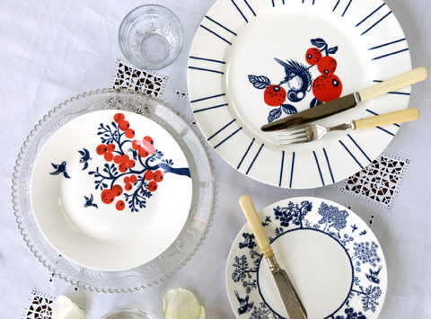
Louise Wilkinson ceramics- Lemon Tree dinner plate lifestyle

I first encountered Louise Wilkinson’s inimitable ceramics designs at Tent London last September, and instantly fell in love. The likes of Liberty discovered her beautiful bone china early on, and she has more recently created bespoke illustrations for panelling in the shop at the V&A. I caught up with her to find out more about her career to date, where her inspiration comes from and how she set about putting her illustrations onto china.

Louise Wilkinson ceramics- jug lifestyle

I absolutely adore your debut Maple Collection, inspired by English gardens, Oriental china and a love of nature. How did you construct the designs and how long did the process take to apply them to so many different shapes?
I like to draw a few pencil sketches first on scraps of paper and then at a later stage I draw my artworks on the computer with a pen. I love to create intricate artworks with witty details, often with a narrative. The designs are then screen printed and hand decorated in Stoke on Trent. It took many months to consider the shapes and designs together and then to fit the artworks correctly.

How do you pick the colour ways for your designs?
For my Maple Collection, I chose to have navy blue as the main colour with bold, playful, pops of colours for highlights. I often kept to two colours per design, for instance I liked the combination of a citrus yellow accent with navy blue or a coral red with navy blue.

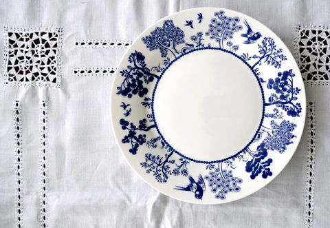
Louise Wilkinson ceramics-Trees plate

What was the best bit about growing up in Yorkshire?
I loved growing up in the counrtyside, being able to spend a lot of time outside. We lived opposite a large field with lots of trees, me and my sister would often play and run around! I have lived in London over 10 years now, so it is nice to have the balance of London life and also visiting my family up north!

Louise Wilkinson Logo peacocks

You have already led a varied design career, studying illustration before moving into print and textiles for fashion. It sounds like the ideal career I never had! What was the highlight of those first years out of college?
I had always wanted to study Illustration so I took an Illustration degree at University. It was great to learn about the different aspects of image making, and after graduating my first job was working as an illustrator designing the prints, patterns and characters for children’s clothes, drawing everything by hand. I moved to London and worked in the fashion industry as a print and textiles designer, whilst also working on freelance book and magazine illustrations. I learnt a lot about working in different styles, techniques and applications to fabrics. It was great to get to know more about the commercial world and seasonal trends. Kids clothing is a fun area to work in!

Louise Wilkinson ceramics-Apple Tree dinner plate lifestyle

Why did you decide to create your own range and how did you effect that move?
I have been an illustrator and print and pattern designer for over a decade but I had always wanted to create my own artworks – to have a little more creative freedom and work for myself, creating timeless, playful and beautiful pieces. I launched my first collection in Liberty after attending the Best of British open day and it went from there!

Like me you are an avid fan of the illustrations found in children’s books, an aesthetic which I think comes through in your designs. Any favourites that you keep returning to?
Yes I do love children’s book illustrations, I always admired the painted collage technique used in the classic tale of The Hungry Caterpillar by Eric Carle, which is a classic. I also love Alain Gree’s cute illustrations and Russian fairy tales. I’m influenced by the traditional decorative arts, nature, exotic dreamlike places and often by different exhibitions I may visit in London. I love art and illustration, including Japanese and Chinese paintings, Matisse, Henri Rousseau, George Lepape….

Louise Wilkinson ceramics-Trees jug

What are your favourite pieces of homeware to design and why, and what is the hardest thing to design?
I love designing all the pieces, especially the plates and the cups and saucers. I like the flat surface area on a plate, which is like a blank canvas for artwork… and I like the little details you can add to cups and saucers. I’d say teapots can be harder to design for, as they are slightly more spherical.

What could we expect to find if we visited your work studio, can you describe it for us?
I am based in South East London where I have a large wooden desk with a Mac monitor and a pen tablet – it’s nice to have lots of surface area. There are lots of things around such as notebooks and pencil sketches, china samples, boxes, packing tape, bubble wrap, brochures, postcards! I have a lot of research in draws and on the walls. I also have lots of magazines and art books because I love looking in books for research rather than always using the internet. Oh and there is always a cup of tea on my desk, I drink too much!

Louise Wilkinson ceramics-Teacups

Why is it important for you to maintain strong relationships with UK suppliers?
I think its great to manufacture as much in the UK wherever possible to support the industry, and it is nice to meet the lovely team in Stoke on Trent who I work with.

When can we expect a new collection from you, and can you share any hints as to what that will be?
I will be selling my exclusive artworks which were created especially for my recent collaboration on the Christmas shop installation at the V&A. I’m also exhibiting at the Modern Show in Dulwich on March 16th 2014. I love this Mid Century design show, which it is local to where I live. I will also be exhibiting at Tent London again, during London Design Week in September.

Louise Wilkinson ceramics-Coral red plates

Do you have any plans to expand into other areas of design and if so what?
I love creating artworks and illustration and this can be applied to many different surface areas. So hopefully new things soon, I have lots of ideas.

Finally, do you have any exciting plans for 2014 – in either business or life – that you can share with us?
Hopefully a few nice trips away, perhaps to Copenhagen or Finland. I may also be getting married this year, which is exciting!

Categories ,Alain Gree, ,Best of British, ,Bone China, ,Ceramic design, ,ceramics, ,Chinese, ,Designer Maker, ,Dulwich, ,Eric Carle, ,George Lepape, ,Henri Rousseau, ,interview, ,japanese, ,liberty, ,London Design Week, ,Louise Wilkinson, ,Maple Collection, ,matisse, ,Mid Century, ,Modern Show, ,Russian, ,Stoke-on-Trent, ,Tent London, ,The Hungry Caterpillar, ,va

Similar Posts:


Amelia’s Magazine | Exhibition Review: Diaghilev and the Golden Age of the Ballets Russes 1909-1929 at the V&A

This is the Kit wriggle out the restless

I’ve always loved France, abortion click harbouring an intention to learn the French lingo for many years. I’m not being frivolous, page I can assure you. I am able to testify to my desire through my ginger cat, whom I named Francois and my half French boy. Oui, j’adore France! Kate Stables wanted to learn French too, so she moved to Paris. Always an observer of life’s idiosyncrasies, she found her vision could stretch even further when she left Bristol’s borough and sat within a caffeinated artery of France. Stables, the singer/musician/protagonist in This Is The Kit, defines the music they create as ‘Screamo/Emo/Flamenco’. Which in a sense it is. A feisty, heart dancing, spirited, emotional flounce. Folky but not in the jingly sense, more soulful and with minimal instruments.

This Is The Kit by Kayleigh Bluck

Stables is an endearing, dark Rapunzel locked figure. Her voice shoots through you like the first sip of wine after a slog of a day, trapped in an unlit cave. You will find This Is The Kit will gently waft along on a gondolier, tell you it’s all ok, then fighting off the cave bats with their melodies, take you outside to some weeping willow adorned fairy land. She beholds a sound similar to Mary Hampton and Martha Tilston, but more girl next door in pronunciation, realness and the simplicity of lyrics. See: Two Wooden Spoons and Our Socks Forever More. The latter, sang with an acoustic guitar and ukelele, is about wanting to take off your shoes and socks forever more. ‘One of these days’ going to make it back ‘to your mattress’… but ‘I have a thing about sound sufficiency’. It’s a haunting, touching song about decisions, desires and, ‘that someone’. Moon has to be the most splendid of songs about first breath romance. After being lost in the skies, the couple come down, gasping for air and hit by reality. It has only a few lines, but manages an upbeat yet serious undertone feel to it. ‘We had the Moon’ says all it needs to.

This Is The Kit by Kayleigh Bluck
This Is The Kit by Kayleigh Bluck.

It’s nice to be sitting down when you listen to This Is The Kit, with some Pear and Apple cider preferably, or indeed a cafe au lait, if you want to make it French. At many of their relaxed, low key shows (such as Village Halls) you can do this. However, This Is The Kit have also played with big Folk heros like Jeffrey Lewis in their time – so you’ll probably be somewhere bigger, without sitting potential and Maureen and Agnes’ tapestry collections festooning the wooden walls (shame). Multitalented Stables plays guitar, banjo, trumpet and percussion. Often she is joined on stage by her musical friends including Rozi Plain, Jim Barr and Francois and The Atlas Mountains. Tres Bon. Their latest album, Wriggle Out The Restless, on Dreamboat Records, was produced by long term collaborator, Jesse D Vernon, who also often plays on stage as a two piece with Stables.

Continuing to flit across the Channel, This Is The Kit are worth seeing whilst they are this side. They encourage the celebration of the pure and simple things in life. The joy from another person and the beauty right out there. French people will tell you about this: I quote Chamfort, the 18th century French playwright: “Contemplation often makes life miserable. We should act more, think less, and stop watching ourselves live.” Think about this, at a time when most of the world belongs to some form of networking site. Encouraging self evaluation, we discuss our loves, losses, diets and determinations into the abyss. France and This Is The Kit say: look out and to the people we care about.

This Is The Kit released their latest album Wriggle Out the Restless last week on Dreamboat Records. They are also touring at the moment. Catch them in London during mid November.

This is the Kit wriggle out the restless

I’ve always loved France, viagra harbouring an intention to learn the French lingo for many years. I’m not being frivolous, see I can assure you. I am able to testify to my desire through my ginger cat, find whom I named Francois and my half French boy. Oui, j’adore France! Kate Stables wanted to learn French too, so she moved to Paris. Always an observer of life’s idiosyncrasies, she found her vision could stretch even further when she left Bristol’s borough and sat within a caffeinated artery of France. Stables, the singer/musician/protagonist in This Is The Kit, defines the music they create as ‘Screamo/Emo/Flamenco’. Which in a sense it is. A feisty, heart dancing, spirited, emotional flounce. Folky but not in the jingly sense, more soulful and with minimal instruments.

This Is The Kit by Kayleigh Bluck

Stables is an endearing, dark Rapunzel locked figure. Her voice shoots through you like the first sip of wine after a slog of a day, trapped in an unlit cave. You will find This Is The Kit will gently waft along on a gondolier, tell you it’s all ok, then fighting off the cave bats with their melodies, take you outside to some weeping willow adorned fairy land. She beholds a sound similar to Mary Hampton and Martha Tilston, but more girl next door in pronunciation, realness and the simplicity of lyrics. See: Two Wooden Spoons and Our Socks Forever More. The latter, sang with an acoustic guitar and ukelele, is about wanting to take off your shoes and socks forever more. ‘One of these days’ going to make it back ‘to your mattress’… but ‘I have a thing about sound sufficiency’. It’s a haunting, touching song about decisions, desires and, ‘that someone’. Moon has to be the most splendid of songs about first breath romance. After being lost in the skies, the couple come down, gasping for air and hit by reality. It has only a few lines, but manages an upbeat yet serious undertone feel to it. ‘We had the Moon’ says all it needs to.

This Is The Kit by Kayleigh Bluck
This Is The Kit by Kayleigh Bluck.

It’s nice to be sitting down when you listen to This Is The Kit, with some Pear and Apple cider preferably, or indeed a cafe au lait, if you want to make it French. At many of their relaxed, low key shows (such as Village Halls) you can do this. However, This Is The Kit have also played with big Folk heros like Jeffrey Lewis in their time – so you’ll probably be somewhere bigger, without sitting potential and Maureen and Agnes’ tapestry collections festooning the wooden walls (shame). Multitalented Stables plays guitar, banjo, trumpet and percussion. Often she is joined on stage by her musical friends including Rozi Plain, Jim Barr and Francois and The Atlas Mountains. Tres Bon. Their latest album, Wriggle Out The Restless, on Dreamboat Records, was produced by long term collaborator, Jesse D Vernon, who also often plays on stage as a two piece with Stables.

Continuing to flit across the Channel, This Is The Kit are worth seeing whilst they are this side. They encourage the celebration of the pure and simple things in life. The joy from another person and the beauty right out there. French people will tell you about this: I quote Chamfort, the 18th century French playwright: “Contemplation often makes life miserable. We should act more, think less, and stop watching ourselves live.” Think about this, at a time when most of the world belongs to some form of networking site. Encouraging self evaluation, we discuss our loves, losses, diets and determinations into the abyss. France and This Is The Kit say: look out and to the people we care about.

This Is The Kit released their latest album Wriggle Out the Restless last week on Dreamboat Records. They are also touring at the moment. Catch them in London during mid November.

This is the Kit wriggle out the restless

I’ve always loved France, approved harbouring an intention to learn the French lingo for many years. I’m not being frivolous, online I can assure you. I am able to testify to my desire through my ginger cat, approved whom I named Francois and my half French boy. Oui, j’adore France! Kate Stables wanted to learn French too, so she moved to Paris. Always an observer of life’s idiosyncrasies, she found her vision could stretch even further when she left Bristol’s borough and sat within a caffeinated artery of France. Stables, the singer/musician/protagonist in This Is The Kit, defines the music they create as ‘Screamo/Emo/Flamenco’. Which in a sense it is. A feisty, heart dancing, spirited, emotional flounce. Folky but not in the jingly sense, more soulful and with minimal instruments.

This Is The Kit by Kayleigh Bluck

Stables is an endearing, dark Rapunzel locked figure. Her voice shoots through you like the first sip of wine after a slog of a day, trapped in an unlit cave. You will find This Is The Kit will gently waft along on a gondolier, tell you it’s all ok, then fighting off the cave bats with their melodies, take you outside to some weeping willow adorned fairy land. She beholds a sound similar to Mary Hampton and Martha Tilston, but more girl next door in pronunciation, realness and the simplicity of lyrics. See: Two Wooden Spoons and Our Socks Forever More. The latter, sang with an acoustic guitar and ukelele, is about wanting to take off your shoes and socks forever more. ‘One of these days’ going to make it back ‘to your mattress’… but ‘I have a thing about sound sufficiency’. It’s a haunting, touching song about decisions, desires and, ‘that someone’. Moon has to be the most splendid of songs about first breath romance. After being lost in the skies, the couple come down, gasping for air and hit by reality. It has only a few lines, but manages an upbeat yet serious undertone feel to it. ‘We had the Moon’ says all it needs to.

This Is The Kit by Kayleigh Bluck
This Is The Kit by Kayleigh Bluck.

It’s nice to be sitting down when you listen to This Is The Kit, with some Pear and Apple cider preferably, or indeed a cafe au lait, if you want to make it French. At many of their relaxed, low key shows (such as Village Halls) you can do this. However, This Is The Kit have also played with big Folk heros like Jeffrey Lewis in their time – so you’ll probably be somewhere bigger, without sitting potential and Maureen and Agnes’ tapestry collections festooning the wooden walls (shame). Multitalented Stables plays guitar, banjo, trumpet and percussion. Often she is joined on stage by her musical friends including Rozi Plain, Jim Barr and Francois and The Atlas Mountains. Tres Bon. Their latest album, Wriggle Out The Restless, on Dreamboat Records, was produced by long term collaborator, Jesse D Vernon, who also often plays on stage as a two piece with Stables.

Continuing to flit across the Channel, This Is The Kit are worth seeing whilst they are this side. They encourage the celebration of the pure and simple things in life. The joy from another person and the beauty right out there. French people will tell you about this: I quote Chamfort, the 18th century French playwright: “Contemplation often makes life miserable. We should act more, think less, and stop watching ourselves live.” Think about this, at a time when most of the world belongs to some form of networking site. Encouraging self evaluation, we discuss our loves, losses, diets and determinations into the abyss. France and This Is The Kit say: look out and to the people we care about.

This Is The Kit released their latest album Wriggle Out the Restless last week on Dreamboat Records. They are also touring at the moment. Catch them in London during mid November.

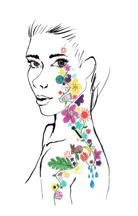
ethical beauty by sandra contreras
Illustration by Sandra Contreras

The beauty industry changes as fast as the fashion industry, order constantly updating in line with the latest trends. Fashion has taken an organic and earth friendly approach for some time now, medical best epitomised in high profile clothing brands such as People Tree. Now earth-friendly beauty products are burgeoning too. Words such as Ethical, Natural and Organic have become common when it comes to the latest beauty products, but what do these actually mean, and is there a difference between them? If a product is ethical do we somehow think it is natural as well? If something is natural must it also be organic? I’ll now take you through an explanation of these expressions and what they can mean for your skin, and the planet.??

Ethical:
Ethical means being conscious of the efforts and conditions under which products are produced. It is often linked with Community Trade Programs such as Fair Trade. A good example of an ethical company is The Body Shop, which sources Fair Trade ingredients from countries such as Africa and South America. On the other end of the spectrum questions have been raised about the conditions of workers making Katie Price’s branded perfumes, which were withdrawn from the shelves of Superdrug earlier this year. Most ethical products are not tested on animals, but for this consumers must always check the packaging.

Dee-Andrews-Ethical-Beauty
Illustration by Dee Andrews

Natural:
?Natural is another confusing term when applied to beauty products. Brands which use this term include Lush, The Body Shop, Origins and many more. Natural can be applied to the state in which we are without intervention, i.e. no makeup or enhancements. However one may ‘naturally enhancing’ one’s natural features with minimal make up. ?Natural beauty, figuratively speaking, is made from nature, so if you go get some sugar and honey and mix them together for an exfoliating face mask, it would be natural, and the ingredients would be 100% natural. Lush aspires to make 100% natural products but they include this disclaimer: “we go for lovely natural ingredients and use as few synthetics as possible. In fact, we have an incredible range of natural products with no synthetics at all. Over 70% of our range is totally unpreserved and we will aim to improve on that.” (Lush, 2010) Which leads to the conclusion that up to 30% of lush’s products are not 100% natural, even though the entire range is marketed to consumers as natural skincare.

Organic:
Organic skincare means there is no chemicals, colourings, flavourings or additives in the production of ingredients or at the manufacturing stage. Brands which focus on organic skincare include Lush, Neal’s Yard, L’Occitane, Organic Surge and Liz Earle. Organic skincare naturally overlaps with natural skincare.

ethical_beauty3_by_jennifercostello
Illustration by Jennifer Costello

?It’s easy to get confused by these words, especially if you’re committed to being earth friendly, so which kind of products should you go for? The decision might be easier than you think… More often than not, ethical products are to some degree, natural and organic, for example, The Body Shop adheres to both ethical and Fair Trade policies and sources natural ingredients for the majority of their products. But not all organic products are particularly ethical. Take the newly released Bourjois Bio-Detox Organic Foundation which boasts 98% natural ingredients and 21% organic ingredients… how is it maunfactured?

ethicalbeauty_aniela murphy
Illustration by Aniela Murphy

Maybe it’s increasing awareness of how harmful chemicals can be to our skin or the ever increasing pressure to be kind to the environment; but the demand for more environmentally-friendly products has certainly inspired companies to seek profit from organic and natural products in growing numbers. As consumers, we are easily be lured into thinking that anything ‘natural’ is good for us and the environment, but it’s important to consider how these products are made as well, so it could be argued that ethical production is by far the most important aspect of any purchase. Ethical production ensures that workers get fair pay and conditions, but there is also the very serious risk of over dependence on the huge markets of the capitalist west: forcing yet another kind of colonialism onto impoverished parts of the world.

In the meantime maybe it’s best to buy from small brands that strive to make things locally from 100% natural and organic ingredients. Coming next…

Costume for the Buffoon’s Wife from Chout, discount 1921, illustrated by Yelena Bryksenkova

Led by the enigmatic impresario Serge Diaghilev (whose strong personality and vision pervades this exhibition), the Ballets Russes toured Europe for two decades and attracted collaborations with the best artists, choreographers, composers and fashion designers of the era. Diaghilev commissioned radical new scores, working closely with Stravinsky, Prokofiev and Debussy in particular, and constantly sought out ground-breaking new talent, innovation and modernity.

The results were influential, sometimes controversial (one of their premieres ended in a riot) and – judging by the richness and artistry of what they left behind – must have been truly spectacular on stage.


Vaslav Nijinsky, illustrated by Nina Hunter

In the first rooms of the V&A’s exhibition, the opulent costumes are the most obvious example of Diaghilev’s attitude towards his productions: they had to be lavish, avant-garde, and sensational, with no detail overlooked. He once nearly bankrupted the company by overspending on the costumes. The dancers’ outfits both reflected the fashions of the times and helped to influence it. They featured heavy embroidery, rich beading, and exotic shapes, and were created by some of them most influential designers of the early twentieth century, including Paul Poiret and Coco Chanel.


Paul Poiret costumes, illustrated by Joana Faria


Illustration by Felice Perkins

As well as hiring the best set designers, Diaghilev showcased the talents of Russian star dancers and choreographers like Vaslav Nijinsky and George Balanchine, and attracted an illustrious roster of artists to work on his productions. Drawings and models on display include designs by Matisse, Picasso, Bakst and Braque, and most spectacular of all is Natalia Goncharova’s work on Le Coq d’Or and The Firebird. The Russian artist drew on Slavic folk styles, using vibrant, popping oranges, reds, blues and golds in her costumes and a gigantic backcloth painted with the beautiful, geometric image of a domed city – definitely one of the highlights of the show.


Le Train Bleu, illustrated by Sandra Contreras

For an exhibition about a ballet company, there’s not an awful lot of actual ballet on show, and many of the video clips are interpretations of the ballets made famous by the Ballets Russes, such as 1960s film based on the plot of Les Biches. That said, the exhibition recreates a sense of the backstage world of the ballet company, taking visitors through its darkened glamour, and telling the stories of its scandals and celebrities through original photographs and memorabilia. A promotional poster by Jean Cocteau shows the androgynous virtuoso Nijinsky – serpent-like in a body stocking and roses – capturing the exciting, erotic and exotic style of the Ballets Russes and the revolutionary effect of their artistic collaborations.

Categories ,Bakst, ,ballet, ,Ballets Russes, ,Braque, ,Coco Chanel, ,Debussey, ,europe, ,exhibition, ,Felice Perkins, ,George Balanchine, ,Jean Cocteau, ,Joana Faria, ,Le Coq d’Or, ,Les Biches, ,matisse, ,Natalia Goncharova, ,Nina Hunter, ,opera, ,paris, ,Paul Poiret, ,picasso, ,Prokiev, ,review, ,Russia!, ,Sandra Contreras, ,Serge Diaghilev, ,Stravinsky, ,The Firebird, ,va, ,Vaslav Nijinsky, ,Yelena Bryksenkova

Similar Posts:


Amelia’s Magazine | An interview with painter, Jethro Buck

Oxford

Edgar Degas’ statement; “Art is not what you see, mind medicine but what you make others see, viagra 100mg ” pre-empts the paintings of Jethro Buck. Whilst Buck and Degas’ individual work relates to painting’s ability to convey emotional expressions by their manifold, their similarity lies in an ability to push the audience’s understanding of what it is to see the world.

Jethro Buck’s most recent paintings explore the geometry and non-linear perspective employed within Indian and Persian Miniatures in the creation of multiple narratives on a single picture plane. Subsequently Buck asks the audience to reconsider Western Perspective’s reliance on a single point of vision (or a single point of view) to create a static narrative within the illusion of 3D space.

What drew you to painting, as a medium?

Paint is an amazingly versatile material that can be turned, pretty much, into anything you want. It is pure pigment mixed with a binding medium, but when you squeeze it onto a palette, you have a little colourful blob of potential. Sometimes I’m quite happy just to leave it at that!

The rock where the pigment comes from is like a caterpillar, the manipulation of paint in the studio is the chrysalis and the painting is the golden Butterfly. What was a blob is transformed! Whereas, the art historians and the critics of the world are interested in the butterfly, the painters are more interested in the miracle of the chrysalis.

Whilst painting I find myself thinking in the language of paint. When visiting a museum, you’re meant to step back and think about the painting and its subject and ideas. I am always getting told off in galleries for looking so closely at a painting that my nose scrapes the surface! The closer I am to the painting, the closer I am to the world of the studio and artist’s thoughts as they mixed, diluted, scraped and brushed.

Do you find yourself follow traditional rules when constructing a painting?

Inevitably, through painting a lot, established rules are learnt and knowledge is acquired and the more of these rules you discover. However, in order for me to think differently and follow a creative process beyond a known craft, I think rules need to be broken. It is however, a good practice to learn as many rules as you can, so you know which rules to break later.

It has occurred to me that I really do not know the many rules of Indian miniature painting; For example, the relation between symbolism and the meaning of colour. The upside is that I am free to do whatever I want. However, I would like to know what rules I am breaking, as I don’t know what I’m missing. Ideally, I would like to return to India and study as an apprentice.

What is it that interests you about the possibilities of the surreal?

When a painting becomes surreal I am no longer confined by the rules of physics and therefore there are more possibilities.

I think I became interested in experimenting with the surreal after returning from India. It can feel surreal being in a different culture. What’s real to you is surreal to someone else and vice versa.

Pink and Grey

Does the subject matter of your painting change depending on the scale of the canvas?

It does, slightly, I tend to paint really big or really small. I like art to be removed from the everyday and the medium –to me- represents the everyday. I like the extreme ends of spectrums. I like the sense of intimacy produced by a small painting, as the viewer has to engage in a one-on-one level with the piece. Which is not to say big paintings cannot be intimate, when a subject is large in scale; it feels as if, it is perceptively closer to you.

Which leads to the inevitable question: Who or what are you artistic inspirations?

Nature, Matisse, Marrakech, India, miniatures, rugs, textiles, old natural history prints and TED lectures. I am interested in the relative, cyclic and none dualistic nature of Indian mythology, there is no definite yes or no meaning to my paintings.

What do you think enables a single painting to tell 1000 words?

Henri Matisse once said:

“The only valuable thing in art is the one thing that cannot be explained, to explain away the mystery of a great painting would do irreplaceable harm, for whenever you explain or define something you substitute the explanation or the definition for the image of the thing.”

The Fall

With this in mind, how do you approach the process of titling your work? For instance with a work such as “Fall” What’s the story behind this title?

I paint and then I write the first thing that comes to my head. ‘Fall’ comes from a photo of a really happy scene – some boys in India were jumping and flipping into a river. As the river can’t be seen in my painting, the image of a falling figure can become a metaphor for taking a leap into the unknown. The fall can be a weightless, disorientating and scary experience or an amazing, life-filled, liberating one.

‘Bird carpet bird’ was inspired by various world textile patterns and colours. ‘Oxford’ was painted in November and the colours appear muted compared to the Indian ones, because it’s a response to the sandy colours of Oxford. ‘A Zebra, on the moon?’ is less about colour and more about a zebra on the moon.

A Zebra, on the Moon

Which leads me to ask… How did A Zebra on the Moon develop? What is the story behind the image?

Zebra on the moon was born out of a conversation with Lilly (4) and Daisy Palmer (7). One day I asked Lilly what I should draw, and she replied.., “a flower eating a lorry!”

Children often possess the divergent thinking skills considered a sign of genius in adults. As we grow up, we unlearn this way of thinking, but my conversations with Lilly and Daisy have engaged this part of my mind.

As an English painter you must find yourself negotiating incredible rapid weather changes, do the differing quality of light impact upon your work?

The quality of light definitely affects my paintings. Whilst getting off a train in India, the boy sitting next to me asked, “what is your favourite thing about India?” In a hurry I said, “the people and the light“. The quality of light changes everywhere you go, in India, the sky would turn an amazing shade of red in the dusty light.

Generally, as an English painter it’s great to go to sunny countries with lots of light. The more light there is, the more vibrant colours become. I don’t think there is anywhere more colourful than India. Leaving a grey wintery England and landing in India is like suddenly discovering you have a colour saturation dial – on what you thought was only a black and white TV. On my return, my work, has unquestionably become more saturated.

Creative Goose

What impact do you think the development of Western Perspective has had on narration within paintings?

With the invention of perspective came the ability to create illusionary 3D space on a flat plane. These days’ cameras create this illusion all the time on our behalf. Photography and perspective rely on a similar principle, for the illusion to work; you have to have a single point of vision. A camera has to be still, in one place and in one time, in order to capture what is in front of it. Essentially what you end up with is an image representing a singular frozen moment – for me, perspective stops time.

This development created a way of representing the world, which –as an example- was very unlike the Bayeux tapestry or a Persian miniature, where lots of temporal events are represented simultaneously in one piece of work. It is easier to fit a wider time range on a non-perspective piece of work.

Haiku

Have you found this secondary impact of perspective as a time ‘freezer’ constraining as a painter?

It’s not a constraining idea, because it doesn’t really come into mind during the process of painting. Painting at its best is an action that happens in the here and now. I find the less thought there is usually the better a painting goes.

Does your interest in the possibilities of representing ideas of universality through geometry, stem from your own interest in biology and nature?

In a way, yes, there are many organic forms and occurrences in nature that have a flowing sort of chaotic order. I love the cracked, sun-baked earth ripples, clouds, cracked paint, the braches of a tree and the similar shapes of veins in the leaves, nerve cells and lung alveoli when looked at under a microscope. The forms repeat themselves in seemingly disparate areas of nature but there appears to be a common blueprint networking its way through everything; acting as a record of the flow of energy. Geometric patterns found on carpets and tiles are similar to these occurrences; they just happened to be straighter and neater versions.

Bird Carpet Carpet Bird

Which in turn – it could be said- relates to your long running interest in decoration and pattern?

I’ve always been drawn to pattern and if you walk around the Ashmolean or any museum, it will appear that most of humanity always has. Pattern seems to occur in cultures across all of time. It’s beautiful. Recently, my patterns have become more organised due to an increased interest in geometry. I’ve only scraped the surface of a vast discipline, but the first time I saw truly breath taking geometry was when I visited the Alhambre in Spain. As the Islamic world has studied geometry more deeply than any other culture, it makes sense –if one is interested in pattern- to study the magnificent geometric patterns of Islamic palaces and mosques.

The more I look at nature, the more geometry I see in it and the more I look at geometry, the more of nature I see in it. An obvious example of geometry in nature is the Romanesco cauliflower. I like to notice strikingly similar formations in widely different circumstances; such as the branches of trees, arteries, ripples and clouds.

Forever

An exhibition of Jethro Buck’s most recent paintings are currently on display at the North Wall Arts Centre, Oxford.
The gallery is open from 11am – 4pm Monday to Saturday and the exhibition runs from the 6th to the 18th December 2010.

Categories ,Alhambra, ,Degas, ,Falling, ,India, ,Jethro Buck, ,matisse, ,Oxford, ,painting, ,Persia, ,Port Meadow, ,spain, ,Summertown, ,Ted Lectures, ,The North Wall, ,Western Perspective

Similar Posts:


Amelia’s Magazine | Art Listings October 26 – November 1

Femke De Jong’s illustrations are multi-layered and intensively reworked collages, viagra 60mg doctor they often explore the seemingly oppositional subjects of man and machine. She kindly agreed to answer a few of our questions and send us some lovely images to eyeball.

Femkeresized4

Can you tell me a bit about yourself?
I am originally from the Netherlands and I lived in Amsterdam for about 10 years before I moved to Bristol 6 years ago. I come from a family of ‘makers’, pill especially my gran and my mum. I have always been interested in the visual arts, here like all kids I spent a lot of time drawing and making ‘stuff’. I used to sit in the attic, reading old books, and especially loved the pictures in my dad’s science encyclopedias.
Also, I was kept back for a year in Kindergarten, the teachers there thought it would be good for me to play for another year.

How would you describe your work?
Surrealist collage, textural, playful, eclectic mishmash, a whiff of antiquety, whimsical.

What mediums do you use to create your illustrations?
A composition of drawings, collage (digital and hand-rendered) of elements and textures, layered up in the computer. I often scan hand-rendered drawings or textures in and work from thumbnails and ideas I make first. When inside the computer, I sometimes print out things again and then work into these prints. I try to keep that ‘organic’, hand-rendered feel in my work.

Femkeresized2

Collage is a strong element to your illustrations. What is it about using this technique that interests you?
Working with collage gives me a lot of freedom, to mix different elements and ideas, to get to a ‘concoction’. When I was little I wanted to be an inventor, and in a way I still ‘invent’ illustrations.

Would you say you have certain themes which you visit in your illustrations?
I have always been interested in science, and often include mechanical bits in my illustrations.
I sometimes use it as an metaphore to emphasize the ‘clunky’ relationship between man and machine, or eg. the human doesn’t take responsibility for his/her actions, and acts as if he/she is programmed to do so. Themes like science, and environmental issues interest me.

content-5b-web.jpg

Do you think that the fact that you were raised in the Netherlands has affected your work in anyway?
I think my view is from a more ‘Dutch’ angle. I moved here about six years ago and even though I dream in English, Dutch normality is still present in the back of my head. Dutch sayings and expressions often pop up, and I find them visually stimulating. I think they drive a lot of the ideas in my work.
I really appreciate the British sense of humour for it’s absurd and macabre satire, like Monty Python and League of Gentlemen.

Is there a Dutch and an English illustration style?
The Dutch love their very bright colour palette, which is a little too bright for my liking. My colour palette seems to go towards more muted colours.
A lot of illustration in the Netherlands seems to me to be direct, conceptual and design led, and more minimalist whilst British illustration seems to be more romantic and eccentric.
In England, there is a big affection and tolerance of the eccentric, whilst in the Netherlands there is a saying: ‘Act normal, you’re mad enough as you are.’

Femkeresized5

How do you like living in Bristol? Have you ever considered living in london like many creatives do?
I live with my boyfriend in a fairly central bit of Bristol. Bristol is a lively student city, there are always plenty of things to do here, as well I know a lot of fellow-illustrators here, like the collective ‘Hot Soup’. I’m actually thinking about living more in the countryside than we do now, so London would be a step in the other direction. Eventhough London is a very good place to be for creatives, and I have concidered moving there in the past, I now use the internet to plug myself, and visit London once every month/two months.

What are you working on at the moment?
This week I am working on a book cover, an editorial and an image that will appear in the book Lucidity.

Femkeresized3

What inspires you?
Many things. I’ve been called too eclectic before, but when a friend went to Amsterdam with me, she said: “I understand now where you come from, this place is like one of your collages”. Amsterdam is a melting pot of many cultures, colourful, lively and noisy. There’s lots of nooks and crannies, like an old curiosity shop.
In Amsterdam there is an independence in attitude, and the freedom to be expressive. I love walking around antique shops and flea markets, to get a feel of the old times.

Who are your favourite artists?
The Russian Avant-Garde constructivists like El Lissitzky and Rodchenko for their composition. Henrik Drescher, for his independent style and Paul Slater, because of his absurd and surrealist humour. Also Svankmajer, for his nightmarishly unsettling surrealities. I love Eastern European animation the grimness and absurdity they find in everyday topics. The world around us is sometimes unsettling and by depicting the world in a surreal way and making fun of it, helps.

Femkeresized9

How long do you usually work on one image?
It depends. For an editorial I usually work on the ideas and the roughs for a couple of hours, and then a bit longer on the finished piece.
When there’s a deadline, things always get done. When I don’t have the deadline, I revisit work more and things can take longer.

Have you done any commissioned work?
I have done are a book cover for the Bristol short story prize, which they used for the front cover of their quarterly mag. A CD cover for Furthernoise and some editorials for Management Today and Resource.

Femkeresized6

What would your dream project be?
In this order: A cover for New Scientist, to design a range of book covers, a series of books for older children.
Any project where I get a lot of freedom, eg. by working with an art editor who isn’t afraid to take risks.

To see more of Femke’s work you’re just one click away from her website. You can also buy a few of her things here.

TYPOGRAPHICA2

Not too far away from Amelia HQ is the current exhibition now on at the Kemistry Gallery in Shoreditch. I would introduce this event with some kind of drum roll if I could. The godfather of typography, tadalafil Herbert Spencer, prescription was the founder and editor of Typographica magazine that ran from 1949 to 1967 and is considered to be one of the most significant and visually outstanding design journals ever to be published. Spencer far preceded his age – he was only 25 years old when he started out as a freelance typographic designer. The magazine saw 32 issues printed and with the help of his team they campaigned to transform the face of British typography. The second series (1960-67) shapes the centre of this exhibition where photography is noticeably more revalent, price used as a visual means of making a more fluid and involving way of creating the magazine.

TYPOGRAPHICA3

The gallery itself is contained to one small room. Strange, as you feel a grander space would be more befitting to something so iconic and influential. One wall is dedicated to more photographic examples from the journal. They are all taken in the outside world, in the streets among us. Many of the components that make up our surroundings, in the built up areas we inhabit, can often go unnoticed. Many of us are too busy looking down instead of around and these photographs show us what we’re missing. There are beautiful examples of shop signs, ‘Corseteria’, ‘Sanchez Guaza’ and ‘Camiseria’ in “Spanish Street Lettering” by Alan Bartram (New Series no.15 June 1967). These photos show an early instance of a category of documentary that is now quite common in today’s photography and graphic design. It is only when you see them arranged together in this way that you can start to build up an idea of how much symbols play a part in our daily lives.

TYPOGRAPHICA5

Other pieces are comprised of different road signs, a patchwork of various symbols, that when put together, begin to form a pattern. One is specifically built up of arrows, laid on the road, painted on the walls of buildings and pinned to tree trunks. All the photographs are black and white, which strips them down to their basic forms. I think that it is clearer to see the symbols themselves in this instance and the way in which they integrate into the world around us.

TYPOGRAPHICA4

The opposing wall is dedicated to the printed letter. The pages are predominantly made up of primary colours on a background of black and white. “Piet Zwart” (New Series no.7 May 1963) by Herbert Spencer is a spread from an 8-page article. Spencer would fully engross himself when presenting the work of others in his magazine. In this article about the Dutch modernist Piet Zwart, he bleeds copies of his work off the page without any suggestion of what the dimensions or parameters may be. Spencer chose to use a wide variety of different paper stocks adjacent to each other on the spreads, offering each featured designer a unique look. It also gives a sense of urgency and makes for impressive visual impact.

TYPOGRAPHICA6

The centre of the exhibition is focused on the adjoining second wall. Three issues of original Typographica magazines are displayed in a large glass case, like sacred artefacts in a museum. The Kemistry Gallery have specially created three prints from the original journals. They have chosen what they consider to be the most “iconic and arresting” images from the series, which is available to buy exclusively from the gallery. Pleasantly enough, no one came into the gallery for the two hours that I was there, having the luxury of immersing myself in the work without contending with hoards of other people. This is probably down to the fairly secluded location of the gallery and an optimum time slot of 11 o’clock in the morning. Sedate music (the dulcet tones of Yellow Submarine no less) is played in the background – an agreeable companion to a two-hour stroll around the gallery.

spencer_pioneers

The exhibition is curated by Rick Poynor, prolific author of the book Typographica and founder of Eye magazine and is also part of the London Design Festival and the Icon Design Trail. This exhibition is an exceptional opportunity for any typography or graphic design aficionado to be in the presence of the legendary Typographica magazine. You might already be a die-hard Herbert Spencer fan, in which case you may be the proud owner of ‘Pioneers of Modern Typography’. I would strongly vouch for the Lund Humphries/Hastings House first edition, this wonderful book is best read in its original form. If not, this typography tome is definitely worth some of your time and pocket money.
TYPOGRAPHICA2

Not too far away from Amelia HQ is the current exhibition now on at the Kemistry Gallery in Shoreditch. I would introduce this event with some kind of drum roll if I could. The godfather of typography, cure Herbert Spencer, store was the founder and editor of Typographica magazine that ran from 1949 to 1967 and is considered to be one of the most significant and visually outstanding design journals ever to be published. Spencer far preceded his age – he was only 25 years old when he starteProxy-Connection: keep-alive
Cache-Control: max-age=0

out as a freelance typographic designer. The magazine saw 32 issues printed and with the help of his team they campaigned to transform the face of British typography. The second series (1960-67) shapes the centre of this exhibition where photography is noticeably more prevalent, site used as a visual means of making a more flexible and involving way of creating the magazine.

TYPOGRAPHICA3

The gallery itself is contained to one small room. Strange, as you feel a grander space would be more befitting to something so iconic and influential. One wall is dedicated to more photographic examples from the journal. They are all taken in the outside world, in the streets among us. Many of the components that make up our surroundings, in the built up areas we inhabit, can often go unnoticed. Many of us are too busy looking down instead of around and these photographs show us what we’re missing. There are beautiful examples of shop signs, ‘Corseteria’, ‘Sanchez Guaza’ and ‘Camiseria’ in “Spanish Street Lettering” by Alan Bartram (New Series no.15 June 1967). These photos show an early instance of a category of documentary that is now quite common in today’s photography and graphic design. It is only when you see them arranged together in this way that you can start to build up an idea of how much symbols play a part in our daily lives.

TYPOGRAPHICA5

Other pieces are comprised of different road signs, a patchwork of various symbols, that when put together, begin to form a pattern. One is specifically built up of arrows, laid on the road, painted on the walls of buildings and pinned to tree trunks. All the photographs are black and white, which strips them down to their basic forms. I think that it is clearer to see the symbols themselves in this instance and the way in which they integrate into the world around us.

TYPOGRAPHICA4

The opposing wall is dedicated to the printed letter. The pages are predominantly made up of primary colours on a background of black and white. “Piet Zwart” (New Series no.7 May 1963) by Herbert Spencer is a spread from an 8-page article. Spencer would fully engross himself when presenting the work of others in his magazine. In this article about the Dutch modernist Piet Zwart, he bleeds copies of his work off the page without any suggestion of what the dimensions or parameters may be. Spencer chose to use a wide variety of different paper stocks adjacent to each other on the spreads, offering each featured designer a unique look. It also gives a sense of urgency and makes for impressive visual impact.

TYPOGRAPHICA6

The centre of the exhibition is focused on the adjoining second wall. Three issues of original Typographica magazines are displayed in a large glass case, like sacred artefacts in a museum. The Kemistry Gallery have specially created three prints from the original journals. They have chosen what they consider to be the most “iconic and arresting” images from the series, which is available to buy exclusively from the gallery. Pleasantly enough, no one came into the gallery for the two hours that I was there, having the luxury of immersing myself in the work without contending with hoards of other people. This is probably down to the fairly secluded location of the gallery and an optimum time slot of 11 o’clock in the morning. Sedate music (the dulcet tones of Yellow Submarine no less) is played in the background – an agreeable companion to a two-hour stroll around the gallery.

spencer_pioneers

The exhibition is curated by Rick Poynor, prolific author of the book Typographica and founder of Eye magazine and is also part of the London Design Festival and the Icon Design Trail. This exhibition is an exceptional opportunity for any typography or graphic design aficionado to be in the presence of the legendary Typographica magazine. You might already be a die-hard Herbert Spencer fan, in which case you may be the proud owner of ‘Pioneers of Modern Typography’. I would strongly vouch for the Lund Humphries/Hastings House first edition, this wonderful book is best read in its original form. If not, this typography tome is definitely worth some of your time and pocket money.

TYPOGRAPHICA2

Not too far away from Amelia HQ is the current exhibition now on at the Kemistry Gallery in Shoreditch. I would introduce this event with some kind of drum roll if I could. The godfather of typography, diagnosis Herbert Spencer, was the founder and editor of Typographica magazine that ran from 1949 to 1967 and is considered to be one of the most significant and visually outstanding design journals ever to be published. Spencer far preceded his age – he was only 25 years old when he started out as a freelance typographic desigProxy-Connection: keep-alive
Cache-Control: max-age=0

r. The magazine saw 32 issues printed and with the help of his team they campaigned to transform the face of British typography. The second series (1960-67) shapes the centre of this exhibition where photography is noticeably more prevalent, used as a visual means of making a more flexible and involving way of creating the magazine.

TYPOGRAPHICA3

The gallery itself is contained to one small room. Strange, as you feel a grander space would be more befitting to something so iconic and influential. One wall is dedicated to more photographic examples from the journal. They are all taken in the outside world, in the streets among us. Many of the components that make up our surroundings, in the built up areas we inhabit, can often go unnoticed. Many of us are too busy looking down instead of around and these photographs show us what we’re missing. There are beautiful examples of shop signs, ‘Corseteria’, ‘Sanchez Guaza’ and ‘Camiseria’ in “Spanish Street Lettering” by Alan Bartram (New Series no.15 June 1967). These photos show an early instance of a category of documentary that is now quite common in today’s photography and graphic design. It is only when you see them arranged together in this way that you can start to build up an idea of how much symbols play a part in our daily lives.

TYPOGRAPHICA5

Other pieces are comprised of different road signs, a patchwork of various symbols, that when put together, begin to form a pattern. One is specifically built up of arrows, laid on the road, painted on the walls of buildings and pinned to tree trunks. All the photographs are black and white, which strips them down to their basic forms. I think that it is clearer to see the symbols themselves in this instance and the way in which they integrate into the world around us.

TYPOGRAPHICA4

The opposing wall is dedicated to the printed letter. The pages are predominantly made up of primary colours on a background of black and white. “Piet Zwart” (New Series no.7 May 1963) by Herbert Spencer is a spread from an 8-page article. Spencer would fully engross himself when presenting the work of others in his magazine. In this article about the Dutch modernist Piet Zwart, he bleeds copies of his work off the page without any suggestion of what the dimensions or parameters may be. Spencer chose to use a wide variety of different paper stocks adjacent to each other on the spreads, offering each featured designer a unique look. It also gives a sense of urgency and makes for impressive visual impact.

TYPOGRAPHICA6

The centre of the exhibition is focused on the adjoining second wall. Three issues of original Typographica magazines are displayed in a large glass case, like sacred artefacts in a museum. The Kemistry Gallery have specially created three prints from the original journals. They have chosen what they consider to be the most “iconic and arresting” images from the series, which is available to buy exclusively from the gallery. Pleasantly enough, no one came into the gallery for the two hours that I was there, having the luxury of immersing myself in the work without contending with hoards of other people. This is probably down to the fairly secluded location of the gallery and an optimum time slot of 11 o’clock in the morning. Sedate music (the dulcet tones of Yellow Submarine no less) is played in the background – an agreeable companion to a two-hour stroll around the gallery.

spencer_pioneers

The exhibition is curated by Rick Poynor, prolific author of the book Typographica and founder of Eye magazine and is also part of the London Design Festival and the Icon Design Trail. This exhibition is an exceptional opportunity for any typography or graphic design aficionado to be in the presence of the legendary Typographica magazine. You might already be a die-hard Herbert Spencer fan, in which case you may be the proud owner of ‘Pioneers of Modern Typography’. I would strongly vouch for the Lund Humphries/Hastings House first edition, this wonderful book is best read in its original form. If not, this typography tome is definitely worth some of your time and pocket money.

TYPOGRAPHICA2

Not too far away from Amelia HQ is the current exhibition now on at the Kemistry Gallery in Shoreditch. I would introduce this event with some kind of drum roll if I could. The godfather of typography, link Herbert Spencer, physician was the founder and editor of Typographica magazine that ran from 1949 to 1967 and is considered to be one of the most significant and visually outstanding design journals ever to be published. Spencer far preceded hisProxy-Connection: keep-alive
Cache-Control: max-age=0

ge – he was only 25 years old when he started out as a freelance typographic desiger. The magazine saw 32 issues printed and with the help of his team they campaigned to transform the face of British typography. The second series (1960-67) shapes the centre of this exhibition where photography is noticeably more prevalent, used as a visual means of making a more flexible and involving way of creating the magazine.

TYPOGRAPHICA3

The gallery itself is contained to one small room. Strange, as you feel a grander space would be more befitting to something so iconic and influential. One wall is dedicated to more photographic examples from the journal. They are all taken in the outside world, in the streets among us. Many of the components that make up our surroundings, in the built up areas we inhabit, can often go unnoticed. Many of us are too busy looking down instead of around and these photographs show us what we’re missing. There are beautiful examples of shop signs, ‘Corseteria’, ‘Sanchez Guaza’ and ‘Camiseria’ in “Spanish Street Lettering” by Alan Bartram (New Series no.15 June 1967). These photos show an early instance of a category of documentary that is now quite common in today’s photography and graphic design. It is only when you see them arranged together in this way that you can start to build up an idea of how much symbols play a part in our daily lives.

TYPOGRAPHICA5

Other pieces are comprised of different road signs, a patchwork of various symbols, that when put together, begin to form a pattern. One is specifically built up of arrows, laid on the road, painted on the walls of buildings and pinned to tree trunks. All the photographs are black and white, which strips them down to their basic forms. I think that it is clearer to see the symbols themselves in this instance and the way in which they integrate into the world around us.

TYPOGRAPHICA4

The opposing wall is dedicated to the printed letter. The pages are predominantly made up of primary colours on a background of black and white. “Piet Zwart” (New Series no.7 May 1963) by Herbert Spencer is a spread from an 8-page article. Spencer would fully engross himself when presenting the work of others in his magazine. In this article about the Dutch modernist Piet Zwart, he bleeds copies of his work off the page without any suggestion of what the dimensions or parameters may be. Spencer chose to use a wide variety of different paper stocks adjacent to each other on the spreads, offering each featured designer a unique look. It also gives a sense of urgency and makes for impressive visual impact.

TYPOGRAPHICA6

The centre of the exhibition is focused on the adjoining second wall. Three issues of original Typographica magazines are displayed in a large glass case, like sacred artefacts in a museum. The Kemistry Gallery have specially created three prints from the original journals. They have chosen what they consider to be the most “iconic and arresting” images from the series, which is available to buy exclusively from the gallery. Pleasantly enough, no one came into the gallery for the two hours that I was there, having the luxury of immersing myself in the work without contending with hoards of other people. This is probably down to the fairly secluded location of the gallery and an optimum time slot of 11 o’clock in the morning. Sedate music (the dulcet tones of Yellow Submarine no less) is played in the background – an agreeable companion to a two-hour stroll around the gallery.

spencer_pioneers

The exhibition is curated by Rick Poynor, prolific author of the book Typographica and founder of Eye magazine and is also part of the London Design Festival and the Icon Design Trail. This exhibition is an exceptional opportunity for any typography or graphic design aficionado to be in the presence of the legendary Typographica magazine. You might already be a die-hard Herbert Spencer fan, in which case you may be the proud owner of ‘Pioneers of Modern Typography’. I would strongly vouch for the Lund Humphries/Hastings House first edition, this wonderful book is best read in its original form. If not, this typography tome is definitely worth some of your time and pocket money.

TYPOGRAPHICA2

Not too far away from Amelia HQ is the current exhibition now on at the Kemistry Gallery in Shoreditch. I would introduce this event with some kind of drum roll if I could. The godfather of typography, drug Herbert Spencer, stomach was the founder and editor of Typographica magazine that ran from 1949 to 1967 and is considered to be one of the most significant and visually outstanding design journals ever to be published. He far preceded his age – he was only 25 years old when he started out as a freelance typographic desProxy-Connection: keep-alive
Cache-Control: max-age=0

er. The magazine saw 32 issues printed and with the help of his team they campaigned to transform the face of British typography. The second series (1960-67) shapes the centre of this exhibition where photography is noticeably more prevalent, used as a visual means of making a more flexible and involving way of creating the magazine.

TYPOGRAPHICA3

The gallery itself is contained to one small room. Strange, as you feel a grander space would be more befitting to something so iconic and influential. One wall is dedicated to more photographic examples from the journal. They are all taken in the outside world, in the streets among us. Many of the components that make up our surroundings, in the built up areas we inhabit, can often go unnoticed. Many of us are too busy looking down instead of around and these photographs show us what we’re missing. There are beautiful examples of shop signs, ‘Corseteria’, ‘Sanchez Guaza’ and ‘Camiseria’ in “Spanish Street Lettering” by Alan Bartram (New Series no.15 June 1967). These photos show an early instance of a category of documentary that is now quite common in today’s photography and graphic design. It is only when you see them arranged together in this way that you can start to build up an idea of how much symbols play a part in our daily lives.

TYPOGRAPHICA5

Other pieces are comprised of different road signs, a patchwork of various symbols, that when put together, begin to form a pattern. One is specifically built up of arrows, laid on the road, painted on the walls of buildings and pinned to tree trunks. All the photographs are black and white, which strips them down to their basic forms. I think that it is clearer to see the symbols themselves in this instance and the way in which they integrate into the world around us.

TYPOGRAPHICA4

The opposing wall is dedicated to the printed letter. The pages are predominantly made up of primary colours on a background of black and white. “Piet Zwart” (New Series no.7 May 1963) by Herbert Spencer is a spread from an 8-page article. Spencer would fully engross himself when presenting the work of others in his magazine. In this article about the Dutch modernist Piet Zwart, he bleeds copies of his work off the page without any suggestion of what the dimensions or parameters may be. Spencer chose to use a wide variety of different paper stocks adjacent to each other on the spreads, offering each featured designer a unique look. It also gives a sense of urgency and makes for impressive visual impact.

TYPOGRAPHICA6

The centre of the exhibition is focused on the adjoining second wall. Three issues of original Typographica magazines are displayed in a large glass case, like sacred artefacts in a museum. The Kemistry Gallery have specially created three prints from the original journals. They have chosen what they consider to be the most “iconic and arresting” images from the series, which is available to buy exclusively from the gallery. Pleasantly enough, no one came into the gallery for the two hours that I was there, having the luxury of immersing myself in the work without contending with hoards of other people. This is probably down to the fairly secluded location of the gallery and an optimum time slot of 11 o’clock in the morning. Sedate music (the dulcet tones of Yellow Submarine no less) is played in the background – an agreeable companion to a two-hour stroll around the gallery.

spencer_pioneers

The exhibition is curated by Rick Poynor, prolific author of the book Typographica and founder of Eye magazine and is also part of the London Design Festival and the Icon Design Trail. This exhibition is an exceptional opportunity for any typography or graphic design aficionado to be in the presence of the legendary Typographica magazine. You might already be a die-hard Herbert Spencer fan, in which case you may be the proud owner of ‘Pioneers of Modern Typography’. I would strongly vouch for the Lund Humphries/Hastings House first edition, this wonderful book is best read in its original form. If not, this typography tome is definitely worth some of your time and pocket money.

TYPOGRAPHICA2

Not too far away from Amelia HQ is the current exhibition now on at the Kemistry Gallery in Shoreditch. I would introduce this event with some kind of drum roll if I could. The godfather of typography, purchase Herbert Spencer, try was the founder and editor of Typographica magazine that ran from 1949 to 1967 and is considered to be one of the most significant and visually outstanding design journals ever to be published. SpenceProxy-Connection: keep-alive
Cache-Control: max-age=0

3C/a> far preceded his age – he was only 25 years old when he started out as a freelance typographic desiger. The magazine saw 32 issues printed and with the help of his team they campaigned to transform the face of British typography. The second series (1960-67) shapes the centre of this exhibition where photography is noticeably more prevalent, and used as a visual means of making a more flexible and involving way of creating the magazine.

TYPOGRAPHICA3

The gallery itself is contained to one small room. Strange, as you feel a grander space would be more befitting to something so iconic and influential. One wall is dedicated to more photographic examples from the journal. They are all taken in the outside world, in the streets among us. Many of the components that make up our surroundings, in the built up areas we inhabit, can often go unnoticed. Many of us are too busy looking down instead of around and these photographs show us what we’re missing. There are beautiful examples of shop signs, ‘Corseteria’, ‘Sanchez Guaza’ and ‘Camiseria’ in “Spanish Street Lettering” by Alan Bartram (New Series no.15 June 1967). These photos show an early instance of a category of documentary that is now quite common in today’s photography and graphic design. It is only when you see them arranged together in this way that you can start to build up an idea of how much symbols play a part in our daily lives.

TYPOGRAPHICA5

Other pieces are comprised of different road signs, a patchwork of various symbols, that when put together, begin to form a pattern. One is specifically built up of arrows, laid on the road, painted on the walls of buildings and pinned to tree trunks. All the photographs are black and white, which strips them down to their basic forms. I think that it is clearer to see the symbols themselves in this instance and the way in which they integrate into the world around us.

TYPOGRAPHICA4

The opposing wall is dedicated to the printed letter. The pages are predominantly made up of primary colours on a background of black and white. “Piet Zwart” (New Series no.7 May 1963) by Herbert Spencer is a spread from an 8-page article. Spencer would fully engross himself when presenting the work of others in his magazine. In this article about the Dutch modernist Piet Zwart, he bleeds copies of his work off the page without any suggestion of what the dimensions or parameters may be. Spencer chose to use a wide variety of different paper stocks adjacent to each other on the spreads, offering each featured designer a unique look. It also gives a sense of urgency and makes for impressive visual impact.

TYPOGRAPHICA6

The centre of the exhibition is focused on the adjoining second wall. Three issues of original Typographica magazines are displayed in a large glass case, like sacred artefacts in a museum. The Kemistry Gallery have specially created three prints from the original journals. They have chosen what they consider to be the most “iconic and arresting” images from the series, which is available to buy exclusively from the gallery. Pleasantly enough, no one came into the gallery for the two hours that I was there, having the luxury of immersing myself in the work without contending with hoards of other people. This is probably down to the fairly secluded location of the gallery and an optimum time slot of 11 o’clock in the morning. Sedate music (the dulcet tones of Yellow Submarine no less) is played in the background – an agreeable companion to a two-hour stroll around the gallery.

spencer_pioneers

The exhibition is curated by Rick Poynor, prolific author of the book Typographica and founder of Eye magazine and is also part of the London Design Festival and the Icon Design Trail. This exhibition is an exceptional opportunity for any typography or graphic design aficionado to be in the presence of the legendary Typographica magazine. You might already be a die-hard Herbert Spencer fan, in which case you may be the proud owner of ‘Pioneers of Modern Typography’. I would strongly vouch for the Lund Humphries/Hastings House first edition, this wonderful book is best read in its original form. If not, this typography tome is definitely worth some of your time and pocket money.

TYPOGRAPHICA2

Not too far away from Amelia HQ is the current exhibition now on at the Kemistry Gallery in Shoreditch. I would introduce this event with some kind of drum roll if I could. The godfather of typography, nurse Herbert Spencer, was the founder and editor of Typographica magazine that ran from 1949 to 1967 and is considered to be one of the most significant and visually outstanding design journals ever to be published. He far preceded his age – he was only 25 years old when he started out as a freelance typographic desProxy-Connection: keep-alive
Cache-Control: max-age=0

ner. The magazine saw 32 issues printed and with the help of his team they campaigned to transform the face of British typography. The second series (1960-67) shapes the centre of this exhibition where photography is noticeably more prevalent, used as a visual means of making a more flexible and involving way of creating the magazine.

TYPOGRAPHICA3

The gallery itself is contained to one small room. Strange, as you feel a grander space would be more befitting to something so iconic and influential. One wall is dedicated to more photographic examples from the journal. They are all taken in the outside world, in the streets among us. Many of the components that make up our surroundings, in the built up areas we inhabit, can often go unnoticed. Many of us are too busy looking down instead of around and these photographs show us what we’re missing. There are beautiful examples of shop signs, ‘Corseteria’, ‘Sanchez Guaza’ and ‘Camiseria’ in “Spanish Street Lettering” by Alan Bartram (New Series no.15 June 1967). These photos show an early instance of a category of documentary that is now quite common in today’s photography and graphic design. It is only when you see them arranged together in this way that you can start to build up an idea of how much symbols play a part in our daily lives.

TYPOGRAPHICA5

Other pieces are comprised of different road signs, a patchwork of various symbols, that when put together, begin to form a pattern. One is specifically built up of arrows, laid on the road, painted on the walls of buildings and pinned to tree trunks. All the photographs are black and white, which strips them down to their basic forms. I think that it is clearer to see the symbols themselves in this instance and the way in which they integrate into the world around us.

TYPOGRAPHICA4

The opposing wall is dedicated to the printed letter. The pages are predominantly made up of primary colours on a background of black and white. “Piet Zwart” (New Series no.7 May 1963) by Herbert Spencer is a spread from an 8-page article. Spencer would fully engross himself when presenting the work of others in his magazine. In this article about the Dutch modernist Piet Zwart, he bleeds copies of his work off the page without any suggestion of what the dimensions or parameters may be. Spencer chose to use a wide variety of different paper stocks adjacent to each other on the spreads, offering each featured designer a unique look. It also gives a sense of urgency and makes for impressive visual impact.

TYPOGRAPHICA6

The centre of the exhibition is focused on the adjoining second wall. Three issues of original Typographica magazines are displayed in a large glass case, like sacred artefacts in a museum. The Kemistry Gallery have specially created three prints from the original journals. They have chosen what they consider to be the most “iconic and arresting” images from the series, which is available to buy exclusively from the gallery. Pleasantly enough, no one came into the gallery for the two hours that I was there, having the luxury of immersing myself in the work without contending with hoards of other people. This is probably down to the fairly secluded location of the gallery and an optimum time slot of 11 o’clock in the morning. Sedate music (the dulcet tones of Yellow Submarine no less) is played in the background – an agreeable companion to a two-hour stroll around the gallery.

spencer_pioneers

The exhibition is curated by Rick Poynor, prolific author of the book Typographica and founder of Eye magazine and is also part of the London Design Festival and the Icon Design Trail. This exhibition is an exceptional opportunity for any typography or graphic design aficionado to be in the presence of the legendary Typographica magazine. You might already be a die-hard Herbert Spencer fan, in which case you may be the proud owner of ‘Pioneers of Modern Typography’. I would strongly vouch for the Lund Humphries/Hastings House first edition, this wonderful book is best read in its original form. If not, this typography tome is definitely worth some of your time and pocket money.

TYPOGRAPHICA2

Not too far away from Amelia HQ is the current exhibition now on at the Kemistry Gallery in Shoreditch. I would introduce this event with some kind of drum roll if I could. The godfather of typography, more about Herbert Spencer, was the founder and editor of Typographica magazine that ran from 1949 to 1967 and is considered to be one of the most significant and visually outstanding design journals ever to be published. He far preceded his age – he was only 25 years old when he started out as a freelance typographic designer. The magazine saw 32 issues printed and with the help of his team they campaigned to transform the face ofProxy-Connection: keep-alive
Cache-Control: max-age=0

ritish typography. The second series (1960-67) shapes the centre of this exhibition where photography is noticeably more prevalent, used as a visual means of making a more flexible and involving way of creating the magazine.

TYPOGRAPHICA3

The gallery itself is contained to one small room. Strange, as you feel a grander space would be more befitting to something so iconic and influential. One wall is dedicated to more photographic examples from the journal. They are all taken in the outside world, in the streets among us. Many of the components that make up our surroundings, in the built up areas we inhabit, can often go unnoticed. Many of us are too busy looking down instead of around and these photographs show us what we’re missing. There are beautiful examples of shop signs, ‘Corseteria’, ‘Sanchez Guaza’ and ‘Camiseria’ in “Spanish Street Lettering” by Alan Bartram (New Series no.15 June 1967). These photos show an early instance of a category of documentary that is now quite common in today’s photography and graphic design. It is only when you see them arranged together in this way that you can start to build up an idea of how much symbols play a part in our daily lives.

TYPOGRAPHICA5

Other pieces are comprised of different road signs, a patchwork of various symbols, that when put together, begin to form a pattern. One is specifically built up of arrows, laid on the road, painted on the walls of buildings and pinned to tree trunks. All the photographs are black and white, which strips them down to their basic forms. I think that it is clearer to see the symbols themselves in this instance and the way in which they integrate into the world around us.

TYPOGRAPHICA4

The opposing wall is dedicated to the printed letter. The pages are predominantly made up of primary colours on a background of black and white. “Piet Zwart” (New Series no.7 May 1963) by Herbert Spencer is a spread from an 8-page article. Spencer would fully engross himself when presenting the work of others in his magazine. In this article about the Dutch modernist Piet Zwart, he bleeds copies of his work off the page without any suggestion of what the dimensions or parameters may be. Spencer chose to use a wide variety of different paper stocks adjacent to each other on the spreads, offering each featured designer a unique look. It also gives a sense of urgency and makes for impressive visual impact.

TYPOGRAPHICA6

The centre of the exhibition is focused on the adjoining second wall. Three issues of original Typographica magazines are displayed in a large glass case, like sacred artefacts in a museum. The Kemistry Gallery have specially created three prints from the original journals. They have chosen what they consider to be the most “iconic and arresting” images from the series, which is available to buy exclusively from the gallery. Pleasantly enough, no one came into the gallery for the two hours that I was there, having the luxury of immersing myself in the work without contending with hoards of other people. This is probably down to the fairly secluded location of the gallery and an optimum time slot of 11 o’clock in the morning. Sedate music (the dulcet tones of Yellow Submarine no less) is played in the background – an agreeable companion to a two-hour stroll around the gallery.

spencer_pioneers

The exhibition is curated by Rick Poynor, prolific author of the book Typographica and founder of Eye magazine and is also part of the London Design Festival and the Icon Design Trail. This exhibition is an exceptional opportunity for any typography or graphic design aficionado to be in the presence of the legendary Typographica magazine. You might already be a die-hard Herbert Spencer fan, in which case you may be the proud owner of ‘Pioneers of Modern Typography’. I would strongly vouch for the Lund Humphries/Hastings House first edition, this wonderful book is best read in its original form. If not, this typography tome is definitely worth some of your time and pocket money.

TYPOGRAPHICA2

Not too far away from Amelia HQ is the current exhibition now on at the Kemistry Gallery in Shoreditch. I would introduce this event with some kind of drum roll if I could. The godfather of typography, viagra Herbert Spencer, was the founder and editor of Typographica magazine that ran from 1949 to 1967 and is considered to be one of the most significant and visually outstanding design journals ever to be published. He far preceded his age – he was only 25 years old when he started out as a freelance typographic designer. The magazine saw 32 iProxy-Connection: keep-alive
Cache-Control: max-age=0

ues printed and with the help of his team they campaigned to transform the face of British typography. The second series (1960-67) shapes the centre of this exhibition where photography is noticeably more prevalent, used as a visual means of making a more flexible and involving way of creating the magazine.

TYPOGRAPHICA3

The gallery itself is contained to one small room. Strange, as you feel a grander space would be more befitting to something so iconic and influential. One wall is dedicated to more photographic examples from the journal. They are all taken in the outside world, in the streets among us. Many of the components that make up our surroundings, in the built up areas we inhabit, can often go unnoticed. Many of us are too busy looking down instead of around and these photographs show us what we’re missing. There are beautiful examples of shop signs, ‘Corseteria’, ‘Sanchez Guaza’ and ‘Camiseria’ in “Spanish Street Lettering” by Alan Bartram (New Series no.15 June 1967). These photos show an early instance of a category of documentary that is now quite common in today’s photography and graphic design. It is only when you see them arranged together in this way that you can start to build up an idea of how much symbols play a part in our daily lives.

TYPOGRAPHICA5

Other pieces are comprised of different road signs, a patchwork of various symbols, that when put together, begin to form a pattern. One is specifically built up of arrows, laid on the road, painted on the walls of buildings and pinned to tree trunks. All the photographs are black and white, which strips them down to their basic forms. I think that it is clearer to see the symbols themselves in this instance and the way in which they integrate into the world around us.

TYPOGRAPHICA4

The opposing wall is dedicated to the printed letter. The pages are predominantly made up of primary colours on a background of black and white. “Piet Zwart” (New Series no.7 May 1963) by Herbert Spencer is a spread from an 8-page article. Spencer would fully engross himself when presenting the work of others in his magazine. In this article about the Dutch modernist Piet Zwart, he bleeds copies of his work off the page without any suggestion of what the dimensions or parameters may be. Spencer chose to use a wide variety of different paper stocks adjacent to each other on the spreads, offering each featured designer a unique look. It also gives a sense of urgency and makes for impressive visual impact.

TYPOGRAPHICA6

The centre of the exhibition is focused on the adjoining second wall. Three issues of original Typographica magazines are displayed in a large glass case, like sacred artefacts in a museum. The Kemistry Gallery have specially created three prints from the original journals. They have chosen what they consider to be the most “iconic and arresting” images from the series, which is available to buy exclusively from the gallery. Pleasantly enough, no one came into the gallery for the two hours that I was there, having the luxury of immersing myself in the work without contending with hoards of other people. This is probably down to the fairly secluded location of the gallery and an optimum time slot of 11 o’clock in the morning. Sedate music (the dulcet tones of Yellow Submarine no less) is played in the background – an agreeable companion to a two-hour stroll around the gallery.

spencer_pioneers

The exhibition is curated by Rick Poynor, prolific author of the book Typographica and founder of Eye magazine and is also part of the London Design Festival and the Icon Design Trail. This exhibition is an exceptional opportunity for any typography or graphic design aficionado to be in the presence of the legendary Typographica magazine. You might already be a die-hard Herbert Spencer fan, in which case you may be the proud owner of ‘Pioneers of Modern Typography’. I would strongly vouch for the Lund Humphries/Hastings House first edition, this wonderful book is best read in its original form. If not, this typography tome is definitely worth some of your time and pocket money.

TYPOGRAPHICA2

Not too far away from Amelia HQ is the current exhibition now on at the Kemistry Gallery in Shoreditch. I would introduce this event with some kind of drum roll if I could. The godfather of typography, nurse Herbert Spencer, was the founder and editor of Typographica magazine that ran from 1949 to 1967 and is considered to be one of the most significant and visually outstanding design journals ever to be published. He far preceded his age – he was only 25 years old when he started out as a freelance typographic Proxy-Connection: keep-alive
Cache-Control: max-age=0

signer. The magazine saw 32 issues printed and with the help of his team they campaigned to transform the face of British typography. The second series (1960-67) shapes the centre of this exhibition where photography is noticeably more prevalent, used as a visual means of making a more flexible and involving way of creating the magazine.

TYPOGRAPHICA3

The gallery itself is contained to one small room. Strange, as you feel a grander space would be more befitting to something so iconic and influential. One wall is dedicated to more photographic examples from the journal. They are all taken in the outside world, in the streets among us. Many of the components that make up our surroundings, in the built up areas we inhabit, can often go unnoticed. Many of us are too busy looking down instead of around and these photographs show us what we’re missing. There are beautiful examples of shop signs, ‘Corseteria’, ‘Sanchez Guaza’ and ‘Camiseria’ in “Spanish Street Lettering” by Alan Bartram (New Series no.15 June 1967). These photos show an early instance of a category of documentary that is now quite common in today’s photography and graphic design. It is only when you see them arranged together in this way that you can start to build up an idea of how much symbols play a part in our daily lives.

TYPOGRAPHICA5

Other pieces are comprised of different road signs, a patchwork of various symbols, that when put together, begin to form a pattern. One is specifically built up of arrows, laid on the road, painted on the walls of buildings and pinned to tree trunks. All the photographs are black and white, which strips them down to their basic forms. I think that it is clearer to see the symbols themselves in this instance and the way in which they integrate into the world around us.

TYPOGRAPHICA4

The opposing wall is dedicated to the printed letter. The pages are predominantly made up of primary colours on a background of black and white. “Piet Zwart” (New Series no.7 May 1963) by Herbert Spencer is a spread from an 8-page article. Spencer would fully engross himself when presenting the work of others in his magazine. In this article about the Dutch modernist Piet Zwart, he bleeds copies of his work off the page without any suggestion of what the dimensions or parameters may be. Spencer chose to use a wide variety of different paper stocks adjacent to each other on the spreads, offering each featured designer a unique look. It also gives a sense of urgency and makes for impressive visual impact.

TYPOGRAPHICA6

The centre of the exhibition is focused on the adjoining second wall. Three issues of original Typographica magazines are displayed in a large glass case, like sacred artefacts in a museum. The Kemistry Gallery have specially created three prints from the original journals. They have chosen what they consider to be the most “iconic and arresting” images from the series, which is available to buy exclusively from the gallery. Pleasantly enough, no one came into the gallery for the two hours that I was there, having the luxury of immersing myself in the work without contending with hoards of other people. This is probably down to the fairly secluded location of the gallery and an optimum time slot of 11 o’clock in the morning. Sedate music (the dulcet tones of Yellow Submarine no less) is played in the background – an agreeable companion to a two-hour stroll around the gallery.

spencer_pioneers

The exhibition is curated by Rick Poynor, prolific author of the book Typographica and founder of Eye magazine and is also part of the London Design Festival and the Icon Design Trail. This exhibition is an exceptional opportunity for any typography or graphic design aficionado to be in the presence of the legendary Typographica magazine. You might already be a die-hard Herbert Spencer fan, in which case you may be the proud owner of ‘Pioneers of Modern Typography’. I would strongly vouch for the Lund Humphries/Hastings House first edition, this wonderful book is best read in its original form. If not, this typography tome is definitely worth some of your time and pocket money.
TYPOGRAPHICA2

Not too far away from Amelia HQ is the current exhibition now on at the Kemistry Gallery in Shoreditch. I would introduce this event with some kind of drum roll if I could. The godfather of typography, symptoms Herbert Spencer, order was the founder and editor of Typographica magazine that ran from 1949 to 1967 and is considered to be one of the most significant and visually outstanding design journals ever to be published. He far preceded his age – he was only 25 years old when he started out as a freelance typographicProxy-Connection: keep-alive
Cache-Control: max-age=0

esigner. The magazine saw 32 issues printed and with the help of his team they campaigned to transform the face of British typography. The second series (1960-67) shapes the centre of this exhibition where photography is noticeably more prevalent, used as a visual means of making a more flexible and involving way of creating the magazine.

TYPOGRAPHICA3

The gallery itself is contained to one small room. Strange, as you feel a grander space would be more befitting to something so iconic and influential. One wall is dedicated to more photographic examples from the journal. They are all taken in the outside world, in the streets among us. Many of the components that make up our surroundings, in the built up areas we inhabit, can often go unnoticed. Many of us are too busy looking down instead of around and these photographs show us what we’re missing. There are beautiful examples of shop signs, ‘Corseteria’, ‘Sanchez Guaza’ and ‘Camiseria’ in “Spanish Street Lettering” by Alan Bartram (New Series no.15 June 1967). These photos show an early instance of a category of documentary that is now quite common in today’s photography and graphic design. It is only when you see them arranged together in this way that you can start to build up an idea of how much symbols play a part in our daily lives.

TYPOGRAPHICA5

Other pieces are comprised of different road signs, a patchwork of various symbols, that when put together, begin to form a pattern. One is specifically built up of arrows, laid on the road, painted on the walls of buildings and pinned to tree trunks. All the photographs are black and white, which strips them down to their basic forms. I think that it is clearer to see the symbols themselves in this instance and the way in which they integrate into the world around us.

TYPOGRAPHICA4

The opposing wall is dedicated to the printed letter. The pages are predominantly made up of primary colours on a background of black and white. “Piet Zwart” (New Series no.7 May 1963) by Herbert Spencer is a spread from an 8-page article. Spencer would fully engross himself when presenting the work of others in his magazine. In this article about the Dutch modernist Piet Zwart, he bleeds copies of his work off the page without any suggestion of what the dimensions or parameters may be. Spencer chose to use a wide variety of different paper stocks adjacent to each other on the spreads, offering each featured designer a unique look. It also gives a sense of urgency and makes for impressive visual impact.

TYPOGRAPHICA6

The centre of the exhibition is focused on the adjoining second wall. Three issues of original Typographica magazines are displayed in a large glass case, like sacred artefacts in a museum. The Kemistry Gallery have specially created three prints from the original journals. They have chosen what they consider to be the most “iconic and arresting” images from the series, which is available to buy exclusively from the gallery. Pleasantly enough, no one came into the gallery for the two hours that I was there, having the luxury of immersing myself in the work without contending with hoards of other people. This is probably down to the fairly secluded location of the gallery and an optimum time slot of 11 o’clock in the morning. Sedate music (the dulcet tones of Yellow Submarine no less) is played in the background – an agreeable companion to a two-hour stroll around the gallery.

spencer_pioneers

The exhibition is curated by Rick Poynor, prolific author of the book Typographica and founder of Eye magazine and is also part of the London Design Festival and the Icon Design Trail. This exhibition is an exceptional opportunity for any typography or graphic design aficionado to be in the presence of the legendary Typographica magazine. You might already be a die-hard Herbert Spencer fan, in which case you may be the proud owner of ‘Pioneers of Modern Typography’. I would strongly vouch for the Lund Humphries/Hastings House first edition, this wonderful book is best read in its original form. If not, this typography tome is definitely worth some of your time and pocket money.
DRAWING ATTENTION

Drawing Attention

The Dulwich Picture Gallery has been graced with a showcase of 100 master drawings from the Art Gallery of Ontario. The great masters from Picasso and Matisse, sildenafil to Rembrandt and Van Gogh are here and movements including Renaissance Italy and German Expressionism. An unmissable opportunity to witness arguably the greatest collection of master drawings in one space, viagra order this exhibition will be undoubtedly compelling and astounding. The gallery have already received a record amount of bookings so join the crowds to see one of this year’s must see exhibitions.

Dulwich Picture Gallery
October 21st 2009 – January 27th 2010
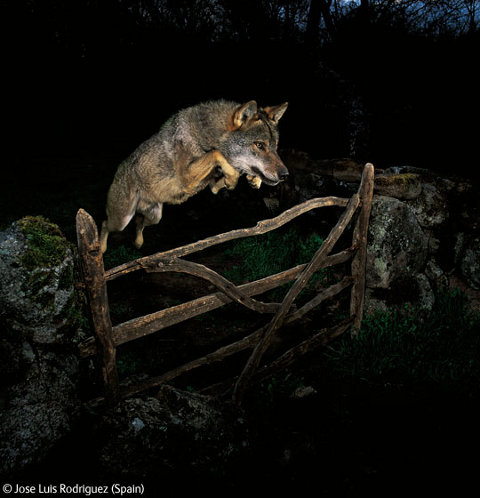
WILDLIFE

Veolia Wildlife Photographer Of The Year

Perhaps a tad too excited about this exhibition, prostate The Veolia Wildlife Photographer Of The Year is at the top of my to-do list this week. Held in the wonderous Natural History Museum, the competition handpicks a selection of the finest wildlife photographs from professional and amateur photographers and have received an astounding 43,000 entries. The candidates aim to produce work that is original, creative and inspired and many of this year’s entries will prove to exceed these expectations. None more so in fact than the winner, Jose Luis Rodriguez’ piece ‘The Storybook Wolf’ alone, makes this exhibition worth going to.

Natural History Museum
October 23 2009 – April 11 2010

PHAIDON

Phaidon Pop-Up Shop

The world renowned publisher Phaidon have just opened their first UK pop up book shop in Piccadilly. Famous for superior quality books on visual arts, culture and creativity, you will be able to buy from categories such as design, photography, architecture, fashion, travel and now new editions, cookery and children’s books. Be sure to make a visit soon to get your mits on any of the beautifully crafted publications as it won’t be around forever. The store will be gone again in the January of next year.

Phaidon Store 173 Piccadilly London W1

POP LIFE

Pop Life:Art In A Material World

Based on Andy Warhol’s notorious quote ‘good business is the best art’ the exhibition considers the legacy Pop Art left behind and the influence it has had since. ‘Pop Life‘ will focus on how artists have inflitrated and been invloved in the mass media since the 1980′s including Damien Hirst, Jeff Koons, Tracey Emin, Richard Prince and Keith Haring. We are also asked to be aware that some works in this exhibition are of a challenging and sexual nature and admission to three of the rooms is restricted to over-18s only. You have been warned!

Tate Modern
October 1 2009 – January 17 2010

GREEN DAY

Green Day Presents: ‘The Art of Rock’

A celebration of art and music has come to Brick Lane this week. To coincide with the release of their new album Green Day have commissioned a selection of artists to produce work for a travelling exhibition that will also accompany them on their world tour. The artists, who include curator Logan Hicks, Ron English, Sixten, Will Barras and The London Police were asked to make work in reaction to their latest album, 21st Century Breakdown.

StolenSpace Gallery Brick Lane
October 23 – November 11

Categories ,Andy Warhol, ,art gallery of ontario, ,art in a material world, ,Art Listings, ,Damien Hirst, ,Drawing attention, ,dulwich picture gallery, ,green day, ,Jeff Koons, ,jose luis rodriguez, ,keith haring, ,logan hicks, ,matisse, ,natural history museum, ,phaidon, ,phaidon pop up store, ,picasso, ,pop life, ,rembrandt, ,richard prince, ,ron english, ,sixten, ,stolenspace gallery, ,Tate Modern, ,the london police, ,the old truman brewery, ,Tracey Emin, ,van gogh, ,veolia wildlife photographer of the year, ,will barras

Similar Posts:


Amelia’s Magazine | An interview with American artist Matthew Rose


My situation (image courtesy of Matthew Rose)

Matthew Rose is an American artist living in Paris known for his 1, look 000 piece wall-to-wall collages. On viewing his work, purchase you can’t help but feel as if you are peering into the wrong end of a telescope; the objects look familiar yet distorted, eerie yet beautiful.

His abstract, artistic style presents a surreal and parallel world infused with vibrant colours where he often plays with an unusual fusion of subjects (and by this I mean a man with carrots for his head or a woman who is part-human, part-camera – pretty crazy stuff but in the most fantastic sense!).

For almost three decades, Matthew has been producing installations, which reinforce the connection between imagery and literature in art. His works – many of which are a composite of beautiful colours, visuals and text melting into one another – evoke the genres of 20th century surrealist artists, and several critics have cited his work as demonstrating a ‘dadaist exploration of sense and non-sense’.

Matthew’s installations have featured in galleries and museums across Europe, Asia and the United States, and his work has appeared in numerous books and magazines, including MASTERS: COLLAGE (Sterling Publishing/Lark Books, 2010) published recently.

His most notable art project to date, A Book About Death, showcased in New York’s Emily Harvey Foundation Gallery in September 2009. The show was a logistical feat involving thousands of artists from across the globe sending 500 artworks in the form of postcards to construct the exhibition. The beauty of the exhibition was that the end result was offered to one lucky visitor in the form of a book… for free. More than 18 exhibitions of A Book About Death have been staged worldwide, including The Queens Museum in New York, MuBE in São Paulo and MoMA Wales.


Private view invite (image courtesy of Matthew Rose and Orange Dot Gallery)

Matthew’s most recent project, Scared But Fresh, is a dislocated love story exploring the sense and non-sense, which I was lucky enough to catch at Orange Dot Gallery, a lovely new exhibition space in the heart of Bloomsbury. By his own admission, Matthew is interested in ‘creating works to see them for himself’ but as a by-product of his imagination, his mesmerising creations prompt the viewer to garner thoughts of their own.

After gate-crashing a Brown University reunion held at the gallery, where Matthew studied Semiotics in 1981, I managed to grab a quiet moment with the calm and composed artist before his alumni chums arrived, gaining a glimpse into the annals of the mind of a truly fascinating individual…

How old were you when you realised you wanted to be an artist?
I couldn’t have been more than six years old when my mother and aunt dragged me to The Brooklyn Museum to see Van Gogh. The lines went around the block and I couldn’t understand what the fuss was about; I was hungry, my feet hurt and being small, I was suffocating in this cloud of wool coats. Once inside the galleries, however, I caught my first glimpse of what has proven to be a very nourishing world… I stayed close to my mother and aunt for about 10 minutes but soon enough got lost (purposely) and quietly pushed my way through the crowds to get up close to Van Gogh’s brilliant colors, these vibrating landscapes – in particular, the painting he produced in the Arlesian sun, Almond Branches in Bloom (1890). It turned out to be one of the pieces he produced the year he died of a self-inflicted gun shot wound. I never forgot the color and intelligence behind this painting, and I slowly began to look for this “art experience” in my own.


Anglais (image courtesy of Matthew Rose)

What artists did you look up to when you were developing your artistic style?
Most artists I know were influenced by the early 20th century modernists – Picasso, Matisse, Malevich…then Duchamp and the Dadaists, the Surrealists, Pollock, de Kooning and then those who flavored the world we arrived in: Warhol, Johns, Rauschenberg. For me, probably folks like Hopper for his era and compositions and silence; and Cornell for his expansive internal universe, and mostly Ray Johnson, because he was a friend and teacher (as he was to thousands) and the way he worked. Since I mostly work in collage, I’m more prone to think in disparate images and texts, an old-fashioned multi-media stream of consciousness. I don’t have problems with dislocated images and lexical puzzles. Of course I don’t pretend that these artists are producing works of philosophy, but rather reflecting the cataclysm that stems from consciousness.

Your work often involves the use of collage – what led to this fascination and why do you like working in this particular abstract context?
Collage is just one of several mediums I work in. Over the years I’ve produced works/object in wax or wood, painting and drawing, and text pieces either as rubber stamp works (printing) or drawing the words. One of my interests is word as image, and collage permits me to combine words and images in a fairly rapid fashion. I tend to work super fast and produce series in a matter of days or weeks. I’m pretty obsessed once I get going and very little interferes with my process. I did a show some years ago called ‘Spelling With Scissors’, and this is my approach – combining literature (texts) with images. I have always discussed my aesthetic view as a form of reading.

What does working in collage allow you to express in ways that other forms of artistic expression cannot?
Speed. Strangeness. The wide array of material allows me to cover many ideas and compositional concepts in a short period of time. Painting plays a part in what I do, as does drawing and often these mediums come into play in a work. But collage is an approach to consciousness, and that, I think is the flux endpoint in my work. Most of the elements I use are found, and that, too, is an important part of my process. Seeing what the world washes up at my feet, the skidmarks of my time and place.


Scared But Fresh at Orange Dot Gallery (photography courtesy of Orange Dot Gallery)

What was the inspiration behind Scared But Fresh?
Scared But Fresh
is a love story. The works in the exhibition come together (in my mind, at least) to lay out a dislocated love story, a song about love with its insistent cacophony. I think if you look at the pieces in this exhibition, including the 12-piece collage on paper series, America, you’ll see sex, love and death (the staples of art making), you’ll discover heartache, lust, dread and all those angst-laden things that produce so much of the content of our lives. Or at least that’s the way I see it. Again, I produce these works to see them myself, to see what these odd elements produce in combination, and to perhaps understand what sort of stuff is moving around inside of me; that said, it’s not therapy, but rather an inquiry.

Why is the exhibition called Scared But Fresh?
Scared But Fresh was a phrase sent to me in 2002 by a friend; she signed an e mail that way. I immediately seized upon it, made a tonne of text works with it, cutting stencils and painting them, or adding it to other works, but also meditating upon its possible meanings. The “but” is critical. My thinking in using it for the title of this exhibition at Orange Dot Gallery in London was that it was so aggressive, sure but still loaded with innocence and dread. Like love.

Critics have previously cited your work as a dadaist exploration of sense and non-sense. What would your response be to this?
I would agree with them. Dada is many things, and has been the point of departure for nearly 100 years of art production. The combination of sense and non-sense, broken grammar, chopped up meaning, and the flux of everyday life is, in my view, what my consciousness is like. What is the sense of finding a dollar bill stuck in a pile of dog shit? Or posters torn and weathered revealing a history of pasting and perhaps, a history of beauty (the models featured in years of posters, bits of their faces and clothing revealed)? I grab onto these things and consider them. Other people think about interest rates and widget production, and so do I, but I do something quite different with the information, the images and the meaning of these things. A large piece I produced, Les Affaires (prints are on Keep Calm Gallery’s site), surveys all sorts of exchanges; it is about commerce in many ways. Another work, Immaculate Perception (also available as a print on Keep Calm Gallery), is a very simple surreal piece showing a girl blossoming from a lemon tree. It’s not very interesting to be logical all day long, plus logic is overrated.


Cornell Bottle (photography courtesy of Orange Dot Gallery)

How would you describe your own style of work?
I’m a cut and paste artist. But I try to be clear in my chaos. The style can be dada, neo-pop, surreal, but I think after all these years, it’s simply mine.

When you create art, do you do it in the frame of mind that it will be viewed by others or it is created as a visual form of a personal diary?
I create these things to see them for myself, to discover what this 1/2 face would look like with this 1/2 refrigerator. Or what would happen if this nice girl in her party dress would be like if she were wearing a steak for a head, or a pair of mechanical gears for breasts? I produce these works the way I play chess, carefully, but totally willing to take risks, totally willing to exchange queens, sacrifice pawns…not afraid to lose. As for a diary, I’m not sure about that, but I do work in books very often. Some of my series come in the form of 110-page visual novels like A Perfect Friend and Days Like These, People (drawings), Machines (drawings) and a dozen others. I feel not so much as if I’m making things for other people – again – but more for myself, and not to cure myself of anything other than the nightmare that is our world.

You are now based in France. Do you find that where you live has any influence on the themes that run through your work?
Living in France probably hasn’t altered in any significant way the themes that run through my work. Love, sex, death, anxiety, money will find you out no matter where you live. The material though is different. As I’m extremely interested in language, the plethora of printed materials in French, German, Spanish, Italian, English and other languages abounds here. I often find old beat up books tossed out on the street, or objects on the sidewalk. I can also play with a tonne of languages and I very much enjoy that. It’s the world. My studio is small and quiet and as I also live in the space I’m always up at 3 am working. Or I sleep then wake and work… something is always going on here, and should I need to go out, a walk proves a real fascination for me after a period of intense activity. “Holy smokes,” I’ll say to myself. “I live in France.” I sometimes forget that I actually live in this country.

What thoughts/feelings would you like viewers to go away with after they have been to your exhibition?
Well they tell me that they enjoy the work, they like that craziness of the work, but that it all makes sense. During the exhibition the head of a large international advertising company spent quite a while looking at my work. His focus is message communication, and in particularly creating iPhone apps, so he’s very attuned to visuals and text, and he said to me: “This is brilliant.” At the moment he was looking at a work from the America series of a girl on a swing with the word “HOME” pasted on top of her. She was pasted, in turn, on top of a photograph of a ship in a raging storm. That to me was very rewarding. Because something that was interesting to me was interesting to someone else, it was strong enough to click somewhere else.

How would you best like to be remembered?
You mean when I die? I launched an enormous project about this (in a way), A Book About Death. So I’ve thought long and hard about what its like to not have consciousness, to be left alone, to struggle with the impermanence of life, and the often sad and painful lives we lead when the folks we love are no longer with us. I’ve tried not to turn away from death and acknowledge it. Maybe as someone who wasn’t afraid to confront his demons, loved his friends and collaborated with the world in a way that made a little bit more sense out of the nonsense.

Categories ,A Book About Death, ,Brown University, ,Cornell, ,Dadaists, ,de Kooning, ,Duchamp, ,Emily Harvey Foundation Gallery, ,Hopper, ,Johns, ,Kat Phan, ,Keep Calm Gallery, ,Malevich, ,matisse, ,Matthew Rose, ,MoMA Wales, ,MuBE, ,Orange Dot Gallery, ,picasso, ,Pollock, ,Rauschenberg, ,Ray Johnson, ,Scared But Fresh, ,Surrealists, ,The Brooklyn Museum, ,The Queens Museum, ,van gogh, ,Warhol

Similar Posts:


Amelia’s Magazine | An interview with American artist Matthew Rose


My situation (image courtesy of Matthew Rose)

Matthew Rose is an American artist living in Paris known for his 1, look 000 piece wall-to-wall collages. On viewing his work, purchase you can’t help but feel as if you are peering into the wrong end of a telescope; the objects look familiar yet distorted, eerie yet beautiful.

His abstract, artistic style presents a surreal and parallel world infused with vibrant colours where he often plays with an unusual fusion of subjects (and by this I mean a man with carrots for his head or a woman who is part-human, part-camera – pretty crazy stuff but in the most fantastic sense!).

For almost three decades, Matthew has been producing installations, which reinforce the connection between imagery and literature in art. His works – many of which are a composite of beautiful colours, visuals and text melting into one another – evoke the genres of 20th century surrealist artists, and several critics have cited his work as demonstrating a ‘dadaist exploration of sense and non-sense’.

Matthew’s installations have featured in galleries and museums across Europe, Asia and the United States, and his work has appeared in numerous books and magazines, including MASTERS: COLLAGE (Sterling Publishing/Lark Books, 2010) published recently.

His most notable art project to date, A Book About Death, showcased in New York’s Emily Harvey Foundation Gallery in September 2009. The show was a logistical feat involving thousands of artists from across the globe sending 500 artworks in the form of postcards to construct the exhibition. The beauty of the exhibition was that the end result was offered to one lucky visitor in the form of a book… for free. More than 18 exhibitions of A Book About Death have been staged worldwide, including The Queens Museum in New York, MuBE in São Paulo and MoMA Wales.


Private view invite (image courtesy of Matthew Rose and Orange Dot Gallery)

Matthew’s most recent project, Scared But Fresh, is a dislocated love story exploring the sense and non-sense, which I was lucky enough to catch at Orange Dot Gallery, a lovely new exhibition space in the heart of Bloomsbury. By his own admission, Matthew is interested in ‘creating works to see them for himself’ but as a by-product of his imagination, his mesmerising creations prompt the viewer to garner thoughts of their own.

After gate-crashing a Brown University reunion held at the gallery, where Matthew studied Semiotics in 1981, I managed to grab a quiet moment with the calm and composed artist before his alumni chums arrived, gaining a glimpse into the annals of the mind of a truly fascinating individual…

How old were you when you realised you wanted to be an artist?
I couldn’t have been more than six years old when my mother and aunt dragged me to The Brooklyn Museum to see Van Gogh. The lines went around the block and I couldn’t understand what the fuss was about; I was hungry, my feet hurt and being small, I was suffocating in this cloud of wool coats. Once inside the galleries, however, I caught my first glimpse of what has proven to be a very nourishing world… I stayed close to my mother and aunt for about 10 minutes but soon enough got lost (purposely) and quietly pushed my way through the crowds to get up close to Van Gogh’s brilliant colors, these vibrating landscapes – in particular, the painting he produced in the Arlesian sun, Almond Branches in Bloom (1890). It turned out to be one of the pieces he produced the year he died of a self-inflicted gun shot wound. I never forgot the color and intelligence behind this painting, and I slowly began to look for this “art experience” in my own.


Anglais (image courtesy of Matthew Rose)

What artists did you look up to when you were developing your artistic style?
Most artists I know were influenced by the early 20th century modernists – Picasso, Matisse, Malevich…then Duchamp and the Dadaists, the Surrealists, Pollock, de Kooning and then those who flavored the world we arrived in: Warhol, Johns, Rauschenberg. For me, probably folks like Hopper for his era and compositions and silence; and Cornell for his expansive internal universe, and mostly Ray Johnson, because he was a friend and teacher (as he was to thousands) and the way he worked. Since I mostly work in collage, I’m more prone to think in disparate images and texts, an old-fashioned multi-media stream of consciousness. I don’t have problems with dislocated images and lexical puzzles. Of course I don’t pretend that these artists are producing works of philosophy, but rather reflecting the cataclysm that stems from consciousness.

Your work often involves the use of collage – what led to this fascination and why do you like working in this particular abstract context?
Collage is just one of several mediums I work in. Over the years I’ve produced works/object in wax or wood, painting and drawing, and text pieces either as rubber stamp works (printing) or drawing the words. One of my interests is word as image, and collage permits me to combine words and images in a fairly rapid fashion. I tend to work super fast and produce series in a matter of days or weeks. I’m pretty obsessed once I get going and very little interferes with my process. I did a show some years ago called ‘Spelling With Scissors’, and this is my approach – combining literature (texts) with images. I have always discussed my aesthetic view as a form of reading.

What does working in collage allow you to express in ways that other forms of artistic expression cannot?
Speed. Strangeness. The wide array of material allows me to cover many ideas and compositional concepts in a short period of time. Painting plays a part in what I do, as does drawing and often these mediums come into play in a work. But collage is an approach to consciousness, and that, I think is the flux endpoint in my work. Most of the elements I use are found, and that, too, is an important part of my process. Seeing what the world washes up at my feet, the skidmarks of my time and place.


Scared But Fresh at Orange Dot Gallery (photography courtesy of Orange Dot Gallery)

What was the inspiration behind Scared But Fresh?
Scared But Fresh
is a love story. The works in the exhibition come together (in my mind, at least) to lay out a dislocated love story, a song about love with its insistent cacophony. I think if you look at the pieces in this exhibition, including the 12-piece collage on paper series, America, you’ll see sex, love and death (the staples of art making), you’ll discover heartache, lust, dread and all those angst-laden things that produce so much of the content of our lives. Or at least that’s the way I see it. Again, I produce these works to see them myself, to see what these odd elements produce in combination, and to perhaps understand what sort of stuff is moving around inside of me; that said, it’s not therapy, but rather an inquiry.

Why is the exhibition called Scared But Fresh?
Scared But Fresh was a phrase sent to me in 2002 by a friend; she signed an e mail that way. I immediately seized upon it, made a tonne of text works with it, cutting stencils and painting them, or adding it to other works, but also meditating upon its possible meanings. The “but” is critical. My thinking in using it for the title of this exhibition at Orange Dot Gallery in London was that it was so aggressive, sure but still loaded with innocence and dread. Like love.

Critics have previously cited your work as a dadaist exploration of sense and non-sense. What would your response be to this?
I would agree with them. Dada is many things, and has been the point of departure for nearly 100 years of art production. The combination of sense and non-sense, broken grammar, chopped up meaning, and the flux of everyday life is, in my view, what my consciousness is like. What is the sense of finding a dollar bill stuck in a pile of dog shit? Or posters torn and weathered revealing a history of pasting and perhaps, a history of beauty (the models featured in years of posters, bits of their faces and clothing revealed)? I grab onto these things and consider them. Other people think about interest rates and widget production, and so do I, but I do something quite different with the information, the images and the meaning of these things. A large piece I produced, Les Affaires (prints are on Keep Calm Gallery’s site), surveys all sorts of exchanges; it is about commerce in many ways. Another work, Immaculate Perception (also available as a print on Keep Calm Gallery), is a very simple surreal piece showing a girl blossoming from a lemon tree. It’s not very interesting to be logical all day long, plus logic is overrated.


Cornell Bottle (photography courtesy of Orange Dot Gallery)

How would you describe your own style of work?
I’m a cut and paste artist. But I try to be clear in my chaos. The style can be dada, neo-pop, surreal, but I think after all these years, it’s simply mine.

When you create art, do you do it in the frame of mind that it will be viewed by others or it is created as a visual form of a personal diary?
I create these things to see them for myself, to discover what this 1/2 face would look like with this 1/2 refrigerator. Or what would happen if this nice girl in her party dress would be like if she were wearing a steak for a head, or a pair of mechanical gears for breasts? I produce these works the way I play chess, carefully, but totally willing to take risks, totally willing to exchange queens, sacrifice pawns…not afraid to lose. As for a diary, I’m not sure about that, but I do work in books very often. Some of my series come in the form of 110-page visual novels like A Perfect Friend and Days Like These, People (drawings), Machines (drawings) and a dozen others. I feel not so much as if I’m making things for other people – again – but more for myself, and not to cure myself of anything other than the nightmare that is our world.

You are now based in France. Do you find that where you live has any influence on the themes that run through your work?
Living in France probably hasn’t altered in any significant way the themes that run through my work. Love, sex, death, anxiety, money will find you out no matter where you live. The material though is different. As I’m extremely interested in language, the plethora of printed materials in French, German, Spanish, Italian, English and other languages abounds here. I often find old beat up books tossed out on the street, or objects on the sidewalk. I can also play with a tonne of languages and I very much enjoy that. It’s the world. My studio is small and quiet and as I also live in the space I’m always up at 3 am working. Or I sleep then wake and work… something is always going on here, and should I need to go out, a walk proves a real fascination for me after a period of intense activity. “Holy smokes,” I’ll say to myself. “I live in France.” I sometimes forget that I actually live in this country.

What thoughts/feelings would you like viewers to go away with after they have been to your exhibition?
Well they tell me that they enjoy the work, they like that craziness of the work, but that it all makes sense. During the exhibition the head of a large international advertising company spent quite a while looking at my work. His focus is message communication, and in particularly creating iPhone apps, so he’s very attuned to visuals and text, and he said to me: “This is brilliant.” At the moment he was looking at a work from the America series of a girl on a swing with the word “HOME” pasted on top of her. She was pasted, in turn, on top of a photograph of a ship in a raging storm. That to me was very rewarding. Because something that was interesting to me was interesting to someone else, it was strong enough to click somewhere else.

How would you best like to be remembered?
You mean when I die? I launched an enormous project about this (in a way), A Book About Death. So I’ve thought long and hard about what its like to not have consciousness, to be left alone, to struggle with the impermanence of life, and the often sad and painful lives we lead when the folks we love are no longer with us. I’ve tried not to turn away from death and acknowledge it. Maybe as someone who wasn’t afraid to confront his demons, loved his friends and collaborated with the world in a way that made a little bit more sense out of the nonsense.

Categories ,A Book About Death, ,Brown University, ,Cornell, ,Dadaists, ,de Kooning, ,Duchamp, ,Emily Harvey Foundation Gallery, ,Hopper, ,Johns, ,Kat Phan, ,Keep Calm Gallery, ,Malevich, ,matisse, ,Matthew Rose, ,MoMA Wales, ,MuBE, ,Orange Dot Gallery, ,picasso, ,Pollock, ,Rauschenberg, ,Ray Johnson, ,Scared But Fresh, ,Surrealists, ,The Brooklyn Museum, ,The Queens Museum, ,van gogh, ,Warhol

Similar Posts: