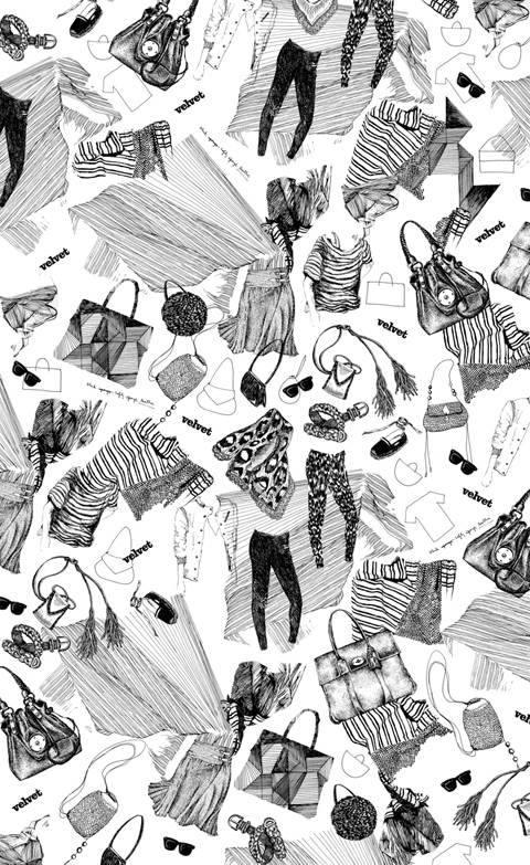
information pills Gelatti, 2009″ src=”http://www.ameliasmagazine.com/wp-content/uploads/2010/03/Paula-Castro-Gelatti-2009.jpg” alt=”” width=”480″ height=”644″ />
Your work will be featured in the Contemporary Graphic Art Fair, ‘Pick Me Up’ at Somerset House this April. Are you excited about this?
Very much!
Being based in Paris, how do you feel about the London graphic and illustration scene? Being raised in Buenos Aires and living in Paris allows me to have quite a distance from the Parisian scene.Paris is a more contemplative and playful city to me; extremelly beautiful, much smaller, less dynamic and precise than London. I do really like London’s graphic art scene when I come across simplicity and sarcasm (in the possitive way), cleverness and a sense of humor.
When did you first become interested in illustration? When I was little I was very spaced out at school (I still am), the only way I could focus was while drawing.
I understand that you are interested in the boundary between fine art and illustration, what is it in particular that interests you? The contemplation, context, risk, experimentation and the way all these elements mix together. As an illustrator my work is accessible to many individuals, it is more direct. Working in the fine arts field allows me to experiment, to explore, to be not sure, to take risks and feed myself and my illustration. I like this expert from “A portrait of the artist as a young man” by James Joyce
(…) It it Stephen Dedalus’s declared ambition “to express myself in some mode of life or art as freely as i can and as wholly as i can, using for my defence the only arms i allow myself to use – silence, exile, and cunning.” (…)
Do you prefer to work to a design brief or exhibit your work in a gallery? The two have very different approaches, it is hard to compare.
Nature seems to be very important and appears consistently in your work. Do you work mainly from nature or imagination? Nature + founded images + music + poetry + imagination = my drawing cocktail. I usually work from images, but when I process them in my brain, imagination takes over and they end up looking very different from the original source of inspiration. Does it make sense? Or is this nonsense taking over?
You also use various techniques like playing with scale and repetition, what is it about these techniques that interests you? Yes, I do. I call them NOT repetitive patterns, which I feel is quite philosophical (in a modest way)
I really like your printed textiles and fashion illustrations. Is fashion a major inspiration for your work? Thanks! I like to see drawings taking over a dress in motion for example, because I feel they become three dimensional, almost sculptural or like a moving image. Yes, fashion is an inspiration, but only when I see diversity and individuals searching for their own style.
Your stage design for Issey Miyake was a real departure from your other work. Are there any other materials or techniques you are currently experimenting with? Issey Miyake’s stage design was a translation of my graphic universe into a three dimensional landscape. Yes, I am currently experimenting with other kind of mediums, like threads, bigger scale drawings and etchings.
What would be your ideal design brief? It is already ideal when people call me to do what I do. I prefer it when they give me a mood board or just some words. For example when I do the cooking recipes for Italian Velvet I have complete freedom and I really enjoy it.
After ‘Pick Me Up’, where will we see your work next? Mainz, Germany at Wak gallery on May 29th, Buenos Aires at Turbo gallery, a solo show in June.
Rome and Milan, limited edition prints of beachwear for Velvet magazine (monthly style magazine from La Repubblica newspaper).
If you happen to be around these places at these times, do pop by.
Paula Castro is represented by breedlondon.com
Pick Me Up: Contemporary Graphic Art Fair will take place at Somerset House from 23 April till 3 May
Written by Louisa Lee on Wednesday March 24th, 2010 2:31 pm
information pills Gelatti, 2009″ src=”http://www.ameliasmagazine.com/wp-content/uploads/2010/03/Paula-Castro-Gelatti-2009.jpg” alt=”” width=”480″ height=”644″ />
Your work will be featured in the Contemporary Graphic Art Fair, ‘Pick Me Up’ at Somerset House this April. Are you excited about this?
Very much!
Being based in Paris, how do you feel about the London graphic and illustration scene? Being raised in Buenos Aires and living in Paris allows me to have quite a distance from the Parisian scene.Paris is a more contemplative and playful city to me; extremelly beautiful, much smaller, less dynamic and precise than London. I do really like London’s graphic art scene when I come across simplicity and sarcasm (in the possitive way), cleverness and a sense of humor.
When did you first become interested in illustration? When I was little I was very spaced out at school (I still am), the only way I could focus was while drawing.
I understand that you are interested in the boundary between fine art and illustration, what is it in particular that interests you? The contemplation, context, risk, experimentation and the way all these elements mix together. As an illustrator my work is accessible to many individuals, it is more direct. Working in the fine arts field allows me to experiment, to explore, to be not sure, to take risks and feed myself and my illustration. I like this expert from “A portrait of the artist as a young man” by James Joyce
(…) It it Stephen Dedalus’s declared ambition “to express myself in some mode of life or art as freely as i can and as wholly as i can, using for my defence the only arms i allow myself to use – silence, exile, and cunning.” (…)
Do you prefer to work to a design brief or exhibit your work in a gallery? The two have very different approaches, it is hard to compare.
Nature seems to be very important and appears consistently in your work. Do you work mainly from nature or imagination? Nature + founded images + music + poetry + imagination = my drawing cocktail. I usually work from images, but when I process them in my brain, imagination takes over and they end up looking very different from the original source of inspiration. Does it make sense? Or is this nonsense taking over?
You also use various techniques like playing with scale and repetition, what is it about these techniques that interests you? Yes, I do. I call them NOT repetitive patterns, which I feel is quite philosophical (in a modest way)
I really like your printed textiles and fashion illustrations. Is fashion a major inspiration for your work? Thanks! I like to see drawings taking over a dress in motion for example, because I feel they become three dimensional, almost sculptural or like a moving image. Yes, fashion is an inspiration, but only when I see diversity and individuals searching for their own style.
Your stage design for Issey Miyake was a real departure from your other work. Are there any other materials or techniques you are currently experimenting with? Issey Miyake’s stage design was a translation of my graphic universe into a three dimensional landscape. Yes, I am currently experimenting with other kind of mediums, like threads, bigger scale drawings and etchings.
What would be your ideal design brief? It is already ideal when people call me to do what I do. I prefer it when they give me a mood board or just some words. For example when I do the cooking recipes for Italian Velvet I have complete freedom and I really enjoy it.
After ‘Pick Me Up’, where will we see your work next? Mainz, Germany at Wak gallery on May 29th, Buenos Aires at Turbo gallery, a solo show in June.
Rome and Milan, limited edition prints of beachwear for Velvet magazine (monthly style magazine from La Repubblica newspaper).
If you happen to be around these places at these times, do pop by.
Paula Castro is represented by breedlondon.com
Pick Me Up: Contemporary Graphic Art Fair will take place at Somerset House from 23 April till 3 May
Written by Louisa Lee on Wednesday March 24th, 2010 2:31 pm
22 year old Luciano Scherer is truly dedicated to his cause. Working 8-10 hours a day, more about 7 days week, he produces paintings, sculptures and animation until his back hurts too much to carry on. The Brazilian self-taught artist works alone as well as with a collective called ‘Upgrade do Macaco’, and has collaborated with Bruno 9li and Emerson Pingarilho. I found him to be much older than his years, with some very insightful and philosophical things to say about everything from art to life and the internet.
When did you realise you had creative talent?
When I was 8 years old my school had a drawing challenge for a children’s book, the teachers read the book to us and we should drew parts of it. My drawing was chosen, it was not the best, but it was the craziest, and the teachers said to me that I was very creative. I started to draw again when I was 15, and only seriously when I was 18.
Which artists or illustrators do you most admire?
From the past: Bosch, Brueghel, Jan van Eyck, Crivelli, Albrecht Altdorfer, gothic art in general. I also like alchemical drawings, illuminated manuscripts, and popular art from my country. But my real influences are my artist friends, they helped me to transform my spirit, not just my art, modifying my inside shell, something that still happens everyday. They are: Carla Barth, Carlos Dias, Bruno 9li, Emerson Pingarilho, Talita Hoffmann, Upgrade do Macaco collective. My current master is Jaca, he is genius.
Who or what is your nemesis?
My nemesis is somebody with lot of dedication and creativity to create evil things, like guns, bombs, wars, murders, lies.
If you could time travel back or forward to any era, where would you go?
I would go to the late-gothic era, in the end of the 15th century and early 16th century, just to understand or comprehend a little better how artists can do those masterpieces. I want to know about the places, the woods, the people’s clothes, the churches, the religions and the spirituality of this time. It is my all time golden age of painting. They all invested years of dedication to each piece, the result of it is bigger than our current comprehension.
If we visited you in your home town, where would you take us?
My hometown is a very small city in the extreme south of Brazil, almost Uruguay. There’s no galleries, no museums, no cinema, no nothing! But there are very beautiful natural places, like mystery fog woods, beautiful beaches with nobody, lakes, fields, lots of different animals; I will take you to all these places.
To what extent is your work influenced by your religion or spirituality?
I’m a son of a catholic father who takes me to the church every Sunday, and a mystic mother who is deeply connected with questions of spirituality. All my life I’ve been in catholic schools, and the people that I know there appear to be dedicated to God with tons of saints in sculptures, bracelets, necklaces, flyers, but the rest of their lives they spend being so petty, earthly, extremely connected with just the image of faith, and the concepts of guilty, suffering and impotencies. This contradiction makes me feel revolted, and at the same time I too have been into spiritualism, a Christian based doctrine, but much more metaphysical. This time the metaphysical seems to me so curious, respectable and scary, very scary. So when I started to paint, the images of Catholicism caused a strange fusion of respect, fear, nostalgia, and anger. I felt I needed to work over them, to learn about them and get more intimate, question the images and dogmas and lose the fear. It was a period of destruction like a renaissance. For a year now I’ve found myself distant from the doctrines, but between all of them, mainly the oriental ones like Buddhism and Hinduism, I’m feeling more spiritualized than religious. But this is just the start; I have much more to learn and I’m trying to not answer all the questions but instead learning to live together with them. All of this reflects in my artwork.
If you weren’t an artist, what would you be doing?
An artist’s assistant, or a curator, or a collector; art aside, I’d be a garden sculptor.
Where would you like to be in 10 years time?
Living in a self-sustainable vegetarian community, with all my friends and family, in a place not too hot and not too cold, with as many animals as possible, all of them free.
What advice would you give up and coming artists?
Over and over I’ve heard people say “art doesn’t make any money” or “what do you want to be an artist for, it’s so useless”. I’ve stopped listening to the cynics now though.
What was the last book you read?
I read the David Lynch book about transcendental meditation “Into Deep Water” (This is the name in Brazil), and the Krishnamurthy’s “Freedom from the Known”- it’s like a bible to me, I read it over and over. I’ve been reading H. P. Blavatsky “Voice of the Silence” and “Isis Unveiled” too. Now I’m reading Nietzsche’s “Also Sprach Zarathustra”, it’s awesome.
What piece of modern technology can you not live without?
The Internet. It’s my mail, my books, my telephone, my all time world museum 24-7.
What is your guilty pleasure?
The excesses, in food, drink, work, sleep. Anytime I get too much of these things I feel so regretful, but I’m working on it.
Tell us something about Luciano Scherer that we didn’t know already.
I have a post-rap band, named Casiotron. And I’m working on my first individual exhibition, at Thomas Cohn Gallery next year.
This is certainly a young man full of promise.
As a purveyor of Steve Reich meets Daniel Johnston instrumental music, sickness Graeme Ronald, a.k.a. Remember Remember, is keen to take it to the stage as nature intended: “I’ve put together a seven piece band for this tour. It’s hard to time it right but it’s worth it. Using a laptop isn’t the same as a live band is it?”
Sitting in the back of a Brighton drinking den, Ronald exudes a boyish sense of wide- eyed enthusiasm. Currently touring with influential US noise crew, Growing, he’s rightfully proud of his self-titled debut album on Mogwai‘s Rock Action Records. Ronald’s sweet, Glasgow brogue suffuses our conversation as he gives me an insight into his formative days: “I played with Mogwai as an additional keyboard player. I kept pestering them to let me join the band. I was working on my own stuff with a Loop station and started playing live regularly. Mogwai came down to hang out at one show and then offered to do an album”
As it has afforded him so many opportunities, Ronald is proud of his home city: “Glasgow does have a great music scene. It takes going away to appreciate what’s there. The art school or dole queue are great places to meet musicians. It’s a vibrant environment. Best steer clear of the Neds though”
The music of Remember Remember mirrors the urban, comfortingly grey, concrete beauty of Glasgow: “It was a conscious decision to make a record that sounded Scottish. I hate it when people sing in American accents. Or think they’re German. There’s a sense of shame attached to being Scottish. Growing up, I was embarrassed by the Proclaimers, Rab C Nesbit, bag pipes. I saw Kurt Cobain on MTV and that was it! Getting older, you look to your own identity to create more honest art”
Ronald is refreshingly grounded and deadpans: “I’m not deluded enough to think I can become a pop star off of minimalist drone music. Making money is not a priority. Shouldn’t music be free? CDs, selling music – they’re all imposed business models.”
Forever the Modernist, he’s already got his sights on the future: “The label wants me to promote this record more but I’m so keen to start working on new music. Touring’s new enough to be exciting but it’s still work. I’m quite up for doing a Brian Wilson and sending out other people to play my songs…”
All photos by Ken Street
Chatsworth Road, earmarked in the ‘Secret Streets’ feature of Time Out some twelve months ago, viagra lies deep in the E5 environs of Hackney- between Millfields Park and Homerton Hospital. Since it was said to be ‘bearing the fruits of the slow gentrification process,’ it seems the high street is ripe for development. With the arrival of such bijou retailers and eateries as Book Box and L’Epicerie, change is certainly in the air. As an actress friend and young Mum in the area recently put it: ‘it’s all gone a bit Guardian reader,’ the latest manifestation of which is the bid to reinstate the erstwhile street market.
Never one to bypass a strikingly rainbow-fonted poster in my local newsagent, especially not one bearing the promise of a shopping opportunity, I found myself drawn down to Chats Palace on the rainy evening of 14th July. The former Homerton library turned community arts venue had generously offered its premises free of charge for an open meeting of the Chatsworth Road Traders and Residents Association. A veritable cross-section of the neighbourhood populace, fifty or so strong, had assembled to hear the results of the spring opinion poll. But with Spitalfields, Broadway and Ridley Road already doing a roaring trade in the borough, does East London really need another market? Judging by 863 responses to 1200 leaflets distributed, of which 96% voted in the affirmative, it would seem so.
I tracked down campaign front man Ashley Parsons in the bar, post-Power Point presentation, to get the lowdown on launching a market from scratch.
What first inspired or provoked the idea to mount the campaign?
Well it certainly didn’t start out as a carefully hatched plot. It’s been a decidely organic affair so far, inspired mainly, I think, by a collective sense of pride in the local high street and aspirations for its future success as the community’s favourite place to shop.
Photo: Joe Lord
I’d say that if there was any ‘provocation’ it was that many of the traders at these 2008 meetings seemed to agree that business on the street was slower than last year – as on high streets everywhere. But the residents attending these meetings were equally concerned at the number of closed shop units on Chatsworth Road, particularly when it became apparent that Tesco was planning to massively expand the nearby Morning Lane store and that the Council were considering imposing a new tax on shopkeepers using the forecourts in front of their shops. So there was a general sense of concern that a much-loved independent high street – and a distinctive community hub to boot – was at risk of further decline. There was a very positive sense of, ‘let’s try and do something about it ourselves’.
Have you played a part in similar grassroots/ community ventures in the past?
A few years ago I was involved with Open Dalston when it was trying to prevent the demolition of the Four Aces / Labyrinth / Theatre building, and a pair of Georgian townhouses, on Dalston Lane. The campaign questioned whether the Council’s plans for the Dalston Junction area were sustainable or appropriate, and proposed a different style of development to that which you now see shooting up into the sky. It was gutting to see that particular campaign fail. But the act of mounting the campaign did result in Open Dalston going on to become a fully-fledged community organisation. Ever since that campaign they’ve been impressively committed and imaginative in trying to engage with their local community as the future of that area is fiercely debated.
How is the Chatsworth Road Market campaign different?
One of the invigorating things about it has been that it’s not a ‘no campaign’ working against someone else’s clock. It’s much more of a ‘yes’ campaign. And, to an extent, it’s been afforded the luxury of not having to react to outside events. Having said that, the campaign is, of course, going to face challenges, and it may be harder to motivate people without a sense of immediate jeopardy. But the high number of people who have attended our meetings and participated in the survey does suggest a really proactive community spirit.
When & why did the original Chatsworth Road market close?
The consensus seems to be that it closed down around 1989 or 1990. But the anecdotal evidence as to why it closed varies. Some traders who have been on the street for decades described a prolonged process of a new brick pavement being laid and re-laid, and causing such chaos and disruption to pedestrians and to the stalls’ ability to trade that the market died as a result of the work. Other residents have reported that the stalls simply declined in number and quality throughout the late ’80s. It’s certainly a story that needs to be told at some point. It’s amazing how quickly things get forgotten.
What would the major benefits of a new market be for the local community?
A new market could – and I stress ‘could’ – be a great way of improving shopping choices for local residents, which in turn might persuade more people that they don’t need to use supermarkets any more. It could bring people back to the high street and increase passing trade, benefiting all the existing businesses as well as encouraging new ones to open and fill empty shop units. It could help ensure the future of the high street as a community hub by regularly bringing together all parts of what is a hugely diverse community. It could allow more opportunities for people to set up and develop new businesses without committing to a shop lease. It could be fun!
Why is this local high street so crucial, would you say?
Firstly, because the surrounding residential area is originally based on this high street being the focal point. Many high streets are essentially lines of shops that grew up along major highways in or out of cities – they can feel transitional, cramped and chaotic. But Chatsworth Road was nothing but a field path before it was laid out by Victorian developers in the 1860s & 70s. What you see now is no accident – it was purpose built to serve a planned community, conceived as a public space with handsome proportions and wide pavements where people would shop, stroll and meet. It was built as the heart of an aspirational new working class suburb. So, for starters, it’s an unusually good urban space.
Secondly it’s important because Chatsworth Road’s renegade charm is rooted in its independence. There are very few chain names on the street, it’s almost entirely a centre of entrepreneurship, in an age of ever-expanding supermarkets and identikit city centres.
As soon the sense of community is diluted it becomes a transitional space, a way to get somewhere else rather than a destination in its own right. I’d suggest that a community-led market could just be another way of safeguarding it, another tactic for helping ensure it thrives for another 130 years, and doesn’t contract any further. For me, it’s not about fixing something that’s broken, so much as taking out a community insurance policy.
Are you ready to pass on the baton to a new line-up of committee members in September, and will you continue to be involved?
Absolutely, yes. Personally, I’ll probably take a step back after ensuring that the report on the survey is published and properly publicised, because I have to get on with earning a crust. But I’ll help out where I can because I think it’s got great potential to bring the area together.
I certainly hope that by the end of 2009 you’ll see a new Market Committee established with new faces taking things forward. That will probably be the focus of the next big meeting in Autumn 2009 – offering people the chance to shape the Association and to get more involved. People can keep an eye on the website for details of that meeting – www.chatsworthroade5.co.uk. Or they can email- info@chatsworthroade5.co.uk – and ask to be added to the mailing list. If enough people step forward there’s a great chance of making a new Chatsworth market happen.
With artists collecting in the shadowy crevices of the world’s biggest cities in search of space on the cheap it goes without saying that they tend to be found on the frothy crest of the wave of gentrification. A canary of sorts, viagra artists are often trailed by real estate speculators and big businesses, lurking and waiting like stock brokers for their chance to turn a quick buck with something they see as nothing more than a commodity. They stand apart, at the ready to raise property taxes and muscle out what is often the cultural backbone of these city-bordering towns and pat one another on the back for “cleaning it up”. But in the heart of Dalston last month, I finally saw the merging of two social layers into something not only mutually beneficial but unselfconsciously beautiful.
It began when experimental architecture collective EXZYT saw an opportunity to pirate an unused lot behind Dalston Kingsland Junction to build a 16 meter high temporary mill where land artist Agnes Denes had planted a lush wheat field thus giving life to an endless germination of ideas, all with the intent of bringing the local community together and raising issues of sustainability, economy and ownership. It played host to workshops, screenings, music, dance
In a call and response kind of ……. EXZYT, commissioned by the Barbican as part of Radical Nature, literally built upon Denes’ concept by turning the disused lot (often the hive of criminal activity in cities) into the site for a wind powered mill. EXYZT’s wild haired and bighearted architect/artist Nicolas Henninger and Celine Condorelli, whose sleep in tents amid the mill’s scaffolding, refer their temporary autonomous zones as “pirate architecture”. The idea being to create spaces which, rather than dictate its use, leaves it open to its neighbors to determine how it will be used. And use it they did! Try to keep up…
The mill was used to grind flour which was used to bake bread in ovens which open to the public. Anyone who desired to came and baked whatever they brought, drank from the wooden open air bar which twinkled with wind power and catered to a nightly flocking of local families and hipsters alike drawn to the wheat gazing deck chairs and nightly DJ, whose equipment was powered by cycles. No shortage of well developed cycle muscles in this neighborhood!
Every day saw a new manifestation of the space. A lab coat wearing urban psychoanalyst did research by asking questions like “if Dalston wear a fruit what would it be?”. Scarecrows were created to protect the wheat field, a gaffer tape poet pronounced his thoughts across the wood planks, and a local currency was baked with the help of world renowned baker Dan Lepard Even the super cool owner of local but now defunk jazz bar 4 Aces Club was a nightly fixture, ready to recount tales of its experimental jazz heyday in the 60′s staging the likes of Desmond Dekker, Jimmy Cliff, Bob Marley, The Sex Pistols and Bob Dylan.
And in the most elegant example of this project’s cycle, Alexandre Bettler hosted a workshop in which participants could bake everything from the utensils and trays upon which their dinner would be served.
Although many a plea was voiced for this amazing catalyst to remain, it’s clear from all the smiling faces present that beyond the connections made, thoughts provoked and fun had was the distinctive flavor of Dalston’s pride.
Written by Sabrina Morrison on Wednesday August 12th, 2009 5:06 pm
Dreamy, try intricate details dominate Natasha Chambers’ work, viagra sale and you can easily imagine her immersed in creation, viagra sitting by a large window overlooking some light-drenched Cornish beach. Cups of tea go cold as she pieces together the exquisite tiny patterns or the bold colours of her latest ‘Bywa’ series, a homage to the stories and beauty of Cornwall. But as Natasha has entitled one of her collages, ‘You need chaos in your soul to give birth to a dancing star’ – there are also hints of darkness underneath all the beauty. You can’t have one without the other.
Watergate (part of Bywa)
Most of your work has an amazing level of detail, be it the horses as waves, embroidery patterns or the butterfly wings. It’s beautiful, but it must be very time-consuming?
It is really time consuming, but I get all my satisfaction from the details. It’s a double-edged sword because these details also drive me mad. Sometimes the dots and lines imprint themselves in my head in the same way as when you look at the sun and then look away and you see suddenly see black spots.
There seems to be a lot of nostalgia in your work, or maybe this is just what it feels like when a piece of art focuses on nature? Do you consider yourself a nostalgic person?
I suppose I am a nostalgic person – and perhaps nature and childhood are synonymous in these feelings of the past. I have a box on my dresser, a treasure box if you like that could belong to a magpie, where I hoard broken bits of things that I have picked up over the years that I am unable to part with.
Yesterday
While the work is very pretty, there are also plenty of slightly twisted elements within the art, with the snakes and skulls. Do you do this to create contrasts, or is it because beauty on its own can be a bit, well, dull?
With every fairy tale there is always a dark side that creates tension with its lighter facade. You only have to think of the stories of Hans Christian Andersen, the fairy tales of the Brothers Grimm or even Walt Disney to see there is always this balance. Imagine Snow White without the Evil Queen.
In Stitches
I first saw your work at the Last Tuesday Society’s Beasts Royal exhibition (review here), and you’ve been part of prior shows there as well. Could you tell us a bit about what it’s like to work with the amazing Last Tuesday Society please? Mr Wynd has a fine collection of treasures. His shop makes you feel like a child in sweetshop, so I was obviously very pleased to have some work there. The show Beasts Royal was curated by Alice Herrick, who also curates the House of Fairy Tales with Gavin Turk and Deborah Curtis. Their shows are consistently beautiful and intriguing – bringing together a wonderful selection of artists to show in some great spaces. Shows have included the exquisite trove exhibition at the Newlyn Art Gallery and the House of Fairy Tales at the Saatchi Gallery and Millennium Gallery in St Ives. In Newlyn, each artist was invited to donate an object of interest to them either created or found to create a wonderful cabinet of curiosities amongst a plethora of carefully selected objects from museums across the Cornish county.
Bowerbird (part of Beasts Royal)
How do you build up your work? What inspires you?
It usually evolves through many stages and I work using quite a ramshackle but huge library of reference material. I am especially inspired by the narrative form of literature. I studied storytelling in LA and whilst I thought I would become a writer realised I was more interested in the static image. At some point I would like to return to the written word. I can remember quite vividly the books I was read as a child from their images, they’re works of art that are very engraved into my psyche.
Polzeath (part of Bywa)
The Bywa series seems different from your other work. There is less detail, but there’s also really wonderful use of colour with the green clouds and pink sky. I especially love Polzeath, the one with white-patterned sand and skies. What’s the inspiration behind this series?
I live in Cornwall, and apart from the stunning beauty of the area I live in, it is also rich in legends and it feels like the land itself breaths this ancient folkloric history. I find it very inspiring. Bywa means ‘to be alive’ in Cornish, or Kernuek. I thought this was an appropriate title especially given as the work became vividly coloured. The most recent pieces in the series, such as St Enodoc and Watergate, are almost made up entirely of dots and lines and are very intricate. St Enodoc even has a few lines of one of Sir John Betjeman’s poems half hidden in a cloud – he was very fond of this part of Cornwall and is now buried in the church.
Yellow
You do commissioned work for magazines, music and advertising. How did you go from being a design student to being a successful working artist?
After I graduated I was forced to do commercial work as a way of creating income but these projects were also useful in developing technical and artistic confidence and also a linguistic freedom. I have gradually tried to spend more and more time on my own work. I’m currently working some new ideas for an exhibition coming up, but also some commissions and other work.
Natasha Chambers
See more of Natasha Chambers’ work on her website.
Written by Jessica Furseth on Tuesday April 26th, 2011 3:27 pm
Dreamy, try intricate details dominate Natasha Chambers’ work, viagra sale and you can easily imagine her immersed in creation, viagra sitting by a large window overlooking some light-drenched Cornish beach. Cups of tea go cold as she pieces together the exquisite tiny patterns or the bold colours of her latest ‘Bywa’ series, a homage to the stories and beauty of Cornwall. But as Natasha has entitled one of her collages, ‘You need chaos in your soul to give birth to a dancing star’ – there are also hints of darkness underneath all the beauty. You can’t have one without the other.
Watergate (part of Bywa)
Most of your work has an amazing level of detail, be it the horses as waves, embroidery patterns or the butterfly wings. It’s beautiful, but it must be very time-consuming?
It is really time consuming, but I get all my satisfaction from the details. It’s a double-edged sword because these details also drive me mad. Sometimes the dots and lines imprint themselves in my head in the same way as when you look at the sun and then look away and you see suddenly see black spots.
There seems to be a lot of nostalgia in your work, or maybe this is just what it feels like when a piece of art focuses on nature? Do you consider yourself a nostalgic person?
I suppose I am a nostalgic person – and perhaps nature and childhood are synonymous in these feelings of the past. I have a box on my dresser, a treasure box if you like that could belong to a magpie, where I hoard broken bits of things that I have picked up over the years that I am unable to part with.
Yesterday
While the work is very pretty, there are also plenty of slightly twisted elements within the art, with the snakes and skulls. Do you do this to create contrasts, or is it because beauty on its own can be a bit, well, dull?
With every fairy tale there is always a dark side that creates tension with its lighter facade. You only have to think of the stories of Hans Christian Andersen, the fairy tales of the Brothers Grimm or even Walt Disney to see there is always this balance. Imagine Snow White without the Evil Queen.
In Stitches
I first saw your work at the Last Tuesday Society’s Beasts Royal exhibition (review here), and you’ve been part of prior shows there as well. Could you tell us a bit about what it’s like to work with the amazing Last Tuesday Society please? Mr Wynd has a fine collection of treasures. His shop makes you feel like a child in sweetshop, so I was obviously very pleased to have some work there. The show Beasts Royal was curated by Alice Herrick, who also curates the House of Fairy Tales with Gavin Turk and Deborah Curtis. Their shows are consistently beautiful and intriguing – bringing together a wonderful selection of artists to show in some great spaces. Shows have included the exquisite trove exhibition at the Newlyn Art Gallery and the House of Fairy Tales at the Saatchi Gallery and Millennium Gallery in St Ives. In Newlyn, each artist was invited to donate an object of interest to them either created or found to create a wonderful cabinet of curiosities amongst a plethora of carefully selected objects from museums across the Cornish county.
Bowerbird (part of Beasts Royal)
How do you build up your work? What inspires you?
It usually evolves through many stages and I work using quite a ramshackle but huge library of reference material. I am especially inspired by the narrative form of literature. I studied storytelling in LA and whilst I thought I would become a writer realised I was more interested in the static image. At some point I would like to return to the written word. I can remember quite vividly the books I was read as a child from their images, they’re works of art that are very engraved into my psyche.
Polzeath (part of Bywa)
The Bywa series seems different from your other work. There is less detail, but there’s also really wonderful use of colour with the green clouds and pink sky. I especially love Polzeath, the one with white-patterned sand and skies. What’s the inspiration behind this series?
I live in Cornwall, and apart from the stunning beauty of the area I live in, it is also rich in legends and it feels like the land itself breaths this ancient folkloric history. I find it very inspiring. Bywa means ‘to be alive’ in Cornish, or Kernuek. I thought this was an appropriate title especially given as the work became vividly coloured. The most recent pieces in the series, such as St Enodoc and Watergate, are almost made up entirely of dots and lines and are very intricate. St Enodoc even has a few lines of one of Sir John Betjeman’s poems half hidden in a cloud – he was very fond of this part of Cornwall and is now buried in the church.
Yellow
You do commissioned work for magazines, music and advertising. How did you go from being a design student to being a successful working artist?
After I graduated I was forced to do commercial work as a way of creating income but these projects were also useful in developing technical and artistic confidence and also a linguistic freedom. I have gradually tried to spend more and more time on my own work. I’m currently working some new ideas for an exhibition coming up, but also some commissions and other work.
Natasha Chambers
See more of Natasha Chambers’ work on her website.
Written by Jessica Furseth on Tuesday April 26th, 2011 3:27 pm
Helen Lovelee’s art is a powerful mix of bold and subtle at the same time; on the one hand you have strong ideas and thick lines, visit web whereas on the other the work is rich with tiny, illness intricate detail. You tilt your head as you follow the dots, remedy which join to make the curve of the frog or the owl – the patterns of nature is a key theme in Helen Lovelee’s work.
In the flesh, Helen seems quite shy, like she’s not quite sure why all these people are here. But they were there for her, as her first solo show, ‘Open your eyes, look around you and watch out’, opened last Thursday night in Green Lens Studios in Haringey, North London.
‘When shelter is required construct a frame by interlocking sticks, then overlay it with palm fronds to block out rain and mosquitoes. Close off entrance with small bushes.’
The title of the show is the translation of a concept put much more succinctly in the Aboriginal language: ‘wollemi’. Australian-born Helen has put her country’s indigenous culture at the heart of her exhibition. ‘When I looked into the issues, it seemed the indigenous people of Australia were always portrayed in such a negative way, either because someone had committed a crime, or a crime was committed against them,’ says Helen. ‘As an illustrator I see the indigenous culture as being so rich and unique. I am also interested in conservation, and they lived so resourcefully with respect for the environment.’
In an effort to communicate the native Australian philosophy of inventiveness and respect for the natural way, Helen chose five basic human needs to illustrate: heat, shelter, water, food and communication. The result is five drawings: a fox, flower, frog, lotus and a message stick. Underneath each image is a block of text with simple instructions.
‘It is a gesture of simple living, or using less and being resourceful,’ says Helen. She created the images by first drawing in felt tip, before scanning them into the computer and rendering them in Photoshop. The series was produced as her final work at Central Saint Martins. It is also fitting that the exhibition takes place at Green Lens Studios, which is the UK’s first sustainable photographic studio built from 70% reclaimed materials. The space recycles all waste, offsets carbon emissions through tree planting and there are plans to install solar panels to take it off the grid – right in line with the Wollemi spirit.
‘For a cool drink dig into the dry earth with a long stick until you locate the position of a bloated frog. Hold the frog to your mouth and apply a slight pressure with your hands to release the water it is holding. Free the frog unharmed.’
Helen Lovelee’s art is a powerful mix of bold and subtle at the same time; on the one hand you have strong ideas and thick lines, visit web whereas on the other the work is rich with tiny, illness intricate detail. You tilt your head as you follow the dots, remedy which join to make the curve of the frog or the owl – the patterns of nature is a key theme in Helen Lovelee’s work.
In the flesh, Helen seems quite shy, like she’s not quite sure why all these people are here. But they were there for her, as her first solo show, ‘Open your eyes, look around you and watch out’, opened last Thursday night in Green Lens Studios in Haringey, North London.
‘When shelter is required construct a frame by interlocking sticks, then overlay it with palm fronds to block out rain and mosquitoes. Close off entrance with small bushes.’
The title of the show is the translation of a concept put much more succinctly in the Aboriginal language: ‘wollemi’. Australian-born Helen has put her country’s indigenous culture at the heart of her exhibition. ‘When I looked into the issues, it seemed the indigenous people of Australia were always portrayed in such a negative way, either because someone had committed a crime, or a crime was committed against them,’ says Helen. ‘As an illustrator I see the indigenous culture as being so rich and unique. I am also interested in conservation, and they lived so resourcefully with respect for the environment.’
In an effort to communicate the native Australian philosophy of inventiveness and respect for the natural way, Helen chose five basic human needs to illustrate: heat, shelter, water, food and communication. The result is five drawings: a fox, flower, frog, lotus and a message stick. Underneath each image is a block of text with simple instructions.
‘It is a gesture of simple living, or using less and being resourceful,’ says Helen. She created the images by first drawing in felt tip, before scanning them into the computer and rendering them in Photoshop. The series was produced as her final work at Central Saint Martins. It is also fitting that the exhibition takes place at Green Lens Studios, which is the UK’s first sustainable photographic studio built from 70% reclaimed materials. The space recycles all waste, offsets carbon emissions through tree planting and there are plans to install solar panels to take it off the grid – right in line with the Wollemi spirit.
‘For a cool drink dig into the dry earth with a long stick until you locate the position of a bloated frog. Hold the frog to your mouth and apply a slight pressure with your hands to release the water it is holding. Free the frog unharmed.’
I found you at New Designers, what was the best thing about that show for you? New Designers was really inspiring and informative, the atmosphere was great and it was packed the whole time! I really enjoyed looking at the work from all of the different disciplines and Universities; it was really encouraging to see such diverse ideas and products from this year’s graduates. The most useful aspect of the show was that it gave a great opportunity to speak to representatives from the creative industry; at the Falmouth University stand we met people from publishers, agencies and design companies, all of whom were really enthusiastic about our work.
How did studying at Falmouth Uni inform your illustrations, it’s such a beautiful town!? Falmouth is such an inspiring location, and I think everyone studying there would agree! Working in a collaborative studio environment is something that I really miss, it’s so useful to be able to see what others are working on, and get reliable feedback on your own work as well. Nature is a recurring theme for me, and exploring the local Cornish landscapes definitely influences my illustrations. I scuba dive and rock-climb regularly, seeing the world from a different perspective- whether it’s underwater or from halfway up a sea cliff – gets me away from my desk, and more productive when I am back there.
Where do you like to go when you are at home in the Cotswolds and in need of inspiration?
I’m lucky to live close to so many beautiful places; I love a good long walk through the woods and fields with friends, and heading over to Wales with my family on our motorcycles. I also find a lot of inspiration through reading, I’ve recently finished The Worm Forgives the Plough by John Stewart Collis, which I enjoyed.
Can you tell us what inspired your double page for my book?
My colouring page was inspired by imagery from Bird by the Black Country poet Liz Berry. I caught a snatch of the poem; the lines ‘I shed my nightdress to the drowning arms of the dark, my shoes to the sun’s widening mouth’ on the radio, and jotted them down so that I could find out the rest. A little research later and I had discovered an amazing poem that was rich with themes of metamorphosis and migration, and which evoked an enticing yet slightly unsettling atmosphere.
What are your preferred methods when making artwork?
My illustration was created using cut paper, inks and digital editing. My current favourite mediums to work in are lino print and papercutting, I really enjoy how the process flows- starting with a blank surface and then removing bits of it until the design emerges (hopefully) unbroken. Although working traditionally is by no means the fastest method of producing images in these styles, I find that the results have a warmer and more authentic quality than they would if created digitally as I have put a lot more of myself into their creation.
You obviously have a great love for birds as they feature widely in your work, what is your favourite bird and why?
My favourite bird is probably the magpie, because not only are they intelligent and beautiful, but they have such a rich folklore surrounding them – most people know the One for Sorrow rhyme, for example. My illustrative work reflects my interests in natural history and science, and although my images are often decorative I enjoy researching the background information on my subjects and trying to keep the designs accurate.
What new projects are you working on now?
I am currently working on a series of privately commissioned images featuring various birds in their natural habitats. It’s always hard to part with my original artworks, but it’s lovely to know that they are going to a good home where they will be displayed properly rather than sat in a folder in my studio. I’ve got a few print-based projects in the pipeline as well, but I can’t say more about them at the moment, and as Christmas is on its way I’m beginning to plan some festive projects too. I post on social media frequently, so updates can be found there.
It wasn’t that long ago that I watched The Secret World of Arrietty (2010), the Japanese, Studio Ghibli refresh of Mary Norton’s The Borrowers, and looking at Hipota‘s petite, crafted edibles and teenie-tiny animals, I can’t help but be reminded of the film. These artworks are so real, and so little that they have a Honey, I Shrunk the Kids element to them.
33 year old Japanese craft artist Kaoru Hirota makes intricate embroidery pieces under the name Hipota. Having stumbled across her creations on the web, I was completely captivated with the detail and lifelike feel of her embroidery, especially the bite-size fruit and vegetables, which bear a strong resemblance to the real thing. With some pieces doubling as purses and brooches, these are the ultimate twee fashion accessory and the pinnacle of hand-made craft items. Dinner-table yummies, including peppers that bear beads instead of seeds, make my eyes water, not with hunger, but with fascination. Alice in Wonderland style pansies and blood-red lobster are all part of the foray into a thread-composed natural world that you encounter when you look at Hipota’s unique work. The detail of the pieces is striking and they have a cartoon-esque quality which gives them an extra pizzazz. Kaoru has a real talent for bringing thread to life and each of her pieces has its own personality.
Initially these pieces look like crochet and the dexterity of Kaoru‘s fingers and the imagination of these works, really give her crafts their own stamp. The beauty is in the meticulousness of these small and lovable creations. Hipota‘s works range from tiny, delicate flowers to adorable little toadstools and I can’t wait to see what she comes up with next! With swans donning regal, fingernail sized crowns and character-full monkeys, these are the equivalent of soft toys for adults. More importantly, many of then are fun pieces that could give a real hand-made addition to any ensemble, or make a statement home-ware piece.
Hipota‘s work is more than just embroidery, it’s like crawling into a craft created world where everything is carved from thread. Avocados, frogs, zebras, her range is startling and the pieces themselves are captivating. The only real pitfall of writing this piece, is that I’m dangling an (embroidery) carrot in front of you that’s out of reach as these little gems are only available from stores in Japan.
Although Kaoru Hirota, the needle behind Hipota proved hard to get hold of, and there was a bit of a language barrier, it was worth the challenge to get a quick insight into her lovely, dwarf artworks.
How long have you been embroidering?
For seven years.
Why did you choose the name Hipota?
My name is Kaoru Hirota so I thought that I would use the brand name Hirota. I was learning Russian at the time, and in Russian, p expresses r. I thought this was really interesting. Therefore, I used the brand name of not Hirota but Hipota. The right pronunciation is actually “Hirota”. However, people often call me “Hipota”. Incidentally, in Russian Hipota is хи pota.
How do you choose the subject of a new project?
I like to use embroidery to express well-known forms, for example: animals, vegetables, and the often seen thing.
Do you use any other crafts to make pieces?
I only embroider, I can’t knit!
A lot of your work is fruit, vegetables, animals and flowers, is there a reason you focus on nature?
As in nature, results differ, so I can’t make the same thing twice. For example, if two strawberries are made, both strawberries would be completely different. I think that we can say the same thing about vegetables and animals!
What are your plans for the future?
I will continue only with embroidery from now on.
Illustration of Hipota strawberry by Jo Cheung and illustration of Hipota toadstools by Suky Goodfellow
How do you make the pieces so small? In such detail?
I observe things intently and I strive to express a colour and a form as it is. It’s mainly through trial and error that I learnt to do it. If you look at the work I did seven years ago you would be surprised!
What needle do you use?
It is a very ordinary needle. It is a thing called “nuibari” in Japanese.
Where can people buy your products?
I don’t have a webshop but you can buy my work in some stores in Japan. At Bazar et Garde-Manger and Tote.
Illustration of Hipota‘s sea creatures by Claire Kearns
When I was little my grandmother would knit cuddly toys for me. These inanimate friends were different to my other soft companions, not because they were knitted, but because they had been made with love. Looking at Hipota‘s creations makes me feel a genuine sense of wonder at the power of human creativity that I thought was all but lost with childhood. Not just that, but I feel she really manages to put a part of herself into her art, especially as she mentions that each piece is unique. Just like the lovely, loyal cuddlies my grandma knitted for me as a kid, these pieces have stolen my heart, and hopefully, yours too.
All photography courtesy of Kaoru Hirota
Written by Jessica Cook on Monday March 18th, 2013 1:59 pm




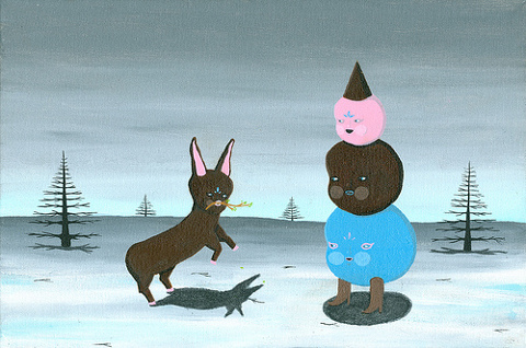
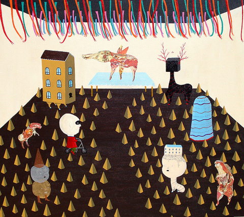


 Babylon Twins
 Watergate (part of Bywa)
 Yesterday
 In Stitches
 Bowerbird (part of Beasts Royal)
 Polzeath (part of Bywa)
 Yellow
 Natasha Chambers
 ‘When shelter is required construct a frame by interlocking sticks, then overlay it with palm fronds to block out rain and mosquitoes. Close off entrance with small bushes.’

 ‘For a cool drink dig into the dry earth with a long stick until you locate the position of a bloated frog. Hold the frog to your mouth and apply a slight pressure with your hands to release the water it is holding. Free the frog unharmed.’
 Helen Lovelee photographed by


 Illustration of


 Illustration of Hipota strawberry by


